Archive for April, 2022

The Ultimate Guide To The Best eCommerce Pop-Up Design

eCommerce is a booming industry today, but navigating the online space can be tricky. With so many options that users can shop in, you need to keep your site attractive to keep users interested.

However, maintaining users’ attention is more challenging than it sounds, and this is where eCommerce pop-ups come in. 

What Is The Definition Of A Pop-Up In eCommerce?

An eCommerce pop-up is essentially an overlay that you place on your website to stop visitors and show them an offer. 

One familiar example might be a pop-up offering a discount for your first online order if you subscribe to the site’s email newsletter.

How Do Pop-Ups Benefit eCommerce?

Pop-ups can be useful for your eCommerce strategy for many reasons. 

Increase Conversion Rates

If you’re struggling to increase sales, you can add an exit pop-up and offer visitors perks like free shipping, discount codes, and other promotions that will convince them to come back to browse through your products.

Grow Customer Database

Email marketing is a great way to boost customer engagement and strengthen relationships, so you can use pop-ups to collect emails from new site visitors. Use the best contact management practices to stay on top of all your email correspondence. 

Reduce Cart Abandonment Rates

Many times, customers add products to their cart but leave without finishing their order. In these cases, you can use psychological marketing by displaying a pop-up that shows their items have a limited-time discount or are only limited in stocks.

It creates a sense of “fear of missing out” (FOMO), which prompts them to check out their cart.

Collect Customer Feedback

Pop-ups can also come in handy for collecting feedback to help you improve the shopping experience and customer service quality. For this use, the pop-up should be a short questionnaire with multiple-choice questions, star ratings, and direct questions to keep the process short.

Provide Targeted Content

Another big benefit to using pop-ups is the ability to provide targeted content to your visitors based on their browsing history, length of time spent on a page, and other factors. The pop-ups work like ads, where you set specific parameters to activate what pop-ups will appear on a specific user’s screen.

Boost Customer Loyalty

Pop-ups are great for boosting customer loyalty since they allow you to give your shoppers incentives like gifts, promo codes, free or discounted shipping, and the like. 

Types Of Pop-Ups

There are many types of eCommerce pop-ups that can be used depending on your objectives and needs. 

Email Sign-Up
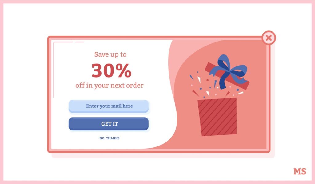
Image Source: MarketSplash

This is perhaps one of the most familiar types of pop-up, which entails asking visitors to write down their email address, usually in exchange for a small incentive like a discount. It is useful for growing your email list and encouraging purchases.

Sale Promotion Pop-Up

Whenever you have promotions, it helps to put them into a pop-up to inform customers loud and clear and encourage them to make a purchase. Common sales promotions you’ll find in pop-ups include discounts, limited-time offers, giveaways, and seasonal campaigns.

Coupon Pop-Up

Coupon pop-ups are as the name suggests—they’re pop-ups offering visitors a coupon or coupon code to get a discount for their order. 

Some variations will combine this with an email sign-up pop-up, wherein users type in their email to get the coupon code, while others simply display the coupon to incentivize immediate purchases.

Updates, News, & Notifications Pop-Up

This type of pop-up intends to keep users informed, so they don’t miss out on any important announcements and updates. It could be about an upcoming product launch, promotion, webinar, or even new content to attract customers and generate more interest for your brand.

Welcome Pop-Up

This is a pop-up that shows up immediately or shortly after your web page loads. It’s designed to target first-time visitors and capture their information so that you can nurture the lead. 

Exit-Intent Pop-Up

Targeted to visitors who are about to leave the site and used to convince them to stay or take a particular action. The most common use cases for exit pop-ups would be to prevent cart abandonment, remind users of benefits, collect feedback, and recommend alternatives.

The Do’s Of Pop-Ups

To guide you, here are some of the top things and handy tips you should consider when designing your eCommerce pop-ups.

DO Use Power Words
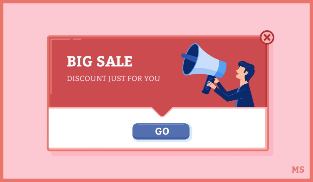
Image Source: MarketSplash

Your goal is to trigger a certain emotion from users when they see your pop-up. Thus, you can evoke that emotion and get a quicker response from them by using powerful words.

DO Make Your Pop-Ups Look Distinct

As the term pop-up suggests, you want these banners to pop when they show up on users’ screens. Use bright colors to draw in the viewer, yet pay attention to how the colors you chose to go together. Better yet, make sure the popup’s color palette matches your brands for full continuity. 

DO Offer More Than Deals

Pop-ups may be effective for promotional deals like discounts and vouchers, but there are many other ways to benefit from them. You can also share relevant content, give targeted recommendations, and provide feedback forms to make use of the full potential of pop-ups.

The Don’ts Of Pop-Ups

Pop-ups can drive huge conversions if used correctly, but getting it right can be tricky. 

DON’T Display The Same Pop-Ups All The Time

It would be more effective to personalize your pop-ups and tailor them to visitors based on their cluster or behavior. For example, you can segment the ads among first-time visitors, repeat customers, and abandoned customers. 

DON’T Show Irrelevant Pop-Ups

The risk of bounce rates increases if you display irrelevant pop-ups to visitors, especially if it’s their first time checking your site. Pop-ups may be useful, but only to the extent that they provide something valuable to the user, or you might just drive them away from your store.

DON’T Use Generic CTAs
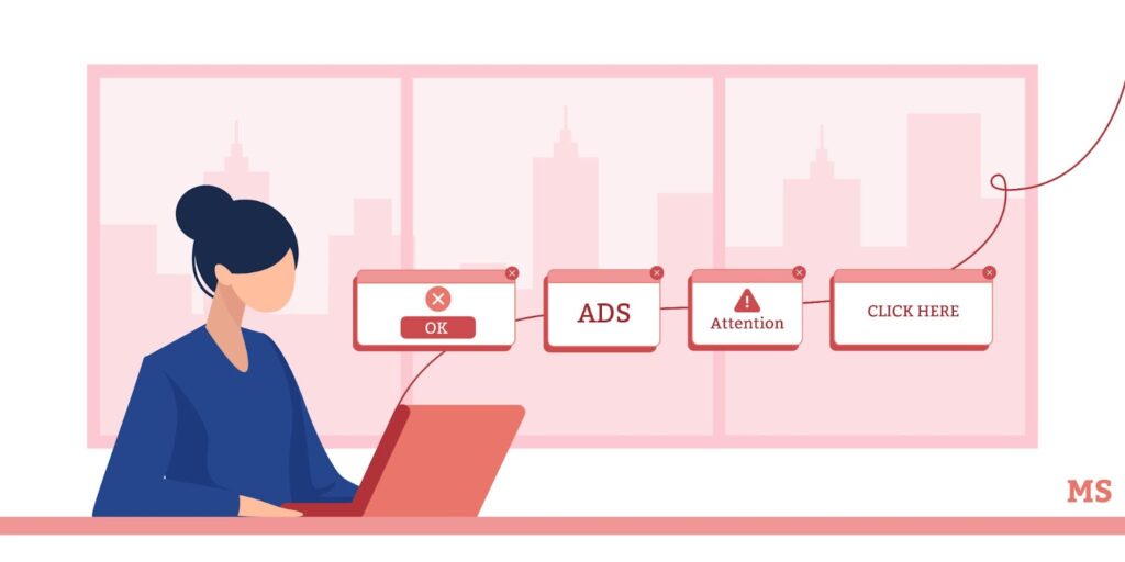
Image Source: MarketSplash

The call-to-action (CTA) is one of the most critical elements in your pop-up, so you shouldn’t overlook them and use a generic message. Your copy is just as important as the design, so much that in some cases, it could be the factor that determines whether a user engages with your pop-up or not!

Tips For Fantastic eCommerce Pop-Ups

While there’s no one way to answer this question, here are some tips that you can use to help you through the process. 

  • Display your ads at the right time. It’s important to know what pop-ups are appropriate for each stage of the buyer’s journey so that they serve their purpose instead of becoming a distraction or annoyance to users. 
  • Use eye-catching imagery. The visual aspect of your pop-ups may affect whether a user chooses to read your offer or skip it. Your pop-up should match how your site looks and feels, so avoid using tacky fonts or spammy language. You can even create a moodboard to showcase all your ideas. 
  • Add social proof. Whenever possible, incorporate social proof into your pop-ups. This can be ratings, short testimonial quotes, success indicators like the number of products you have sold, and other forms of proof to show users that they can trust you. 
  • Target pop-ups based on the audience. Segmenting your pop-ups to match your audience’s demographic and buying behavior is important to ensure that you show them something relevant and useful to their context.
  • Monitor and measure results. Think of your pop-ups like any other marketing strategy. You must monitor them continuously and measure their effectiveness to ensure you’re getting your desired results. 
  • Avoid being intrusive. Make sure you allow visitors to look through your site a bit before displaying any pop-ups. One way to do this is through a time-delayed pop-up that only shows up when a user starts to browse your products, so they aren’t bombarded immediately after entering your site.

Pop-Up Design Styles

You’ve got design options ranging from the most minimalist to the most complex, fun, and gamified. 

Here are some of the common types of pop-up designs that you can use: 

Yes/No
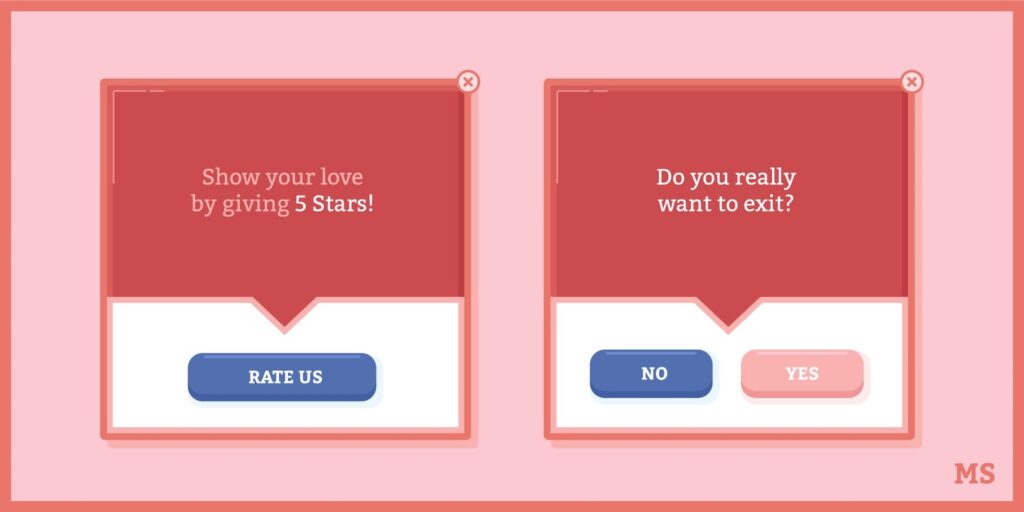
Image Source: MarketSplash

This design is as its name suggests—it’s a pop-up prompting the user to say yes or no to a question or offers that you’re posing. If the user isn’t interested, they can opt to “Continue Reading” instead.

Lightbox

It is perhaps the most common pop-up design for eCommerce sites. The pop-up appears over the web page and darkens the background to highlight the pop-up and grab a user’s attention.

Gamified

Gamified pop-ups are some of the most effective designs because they’re fun and engaging. Here, you’re essentially adding a mini-game to the pop-up, which users can play to get a prize like a discount or an incentive.

Floating bar

Floating bar pop-ups are more subtle than other designs since they resemble banners that rest at the top of your web page. However, you can still personalise them in a way that makes them pop and stand out once a user visits a particular page. 

Yes/Yes

The Yes/Yes pop-up design is similar to Yes/No in that users get a yes or no option for the offer. However, the main difference is that with the Yes/Yes design, the two options will bring users to the same place.

For example, Bluehost used a pop-up to bring users who sign-up to the Bluehost website to grant them their free domain. 

Lead Magnet

As its name suggests, it’s a pop-up that contains a lead magnet, which is an offer you promote on your site—usually a free product or service in exchange for contact information. 

A unique way you can use this pop-up is to invite visitors to attend a webinar you’re hosting. 

Survey
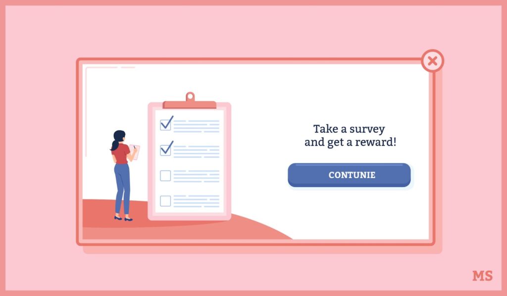
Image Source: MarketSplash

It’s designed to invite users to take a survey so that you can learn more about their interests. Surveys are most ideal if you’re trying to get customer feedback or doing market research for a new product or service you might be planning.

Our Favorite Examples

We’re rounding up some of our favorite examples to give you an idea of how you should create your pop-ups.

Soaked In Luxury

At first, glance, Soaked in Luxury seems to be doing the same thing as many other players, but the biggest difference you’ll see is their CTA. 

Where most fashion eCommerce sites would ask you to sign up for their newsletter, Soaked in Luxury offers them a chance to win ?700. No doubt, it’s an extremely effective way to catch a visitor’s attention and convince them to give you their contact details in no time at all.

Amazon
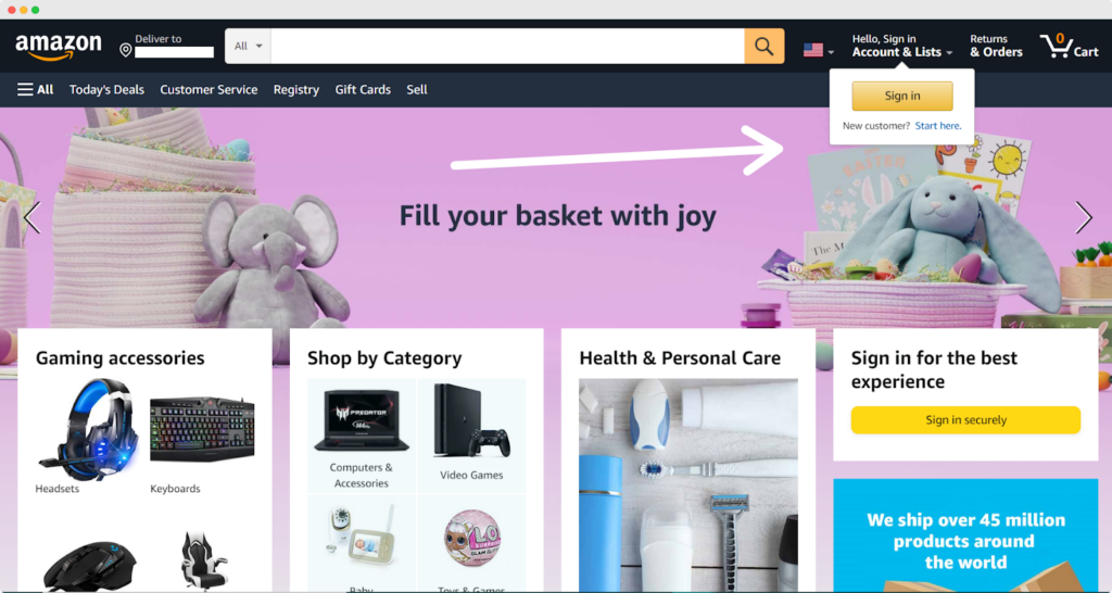
Image Source: Amazon

Known as the King of eCommerce, Amazon has established a solid footing in the industry, so you know that they’re doing something right. 

One of the things you’ll notice first when you visit their site is a pop-up prompting you to sign in or create an account. It may seem like a small and almost inconsequential thing, but it’s a subtle way to notify visitors of what they should do when they enter the Amazon site.

Kellogg’s

When their website loads, you’ll see a lightbox pop-up design inviting you to sign-up for their family rewards to get special discounts, collect points for rewards, and get exclusive coupons and access to recipes. 

The pop-up is highly effective in building customer loyalty and solidifying Kellogg’s position as a household name in the cereals industry. 

Colgate
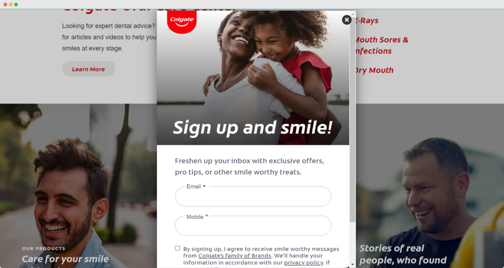
Image Source: Colgate

Colgate uses their pop-ups strategically to ensure that they get as much information as possible from every new site visitor. Once their page loads, you’ll see a lightbox pop-up asking you to sign up for their newsletter so that you can get emails for discounts, savings, product updates, and other promotional offers.

Subway

Subway has a uniquely designed pop-up displayed at the right side of the screen instead of the usual center. It’s also the usual email sign-up form, it’s eye-catching without disrupting the viewer from the center of their screen because of its position.

Final Thoughts

Pop-ups are a valuable tool you can use in your eCommerce strategy to drive sales, increase conversions, and capture a larger customer base. However, there’s no “one-size-fits-all” strategy for designing and implementing your pop-ups. 

Given this, it’s important to plan your pop-up campaigns carefully before launching them.

The post The Ultimate Guide To The Best eCommerce Pop-Up Design appeared first on noupe.


How to Access Great Web Design Without Paying Agency Fees?

Great web design is crucial to the success of any online business, with 50% of customers saying they believe it’s crucial to a business’s overall brand

Naturally, the biggest elephant in the room when it comes to great web design is typically the cost. 

How can you create an awesome website that builds trust and converts without breaking the bank first? 

Is it even possible to access great web design without paying agency fees?

In this article, we’ll show you how to avoid agency fees, keep costs down—and still design a great website for your online business.

What Are Your Web Design Options?

When it comes to building and designing your website, you’ve pretty much got 3 options. You can either: 

  • Work with a professional web designer 
  • Work with an agency 
  • Design your website yourself with a website builder or theme

Working with a Professional Web Designer 

Working with a professional web designer will cost you a lot more money than doing everything yourself. Depending on who you hire and their level of expertise, you can expect to pay anything from around $500 to $10,000+.

This is, can be at least, a one-off fee, and it also means that you’ll be able to draw on someone’s experience when it comes to designing a quality final product that matches your brand and attract more customers. 

Plus, your web designer will take care of everything for you, while you get to work on the core aspects of your business that matter. That said, you will need to communicate your vision to your designer (and vice-versa) so that you end up with a website you’re happy with. 

The only real downside to working with a web designer is that it’s highly likely that they don’t double-up as a developer. In such a scenario, you will need to hire a developer, too. 

Working with a Web Design Agency 

Working with a web design agency is your most expensive web design option. However, because it’s also the best design option in terms of how your website will look and attract customers, it’s the one most online businesses would prefer to go with—if possible. 

Because a web design agency is an agency and not just one individual web designer, you will likely get a whole team working on your website. This can bring many benefits, and you likely have the opportunity to purchase other services, like a content writer, a developer, an SEO pro, and so on. 

Instead of getting just a website that’s nicely designed, you’re essentially getting the whole package. 

That all said, there are drawbacks here, too. The biggest is that web design agencies are expensive and they may require more time to complete your website. Another disadvantage is that you might end up paying for a web design agency that just isn’t a good fit for you, and which doesn’t quite get your vision. 

Moreover, it might be the case that you overpay for the “whole package,” when in reality you could have paid for each separate part—an SEO person, a content writer, etc for a smaller fee. 

How To Access Affordable Web Design 

As we’ve seen, web design agencies can bear fruit in terms of the look and feel of your website, and make sure your website is optimized for SEO—and fix any development faults. 

However, because web design agencies are so expensive, many startups prefer to look for cheaper but still awesome alternatives.

If you are attracted to the idea of working with an agency that can deliver a deluxe package, you could look into startup finance options, such as revenue-based finance.

If, however, you want great but affordable web design and don’t want to pay agency fees, let’s take a closer look at your options. 

Use a High-Quality Website Builder

Website builders like Wix come with a whole raft of tools and helpful resources so that even complete beginners can start using them straight away. 

Using these tools, you can build a website from scratch that matches your brand, and one that works just as well on mobile devices as it does on desktops. How amazing your website turns out will come down to your own personal skill levels.

If you aren’t ready yet to build an entire website—there are landing page builders that focus on creating stand-alone landing webpages. These are ideal for businesses that sell one or only a few products.

Website builders’ basic plans often start out from just $14 a month. But it’s still a smart idea to also work alongside developers and SEO experts who can help you truly develop your website. 

Additionally, for many website builders, you will need to purchase a separate web hosting plan. The cheapest options start out at around $2.49 per month. A hosting plan should come with things like automatic backups that keep your website running smoothly with as little downtime as possible. 

That said, how much you pay for a web host depends on your needs. Bloggers can get away with a shared hosting plan (the cheapest option), but bigger business websites will benefit more from a managed hosting plan that’s faster, where prices can often start from about $20 a month. 

Also, while website builders are fine for smaller websites, it’s probably a better idea to work with a freelancer if you’re planning to build a much bigger website that attracts high volumes of traffic.

Use Website Themes

Designing your website yourself with a theme is arguably the cheapest option. You can work with a content management system like WordPress, which is the most popular CMS in the world—and it has free themes available for you to use. It can, however, cost more money over the long-term if you want access to available add-on features. 

The biggest drawback is that, unless you’re an expert designer yourself, there’s every chance your website won’t look as good as it could do once you’ve set your theme up. 

Conclusion

Great web design doesn’t have to break the bank. Working with an agency can be super expensive, but there are ways to achieve a quality, high-converting website without paying for expensive agencies.

You can go down the DIY route and use an inexpensive website builder that gives you access to an array of templates and tools to get you started, or you can work alongside an expert freelancer who will help bring your ideas to life. 

The post How to Access Great Web Design Without Paying Agency Fees? appeared first on noupe.


The definition of font psychology and how to use it

What is the psychology of fonts?

Most people are more engaged in visual content, less writing (a phenomenon that psychologists call the effect of visual imagery), looking like a text (like a font) on a brand font psychology in logo design, advertising, and other products that are important for brand recognition. That brand memory lowers writing content.

Not only the modern look of the text is an essential factor for branding, but the old look of different fonts can have a psychological impact on the viewer. Having changed the style of the typeface, having made it more emotional and tighter, the designer can change the beauty differently to the brand.

For example, a bank that wants to convey to its customers a sense of stability and decline can choose a traditional serif typeface, and a tech start-up can choose a futuristic sans-serif typeface so that clients embrace it as innovative.

Psychological thinking can be extended even to other design elements, such as color. Advanced designers can combine a few psychological effects, choosing fonts and colors, after which the combination of design elements is psychologically thought out, which conveys one of the emotional font moods.

The influence of the emotional fonts on the perception of the consumer of the brand

Font style definition – can best be conveyed by describing different font styles.

Direct elongated fonts

They convey a business mood and are almost universal fonts. However, it should be borne in mind that direct font will be inappropriate for non-mass and original products that need to be distinguished from competitors. It may seem tedious and faceless if you do not beat it with an unusual color scheme.

Strict square fonts

They are mainly used in the design of advertising industrial products, technologies, and social advertising. Lightness and simplicity are inappropriate here. These fonts are designed to adjust a person to the seriousness of the information provided. They give the impression of importance and authority, so they are designed to attract business partners and investors.

Rounded fonts

They convey a sense of comfort and coziness. When square fonts look strict, rounded ones are positively perceived as a good attitude of the brand towards consumers.

Italic fonts

Most often used to advertise products that target the audience of girls and women. Italic fonts evoke a feeling of lightness and beauty. This is how beauty salons, clothing, and cosmetics stores advertise. Italics facilitate the perception of information, and it looks less important. Therefore, notes and the author’s digressions are highlighted in italics.

Handwritten fonts (script type font)

What is script font definition? Script psychology definition is that they have a unique element of fluid stroke attached to them. In layman’s terms, it is writing using a brush while connecting letters. They were mainly used for print packaging, signage, and advertising. Not suitable for outdoor advertising and slanted fonts – they are challenging to read if you choose a large font size. At the same time, they are great for emphasizing the exclusivity of a product or service. Handwritten fonts are used for advertising legal and consulting services, medical practice, and writing invitations during political PR campaigns.

The visual rhetoric of the text

Text documents mix both visual and verbal rhetoric. Verbal rhetoric refers to the actual textual information and affects the reader’s ability to understand and perceive the content. Visual rhetoric involves the visual elements and forms the overall impression of the document. Graphic elements in the text can activate the semantic imagination – they form individual semantic connections between blocks of text, more broadly explain what is said in the text, or form content that is not related to what is presented in the text.

Web design typography trends

Recent research shows that the emotional state of readers is the result of user experience. The perception of the font depends on the level of knowledge. The headset directly affects the external text on the screen or the document. Depending on the amount of text offered to the reader, choosing fonts that improve the positive attitude and perception of what is read is necessary. Psychologists say that in a state of happiness, the process of human thinking expands, activating creative thinking. When a person is optimistic about shopping, he ignores the inconvenience of the interface. And the choice of inappropriate fonts can cause negative emotions, accompanied by a critical assessment of your site’s user interface.

An attractive interface evokes positive typography emotions and is perceived more efficiently, producing a sense of harmony in visitors.

Font pairs

The main rule: Choose a font pair before you start the design.

This will allow you not to be confused in size in the future, not to think about what font to use here and how to use it here. It is better to define it once (which heading you use, the subheading, and their dimensions) and then apply it in your layout.

With the advent of user-friendly web fonts, the opportunity to improve your site has become even more accessible. But many fonts can confuse not only a beginner – which one is right for you?

The site is the text. When we visit a page, much of the content we come up with is text.

What happens on the page in terms of font pair? When we visit the site, we see many combinations of text. We see headlines. We see some main text. We see some captions and some notes next to them. We know the date. We see “today” written in a completely different font. This font is also different from the title, for example, and here it is. And how to combine it all correctly is a question.

The main rule is sufficient contrast. Not too big, not too small – the one we need here and now. And 4 tools for creating pairs of fonts – the so-called four ways, four tools that we can influence the contrast.

  1. Of course, the font. These are Antiquity and Grotesque, for example. Because of the maximum contrast between them. Antique is a slash font. Grotesque is a slash font.
  2. We can use typefaces within one font and different fonts in the same way. For example, it’s regular spelling (Regular), bold and Italic.
  3. It is also important to say about the size. It would help if you had a difference between your lines. Your font was more than 1.6. 1.6 is a figure from the proportion of the golden ratio. Use it as just a factor. If you have a text and want to make a title to it – multiply the size of this text by 1.6, and you will get the size of the title. If that’s enough, maybe you’ll have to increase it again.
  4. And, of course, color. There are, in principle, established pairs that can be taken and used—for example, Baskerville and Gill Sans. We see a bold typeface in the title, a font with notches, and the text is written in sans serif font. There is also enough contrast – we see the difference between the two fonts.

Also Garamond and Verdana. It is one of the golden rules of font selection definition. When selecting a font pair, you can use such established pairs as Garamond for headings. Verdana is a perfect font for typing the main text – it is comfortable to read. At the same time, Garamond is quite expressive for headlines.

Proxima Nova and Palatino – on the contrary, we use Proxima Nova headers – is a font without serifs.

And Palatino can be used for some book sets, sets, maybe articles. Palatino + Proxima Nova

Another example is PT Sans and PT Serif. These are fonts that are part of one typeface, that is, so-called fonts of the exact nature. That is Sans in the title, Serif in the main text.

What is the beauty of using a headset as part of a font pair? The fonts are similar: they were made by one author and have a single concept. They have, of course, differences in the image – there are notches, there are not, but they are very harmoniously combined. Helvetica + Times.

Perception of the font as part of the logo

Only 6% of international brands use a picture as a logo. 56% use a combination of text and images, and the symbols of 37% of the remaining brands are inscriptions. Thus, the vast majority of companies use text when creating a logo. Font values should not be neglected, and enough time should be devoted to creating a logo with a font that best communicates the brand philosophy to the person.

A logo where the text is placed in a square or circle is associated with confidence, in an ellipse – with a creative approach. The inverted triangle looks like a call to action, and the diagonal arrangement of the text is associated with speed and speed.

The best font for perception

63% of the fonts used in company logos are serif-free. The most popular among them is Helvetica. This font is used in 21% of logo inscriptions.

Helvetica is considered the best font for perception.

Where to get fonts?

  • google.com/fonts is a directory of free fonts from Google
  • typekit.com – similar in model, concept. We can take fonts from there and use them on the web, for example, immediately.
  • myfonts.com is a massive database of fonts. There are a lot of English fonts, Latin, and there is also Cyrillic.

Conclusion

To sum up, try to remember the following:

  • Make sure the text matches the situation in which it is presented
  • Size matters – logical choice of size emphasizes where needed
  • Use a font that displays the dialog you want to run
  • Color is paramount for conveying subliminal messages to your reader
  • You can also use color to draw attention to certain parts of the text
  • Text is useless if it is not easy to read – help your reader use logical formatting.
  • The image is not just colors and forms on the side, not for people.

Though people react to visual culture emotionally, designers can manipulate the psychological reactions of their gazers, sensing the choice of design characteristics, such as colors and fonts. The development of the psychology of fonts in marketing is becoming an important area of research and practice in branding and advertising.

Although it was the prerogative of great corporations, small businesses now recognize the value of stowing the psychology of emotional typography in marketing and brand design. It has been brought to light that different fonts are poured into the psychology of a person, and the deacons of hard fonts are to inspire the building to change the taste of life. It’s not surprising that brands are beginning to hire designers so that they can be smart, understand the psychology of fonts, and know fonts that evoke emotion.

For designers, that company’s understanding of the psychology of fonts is the key to molding how to remember the brand and how customers accept it. It is also true that the word strength in different fonts is different.

The post The definition of font psychology and how to use it appeared first on noupe.


Web Design Trends For 2022: Expert Opinions

The world does not stand still and things change every year, if no color daily. There are new technologies, trends and growing interests in many areas.

Design is no exception. It is probably the most unpredictable trend there can be. Just yesterday your T-shirt was the hottest fashion trend, and now you need something new. Or just recently we could see a revival of retro styles in fonts, posters, and logos, even though it seemed impossible.

When it comes to web design, it is always looking to the future. Due to its fairly dense relationship with innovative technology, the digital sphere can delight all of us every year with something new in animation, user interfaces, and immersion depth. The year 2022 will also be promising in this regard, as we will soon see.

Besides visual trends, we also mention technological ones, keeping in mind that design is a planning job, actually engineering, and not just gradient selection. We appreciate things primarily not just for their color, but for how well they solve their tasks.

Dynamic Content

At the moment, many users are getting a bit fed up with the old type of sites and want to see a new level of personalisation. For this, it is a great idea to add dynamic content (also called adaptive) to your website. In this way, some sort of chip is added to your website and all your content changes depending on user demographics, behavior, preferences and interests.

In other words, the site will shine with new colors, not only visually but also technically. Changing headlines, subheadings, parts of text and images to suit the needs of potential customers will have a positive impact on your project. Using dynamic content, you can also easily create modules without programmer help. For example: with this solution, it’s possible to display a list of available products, manufacturers, or categories (by various criteria) in a modern eCommerce template.

Retro

Remember what we feel when we look at old photographs, games, things. A warm feeling of nostalgia comes over us. Designers love to play on users’ feelings, so they apply this trick in web design.

As the emergence of the Internet becomes an increasingly distant memory, up-and-coming web designers of today draw inspiration from those early days. The so-called ’90s style was characterized by bright background colors, visible table markings and robotic fonts.

While all that was implemented back then with pretty fun results, web designers of 2022 are reviving that trend, while still having the benefit of nearly 30 years of collective design experience.

As well as being a showcase for a variety of tricks, graphics and color, the web of the 90s was also an era when there were no rules and very few professional web designers. Designers who have emerged since then and work to industry standards now see those early days as a breeding ground for unrestricted creativity (for better or for worse).

Three-Dimensional Colors

Color schemes in web design have been trending towards gradient for a long time, and this year’s trend seems to be the next evolution, with color transitions becoming more realistic than ever. Following Apple’s Big Sur OS example, we expect colors to be rich and three-dimensional, almost like fruit that you can pick right off the screen.

This trend is achieved by a darkening that gives roundness to the flat icons of years gone by. While we expect this to appear more often on app icons, web designers are also eschewing neat gradient transitions for mixed background colors that seem more imperfect and natural. Two colors next to each other can suddenly blend together, or can retain the shadows and depth of colored objects. Overall, this trend suggests that 2022 web design colors aspire to higher levels of realism.

3D Elements

Visual effects successfully attract the attention of the potential audience, fully showcasing the virtual space. The design trends of 2022 are aimed at shortening the time it takes to open a resource. In the future, the emphasis will be on small frameworks. Three-dimensional elements will be a useful addition, and may increase usability. Design will look more original and unusual. In 2022, development specialists will be looking for new tools for fast loading of information on the page, including graphic images.

At the moment, they are creating interactive animations that are more memorable for the user, but do not slow down the loading speed of the site. The main purpose of such a picture is to attract the attention of visitors . The motion effect has a positive effect on a company’s reputation and promotion, increasing the number of target audiences.

Dark Design

This trend will only strengthen its position and progress this year. Many users have noted that it is the dark theme that they activate in their daily lives. This light is known to feel less strain on the eyes. It is also recommended activating the dark background if you use the device before going to bed. This promotes easy falling asleep and also has little effect on the quality of sleep. And, in general, a lot of people like dark mode. 

Dark mode combined with OLED (organic light-emitting diode) can prolong battery life. Many large companies have already introduced a dark theme to their own digital designs in UI/ UX design. The popularity of the feature will only increase. In addition, in 2022, companies will offer several design options. The user will be able to choose the interface that suits his or her preferences in the most pleasant way.

Animated Logos

The year 2022 does not abolish business cards, notepads, pens and booklets: animated logos make no sense for print products. But online brands are facing new challenges and looking for new solutions, one of which is creating animated logos.

And this is a legitimate expectation because they have many advantages, such as:

  • They attract attention. It means that they help increase brand awareness.
  • They look good on mobile devices. Catchy animations look more interesting than a static logo.
  • Most importantly, they showcase a story. The idea of a static logo evolves into an animation. It allows you to show not only the mission of the brand, but also its values in a few seconds!

Minimalism

Of course, good old-fashioned minimalism has not been abandoned. Sometimes you get the impression that it will always be on trend.

These days, end-users prefer minimalist and clean websites because they help them focus on what is most important, rather than being distracted by insignificant details.

With a lot of information already present everywhere, the modern user is looking for accurate “no water” information, seeking to eliminate unnecessary wandering around the web.

Websites with a huge number of elements can not only distract the user from getting the information they need, but also get forgotten rather quickly. After all, when instead of searching for certain information it is necessary to leaf through a huge amount of content, the user is more likely to choose only the button to close and forget the site.

On the other hand, a minimal, clean and dynamic website, complete with bold font where appropriate, helps the user to access the information they need very quickly without much effort.

New Fonts

Typographic trends change direction every year. In 2022, designers will no longer welcome classic fonts and are more likely to use custom typefaces as well as serifs (a short, usually perpendicular stroke at the end of a letter that begins and ends the main stroke of the character). The size will also change quite frequently. From word to word, the semi-transparent font will overlap the non-transparent one. Plus, boldness and italics will be added. You can see this trend in MasterBundles, CreativeMarket and Etsy.

Authenticity

Does it seem to you that sometimes you visit almost identical websites? More online platforms have become similar to each other. Finding something out of the ordinary is becoming almost impossible. A new trend was born out of this — authenticity. The essence of this trend is to combine things that are very difficult to match, to be unusual, to be out of the box, leaving the users baffled by what they see. It is about working with meanings, ideas and the presentation of information.

Parallax Effect

The “parallax effect” is still a popular design solution today. It is one of the trends of the 2022 website, and has been for years. It is not surprising as it is a really worthwhile move to get users’ attention. Parallax is commonly referred to as an optical illusion that occurs when floating parts are formed. Presented method is commonly used in the design of web pages. This effect allows visitors to the site to feel the effect of immersion to the fullest extent.

Conclusion

We can say for sure that most of the trends will, of course, take over from previous years, but they will also have higher quality content using new, modern technology. But what is really fresh about these trends is that they are aimed at creating excitement.

Whether they bring back a forgotten decade, delight the user with interaction and animation, or offer something created by hand, the goal of this year’s web design trends is to create an instant sense of wonder, no matter how unconventional the approach may be.

The post Web Design Trends For 2022: Expert Opinions appeared first on noupe.


Software Developers vs Software Engineers

If, as a business owner, you too are confused between the terms software developers and software engineers, you are not alone.

Not only do the terms sound similar, but there are specific responsibilities of software developers and software engineers that get intertwined, making it even more challenging to differentiate between the two.

Despite sharing many similarities in software development, both software developers and engineers approach a particular task differently based on their skillset. In this blog, we will dive deep into the skills and responsibilities of both software developers and engineers so that the business organization has a clear idea when they are hiring them.

Software Developers and Software Engineers are highly skilled and knowledgeable tech professionals who could be an asset to a business firm. Therefore, it is essential to know their differences correctly. Otherwise, it may harm an enterprise for a more extended period.

Let us begin!

Who is a Software Developer?

A software developer is a professional whose primary work is to develop softwares that can run across various computer devices, tabs, and smartphones. The dedicated software developers are very creative and brainstorm masterminds who can create giant networks or underlying systems or focus on a specific program or an app.

The experienced software developers also focus on using various source debuggers and other visual development environments to write programs and modify codes and debug the softwares for client applications. Moreover, they are also expected to document and test the client software and write codes for apps that boost access to servers or services.

Top Technical Skills for Software Developers

Software development is a very complex job. Thus, business organizations expect software developers to be aware of specific technical skills that would help them during the software development process. For the knowledge of our readers, we have listed the essential technical skills that software developers must possess to excel in their work.

Algorithms and data structures

Understanding data structures and algorithms are essential for best software developers as they are the heart of software programming. Moreover, many business enterprises and employers are looking for talented software developers who are efficient in different data structures such as map, set, linked list, array, etc. Therefore, knowledge about basic algorithms and data structures will help software developers build better applications.

Cloud computing

Software developers must be highly skilled in cloud computing. Tech pundits worldwide also believe that cloud platforms will remain in demand in 2022 and years to come as there is no shortage of space, and companies can store their data quickly in a synchronized way.

Git and Github

An expert software developer must have a strong hand in knowing the versions of source controls such as SVN and Git. For example, more than 70% of the organizations use Git and Github as it has streamlined the market significantly. Therefore, the custom software developers must make some effort to be familiar with the advanced versions of this source control, such as knowing the concepts of merging and branching.

Top Soft Skills for Software Developers

Along with being brilliant in the technical aspects, the software developers must have some soft skills such as the interpersonal skills to make the communication process easy during the entire software development project.

Accuracy and attention to detail

It will not be an overstatement if we say that a software developer must have surgeon’s precisions while writing codes. They must be able to extensively run through their work to be the problem-solvers themselves and point out even the tiniest mistake that is messing up the entire code.

Willing to work in a team environment

The software developers should always strive to become brilliant individually but must also be able to do well in a team environment. They must have excellent collaborative skills and a cool head over their shoulders for staying calm under challenging circumstances.

Staying curious

A software developer who remains on one’s heels while doing a task will become a liability in the future. Therefore, they must always be looking for self-development by challenging themselves to remain at par with the changing requirements of the dynamic business environment.

Who is a Software Engineer?

A software engineer is mainly responsible for applying state-of-the-art software engineering principles to develop, design, test, maintain, and evaluate the software. Along with the software lifecycle, the latest engineering trends applied by the software engineer also relate to incremental development, consistency, generality, and modularity of the software.

The dedicated software engineers apply mathematical analytics and work on a larger scale than the software developers. As a result, they play a pivotal role in creating new tools for software development used by the software developers.

Top Technical Skills for Software Engineers

To become an efficient software engineer, a tech professional must have a strong hand in hardcore technical skills. For the benefit of our readers, we have listed a few of the top skills below:

Object-Oriented Design (OOD)

A specific software design approach has become popular since the proliferation of the software development realm. Object-Oriented Design (OOD) includes the critical principle of software design such as encapsulation, abstraction, decomposition, inheritance, and generalization. Therefore, if the software engineer is well-aware of the OOD guidelines, they will be able to develop reusable, modular, and very flexible software.

Software testing

One might say that software testing is an area where the quality assurance team has a specialization. But an experienced software engineer must know the ins and outs of software testing as it will help them reduce the time of overall software development.

Knowing the software testing process will also make the analytical and problem-solving skills better of the software engineer.

Accurate coding and computer programming

The instances where the software engineers would be required to code are rare, but it will be handy for them to be familiar with the programming languages. Knowledge of leading programming languages such as Python, Ruby, C/C++, etc., will make it easier for software engineers to be good with the data structures and algorithms.

Top Soft Skills for Software Engineers

Apart from being proficient with technical skills, software engineers must also have excellent ‘people skills’. Some of the leading soft skills that make the expert software engineers stand apart from their league are:

Leadership and persuasion

Along with being profound in their work abilities, software engineers are also expected to lead a team. Therefore, a software engineer must convey the basics of the development project to the team and guide them through all the thick and thin. Moreover, if the engineers are aware of the software engineering trends, it would assist them in sharpening their leadership skills.

In addition, they must persuade their team members to put in their 100% during the software development process so that the software renders the desirable outcome at the market.

Self-confidence

Software engineers must have complete confidence in their skills. Self-confidence will help them guide a team if they are stuck anywhere during the development process of software project. Moreover, with self-confidence, the software engineer will be able to look at problems from a different angle and have more chances of solving them quickly.

Taking risks

Apart from leading by example, the software engineer must also not shy away from taking calculated risks. The risk-taking ability will help the software engineer get out of one’s comfort zone and be better at their work. Moreover, it will also help them learn new skills that they can apply to better the software development procedure.

The Key Difference Between Software Developers vs Software Engineers

Below are some essential aspects that business organizations must consider to clarify what to expect from a software developer and software engineer.

  • A software engineer is involved in the entire software development process, whereas the software developers are only included in one aspect of the software development process
  • The software engineers create tools such as eclipse, visual studio, etc., while the software developers use them for development purposes
  • A software developer writes the entire program while the software engineer works on the component to build a system.
  • The software engineers solve issues on a larger scale. Moreover, the scope of work of software developers includes everything, but it is limited.
  • Software engineers work in a team while the software developers can either work alone or are a part of team.

The post Software Developers vs Software Engineers appeared first on noupe.


  •   
  • Copyright © 1996-2010 BlogmyQuery - BMQ. All rights reserved.
    iDream theme by Templates Next | Powered by WordPress