Author Archive

The Ultimate Guide to Knowledge Management Systems

If your business is swamped with inquiries it would probably be a help to have a well-organized system of information accumulation, so that when the same queries come up repeatedly, situations can be dealt with in real-time. 

Even better if the user can find the solution to their issue themselves. Well, luckily, such a system exists. It’s called a Knowledge Management System.  

What Exactly Is a Knowledge Management System?

Data is becoming more highly valued. In fact, 85% of US companies are now increasing their focus on data. So, it makes sense to look at how best to structure this. 

In the most general sense, a Knowledge Management System is a way of storing and accessing the expertise and wisdom born from experience, so that the circulation of intelligence can flourish.  

These systems can find themselves in many guises and in a multitude of applications. It can be said, for instance, that every library on earth is a knowledge management system. As is a magnetic memo pad stuck on the side of the fridge.

Knowledge Management Systems can be broadly divided into internal and external. The former is intended to deliver benefit to the staff member needing answers to work-based queries like “how to record a phone conversation?” and requiring models of the business process. This can be very useful in employee training, for instance. The latter is focused on giving those outside the organization the information they need in a clear and reliable manner.

For the purposes of this article, we’ll concentrate primarily on the latter. We’ll cover the system used in client support, as this is an area of increasing interest to organizations wishing to improve customer care while saving money. 

Examples of a Knowledge Management System in Customer Support

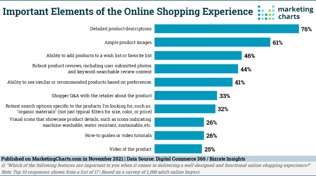
Research shows that customers want more product information.

Image Source

So, the aim of the game is to render the customer adequately informed. Here are a few ways Knowledge Management Systems can do this.  

Frequently Asked Questions (FAQs)

An FAQ section is a feature that is used extremely widely. They can be said to be the very essence of a Knowledge Management System. As the name suggests, the question list therein is generated from the most common enquiries directed at the website or over a digital phone number over at a call center. The answers provided are gleaned from the expertise accumulated over time. 

This expertise is readily accessed by the enquirer, who is able to acquire satisfaction with little or no output in effort or time from any of your team. No wonder FAQs are such an internet mainstay. They’re a very significant way of improving the customer online experience, especially on sales channels.

Forums

These are a great way of harnessing user expertise and making it available for other users. A user’s perspective can unearth nuance that may have eluded the sales entity’s attention. It’s not so great though when overly critical material surfaces. This is of course the problem with accessing the voice of customer experience. For this reason, moderation is often required.

Tutorials

These can be very effective, especially for more complex processes. They do depend on a certain amount of commitment on the part of the user to see the job through to the end. Your organization can assist in the likelihood of success here by ensuring that the tutorial quality is sufficiently simple and compelling to result in fulfilment.

Case Studies

For detail and story value, a case study can be very useful. As long as the story of a company’s overcoming of a particular issue has relevance to the user reading it, it can provide the color and real-life aspect that is crucial in generating impact.

Reviews

Massively significant in terms of user value, reviews have a huge influence on sales. 

Image Source

Beware negative reviews, though. Of special concern are bogus negative reviews posted by those with an interest in your commercial demise. This then is another area that will benefit from at least a little monitoring, with an eye to ensuring data integrity.

Knowledge Management System Benefits

New Customers Can be Attracted

Sales prospecting made easy. How? Customers exploring a new product or service will often wish to have a well-rounded portrait of what they’re looking at. For this purpose, the reviews, tutorials, and case studies found in your organization’s Knowledge Management System can be invaluable. 

More than this though, a customer wanting to see if your company has the agility and commitment to be able to respond effectively to customer concerns will find assurance in the presence of a good Knowledge Management System.   

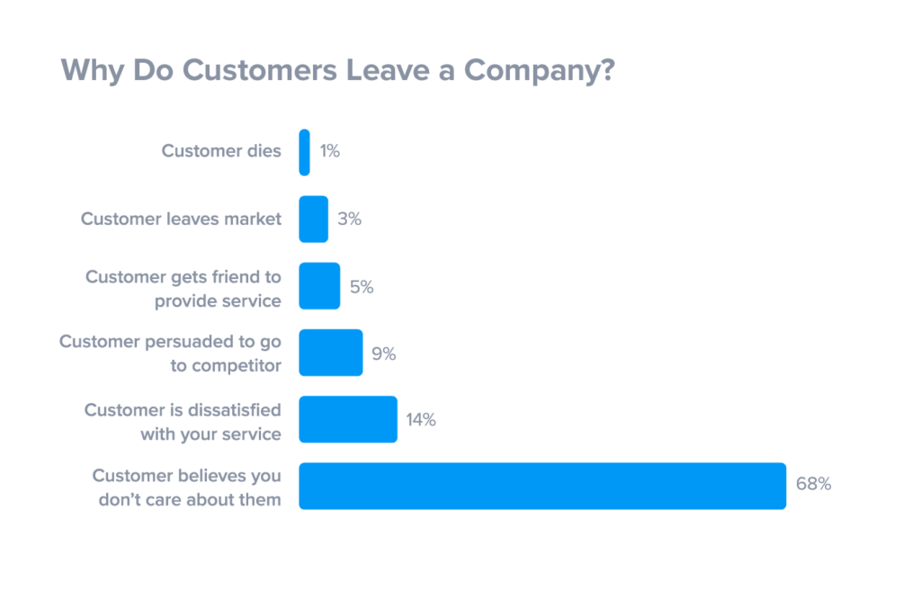
A Happy Customer is a Retained Customer

More specifically, customers need to feel that a company cares about them.

Image Source

When you can deliver this kind of benefit without committing expensive staff time you have a win.

Freeing Up

You and your staff can be liberated from more repetitive tasks such as dealing with the tenth instance of the same query that morning. If you can match this spare capacity with tasks requiring more creativity and spontaneity, you’ll probably have a happier and more fulfilled workforce.

Avoid Loss

When staff members leave, the expertise gap generated can be enormously damaging to a company’s collective competence. It could be that a departing member of staff knows all there is to know in many areas like knowing how to transfer phone calls to another phone or understanding what is HDFS file system. Some of this you will want to enshrine. 

Rather than having to gather this information once more, you can encapsulate it safely, thereby weathering the ups and downs of staff turnover more easily.

Creating a Knowledge Management System

The knowledge in your system is of two broad kinds; what are the questions people are asking? What are the answers to these questions?

User Questions

Image Source

You’ll probably already have an excellent resource here. Your frontline staff will deal with user questions every day. Collate data from their accounts on what comes up most. 

Sensation bias (where the most eye-catching and colorful issues tend to be more readily recalled) can distort matters, so it’s good to pair this approach with a trawl through a section of your company’s support tickets. The information that will be available can be really helpful here.

Another tool you can use is ecommerce analytics: by studying what your site visitors are searching for, you can construct a good picture of customer interest. 

Finally, don’t forget to keep an eye on mentions your company may score on internet marketing software and social media. The frankness that characterizes social media will give you a great window into what users are currently feeling about your products and services.

Generating the Answers

Don’t assume you have all the best answers yourself. Your staff will have accumulated a wealth of information between them, so don’t be afraid to mine their expertise. Pair this with your own knowledge, plus product information from the manufacturers, and you will start to build a detailed information base.

It’s a wise move to go looking at other companies’ systems or check their affiliate marketing tools. You may find that some of the issues that you are seeking information on will already have been dealt with elsewhere. Just be sure to use the general information and not the exact wording. Commercial larceny makes for twitchy lawyers.

Making Answers Accessible

There is a dichotomy in Knowledge Management Systems thinking that can be characterized thus: storing knowledge vs sharing knowledge (or, on a similar note, codification vs personalization). Stored knowledge without any access facility is pretty much useless. 

Naturally, you’ll want to ensure security where necessary, but your fundamental goal is to enhance user learning. As previously mentioned, one of the advantages of a Knowledge Management System is being able to deliver this without a big staff spend. This is a key concern for businesses:

Image Source

Which of the varieties of Knowledge Management System outlined earlier in this piece you decide to use depends on the size of your operation and your customer profile. Overall though, it’s a good idea to incorporate a blend of different approaches. Your priorities are threefold: make the information easy to find, readily understandable, and as definitive as you can manage. This is the way to bring about a better customer experience.

Making Your System Better

Image Source

The importance of research into the user experience of knowledge bases is illustrated by how many times a pop-up will enquire about your satisfaction just as you leave the site. It’s best practice to combine this data with other approaches (such as time on page or bounce rate) in tandem.

The best way to make your system better is by regularly attending to its content to ensure that the information within is up to date and relevant. You also need to review pages to try to address parts that some users seem to have struggled with.

Finally, stay abreast of developments in technology so that your system can stay at the cutting edge of the game.

These are all ways you can be sure of improving data quality in your company.

Conclusion

By putting in place a decent Knowledge Management System, you can streamline activities for all concerned. Just don’t assume it’s a fire-and-forget solution.

Knowledge needs to be treated as a living entity to be of use to your company and your customers. It needs nurturing and feeding, it needs pruning and shaping: it needs regular attention from your wise hands.

The post The Ultimate Guide to Knowledge Management Systems appeared first on noupe.


10 Best Practices for Creating Exceptional Website Pop up Design to Increase Conversions

How do you catch visitor attention when even the most creative ads are, by definition, an interruption and the majority are viewed almost universally as a nuisance? 

It’s a formidable challenge that marketers face in a world of shrinking attention spans. 

What if we told you that you could do it with good old-fashioned pop ups provided you follow a few guiding principles that underlie some best practices?

If the name alone can cause conniptions, we know their reputation for irritation goes before them. 

Yet despite this, most folks aren’t terminally averse to pop ups per se. Look no further than how long they’ve stuck around and their current use. 

Play by the rules of permission marketing and combine that with exceptional design, and you can reach customers with your message. 

And here’s the thing: we don’t see them going away anytime soon. 

Pop ups can help you expand your subscriber list and give your conversion rate a jolt.

One of the fastest routes to increasing conversions is having an understanding of your customer’s buying habits. That means having a firm grasp of important metrics, such as knowing AOV meaning and conversion rate. Track them together to calculate your gross revenue. To optimize their average order value, businesses can add cart reminder pop ups to encourage visitors to purchase product bundles or avail of volume discounts.

People, it seems, are happy to engage with good designs and offers that add value.

With that in mind, we’ve created this guide.

Read on as we explore 10 best practices for putting together exceptional website pop up design that converts. 

1. Consider different types

The most familiar default pop up design is the square window that appears in the middle of the screen. In an e-commerce context, these are probably the most aggressive kind and interrupt browsing. This front-and-center approach can be used to signify something important. 

For example, consider a healthcare contact center setting where there’s a need to maintain critical service levels. Alerts automatically pop up for supervisors when levels dip below a specific threshold. 

Image Source

In business, this type of pop up is best when you’re confident your message is click-worthy or used as a bold exit-intent trigger. Examples include offers for immediate purchases or journalism paywalls.  

The slide-in pop up is popular because it allows visitors to choose whether they want to engage. Subtle and unobtrusive, this type can go a long way toward getting users to opt in for teaser content such as an email newsletter that actually gets read.

Animation is another worthy design consideration. Higher-effort approaches can feel less like an ad and more like a creative, aesthetically-pleasing feature of the website pop up design that elevates the user experience.

2. Match pop up design with site branding

Why align the design of your pop up with the branding of your site? The reason goes back to the genesis of the pop up and its fallen status ever since as a pesky intrusion. 

Website pop up design tactics used to be so breathless, salesy, and heavy-handed in their use of colors that the original creator felt the need to apologize. 

Add in the fact that scammers use pop ups to deceive users into downloading malware. In this context, today’s brands use designs that complement the rest of their content to grab attention in a way that earns trust. 

It’s a more subdued approach. But using visual hierarchy and enticing images can produce a cleaner design and ensure your pop up appears like a genuinely good offer, which off-brand, gimmicky tactics can undermine. 

It’s also a safe bet for increasing conversion rates, generating leads, and decreasing your cost per purchase.

Image Source

3. Communicate effectively with color and shape

There’s nothing too surprising about this one. Visual elements, such as color and shape, are essential to a good design that avoids bounce rates. For example, pastel colors can emanate calmness, while white can evoke a sense of mental clarity. 

Loud and proud colors will make your message stand out, and a stark contrast of light versus dark can be a stylish plan. 

Likewise, your choice of shape also speaks to visitors. Rounded shapes communicate much-needed approachability in contrast to the sharp edges of traditional square windows. 

4. Nail CTAs

Visitor attention spans aren’t getting any longer. And when it comes to pop ups, the instinct to close them immediately is near Pavlovian. Given such a short window of opportunity, keep their content clear and to the point.

Here’s where your call-to-action (CTA) comes in. Make a point to use hard-hitting copy to get users to act quickly. Craft powerful headlines that crystalize the benefits of your offer if they take the action you want. Use contrasting colors to make great CTA buttons that can’t miss. 

5. Use fewer fields to increase conversion rates

You’ve heard of unified field theory, right? No, we’re not talking particle physics. We mean the simple fact that asking users to fill out fewer input fields makes signing up that much quicker. But because the more information you can get about your prospects is usually the better, this is easy to overlook.

Note that you can get in touch and follow up with those who sign up with their email address later. If it’s an important prospect, you can always improve your business communications with an HD call once you’ve started the ball rolling.

As well as saving precious seconds that can entice new subscribers, many folks are uneasy about parting with too much personal information. The data is in – fewer fields mean less effort for customers and more conversions. 

Image Source

6. Design separately for mobile

Mobile is taking over e-commerce, and companies are now reaping the benefits of providing better customer service by having their own business app. While Google can penalize site owners whose lackluster website pop up design hampers the mobile experience, you needn’t refrain from using them entirely. 

But you do have to know how to design them for different devices. Mobile pop ups can still be a confusing nightmare to navigate.

Following best practices for mobile pop ups means scaling down your desktop designs and reducing the number of elements that can fit into less screen space. Mobile designs need to be optimized for a portrait orientation. Plus, there’s the fact that fields are harder to fill in using one hand and a thumb. Minimalist design with defined buttons will keep them tap-friendly. 

Conversely, mobile design uses unique kinds of input that intelligent website pop up design can exploit. The solution? Follow the suit of designers who use a mobile-first approach and start by designing a separate mobile version. 

7. Personalized offers and conversational copy establishes credibility

We’ve come a long way from the days of ubiquitous, in-your-face pop ups. Consumers are pretty much over those thoughtless designs.

How can you regain the trust of jaded site visitors? Regain trust by being sophisticated in how you frame messages. Remember, you’re adding value and providing helpful tips. Offers that ask users for their input and preferences also work well.

Pop ups with personalized offers have better vibes than those that feel like traditional ads and nudge consumers to share personal information. That’s because they encourage interaction with your brand and cultivate the connection essential to trust. For similar reasons, ditch stuffy business-speak. Instead, be sure to communicate with your potential customers in a friendly and conversational tone. 

8. Pay attention to fonts and spacing

Image Source

Another important element is fonts. As a rule, sticking with your standard website font for your pop up copy will increase readability. And you can combine different fun fonts for headlines – up to a maximum of three. Experimenting with different fonts can accentuate your message. 

One thing you can’t experiment with, though, is spacing. Consistency is key to professional-looking pop ups. As your invisible content, it’s an easy thing to neglect. When your pop ups are askew, it’ll soon show up in your conversion rate. 

9. Iterative design

While these are tried-and-true best practices, every business is unique. You probably have your own ideas about what looks good to you. And, of course, theories, tips, and tricks can point you in the right direction. But what really matters is performance. Does your design drive conversions? The only way to find out is to test and evaluate it. 

Once you have your findings – from A/B tests, for example – you can make changes and continue to refine your design until its performance meets your goals. Tracking design metrics is just as important as all other essential metrics businesses monitor to stay afloat (depending on company size, these usually fall under the remit of revenue operations and sales operations).

At the end of the day, consumer opinion gauges whether or not your design works. 

If all this talk of instant testing and changing speaks to a need for remote agile team collaboration, don’t worry, we’ve got best practices for that too!

10. Don’t sleep on the close button

Okay. We’ve already covered the importance of compelling CTAs for optimizing conversions. How showcasing tangible benefits makes offers feel more valuable. Alas, while your design aims to get users to convert, most will look to close your pop up. The kind of good user experience that pays dividends in the long run hinges on their ability to perform this action.

Image Source

The most common option is having an X in the top right corner. However, some websites favor a slightly less prominent sweet spot or use negative language to highlight value missed. 

Crucially, this ignores the visitors who don’t click through yet still become customers. And that exasperation at your sarcastic pop up can so easily spill over and hurt your brand. 

Wrapping up

If you’re a skeptic and think pop ups are impossibly old school, we get it.

And yet, it’s not for nothing that millions of eCommerce sites still depend on them. 

Modern, sophisticated website pop up design can thread the needle of catching visitor attention and getting a hearing for your offer. 

We hope these best practices can cause you to rethink their potential. Ready to opt in NOW?

The post 10 Best Practices for Creating Exceptional Website Pop up Design to Increase Conversions appeared first on noupe.


  •   
  • Copyright © 1996-2010 BlogmyQuery - BMQ. All rights reserved.
    iDream theme by Templates Next | Powered by WordPress