
When you’ve invested a lot of time and resources in a new website design, the last thing you want to happen is to start optimizing the restructured site from scratch. In fact, nothing negates the enthusiasm of a new platform migration more than the danger of tanking SERPs rankings.
Most times, site owners are reluctant to migrate their already established websites. However, in case there is no workaround solution, each step needs to be well-thought and measured. Without proper planning and execution, the transition can lead to significant losses in organic traffic, revenue, and market share.
SEO migrations imply serious changes and you need a really, really good reason to bite the bullet. It is usually inevitable if you decide to change your business name, offerings, server, CMS platform, add a mobile version, or add a security certificate.
Common pitfalls include failing to create a migration plan, overlooking information architecture, and implementing sloppy 301 redirects. Content pruning, mobile responsiveness issues, slow page load times, and crawlability bugs are also common challenges. It’s crucial to set up analytics and tracking, prioritize XML sitemaps, and ensure that non-indexable content remains out of search engine indices. Post-migration monitoring is essential to spot and address issues promptly. By proactively addressing these risks, businesses can navigate website migrations successfully and maintain their SEO performance.
In this article, we will discuss the implications of site migration on SEO and illuminate the strategic steps that businesses can take, under the expert counsel of the WordPress agency DevriX, to ensure a seamless transition that not only preserves but enhances their digital visibility.
Site Migrations vs. SEO Migrations
Just so we are clear, these terms are not the same thing although often used interchangeably.
Site Migrations
Different types of site migration include domain migration, where the website’s domain name changes, design migration, involving visual updates while retaining content and URLs, platform migration, moving to a different CMS or e-commerce platform, URL structure migration, altering URL organization, content migration, transferring and updating site content, and server migration, shifting to a new hosting environment for better performance or security. Each type serves specific purposes, from rebranding efforts to technical optimizations, requiring careful planning and execution to ensure a smooth transition without compromising user experience or SEO.
SEO Migrations
SEO migrations are a core aspect of website migration, encompassing critical adjustments to maintain or enhance search engine visibility, traffic, and rankings. This process involves meticulously managing various elements such as URL structures, redirects, content optimization, and technical configurations to ensure seamless transitions while preserving or improving SEO performance.
How Does A Site Migration Affect SEO?
Embarking on a site migration is akin to orchestrating a complex symphony where every note, or in this case, every aspect, must be meticulously aligned to maintain the harmony of SEO. Understanding the impact of SEO migrations on a site’s rankings is paramount for businesses looking to evolve their online presence.
URL Changes and Link Structure
Changing URLs during a migration can disrupt the existing link structure. Links, both internal and external, contribute to a website’s authority. Implementing 301 redirects is crucial to seamlessly guide users and search engines from the old URLs to their new counterparts, preserving link equity.
Content Structure and Keywords
A shift in content structure can affect keyword relevance and page authority. Careful content mapping ensures that existing SEO value is retained and aligns with the new site architecture. This involves mapping old content to its equivalent or optimized version in the new structure and maintaining keyword relevance.
Technical Aspects and User Experience
Technical considerations, such as site speed, mobile responsiveness, and schema markup, play a pivotal role in SEO. A well-optimized website not only enhances user experience but also aligns with search engine algorithms. Prioritizing technical optimization ensures a smooth migration that positively impacts SEO.
Indexing Challenges
Mismanaged migrations can lead to indexing issues, where search engines struggle to crawl and index the new site. Proper handling of sitemaps, ensuring all relevant pages are included, and addressing potential crawl errors promptly are imperative to maintain visibility in search results.
Monitoring and Analysis
Post-migration, diligent monitoring is essential. Analyzing performance metrics, search engine rankings, and user behavior provides insights for ongoing optimization. Identifying anomalies and addressing them promptly safeguards the SEO health of the migrated site.
14 Steps for Successful SEO Migration
In case you didn’t already get the hint, site migrations are very clever traps. Navigating this intricate process demands a strategic approach and the expertise of a seasoned web developer to ensure a smooth transition. Let’s explore the essential steps for a successful SEO migration, where every move is calibrated to preserve and enhance digital visibility.
1. Thorough Site Audit
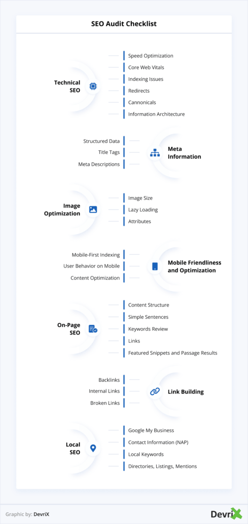
Start site migrations with a comprehensive site audit. Understand the current SEO landscape, identifying strengths, weaknesses, and areas for improvement. This audit serves as the foundation for crafting a tailored migration strategy aligned with business goals.
2. Strategic URL Mapping
URL changes are inherent in most migrations and require meticulous planning. Develop a strategic URL mapping plan, ensuring that redirects (especially 301 redirects) are implemented for old URLs to guide users and search engines smoothly to their new destinations. This step is critical for preserving link equity and maintaining SEO continuity.
3. Content Mapping and Optimization
Content is the lifeblood of SEO and is crucial for successful SEO migrations. Map existing content to the new site structure, optimizing for relevant keywords. Align meta tags, headers, and other on-page elements with SEO best practices. Ensure that the migration enhances content relevance and aligns seamlessly with the new architecture.
4. Technical Optimization
Address technical aspects to bolster SEO. Prioritize site speed, ensure swift loading times, and optimize for mobile responsiveness. Implement schema markup to enhance rich snippets in search results. Technical optimization contributes not only to SEO but also to overall user experience, a key factor in search engine algorithms.
5. Implement 301 Redirects
Implementing 301 (permanent) redirects is fundamental to SEO migration success. This step ensures that old URLs are seamlessly redirected to their new counterparts, preserving both user experience and link equity. It’s a critical strategy to communicate the structural changes to search engines effectively.
6. Update XML Sitemaps
Update and submit XML sitemaps to search engines, guiding their crawling and indexing processes. This step helps search engines understand the new site structure and ensures that all relevant pages are indexed. Regularly monitor crawl errors and address them promptly.
7. Create A Custom 404 Error Page
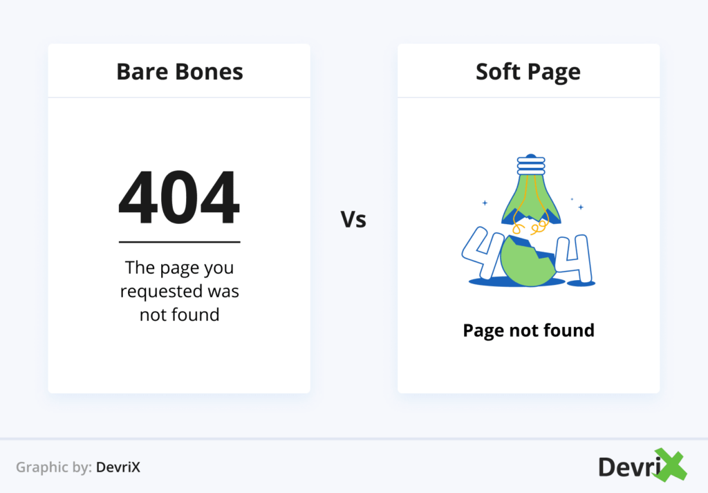
When carrying out an SEO migration, the emergence of broken links and error pages is inevitable often due to URL changes. As a WordPress developer, understanding the root cause of these errors and coming up with a clever error page design is crucial for seamless website functionality and good user experience. To effectively resolve this issue, consider utilizing the .htaccess file. Also, make sure you customize the design so that it helps visitors navigate to the Home page or other relevant sections of your website to locate the desired content. Look at it as a branding opportunity – it will not only suppress the turnover rate and the disappointment of an empty page, but it will also build trust in your brand as it shows “You have it under control”.
8. Crawl the Staging Site
It’s crucial to thoroughly crawl the staging site before launch to identify and address any potential issues such as broken links or missing metadata. Employing tools like JetOctopus or Screaming Frog is recommended for this task, especially when dealing with password-protected or no-index-tagged staging sites. It’s essential to ensure that the staging site accurately mirrors the final version of the website to prevent any unexpected challenges or discrepancies after the launch. This proactive approach helps streamline the transition process and minimize the likelihood of post-launch surprises.
9. Monitor Post-Migration Metrics
Post-migration, closely monitor essential metrics, including organic traffic, keyword rankings, and user engagement. Analyzing these metrics provides insights into the impact of the migration on SEO performance. Swiftly address any anomalies to maintain a healthy SEO profile.
10. Backlink Preservation
Identify websites linking to the old URLs and reach out to them. Request updates to ensure that backlinks redirect to the new site, preserving link authority. Backlinks are crucial for SEO, and their preservation contributes to maintaining and enhancing search engine rankings.
11. Engage with Search Console and Bing Webmaster Tools
Leverage tools like Google Search Console and other webmaster tools to monitor how search engines perceive the migration. Address any issues highlighted in these platforms promptly. Regular engagement with these tools provides valuable insights into ongoing SEO performance.
12. User Communication
Transparent communication with users is essential. Inform them of the migration through on-site announcements and social media. Managing user expectations helps mitigate any temporary disruptions and builds trust. Users who are aware of the changes are more likely to adapt positively. Also, don’t forget to update your Google My Business, Bing Places and any directory listings you have online.
13. Post-Migration SEO Analysis
Conduct a detailed analysis of SEO performance post-migration. Evaluate the impact on search engine rankings, organic traffic, and user engagement. Carry out SEO forecasting to identify areas for further optimization and fine-tune strategies based on the analysis.
14. Ongoing SEO Maintenance
SEO is not a one-time effort but an ongoing process. Continue to monitor and adapt SEO strategies as the digital landscape evolves. Regularly update content, address technical issues promptly, and stay informed about industry trends and algorithm changes.
Wrapping Up
Each step in site SEO migrations, from strategic URL mapping to ongoing SEO maintenance, shapes the success of your newly launched website. The symphony of technology and strategy ensures not only a seamless transition but also an optimized online presence. Remember, migrating a website is not an easy decision, and if you lack the expertise to DIY it, partner up with a web developer to ensure success.
Featured image by Kindel Media
The post A WordPress Agency Advises On SEO Migrations appeared first on noupe.