Archive for March, 2010

CSS3 Transforms & @font-face Experiment

This is the first of what I hope are number of experiments I plan on working on over the next few months, all in an effort to get acquainted with some of the new CSS3 features out in the wild that seem to be gaining some traction.

The last few months have been pretty exciting, with all the talk about new CSS3 features and how browsers are adding support for them, it’s a great time to be a designer for the web. It’s a lot easier these days to experiment with different typefaces, layouts and techniques previously not available.

Take a look at the image below:

All Humans

No, it’s not a poster. It’s a web page completely designed using basic CSS and new CSS3 techniques. Pretty impressive right?

How’s it done?

Pretty easy actually, I used basic CSS positioning and some of the newer CSS3 features to put it together. Below are a few samples of the code so you can get an idea:

@font-face

@font-face {
	font-family: 'ChunkFiveRegular';
	src: url('Chunkfive.eot');
	src: local('ChunkFive'),local('ChunkFive'),
	    url('Chunkfive.woff') format('woff'),
	    url('Chunkfive.ttf') format('truetype'),
	    url('Chunkfive.svg#ChunkFive') format('svg');
}

Transforms

-webkit-transform: rotate(1deg);
-moz-transform: rotate(1deg);
-o-transform: rotate(1deg);

Text-Shadows & Box Shadows

text-shadow: 2px 8px #b5c1b8, -1px -1px #fff;
box-shadow: 4px 6px #b5c1b8;

The font used is called Chunk, a nice bold slab serif. The text is an excerpt from the Universal Declaration of Human Rights.

Works in these browsers

  • Firefox 3.6
  • Safari 4
  • Chrome 5
  • Opera 10

IE can suck it.

So there it is. Nothing out of this world, however I think it shows the potential of CSS specifically the potential in using new CSS3 features.

In the words of Matt Brett:

“if you showed me that 10 years ago, my head would have exploded!�

Indeed. We’ve come a long way.


What’s your focus?

Every great website has a focus. If you can’t summarize the purpose of your website into one sentence, ten words or less — your idea will almost certainly fail. Talking to founders, I’d say this idea is pretty well established. Now let me reveal a secret that is not so well established: your website’s design should follow this same focus.

Learn by example: source hosting sites

Let’s start off with a field I’m pretty familiar with: source hosting sites. I’m talking about GitHub, BitBucket, SourceForge, Google Code, Launchpad and the likes. These sites all have a common focus: sharing code. I’m going to show you why GitHub is the only site who’s design follows it’s focus.

If your site’s focus is sharing code, the design should focus on sharing code. If you ever talk to any of us GitHubbers, we’ll always say that the site is all about the code. Let’s look at project landing pages in each of the above sites.

GitHub

GitHub

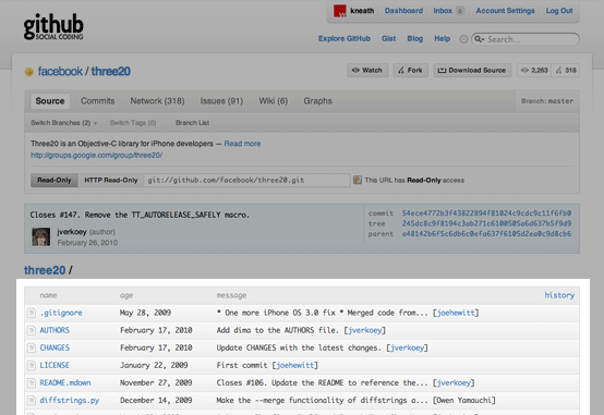
When you visit a GitHub project page, the first thing you see is the source code. Right below is the README pulled straight from the code.

BitBucket

BitBucket

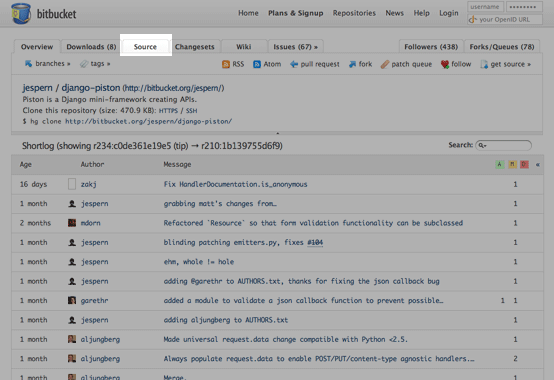
BitBucket chose to highlight the shortlog (recent commits) on the project page. If you want to see the code, you need to go to the 3rd tab.

SourceForge

SourceForge

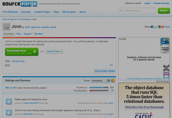
Sourceforge chose to highlight downloads (in this case, a compiled jar file — not the code) on the project page. If you want to see the code, you need to click Develop, and then fish around in the sidebar for the correct VCS and click browse.

Google Code

Google Code

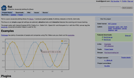
Google Code chose to highlight the wiki on the project page. Getting to the code in Google Code is probably the most interesting of the bunch because many projects don’t even host their code there (example: redis).

When you click the Source tab you actually get a wiki page which many projects use to point to another repository. If the project hosts it’s code there, there is a sub link under Source that is labeled Browse that you can finally see the code.

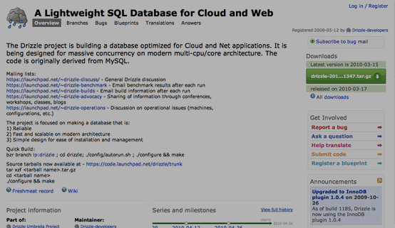
Launchpad

Launchpad

Launchpad decided to highlight everything but the source code on the project page. If you want to see the code, there is a tiny link in the middle of the page that says ‘View the branch content.’

Great examples from other fields

Source code hosting is just something that I’m extremely involved with. That doesn’t mean that focus is limited to code.

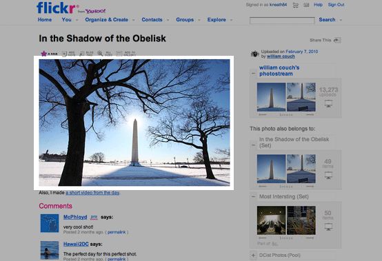
Flickr

Flickr

Flickr is all about sharing photos.

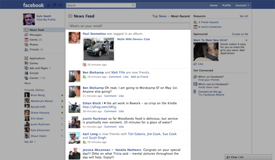
Facebook

Facebook

Facebook is all about connecting with your friends.

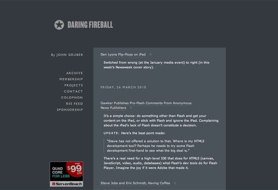
Daring Fireball

Daring Fireball

Daring Fireball is all about John Gruber’s writing.

Sites that have lost their focus

There is a huge genre of sites that seem to have completely forgotten their focus. I’ll see if you can guess the genre.

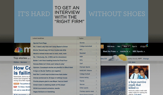
MSNBC

MSNBC

NYTimes

NYTimes

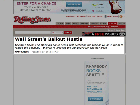
Rolling Stone

Rolling Stone

It’s no wonder news sites can’t get people to pay for their content. You need to focus on your content to get people to pay for it.

Charging for your focus

Many sites don’t want to give away their focus for free. That’s perfectly fine. But it doesn’t change a thing. Replace what people are going to pay for with an opportunity to pay you.

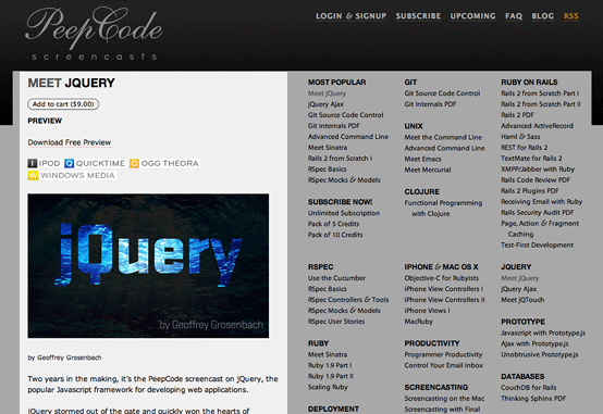
PeepCode

PeepCode’s focus is great tutorials. But the tutorial is not the focus of the product page — instead a teaser and a purchase button are.

Lots of people think that replacing their paid focus content with advertising is the solution — but that just redirects the focus on advertising — not getting paid.

Premium content is not about removing access, it’s about charging for access. Don’t focus on removing content, focus on charging for it.

Find your focus and focus on it

If you work on a website for a living, you should be thinking about your focus every single day. It doesn’t matter if you’re a copywriter, project manager, designer or sysadmin. What’s the focus of your site? Does your design reflect this? Run that through your head for every decision.

The beautiful thing about focus is that it’s not about the details. It doesn’t matter if you add some advertising to a sidebar, links to your header, change the background color or add administrative debris — these are all minor subjects. Focus is more about aiming in the right direction. Worry about the details later — but never aim in a different direction.


What’s your focus?

Every great website has a focus. If you can’t summarize the purpose of your website into one sentence, ten words or less — your idea will almost certainly fail. Talking to founders, I’d say this idea is pretty well established. Now let me reveal a secret that is not so well established: your website’s design should follow this same focus.

Learn by example: source hosting sites

Let’s start off with a field I’m pretty familiar with: source hosting sites. I’m talking about GitHub, BitBucket, SourceForge, Google Code, Launchpad and the likes. These sites all have a common focus: sharing code. I’m going to show you why GitHub is the only site who’s design follows it’s focus.

If your site’s focus is sharing code, the design should focus on sharing code. If you ever talk to any of us GitHubbers, we’ll always say that the site is all about the code. Let’s look at project landing pages in each of the above sites.

GitHub

GitHub

When you visit a GitHub project page, the first thing you see is the source code. Right below is the README pulled straight from the code.

BitBucket

BitBucket

BitBucket chose to highlight the shortlog (recent commits) on the project page. If you want to see the code, you need to go to the 3rd tab.

SourceForge

SourceForge

Sourceforge chose to highlight downloads (in this case, a compiled jar file — not the code) on the project page. If you want to see the code, you need to click Develop, and then fish around in the sidebar for the correct VCS and click browse.

Google Code

Google Code

Google Code chose to highlight the wiki on the project page. Getting to the code in Google Code is probably the most interesting of the bunch because many projects don’t even host their code there (example: redis).

When you click the Source tab you actually get a wiki page which many projects use to point to another repository. If the project hosts it’s code there, there is a sub link under Source that is labeled Browse that you can finally see the code.

Launchpad

Launchpad

Launchpad decided to highlight everything but the source code on the project page. If you want to see the code, there is a tiny link in the middle of the page that says ’View the branch content.’

Great examples from other fields

Source code hosting is just something that I’m extremely involved with. That doesn’t mean that focus is limited to code.

Flickr

Flickr

Flickr is all about sharing photos.

Facebook

Facebook

Facebook is all about connecting with your friends.

Daring Fireball

Daring Fireball

Daring Fireball is all about John Gruber’s writing.

Sites that have lost their focus

There is a huge genre of sites that seem to have completely forgotten their focus. I’ll see if you can guess the genre.

MSNBC

MSNBC

NYTimes

NYTimes

Rolling Stone

Rolling Stone

It’s no wonder news sites can’t get people to pay for their content. You need to focus on your content to get people to pay for it.

Charging for your focus

Many sites don’t want to give away their focus for free. That’s perfectly fine. But it doesn’t change a thing. Replace what people are going to pay for with an opportunity to pay you.

PeepCode

PeepCode’s focus is great tutorials. But the tutorial is not the focus of the product page — instead a teaser and a purchase button are.

Lots of people think that replacing their paid focus content with advertising is the solution — but that just redirects the focus on advertising — not getting paid.

Premium content is not about removing access, it’s about charging for access. Don’t focus on removing content, focus on charging for it.

Find your focus and focus on it

If you work on a website for a living, you should be thinking about your focus every single day. It doesn’t matter if you’re a copywriter, project manager, designer or sysadmin. What’s the focus of your site? Does your design reflect this? Run that through your head for every decision.

The beautiful thing about focus is that it’s not about the details. It doesn’t matter if you add some advertising to a sidebar, links to your header, change the background color or add administrative debris — these are all minor subjects. Focus is more about aiming in the right direction. Worry about the details later — but never aim in a different direction.

1 Comment more...

Getting Work Done for Free: Best Microsoft Office Alternatives

free microsoft office alternativesMicrosoft’s Office suite has long been the king of productivity software. And with good reason—it is the most full-featured office suite available. Not only is MS Office deployed extensively throughout enterprises, but many consumers rely on it for their day-to-day word processing, spreadsheet, and presentation needs, too.

But Microsoft Office isn’t cheap. Office Home and Student 2007 sells for $149.95 at the Microsoft Store (the 2008 Mac version is the same price). There are some discounts available for University students, but unless you’re in college you might be stuck paying the full price—which is why many folks are starting to look for alternatives.

Fortunately there are several quality, free Microsoft Office alternatives that are completely compatible with the famous word processor, spreadsheet, or presentation software. Each alternative product has its own strengths and weaknesses depending on how you prefer to get your work done.

If you’re looking for a free Microsoft Office download, good luck. However, we do have the next best thing. Here are our top choices for free Microsoft office alternatives: (...)
Read the rest of Getting Work Done for Free: Best Microsoft Office Alternatives


© Tutorial Blog, 2010. | Buy iPhone Accessories | iPad App Reviews

Getting Work Done for Free: Best Microsoft Office Alternatives is a post from: Tutorial Blog


Cheap WordPress Themes: 5 Semi-Premium Designs for Business Websites

wordpress-theme-clubWe’ve talked about Premium WordPress Themes ad infinitum on TutorialBlog. But, sometimes you need a cheap WordPress theme that you can get online and looking good in less than an hour. What do you when you (or your client) want it all … and your budget is under $25?

You call in reinforcements!

Take the pain out of working under an impossible budget by making it easy. Your “client” will be pleased as punch with any of these semi-premium WordPress themes and you’ll still have money left to buy a fancy coffee from your favorite java dealer.

What is a semi-premium theme you ask? These themes may not have everything as the expensive, bells-and-whistles-included brand of premium themes. That could mean fewer choices on the theme options screen or only a single page template or fewer plugins pre-built into the site. However, in most areas a good semi-premium theme has everything you need to build a quality website, quick and easy.

Elegant Themes is a WordPress theme club that specializes in semi-premium themes. (...)
Read the rest of Cheap WordPress Themes: 5 Semi-Premium Designs for Business Websites


© Tutorial Blog, 2010. | Buy iPhone Accessories | iPad App Reviews


  •   
  • Copyright © 1996-2010 BlogmyQuery - BMQ. All rights reserved.
    iDream theme by Templates Next | Powered by WordPress