 |
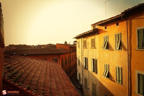
We always try our best to challenge your artistic abilities and produce some interesting, beautiful and creative artwork. And as designers we usually turn to different sources of inspiration. As a matter of fact, we’ve discovered the best one—desktop wallpapers that are a little more distinctive than the usual crowd. This creativity mission has been going on for over four years now, and we are very thankful to all designers who have contributed and are still diligently contributing each month.
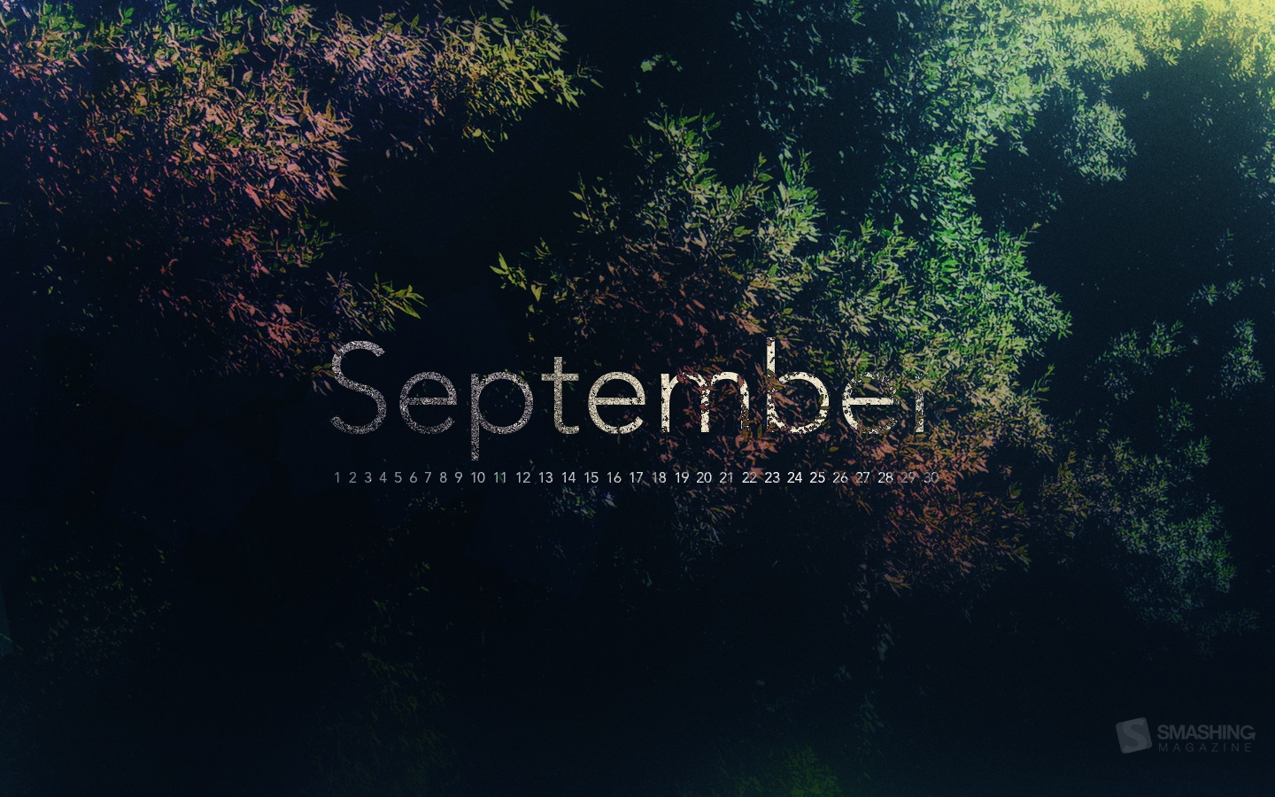
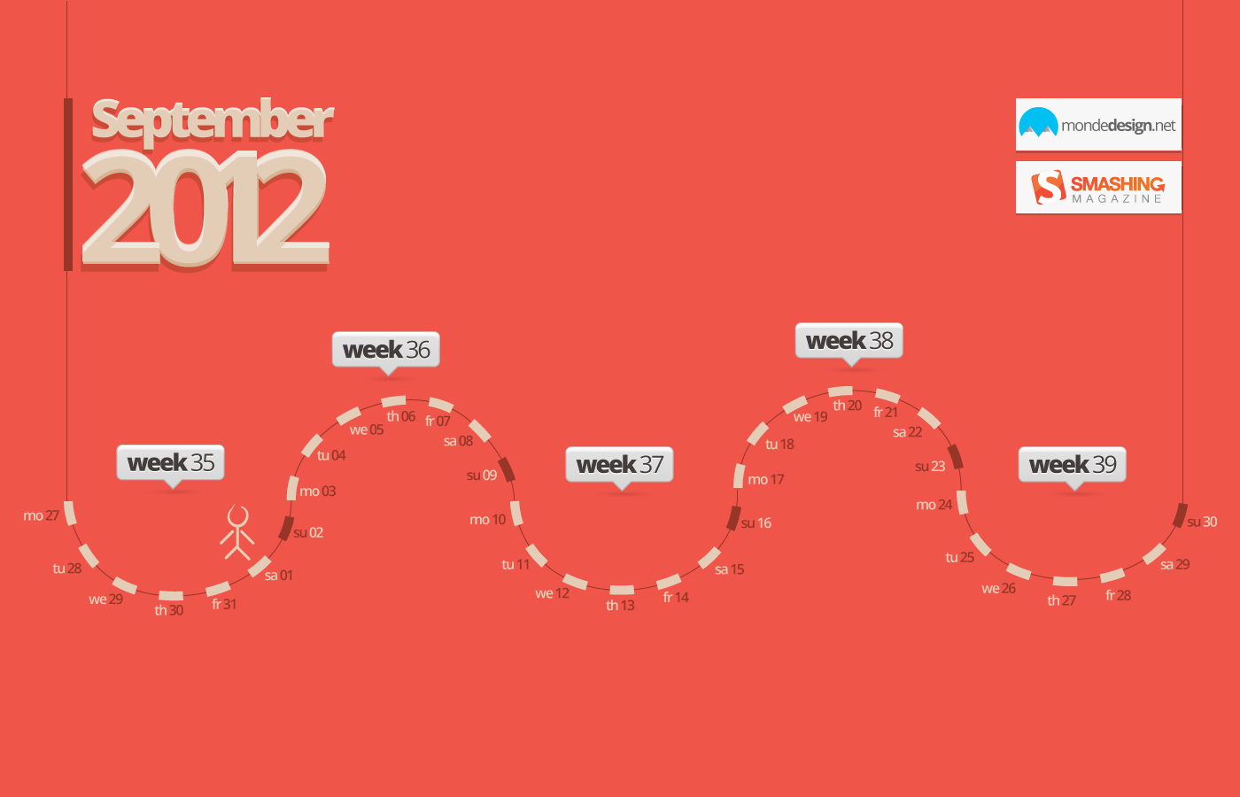
We continue to nourish you with a monthly spoon of inspiration. This post features free desktop wallpapers created by artists across the globe for September 2012. Both versions with a calendar and without a calendar can be downloaded for free. It’s time to freshen up your wallpaper!
Please note that:
- All images can be clicked on and lead to the preview of the wallpaper,
- You can feature your work in our magazine by taking part in our Desktop Wallpaper Calendar series. We are regularly looking for creative designers and artists to be featured on Smashing Magazine. Are you one of them?
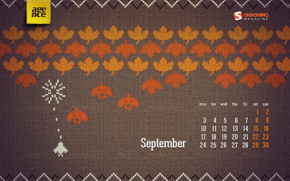
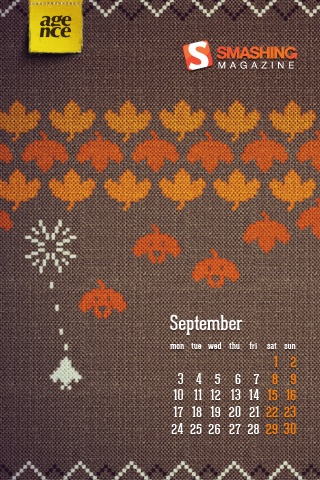
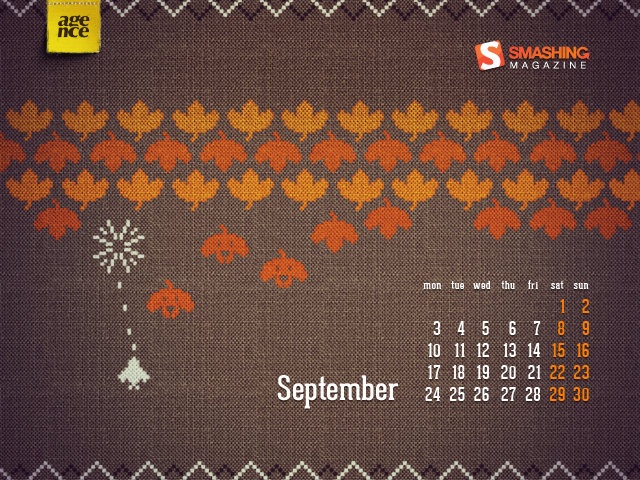
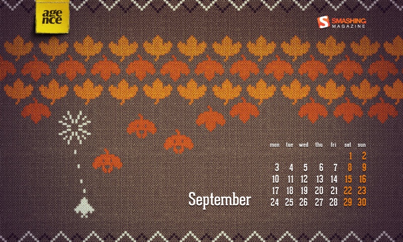
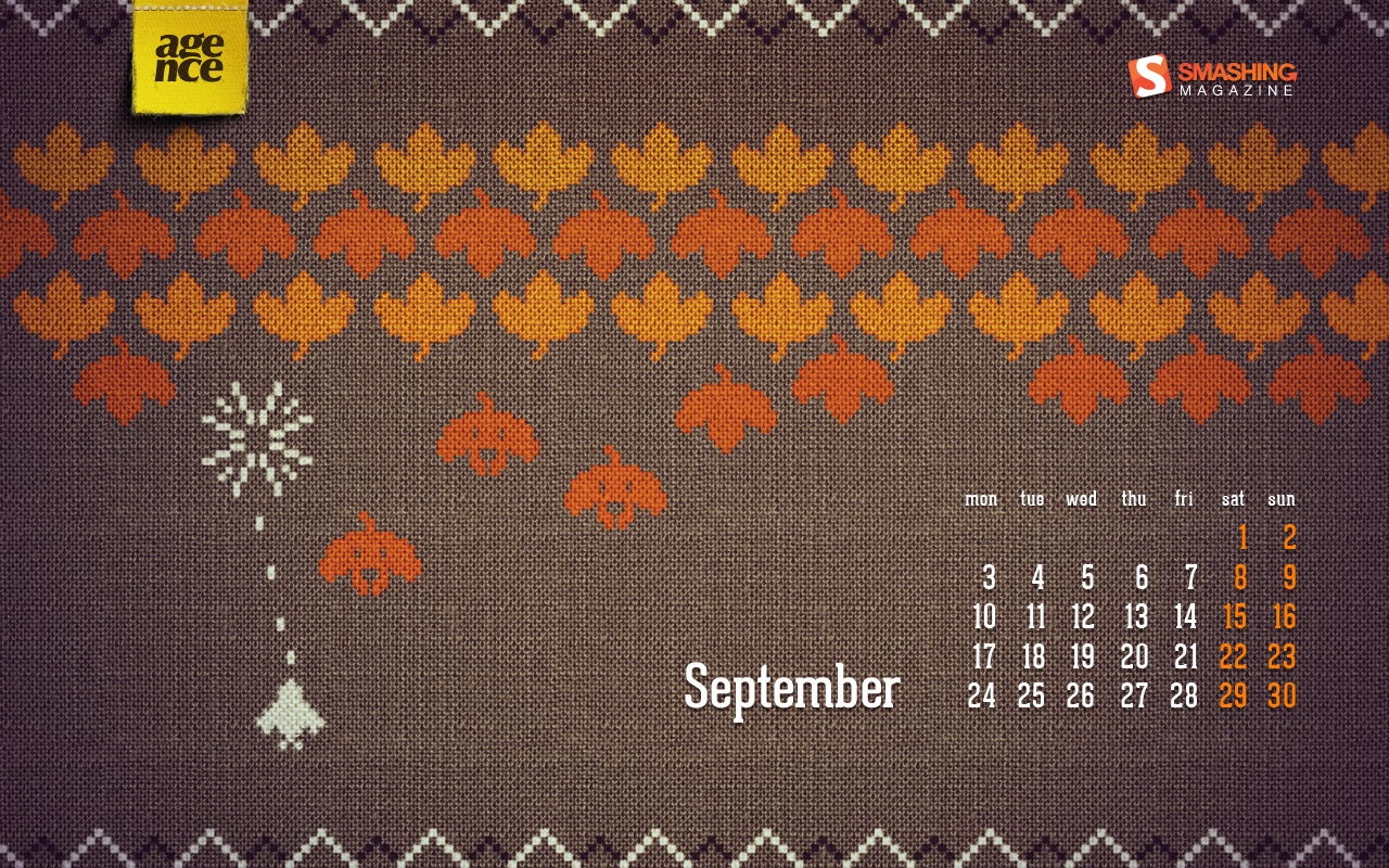
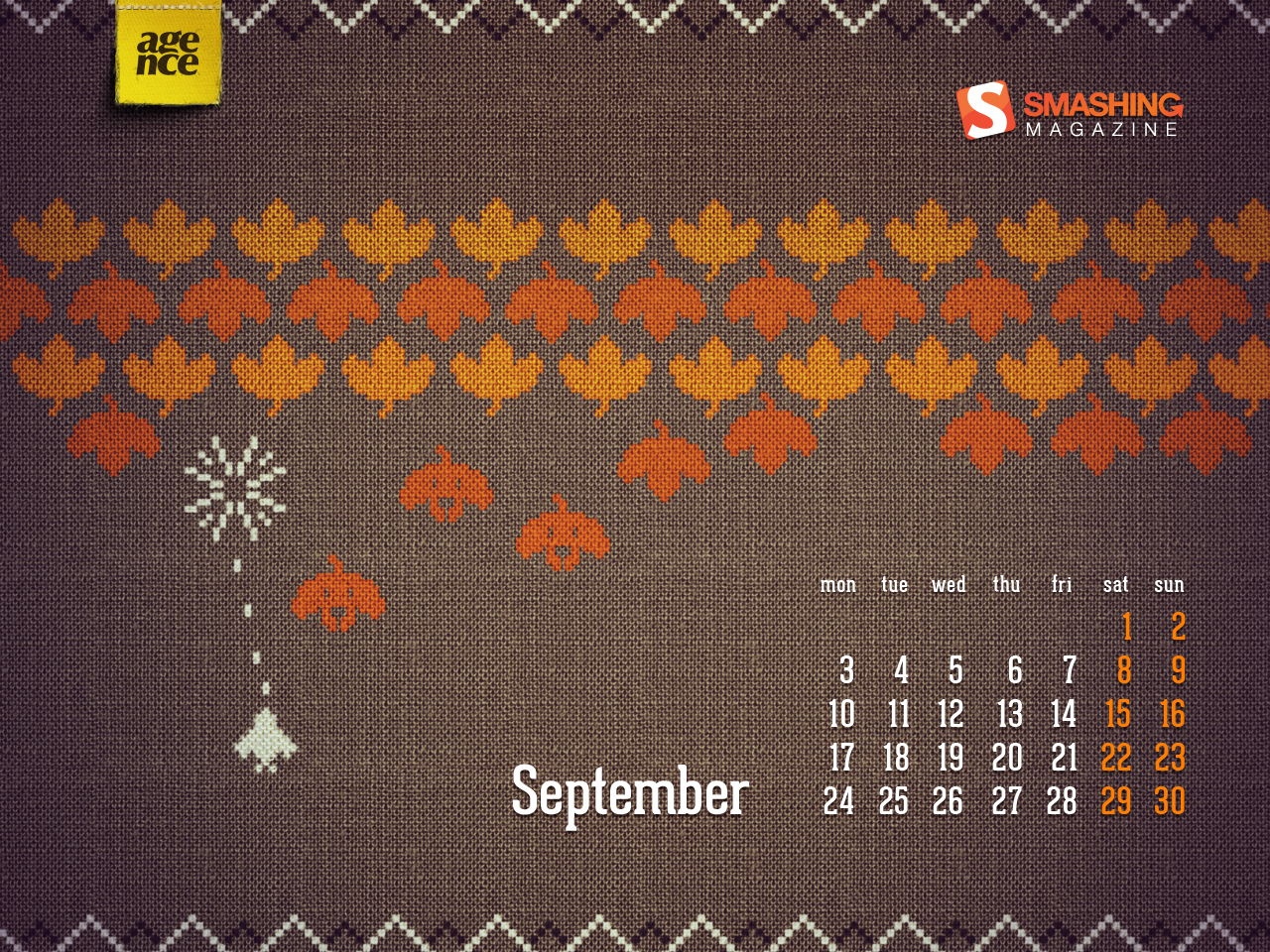
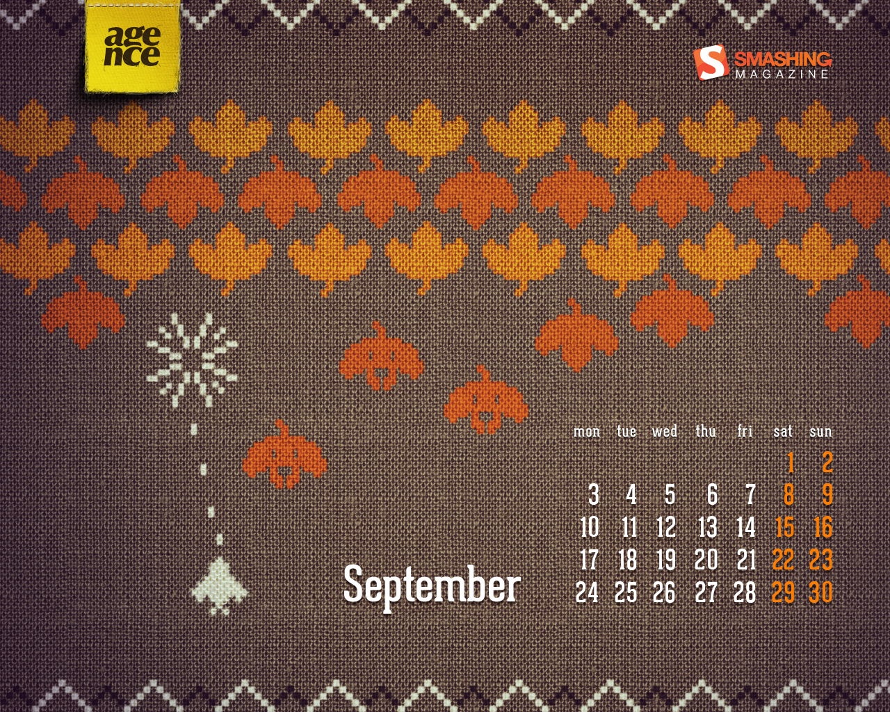
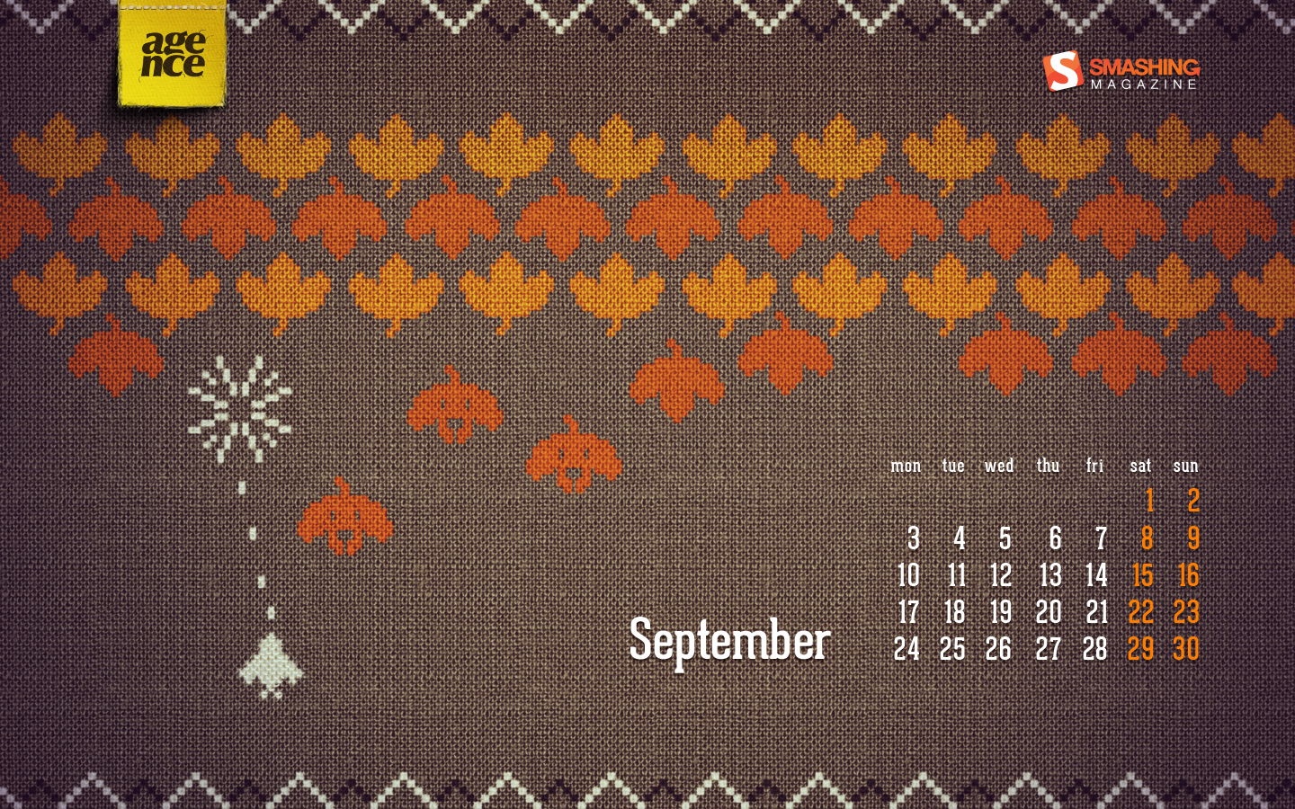
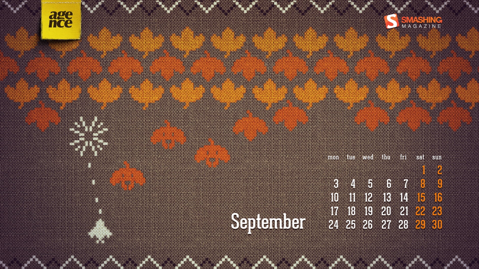
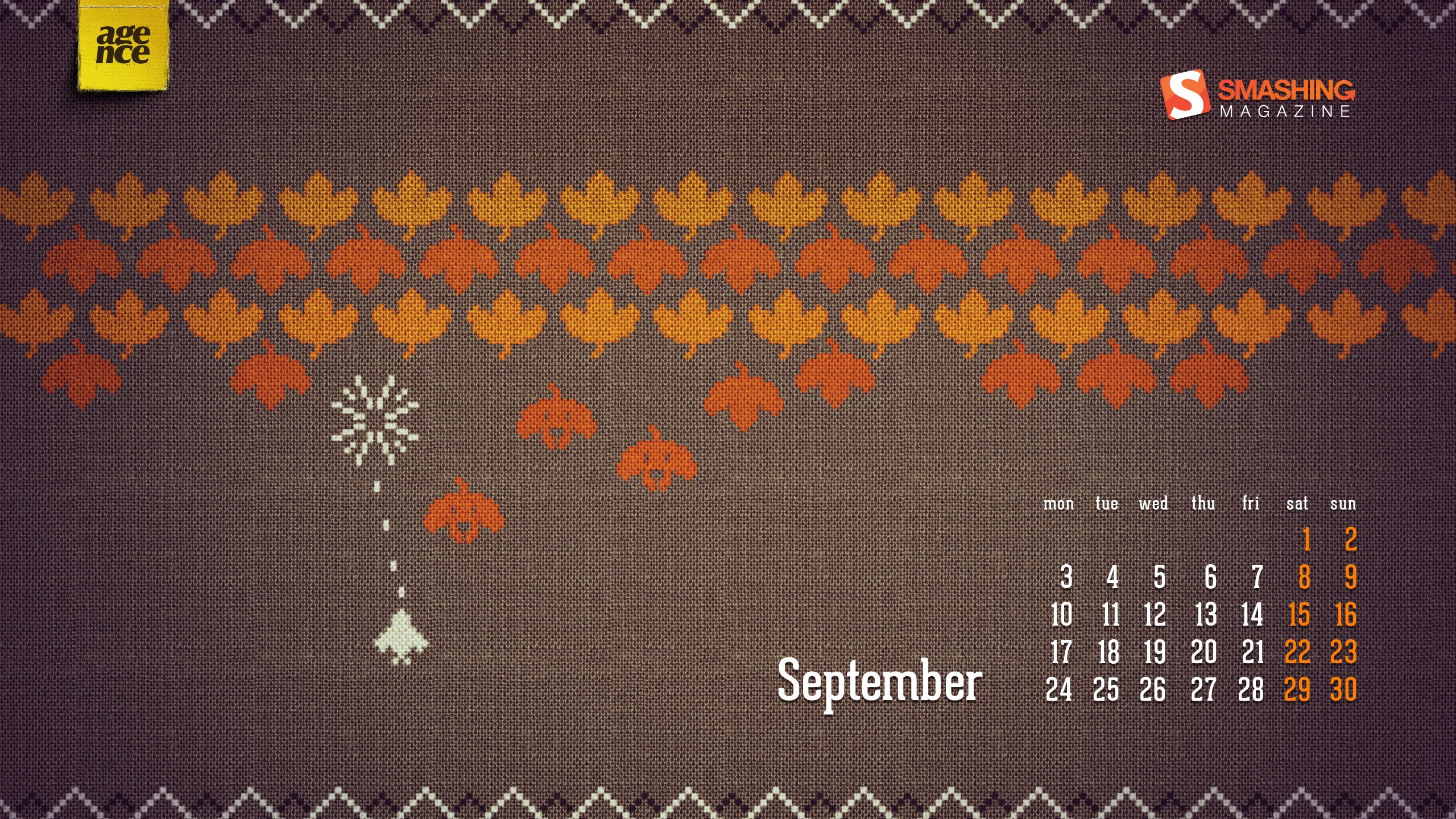
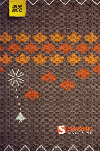
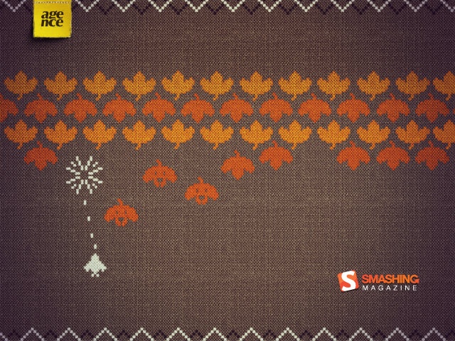
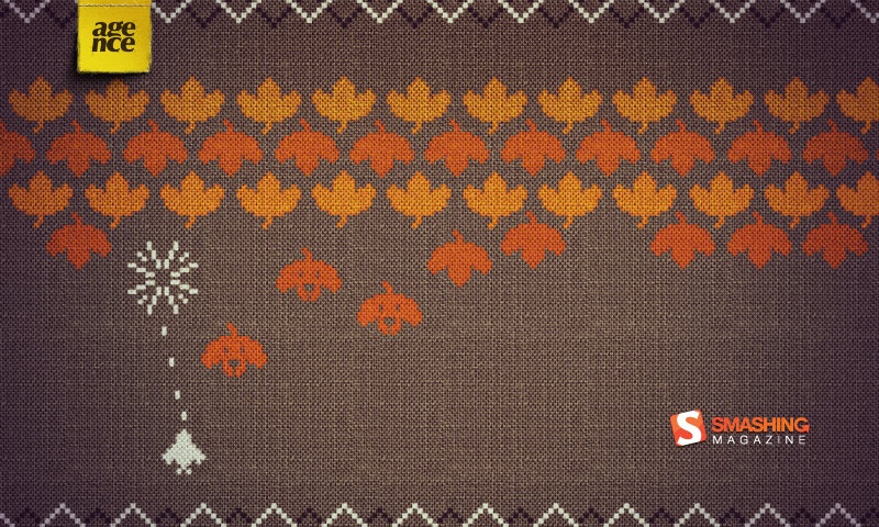
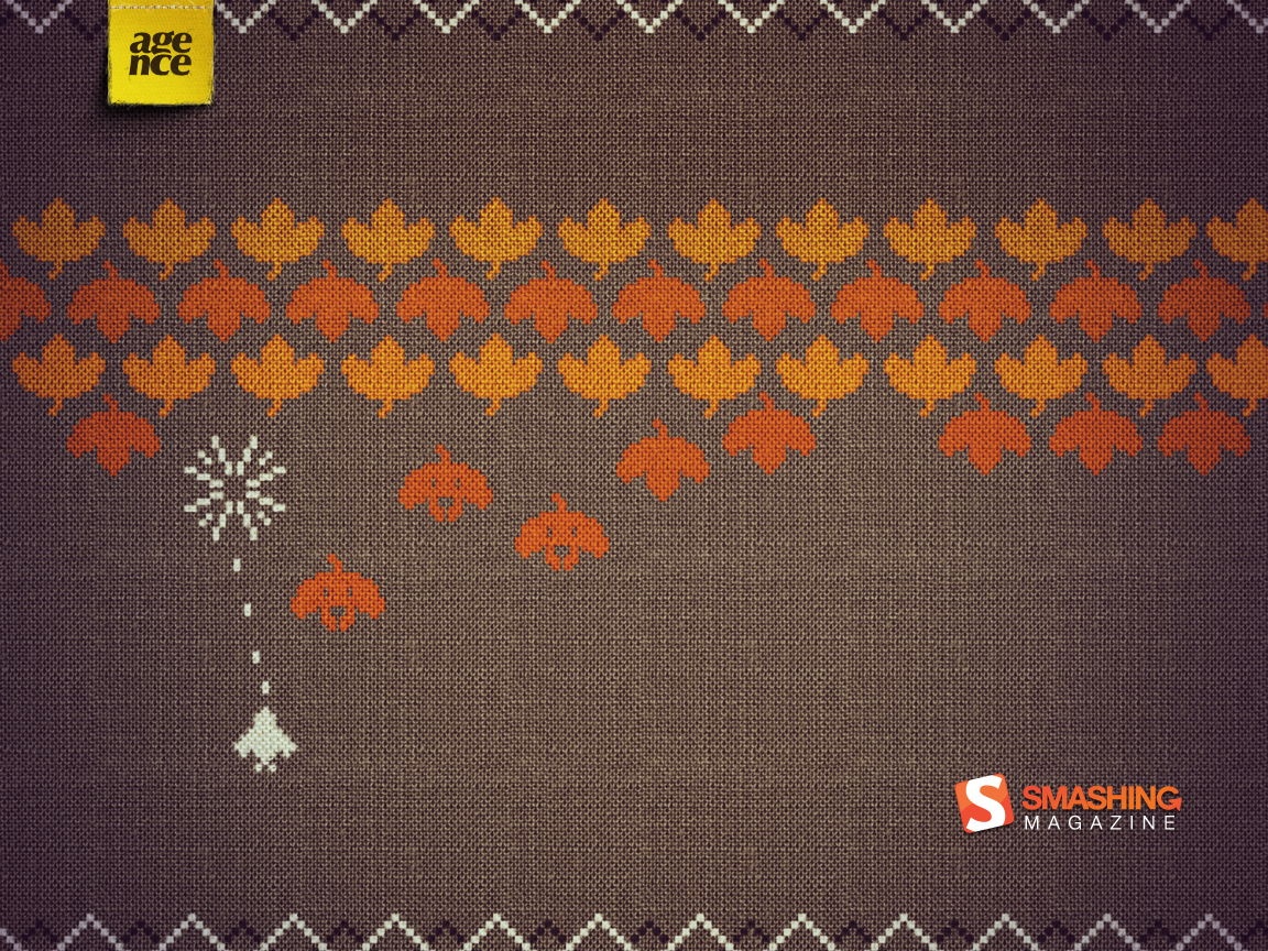
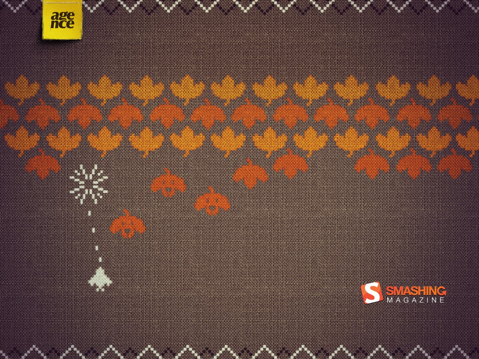
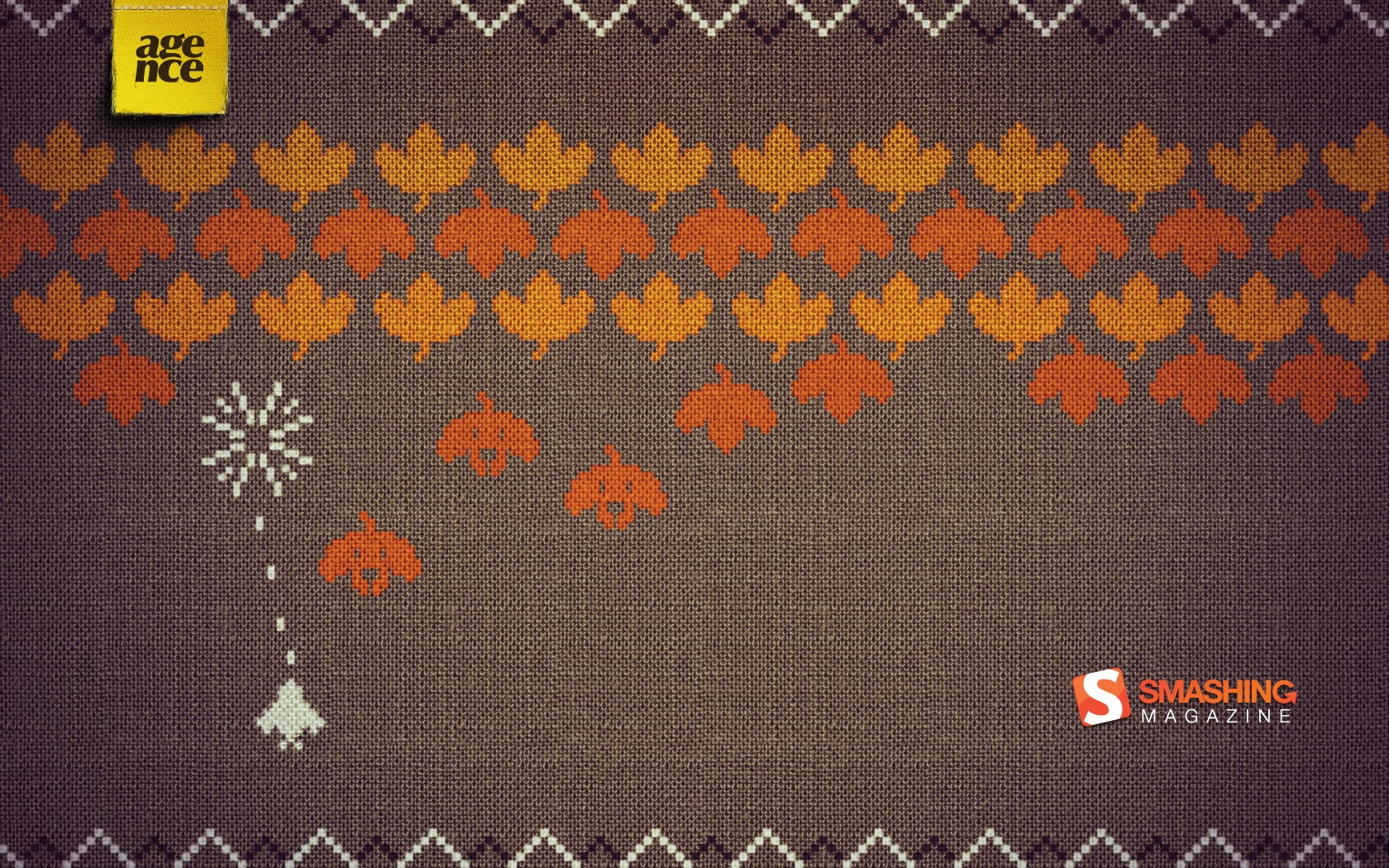
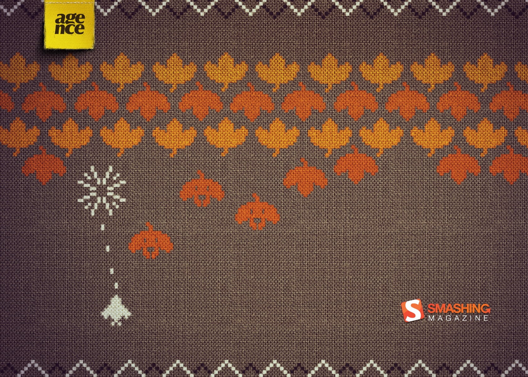
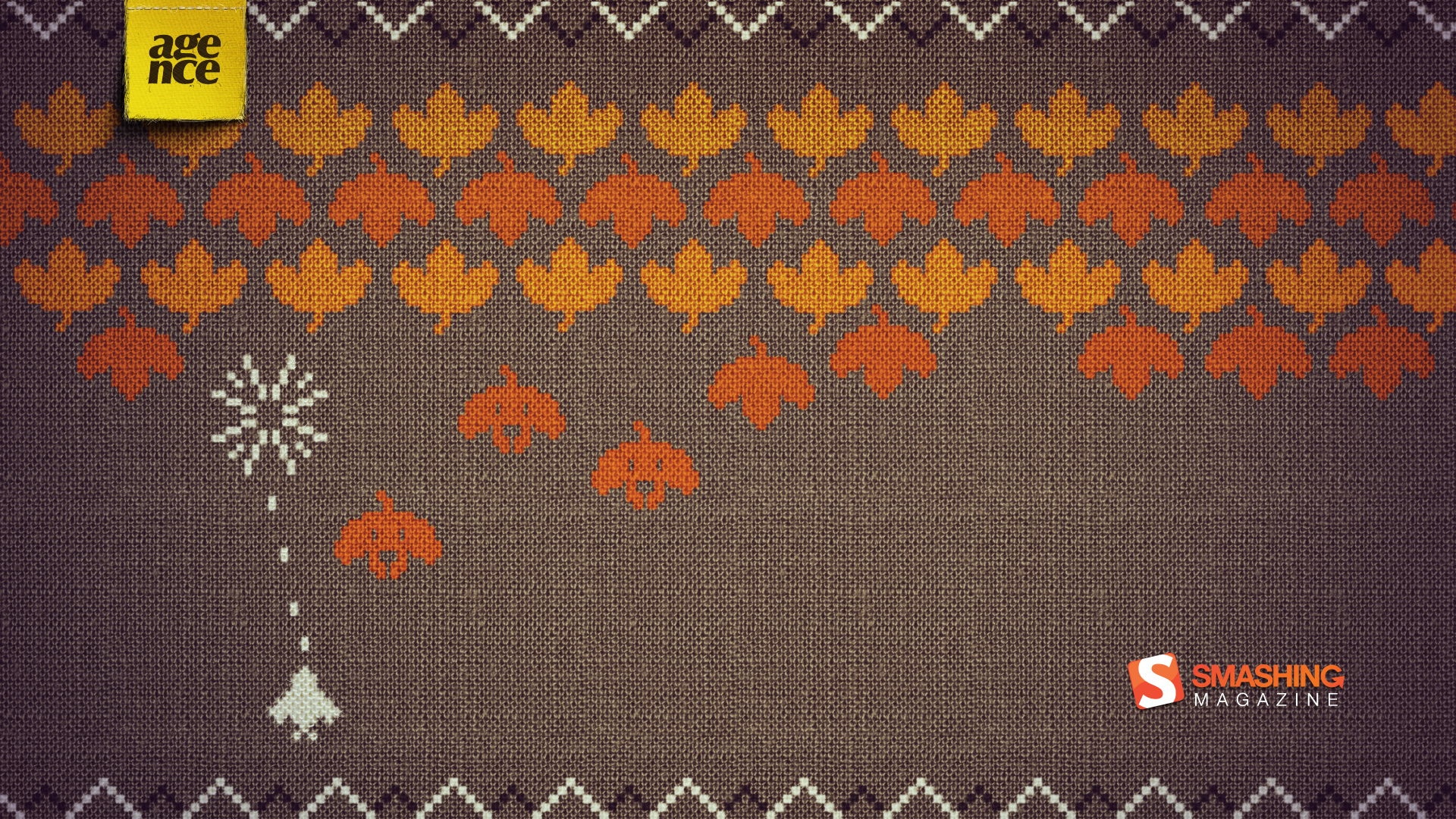
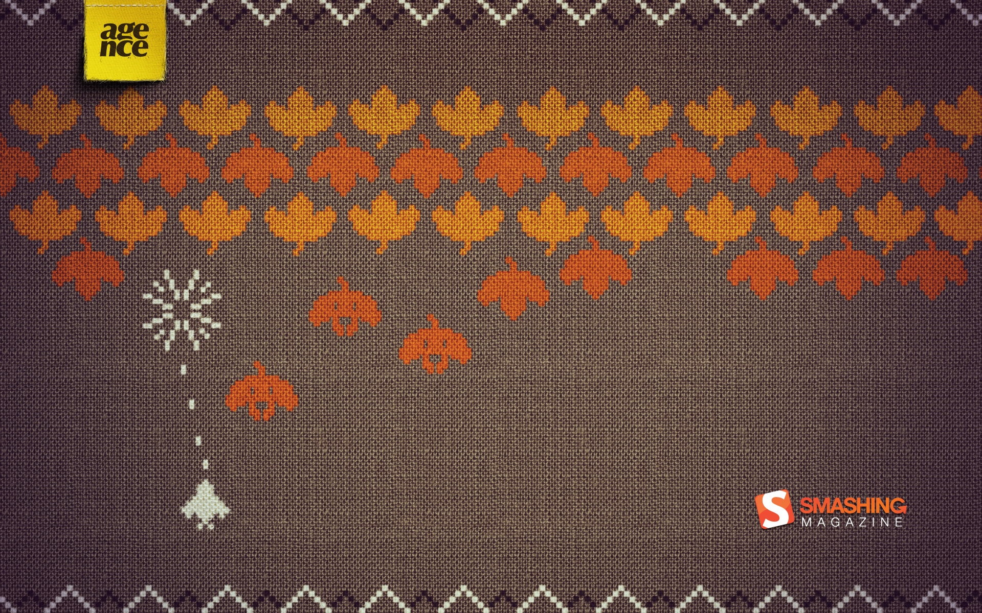
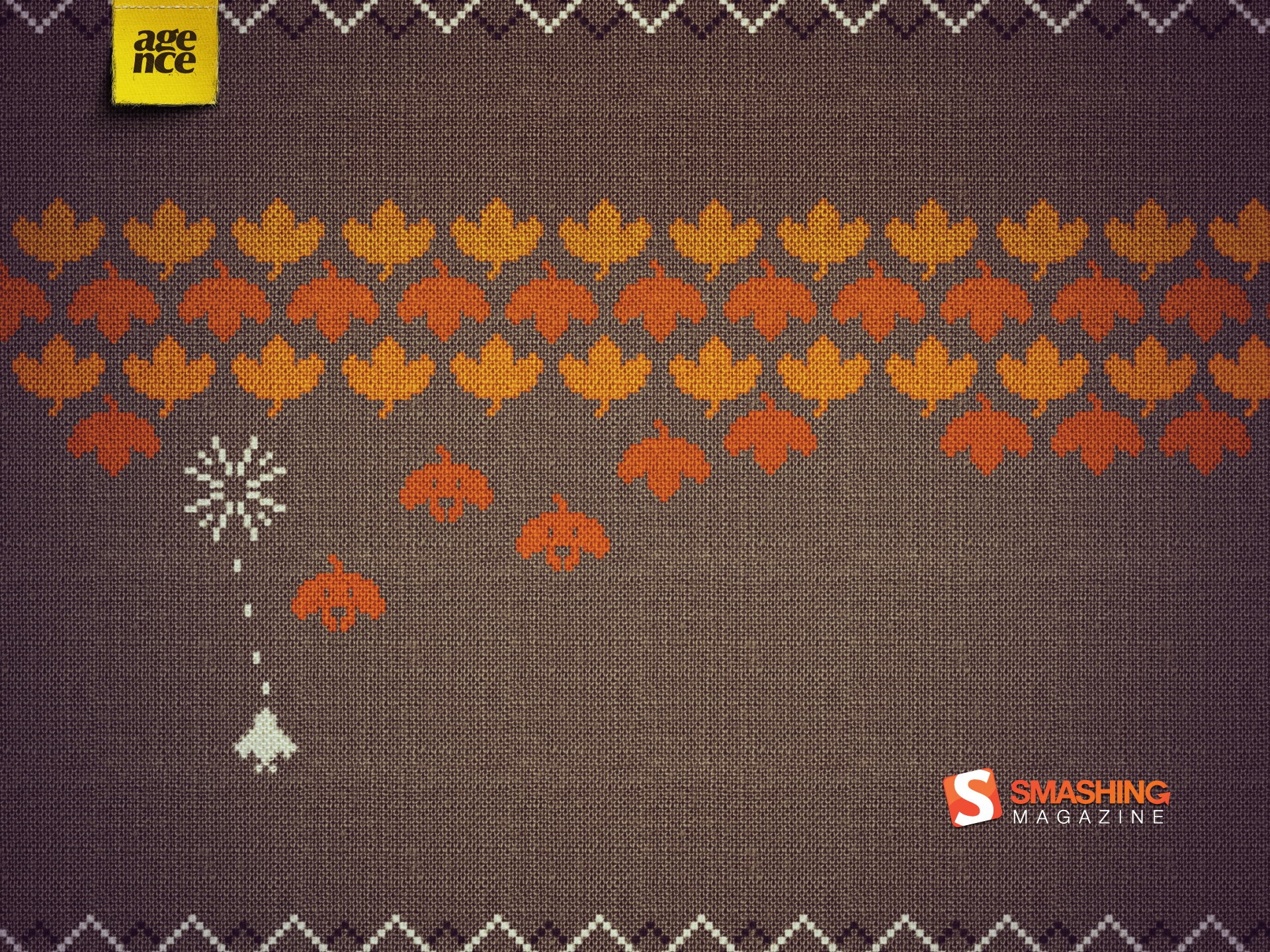
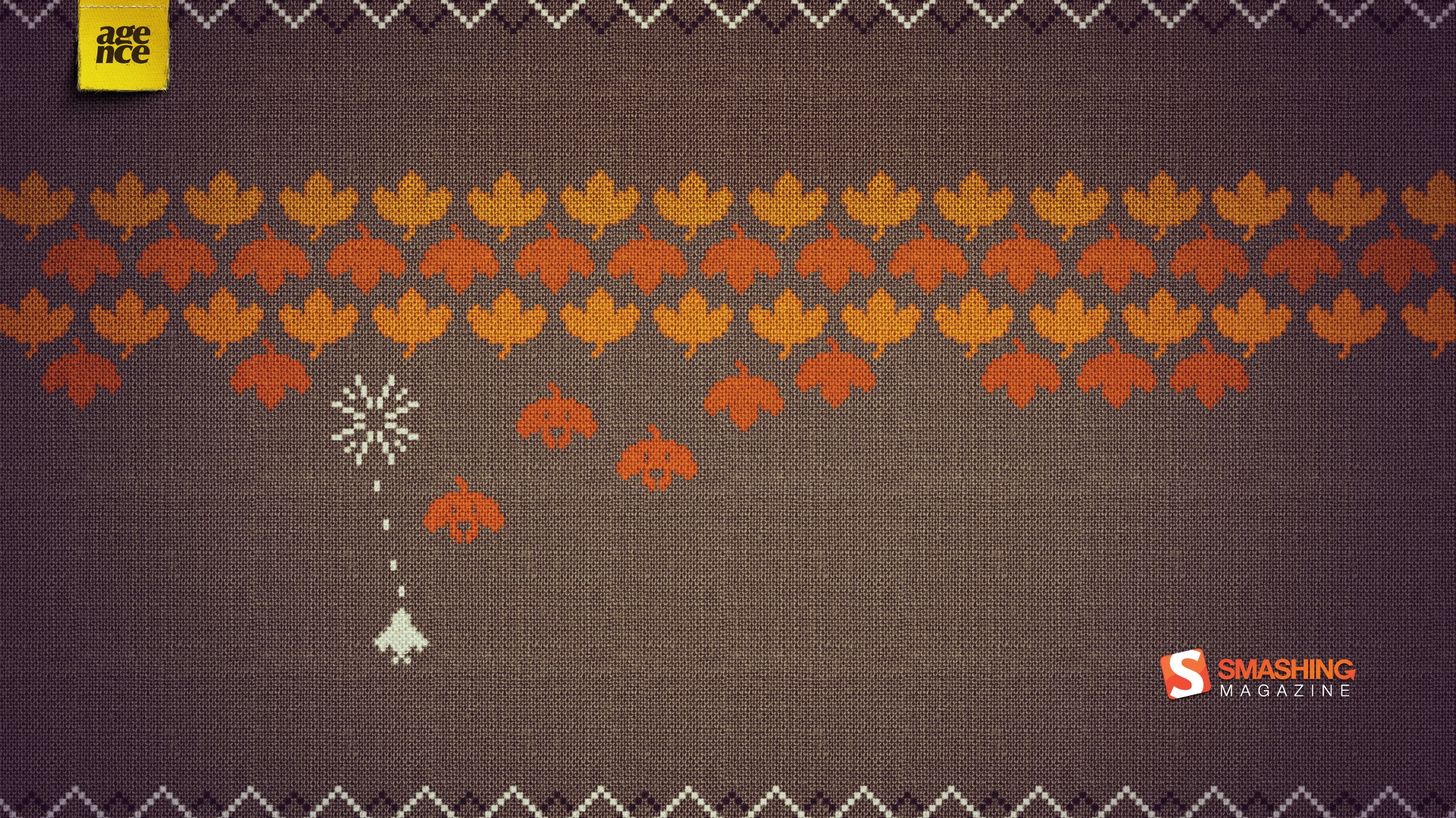
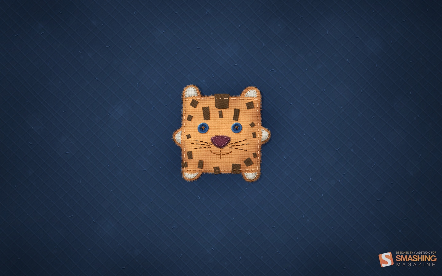
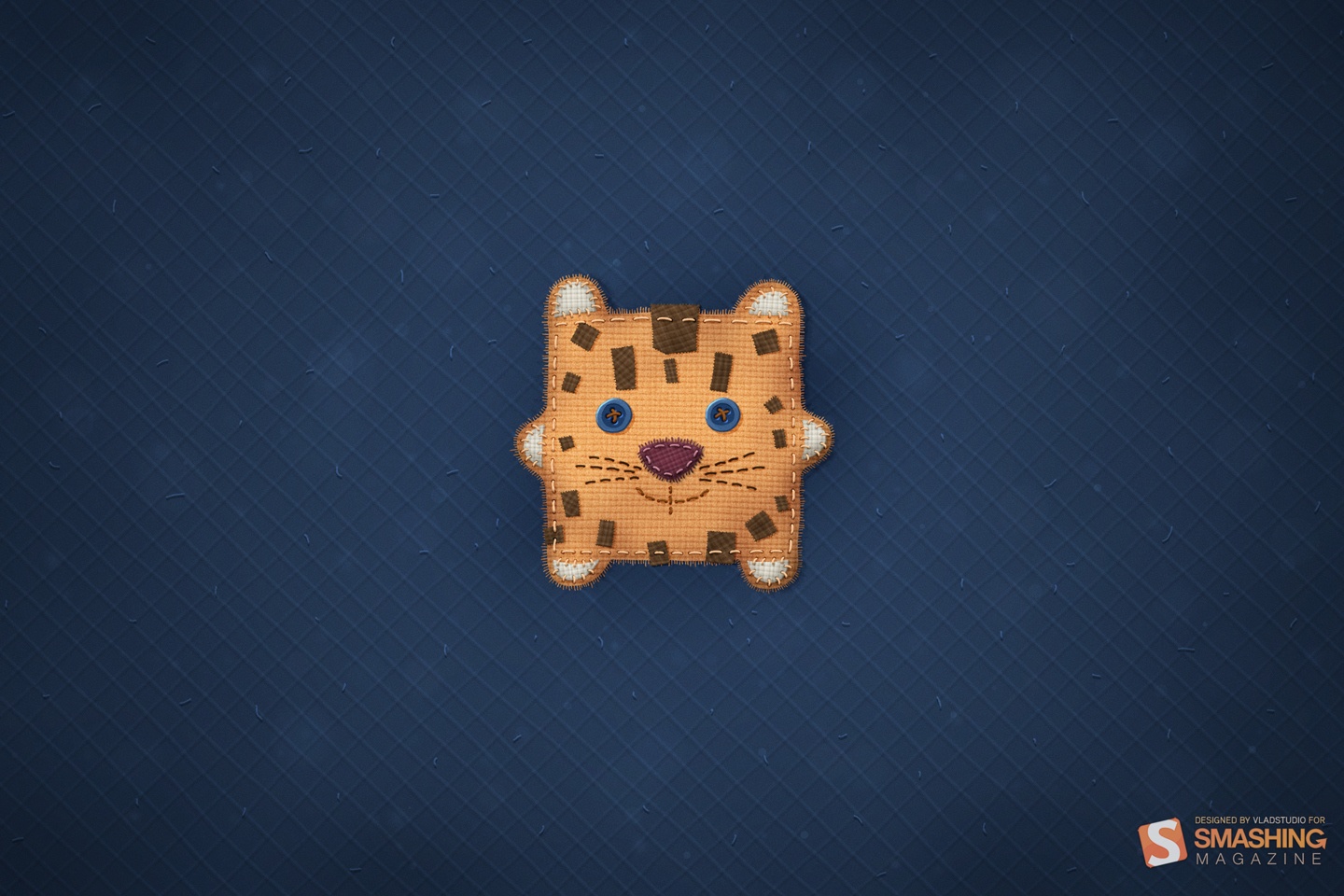
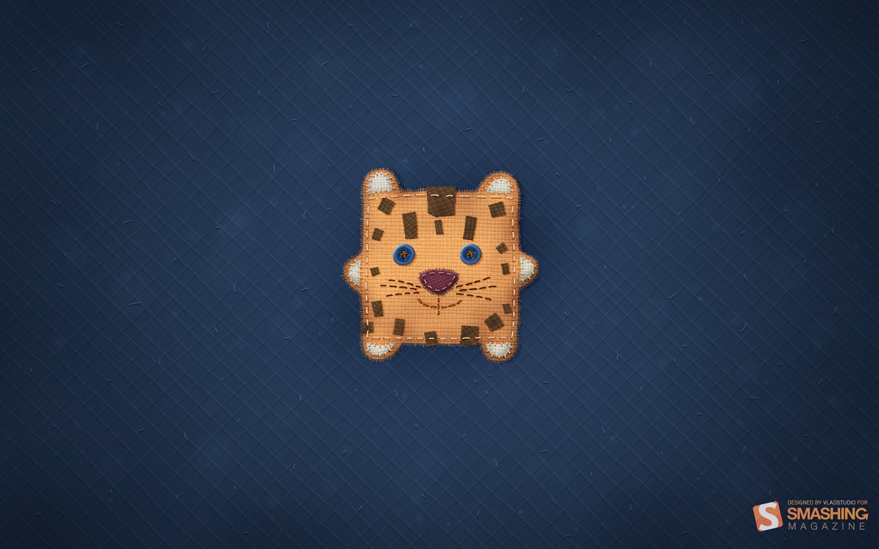
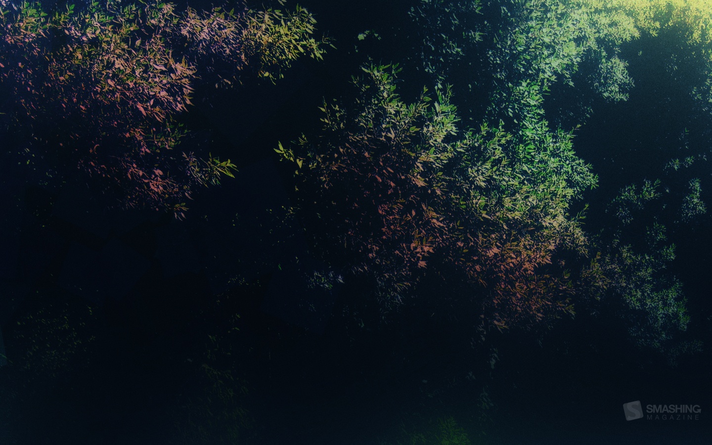
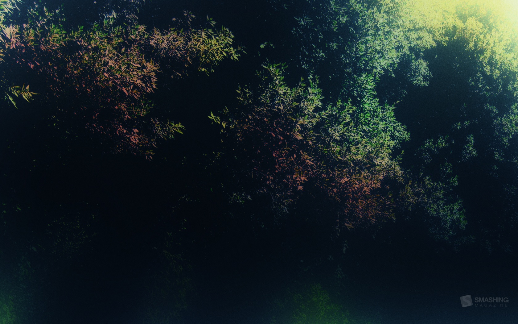
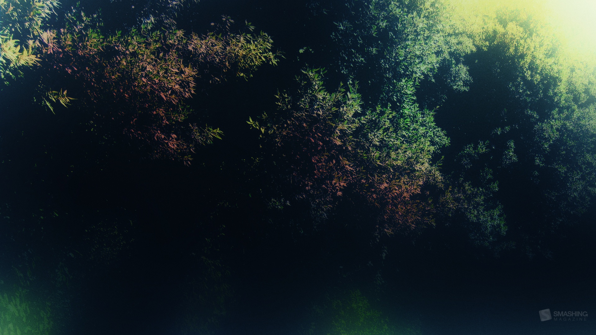
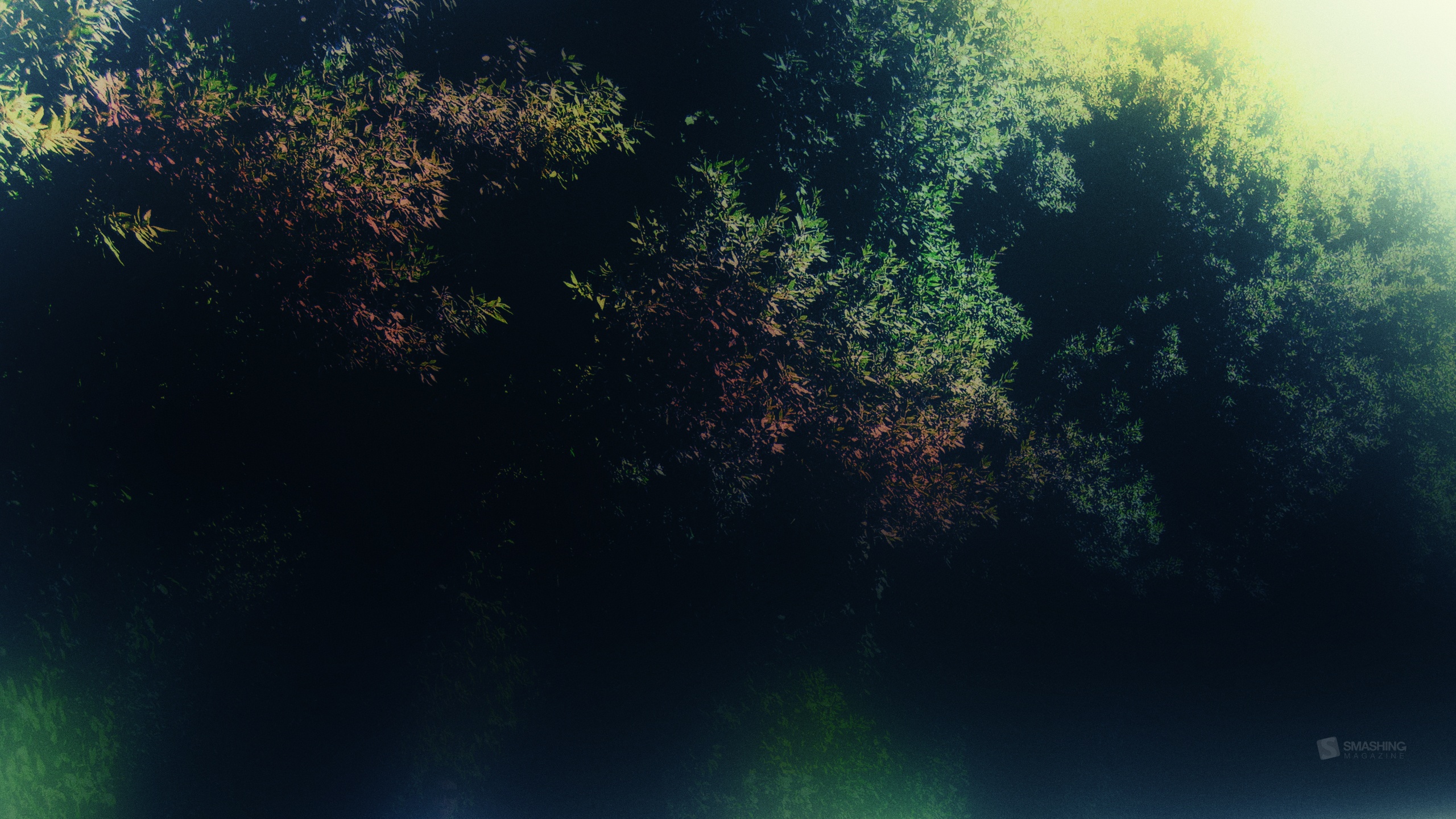
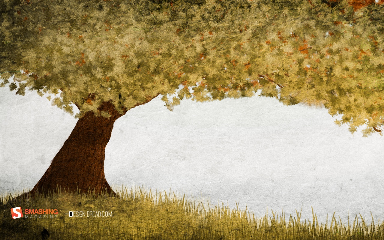
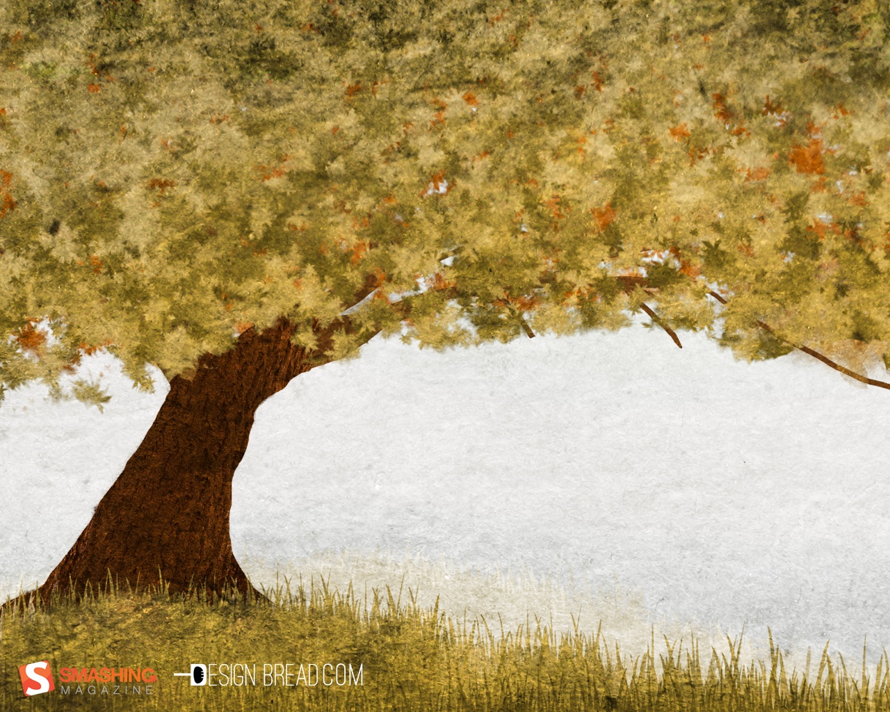
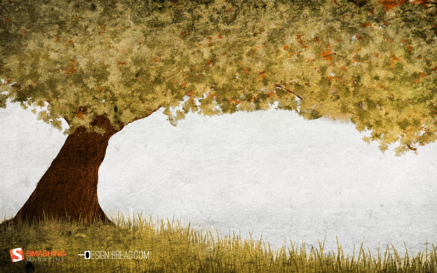
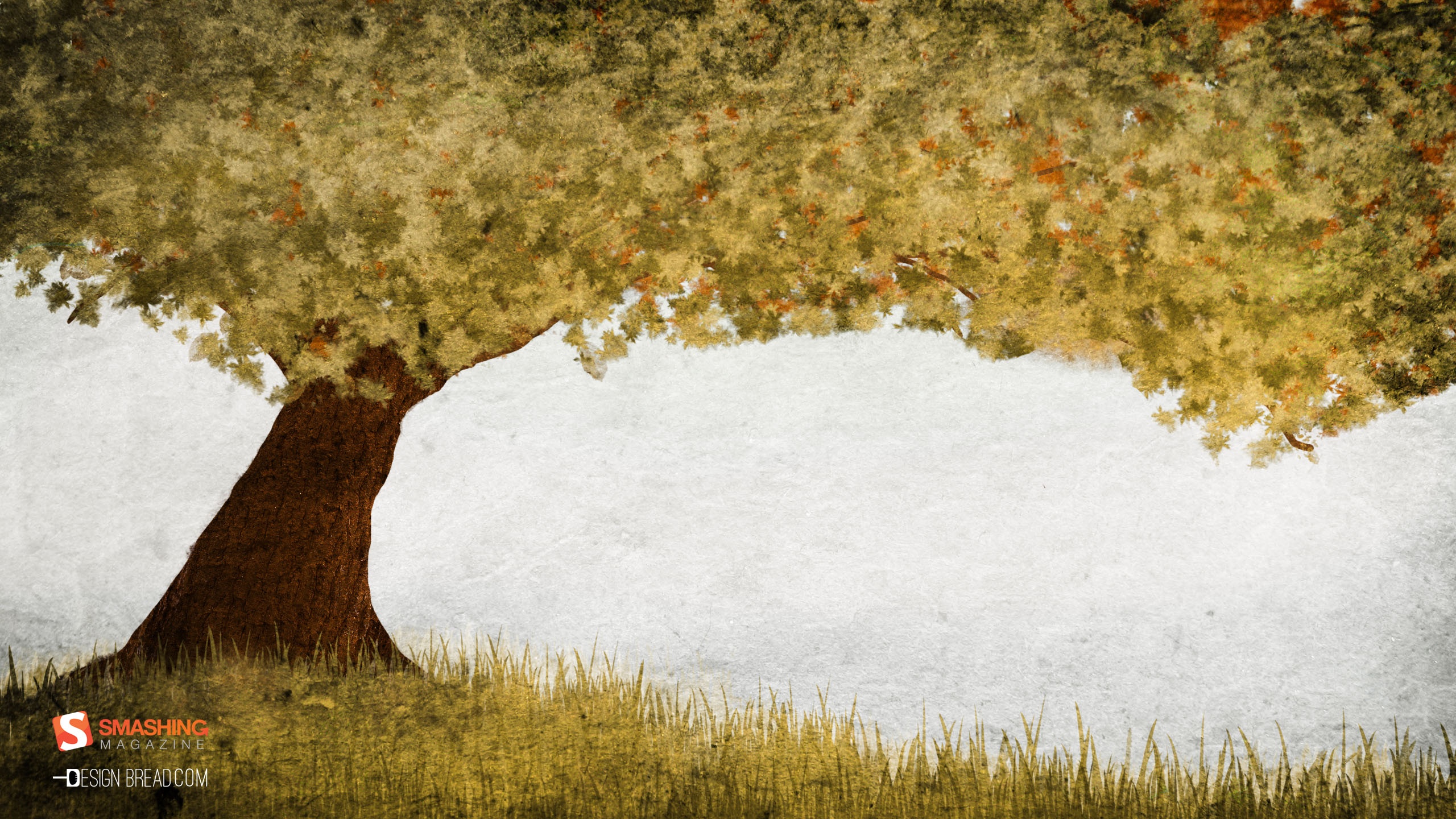
Autumn Invaders
"Invaders of autumn are already here. Make sure you are well prepared!" Designed by German Ljutaev from Ukraine.
- preview
- with calendar: 320×480, 640×480, 800×480, 800×600, 1024×768, 1152×864, 1280×800, 1280×960, 1280×1024, 1400×1050, 1440×900, 1600×1200, 1680×1050, 1680×1200, 1920×1080, 1920×1200, 1920×1440, 2560×1440
- without calendar: 320×480, 640×480, 800×480, 800×600, 1024×768, 1152×864, 1280×800, 1280×960, 1280×1024, 1400×1050, 1440×900, 1600×1200, 1680×1050, 1680×1200, 1920×1080, 1920×1200, 1920×1440, 2560×1440
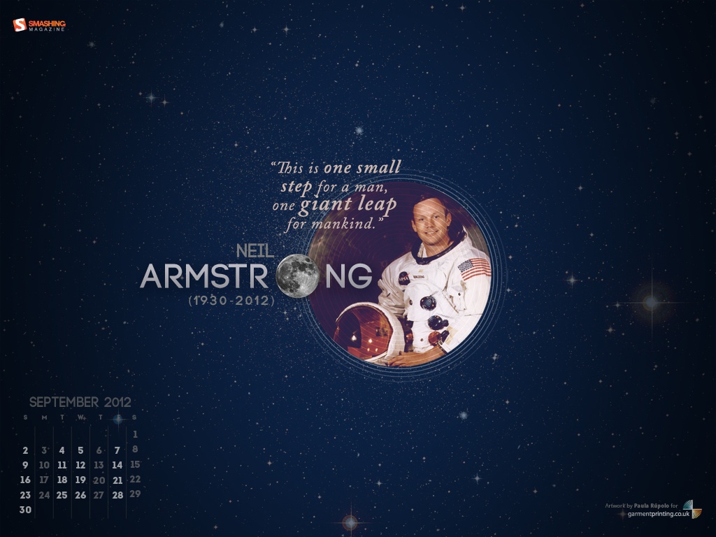
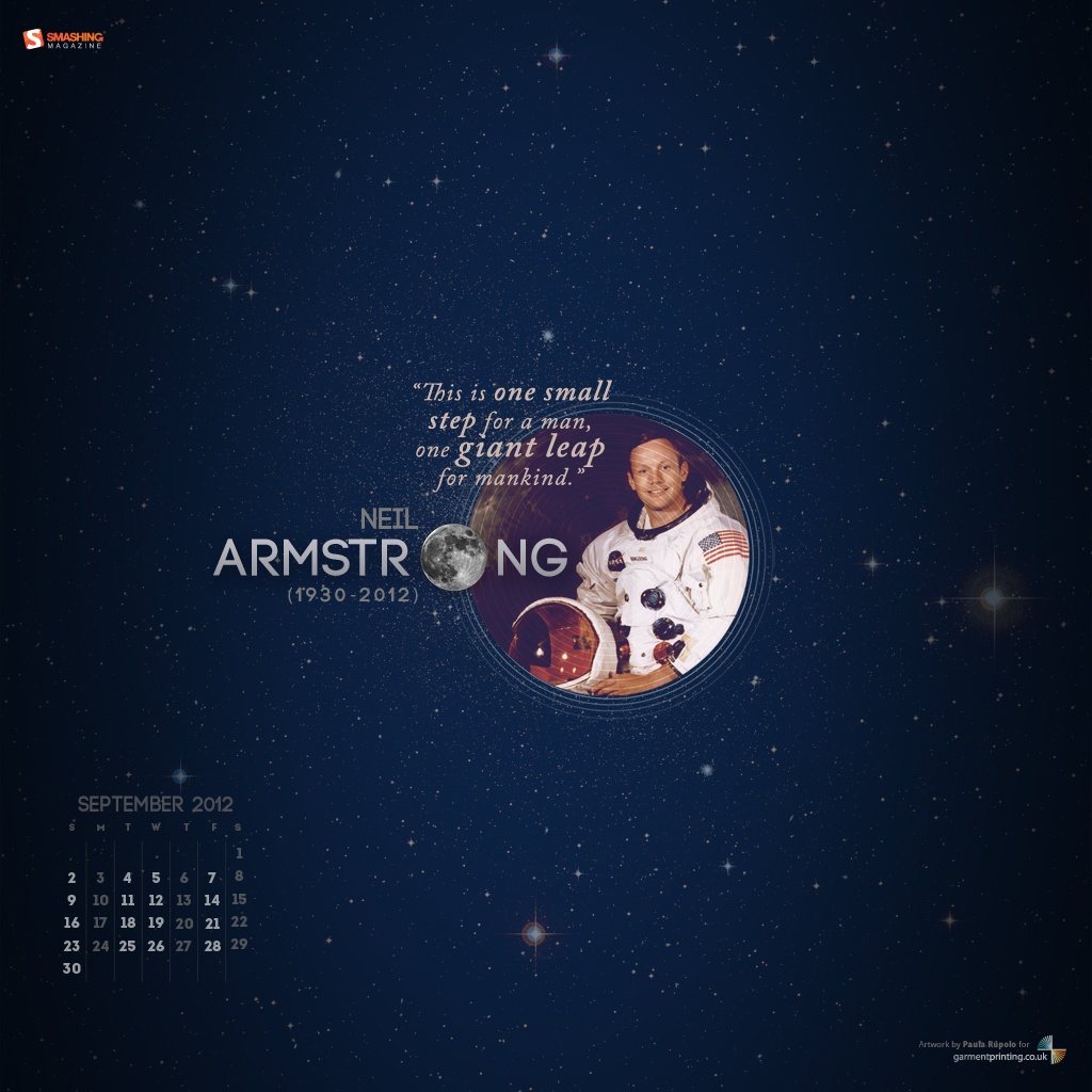
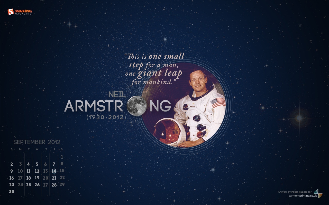
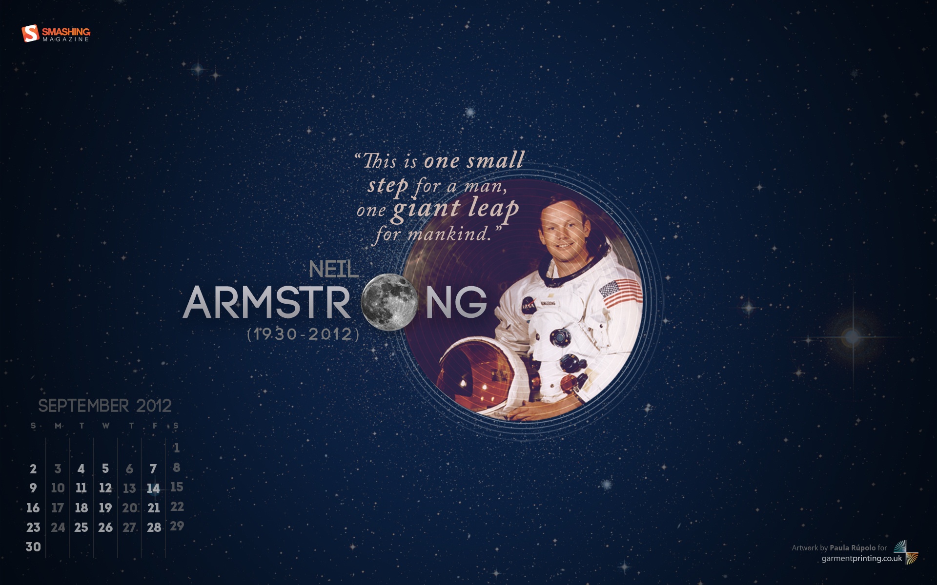
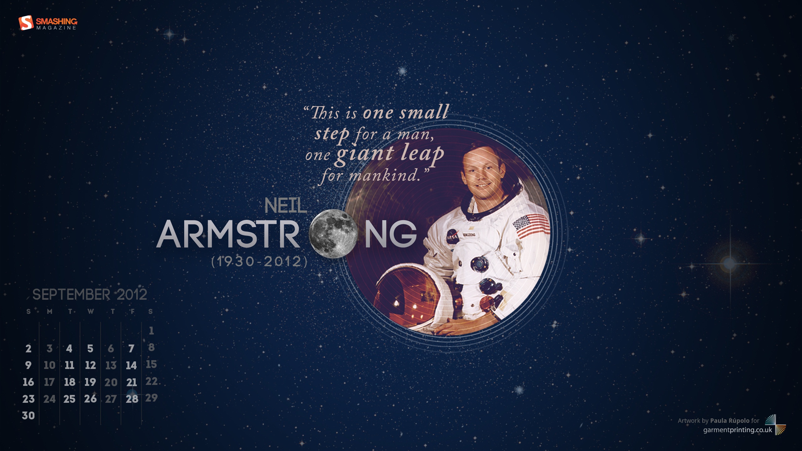
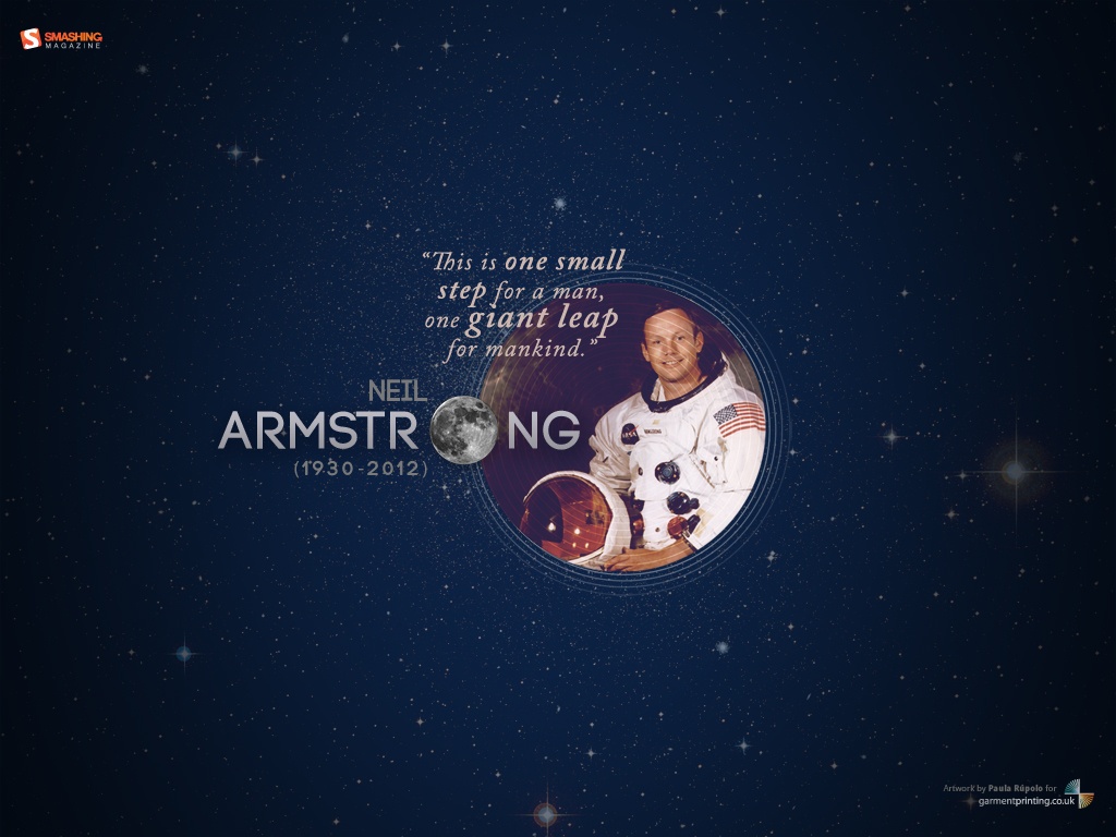
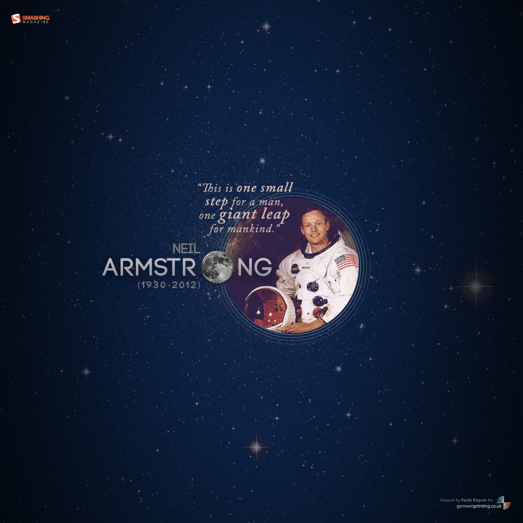
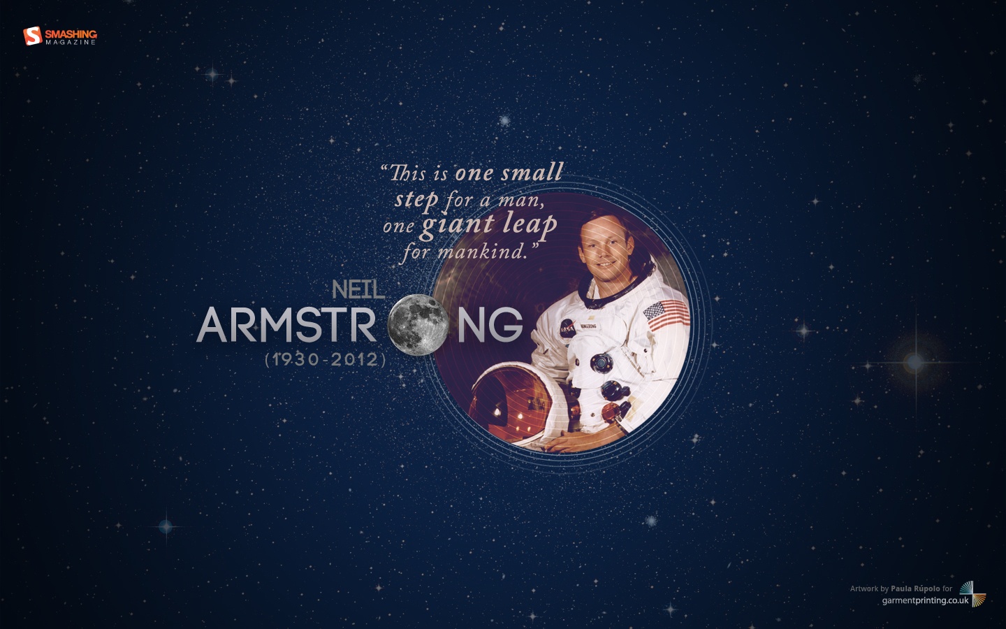
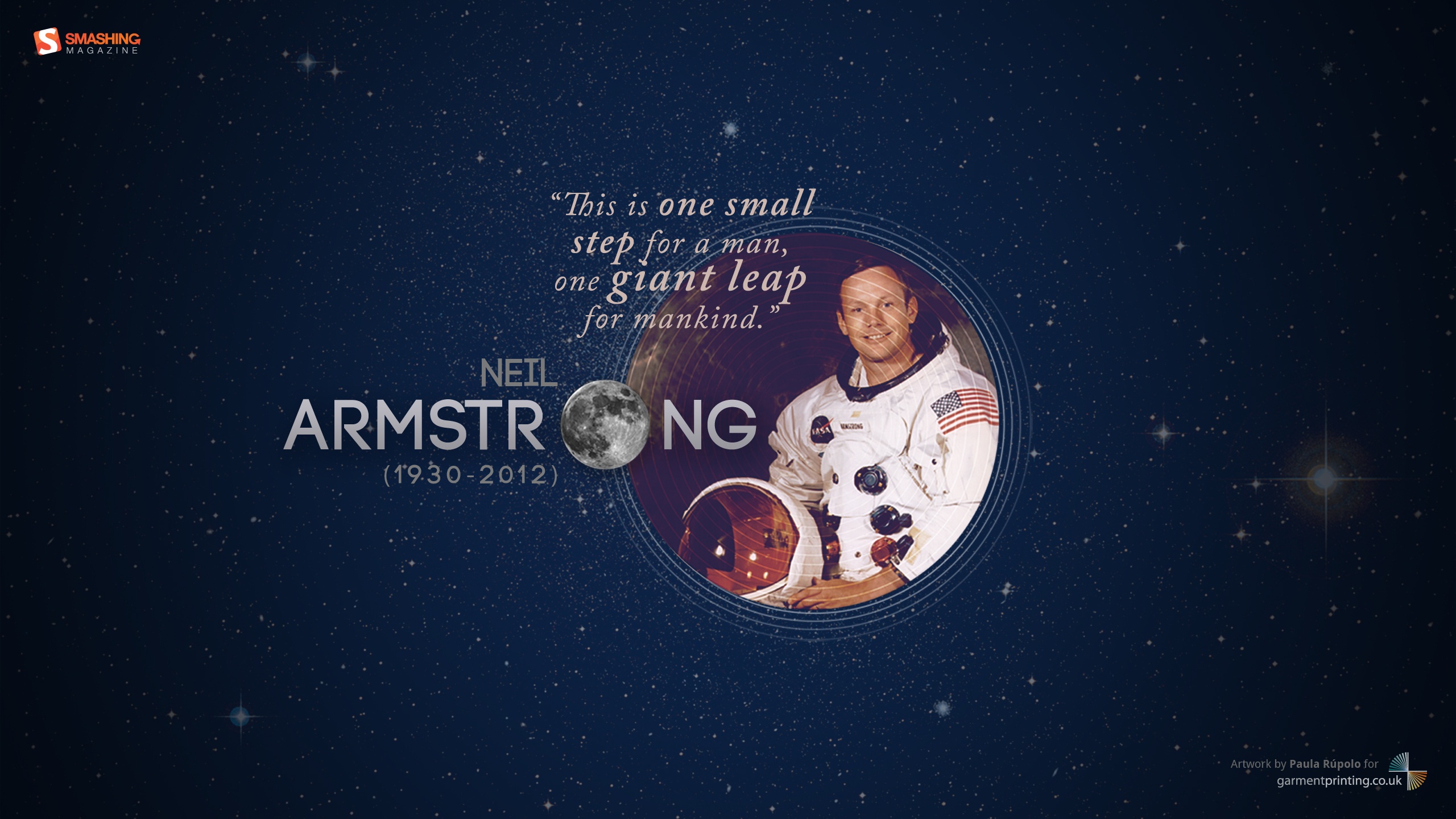
Man On The Moon
"A tribute to Neil Armstrong (1930-2012), the first man to ever walk on the moon." Designed by Paula Rupolo For Garment Printing from United Kingdom.

- preview
- with calendar: Â 320×480, 1024×768, 1024×1024, 1280×800, 1440×900, 1920×1080, 1920×1200, 2560×1440
- without calendar: Â 320×480, 1024×768, 1024×1024, 1280×800, 1440×900, 1920×1080, 1920×1200, 2560×1440
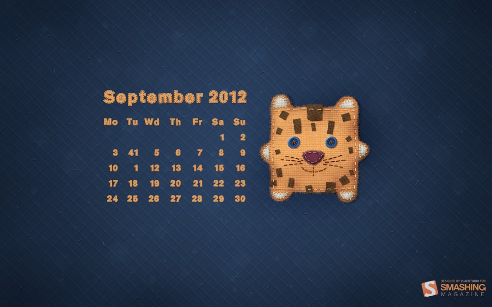
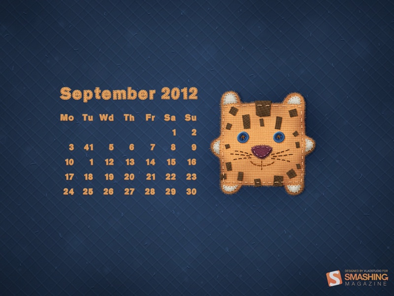
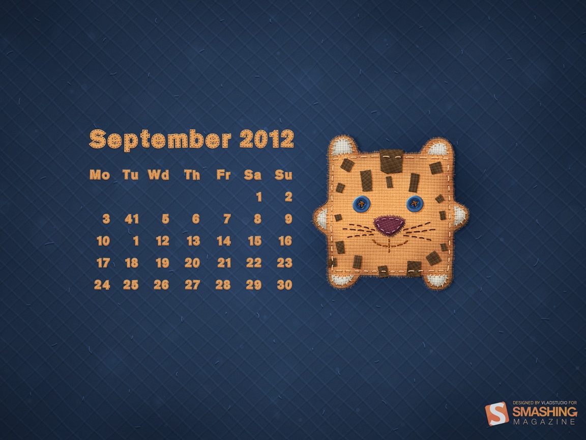
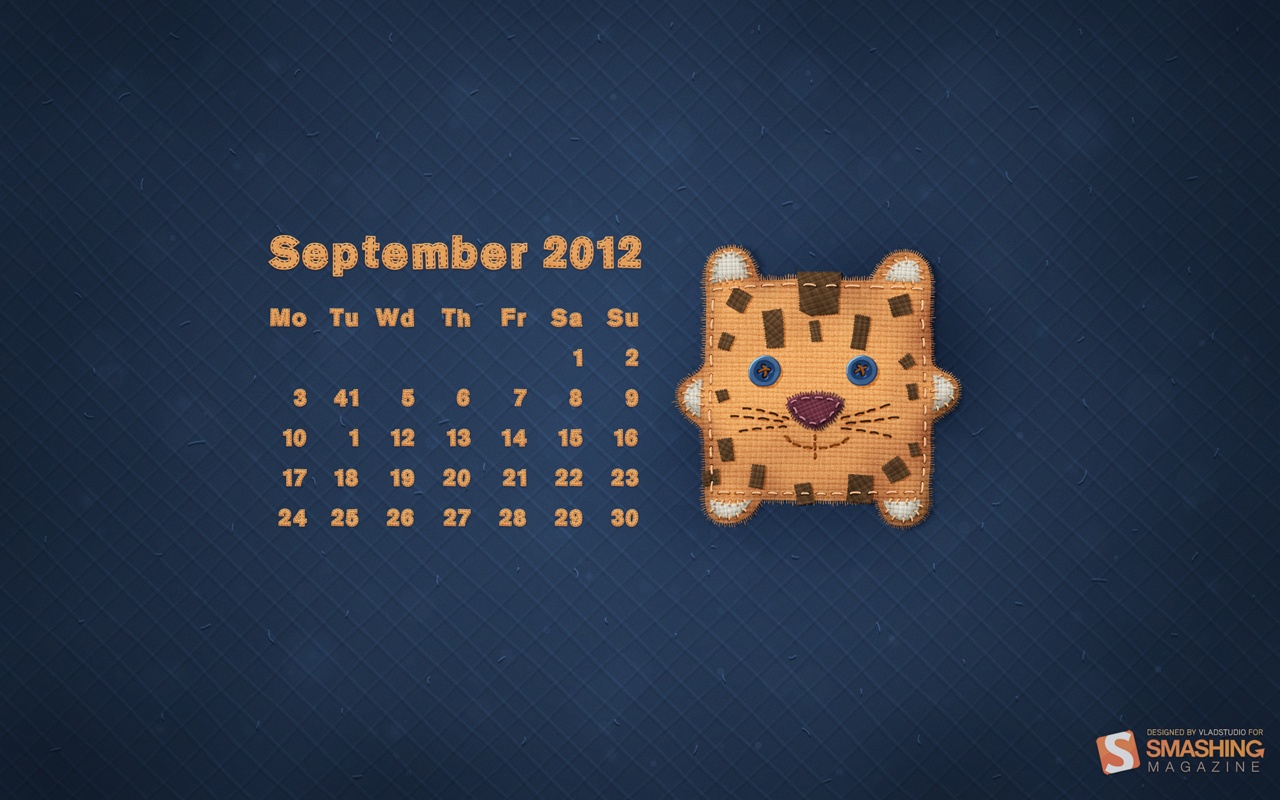
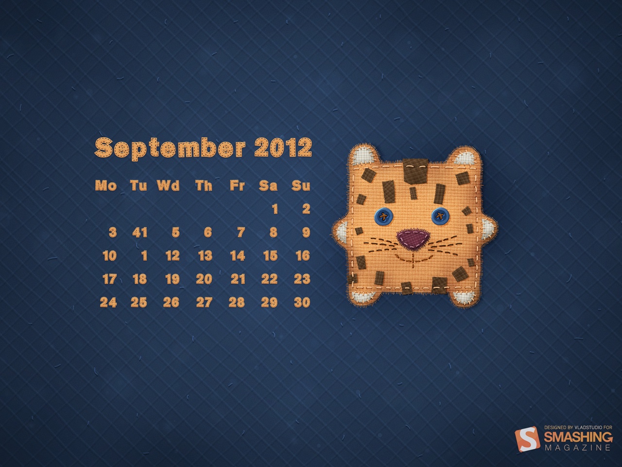
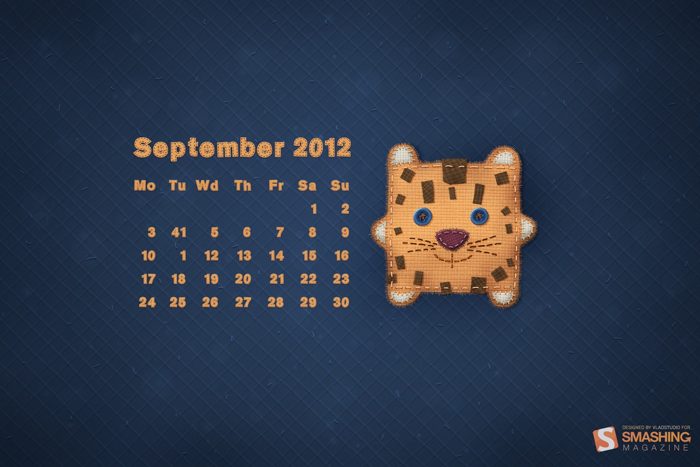
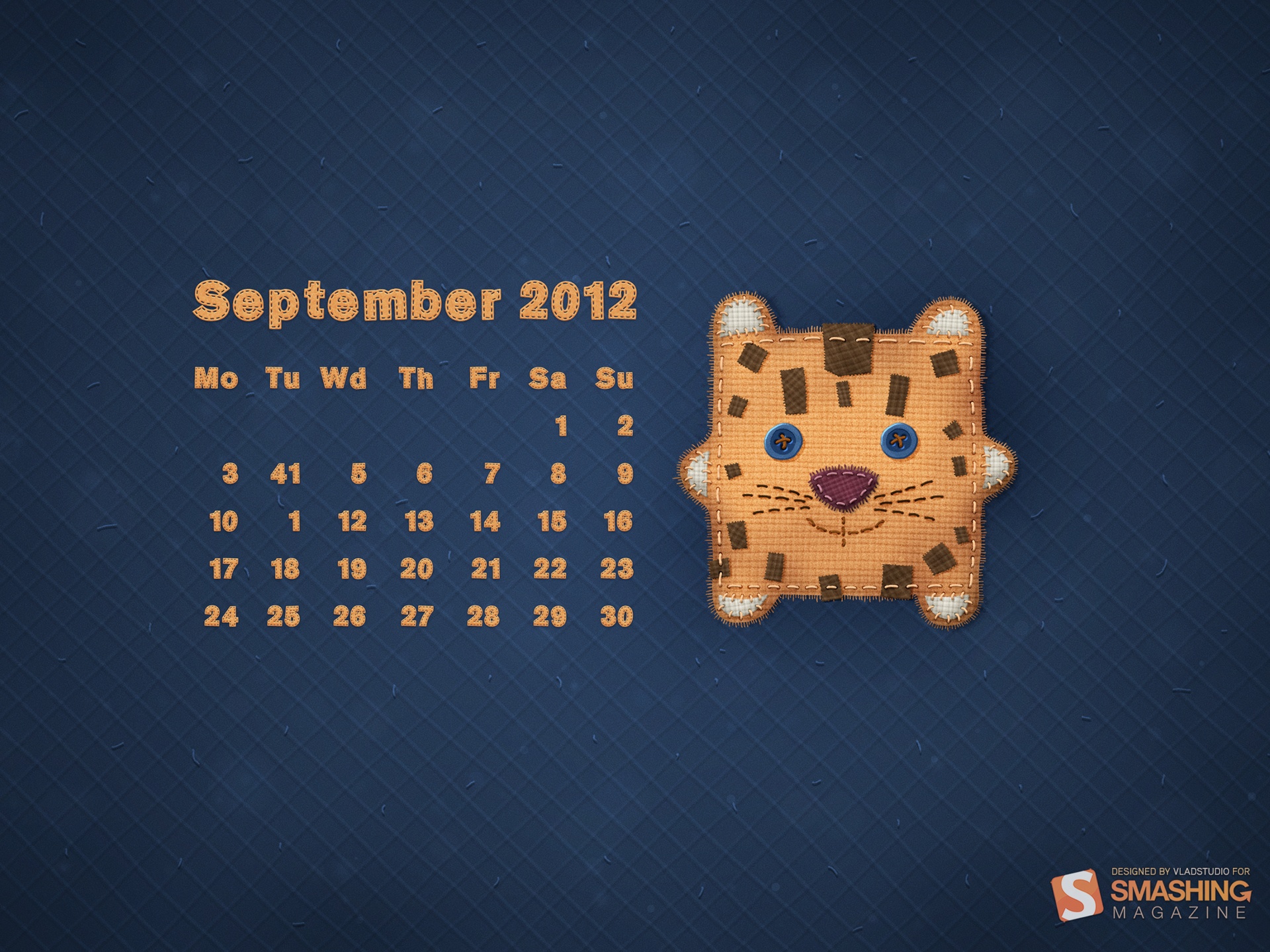
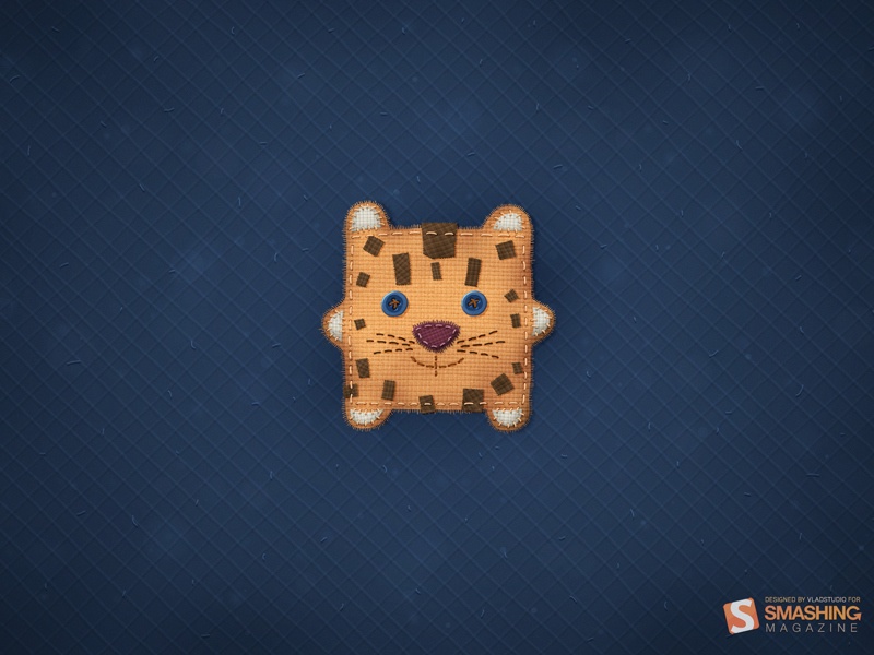
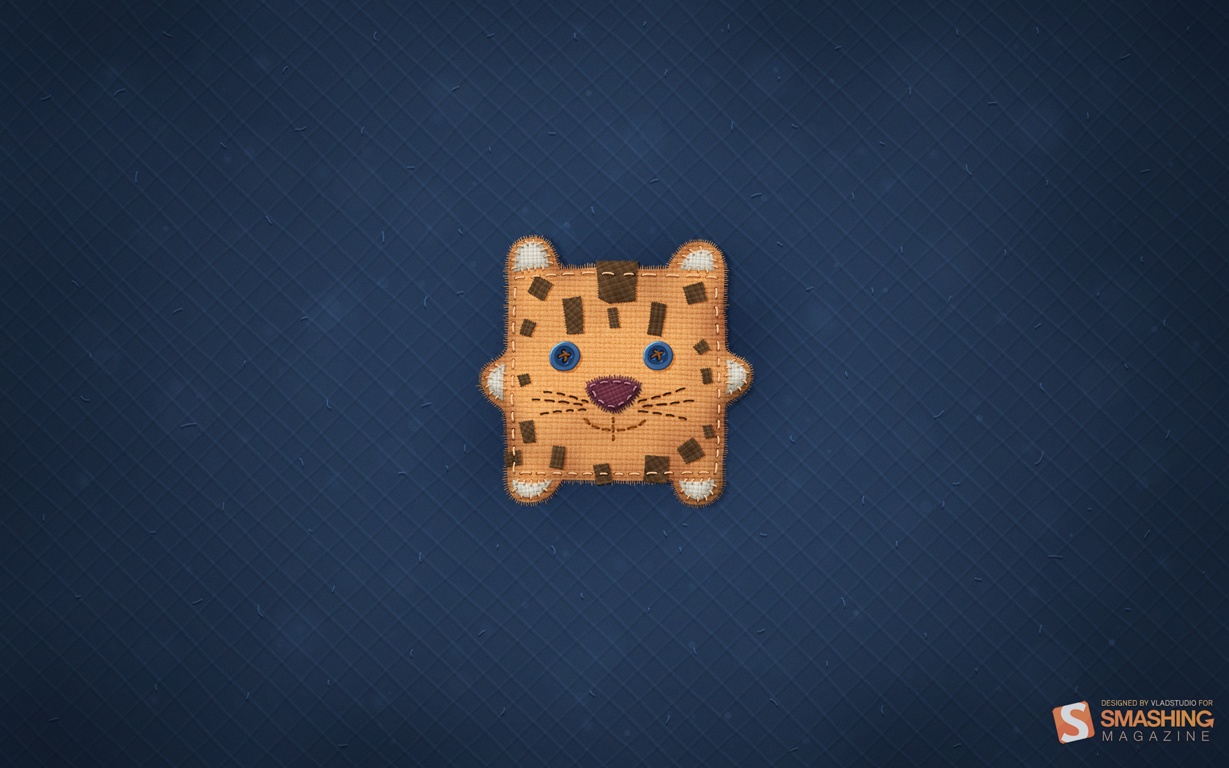
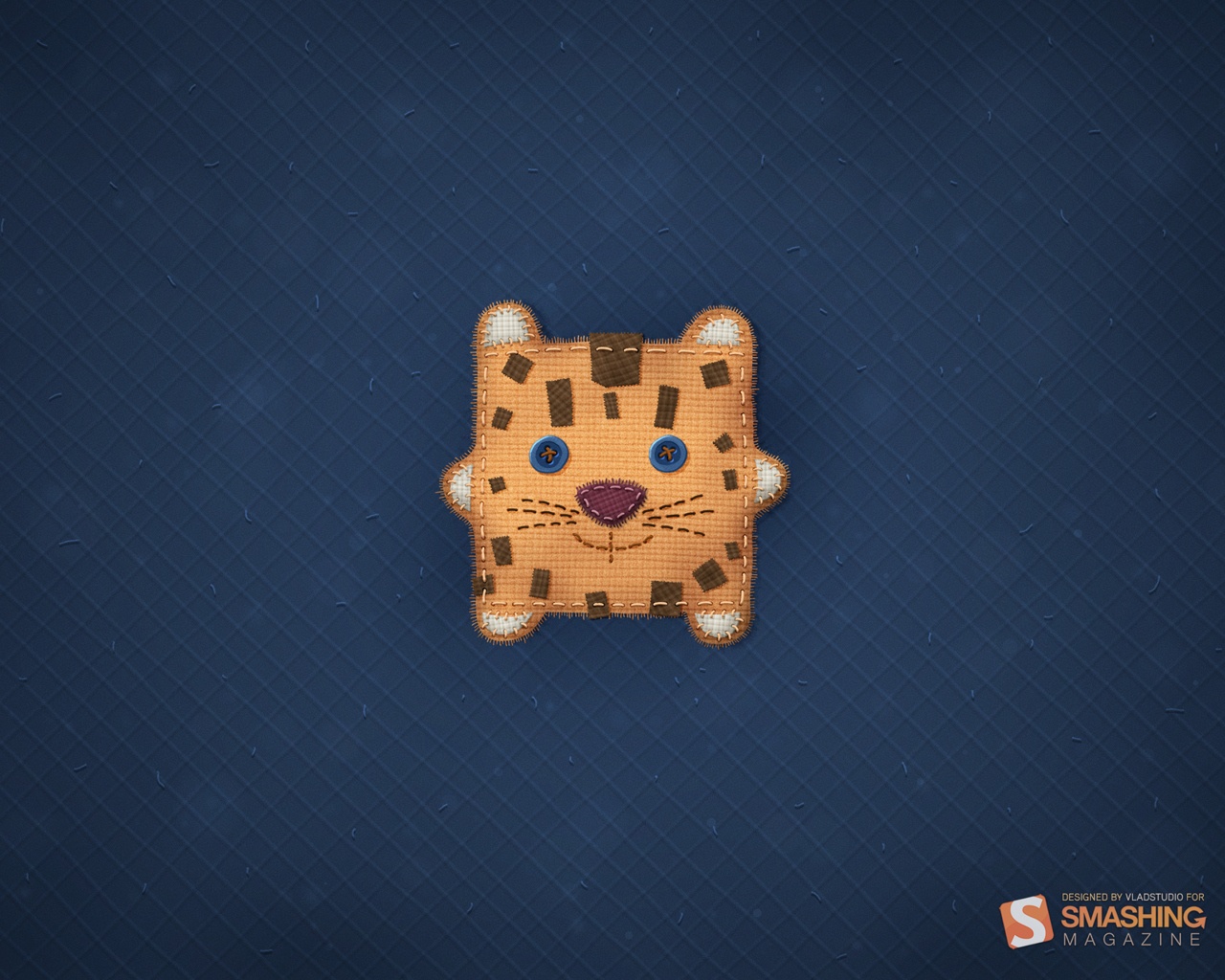
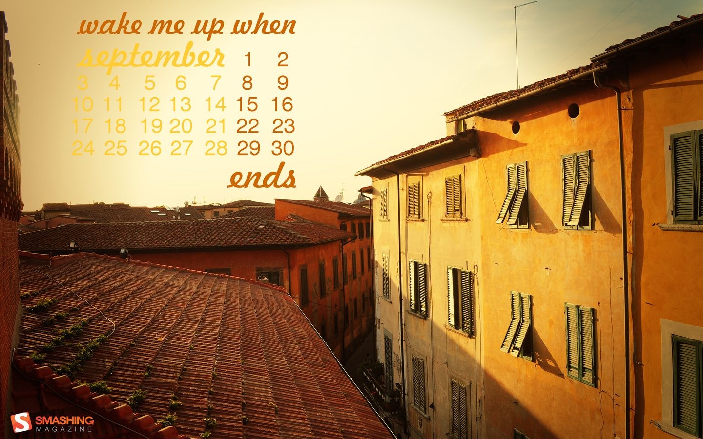
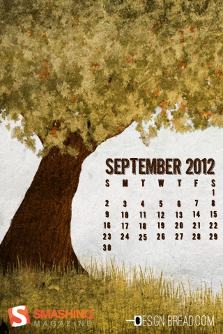
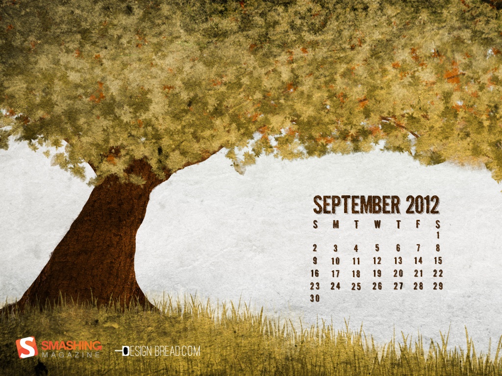
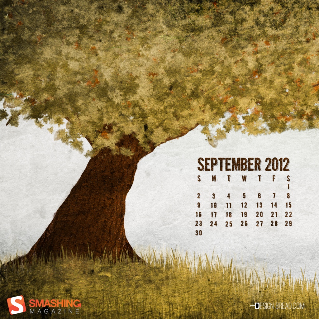
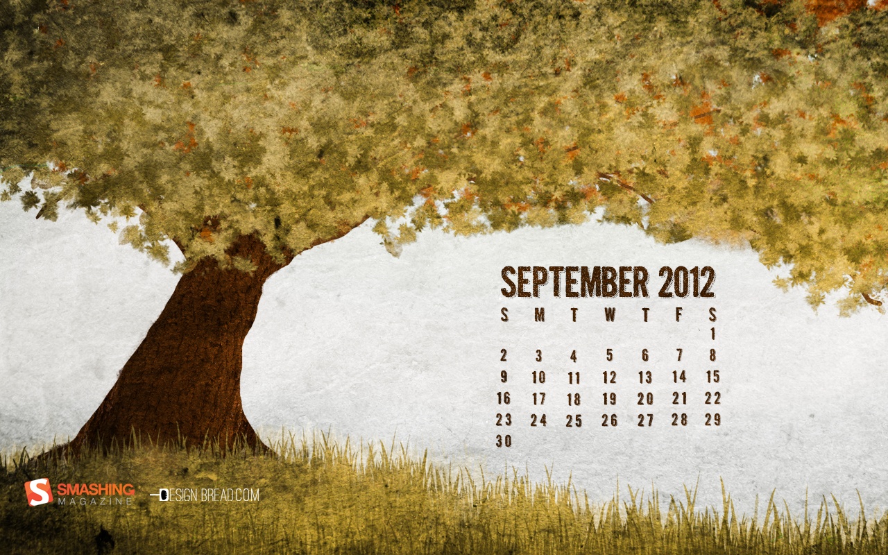
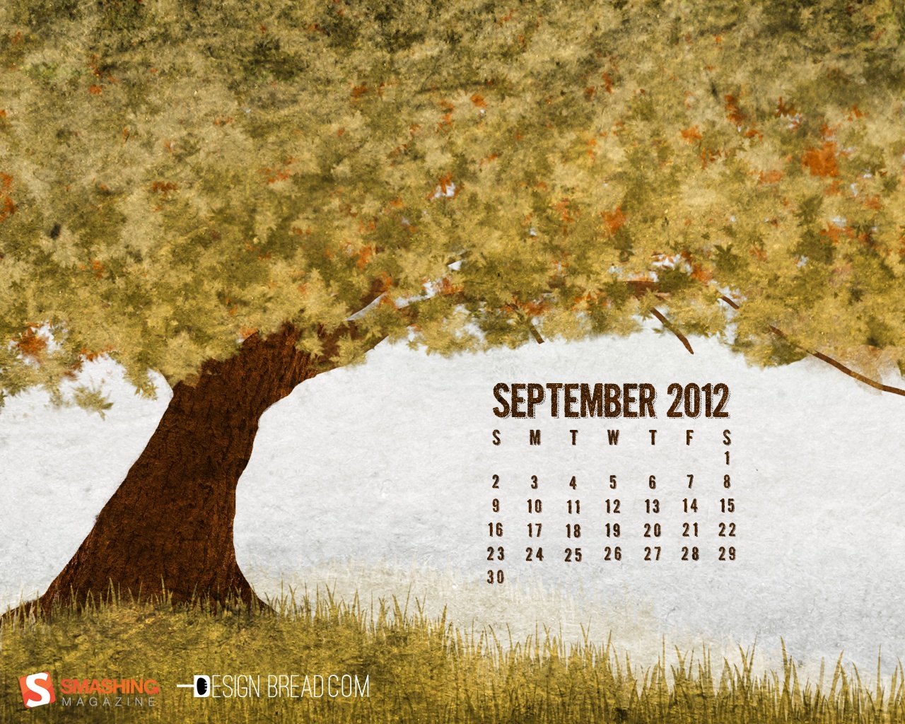
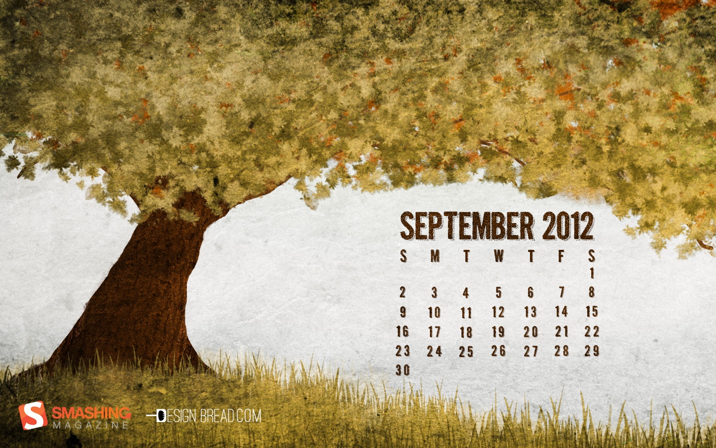
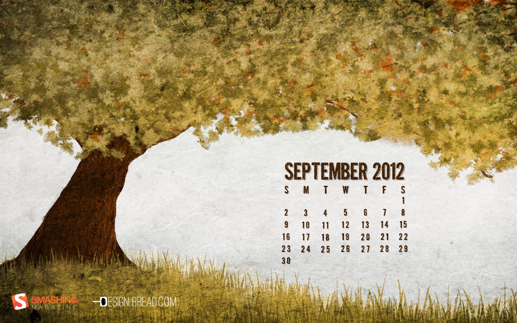
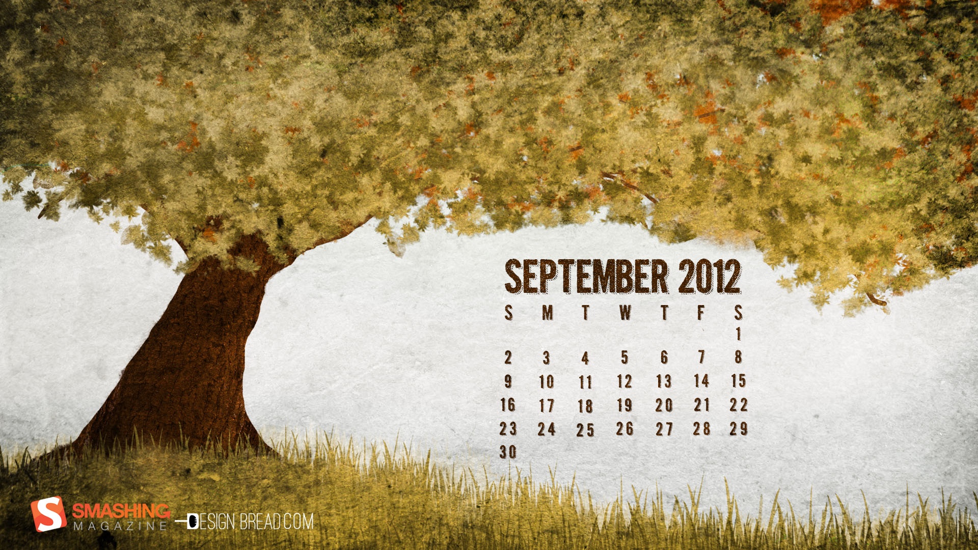
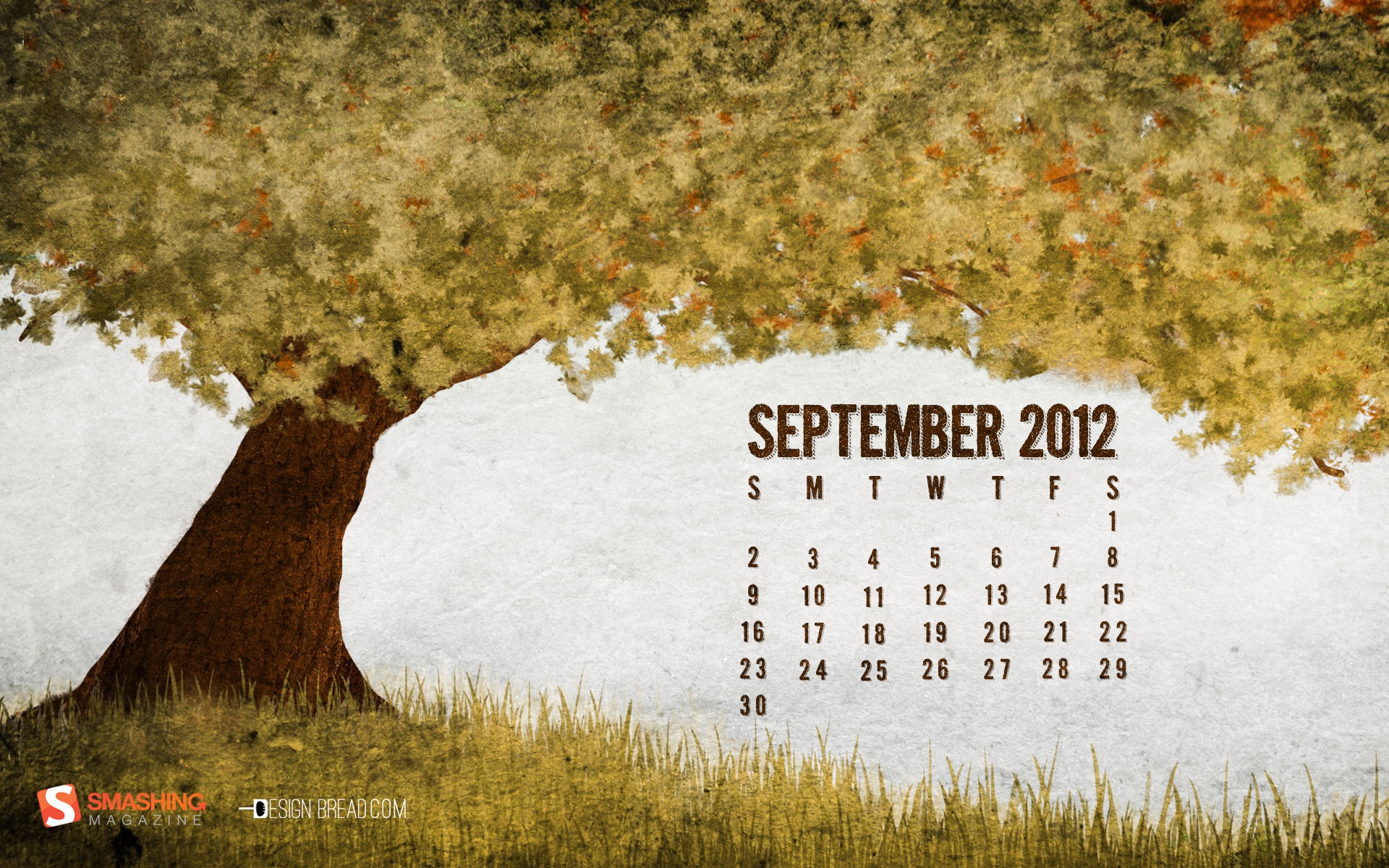
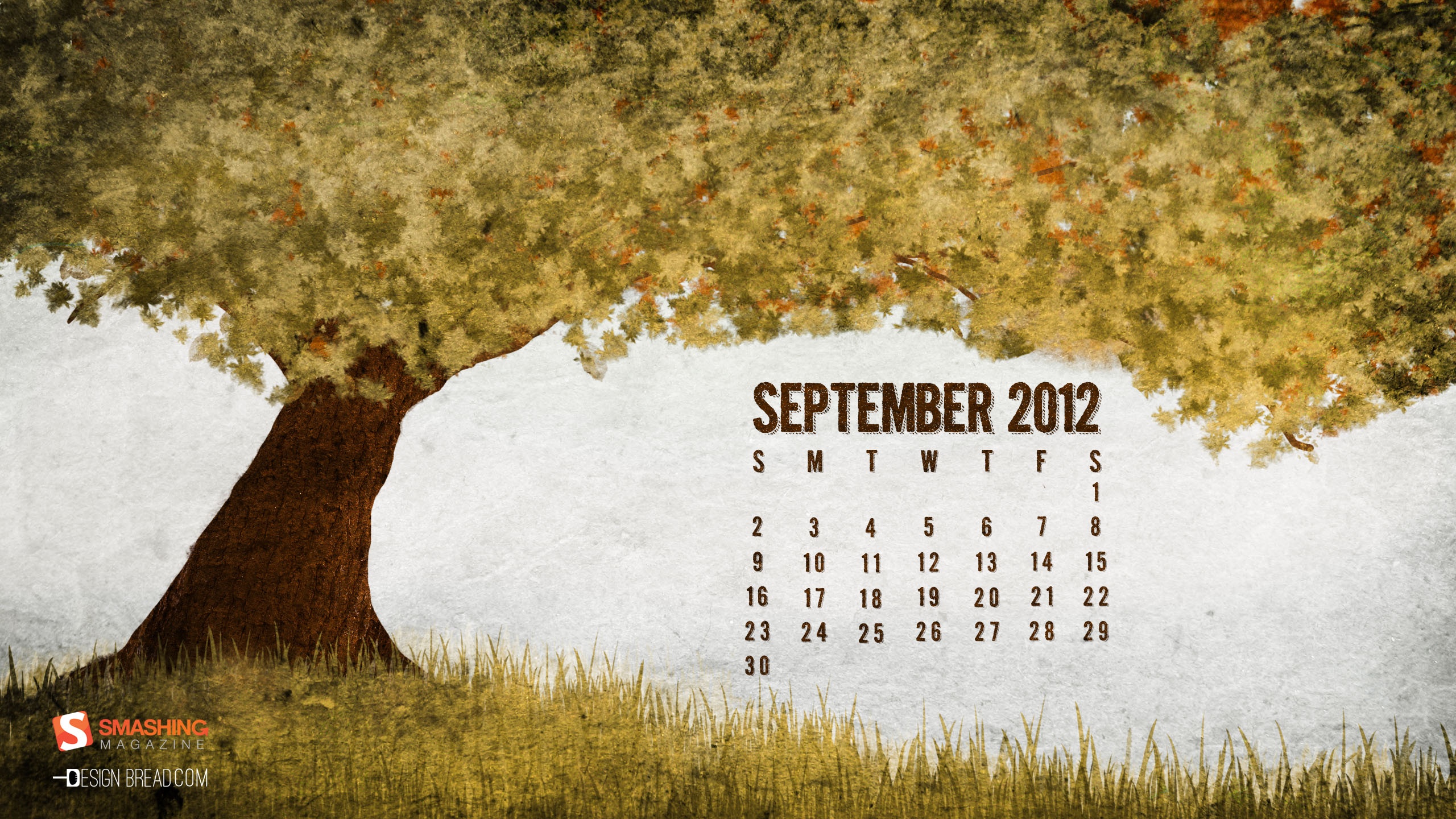
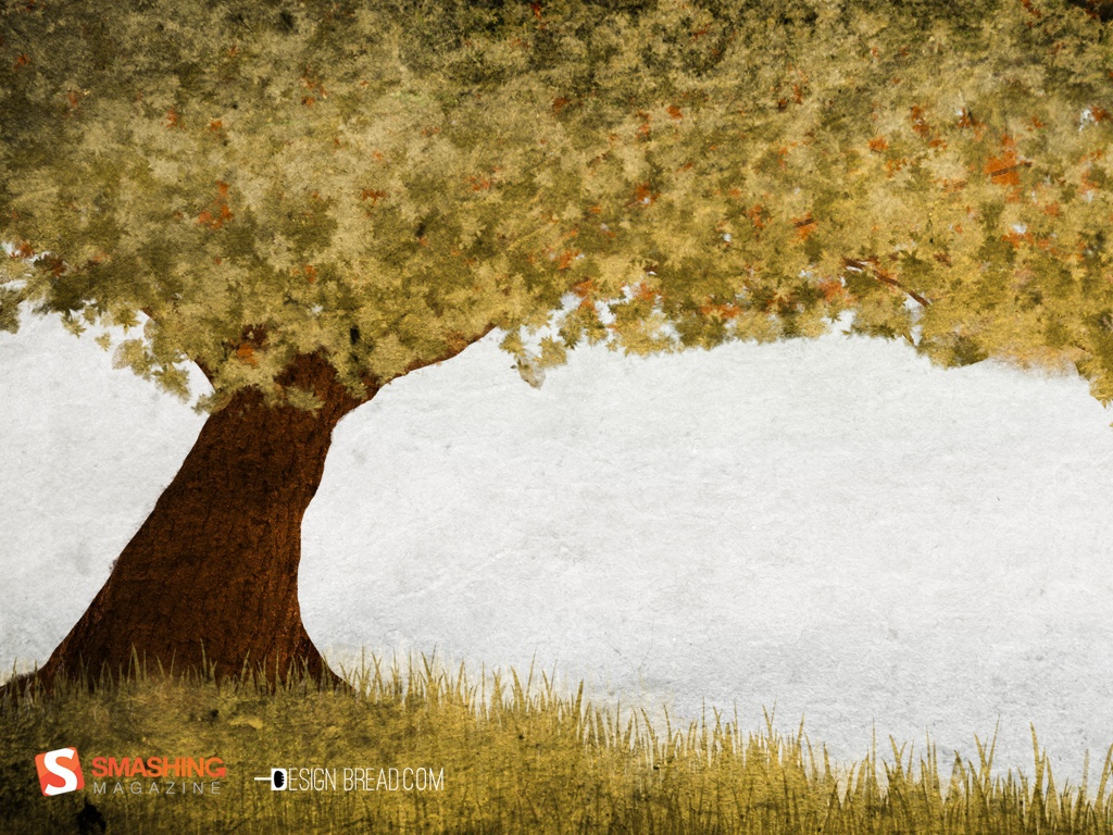
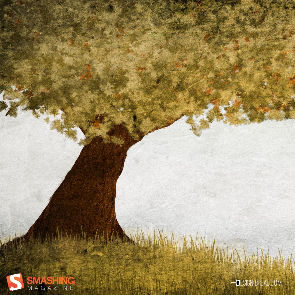
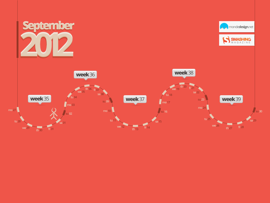
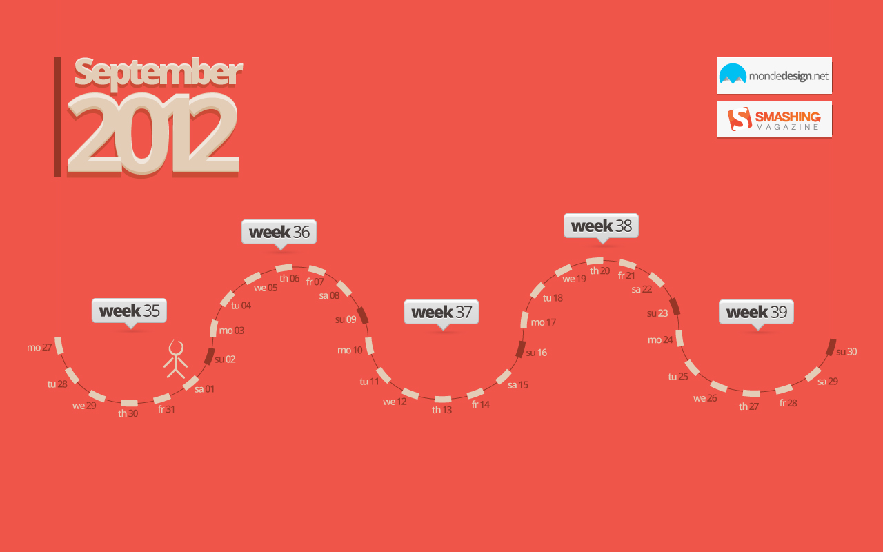
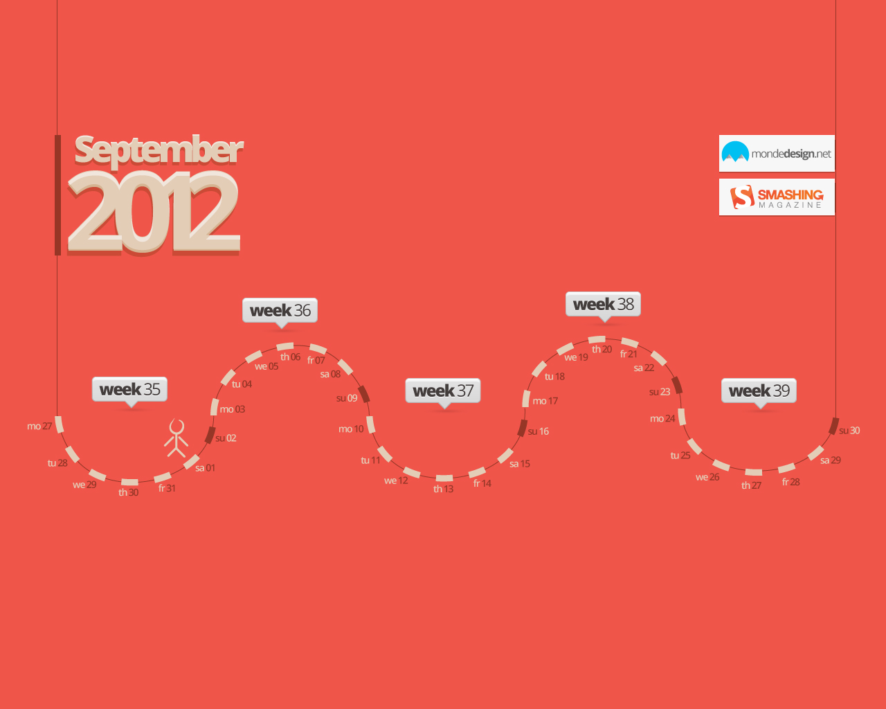
September Calendar
Designed by Vlad Gerasimov from Russia.
- preview
- with calendar: Â 800×600, 960×600, 1024×768, 1152×864, 1229×768, 1280×800, 1280×960, 1280×1024, 1400×1050, 1440×900, 1440×960, 1600×1200, 1680×1050, 1728×1080, 1920×1200, 1920×1440, 2304×1440
- without calendar: Â 800×600, 960×600, 1024×768, 1152×864, 1229×768, 1280×800, 1280×960, 1280×1024, 1400×1050, 1440×900, 1440×960, 1600×1200, 1680×1050, 1728×1080, 1920×1200, 1920×1440, 2304×1440
Photo Manipulation
Designed by Joana Machado from Portugal.

- preview
- with calendar: 1280×800, 1440×900, 1680×1050, 1920×1080, 1920×1200
- without calendar: 1280×800, 1440×900, 1680×1050, 1920×1080, 1920×1200
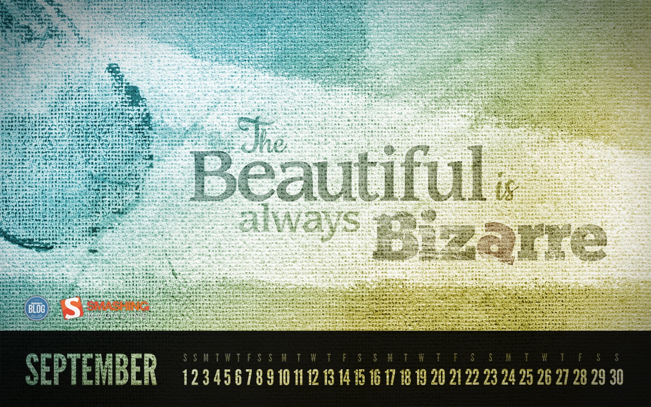
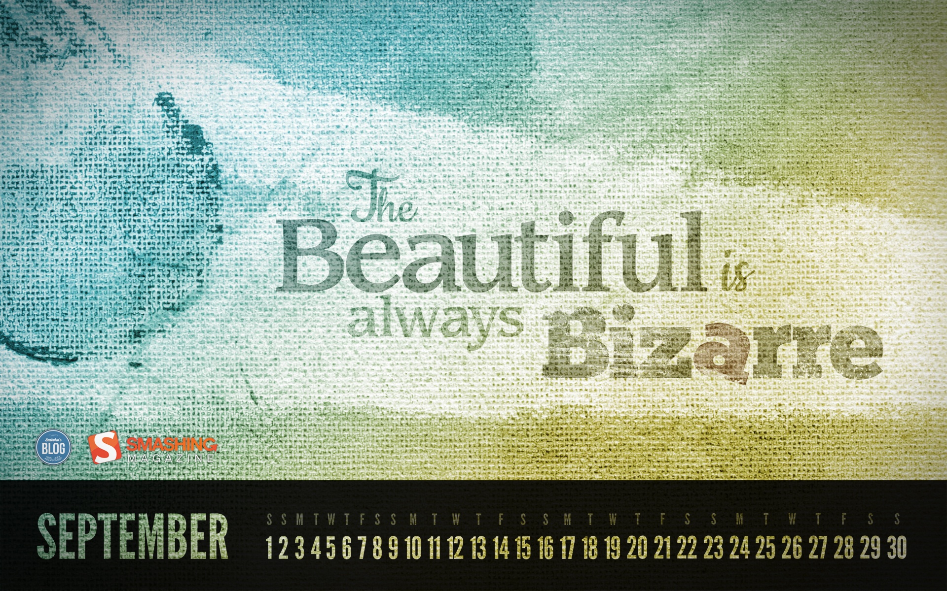
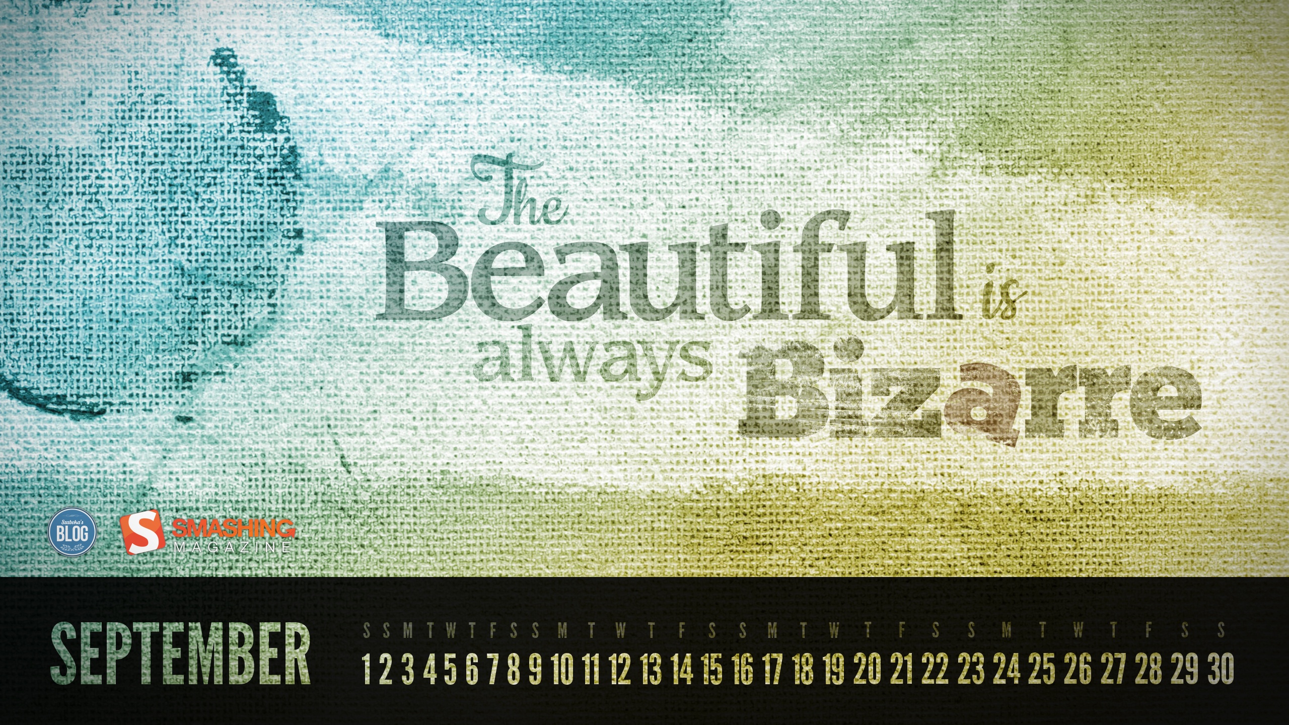
Beautiful & Bizarre
"The Beautiful is always Bizarre – a quote by Ralph Waldo Emerson." Designed by Roland Szabo from Hungary.

- preview
- with calendar: 1280×720, 1280×800, 1366×768, 1440×900, 1600×900, 1680×1050, 1920×1080, 1920×1200, 2560×1440, 2560×1600
Colorful Trees
Designed by Blazoon.
- preview
- with calendar: 1024×1024, 1280×800, 1440×900, 1680×1050, 1920×1080, 2560×1440
- without calendar: 1024×1024, 1280×800, 1440×900, 1680×1050, 1920×1080, 2560×1440
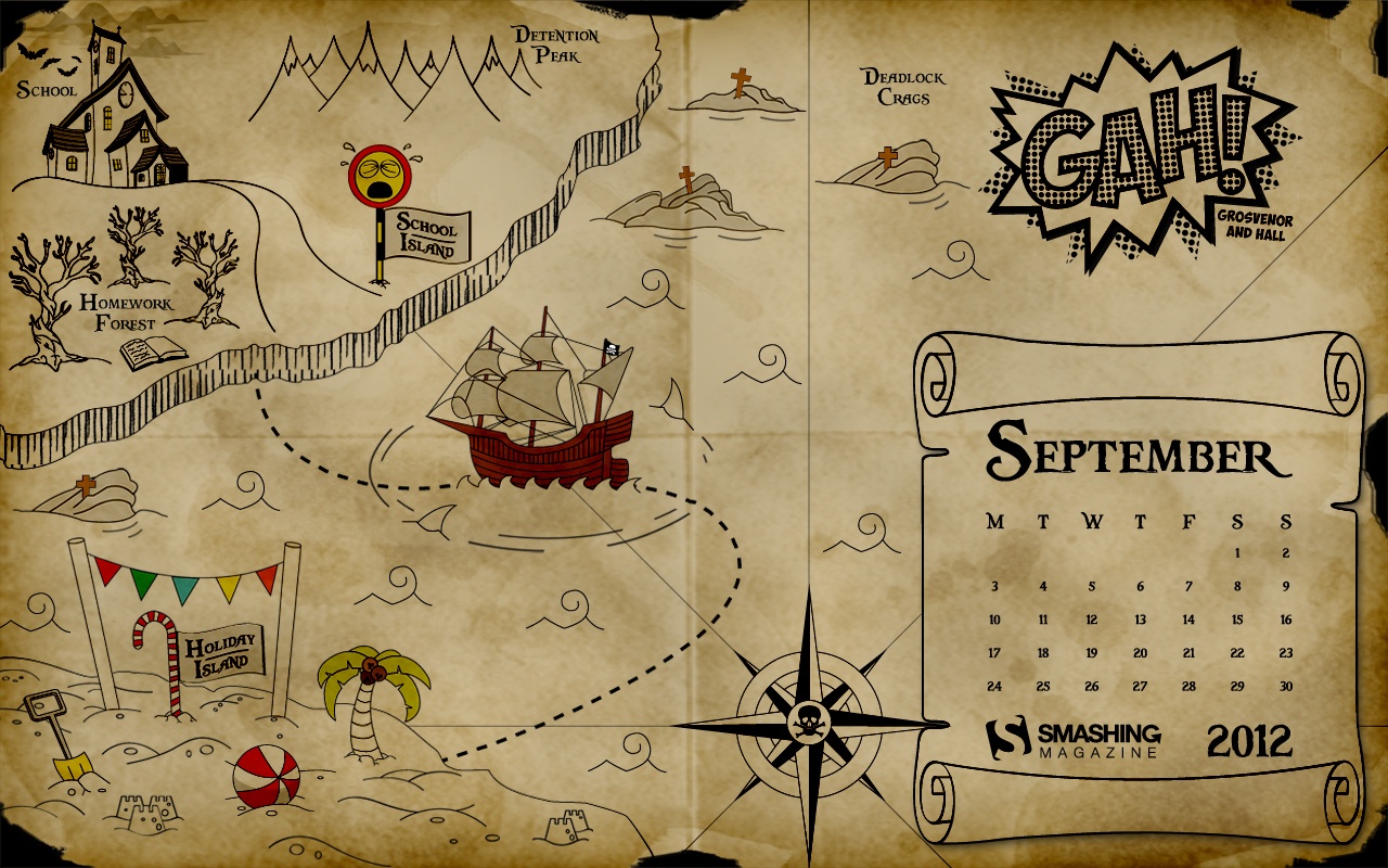
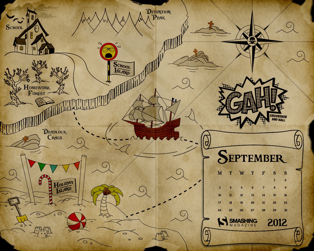
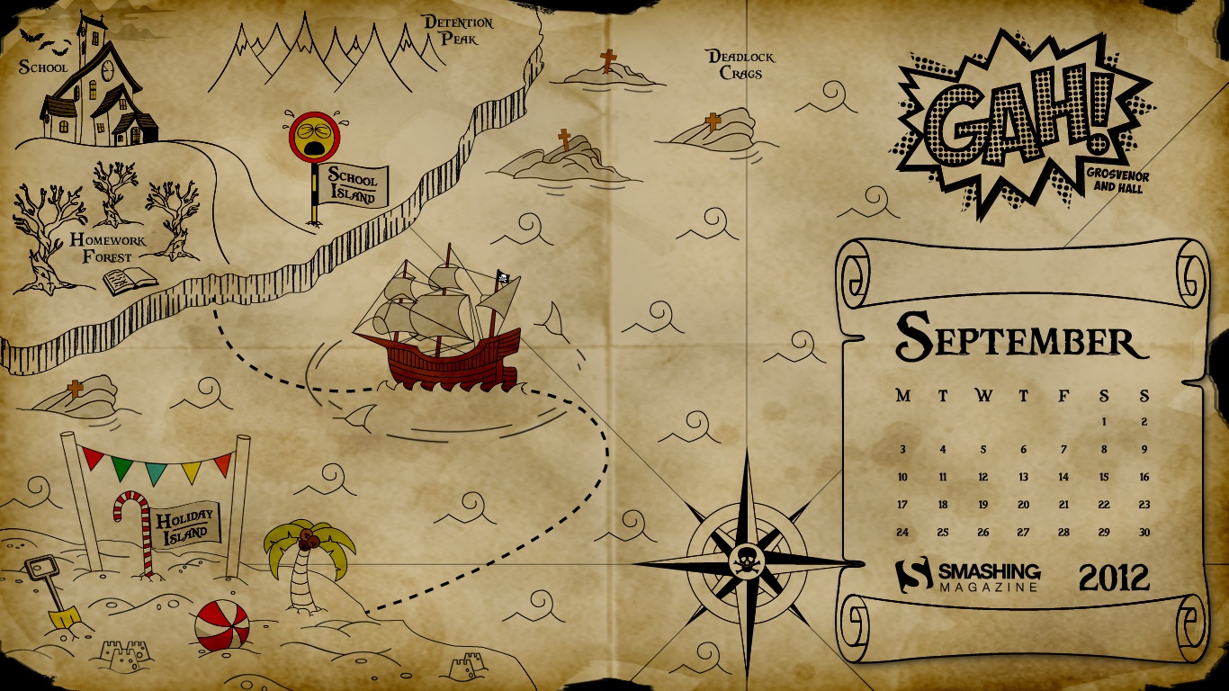
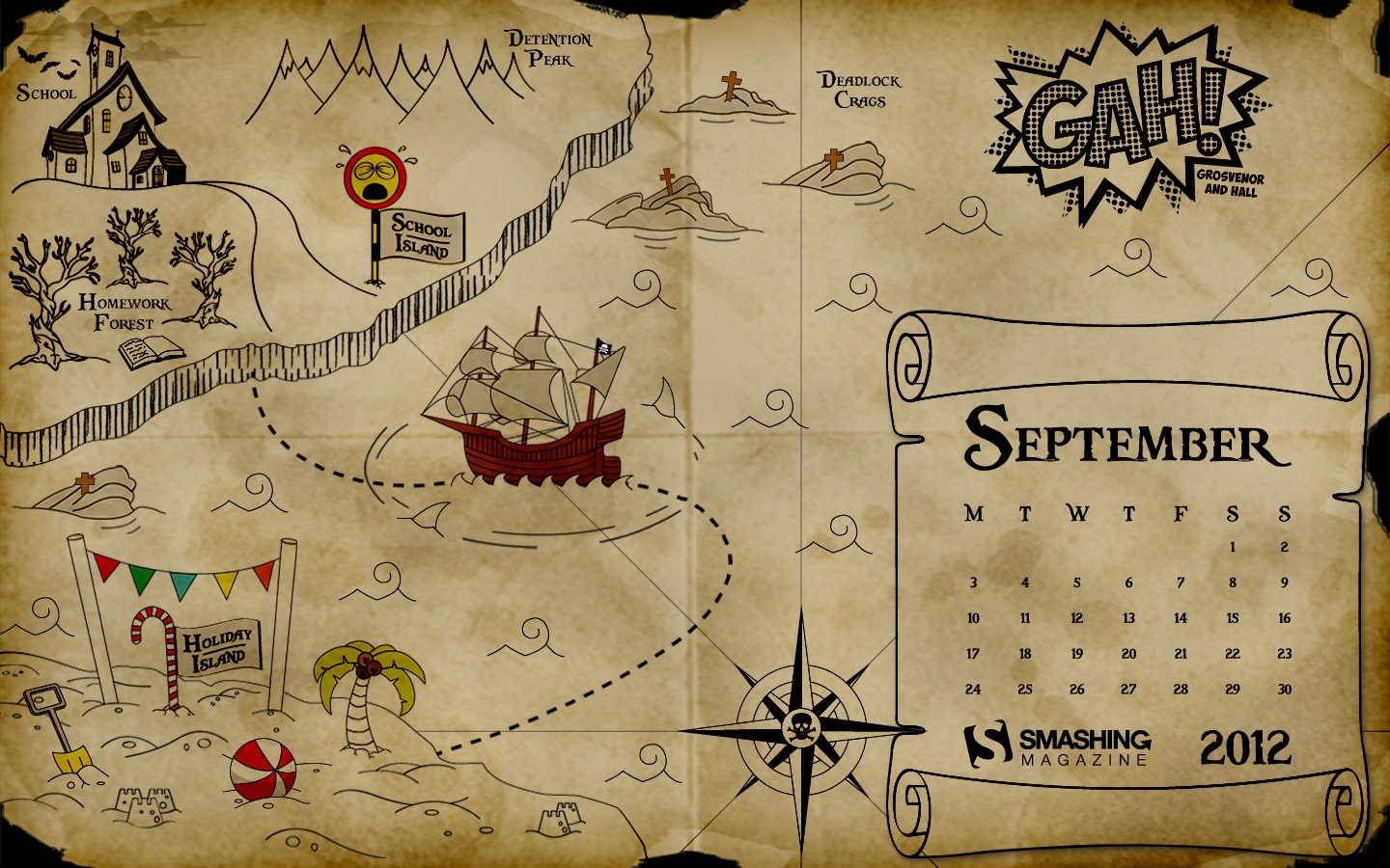
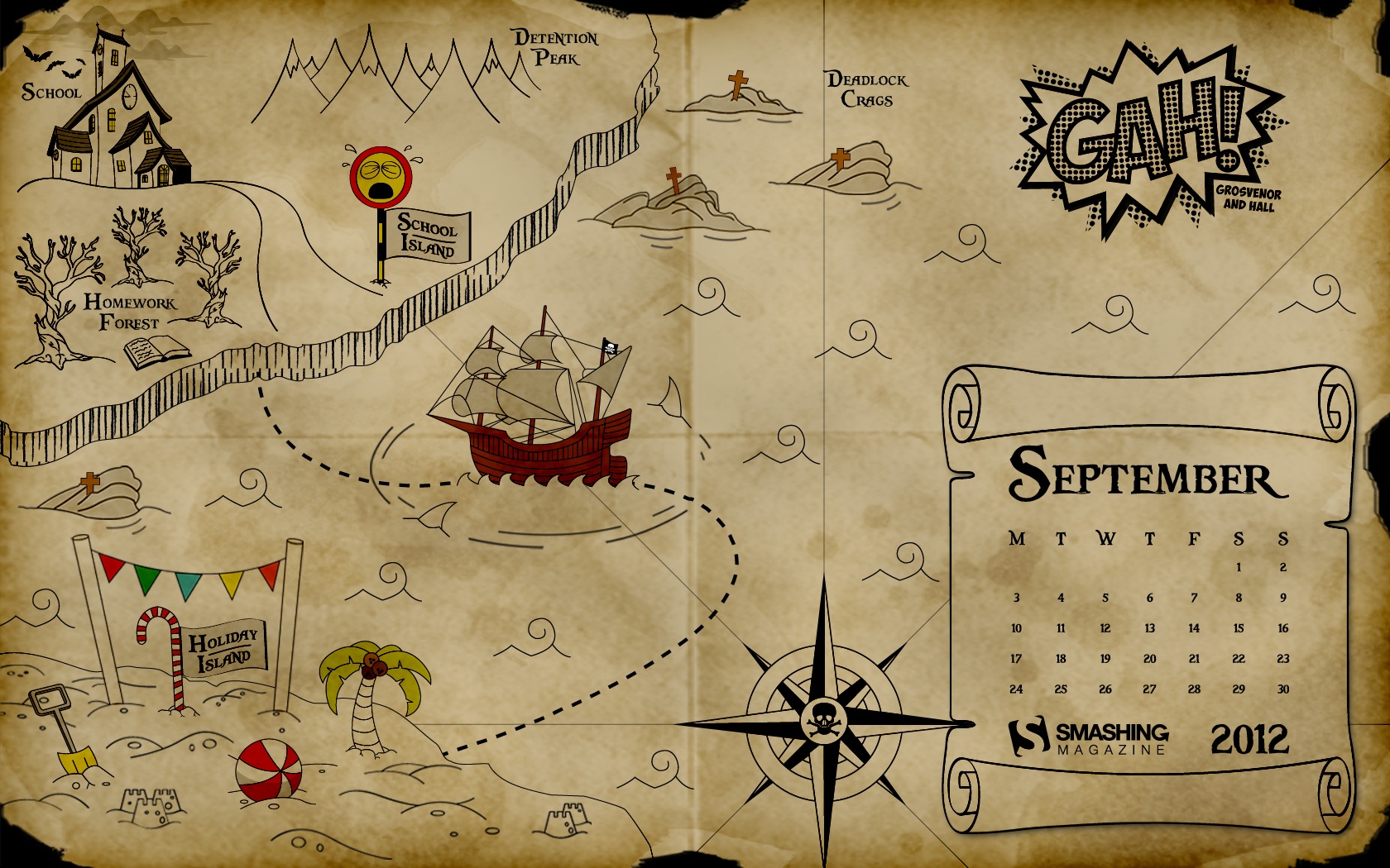
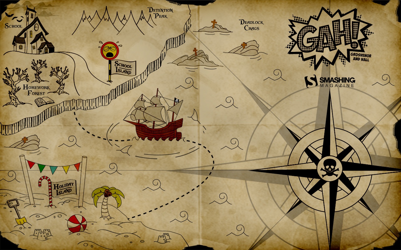
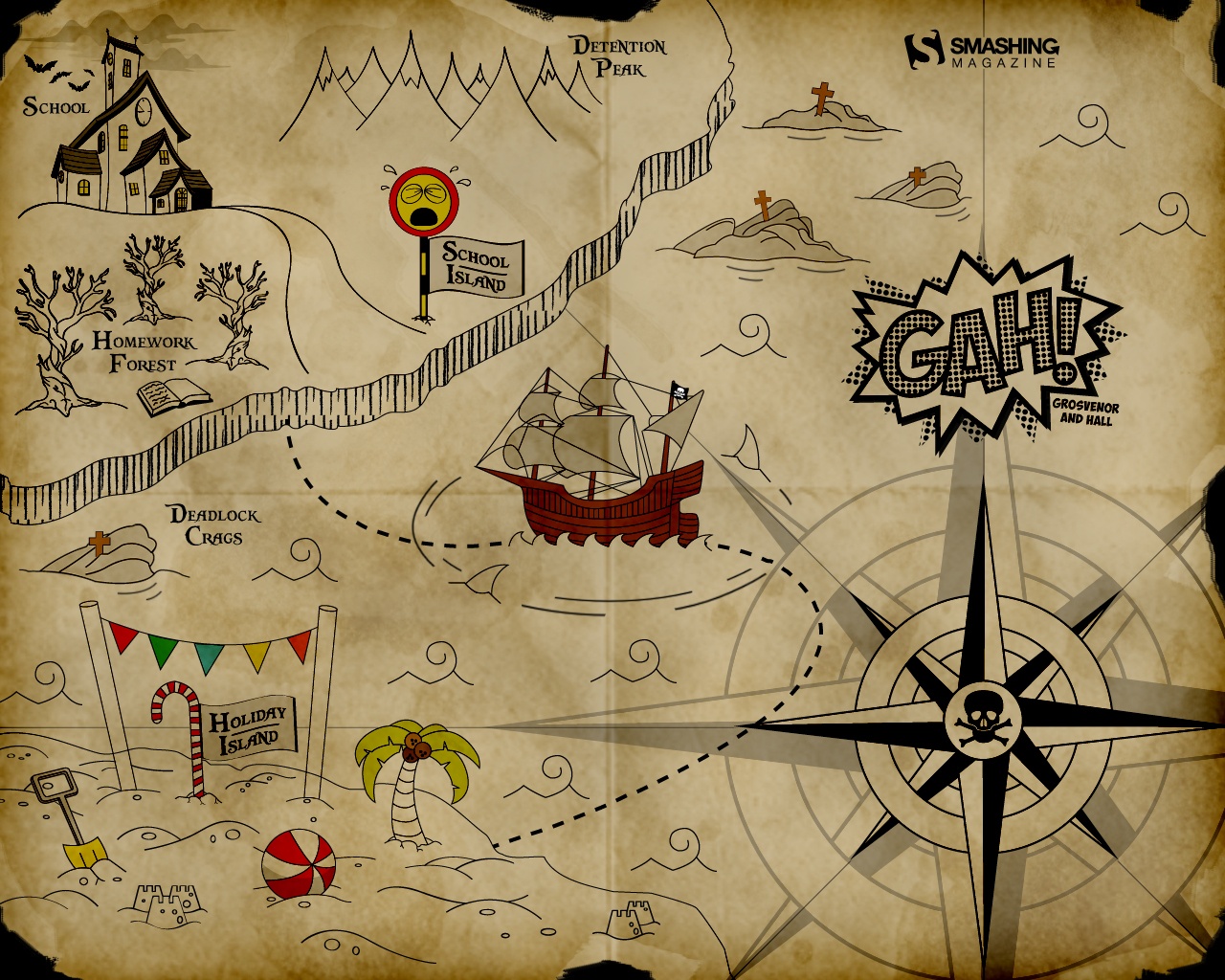
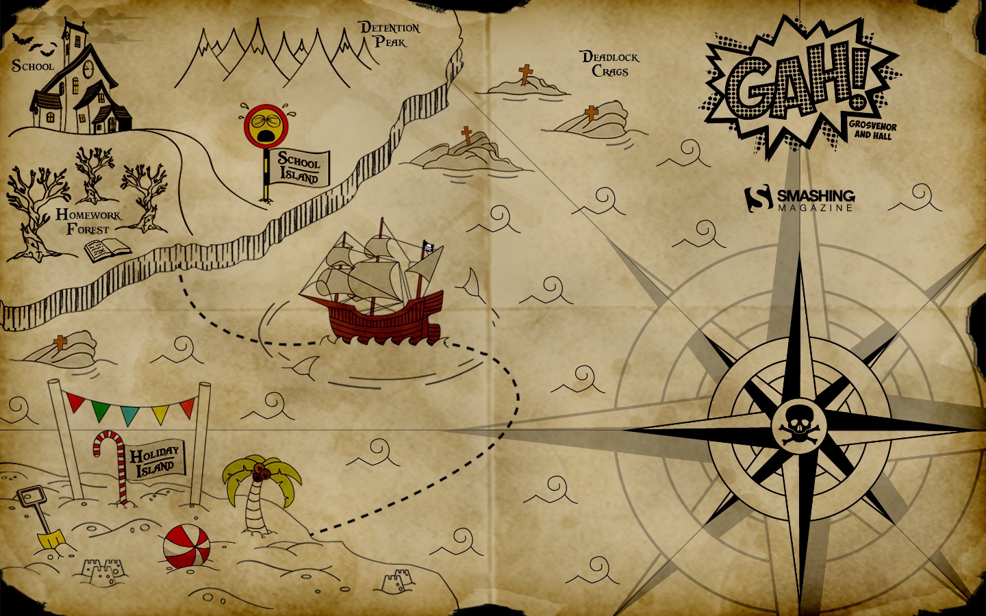
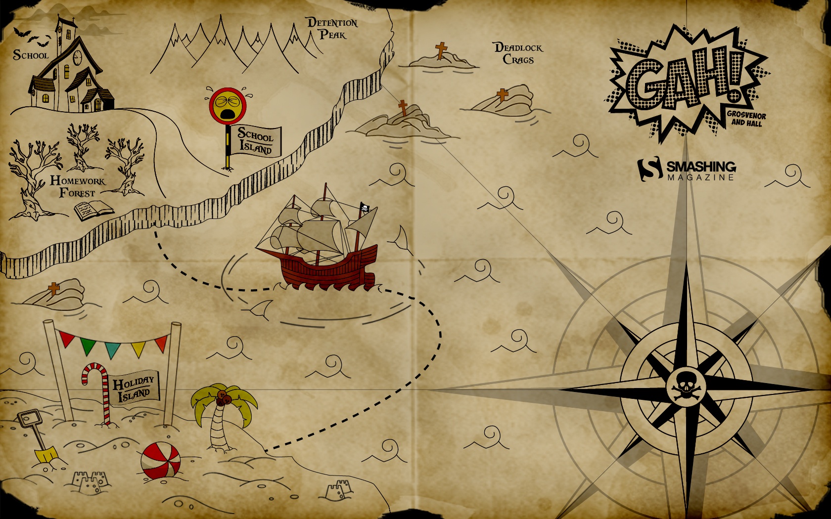
Back To School Me Hearties
"19th September is ‘International Talk Like a Pirate Day’ and September is the month our children go back to school after the summer holidays here in the UK. We have combined these two things to bring you the ‘Back to School me Hearties’ desktop wallpaper calendar. We hope you enjoy exploring the wonders of Holiday Island and manage to escape the waiting terrors at School Island! Perhaps you would rather walk the plank and face the shark infested waters than return to School Island?" Designed by Donna Hall and Loren Grosvenor from United Kingdom.

- preview
- with calendar: 1280×800, 1280×1024, 1366×768, 1440×900, 1680×1050
- without calendar: 1280×800, 1280×1024, 1366×768, 1440×900, 1680×1050
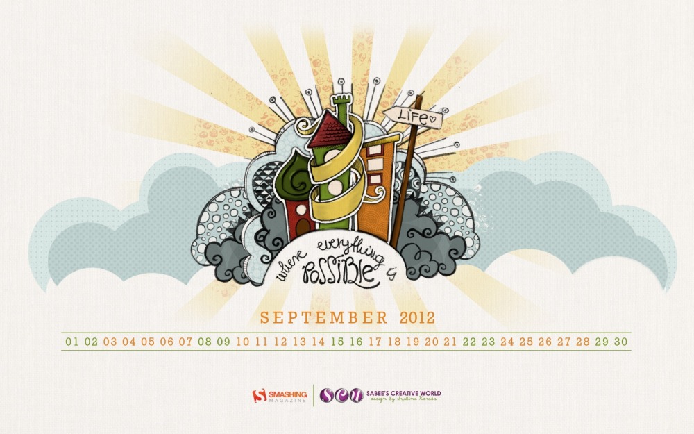
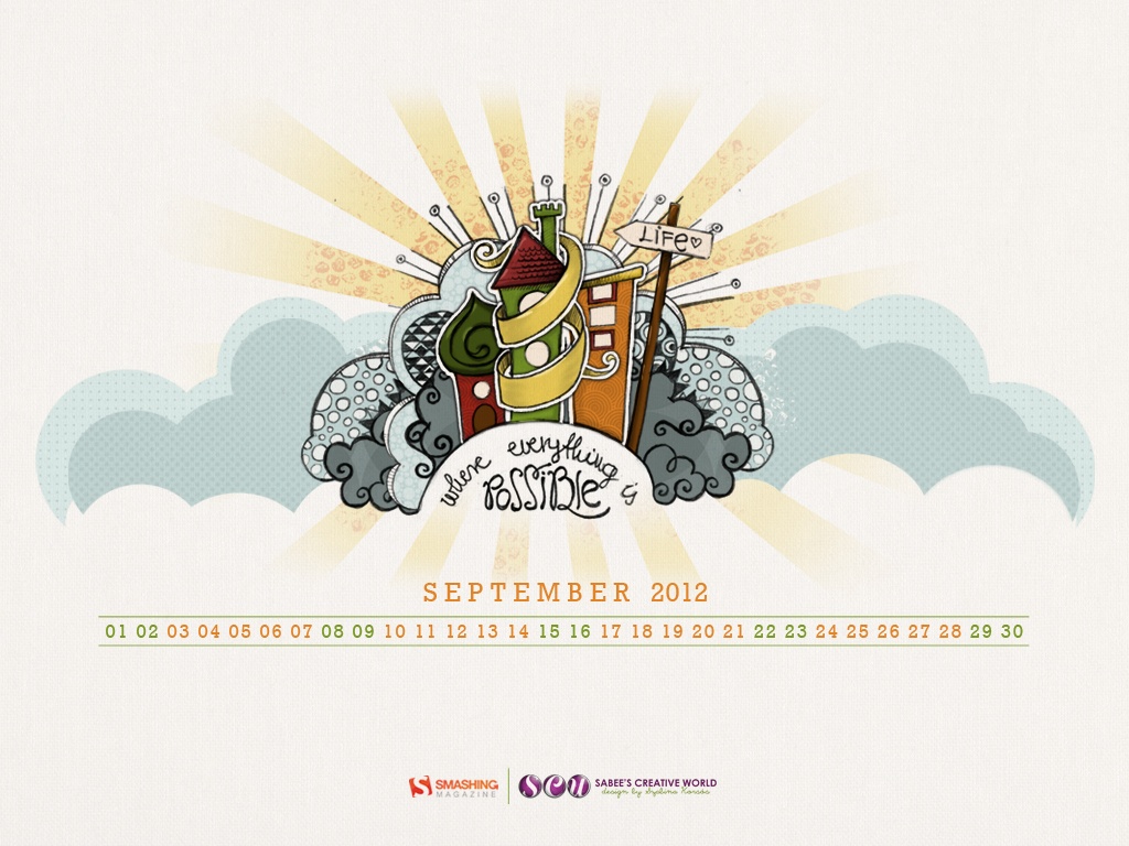
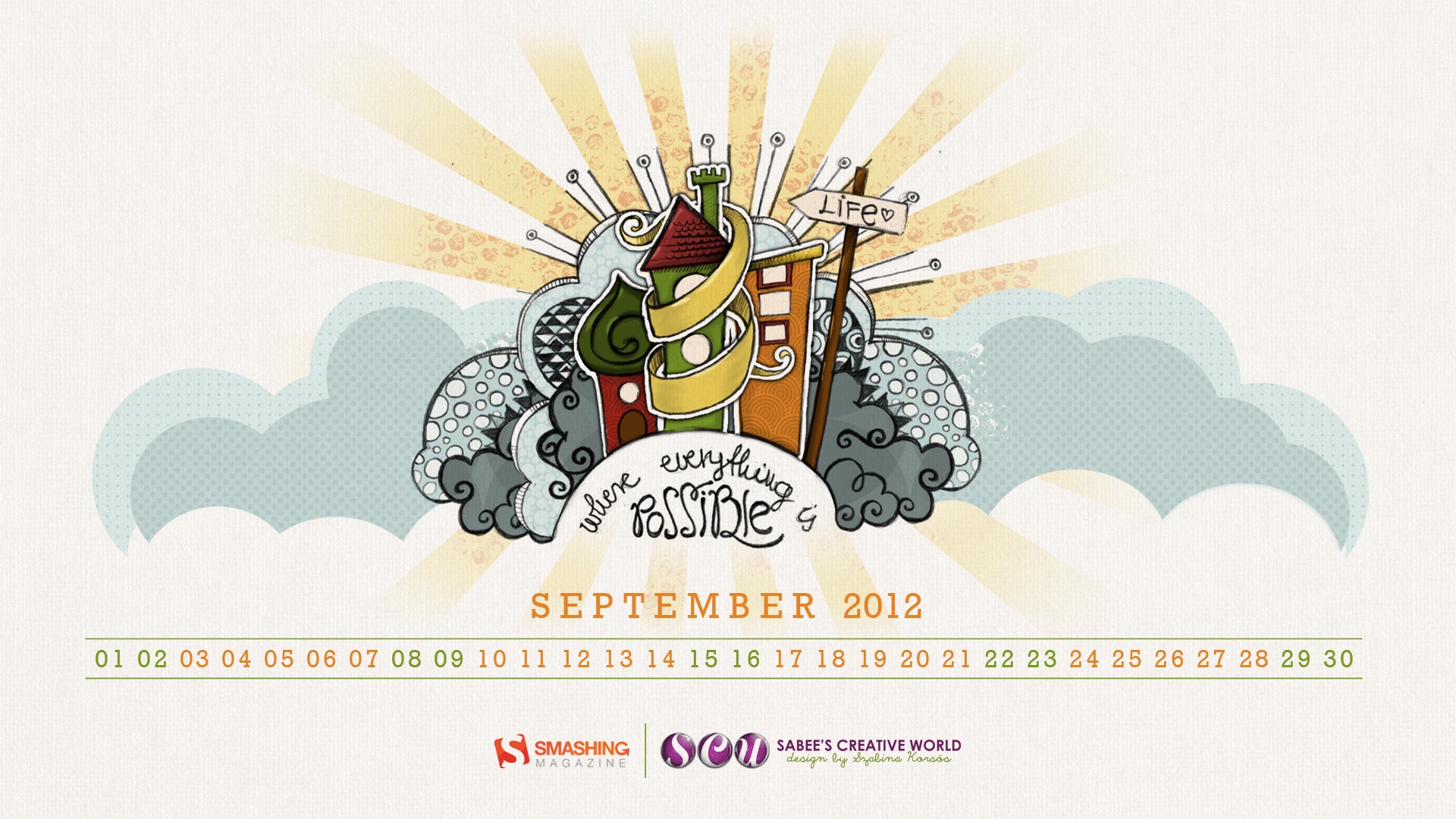
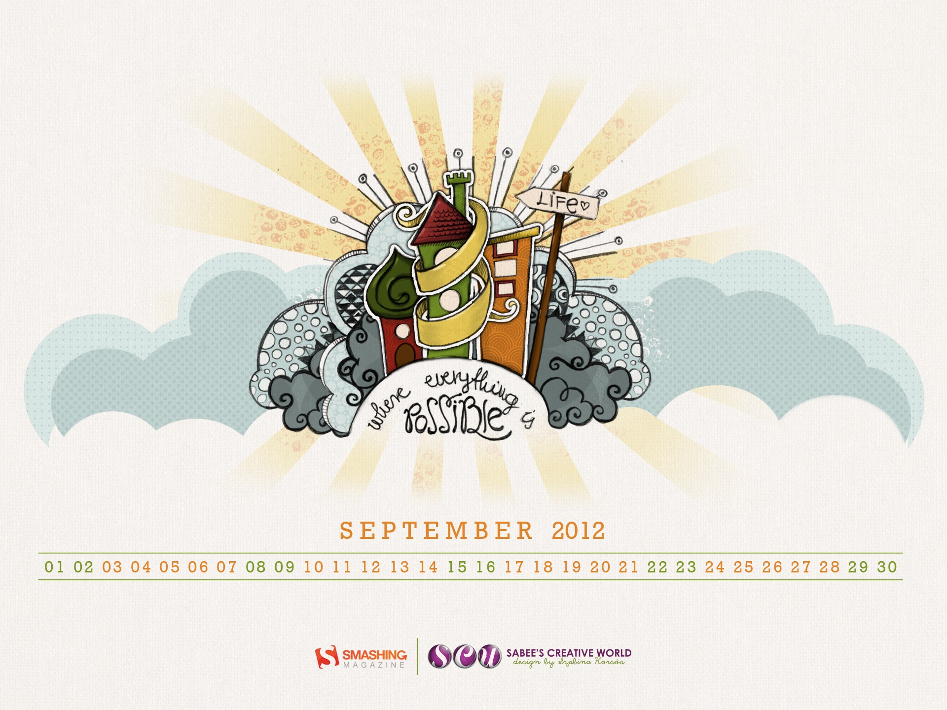
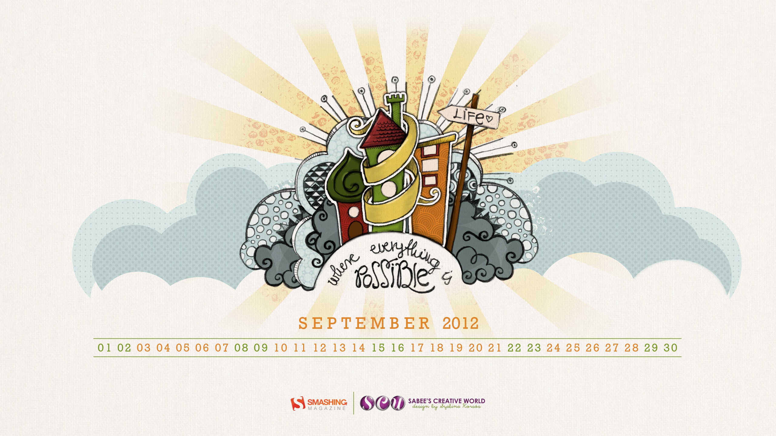
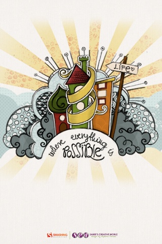
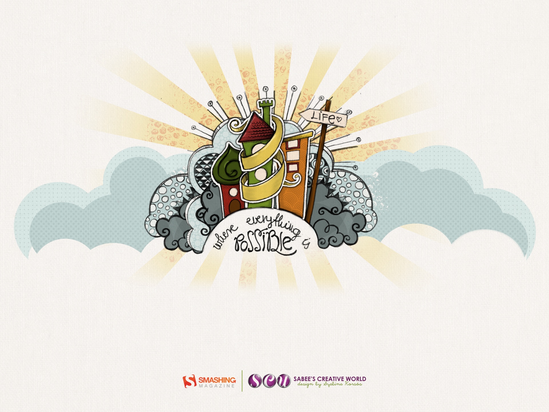
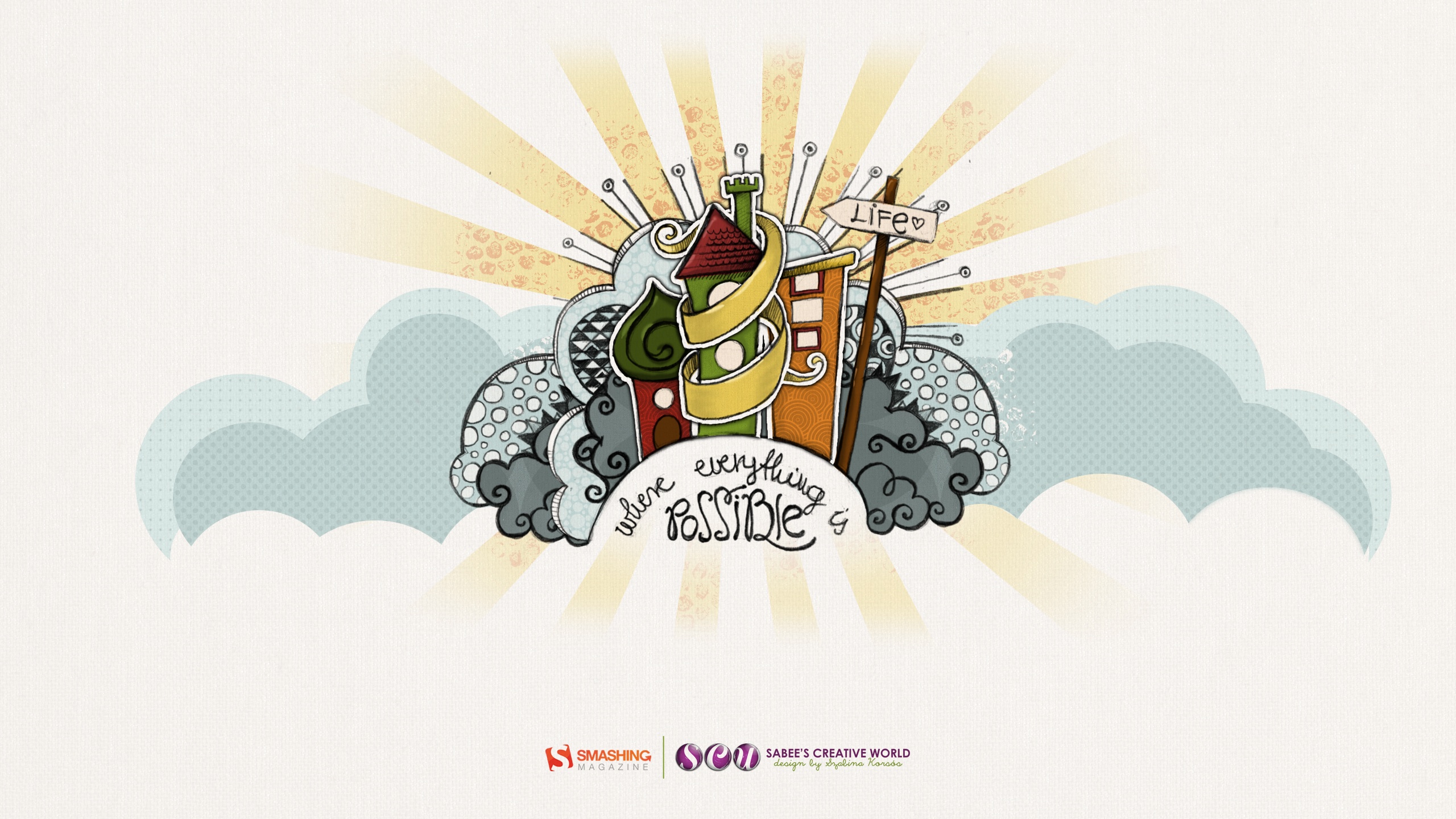
Life
"This drawing was done first as a pencil sketch, then traced and colored in Photoshop." Designed by Szabina Korsos from Hungary.
- preview
- with calendar: 1024×768, 1024×1024, 1280×800, 1680×1050, 1920×1080, 1920×1440, 2560×1440
- without calendar: 320×480, 1024×768, 1280×800, 1680×1050, 1920×1080, 1920×1440, 2560×1440
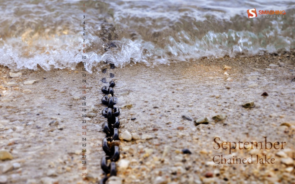
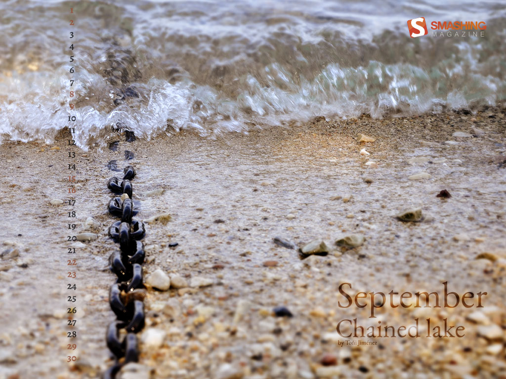
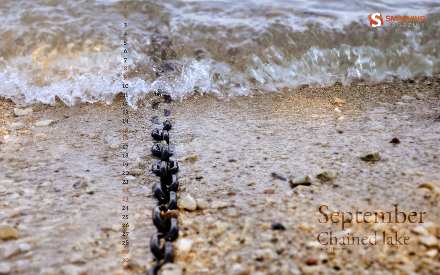
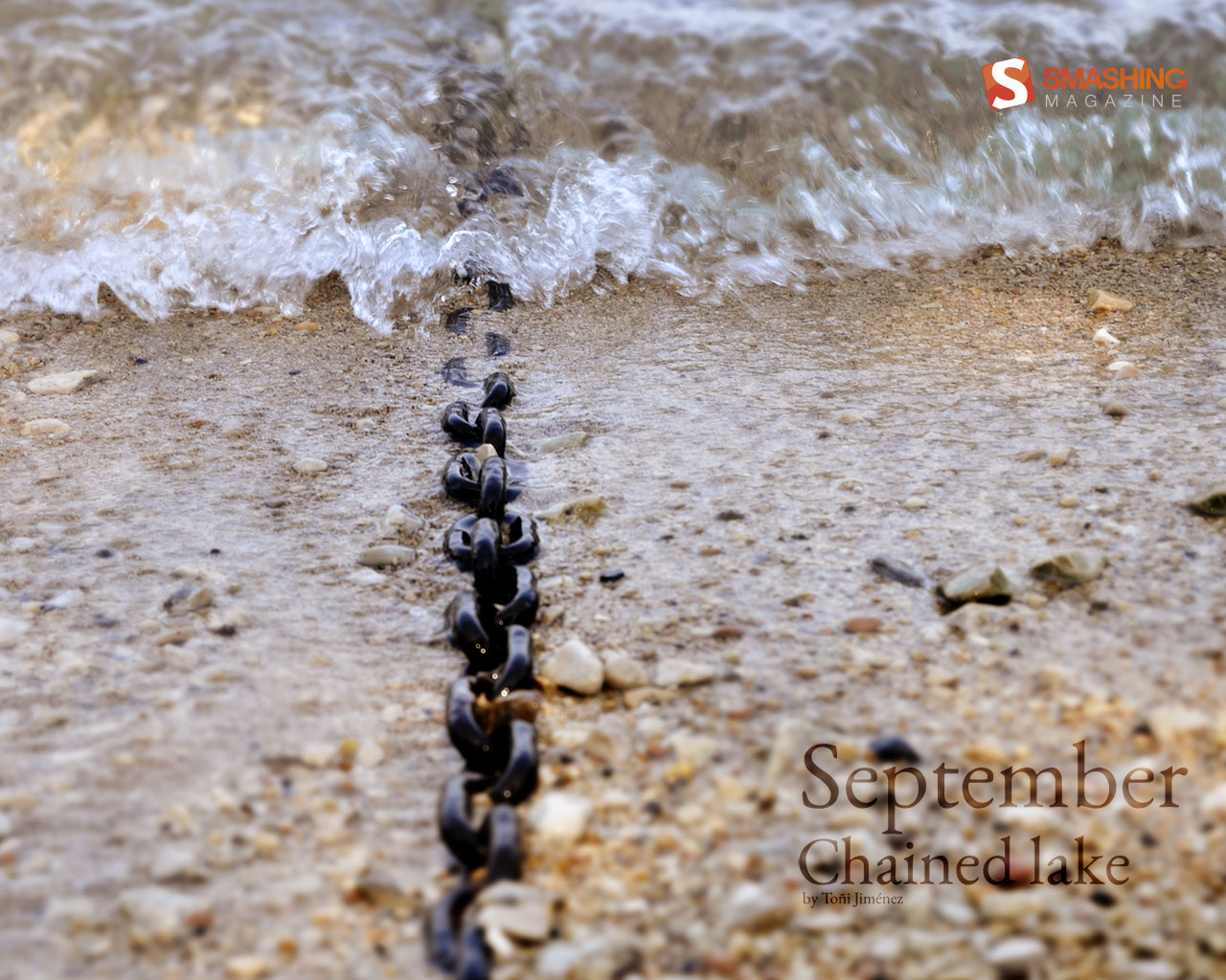
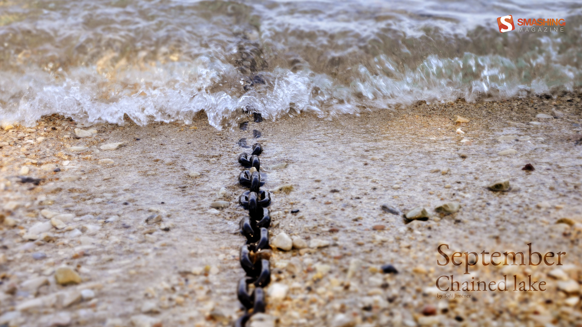
Chained Lake
"Chain in a lake (Garda, Italy)." Designed by Toci Jimenez from Spain.
- preview
- with calendar: 1024×768, 1280×1024, 1440×900, 1920×1080, 1920×1200, 2560×1440
- without calendar: 1024×768, 1280×1024, 1440×900, 1920×1080, 1920×1200, 2560×1440
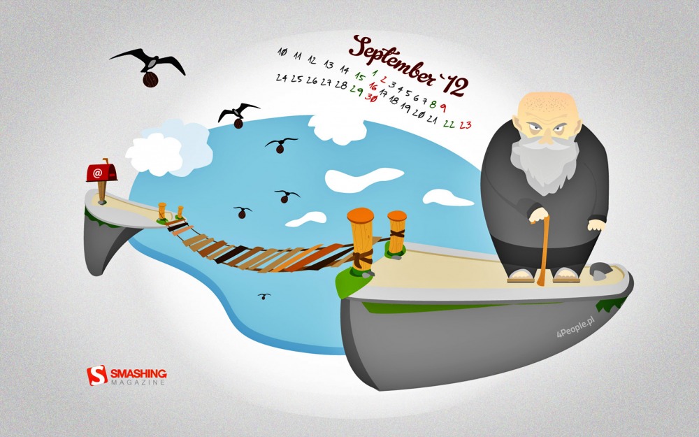
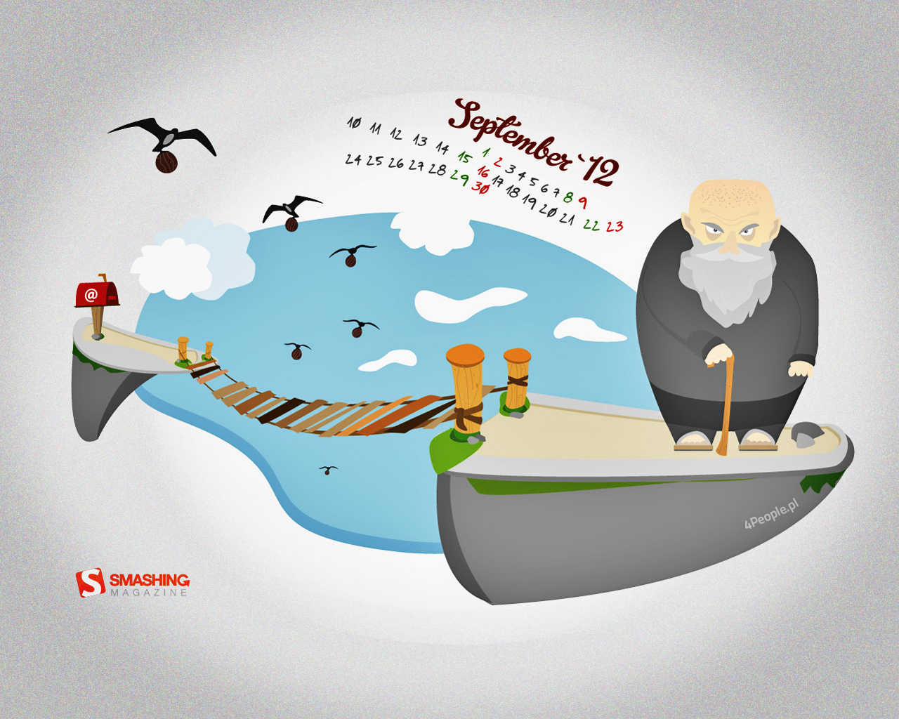
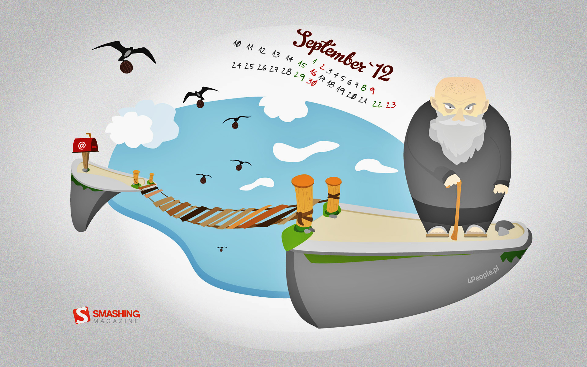
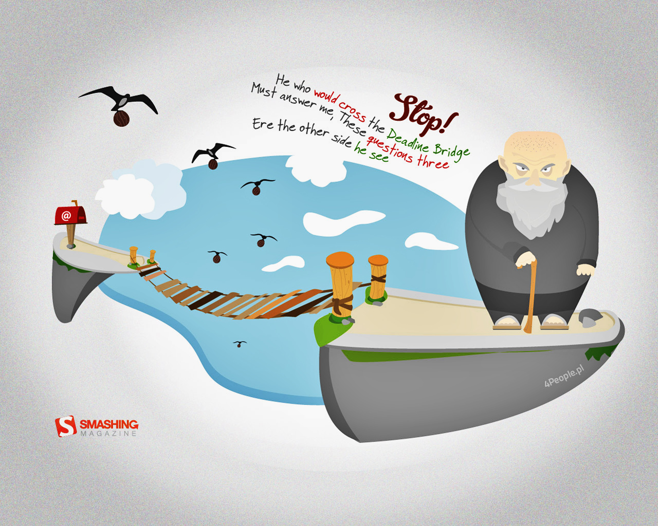
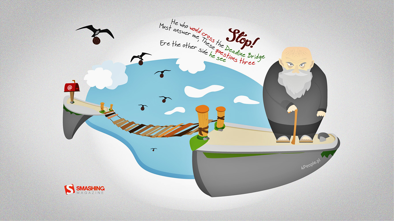
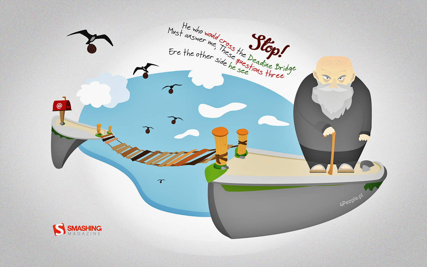
Deadline Bridge
"He who would cross the Deadline Bridge
Must answer me,
These questions three
Ere the other side he see.
— Wallpaper is based on the film “Monty Python and the Holy Grail”." Designed by Patrycjusz Brzezinski For 4people.pl from Poland.
- preview
- with calendar: 1280×800, 1280×1024, 1366×768, 1440×900, 1680×1050, 1920×1080, 1920×1200
- without calendar: 1280×800, 1280×1024, 1366×768, 1440×900, 1680×1050, 1920×1080, 1920×1200
Autumn Memories
"September shares with us the end of summer. Autumn is coming, all around is full of orange shades, a perfect weather to relax, to admire the infinite world from your window." Designed by Simona Gosu from Romania.

- preview
- with calendar: 480×320, 1200×750, 1280×800, 1440×900, 1600×900, 1920×1080, 1920×1200, 2560×1600, 2880×1800
- without calendar: 480×320, 1200×750, 1280×800, 1440×900, 1600×900, 1920×1080, 1920×1200, 2560×1600, 2880×1800
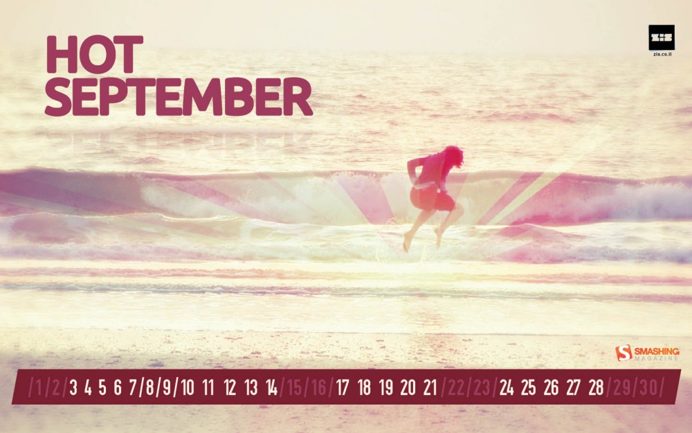
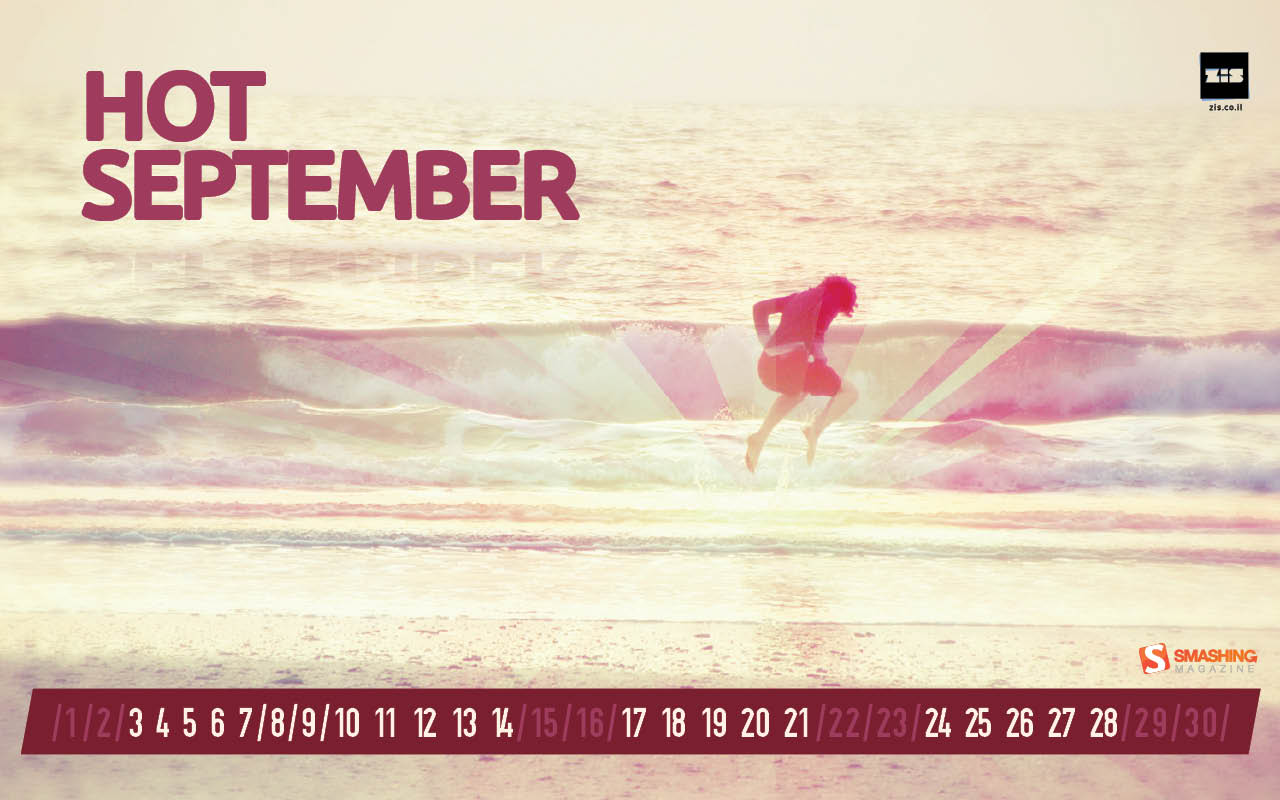
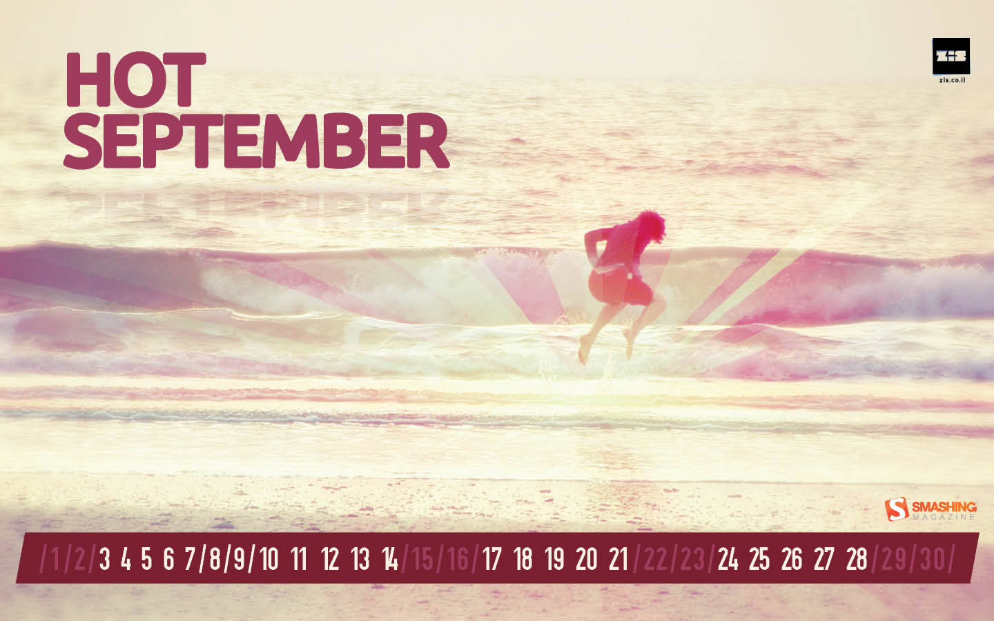
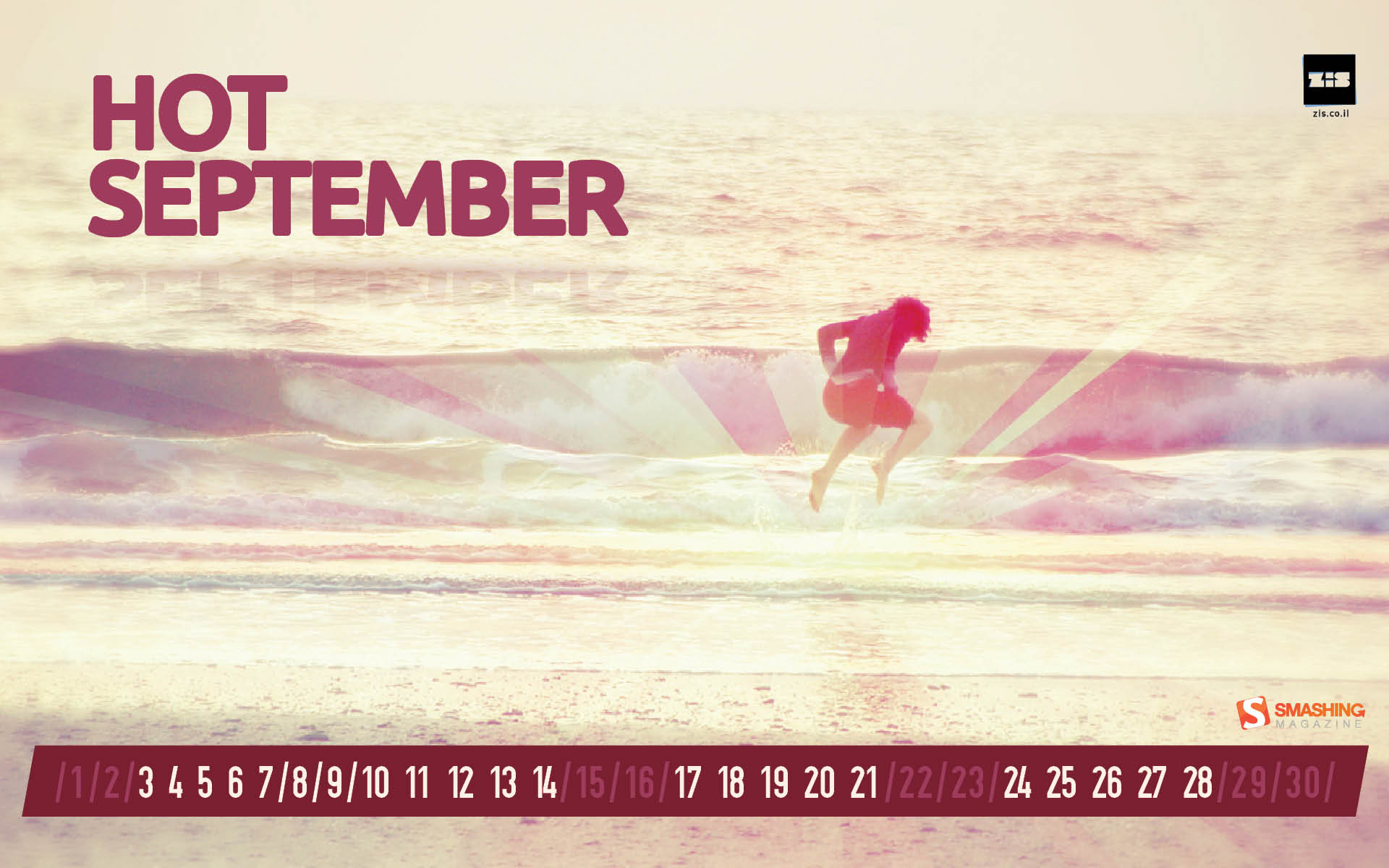
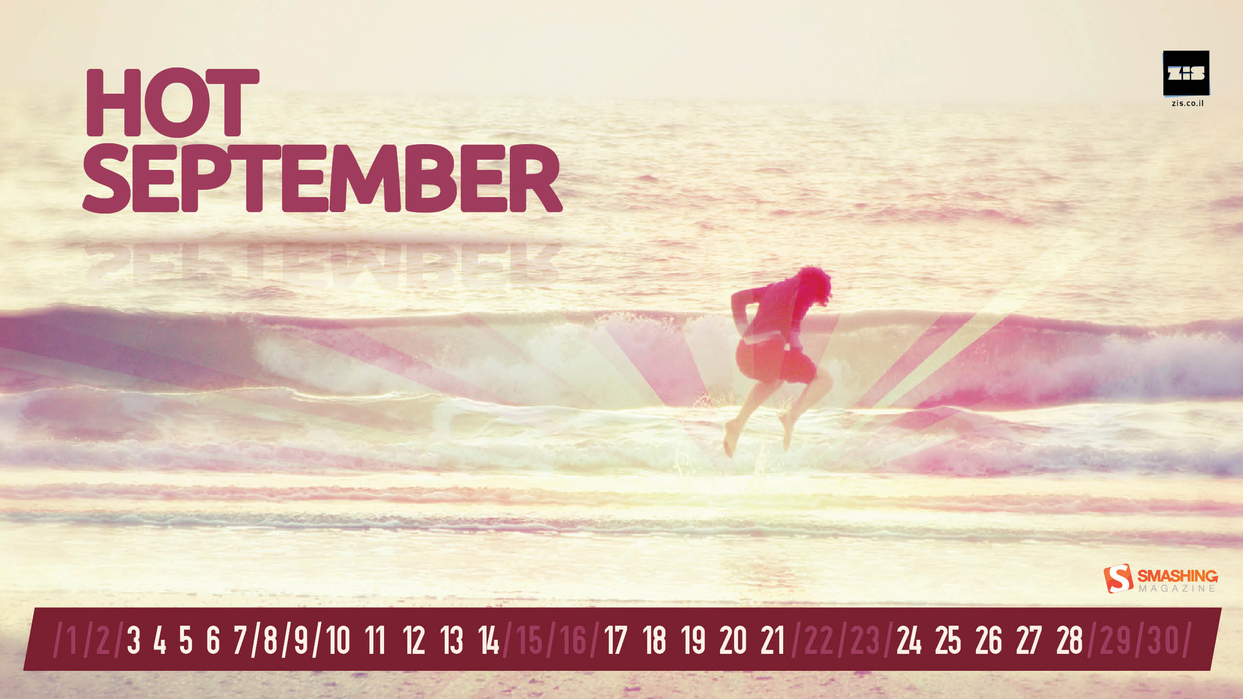
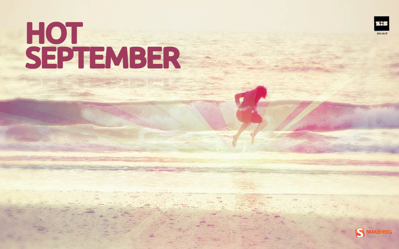
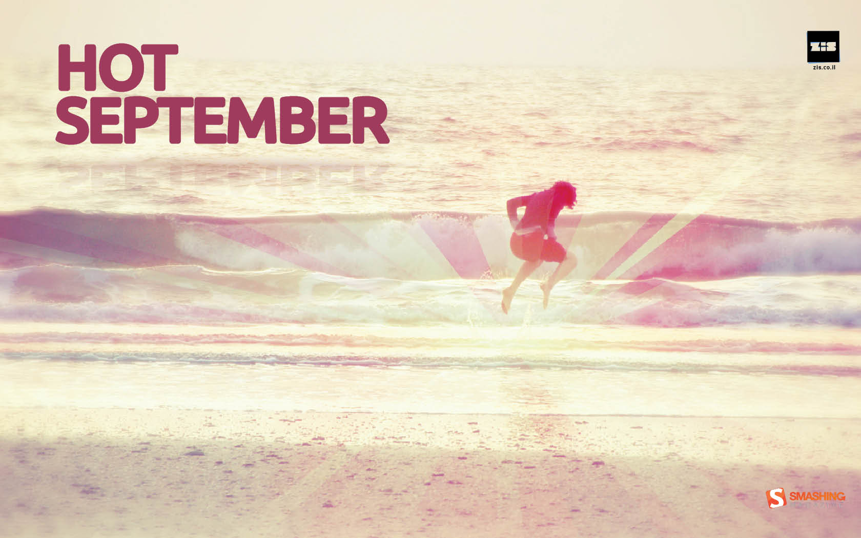
Hot September
"Summer’s heat is too exhausting. Let us just rest for a little while." Designed by Zis | Inbal Zissu from Israel.
- preview
- with calendar: 1280×800, 1440×900, 1680×1050, 1920×1200, 2560×1440
- without calendar: 1280×800, 1440×900, 1680×1050, 1920×1200, 2560×1440
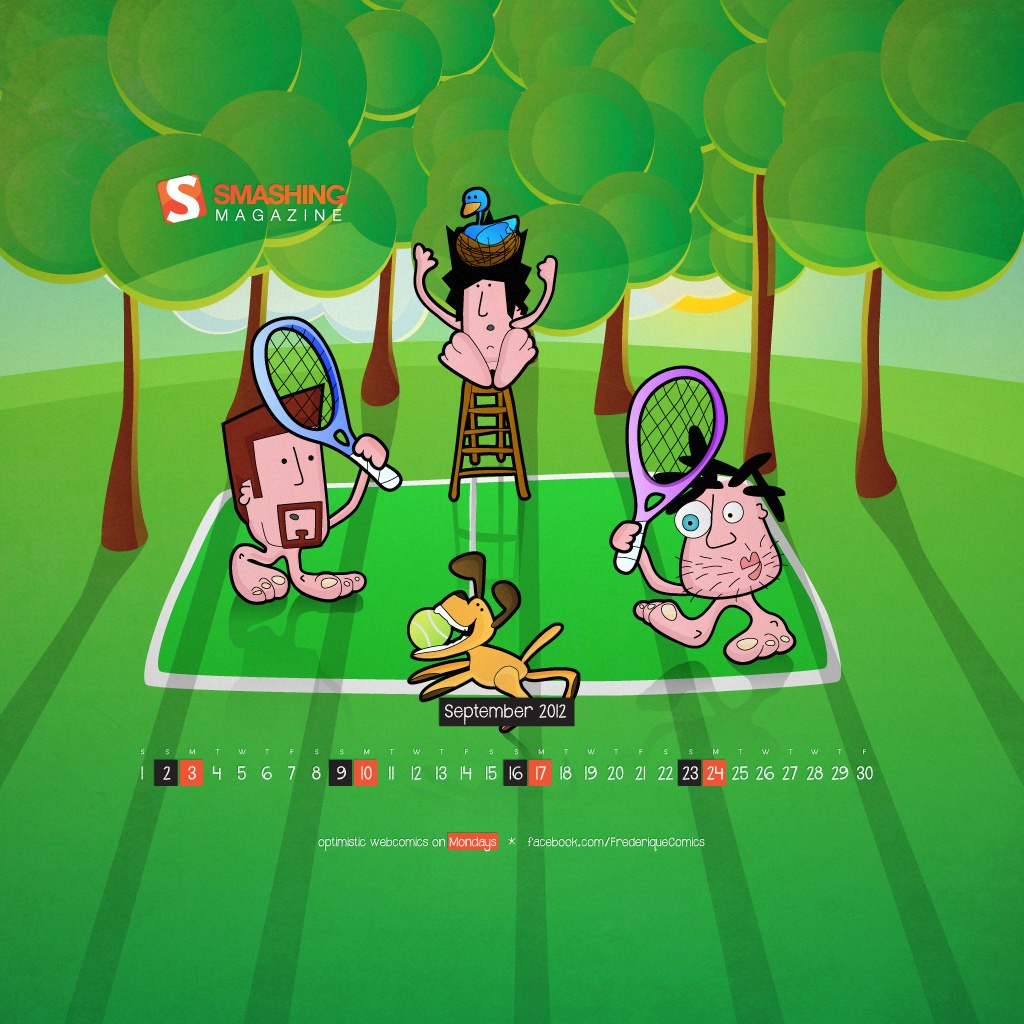
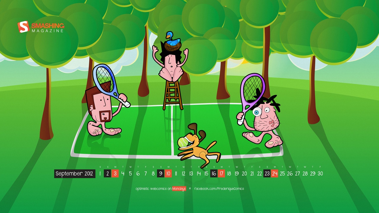
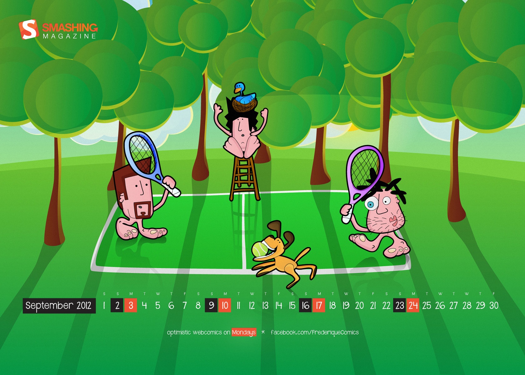
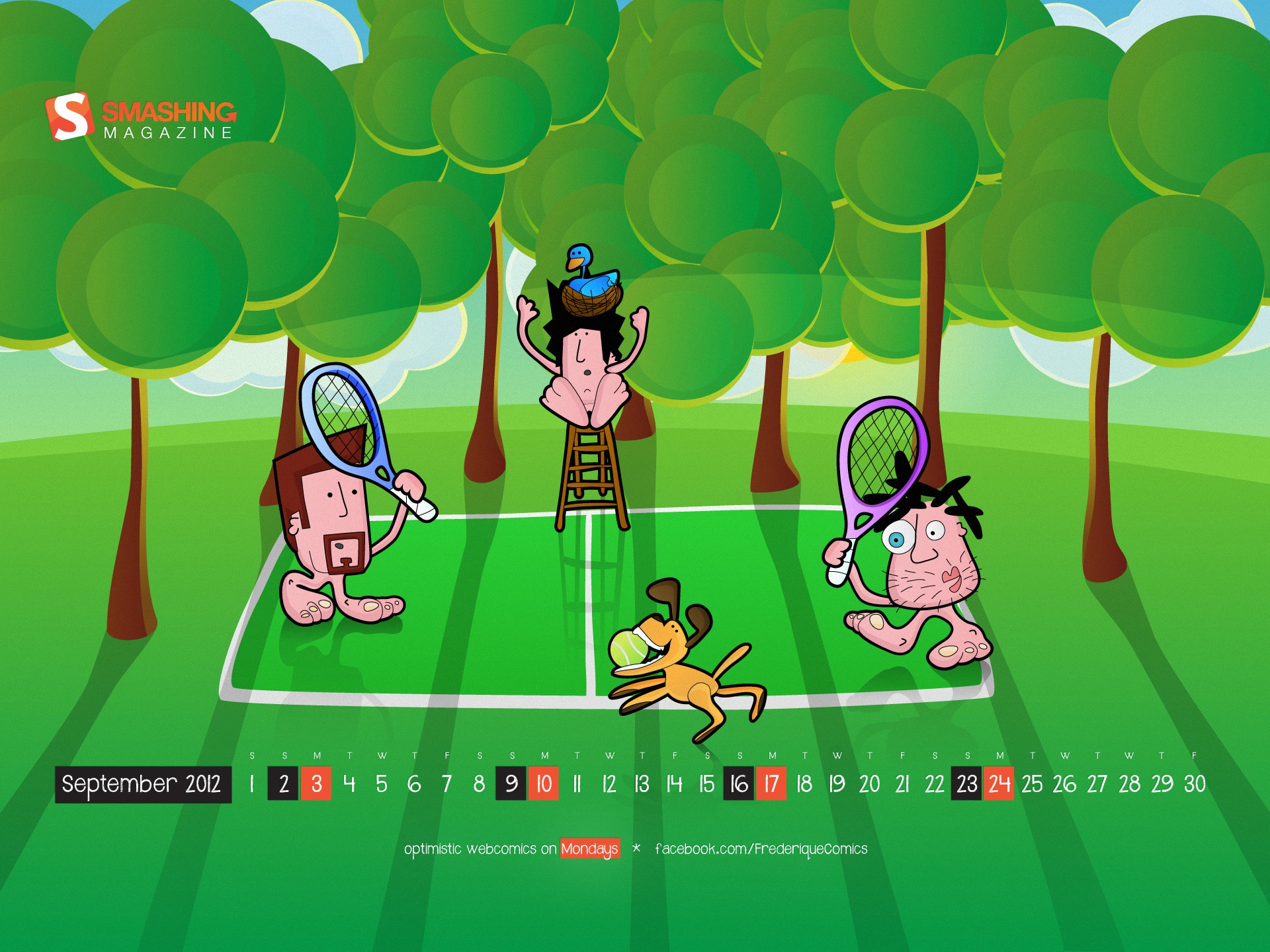
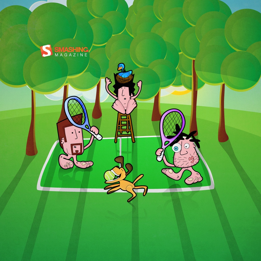
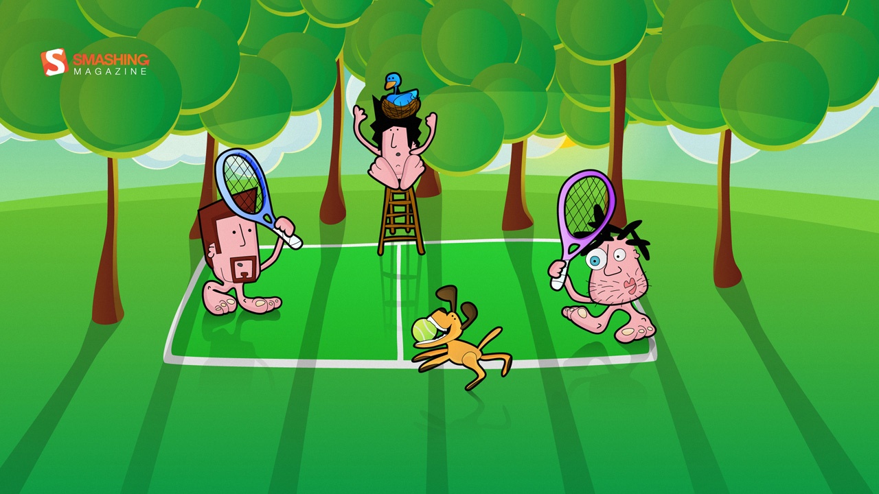
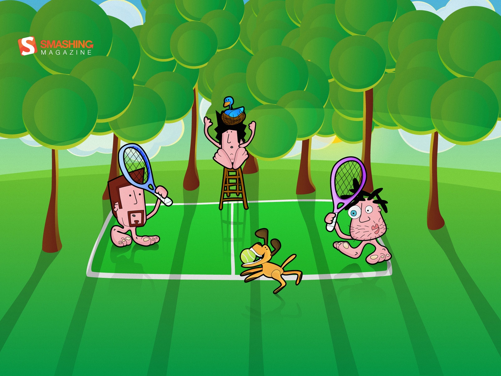
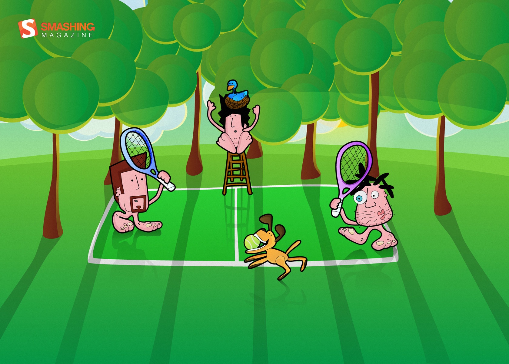
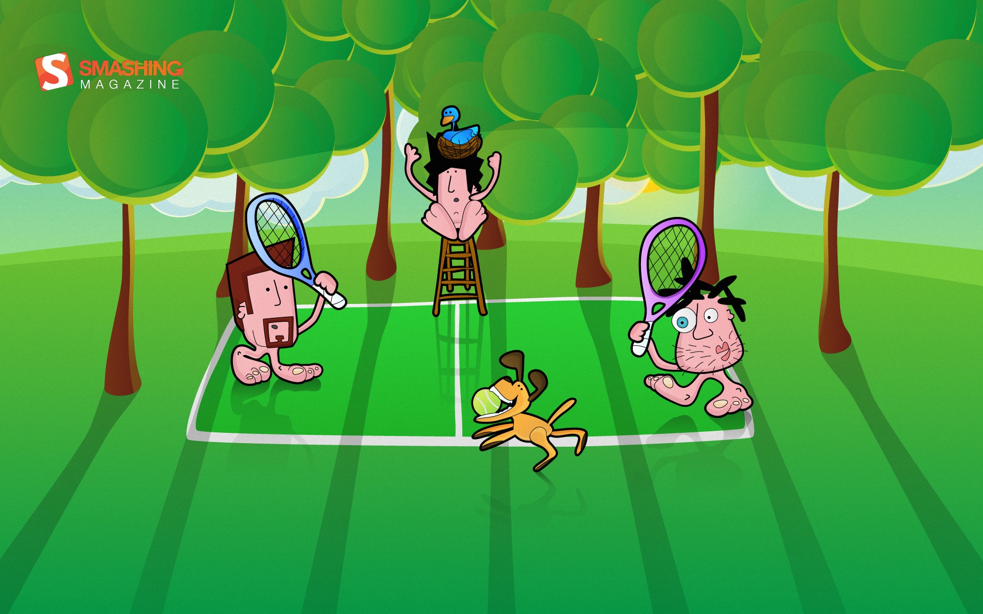
Frederique In September
"Frederique is a satiric comic strip about hanging around at beaches, getting rejected by hot chicks and enjoying life with full blown optimism." Designed by Richard Dancsi from Hungary/Germany.

- preview
- with calendar: 1024×1024, 1280×720, 1280×960, 1440×900, 1600×1200, 1680×1200, 1920×1080, 1920×1200, 1920×1440, 2560×1440
- without calendar: 1024×1024, 1280×720, 1280×960, 1600×1200, 1680×1200, 1920×1080, 1920×1200, 1920×1440, 2560×1440
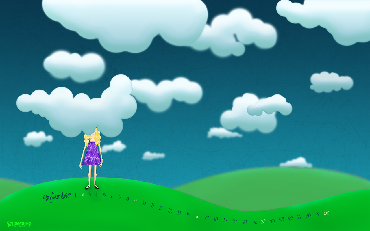
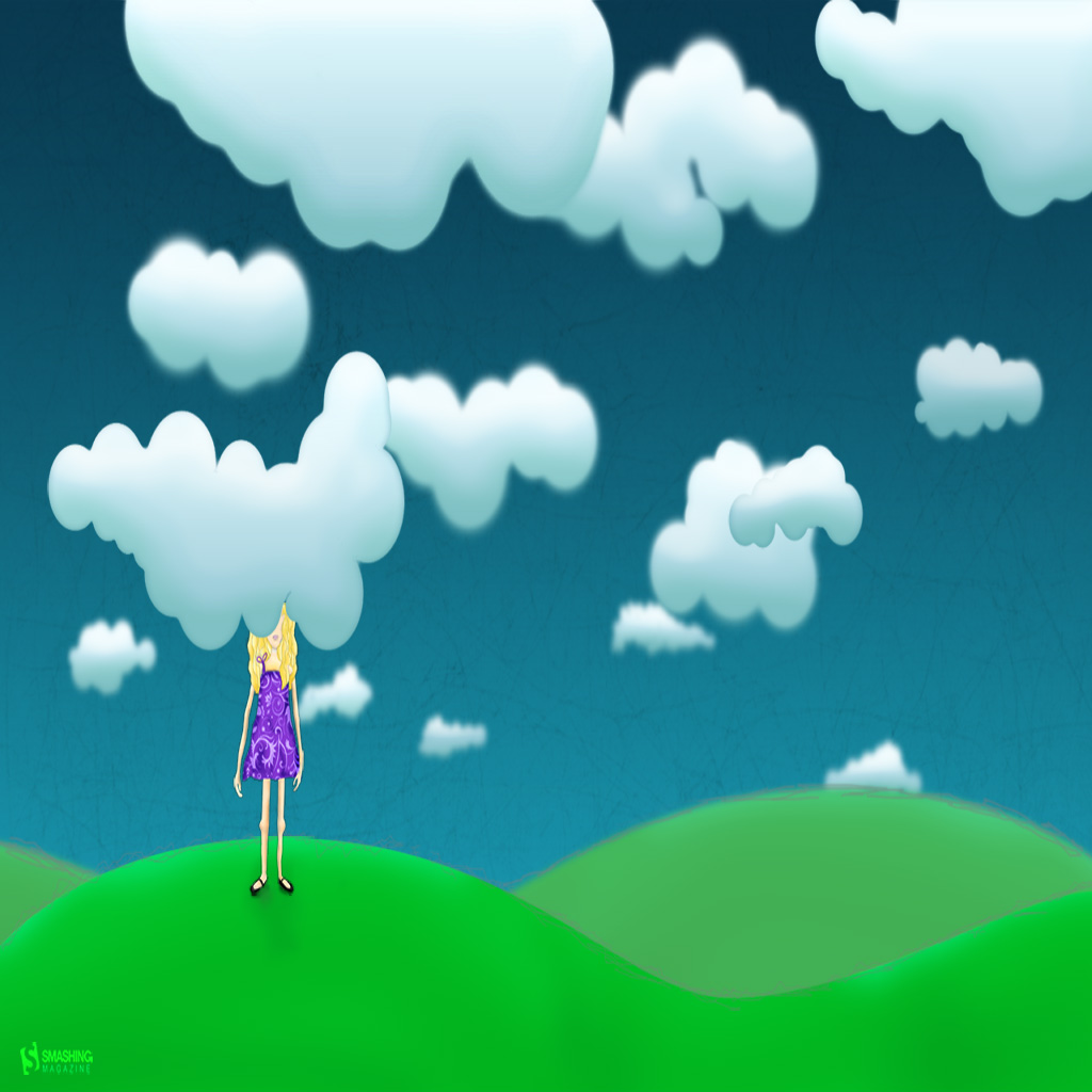
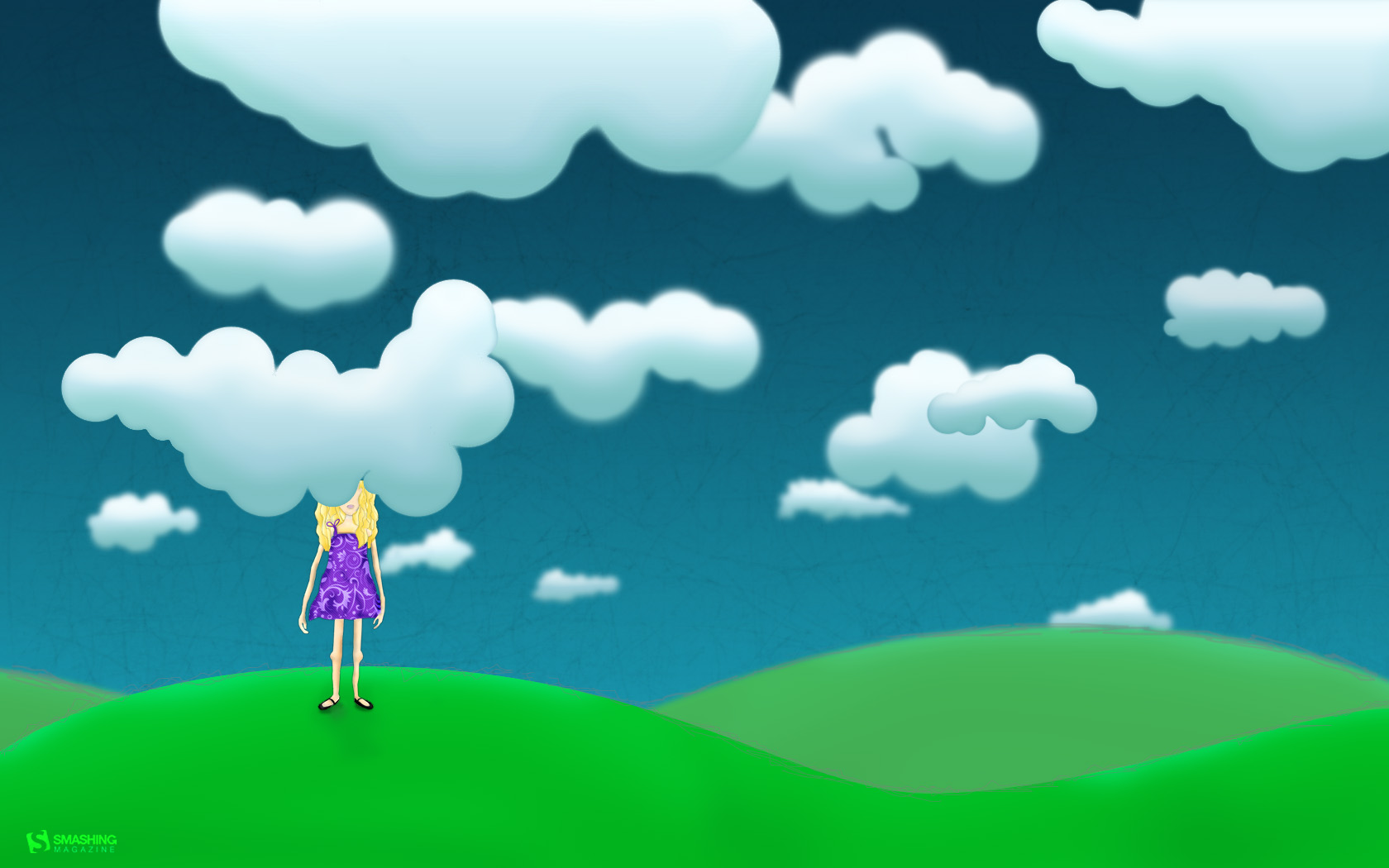
Head In The Clouds
"Keep your head in the clouds and your feet on the ground." Designed by Kari Andresen from USA.

- preview
- with calendar: 1024×768, 1024×1024, 1280×800, 1440×900, 1680×1050
- without calendar: 1024×768, 1024×1024, 1280×800, 1440×900, 1680×1050
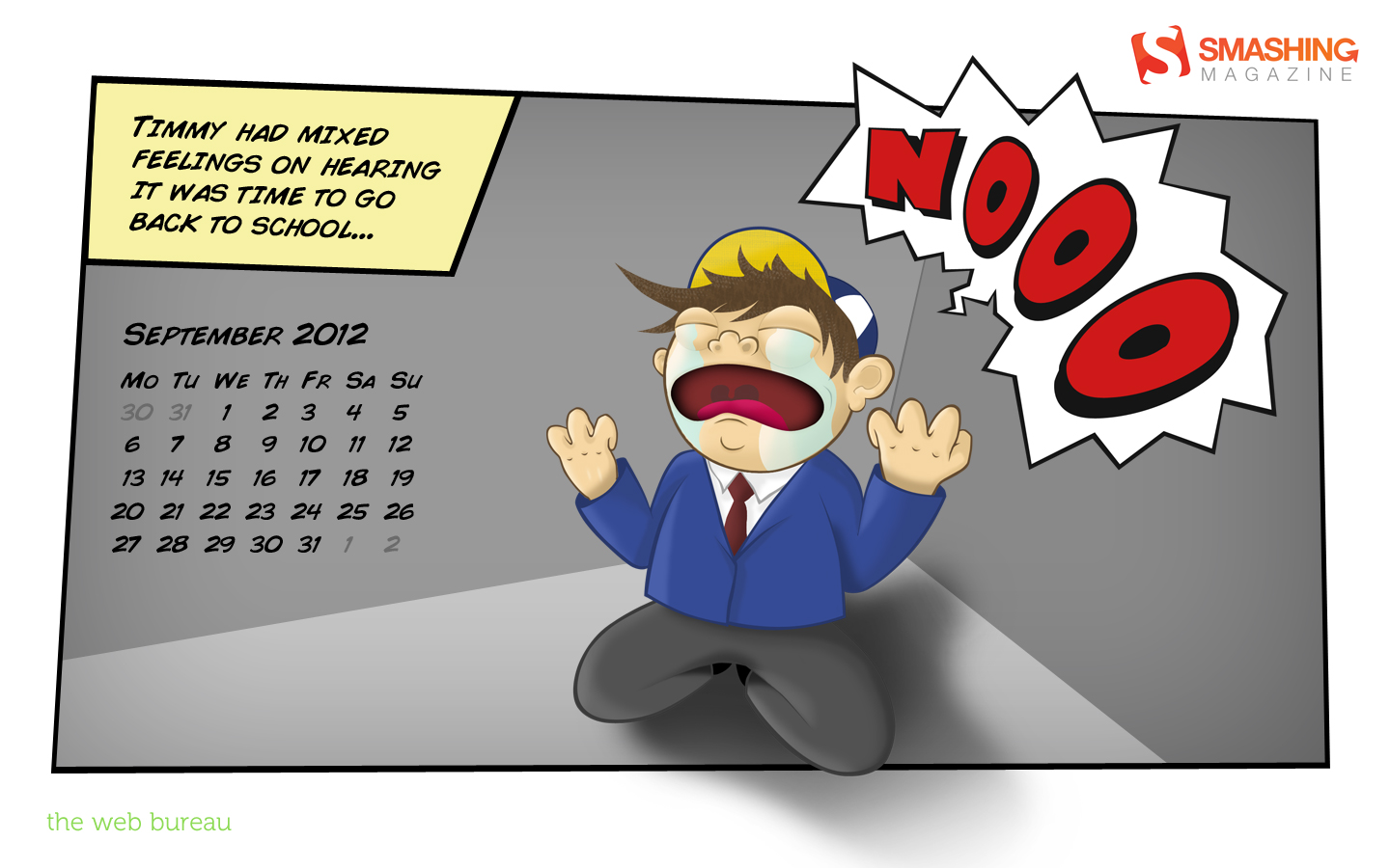
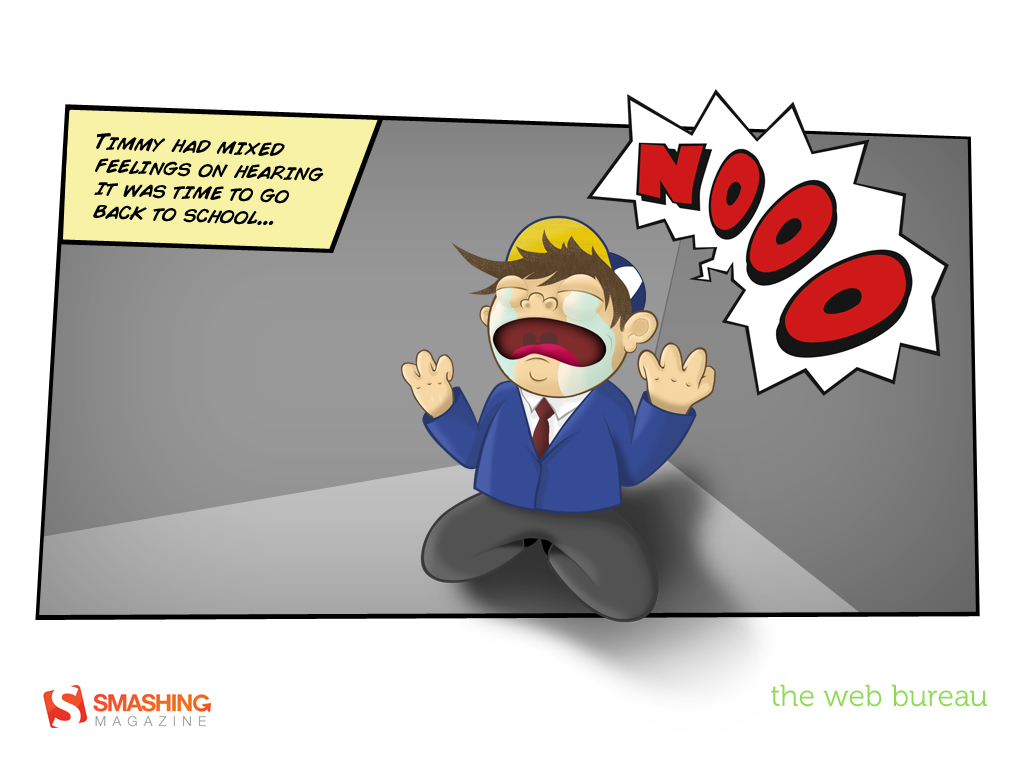
Back To School
"A simple illustration capturing the emotions of going back to school." Designed by Mark Mcgall from Northern Ireland.

- preview
- with calendar: 320×480, 1024×768, 1024×1024, 1280×800, 1440×900, 1920×1080
- without calendar: 320×480, 1024×768, 1024×1024, 1280×800, 1440×900, 1920×1080
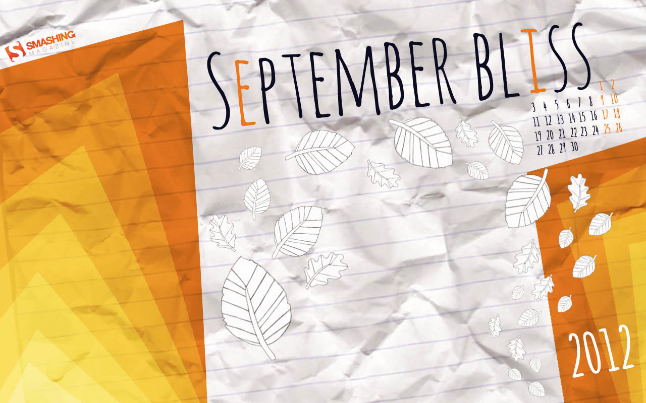
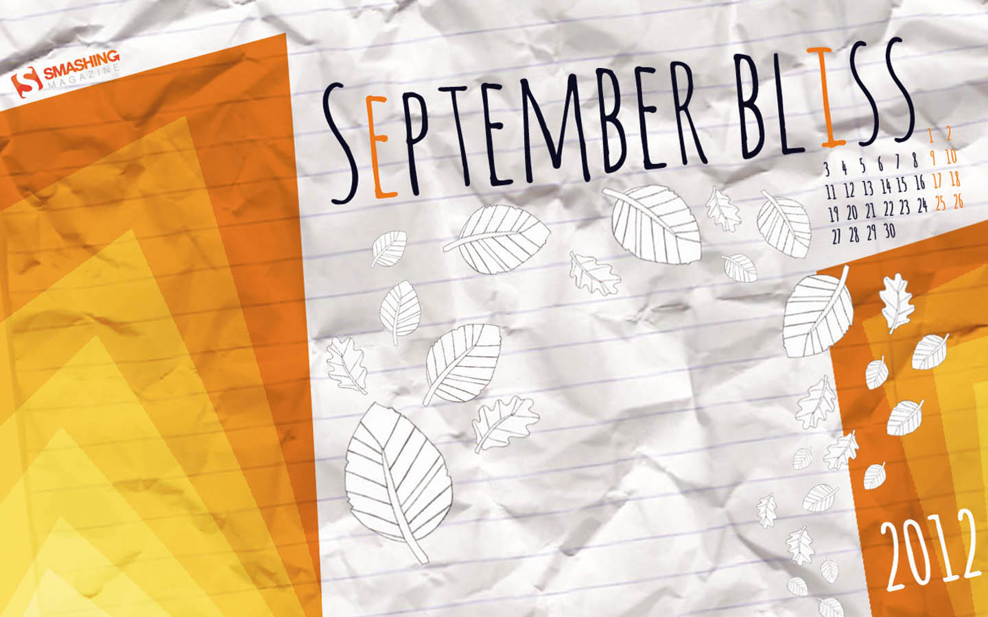
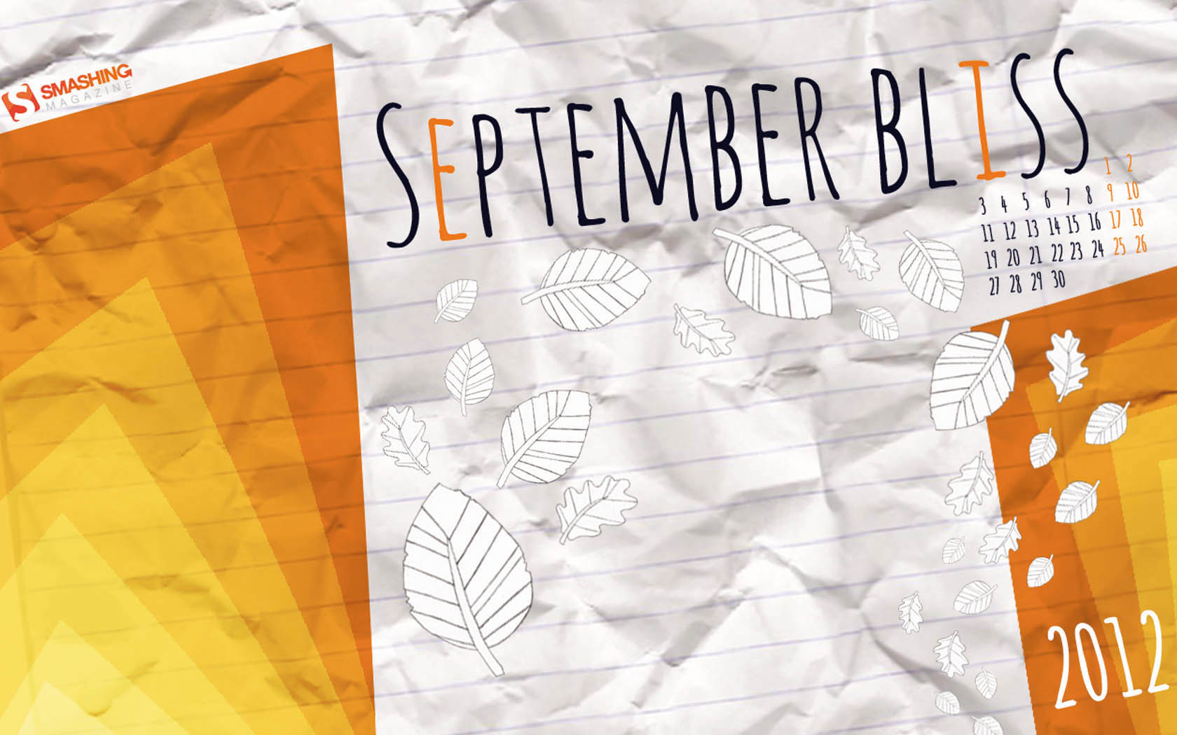
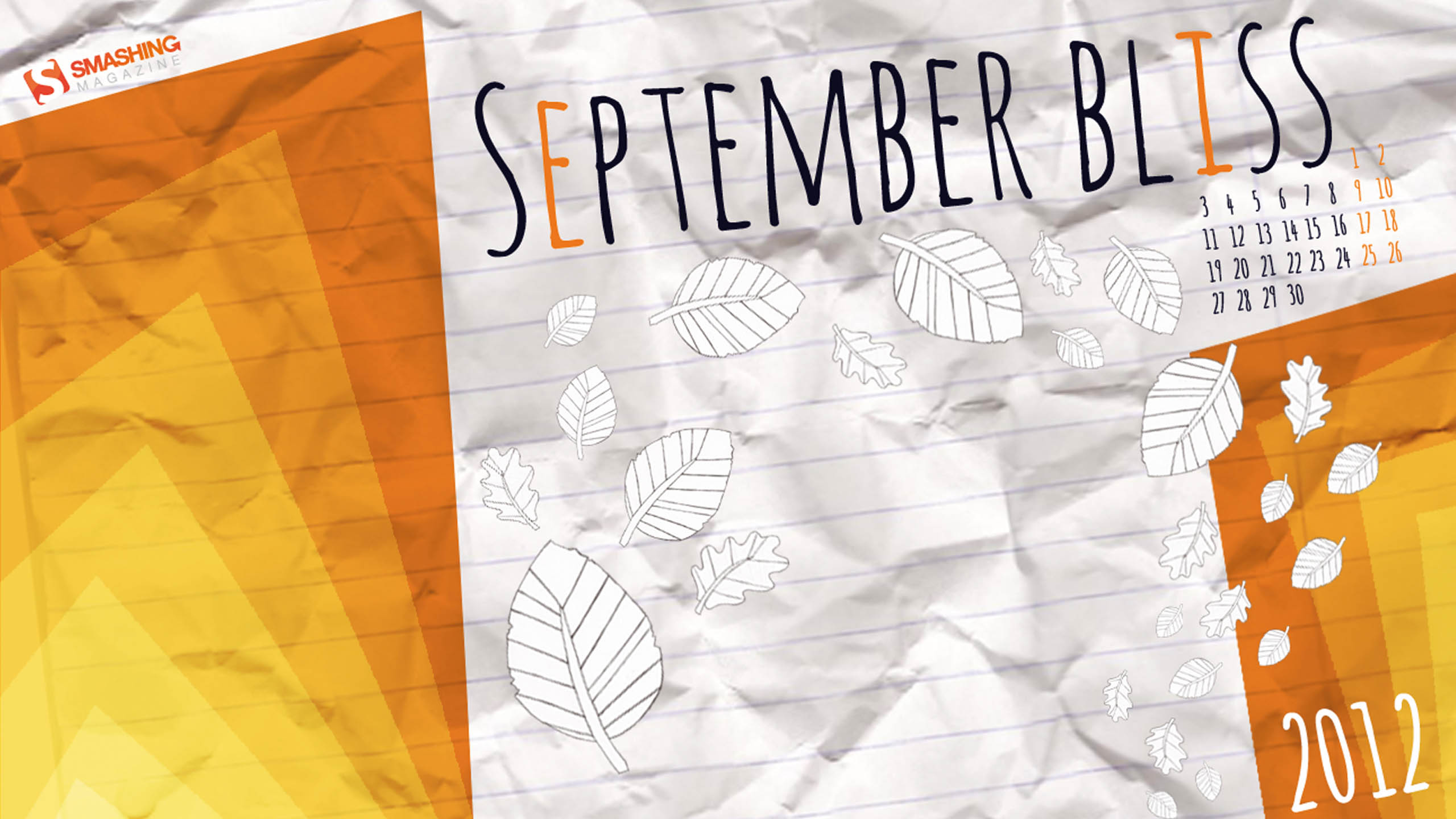
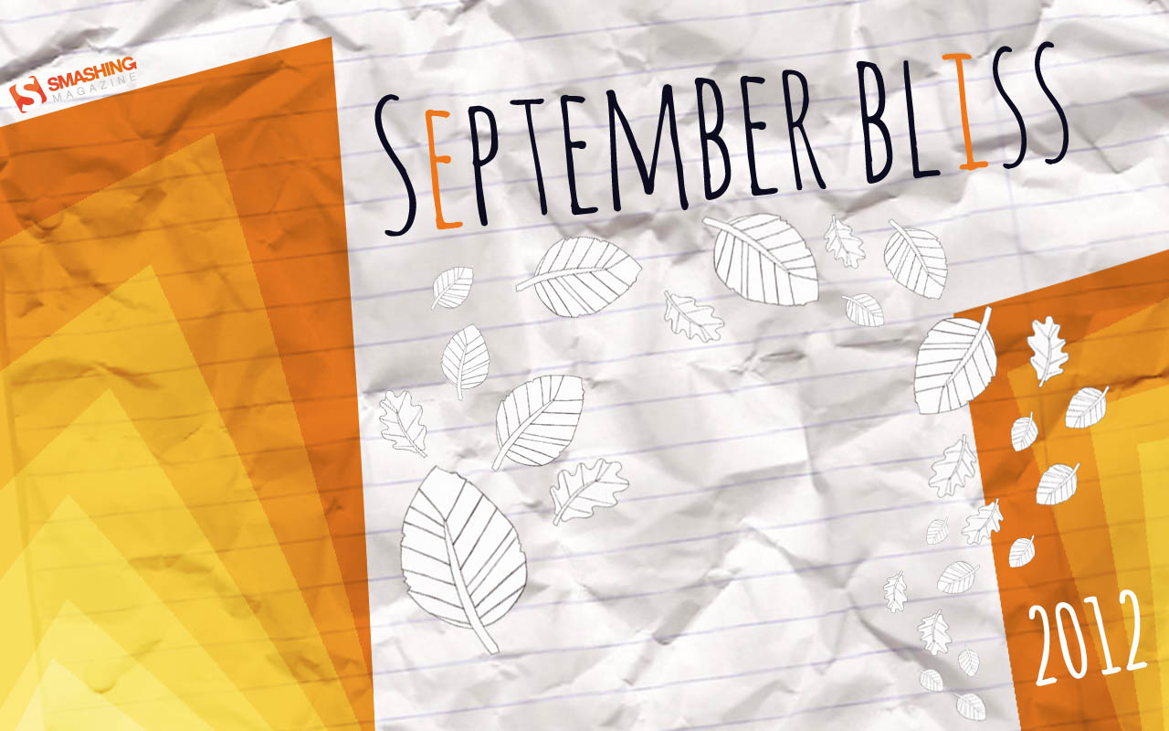
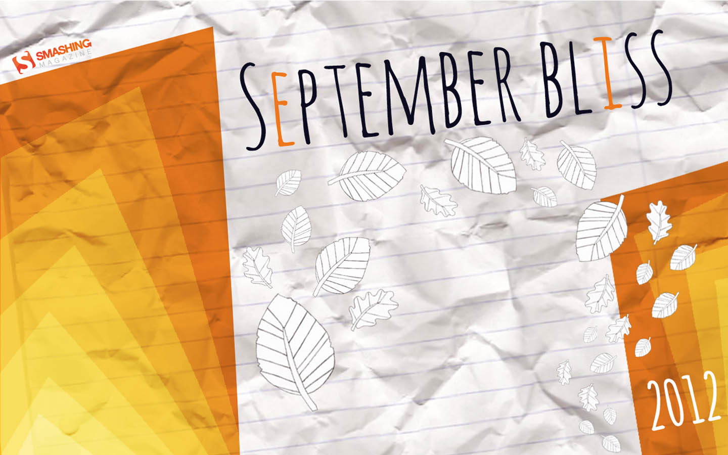
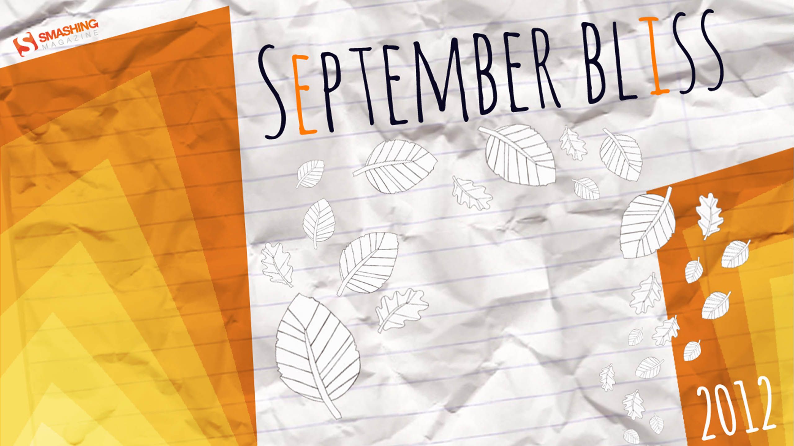
September Bliss
"This wallpaper represents both the early autumn (with orange colors) and back to school (with paper texture in the background)." Designed by Elise Vanoorbeek from Belgium.

- preview
- with calendar: 1280×800, 1440×900, 1680×1050, 1920×1200, 2560×1440
- without calendar: 1280×800, 1440×900, 1680×1050, 1920×1200, 2560×1440
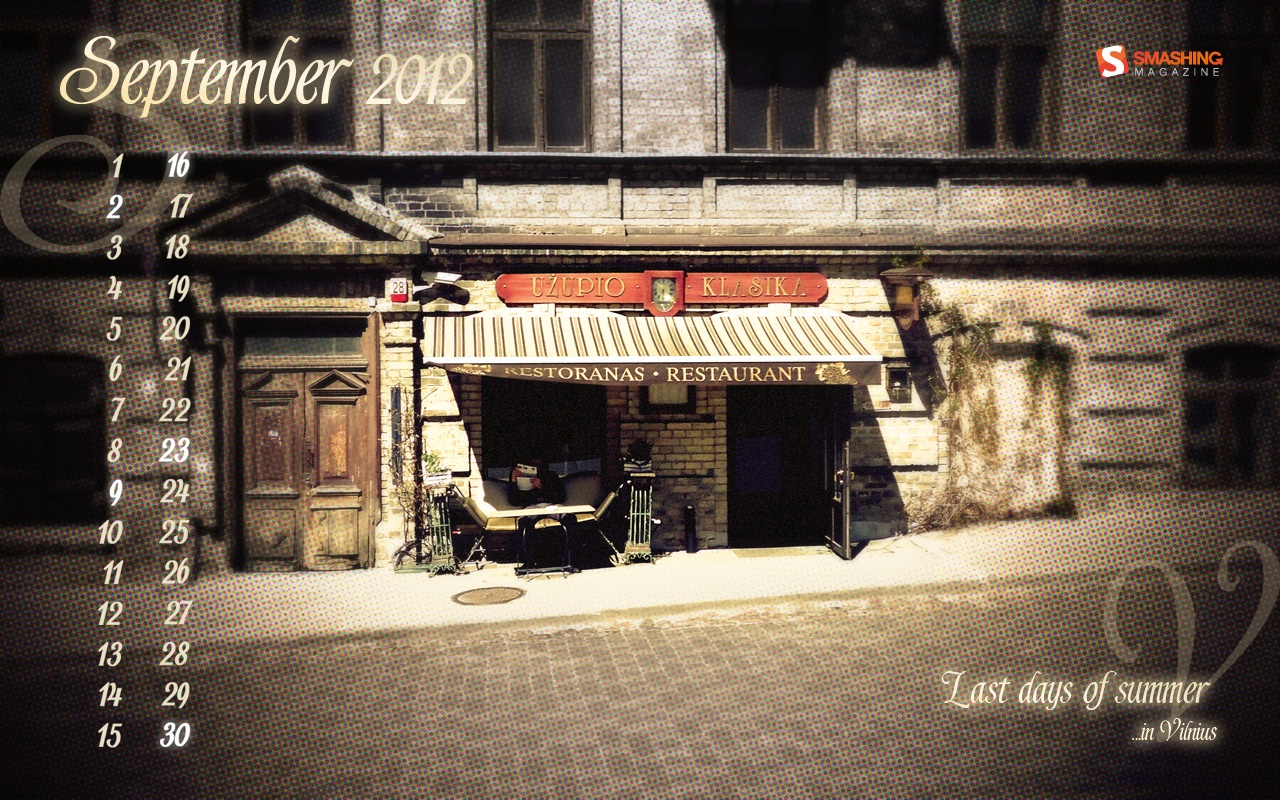
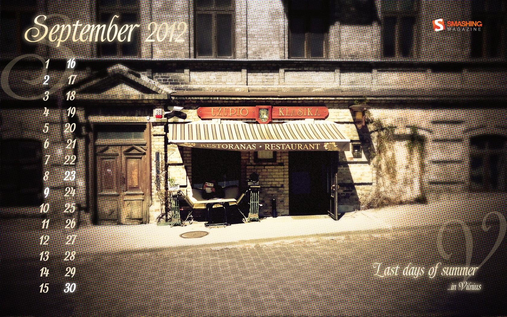
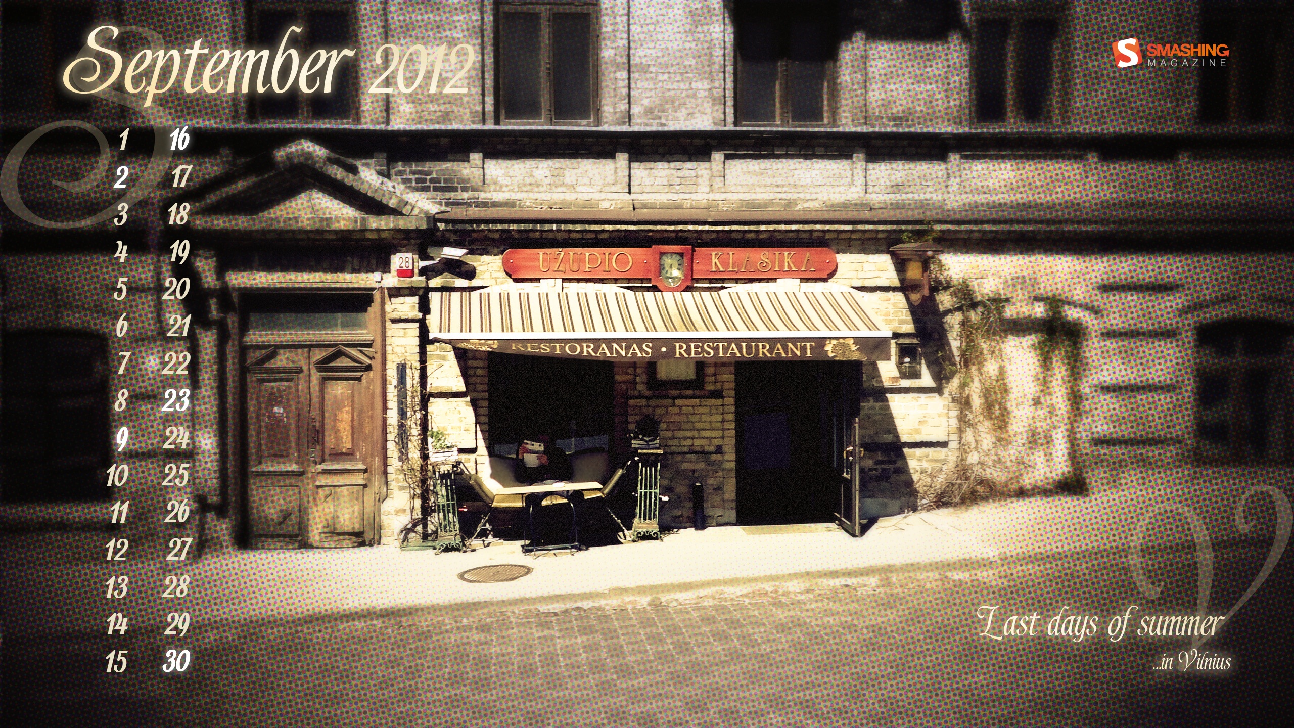
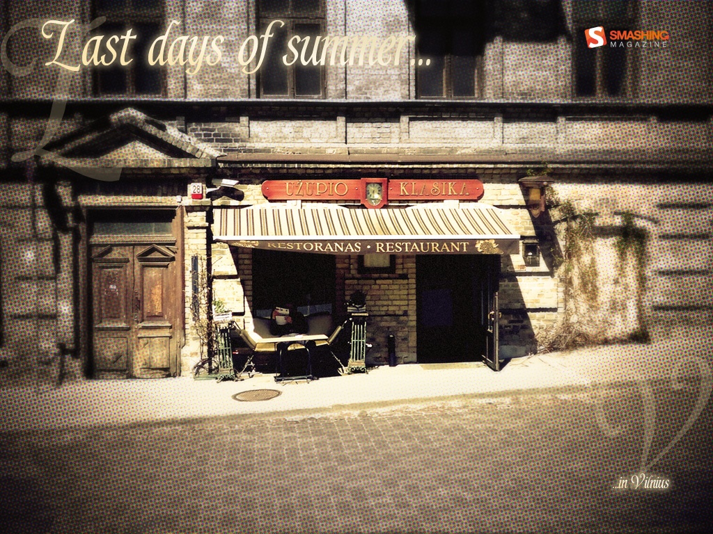
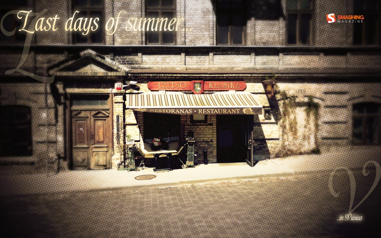
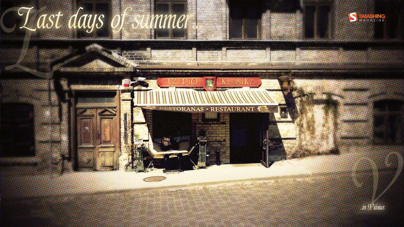
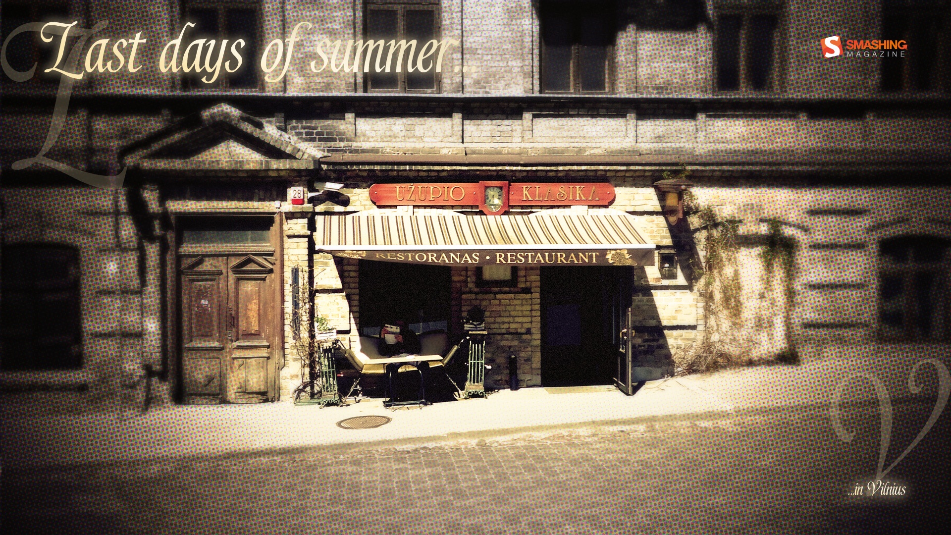
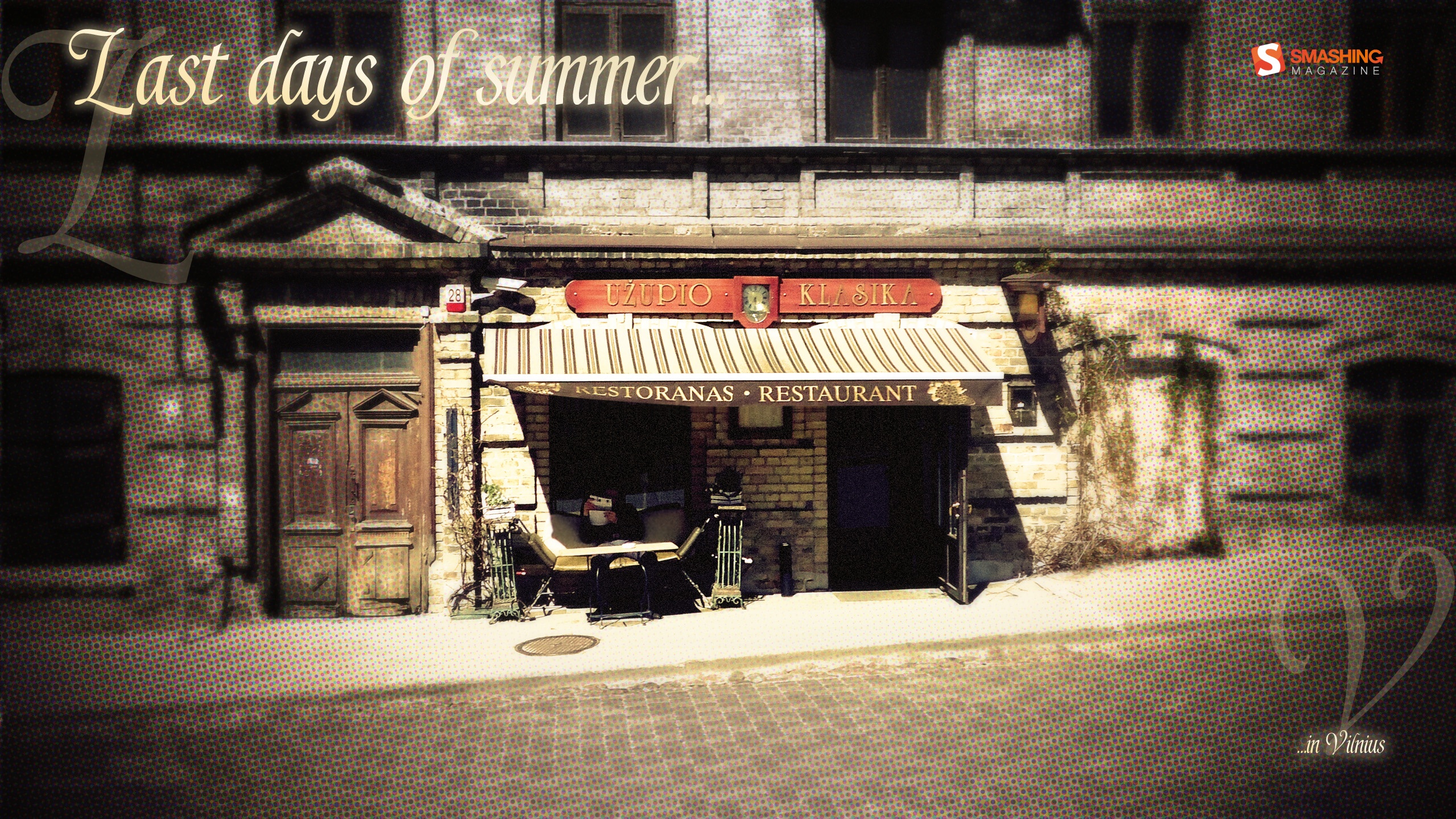
Last Days Of Summer
"Summer is saying goodbye to one of Vilnius’ streets." Designed by Karolina Przesmycka from Poland.

- preview
- with calendar: 1024×768, 1280×800, 1440×900, 1680×1050, 1366×768, 1920×1080, 2560×1440
- without calendar: 1024×768, 1280×800, 1440×900, 1680×1050, 1366×768, 1920×1080, 2560×1440
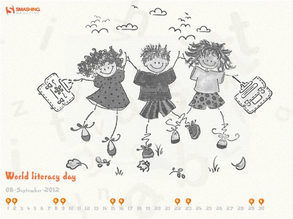
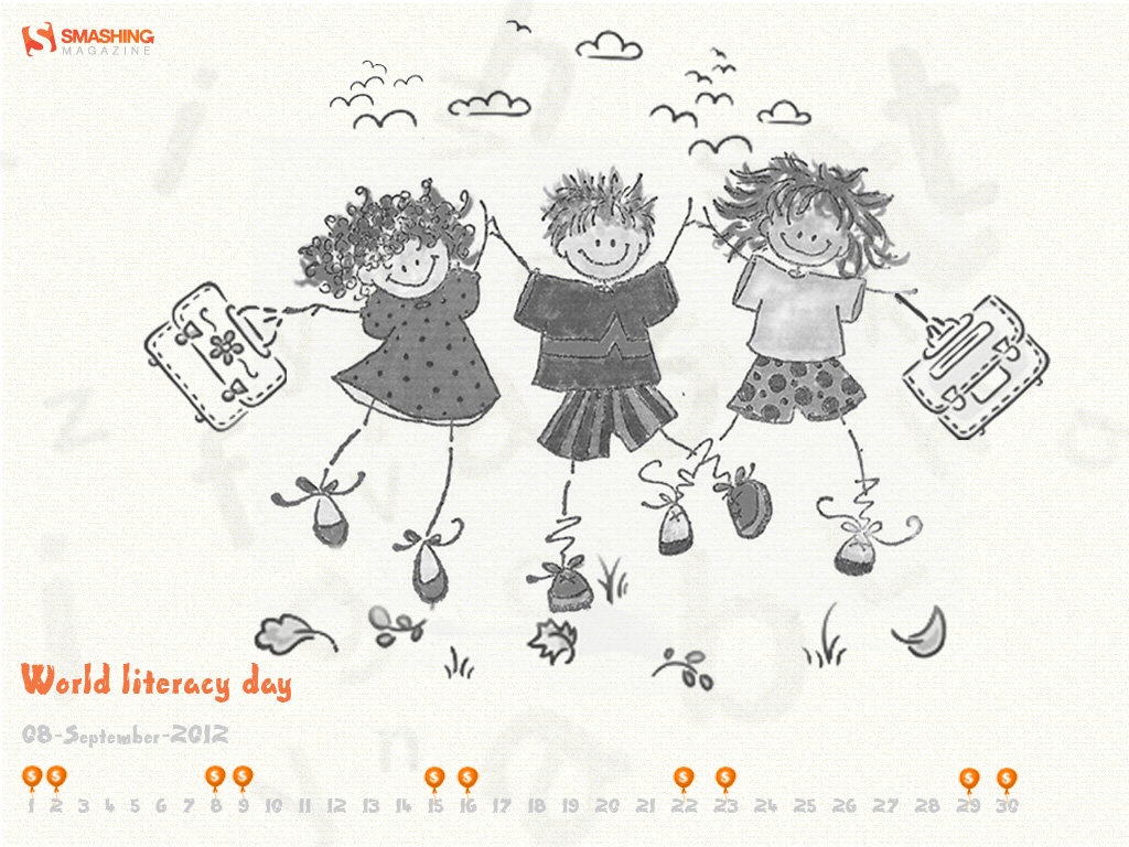
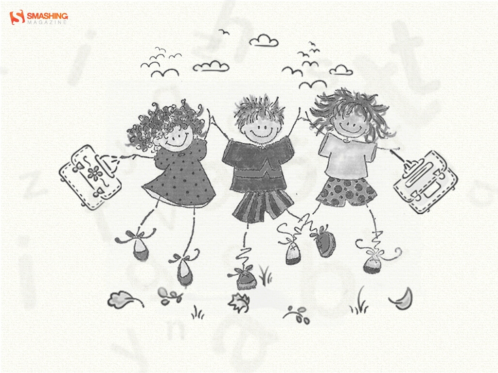
World Literacy Day
Designed by Cheriyan Manalel from India.
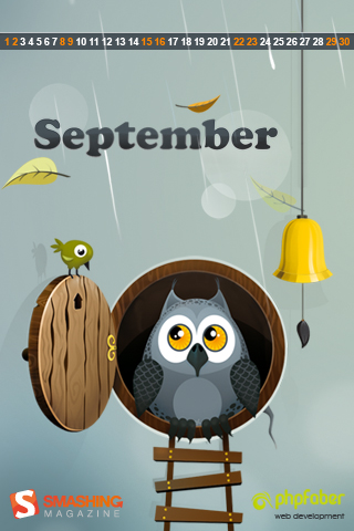
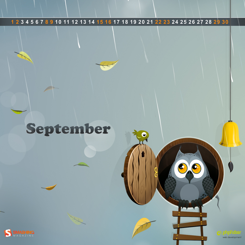
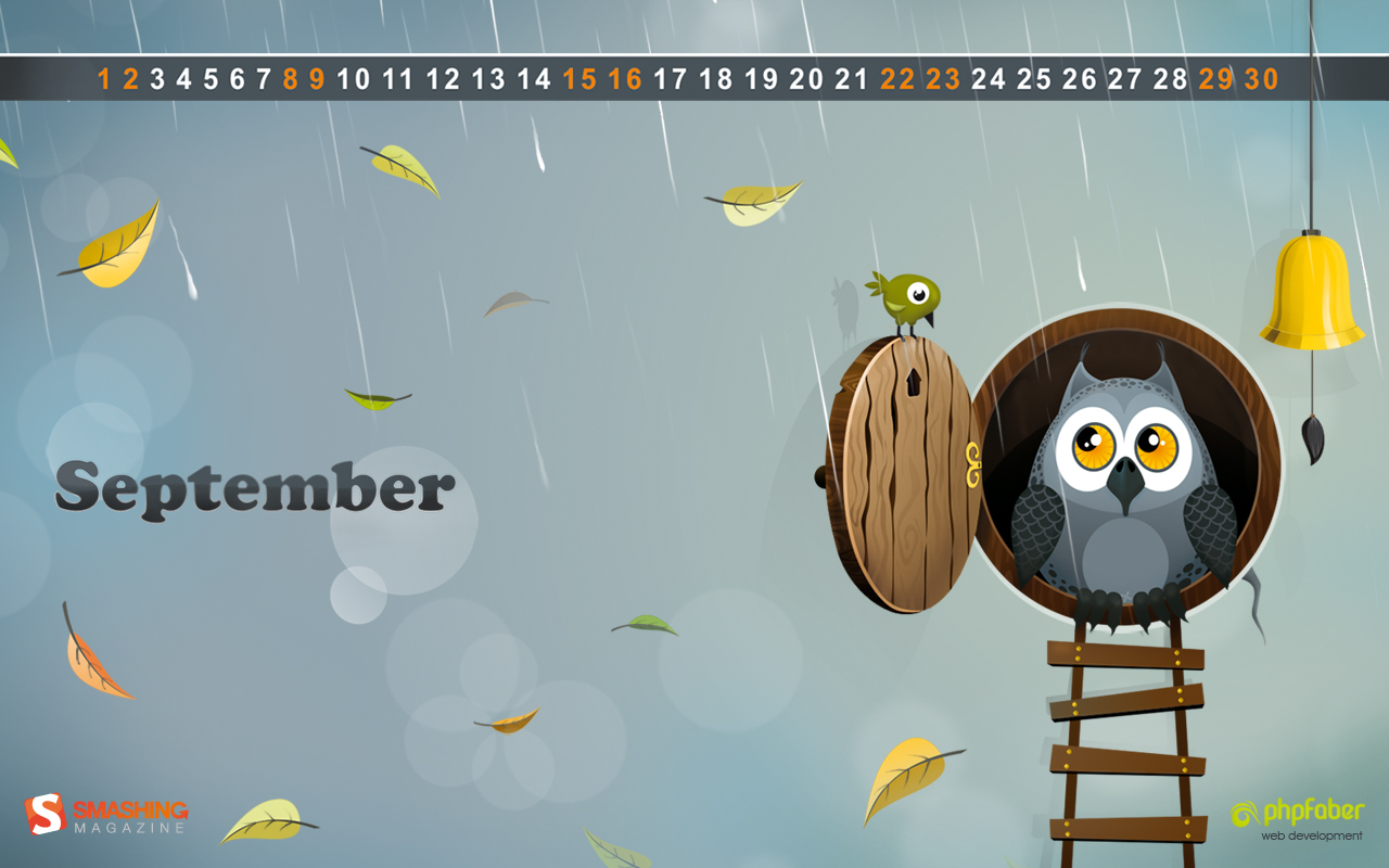
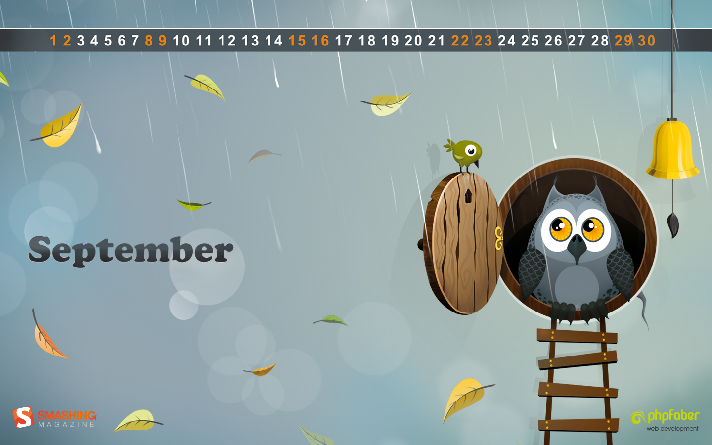
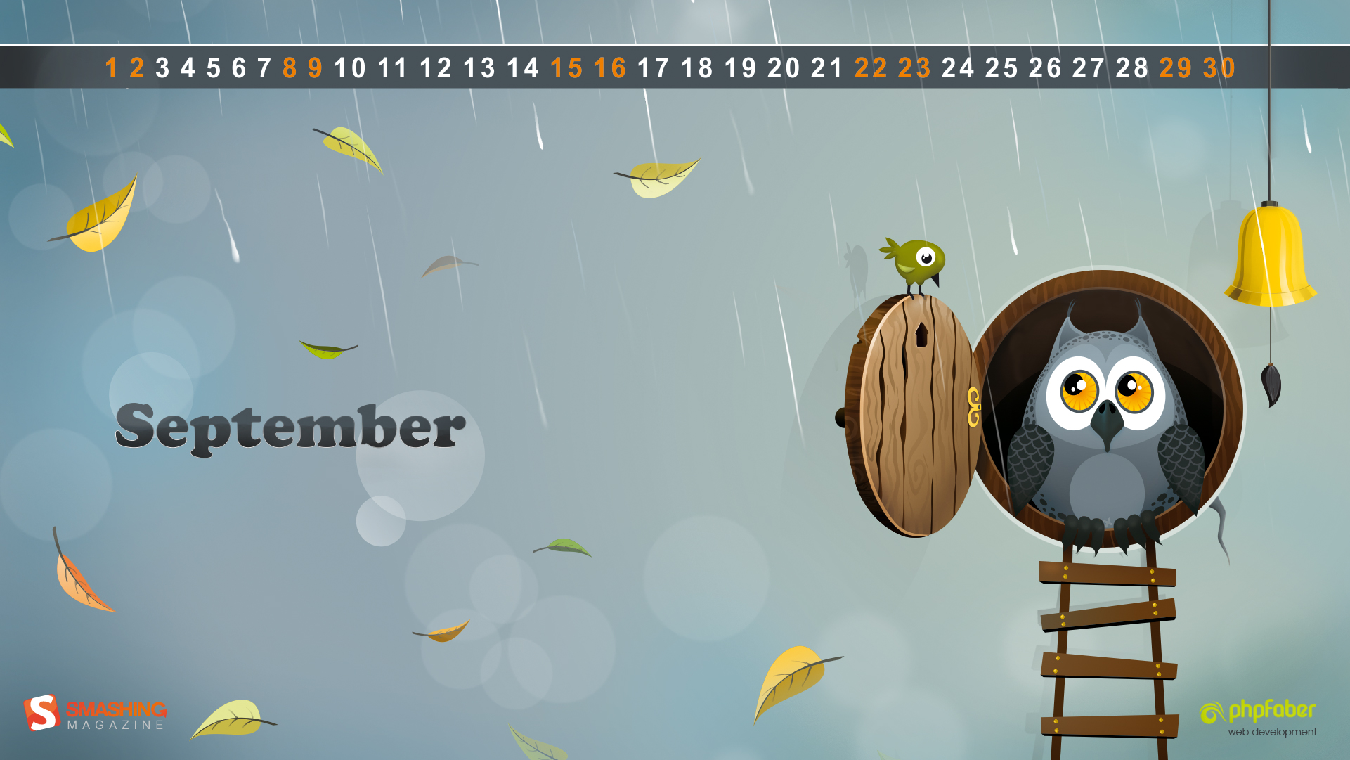
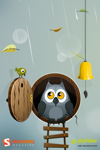
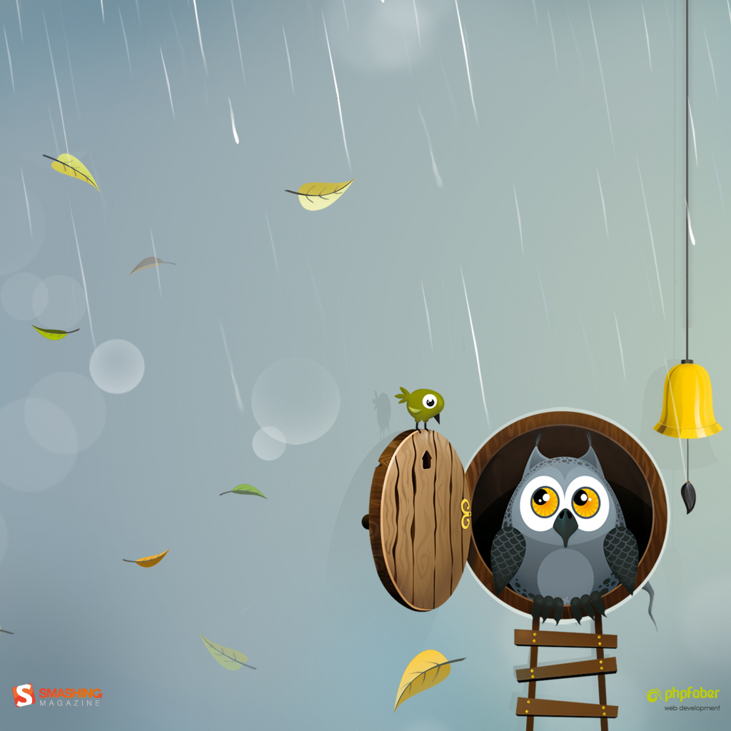
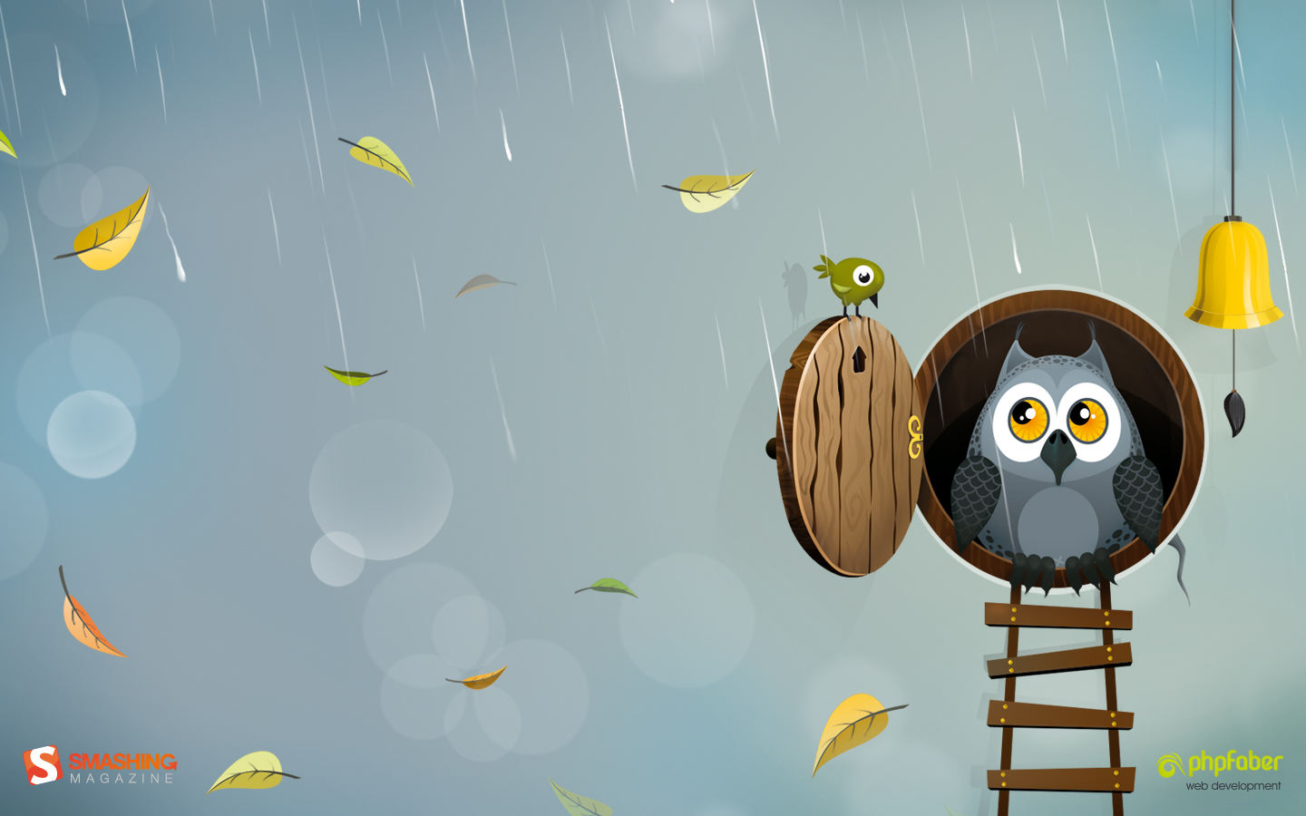
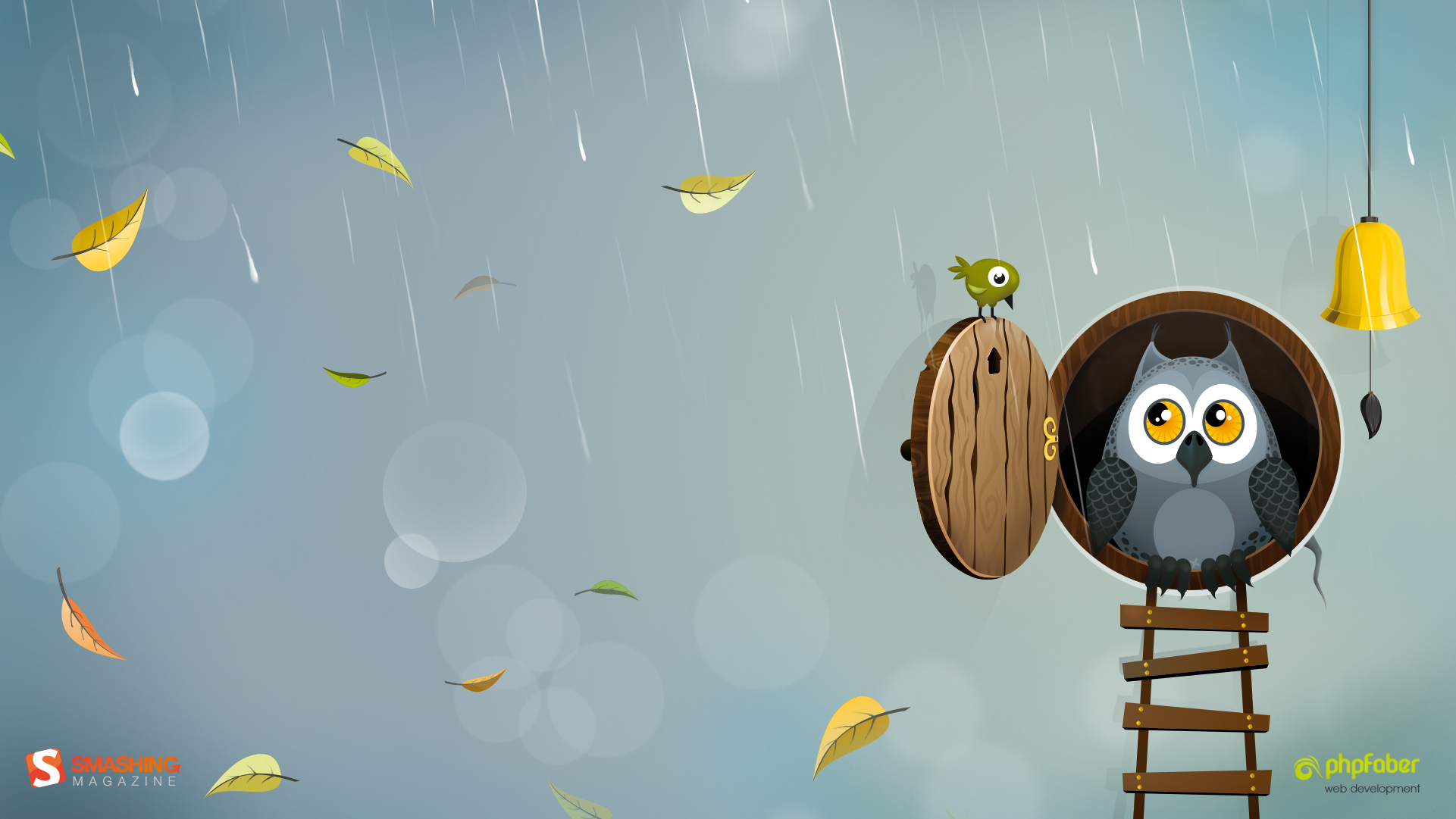
Autumn Owl
Designed by Katerina Bobkova from Ukraine.

- preview
- with calendar: 320×480, 1024×768, 1024×1024, 1280×800, 1440×900, 1680×1050, 1921×1081
- without calendar: 320×480, 1024×768, 1024×1024, 1280×800, 1440×900, 1680×1050, 1921×1081
Early Fall
Designed by Colin Whitehurst from USA.

- preview
- with calendar: 320×480, 1024×768, 1024×1024, 1280×800, 1280×1024, 1440×900, 1680×1050, 1920×1080, 1920×1200, 2560×1440
- without calendar: 320×480, 1024×768, 1024×1024, 1280×800, 1280×1024, 1440×900, 1680×1050, 1920×1080, 1920×1200, 2560×1440
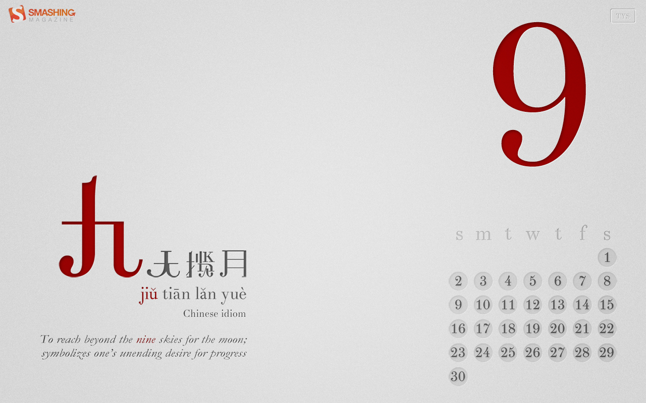
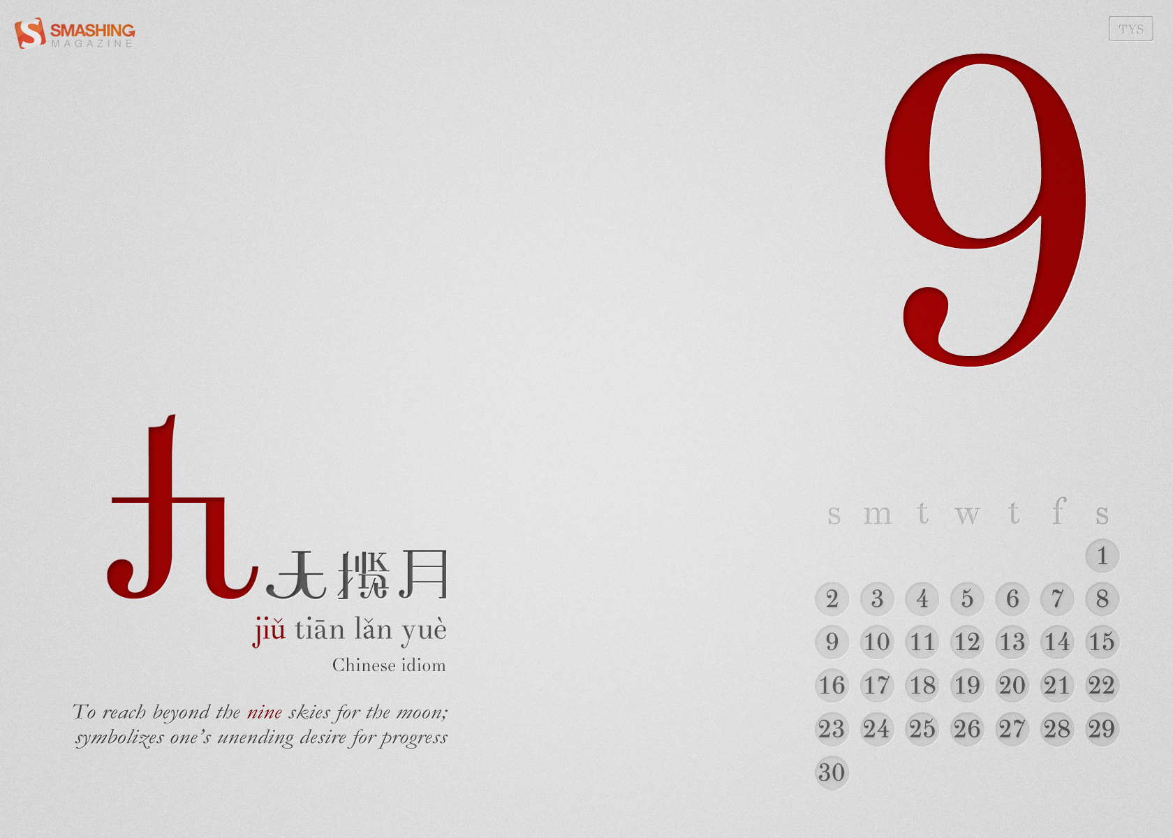
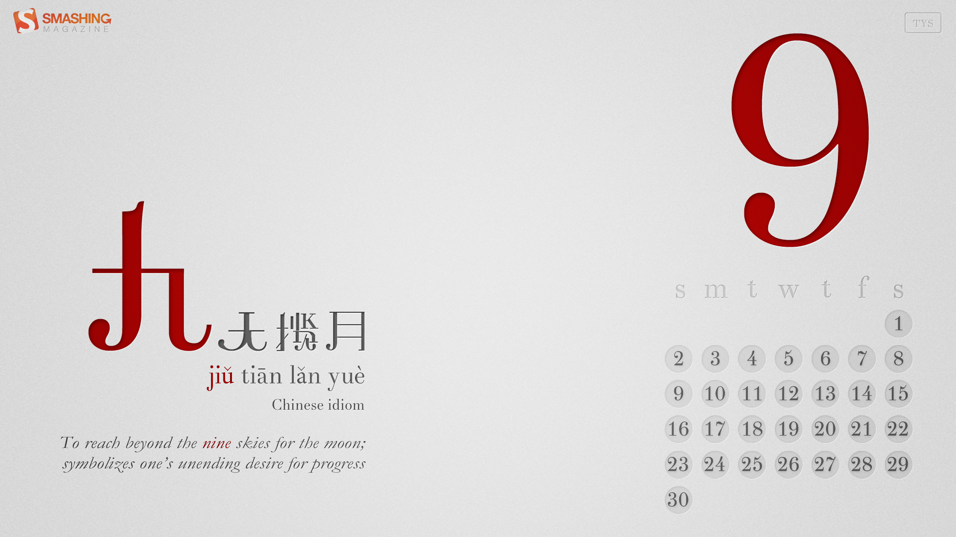
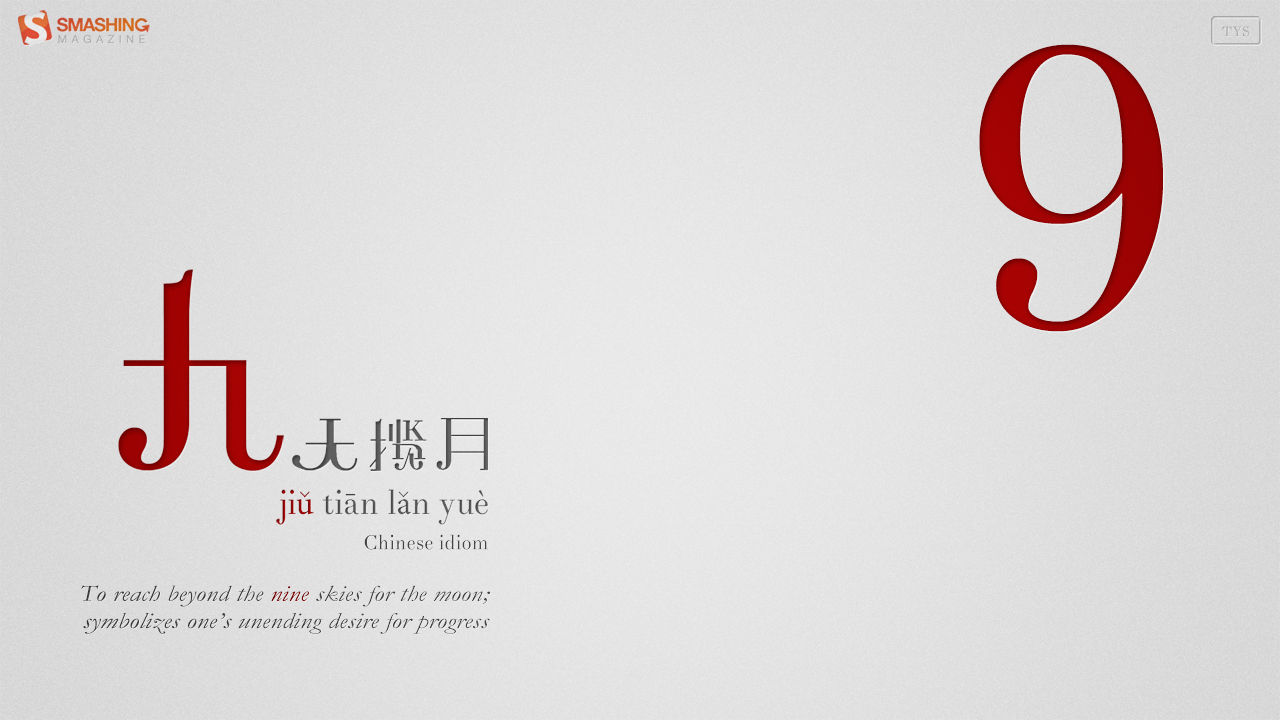
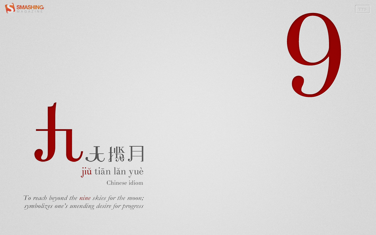
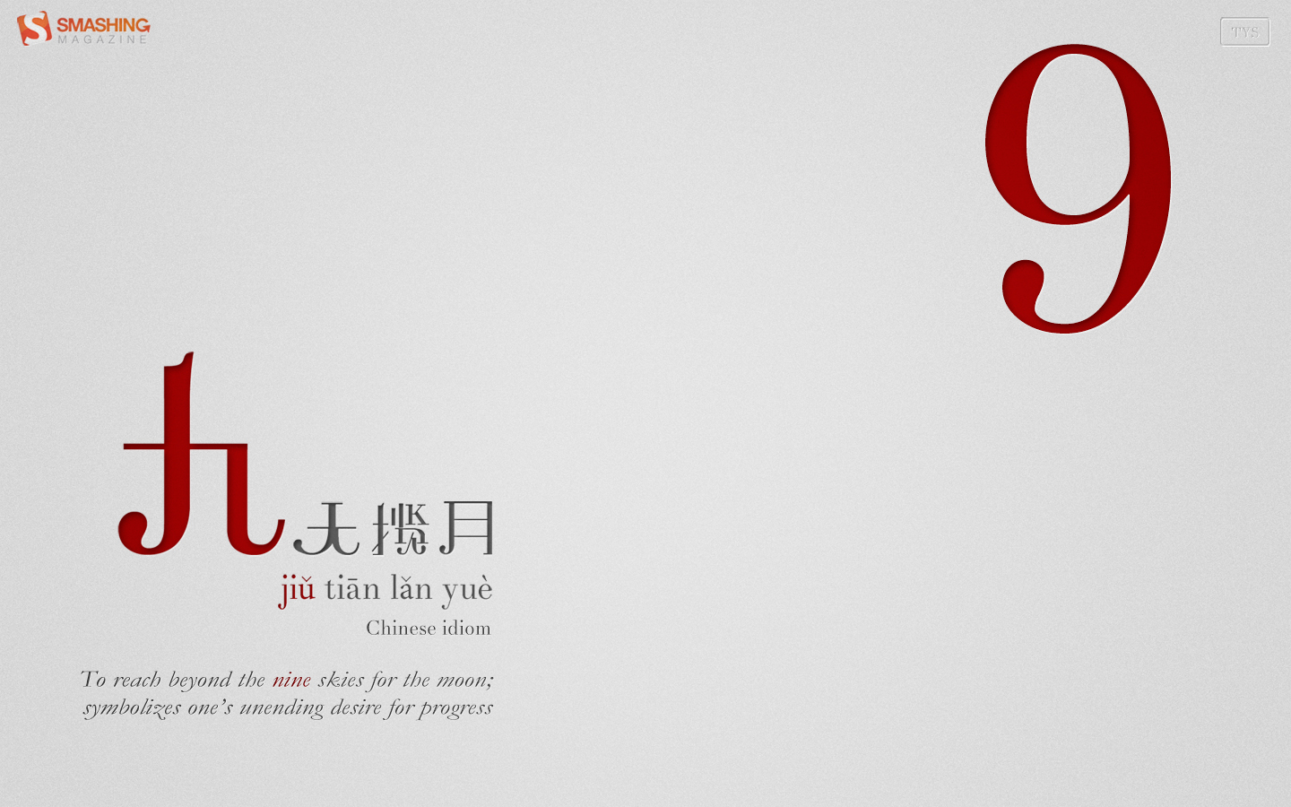
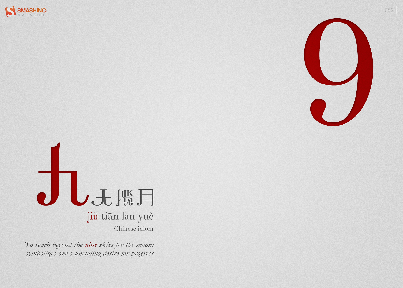
Nine
"I’m always interested in bridging language and cultures with design. In this wallpaper, I introduce a Chinese idiom with the word ‘Nine’ (in red, pronounced Jiu) – corresponding to September, which is the ninth month of the year. What’s different here is that I’ve constructed my own Chinese words instead of using Chinese fonts – I’ve broken up, joined and bridged glyphs from the Didot font and formed these words – so it’s actually a very visual, design-oriented approach to bridging languages. Hopefully if time permits, I’ll complete the set and do one design for each month, each with a different Chinese idiom containing the number of the month." Designed by Teo Yu Siang from Singapore.

- preview
- with calendar: 1280×720, 1280×800, 1440×900, 1680×1050, 1680×1200, 1920×1080
- without calendar: 1280×720, 1280×800, 1440×900, 1680×1050, 1680×1200, 1920×1080
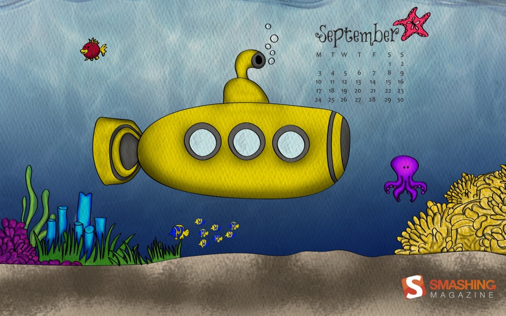
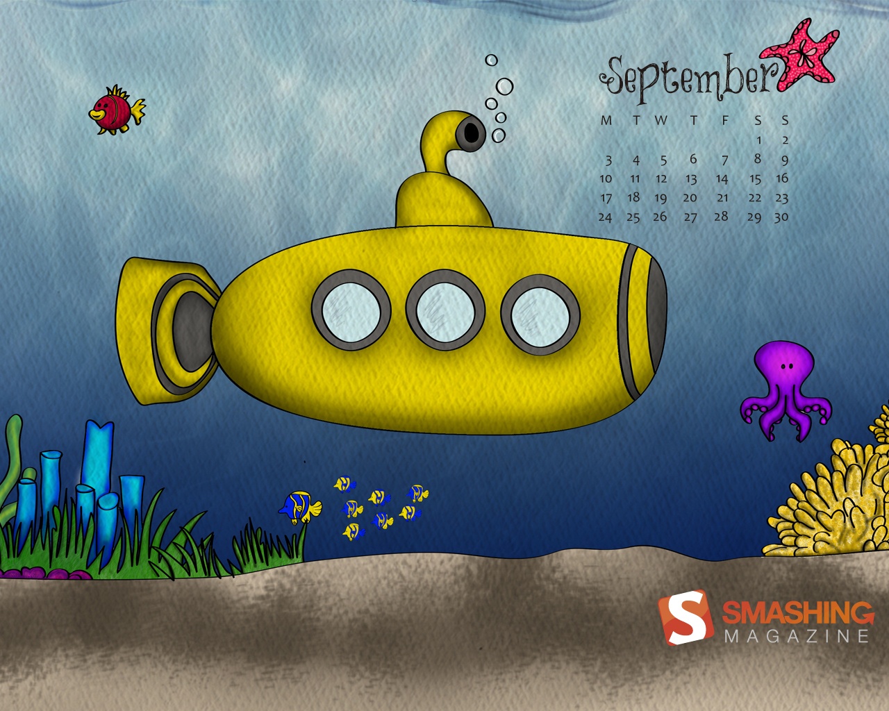
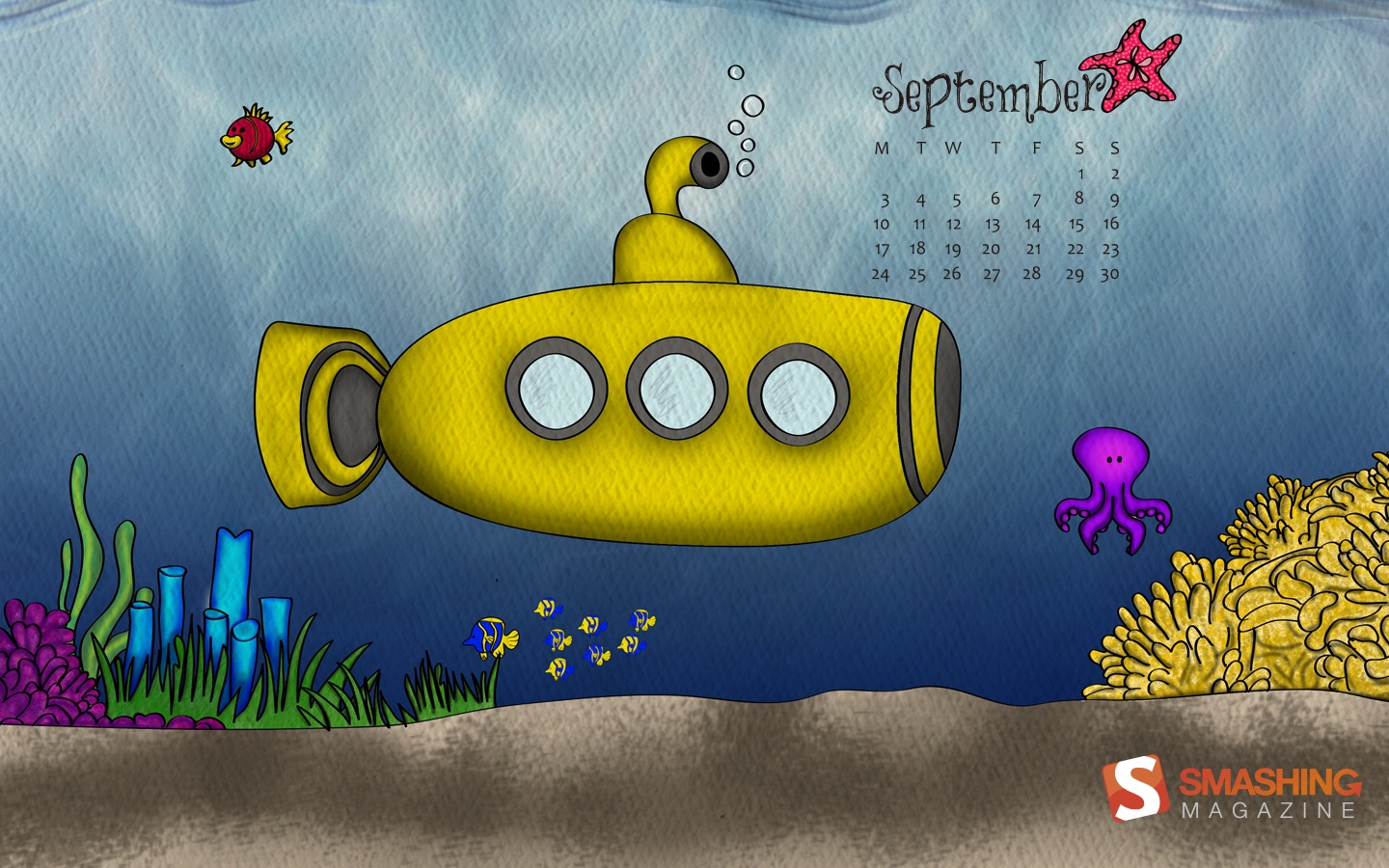
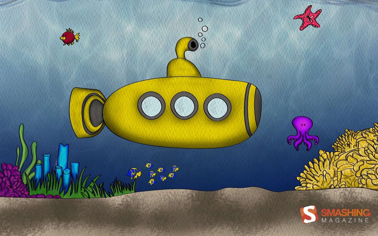
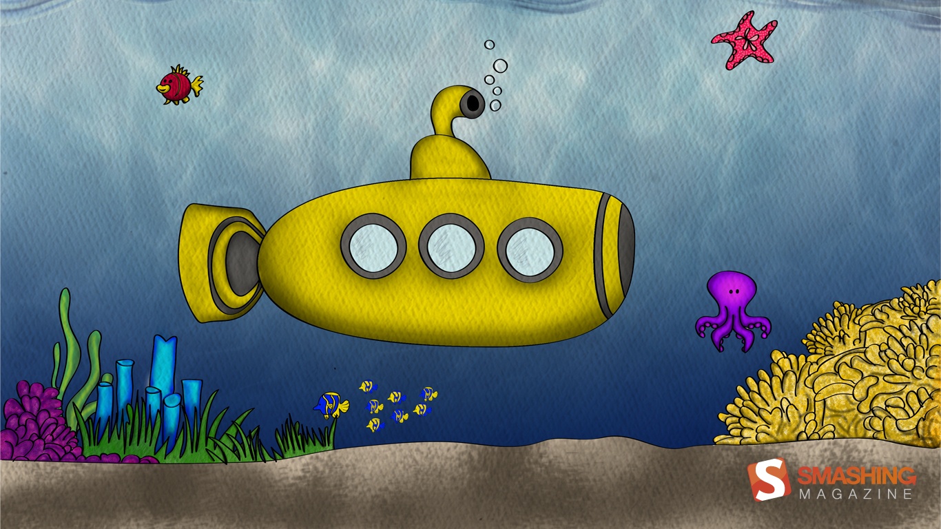
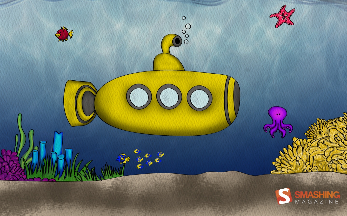
Under The Sea
Designed by Ana Henao from Colombian in Spain.
- preview
- with calendar: 1280×800, 1280×1024, 1366×768, 1440×900, 1680×1050
- without calendar: 1280×800, 1280×1024, 1366×768, 1440×900, 1680×1050
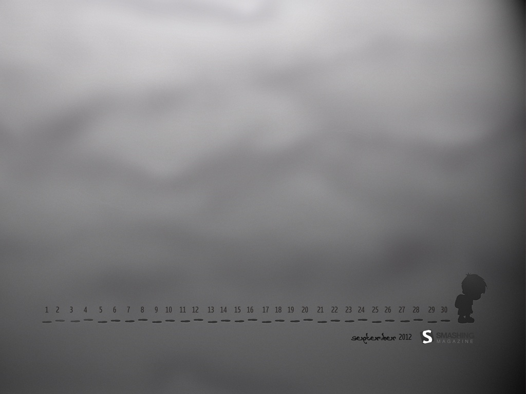
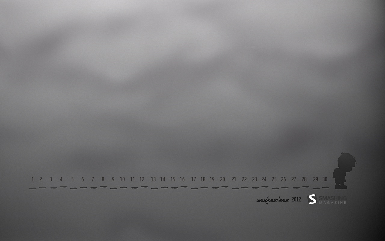
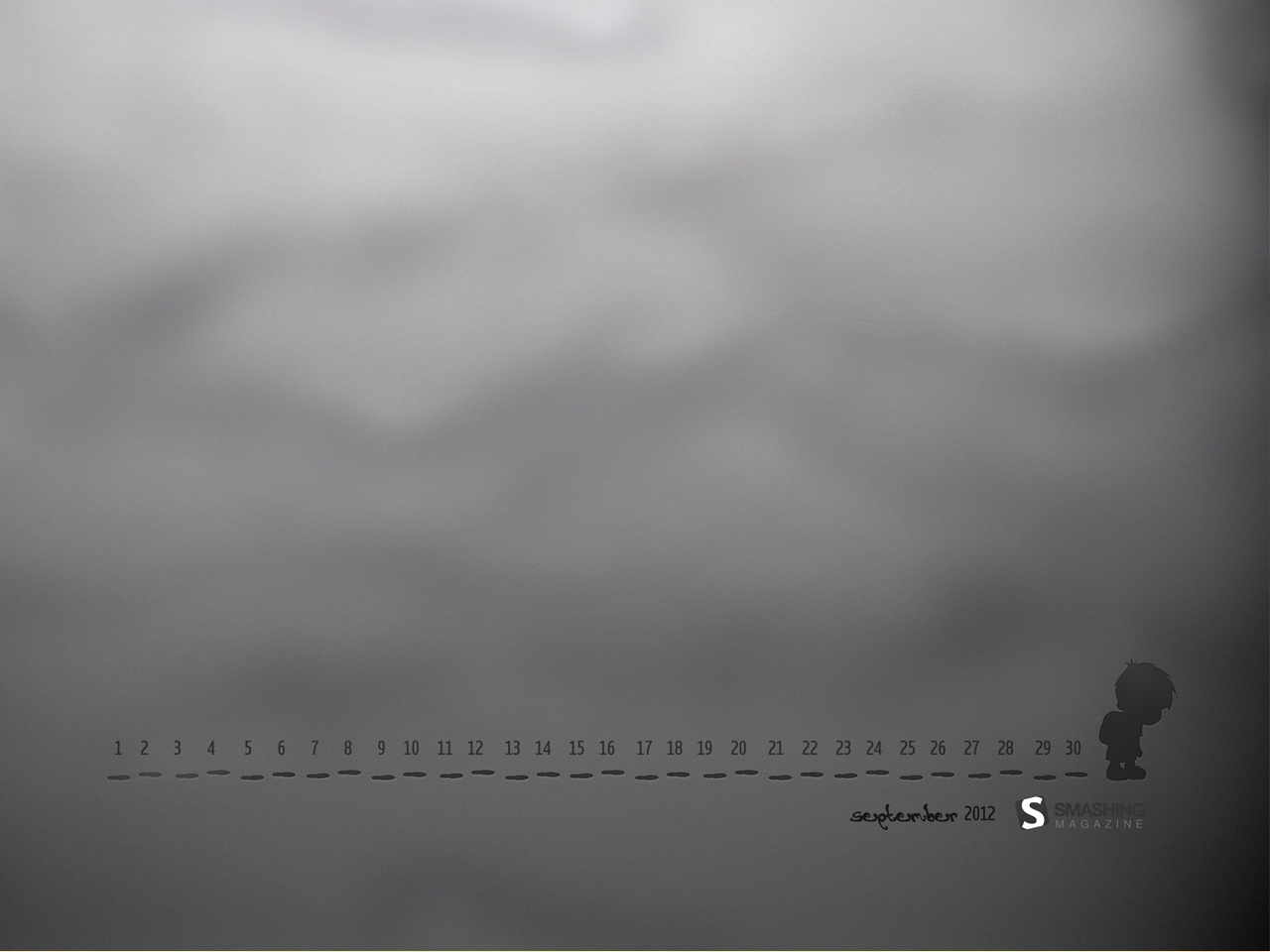
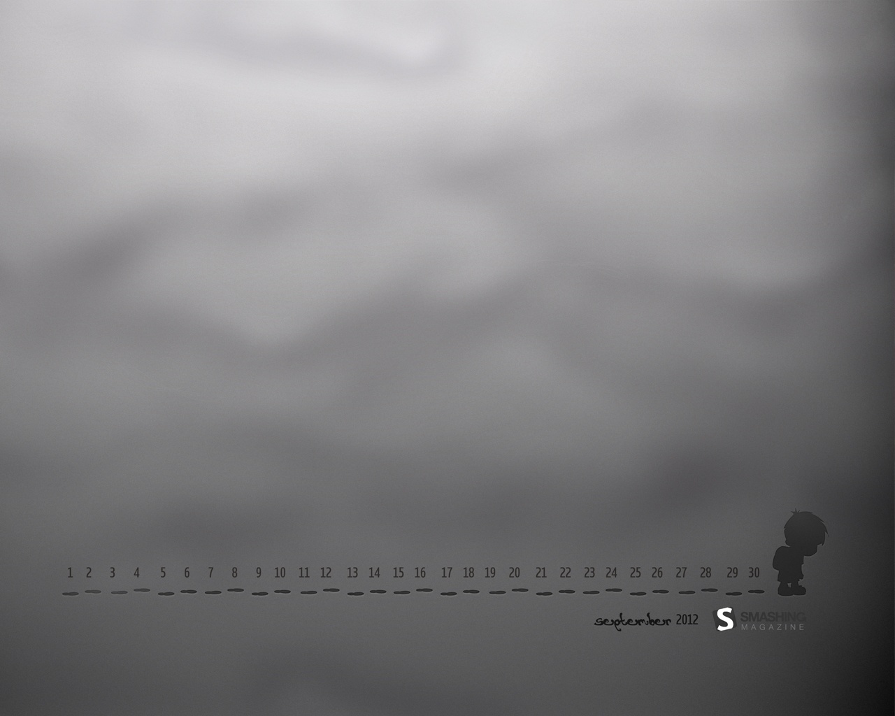
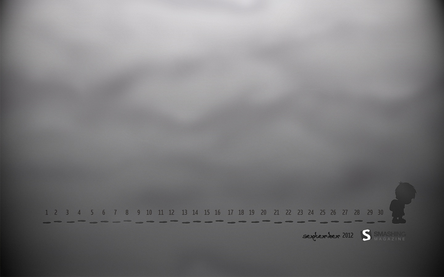
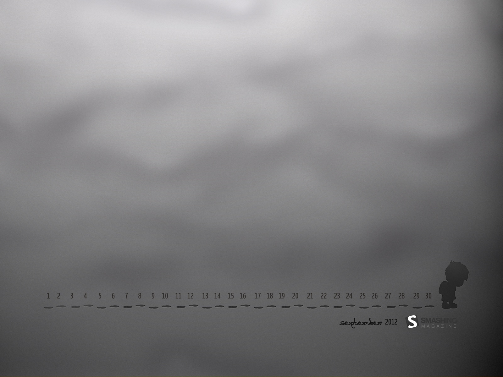
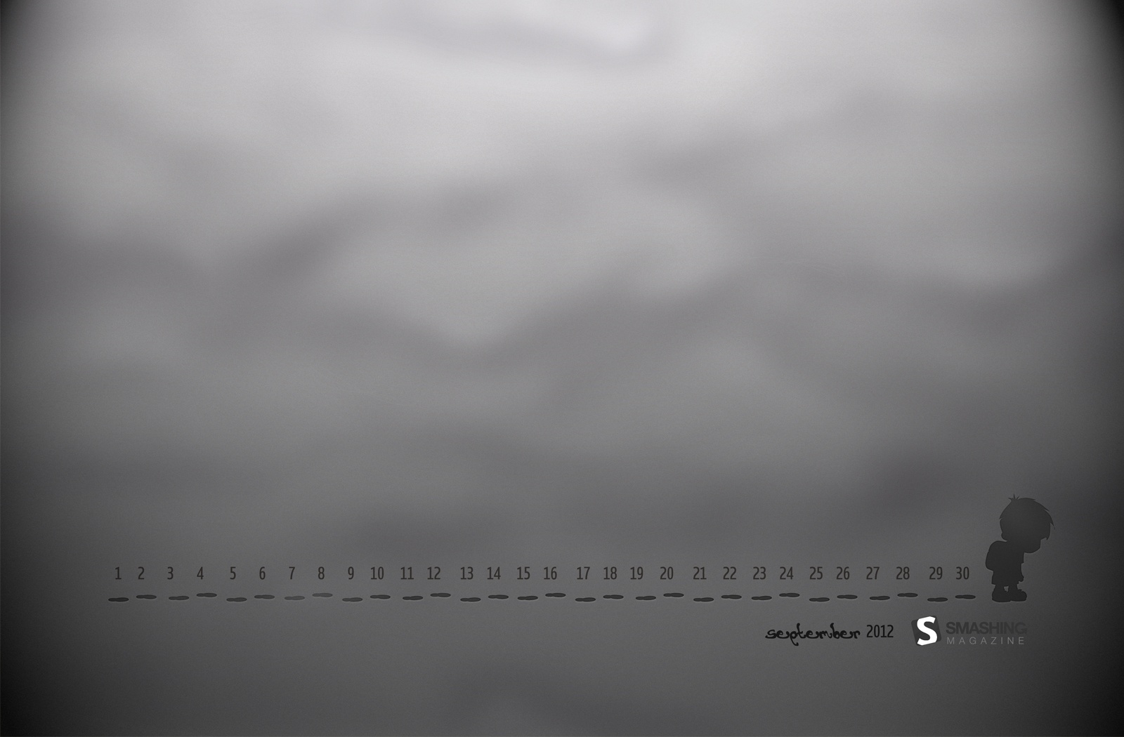
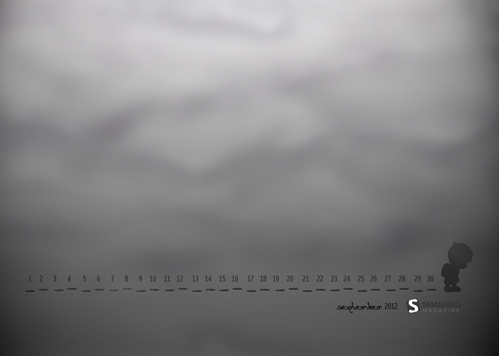
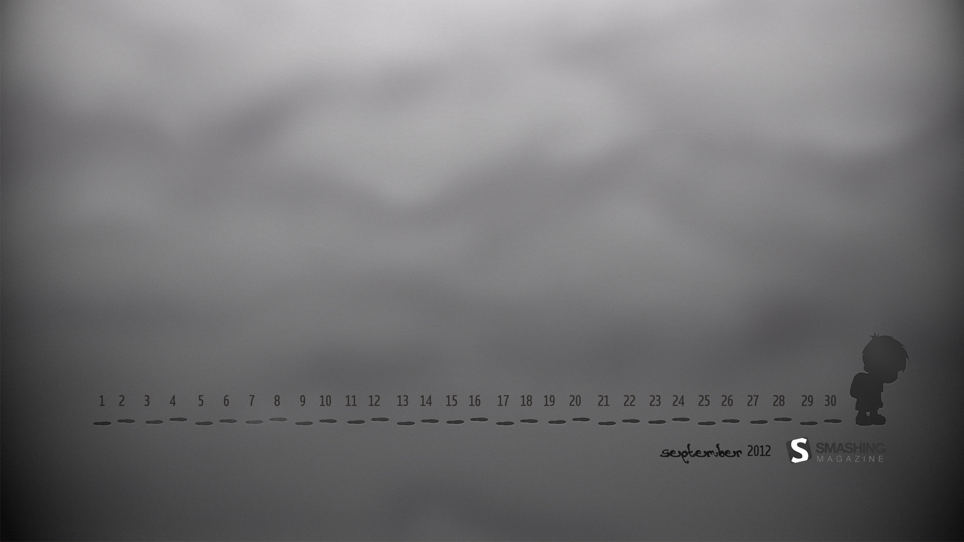
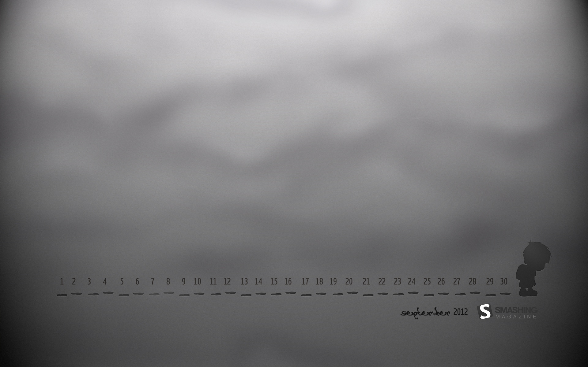
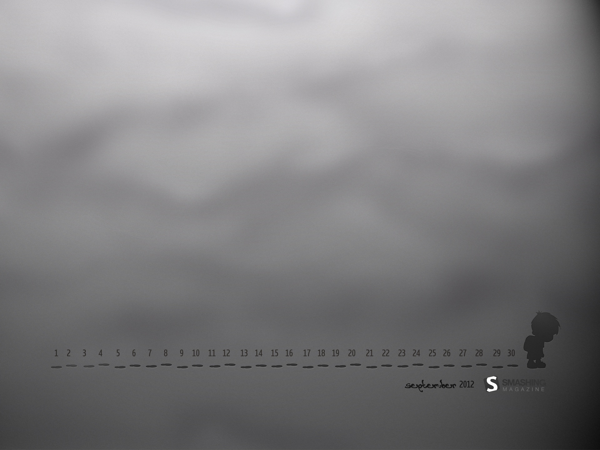
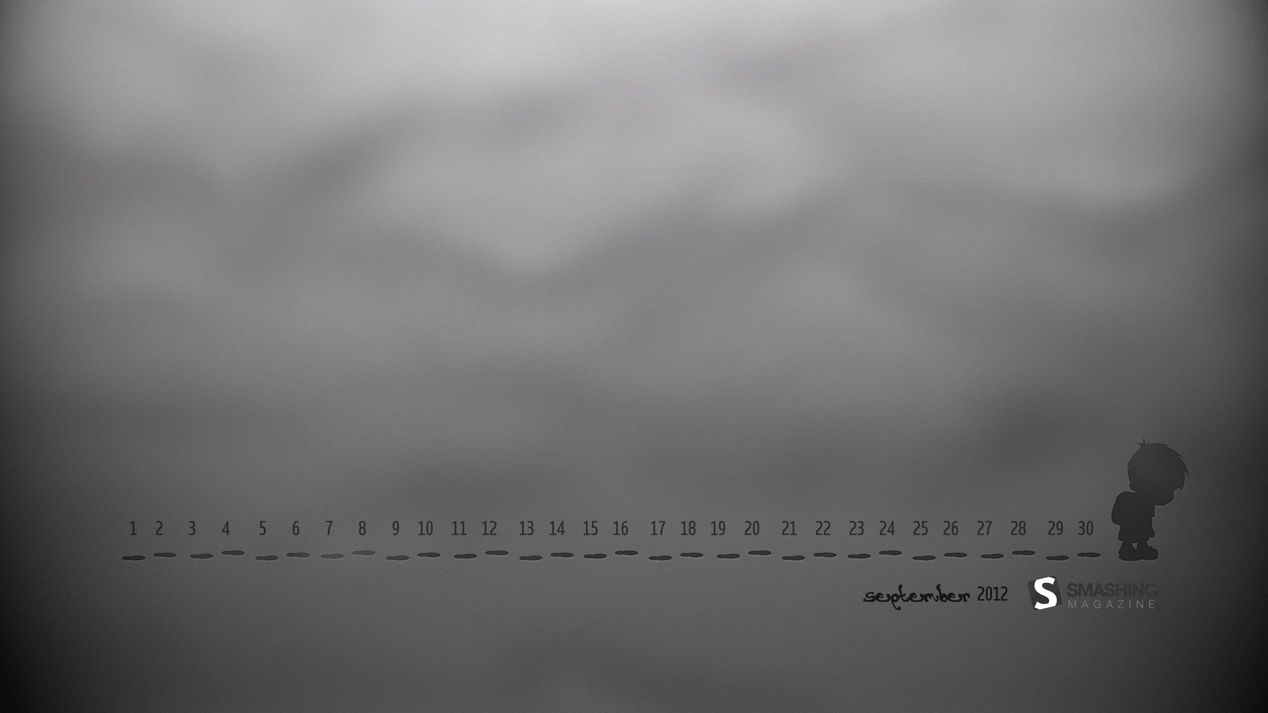
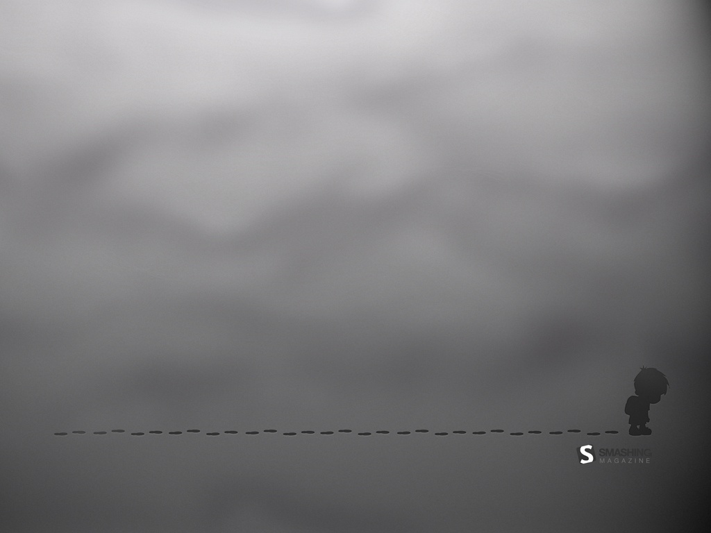
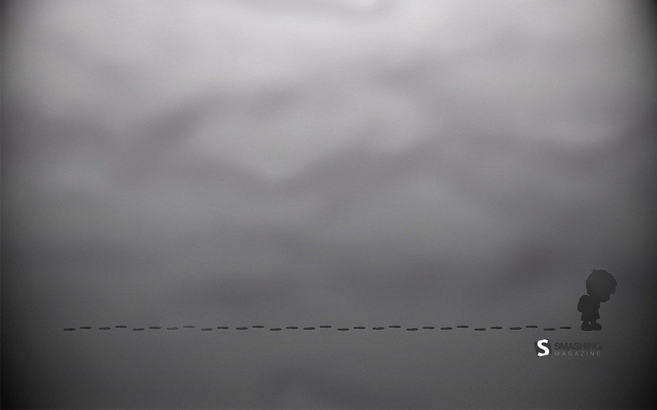
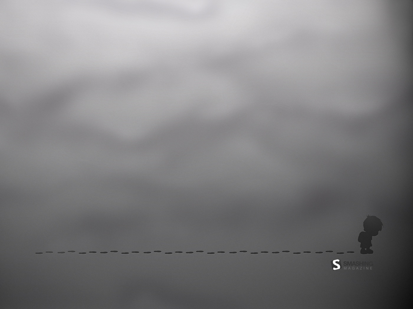
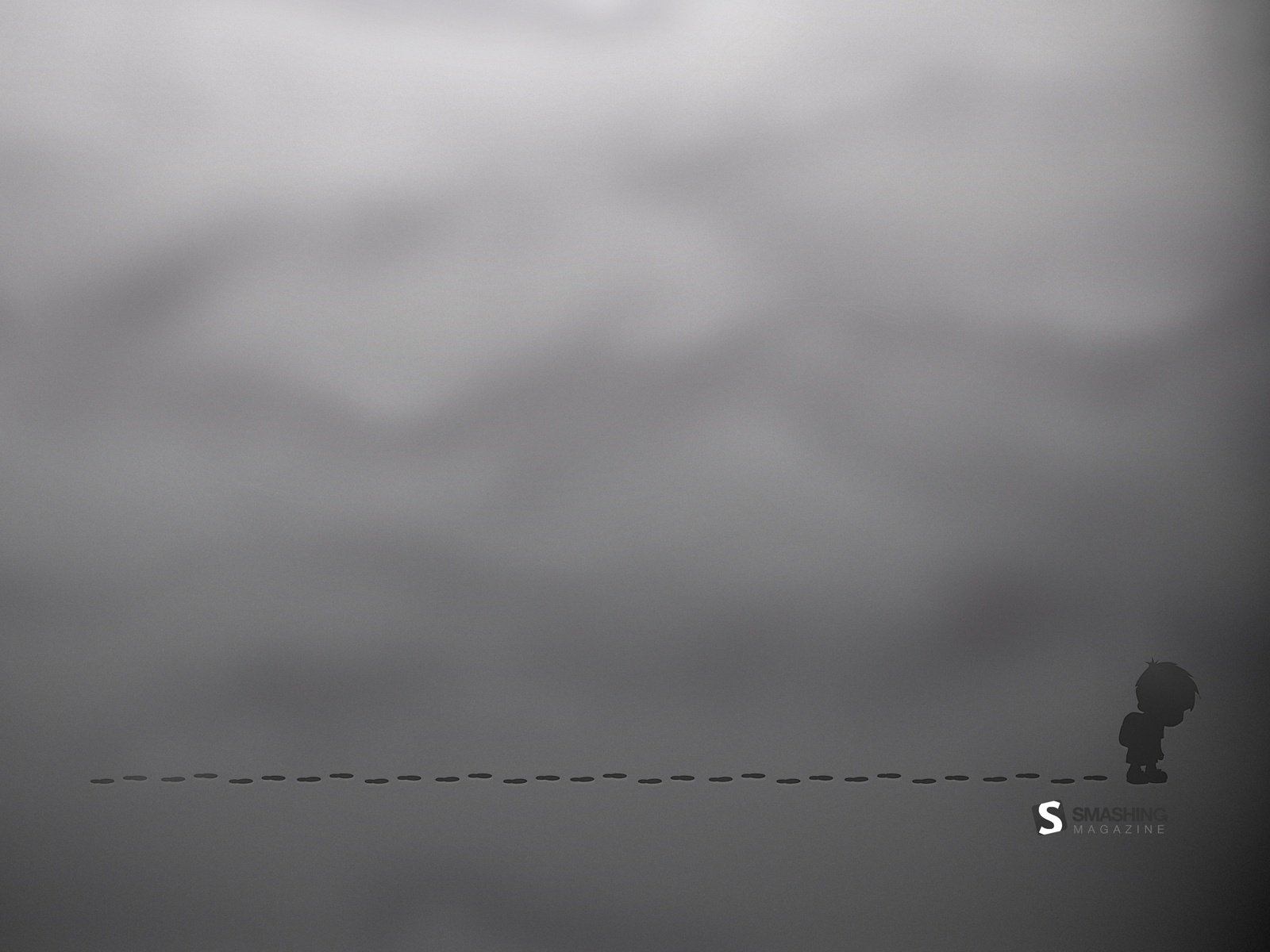
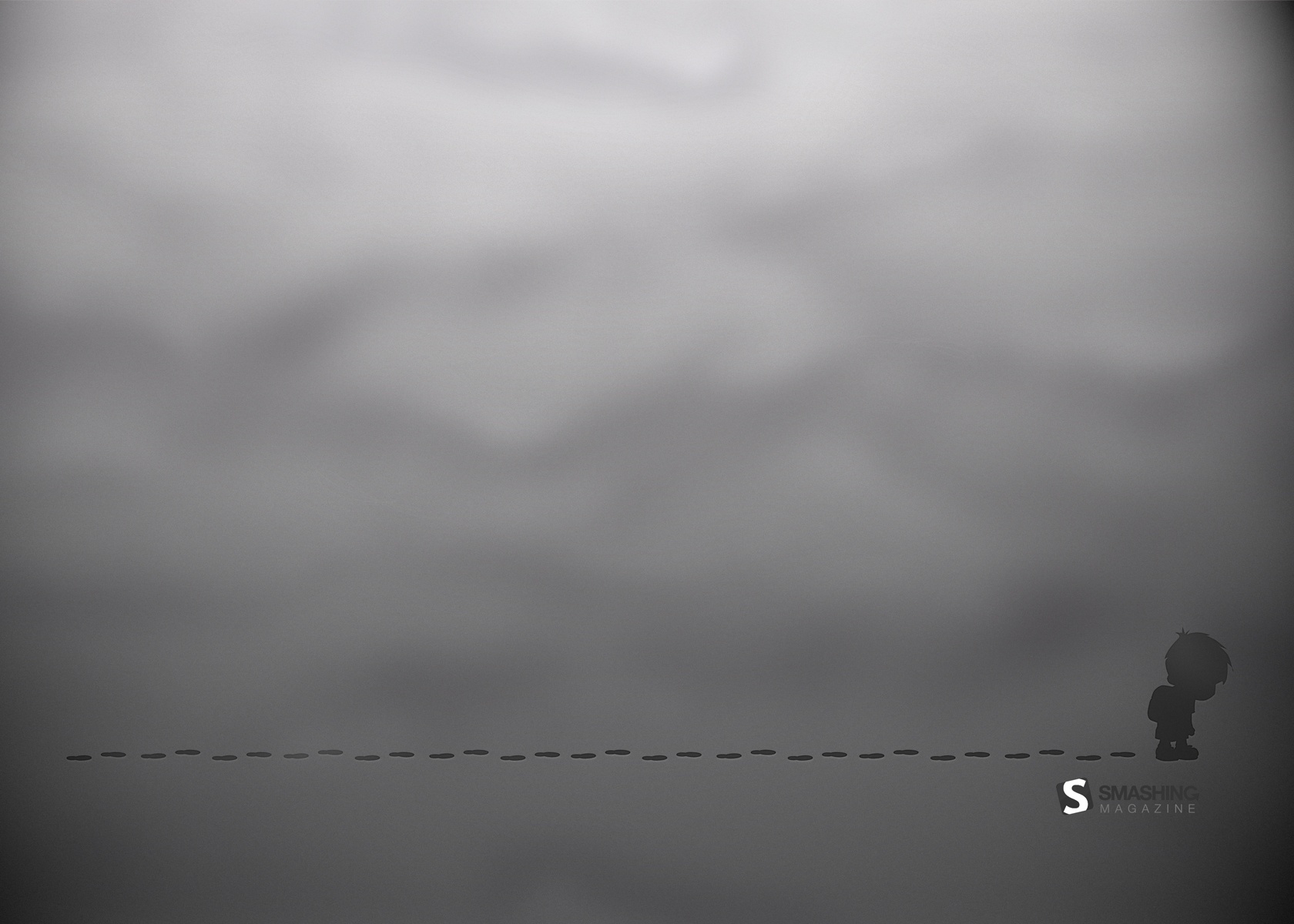
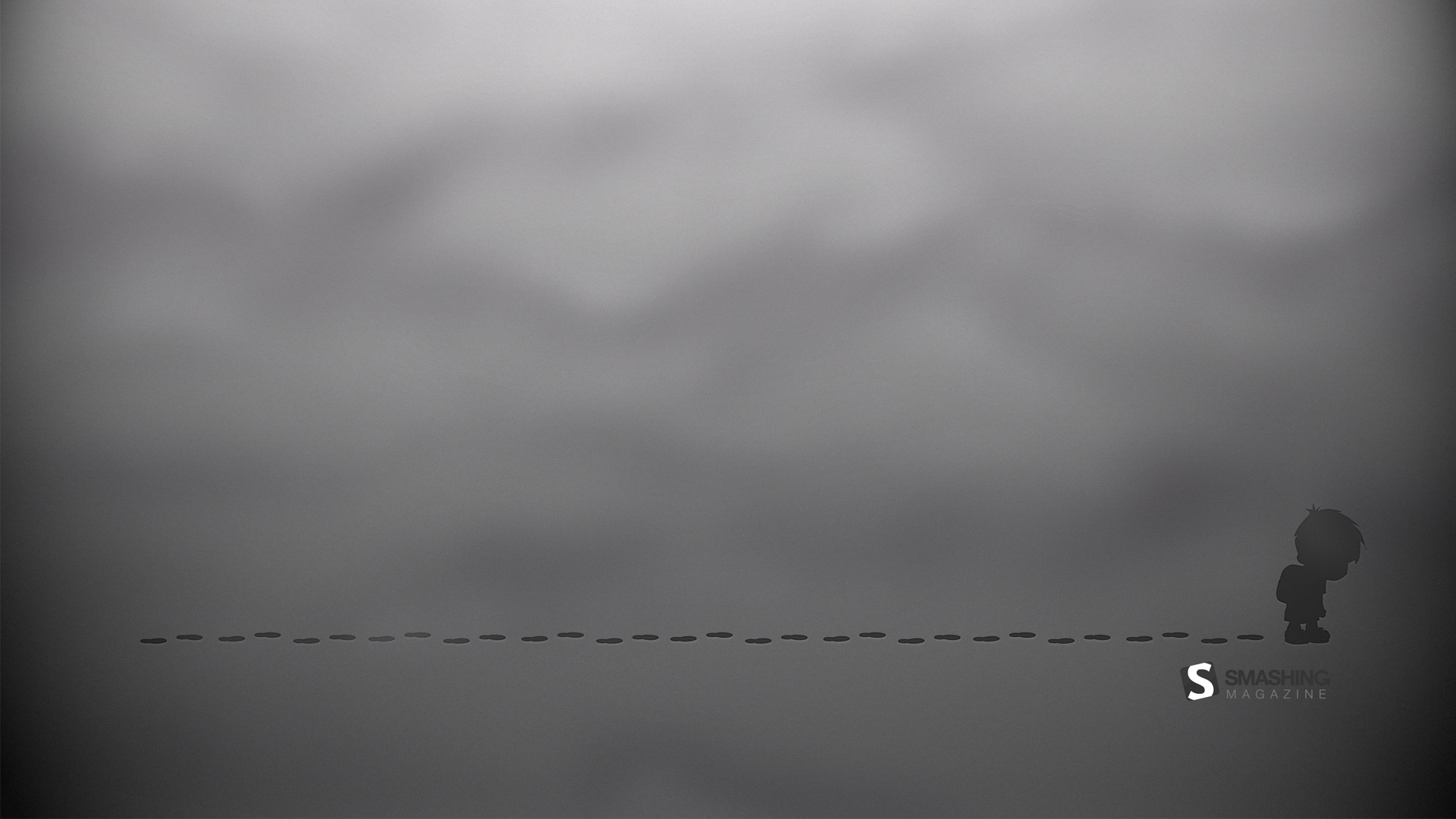
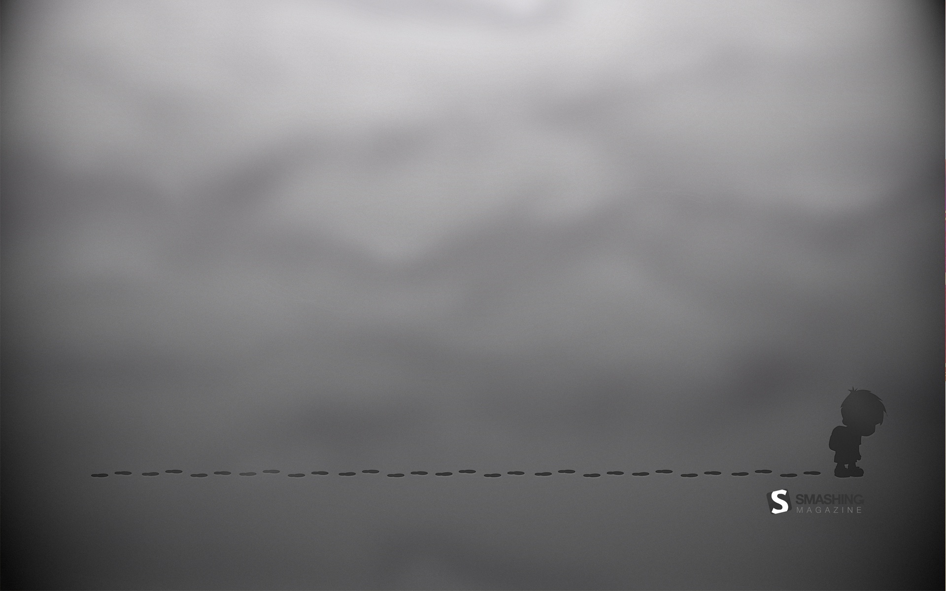
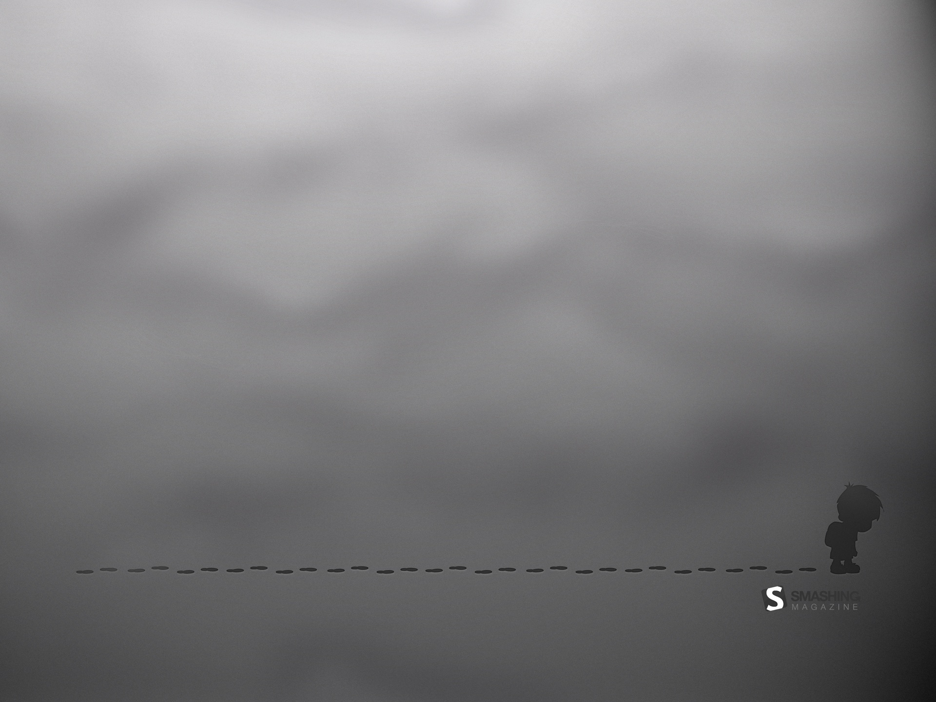
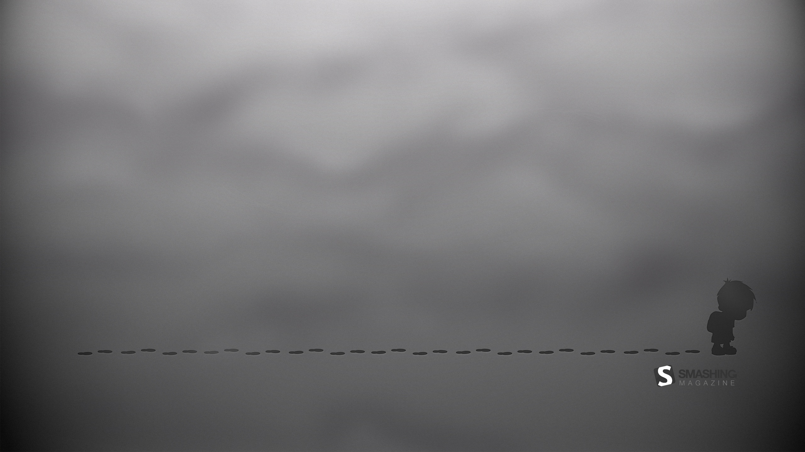
Traces
"A little boy is going to school. His foot traces are as sad as he is." Designed by Mypoint from Poland.
- preview
- with calendar: 1024×768, 1280×800, 1280×960, 1280×1024, 1400×1050, 1440×900, 1600×1200, 1600×1050, 1680×1200, 1920×1080, 1920×1200, 1920×1440, 2560×1440
- without calendar: 1024×768, 1280×800, 1280×960, 1280×1024, 1400×1050, 1440×900, 1600×1200, 1600×1050, 1680×1200, 1920×1080, 1920×1200, 1920×1440, 2560×1440
September Map
"Map for the month." Designed by Sherif Saleh from France.

- preview
- with calendar: 1024×768, 1280×720, 1280×800, 1280×1024, 1365×768, 1400×900, 1680×1050, 1920×1080, 2560×1440
Join In Next Month!
Please note that we respect and carefully consider the ideas and motivation behind each and every artist’s work. This is why we give all artists the full freedom to explore their creativity and express emotions and experience throughout their works. This is also why the themes of the wallpapers weren’t anyhow influenced by us, but rather designed from scratch by the artists themselves.
A big thank you to all designers for their participation. Join in next month!
What’s Your Favorite?
What’s your favorite theme or wallpaper for this month? Please let us know in the comment section below.
Stay creative and keep on smashing!
(vf)
© Smashing Editorial for Smashing Magazine, 2012.


