 |
We always try our best to challenge your artistic abilities and produce some interesting, beautiful and creative artwork. And as designers we usually turn to different sources of inspiration. As a matter of fact, we’ve discovered the best one—desktop wallpapers that are a little more distinctive than the usual crowd. This creativity mission has been going on for over four years now, and we are very thankful to all designers who have contributed and are still diligently contributing each month.
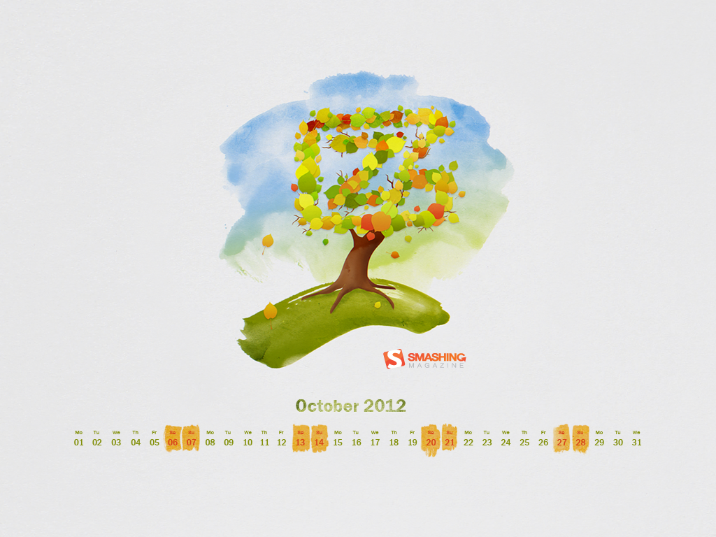
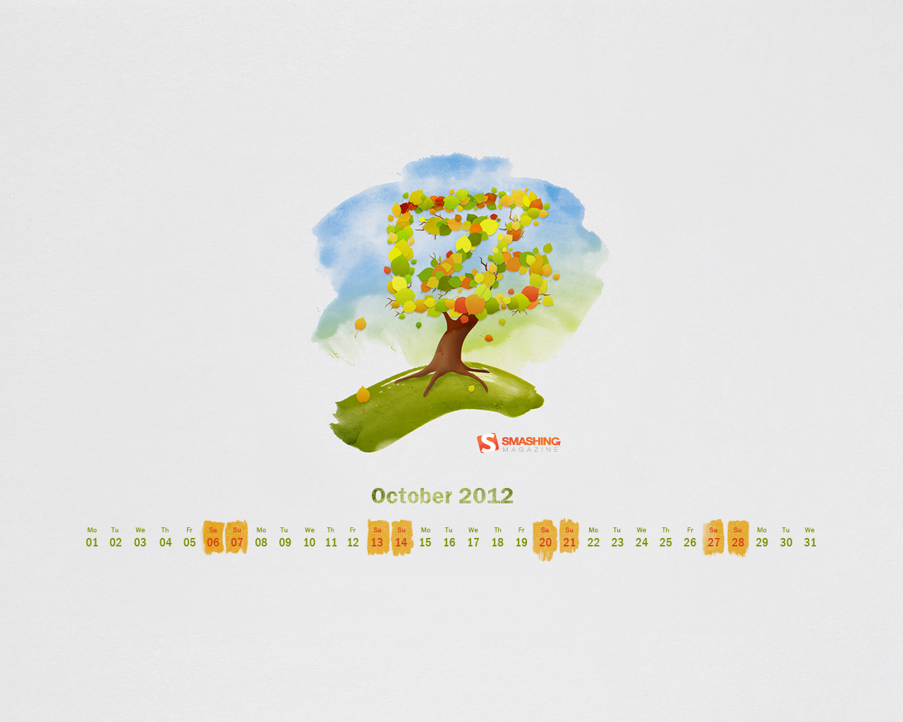
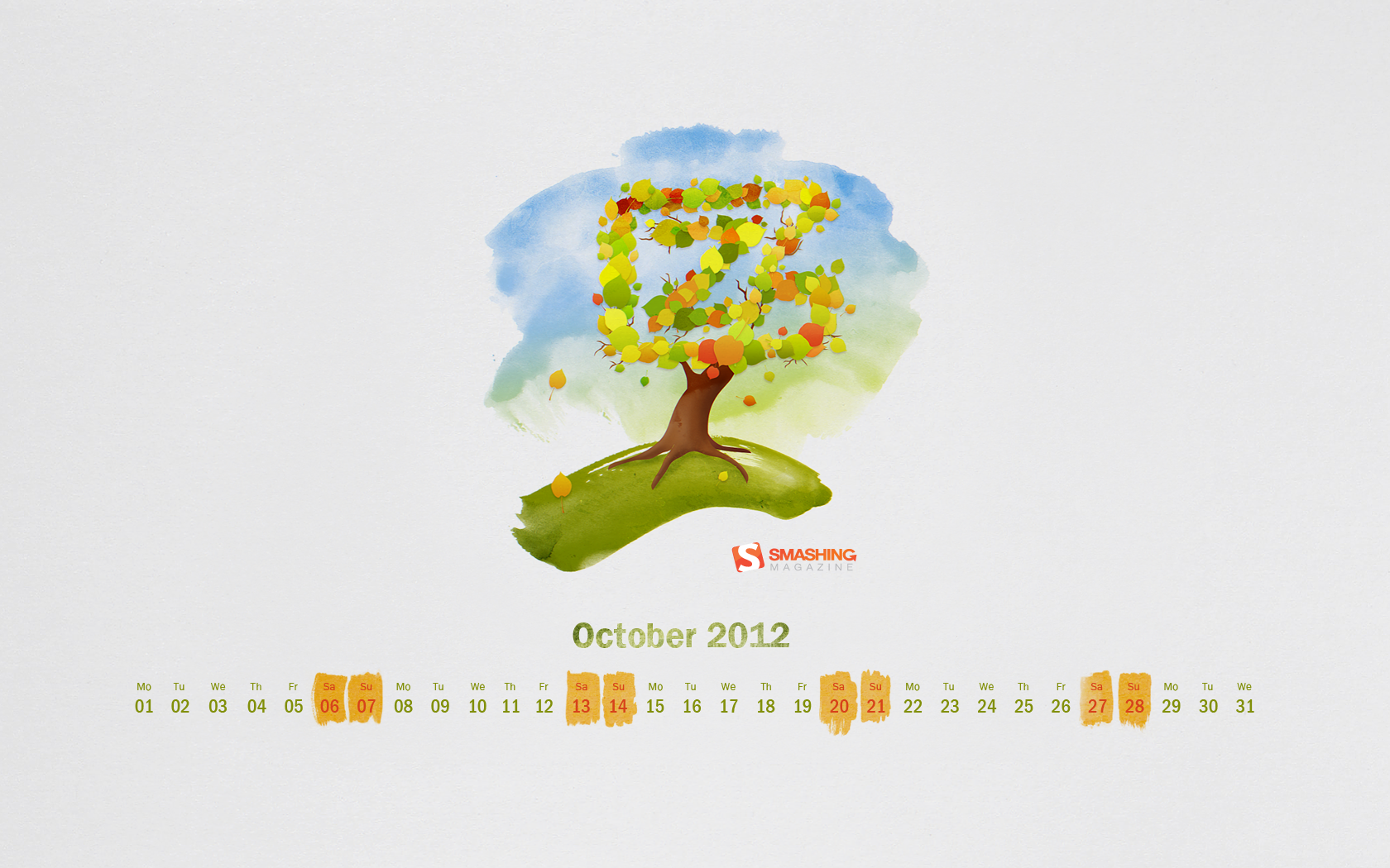
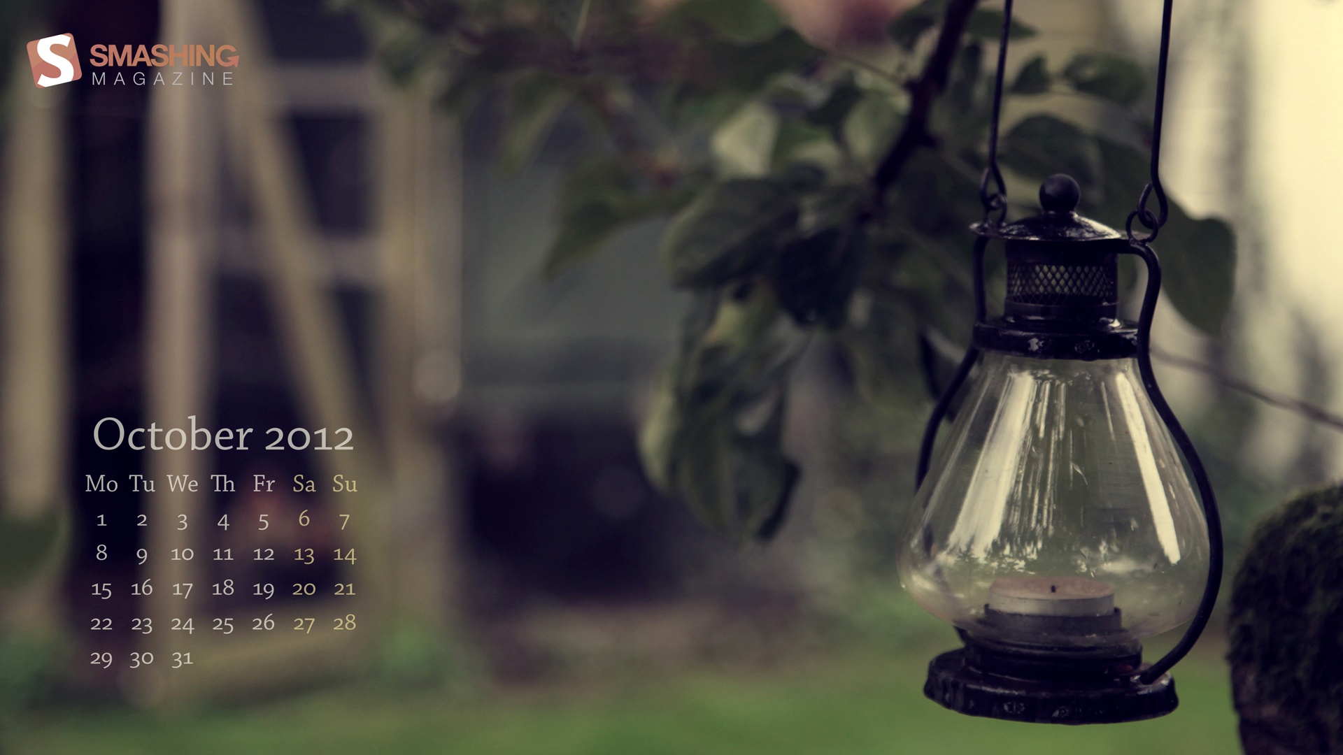
This post features free desktop wallpapers created by artists across the globe for October 2012. Many of the wallpapers this month are related to Halloween which seems to have become a tradition on Smashing Magazine over the years. Both versions with a calendar and without a calendar can be downloaded for free. It’s time to freshen up your wallpaper!
Please note that:
- All images can be clicked on and lead to the preview of the wallpaper,
- You can feature your work in our magazine by taking part in our Desktop Wallpaper Calendar series. We are regularly looking for creative designers and artists to be featured on Smashing Magazine. Are you one of them?
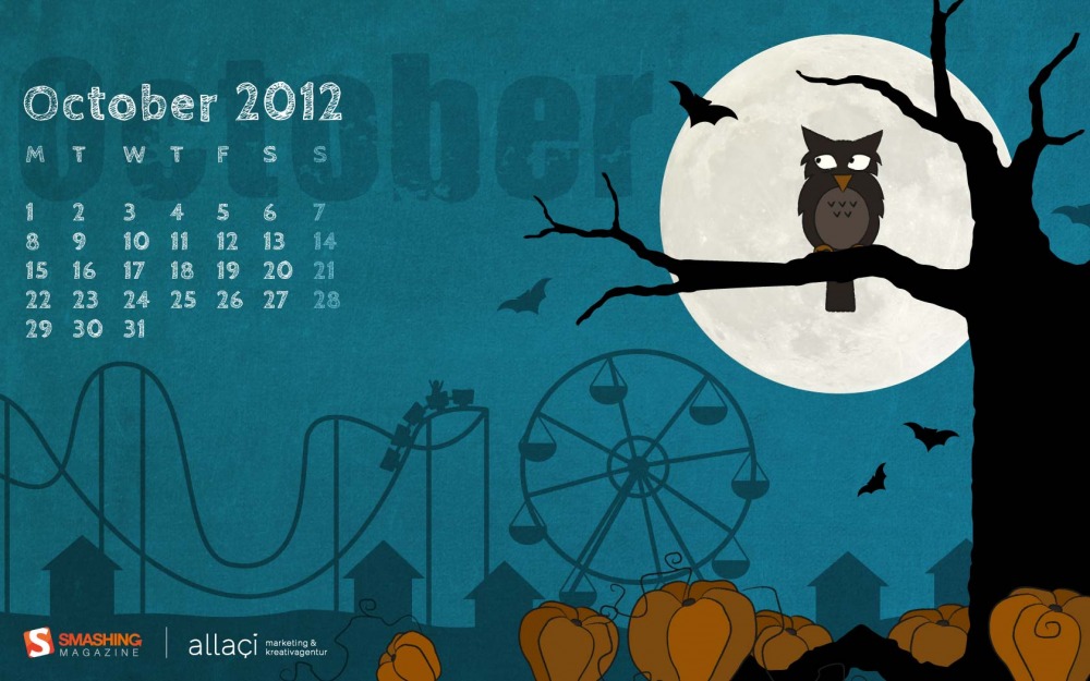
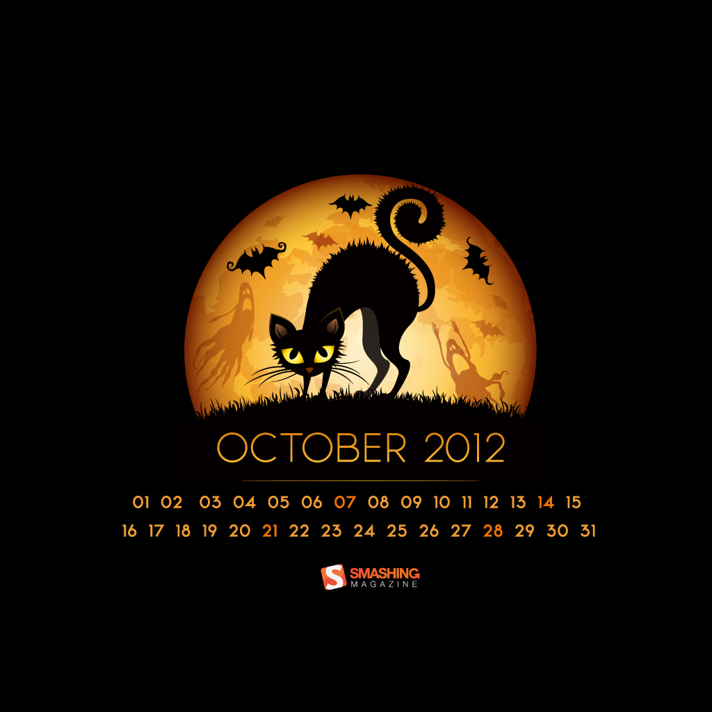
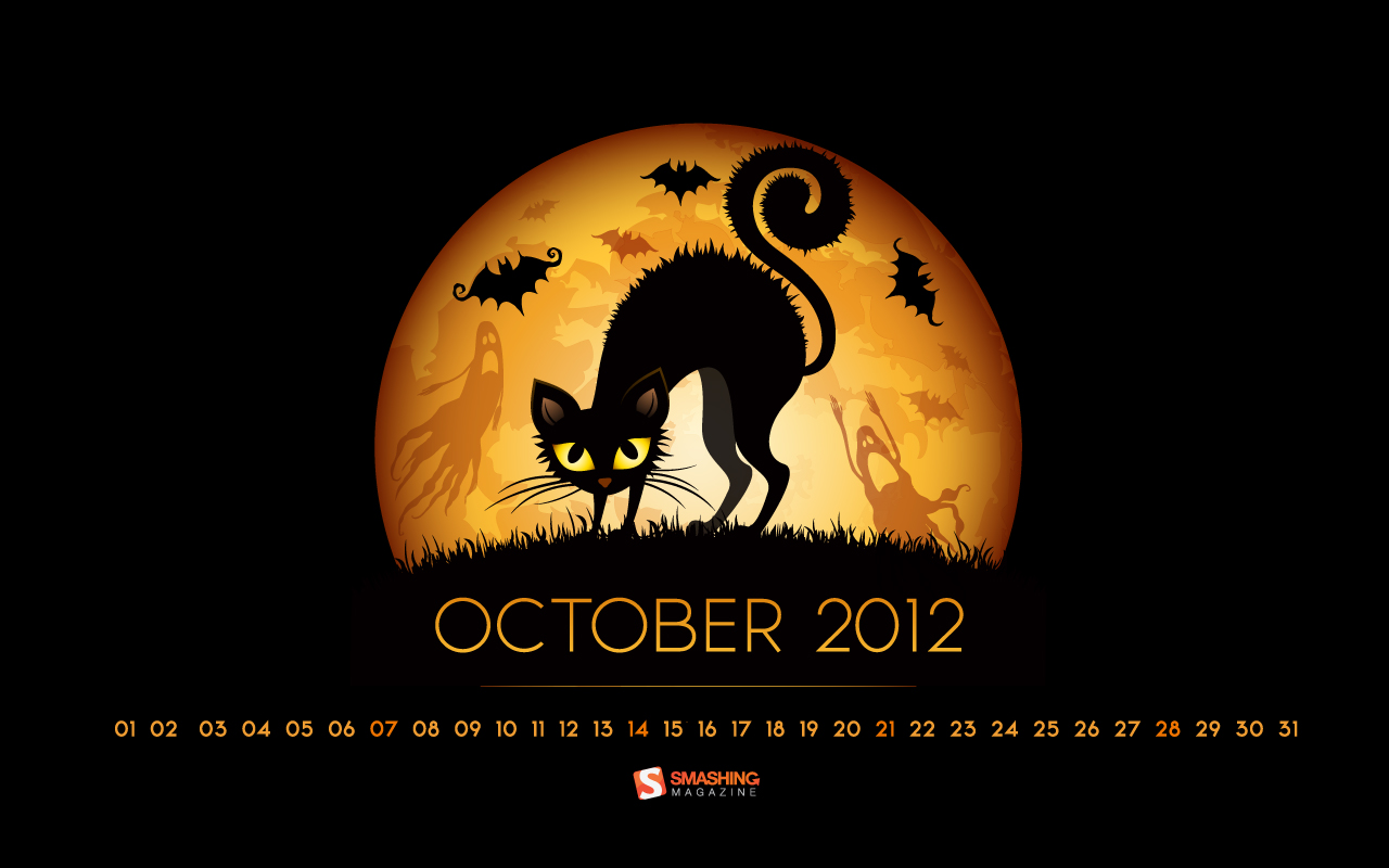
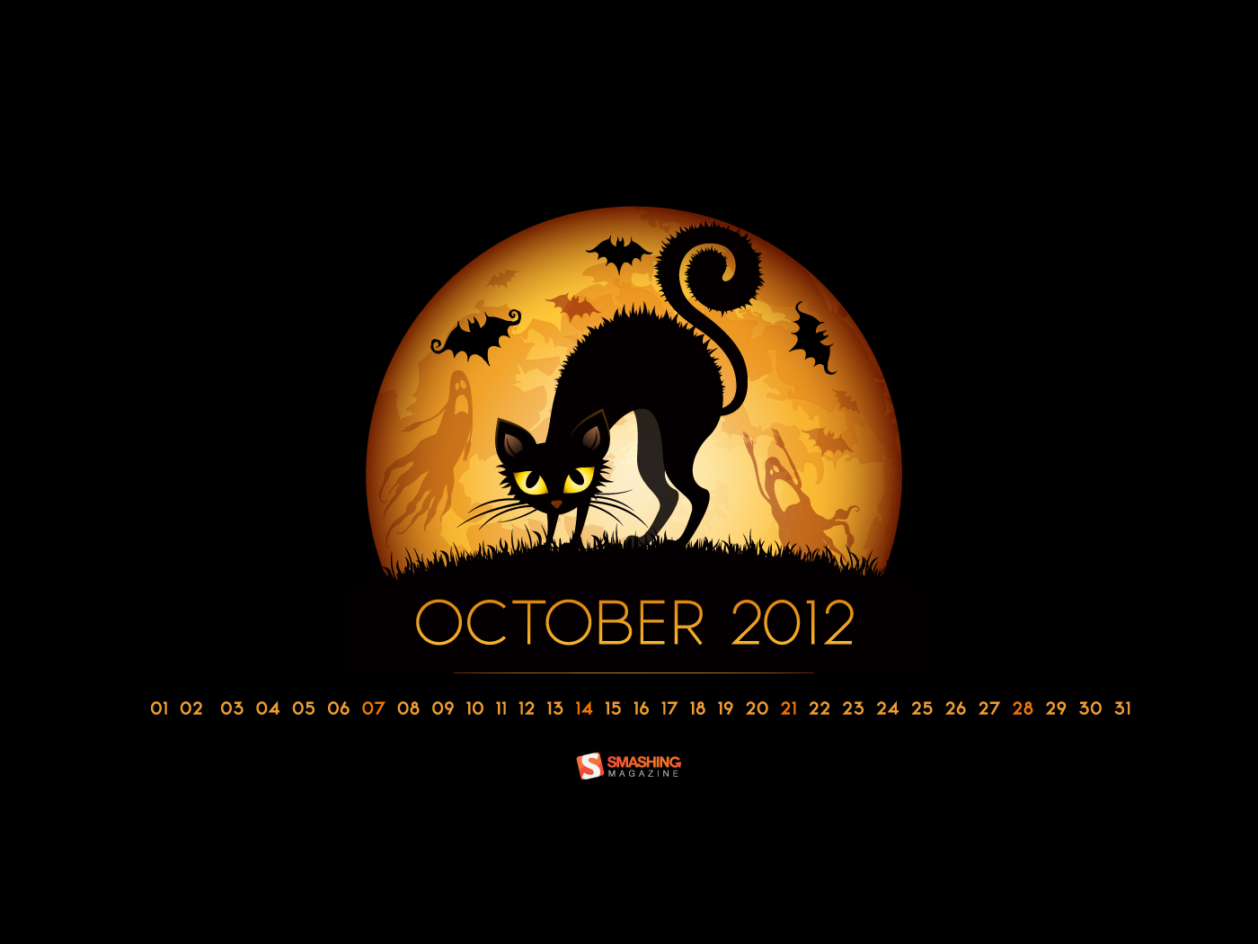
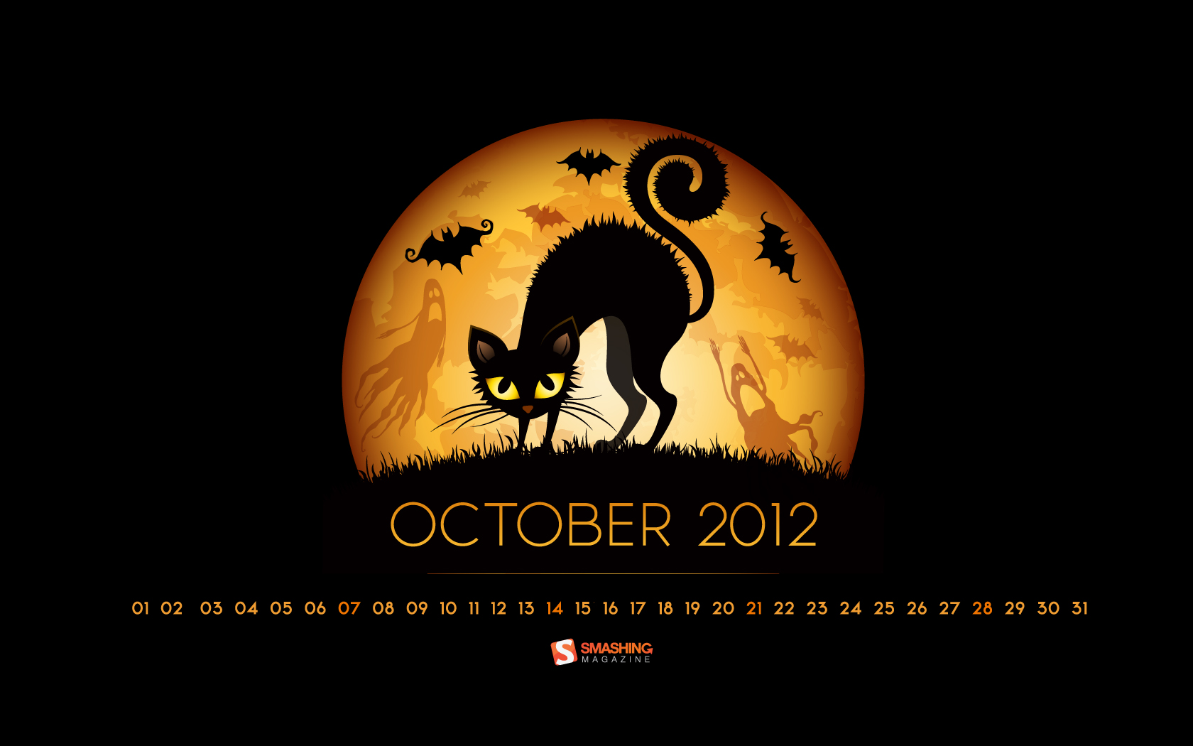
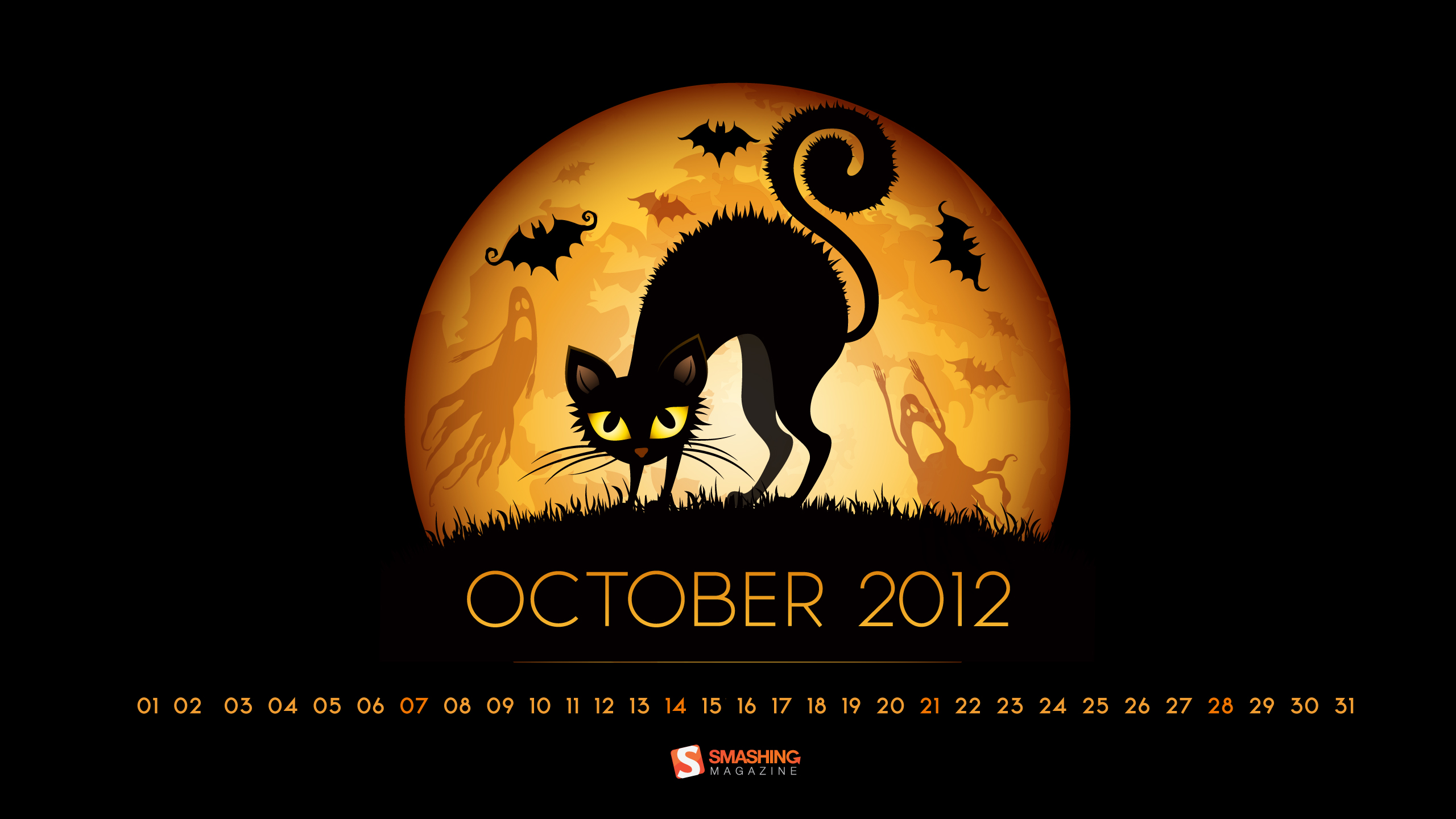
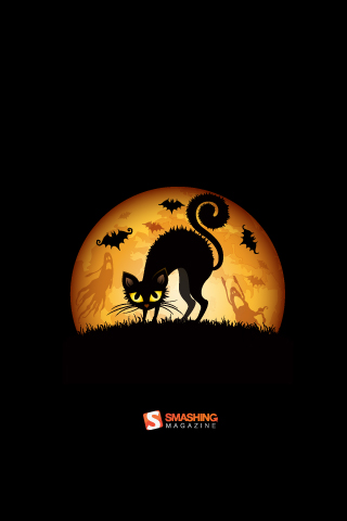
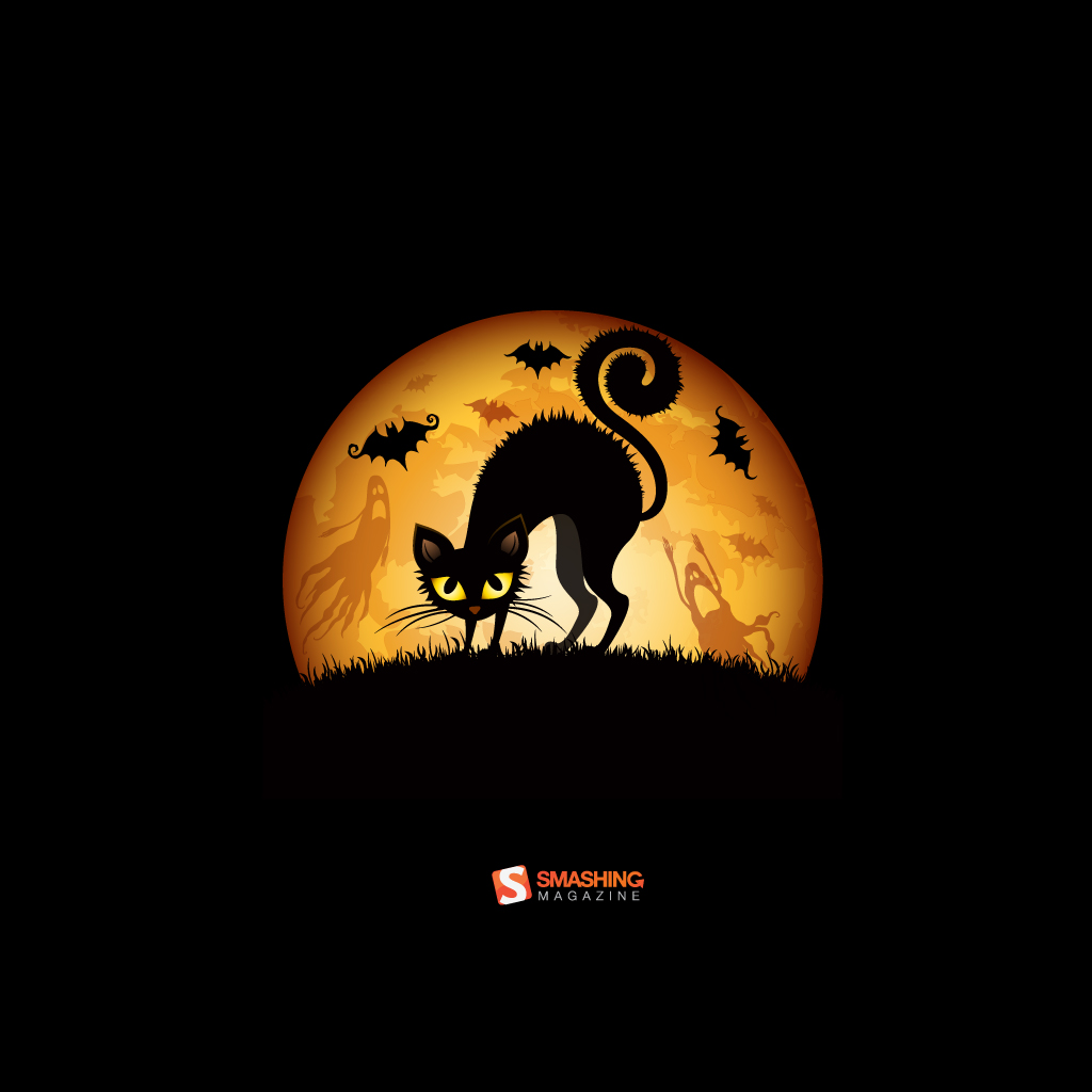
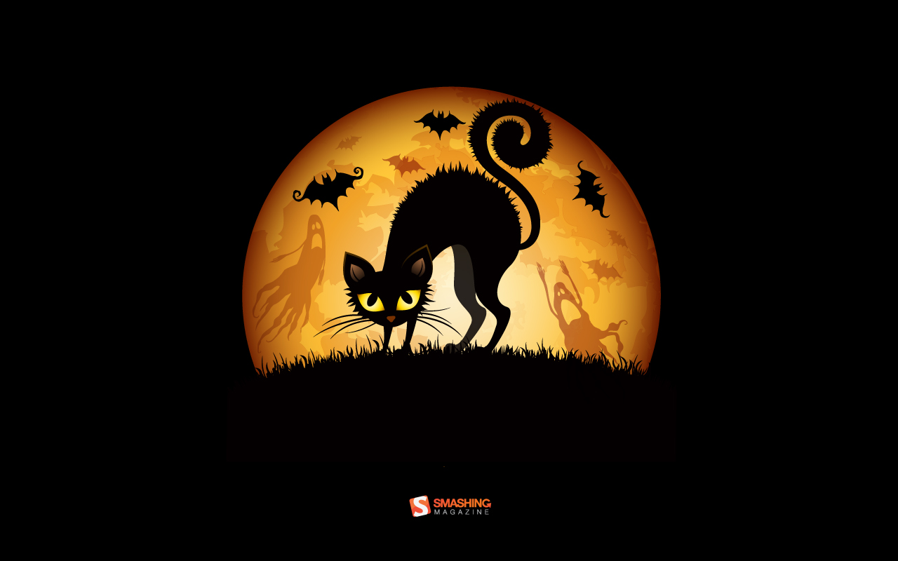
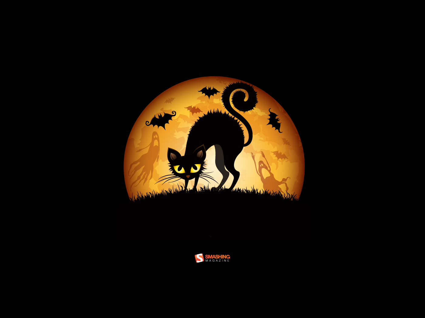
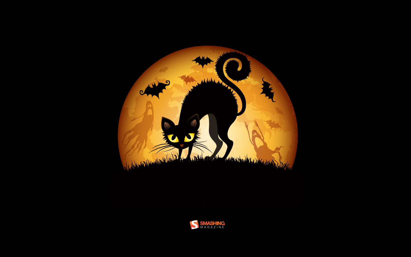
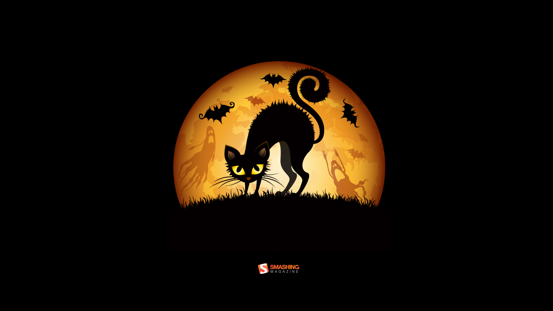
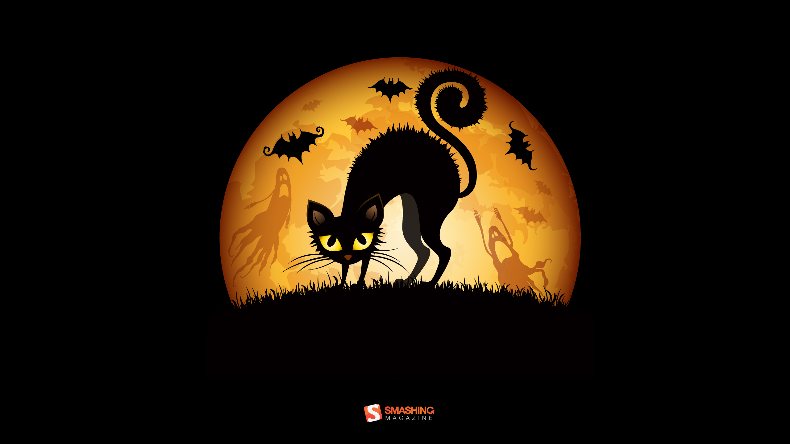
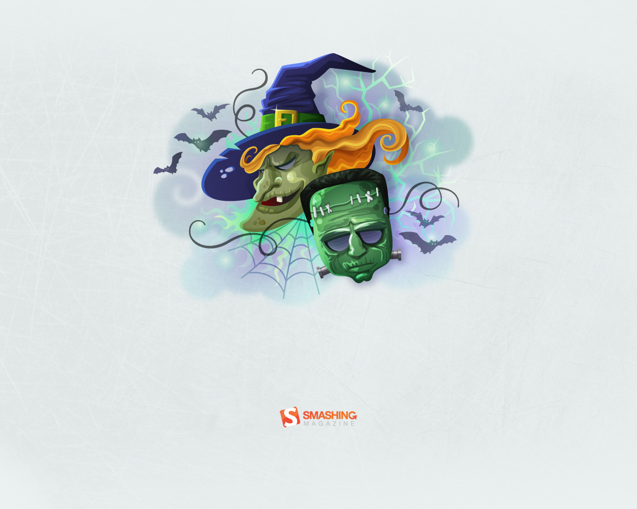
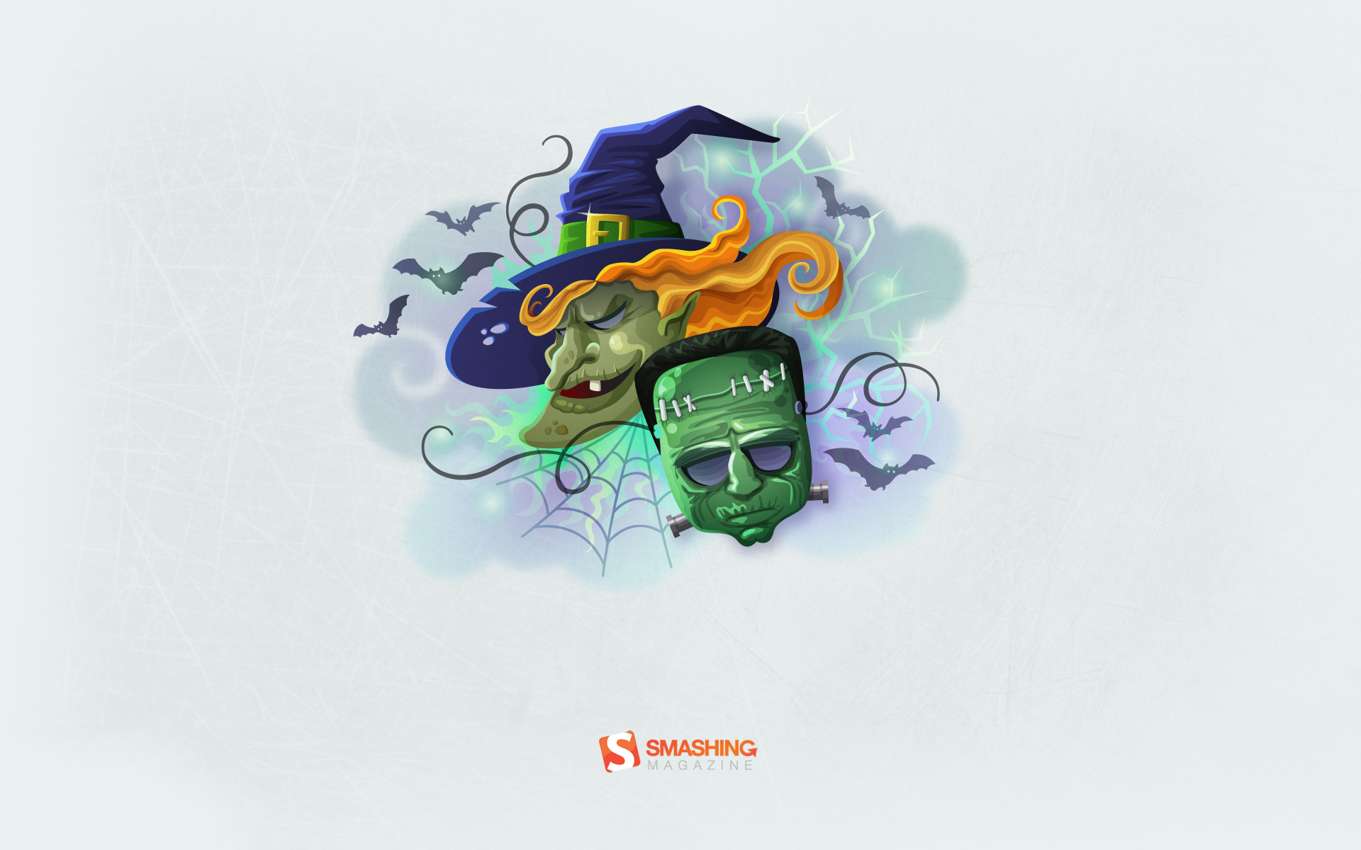
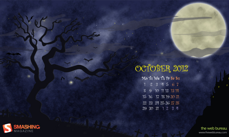
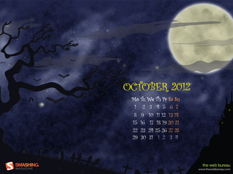
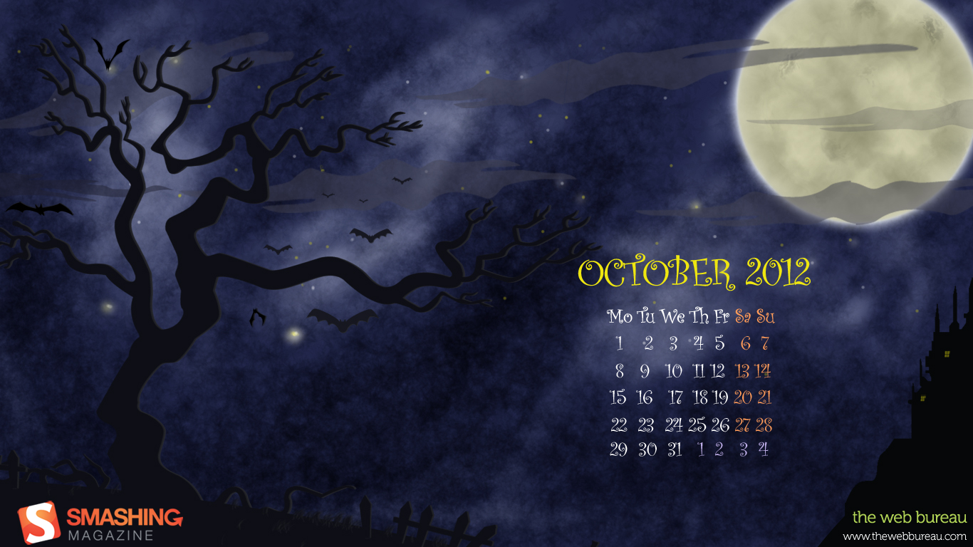
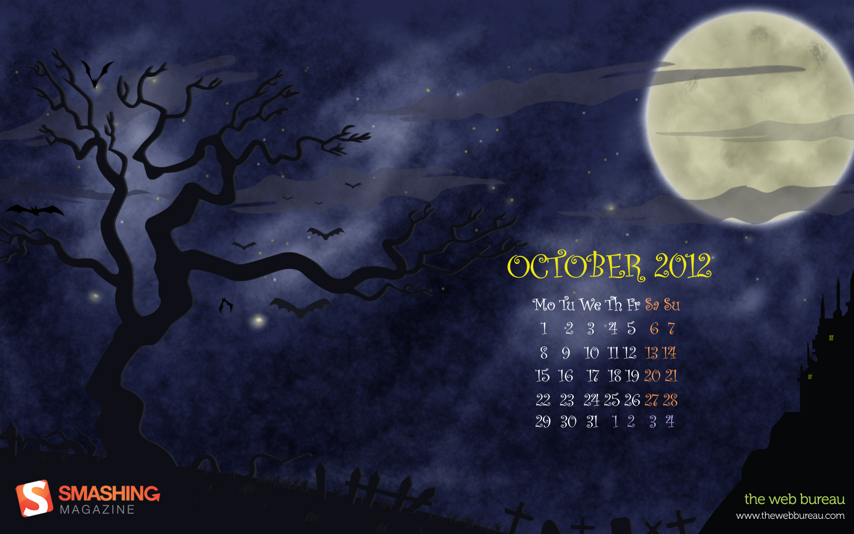
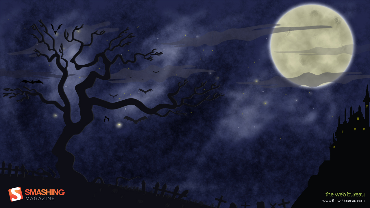
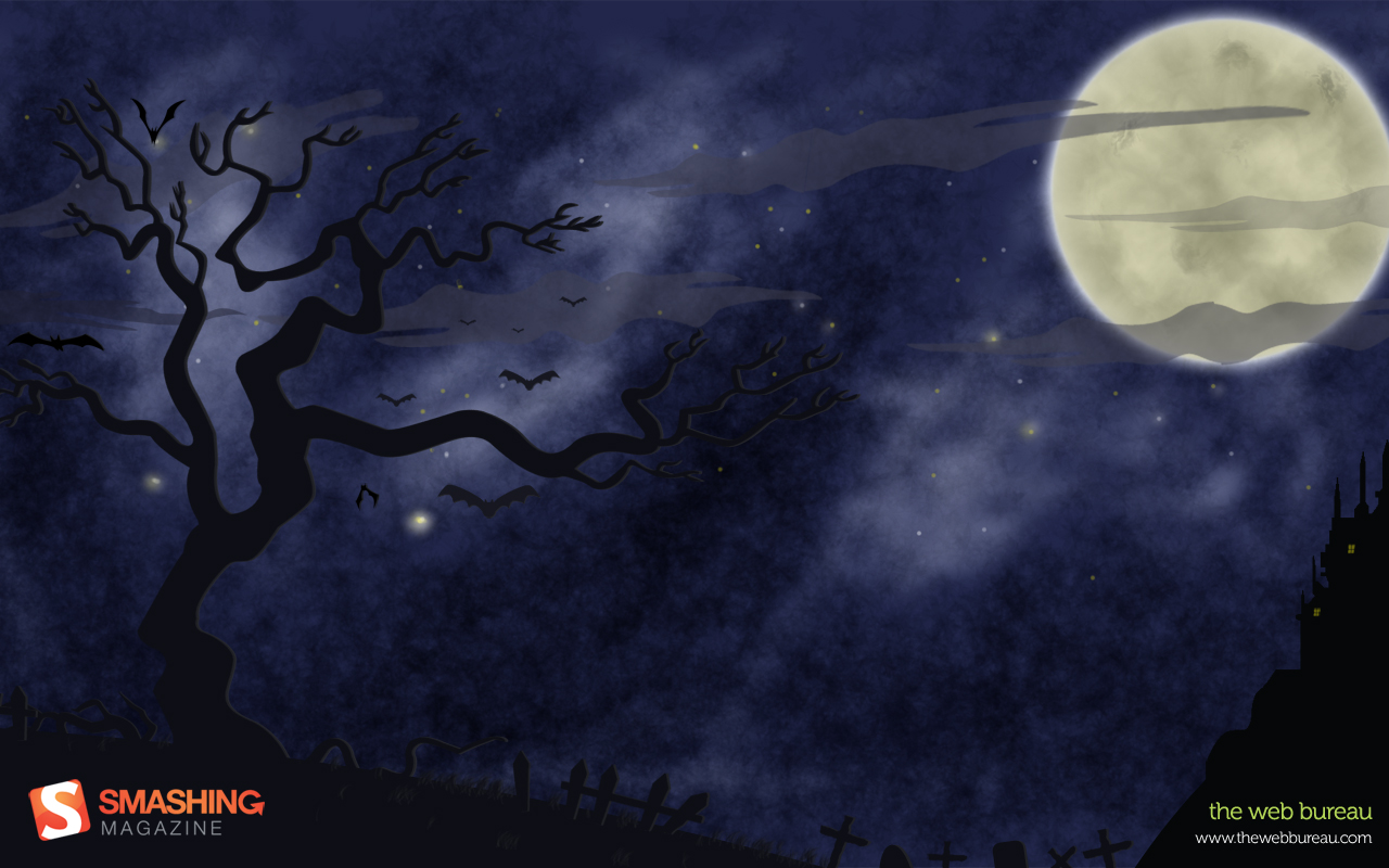
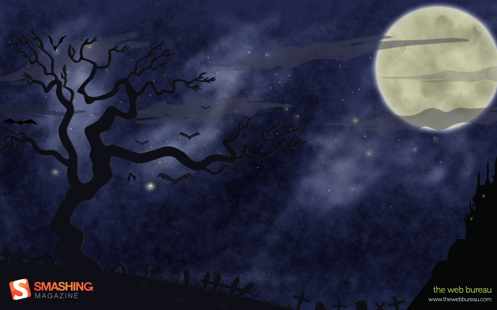
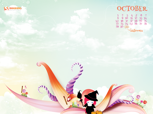
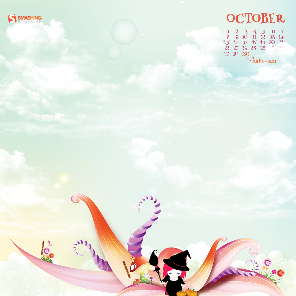
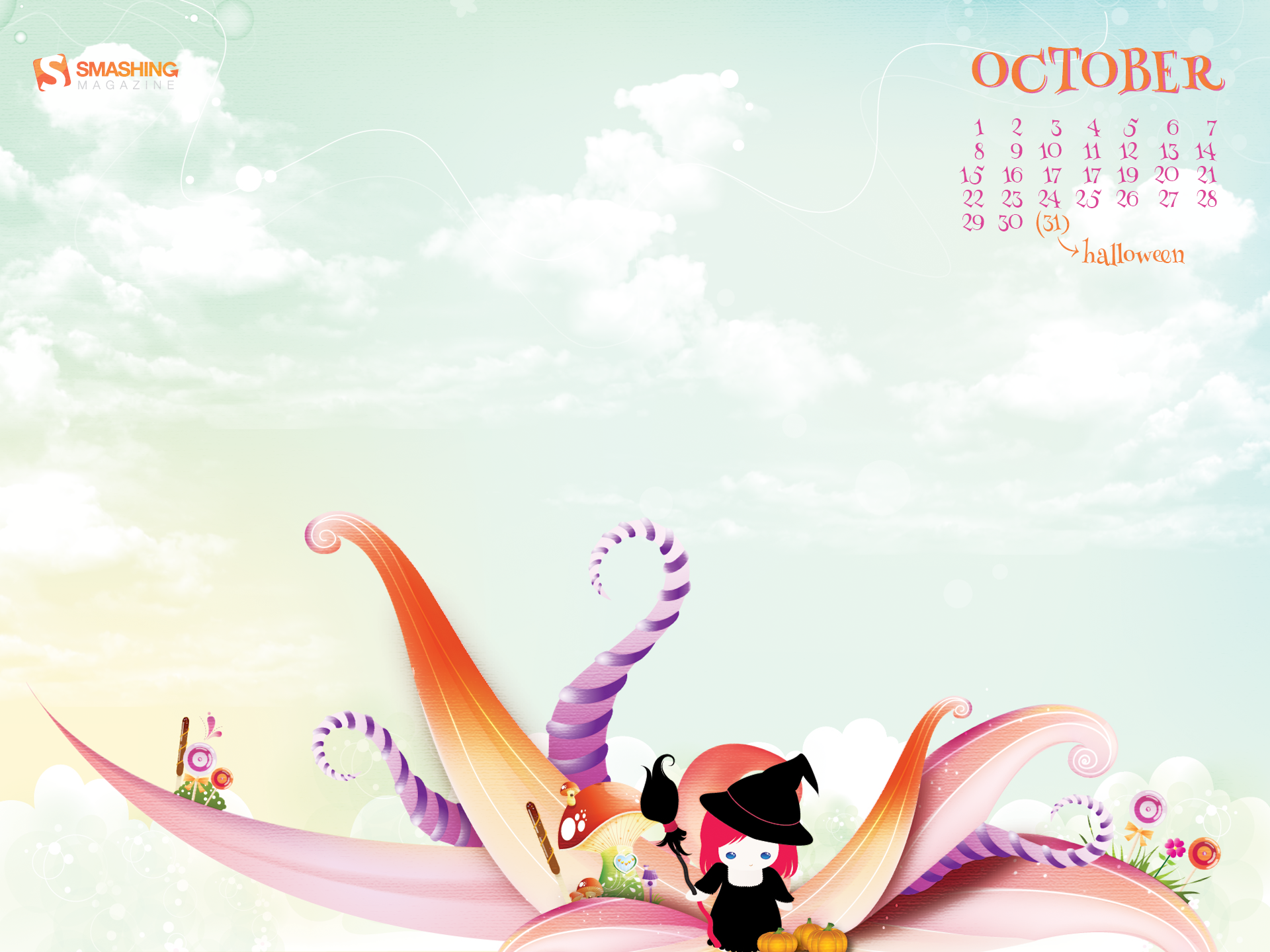
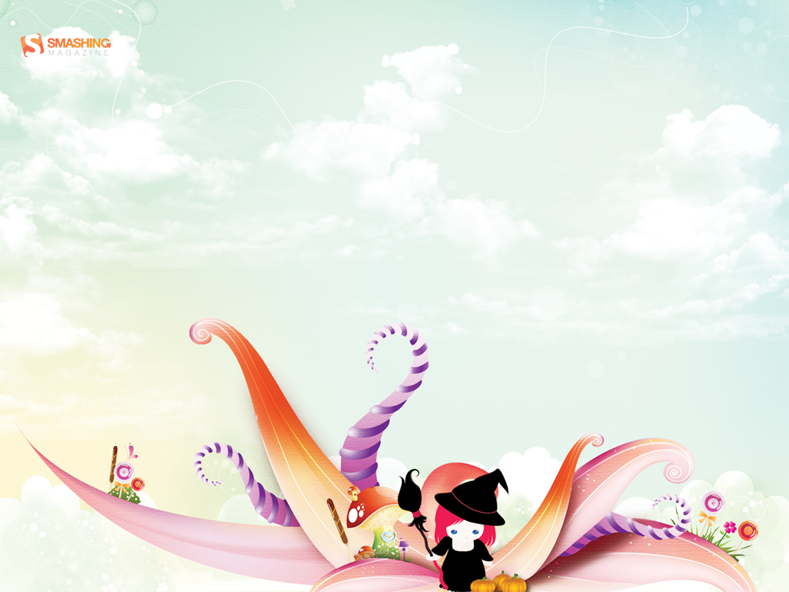
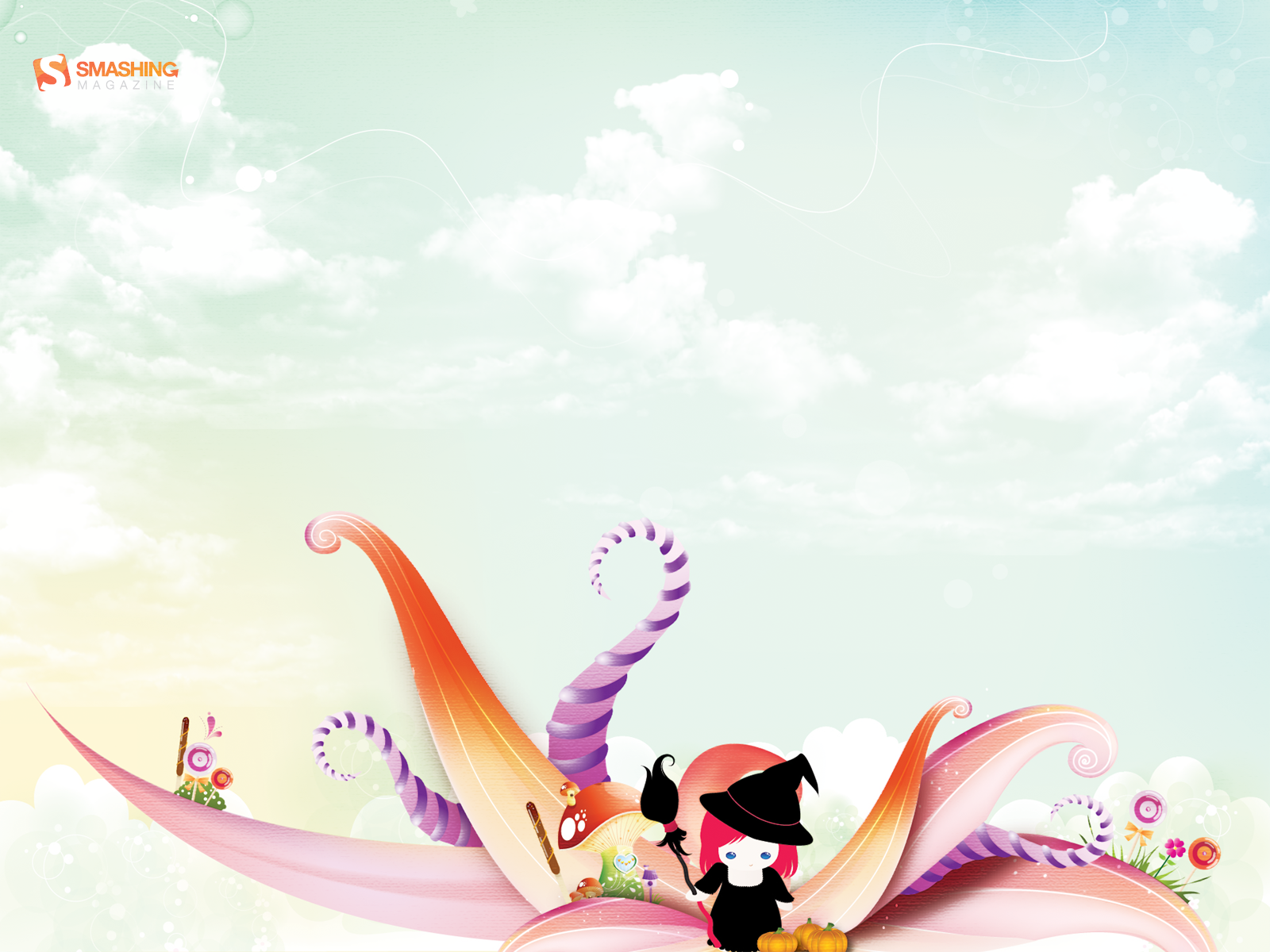
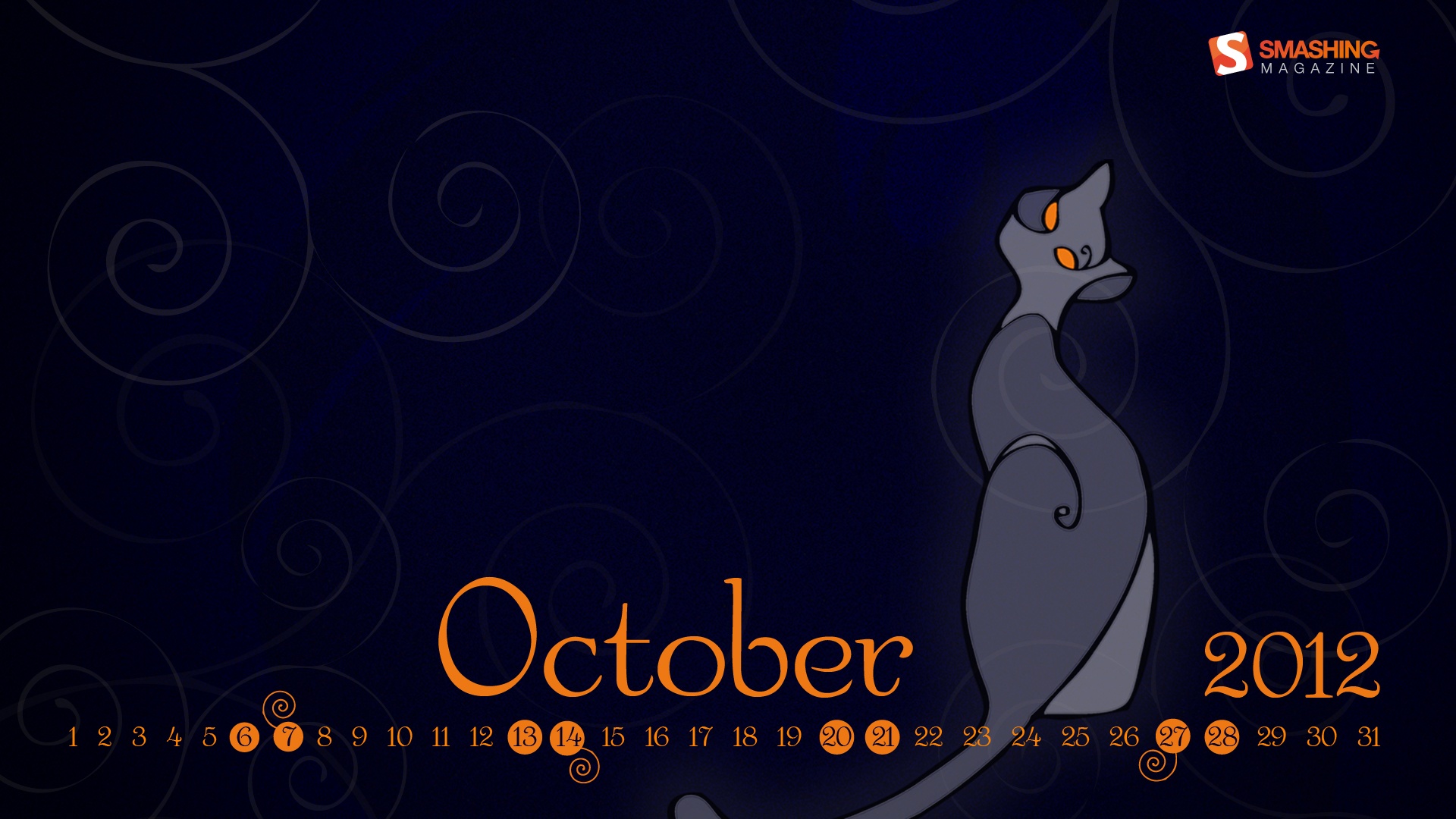
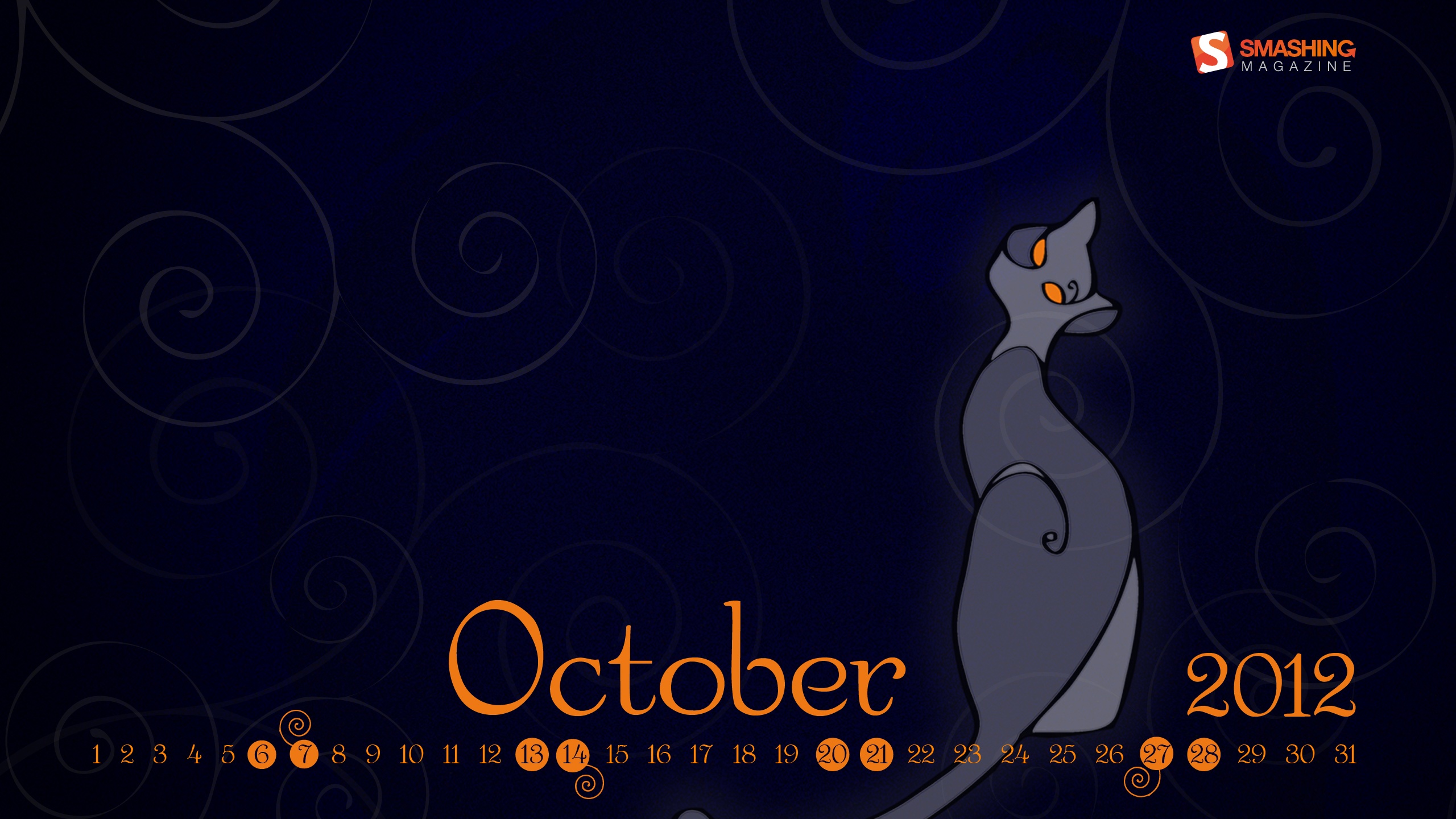
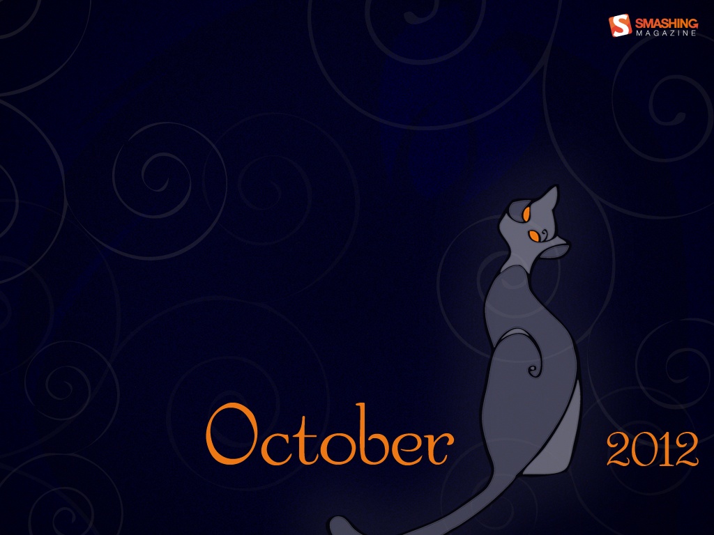
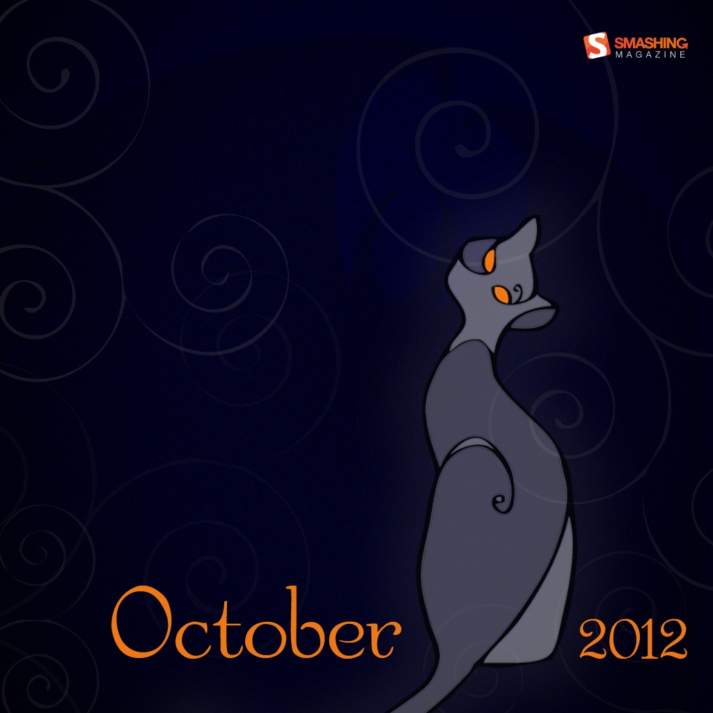
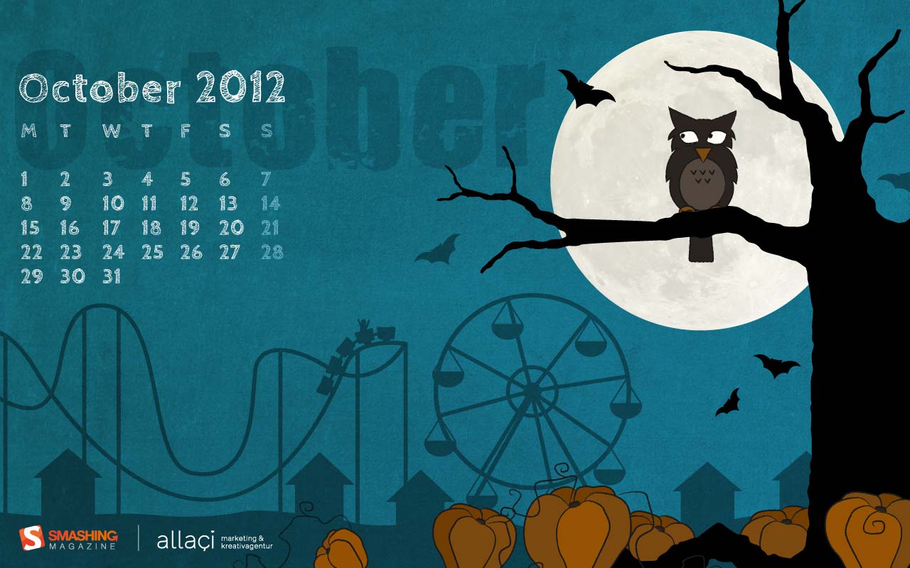
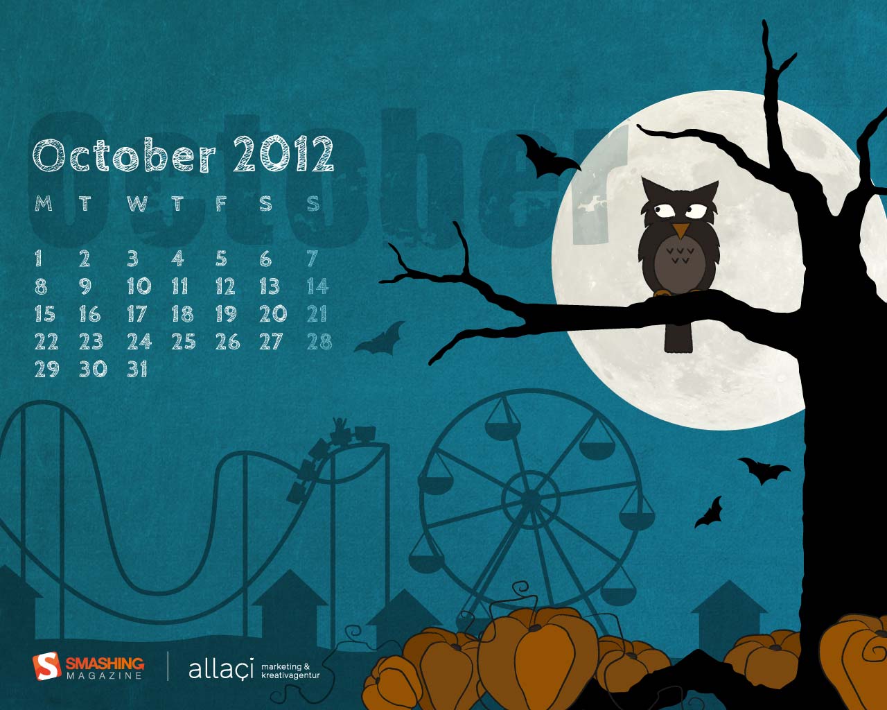
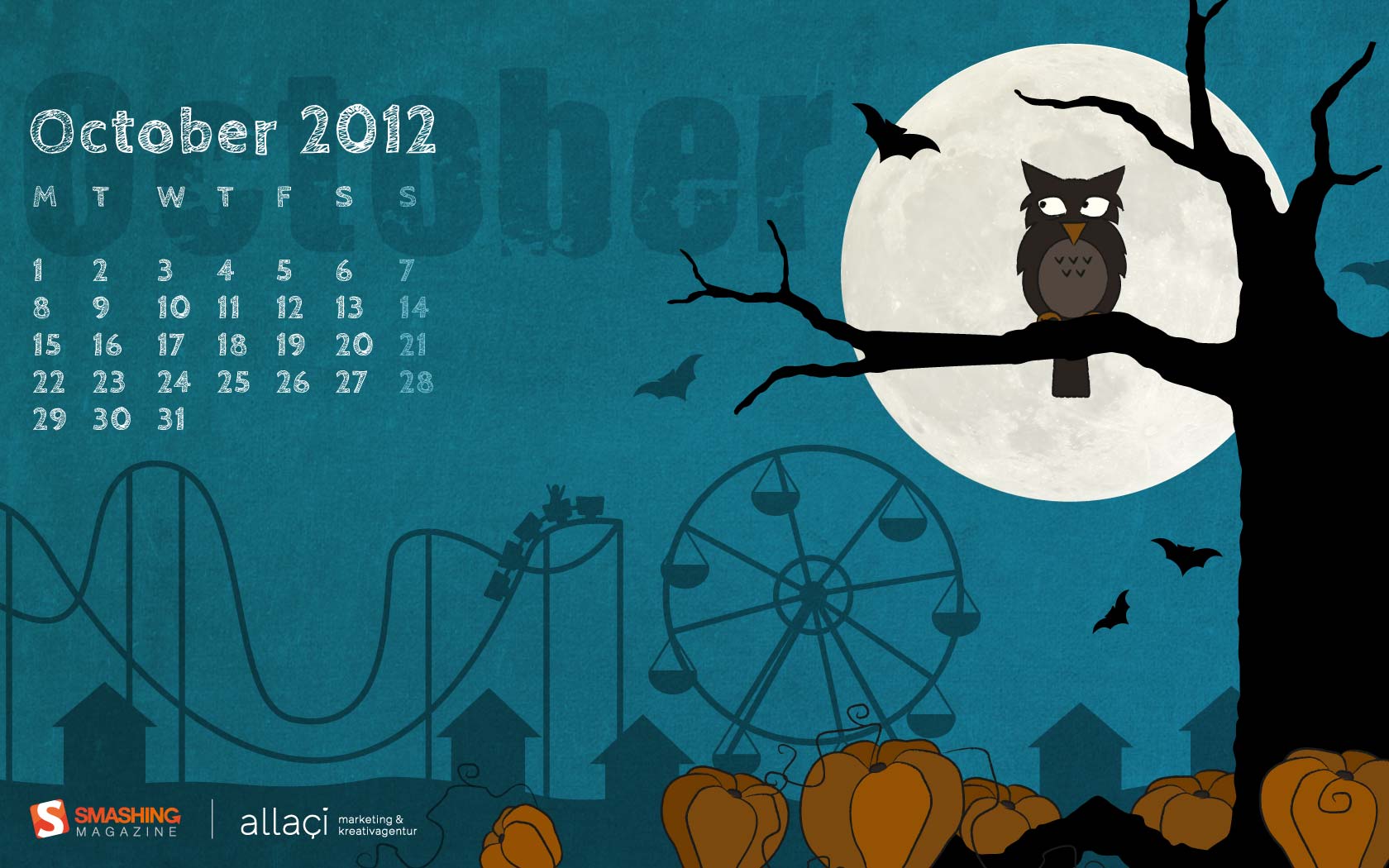
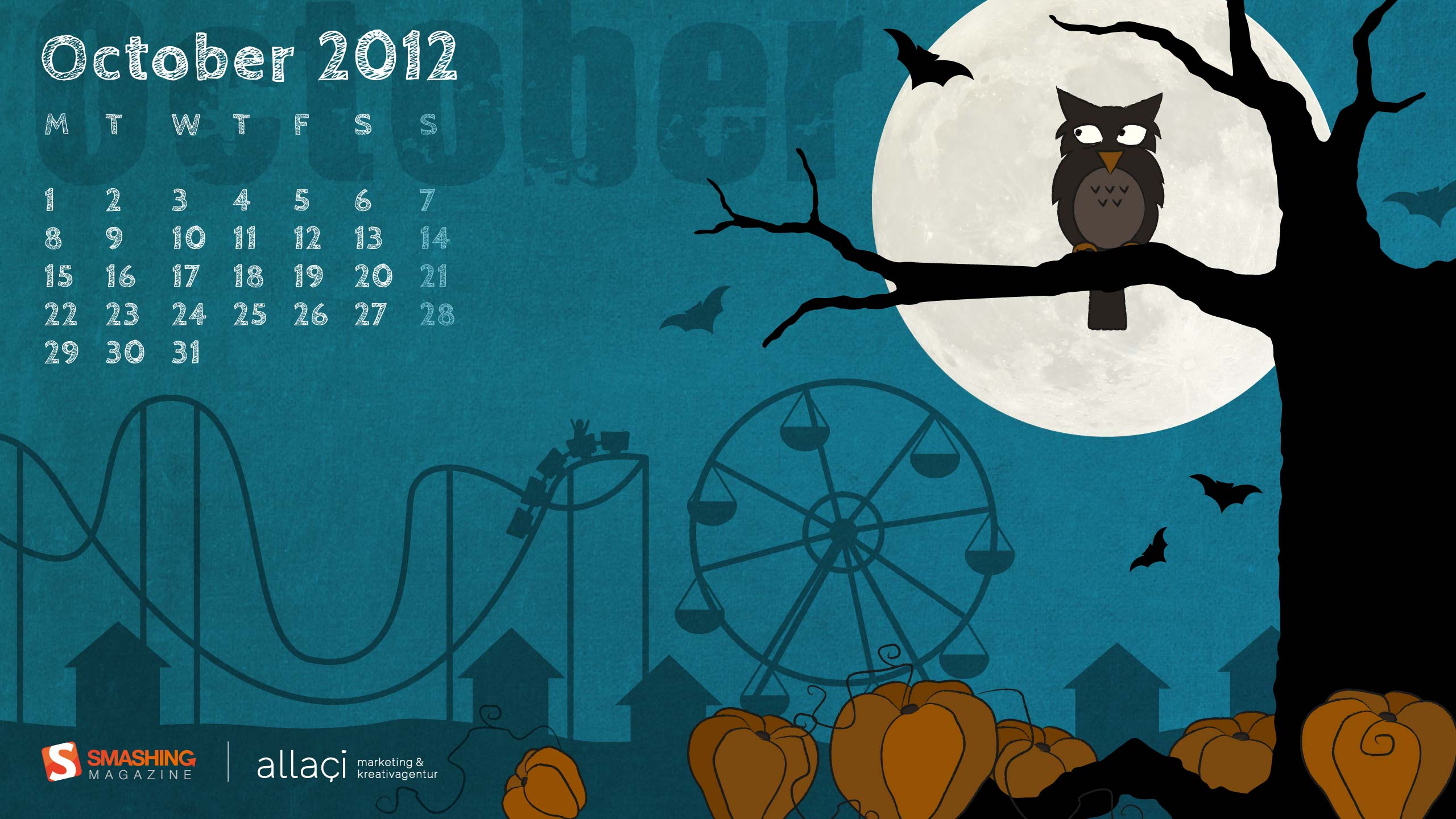
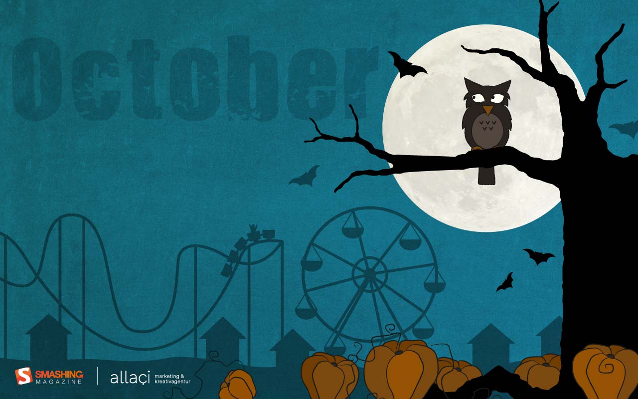
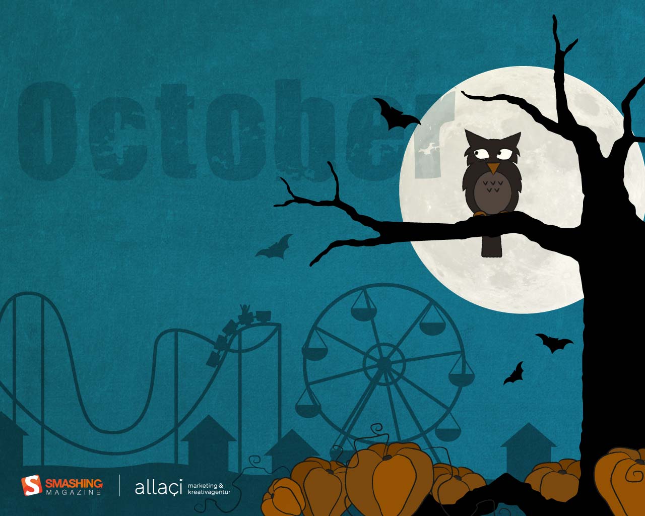
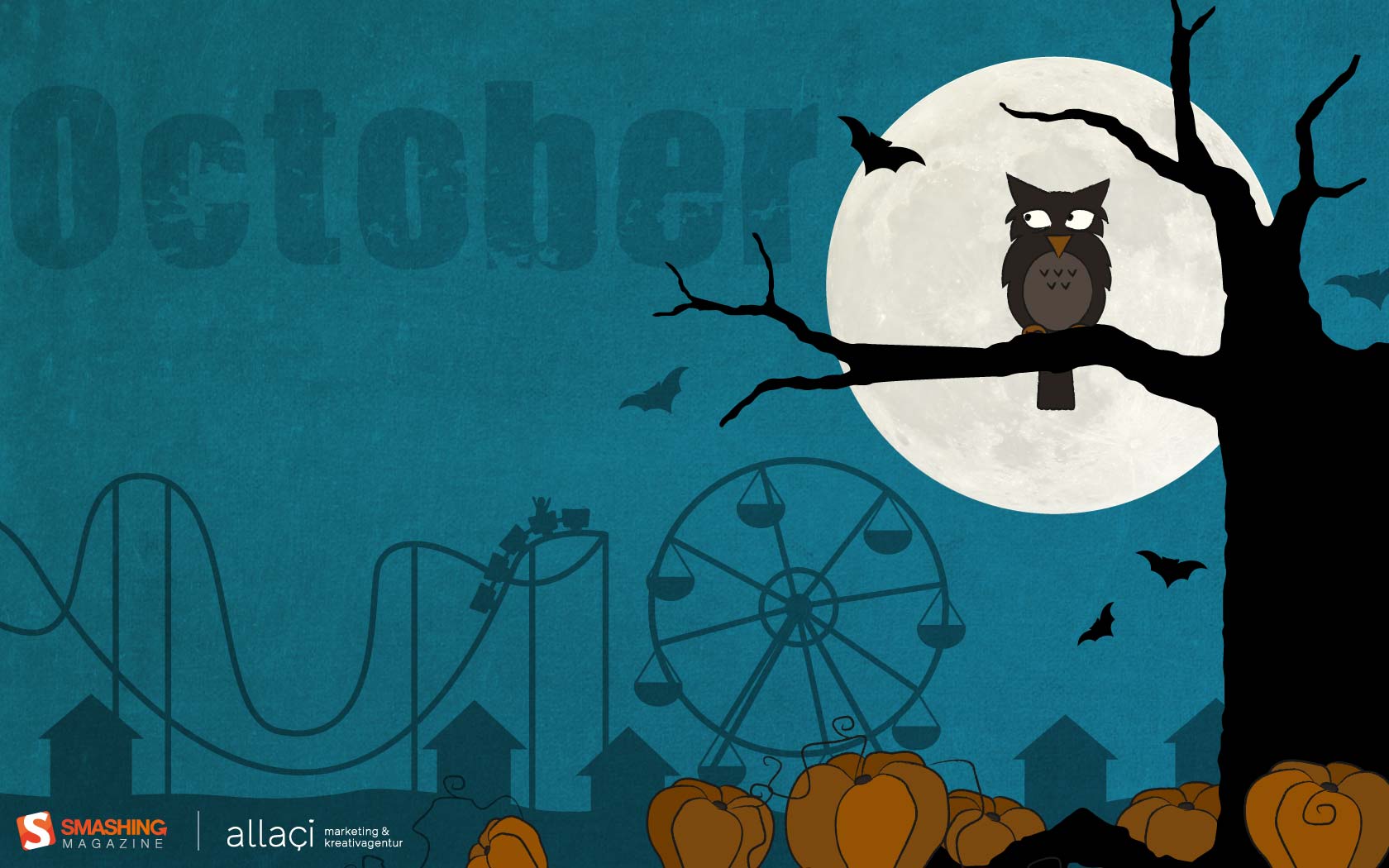
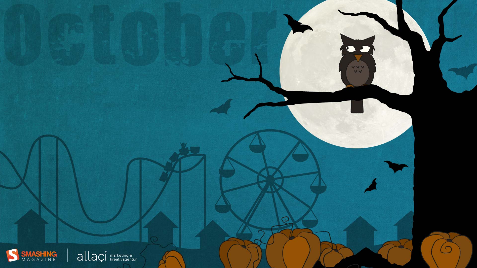
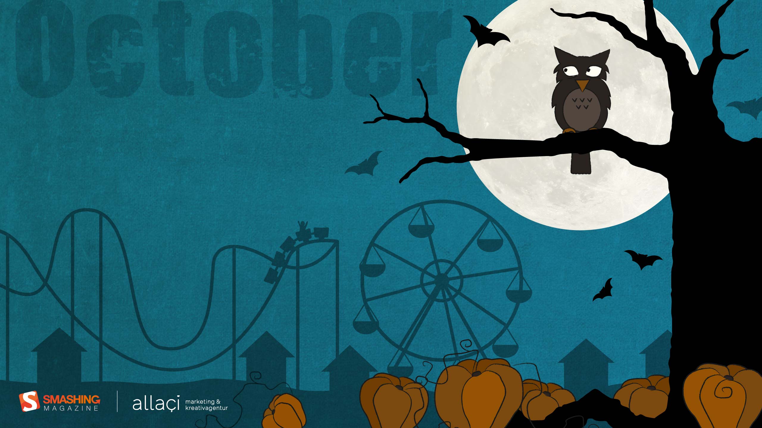
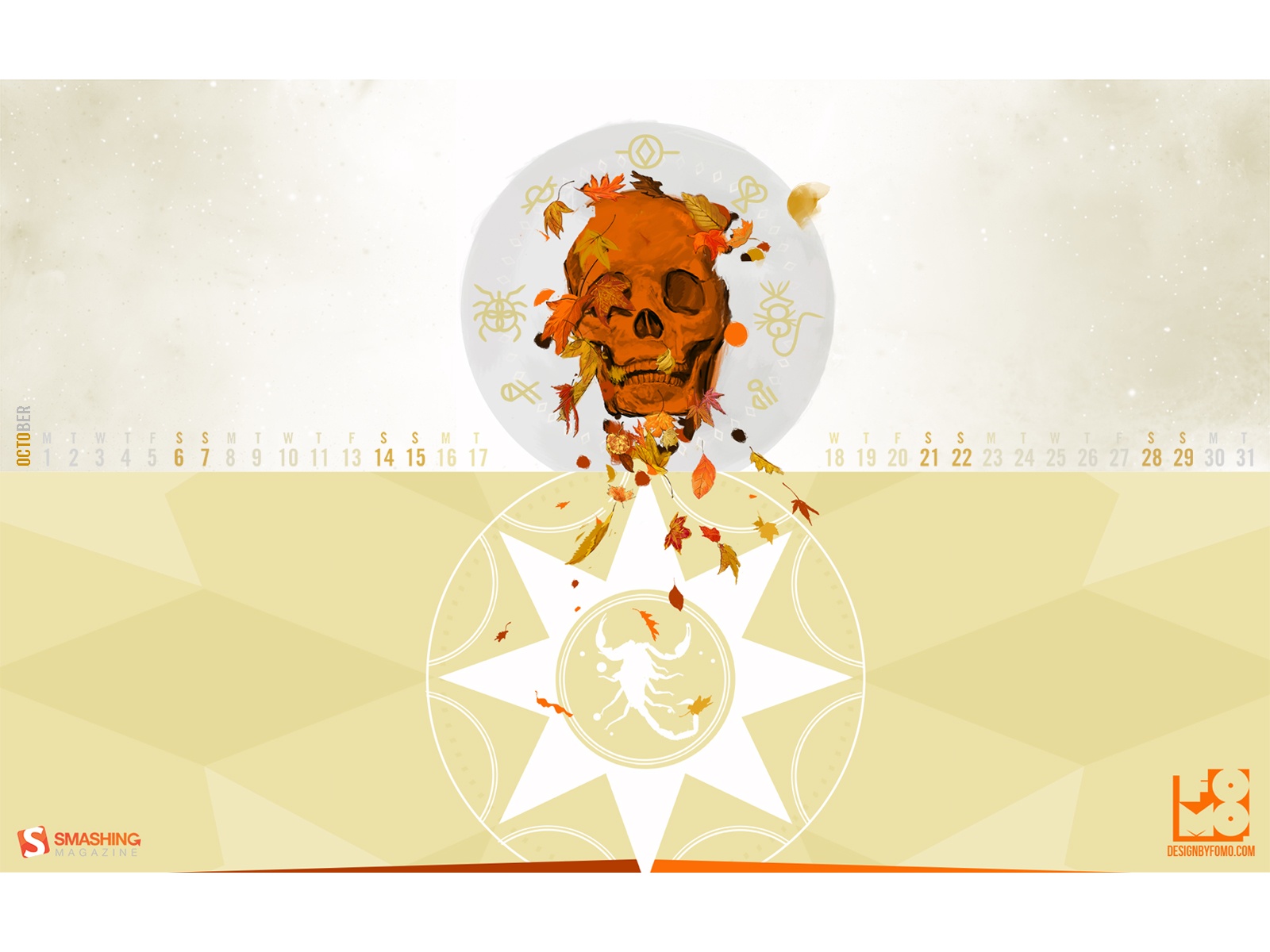
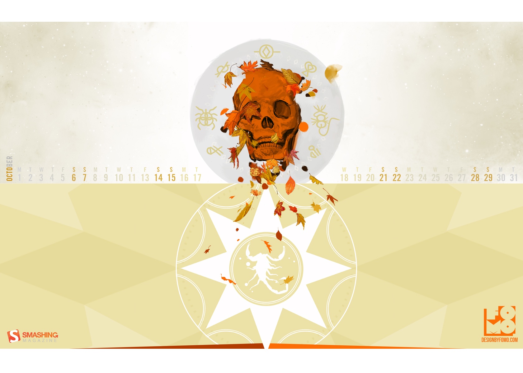
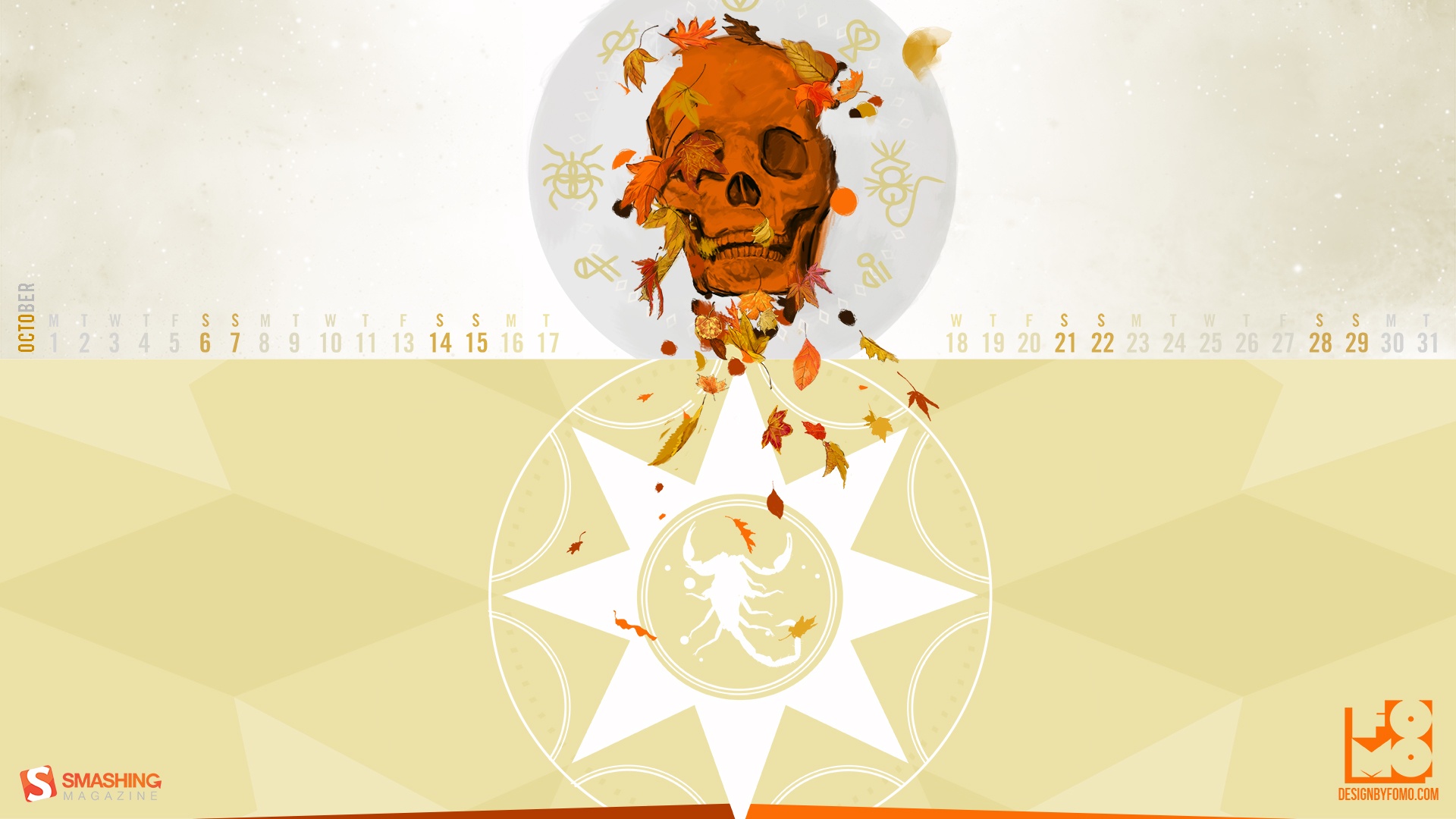
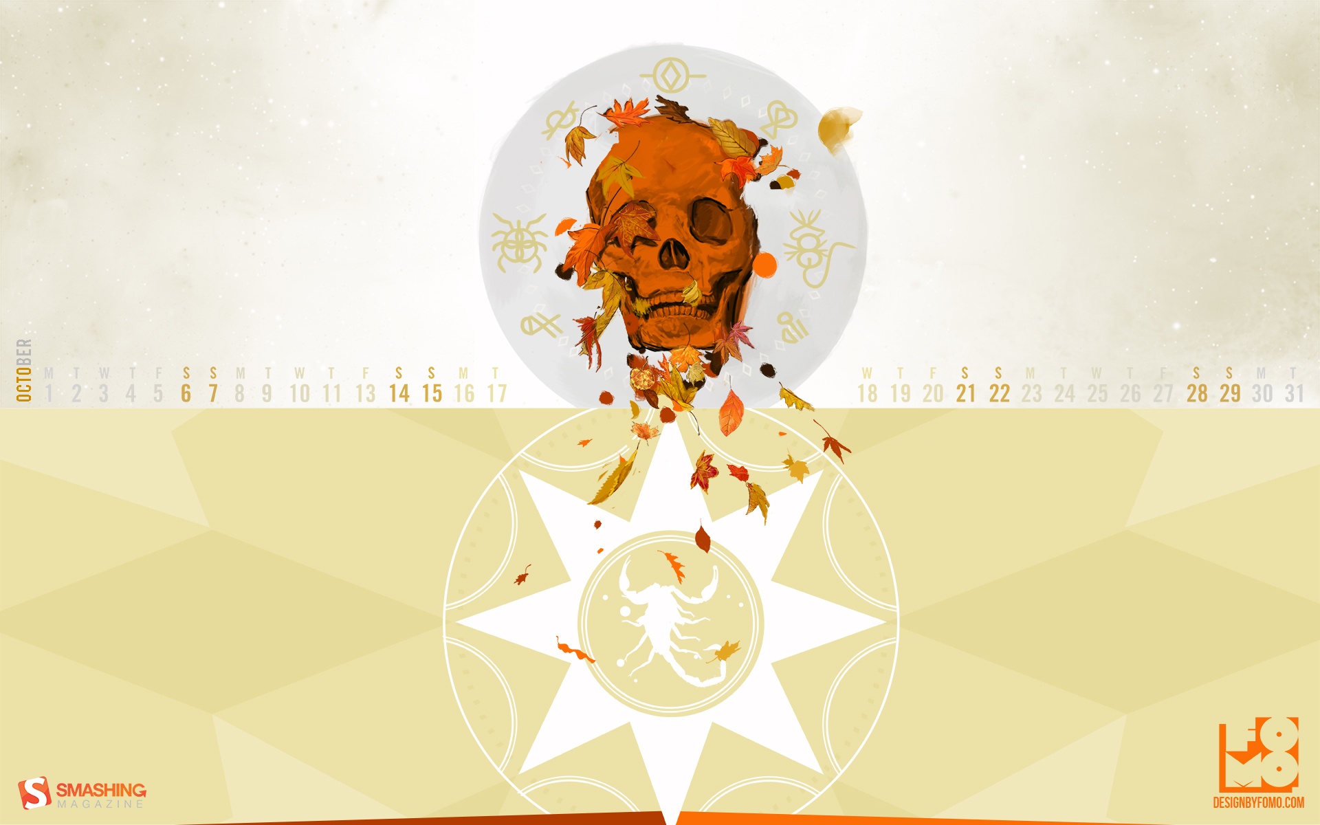
Halloween
Designed by Mohamad Khatib from Lebanon.

- preview
- with calendar: 320×480, 1024×1024, 1280×800, 1400×1050, 1680×1050, 1920×1080, 2560×1440
- without calendar: 320×480, 1024×1024, 1280×800, 1400×1050, 1680×1050, 1920×1080, 2560×1440
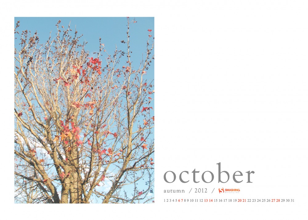
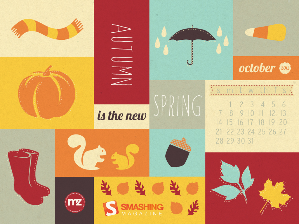
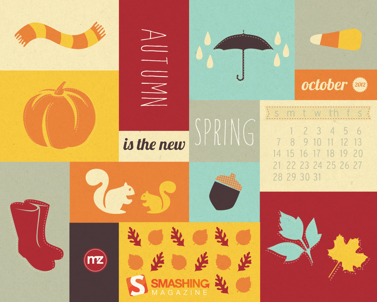
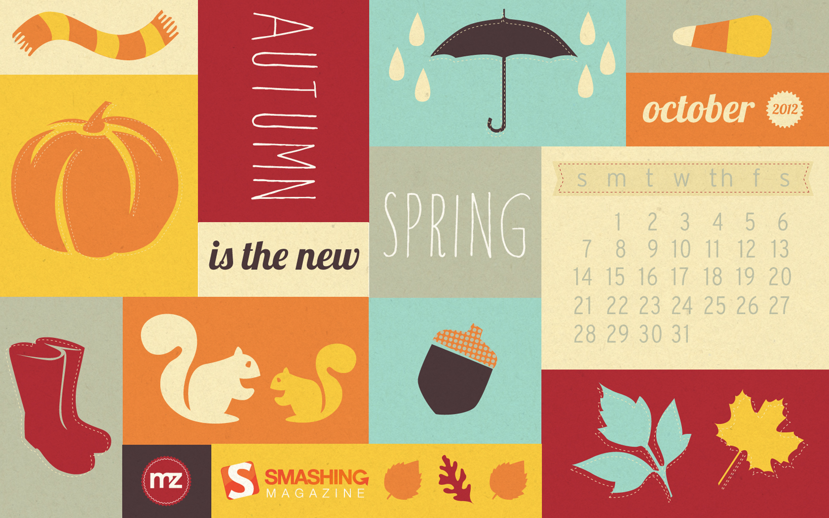
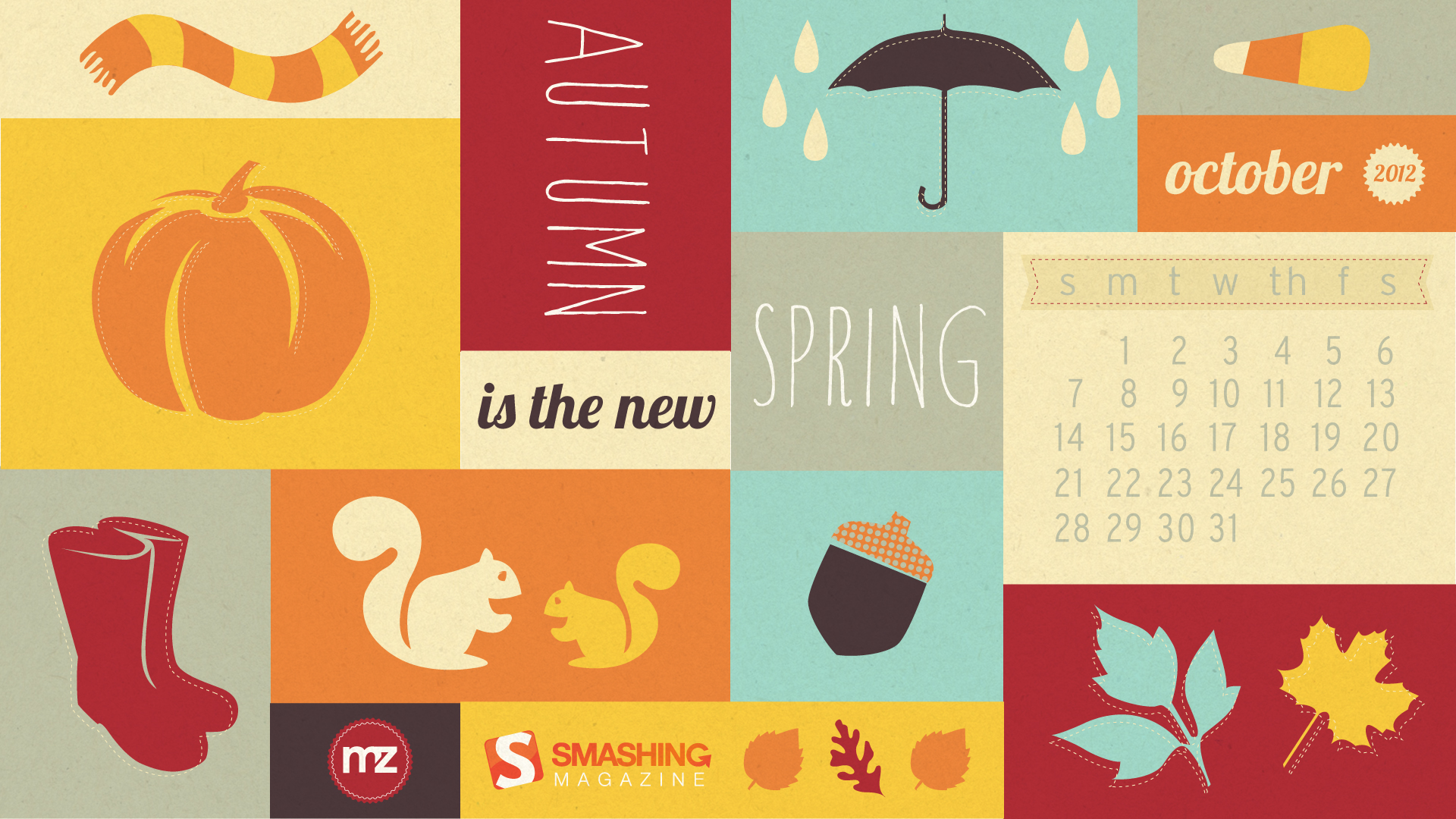
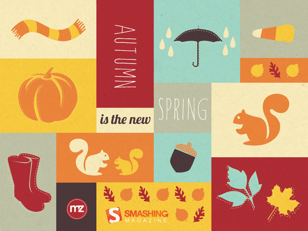
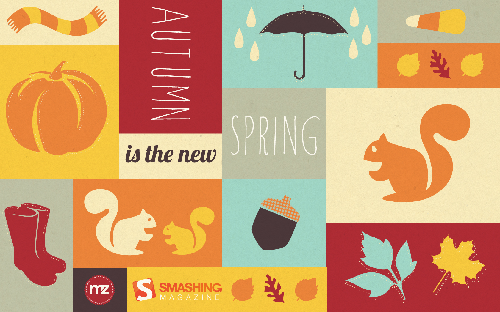
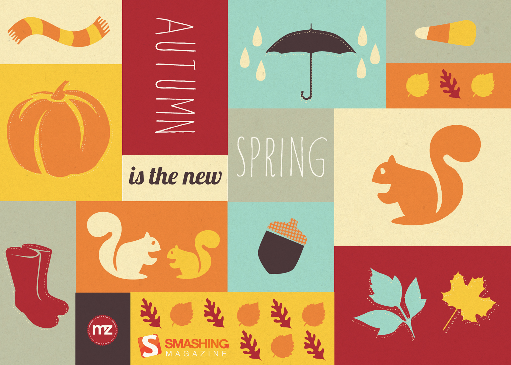
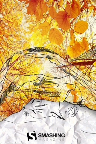
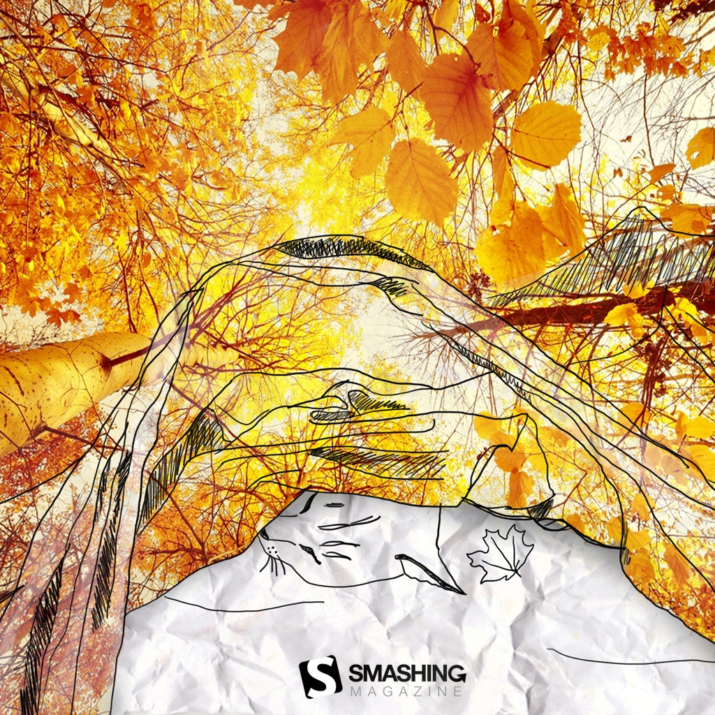
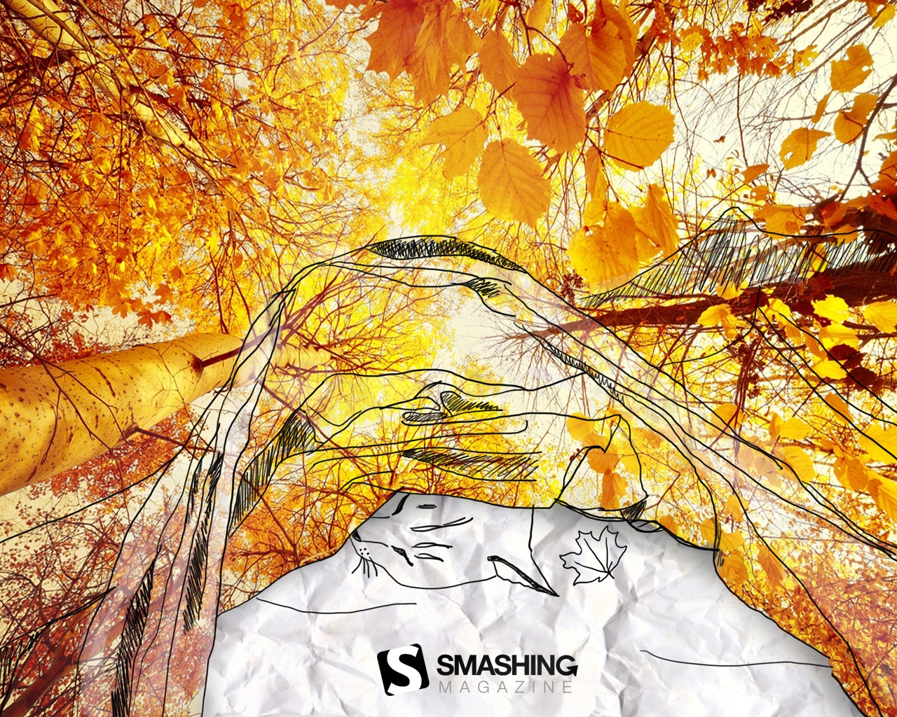
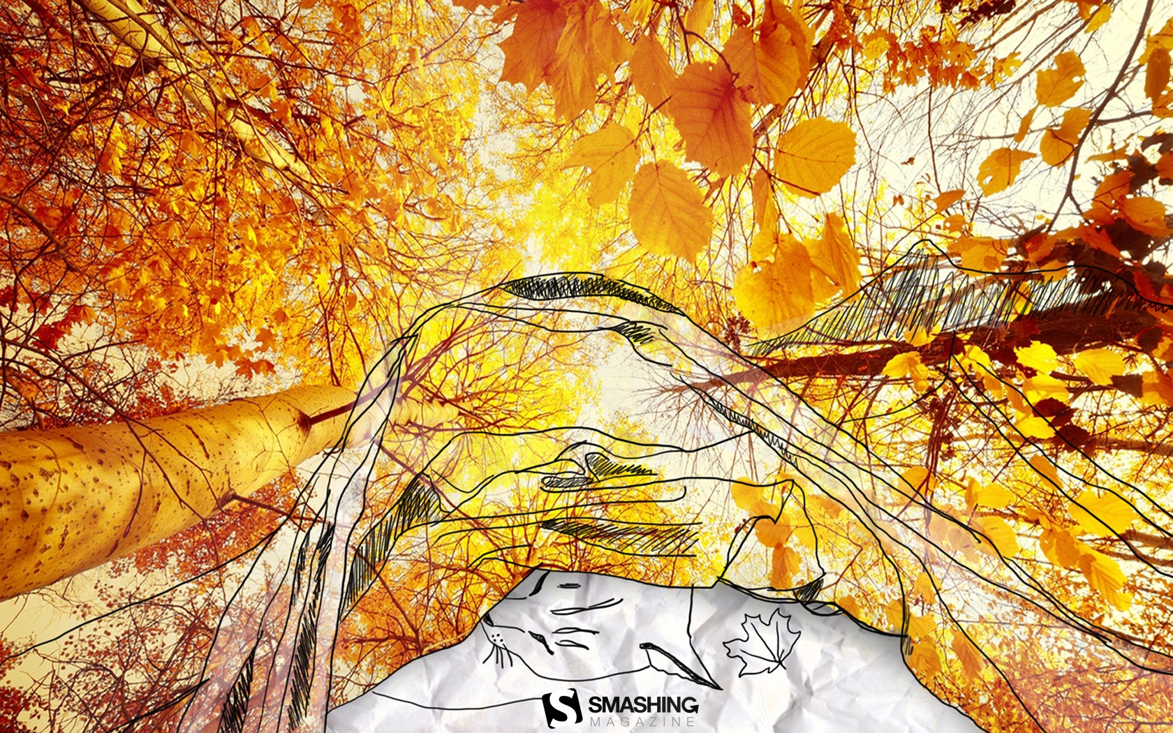
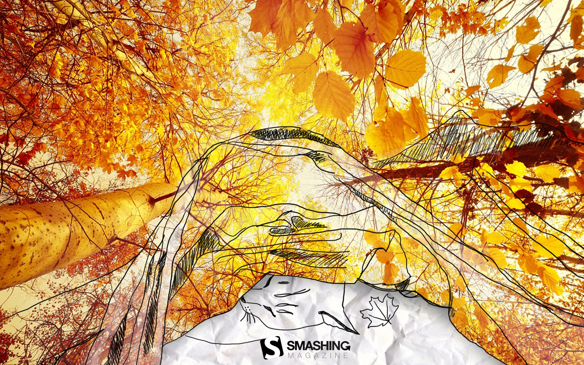
Autumn Is The New Spring
“Who says Autumn isn’t fun? It’s the new Spring, after all!” Designed by Marina Zhukov from USA.

- preview
- with calendar: 1024×768, 1280×1024, 1680×1050, 1680×1200, 1920×1080
- without calendar: 1024×768, 1280×1024, 1680×1050, 1680×1200, 1920×1080
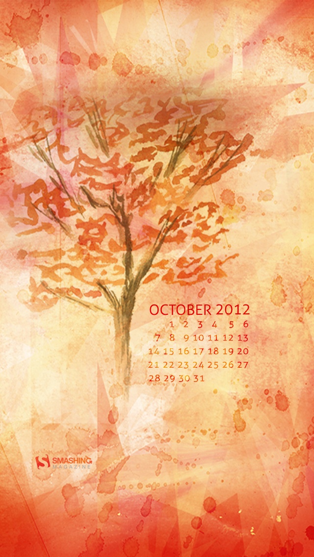
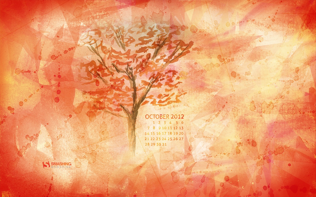
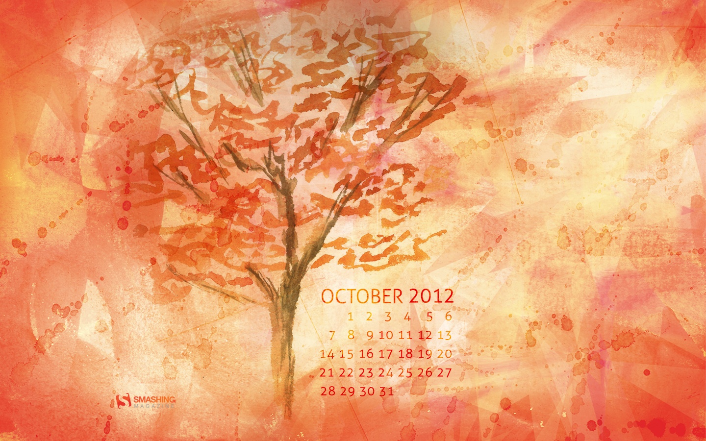
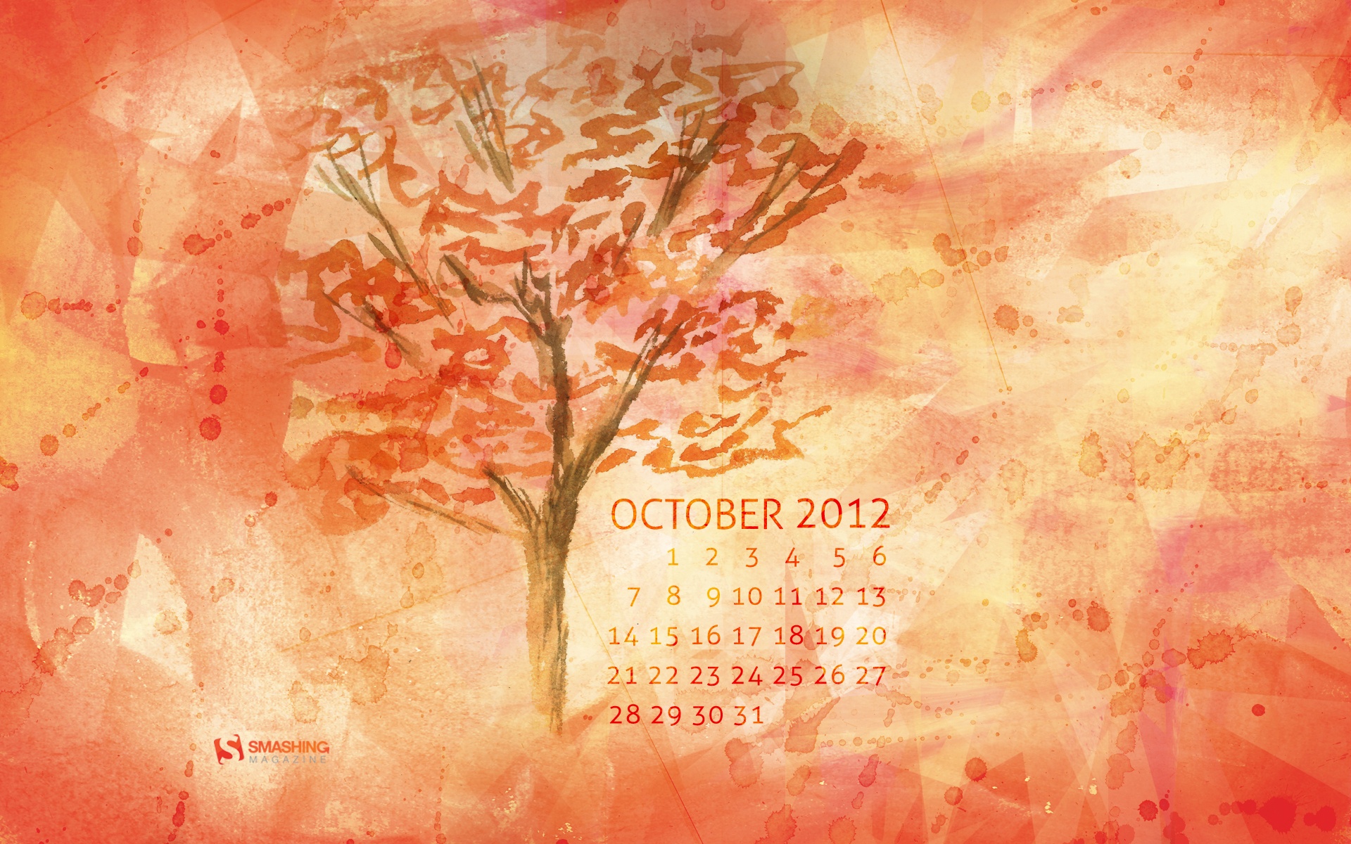
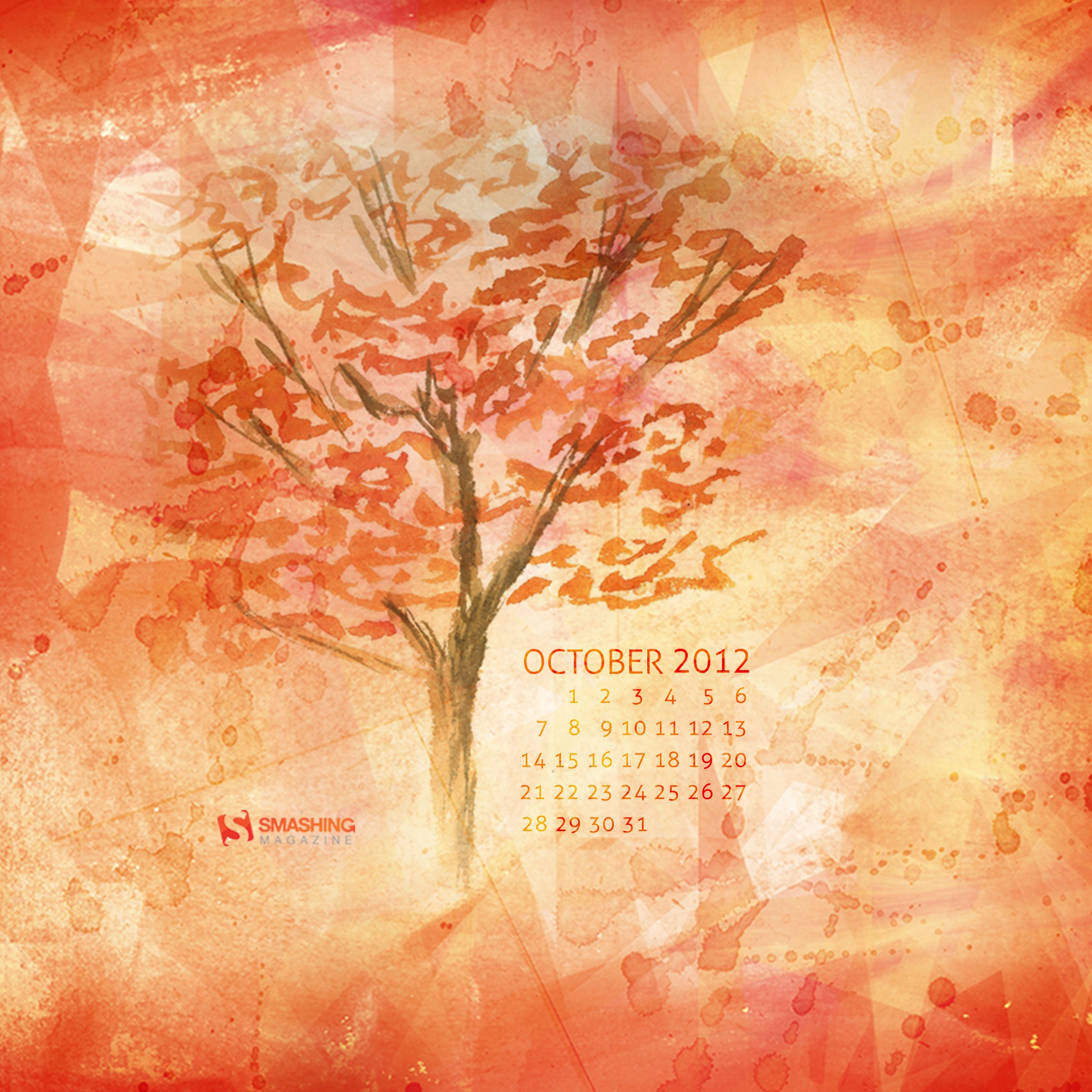
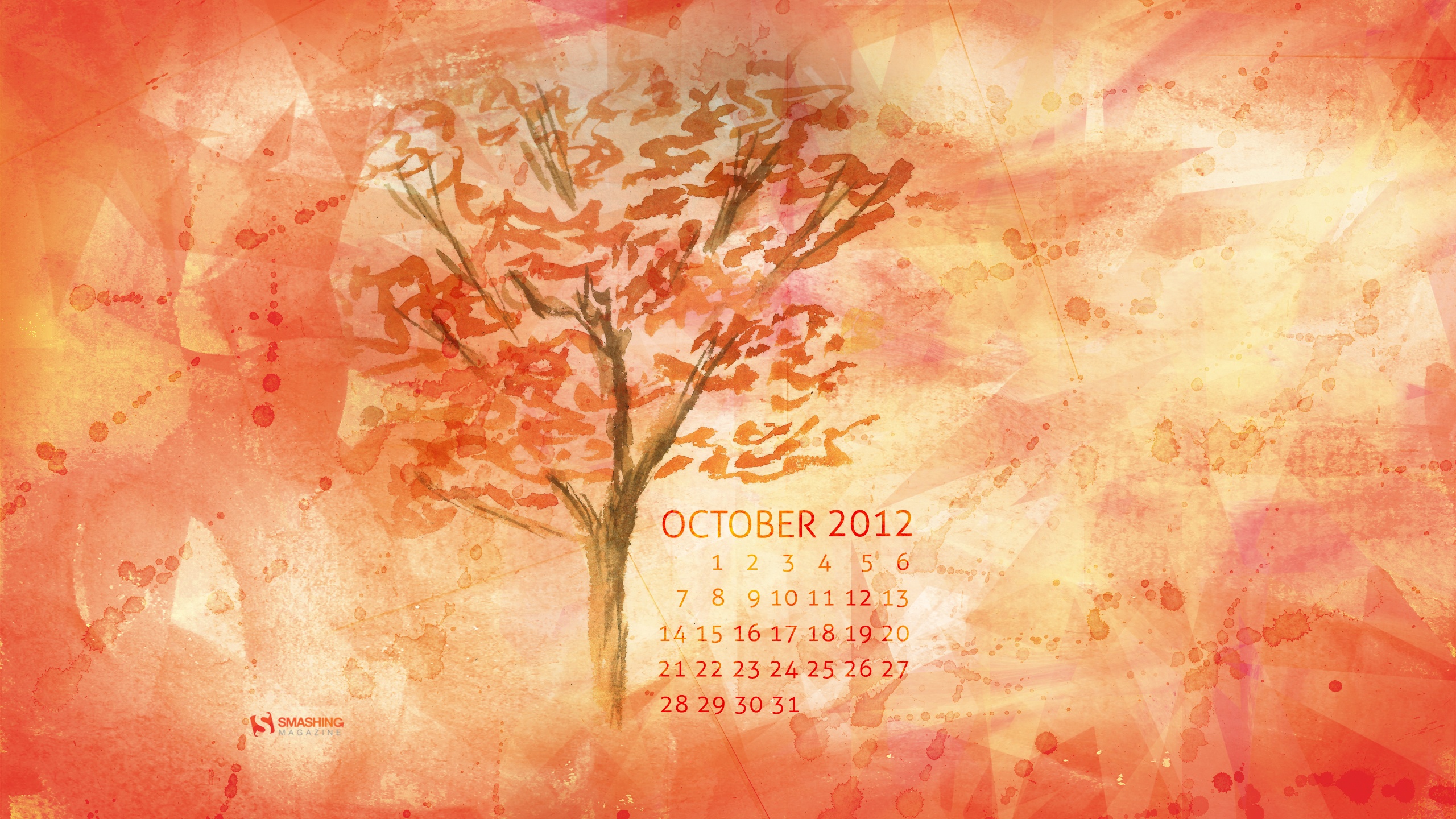
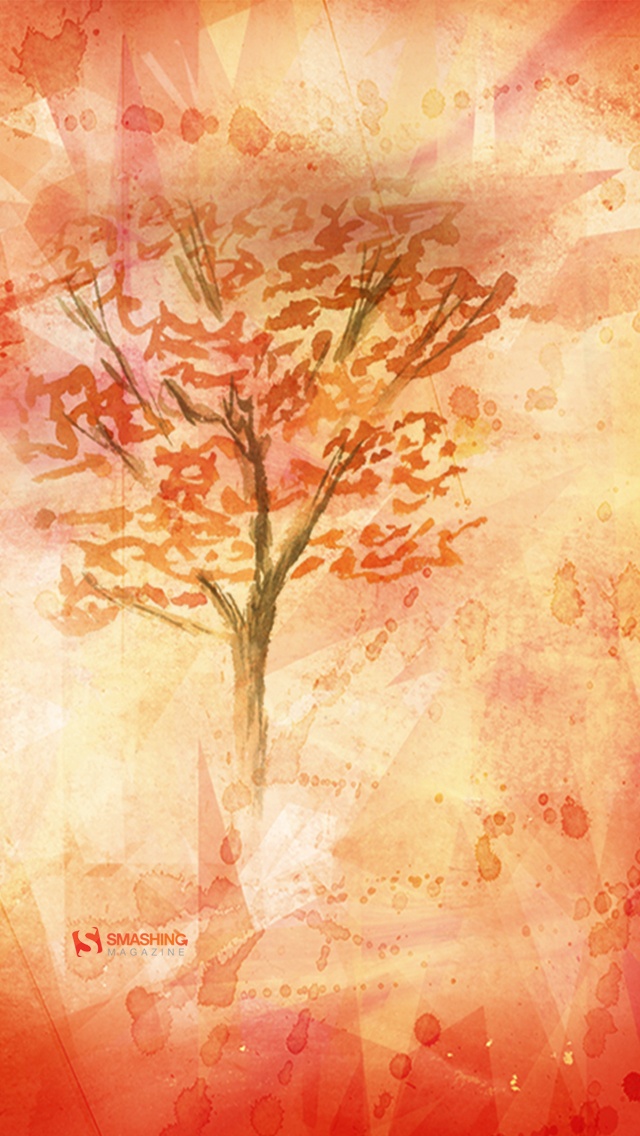
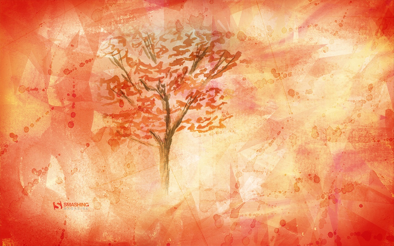
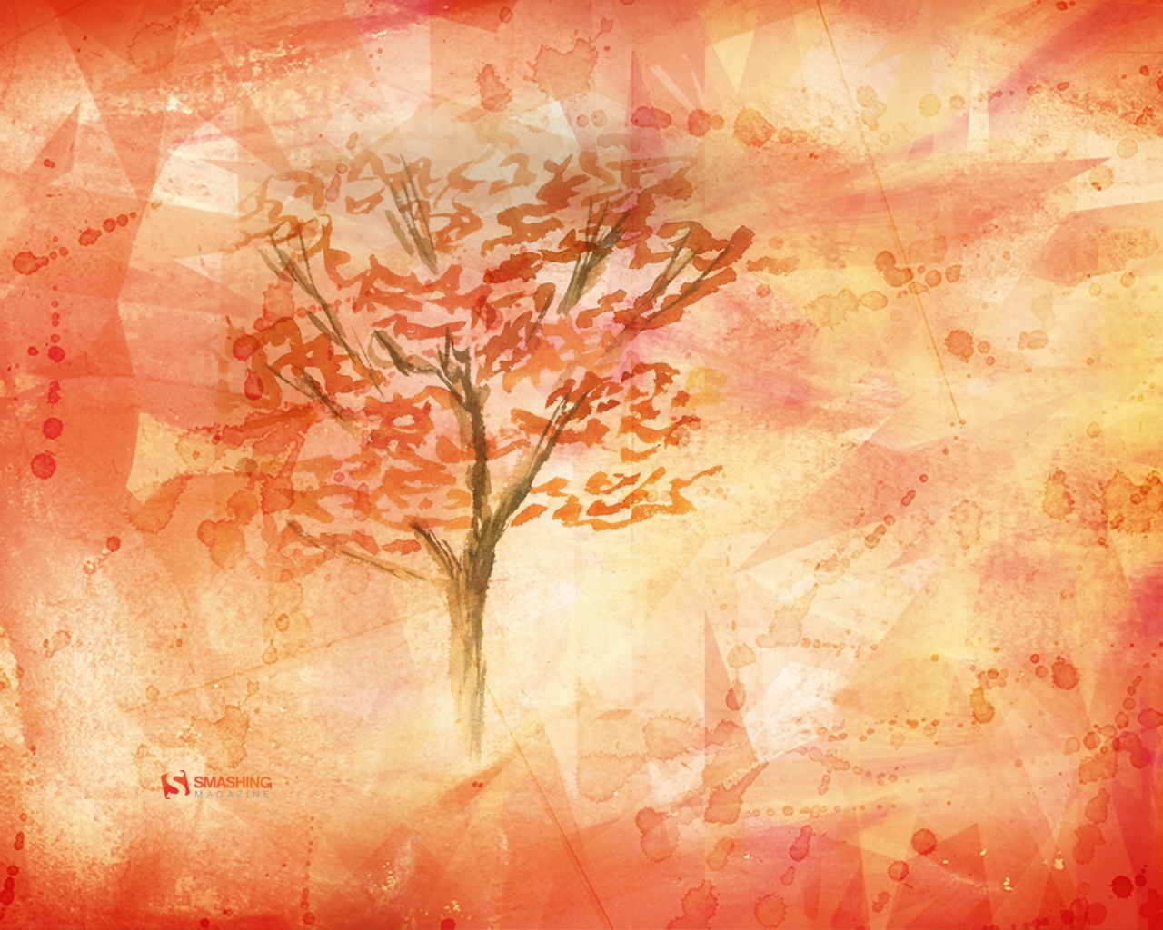
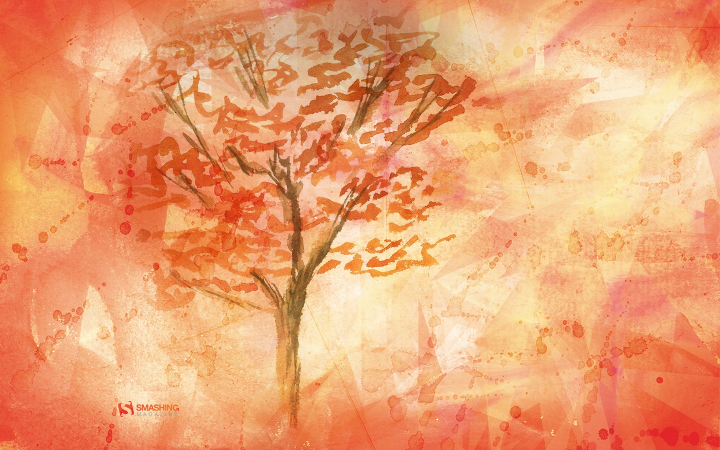
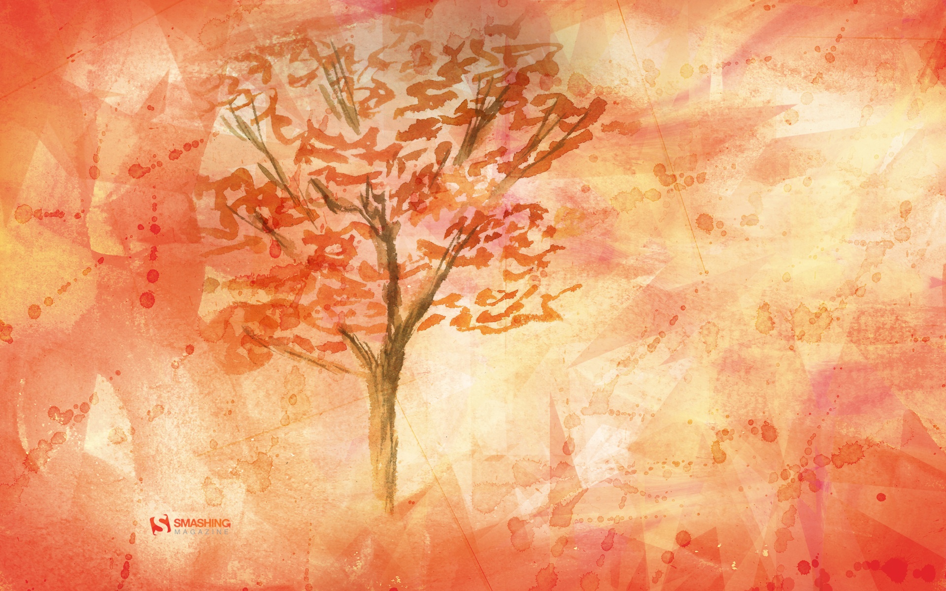
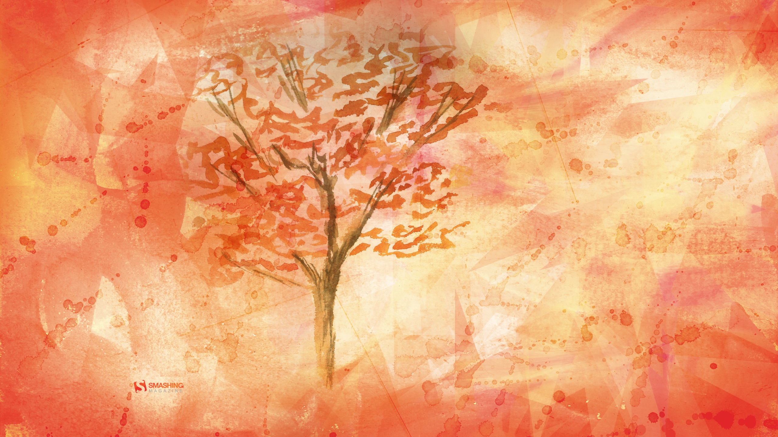
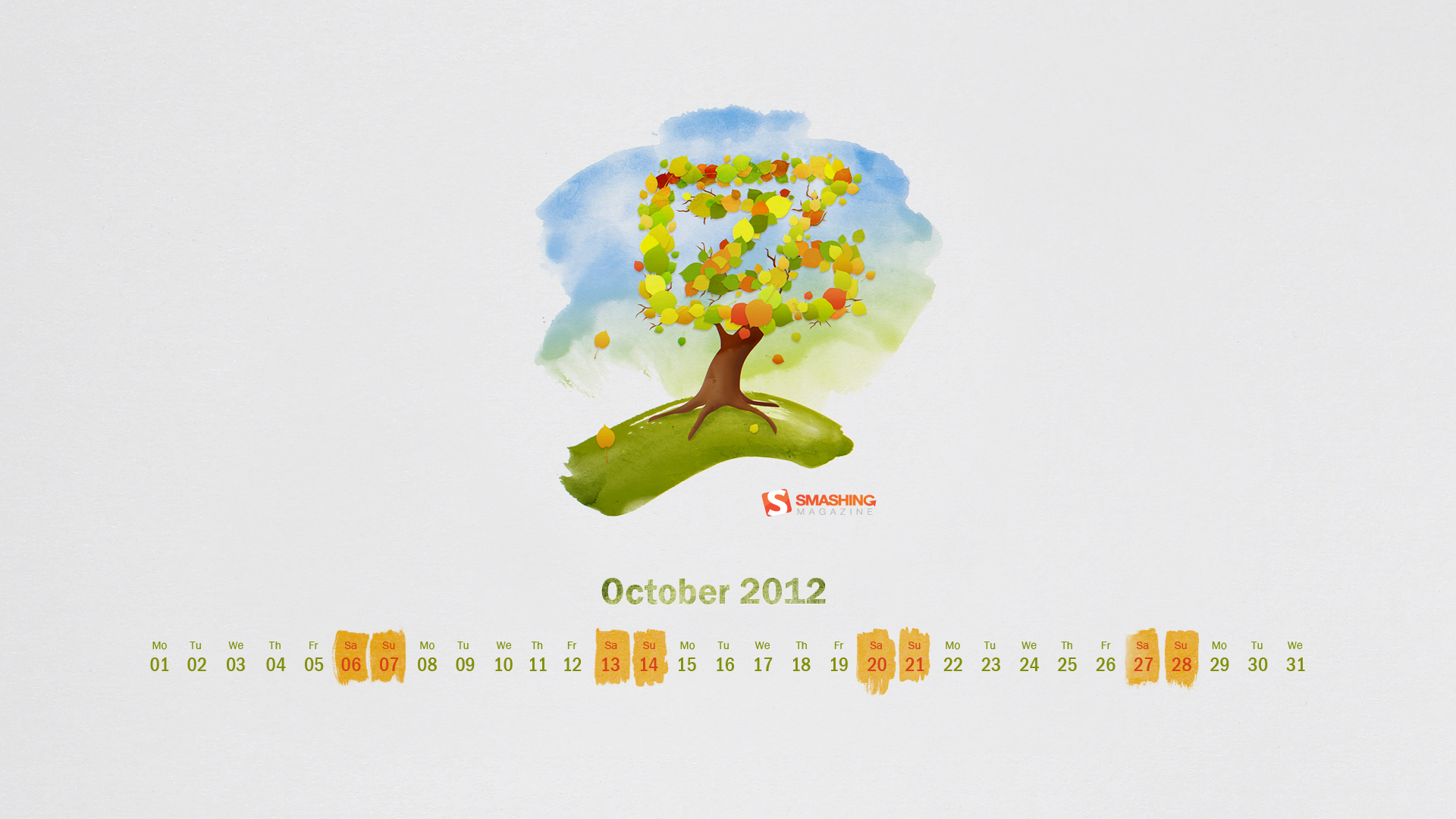
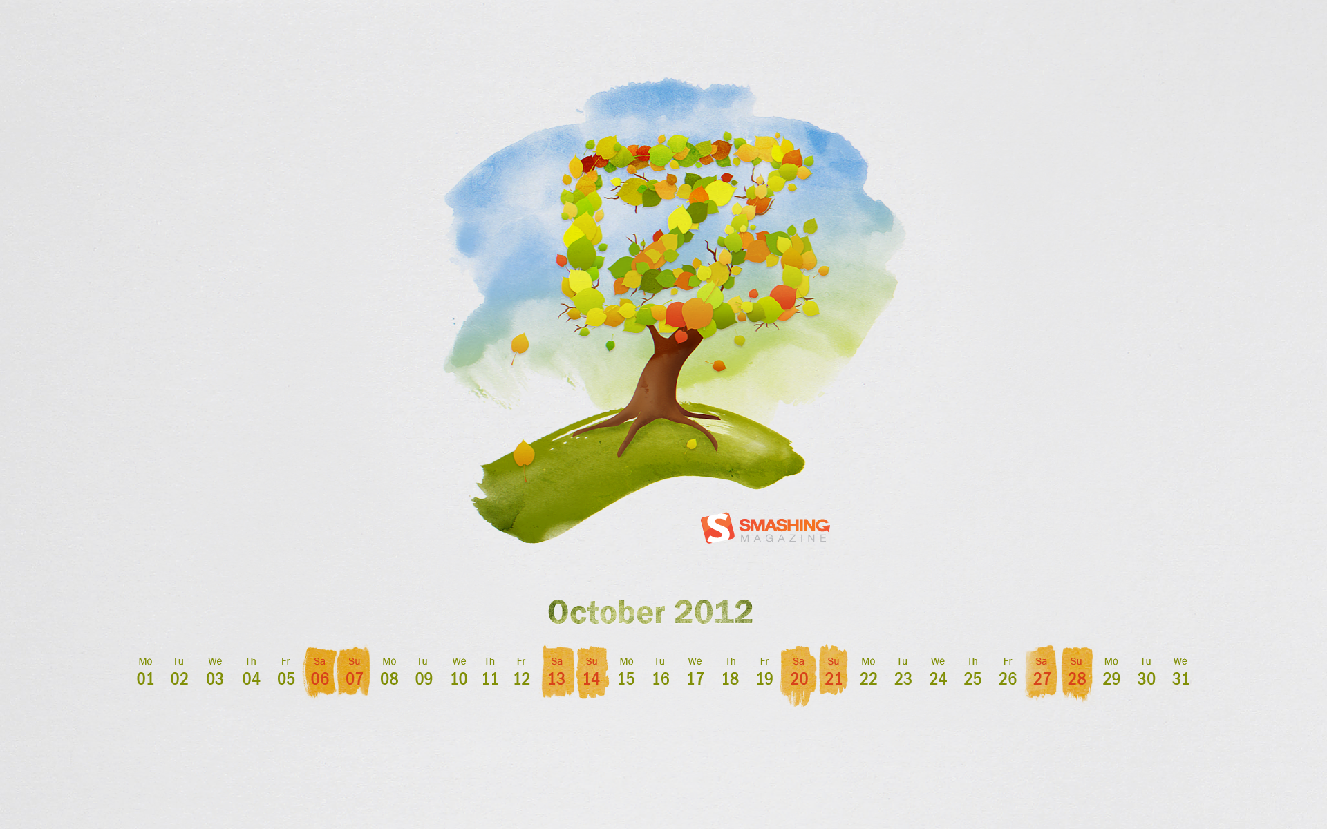
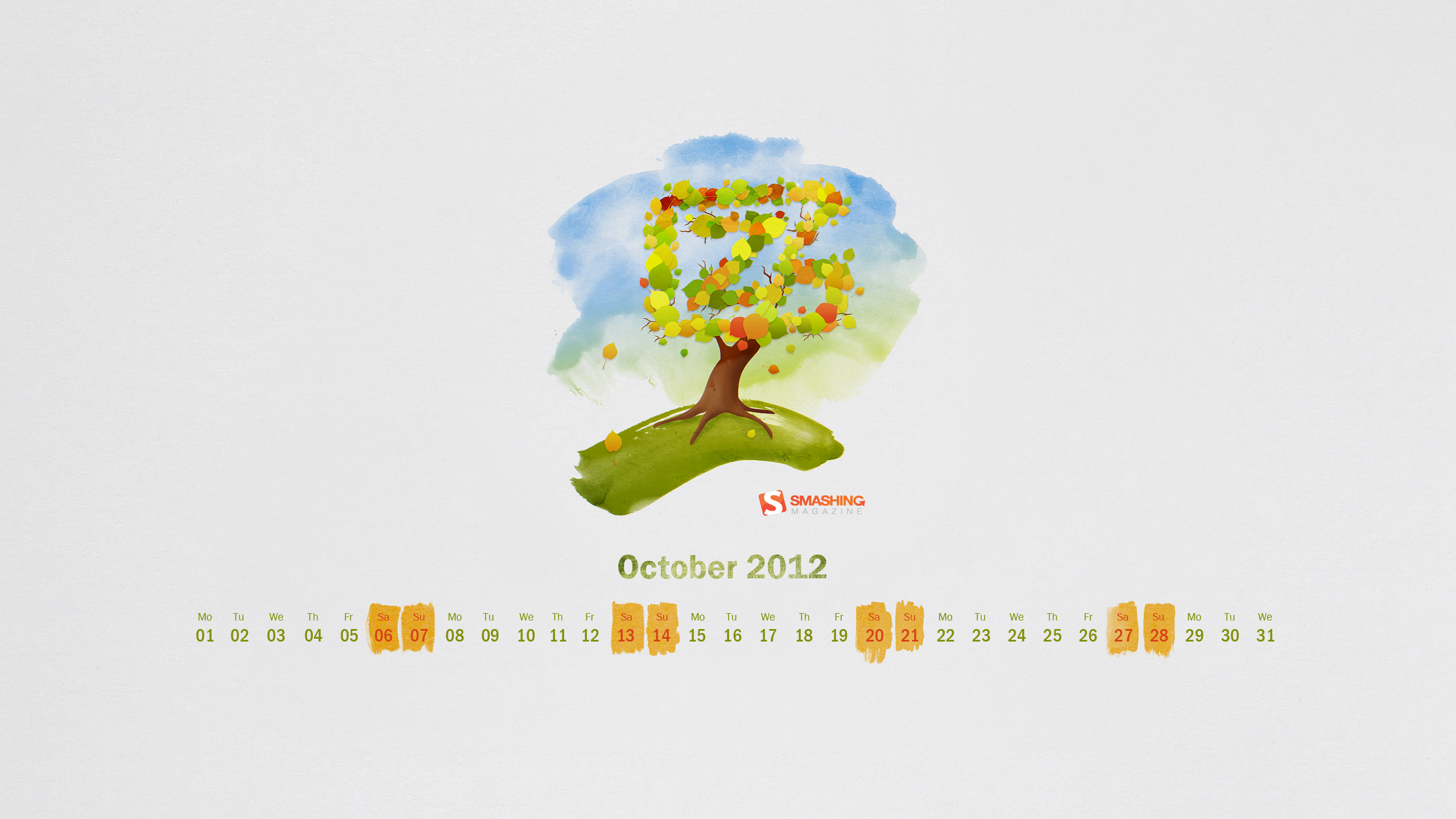
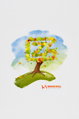
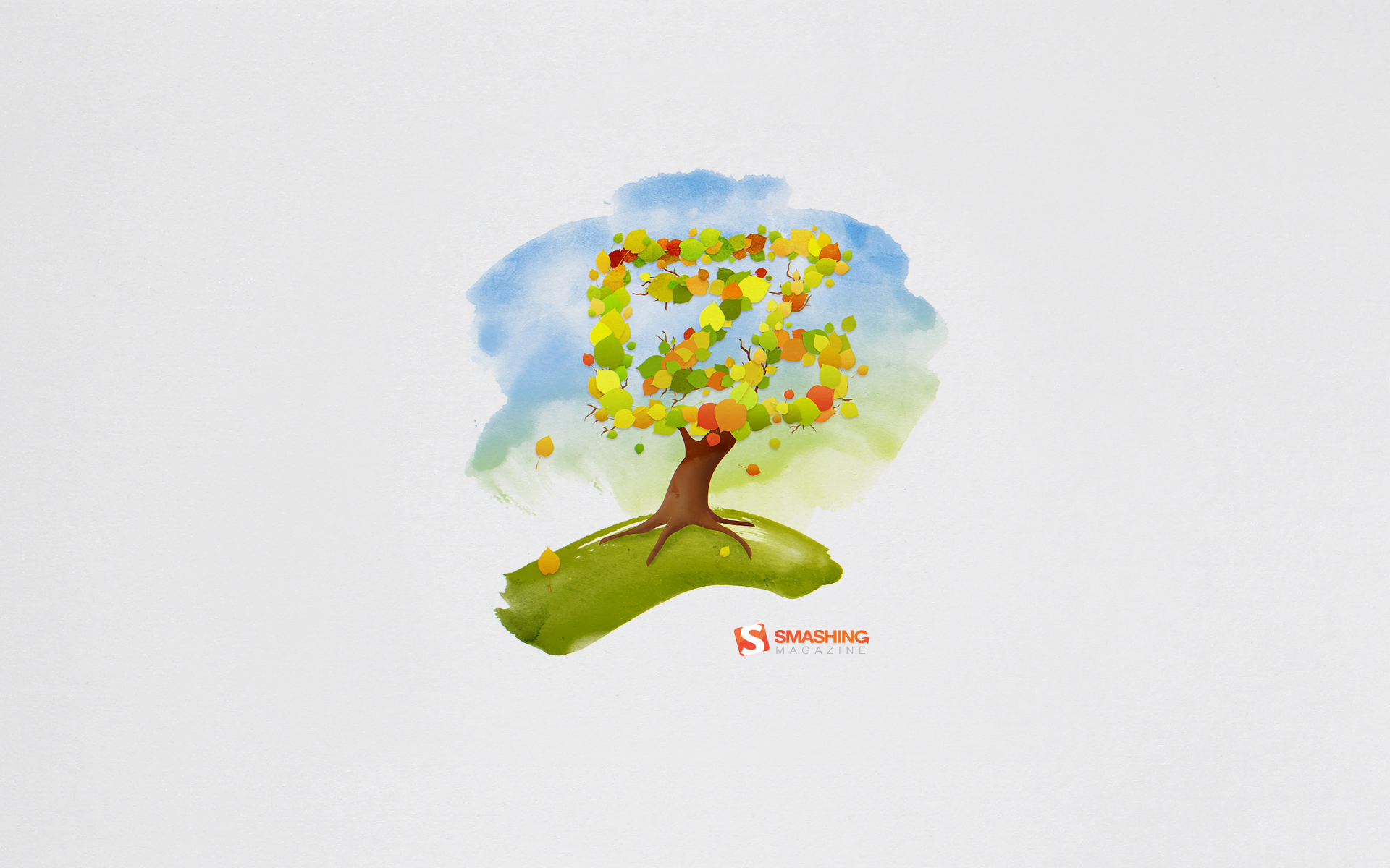
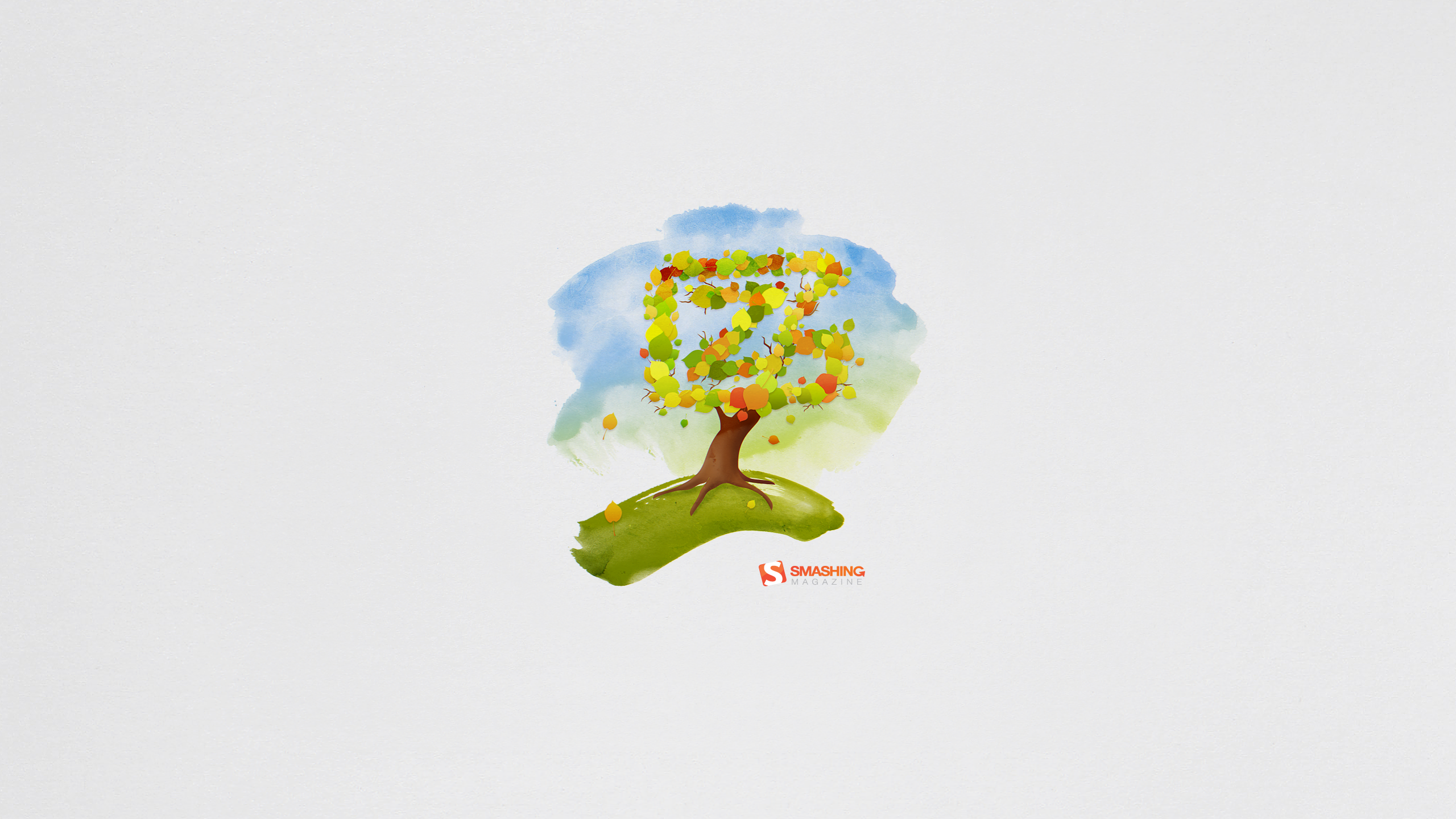
Watercolor Autumn
“There is nothing like being surrounded by beautiful, fiery, natural art for 2.5 months every year. This piece was inspired by the Falls I remember back in my New England hometown.” Designed by Rachel Ladew from USA.

- preview
- with calendar: 640×1136, 1280×800, 1280×1024, 1440×900, 1920×1200, 2048×2048, 2560×1440
- without calendar: 640×1136, 1280×800, 1280×1024, 1440×900, 1920×1200, 2048×2048, 2560×1440
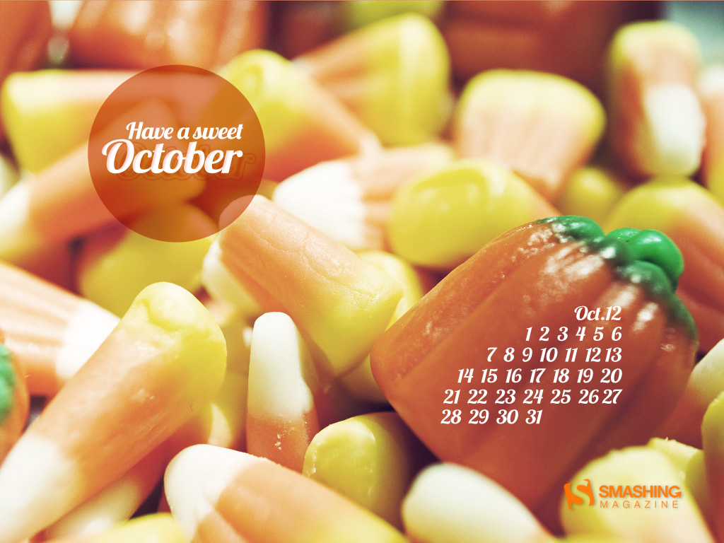
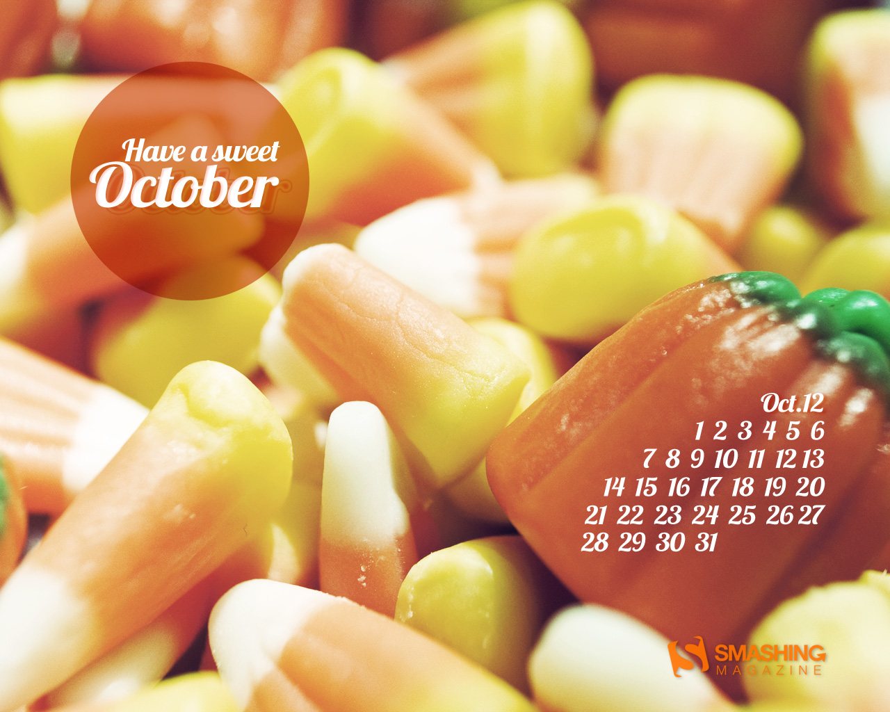
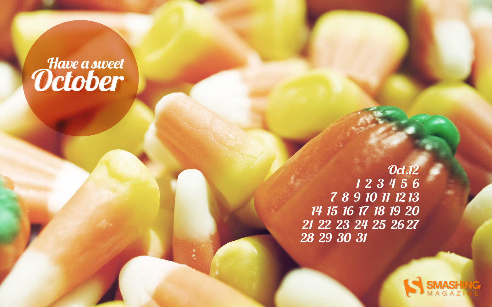
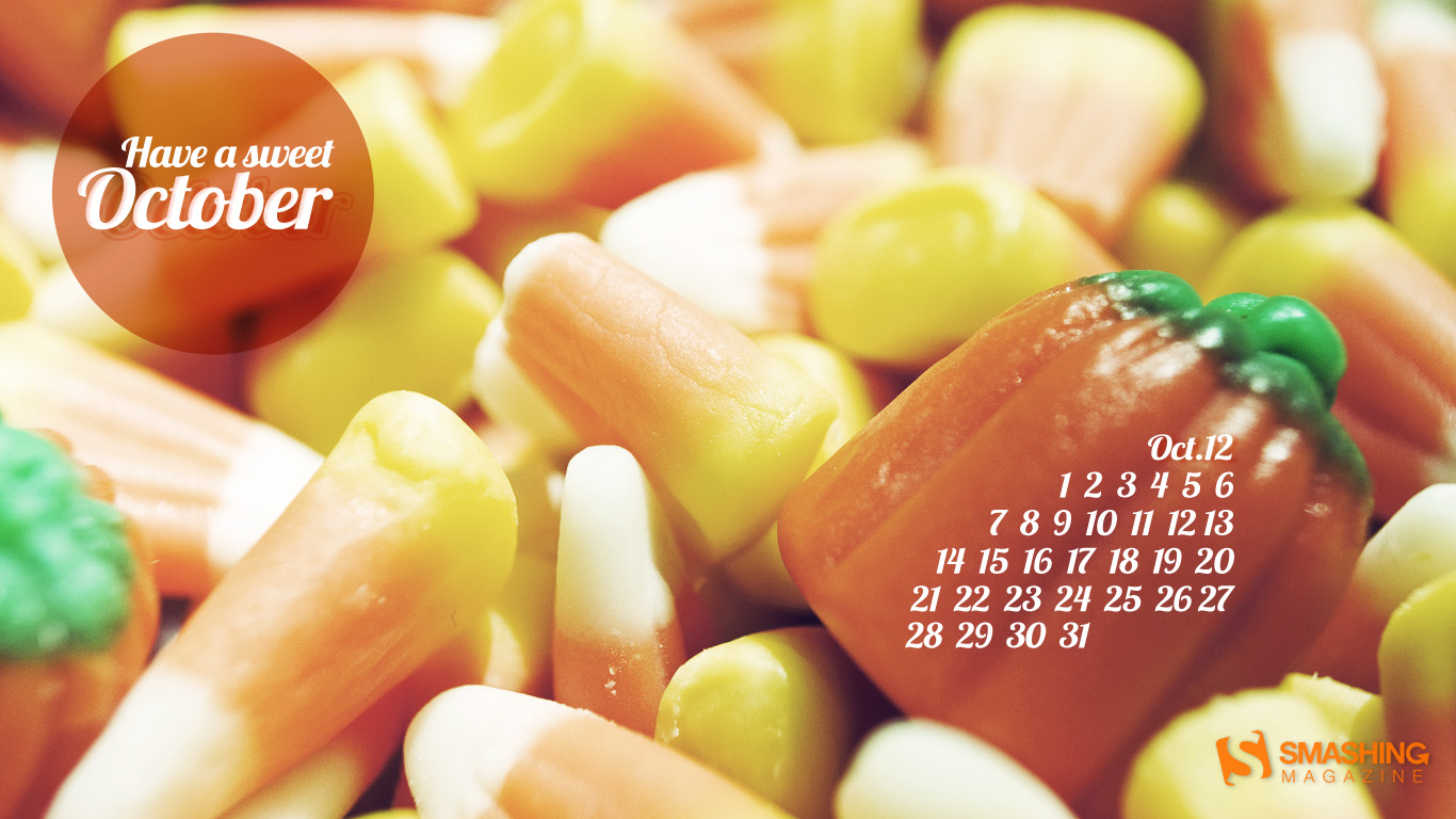
Sweet October
“I love eating candy corn in the Fall time. Especially around Halloween. It just makes me think of Fall.” Designed by Lindsay Ebner from USA.

- preview
- with calendar: 1024×768, 1280×1024, 1680×1050, 1920×1200, 1366×768
- without calendar: 1024×768, 1280×1024, 1680×1050, 1920×1200, 1366×768
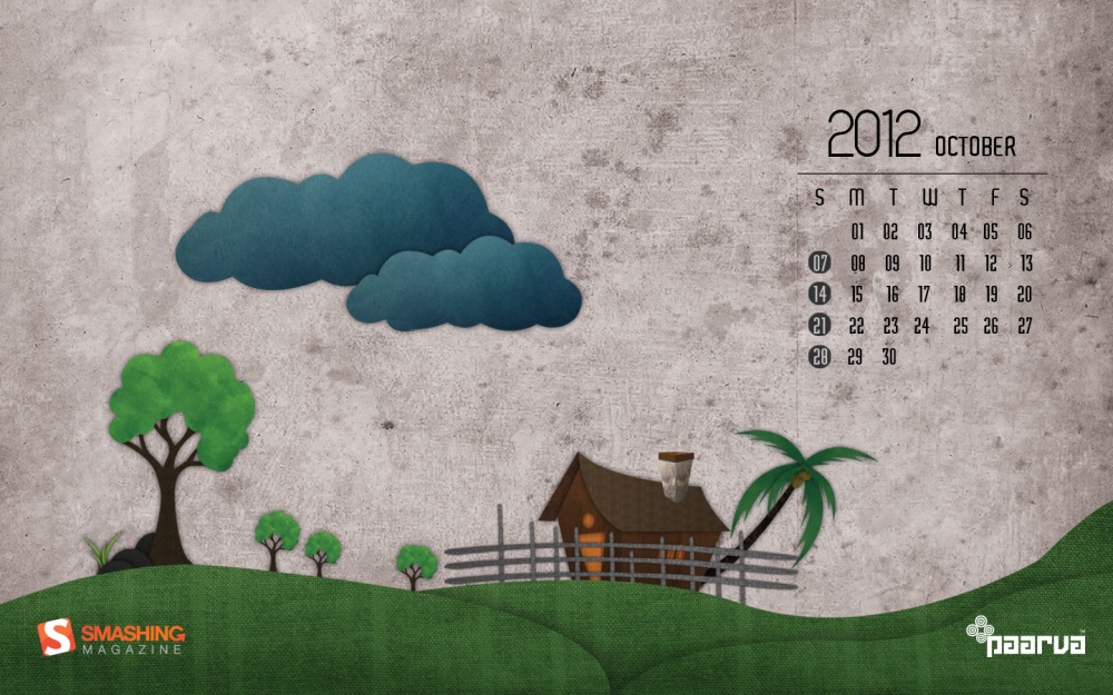
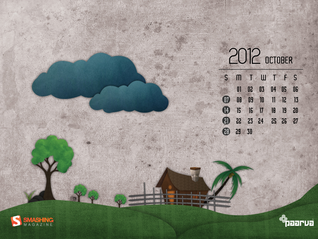
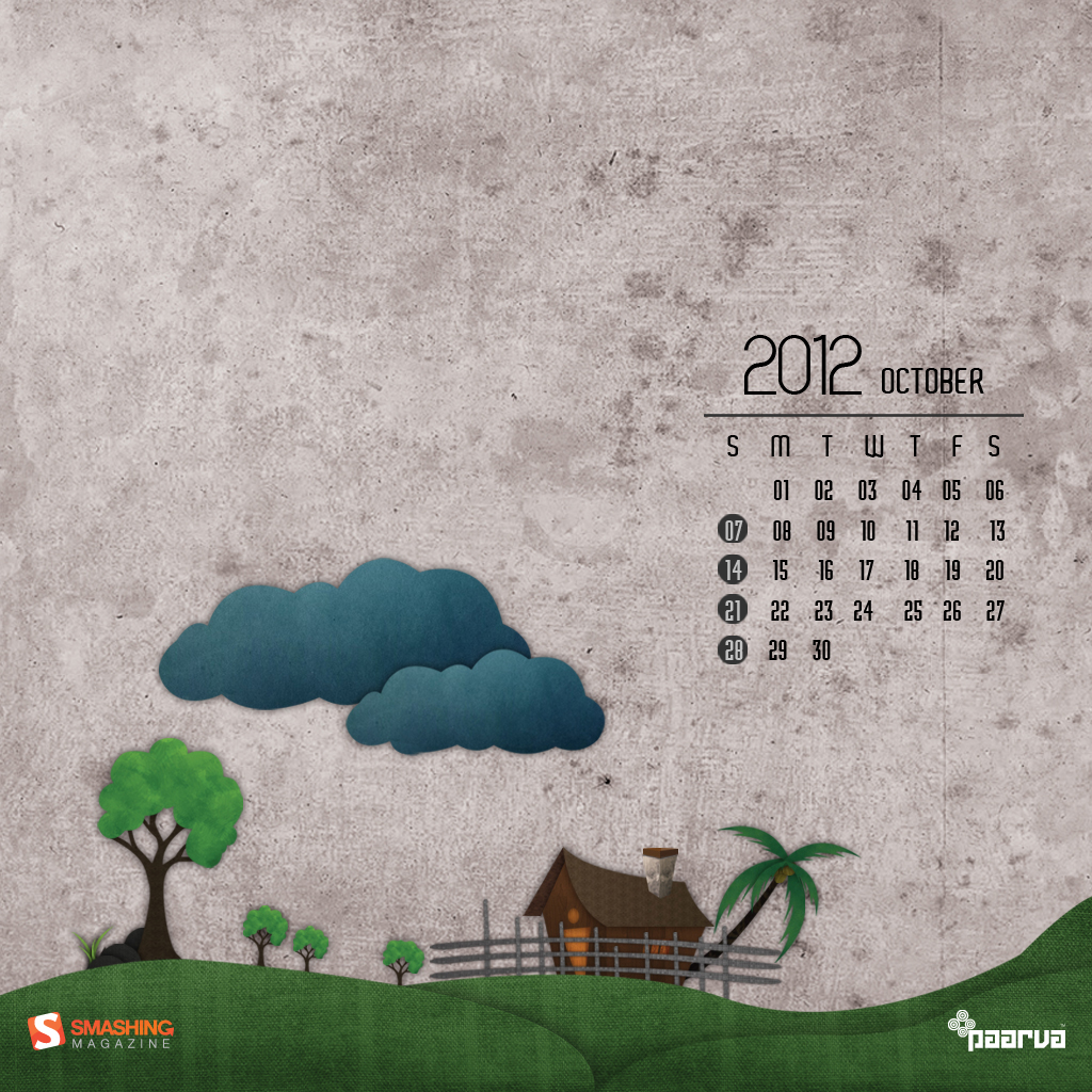
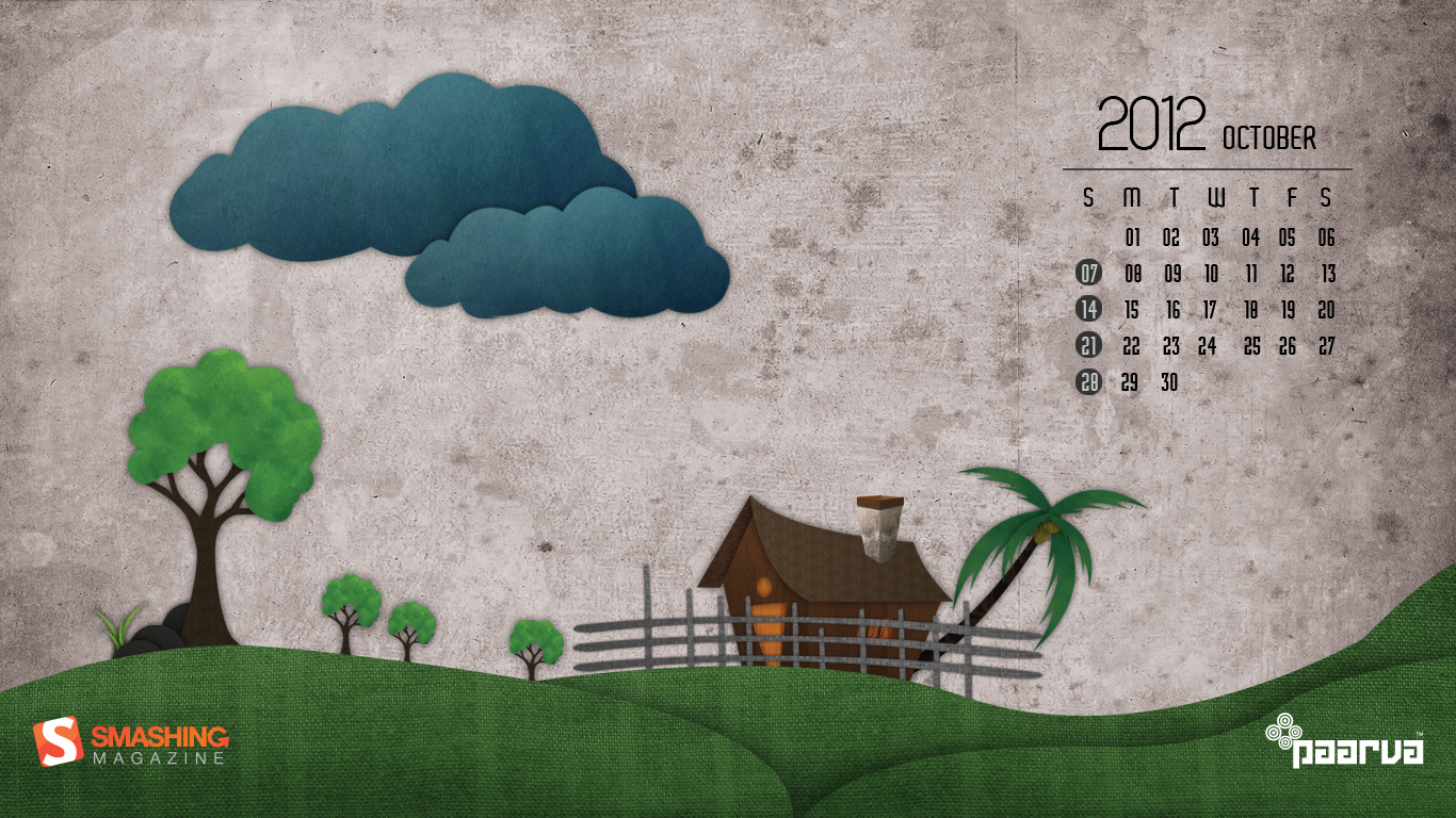
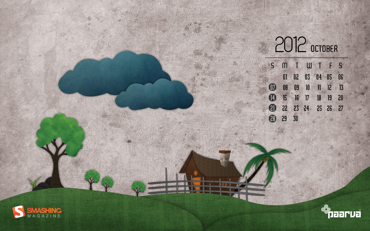
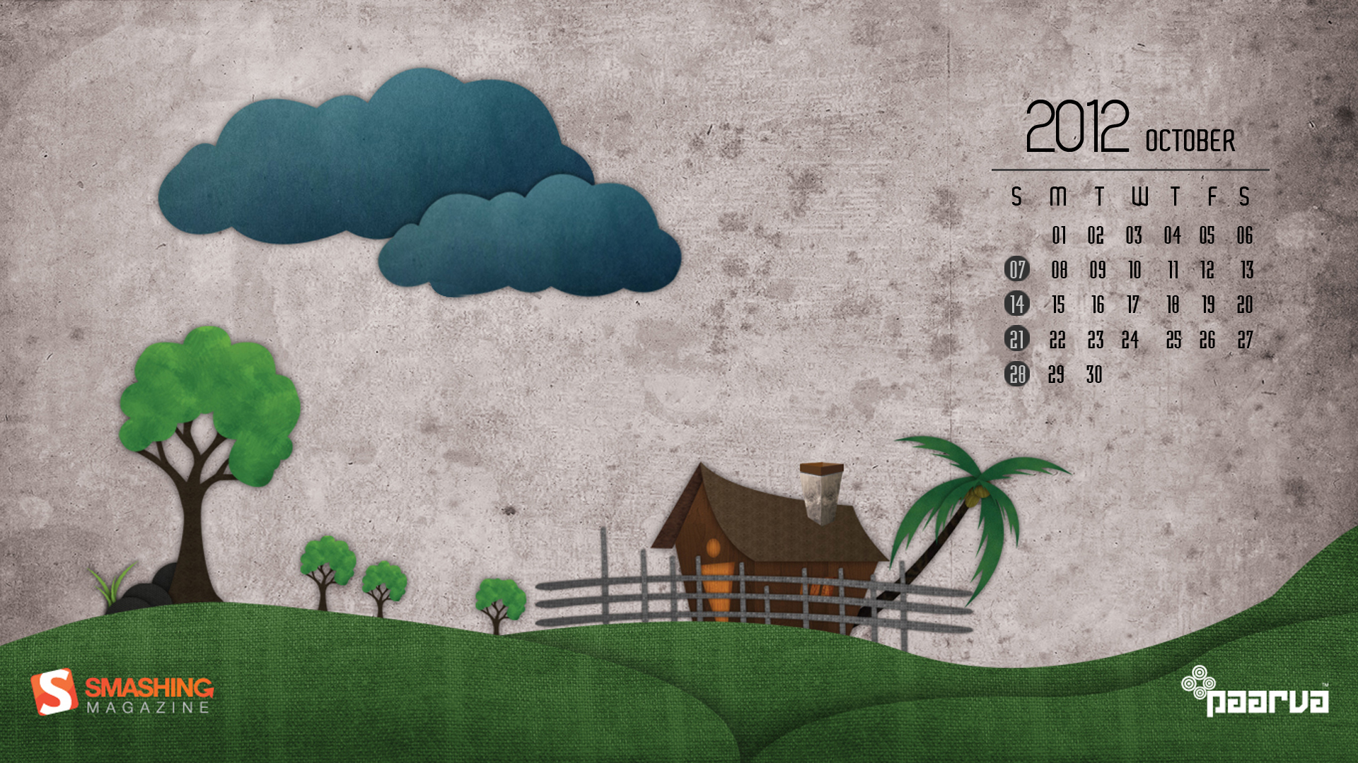
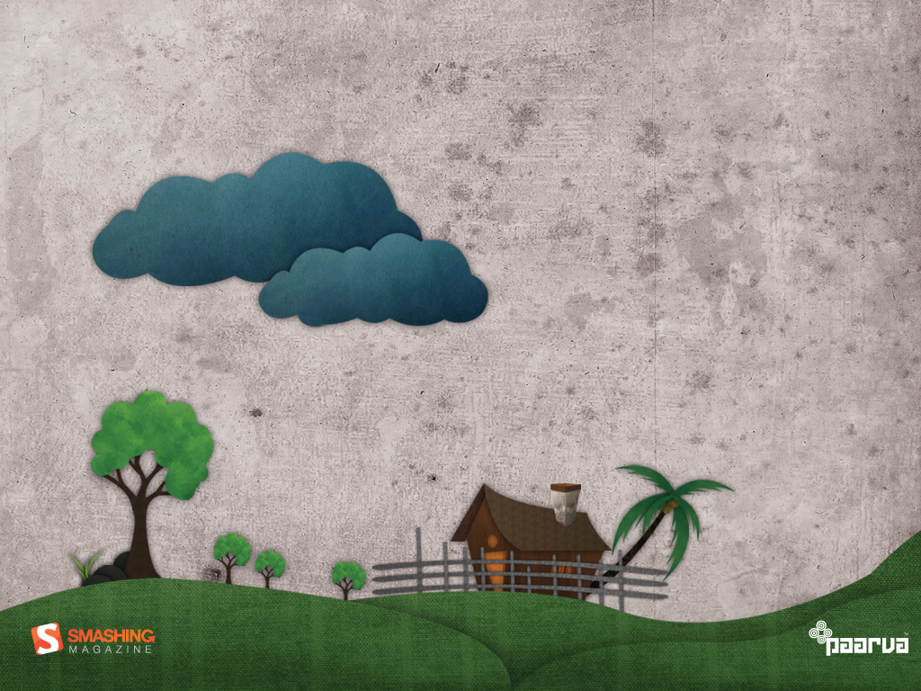
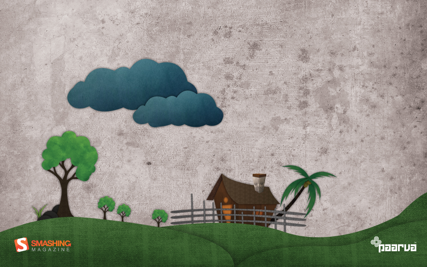
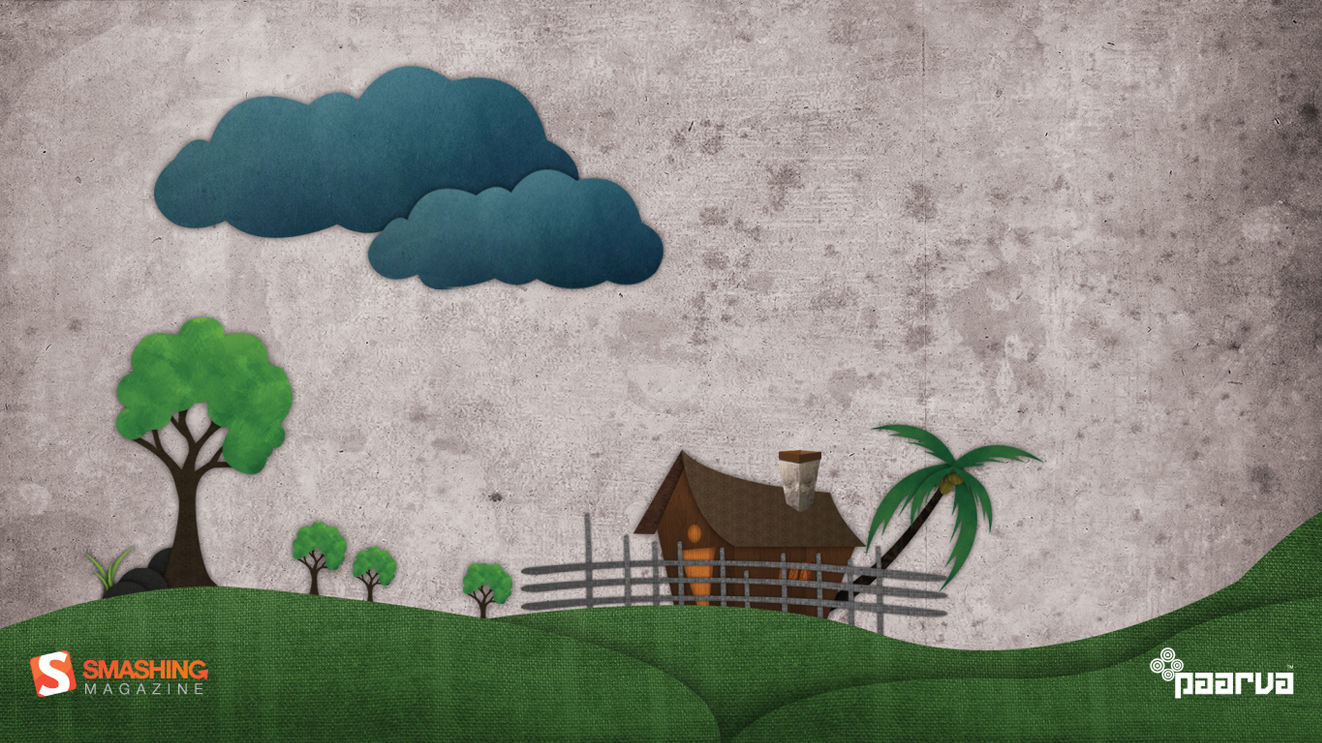
Departing Monsoon Clouds
Designed by Paarva Creations from India.
- preview
- with calendar: 1024×768, 1024×1024, 1366×768, 1440×900, 1920×1080
- without calendar: 1024×768, 1024×1024, 1366×768, 1440×900, 1920×1080
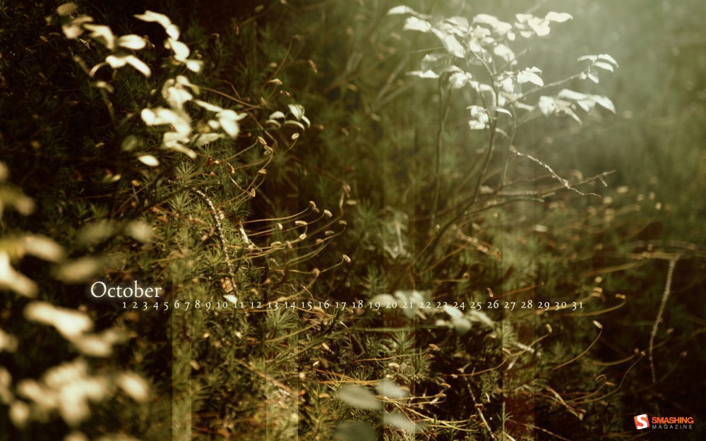
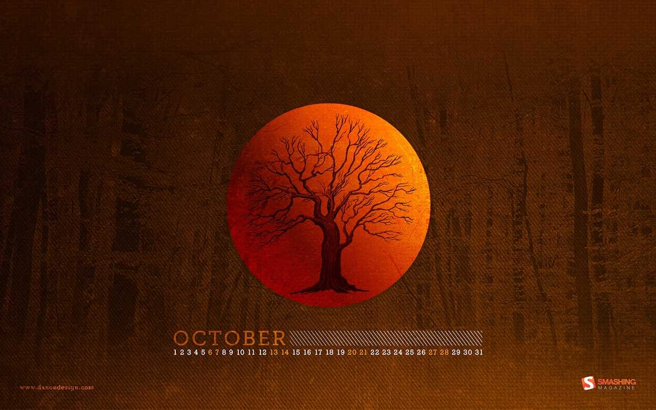
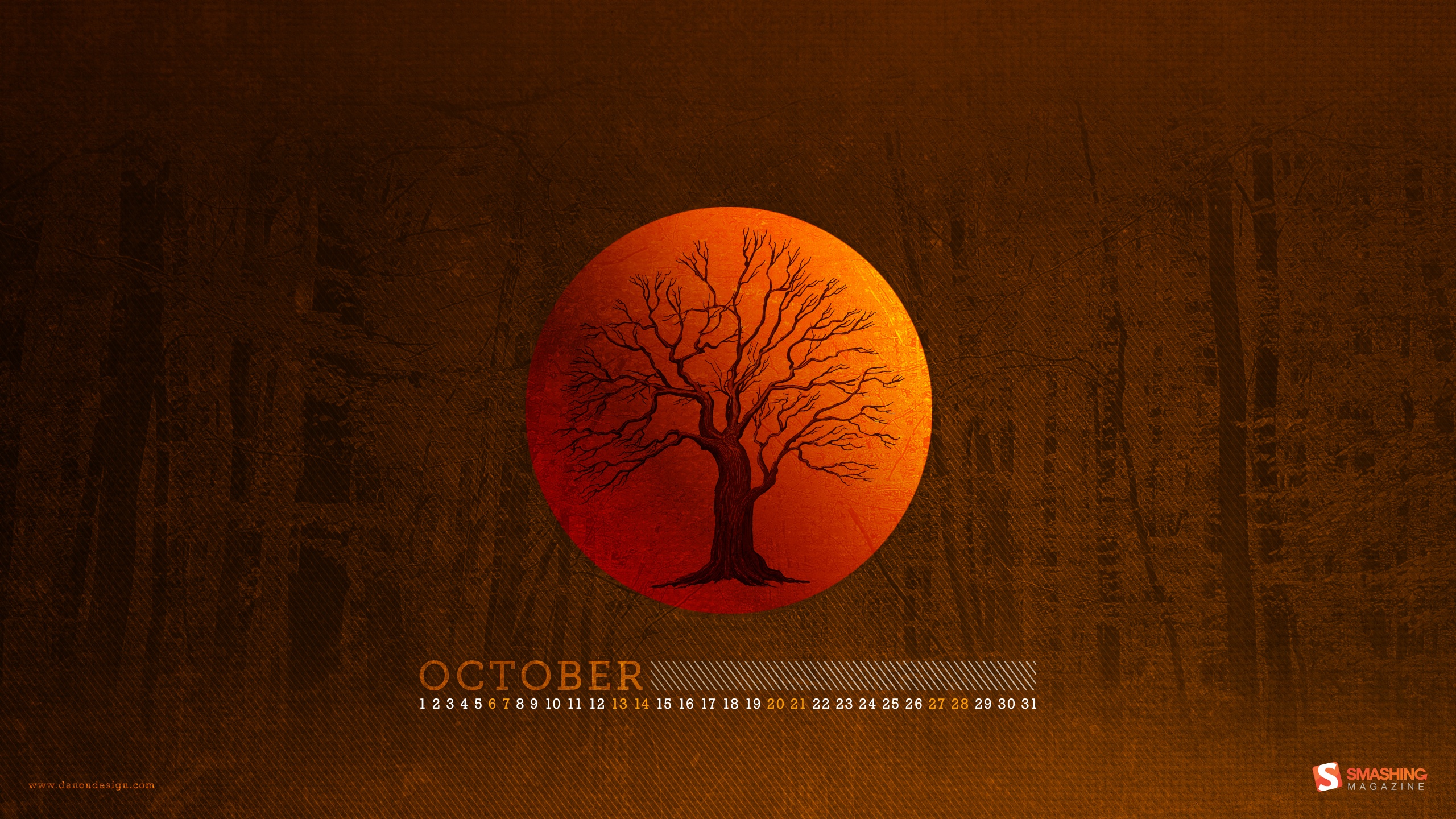
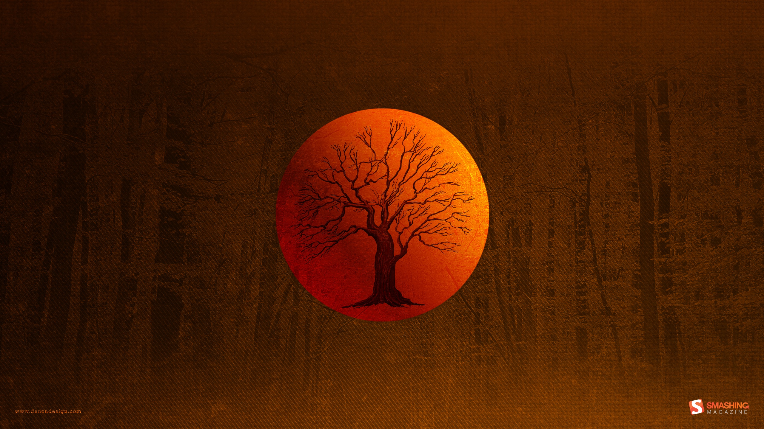
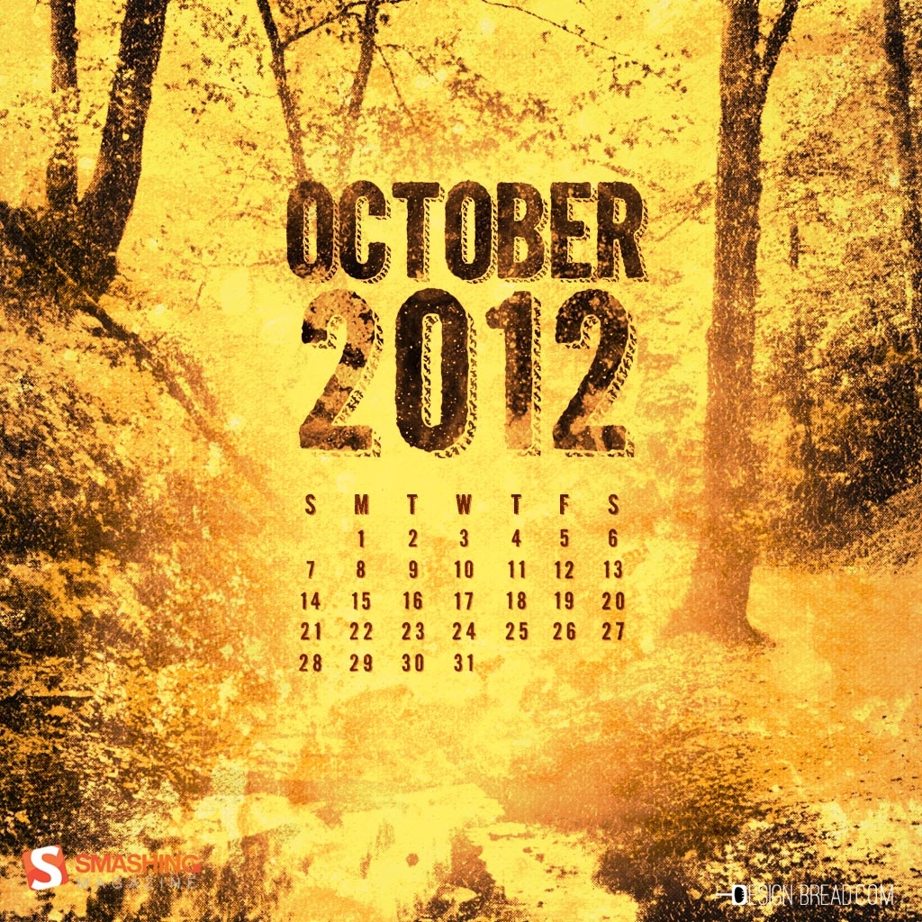
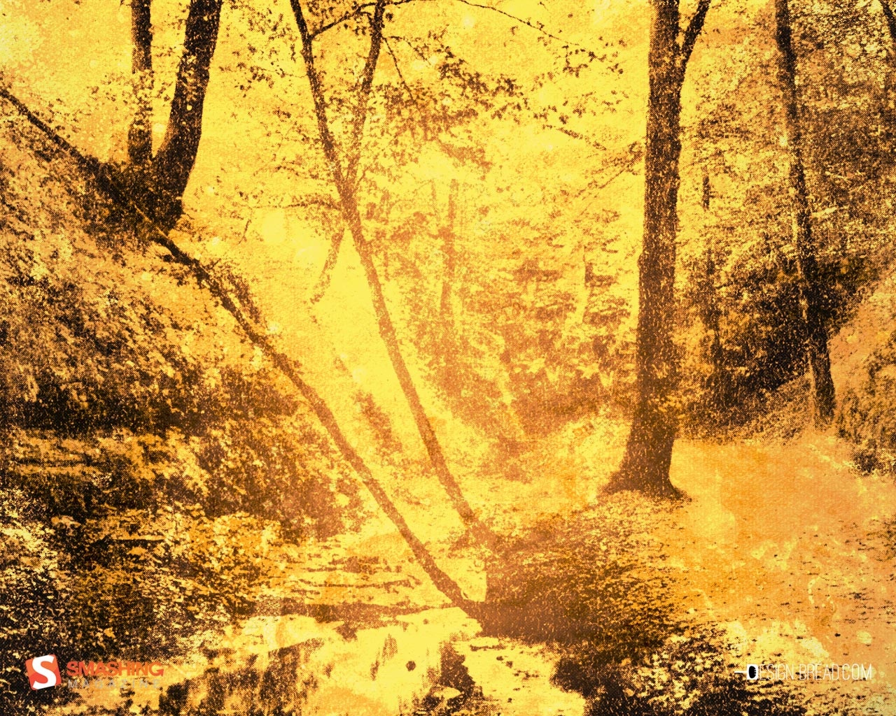
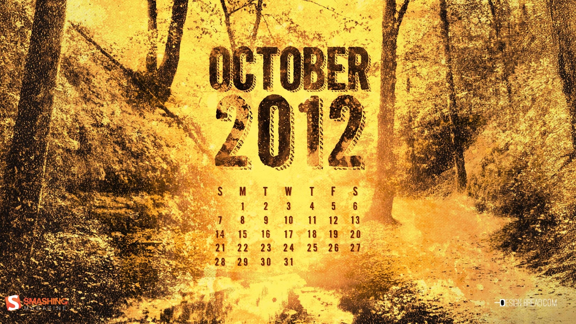
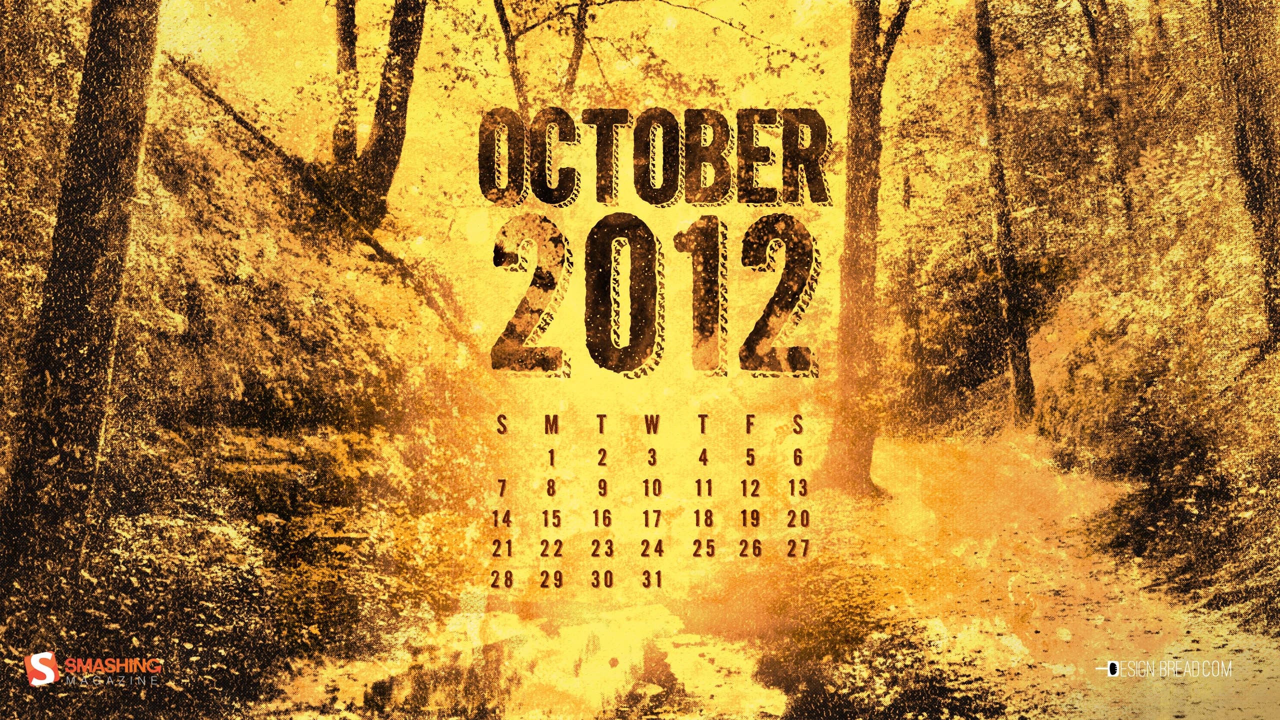
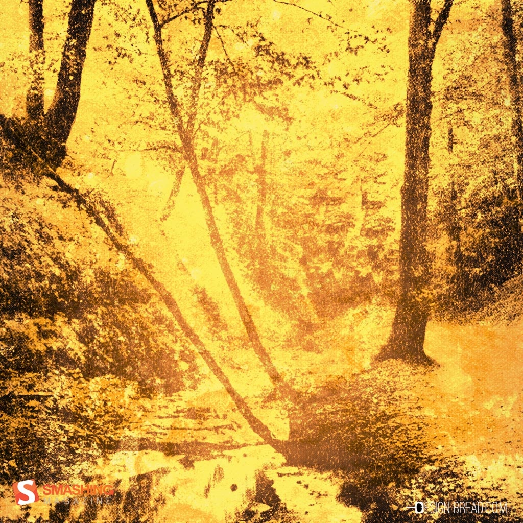
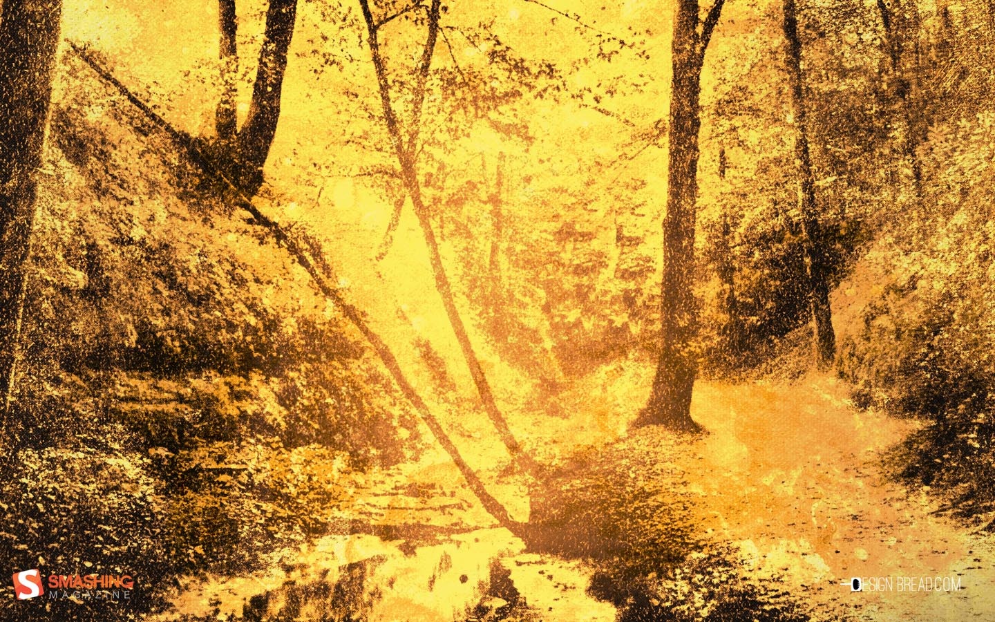
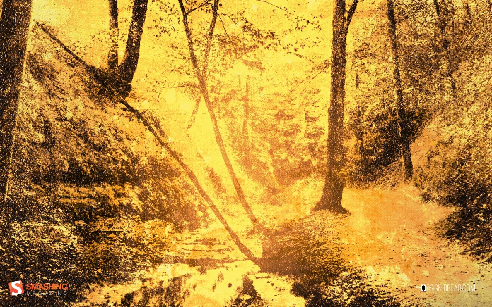
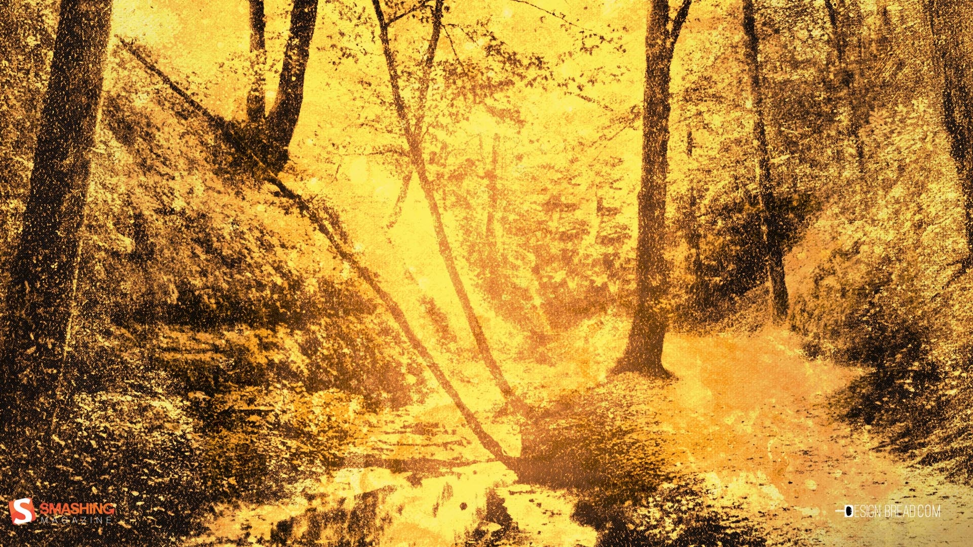
Fallen Woods
Designed by Dan Ioanitescu from Canada.

- preview
- with calendar: 1280×720, 1280×800, 1680×1050, 1920×1080, 2560×1440
- without calendar: 1280×720, 1280×800, 1680×1050, 1920×1080, 2560×1440
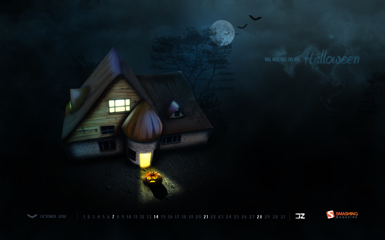
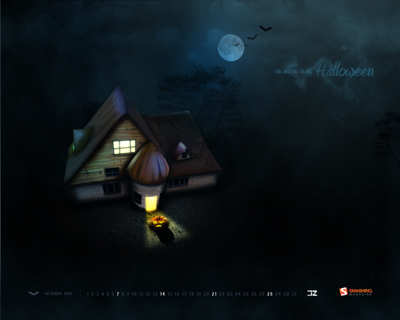
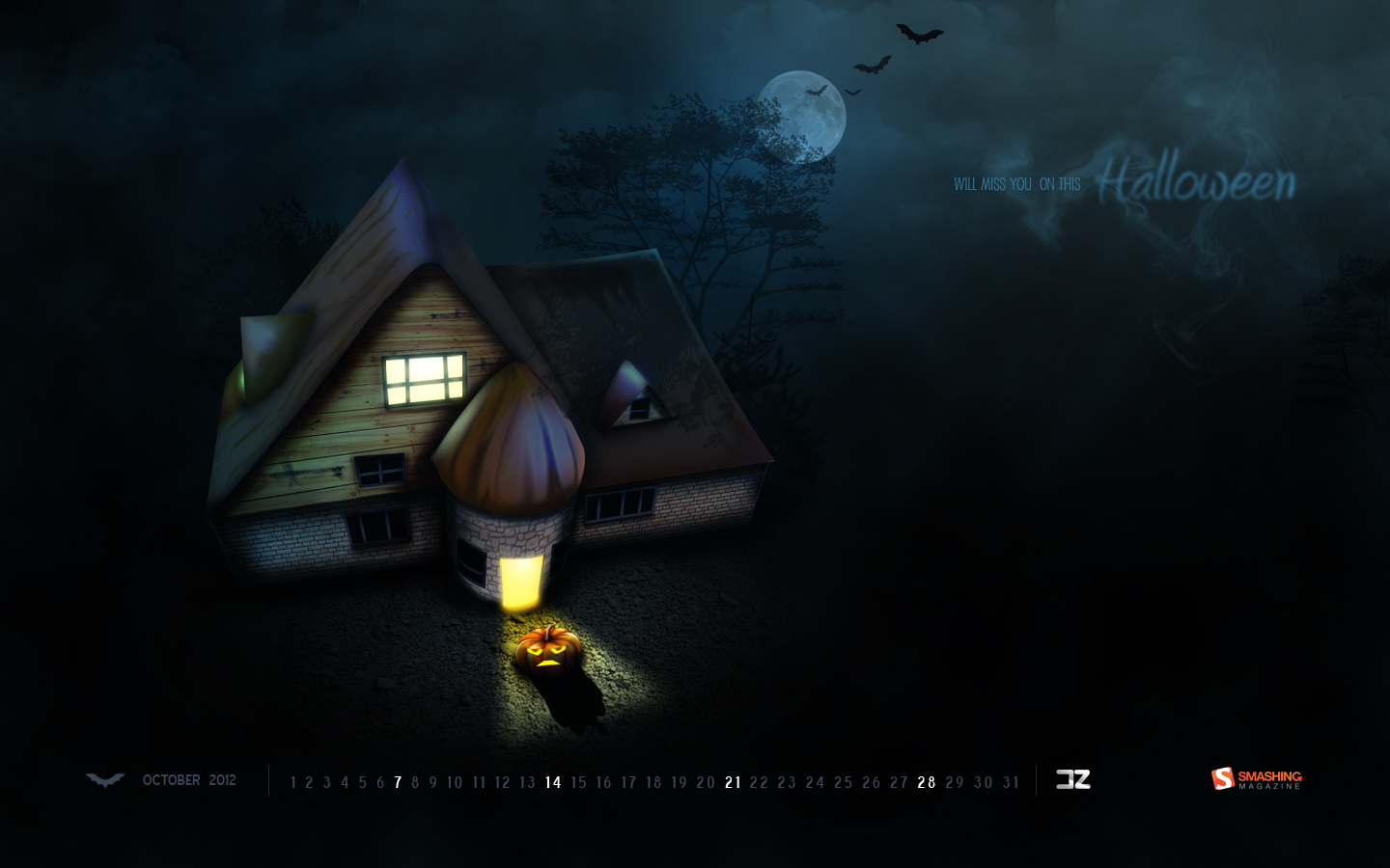
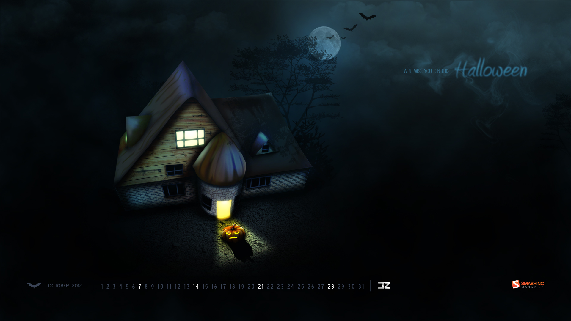
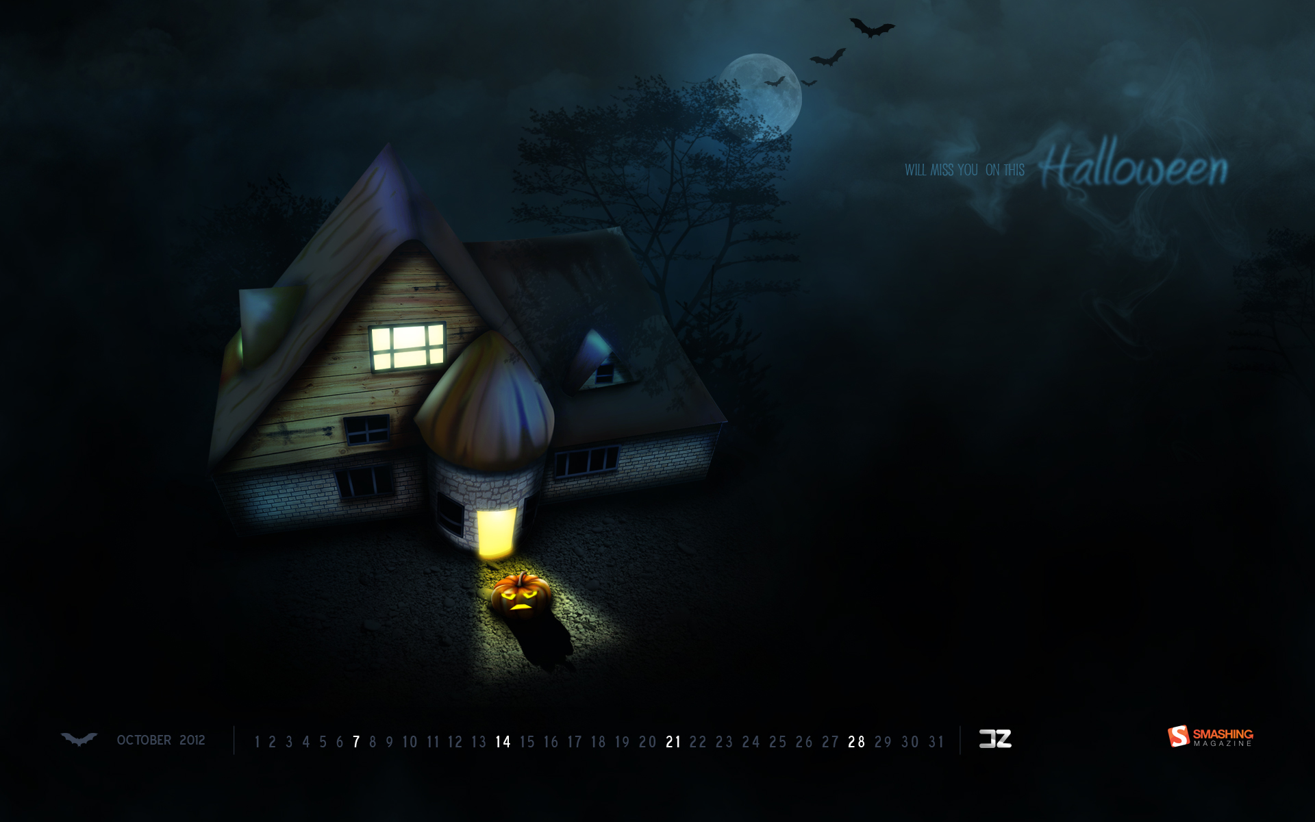
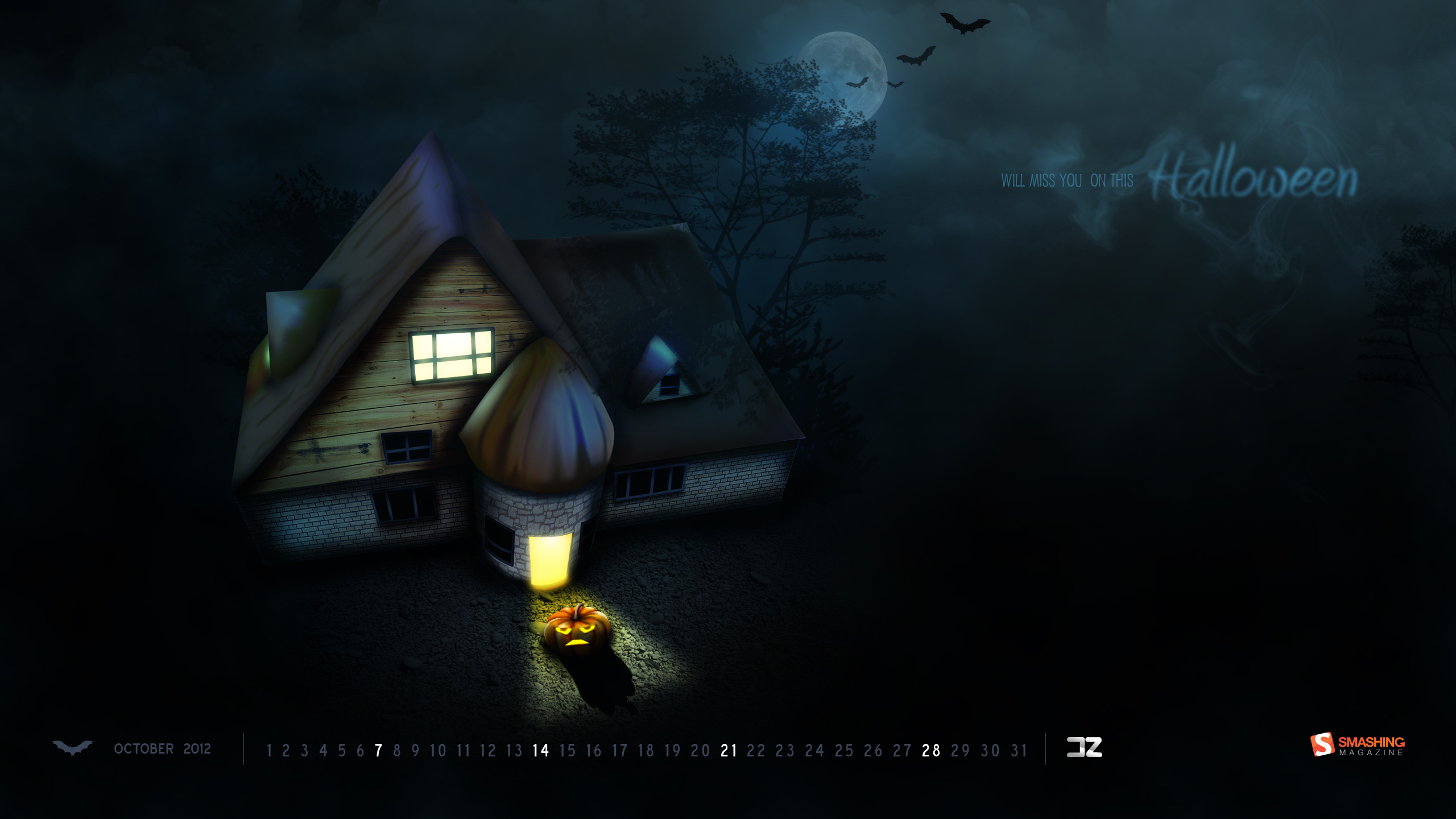
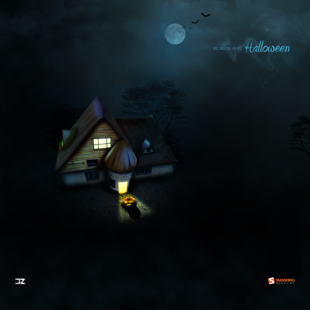
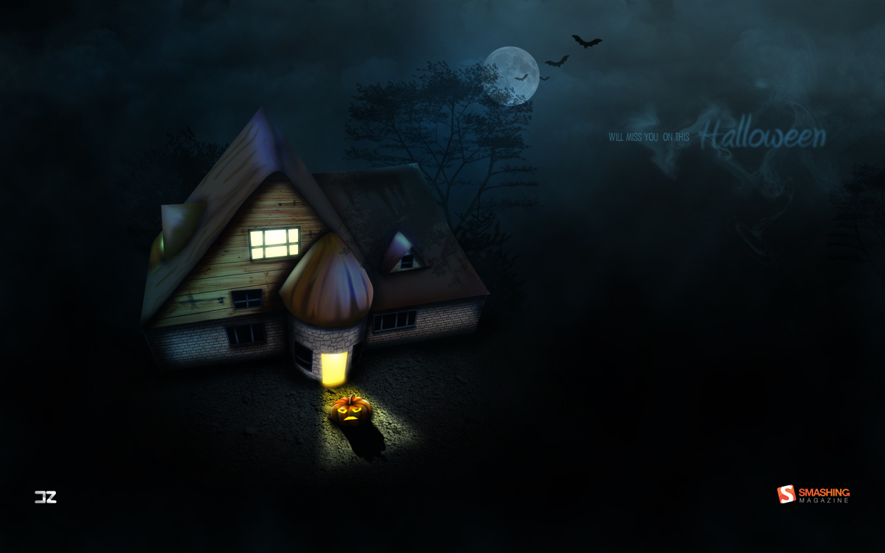
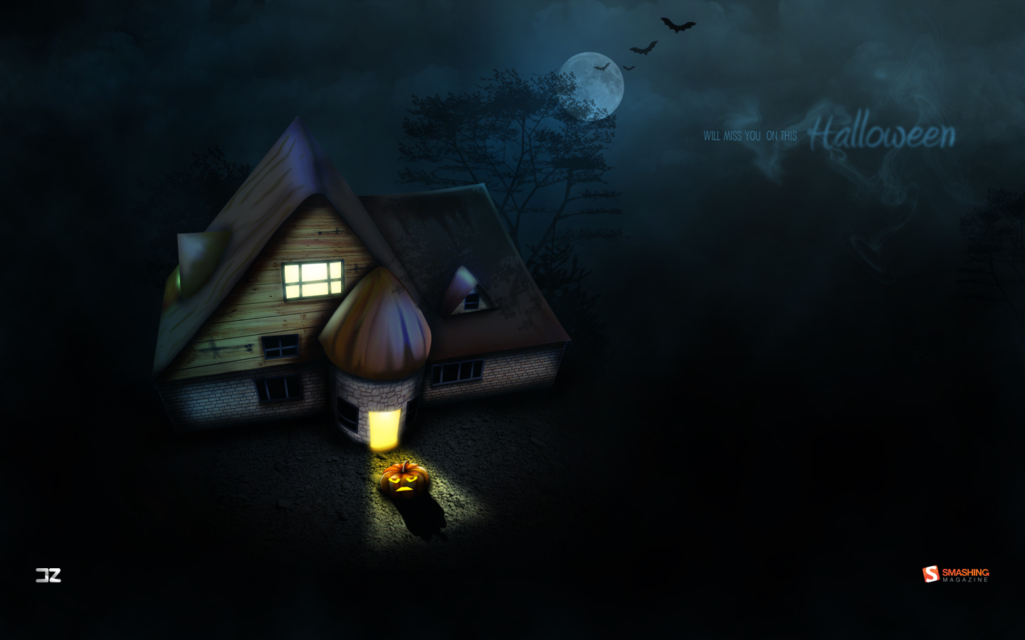
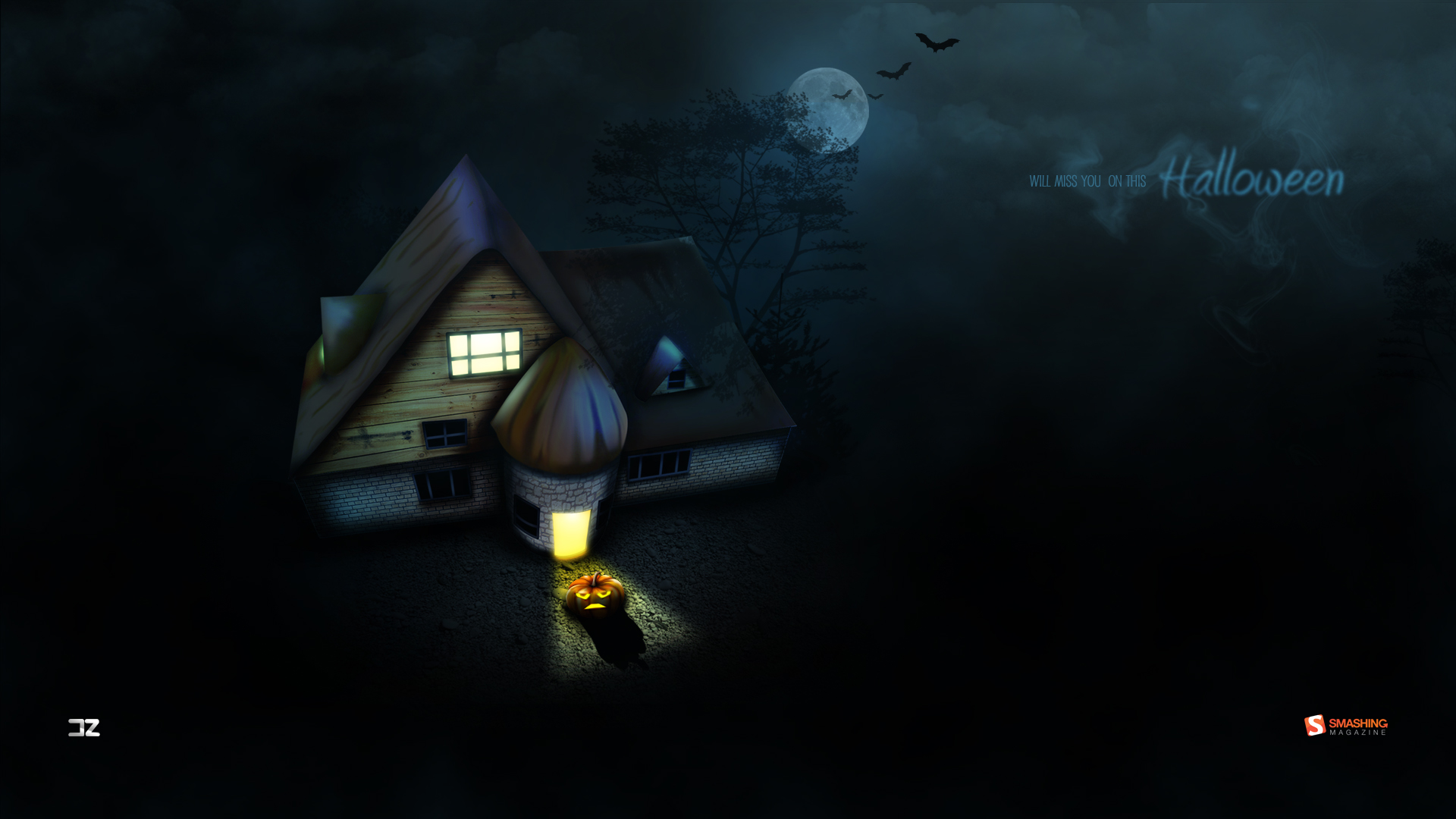
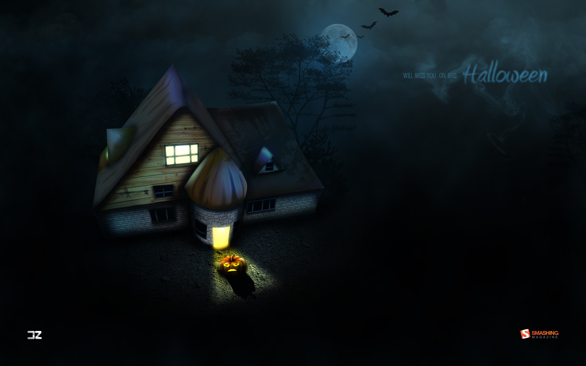
Will Miss You On This Halloween
“It’s the Halloween tonight… Jack-o-lanterns and spooky ghosts are coming to fight the haunted house, witches all alive again! But this time don’t miss your friends. It’s time to scare the family, pals and mates with ghosts! Wish you a happy Halloween night again and again.” Designed by Debobrata Debnath from India.

- preview
- with calendar: 1024×1024, 1280×800, 1280×1024, 1440×900, 1920×1080, 1920×1200, 2560×1440
- without calendar: 1024×1024, 1280×800, 1280×1024, 1440×900, 1920×1080, 1920×1200, 2560×1440
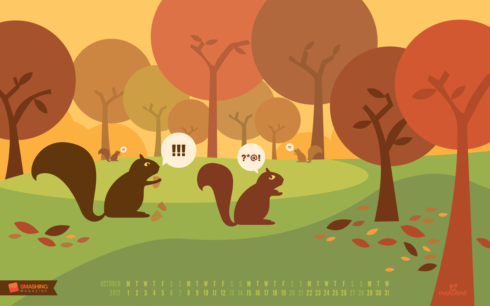
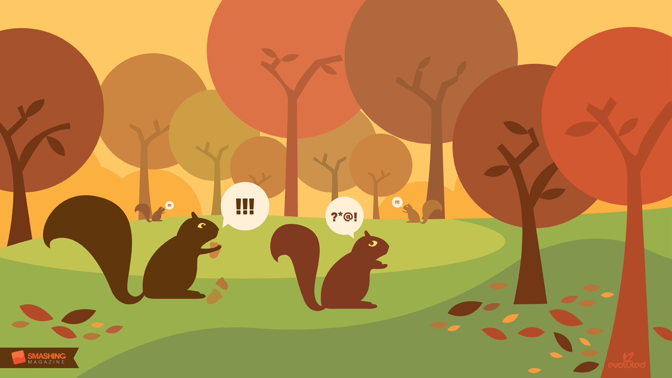
Autumn Squirrels
Designed by Jenny Hurman (Evoluted New Media) from United Kingdom.

- preview
- with calendar: 1024×768, 1366×768, 1680×1050, 1920×1080, 1920×1200, 2560×1440
- without calendar: 1024×768, 1366×768, 1680×1050, 1920×1080, 1920×1200, 2560×1440
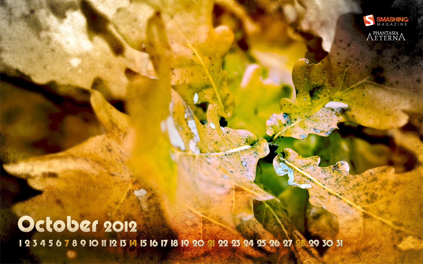
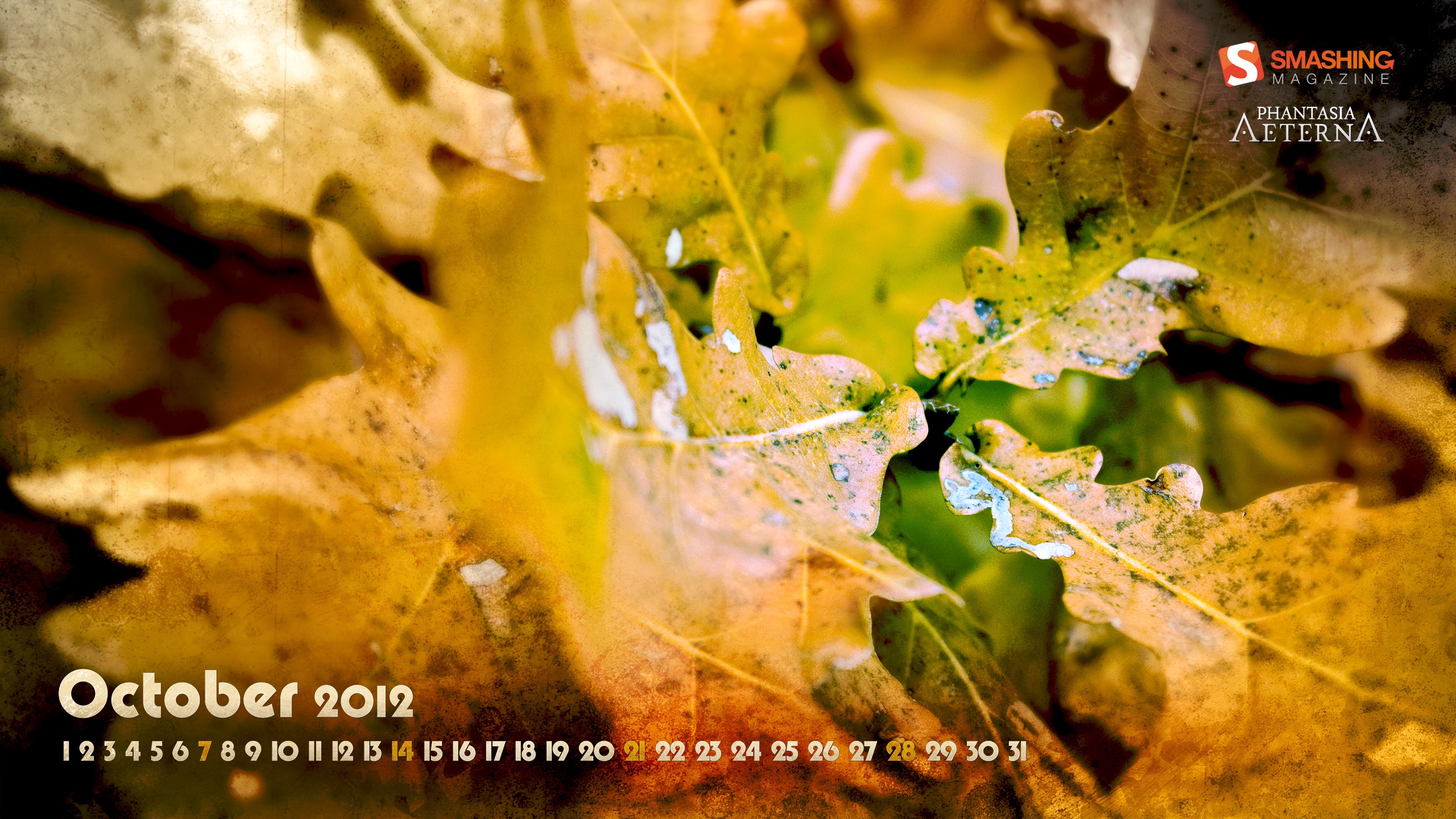
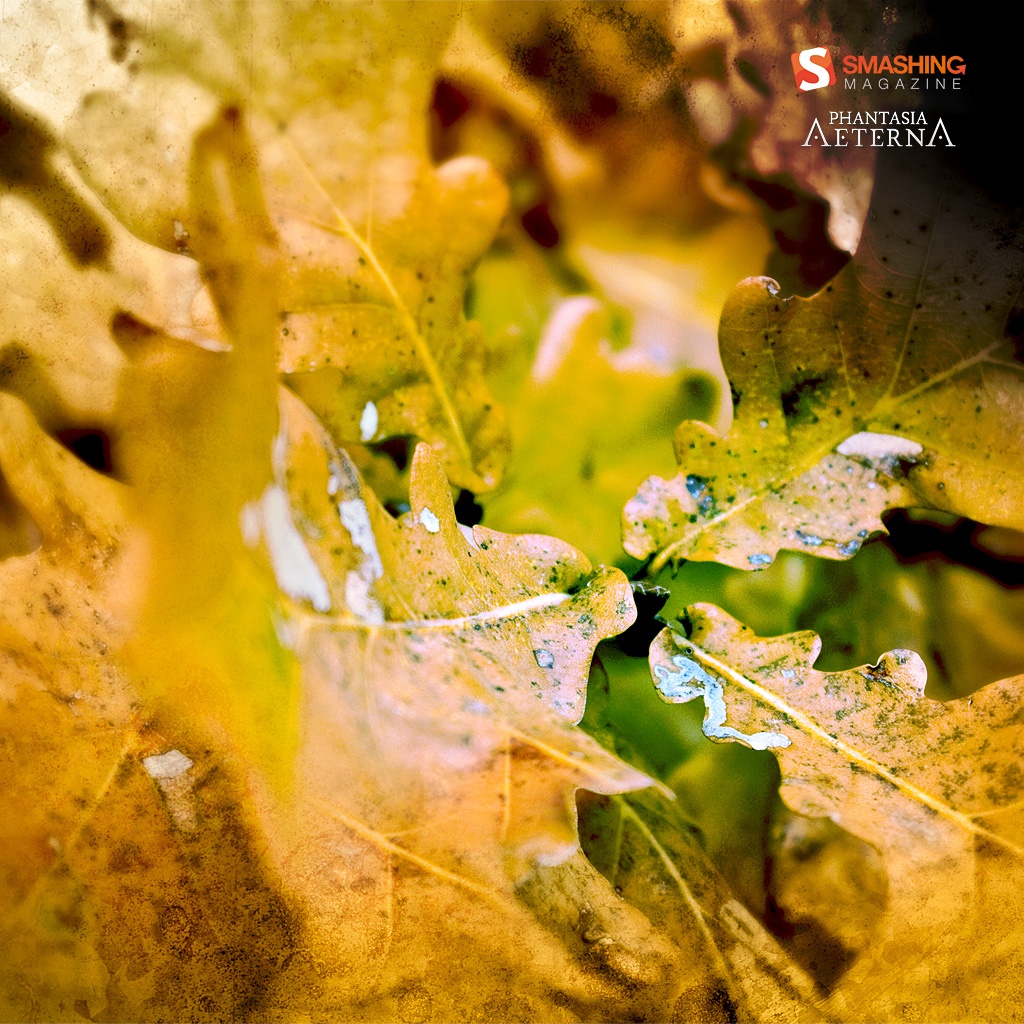
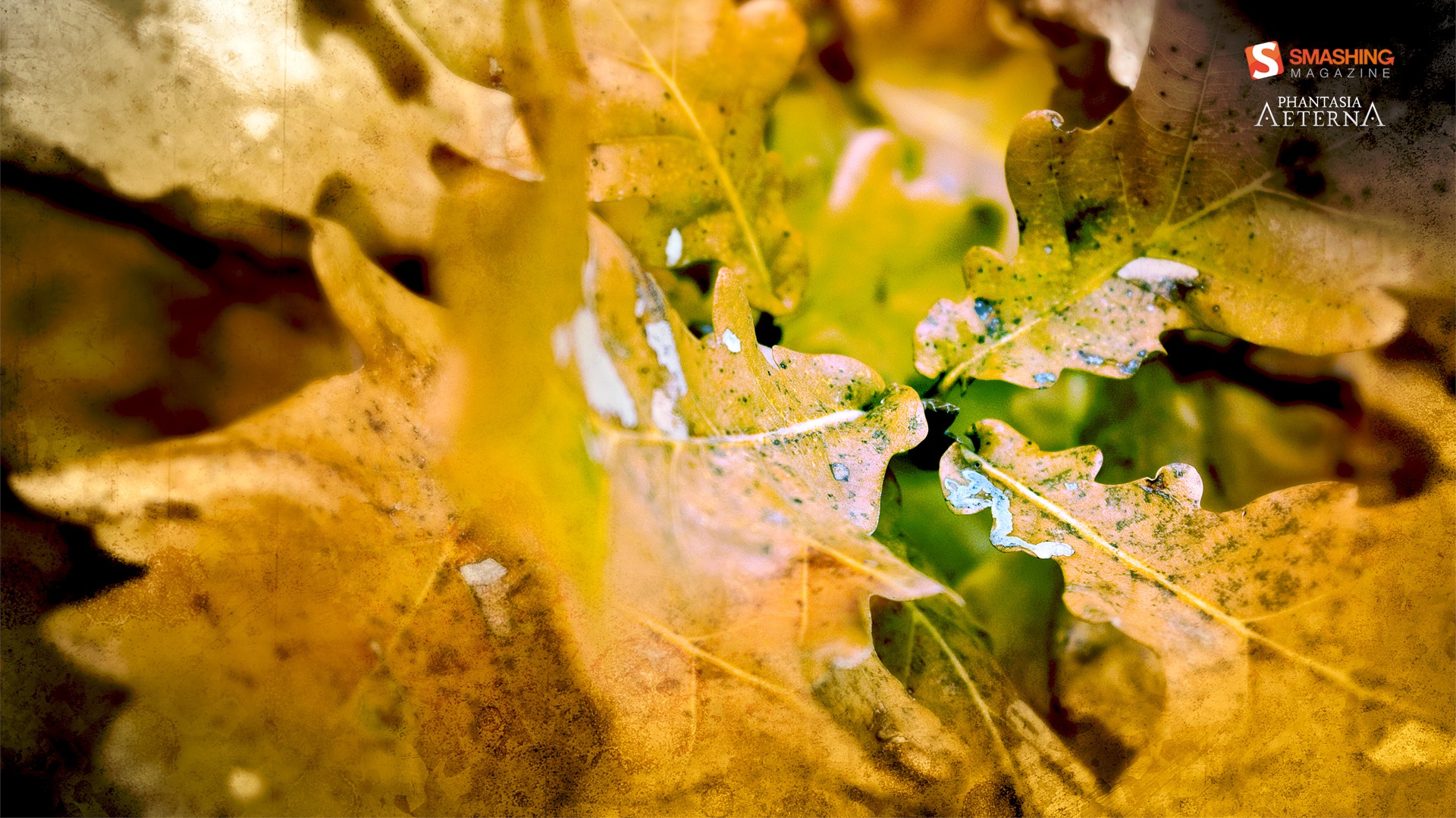
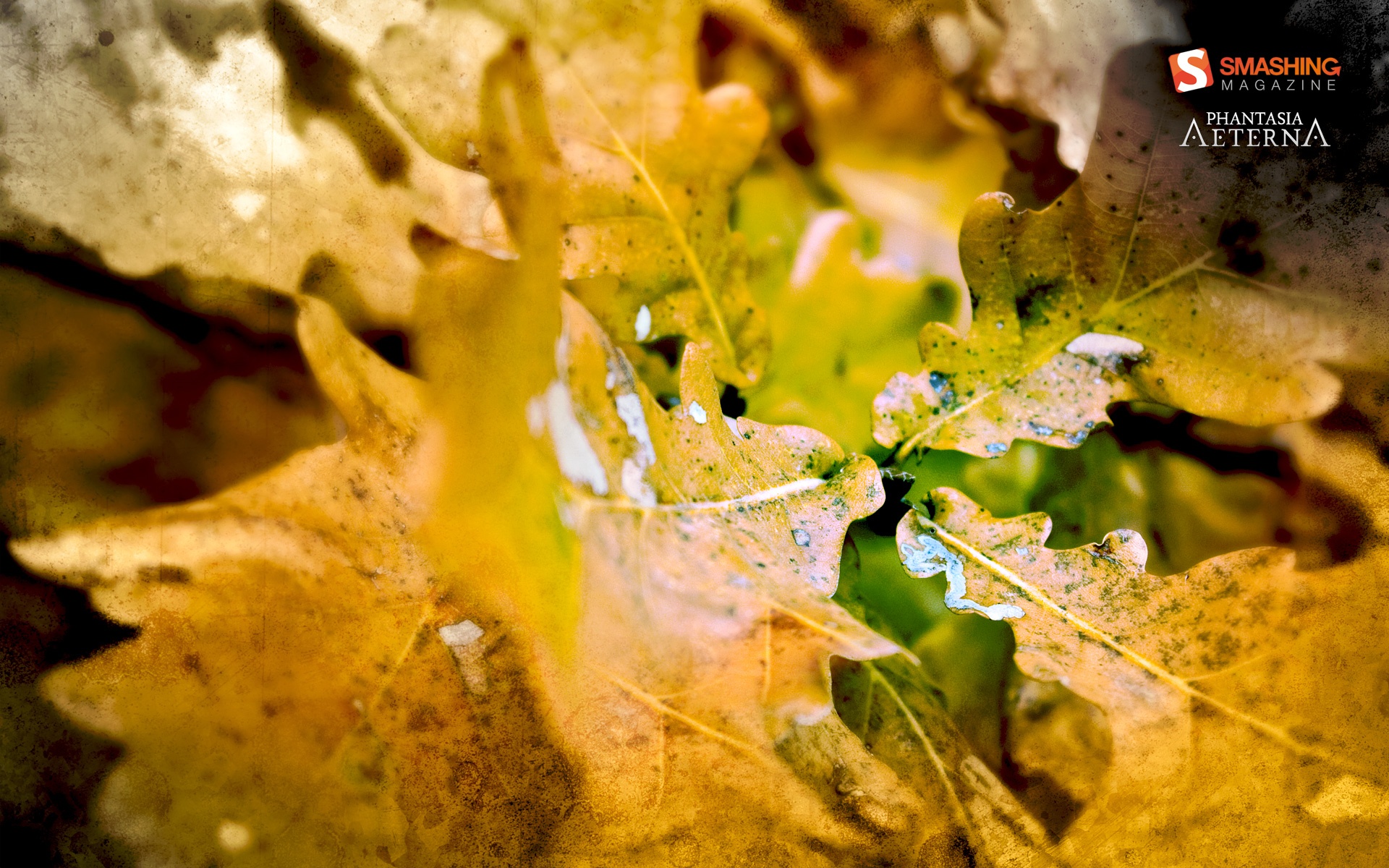
Autumn Leaves
“Altering tints bringing belief.” Designed by Lubos Volovar from Slovakia.

- preview
- with calendar: 1024×1024, 1280×800, 1366×768, 1440×900, 1680×1050, 1920×1080, 1920×1200, 2560×1440
- without calendar: 1024×1024, 1280×800, 1366×768, 1440×900, 1680×1050, 1920×1080, 1920×1200, 2560×1440
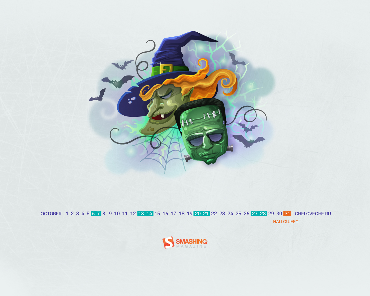
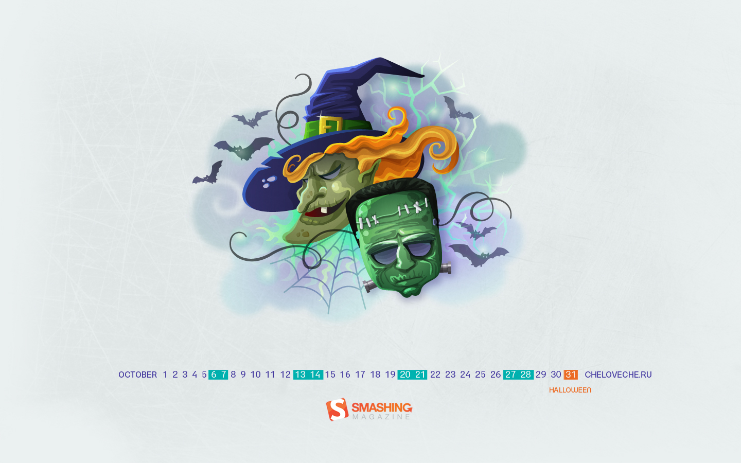
Halloween
Designed by Cheloveche.ru from Russia.

- preview
- with calendar: 1024×768, 1280×800, 1280×1024, 1440×900, 1680×1050, 1920×1200
- without calendar: 395×512, 1024×768, 1280×800, 1280×1024, 1440×900, 1680×1050, 1920×1200
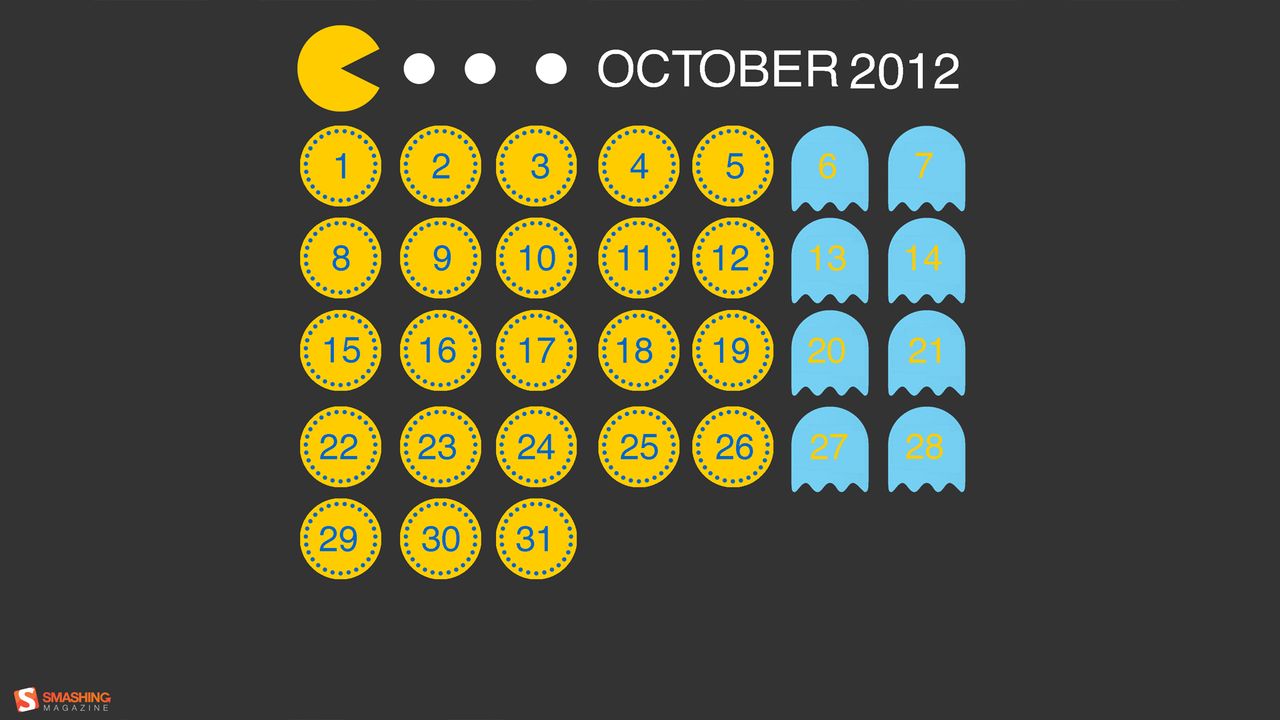
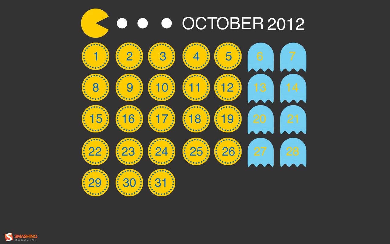
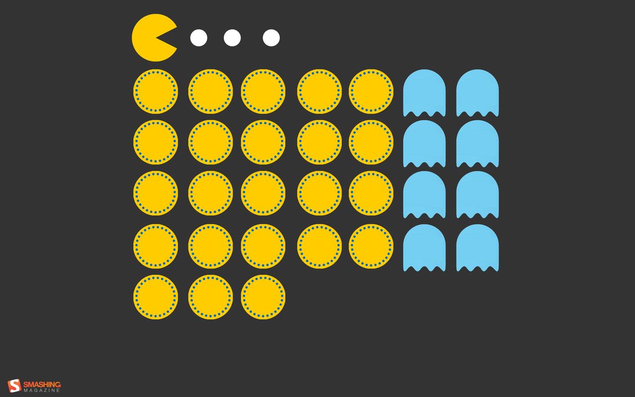
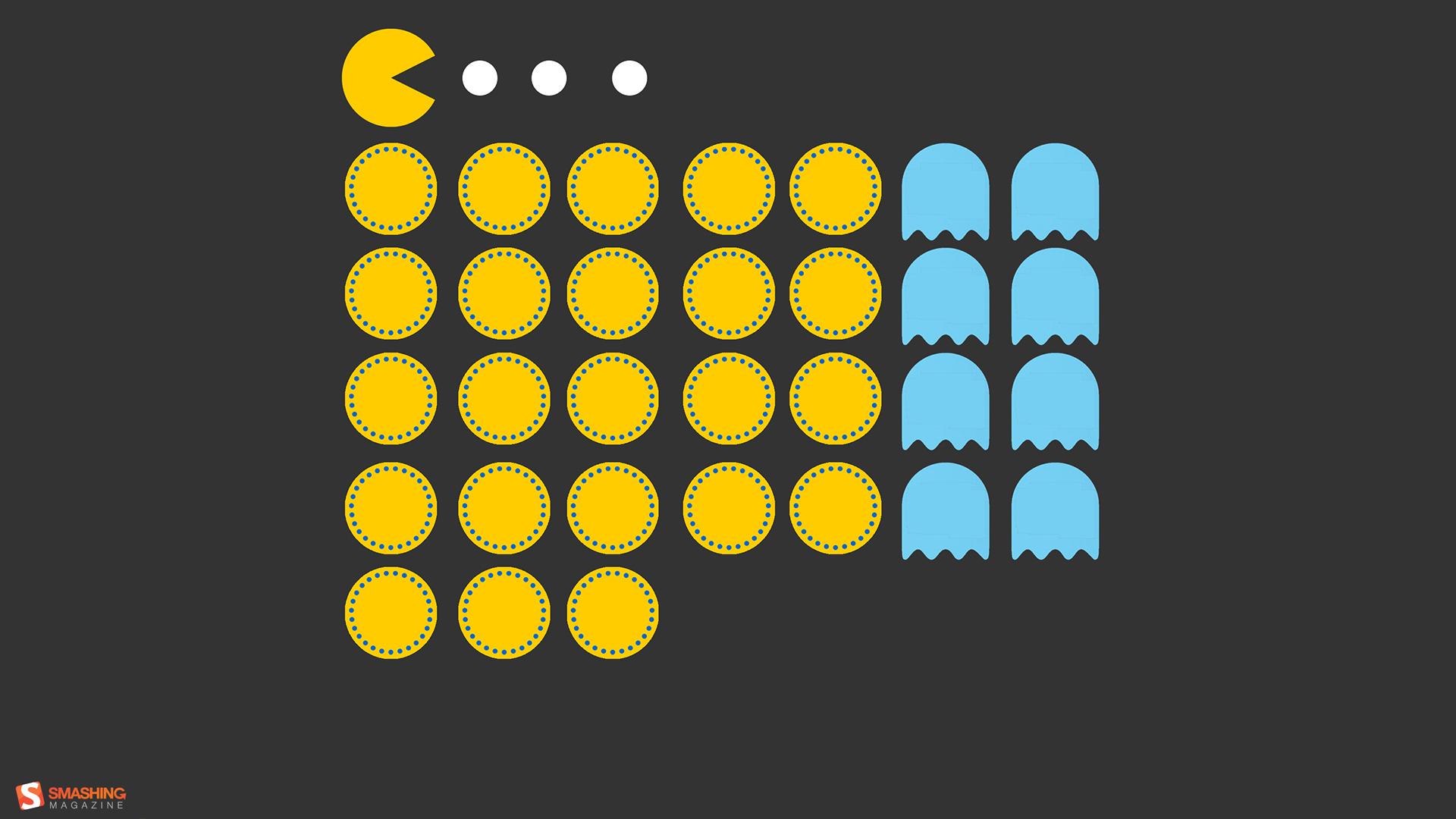
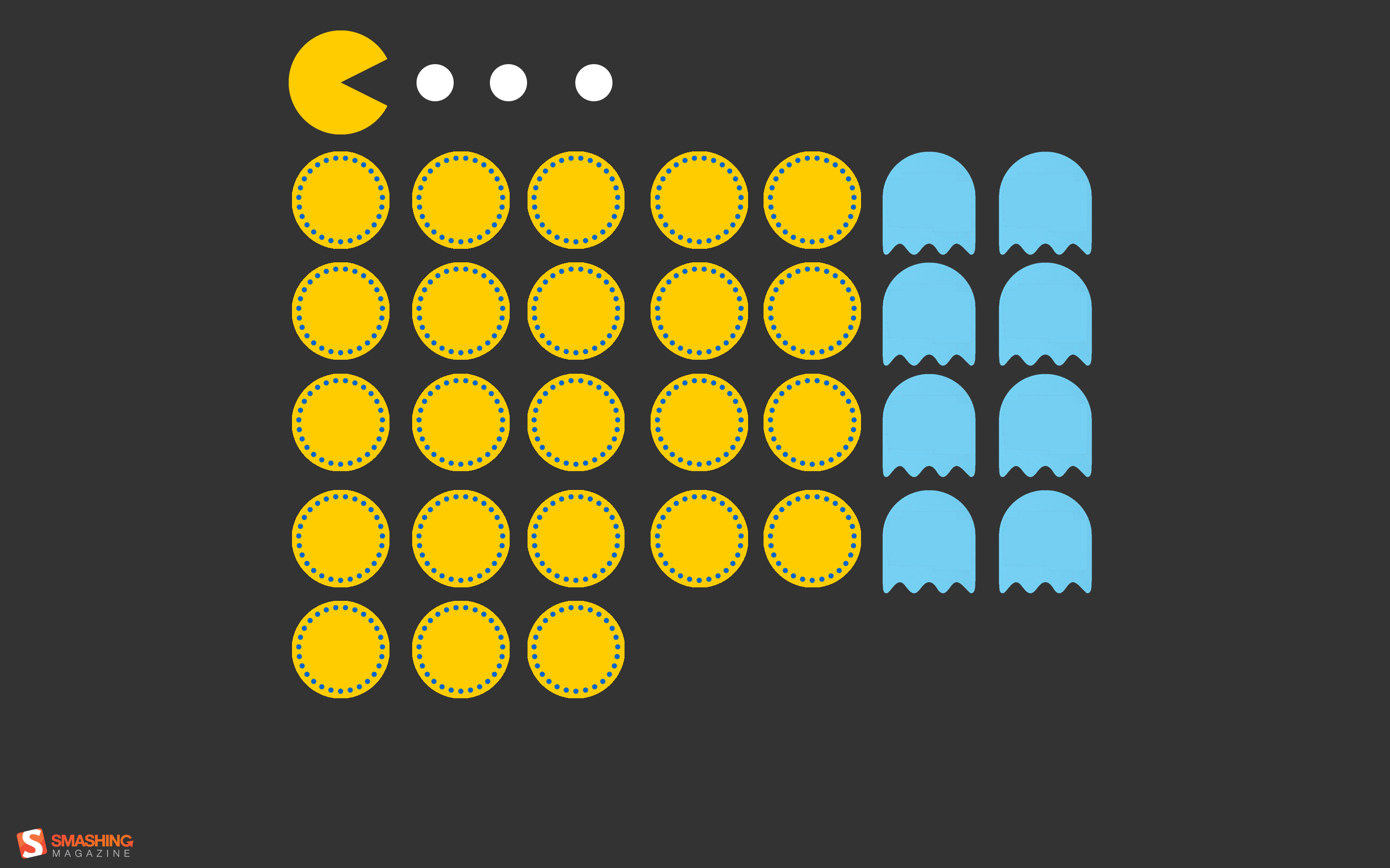
Pac Man
“A tribute to the iconic video game, Pac Man.” Designed by Simona Gosu from Romania.

- preview
- with calendar: 1280×720, 1280×800, 1440×900, 1600×900, 1680×1050, 1920×1080, 1920×1200, 2560×1600, 2880×1800
- without calendar: 1280×720, 1280×800, 1440×900, 1600×900, 1680×1050, 1920×1080, 1920×1200, 2560×1600, 2880×1800
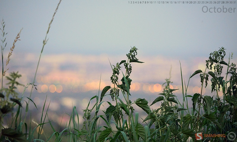
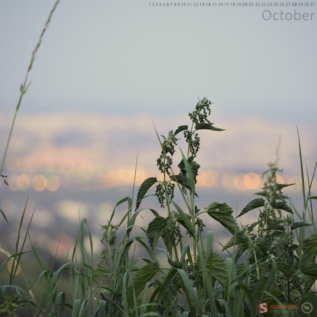
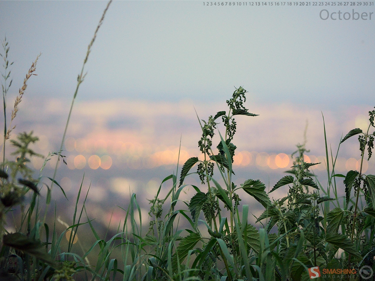
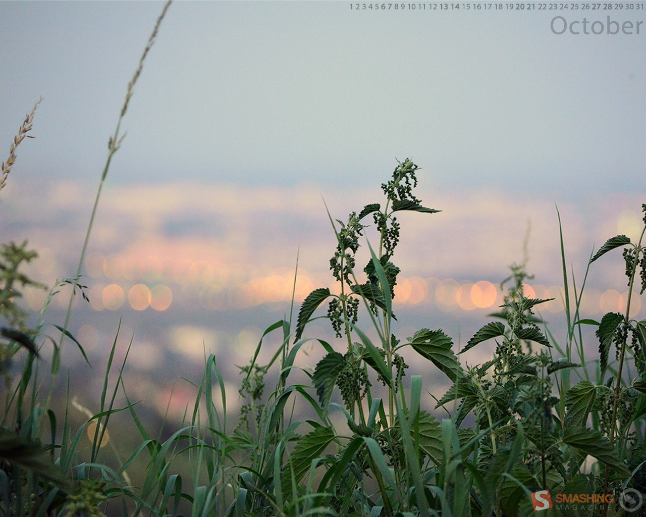
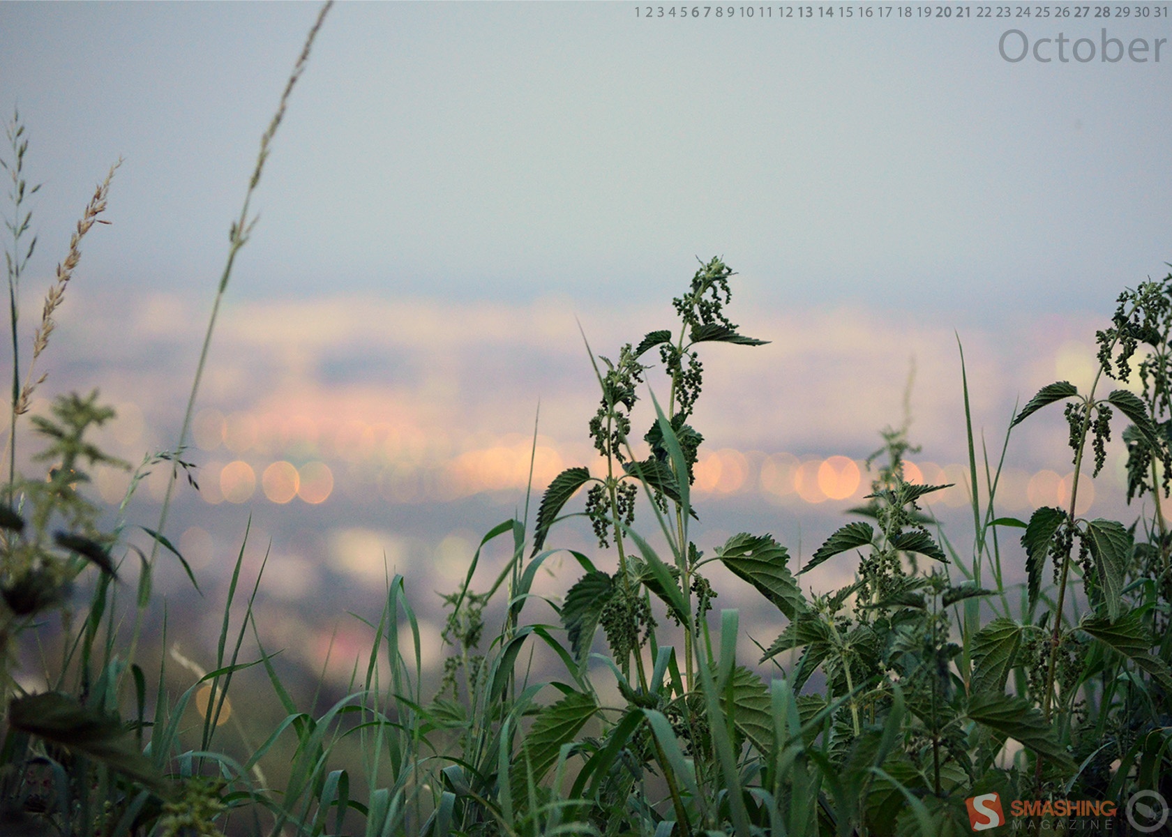
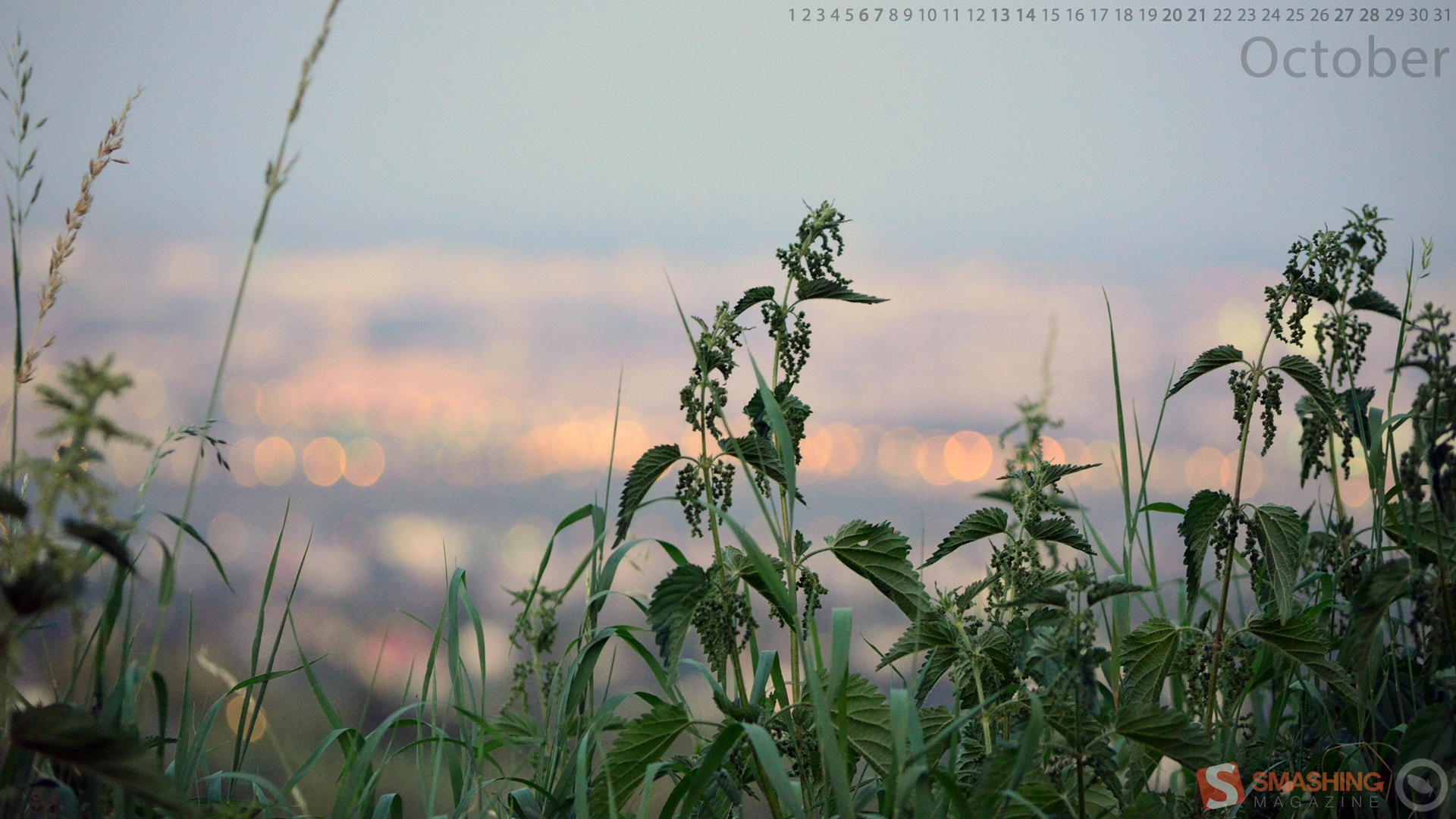
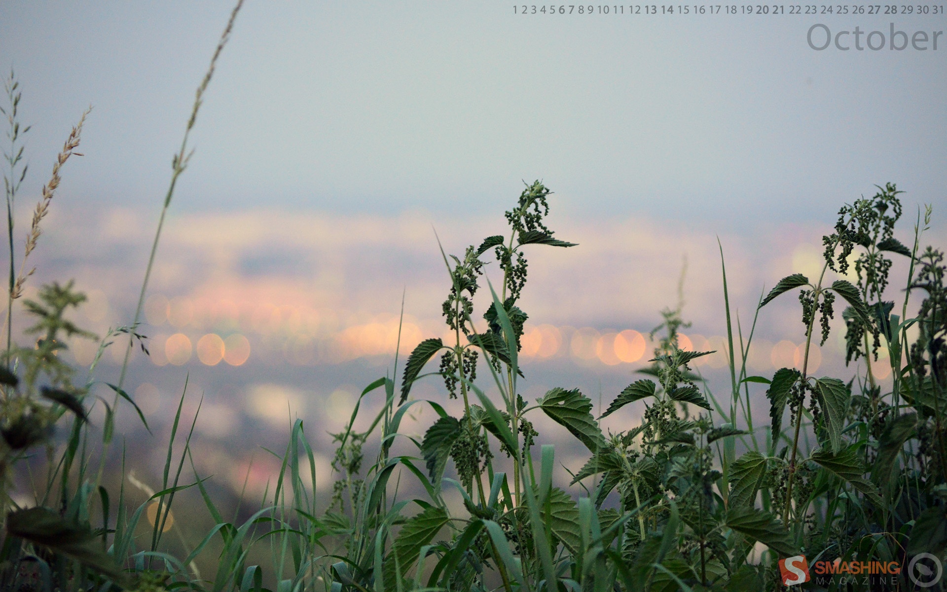
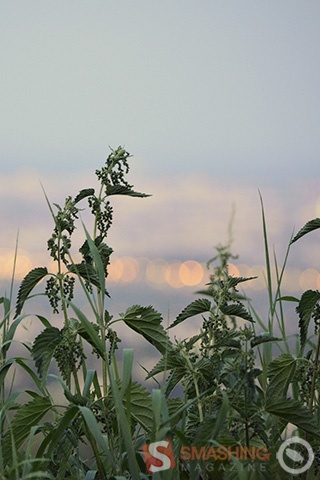
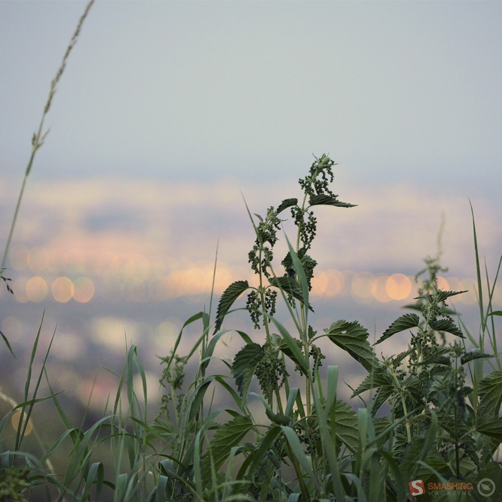
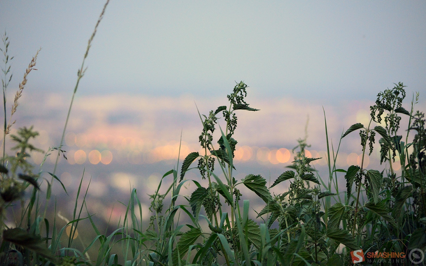
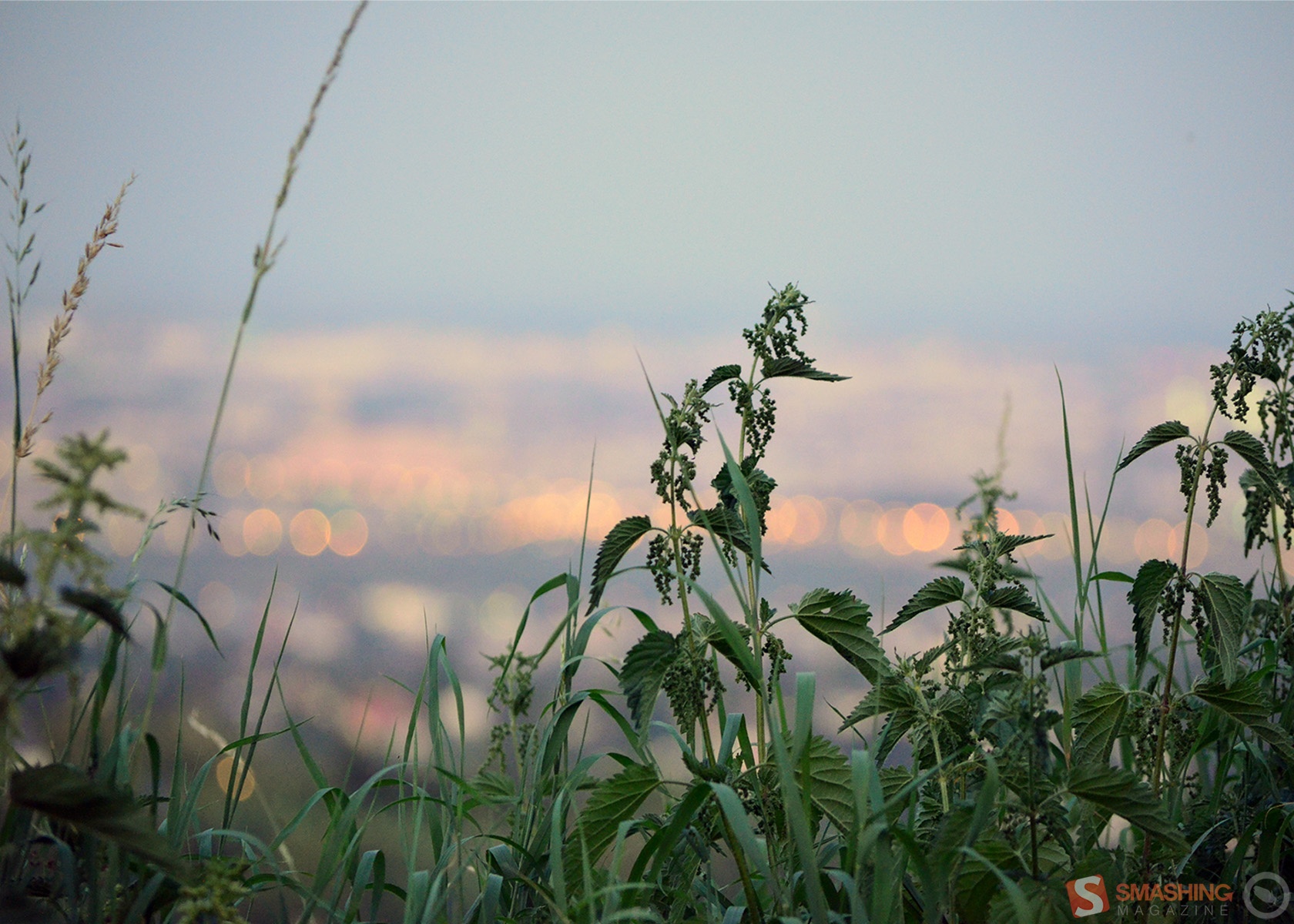
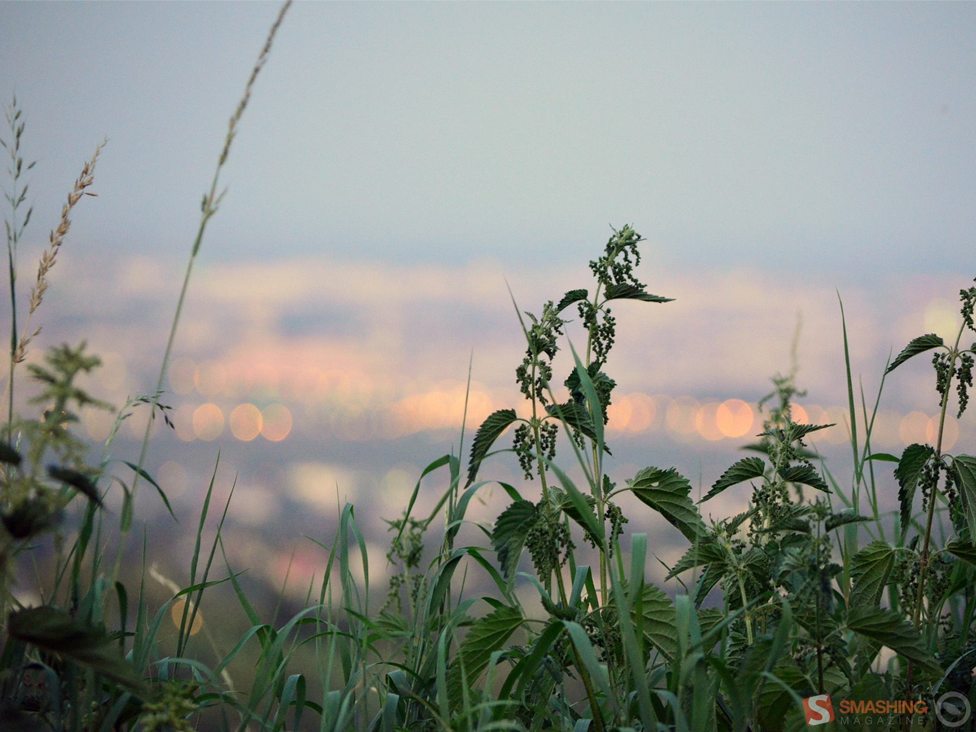
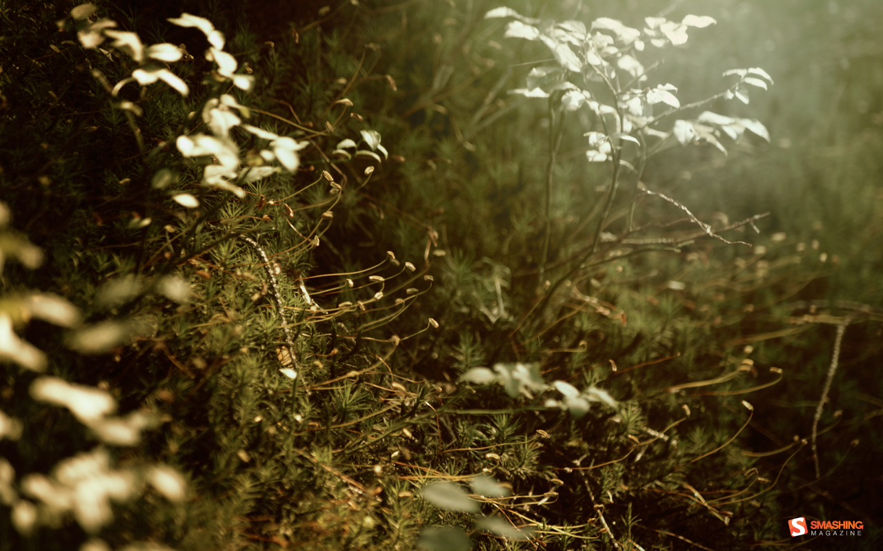
Stinging Nettle
“Stinging nettle in front of Vienna.” Designed by Kai Szendi from Austria.

- preview
- with calendar: 320×480, 640×480, 800×480, 800×600, 1024×768, 1024×1024, 1152×864, 1280×720, 1280×800, 1280×960, 1280×1024, 1400×1050, 1440×900, 1600×1200, 1680×1050, 1680×1200, 1920×1080, 1920×1200, 1920×1440, 2560×1440
- without calendar: 320×480, 640×480, 800×480, 800×600, 1024×768, 1024×1024, 1152×864, 1280×720, 1280×800, 1280×960, 1280×1024, 1400×1050, 1440×900, 1600×1200, 1680×1050, 1680×1200, 1920×1080, 1920×1200, 1920×1440, 2560×1440
Halloween
Designed by Katerina Bobkova from Ukraine.

- preview
- with calendar: 320×480, 1024×768, 1024×1024, 1280×800, 1440×900, 1680×1050, 1920×1080
- without calendar: 320×480, 1024×768, 1024×1024, 1280×800, 1440×900, 1680×1050, 1920×1080
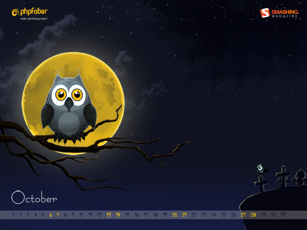
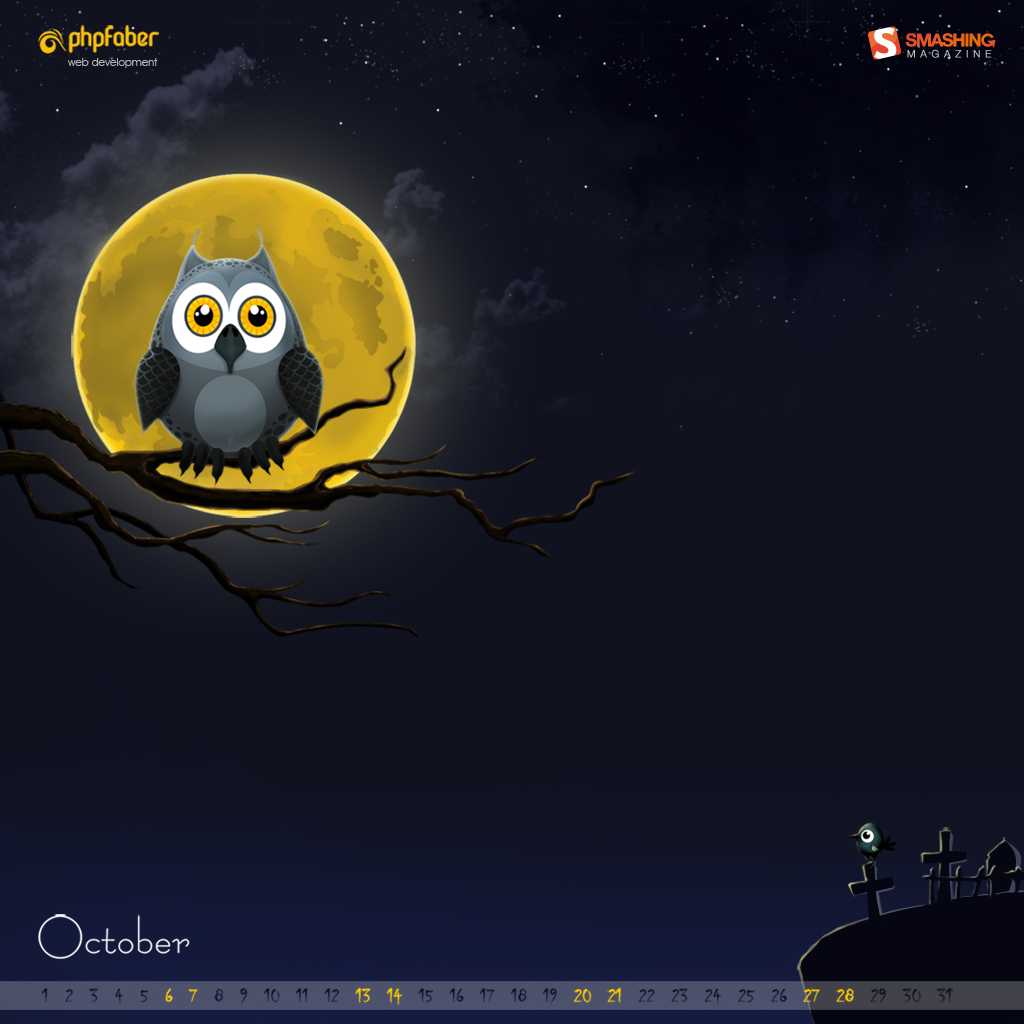
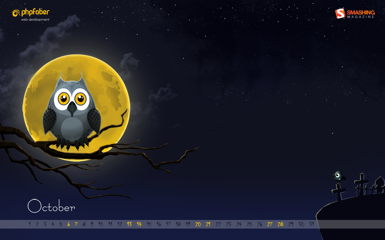
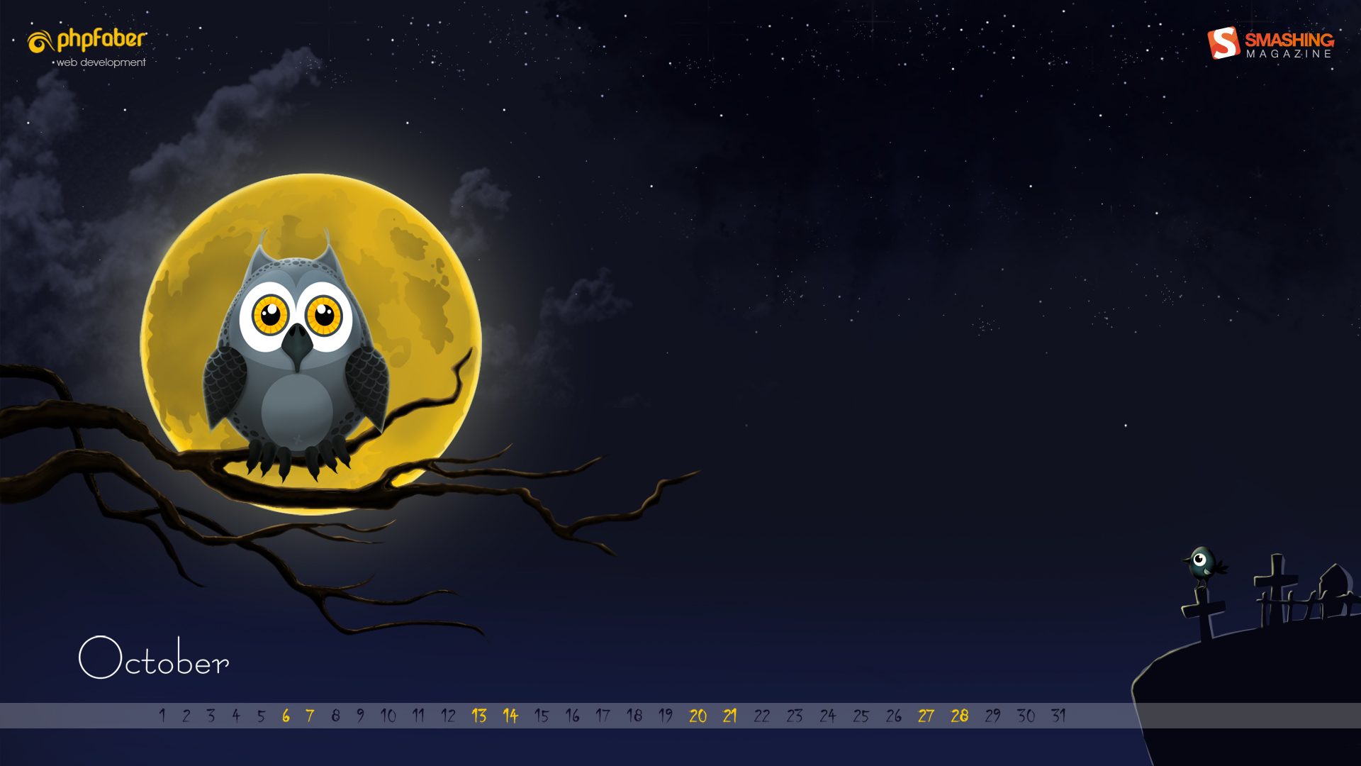
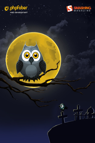
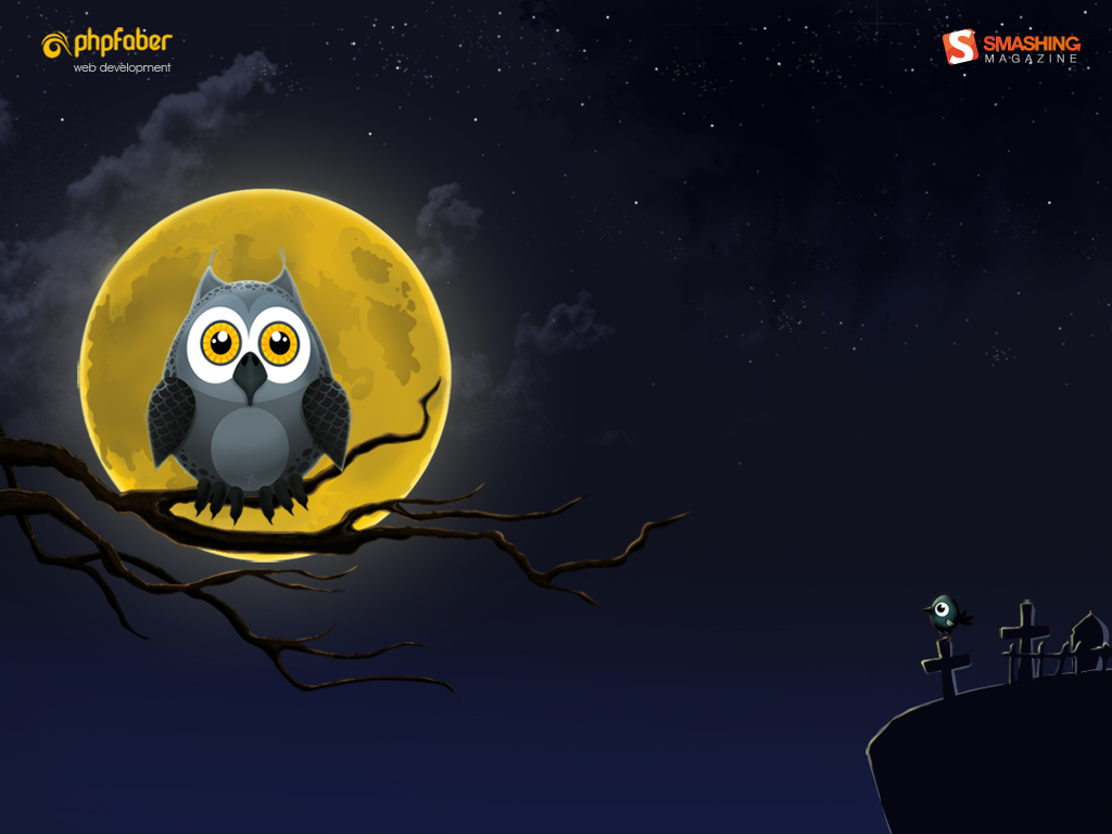
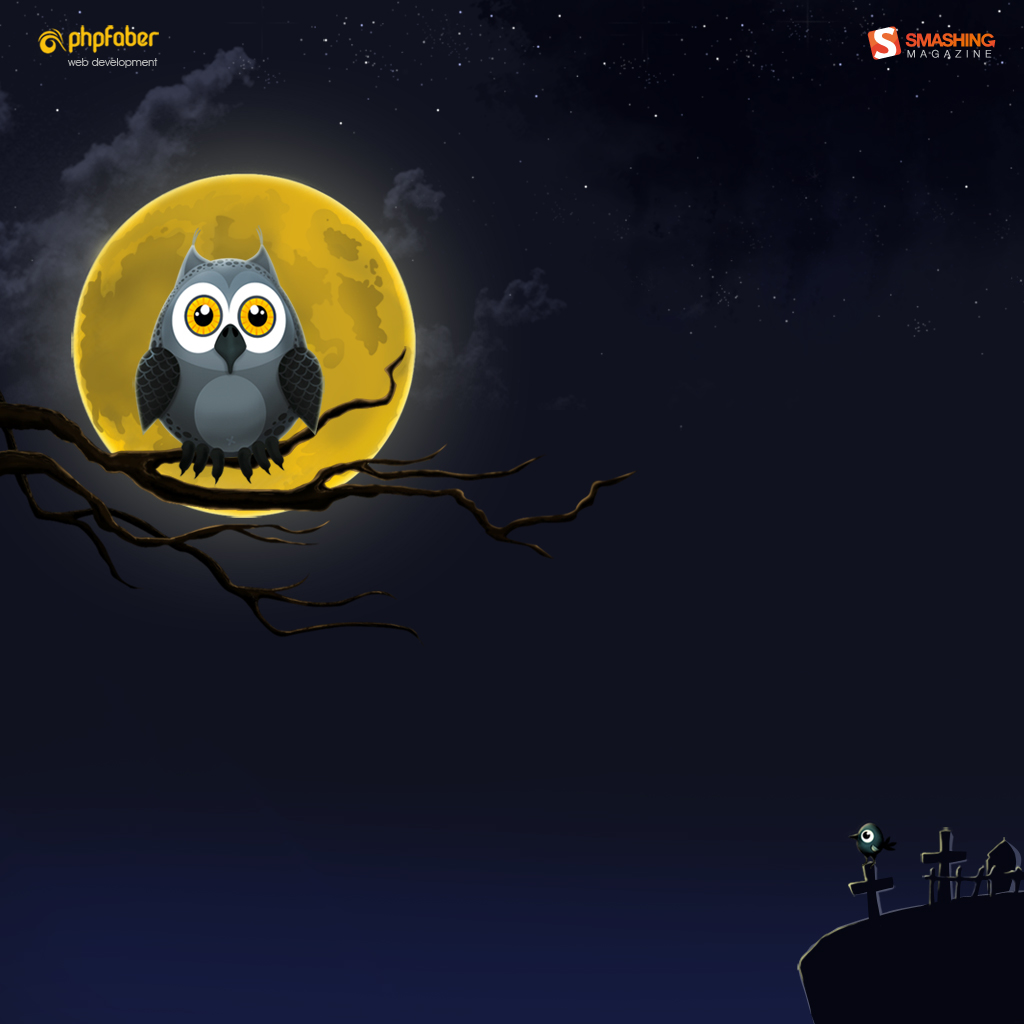
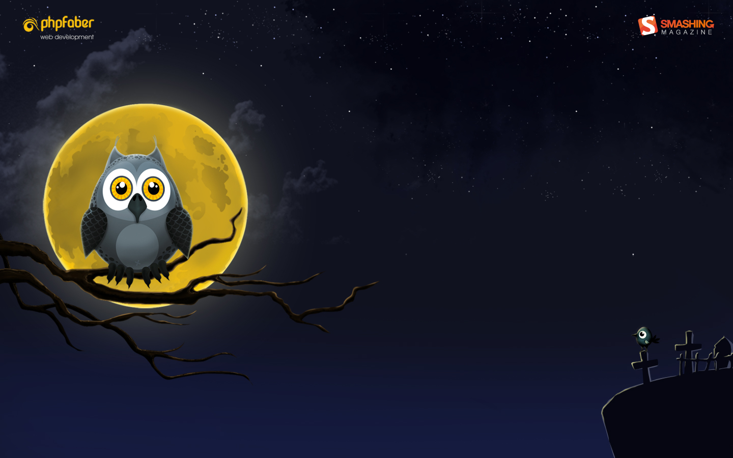
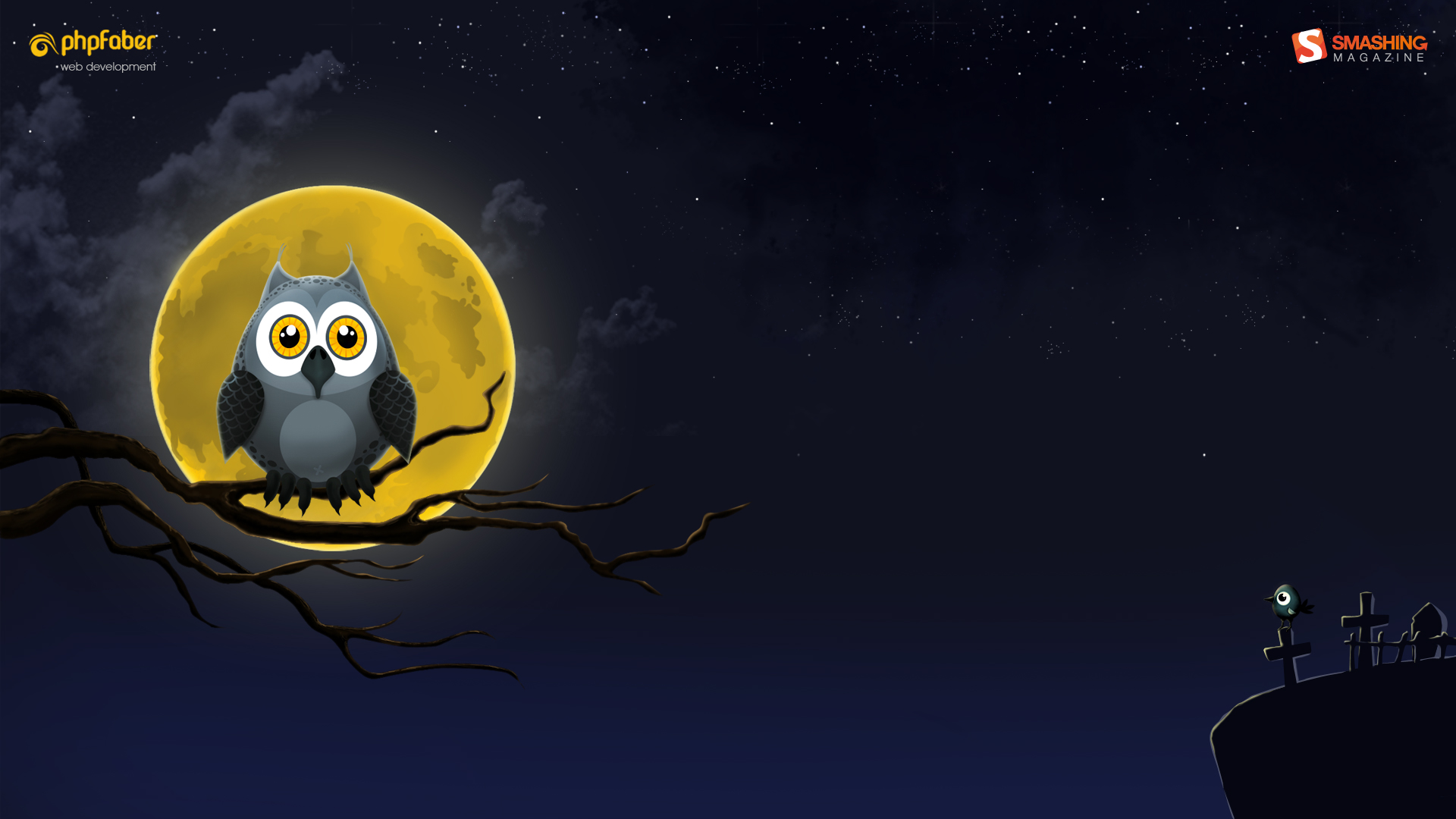
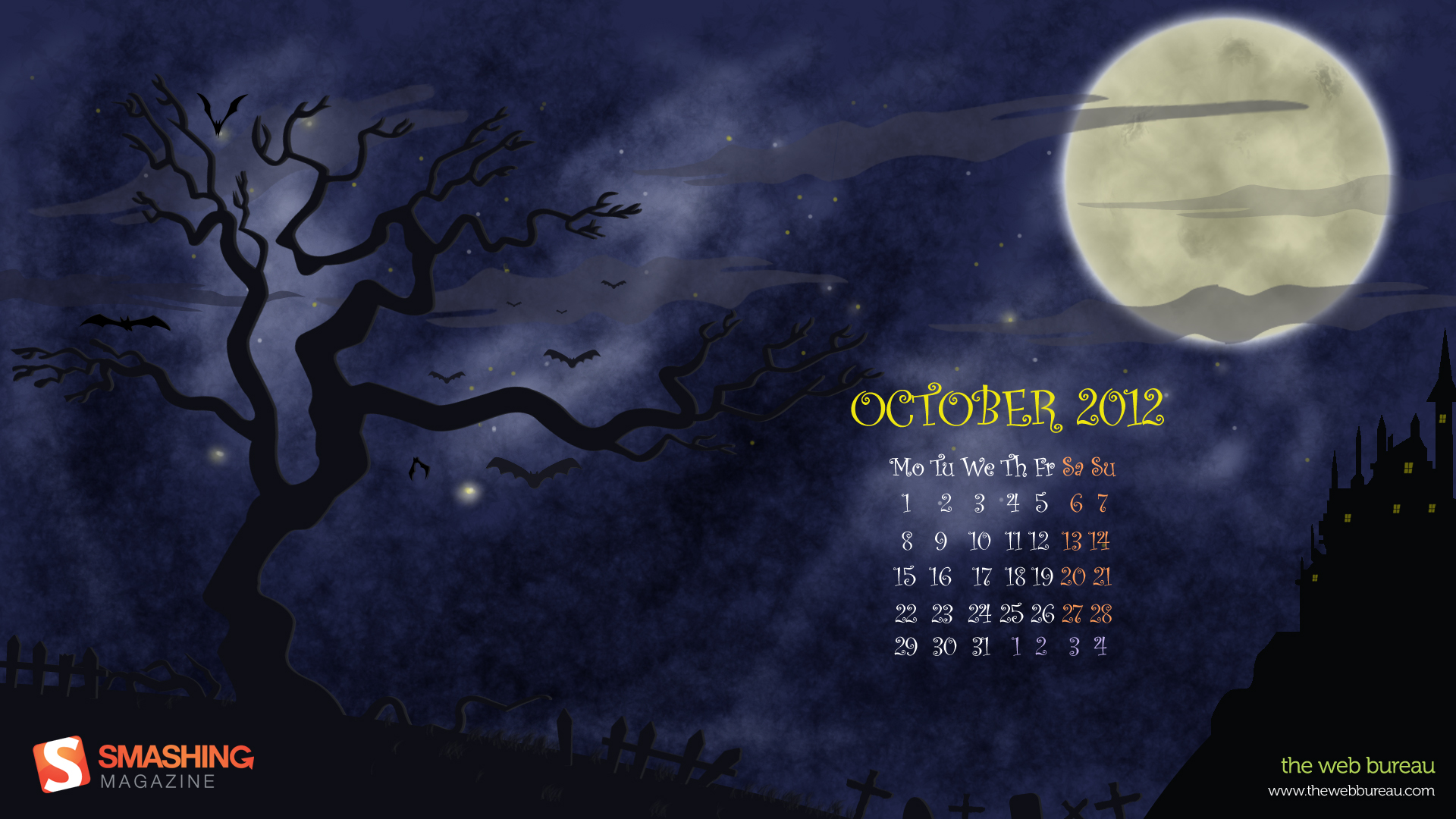
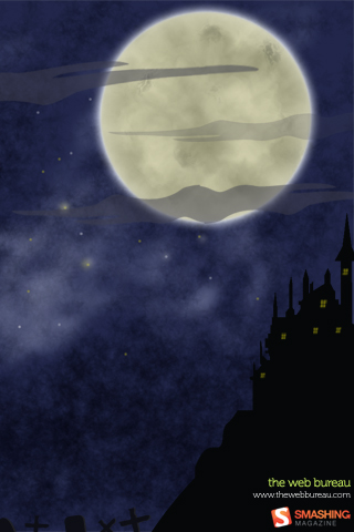
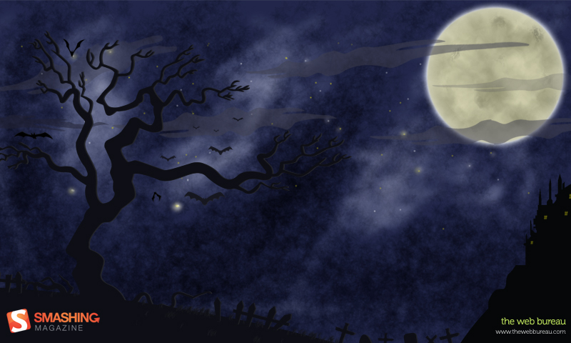
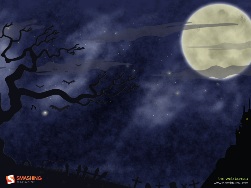
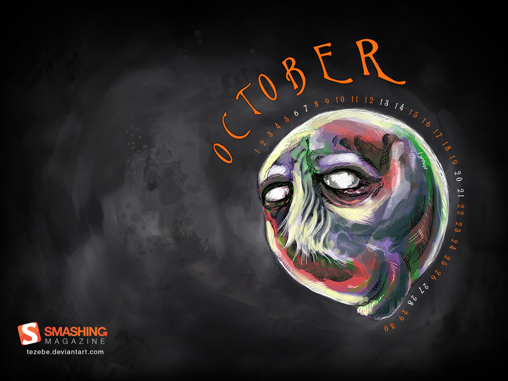
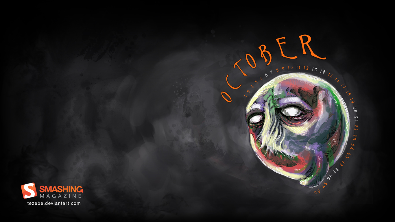
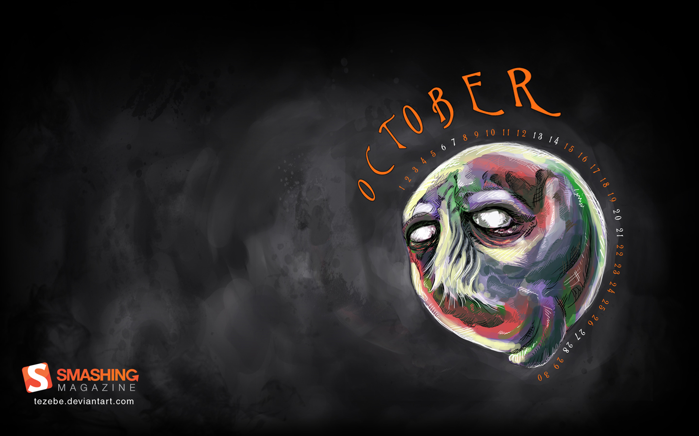
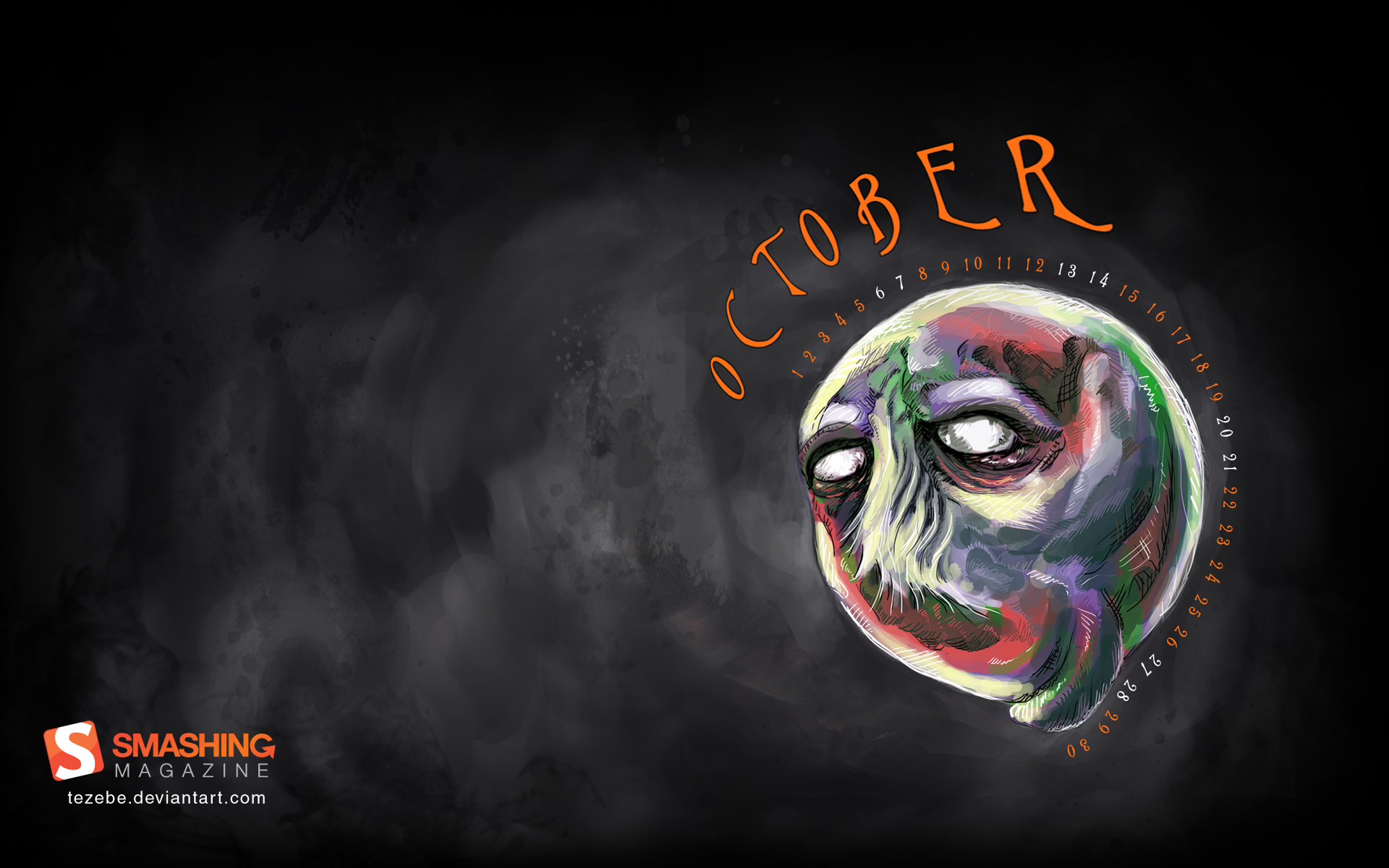
Halloween Moon
“A simple Halloween wallpaper for October.” Designed by Andy Murphy from Northern Ireland.

- preview
- with calendar: 320×480, 800×480, 800×600, 1280×720, 1280×800, 1366×768, 1440×900, 1680×1050, 1920×1080
- without calendar: 320×480, 800×480, 800×600, 1280×720, 1280×800, 1366×768, 1440×900, 1680×1050, 1920×1080
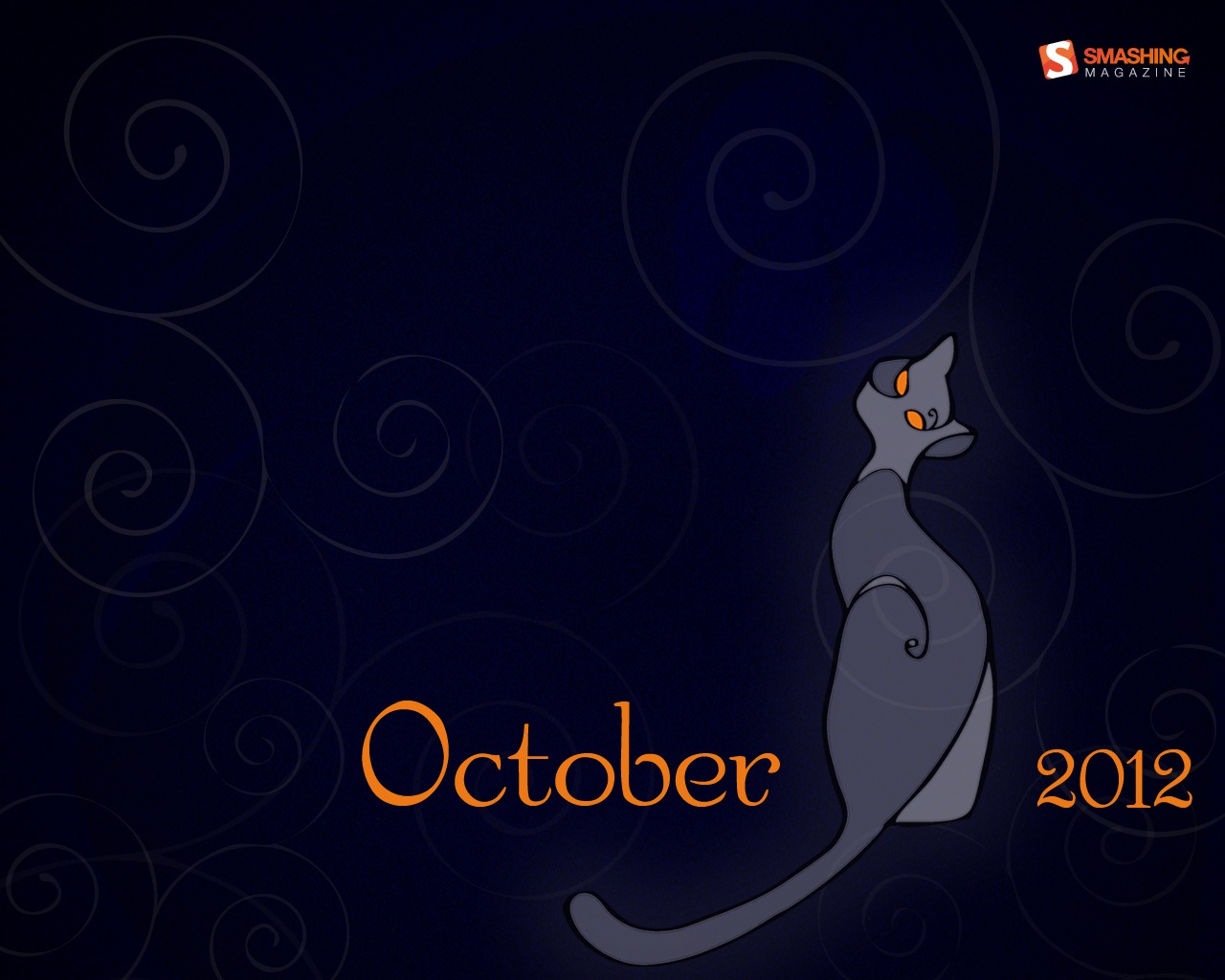
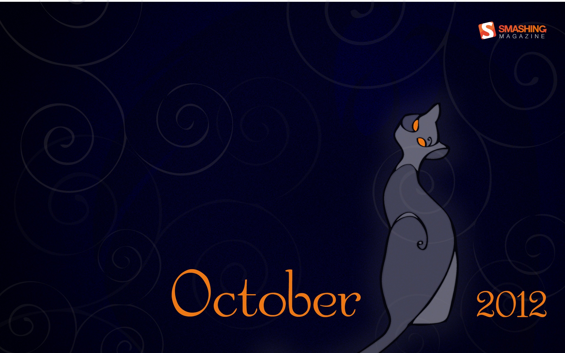
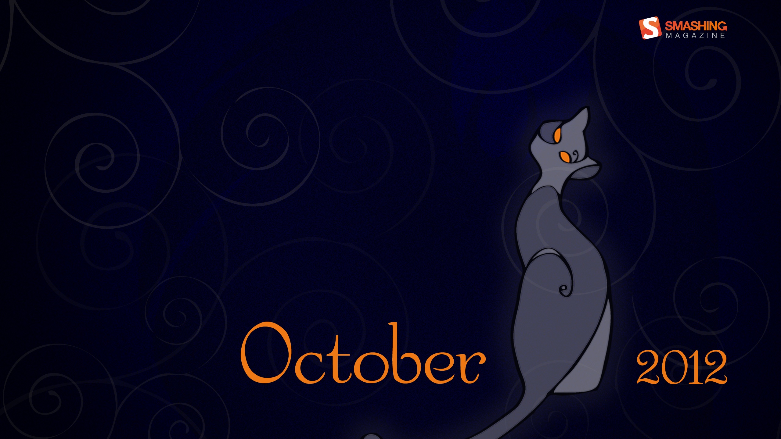
Dream Of Autumn
“Graphics and hand-drawing picture a cat.” Designed by Irina.

- preview
- with calendar: 320×480, 1024×1024, 1280×800, 1280×1024, 1680×1050, 1920×1200
- without calendar: 320×480, 1024×1024, 1280×800, 1280×1024, 1680×1050, 1920×1200
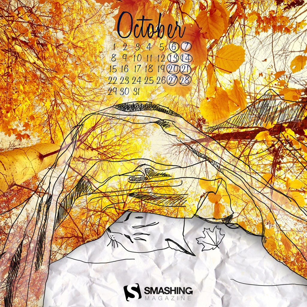
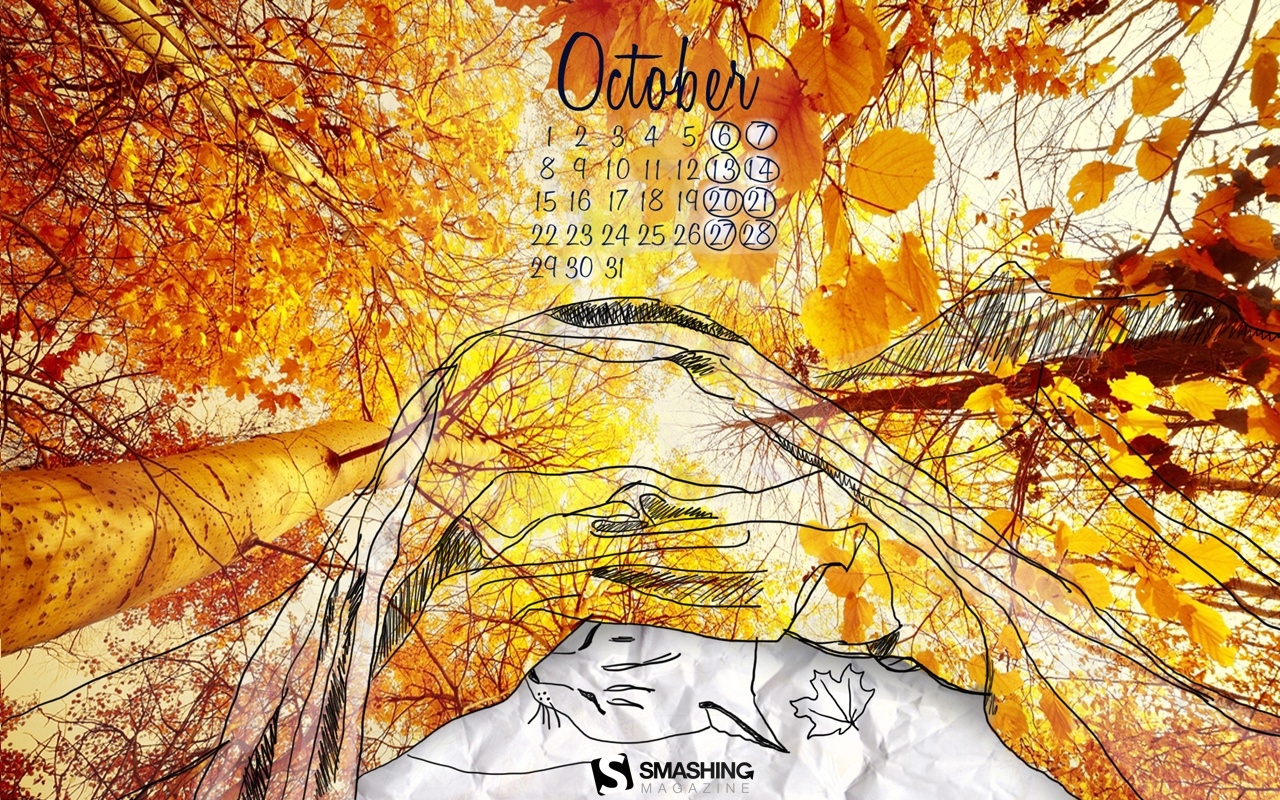
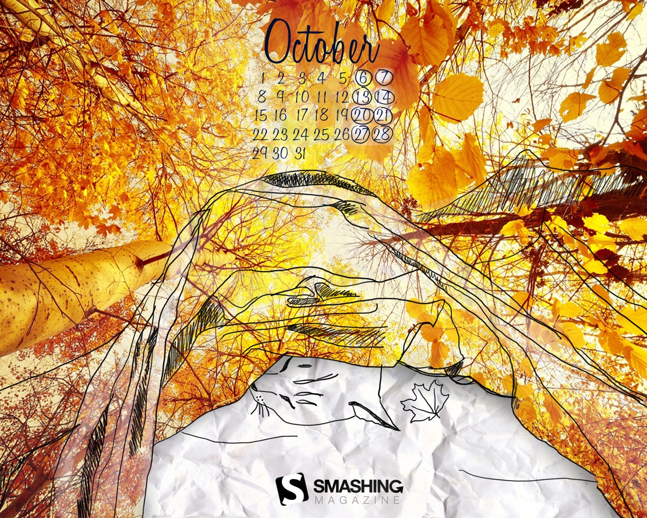
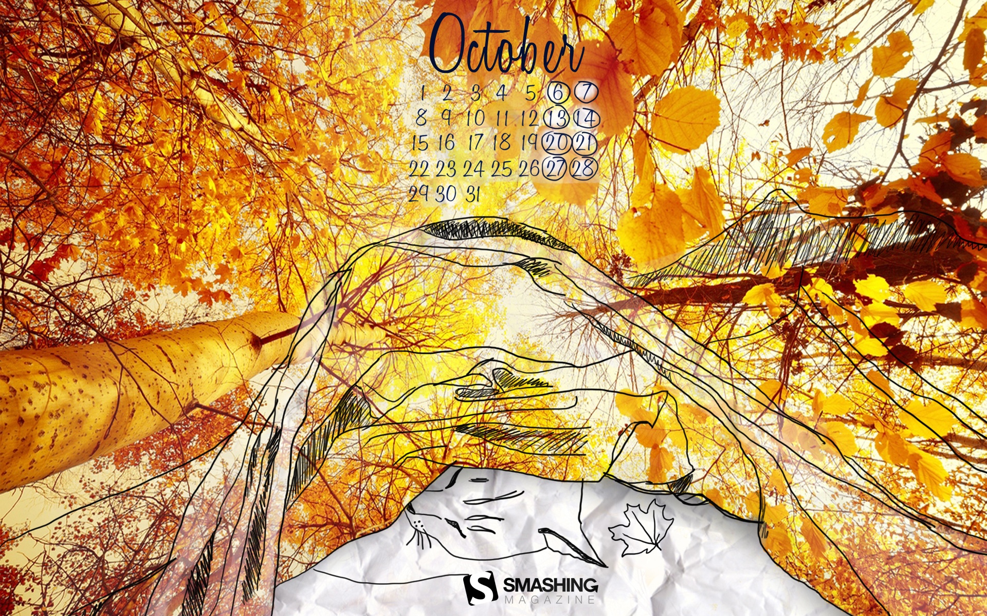
Say “Bye” To Summer
“And hello to Autumn! The Summer heat and high season is over. It’s time to pack our backpacks and head for the mountains — there are many treasures waiting to be discovered!” Designed by Agnes Sobon from Poland.
- preview
- with calendar: 1280×800, 1440×900, 1680×1050, 1920×1080, 1920×1200, 2560×1440
- without calendar: 1280×800, 1440×900, 1680×1050, 1920×1080, 1920×1200, 2560×1440
Sweet Halloween
Designed by Cortando Pixeles from Argentina.

- preview
- with calendar: 640×480, 800×600, 1024×768, 1024×1024, 1152×864, 1280×960, 1400×1050, 1600×1200, 1920×1440
- without calendar: 640×480, 800×600, 1024×768, 1024×1024, 1152×864, 1280×960, 1400×1050, 1600×1200, 1920×1440
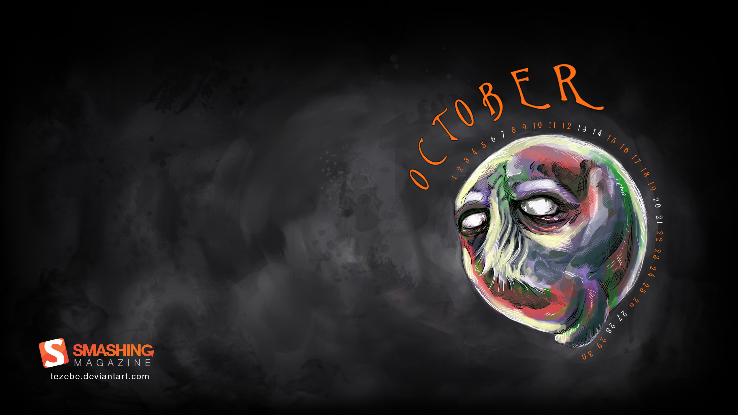
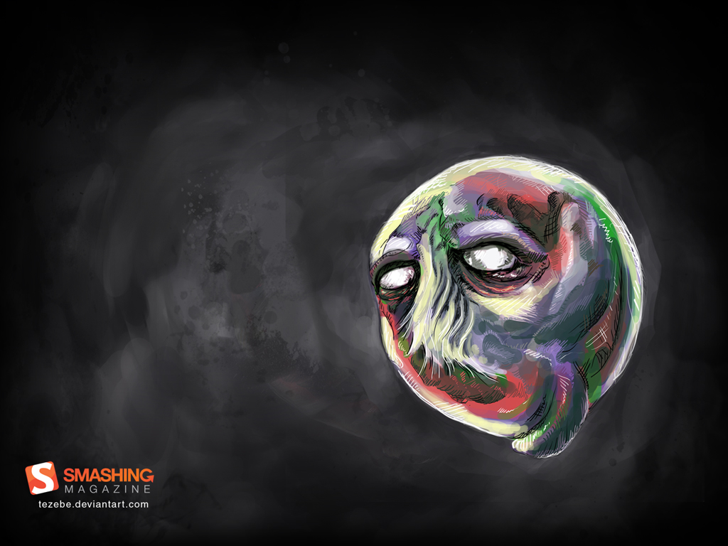
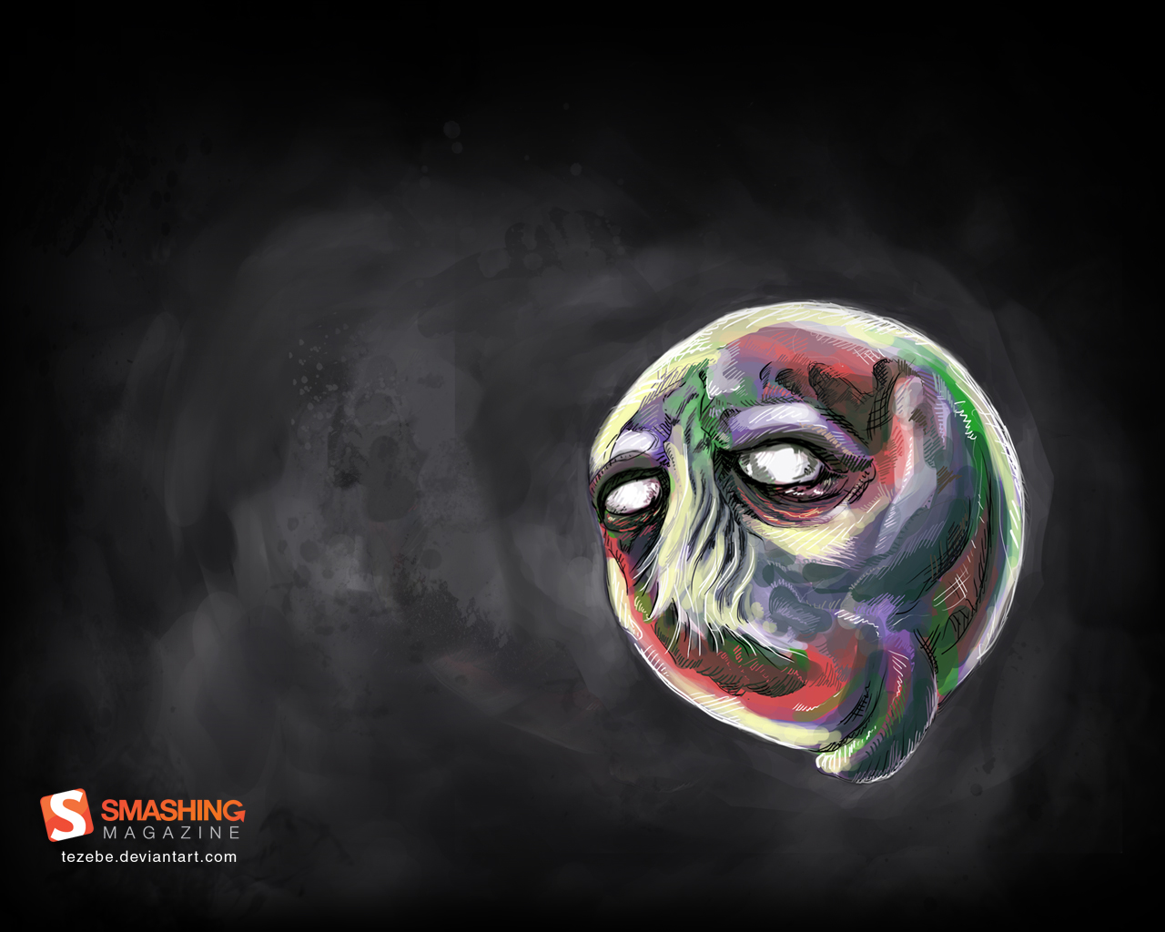
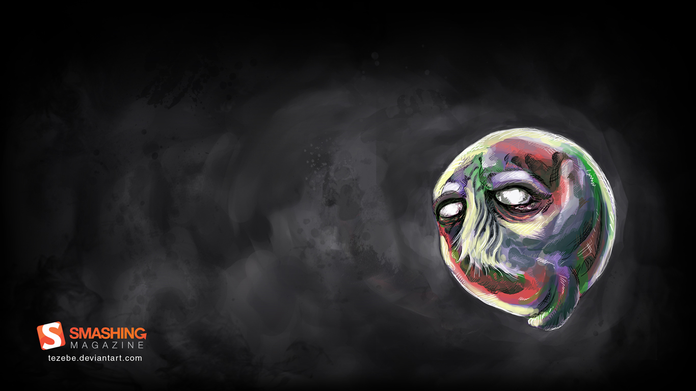
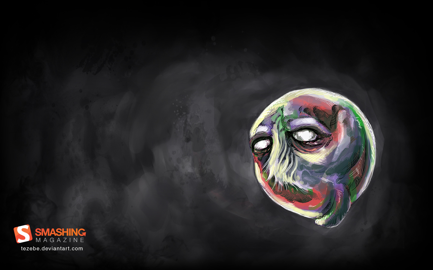
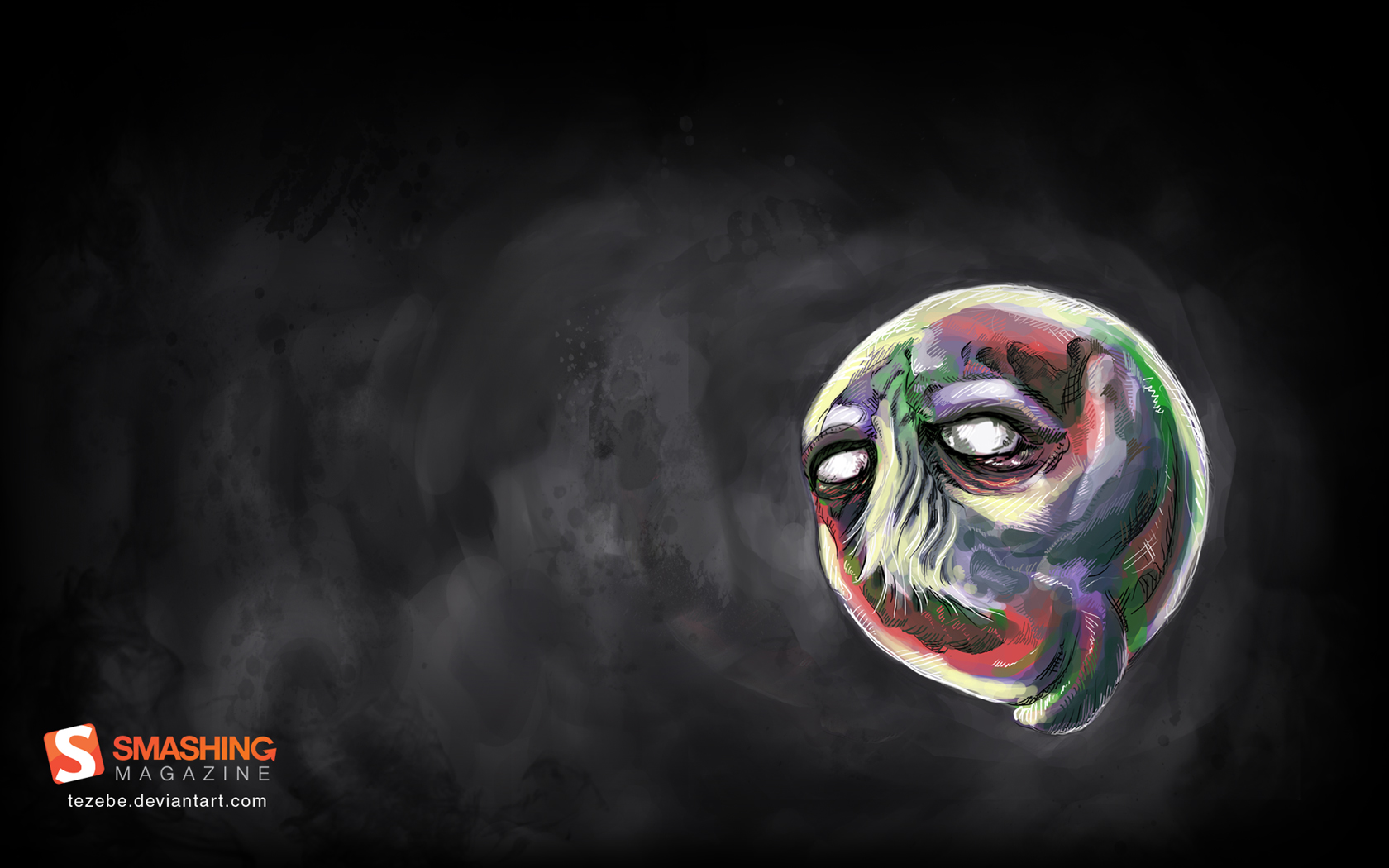
Delusional
Designed by Andrei R. Terbea from Romania.

- preview
- with calendar: 1024×768, 1280×1024, 1366×768, 1440×900, 1680×1050, 1920×1080, 1920×1200, 2560×1440
- without calendar: 1024×768, 1280×1024, 1366×768, 1440×900, 1680×1050, 1920×1080, 1920×1200
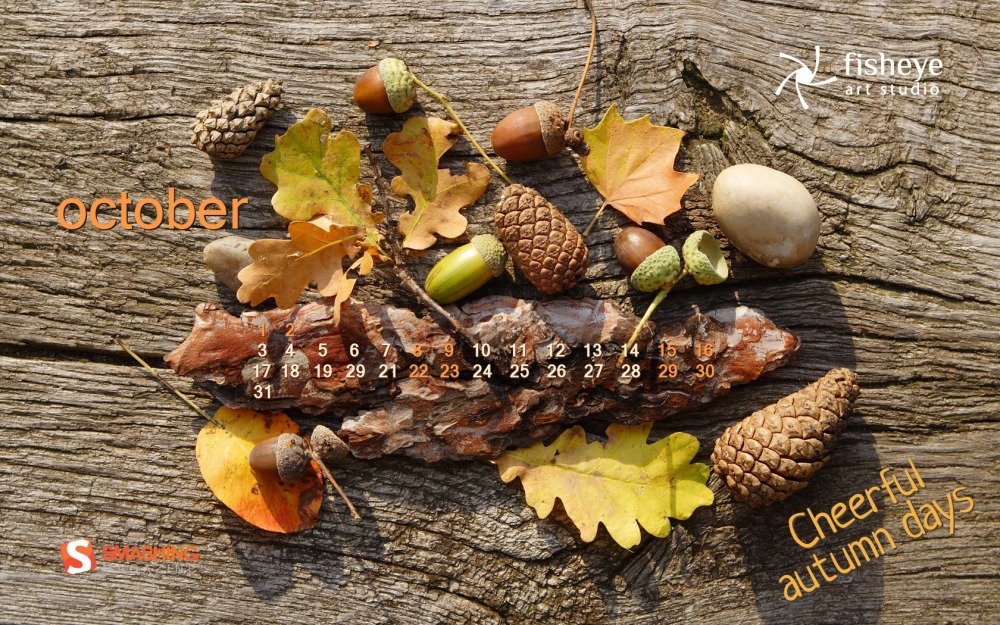
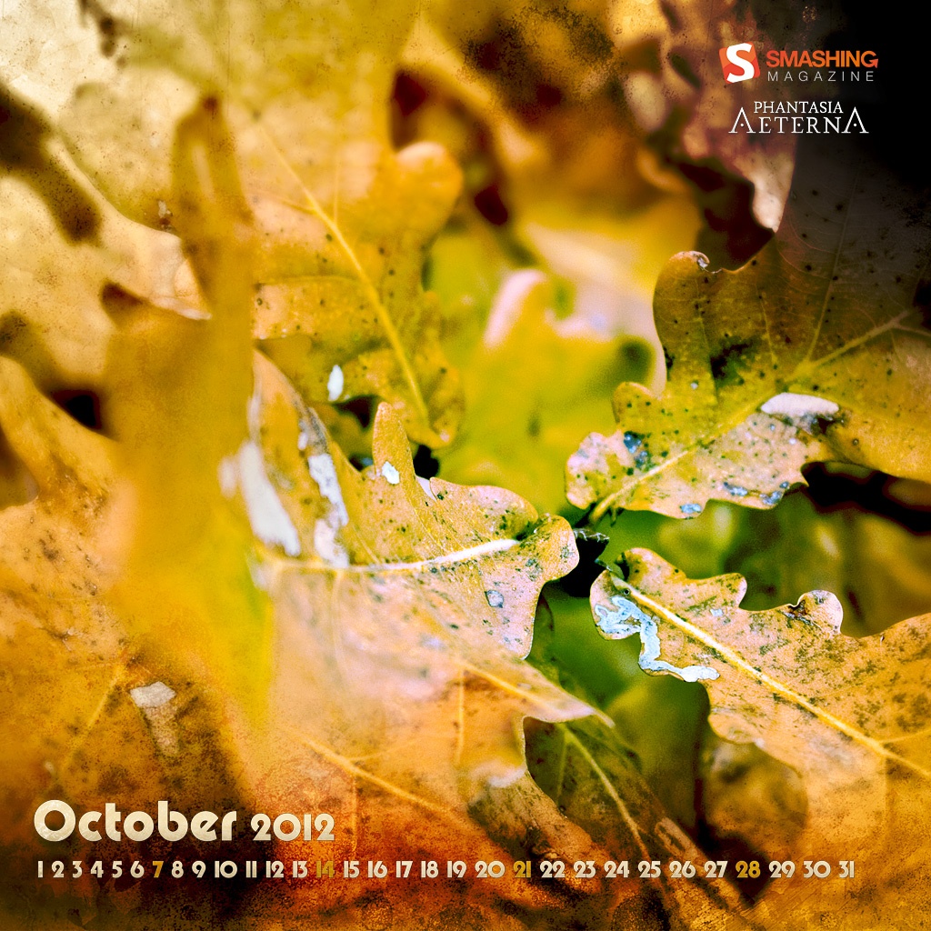
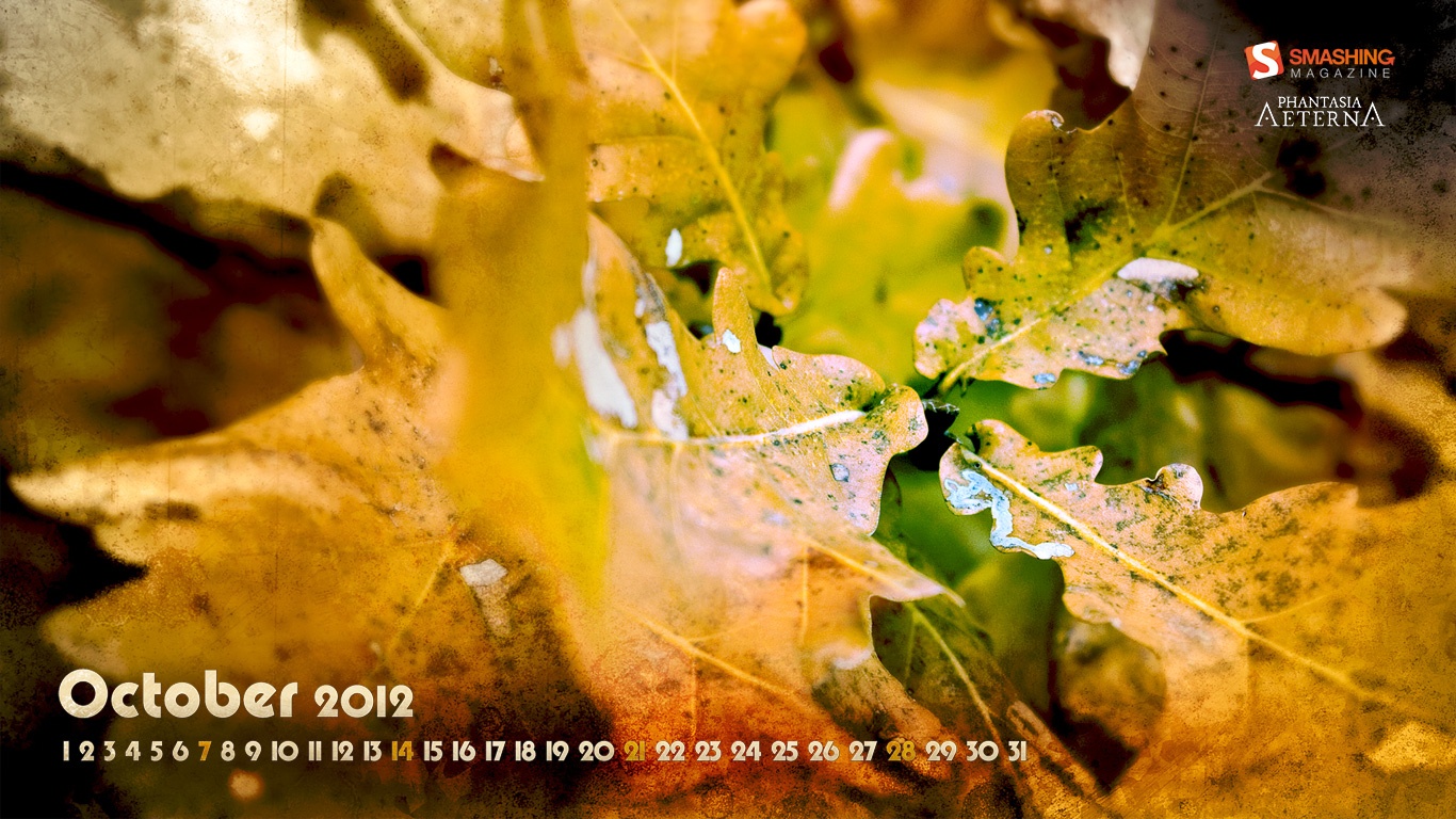
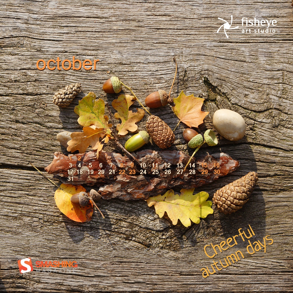
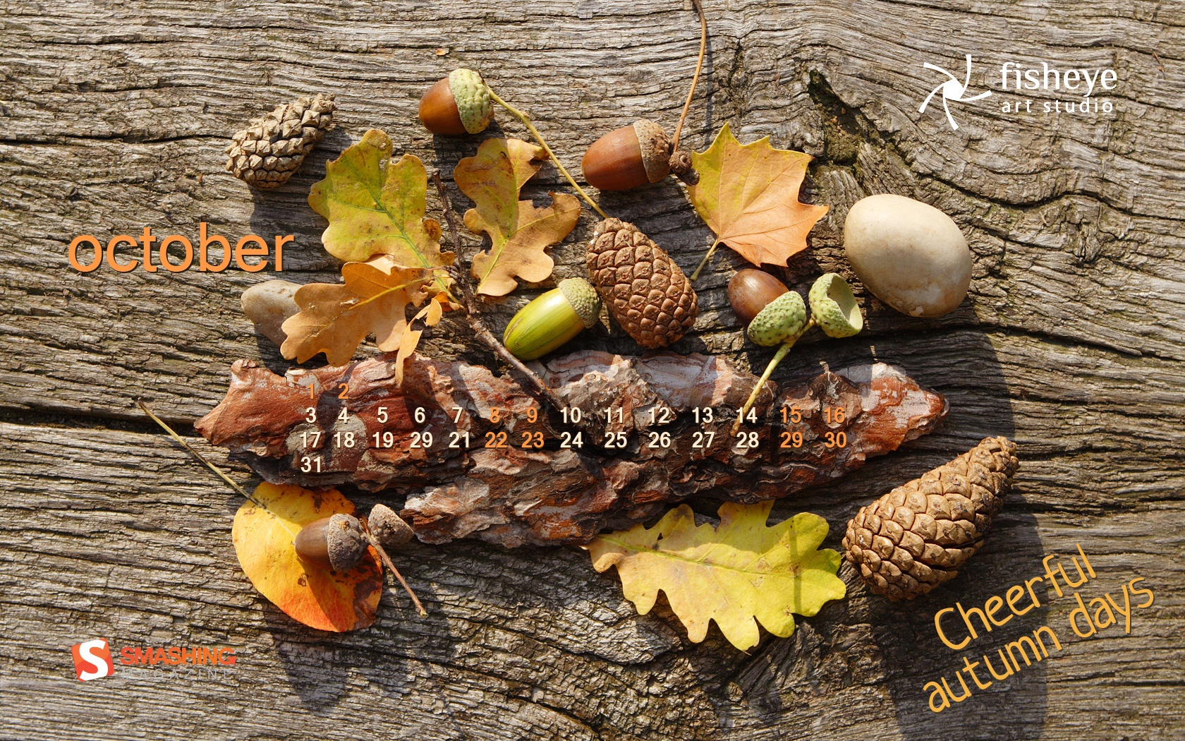
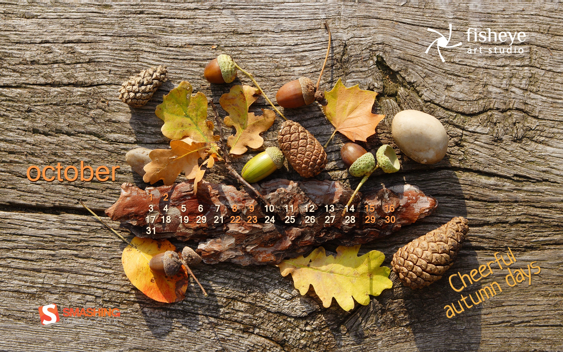
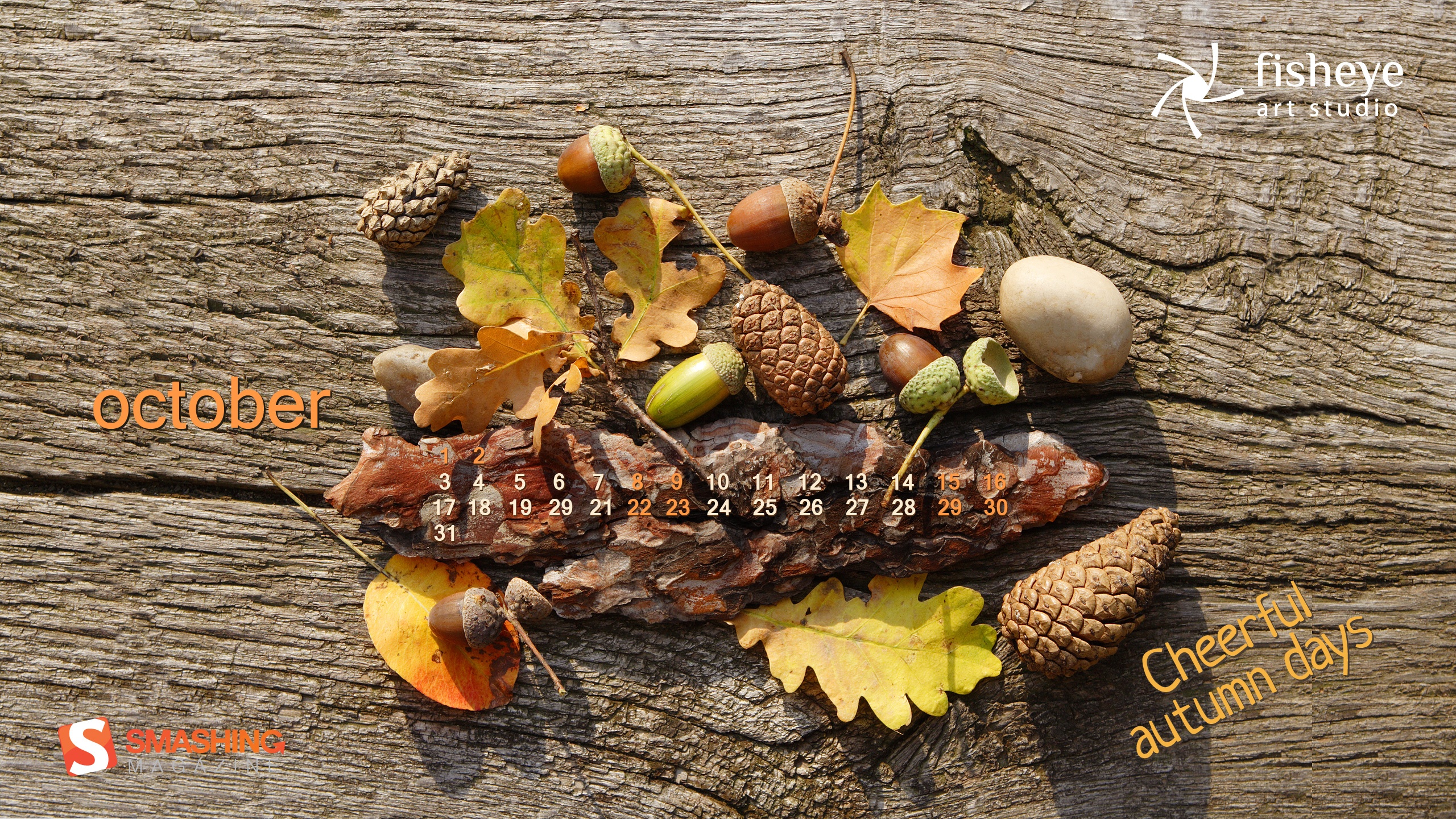
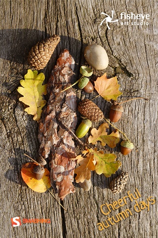
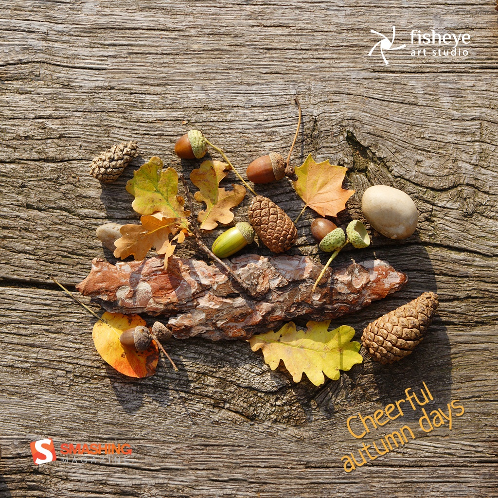
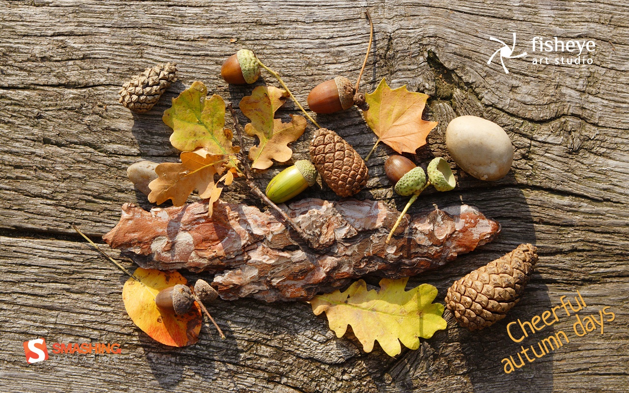
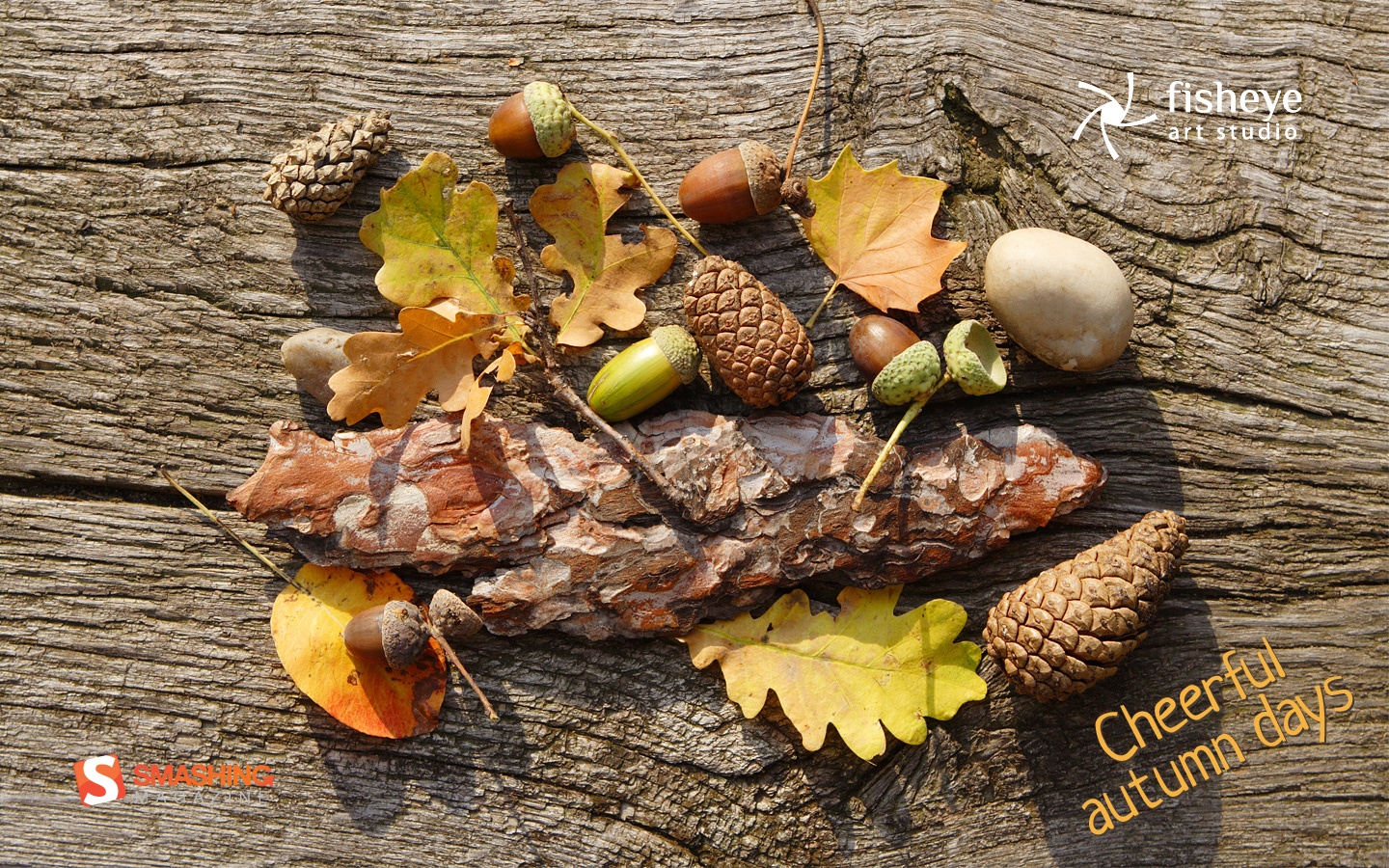
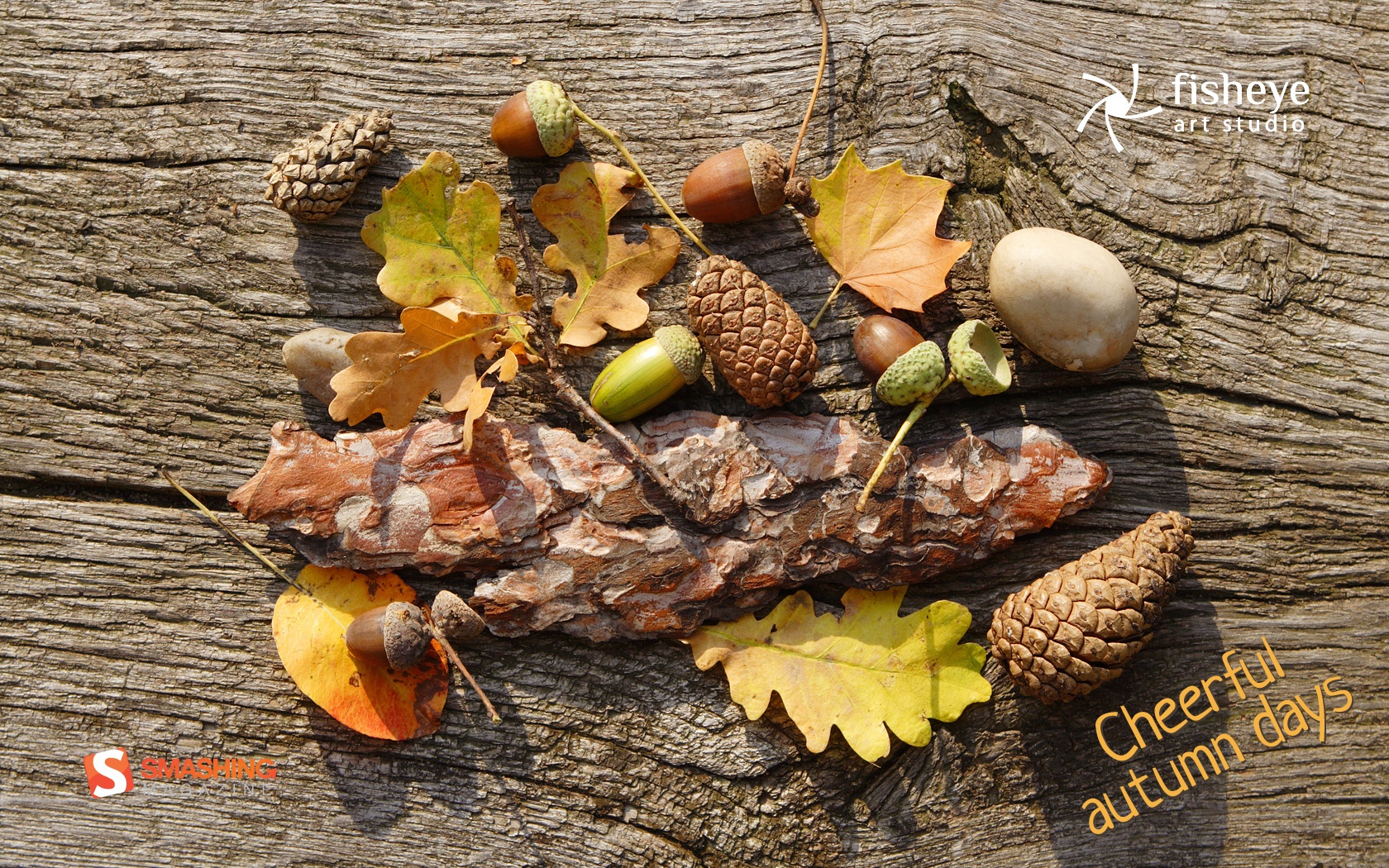
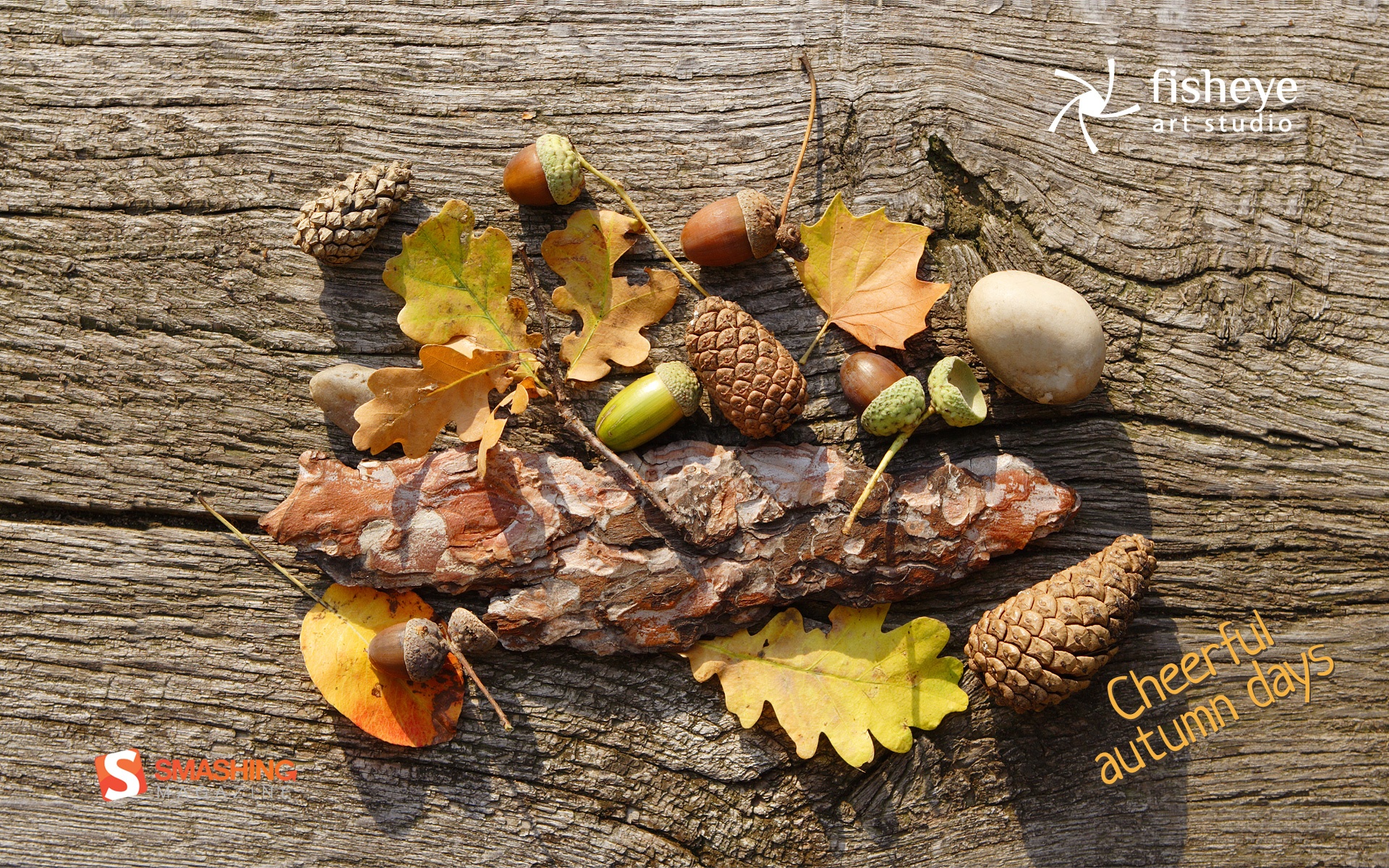
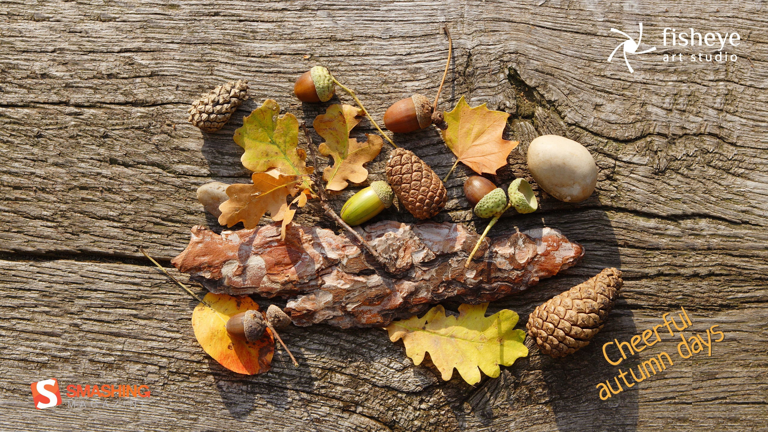
Cheerful Autumn Days
“This photo was taken in an English garden in Prague. It was a beautiful Autumn day. I was walking in the park and suddemnly saw leaves, cones and other nature objects on the bench. What I saw inspired me to shoot this image. At first I created this photo, and then I photographed still life at sunset.” Designed by Larina Yevgeniya from Ukraine.
- preview
- with calendar: 320×480, 1024×1024, 1280×800, 1440×900, 1680×1050, 1920×1200, 2560×1440
- without calendar: 320×480, 1024×1024, 1280×800, 1440×900, 1680×1050, 1920×1200, 2560×1440
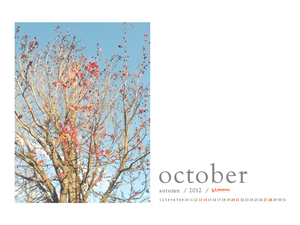
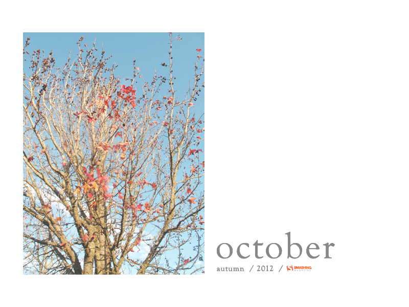
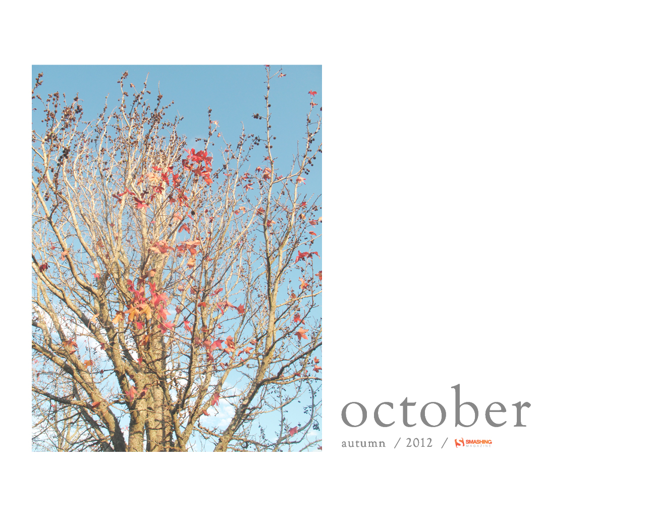
Blue October
Designed by Elise Vanoorbeek from Belgium.

- preview
- with calendar: 1024×768, 1024×1024, 1280×800, 1280×1024, 1440×900, 1680×1050, 1920×1080, 1920×1200, 2560×1440
- without calendar: 320×480, 1024×768, 1024×1024, 1280×800, 1280×1024, 1440×900, 1680×1050, 1920×1080, 1920×1200, 2560×1440
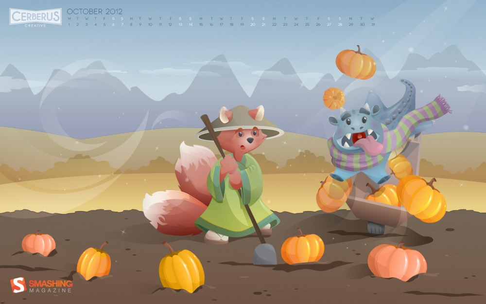
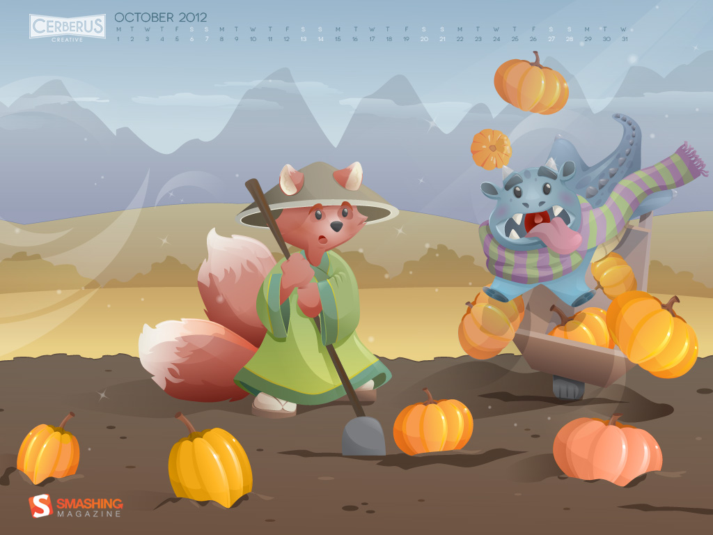
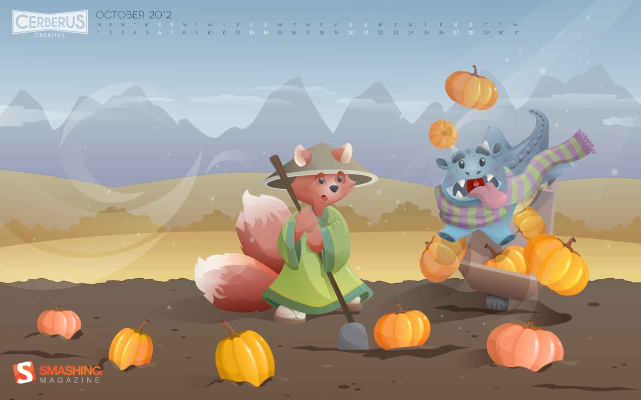
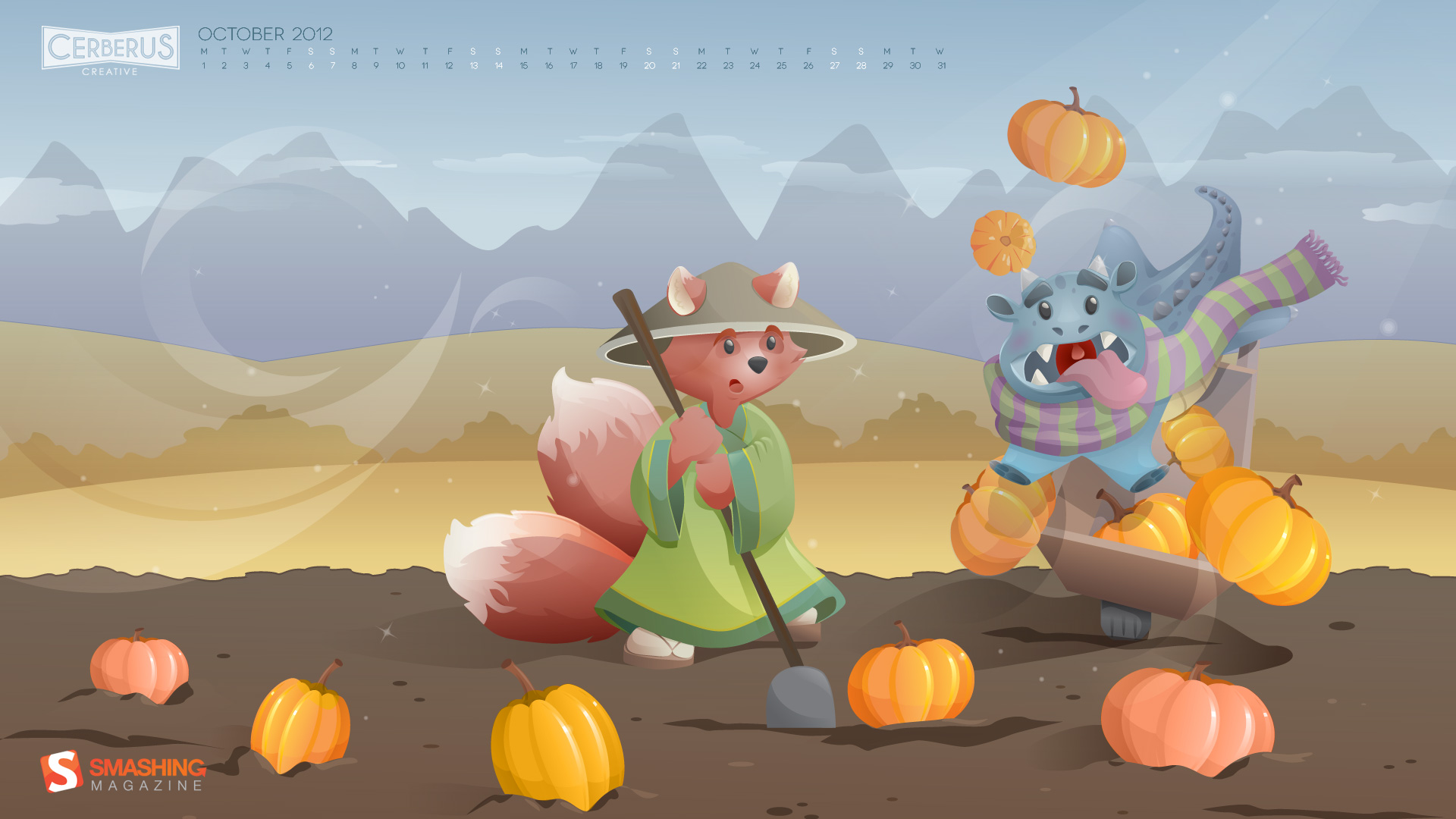
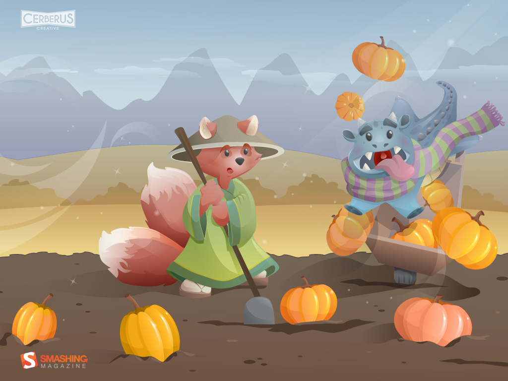
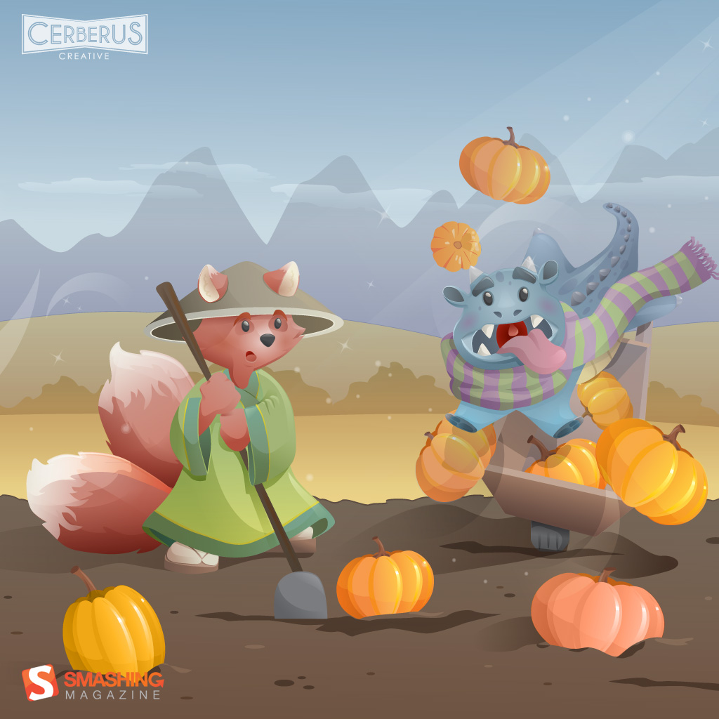
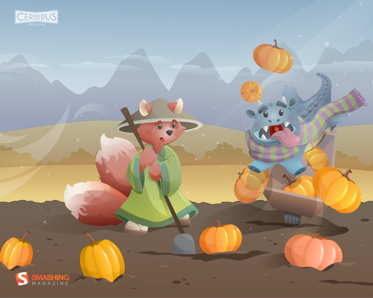
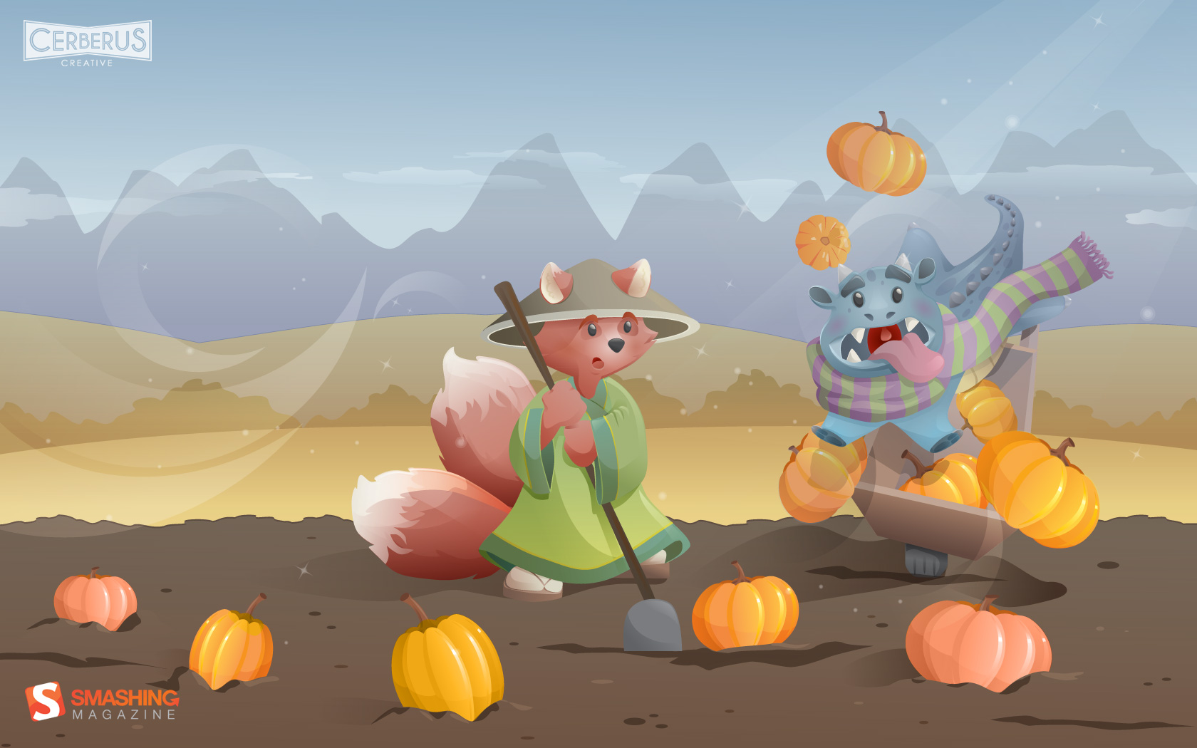
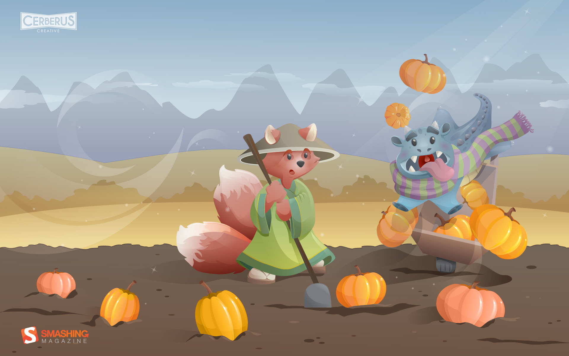
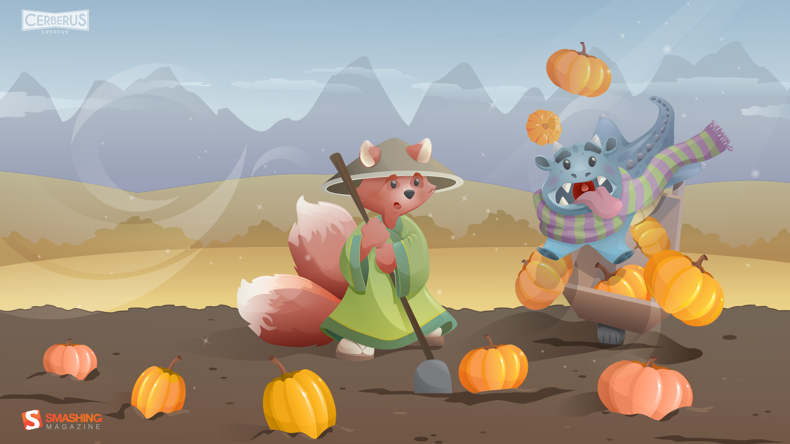
Whoops
“A vector illustration of a dragon tipping over a wheelbarrow of pumpkins in a field with an illustrative fox character.” Designed by Cerberus Creative from USA.
- preview
- with calendar: 1024×768, 1024×1024, 1280×800, 1280×1024, 1440×900, 1680×1050, 1920×1080, 1920×1200, 2560×1440
- without calendar: 1024×768, 1024×1024, 1280×800, 1280×1024, 1440×900, 1680×1050, 1920×1080, 1920×1200, 2560×1440
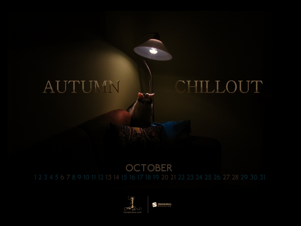
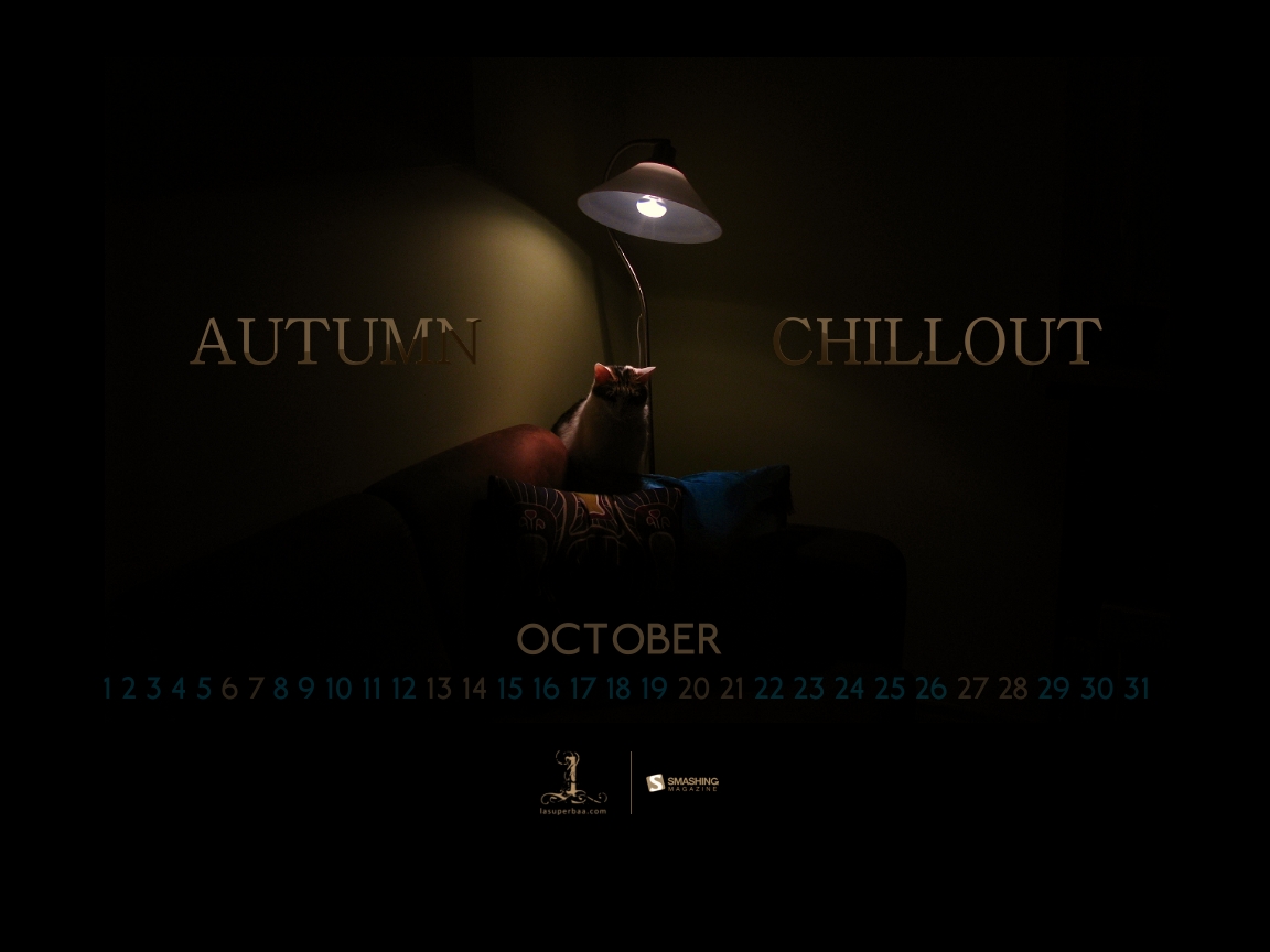
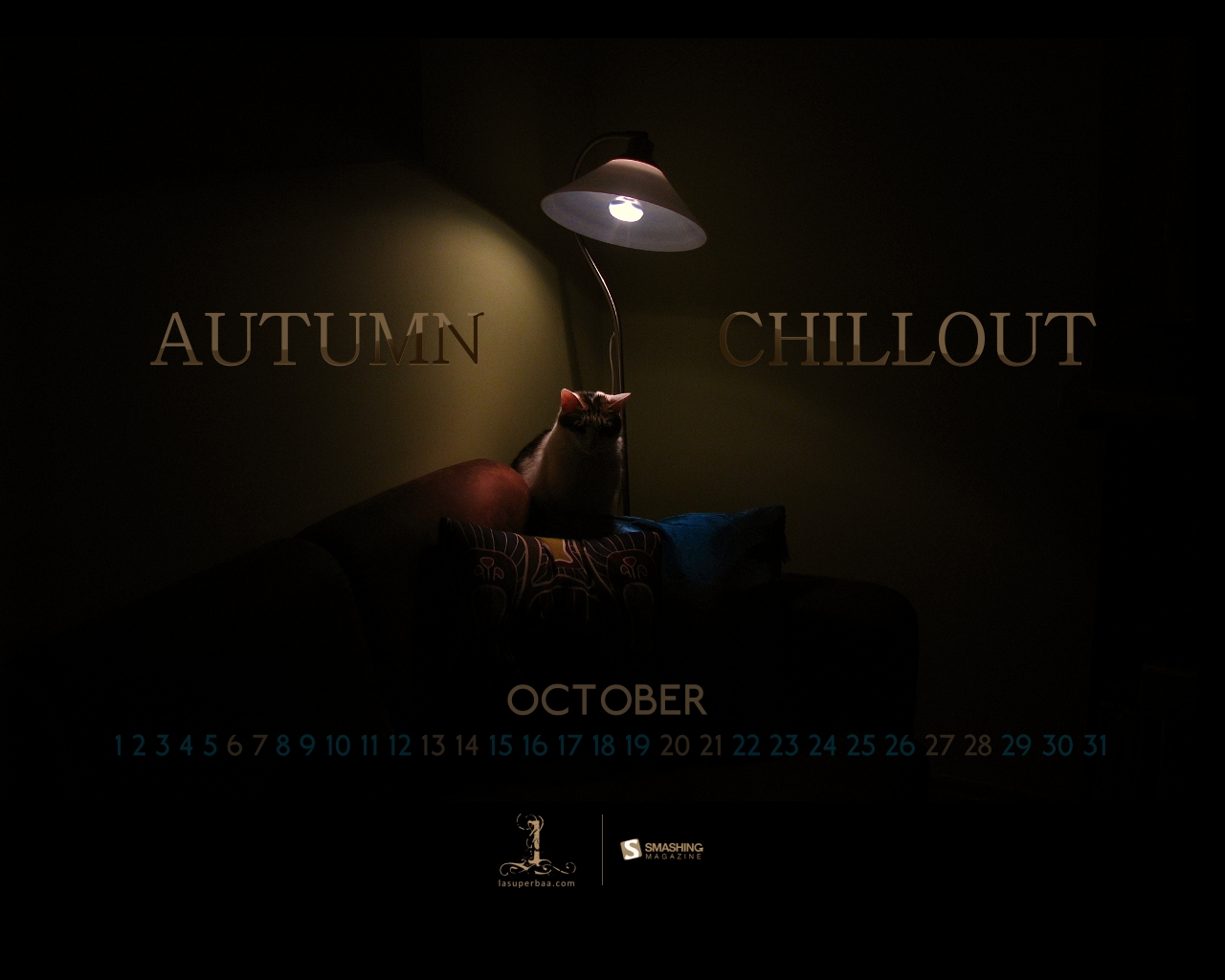
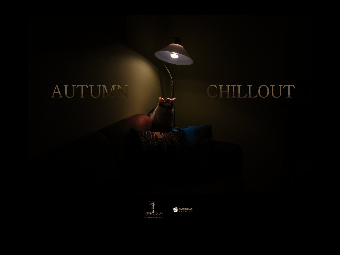
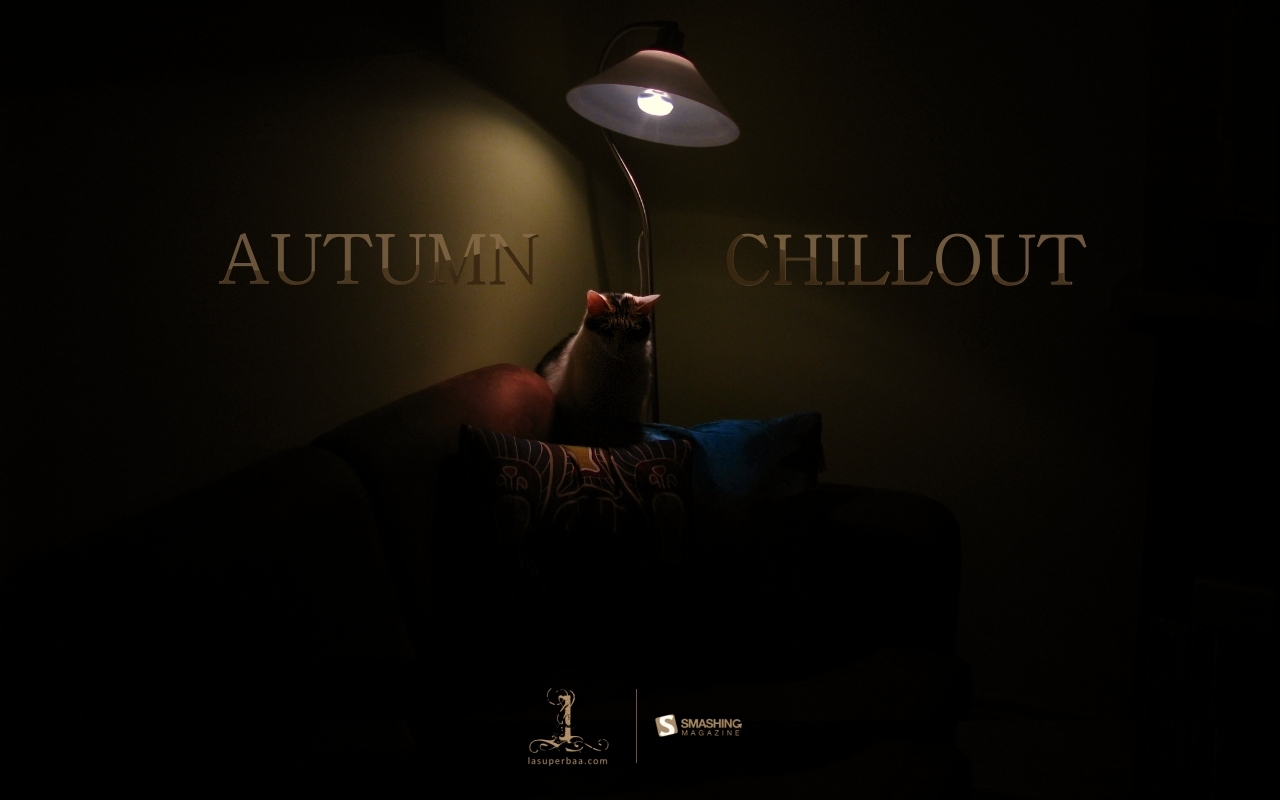
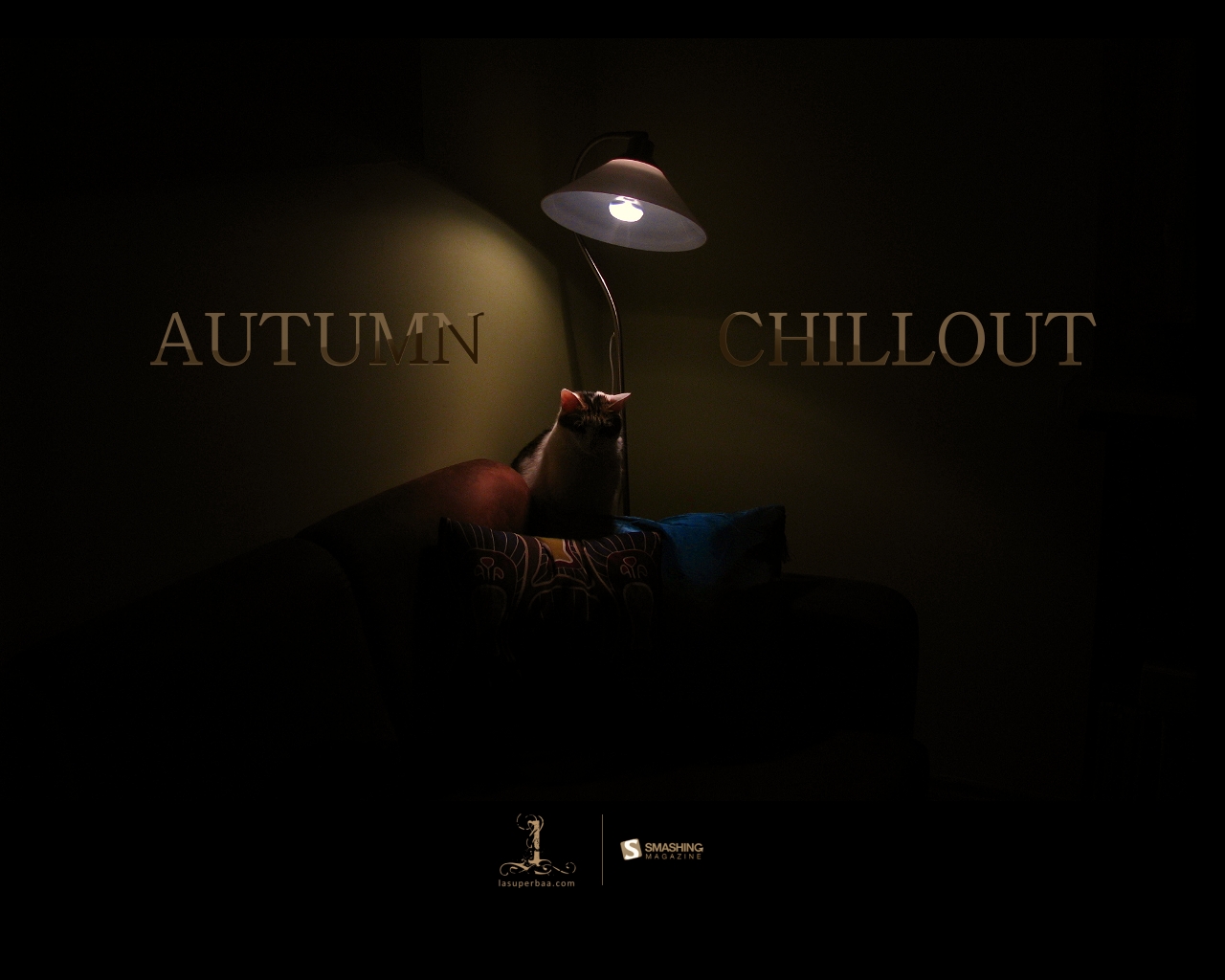
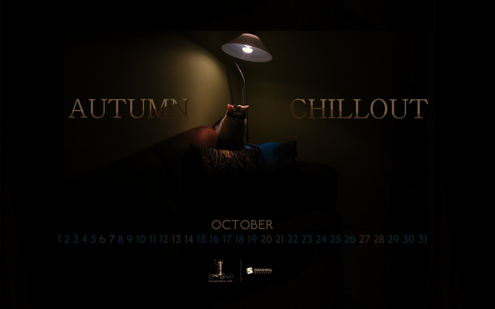
Autumn Chillout
“It’s Autumn — chill out and prepare yourselves for the Winter.” Designed by Lasuperbaa from Poland.

- preview
- with calendar: 1024×768, 1152×864, 1280×800, 1280×1024, 1400×1050, 1680×1050
- without calendar: 1024×768, 1152×864, 1280×800, 1280×1024, 1400×1050, 1680×1050
Autumn Red
“The colors of autumn captured in New Zealand.” Designed by Ashley Hau from Singapore / Malaysia.
- preview
- with calendar: 640×480, 800×600, 1024×768, 1280×1024, 1680×1200
- without calendar: 640×480, 800×600, 1024×768, 1280×1024, 1680×1200
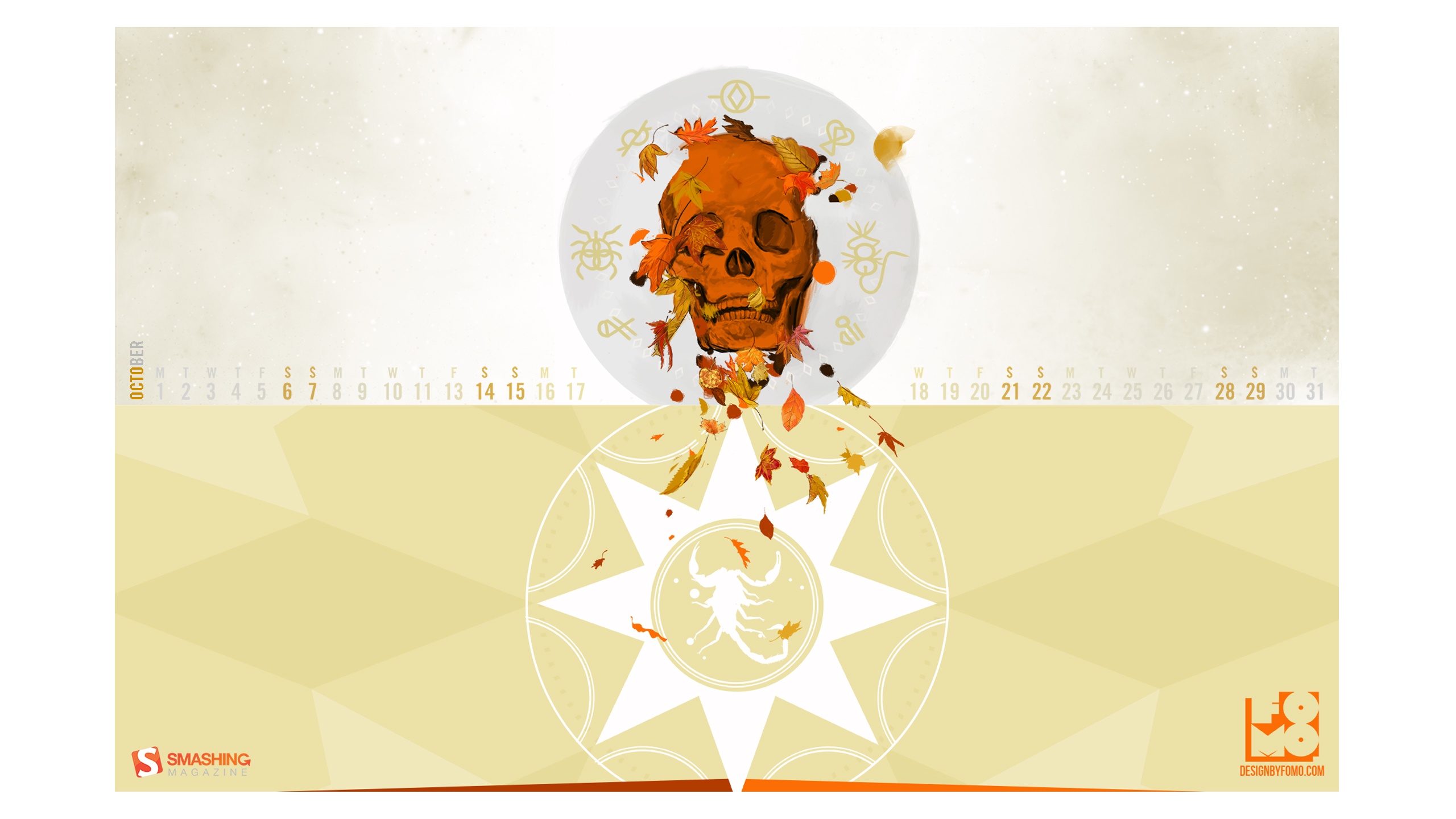
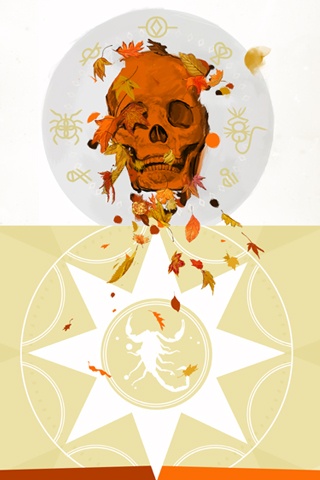
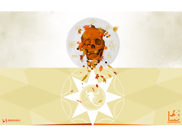
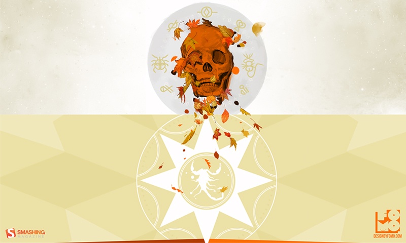
Creepy October
Designed by Christina Mokry from Germany.
- preview
- with calendar: 1280×800, 1280×1024, 1680×1050, 1920×1080, 2560×1440
- without calendar: 1280×800, 1280×1024, 1680×1050, 1920×1080, 2560×1440
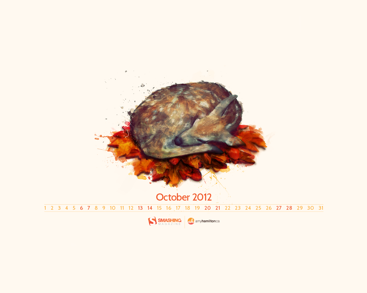
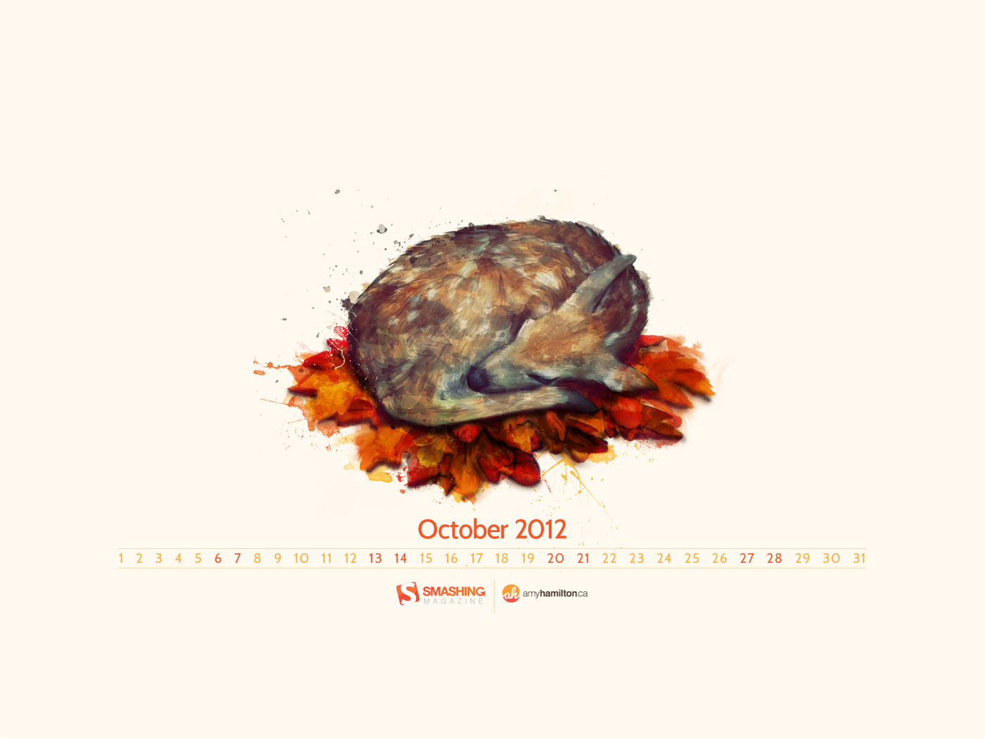
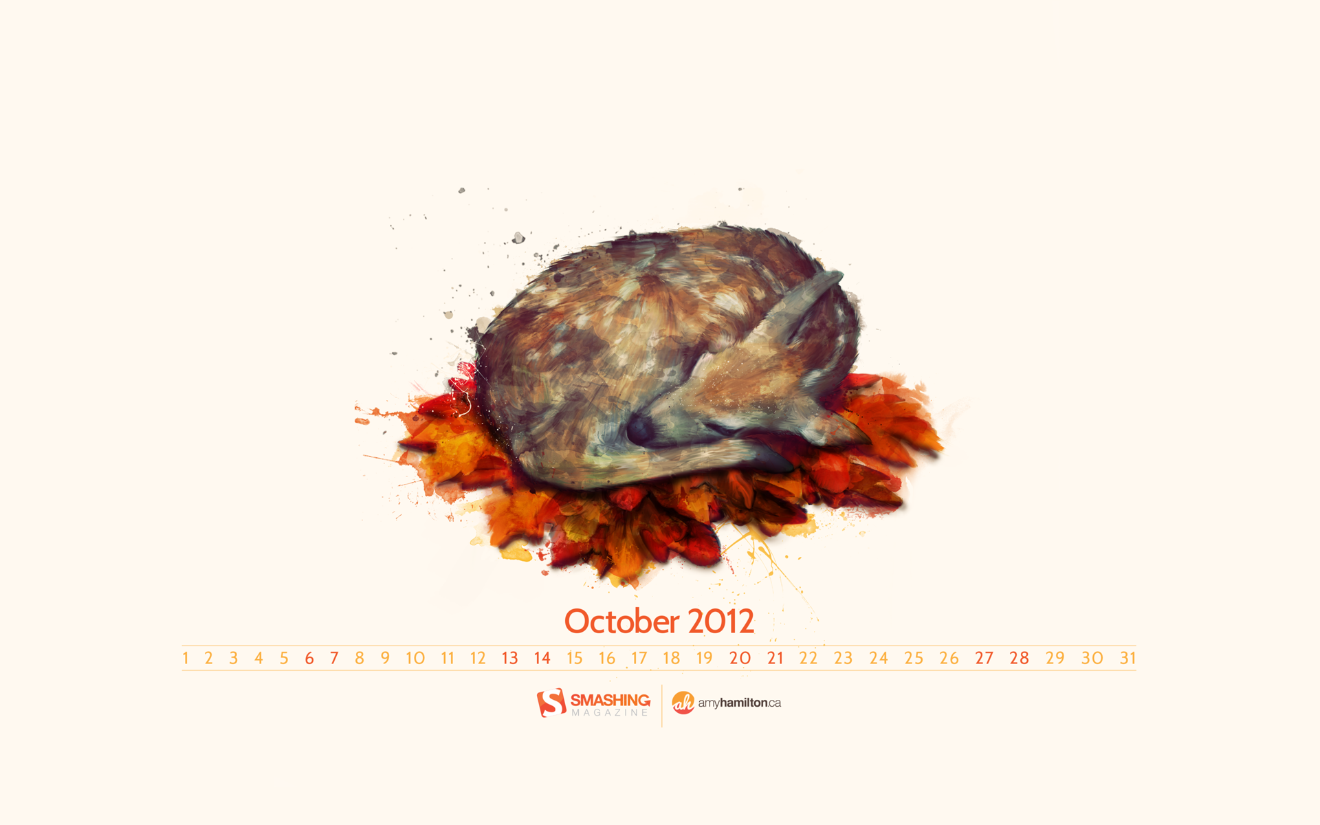
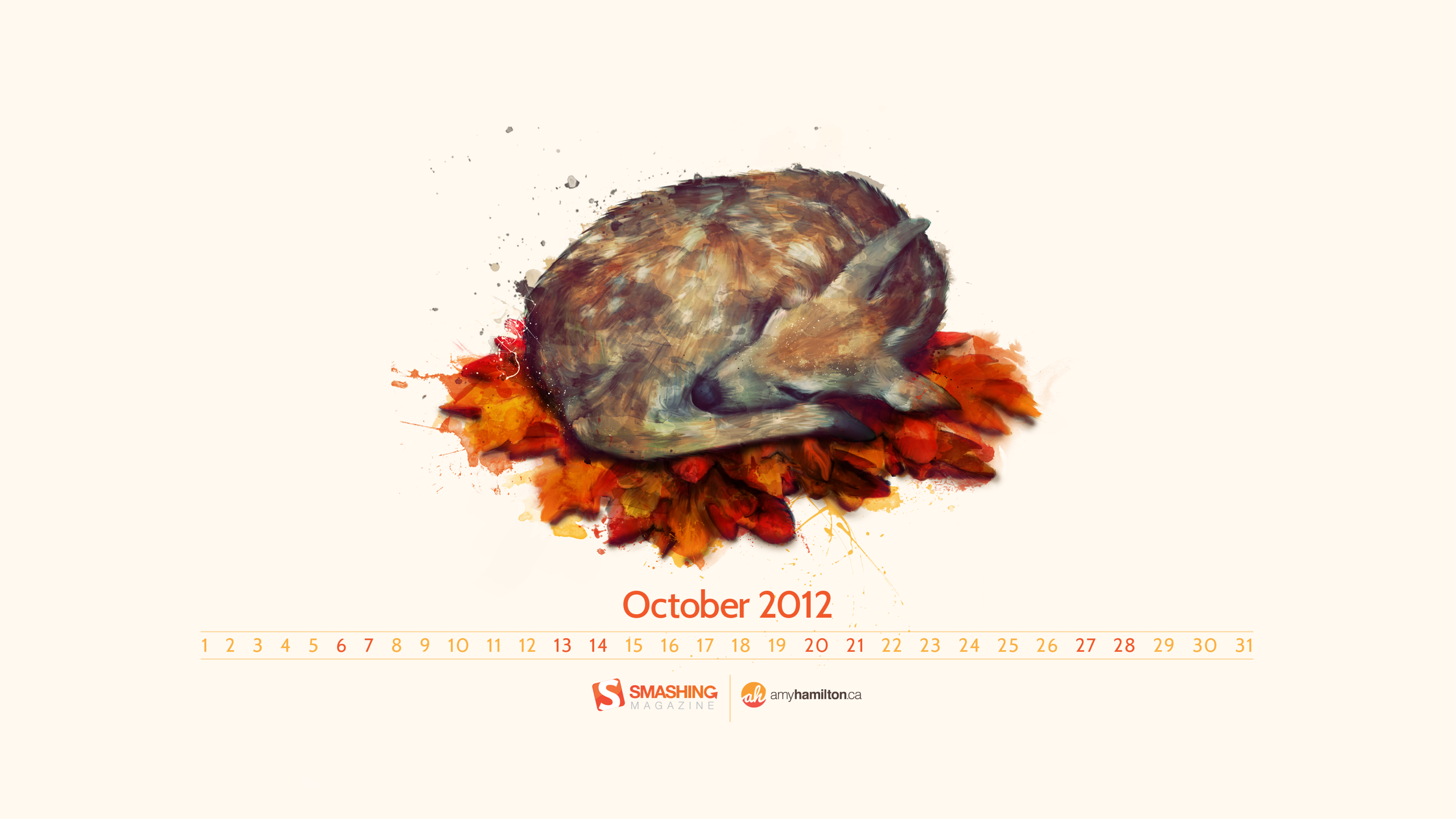
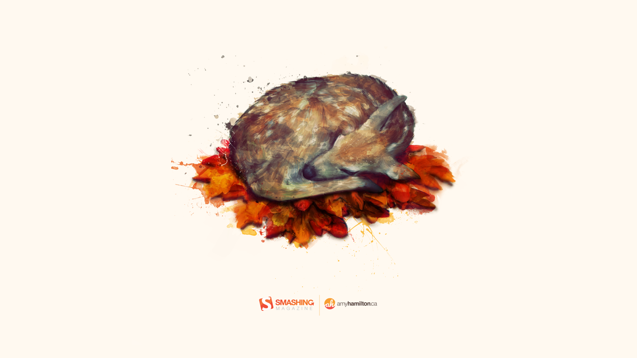
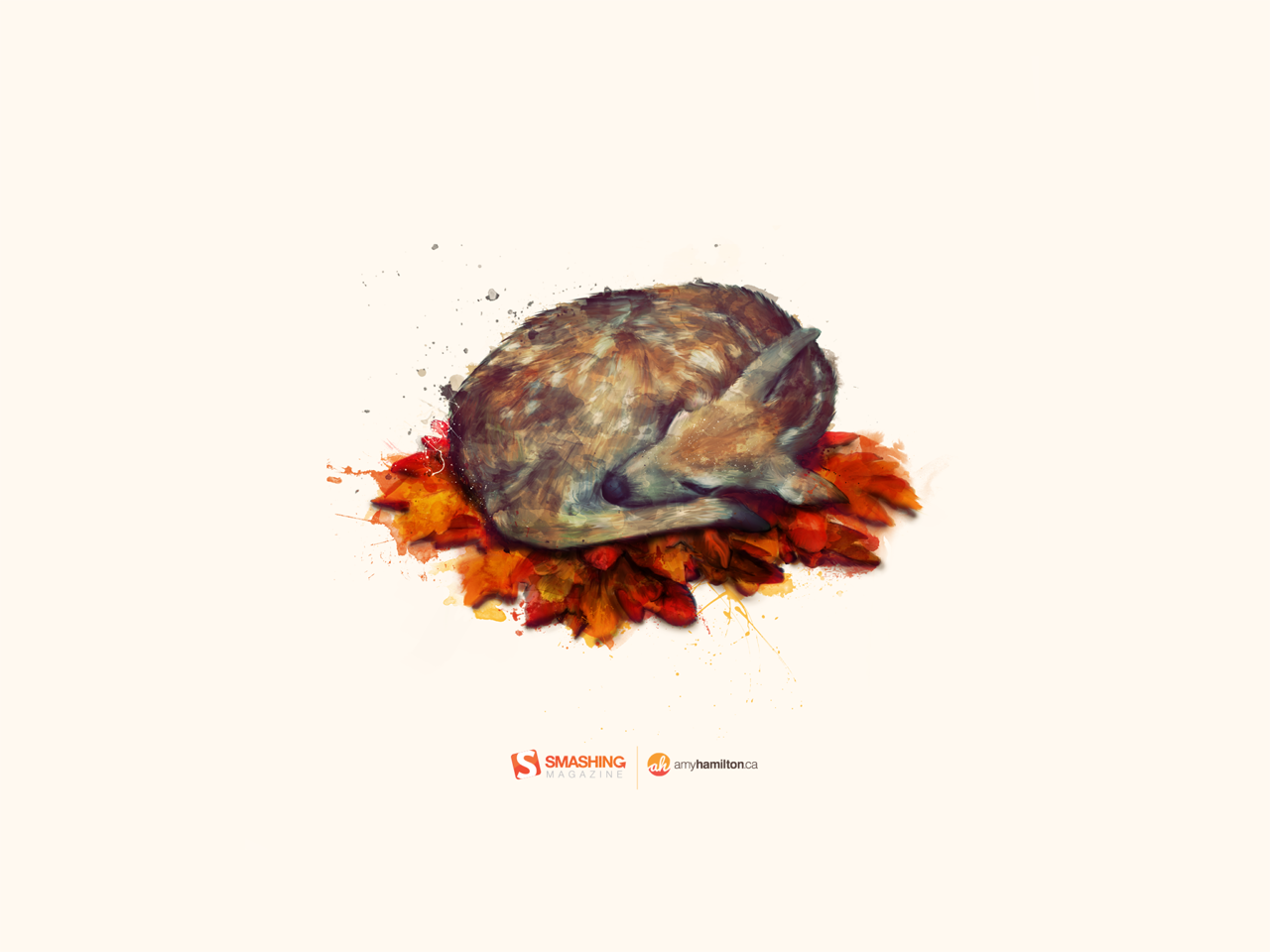
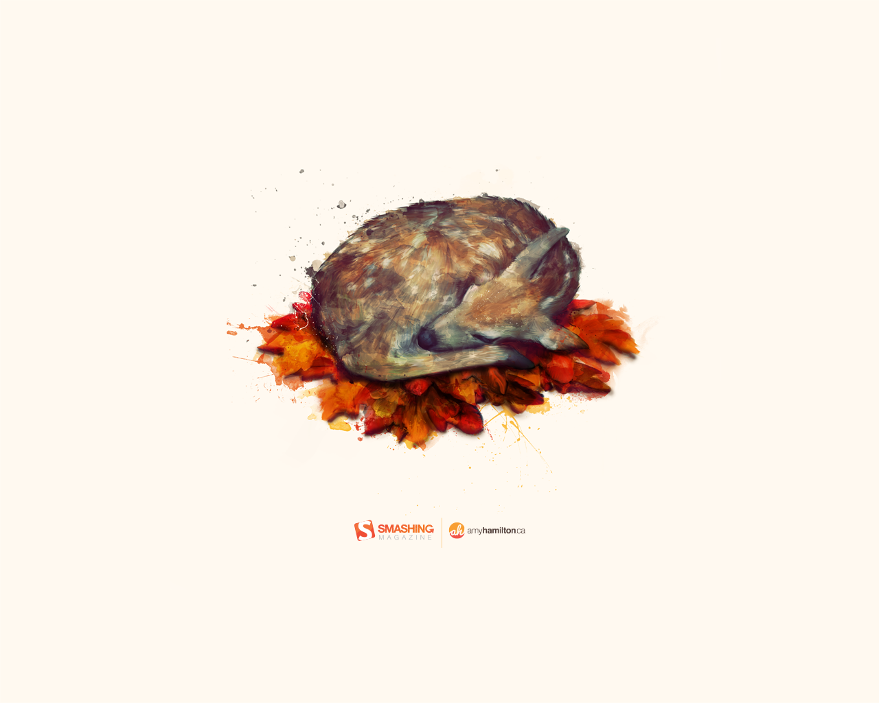
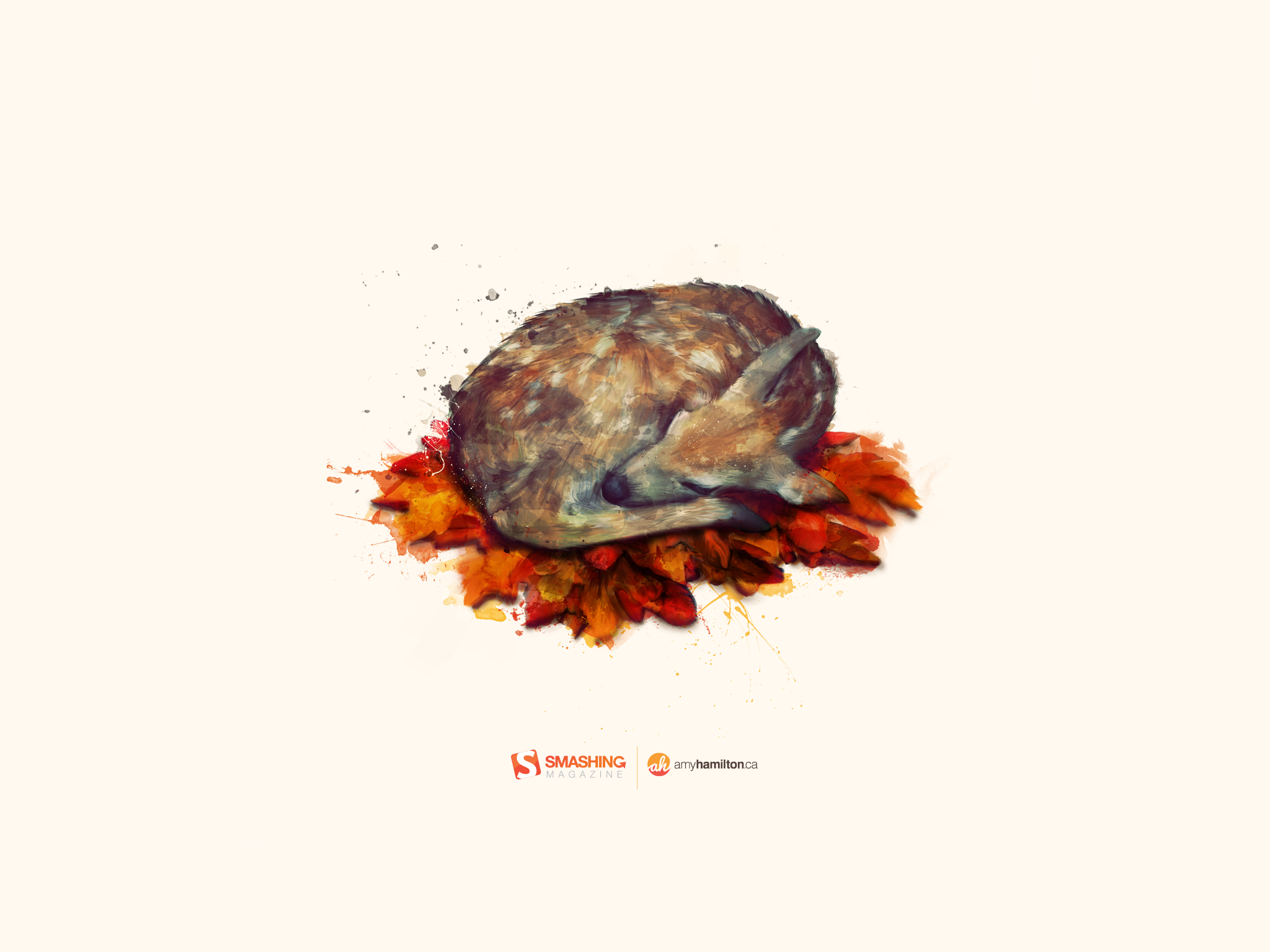
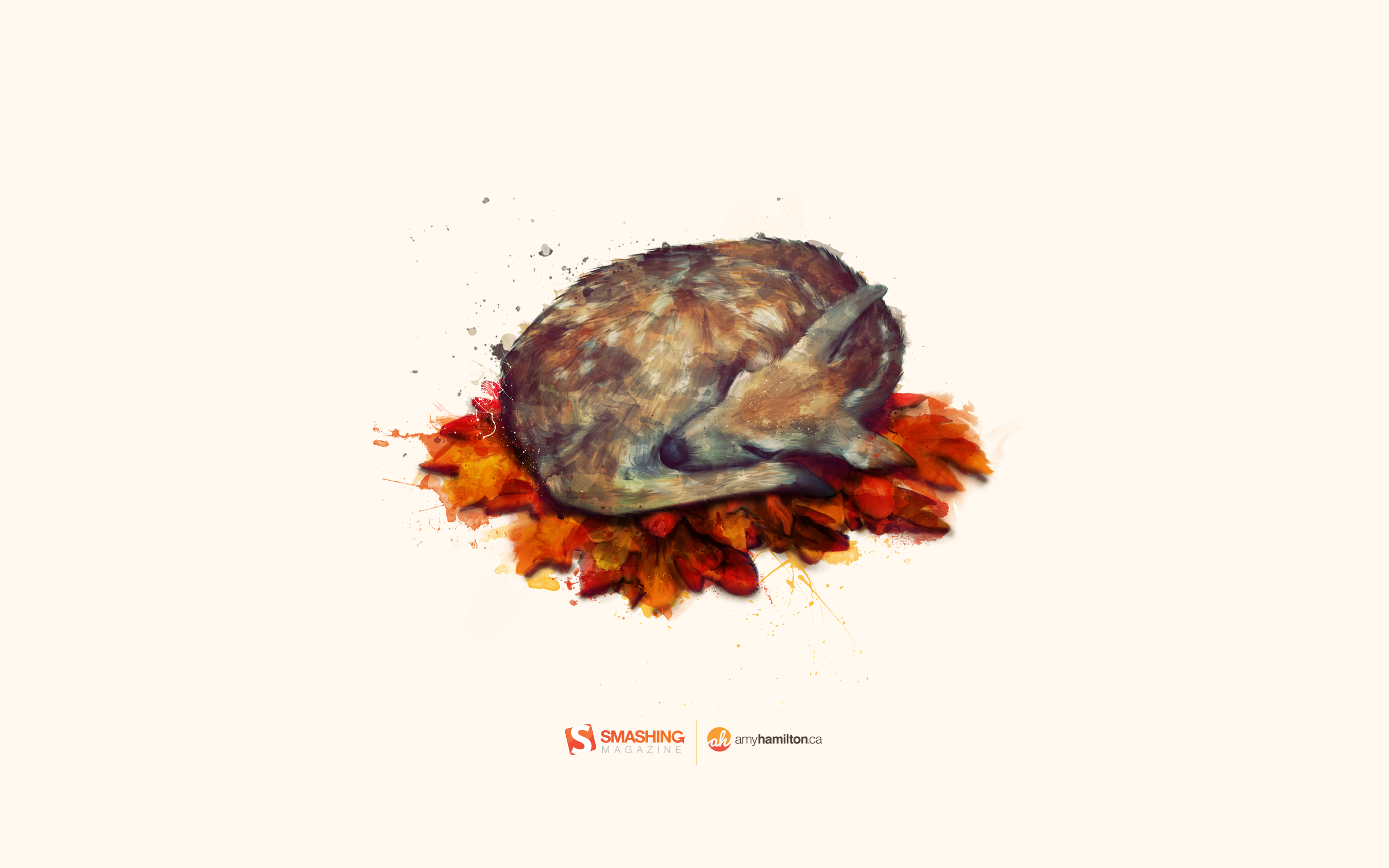
Autumn Deer
Designed by Amy Hamilton from Canada.

- preview
- with calendar: 1024×768, 1280×720, 1280×800, 1280×960, 1280×1024, 1400×1050, 1440×900, 1600×1200, 1680×1050, 1920×1080, 1920×1200, 2048×1536, 2560×1440, 2880×1800
- without calendar: 1024×768, 1280×720, 1280×800, 1280×960, 1280×1024, 1400×1050, 1440×900, 1600×1200, 1680×1050, 1920×1080, 1920×1200, 2048×1536, 2560×1440, 2880×1800
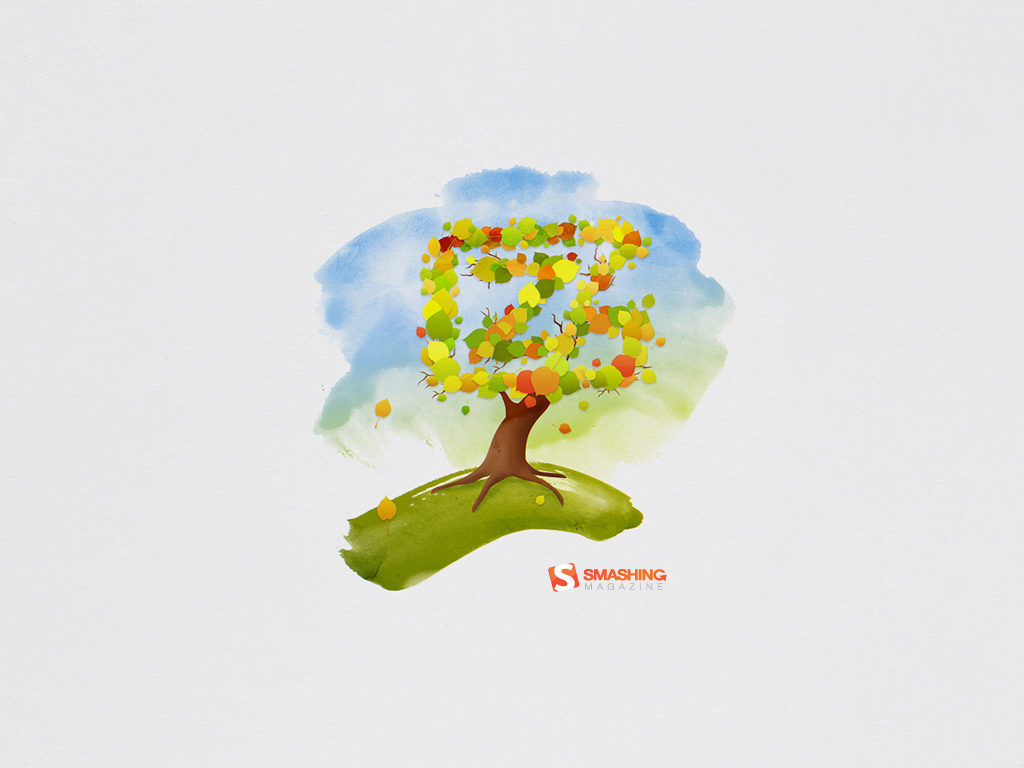
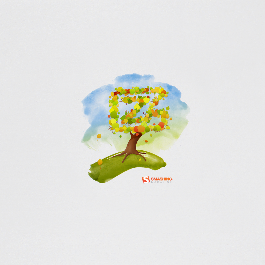
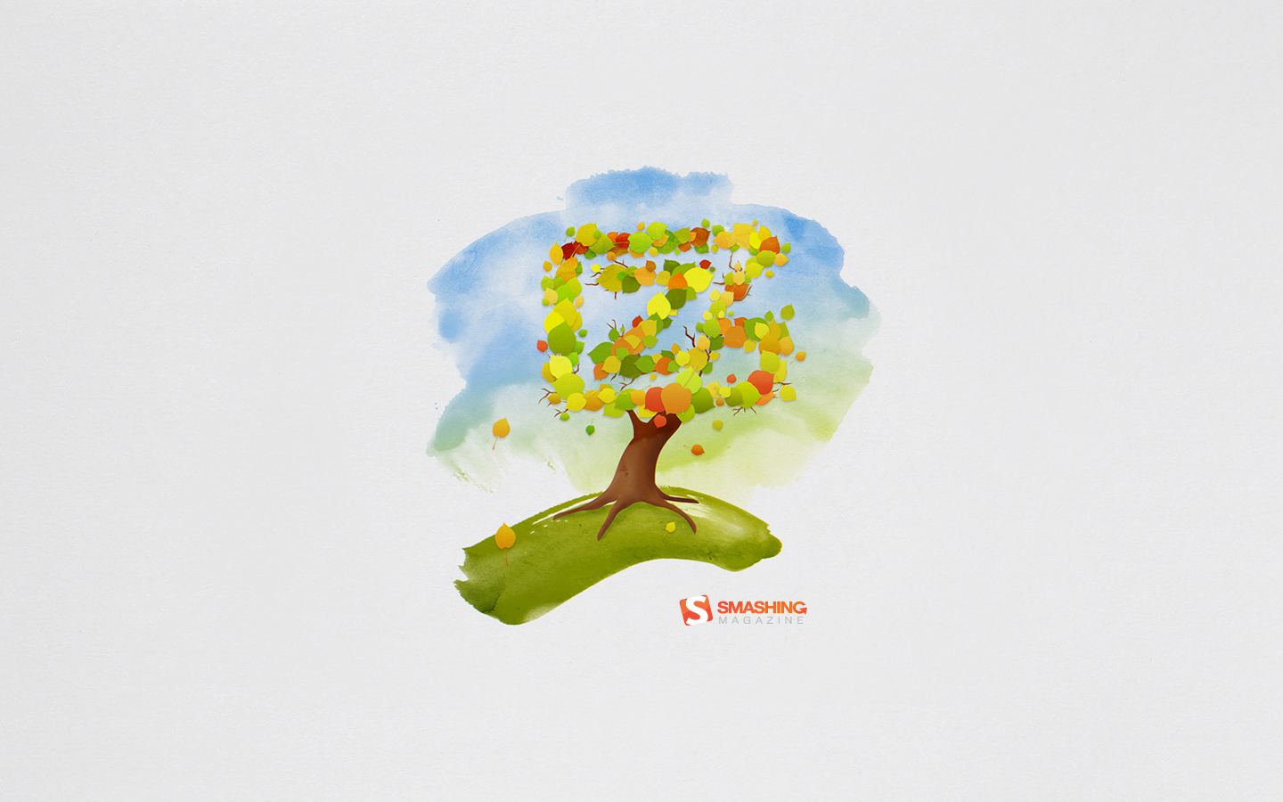
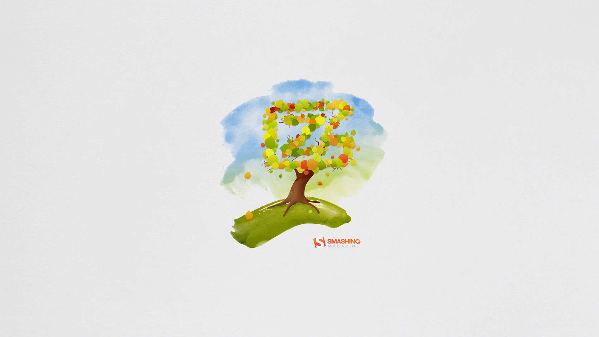
Zfort Autumn
“When nature prepares to rest, it brings very beautiful transformations – immense inspiration resource. That’s how Zfort is inspired by Autumn.” Designed by Zfort Group from Ukraine.

- preview
- with calendar: 320×480, 1024×768, 1024×1024, 1280×800, 1280×1024, 1440×900, 1680×1050, 1920×1080, 1920×1200, 2560×1440
- without calendar: 320×480, 1024×768, 1024×1024, 1280×800, 1280×1024, 1440×900, 1680×1050, 1920×1080, 1920×1200, 2560×1440
Scent Of Autumn
“After october’s rain you want to go to the backyard, wrap yourself in a blanket and feel the scent of Autumn.” Designed by Sotnikova Antonina from Ukraine.

- preview
- with calendar: 640×480, 800×600, 1024×768, 1280×720, 1280×800, 1280×960, 1280×1024, 1400×1050, 1440×900, 1600×1200, 1600×900, 1680×1050, 1920×1080, 1920×1200, 1920×1440, 2560×1600
- without calendar: 640×480, 800×600, 1024×768, 1280×720, 1280×800, 1280×960, 1280×1024, 1400×1050, 1440×900, 1600×1200, 1600×900, 1680×1050, 1920×1080, 1920×1200, 1920×1440, 2560×1600
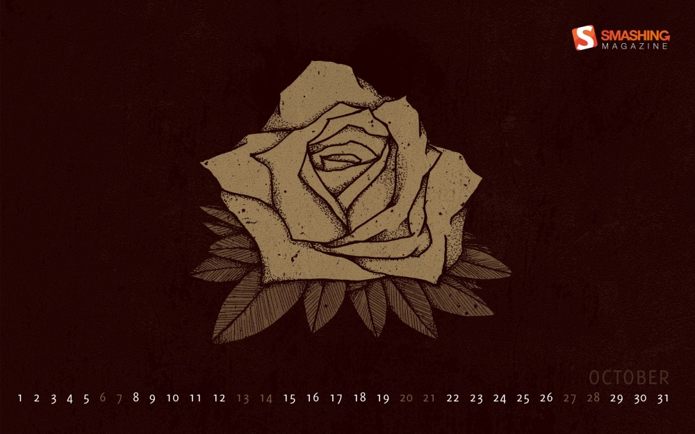
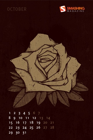
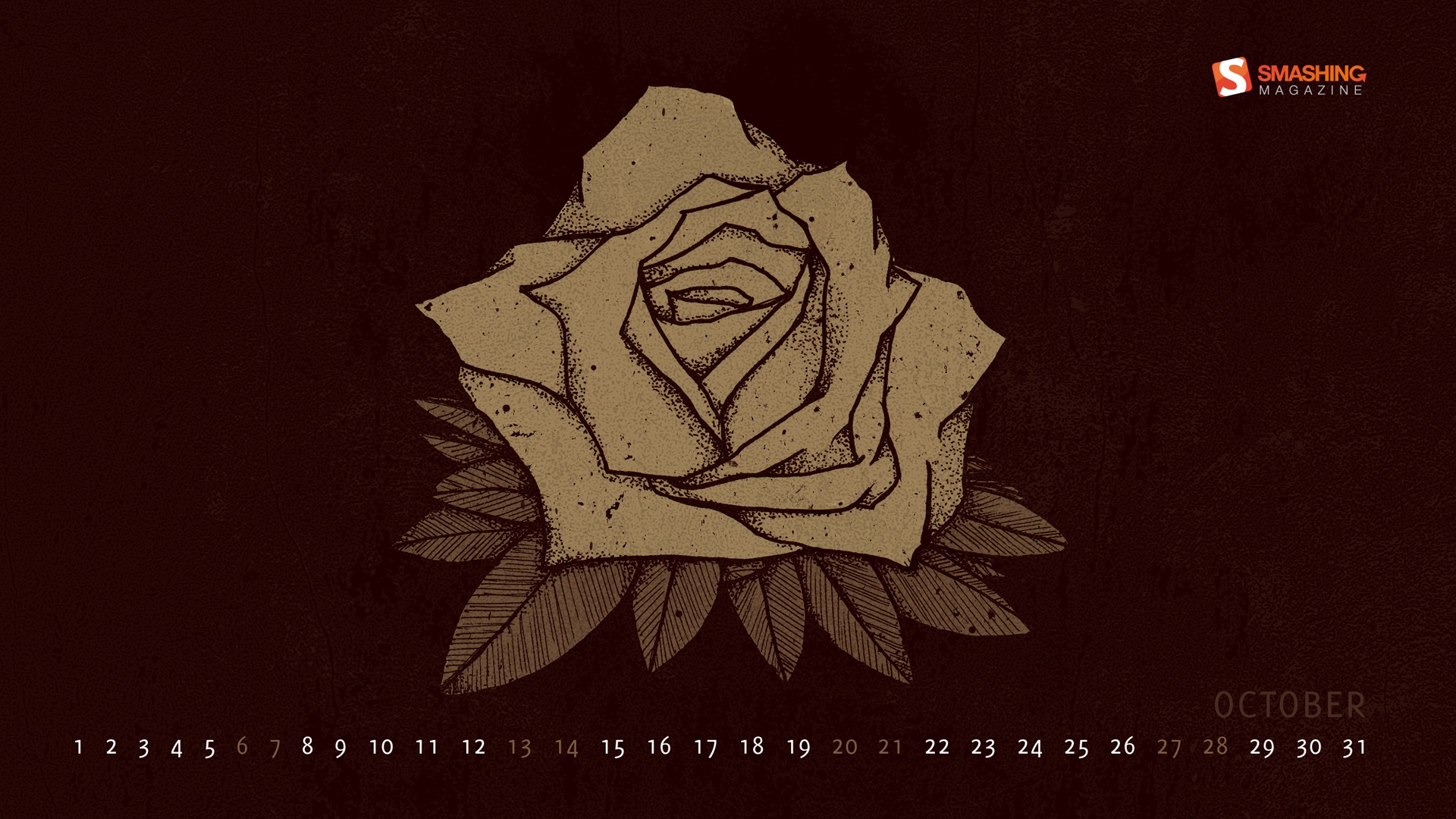
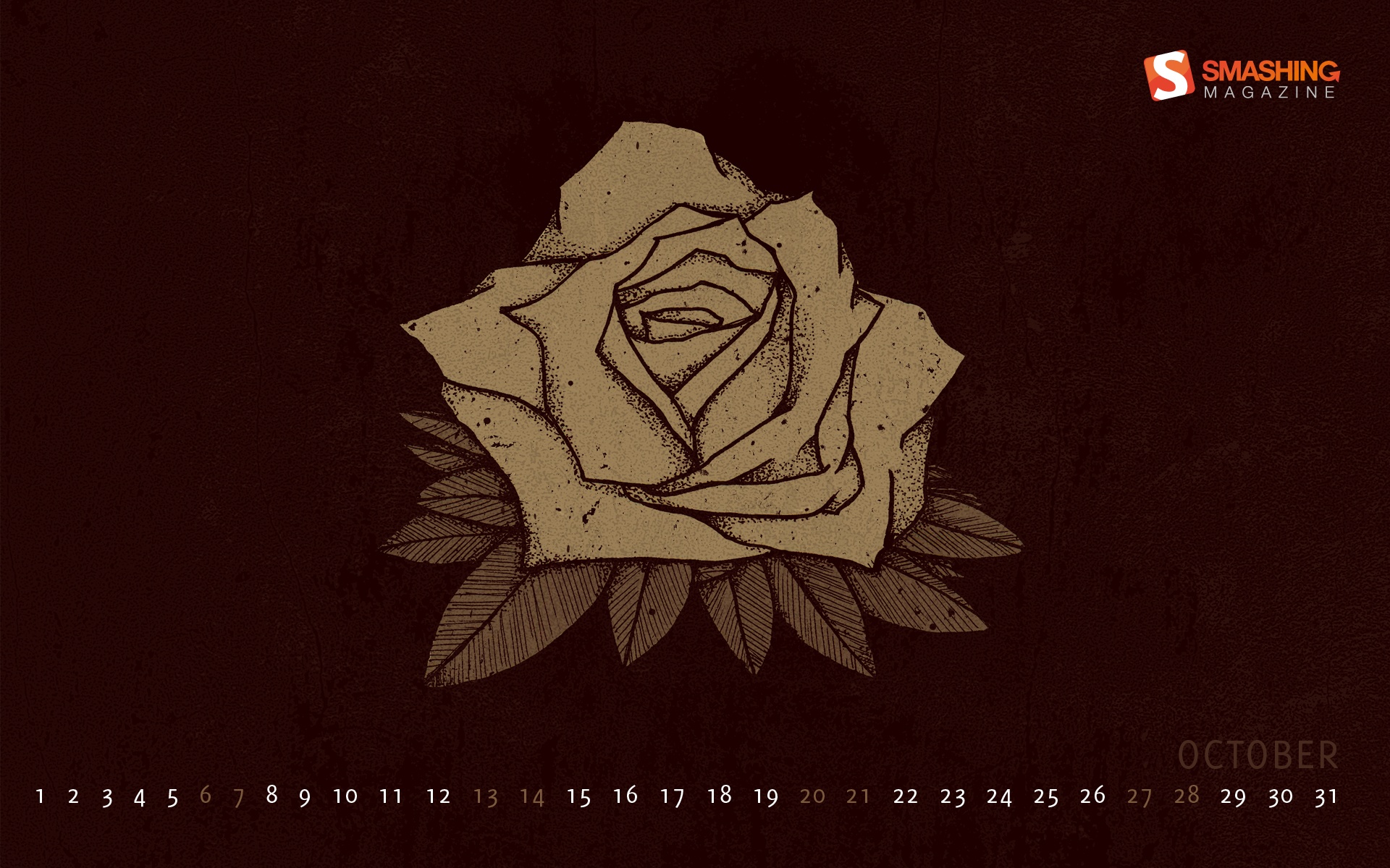
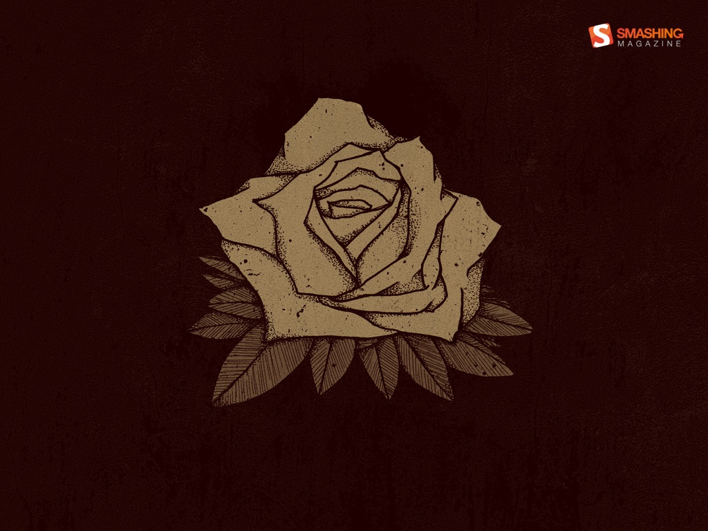
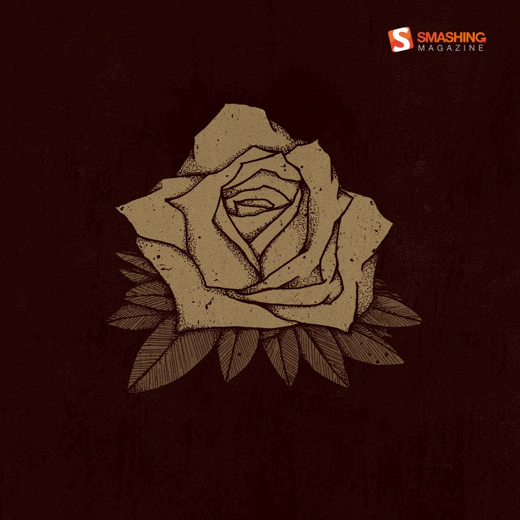
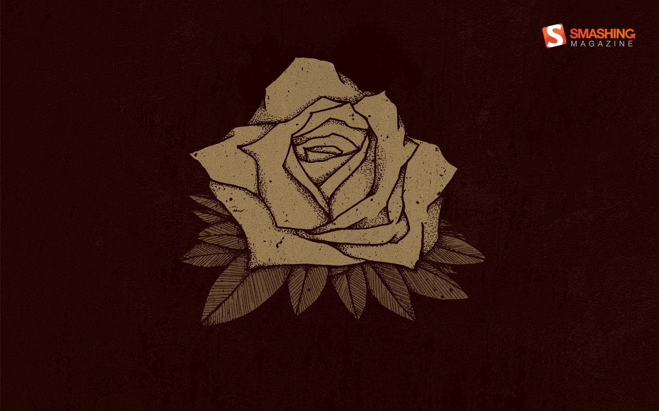
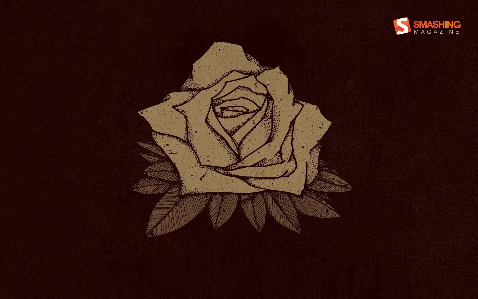
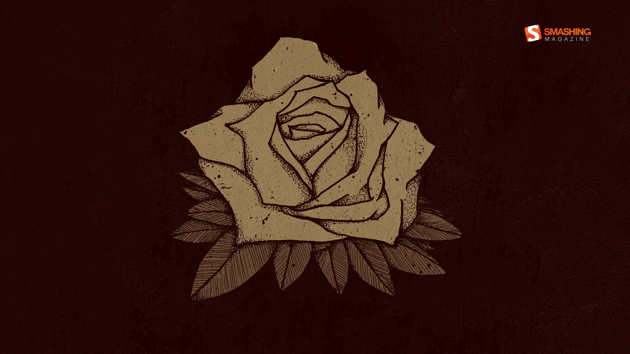
Rose
“October in Poland was always nostalgic. I also love to draw things with a pencil, ink and stuff and then colorize and manipulate it in an image editing application. So I’ve mixed nostalgy and my skills and here it is!” Designed by Kanze from Poland.
- preview
- with calendar: 320×480, 1024×768, 1024×1024, 1280×800, 1920×1080, 1920×1200, 2560×1440
- without calendar: 320×480, 1024×768, 1024×1024, 1280×800, 1920×1080, 1920×1200, 2560×1440
Spooky Forest
Designed by Colin Whitehurst from USA.

- preview
- with calendar: 320×480, 1024×768, 1024×1024, 1280×800, 1280×1024, 1440×900, 1680×1050, 1920×1080, 1920×1200, 2560×1440
- without calendar: 320×480, 1024×1024, 1280×800, 1440×900, 1680×1050, 1920×1080, 1920×1200, 2560×1440
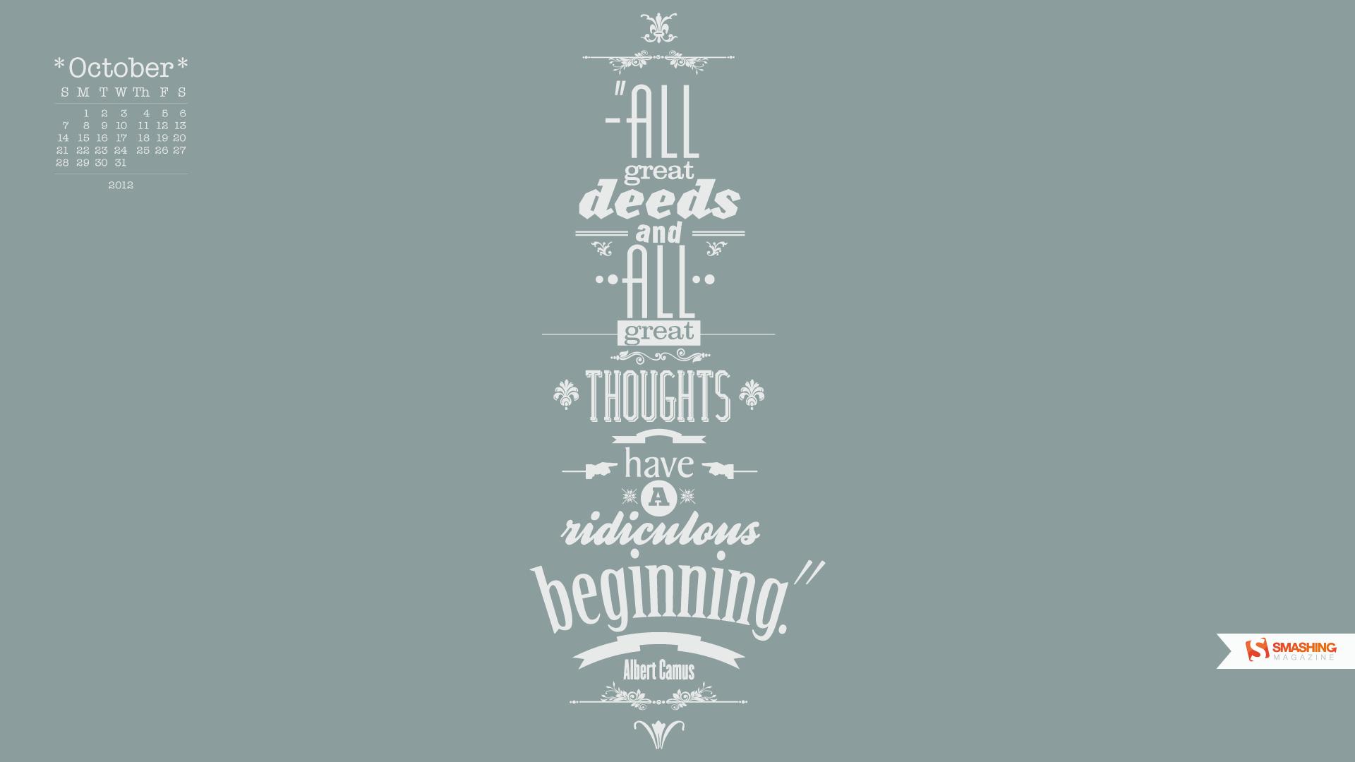
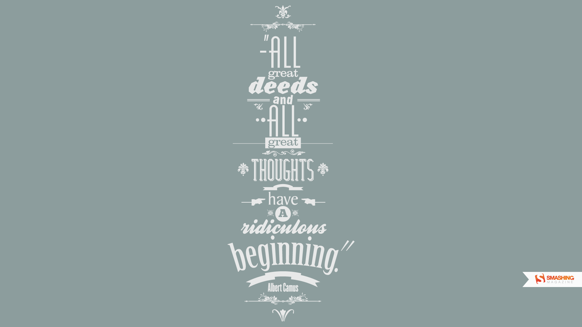
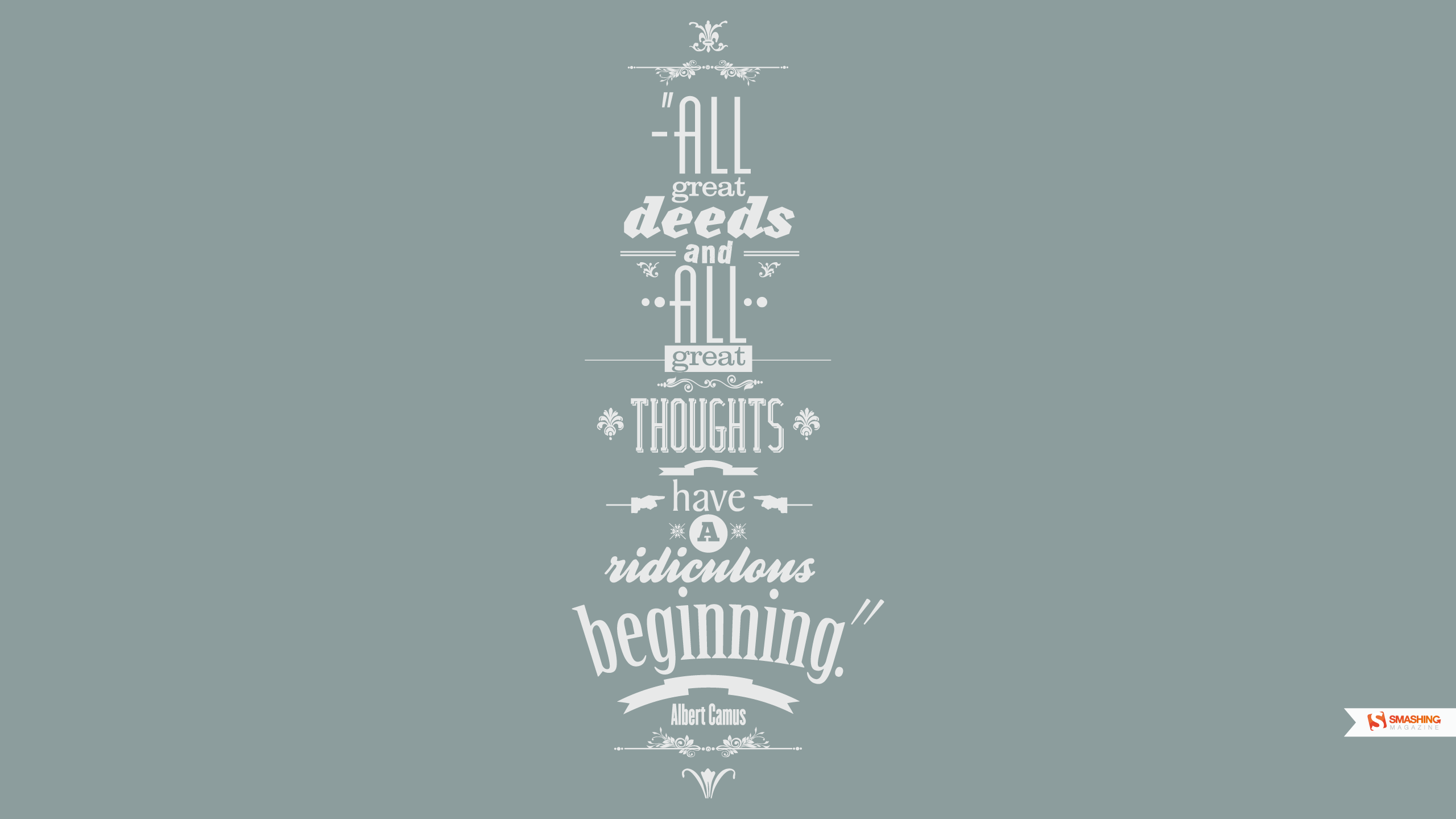
October Quotes
Designed by Jonathan Guillou from France/Canada.

- preview
- with calendar: 1280×800, 1440×900, 1680×1050, 1920×1080, 1920×1200, 2560×1440
- without calendar: 1280×800, 1440×900, 1680×1050, 1920×1080, 1920×1200, 2560×1440
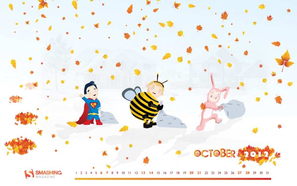
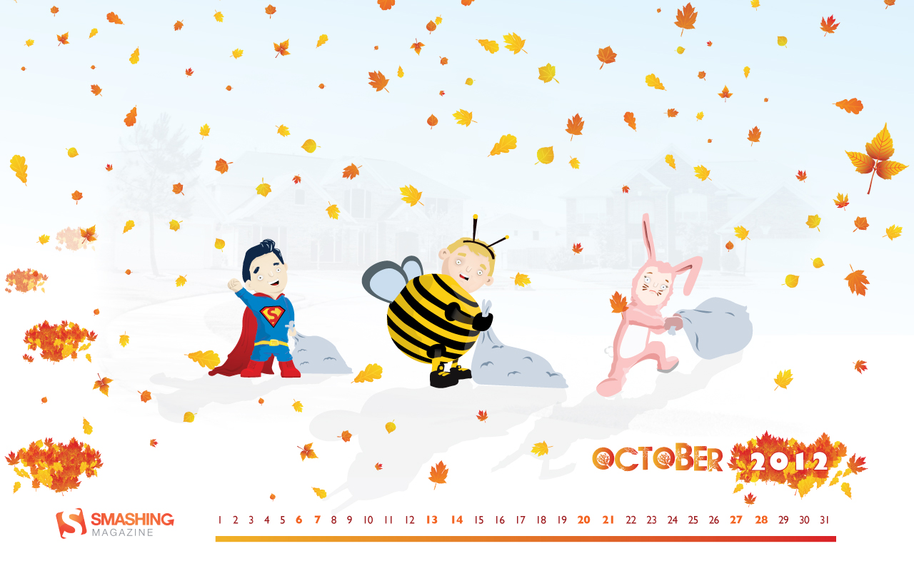
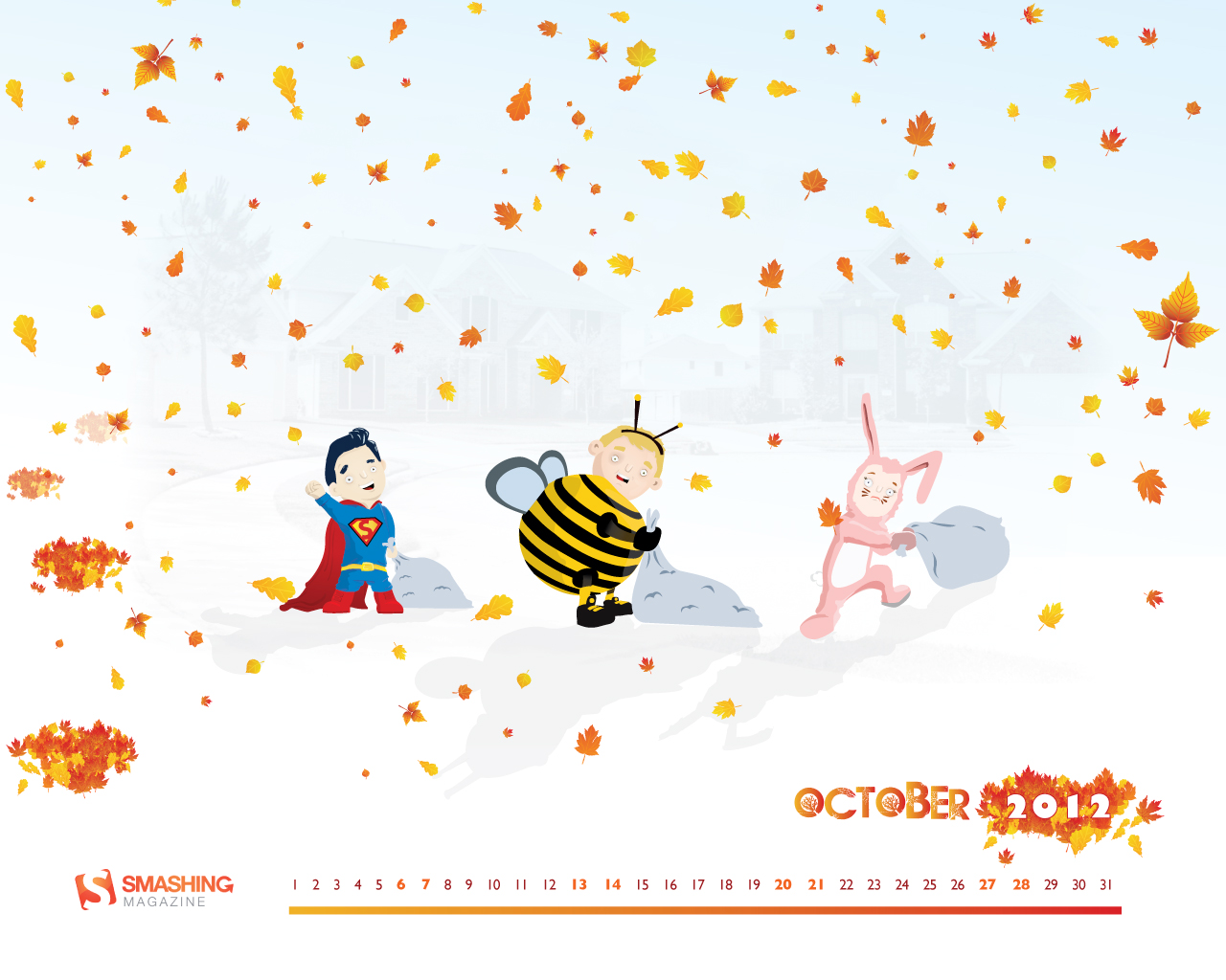
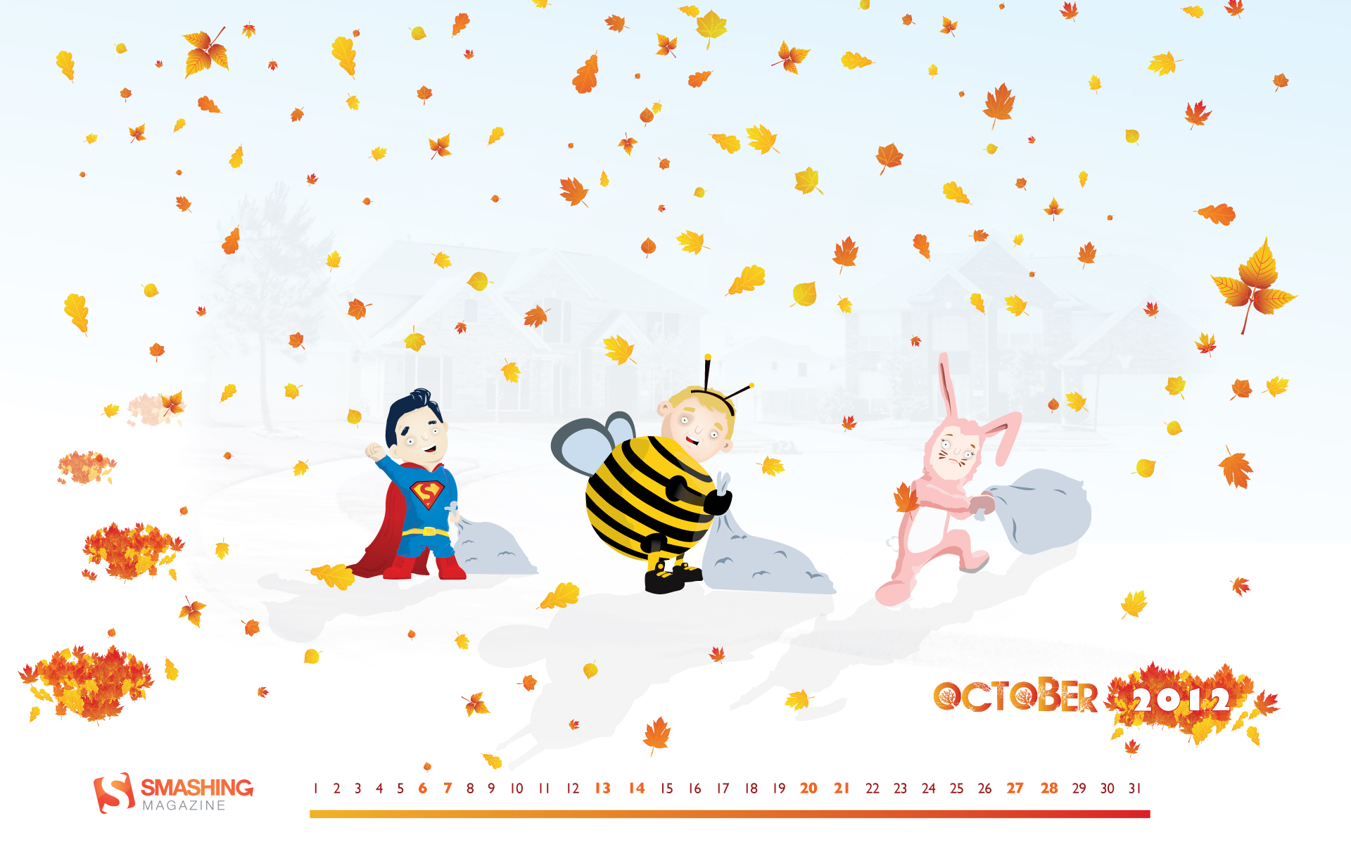
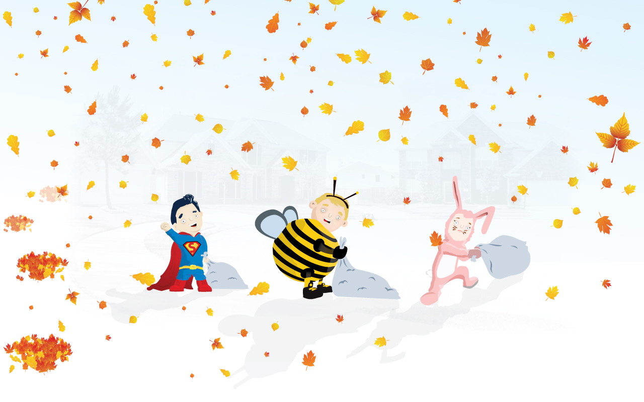
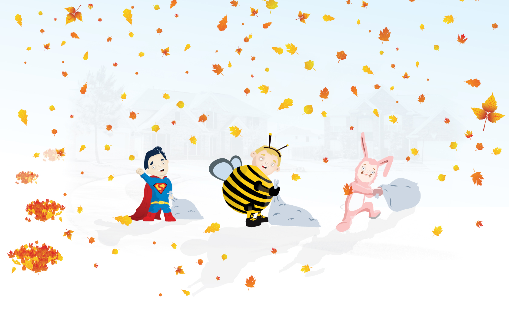
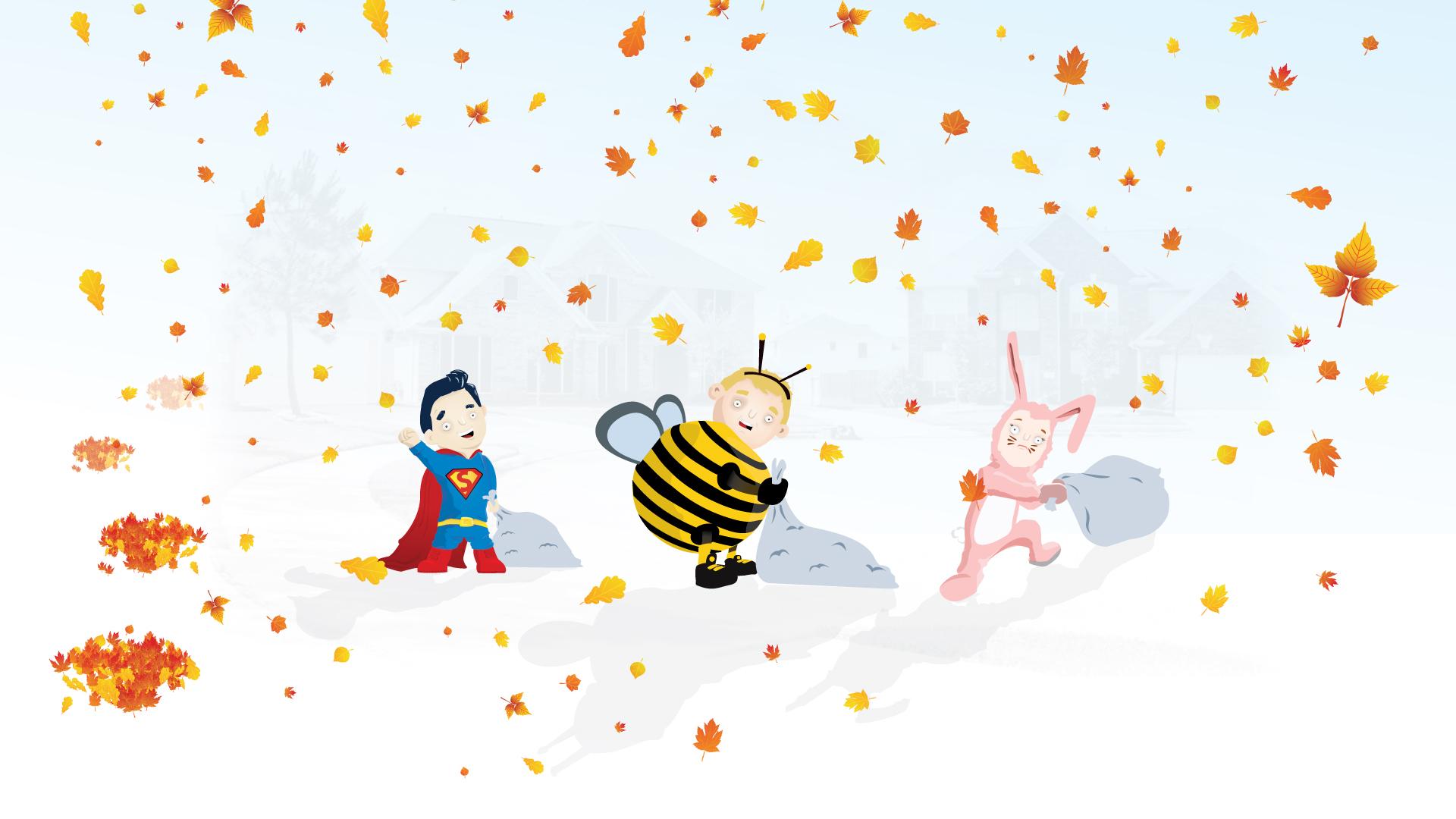
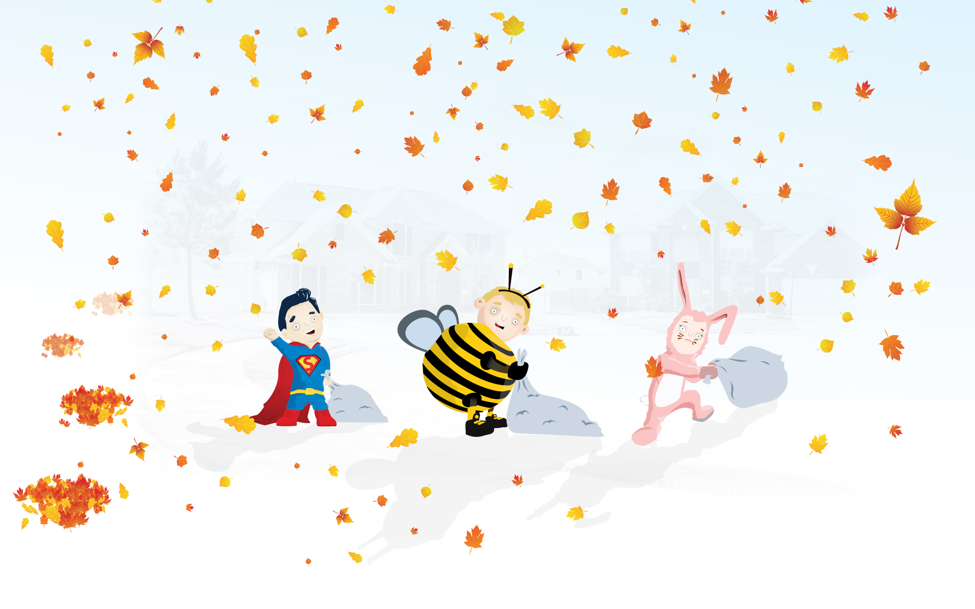
Superman Goes Halloween
“Superman, chubby bee, and pink rabbit, hit the streets for their first Halloweeen!” Designed by Sean Bobbato from Canada.
- preview
- with calendar: 1280×800, 1280×1024, 1680×1050, 1920×1080, 1920×1200
- without calendar: 1280×800, 1280×1024, 1680×1050, 1920×1080, 1920×1200
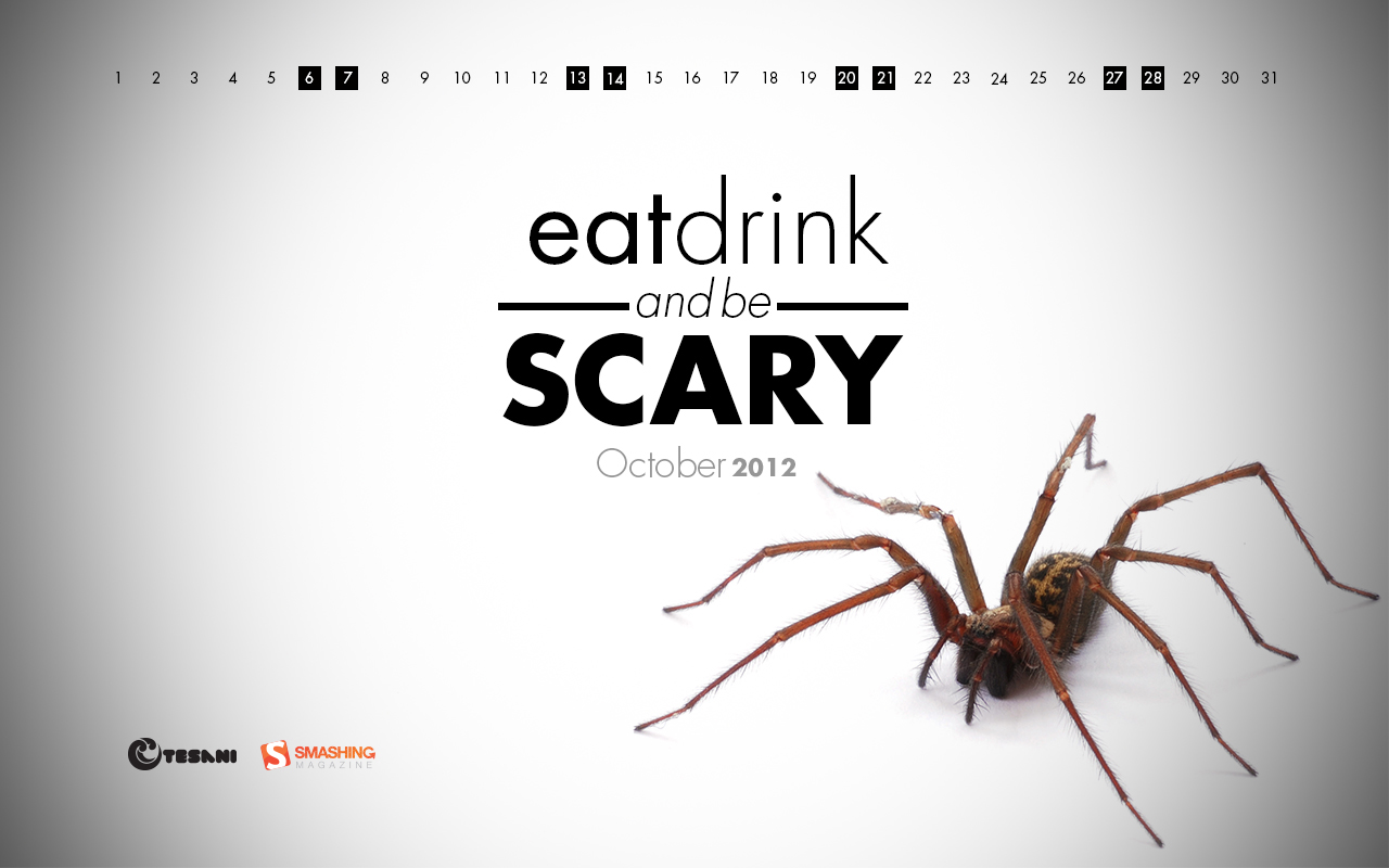
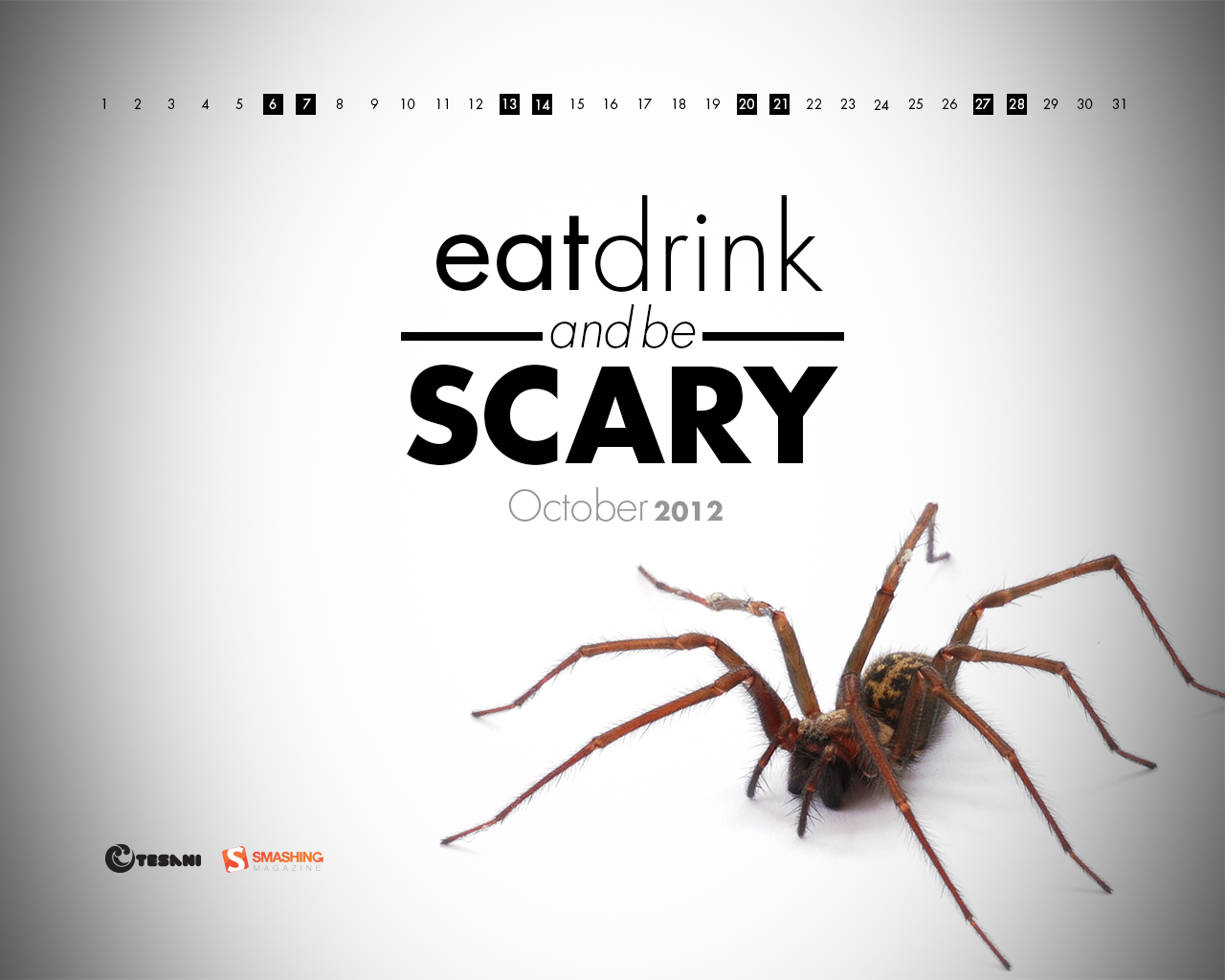
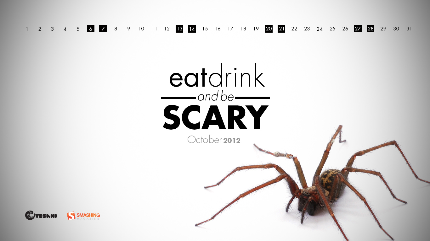
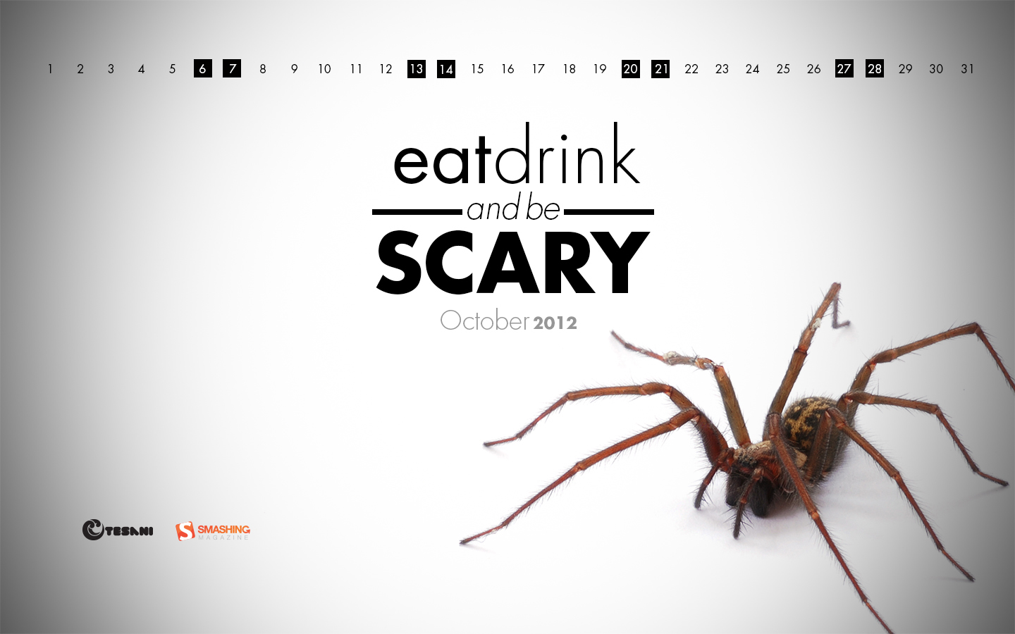
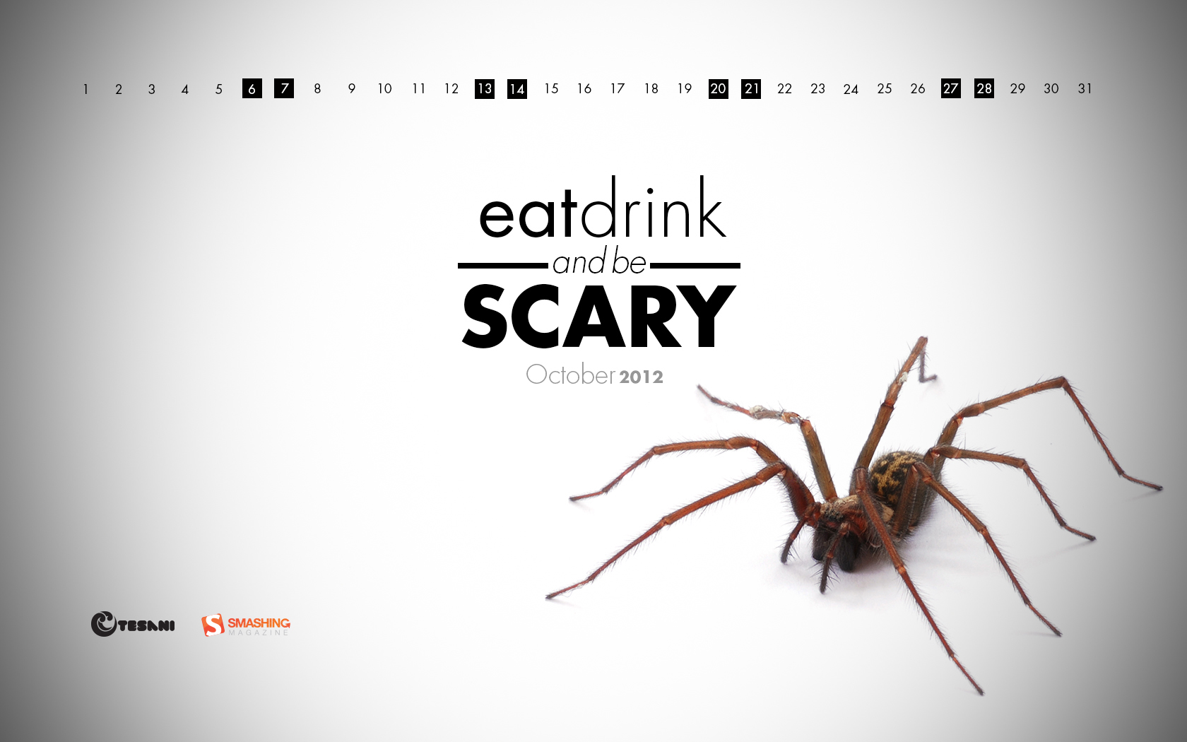
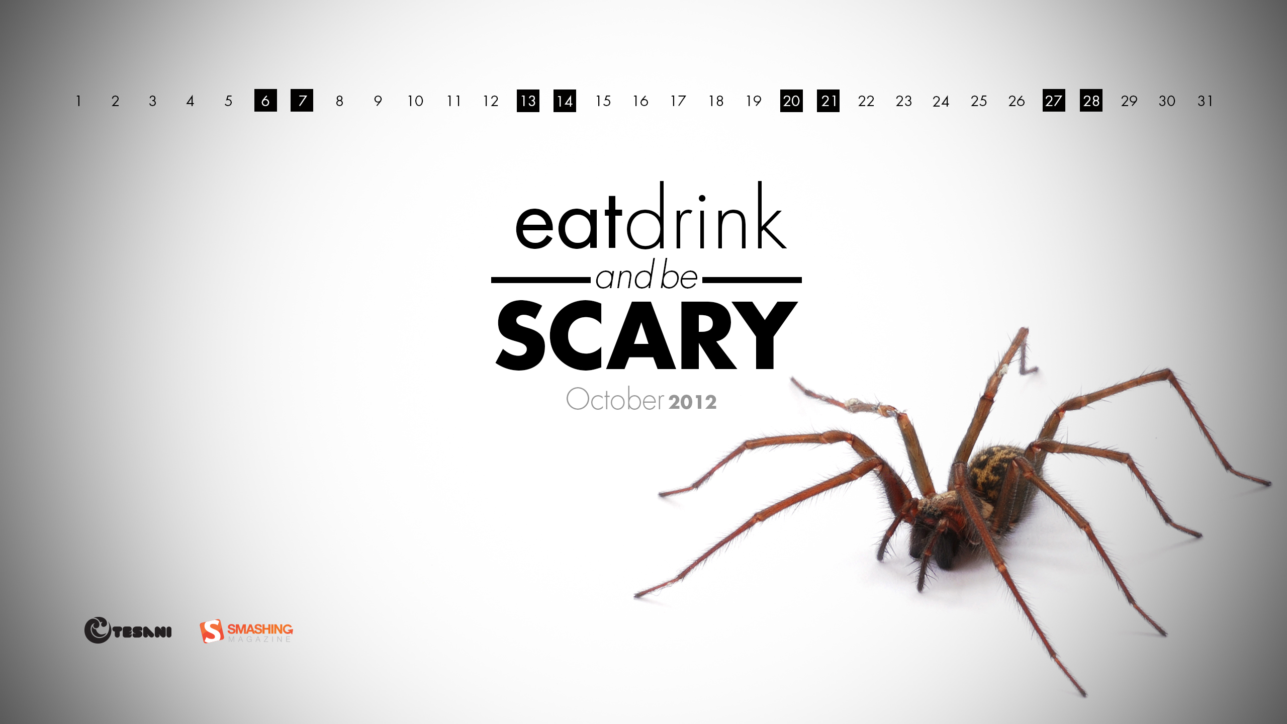
Eat, Drink And Be Scary
“This calendar is a play on the olds saying, ‘eat, drink, and be merry.’ I am a huge fan of clean, minimal design. As my college design teacher would say, “give me exactly what I want, no more, no less, do it well, get the A, and let’s move on.” Designed by Brandon Barringer from USA.

- preview
- with calendar: 1024×768, 1280×800, 1280×1024, 1366×768, 1440×900, 1680×1050, 1920×1080, 1920×1200, 2560×1440
- without calendar: 1024×768, 1024×1024, 1280×800, 1280×1024, 1366×768, 1440×900, 1680×1050, 1920×1080, 1920×1200, 2560×1440
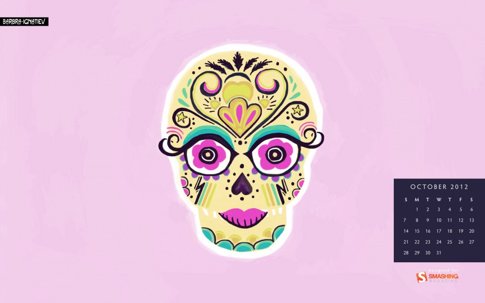
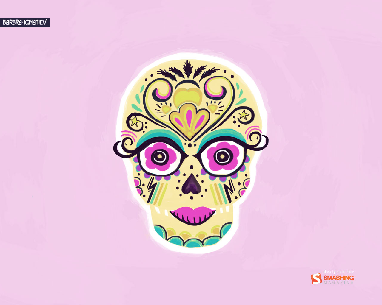
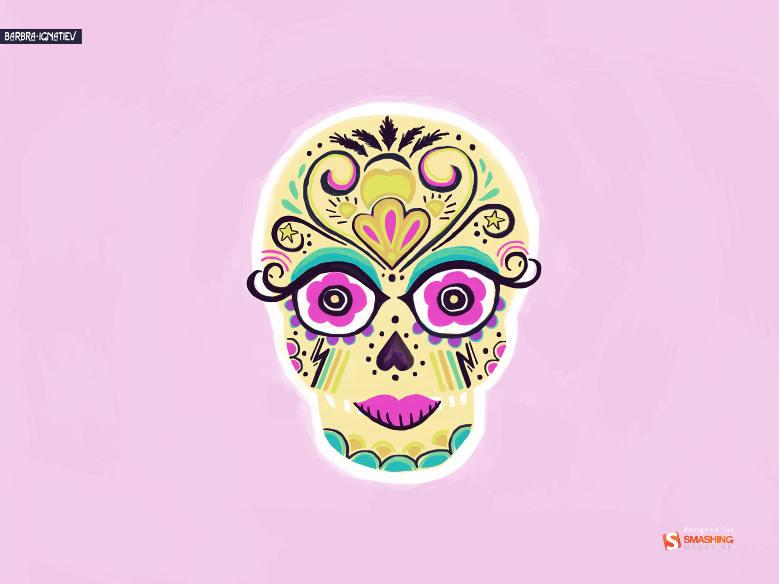
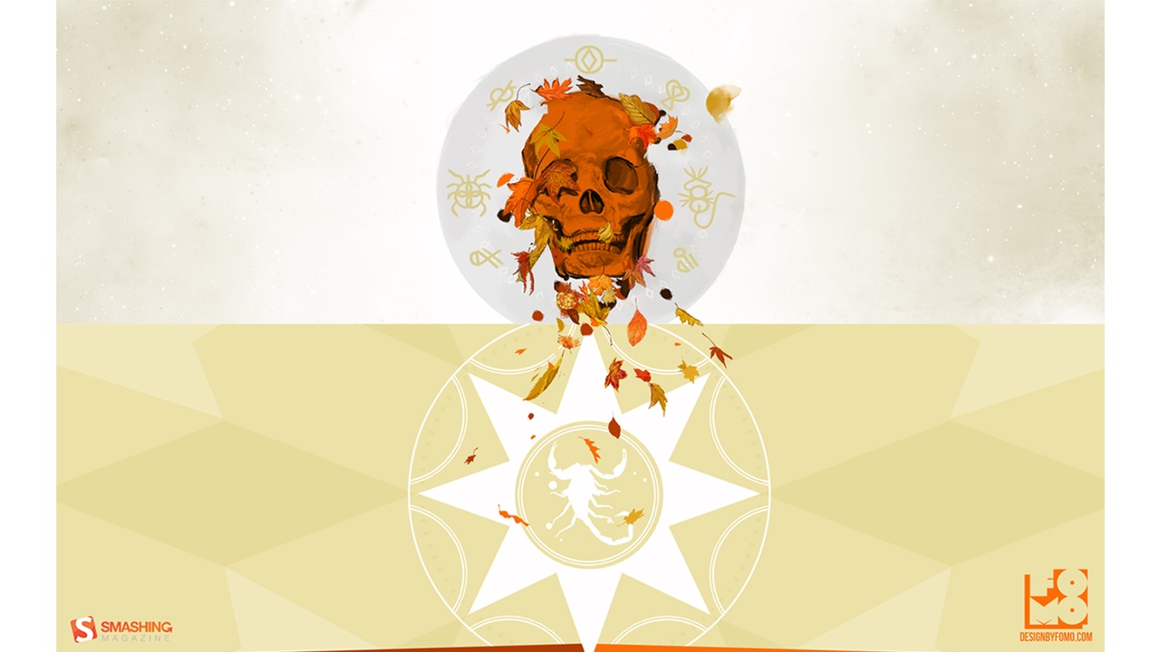
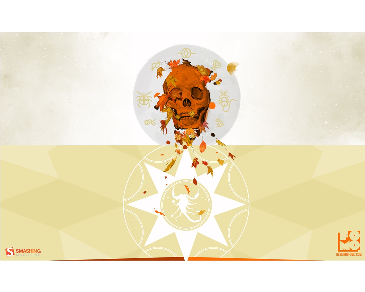
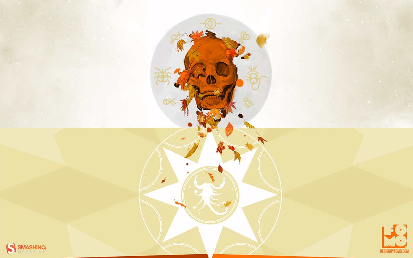
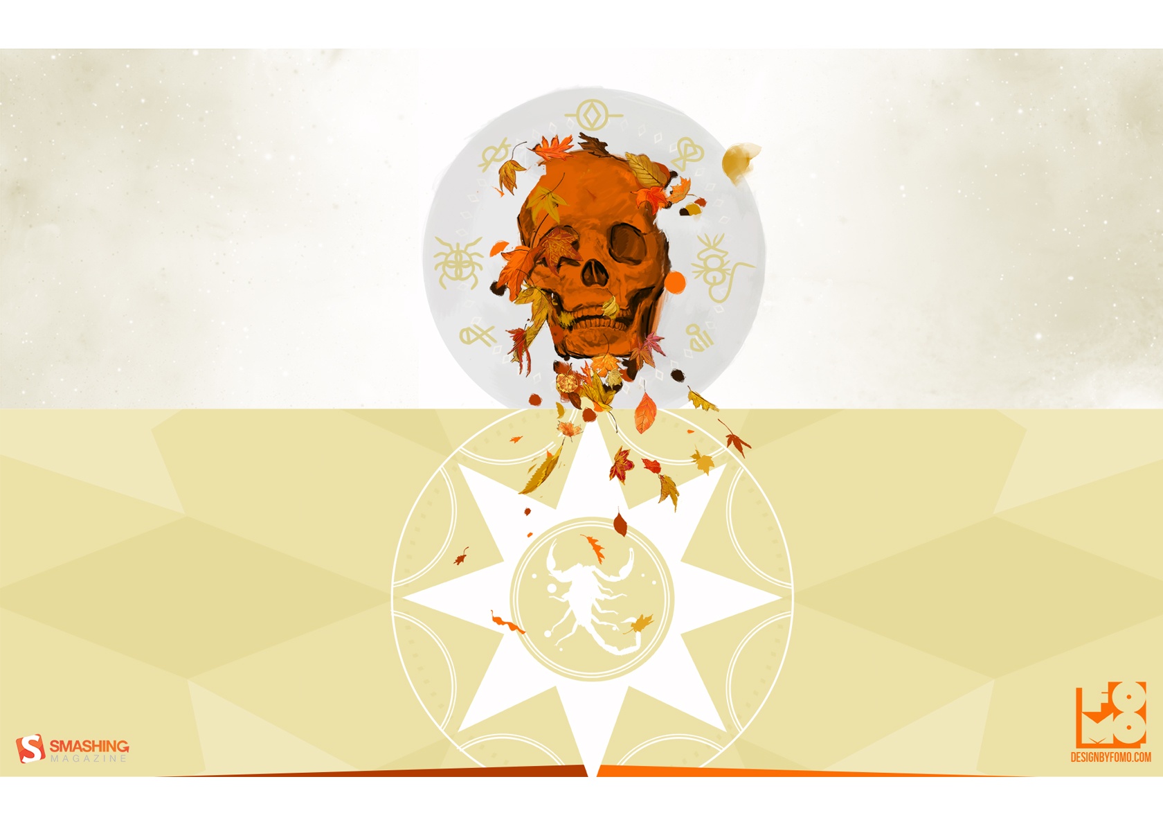
Fancy Sugar Skull
“Day of the Dead fanciness inspired by a make-up and rock and roll.” Designed by Barbra Ignatiev from USA.
- preview
- with calendar: 1280×1024, 1366×768, 1600×1200, 1680×1050, 1920×1080, 2560×1440
- without calendar: 1280×1024, 1366×768, 1600×1200, 1680×1050, 1920×1080, 2560×1440
Weird Season
Designed by Ryan Thompson from USА.
- preview
- with calendar: 640×480, 800×480, 800×600, 1024×768, 1024×1024, 1152×864, 1280×720, 1280×800, 1280×960, 1280×1024, 1400×1050, 1440×900, 1600×1200, 1680×1050, 1680×1200, 1920×1080, 1920×1200, 1920×1440, 2560×1440
- without calendar: 320×480, 640×480, 800×480, 800×600, 1024×768, 1024×1024, 1152×864, 1280×720, 1280×800, 1280×960, 1280×1024, 1400×1050, 1440×900, 1600×1200, 1680×1050, 1680×1200, 1920×1080, 1920×1200, 1920×1440, 2560×1440
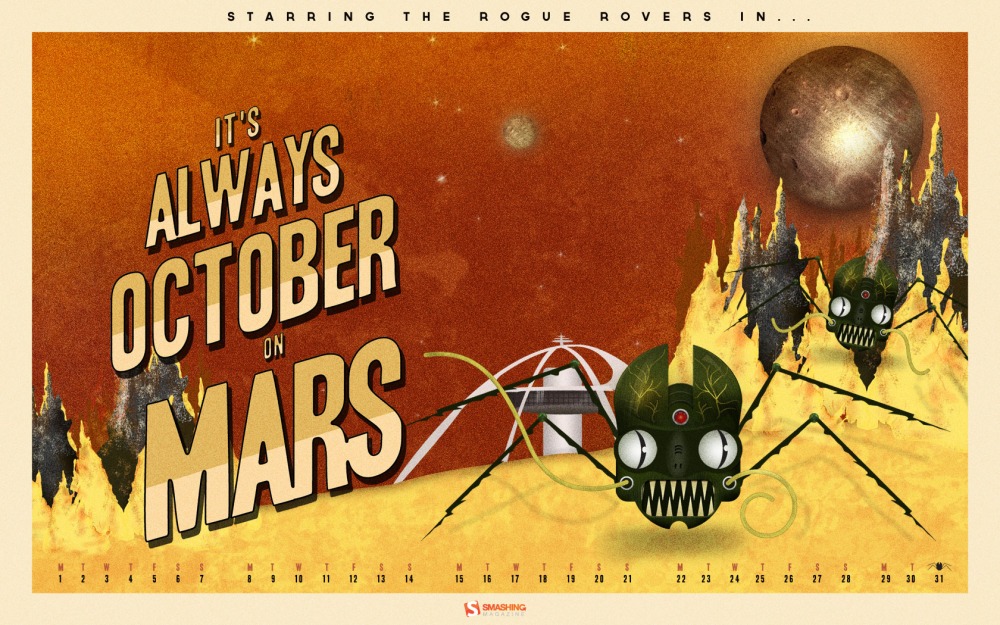
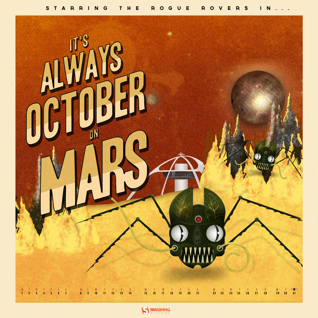
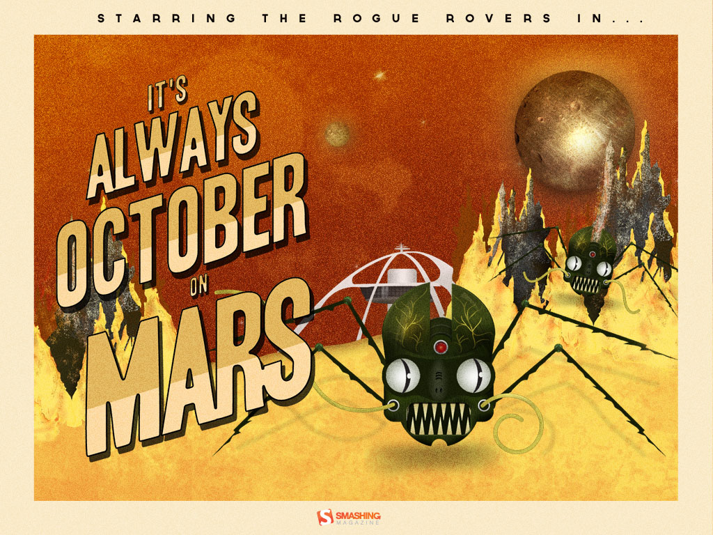
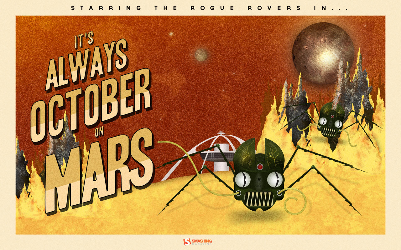
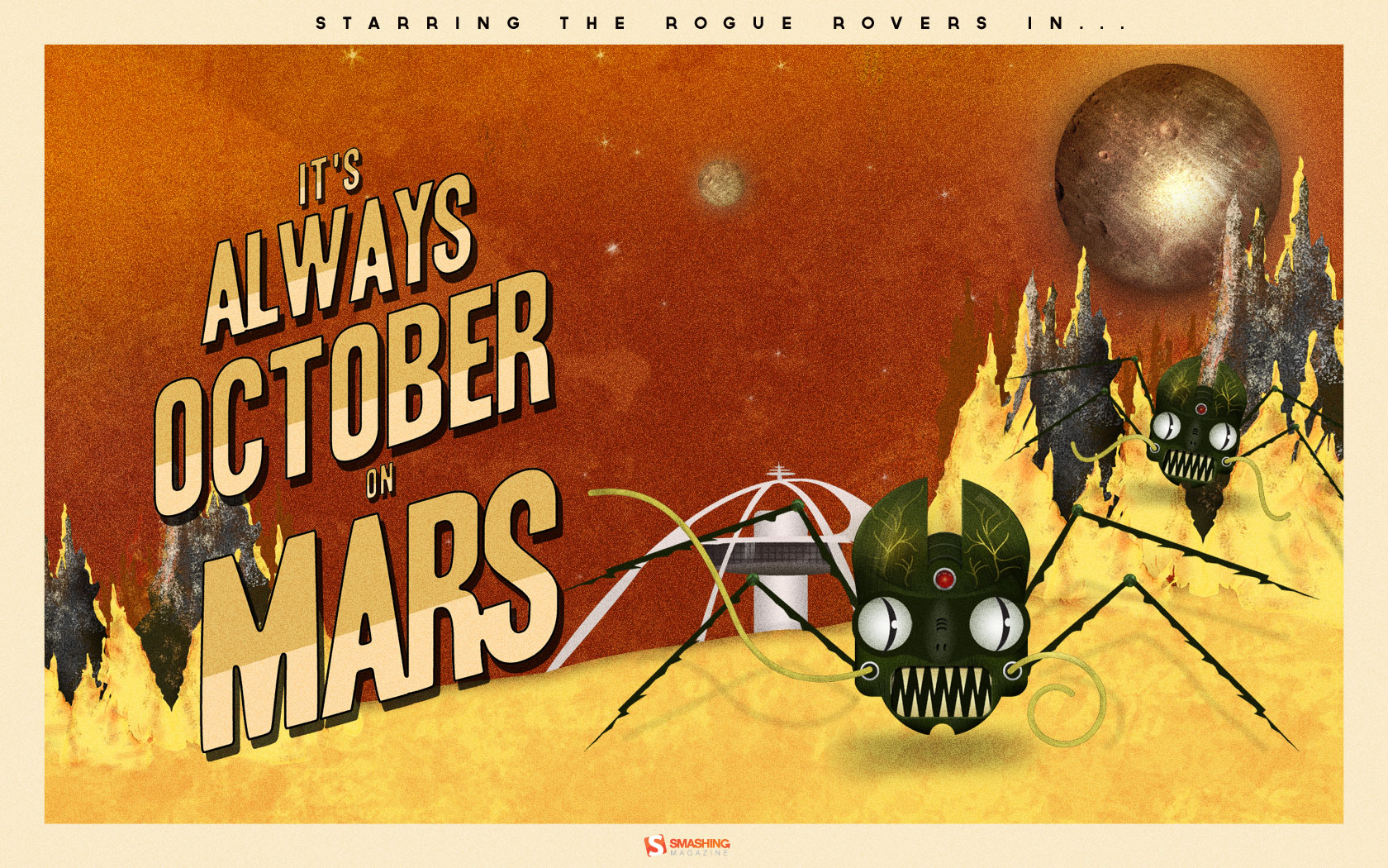
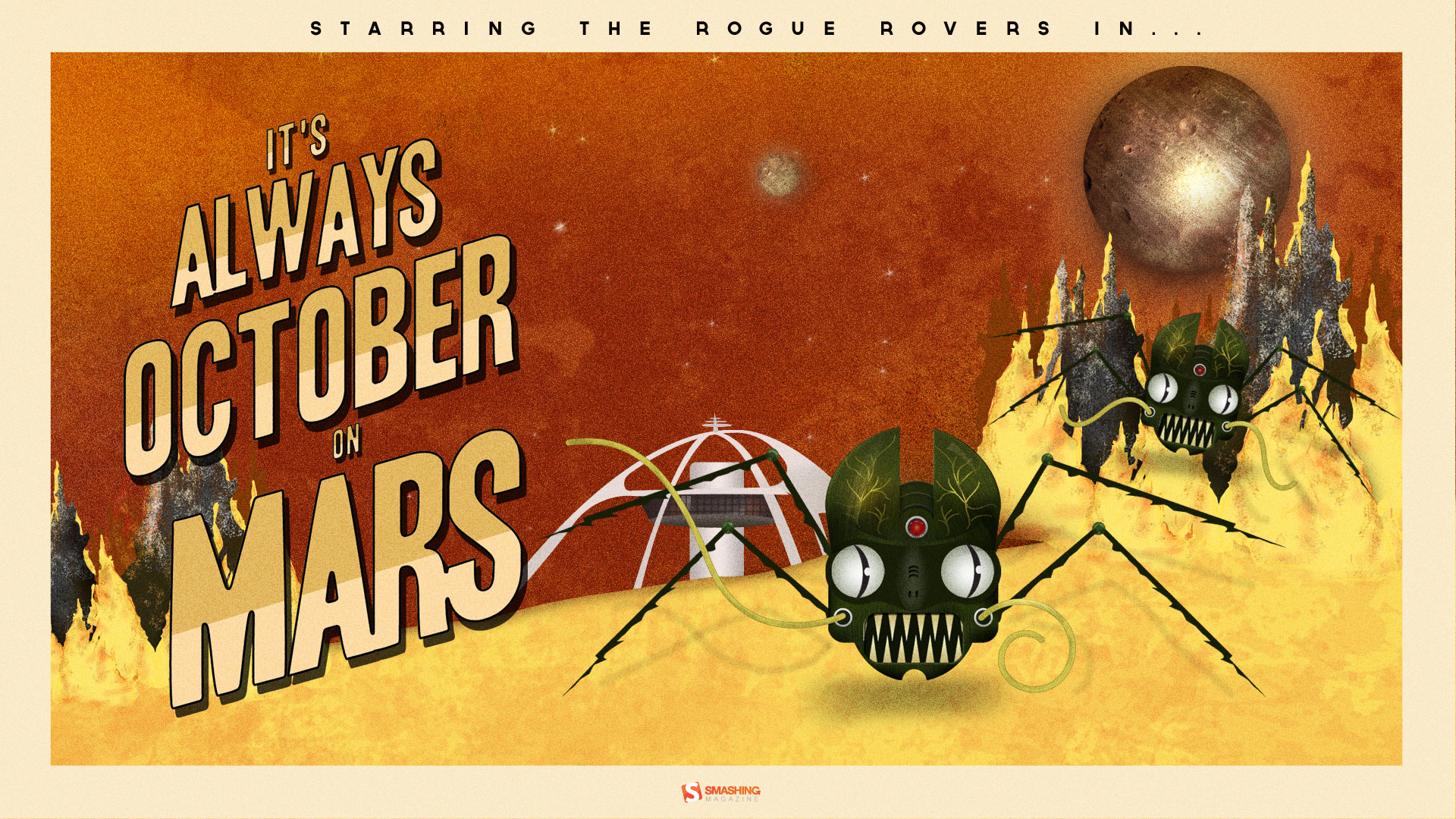
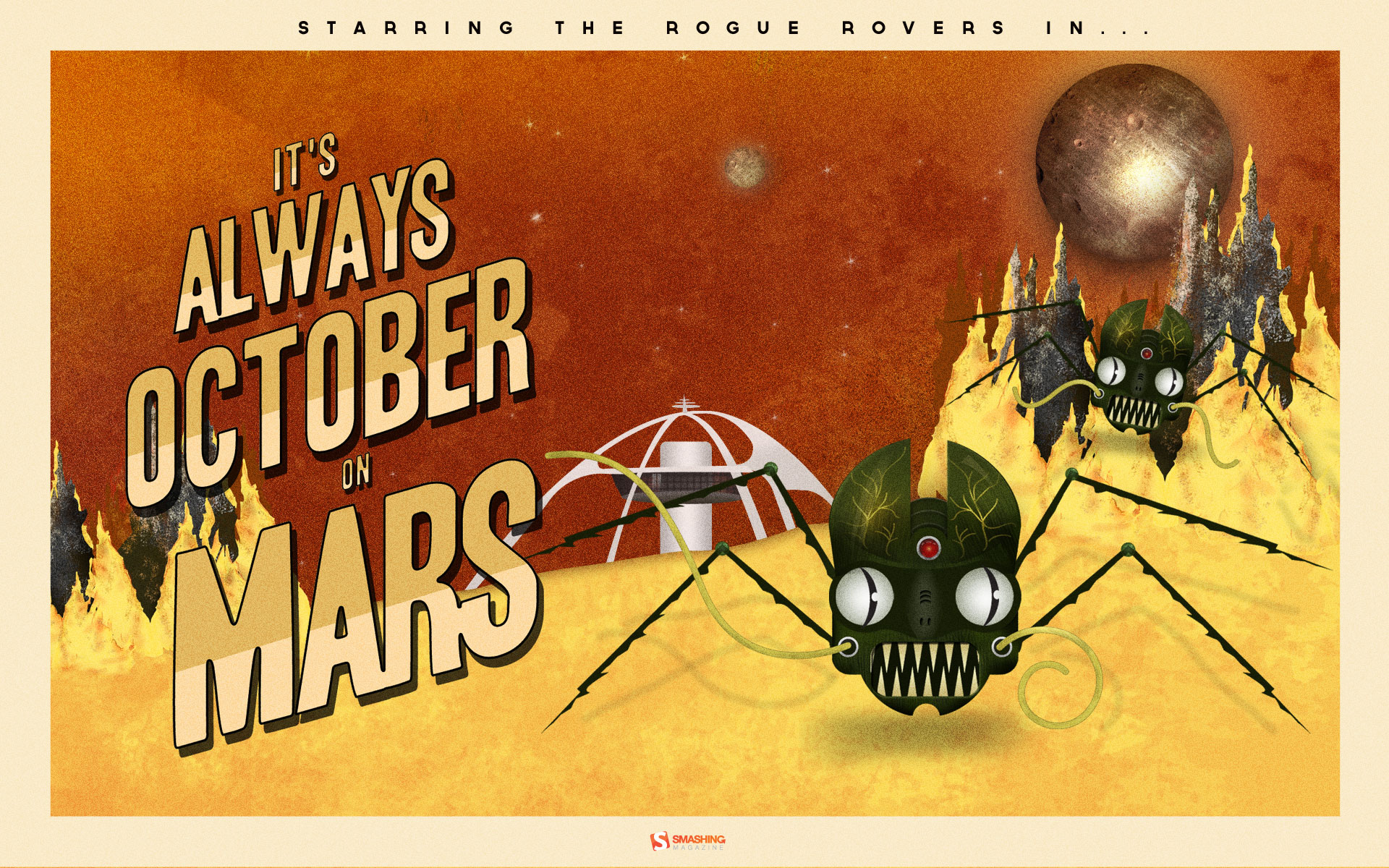
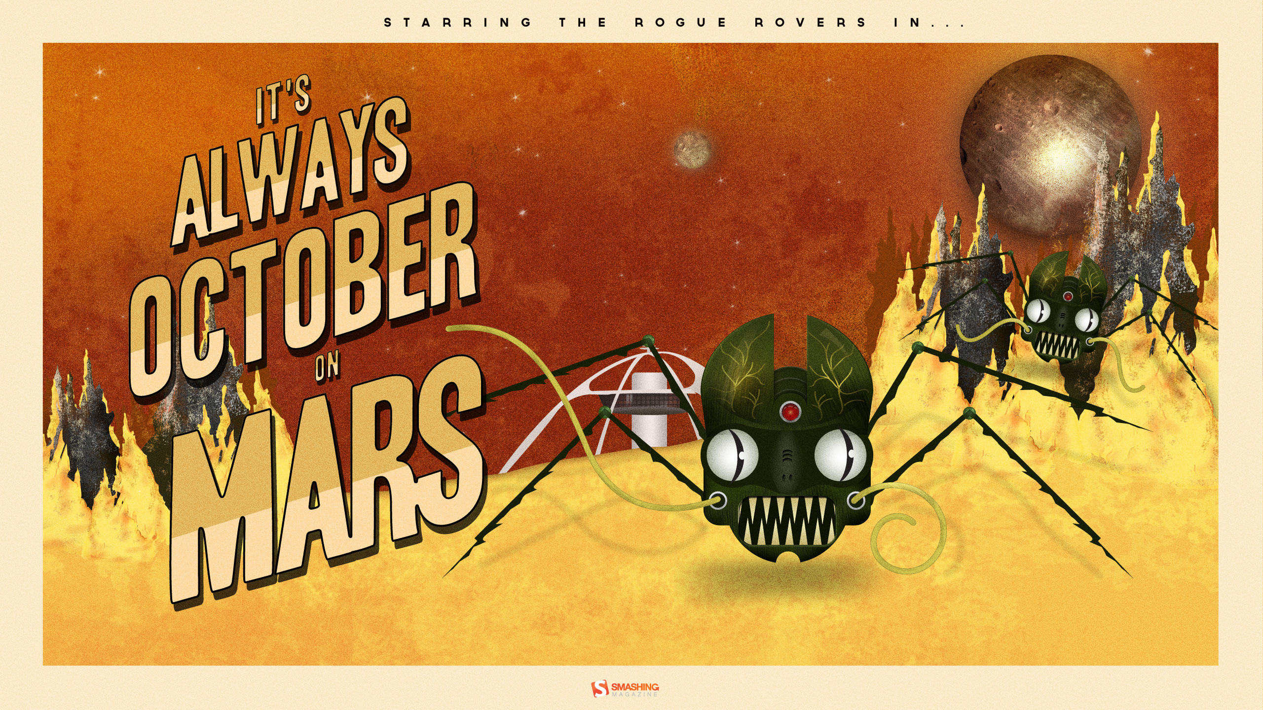
Roger That Rogue Rover
“The story is a mash-up of retro science fiction and zombie infection. What would happen if a Mars rover came into contact with an unknown Martian material and got infected with a virus? What if it reversed its intended purpose of research and exploration? Instead choosing a life of chaos and evil. What if they all ran rogue on Mars? Would humans ever dare to voyage to the red planet?” Designed by Frank Candamil from USA.
- preview
- with calendar: 1024×768, 1024×1024, 1280×800, 1680×1050, 1920×1080, 1920×1200, 2560×1440
- without calendar: 1024×768, 1024×1024, 1280×800, 1680×1050, 1920×1080, 1920×1200, 2560×1440
Join In Next Month!
Please note that we respect and carefully consider the ideas and motivation behind each and every artist’s work. This is why we give all artists the full freedom to explore their creativity and express emotions and experience throughout their works. This is also why the themes of the wallpapers weren’t anyhow influenced by us, but rather designed from scratch by the artists themselves.
A big thank you to all designers for their participation. Join in next month!
What’s Your Favorite?
What’s your favorite theme or wallpaper for this month? Please let us know in the comment section below.
Stay creative and keep on smashing!
(vf)
© Smashing Editorial for Smashing Magazine, 2012.


