 |
We always try our best to challenge your artistic abilities and produce some interesting, beautiful and creative artwork. And as designers we usually turn to different sources of inspiration. As a matter of fact, we’ve discovered the best one — desktop wallpapers that are a little more distinctive than the usual crowd. This creativity mission has been going on for over two years now, and we are very thankful to all designers who have contributed and are still diligently contributing each month.
We continue to nourish you with a monthly spoon of inspiration. This post features free desktop wallpapers created by artists across the globe for March 2012. Both versions with a calendar and without a calendar can be downloaded for free. It’s time to freshen up your wallpaper!
Please note that:
- All images can be clicked on and lead to the preview of the wallpaper,
- You can feature your work in our magazine by taking part in our Desktop Wallpaper Calendar series. We are regularly looking for creative designers and artists to be featured on Smashing Magazine. Are you one of them?
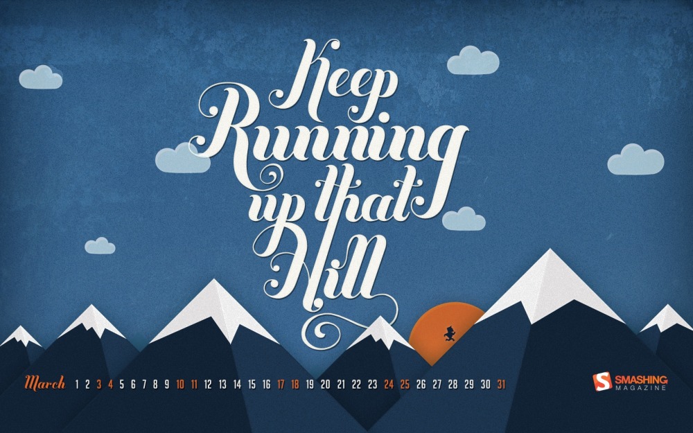
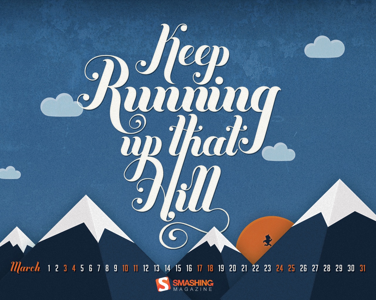
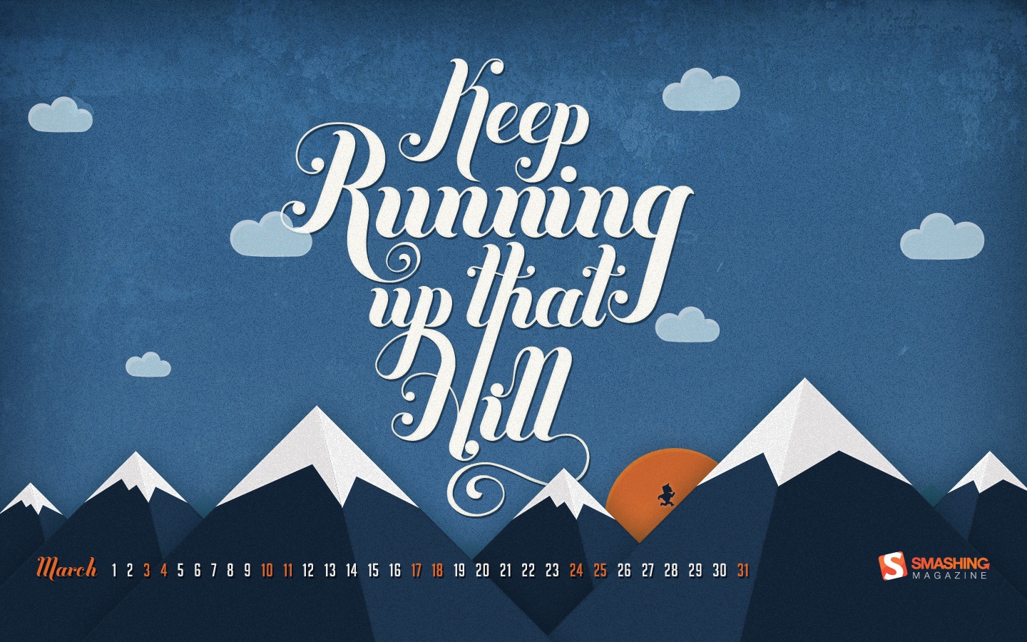
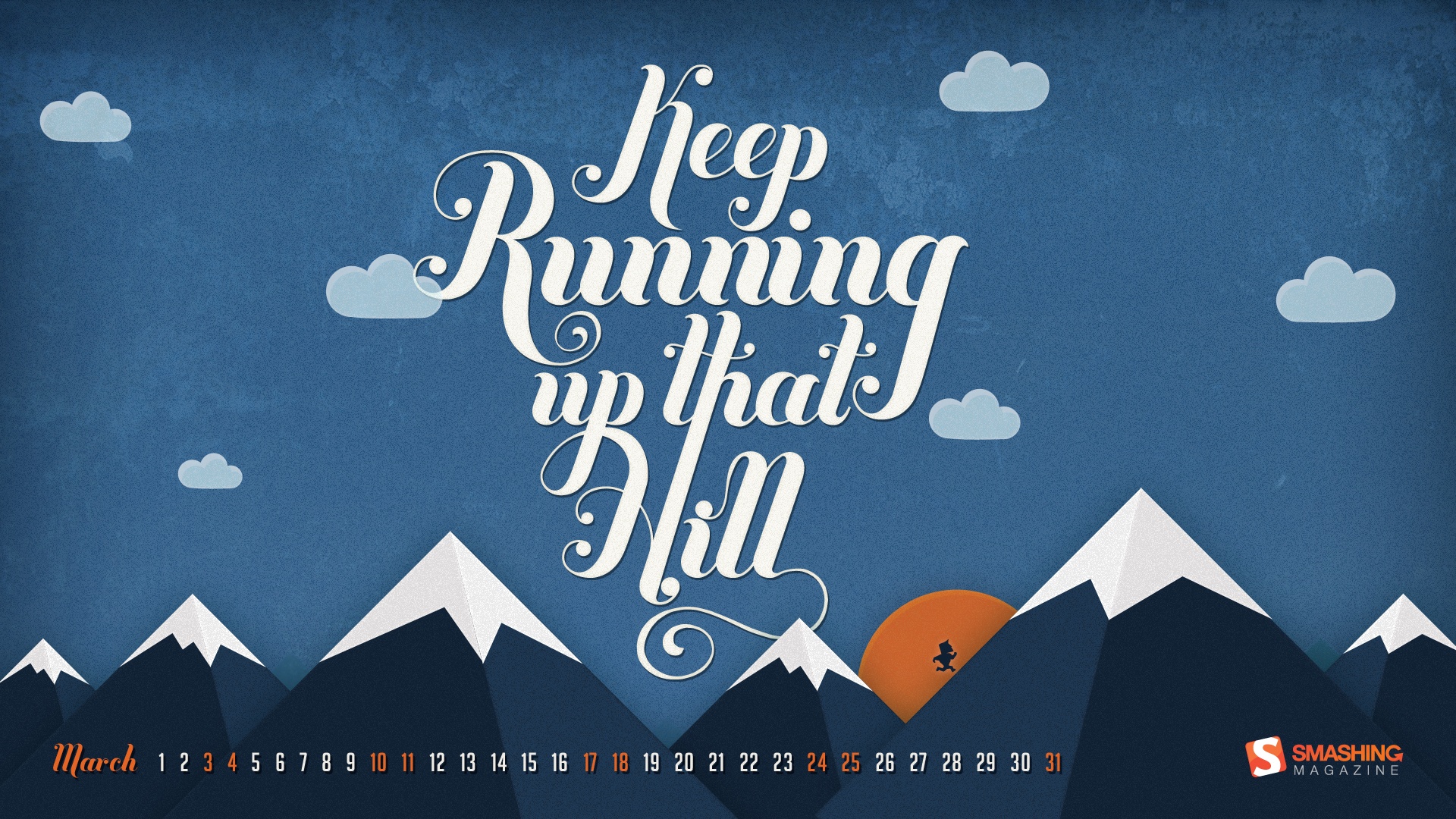
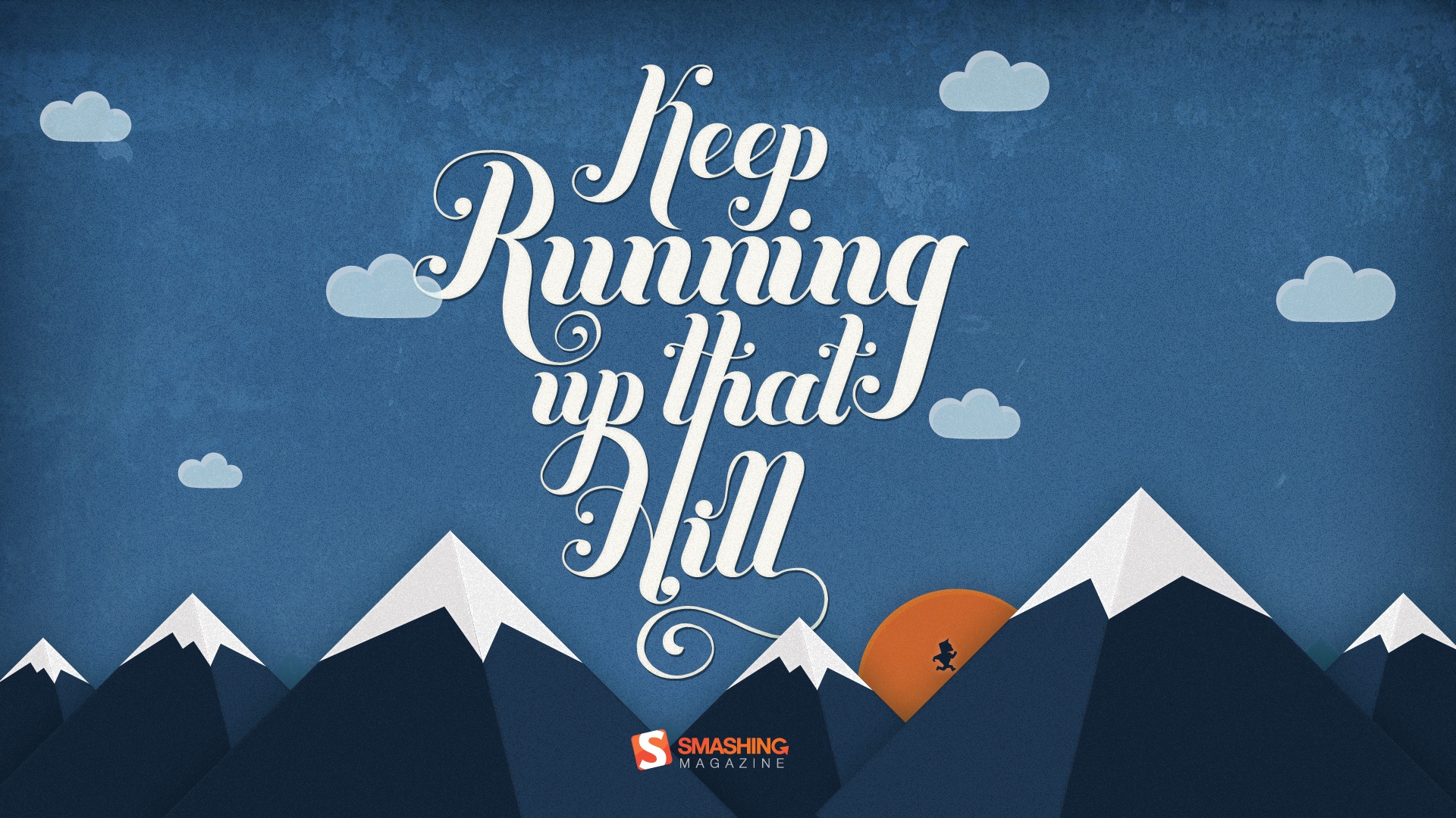
Keep Running Up That Hill
"Keep working towards that new years resolution! Be it getting a promotion, learning a skill or getting fit, whatever it is – keep running!" Designed by Andy Patrick from Canada.
- preview
- with calendar: 320×480, 1024×768, 1024×1024, 1280×800, 1280×1024, 1366×768, 1440×900, 1680×1050, 1920×1080, 1920×1200
- without calendar: 320×480, 1024×768, 1024×1024, 1280×800, 1280×1024, 1366×768, 1440×900, 1680×1050, 1920×1080, 1920×1200
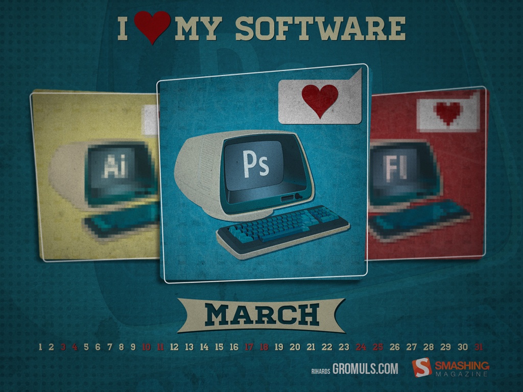
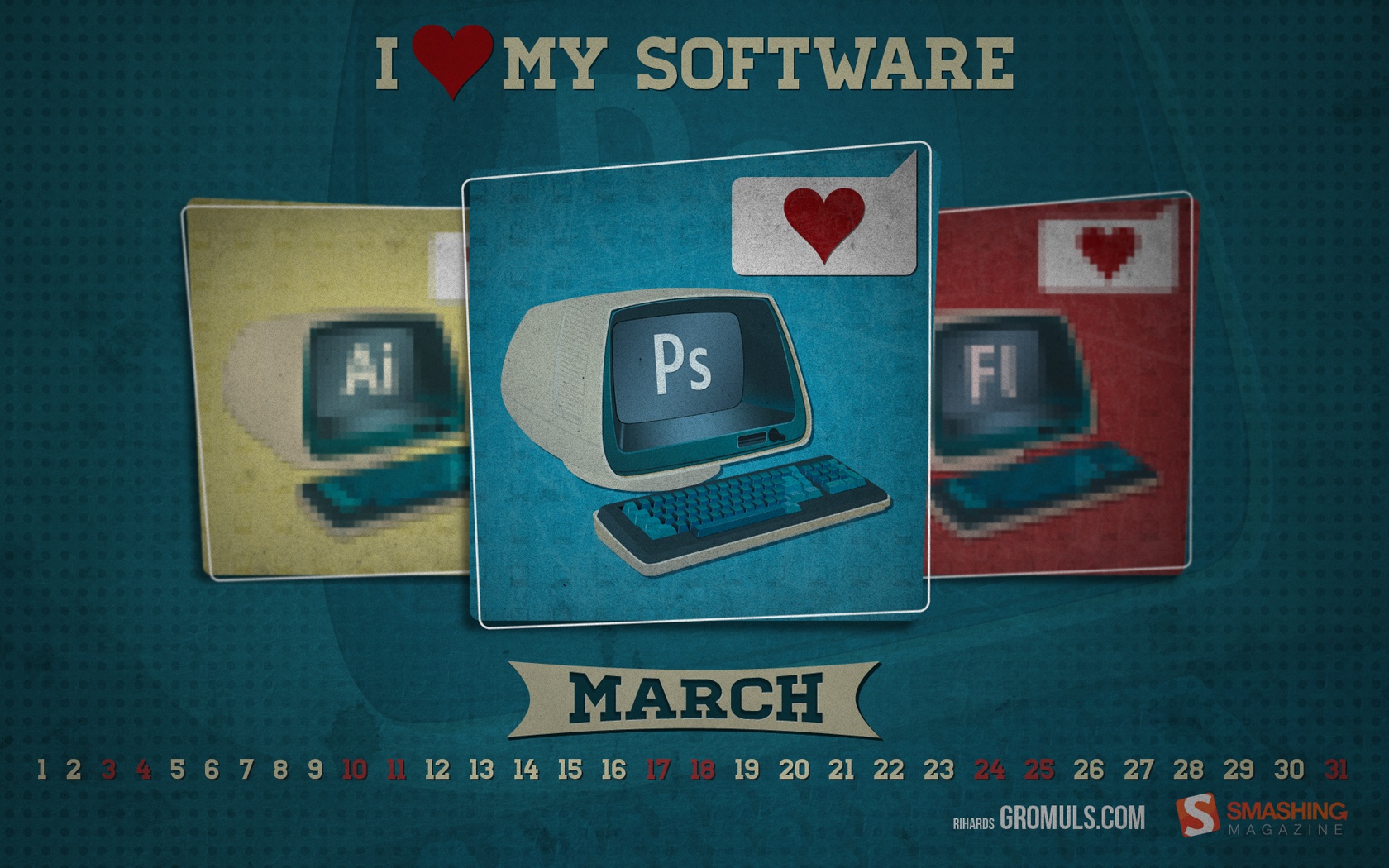
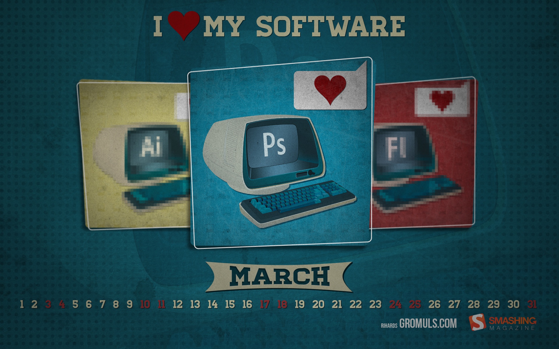
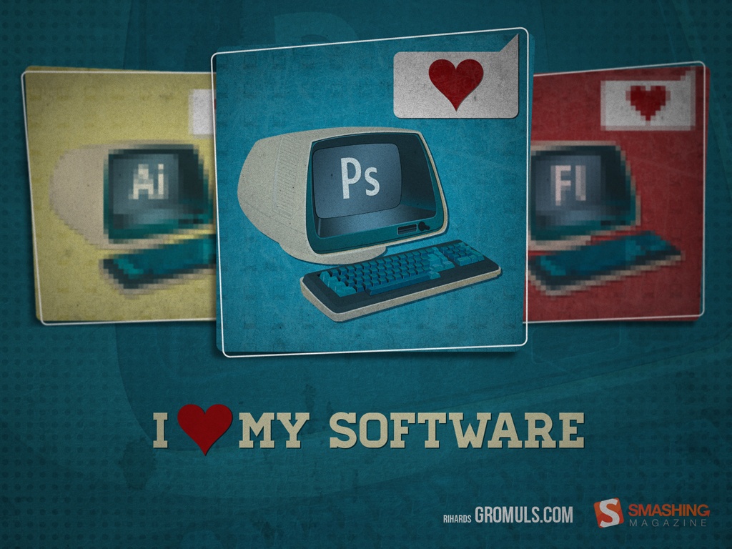
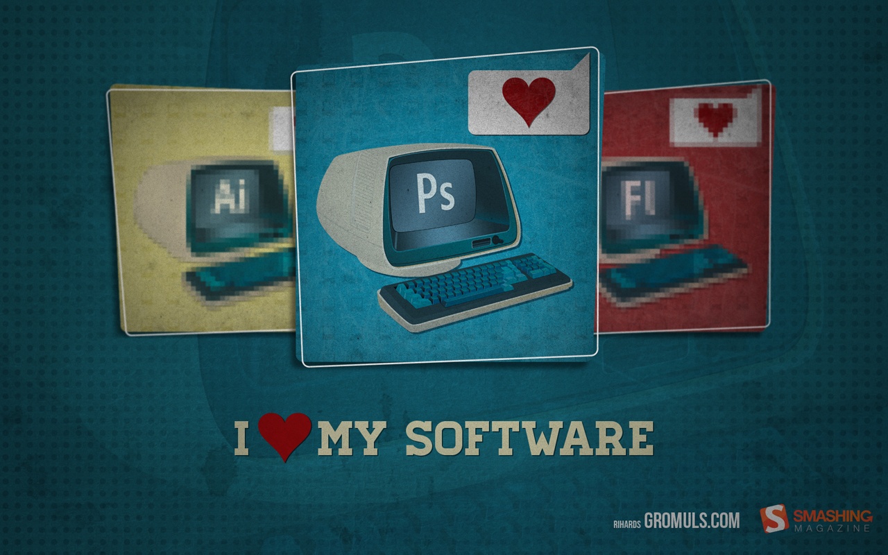
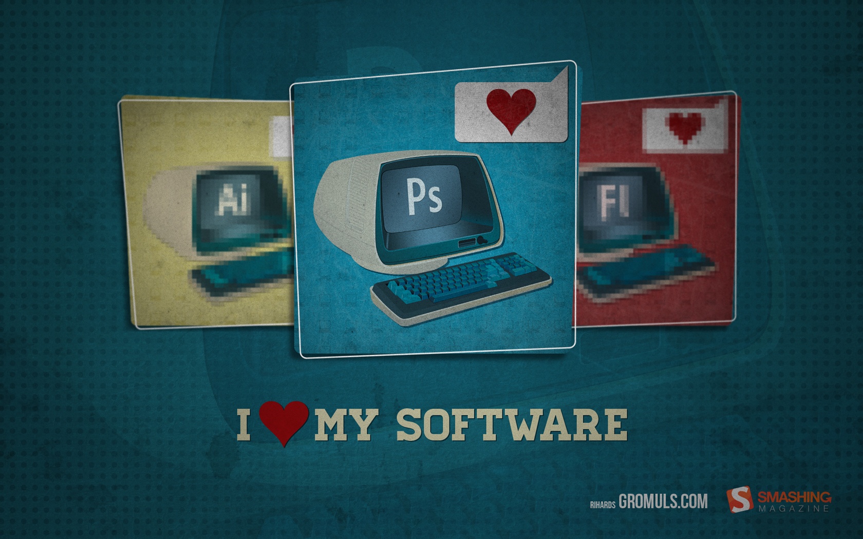
I Love My Software
"Since it is my birthday this month, I decided to pay a little tribute to 3 softwares that pay my bills and have had made my a job a pleasure to be at :)." Designed by Rihards Gromuls from Latvia.

- preview
- with calendar: 1024×768, 1280×800, 1280×1024, 1440×900, 1680×1050, 1920×1200
- without calendar: 1024×768, 1280×800, 1280×1024, 1440×900, 1680×1050, 1920×1200
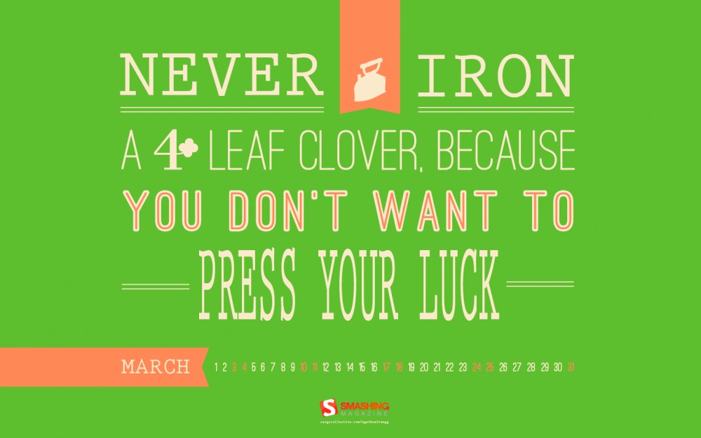
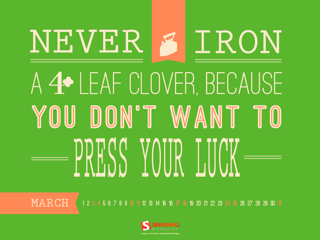
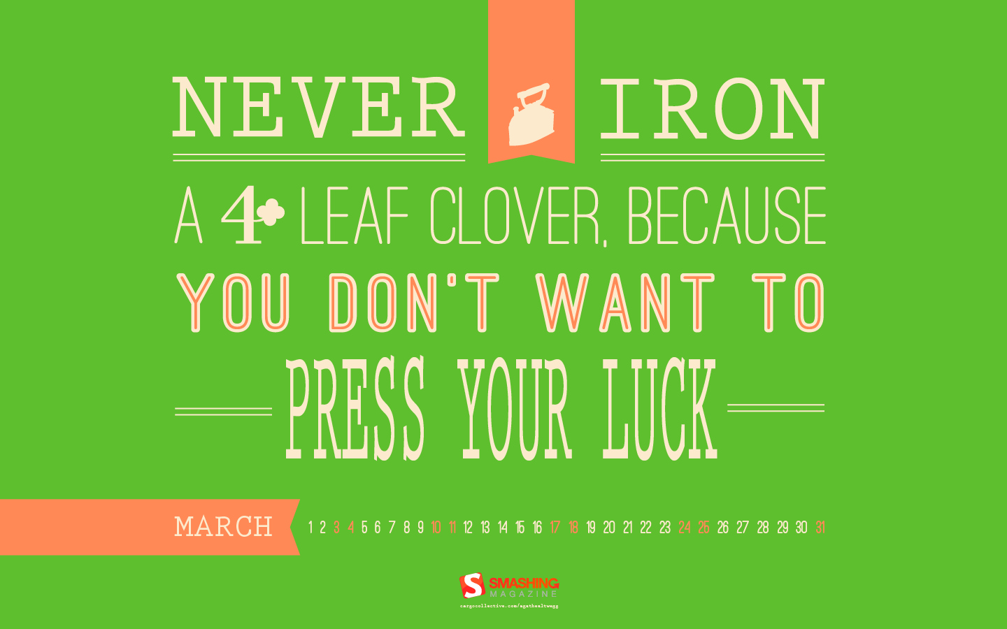
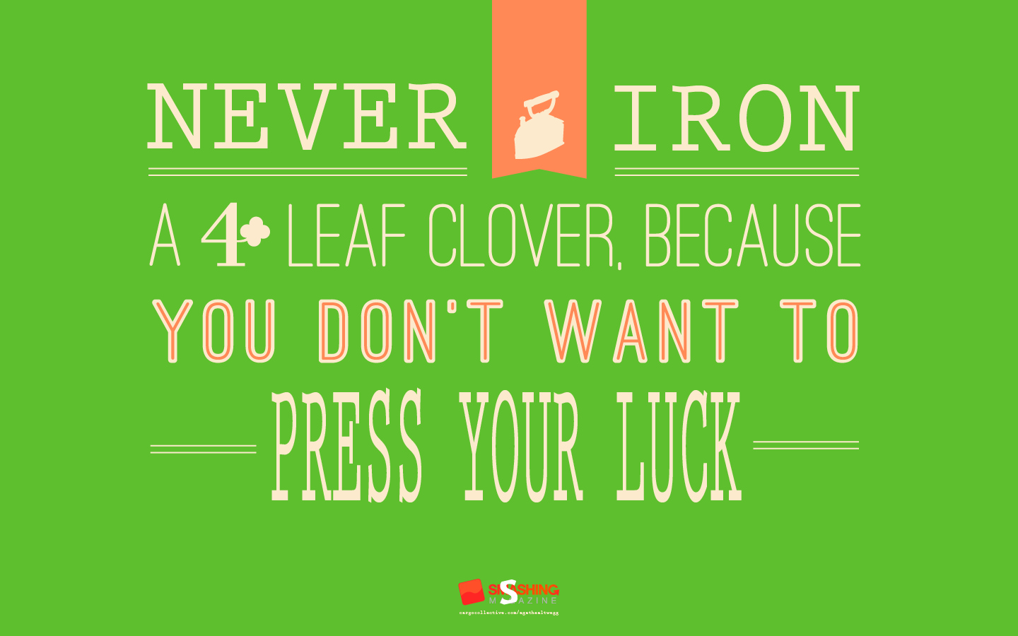
Lucky Month
"A lucky Irish saying to make you go through St. Patrick’s month." Designed by Agathe Altwegg from France.
- preview
- with calendar: 1024×768, 1024×1024, 1440×900, 1680×1200
- without calendar: 1024×1024, 1440×900, 1680×1200
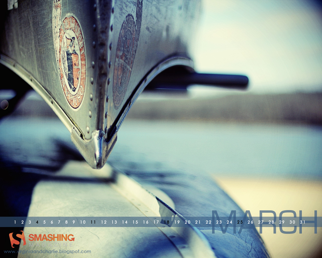
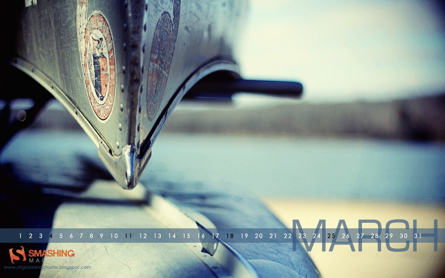
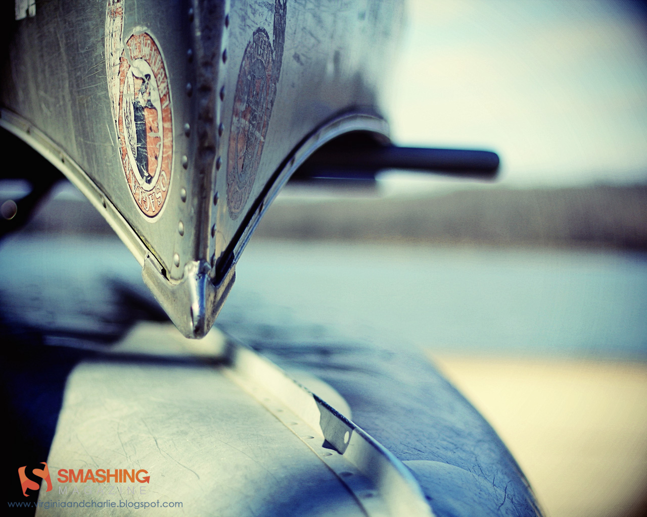
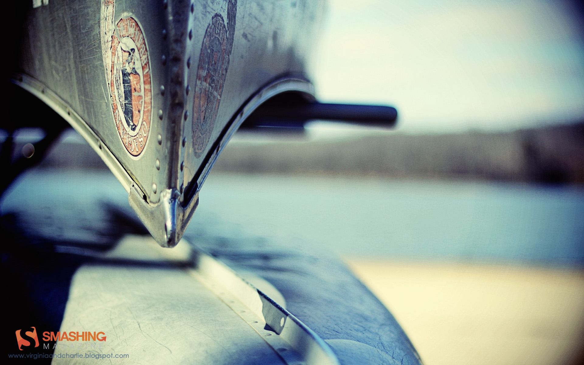
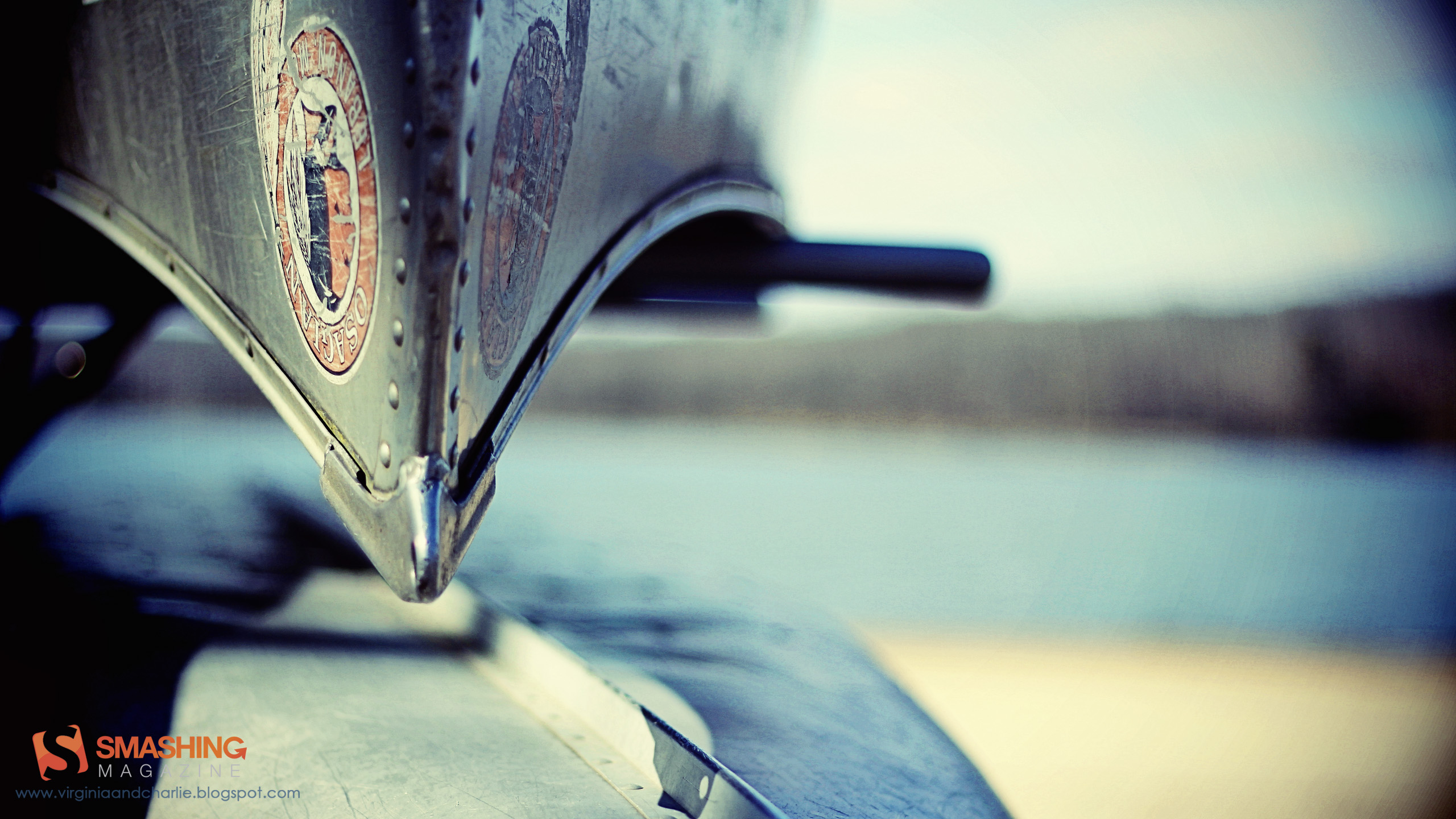
Canoe By The Lake
Designed by Virginia Saint from USA.

- preview
- with calendar: 1280×800, 1280×1024, 1440×900, 1920×1200, 2560×1440
- without calendar: 1280×800, 1280×1024, 1440×900, 1920×1200, 2560×1440
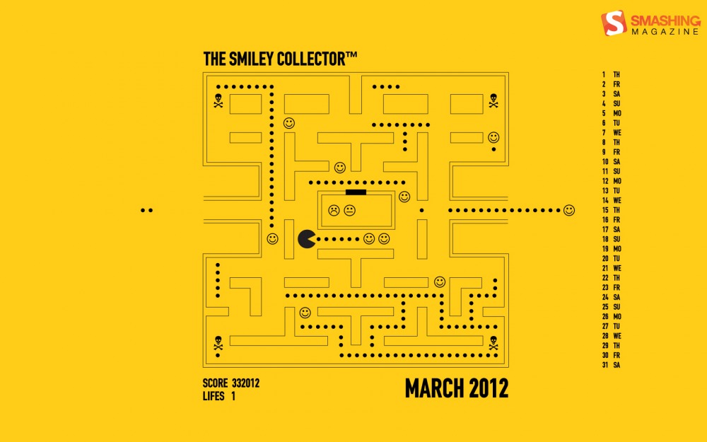
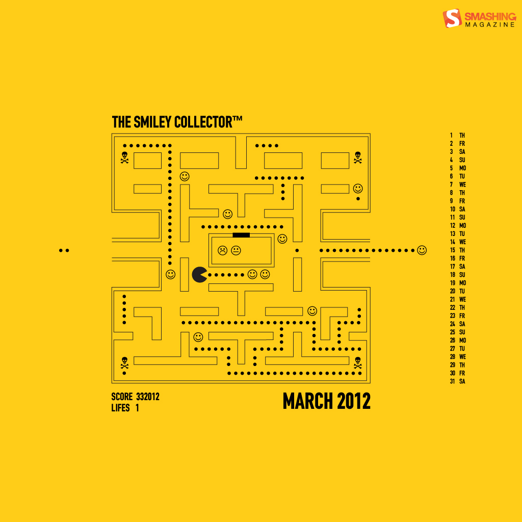
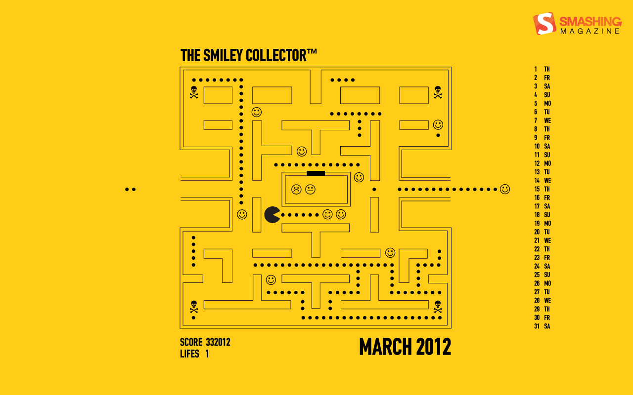
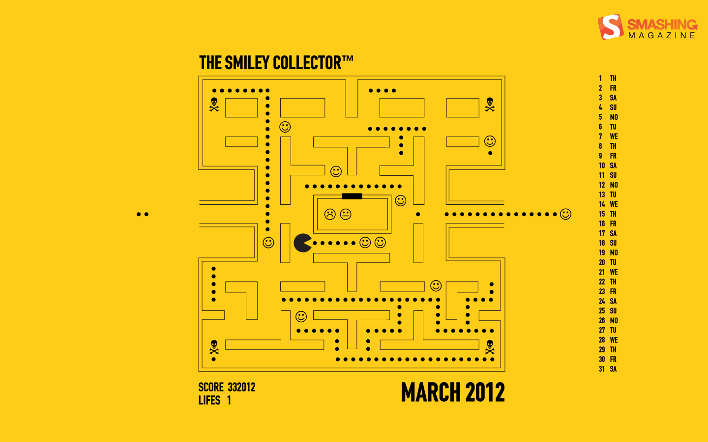
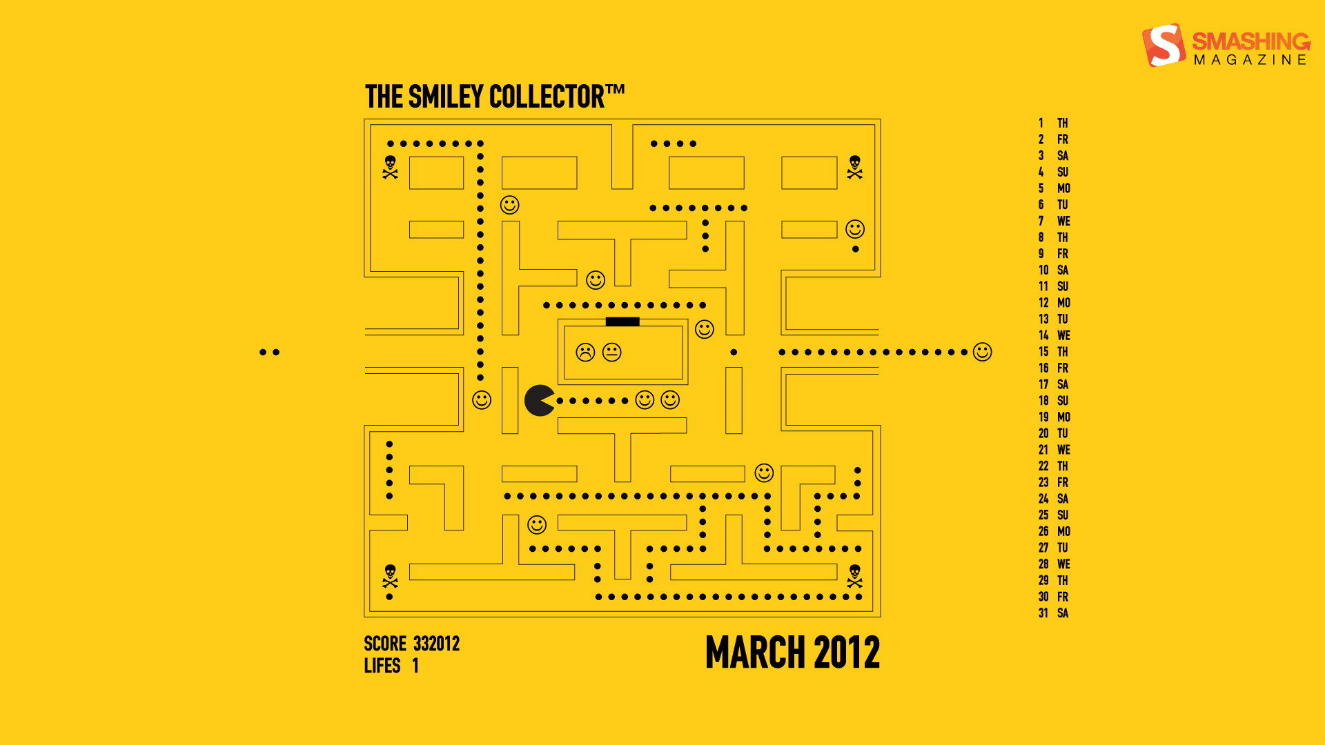
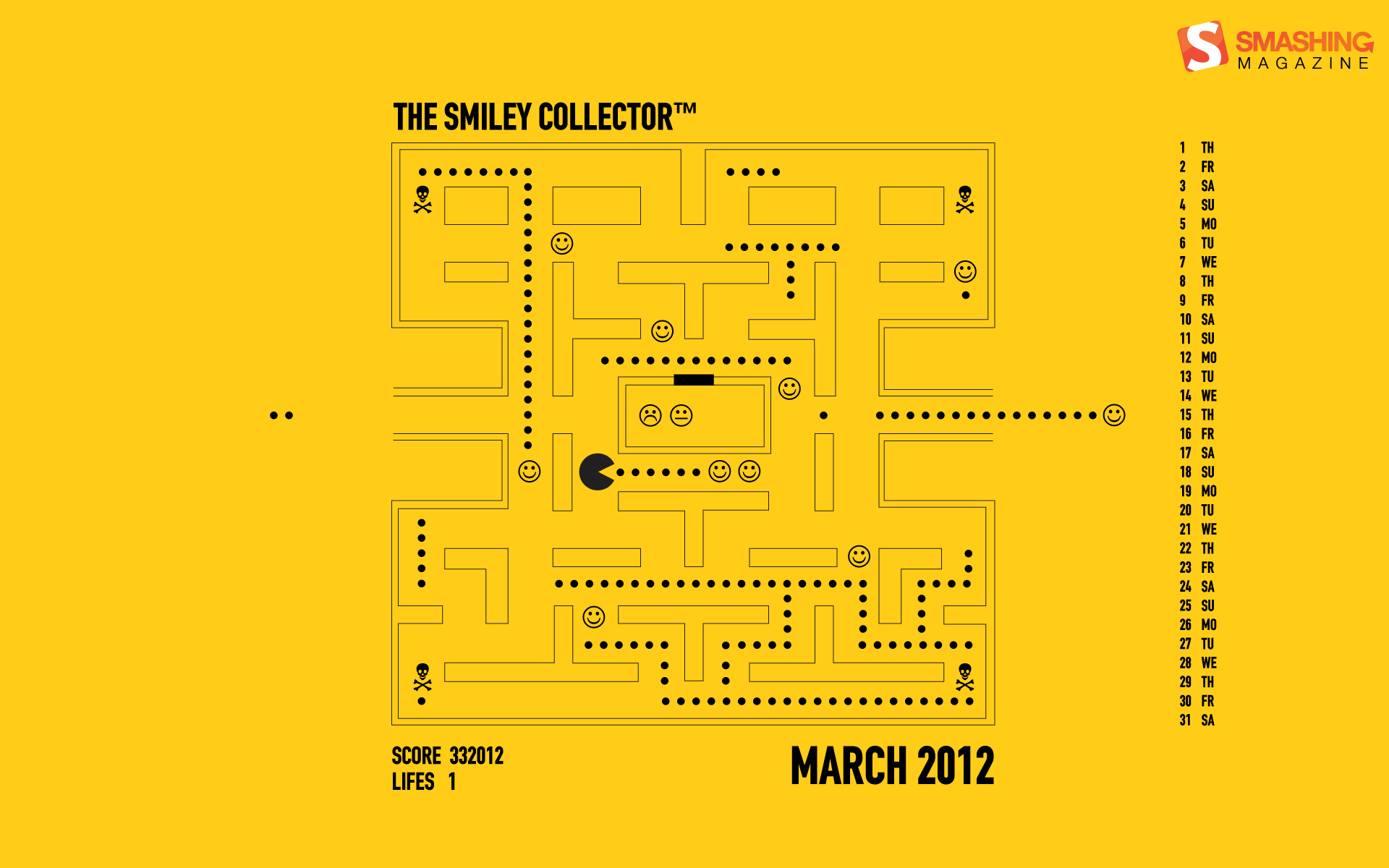
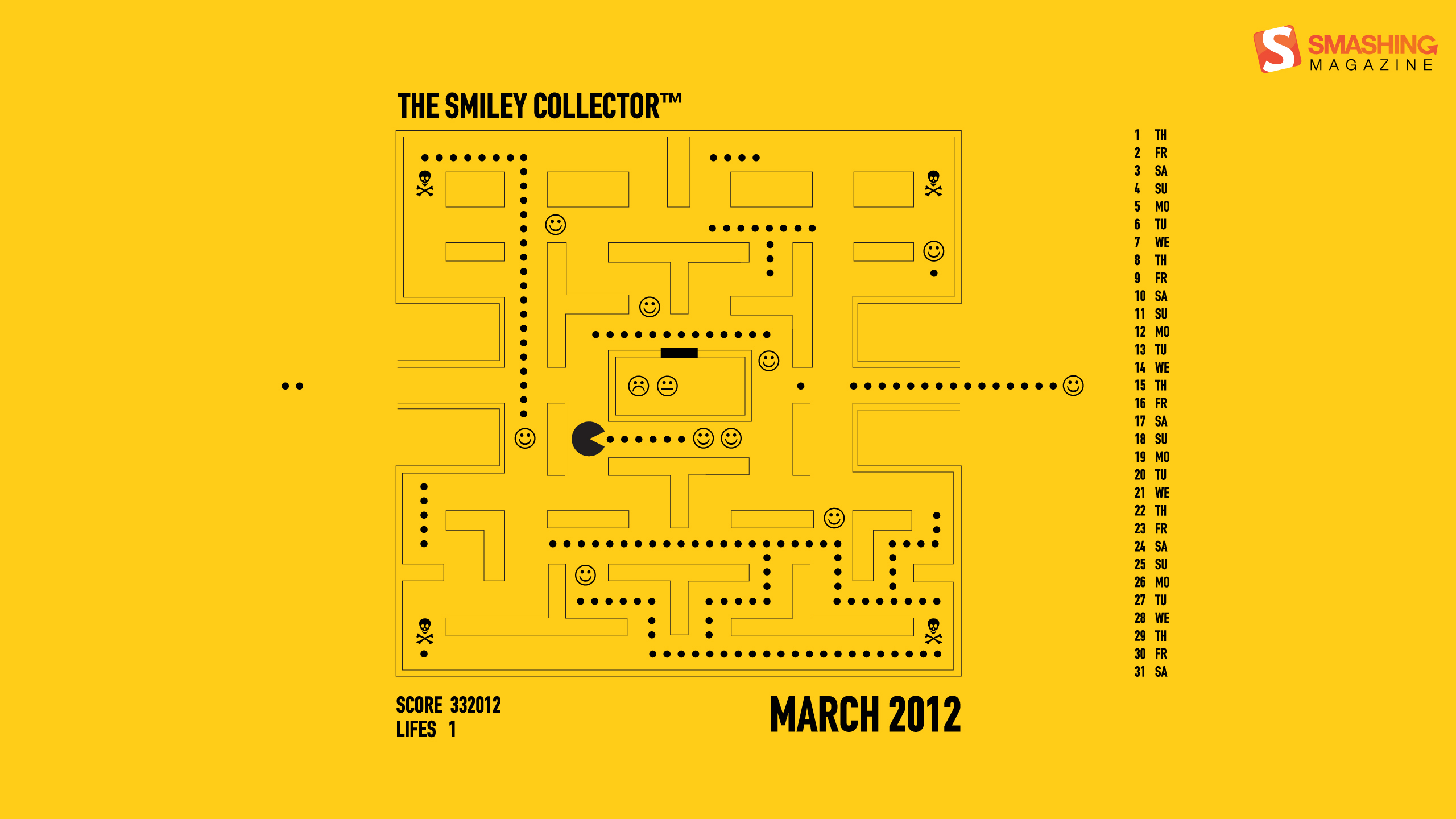
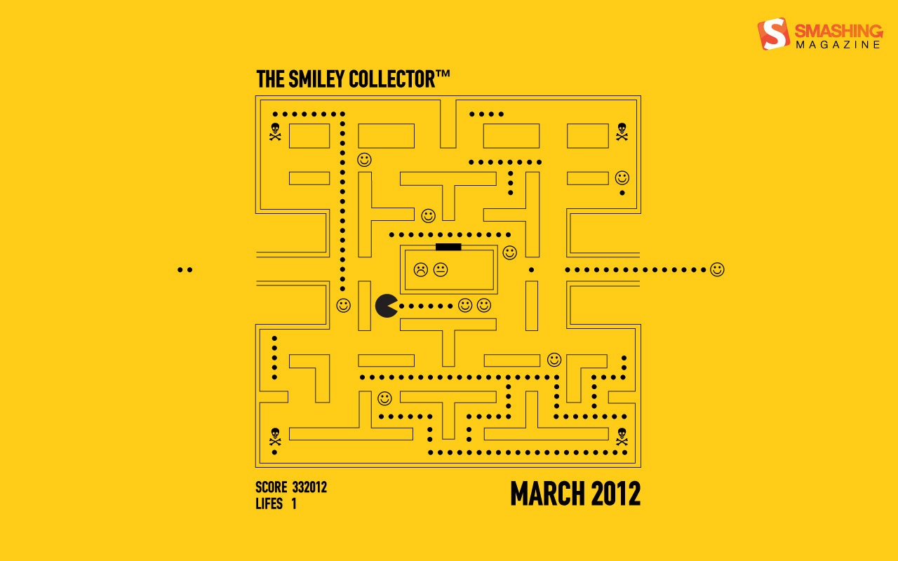
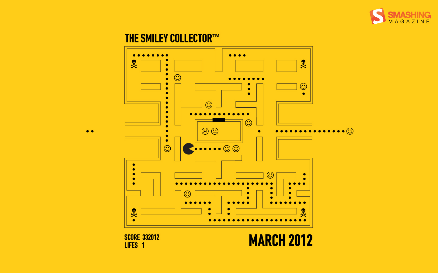
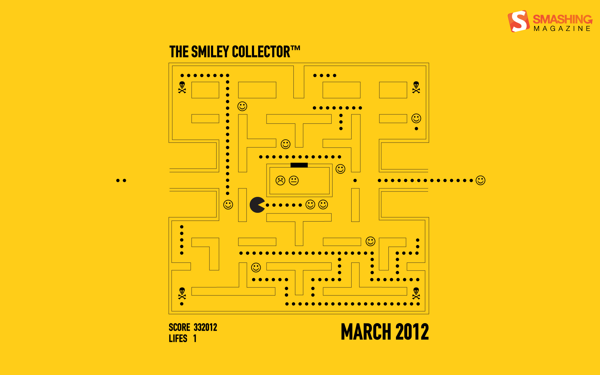
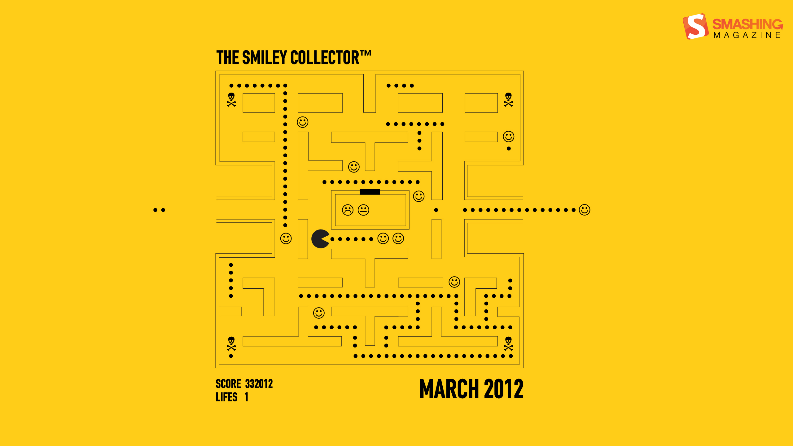
The Smiley Collector
Designed by George Kasapis from Cyprus.
- preview
- with calendar: 1024×1024, 1280×800, 1440×900, 1680×1050, 1920×1080, 1920×1200, 2560×1440
- without calendar: 1024×1024, 1280×800, 1440×900, 1680×1050, 1920×1080, 1920×1200, 2560×1440
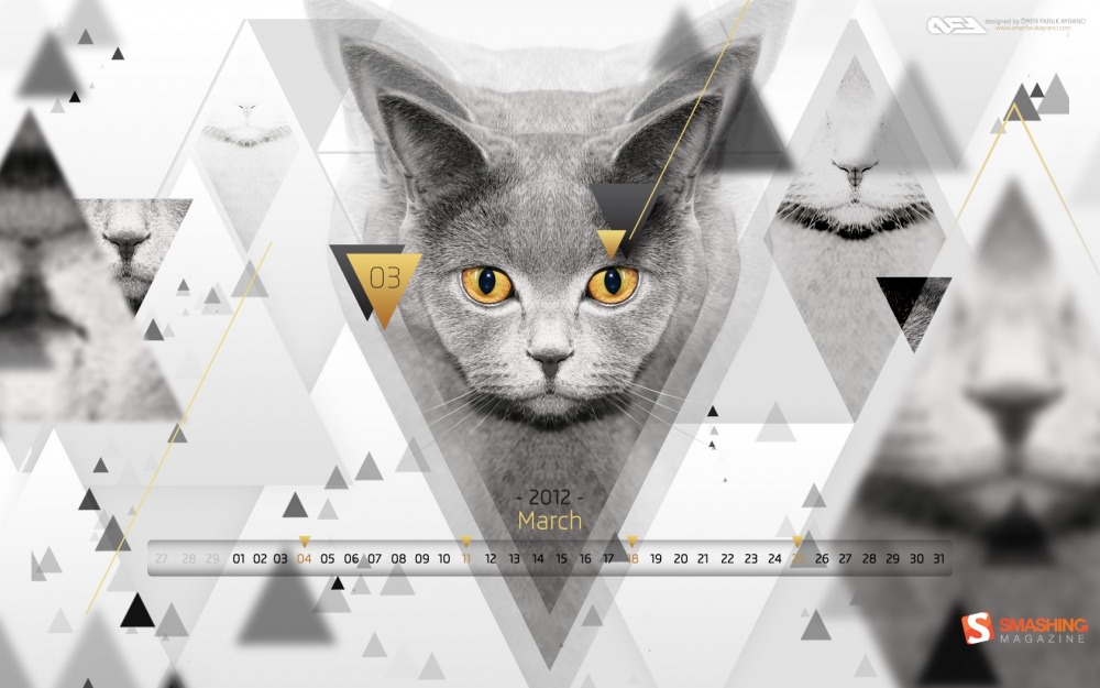
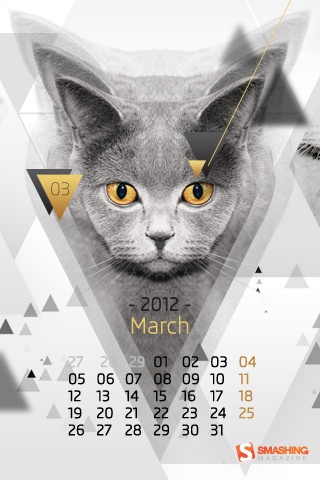
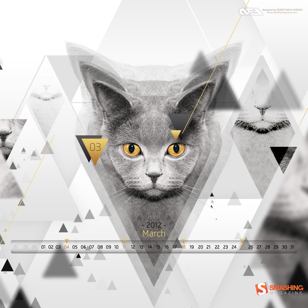
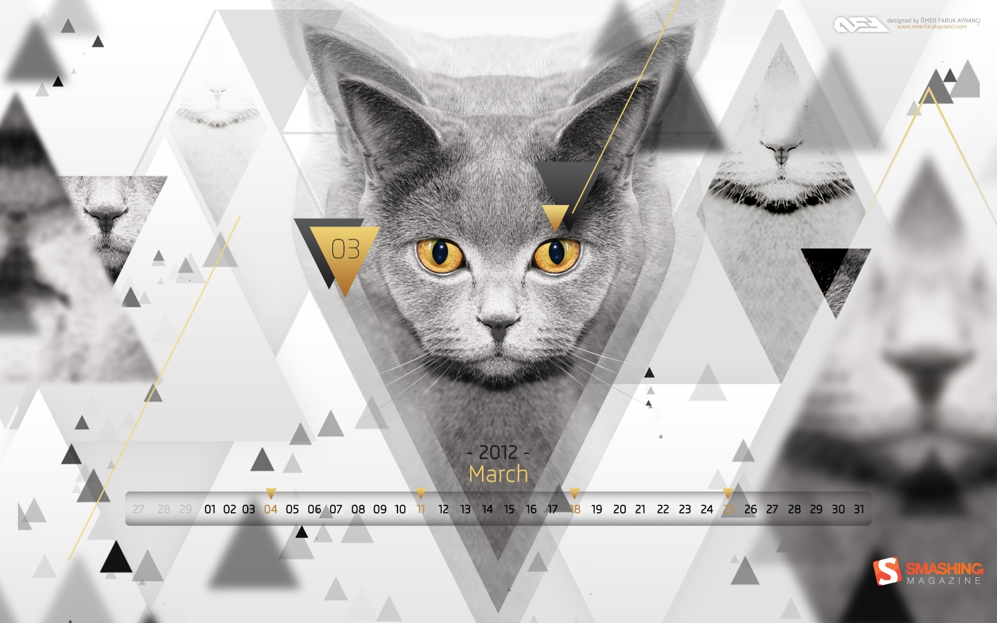
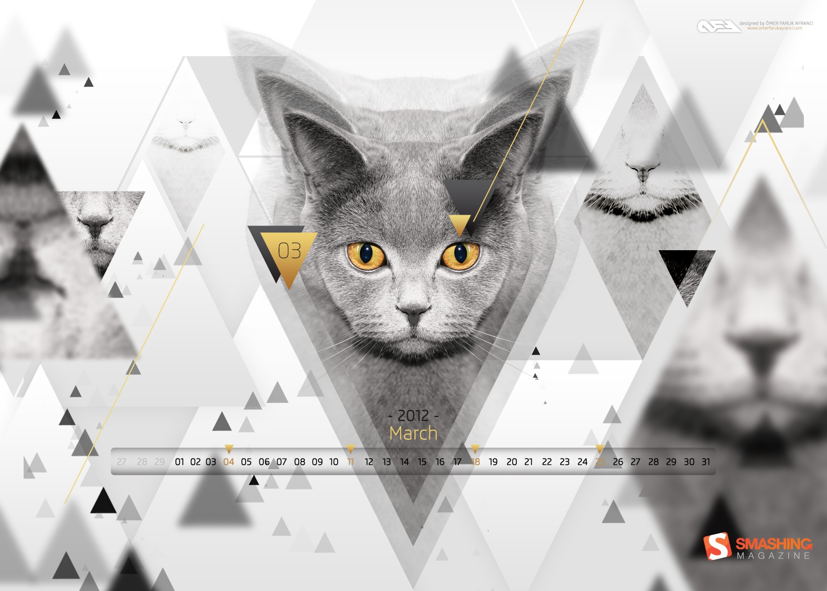
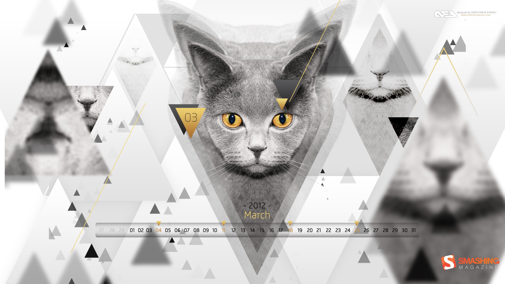
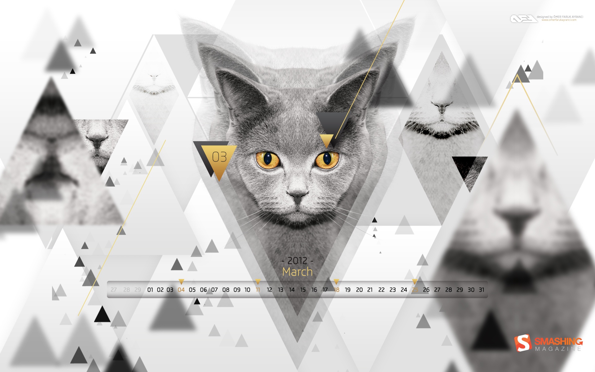
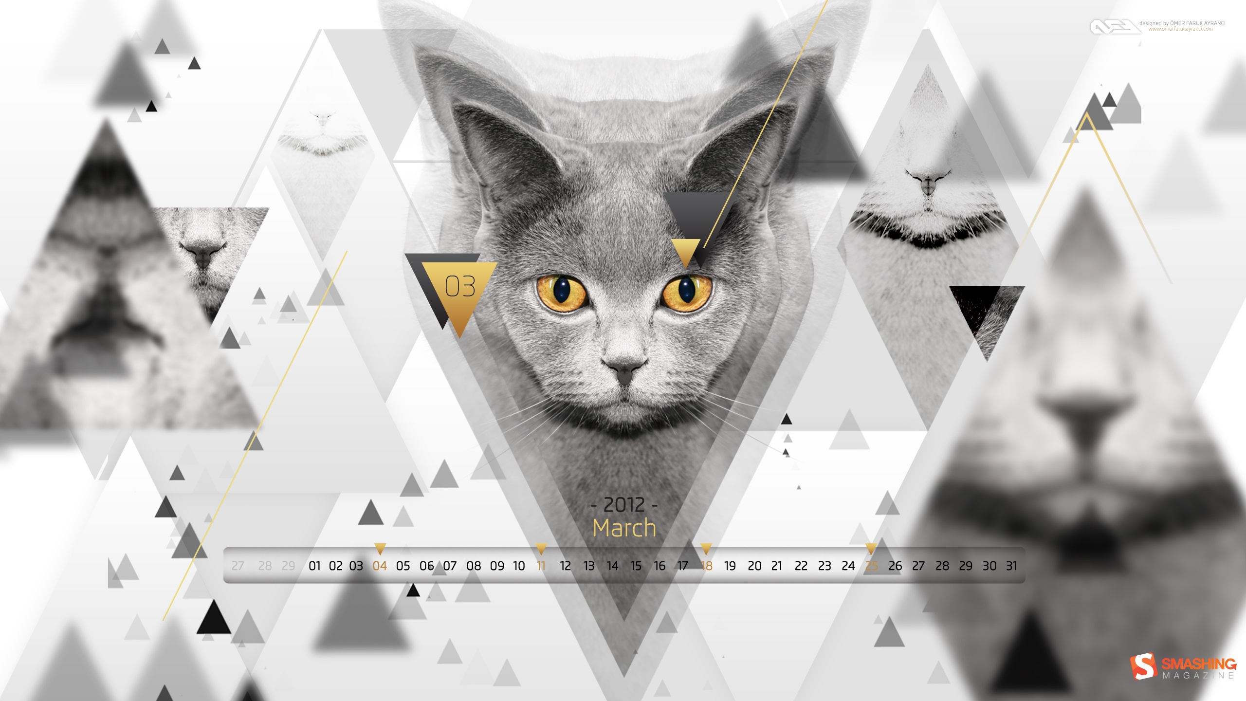
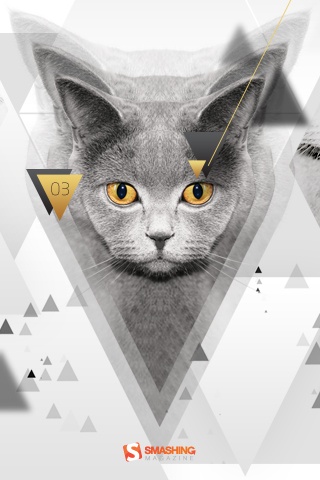
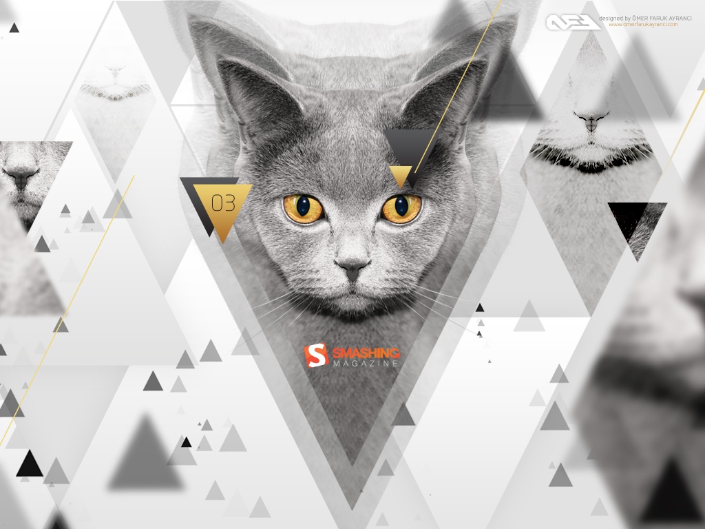
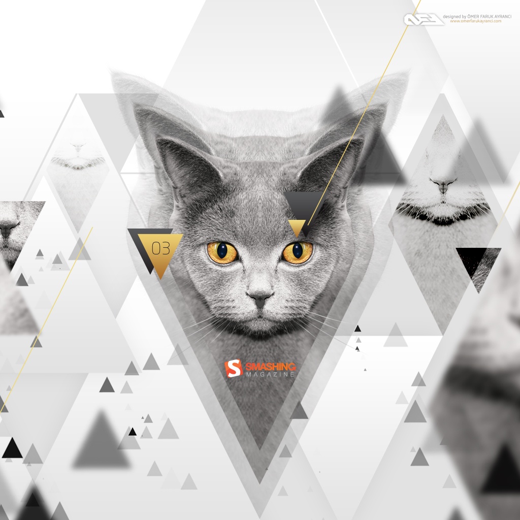
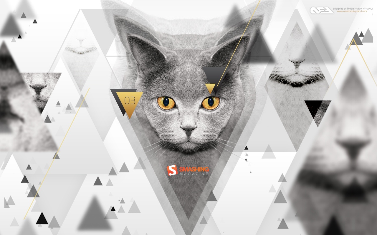
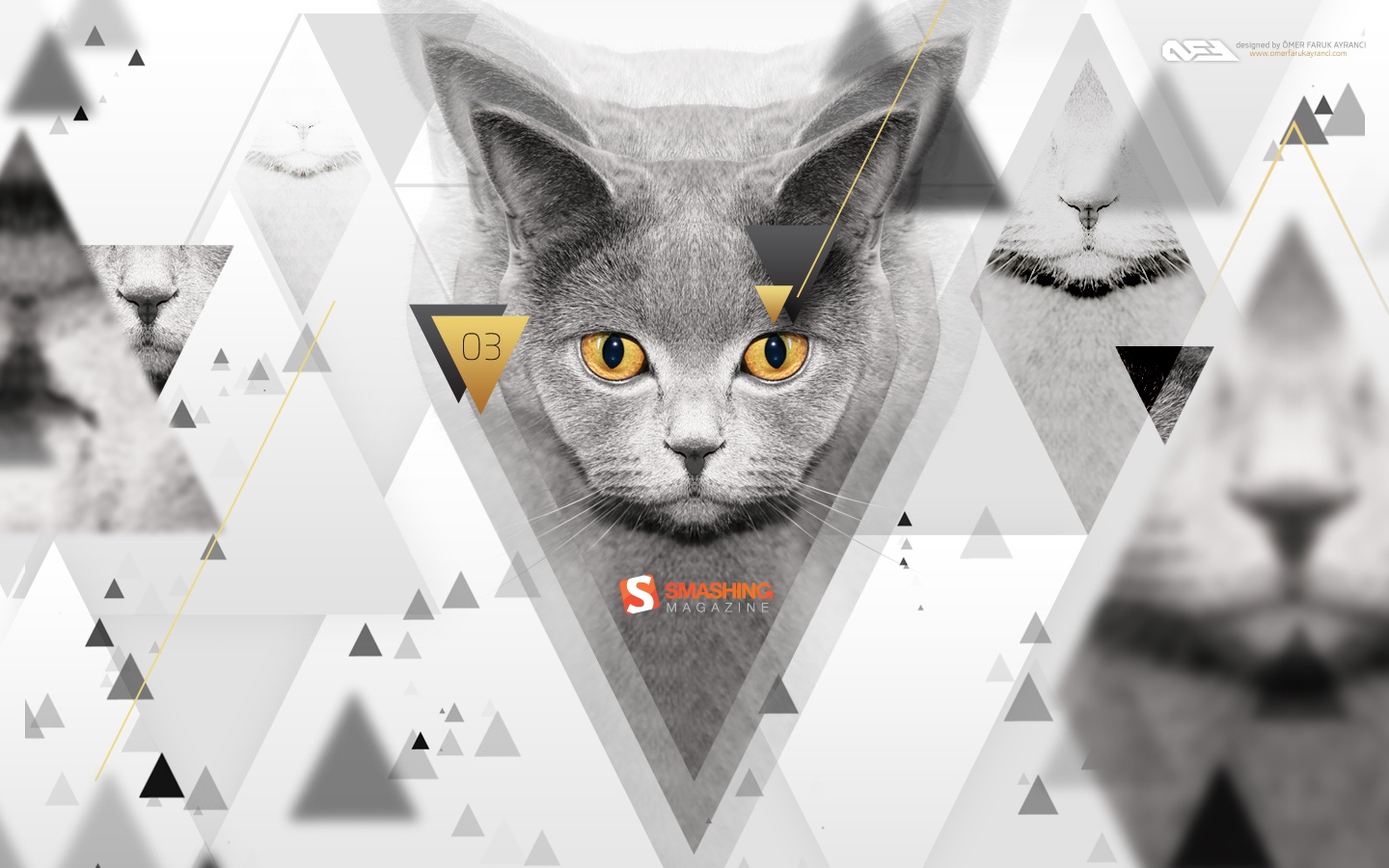
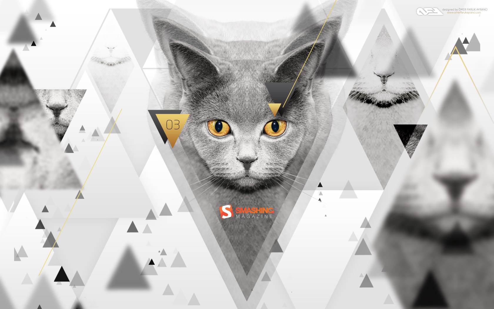
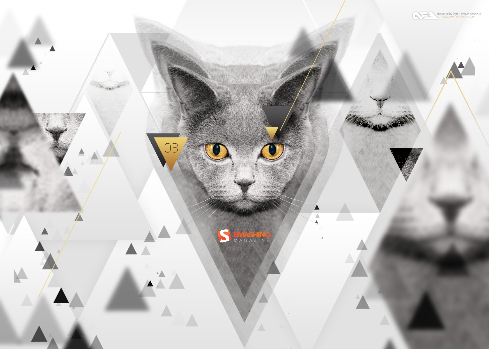
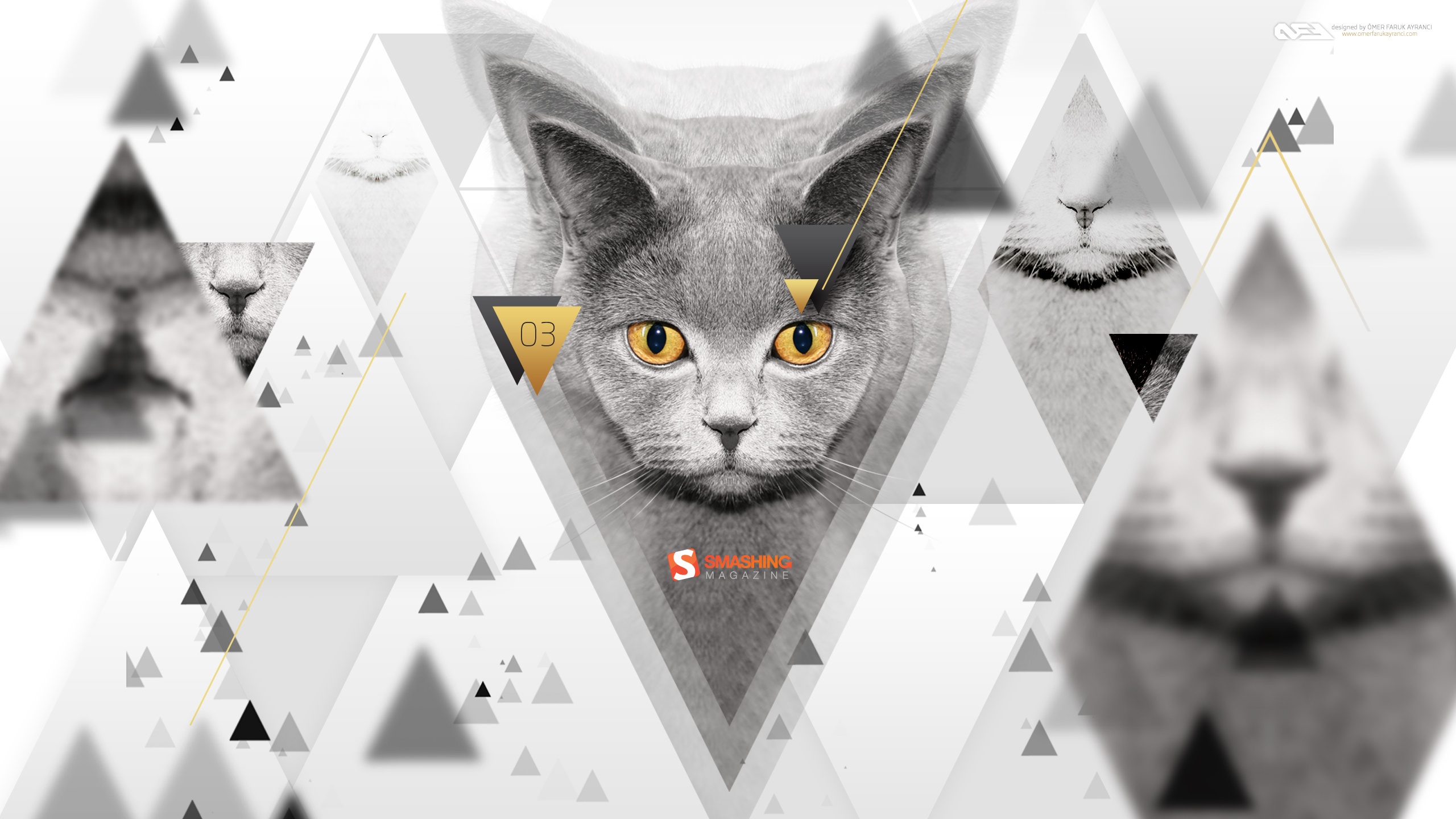
The Golden Eyed Cat
Designed by Omer Faruk Ayranci from Turkey.
- preview
- with calendar: 320×480, 1024×768, 1024×1024, 1280×800, 1280×1024, 1440×900, 1680×1050, 1680×1200, 1920×1080, 1920×1200, 2560×1440
- without calendar: 320×480, 1024×768, 1024×1024, 1280×800, 1280×1024, 1440×900, 1680×1050, 1680×1200, 1920×1080, 1920×1200, 2560×1440
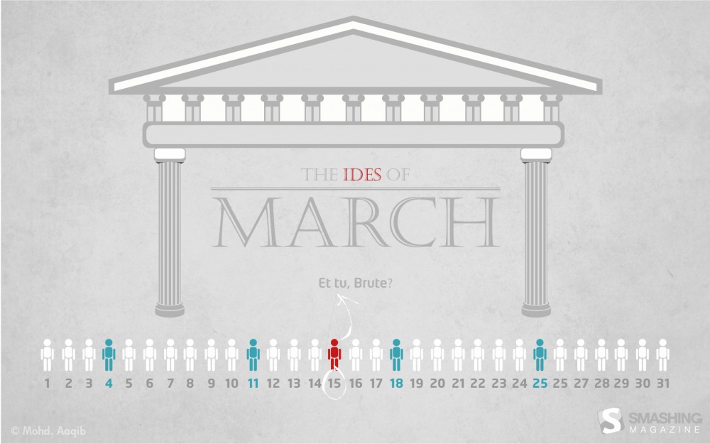
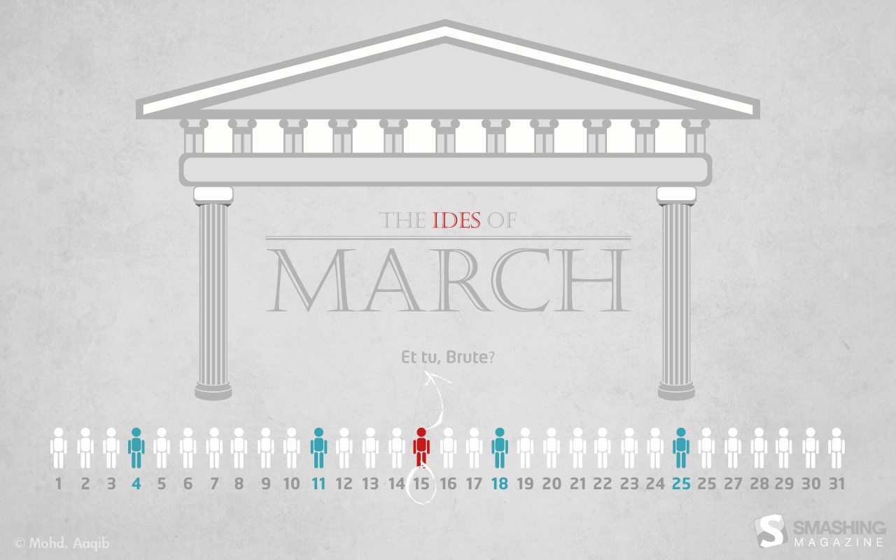
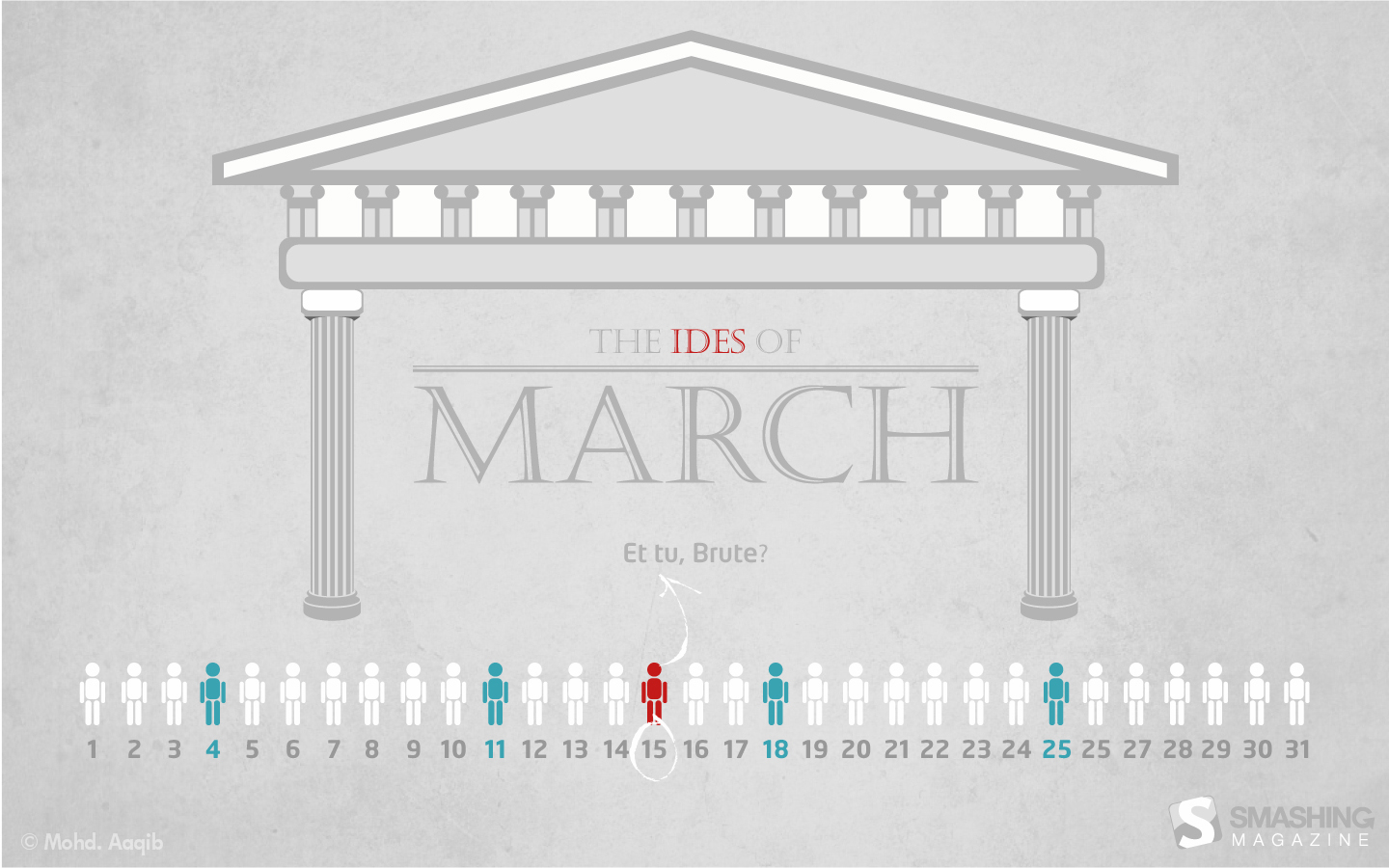
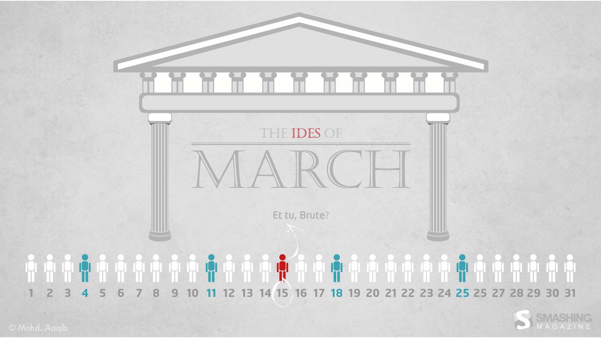
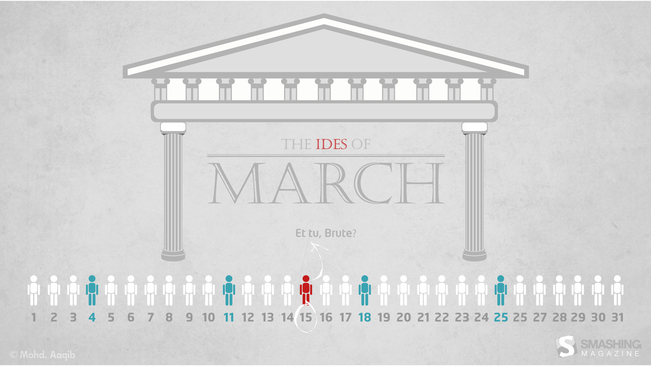
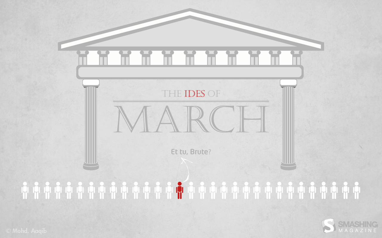
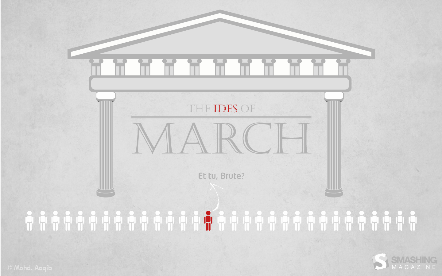
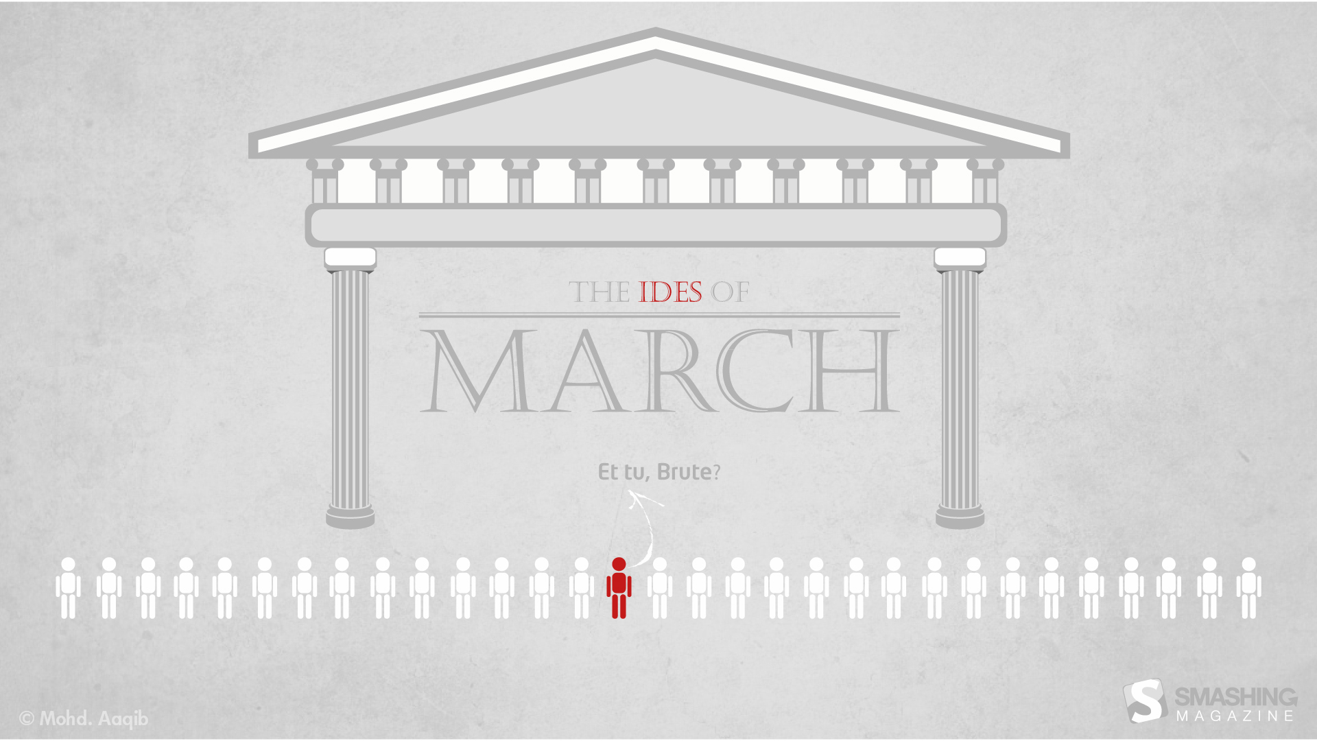
Ides Of March
"This is inspired by the play “Julius Caesar” by William Shakespeare, that I read a few years ago in school." Designed by Mohammed Aaqib from India.
- preview
- with calendar: 1280×800, 1440×900, 1680×1050, 1920×1080, 1920×1200, 2560×1440
- without calendar: 1280×800, 1440×900, 1680×1050, 1920×1080, 1920×1200, 2560×1440
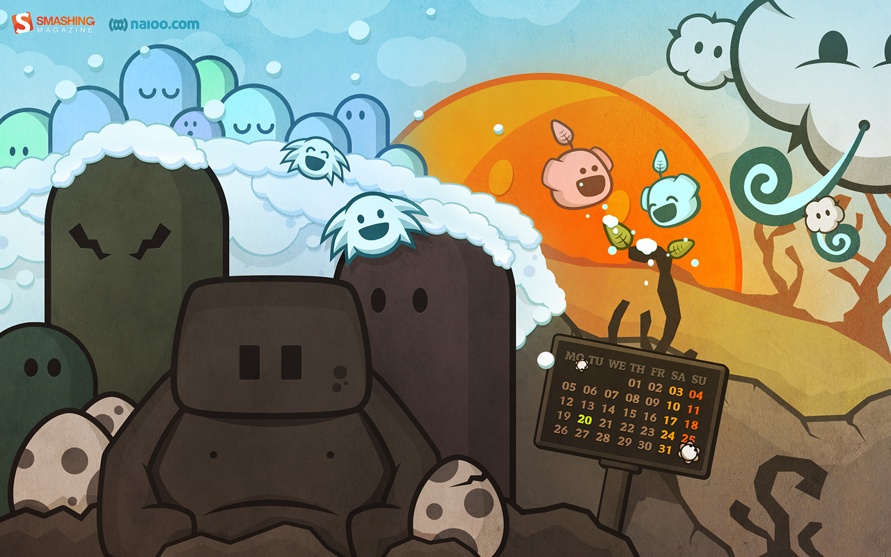
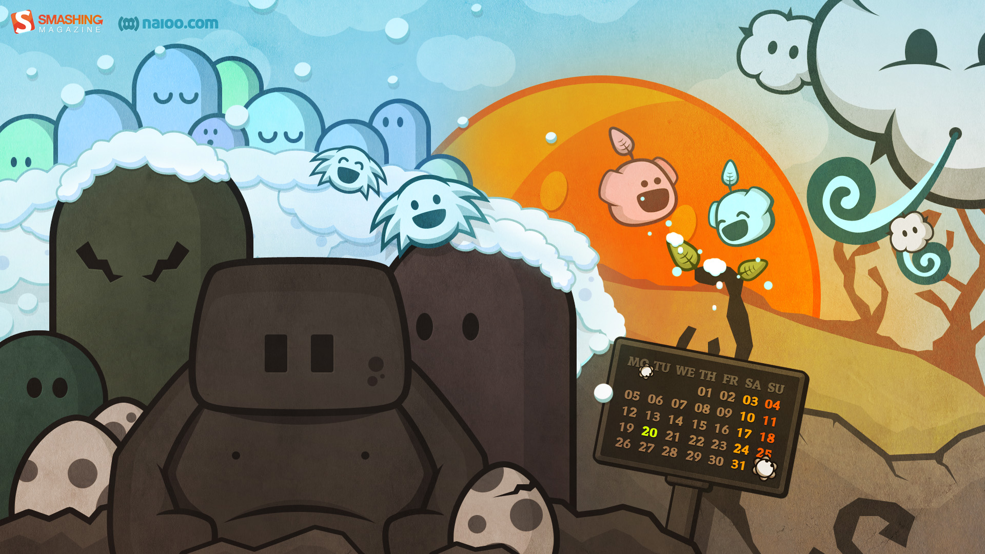
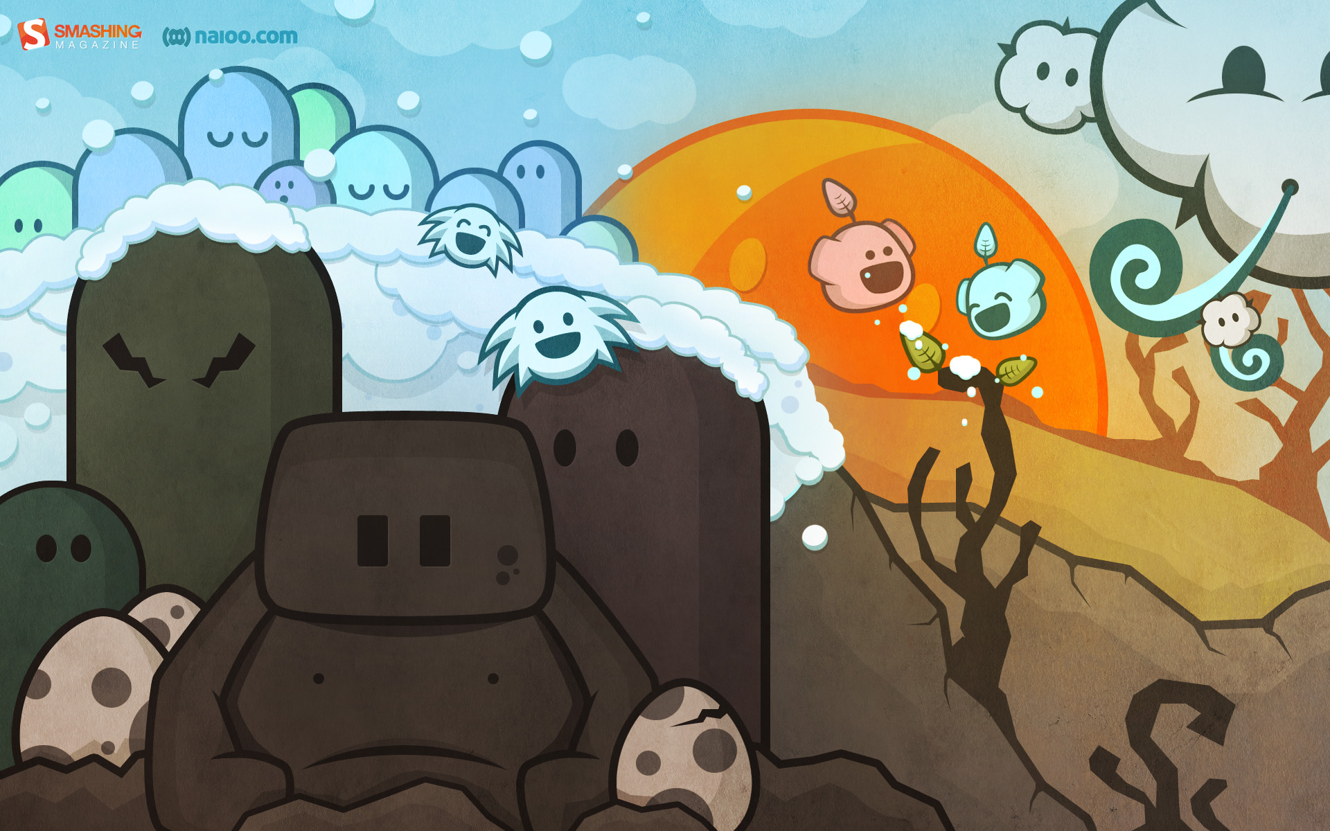
Waiting For Spring
"As days are getting longer again and the first few flowers start to bloom, we are all waiting for Spring to finally arrive. First day of Spring is marked in the calendar for you to remember :)." Designed by Naioo from Germany.

- preview
- with calendar: 1280×800, 1366×768, 1440×900, 1680×1050, 1920×1080, 1920×1200
- without calendar: 1280×800, 1366×768, 1440×900, 1680×1050, 1920×1080, 1920×1200
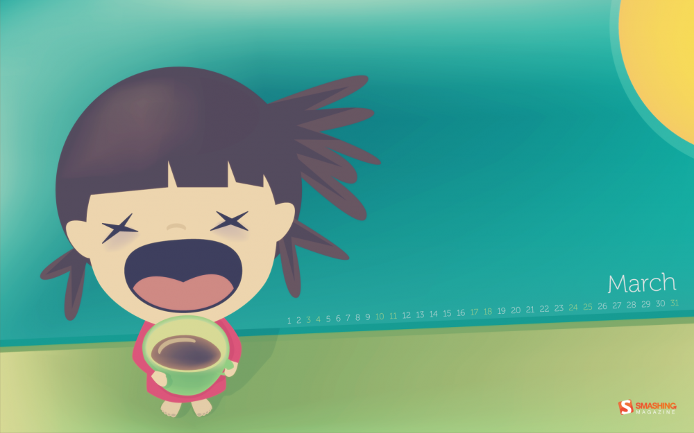
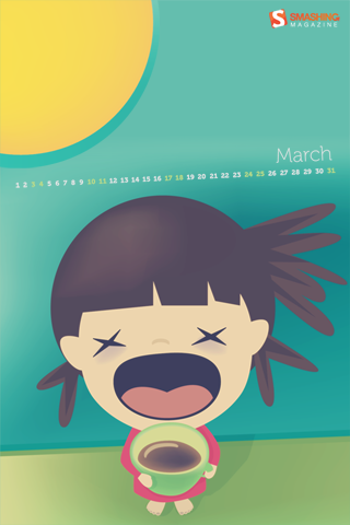
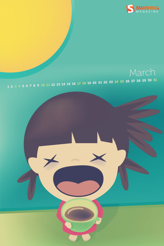
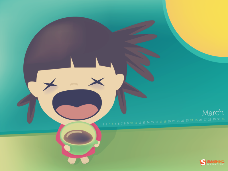
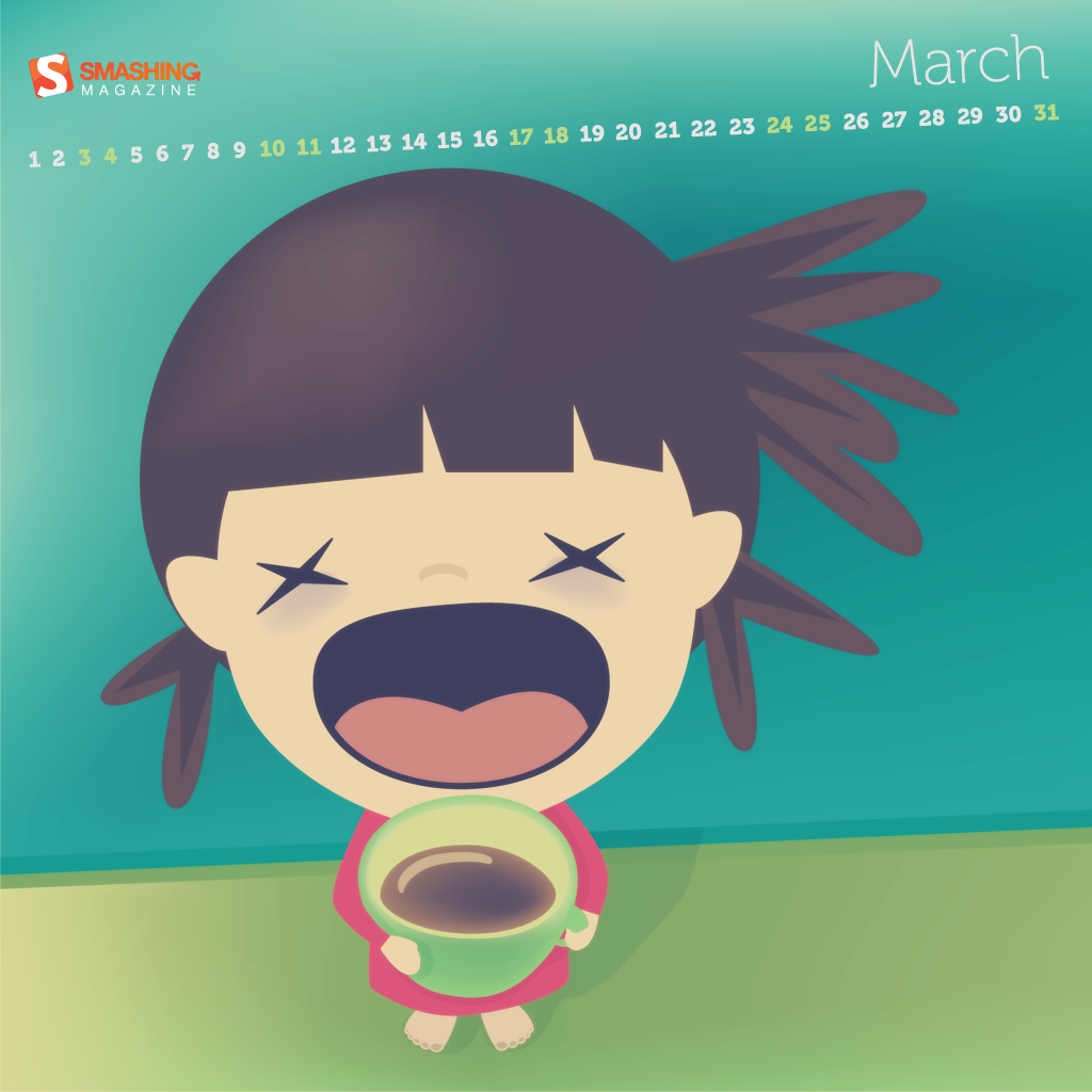
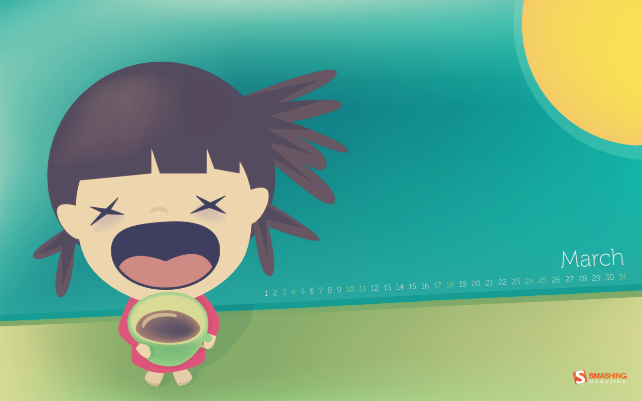
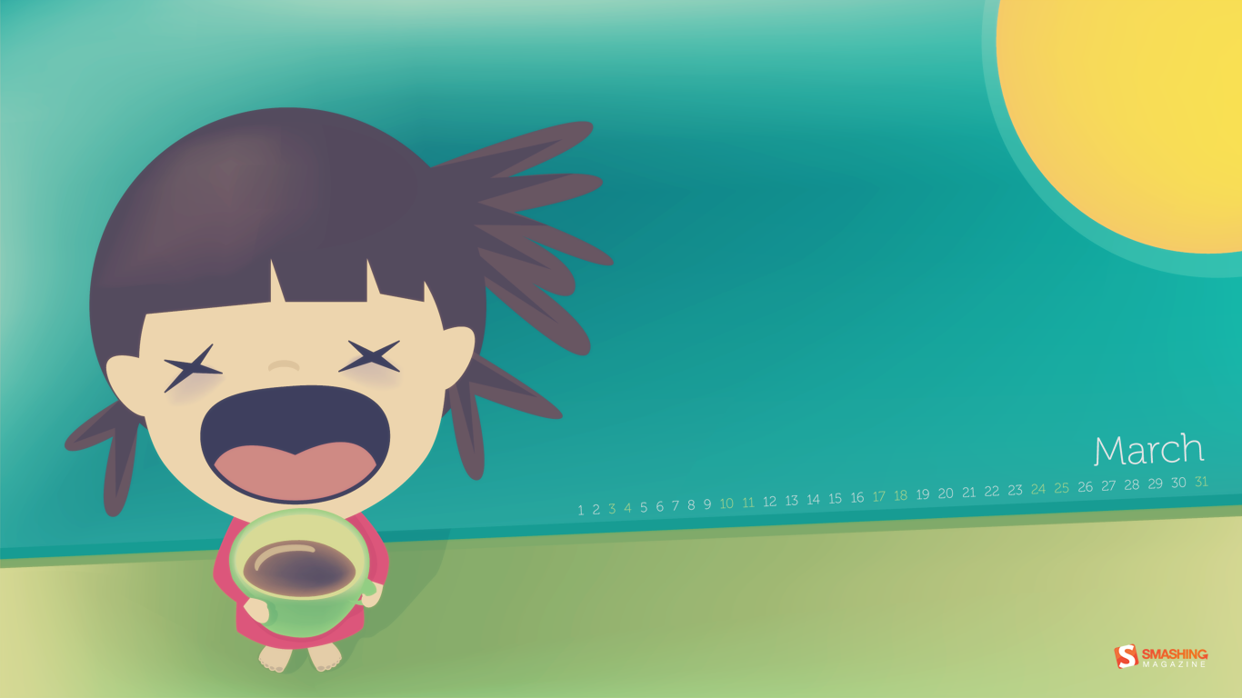
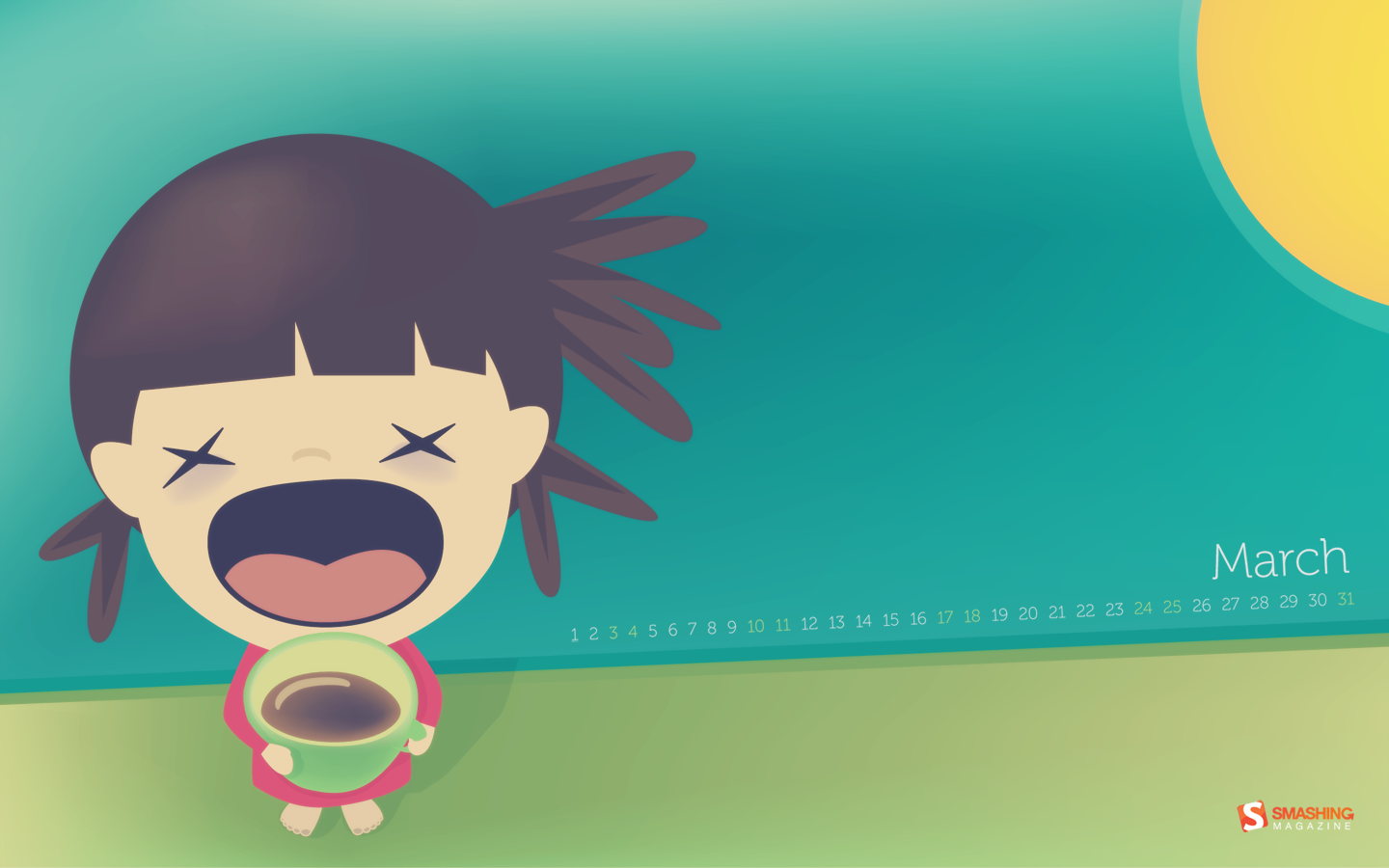
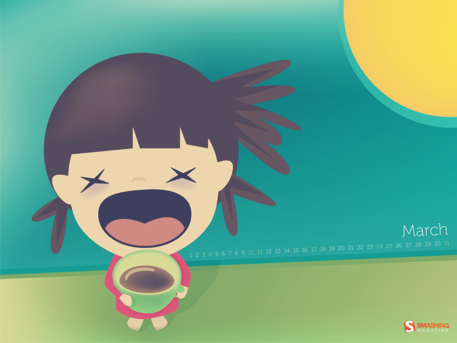
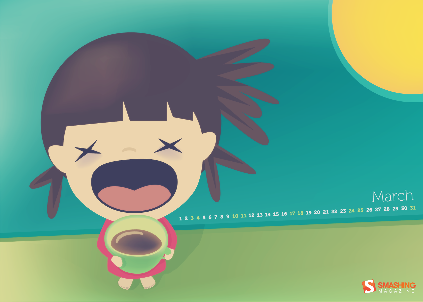
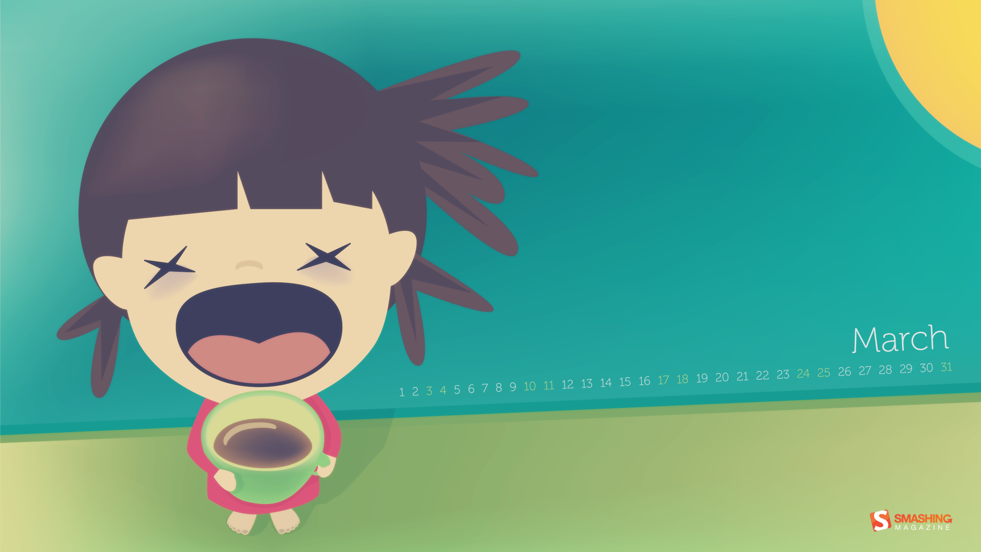
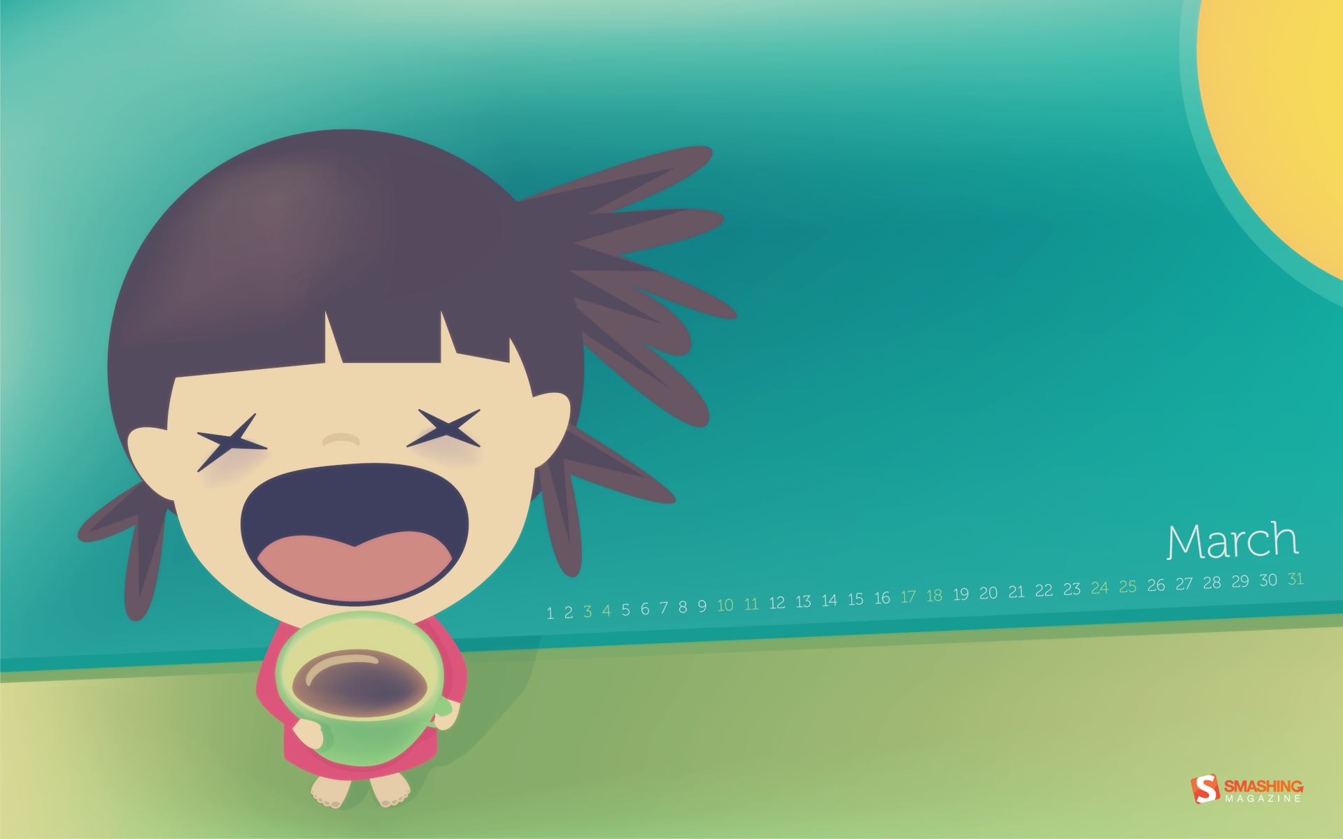
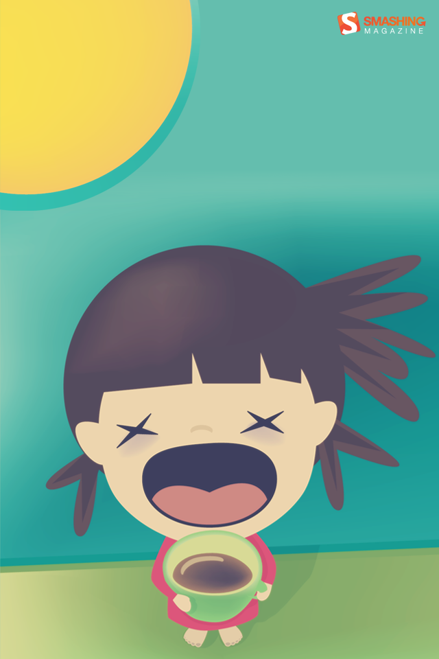
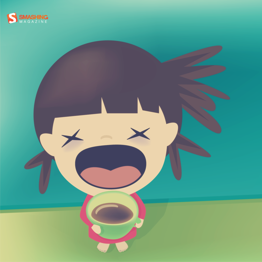
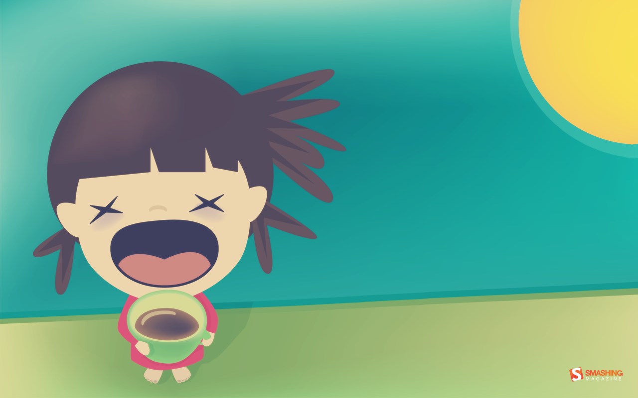
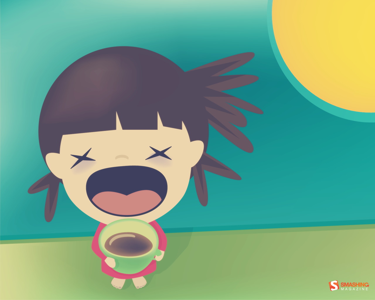
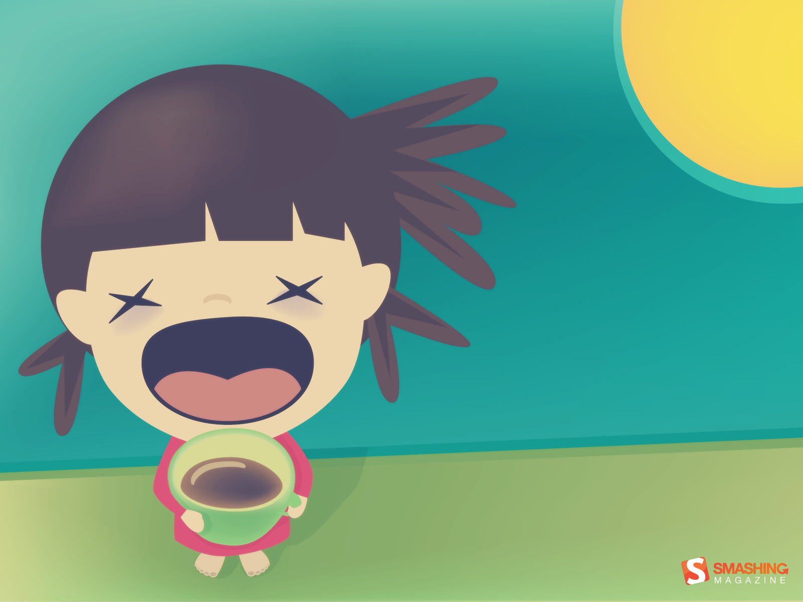
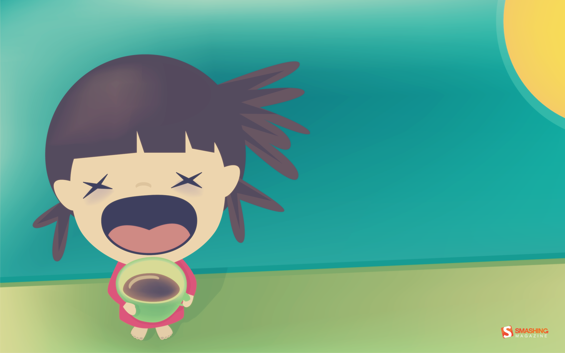
Good Morning
"Good morning!" Designed by Maja Bencic from Croatia.
- preview
- with calendar: 320×480, 640×960, 800×600, 1024×1024, 1280×800, 1280×1024, 1366×768, 1440×900, 1600×1200, 1680×1050, 1680×1200, 1920×1080, 1920×1200
- without calendar: 320×480, 640×960, 800×600, 1024×1024, 1280×800, 1280×1024, 1366×768, 1440×900, 1600×1200, 1680×1050, 1920×1080, 1920×1200
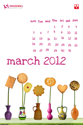
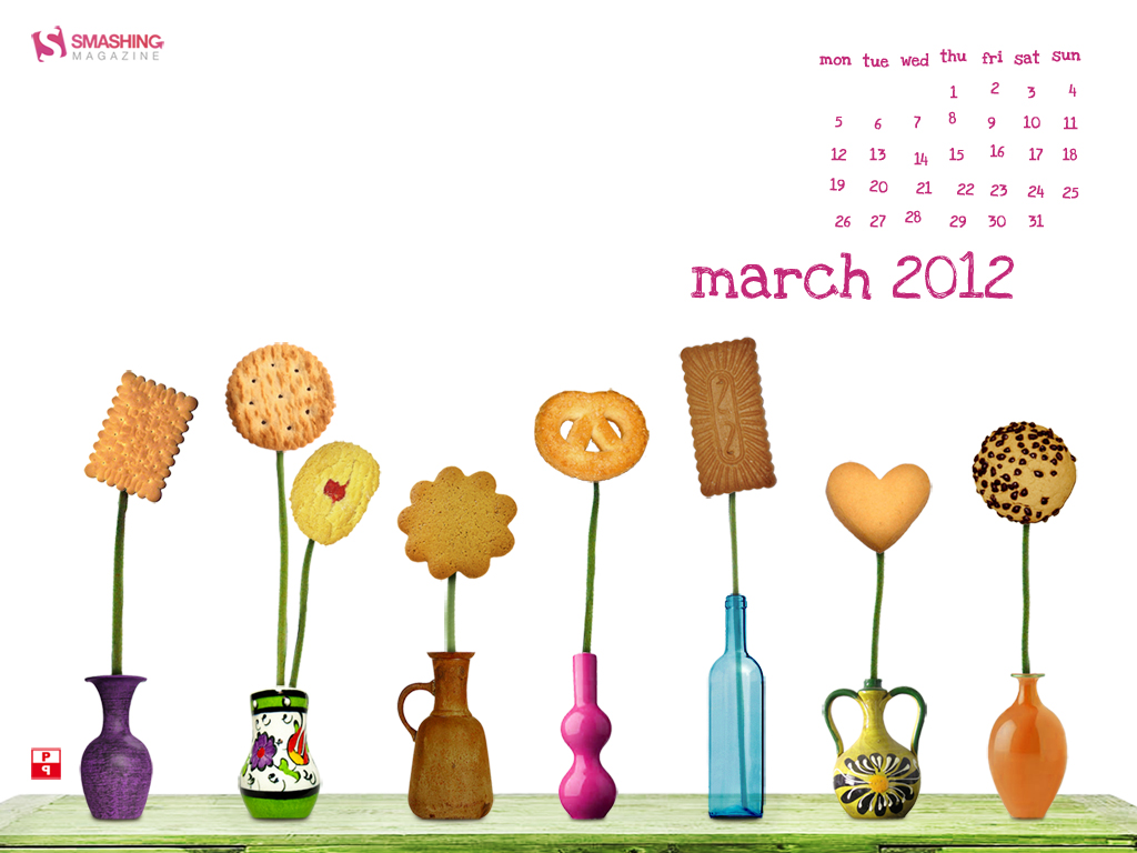
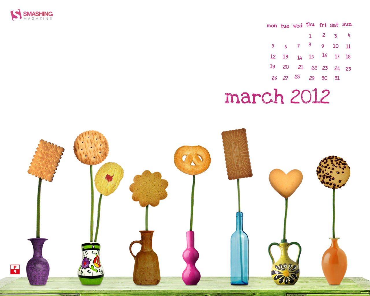
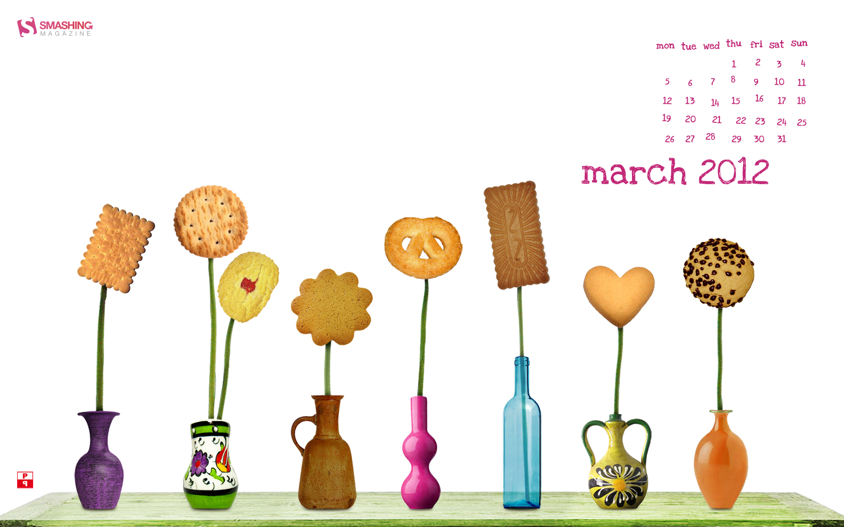
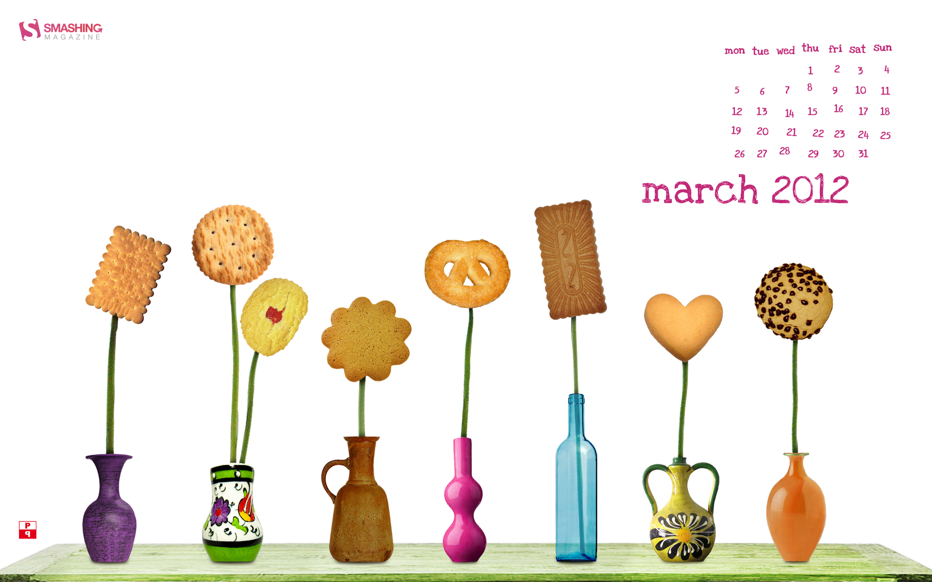
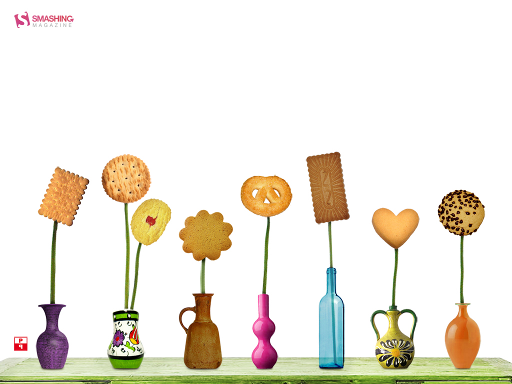
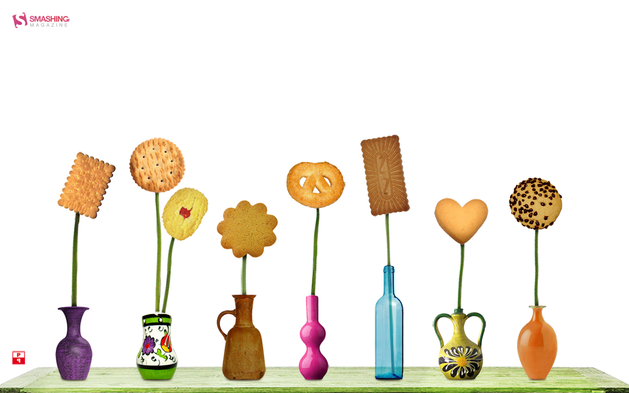
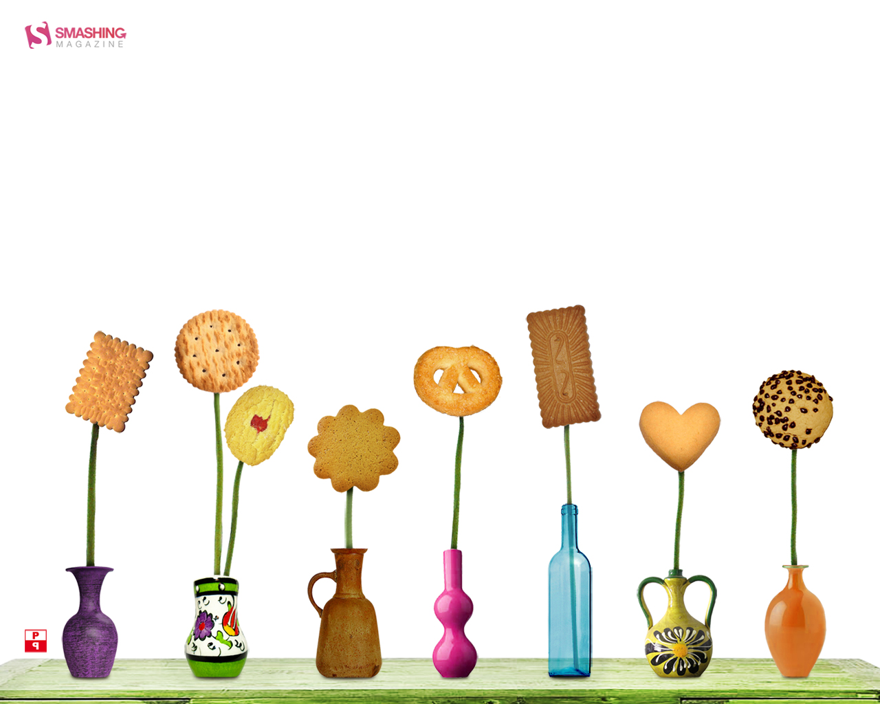
Cookie Fun
Designed by Pietje Precies from The Netherlands.

- preview
- with calendar: 320×480, 1024×768, 1280×800, 1280×1024, 1440×900, 1680×1050, 1920×1200
- without calendar: 320×480, 1024×768, 1280×800, 1280×1024, 1440×900, 1680×1050, 1920×1200
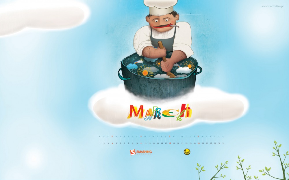
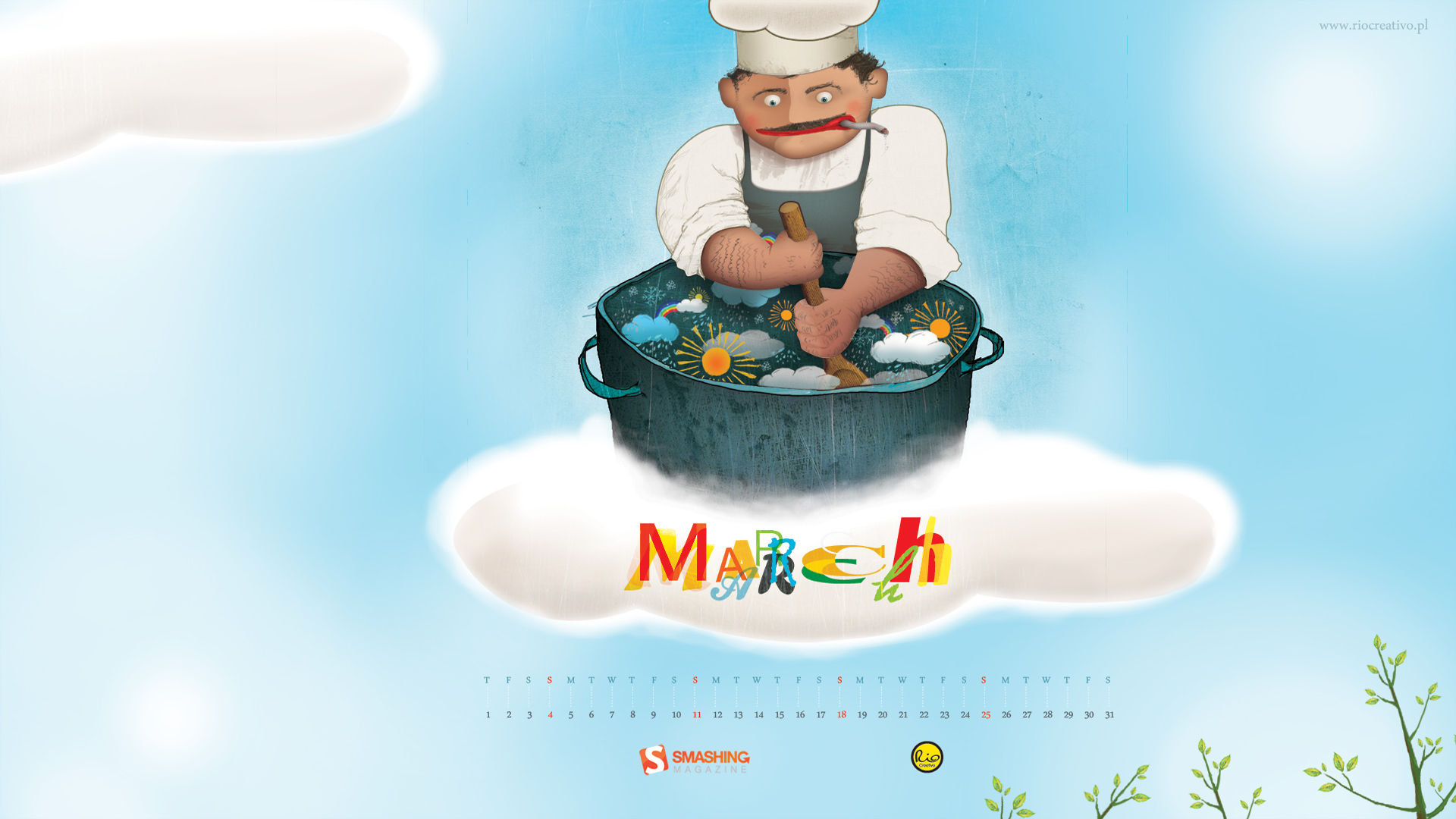
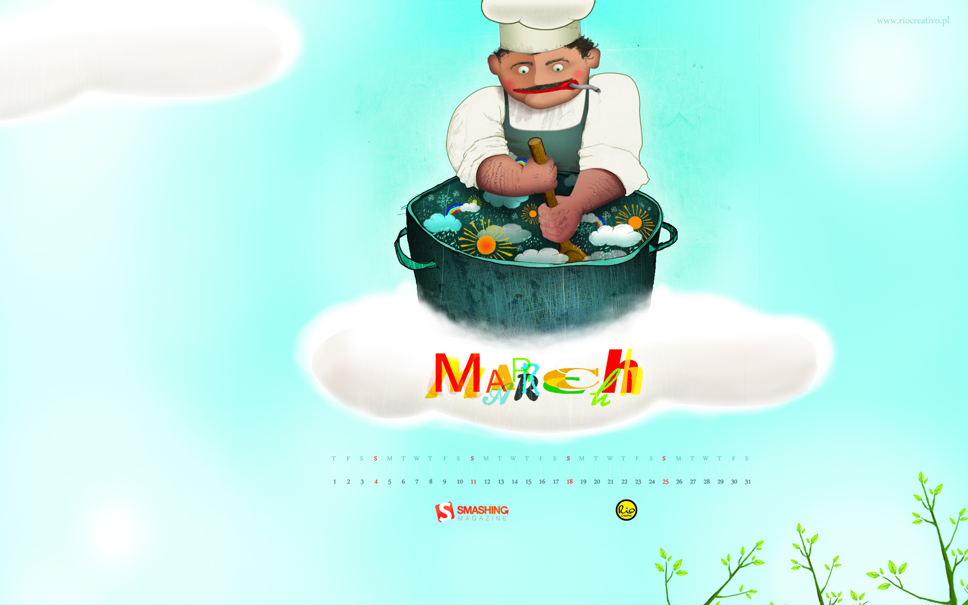
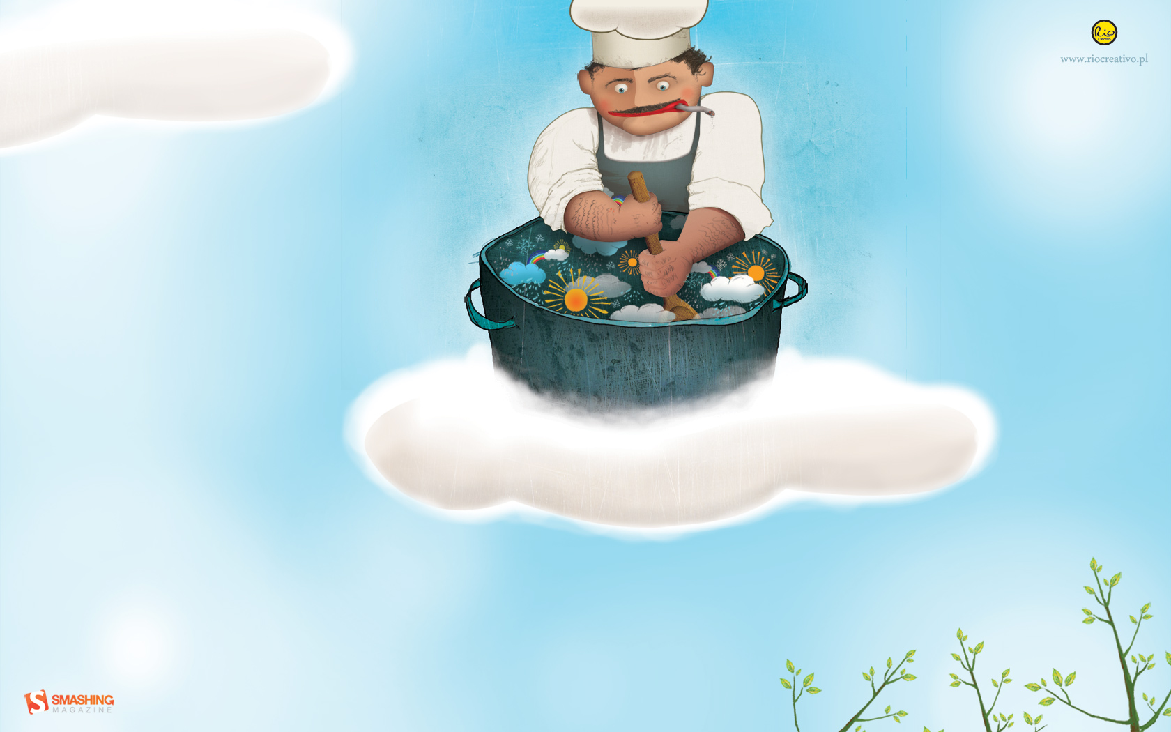
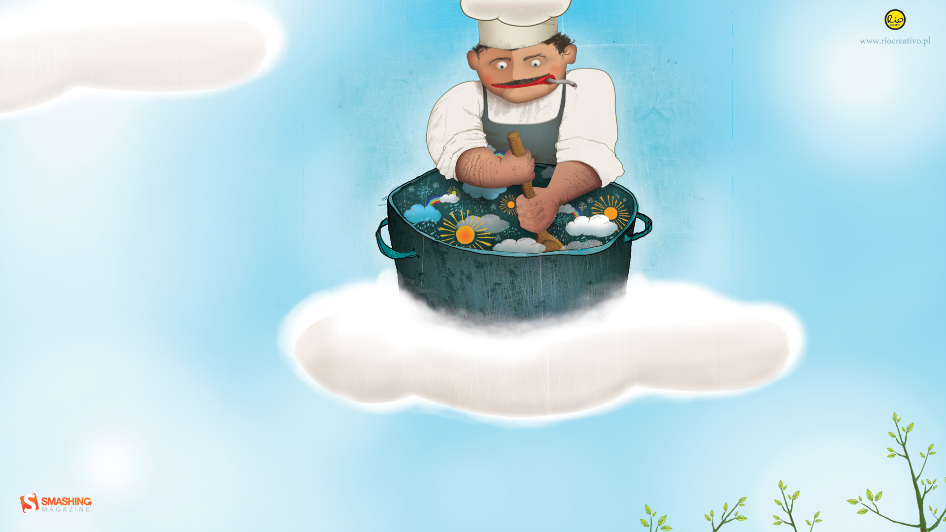
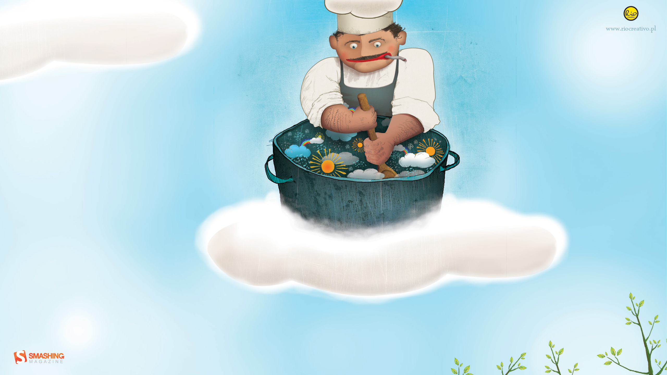
March Fusion
Designed by Rio Creativo from Poland.
- preview
- with calendar: 1280×800, 1680×1050, 1920×1080, 1920×1200, 2560×1440
- without calendar: 1280×800, 1680×1050, 1920×1080, 1920×1200, 2560×1440
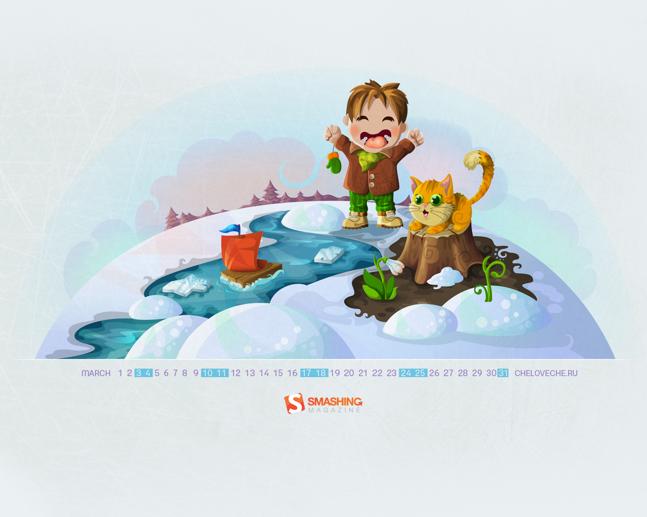
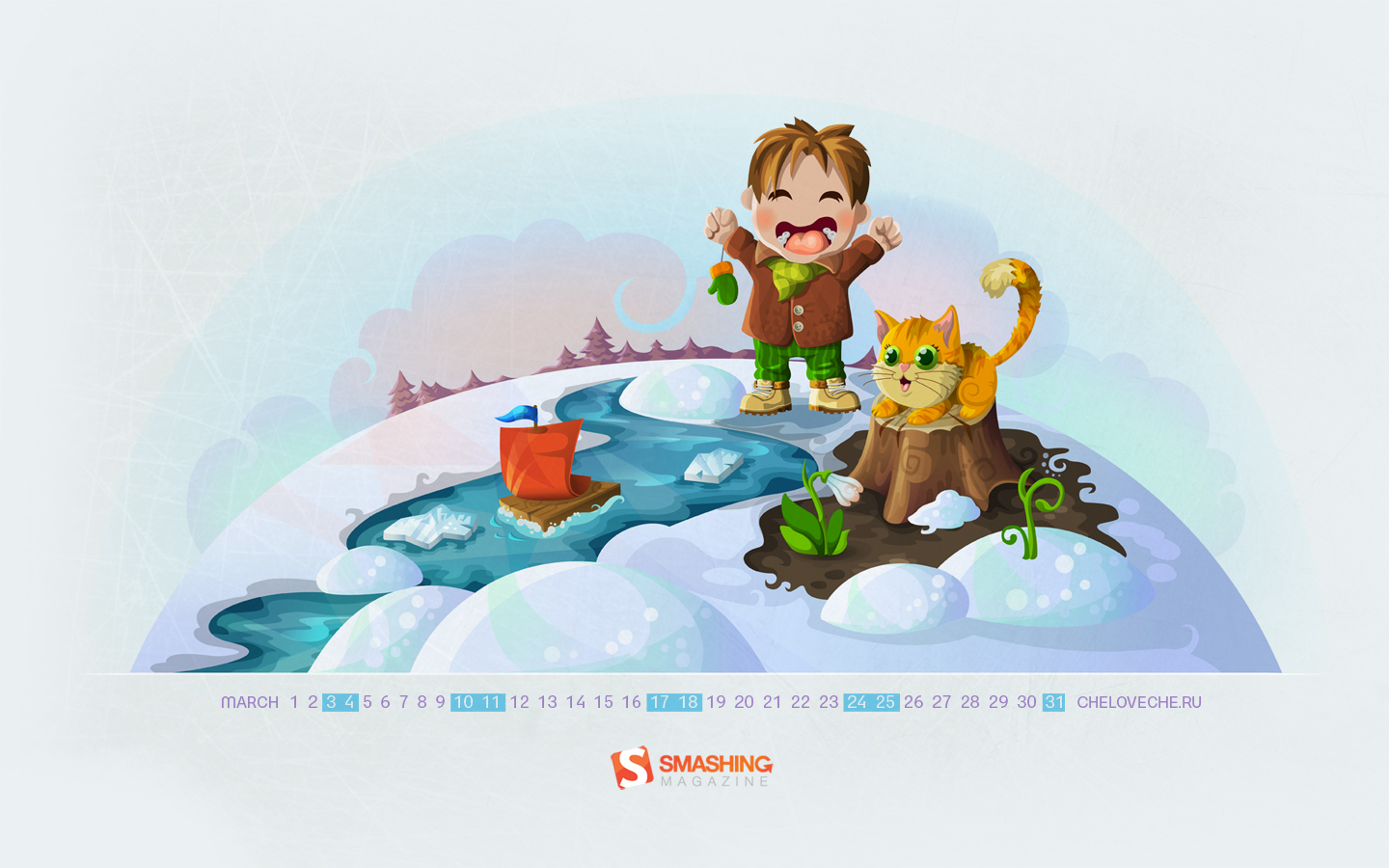
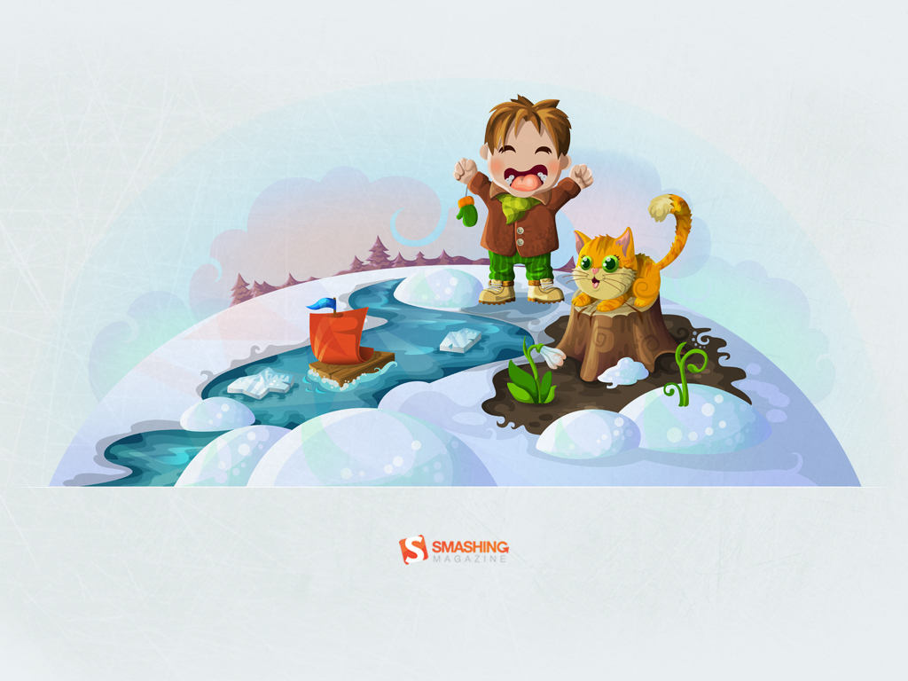
Spring Creek
"A boy and a cat playing near the creek." Designed by Cheloveche.ru from Russia.

- preview
- with calendar: 1024×768, 1280×800, 1280×1024, 1440×900, 1680×1050, 1920×1200
- without calendar: 1024×768, 1280×800, 1280×1024, 1440×900, 1680×1050, 1920×1200
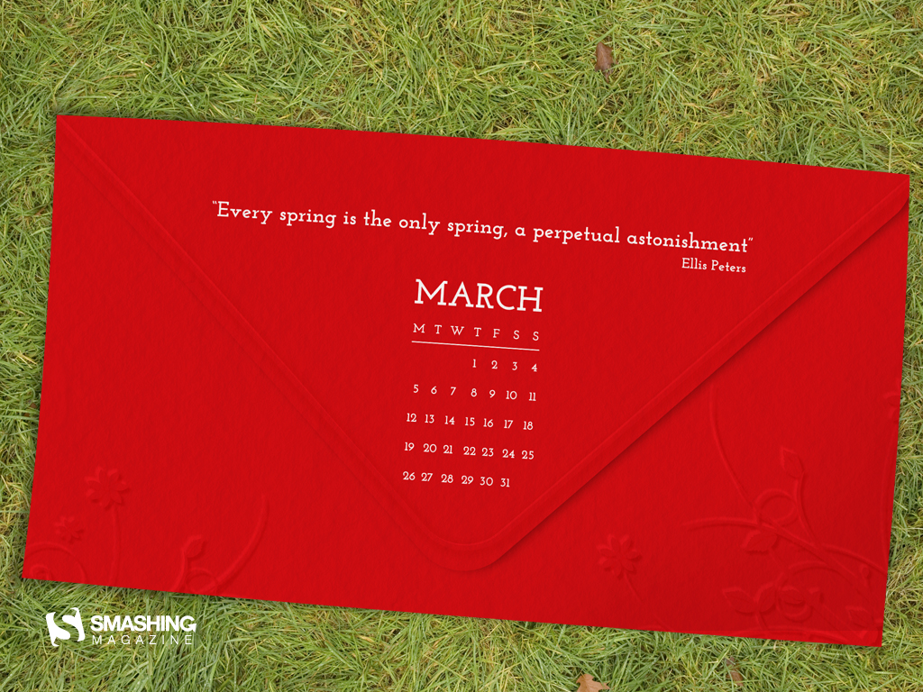
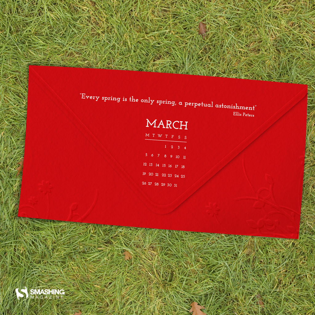
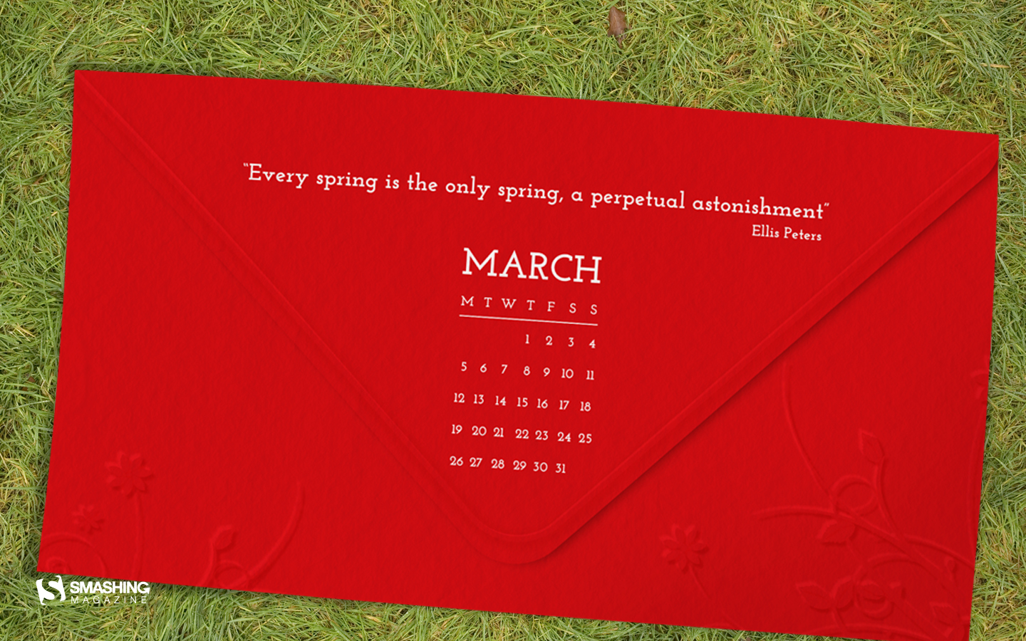
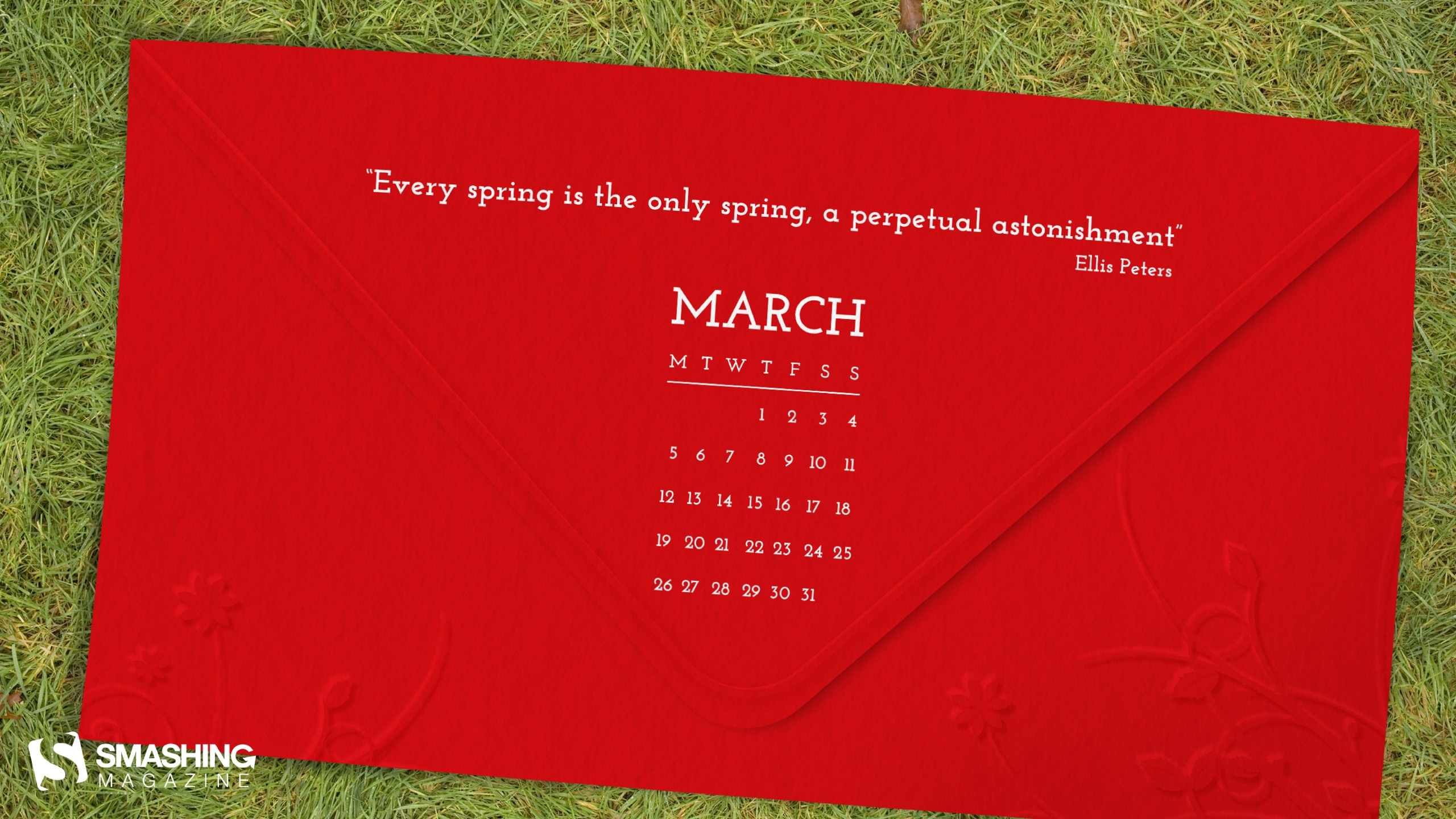
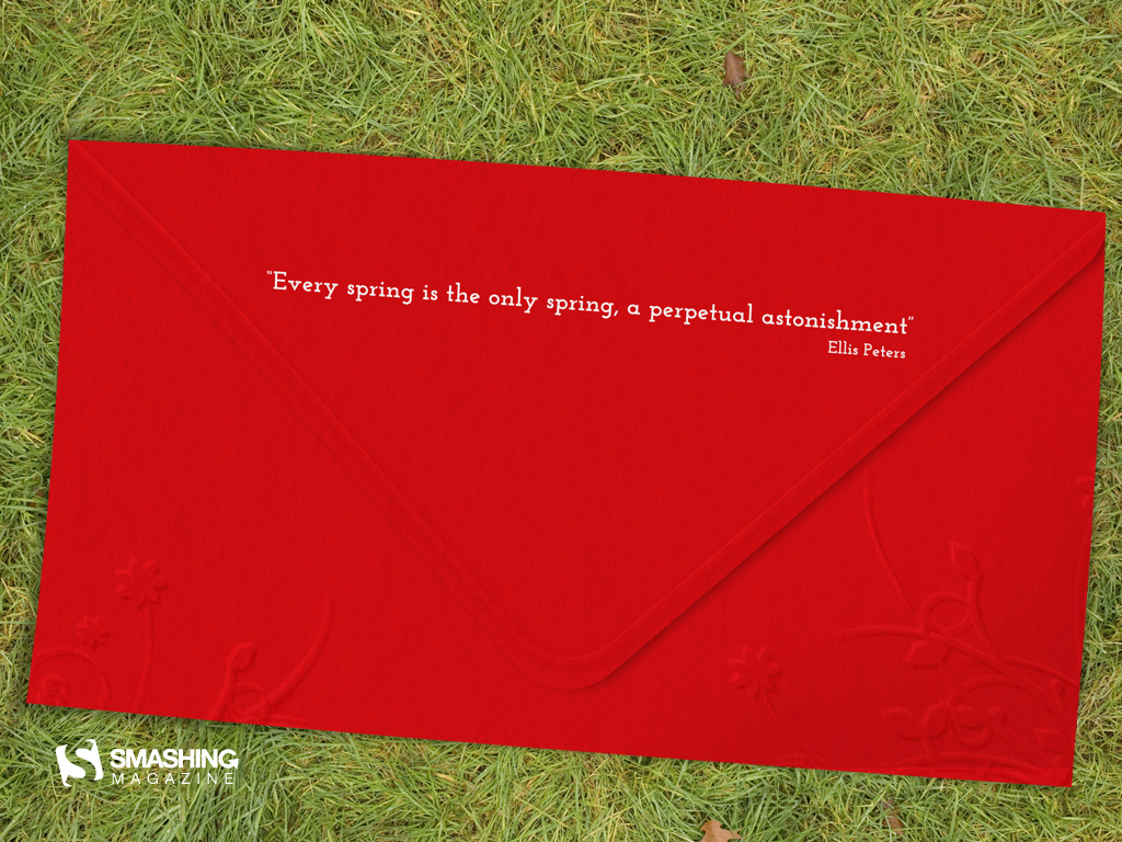
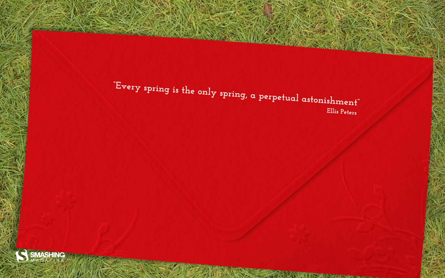
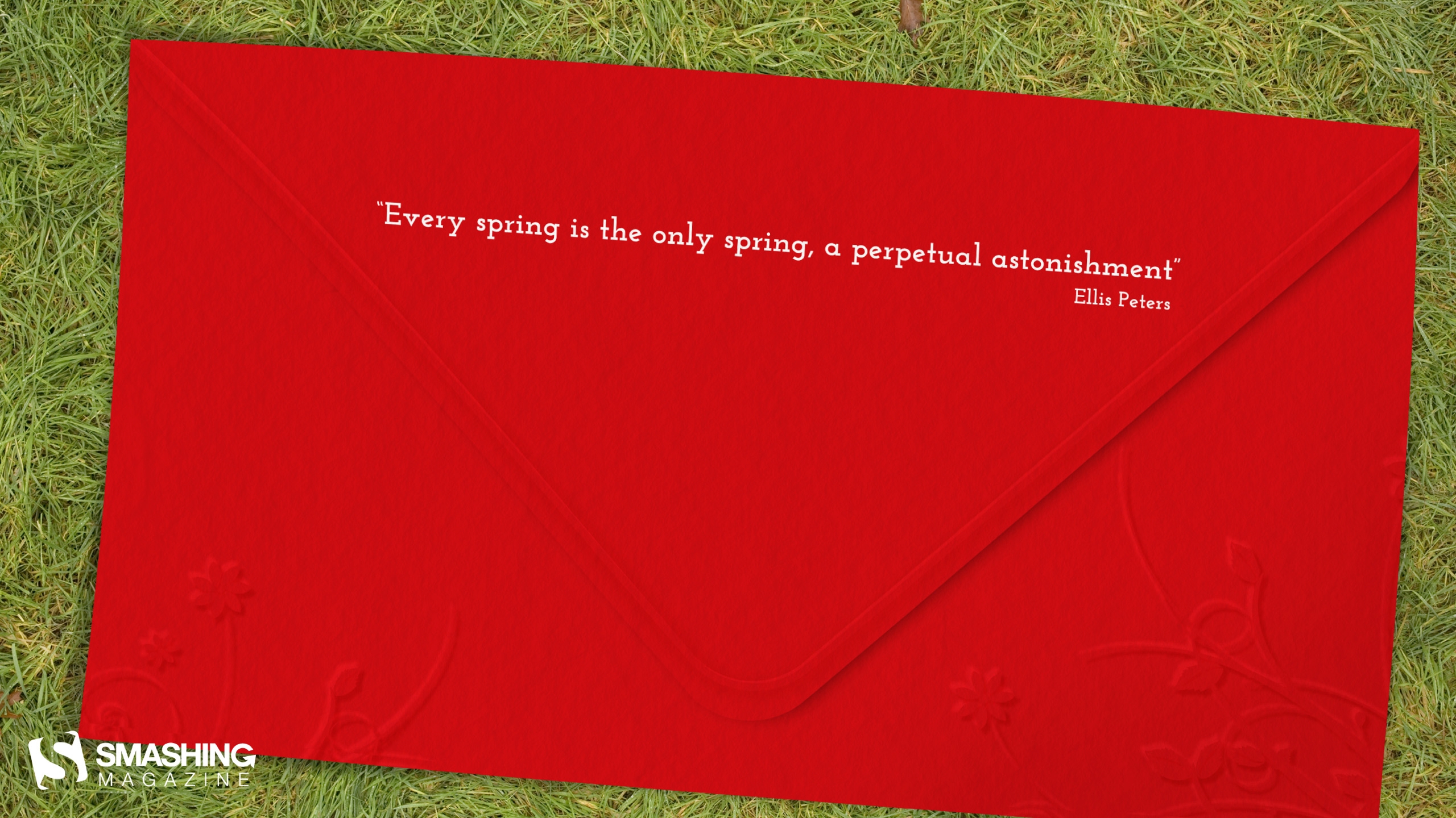
Letter From Spring
"My calendar represents a dropped letter from spring who is leting us know that she is arriving and soon enogh. I chose the colors red and white because in Romania are some traditions related to this colors for the month of March." Designed by Miclaus Andreea from Romania.

- preview
- with calendar: 1024×768, 1024×1024, 1440×900, 1920×1080, 2560×1440
- without calendar: 1024×768, 1024×1024, 1440×900, 1920×1080, 2560×1440
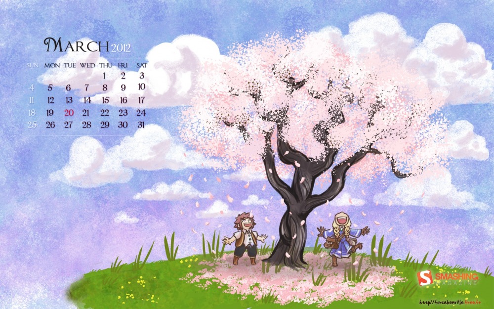
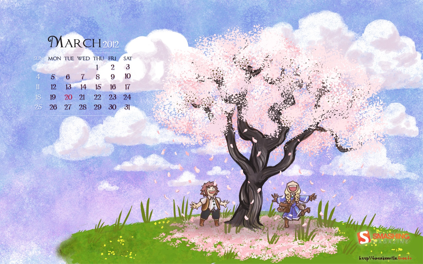
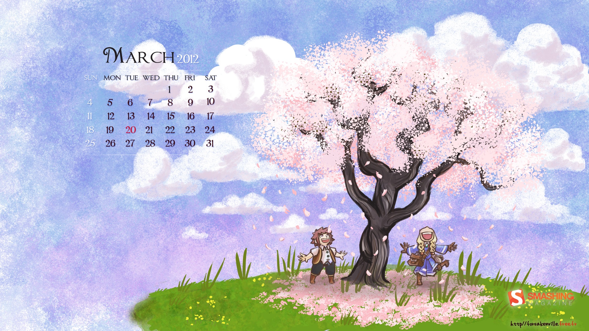
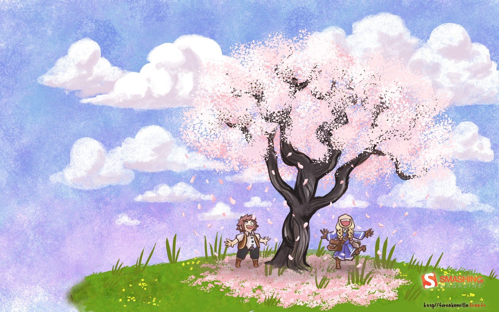
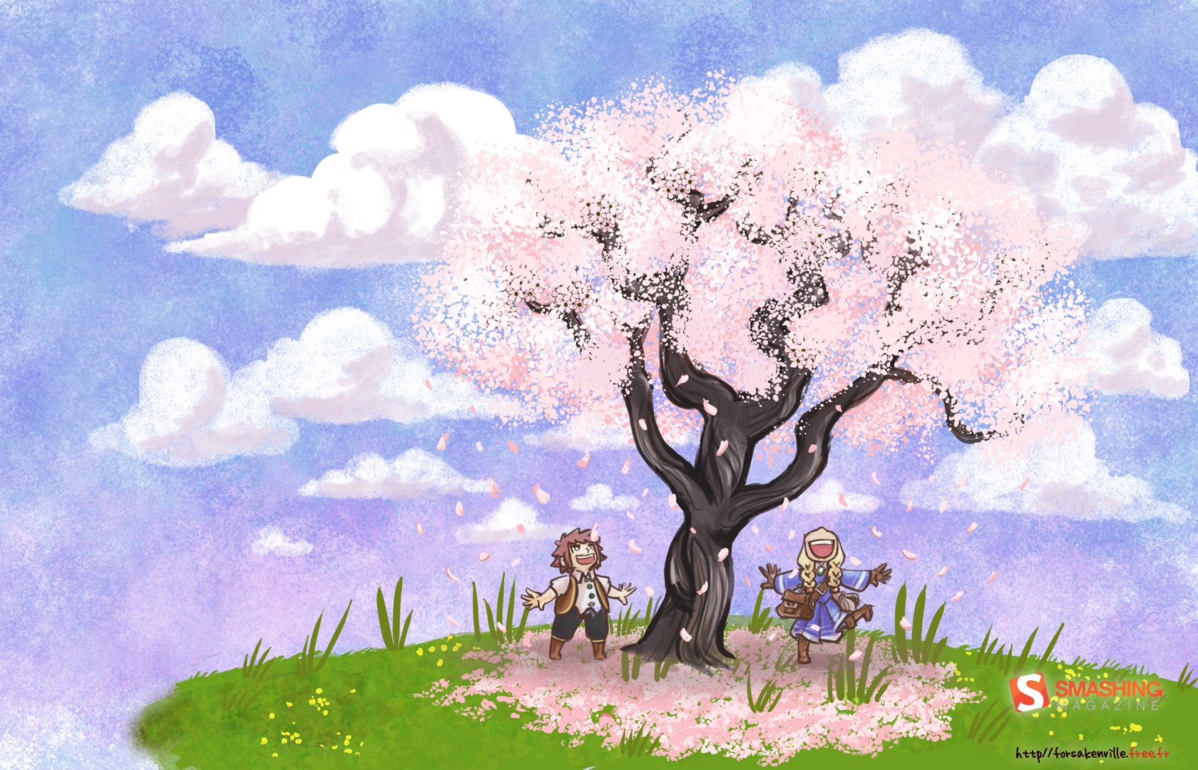
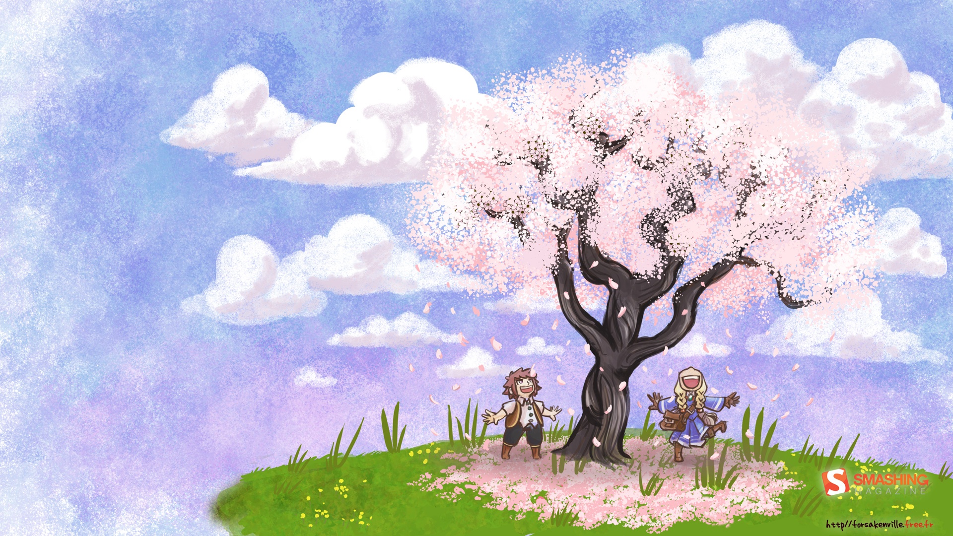
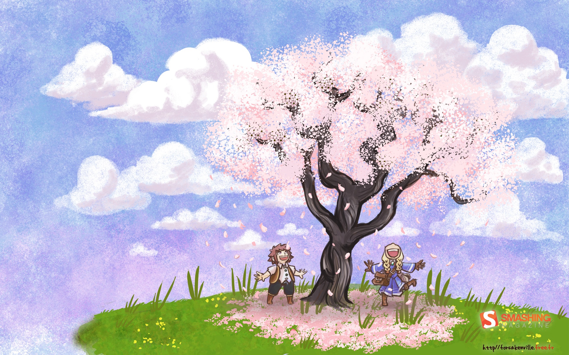
Hello Spring
Designed by Forsaken from France.
- preview
- with calendar: 1440×900, 1680×1050, 1680×1080, 1920×1080, 1920×1200
- without calendar: 1440×900, 1680×1050, 1680×1080, 1920×1080, 1920×1200
The Spring
"Springtime!" Designed by Kris Koubaddy from USA.

- preview
- with calendar: 1024×768, 1024×1024, 1280×800, 1280×960, 1280×1024, 1440×900, 1600×1200, 1680×1050, 1920×1080, 1920×1200
- without calendar: 1024×768, 1024×1024, 1280×800, 1280×960, 1280×1024, 1440×900, 1600×1200, 1680×1050, 1920×1080, 1920×1200
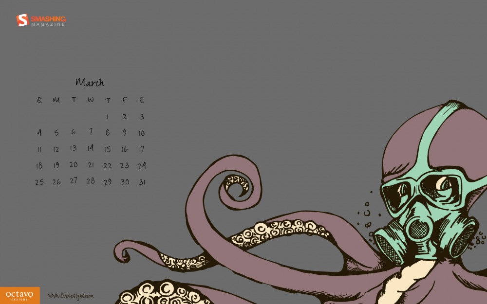
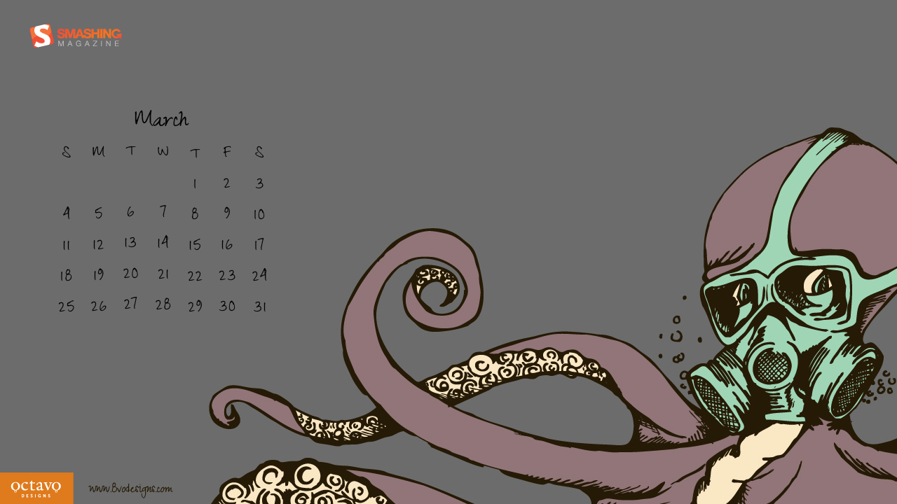
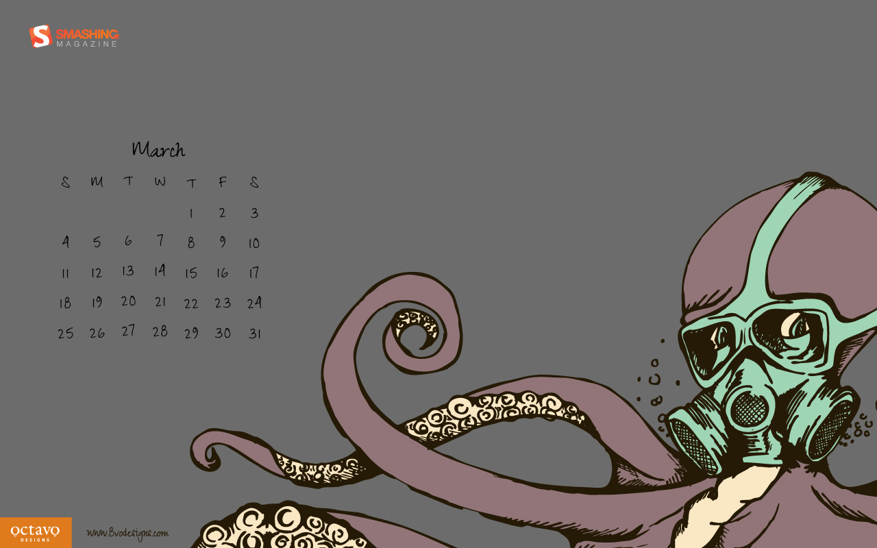
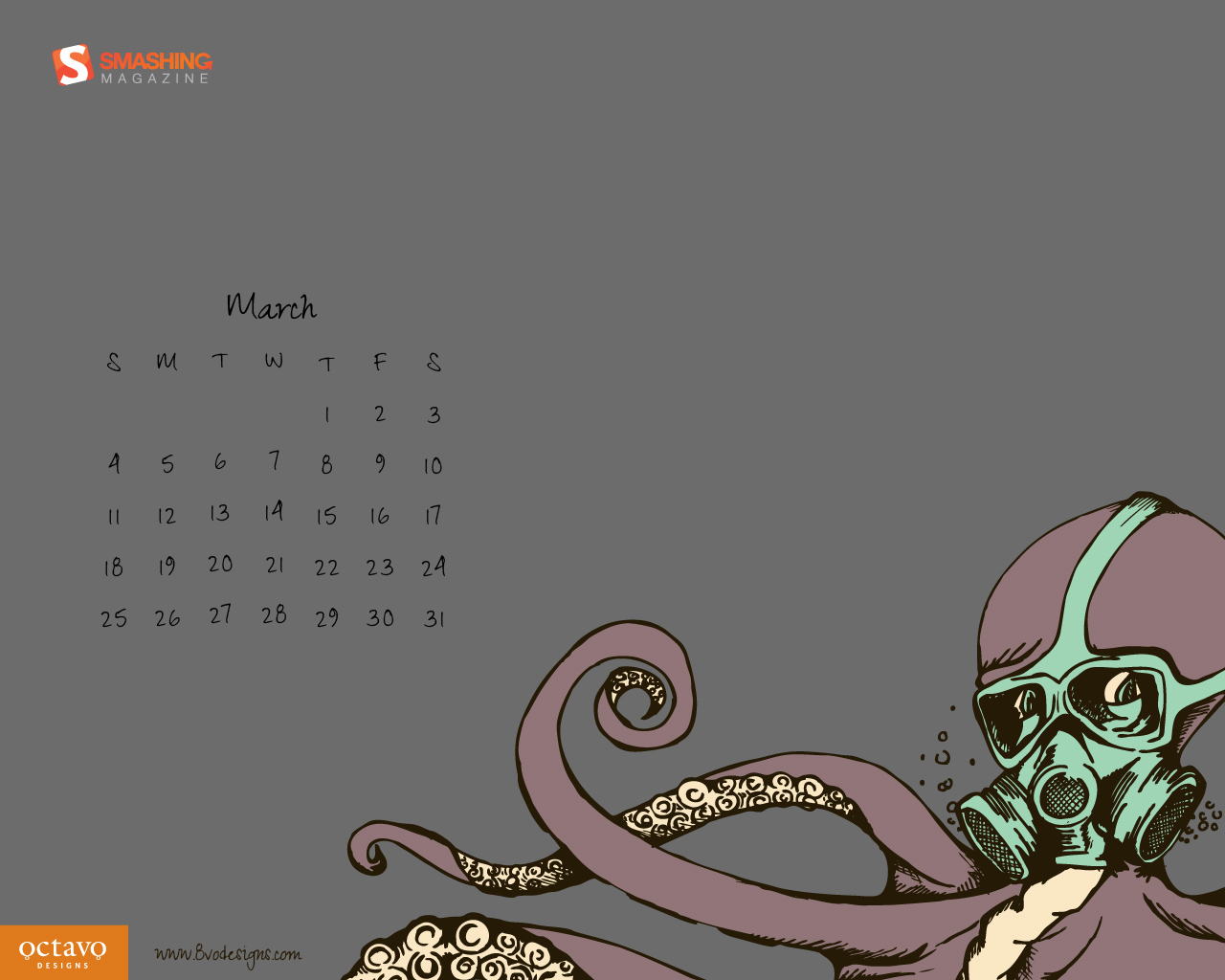
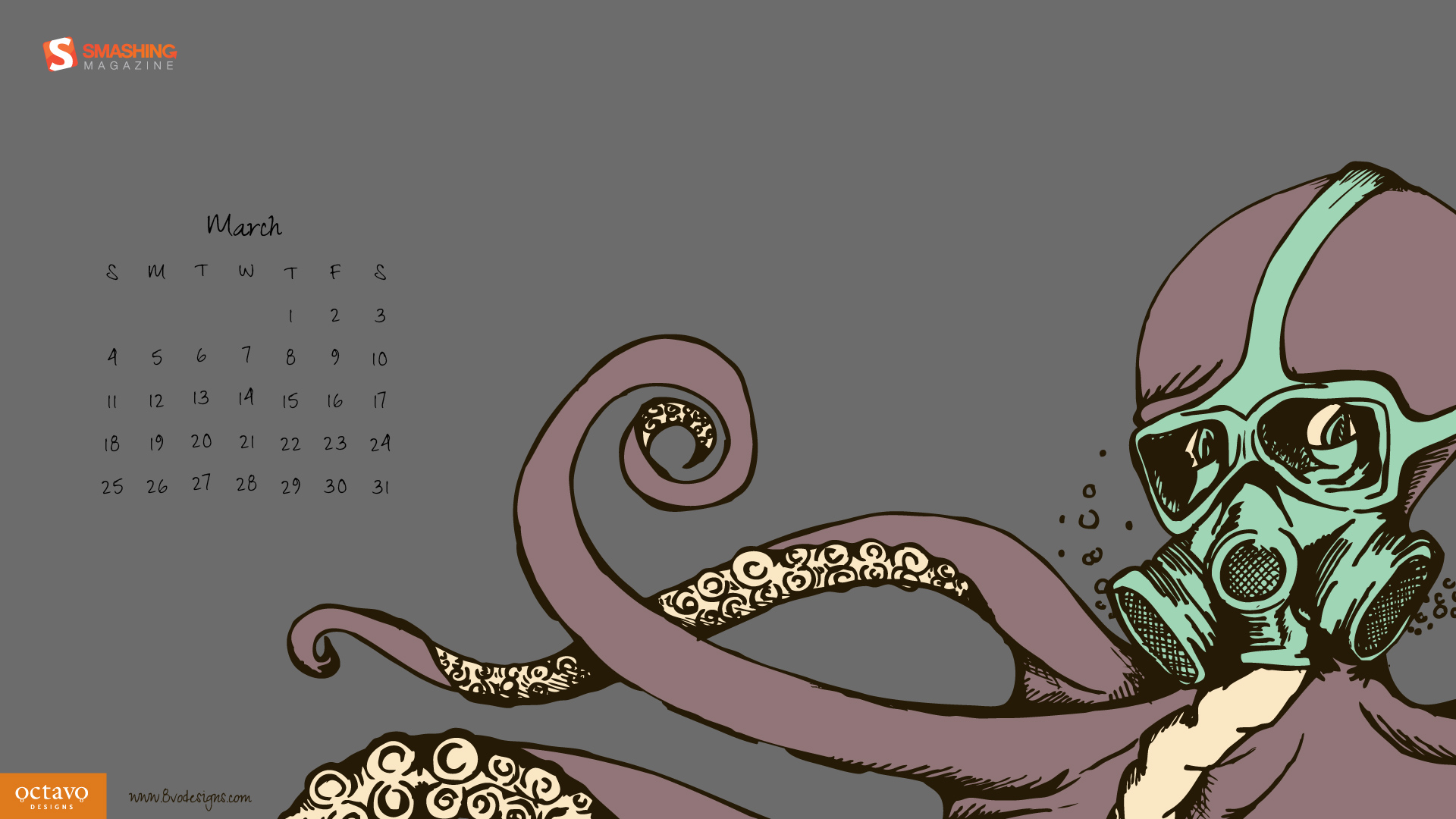
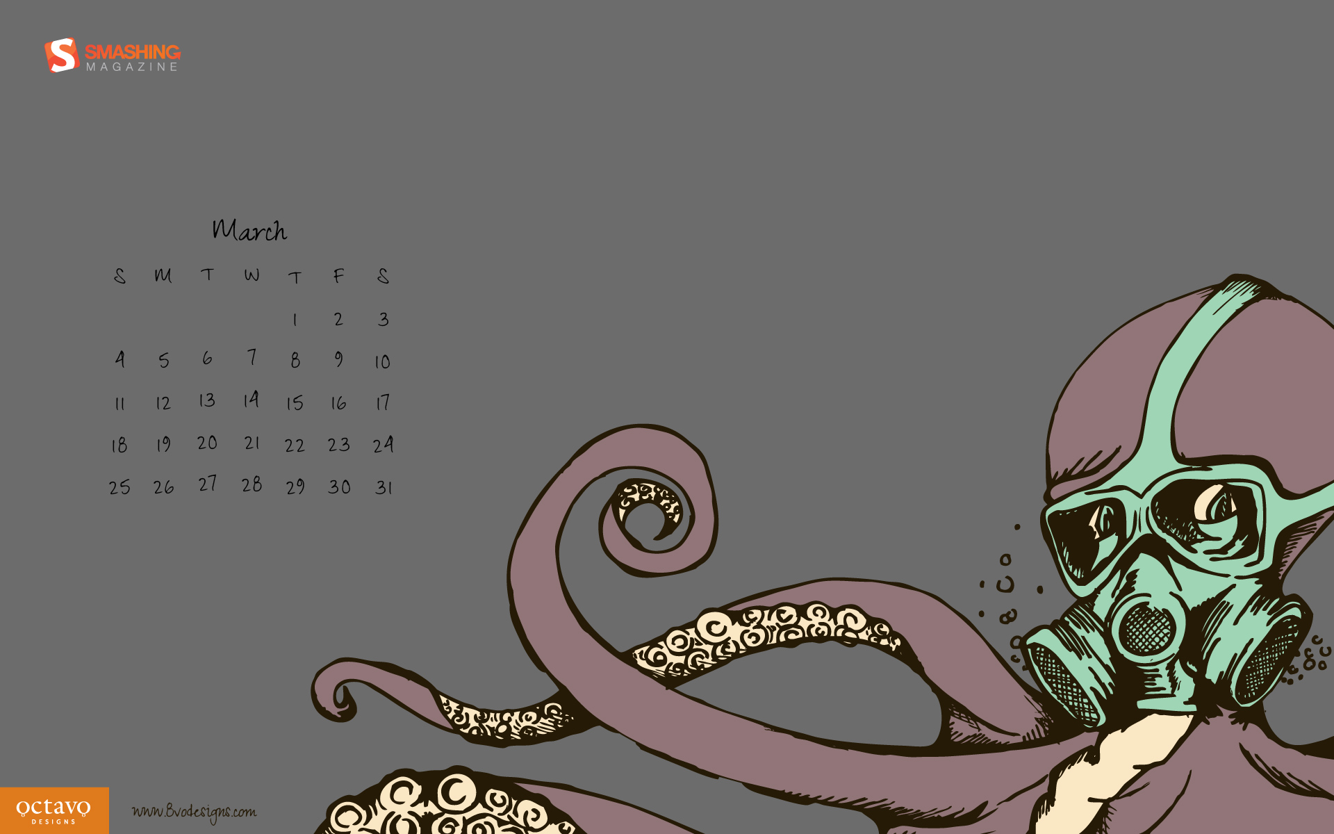
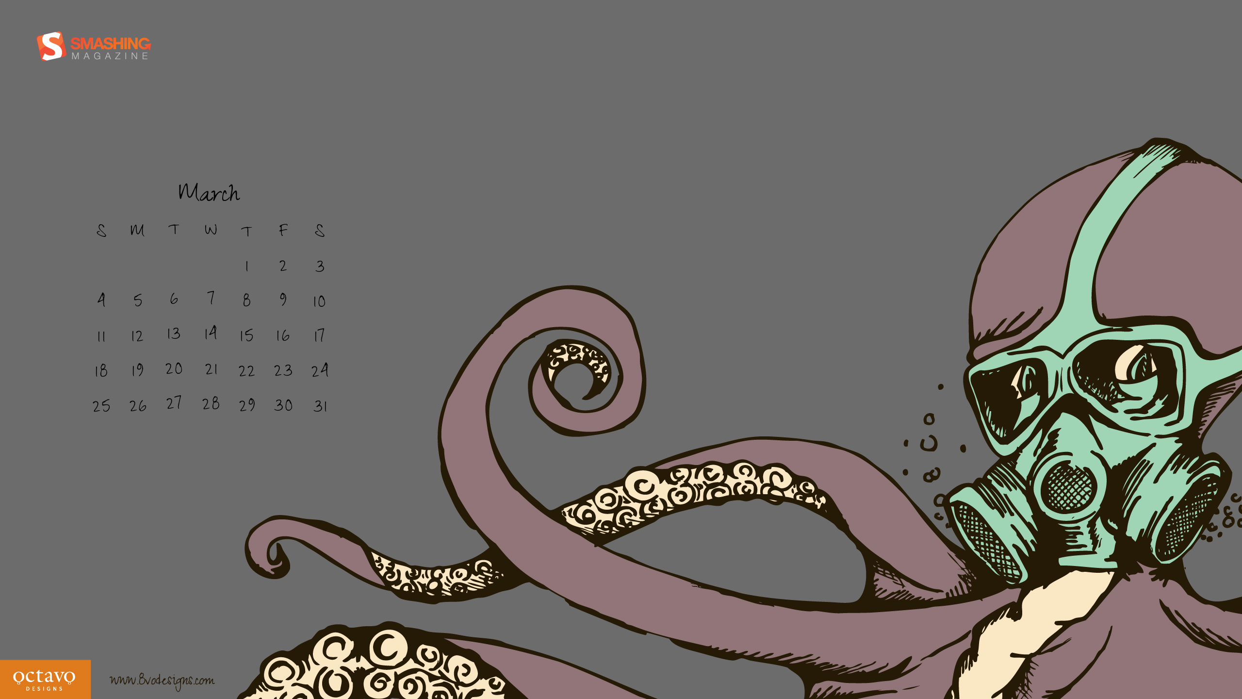
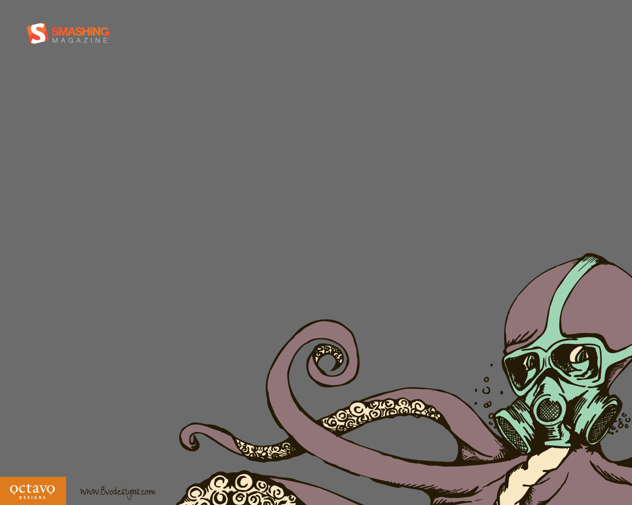
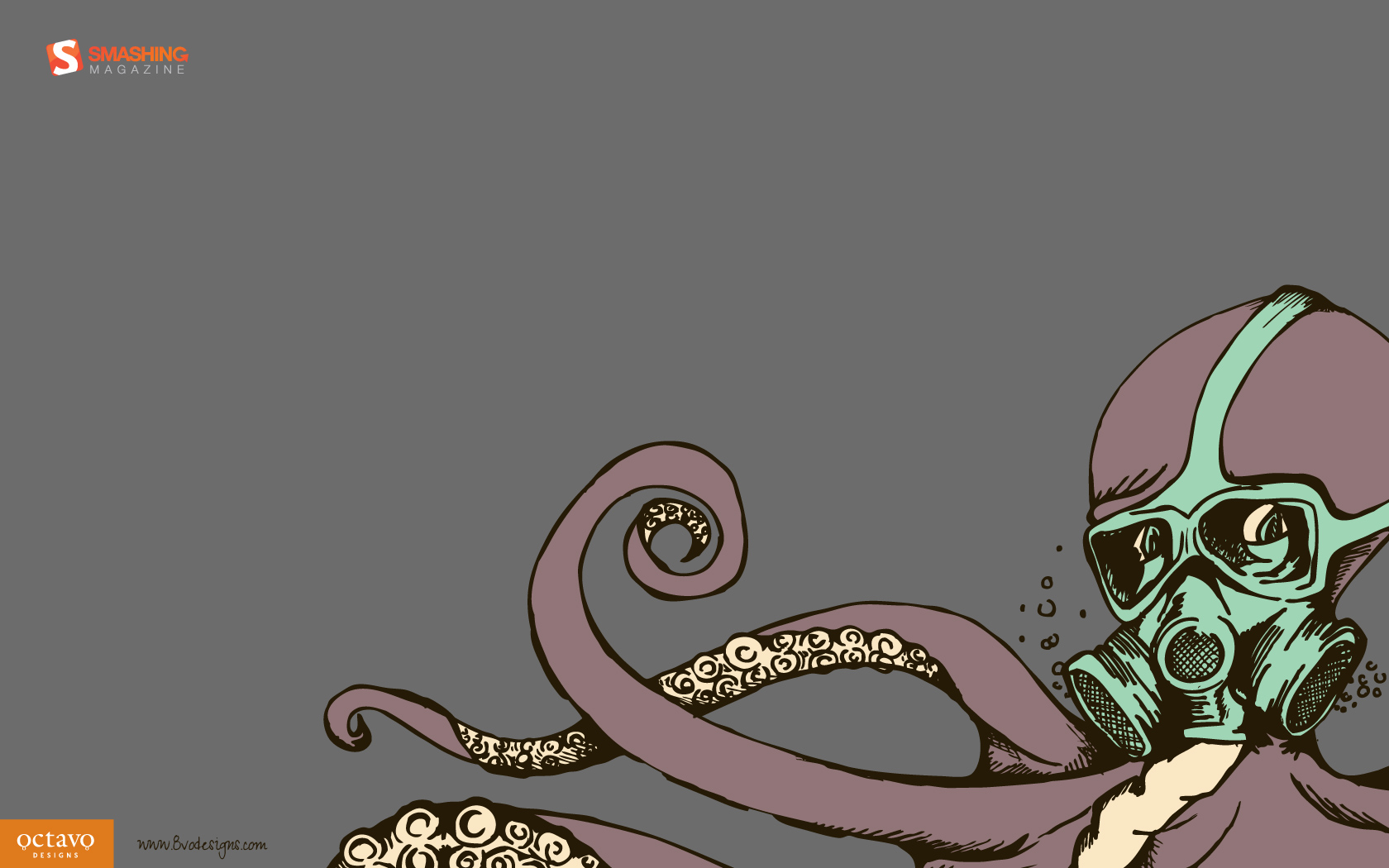
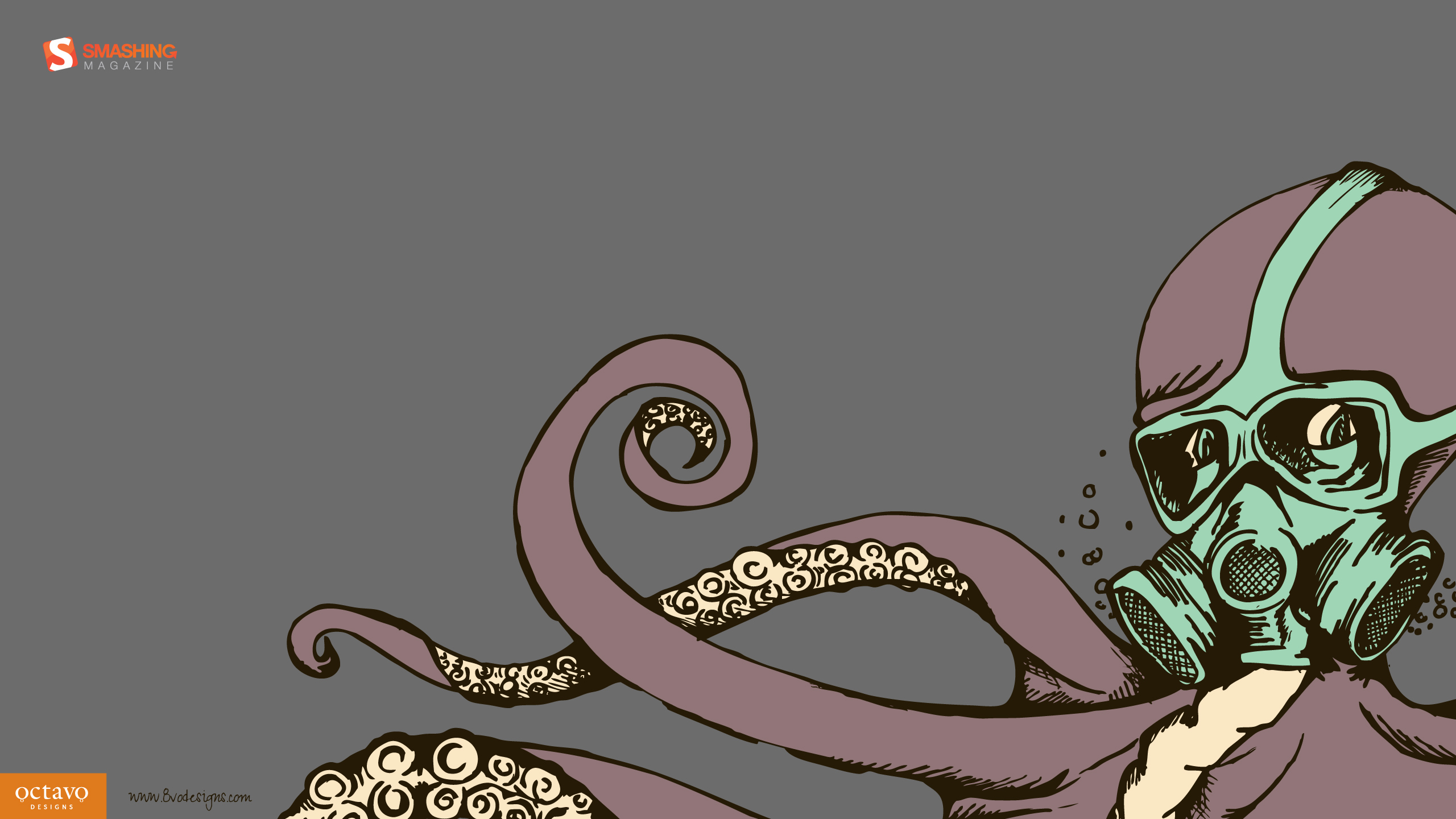
8vo Gas
Designed by Octavo Designs from USA.
- preview
- with calendar: 1024×768, 1280×720, 1280×800, 1280×1024, 1440×900, 1680×1050, 1920×1080, 1920×1200, 2560×1440
- without calendar: 1024×768, 1280×720, 1280×800, 1280×1024, 1440×900, 1680×1050, 1920×1080, 1920×1200, 2560×1440
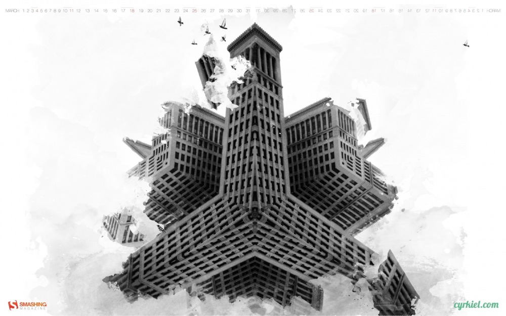
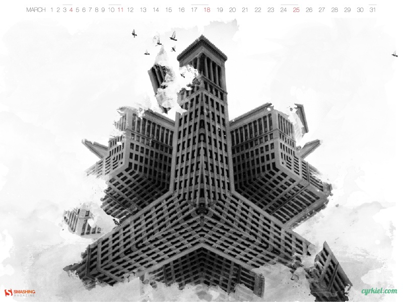
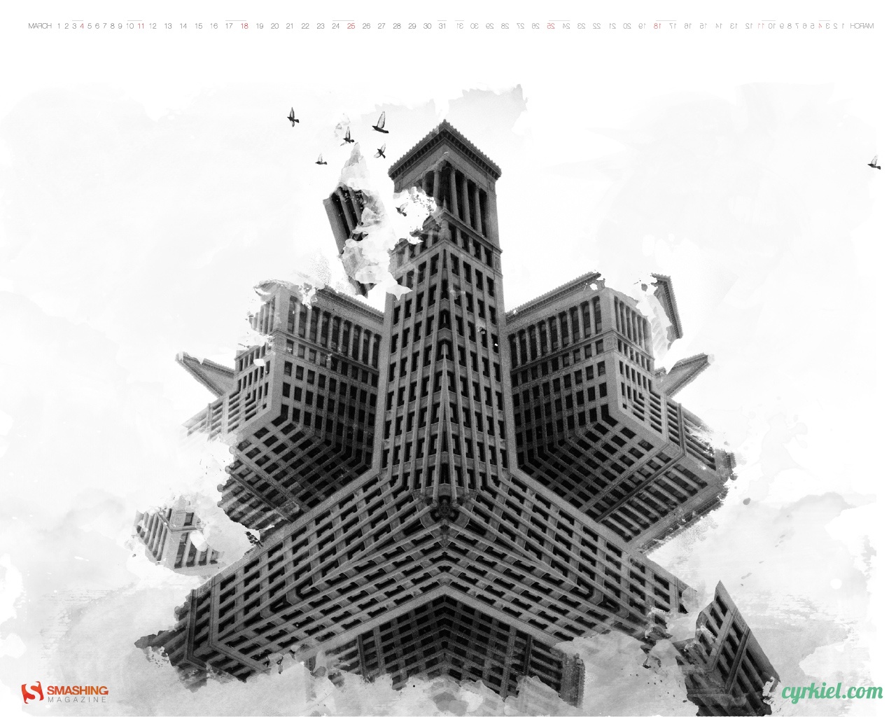
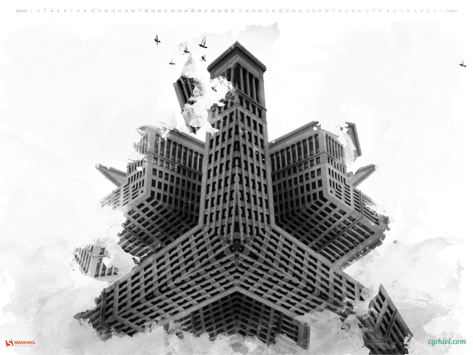
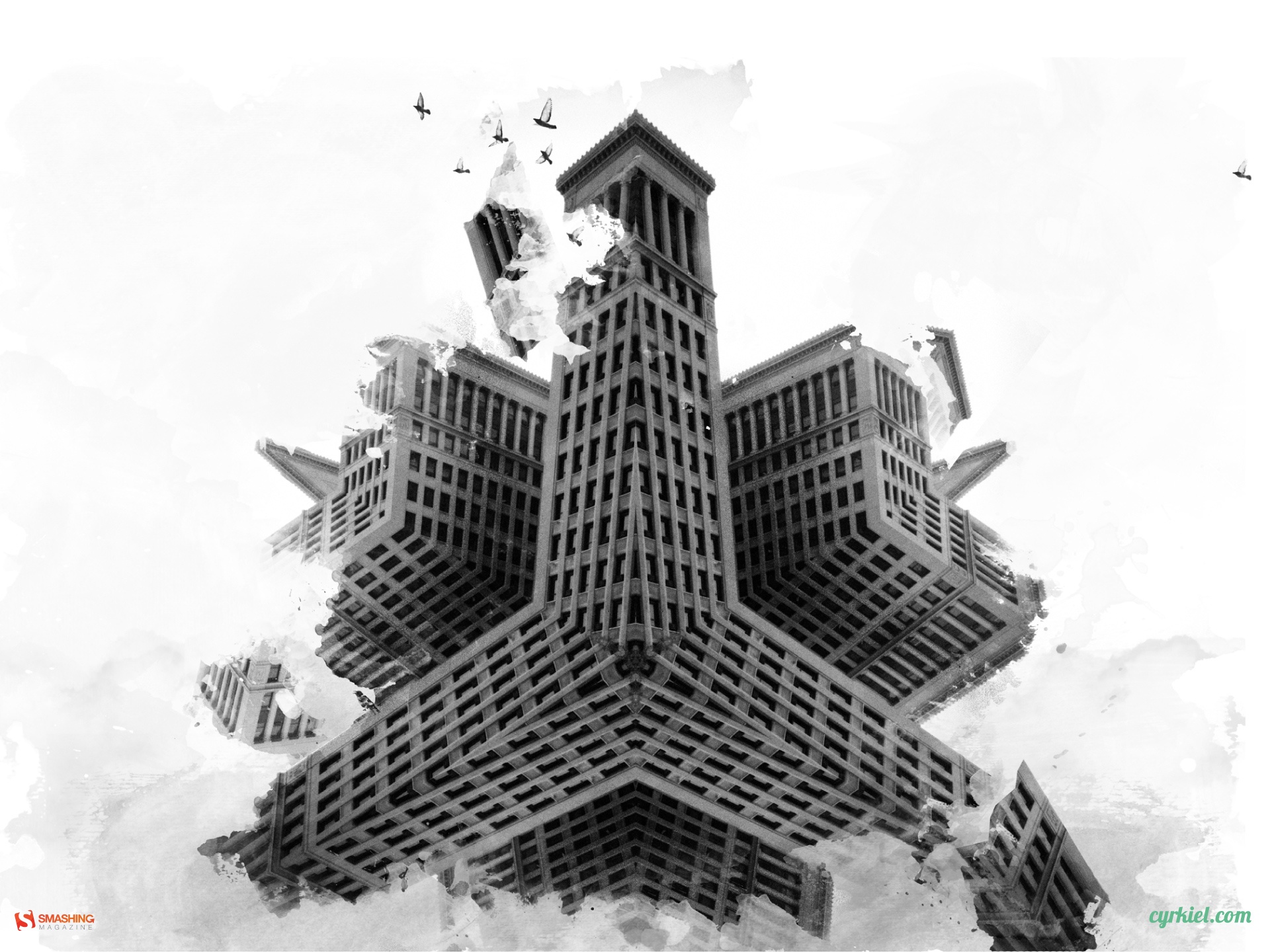
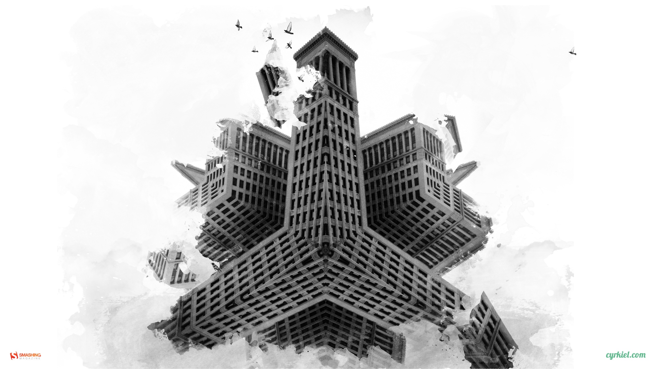
Cyrkiel
Designed by Michal Michno from Poland.
- preview
- with calendar: 800×600, 1024×768, 1152×864, 1280×960, 1280×1024, 1400×1050, 1440×900, 1600×1200, 1920×1200, 1920×1440, 2560×1440
- without calendar: 800×600, 1024×768, 1152×864, 1280×960, 1280×1024, 1400×1050, 1440×900, 1600×1200, 1680×1050, 1920×1200, 1920×1440, 2560×1440
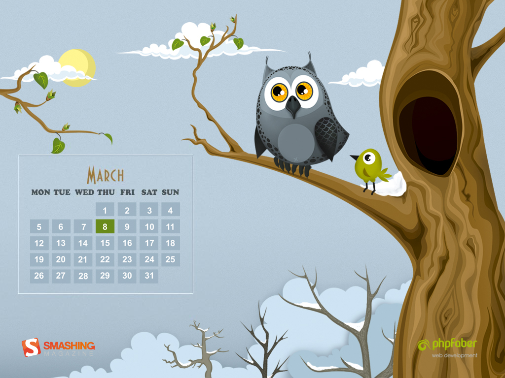
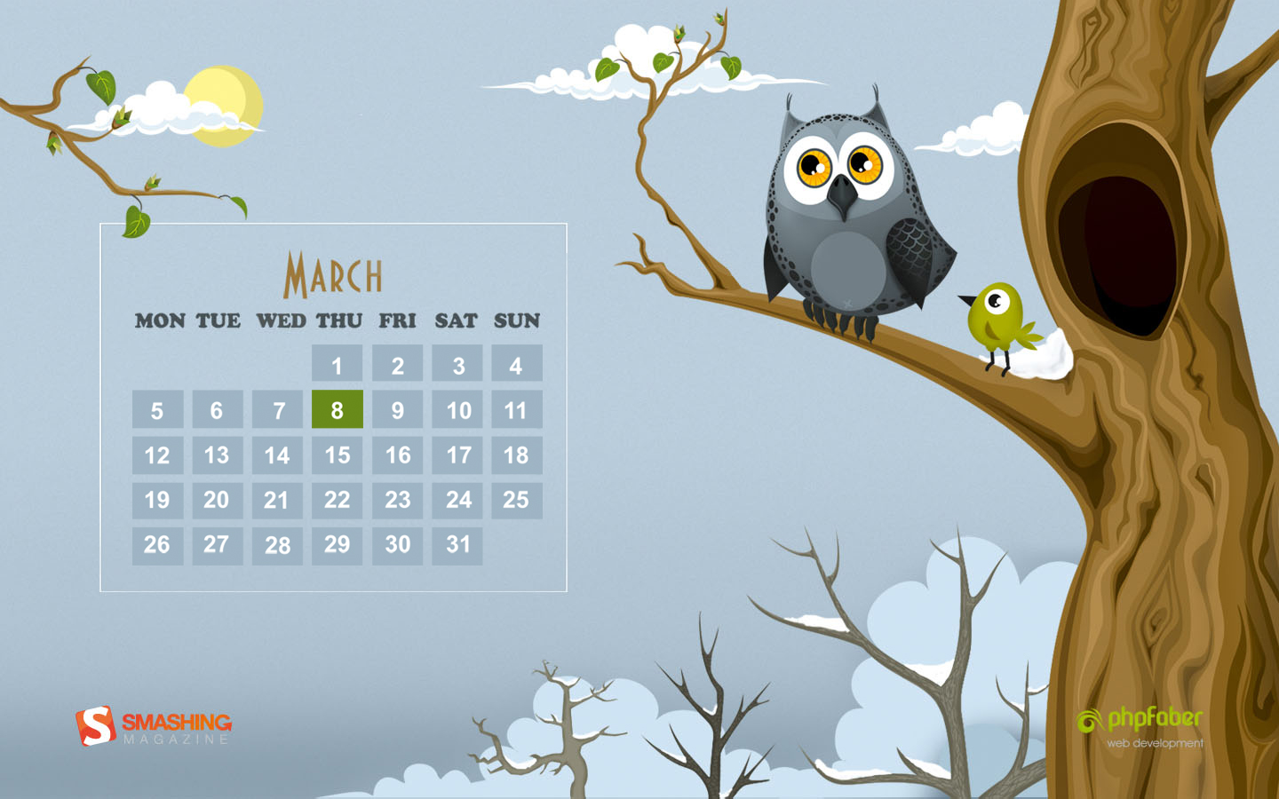
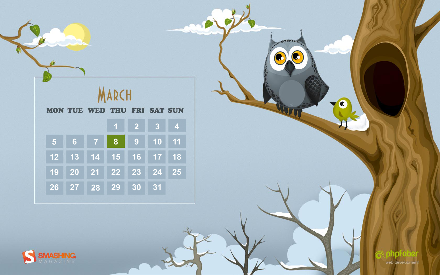
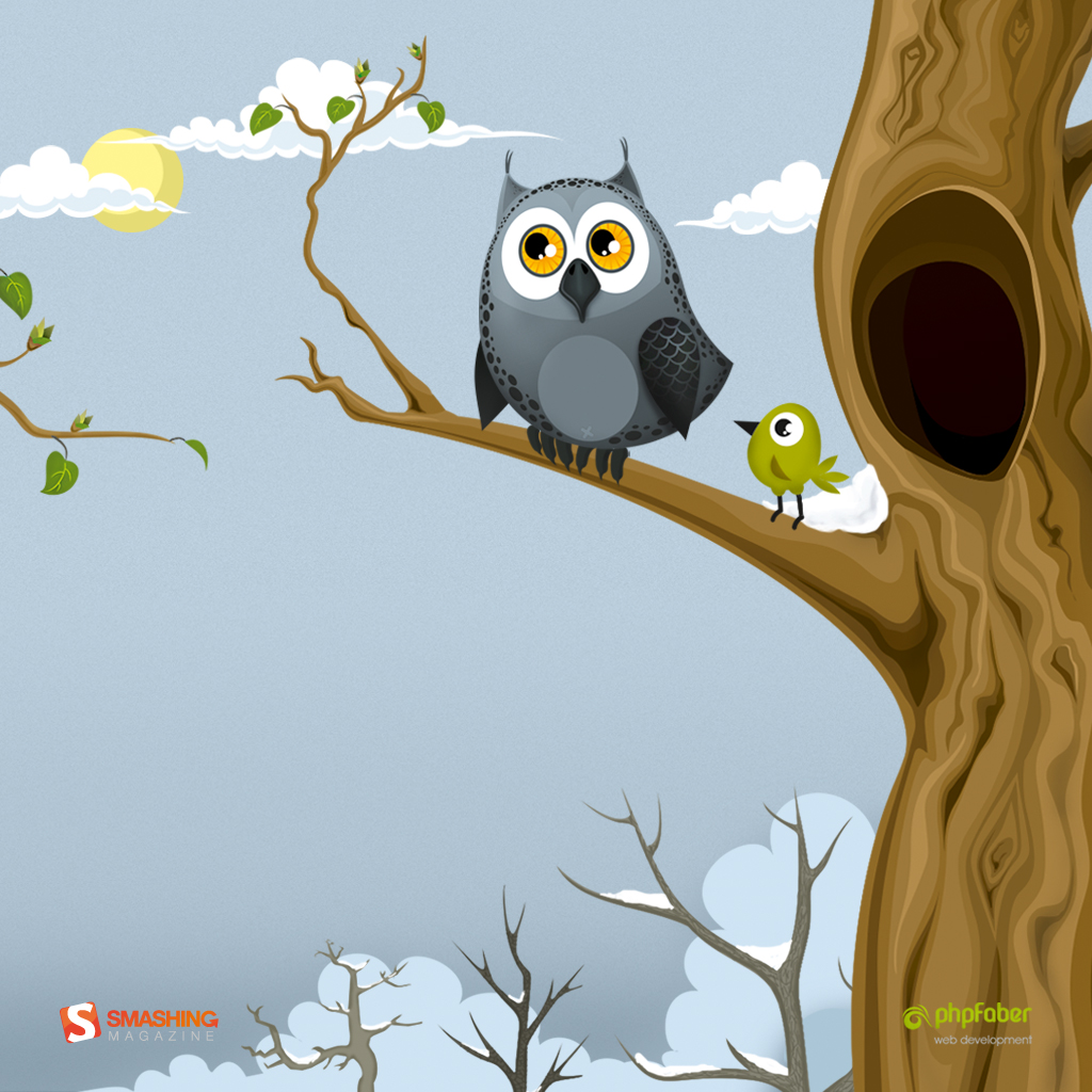
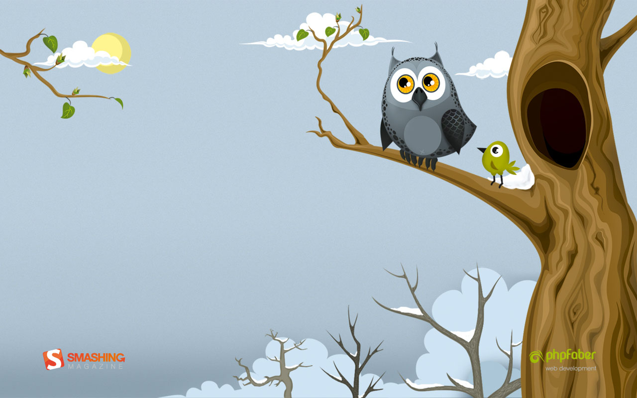
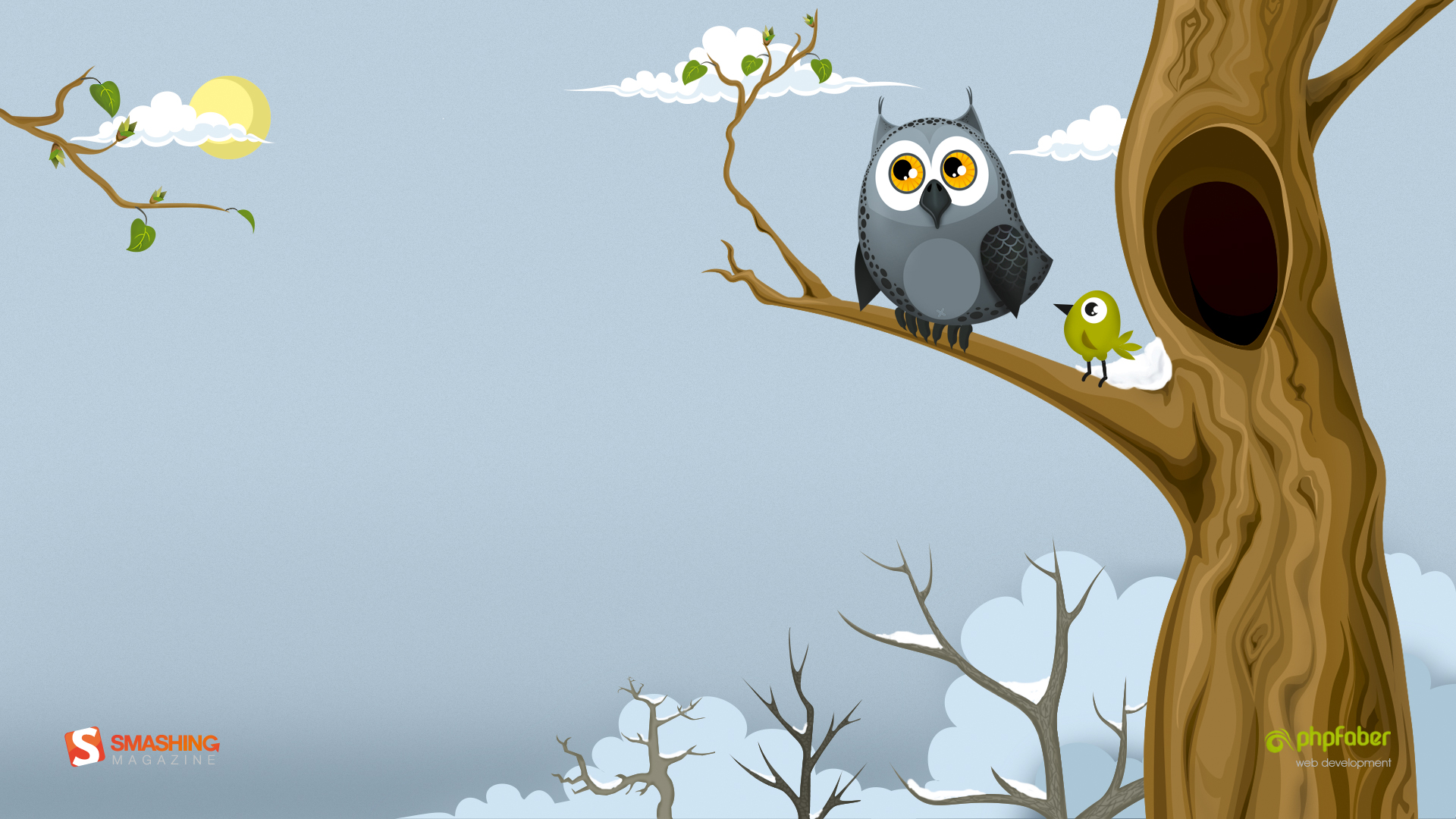
Spring And Owl
Designed by Katerina Bobkova from Ukraine.

- preview
- with calendar: 320×480, 1024×768, 1024×1024, 1280×800, 1440×900, 1680×1050, 1920×1080
- without calendar: 320×480, 1024×768, 1024×1024, 1280×800, 1440×900, 1680×1050, 1920×1080
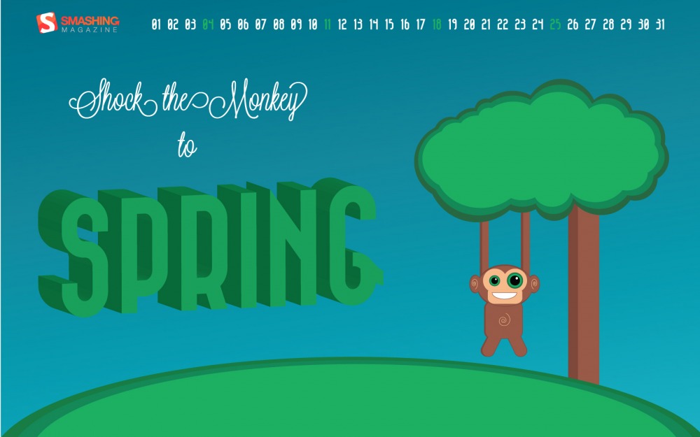
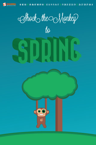
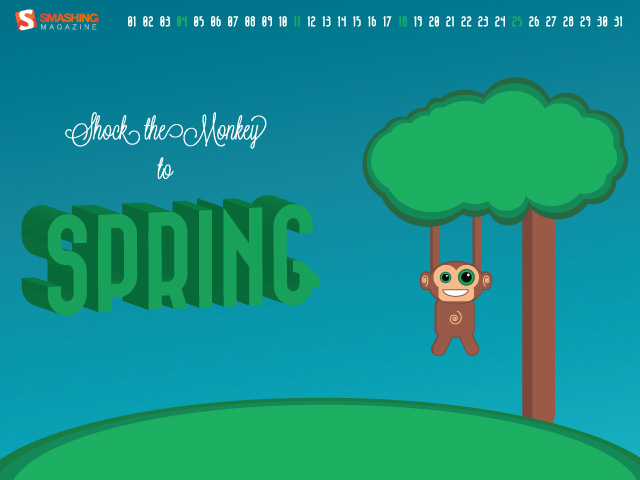
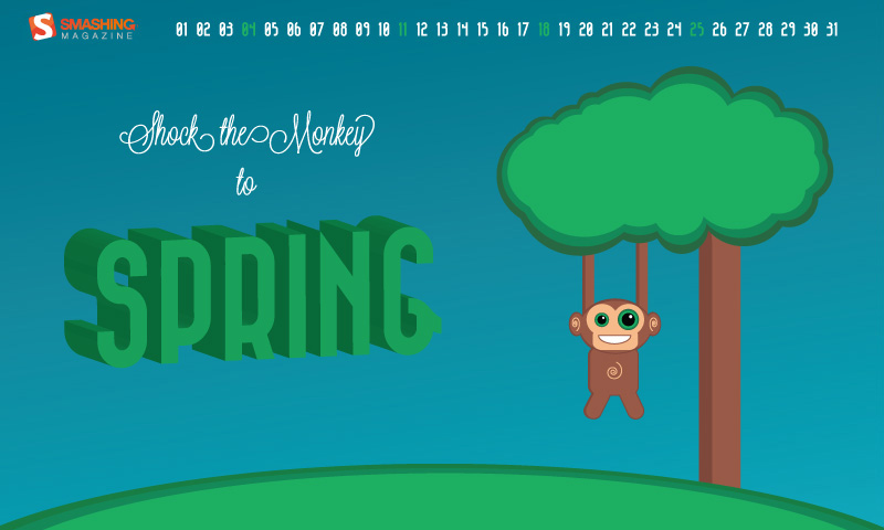
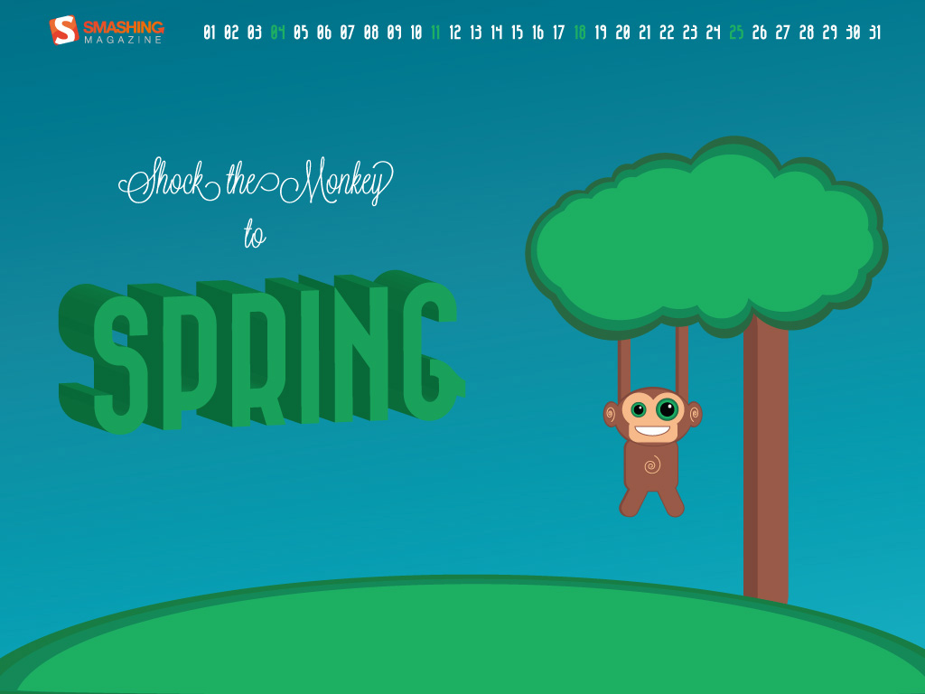
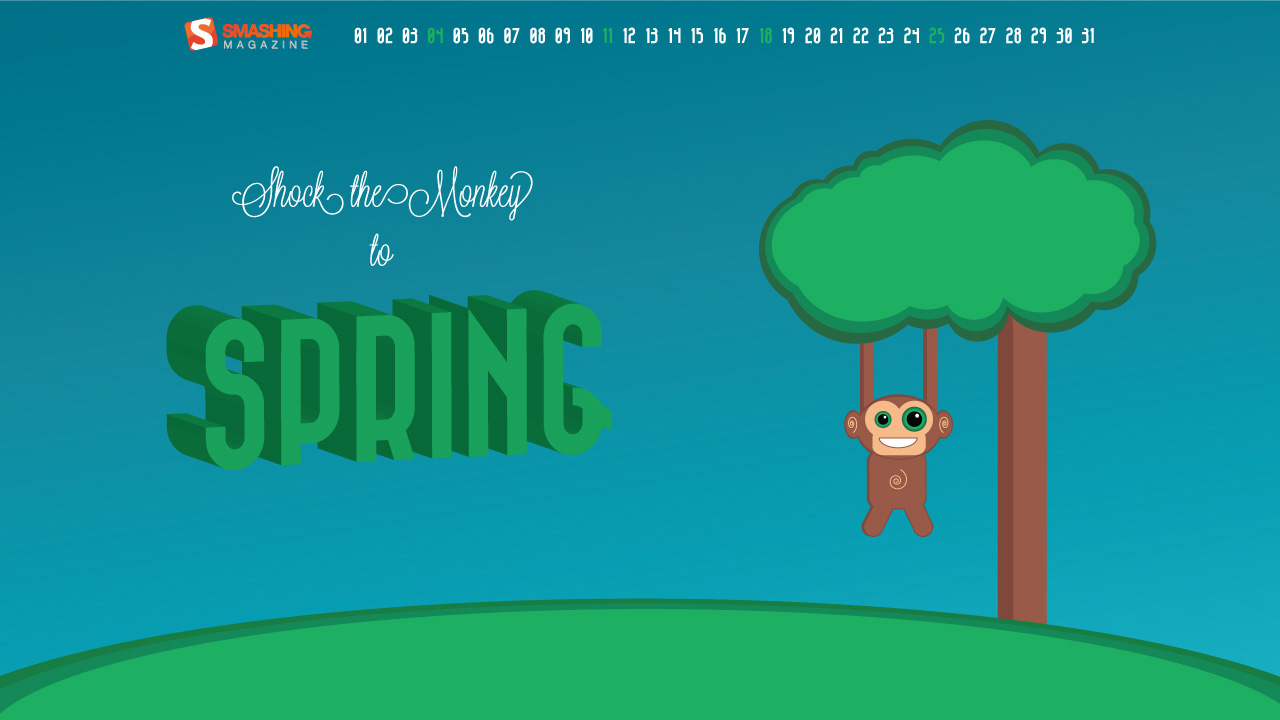
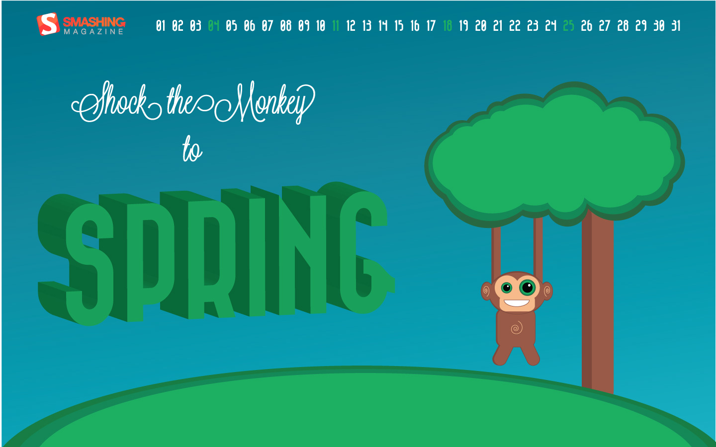
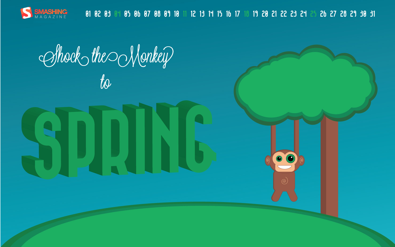
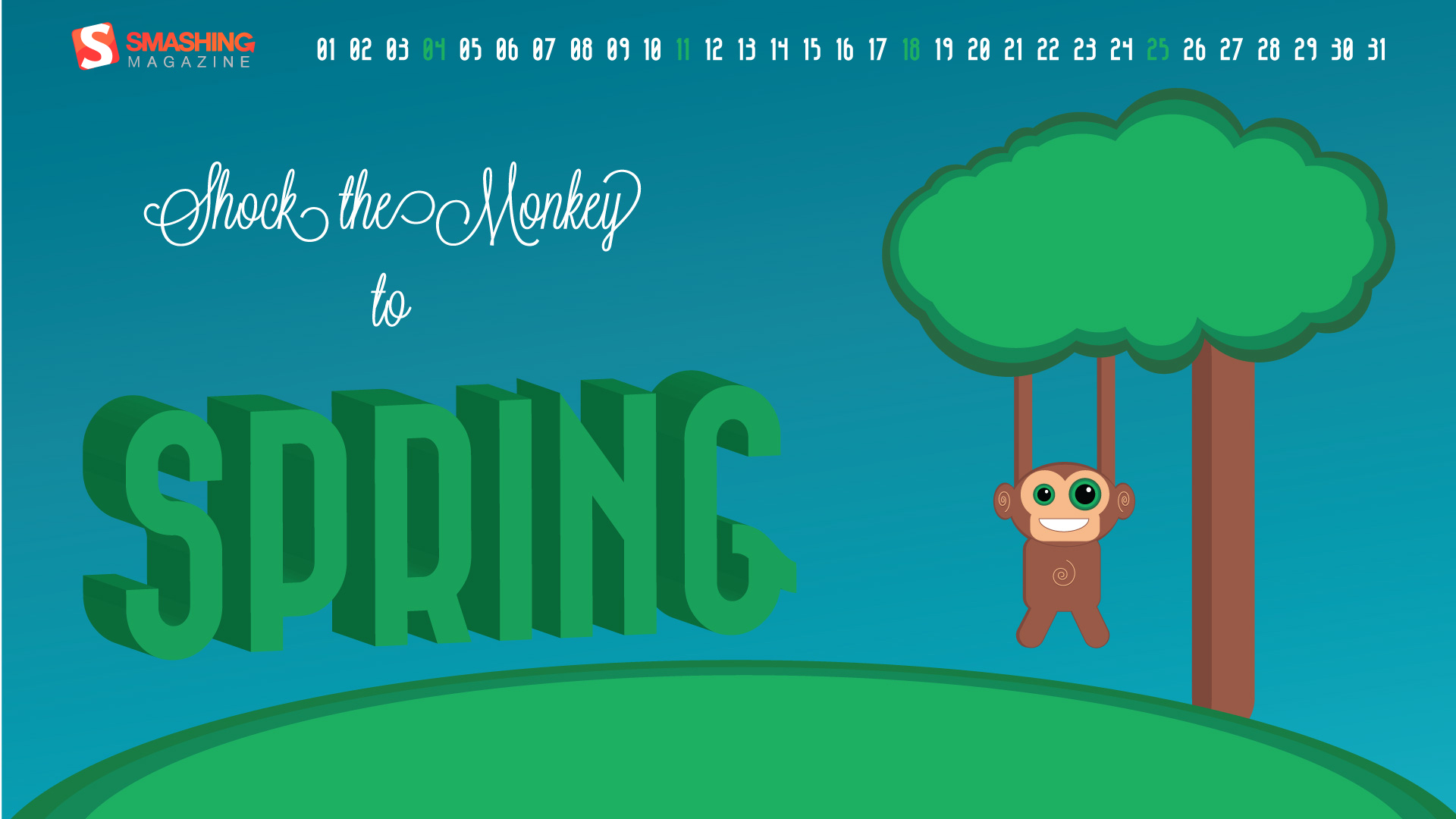
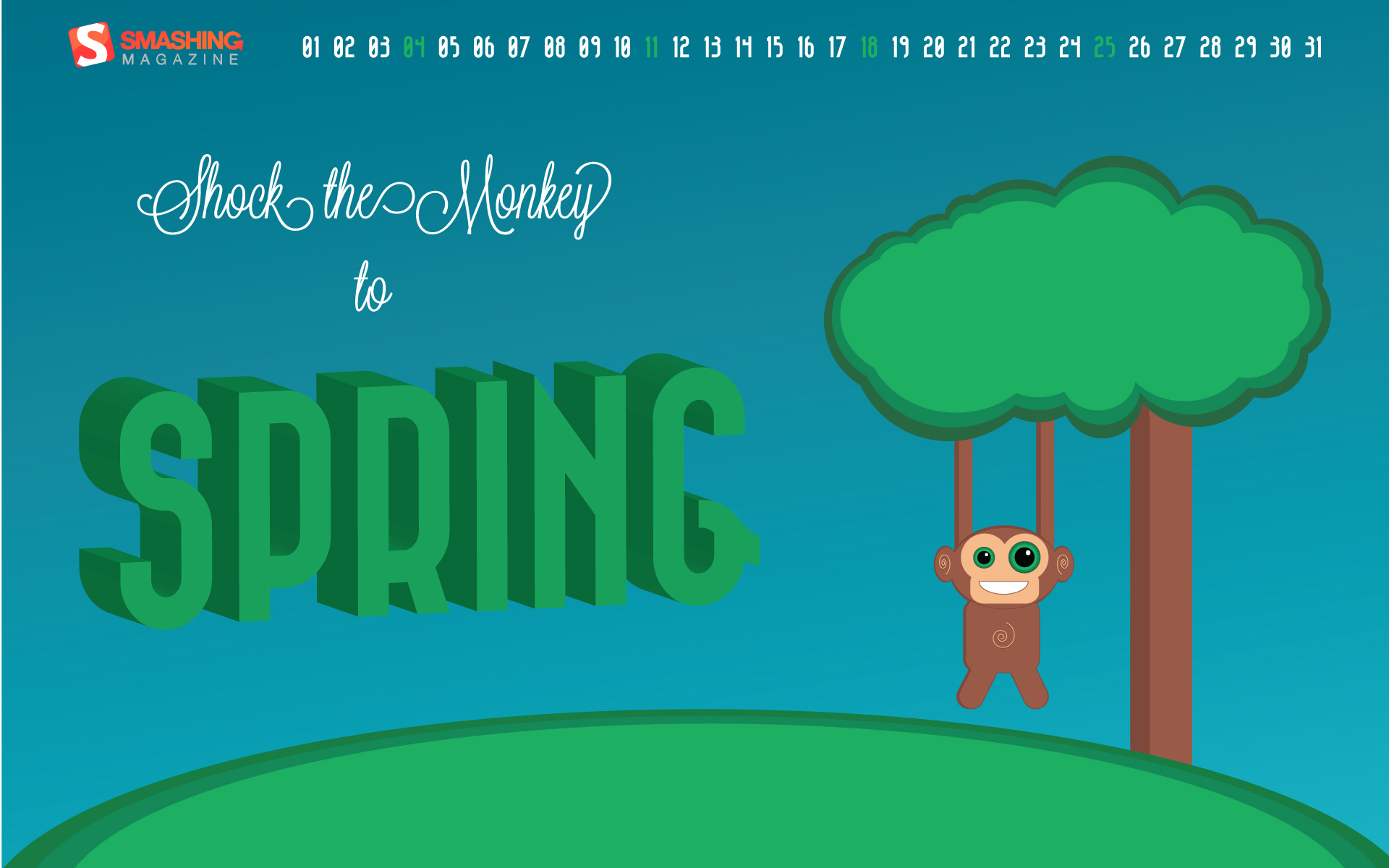
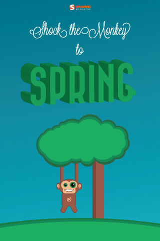
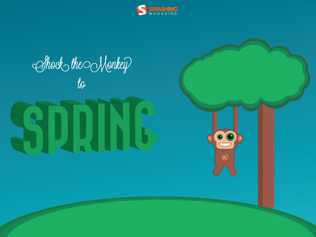
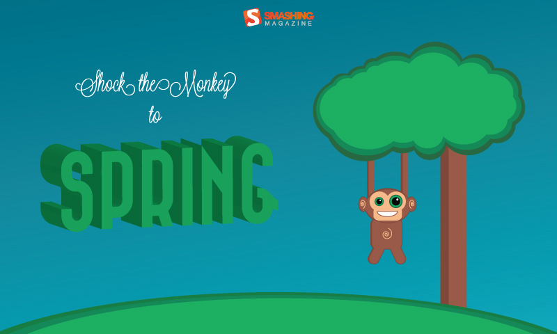
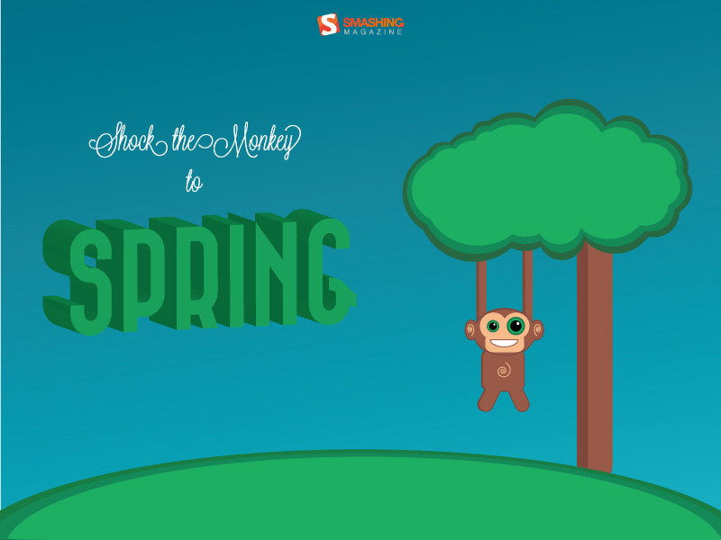
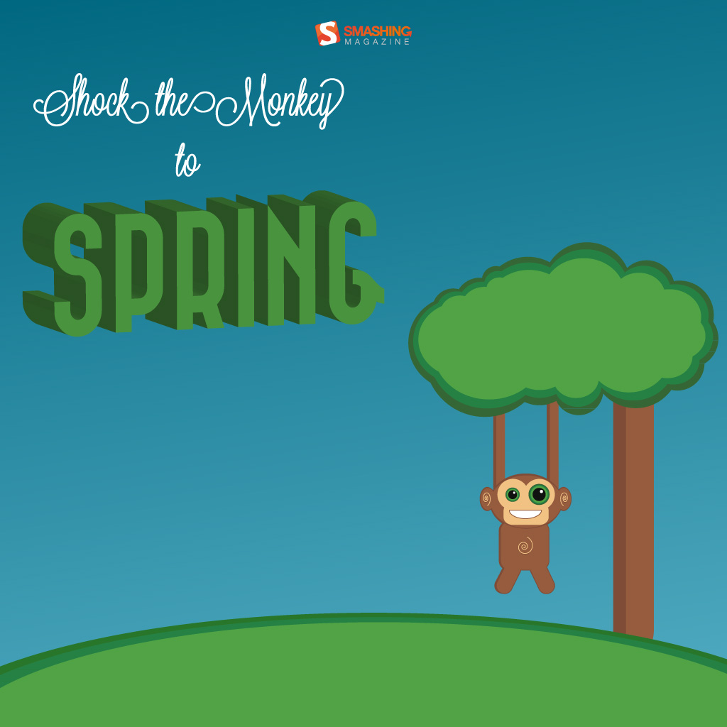
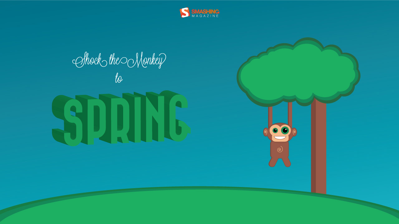
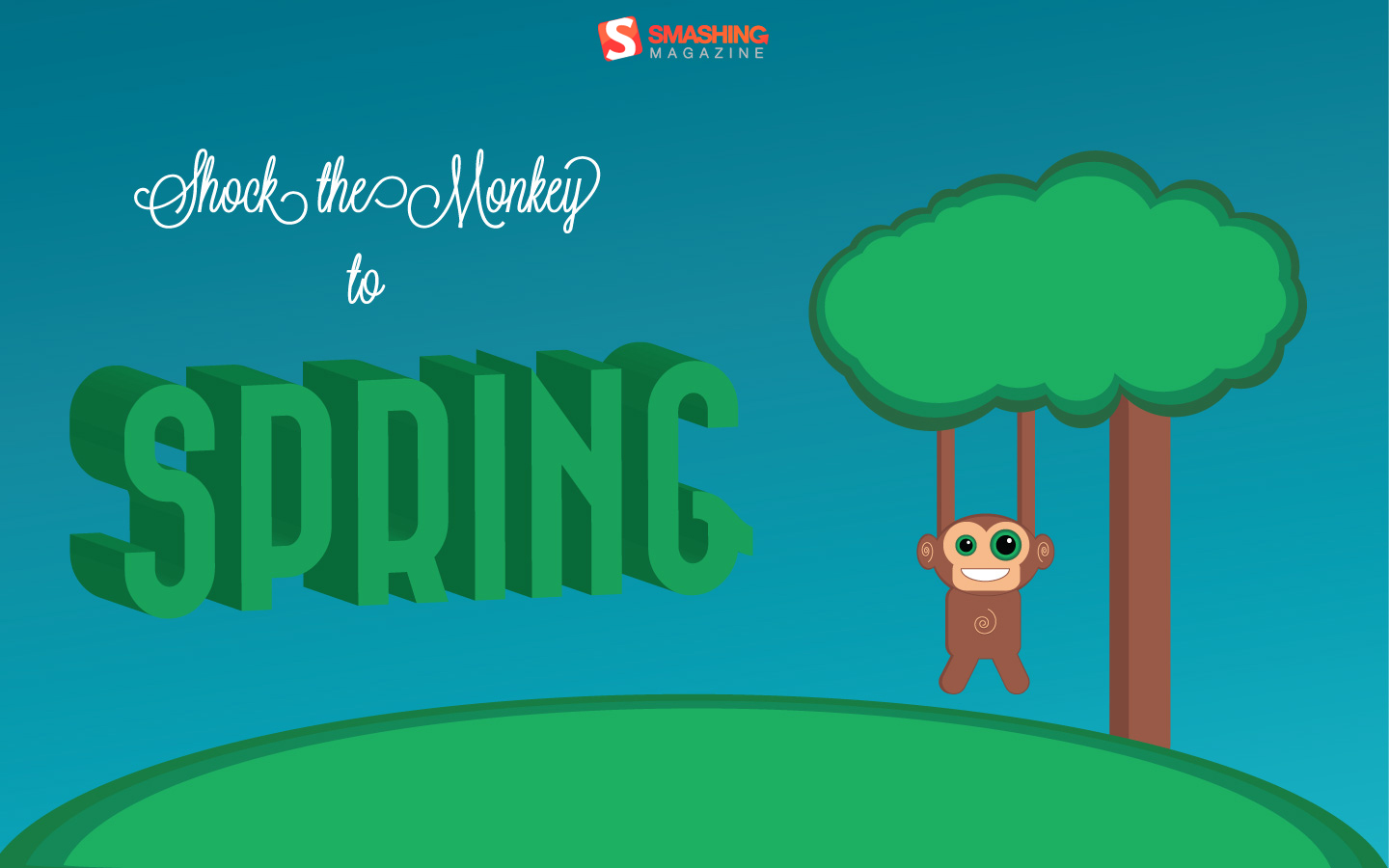
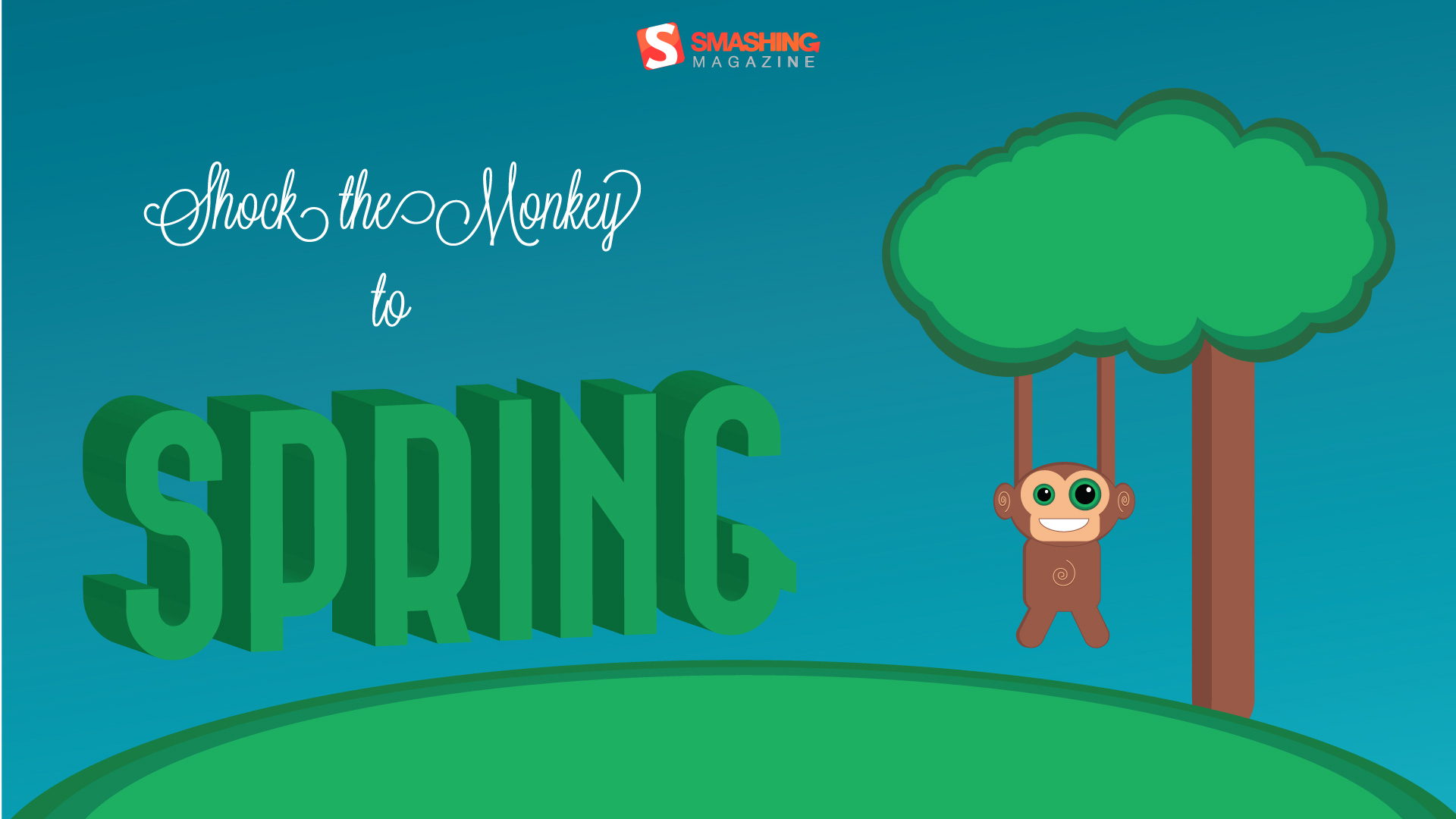
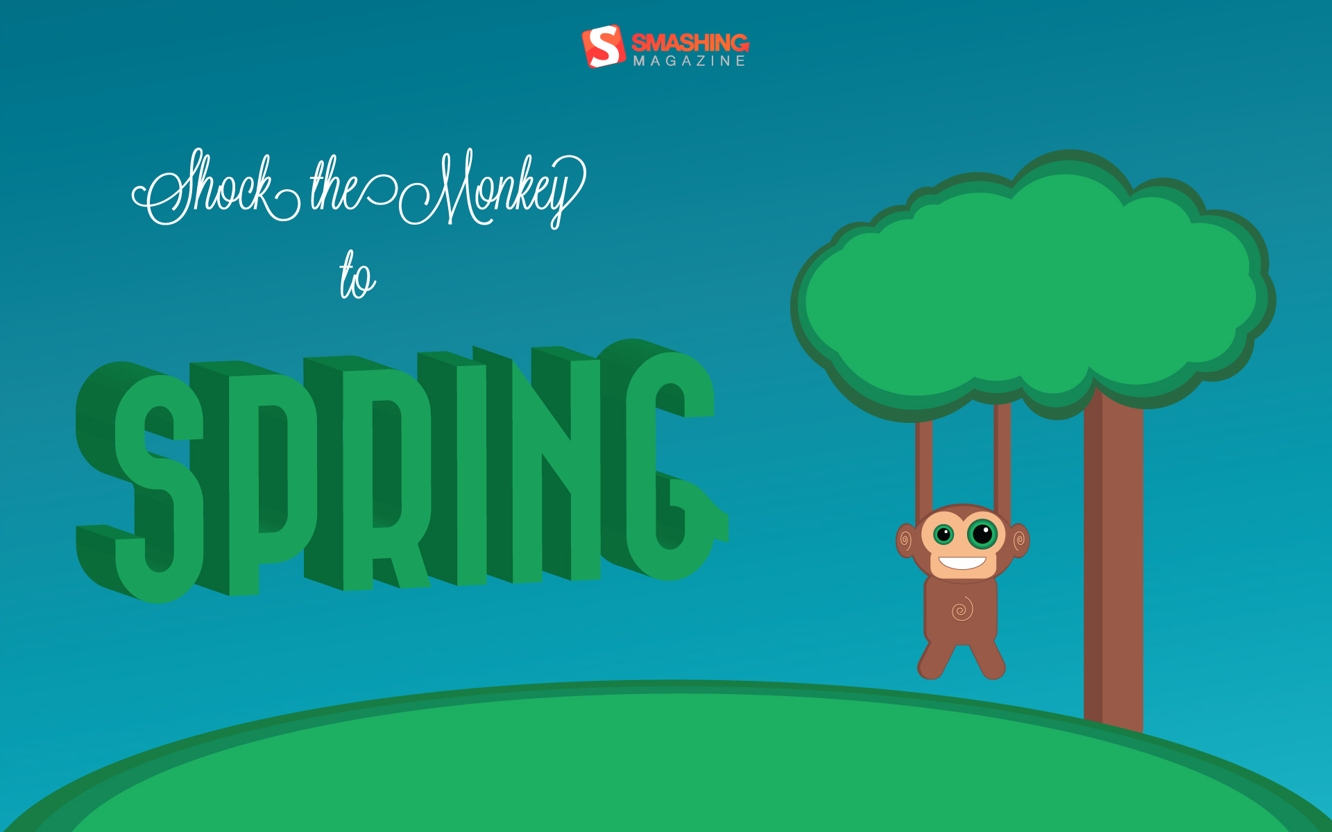
Shock The Monkey
"Shock the monkey to spring." Designed by Riccardo Salucco from Italy.
- preview
- with calendar: 320×480, 640×480, 800×480, 800×600, 1024×768, 1024×1024, 1280×720, 1280×800, 1440×900, 1680×1050, 1920×1080, 1920×1200
- without calendar: 320×480, 640×480, 800×480, 800×600, 1024×768, 1024×1024, 1280×720, 1280×800, 1440×900, 1680×1050, 1920×1080, 1920×1200
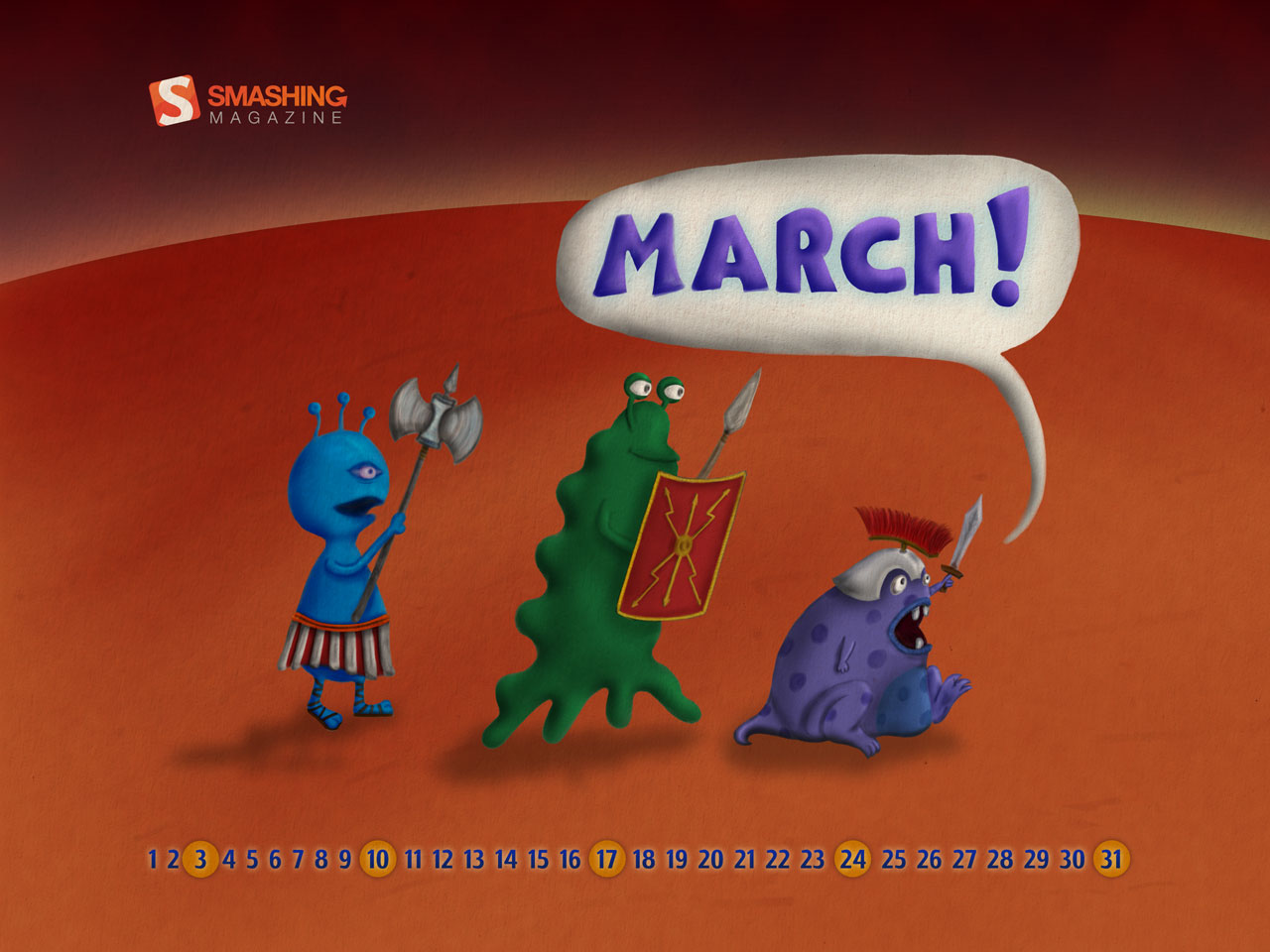
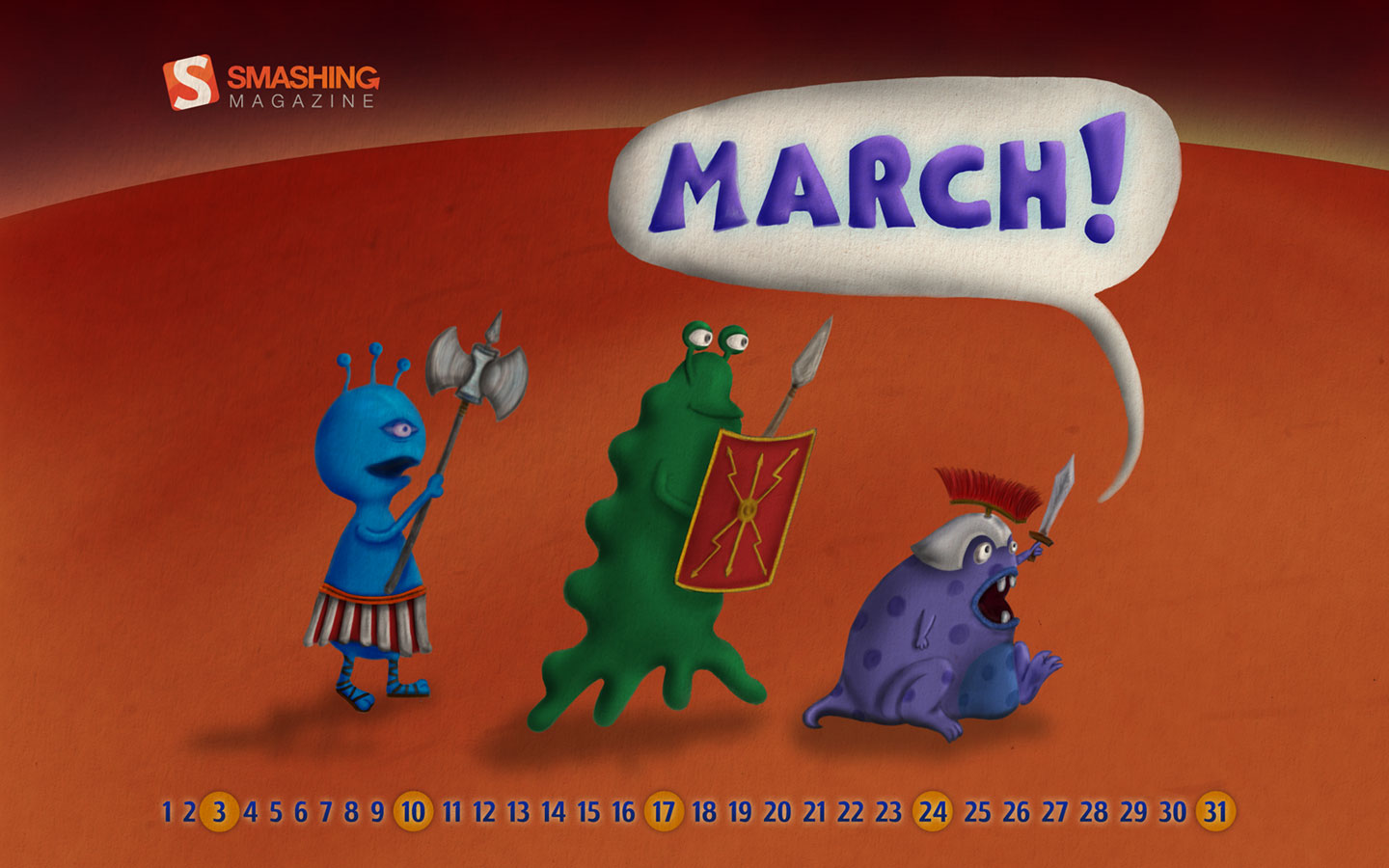
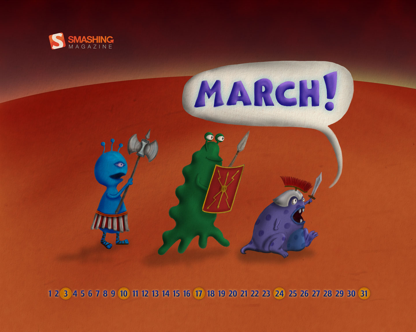
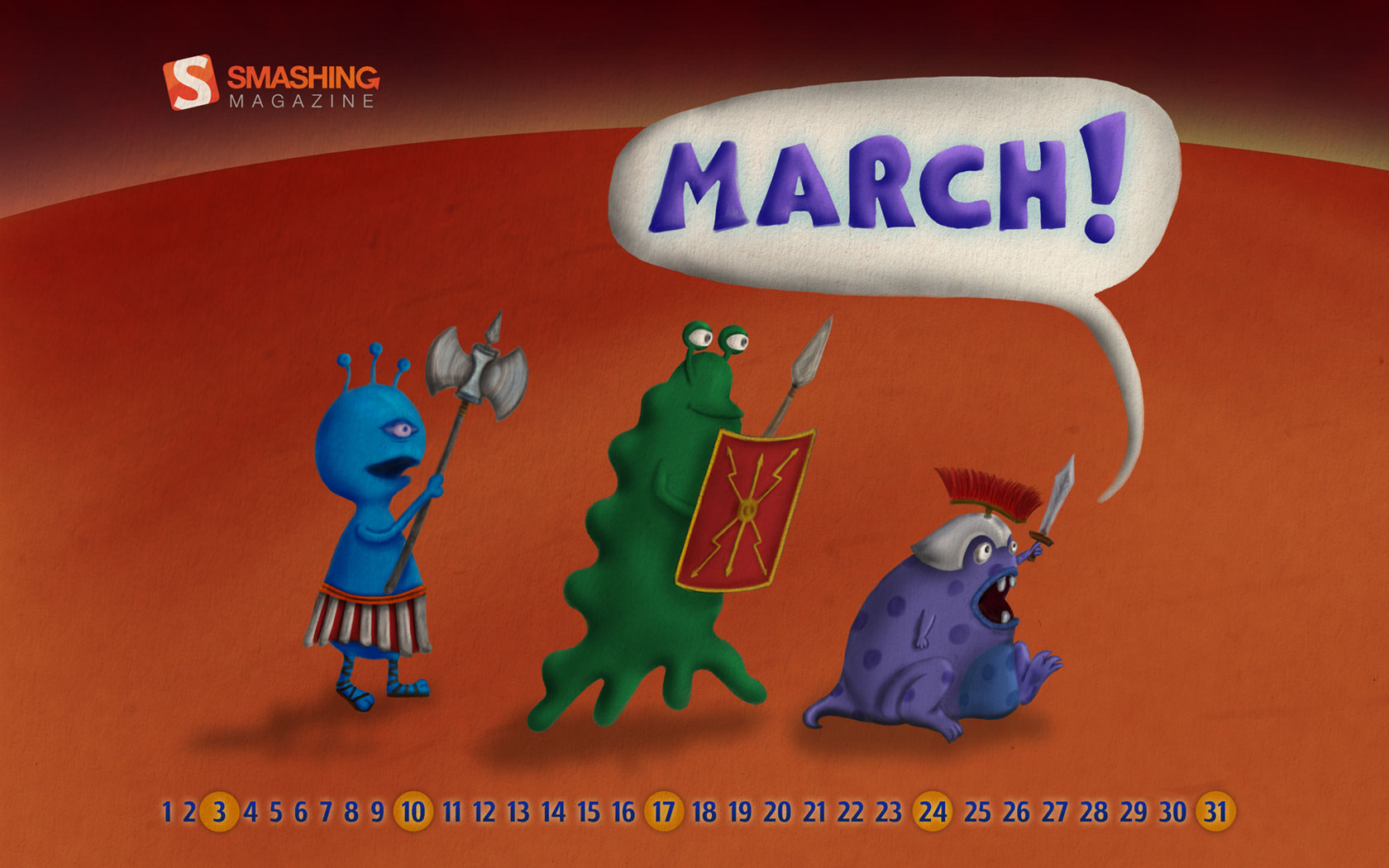
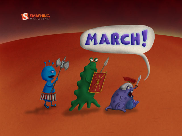
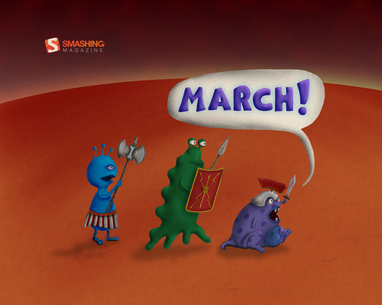
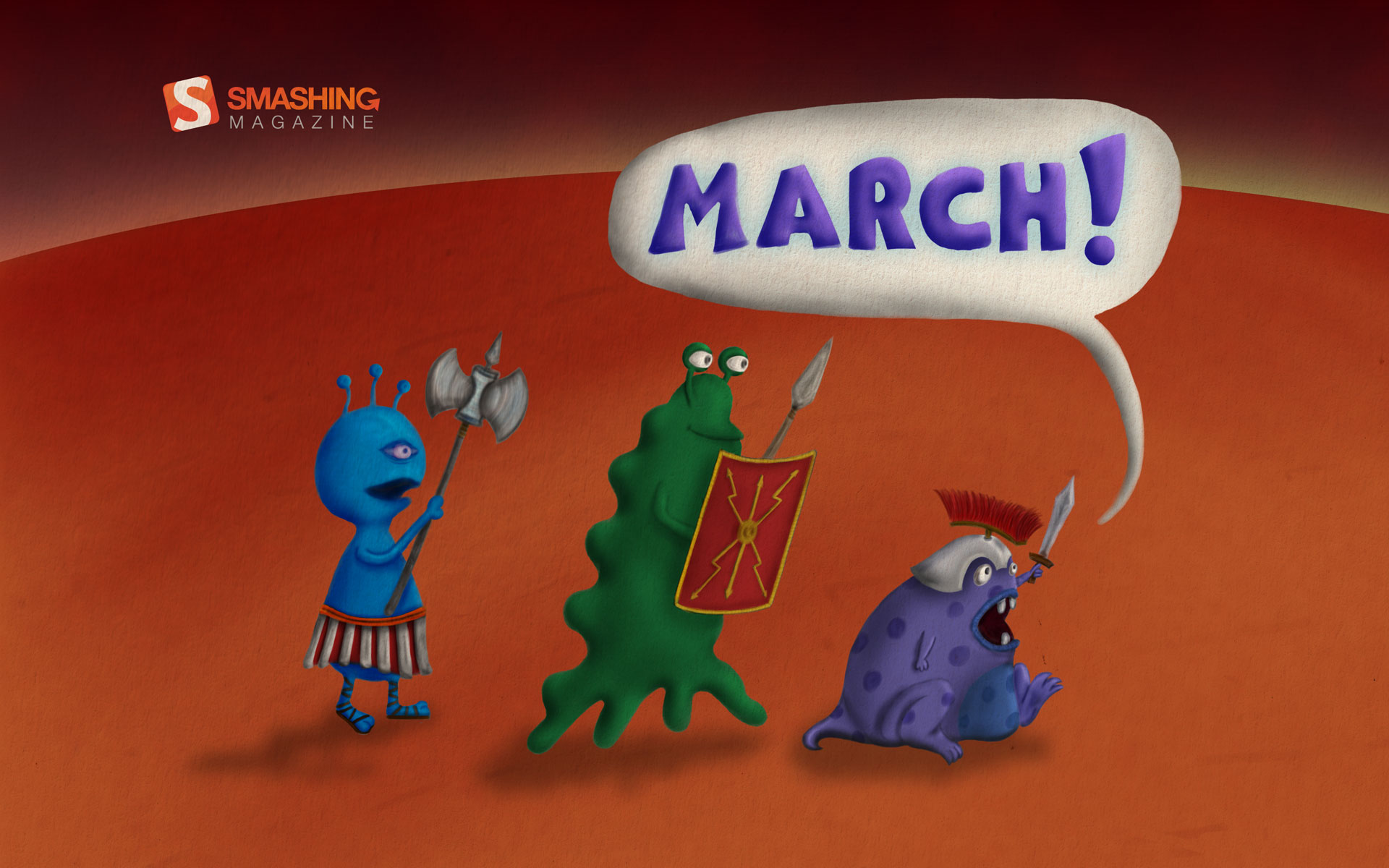
Marching Martians
"Mars, Martians and marching, all joined together in this wallpaper." Designed by Ron Gilad from Israel.

- preview
- with calendar: 320×480, 640×480, 640×960, 1280×800, 1280×960, 1280×1024, 1440×900, 1440×1152, 1680×1050, 1920×1200, 2560×1600, 2560×2048
- without calendar: 320×480, 640×480, 640×960, 1280×800, 1280×960, 1280×1024, 1440×900, 1440×1152, 1680×1050, 1920×1200, 2560×1600, 2560×2048
Join In Next Month!
Please note that we respect and carefully consider the ideas and motivation behind each and every artist’s work. This is why we give all artists the full freedom to explore their creativity and express emotions and experience throughout their works. This is also why the themes of the wallpapers weren’t anyhow influenced by us, but rather designed from scratch by the artists themselves.
A big thank you to all designers for their participation. Join in next month!
What’s Your Favourite?
What’s your favorite theme or wallpaper for this month? Please let us know in the comment section below.
Stay creative and keep on smashing!
(il) (vf)
© Smashing Editorial Team for Smashing Magazine, 2012.


