Archive for January, 2011

Fresh Photo Manipulation Tutorials

Advertisement in Fresh Photo Manipulation Tutorials
 in Fresh Photo Manipulation Tutorials  in Fresh Photo Manipulation Tutorials  in Fresh Photo Manipulation Tutorials

Are you not happy with your photograph? Want to make it look stunning and outstanding? Well, photo manipulation is your way to do that. Photo manipulation is an art which can manipulate your photograph the way you want. You can create some very cool results if you put your creativity and imagination into your photo manipulation process.

The whole process of manipulating your photograph requires loads of patience and skills which comes with experience. Here we have gathered a collection of some useful tutorials that will guide you through the process of photo manipulation. We hope you will like this collection!

Excellent Photo Manipulation Tutorials

Create a Surreal Environmental Photomanipulation
Today’s Photoshop tutorial shows you how to combine photographs to create a surreal photo manipulation using a combination of creative techniques and tips. Image manipulation can be tricky, especially for beginners, but this tutorial breaks some of he more advanced techniques; making it easy to understand for everyone.

Photomanipulation Tuts58 in Fresh Photo Manipulation Tutorials

The young lady
In this tutorial Cassio Braga will show you how to create a great photo manipulation that was created in his first game where the theme was water.

Photomanipulation Tuts22 in Fresh Photo Manipulation Tutorials

How to Create a Greek Mythology Inspired
In Greek Mythology, the Titan Atlas literally carried the weight of the world on his shoulders. This is because when the Titans were defeated Zeus condemned him to hold the Earth in place. In today’s tutorial we will demonstrate how to depict Atlas’ punishment using stock photography and Photoshop.

Photomanipulation Tuts35 in Fresh Photo Manipulation Tutorials

Create a Nature Inspired Photo Manipulation in Photoshop
Today, we will demonstrate how to combine several images to create a nature inspired photo manipulation. Let’s get started!

Photomanipulation Tuts2 in Fresh Photo Manipulation Tutorials

Create a Fantasy Peacock Princess Composition
Ryan Forshaw will demonstrate how turn a standard stock photo of a female model into a fantasy Indian princess. Along the way Ryan will demonstrate how to use advanced techniques to combine several elements into one complete composition.

Photomanipulation Tuts3 in Fresh Photo Manipulation Tutorials

The Babel Tower Photo Manipulation
In this tutorial we will learn how to create one big construction from many architectural parts. In the steps below I will show you how to combine the traditional photo manipulation with matte painting resulting in a renaissance piece. A PSD is included with this Photoshop tutorial.

Photomanipulation Tuts29 in Fresh Photo Manipulation Tutorials

Make a Surreal 3D Outdoor Room Scene in Photoshop
In this photo manipulation tutorial, you will learn how to create a realistic composition of a painter using a room as his canvas.

Photomanipulation Tuts10 in Fresh Photo Manipulation Tutorials

The creation of “A Life Of Aquatic Sounds�
In this tutorial the artist will show you how he created “A Life Of Aquatic Sounds�. We will realize it using a variety of blending mode tricks, photo filters and other useful Photoshop techniques. At the end of this process we will have a beautiful photo manipulation, realized in a short time and a very easily way.

Photomanipulation Tuts18 in Fresh Photo Manipulation Tutorials

How to Create a Flaming Manipulation in Photoshop
Learn how to create this photo manipulation of a flying man similar to Iron Man. This Photoshop tutorial will show you how to apply cinematic lighting effects and manipulate fire to create this composite.

Photomanipulation Tuts30 in Fresh Photo Manipulation Tutorials

Create an Intense Apocalyptic Photo Manipulation
Learn how to create this amazing apocalyptic photo manipulation with Photoshop! You’ll learn how to blend elements such as water and moon, create seamless structures with the Clone Stamp tool, and finish it off with a cold movie photo effect.

Photomanipulation Tuts34 in Fresh Photo Manipulation Tutorials

Lost Treasure
In this tutorial the artist will show you how to create a fantasy montage.

Photomanipulation Tuts40 in Fresh Photo Manipulation Tutorials

Create a Surreal Sci-Fi Movie Poster with Photoshop CS5
In this Photoshop graphic design tutorial, we will be designing a science fiction (sci-fi) inspired movie poster while exploring–and taking advantage of–a few new features in Adobe Photoshop CS5 that will not only save us time, but will also give us awesomely stunning results.

Photomanipulation Tuts59 in Fresh Photo Manipulation Tutorials

Dry World
In this tutorial the artist will try to make a detailed explanation of how to achieve the same result or at least something similar.

Photomanipulation Tuts39 in Fresh Photo Manipulation Tutorials

Serene Fantasy Photo Manipulation
This tutorial shows you how to combine different stock photos to create calm landscape manipulation. You will learn different techniques of blending, changing lights and shadows and color adjustments. Let’s get started!

Photomanipulation Tuts28 in Fresh Photo Manipulation Tutorials

High-Rise B-Movie Poster
In this tutorial Ralf Krause wanted to do a different kind of a promo photo that looks more like a kind of a lobby card with a mixture of painted touch and filthy film grain look.

Photomanipulation Tuts21 in Fresh Photo Manipulation Tutorials

Create a Fantastic Surreal Representation of Time
This tutorial will provide the evolution process of one of my works. In the tutorial you’ll learn some manipulation methods and have a glimpse on how to create a surreal image, taking in consideration a solid theme or idea, in this case the theme is naturally about time and its (un)possibility to redeem itself.

Photomanipulation Tuts23 in Fresh Photo Manipulation Tutorials

Create a Cosmic Space Girl 3D Photo Illustration
Combining techniques is one of the best ways to achieve varied and interesting results in your digital art, and it really helps with your experimentation and creative process when you can rely on a variety of techniques. This tutorial is jam-packed with techniques and tips for you to apply, so let’s get to it!

Photomanipulation Tuts44 in Fresh Photo Manipulation Tutorials

Create a Superhero Movie Inspired Photo Manipulation
In this tutorial the artist is going to show you some photo manipulation techniques for creating a movie inspired scene using Photoshop. We will create an exploding airplane and then we will merge our flying superhero, psd file is also attached.

Photomanipulation Tuts4 in Fresh Photo Manipulation Tutorials

Create a Centaur Photo Manipulation in Photoshop
In this tutorial, we will create one of these mythological creatures by blending several images together and adding some dramatic lighting and depth to the scene. Grab your shield and prepare to do battle as we set out to encounter one of the greatest beasts ever known!

Photomanipulation Tuts7 in Fresh Photo Manipulation Tutorials

Grunge Stone Woman Photo Manipulation in Photoshop
In this design tutorial, we are going to perform a photo manipulation of a beautiful woman breaking free from the confines of her stone prison. We will be using Photoshop to blend various images together along with a bit of brushwork, adjustment layers, and layer styles to create a masterful and compelling image.

Photomanipulation Tuts8 in Fresh Photo Manipulation Tutorials

How to Make an Eerie Looking Photo Manipulation Scene
In this Adobe Photoshop tutorial, we will create a dark photo manipulation scene with a very creepy/eerie/mysterious atmosphere. We will go through some basic techniques for making a shadowy scene and using some creative lighting effect methods that can spice up your work, such as adding a green flame, light streaks and sparkles. For this tutorial, you should be familiar with Photoshop basics, using the Pen Tool (P), and layer masks.

Photomanipulation Tuts9 in Fresh Photo Manipulation Tutorials

Create a Fantasy “Night & Day� Composition in Photoshop
In this tutorial I will show you how to put together some images and how to make use of some Photoshop brushes to design a fantastic fantasy photomanipulation in Photoshop. We will create a scene with a girl floating in front of a building and some vines that connect the girl to the gargoyles of the building.

Photomanipulation Tuts11 in Fresh Photo Manipulation Tutorials

Surreal Train Cabin Photo Manipulation
In this Adobe Photoshop tutorial, we are going to create a simple but effective photo manipulation that blends different images together to create a bold and surreal scene. This tutorial covers how to add realistic blood and shadows, easy-to-use techniques to blend images together, and applying image adjustments automatically using a Photoshop action.

Photomanipulation Tuts13 in Fresh Photo Manipulation Tutorials

Create a Dark and Gloomy Photo Manipulation
Photoshop is great because it allows us to combine several images into a scene that can’t always be created in real life. In today’s tutorial we will demonstrate how to combine several stock images into one gloomy scene. Let’s get started!

Photomanipulation Tuts14 in Fresh Photo Manipulation Tutorials

Design a spectral photo-manipulation
In this tutorial the artist will show you how to realize from scratch a ghostly scene in few steps. We will use a couple of stock photos and modify them so they will look harmoniously combined. In particular we will deal with the burn tool, layer masks and some Photoshop filters often overlooked.

Photomanipulation Tuts15 in Fresh Photo Manipulation Tutorials

How to Create a Nuclear Disaster Landscape
In today’s tutorial we will demonstrate how to create a nuclear disaster landscape using a dozen or stock photos.

Photomanipulation Tuts16 in Fresh Photo Manipulation Tutorials

How to create a melancholy model photo manipulation
In this tutorial we will use several simple techniques to realize a beautiful melancholy photo manipulation starting from the image of a model. We will deal in particular with masks, brushes and lots of adjustment layers to have full color control.

Photomanipulation Tuts19 in Fresh Photo Manipulation Tutorials

CREATE A OUT OF BOUNDS SURREAL PHOTO MANIPULATION
In this tutorial, the artist will walk you through creating an awesome out of bounds photo manipulation. Here are the prerequisites that is required for the successful completion of the tutorial. He also have added the PSD file, in case you want to edit and tinker with it.

Photomanipulation Tuts20 in Fresh Photo Manipulation Tutorials

Create a Surreal Turtle Image
In this tutorial the artist will show how he adjust lighting and colours in his images to create this surrealistic turtle. Hopefully, you’ll be able to transfer these methods to your own work.

Photomanipulation Tuts24 in Fresh Photo Manipulation Tutorials

Create a fantasy-horror scene
In this tutorial the artist will drive you through the process of making a fantasy horror scene in Photoshop. We will use some of our grunge textures to realize the background scene, several Photoshop filters to create light effects and we will turn the picture of an innocent child into a diabolic character.

Photomanipulation Tuts25 in Fresh Photo Manipulation Tutorials

Surrealistic Room Photo Manipulation
In this tutorial, we will be creating a surrealistic room with realistic water as its floor, real clouds as its wallpaper with a clock on the wall and a boat on the water floor.

Photomanipulation Tuts26 in Fresh Photo Manipulation Tutorials

A Photo Manipulator’s Guide to Blending
Blending is the essential skill for every photo manipulator and it´s one of the first things to learn. Without proper blending your images won’t look believable. There are several ways how to blend images together. In this article the artist would like to cover basic techniques which are essential for every manipulation.

Photomanipulation Tuts27 in Fresh Photo Manipulation Tutorials

How to Create an Amazing Apocalyptic Photo Manipulation
This tutorial will show you how to compose an image using 3D and painted elements. These techniques include setting the global light of your manipulation and adding shadow and color adjustments.

Photomanipulation Tuts32 in Fresh Photo Manipulation Tutorials

How to Create a Comic Book Styled Photo Manipulation
Learn how to create this scene in space using photographs. The author will show you how you can photograph objects around your house to create this photo manipulation then finish it off with a comic book effect.

Photomanipulation Tuts37 in Fresh Photo Manipulation Tutorials

Dark Halloween Manipulation Tutorial
In this tutorial the artist will show you his techniques and ideas but you can make your own version and add more elements to your artworks. Power up Photoshop and get the stock images you need.

Photomanipulation Tuts42 in Fresh Photo Manipulation Tutorials

Create an Unbelievable Surreal Abstract Artwork
In this Surreal Photoshop tutorial, you’ll see how to create an incredible surreal abstract artwork with stylistic influences from traditional artistic masters combined with modern, digital and 3D techniques. You’ll see how to analyze a light source and identify where to place highlights and shadows, as well as how to use the pen tool, burn tool, dodge tool, liquify tool and others.

Photomanipulation Tuts43 in Fresh Photo Manipulation Tutorials

Create a Dramatic Urban Raining Composition with 3D Elements
In this tutorial, you’ll learn how to take some stock photos and create a dramatic urban environment, complete with rain, and then build a design composition around it using some 3D elements. You’ll learn how to create a nice raining effect, and how to use urban styles to enhance your work.

Photomanipulation Tuts45 in Fresh Photo Manipulation Tutorials

How to Create a Japanese Fantasy Photo-Manipulation
In this Japanese fantasy photo-manipulation photoshop tutorial, we are going to learn how to create an Oriental-inspired sunset-landscape with two ninjas on the field, posing against the blazing sun. We are going to learn how to blend images seamlessly together by creating dramatic light on the background; Use the Eraser tool to insert persons into a field; create a Vignette and finally make the image glow using the Gaussian Blur tool.

Photomanipulation Tuts47 in Fresh Photo Manipulation Tutorials

Create a Fantastic Environmental Awareness Composition
In this tutorial, you’ll learn how to create a fantastic environmental awareness composition that fits a specific theme, namely the BP oil spill. You’ll learn how to develop a plan of attack for the image, and then combine various stocks to create an environment, then populate it with various sea creatures, then finally you’ll learn how to create the illusion of an oil spill using stock images and painting techniques.

Photomanipulation Tuts50 in Fresh Photo Manipulation Tutorials

Imaginary Photo Manipulation Tutorial Using Photoshop
We will learn how to manipulate few photos into a scene where an princes imagine some beauty of nature. We’ll use some relatively simple techniques to give these images a semi-realistic, stylized feel. Let’s get started!

Photomanipulation Tuts51 in Fresh Photo Manipulation Tutorials

Dark and Eerie Photo Manipulation Scene
In this Photo-manipulation tutorial, we will learn how to create a dark photo manipulation scene with an eerie yet magical atmosphere. We will tackle basic techniques to create an ancient-looking room, using various stock photographs and applying adjustment layers and creating shadows using the Brush tool to blend the images seamlessly.

Photomanipulation Tuts55 in Fresh Photo Manipulation Tutorials

The enchanted forest- Fantasy photo manipulation
In this tutorial we will learn how to create a fantasy photo manipulation.

Photomanipulation Tuts57 in Fresh Photo Manipulation Tutorials

Create a Devastating Twister With Photo Manipulation Techniques
If you’re looking to create a really nice photo manipulation, often you will have to combine several photos and apply a few effects to get your desired look. In this tutorial the artist decided to combine a few photos that he took while I was traveling to create a devastating tornado consuming everything in its path. Okay, let’s get started!

Photomanipulation Tuts36 in Fresh Photo Manipulation Tutorials

Make a TRON-Inspired Photo Manipulation
This Photoshop tutorial goes over the creation of an action scene inspired by the movie, TRON. We will discuss surreal photo manipulation techniques that give the illusion that the subject’s arm and other parts of his body are disintegrating into light. The techniques in this tutorial use different transform tools, filters and adjustment layers to give phenomenal results.

Photomanipulation Tuts5 in Fresh Photo Manipulation Tutorials

Solo – Photoshop Manipulation Tutorial
In this tutorial Andrei Oprinca will show you a few techniques that you can use in your fantasy photo manipulations. You will use the Dodge/Burn to create nice effects by enhancing the highlights and shadows of your stock images. He will also show you how to create realistic shadows using the brush tool.

Photomanipulation Tuts38 in Fresh Photo Manipulation Tutorials

Create an Epic Roman Empire Photo Manipulation Scene
In this Photoshop tutorial, we’ll be using plenty of professional Photoshop techniques to create a scene right out of the fall of the Roman Empire.

Photomanipulation Tuts6 in Fresh Photo Manipulation Tutorials

Floating Island on Water
In this Photoshop tutorial, we will learn how to create a picture with two different stories, one: a town on an island and two: the deep and huge body of water below it.

Photomanipulation Tuts56 in Fresh Photo Manipulation Tutorials

Create a Powerful Mental Wave Explosion Effect
Have you ever wanted to use your mind to move an object? Use the Force to fling things out of your way? Unfortunately, we all know those types of abilities are impossible but using the power of Photoshop anything can be accomplished. In this tutorial we will demonstrate how to create a powerful mental wave effect using Photoshop.

Photomanipulation Tuts1 in Fresh Photo Manipulation Tutorials

Make a Story Book Come to Life
Learn how to create this surreal photo manipulation in Photoshop. You’ll learn the basics of combining stock photos, how to blend them in by adding light and shadows, and complete it with a vintage photo effect.

Photomanipulation Tuts33 in Fresh Photo Manipulation Tutorials

Create this “City to Country� Photo Manipulation with Photoshop
This tutorial will show you how to create a beautiful “city to country” composition using several images. You’ll accomplish this by combining & blending images, and also creating a few lighting/color effects.

Photomanipulation Tuts31 in Fresh Photo Manipulation Tutorials

(ik)


FeedBurner URLs without querystrings

If you use FeedBurner to handle your RSS/Atom/whatever feed, make sure to subscribe to it so you can verify that your posts show up properly. Also follow the links to your posts to check the URLs – they may be a bit mangled by FeedBurner without you knowing it.

It’s probably been like that for a long, long time, but I only recently noticed that FeedBurner added a bunch of querystring parameters (utm_source, utm_medium, and utm_campaign) that I wasn’t aware of to the post URLs in my feed. So instead of http://www.456bereastreet.com/archive/201011/bye_bye_flash/ URLs would look something like this:

http://www.456bereastreet.com/archive/201011/bye_bye_flash/?utm_source=feedburner&utm_medium=feed&utm_campaign=Feed%3A+456bereastreet+%28456+Berea+Street%29

Ouch.

Read full post

Posted in , .

Jobs from Authentic Jobs


Mac App Store: Our pick of the best launch apps

With little in the way of fanfare the new Mac App Store launched this morning. Only time will tell if it will ever match the success of its big brother the iOS App store but it is safe to say its going to revolutionize the way software is distributed on the Mac at least.

You will probably already be familiar with much of whats on offer here (many of the launch titles are ported iOS apps) but we thought it would still be useful to compile a list of stand out launch titles.  If you think we have missed any please let us know in the comments and we will get them added.

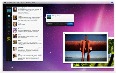
Twitter

Pixelmator

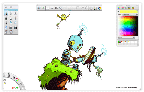
Autodesk SketchBook Express

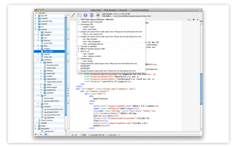
TextWrangler

Aperture 3

Pixelruler

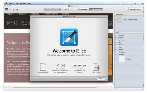
iSlice

MiniShadow


Creative Use Of Video in Web Design: Background Videos

Advertisement in Creative Use Of Video in Web Design: Background Videos
 in Creative Use Of Video in Web Design: Background Videos  in Creative Use Of Video in Web Design: Background Videos  in Creative Use Of Video in Web Design: Background Videos

Since its early days, video has been one of the most powerful and efficient tools of visual communication. It is able to deliver a direct and clear message to a broad audience as well as focus viewers on something particular. A visually appealing video is an excellent way to present a product, service or brand and take user experience to a much more interactive level. For this reason, elegant, creative and professional videos are becoming increasingly popular in Web design today.

Some designers go even further, creating Bluray-like experience in the browser, with interactive navigation menus, soft transitions and exceptional visual effects — all supported with background videos. This can be done with Flash or HTML5, however, most websites incorporate background videos using only Flash. To enable the rich cross-device experience, it is worth considering adding fallback-videos for those users who have a browser that does not support Flash. Nevertheless, we didn’t want to go into technical details just yet and wanted to see what actual approaches designers take within their websites.

The performance of a website including a background video depends significantly on the speed of the user’s internet connection. Video backgrounds certainly do not fit in every setting; they wouldn’t be meaningful in online magazines or blogs. However, they can work really well in entertainment and certain corporate settings which are supposed to communicate artistic qualities, exclusivity, branding or even high quality standards. As you will see, they work very well in portfolio websites, fashion websites and promotional campaigns. Below you’ll find a showcase of good and not so good websites that implement this dynamic eye candy at full screen.

Fashion Websites: Clothes, Shoes, Jewellery

Bulgari B.Zero1
Bulgari, an Italian jeweller and luxury goods retailer, uses a background video to showcase (or “celebrate�) its new B.Zero1 line. Although the implementation is natural and done well, once again there is a strong potential for making the browser slow that would cause the website to run less than optimally. This may be the reason that Bulgari avoids using background videos on every page and use small versions instead; but then those videos feel underwhelming as a result, given the grandeur of the products being sold. The overall feel is very much like on DVDs, with interactive navigation menus, soft transitions and visually exceptional graphics.

Videobackground12 in Creative Use Of Video in Web Design: Background Videos

Uniqlock
Uniqlock is an advertising campaign for Uniqlo, one of Japan’s largest casual wear retailers. By including the video dance routines, time-signal music and clock utilities, the designers craft a unique experience using the background video technique. This is a virtual 24/7 presentation of Uniqlo clothing done with creativity and style. It won one of six Black Pencils in the online advertising category at the D&AD Awards 2008 in London.

Videobackground13 in Creative Use Of Video in Web Design: Background Videos

Gudrun og Gudrun
Gudrun og Gudrun is a hand-made clothing brand by two knitwear designers from the Faroe Islands. The designers use background video to showcase their fashion show, and they use it throughout the website, with subtle transitions via various elements. An interesting use case, even if somewhat taxing on some users’ systems. The site is a bit older than others, yet it still is interesting and attractive.

Videobackground15 in Creative Use Of Video in Web Design: Background Videos

Jay Jays Dance/Off
Dance/Off is an interactive 3-D online catalogue for the new line by youth fashion brand Jay Jays. This website is truly exceptional in concept, but not so in execution. The 3-D approach is innovative but also makes the website (which is effectively a fashion ad) impractical. Without 3-D capabilities (and that would be most homes thus far), users would find the videos pixelated and visually unappealing. The interactive element is also conceptually intriguing, but with the long loading time and numerous instructions for using the website, most users would probably just move on. Besides, the page takes way too much time to load, even on the broadband connection. A nice touch: you can navigate the website using your keyboard.

Videobackground08 in Creative Use Of Video in Web Design: Background Videos

Yves Rocher: Tout le Film
“Ce qui est essentiel rend belleâ€� is a promotional short video that anchors this website. The video challenges the taboo of sexuality at any age, highlighting its biological benefits. The rest of the website is subtle and stylistically simple, making it easy on system resources. The video doesn’t start playing automatically, but requires user to click on the large green “Play” button first. Simple and user-friendly.

Videobackground16 in Creative Use Of Video in Web Design: Background Videos

Louis Vuitton Journeys
Louis Vuitton Journeys is an advertising campaign features three soccer legends, Zinedine Zidane, Pele and Diego Maradona. The intro to the video plays a little too fast to catch everything as it loads, but otherwise it is handled well. The video navigation and transitions are smooth, and the videos themselves are somewhat interactive.

Videobackground01 in Creative Use Of Video in Web Design: Background Videos

John Galliano
John Galliano is a Gibraltarian-British fashion label; here, the video begins on the main page and takes over your sound and drains your system resources. The navigation is a little too fluid, making it difficult at times to quickly jump around to where you want to go. As you move deeper into the website, the background becomes less system-intensive, and each page opens in the current tab, freeing up the sound and CPU from the home page. The video introduction on the front page is interesting and not too obtrusive, but the music should not start automatically when the page is loaded.

Videobackground03 in Creative Use Of Video in Web Design: Background Videos

Valentino
Valentino is an international clothing company based in Italy. It does a much subtler and less intrusive variation on this technique. Although video elements play throughout the website (e.g. on the “Haute Couture” page), the home page does not automatically start a big video until you select one navigation item. And because you are prompted to begin the videos, your sound is not taken over until you decide. More user-friendly, better, cleaner design.

Videobackground04 in Creative Use Of Video in Web Design: Background Videos

Byblos (-> Runway)
Byblos is an Italian fashion house that uses video backgrounds very subtly. The splash page is a single frame, and sound runs continuously through the website unless you turn it off. But once you get past the splash page, the only really resource-sapping videos are limited to certain sections of the website, namely the “Runway� section. This feels like a more natural use of this technique; the whole website is not overly resource-dependent and prone to lagging on slow connections.

Videobackground06 in Creative Use Of Video in Web Design: Background Videos

Nike: M6
Jordan Melo’s sixth signature shoe by Nike is the subject of the background video featured here; it is a multi-part behind-the-scenes look at the new product design. Once again, there is a potential lag issue because the videos are very big and looped continuously. Rather than automatically transitioning from one video segment to the next, the website could just as easily have paused and prompted the user to move on, giving them a breath to digest what they just saw. Controls for pausing the videos are available, so the user has the option, but automatic pauses would have helped here.

Videobackground10 in Creative Use Of Video in Web Design: Background Videos

Anti Sweden
Anti Sweden is a Norwegian fashion brand that subtly employs background video to complement its minimalist approach. Without the heavy graphics and sound that usually accompany this technique, the website is not as resource-intensive as some others, which is a nice change. The website demonstrates how the technique can be a lightweight yet completely engaging concept.

Videobackground14 in Creative Use Of Video in Web Design: Background Videos

I Surf Because
The “I Surf Becauseâ€� site is part of Billabong’s digital marketing campaign. Here, Billabong uses a background video on the home page to push its campaign, but the technique is absent on deeper pages. This makes the website more CPU friendly, even though the embedded YouTube videos inside feel a bit lacking after the effect of the home page. An interesting idea: sometimes videos pause, show a tagline allowing for a comfortable reading and then continue again.

Videobackground11 in Creative Use Of Video in Web Design: Background Videos

Vibram FiveFingers (Be cautious: NSFW!)
FiveFingers is a shoe brand manufactured by Vibram, which has conceived an entire website driven by background videos. The execution is certainly interesting. With unique fluid navigation elements throughout the website, this interactive video features both the product itself and relevant data, making for a truly unique concept that is perfect for this technique. The splash page lets users choose if they want to see a normal site, a fullscreen site and if they are on low bandwidth connection.

Sam Edelman
Sam Edelman, a fashionable shoe brand, shows that one can achieve certain level of interaction without videos. In this case, subtle animations are used instead of streaming videos. The overall website is understated, as is the tone and theme of the background video, which is nicely done. Also, no sound takes over your system, a refreshing change up till now. A nice alternative to video backgrounds.

Videobackground07 in Creative Use Of Video in Web Design: Background Videos

Car Websites

Toyota Avalon
The promotional website for the Toyota Avalon is a fully interactive trip through five destinations and five of the vehicle’s features. The website creatively employs background video to some of its fullest and funnest potential. A promotional website which is essentially an interactive show-off with rich, creative, sophisticated imagery and navigation. Created by North Kingdom (Stockholm, Sweden) in collaboration with Saatchi & Saatchi LA (Los Angeles, USA).

Videobackground17 in Creative Use Of Video in Web Design: Background Videos

Scion
The official website for the Toyota Scion is another website where video background seems a bit underused. The website does not take over your sound to add to the video background, although numerous video transitions feel like they should have had sound; thus the videos feel lacking or somewhat broken in parts. Other videos open in smaller separate windows, once again feeling like a missed opportunity to employ the technique. By the way: the font size on the page is way too small.

Videobackground18 in Creative Use Of Video in Web Design: Background Videos

Beverages And Food Websites

LemonAid
LemonAid is an organic drink made entirely of a few organic, fair-trade ingredients, and the company uses a retro-styled background video to tell everyone what it’s all about. On entering the main website, system resource usage goes up significantly, which for some users will mean a bit of drag on the video and sound. Despite this, the concept is fairly simple, and the implementation works well for the product. One major drawback: the font size is way too small.

Videobackground20 in Creative Use Of Video in Web Design: Background Videos

Hennessy
Hennessy is a well-known French cognac brand. The video background gives this website a fitting elegance but with a twist. The video is resource-intensive in some areas and simpler in others. In both cases, the visuals are quite vivid and remarkable. Overall, a good, elegant fit for the brand.

Videobackground21 in Creative Use Of Video in Web Design: Background Videos

Russian Standard Vodka
Russia’s leading premium vodka is low key and unobtrusive with most of the information on its website; the main section automatically scrolls through a selection of promo material. The navigation is context-sensitive, being displayed only when users hovers over the menu. You can click on the video to pause it.

Videobackground22 in Creative Use Of Video in Web Design: Background Videos

El culto a la vida
“El culto a la vida� is an advertising campaign for Havana Club, a brand of rum made in Santa Cruz del Norte, Cuba. Background videos are employed for several uses throughout the website. With everything from live footage to interactive elements, the videos fully complement the look and tone of the brand.

Videobackground23 in Creative Use Of Video in Web Design: Background Videos

Tub Gin
Tub Gin is a premium gin brand that uses video to humorously project its grungy and tough image while providing useful product information. Your CPU will take a bit of a hit as you peruse the various offerings, but given how entertaining the website is, you will barely notice it.

Videobackground24 in Creative Use Of Video in Web Design: Background Videos

Battle of the Cheetos
Battle of the Cheetos is a promotional online multi-player game with a low learning curve, but still complex enough to keep users engaged. Notice how well various video-elements are incorporated in the Flash-movie, vividly inviting the users to join in. Developed by North Kingdom (Stockholm, Sweden) and Goodby, Silverstein & Partners.

Videobackground25 in Creative Use Of Video in Web Design: Background Videos

Asylum626
Asylum 626 is an advertising campaign for Doritos, which went with an interactive horror experience for this campaign. The “treatment” is available only between 6PM and 6AM and users can book an appointment to “participate”. According to the website, the experience is a scare that is too personal for the cinema. But for all the time required to go through the website, one ends up seeing little correlation between the product and these overproduced horror sequences.

Videobackground26 in Creative Use Of Video in Web Design: Background Videos

MyAmoy
Amoy Food, one of the food and sauce brands in Southeast Asia, uses background video to complement its interactive promotional website. The site allows you to actually visually add ingredient and see them being prepared. Get ready to lose some time in the recipe-maker section, which is the highlight and focus of the campaign.

Videobackground27 in Creative Use Of Video in Web Design: Background Videos

Music And Dance Websites

White Lies
White Lies is an alternative rock band from Ealing, west London, that uses background videos to play its music videos while the user browses the rest of the website. Designers have made a poor choice for the resolution of the displayed video: at large resolutions, it looks very pixelated and blurry — even a bit larger resolution would work much better. Most navigation actions do not disrupt the playing either, because external links open in new tabs, leaving the slightly resource-heavy video to continue playing. Also, even though the website is for a music band, the website opens with the sound muted by default, which is a nice change.

Videobackground28 in Creative Use Of Video in Web Design: Background Videos

Sick City Club
Sick City Club is an indie rock quartet from Birmingham, England, that employs the technique of playing its videos while the user looks around. New content slides in from the side, never disrupting or creating lag for the video. This is somewhat unusual among the websites featured here, most of which have elements that are complex or resource-heavy. The elements here seem to be simple and lightweight, which suit the website well.

Videobackground29 in Creative Use Of Video in Web Design: Background Videos

Tomato Jaws
Tomato Jaws is an electronic band from the Ukraine. It uses background video for ambience as the user engages with the unique navigation. The difference here, though, is that the music videos that play in the background are not necessarily theirs. In fact, in a bit of short-sightedness, the band’s music videos open in smaller players while the background video continues, thereby draining the CPU even more than necessary and causing both the music and background video to skip and drag.

Videobackground31 in Creative Use Of Video in Web Design: Background Videos

Arcade Fire: Neon Bible
Canadian indie rock band Arcade Fire employs video backgrounds in a fun and unique way for its Neon Bible interactive music video. The website looks sparse at first and it features just a single music video, but with several interesting elements thrown in so that the viewer can sort of play along as the video plays. Still a bit heavy on resources, even for such a minimal approach, but that is to be expected.

Videobackground32 in Creative Use Of Video in Web Design: Background Videos

Radio Soulwax
“Part of the Weekend Never Diesâ€� is a documentary about Radio Soulwax’s summer 2006 tour, filmed by director Saam Farahmand. The website features a particularly creative use of background video: it enables the user to create their own mix by triggering various loops and video clips from the click of the mouse. While resource-intensive, it is an interesting use case.

Videobackground33 in Creative Use Of Video in Web Design: Background Videos

Destroy Rankin
To celebrate Youth Music’s 10th birthday, 70 of the world’s greatest musicians and visual artists have created a groundbreaking body of collaborative artwork based on Rankin’s iconic portraits of musicians. Simple, artistic and a worthy complement to the photographer’s work.

Videobackground34 in Creative Use Of Video in Web Design: Background Videos

1001 Attitude
1001 Attitude is a dance school in Montfermeil (Paris) that uses background video to show its students dancing and, at times, warming up. This is a good use for a dance school, but the video is stretched to fit the background and so becomes distorted, which is unfortunate because it detracts from the elegance of the effect.

Videobackground35 in Creative Use Of Video in Web Design: Background Videos

Random Dance
Random Dance, an internationally renowned British dance company, puts background video on full display on its home page. As you move deeper in, a smaller video player is used, which fits the flow and structure of the website.

Videobackground37 in Creative Use Of Video in Web Design: Background Videos

Hotel, Restaurant, Bar and Nightclub Websites

Iberostar
“On vacation, we’re all stars� is the slogan for the Iberostar Hotels & Resorts campaign featuring Antonio Banderas. A partly interactive background video walks you through a virtual tour of what your actual experience at a resort would be like. The tour is an interesting way for hotels to deliver this experience.

Videobackground38 in Creative Use Of Video in Web Design: Background Videos

The Wood
The Wood is a brand new bar/restaurant in the heart of Brussels and the famous “Bois de la Cambre.� The designers use background video to craft a soft atmosphere, which seems to fit the feel and decor of the restaurant in its unique woodsy way. The navigation plays into the rest of the website’s structure wonderfully, tying together the whole experience.

Videobackground40 in Creative Use Of Video in Web Design: Background Videos

Jazzownia Liberalna
Jazzownia Liberalna is a music club and restaurant that uses this technique in a stylish way. Adding various elements outside of the menu, the owners have gathered a lot of information on the history of jazz and displayed it in an simple interactive timeline of sorts. The rest of the website appears fluidly over top of the video. Breaking from the background once or twice might actually help here.

Videobackground41 in Creative Use Of Video in Web Design: Background Videos

Byblos
Byblos is a dance club in Porec, Croatia. It uses video background not only to show footage of the club itself, but to establish the tone and attitude of this hotspot. The website is hard on the system, but you are told that from the start, so be prepared. The transitions and overlays fit right in with the background, and they work well together and don’t detract from each another.

Videobackground42 in Creative Use Of Video in Web Design: Background Videos

Advertising, Design Agencies and Film Studios

Razorfish
Razorfish is an interactive agency for marketing, experience and enterprise design. Its use of background videos is both subtle and nearly unobtrusive in implementation. With minimal sound and graphic-heavy inclusions, the website is smooth and fluid throughout.

Videobackground43 in Creative Use Of Video in Web Design: Background Videos

Less Rain
Less Rain is a digital creative agency with offices in London, Berlin and Tokyo. Its site uses background video to complement the ambience of the rest of the website. However, as on other websites, the videos in the gallery open in a separate player, rather than in the background (where the main video stops playing). With the kind of work being showcased, a bigger presentation seems more suitable.

Videobackground44 in Creative Use Of Video in Web Design: Background Videos

1stAveMachine
1stAveMachine is an NYC-based CGI, visual effects and animation studio that uses video background to enrich its website experience. Video sequences that play in the background do not always complement the navigable elements; they make the content displayed over top of it illegible in many instances.

Videobackground45 in Creative Use Of Video in Web Design: Background Videos

IDEAL Production Company
Ideal Production Company is a motion-design studio from Warsaw, Poland, that uses an interactive navigation element to enhance the background video employed throughout the website. This navigation also seems to be the reason that most videos on the website play in a smaller separate player. Still, given the nature of these videos, the smaller presentation does work here.

Videobackground46 in Creative Use Of Video in Web Design: Background Videos

BlackBeltMonkey
BlackBeltMonkey is a German communications and interactive design agency that has a subtler variation on background videos. While adding unique and whimsical interactive elements, the designers manage to keep the background from interfering with the content almost perfectly. There are some instances of text and background colors matching, rendering some of the headings partially illegible.

Videobackground47 in Creative Use Of Video in Web Design: Background Videos

Marketel
Marketel, one of the largest advertising agencies in Quebec, Canada, uses background video and with a responsive hover element to boot. The stylish background adds sophistication, and it remains active during all of the other interactions on the website. But when the television ads run in the gallery, the background can create a heavy lag for some users.

Videobackground48 in Creative Use Of Video in Web Design: Background Videos

Designkitchen
Designkitchen is an interactive design agency that delivers award-winning digital branding across multiple channels: social, viral, mobile and Web. It uses background video throughout its website, with various supplementary videos depending where you navigate to. The videos, especially in the news section, repeat themselves (sometimes alternating, but rarely) making them a bit distracting. Also, the portfolio has some white text against a white background, creating some difficulty there as well.

Videobackground49 in Creative Use Of Video in Web Design: Background Videos

Lukas Lindemann Rosinski
Hamburg-based advertising agency LLR (Lukas, Lindemann, Rosinski) also takes a minimalist approach with this technique and its overall website. With their unique and responsive navigational elements, the designers instill a sleek yet stylish feel throughout the website and leave a lasting impression.

Videobackground50 in Creative Use Of Video in Web Design: Background Videos

Working Element
Working Element LLC is a collective made up of directors, photographers, writers, compositors, editors, photo illustrators, designers and cinematographers. The site uses background video to show the truth of its name. But as the large still gallery opens up, the video continues to play behind it, feeling a bit overstimulating. Again, the idea has promise but could use some tweaking.

Videobackground51 in Creative Use Of Video in Web Design: Background Videos

Metaproject
Metaproject is a creative agency based in New York. Its background video is in some ways subtler and in other ways grander than others we’ve seen, but never intrusive or distracting, which is not always easy to achieve as we have seen. The transitions are smooth, and the background varies with the pages and projects in the gallery.

Videobackground52 in Creative Use Of Video in Web Design: Background Videos

MediaNovak
Media Novak’s background video is handled impressively, with little overstimulation. But it drops the ball in the portfolio section. The background fills with a wall of thumbnails, but it scrolls too quickly at times depending on the position of your mouse. There is no resting point. When you open a window, the wall continues to scroll behind it, which can be distracting or unpleasant for some users.

Medianovak in Creative Use Of Video in Web Design: Background Videos

Filmhouse
Filmhouse is a film production studio that uses a combination of background video techniques throughout its website (ranging from moderate to heavy use of system resources as well). As on other websites, this one opens up the videos in its portfolio in smaller windows, even shutting down the background entirely. But after the grand tour of the facility in the background, these smaller portfolio pieces feel a bit underwhelming.

Videobackground55 in Creative Use Of Video in Web Design: Background Videos

About:blank
About:blank uses this technique harmoniously throughout. With the fluid, smoke-like effect playing through a halftone overlay in the background, the website comes across as sleek and well crafted. And the fact that the video continues to play without impeding the readability of the text over top of it shows how well this effect can be implemented with such simplicity.

Videobackground56 in Creative Use Of Video in Web Design: Background Videos

BM8
BM8 Bildmacht is a Hamburg-based film production studio that uses background video in two distinct ways. First, you can play with its portfolio of projects, which opens in the full browser window; and once you enter the website, the background is a continuously flowing video that entertainingly introduces you to the company. The videos are also available as lightboxex, so you can skip to specific parts or simply let them play through.

Videobackground57 in Creative Use Of Video in Web Design: Background Videos

From Scratch Design Studio
From Scratch’s background video is heavy and as results it often causes problems with navigating the website. However, the implementation here shows some interesting ideas. For example, while the videos in the portfolio section open in smaller windows, separate from the page, they do not feel like a break in the flow of the website. The transition feels like a natural fit.

Videobackground58 in Creative Use Of Video in Web Design: Background Videos

Hipopotam Studio
This small talented design studio of two people from Warsaw, Poland, implements this technique site-wide. Thus, the lag factor can get a bit much at times. However, when viewing projects in the portfolio, system usage drops rather significantly; even though video is used here, it is done in a subtle yet still interactive way.

Videobackground59 in Creative Use Of Video in Web Design: Background Videos

9elements
9elements uses background video for its main website and all accompanying material but abandons it on its blog. The background on the main website does not distract in any way from the content displayed over top, which is nice to see. Fluid transitions make for less chance of video disruption.

Videobackground60 in Creative Use Of Video in Web Design: Background Videos

GDSH
GDSH’s background video is very subtle, almost imperceptible. Whereas many sites displayed above use the technique as a focal point, here it serves simply as the background, and without interfering with the content, as a background should.

Videobackground61 in Creative Use Of Video in Web Design: Background Videos

Further Examples

We Choose the Moon
We Choose the Moon is a real-time immersive, interactive website for the John F. Kennedy Library and Museum. It commemorates the 40th anniversary of the Apollo 11 mission, the result of JFK’s pioneering vision to land the first person on the moon. Background video is implemented so that the user can track the entire mission through its various stages, with interactive stops and elements added along the way.

Videobackground62 in Creative Use Of Video in Web Design: Background Videos

Lost in Val Sinestra
The Lost in Val Sinestra is a viral marketing campaign by Swisscom to promote its TV offerings. It allows users to create a personalized movie trailer starring their Facebook friends or with pictures uploaded from their hard drive. The website adds interactivity by allowing users to choose their cast and the thrill-level for the story. To get the most out of the experience, use a big cast.

Videobackground64 in Creative Use Of Video in Web Design: Background Videos

Philips: Cinema
Parallel Lines is a Carousel short-film project to promote Philips TV sets. The films explore the most popular genres of filmmaking — including drama, action, animation, sci-fi and thriller — a nice examples of a site using video to provide a very memorable, rich user experience.

Videobackground65 in Creative Use Of Video in Web Design: Background Videos

Neave Television
Neave Television uses background video to present a truly original and entertaining concept. A series of seemingly context-free, weird and bemusing video clips are presented one after the other, allowing the user to skip to the next clip with the click of the mouse.

Videobackground66 in Creative Use Of Video in Web Design: Background Videos

MTL12
MTL12 is a documentary television series (12 episodes) about Montreal and the people who live there. A stylized and interactive take on the background video technique gives this website its unique look and feel, highlighting the project and its segments in the process.

Videobackground68 in Creative Use Of Video in Web Design: Background Videos

Newturn Group’s Webart Exhibition
The first online art exhibit website of the Newturn Group streams resource-heavy background video leading up to and following the event. However, the videos can lag a lot and be at times unwatchable. The website gets a bit lighter once you start browsing around and move away from the main videos.

Videobackground69 in Creative Use Of Video in Web Design: Background Videos

Aaron Ohlmann
Aaron Ohlmann is an editor, producer and documentarian with an interest in projects that focus on the arts, political structures and social architecture. His website has a scaled-back, resource-friendly background video. But given the appearance of the home page, we expected to see each project in the same format; unfortunately, the other videos on the website open in a smaller player.

Videobackground70 in Creative Use Of Video in Web Design: Background Videos

Yodabaz
Yodabaz is the portfolio of Basile Tournier, co-founder of Web creation studio FCINQ. Once more, we have a main background video element that acts simply as a background, with the website’s other elements seamlessly laid over top. The background is integrated into the website without any interference or lag.

Videobackground71 in Creative Use Of Video in Web Design: Background Videos

EagleClean
EagleClean is a specialist cleaning company based in Central London that takes a subtle, minimalist approach with both its website and background video. It effectively markets its services with quick, once-over cleanings now and again to clean up any smudges on your screen. A creative use of the technique.

Videobackground72 in Creative Use Of Video in Web Design: Background Videos

Wim Vanhenden
Wim Vanhenden is a creative Internet artist from Belgium who uses background video not only to highlight his previous work, but to enhance the art project built right into the website. Upon prompting users to type in their thoughts and other information, the website searches the Web for related images and morphs them into an artistic background slideshow.

Videobackground74 in Creative Use Of Video in Web Design: Background Videos

Futuretainment
Futuretainment: Yesterday the World Changed, Now It’s Your Turn is a book written by Mike Walsh. Background video is used somewhat obtrusively on the website, looping repeatedly through a series of short segments. The segments themselves are so repetitive that they become distracting, and most of the footage is grainy and pixelated which is not a good thing.

Videobackground75 in Creative Use Of Video in Web Design: Background Videos

Walt’s Warning
Walt’s Warning is a first-person interactive experience website from Sony Pictures for Breaking Bad. Using background video to suck the user into the show’s world, the designers add another element of interactivity with responsive mouse-over scrolling. Overall, the experience is short-lived and a bit high on the resource-sapping end of the spectrum.

Videobackground76 in Creative Use Of Video in Web Design: Background Videos

What Do You Think?

As you might have noticed, this article doesn’t really go into details explaining how to actually implement cross-browser video backgrounds in Web design, but if you’d like to have it as a follow-up, please let us know in your comments below.

Also, in general, what is your opinion of background videos in Web design? Do you think that it makes sense to use it? If yes, in which particular designs? If not, why not?

Poll: Would you like to see a HTML5 (or Flash) tutorial on creating video backgrounds in web design as a follow-up?


(al) (ik) (vf)


© Aygul Zagidullina for Smashing Magazine, 2011. | Permalink | Post a comment | Add to del.icio.us | Digg this | Stumble on StumbleUpon! | Tweet it! | Submit to Reddit | Forum Smashing Magazine
Post tags:


iOS browsers that allow font scaling and text reflow

After complaining that Safari for iOS needs a text size preference and text reflow I decided to take a look at what other options are available. Many people don’t realise it, but you don’t have to use Safari for browsing the Web from your iPhone/iPad/iPod Touch.

I had a look around the App Store, searched the Web for a few reviews, and ended up testing two browsers that feel like worthy alternatives to Safari: iCab Mobile and Atomic Web Browser.

Read full post

Posted in , , .


  •   
  • Copyright © 1996-2010 BlogmyQuery - BMQ. All rights reserved.
    iDream theme by Templates Next | Powered by WordPress