Archive for February, 2011

Why Wait For The Opportunity? Create Your Own!

Advertisement in Why Wait For The Opportunity? Create Your Own!
 in Why Wait For The Opportunity? Create Your Own!  in Why Wait For The Opportunity? Create Your Own!  in Why Wait For The Opportunity? Create Your Own!

As many people who work in a creative field like design and development may already know, sometimes our clients just do not understand what it is that we are trying to achieve. The boundaries that we are seeking to push are not ones they approve of for their project, so our creative ideas get backburnered until we can find an appropriate project as well as an agreeable client where you can flex these creative muscles freely. In fact, the standard business processes, especially the ones we allow ourselves to be strapped into, tend to work against us in this aspect.

Allow me to elaborate. For most creatives, the most genuine and innovative ideas can often come without provocation. Which is unfortunate, because that tends to relegate these ideas to one of two categories. The personal project category that we get to whenever we find the time to break away from our work plates to snack on something different. Or to the professional project pool where we wait on that client who will allow us the freedom to incorporate this idea into their project. At other times, the ideas we have tend to be in response to the client, their business or something they have laid down — some sort of foundation — for us to build upon. These ideas are somewhat prompted.

Aces in Why Wait For The Opportunity? Create Your Own!
Don’t just wait for the aces! Image by fitzsean

Now this is not to say that the prompted ideas are any less potent or powerful than the ones that we arrived at alone, only that the ones we get to by ourselves tend to be more imaginative and exciting in our eyes as those are the ones we feel unencumbered by the clients rules or specs. Which also means that they are the ones that we get to work less on due to the fact that we have to pay the bills, and in most cases, that means some kind of compromise on the part of the creative mind. We can say that we think outside the box on every project, but we have to admit that when a client comes to us, they have one or two ideas in the bucket ready and those specs can be considered somewhat of a box that we must work in.

That Is Just How Business Works

Now I know that there are some who are scratching their heads, knowing that this is just the way how business works, and they are confused at to what exactly we are asking them to consider. And yes, we understand that this is the standard way by which this game is played. Businesses have needs — they turn to other experts or specialists to have these needs met. They explain exactly what it is they are looking for, and the experts comply, delivering the experience that hopefully surpasses the client’s expectations. But what if we could change the standard rules of gameplay here on a much wider scale, affording this much freer approach to any designer or developer who wished to truly work unhindered.

Think-outisde-the-box2 in Why Wait For The Opportunity? Create Your Own!
Think outside the box! Image by west.m

Just a quick note: this article is not trying to say that working with all clients is a dull, innovation adjacent venture, or even trying to say that you will never have to work under these more standard rules of gameplay. But we usually have ideas of our own — ideas that we would love to see through without having to compromise or consult with a client or anyone else for that matter to approve what we are doing.

Think of it like the difference in a movie director working independently on a film rather than working for a major studio. They have much more freedom to make the film as they see fit, without any interference from above. For a while this was an approach that not many designers or developers have thought to not be feasible, but that is all changing.

Thanks, by and large, to the avenues being created by and granted access to by the Web.

The Game Changer

Before now, and in some ways still, we have always had to take our ideas to someone else in order to help us make them happen. We had to reach beyond ourselves to find those with the means and know-hows to reach further than we had access in order to get our idea out to the masses and have it connect with the audience. Essentially, we had to sell our idea to someone else in order to get distribution and manufacturing. However, the Web is granting creatives the chances to write their own opportunities, and make things happen for themselves, without having to depend on someone else.

Understanding that the term “sellout” tends to carry negative connotations, but what I mean is that we have to pitch the idea and someone has to buy in order for it to happen. When they buy, that tends to put them in the controlling seat. They hold the final say over the outcome of the project, or even where the project ends up. For some creatives, that compromise alone can take a lot of the fun and excitement out of the equation. But without those buyers, the project would tend to remain an unrealized effort. So there has been an underlying coercion for creatives to play the game and compromise their ideas when necessary in order to connect with the masses.

Strategic-game in Why Wait For The Opportunity? Create Your Own!
Plan your game – several moves ahead. Image by DoubleM2

Enter the Web, and services like Kickstarter, communities like YouTube and Vimeo, and suddenly the middle men that we needed to make our innovative ideas a reality, are not as much of a necessity as they once were. There is a great article by Ryan Carson that highlighted two examples of just how those in creative fields who are no longer waiting for opportunity to knock, instead create those opportunities for themselves. And in these cases, what remains important is that they remain the ones calling the shots.

Now I know there are those who think that this is approach is a complete waste of time. However, already today there are creatives who are just as equally excited about this evolved approach which allows them to completely take the reigns of their creative projects. So below we have taken a look at both the benefits offered and challenges posed by this new gameplay structure to help better see what exactly this approach means and entails.

The Benefits

First, we are going to look at the pros to taking charge of our creations and marching forward with them on our own as the masters of our own destiny. If you are one of those who is on the fence about this whole issue, or even if you are standing firmly against it, perhaps this section will have you rethinking things and getting you to come down on the side for it.

Shot-Caller

This has already been mentioned in the article; however, given its weight, it deserves a deeper examination of just what makes it so important. For most of us in the design and development fields, we have had to work with a client whose lack of understanding of the field can negatively impact the resulting project once their uncompromising input has been implemented. This can hugely effect our resulting takeaway and perspective with which we begin to view our chosen fields. Especially, if we find project after project that comes with compromise after compromise. This can effectively end up sapping our excitement and stifling our creative energy.

Defining-targets-differently in Why Wait For The Opportunity? Create Your Own!
You’re your own boss and choose your own target. Image by HikingArtist.com

Another side effect these compromises can have is that we end up having to lose some truly innovative element of the project because of the client’s wishes, and our work can somewhat reflect a staleness on our parts as a result. When users see the final design and interact with it, they only see the compromised end result. They do not see the processes or the decisions and conditions that ultimately led to a creation that could essentially be much less than its potential. And it is this end result that is looked upon as the limits of our abilities. Client’s input is useful and necessary, but sometimes it’s not exactly what is best for our users. And yes, design is not art, but a medium for delivering messages across, but as designers we are often quite restricted by the decisions made for us, not with us.

But when we are the one who is calling all of the shots, our creative energy can flow freely, and our imaginations are subject to no one’s approval or standards. And there are those who would say that using a service like Kickstarter, where you outline a project and potential investors commit to contributions to fund your creative venture, does not put you in the driver’s seat per se, as you are still having to “sell” your idea. However, the big difference is that the sponsors and investors you get via Kickstarter do not expect to be able to provide some kind of creative input. You are the one in control.

This also means that you are the one in control of the timeline for when and if the project sees the light of day. This can be key, as there are times in the design and development fields when those elements are out of our hands and they end up derailing the project far from its potential or intended destinations. There are times when we work so hard on a project and have put so much into it until we have molded it to what we feel is perfection, only to turn it over and have it altered or never see the light of day. Consequently, there are times when we feel (for whatever reason) that a project just will not come together and should be abandoned, but we can’t drop it, so the end result is a sub-par product that nobody is actually happy with. In this field of play, those calls are all ours.

In Short:

  • You have to deal with less compromises that sap your enthusiasm and excitement for both the project and your field.
  • Your reputation does not suffer from compromises the client forced us to make.
  • You do not have to worry about outside interference, our imagination is not subject to approval.
  • Your project outcome is completely in your hands, and your hands alone.

Time and Money Saver

It may seem like somewhat of a contradiction that this approach could actually save time and money, but when you look at the first example of designer Frank Chimero and his design book that he now can completely finance via Kickstarter, you can see how this approach can do just that. More often than not, in order to get a book published and distributed within what is commonly seen as the mainstream, you would first have to spend weeks, possibly months, writing and rewriting both the outline for the book and the book proposal (not to mention the numerous e-mails, phone calls and meetings with possible publishers). All of which is done without any guarantee of being published and distributed.

Kickstarter in Why Wait For The Opportunity? Create Your Own!
Frank Chimero’s project “The Shape of Design” on Kickstarter.

In the end, all of the time that is taken to write up these proposals and outlines for the books take away from the time we spend on billable work. And in some cases, the entire book or some parts of it must first be written before we are able to get any interest from publishers or distributors. So that time has to be accounted for as well. But by harnessing the Web and social media, we can now find the means to publish and distribute the book on our own — without consuming much time and often the costly process of seeking out and involving the proverbial middle men in the project. For instance, Smashing Magazine produces printed books independently, without the middle man, and so can you.

This is a big step forward, and helps to connect the potential investors directly to the creative individuals, without the compromised hands of the mainstream middle men getting into the project, which simply feels more conducive to innovation. Compromised decisions can end up hurting the project’s potential. This can also mean that we will end up with less forced input which can lead to time consuming revision after time consuming revision which could end up compromising the overall impact of the message. Which might further translate into lost sales. Therefore, we can see huge savings in both time and costs by opting for this new paradigm.

In Short:

  • We can save a lot of time, which tends to equal money, in both the initial and final project stages via this route.
  • Taps potential investors directly into the source of ideas, without any agendas or middle men getting in the way.

Smoother Sailing in the Client Pool

Now, one possible benefit that we could see spring forth from this approach is the higher chances of landing dream clients. This may seem a bit far fetched, but if there were more designers and developers writing their own opportunities and launching their own projects then that is going to create interest in the client pool, right? Essentially, going the route, you can effectively choose between working on a client’s project or creating your own which you could put in your portfolio or even gain some exposure with and consequently connect with some potential clients.

Besides, since you are engaging your heart and soul into your project, you are more likely to produce a remarkable product — a product that will help you gain new insights, learn new creative fields and leave a mark in the design community. You can also create a well-respected name for yourself. And it’s certainly worth trying.

Profit-Sharing

One of the biggest problems that anyone working in any creative field faces, is the undervaluing of their time and talents. This can come either in the guise of those who simply do not see the value of what we do, or in the form of those who capitalize on our creativity without having contributed to the creative process in any way. Whatever form it may take, it means that someone is profiting off of your creativity.

Now, there are cases when there is a service attached to it that we could not handle ourselves. Back in the day, distribution was one of the main incentives that creative persons had to aligning themselves with this model in which they create the product, and do not get to see the majority of the profits from the project. Designers and developers have been signing on with company that provided them with the space and tools they need to do the work for years because of the sheer cost it saves them. Only to sacrifice shares of the profits from their work, not to mention the ability to do the work that they necessarily want the way they want it. But again, this is not the only paradigm on the market anymore.

You want to organize a design conference and sell tickets for it? There are services for you. You’d like to build up a shop from ground up? Again, there are tools for you. You don’t have to rely on anybody, but instead you can just put together everything you need and leverage the potential of social media to back up your projects.

Natasha in Why Wait For The Opportunity? Create Your Own!
Natasha Westcoat creates live online paintings. She saves herself the percentages that galleries, art dealers and online intermediaries, might charge if she sold the work through them.

With no middle men to have to share the profits with, this new approach can also allow us to get the bulk of the revenues generated from the projects that we have created. In the example provided in Ryan’s article, Natasha Westcoat’s live online paintings, not only does she save herself the time and effort of seeking a gallery show to find buyers, she saves herself the percentages that galleries, art dealers and online intermediaries, might charge if she sold the work through them. Here, she controls the profits. So it is exciting to see that the old profit share piggyback model is not the only path in which designers and developers find themselves in these days given the reach and access afforded to them by the Web.

In Short:

  • With this new model, the person who is generating and creating the idea is the one who will reap the majority of the rewards from their work, as it should be.
  • No longer do we have to share the majority of our profits with those who offer us services that help spread the word — not create it.
  • With the middle men gone, the revenues can be more evenly and fairly distributed.

The Challenges

Anyone who is seriously considering taking on the “independent” route, needs to understand that there might be some challenges in the road ahead. These are serious considerations that should be made before moving forward.

Weight of the World

Most of the time that we take on a project, there are going to be some elements of that cause us some bit of stress. Be it the timeline, those we are working with or compromises made. But we tend to be somewhat compartmentalized in the project and therefore our stress levels tend to be as well. If there is stress involved in the project, we can bet that we are only experiencing a fraction of that stress through the buffers provided by the numerous rungs in the ladder above us. Also, because we are usually stacked somewhere in a hierarchy, the instigators of the stress are somewhat abstracts to us. For example, if we are working with a big company, we tend to not have to interact with the client or public directly, it is done through a series of intermediaries. So when they are upset, we get hints of that, but not necessarily the brunt of it.

A-pints-a-pound-the-world-around in Why Wait For The Opportunity? Create Your Own!
No matter where, the burden is the same. Image by Kristian Bjornard

This is not the case when we are stepping up as the masters of our projects. We have no buffers or barriers which allow us to compartmentalize any of it. We are baring the full weight of this world on our shoulders, and are not shielded from the reactions of the public. It all rests on us. Every cog in the process, from creation to marketing, from production to distribution is our responsibility. Either we have to handle it ourselves, or we have to find the right people to put into those roles to ensure that it all goes smoothly and according to plan. If it doesn’t, the blame will fall on you and your reputation — no one else’s. Also, we need to makke certain decisions that we don’t necessarily know much about: e.g. if you decide to print a book, what about fulfillment and support?

This can admittedly be a terrifying step to take, especially when you have never worked through all aspects of the project process before. If you are not strong in marketing, or have never actually overseen the production step by step, doing these tasks for the first time can seem overwhelming. And it is easy to see why many would rather play it safer instead of working on a more demanding and involved approach. For many of us, no benefit is enough to willingly accept the entire weight of the project on our shoulders.

In Short:

  • If you pick the “independent” route, you are responsible for everything, and you alone will own each of the project’s successes and failures.
  • No matter where your strengths are lacking, you have to find ways to fill those gaps and pick up that slack to ensure the project succeeds.
  • You have no buffers to the reactions and fallouts from the project — you have to deal with it all directly.

Confidence Factor

Another consideration that must be understood is that you are not selling the idea alone, you are also promoting yourself. Which is where confidence comes into play pretty heavily. It is easy to have faith in an idea and be able to get others to sign on and ascribe to that idea through the confidence that you are reflecting in it. However, when you are the head of the pyramid, it is not just faith in the idea that all parties involved need, everybody needs to have faith in the main person behind it.

That faith in oneself is harder to project with enough confidence to necessarily have others clamoring at your heels wanting to throw in on the proverbial backing bandwagon. And given that many of us might not be used to having to promote ourselves and effectively market ourselves in order to make a project happen, this could be a necessary adjustment. It is one thing to effectively market ourselves into a job, where we are pitted against other individuals, but in this case, we are marketing ourselves against an entire, well, market. It is not just about the idea, but about our ability to make it real. Whereas now we are competing with what can be seen as more financially stable companies, not just the ideas they are pitching.

As part of a company, when we go forth with an idea, there is a reputation behind us, more than just our own. When we do it alone — not so much. So once again it is easy to understand how this could act as a deterrent. On the other side, it might as well be an area that not deters you, but vividly alerts you to something that you are going to need to work on before you move ahead.

In Short:

  • It is not just the idea under scrutiny, but your ability to make it happen as well.
  • You must be able to effectively position and market yourself and your project against the rest of the market.
  • You do not have any other reputation backing the project other than your own.

No End in Sight

Finally, you must consider that if you are going to try and create your own opportunities and run with them, you will be running for a long, long time. When you are the one spearheading the entire project, and overseeing all facets of the process, there is no end of the line where you just get to hand it over and then move on to the next project. You have to stick with this project and ride it out for the entire reach and life of the project. No matter where it leads, you have signed on to following, and that could prove to be a very long haul indeed. Somewhere, that road could potentially keep going, always requiring some level of dedication, if not participation, on your part.

Can-you-picture-wht-will-be-the-end in Why Wait For The Opportunity? Create Your Own!
Can you picture the end? Image by N3T1O

This could effectively undo any of the time saved benefit that got you looking favorably at this idea in the first place. So you have to look reasonably at the long term time investments and consider how much time the project could require to completely determine if the project will be worthwhile to pursue. Keep in mind that the project will eventually endure beyond their initial projected commitments, althought the exact details depend on the project itself. And it would be better to realize this before beginning and getting others to commit, so that the project does not fall short of its potential because you actually underestimated your own project.

In Short:

  • You may have to be willing to commit to it for however long the project survives to maintain its integrity.
  • There is no point at which you should be expecting to be able to just cut and run from the project without seeing it through to the absolute end.

In the End

Doing things on your own is risky but worthwhile. There is certainly some merit to creating your own opportunities. The tools are available; the medium for connecting with friends, colleagues and like-minded people is available; and you can freely explore your creativity and skills using both of them. I honestly believe that this new culture we observe today might change the rules of the game and I anxiously wait to see what interesting new developments spring up as a result. Please share your opinion in the comments section below.

(sp) (al)


© Robert Bowen for Smashing Magazine, 2011. | Permalink | Post a comment | Smashing Shop | Smashing Network | About Us
Post tags: , , , ,


Free Textures Packs To Spice Up Your Designs

Advertisement in Free Textures Packs To Spice Up Your Designs
 in Free Textures Packs To Spice Up Your Designs  in Free Textures Packs To Spice Up Your Designs  in Free Textures Packs To Spice Up Your Designs

Every day we try our best to present to you some useful tips, dear reader, to inspire you with fresh ideas and to try out new things. Today, we’ve prepared a nice collection of free texture packs that you just may have been looking for to freshen up your designs you’re working on. Enjoy!

High Resolution Texture Pack

Paper-blue in Free Textures Packs To Spice Up Your Designs

5 High Resolution Brick & Tile Textures

91 in Free Textures Packs To Spice Up Your Designs

9 High Resolution Metal Surface Textures

111 in Free Textures Packs To Spice Up Your Designs

Starry Textures

481 in Free Textures Packs To Spice Up Your Designs

4 Free High Resolution Grunge Textures

61 in Free Textures Packs To Spice Up Your Designs

5 High Resolution Grungy Paper Textures

71 in Free Textures Packs To Spice Up Your Designs

10 High Resolution Grungy Surface Textures

81 in Free Textures Packs To Spice Up Your Designs

46 High-Quality Graffiti Textures

381 in Free Textures Packs To Spice Up Your Designs

High Resolution Fabric Texture Pack

101 in Free Textures Packs To Spice Up Your Designs

6 High Resolution Sand and Seashell Textures

121 in Free Textures Packs To Spice Up Your Designs

27 High Resolution Watercolor Textures

110 in Free Textures Packs To Spice Up Your Designs

12 Free Grungy Bokeh Textures

210 in Free Textures Packs To Spice Up Your Designs

27 High-Res Playdough Textures

Playdough in Free Textures Packs To Spice Up Your Designs

8 High Resolution Screen Print Ready Textures

49 in Free Textures Packs To Spice Up Your Designs

30 High-Res Foam Dot Textures

51 in Free Textures Packs To Spice Up Your Designs

14 High Resolution Paper & Canvas Textures

132 in Free Textures Packs To Spice Up Your Designs

12 High Resolution Denim Textures

141 in Free Textures Packs To Spice Up Your Designs

11 Free High Resolution Fabric Textures

171 in Free Textures Packs To Spice Up Your Designs

10 Free High Resolution Wood Textures

161 in Free Textures Packs To Spice Up Your Designs

Wood Textures

181 in Free Textures Packs To Spice Up Your Designs

Grunge Texture

191 in Free Textures Packs To Spice Up Your Designs

Texture Pack: Let It Snow!

211 in Free Textures Packs To Spice Up Your Designs

Aqueous Sun Presents Rust v.01 – 28 Free Textures

52 in Free Textures Packs To Spice Up Your Designs

Aqueous Sun Texture Pack | Volume 1 – 50 Free Images

53 in Free Textures Packs To Spice Up Your Designs

7 Subtle Grunge Pattern Textures

261 in Free Textures Packs To Spice Up Your Designs

27 High-Res Fabric Fold Textures

251 in Free Textures Packs To Spice Up Your Designs

23 Stitchpunk Fabric Textures

151 in Free Textures Packs To Spice Up Your Designs

19 Vintage Book Texture Elements

271 in Free Textures Packs To Spice Up Your Designs

12 Tea Stained Paper Textures

281 in Free Textures Packs To Spice Up Your Designs

44 High-Res Summer Garden Textures

291 in Free Textures Packs To Spice Up Your Designs

Eight Vintage Book Textures

301 in Free Textures Packs To Spice Up Your Designs

Six Free Dirty Paper Textures

311 in Free Textures Packs To Spice Up Your Designs

53 High-Res Rustic Metal Sculpture Textures

321 in Free Textures Packs To Spice Up Your Designs

25 Apocalyptic High Resolution Rust Textures

201 in Free Textures Packs To Spice Up Your Designs

Desolate Texture Pack

221 in Free Textures Packs To Spice Up Your Designs

13 Free Found Paper Textures

332 in Free Textures Packs To Spice Up Your Designs

57 High-Res Classic Car Textures

341 in Free Textures Packs To Spice Up Your Designs

42 Free Vintage Paper Textures

351 in Free Textures Packs To Spice Up Your Designs

8 Colorful Grunge Textures

361 in Free Textures Packs To Spice Up Your Designs

28 High-Res Vintage Postal Textures

371 in Free Textures Packs To Spice Up Your Designs

14 Free High Resolution Slate Textures

391 in Free Textures Packs To Spice Up Your Designs

Grab Bag 40 Random Free Textures

411 in Free Textures Packs To Spice Up Your Designs

20 Simple Subtle Grunge Textures

431 in Free Textures Packs To Spice Up Your Designs

17 Rock and Concrete Textures

441 in Free Textures Packs To Spice Up Your Designs

25 Subtle and Light Grunge Textures

461 in Free Textures Packs To Spice Up Your Designs

Massive Grunge Texture Pack: 40 Textures

471 in Free Textures Packs To Spice Up Your Designs

Aqueous Sun Presents Rust v.02 – 33 Free Textures

50 in Free Textures Packs To Spice Up Your Designs

15 High-Res Lens Flare Textures

241 in Free Textures Packs To Spice Up Your Designs

Free High Quality Texture Pack: Sky and Lens Flare

511 in Free Textures Packs To Spice Up Your Designs

Rust and Stardust Textures

451 in Free Textures Packs To Spice Up Your Designs

(ik)


Designing For Start-Ups: How To Deliver The Message Across

Advertisement in Designing For Start-Ups: How To Deliver The Message Across
 in Designing For Start-Ups: How To Deliver The Message Across  in Designing For Start-Ups: How To Deliver The Message Across  in Designing For Start-Ups: How To Deliver The Message Across

Start-up organizations provide an extraordinary example of chaos organized into manageable chunks. Perhaps more than anyone else, the individuals who comprise a start-up team are required to understand their team’s goals across a variety of disciplines — research, marketing, design, development, architecture, etc. — as well as their own responsibility to move the company’s overarching objective forward. Entrepreneurs must choose the direction, designers must think through the options, and developers must cull a functional product or service, all while giving feedback to and receiving it from their colleagues.

At least, that’s the idea. Most start-ups tend to take liberties somewhere along the way. Some start-ups begin with a novel business model, whereas others begin with a beautiful design. Still others try to test things out first with a functional prototype, even if it is a bit ugly. All of them — regardless of their initial approach — adapt their process over time in order to create a well-rounded product or service. And for this reason, most of today’s start-ups describe themselves as “agile.â€�

Agile start-ups, as the name implies, should be capable of changing their design, development and/or business objectives on a dime. This is much easier said than done — especially for today’s user experience designers. The user experience (UX) designers who work at agile start-ups are required to do two things exceptionally well: (1) grasp the intent of the product or service being developed, and (2) effectively communicate those good intentions to end users in a language they’ll understand. Neither of these is as straightforward as it might sound.

Ideally, designers will jumpstart their design process by carefully selecting well-reasoned entrepreneurs to work with; but what happens when the designer is altogether alien to the community he is designing for? The breakneck speed of agile start-ups makes it incredibly difficult for designers to craft appropriate messages to their audience at large. Only by understanding the processes and opinions that dominate start-ups can designers begin to reach out and make a difference for the end users of their product or service.

User-Centered Design, Sans User

Designing with a clear idea of who the users are has never been simple. Most designers who have experience with the trial by fire known as a “lean start-up� will almost vehemently agree: because there are more than a few fires to fight, adopting a big-d Design process at start-up organizations is, simply put, exceedingly difficult. Invariably, this means that most start-up organizations devolve to the point that salability reigns supreme, or form trumps function. But whereas flexible, agile environments are very good for getting those things done, good design takes time, which makes the design process of start-ups almost universally hamstrung.

User-Experience in Designing For Start-Ups: How To Deliver The Message Across
Keep the levels of UX in mind. (Image: Jon and Barb)

In short, agile, user-centered design tends to ignore the aesthetic, intangible, ambient qualities that good experiences are all about. As a consequence, budding artistic directors, brand ninjas and interaction designers have been apt to worry. Without the ability to intimately understand the audience for whom they’re designing, these team members can’t do their jobs. The logical question becomes, how can they? How can designers effectively communicate with an audience they’ve yet to meet?

The textbook definition(s) of UX design yields some clue. User-centered designers are encouraged to perform design research and then create personas as well as other deliverables. Certainly those would spotlight the factors that affect a company’s relationship with its users… right? Perhaps. While research is undoubtedly necessary to the design process, its deliverables are not.

I’ve written before that designers should bootstrap their own culture of UX within an organization. In this article, I’ll take that idea one step further: in order for a start-up to effectively communicate with its target audience, a spirit of empathy must pervade its every design decision — empathy cultivated by engaging in an ongoing, outward, user-centered conversation.

Where Has All The Empathy Gone?

The task of any designer who works in a start-up environment requires empathy. The designer, perhaps more than any other team member, must empathize with stakeholders (to understand the project’s business objectives), developers (to understand its technical requirements) and, of course, users (to understand the nature of the problem they’re solving), all at once. Designing with consideration for all three parties effectively frames their strife.

Valuable though it may be, however, most start-up environments discourage empathy. Consider the number of times you’ve heard something like, “We’re targeting wealthy single males, ages 45 to 55,� or “We’re just like Amazon, but for baby boomers.� Well, that’s just great. A product description like that might initially help a team grok (a word that, ironically, means “understand by empathy�) an idea, but as far as rhetoric goes, merely saying that you know what segment you’re targeting isn’t enough.

Every e-commerce company sells products. Newcomers to the space can, and often do, learn a lot by studying the desire paths paved by industry notables (indeed, entire books are written on the subject). But let’s be clear: “I want to be Amazonâ€� doesn’t imbue the designer with empathy. Creating something that looks and feels like Amazon will, of course, look and feel like Amazon. If that website is then marketed to a wholly different crowd, then the resulting outfit will be disingenuous — the polar opposite of empathetic.

In order to create something real, unique, of lasting value and with a look and feel of its own, members of start-up teams must vacate their cubicles.

One… Erm, Three Processes

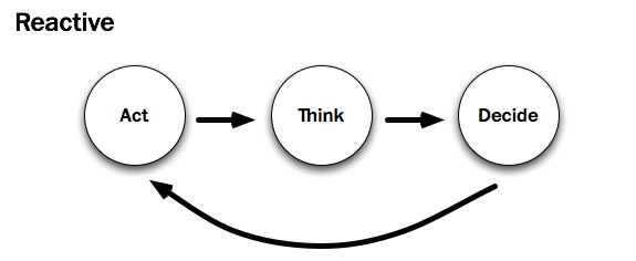
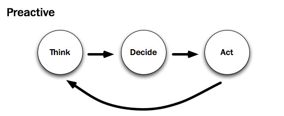
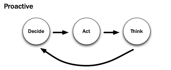
Adding to this perceived resistance are the various processes that drive start-up organizations at any given time. A recent blog post by Whitney Hess contrasts three specific types. It’s worth noting that all of the approaches detailed below show the exact same verbs in the exact same sequence. What’s different in each is the primary action that drives change along the way.

To cite Hess:

Reactive in Designing For Start-Ups: How To Deliver The Message Across

I see a lot of products developed using the Reactive Procedure:

  1. I’m scratching my itch.
  2. Should I keep scratching this itch?
  3. I’ll scratch this other itch.

As a designer who frequently consults with agile start-ups, I concur with Whitney’s sentiments: the reactive approach (“build it and they will comeâ€�) is far and away the most common. There is, of course, a good reason for all that action: development drives change. Start-ups act in order to build an initial prototype. Prototypes, in turn, move the company — indeed, the user feedback loop — forward.

Unfortunately, the prototypes developed by most start-ups exhibit a keen lack of consideration. Who is the prototype targeted at? 40 to 50 somethings? There are certainly a lot of them. Will those 40 to 50 somethings be able to grok it? That is, will users be able to tell what it’s “all about� from the design? Because this kind of subjectivity is incredibly nebulous, prudent start-ups rely on experienced UX designers to help them uncover the answers. It’s no wonder that Whitney and I see this in our line of work.

Preactive in Designing For Start-Ups: How To Deliver The Message Across

As a user experience designer, consultant and member of the New York tech community, I instead advocate for using the Preactive Procedure:

  1. Who’s itchy?
  2. That itch isn’t being scratched.
  3. This is how to scratch that itch.

I believe that most UX designers would agree — dare I say, empathize — with Whitney’s prescribed preactive approach. Beginning with thinking — with research — is in a user-centered designer’s blood; it helps them understand their audience and voice their messages appropriately. Further still, “preactivityâ€� appears to be the only real way for designers to gain empathy. But most start-up environments run counter to this approach. Acting and then thinking usually leaves little room for the voice of research. Has Whitney encountered a start-up that tries to reconcile the two?

As luck would have it, she has. Whitney recently worked with an entrepreneur who marches to a different beat:

Campbell McKellar, founder of Loosecubes, is the first person to make me realize that there’s something even better than the Preactive Procedure — the Proactive Procedure.

Proactive in Designing For Start-Ups: How To Deliver The Message Across

By acting sooner, you are actually achieving more. You are creating the future instead of just predicting and accommodating for it. You are inventing a new reality, based half in what people need, and half in what you want them to have. You can observe behavior sooner and course-correct. It is the most transformative of all three procedures for both the subject and the object.

An entrepreneur at heart, I want to agree here, too. The proactive process appears to be a viable alternative to the unenviable tension between designers and developers at start-ups. But just because a group is humming along with a decision-based proactive process doesn’t mean that the organization’s designer understands its users any better. By UX standards, this process almost seems to disenfranchise them: it moves “thinkingâ€� — and here, I presume, research — all the way to the back of the bus.

In sum, it’s easy to envision scenarios at a start-up in which a given development process proves more valuable, more productive, than its alternative. Should the team think, act or decide? It depends. Regardless, as designers join start-ups, they’re very likely to find that design is secondary to the process unless, of course, their organization follows a preactive process. But for most start-ups, that’s simply not the case.

In order for an organization to learn more about its users, the design-minded members must advocate to that effect, changing the way that design is approached. Designers must stand up for their part of the process. As UX designer Joshua Porter attests, “The further a designer is from the people they’re designing for, the harder it is to design for them.�

Start-ups — or more specifically, the designers at start-ups — need to get as close to users as they can. Product development can’t rest in the entrepreneurs’ and/or the developers’ hands alone.

Why Design Fails

When asked, most designers don’t take long to provide honest, valid reasons why the design process is important to developers and entrepreneurs alike. There is firm precedent to that end, and they are designers by choice, after all. But just because the truth and beauty of good design is evident to most designers doesn’t exactly mean that their colleagues share their sentiments.

Making-dollars in Designing For Start-Ups: How To Deliver The Message Across
If it isn’t making Dollars… (Image: Kristian Bjornard)

Start-ups — and more importantly, the individuals who comprise them — have a great number of mental hurdles standing in the way of their empathy with end users. The aforementioned quickened pace and changing processes aside, here are those hurdles:

  • Start-up teams have strong convictions.
    Anyone who believes strongly in a cause (be it an idea or a Web application… or both) will identify with it. If a designer questions the validity of an idea, then they are questioning the team. This is a difficult, integral part of the design process.
  • Research doesn’t (immediately) sell.
    It doesn’t take weeks of research to sell a product to someone, and given enough time a good marketer can sell anyone almost anything — especially something beautiful. As a consequence, team members are likely to judge the design book by its cover. Research rarely affects their notion of beauty.
  • Start-ups trust results they can measure (preferably in dollars).
    Web metrics are currently the bread and butter of today’s Web-savvy marketers. Saying that a design is good is one thing. Saying that a design has increased conversions by 200% is another. Attaching a number to something makes entrepreneurs (and, yes, designers, too) feel better about the problem being addressed. If the current process is measurable, should an up-front design process be allowed to slow that down?

In sum, short-term, yes-or-no, go-or-no-go (Decide! Act!) thinking pervades the start-up space. The reality is that most agile start-ups favor a “design-less� process. While UX designers might trust that empathy (or understanding) is tantamount to a start-up’s success, their teammates won’t necessarily believe so. In order to effect change, designers must fight for the integrity of their design from the inside out.

Leading The Way With Empathy

To be clear, good design doesn’t come about at start-ups just by studying the metrics generated from a prototype or by talking to users through a proxy — say, support emails. That isn’t to say that these things aren’t valuable — they certainly can (and often do) point to the consequences of prior decisions. But feedback, by definition, cannot determine the company’s next — or, more importantly, first — steps. There’s the rub. Unfortunately, that is the problem routinely faced by start-up designers.

Create-Empathy- -Inclusion in Designing For Start-Ups: How To Deliver The Message Across
Create Empathy and Inclusion. (Image: Kristian Bjornard)

No one would argue that determining what’s “good� for a Web design is subjective, which makes it a frightening prospect. As D. Keith Robinson wrote on A List Apart all the way back in 2005:

Knowing what people want on the Web can be hard. You either need to have incredible empathy or have done fairly extensive research. This empathy I’m talking about, in my opinion, can really only be built up over time observing all kinds of people doing all kinds of things on all kinds of websites and applications. Even then, as you move from project to project, the people, problems and needs change.

With every new project comes a new target user, a new person to empathize with. And just as with meeting a new person, understanding what they like and don’t like takes time. If designers are to appeal to this new person, they first have to get to know them. As both Whitney Hess and Cennydd Bowles have asserted, focusing on a rapid proactive process — decide, act, think — gives most start-ups a solid plan of attack. Not only do teams get to test market viability first, they can then think about how they’ll differentiate the product shortly thereafter.

Yes, this process makes brand-conscious designers uneasy, and understandably so. In the beginning, though, without the context that a prototype creates, designers must lean towards the relatively “safe� side, where all interaction design begins: buttons look like buttons, drop-downs look like drop-downs and perhaps even the names of start-ups sound like start-ups. Robert Hoekman, Jr. calls this Designing the Obvious. I call it designing the boring bits.

Because what this approach makes up for in usability, it certainly lacks in propriety. To determine what’s appropriate (which is subjective), designers must conduct field research.

Hold Your Own Convictions

Plenty of UX designers preach preactivity; they are the ones who want to understand — to empathize with — their audience and build something tailored to them. Moreover, these designers have the relative luxury of working within organizations. For them, Cennydd Bowles and James Box have written a lovely book, Undercover User Experience Design. If you’re at a company where design is ailing and you want to fix it, I suggest picking up a copy right away.

If you’re an independent consultant or a designer working with a start-up that’s out to craft the best possible experience, then I would suggest a couple of things, all centered on the same concept, which is to make listening a part of the company’s design process:

  1. Create a design strategy.
    Articulate who you’ll be designing for (even if they’re only make-believe) and how they’ll use the website. I’ve written before how I do this. Regardless of how you do it, know who you’re trying to know.
  2. Have a solution.
    Work with a development team to generate a quick prototype that demonstrates your best (albeit uninformed) solution. Have at least two people use the prototype the way it is intended to be used. Befriend them, and see if they’ll contribute feedback as you refine your vision.
  3. See for yourself.
    Finally, and most importantly, see for yourself. Visit your users in their natural environment, and make sure their concerns are addressed. If you’re in a position to do this, ask them questions related to the problem your start-up addresses.

In all cases, start-up designers should center their design process on listening to users. Instead of speaking to users by way of the design, converse with users to inform the design. Empathy, the human connection, makes or breaks an informed experience.

Because most of us work behind computers for hours, days or weeks at a time, gaining empathy is obviously easier said than done. However, empathy is the only way to turn a good business idea into a well-articulated design conversation. Respect is earned, a brand is born, when every interaction that an organization has with its users is open, earnest, honest and, most of all, appropriate.

Related Resources

(al) (sp)


© Andrew Maier for Smashing Magazine, 2011. | Permalink | Post a comment | Smashing Shop | Smashing Network | About Us
Post tags: ,


Impressive Typography Sites

Advertisement in Impressive Typography Sites
 in Impressive Typography Sites  in Impressive Typography Sites  in Impressive Typography Sites

Typography is one of the very important aspects to consider when designing a website. Well-written content finds its actual place and praise only then when it is placed properly in readable and as well as attractive format. Web typography can embrace everything from calligraphy to digital type — it is not only about using an array of fonts, but also focusing on the ‘where’ and ‘why’ when choosing a particular font’s size and color. Here are some of many examples of beautiful, interesting and inspiring typography-related sites out there. Please share with us other sites you’ve found typo-riffic!

Grip Limited
Ever thought of using scroll wheels for a site? This ad agency did:

Frontpage in Impressive Typography Sites

Grafik
Very simple and elegant — Nick de Jardine’s site presented with large typography:

Grafik in Impressive Typography Sites

Pieoneers
A mighty colourful website that not only makes your mouth water but also arouses your interest to look around:

Pieoneers in Impressive Typography Sites

Justdot
A back-to-school feeling once your enter this site — pretty impressive:

0201 in Impressive Typography Sites

Fail-ure
A well-made site with clear directions to where you can find the products with no ado:

Fail-ure in Impressive Typography Sites

Eighty Two Design
A vintage-styled site that prooves old fashion can also look swell:

Eightytwodesign in Impressive Typography Sites

Sibling Rivalry
A site project that three brothers have brought to life. Interesting use of type and images:

Siblingrivalrywine in Impressive Typography Sites

Uncle Emile
A French site that is full of art and very creative ideas:

Uncleemile in Impressive Typography Sites

August
Not only does the type look good here, but also the fantastic photography:

August in Impressive Typography Sites

Cascade Brewery
Australia’s oldest operating brewery has a site and really makes good use of it:

Cascadebreweryco in Impressive Typography Sites

Iron to Iron
An interesting way to reflect shades as well as light with typography:

Irontoiron in Impressive Typography Sites

Marie Catrib’s
This restaurant already looks very inviting from the looks of their site:
0251 in Impressive Typography Sites

Kari Jobe
Having your site as a diary lookalike is not such a bad idea. You’d always be uptodate:

Karijobe in Impressive Typography Sites

Elan Snowboards
A snowboard company that uses clear words and is very user friendly:

Elansnowboards in Impressive Typography Sites

National Television
A design and animation studio based on creative collaboration:

Natl in Impressive Typography Sites

Nike Better World
A single page template with some amazing CSS and JS features:

Nikebetterworld in Impressive Typography Sites

Arqandgraph
An interesting use of type and image blocks for a portfolio of the Arqandgraph Design Firm:

Arqandgraph in Impressive Typography Sites

Poems Out Loud
A site not only dedicated to typography but also language itself:

Poemsoutloud in Impressive Typography Sites

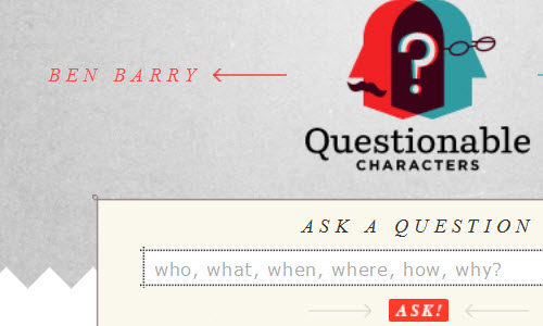
Questionable Characters
Asking Ben Barry and Frank Chimero — witty and informative:

0241 in Impressive Typography Sites

Sushi Monstr
This creative site is made by a writer, usability designer and web developer:

Sushimonstr in Impressive Typography Sites

Chama inc
Kepping it simple with black and white is always a good alternative as well:

Chamainc in Impressive Typography Sites

Precinkt
Here is a good example of using just a few types as possible within one website:

Precinkt in Impressive Typography Sites

Typejockeys
A site that offers everything from graphic design, type design and various fonts:

Typejockeys in Impressive Typography Sites

Oliver James Gosling
This Web developer and internet specialist really put a lot of effort and time into his site:

Goslingo in Impressive Typography Sites

Lega-Lega
A playful way of attracting customers to your site with a self-drawn navigation menu:

Lega-lega in Impressive Typography Sites

The Old State
This is another good example of using black and white to achieve that classy effect:

Theoldstate in Impressive Typography Sites

Ben the Bodyguard
So why not use as much space as you can on your website? Scrolling down on this site takes you on an interesting adventure:

0211 in Impressive Typography Sites

One Day without Google
A site that uses just about two colours. It’s not as bad as it sounds — take a look:

Onedaywithoutgoogle in Impressive Typography Sites

Mark Hobbs
A witty, colourful site that attracts the attention of any visitor passing by:

0181 in Impressive Typography Sites

THE= SUM
A team of two who are dedicated to design and show it very well:

0191 in Impressive Typography Sites

(ik)


Merging directories (folders) on Mac OS X

Every now and then I find myself in a situation where I have a folder (I’ll call it source) of files and nested folders, possibly many levels deep, that I want to copy into another folder (which I’ll call target). target already contains some of the files and folders I’m copying, and it also has files and folders that are not present in source.

Simply copying source to target’s parent folder in the Mac OS X Finder will replace everything in target with the contents of source. This is not always what I want, and in my opinion it’s one of the biggest flaws of the Mac OS X Finder. Not just Mac OS X actually – back in the pre-Mac OS X days there was a utility called Speed Doubler that patched the Finder to add a smart replace option when copying files.

It’s possible to manually open each folder and their subfolders and copy just the files, but it can be very tedious. There are also third party software options that let you merge files when copying, and if you have Apple’s Developer Tools installed there is the FileMerge utility.

However, you can open a Terminal window and copy the files from the command line, which saves you from installing extra software. Since I keep looking up the syntax every time I need to do this I decided to document it here for future reference.

Read full post

Posted in .


  •   
  • Copyright © 1996-2010 BlogmyQuery - BMQ. All rights reserved.
    iDream theme by Templates Next | Powered by WordPress