Archive for June, 2011

A Comprehensive Website Planning Guide

Advertisement in A Comprehensive Website Planning Guide
 in A Comprehensive Website Planning Guide  in A Comprehensive Website Planning Guide  in A Comprehensive Website Planning Guide

As a veteran designer, developer and project manager for more websites than I can count, I’ve identified a common problem with many Web projects: failure to plan. The same issues come up repeatedly in my work, so I’ve written this guide in order to help clients, other designers, businesses and organizations plan and realize successful websites.

This guide is written in relatively non-technical language and provides a broad overview of the process of developing a website, from the initial needs assessment through the launch, maintenance and follow-up. It is appropriate for:

  • Small and medium-sized businesses;
  • Organizations;
  • Institutions;
  • Web designers, developers, and design and development firms.

If you’re building a four-page website for your family reunion or a 5000-page website for a Fortune 500 company, then this guide might not be for you; it will either be too detailed or way too short, respectively.

QA in A Comprehensive Website Planning Guide
Important questions and answers. Image by opensourceway

Why Plan?

Planning is essential for most businesses and organizations. In practice, many people fail to plan their websites. Sometimes the ever-busy, dynamic nature of running a business is to blame; there are so many operational demands that proper time is not allotted to projects. But this often happens because people fail to recognize that planning for the Web is just as important as planning for anything else in a business.

The (Lengthy) Deck Example

Consider the example of building a deck. If you want a deck for your house, you probably won’t call several carpenters and ask, “How much is a deck?� If you do, you’ll get the smart answer: “It depends.� In order to provide you with an estimate, a carpenter needs some details about the project:

  • What kind of wood? Cedar? Treated? Synthetic?
  • Where exactly will the deck go? Are there any obstacles to work around?
  • What height will it be, and how many levels will it have?
  • Do you want benches, railings, built-in planters?
  • Do you have clearance to bring special equipment into your yard?

Then there is the host of other things for the carpenter to consider: scheduling, building permits, inspection, maintenance, etc. That’s why a smart carpenter will answer your simple question with “it depends.�

Way-to-success in A Comprehensive Website Planning Guide
Be sure to plan your way to success. Image by opensourceway

It makes sense to meet with more than one contractor to address the questions above and more. When you choose a carpenter, they should provide a detailed plan that you both sign. Throughout the building process, the carpenter should check in with you periodically and discuss potential challenges and snags.

Surely all of this makes sense, but consider another scenario wherein there is no clear plan:

“Hi, Jennifer Carpenter. It’s Juan Homeowner. I need a 20 × 30-foot cedar deck in my backyard. I want it built in two weeks.â€�

“Okay, Juan. I’ll pick up the materials and get started tomorrow. If you have any questions, just see me in your backyard while I’m working.�

Jennifer Carpenter gets started by drilling post holes for each corner of the deck. She assumes that Juan Homeowner has secured a building permit from city hall, because that’s how most of her previous jobs have worked out… But there’s no building permit.

As Ms. Carpenter starts framing the deck, she notices that Mr. Homeowner has put a large hose reel against his house and connected it to the faucet. Based on where the deck will sit, the hose reel will have to go. She’s not sure if he will want to move it somewhere else or have his outdoor faucet replumbed to reconnect it and put it on the deck, which is two feet off the ground. She stops building and waits to ask Mr. Homeowner when he gets home… But it turns out that he’s on a business trip for three days.

When he gets back, Ms. Carpenter reaches him by phone. He’s not happy that his faucet will have to be moved, because it adds unplanned expenses to the project. But that’s not Ms. Carpenter’s fault. She’s not the plumber. She’s just putting the deck where he asked.

Once the deck is framed, she starts building a railing for one side. This wasn’t discussed, but she sees that there are small children around the house and thinks this is a good safety measure. Mr. Homeowner comes home one day and is happy to see the great progress on his deck, but he notices the railing.

Mr. Homeowner: “What’s this?�

Ms. Carpenter: “I added a railing to the side because you have kids. It’s a good safety feature.�

Mr. Homeowner: “I don’t have small children.�

Ms. Carpenter: “But I saw them playing in your front yard.�

Mr. Homeowner: “Oh, those are the neighborhood kids. My kids are in high school.�

Ms. Carpenter: “Well, a railing is still a good feature.�

Mr. Homeowner: “Fine, but can you make it shorter and put a bench next to it?�

Ms. Carpenter: “I didn’t buy enough wood for a bench, and the railing is already drilled and attached. I’d have to remove and recut it. Also, we didn’t talk about a bench.�

Mr. Homeowner: “Well, I’d like a bench here.�

Ms. Carpenter: “That will take more time. I won’t be able to get this done by your two-week deadline if we add the bench. Plus, I’d have to charge you for the extra wood.�

What began as a simple project has become a series of headaches, all due to a failure to plan.

From a Web professional’s perspective, developing a 50-page website for six unique stakeholders is far more complex than building a rectangular deck. A deck is a physical structure built in stages. You can look out the window and see the progress. In contrast, a website has a number of technical and administrative steps that aren’t visible to all.

A Caveat, and the “Waterfall� Method of Development

When I worked at an insurance company, business analysts from the information technology (IT) department would write project charters: long, painfully boring documents that attempted to outline every possible aspect of a website. I hated these documents and preferred to work by the seat of my pants. My reasoning in part was that websites are flexible, unlike print material. That is, their content can be changed at will. The idea that every aspect of a website could be pre-planned on paper was ludicrous.

IT departments that handle large projects often use something called the “waterfall� method of development: specify absolutely everything, down to the point size of the type, the line length of page headers and exactly how a simple photo gallery will work.

Seeing-and-doing in A Comprehensive Website Planning Guide
See what is relevant and react. Image by opensourceway

This is my view of the waterfall method: if you’re building a banking application that transfers money in and out of customer accounts, you’d better be sure your code is perfect. When dealing with debits and credits, there is zero allowance for error. For projects this critical, it makes sense to specify everything you’re going to do in great detail before writing a single line of code.

However, as I said, websites are flexible. So how do we reconcile the need for clear and detailed specifications with the inherent flexibility of the medium?

We do this by splitting the difference. By following the process I’ve outlined below, we can create a set of content and design specifications that greatly reduce the likelihood of mid-project glitches, while creating a framework that allows the website to grow with time. In fact, we can plan for expansion by allowing, for example, a news section to handle 10 news items or 200. When these specifications are properly implemented in a content management system (CMS), the website will give its editors the flexibility to swap out key photos, change titles and headers, reorder content, etc.—all within the framework established by proper planning.

The Value of Planning and Needs Assessment

I am frequently approached by prospective clients who want estimates for building their websites. Sometimes they have a general idea of what they want and possibly a simple website map. Others, especially organizations, will submit a request for proposal (RFP). In most cases, none of this gives the designer or developer enough information to generate an accurate proposal. Even a multi-page RFP usually does not have enough detail from which to create a proposal and estimate. If a prospective client just wants a ballpark figure, I can usually do this, but much more information is needed in order to arrive at an accurate cost.

Ideally, prospective clients would hire either a designer, developer or project manager to do a thorough needs assessment before requesting a proposal. However, clients don’t necessarily understand the efficiencies gained by up-front assessment. Ten hours spent on a needs assessment can save 30 hours of development time. Discovering the needs of a client halfway through a project is a recipe for headaches, extended development time, cost overruns and missed deadlines. As you’ll read below, failing to recognize and pay for proper planning creates big problems.

Common Results of Failing to Plan

  • The designer or developer is forced to make assumptions, which may or may not be correct, about how certain content will appear on the website.
  • The amount of back-and-forth communication about trivial matters can be multiplied many times over.
  • Backtracking causes delays and missed deadlines.
  • Work that falls outside the original scope of the project creates cost overruns.
  • Confusion and client dissatisfaction are byproducts of a shoot-from-the-hip process.

Needs Assessment

Important things to remember:

  • Unless you’re building an intranet, the website is not for you and must meet the needs of your client.
  • A website is not an event. It is a flexible, extensible communications tool that reflects, negatively or positively, on the business.

Now we could potentially start using business-speak, as in “Assemble your key internal stakeholders.� That’s another way of saying: “Get everyone together who has something valuable to contribute.�

Aligning the Website With the Marketing Campaign

The website must work in concert with the overall marketing plan. The needs assessment for the website might overlap with the other efforts and approaches of the marketing department, which is fine. This is outside the scope of this article, but note that the established branding and marketing of the business should inform the structure and design of the website.

Roles: Who’s Doing What?

Every project is different, but these are the typical roles in a sizable Web project:

  • Internal stakeholders (aka “clientsâ€�), who represent all primary aspects of the business;
  • Project manager;
  • Copywriter or editor;
  • Web designer (graphic design, illustration, Web design);
  • HTML coder (HTML, CSS, JavaScript, Flash);
  • Web or CMS developer.

Keep in mind that one person can play multiple roles. The number of participants does not necessarily bear on the quality of the result. In some cases, a series of one-on-one meetings between company principals and an experienced designer can yield a great website.

Determine Website Content

Who’s Responsible?

As you prepare to add content to the website, think about who will contribute. In a five-person business, it might be just two of you, and that’s fine. In a large business or organization, 5, 10 or 15 people might be contributing content. The time required to edit and proofread both copy and visual content grows exponentially in proportion to the number of people who contribute content.

To-compete-or-collaborate in A Comprehensive Website Planning Guide
Clear the fronts and distribute clear responsibilities. Image by opensourceway

Content Is Not Just Text

Unless you are creating the dullest, most technical website imaginable, your content should consist of more than just plain text. By using one or more of the following multimedia elements, you’ll greatly enhance the appeal and usefulness of the website:

  • Images;
  • Documents (usually PDFs);
  • Audio;
  • Video (i.e., embedded from YouTube or Vimeo, or self-hosted);
  • Adobe Flash files;
  • Content feeds (from other websites, for example);
  • Photos (from Flickr perhaps);
  • Twitter stream;
  • Facebook “friendsâ€� list;
  • RSS feeds.

The Value of Good Photography

Like other elements of a website, photos communicate the brand of the organization. If you’ve just moved into a beautiful new building or storefront, you may have snapped some pictures of it and your staff on your $150 digital camera. In most instances, unless you have bona fide photography skills, these will not be quality photos. Try to budget for professional photography. You don’t necessarily need a lot of photos, just good ones. Twelve professional images is better than fifty amateur snapshots.

If your budget doesn’t allow for a pro, then contact your local art school or community college and ask for a recommendation. A budding student photographer with a good eye will work for cheap in order to build a portfolio. If you have no budget at all, then take the photos yourself, but pay special attention to lighting, framing and focus… and hope for the best.

In some cases, when generic images will suffice, stock photography can be used. But there is no substitute for quality photos of your staff, storefront, products or services.

The Value of Good Writing

Good writing, like good photography, requires a skill that not everyone possesses. Writing for the Web is different than writing memos, policy papers and technical documents. You might write great technical manuals for precision machining tools, but that doesn’t mean you can write well for the Web. If your organization doesn’t have someone who can write clear and concise marketing copy, hire an expert. If you can write reasonably well but need some guidance, consider hiring an editor to polish your output.

Quick Writing Tips

Consider your audience and write accordingly. Try to see the business from the customer’s perspective. What do they care about?

Avoid business-speak, confusing acronyms and dry details. Your customers do not work at your shop, office or widget factory; they are the ones purchasing your products or services. Speak to them accordingly. When appropriate, write in generalities, and save the hardcore details for multi-page PDFs (as downloads). This approach is especially useful for product information, white papers and copy that approaches or exceeds 1000 words.

Here is a useful approach when writing for the Web:

  1. Write your first draft,
  2. Cut it in half,
  3. Cut it in half again,
  4. Add bulleted and numbered lists where possible,
  5. Send it to the editor.

Reading on a screen is fatiguing. A screen, whether a massive 26-inch monitor or a diminutive smartphone, projects tiny points of light at your eyes. Consequently, reading long stretches of text on it can be very tiring. Users will scan for key points in the text, so short blocks of copy and bulleted or numbered lists are helpful because they’re easy to spot.

Don’t style the content. Most writers prefer to work in Microsoft Word or a similar program. This is fine, but Word is notorious for outputting messy code. Don’t worry about colors, fonts and alignment. Just write well. Style will be applied later at the level of each Web page.

Determine Your Website’s Structure

Here are the key elements in planning a website’s structure.

Site Map

Your site map could be structured like a flow chart and built with software such as Visio or a free tool like Gliffy. Alternatively, you could create an outline with bulleted lists and indentations that indicate pages, sub-pages and other structural breaks.

Content Definition

Some content will be easy to define. A contact page, for example, is generally expected to include a business name, a location, contact information, hours (if applicable) and, often, a simple form. Other types of content require more consideration. This is another point when failing to carefully define the content will create headaches for you later on.

Structure-your-content in A Comprehensive Website Planning Guide
Structure your content. Image by opensourceway

Perhaps you want to put a photo gallery on your website. Good idea, but what exactly will the gallery consist of? Will it be 20 images in a grid of thumbnails with a nice pop-up overlay when you click on one? Or a multi-page gallery with 1000 photos, individually categorized and tracked with meta data? Should users be able to rate the images? Comment on them? Download high-resolution versions? Email them to friends?

This is but one example of why defining each type of content is so important. If you don’t, then the developer will make their best guess as to what each type of content should be. Content elements like an event calendar, staff directory or blog might provide a general frame of reference, but they require clear direction: what exactly do they need to accomplish, and how will they be used?

One way to help define content is to simply observe the functionality of other websites and see what might suit your purpose.

Content Checklist

Here is a list (though not exhaustive) of common types of content. Remember, these are just types, not definitions:

  • Articles;
  • Blog;
  • Banner advertising;
  • Discussion forum;
  • Documents;
  • E-commerce;
  • Forms for contact, quotes or something else;
  • Physical products (how many?);
  • Digital content (what kind and how many?);
  • Email newsletter;
  • Event calendar;
  • Event registration;
  • Image gallery;
  • Link management (dozens or hundreds of links, ordered by category);
  • Incoming RSS feeds (pulled from other websites);
  • Outgoing RSS feeds (your content syndicated to other websites);
  • Search;
  • Social media sharing links (Twitter, Facebook, etc.);
  • Staff directory.

Content Relationships

Some of your content will relate to other content. For example, the same details might appear on different pages of your website. Map these relationships carefully, and remember that when content is changed in one area of the website, it might need to be changed in other areas for consistency and accuracy.

Separating Design From Content

Design and content are intimately related, but they are also separate. This might be confusing at first. But it means that website content is completely free of design elements. To avoid speaking in hypotheticals, let’s consider a simple example. Let’s say your website has a set of articles. For each article, there is a:

  • Title,
  • Meta title,
  • Meta description,
  • Author,
  • Date of publication,
  • Category,
  • Summary,
  • Main text.

These pieces of information constitute a whole article. At this point in the process, it doesn’t matter what design you apply to the copy: fonts, layout, colors, author photo thumbnails, etc. The content is valid even in the absence of design. It may not look pretty in plain text, but it reads correctly.

This separation neatly suits Web Standards, a project that advocates for a set of standards for Web design that makes content accessible to the broadest possible range of people and devices.

Then, when it’s time next to redesign your website, you can easily apply an entirely new design to your existing content, because you’ve maintained the separation between content and design.

The Value Of Good Content And Meta Data

What Is Meta Data?

Meta data is content about your content. In the case of an article, everything other than the title and article text is considered meta data. When some people hear “meta data,� they immediately think, “Oh, that’s for search engines,� which is correct: search engines do rely on meta data to index Web pages effectively. However, you might want some meta data just for your own records, without displaying it.

When deciding what meta data to collect for each type of content, there is a benefit to collecting more data than needed. Still, you could collect a lot less than what we’ve listed above and still have a valid article. The bare minimum you need for something to qualify as an article is:

  • Title,
  • Author,
  • Article text.

You might think that that is enough, or that you won’t have many articles, or that they’ll be short, or that the articles won’t need summaries, or that your visitors won’t care about date or categories. This might be true today, but what about next year? If you write good content, then it will be useful well into the future.

Collect Meta Data, Plan for the Future

Over time, the value of good meta data increases. If you have only 10 articles, then tracking authors and categories might not seem useful. In two years, though, when you’ve built up a library of 150, you’ll be glad you took the time to collect it. You will be able to sort by author, date and category. And because you’ve collected summaries, you’ll be able to make a version of your website for mobile devices, for which summaries are all that fit on the screen at once.

Wireframes

Once you’ve determined the structure of the content, you can move to the first step in the design process. Building wireframes mostly has to do with the layout aspect of Web design. They are done in grayscale and are designed not to be pretty but rather to show page layout. There are many great tools for this: Photoshop, Illustrator and Visio work well, as do specialized tools like Balsamiq.

Wireframe in A Comprehensive Website Planning Guide
You can wireframe anything. Image by opensourceway

The tendency of designers especially is to make things look appealing from the beginning of the process. But this should be avoided completely at the wireframing stage, because that would distract from the purpose of the wireframe, which is to decide where things should go, not what font size to use or what color the navigation should be.

Generally speaking, one wireframe should be made for each unique page on a website. If you have a page that offers downloads or photo galleries, mock it up as well. The examples that follow are for a home page and two internal pages, respectively.

Once the wireframes have gone through your review process, it’s time to move to the design stage.

The Value of Good Design

Consider the iPod. Apple has been wildly successful at selling products with exquisite and refined design (in terms of both the physical object and the user interface). The iPod doesn’t have any particular capabilities that its competitors lack. In fact, by some measures, it has fewer features than others. For example, it doesn’t record audio out of the box; you have to attach a piece of hardware to the iPod before it can do this. Nonetheless, the product’s exceptional industrial design and highly intuitive interface, combined with great marketing, make the iPod a far more coveted item than any competing product.

Design in A Comprehensive Website Planning Guide
Where does good design start? Image by opensourceway

When it comes to websites, however, good design and attention to detail are often discounted. The reasoning is that if something works, it doesn’t need to be refined. This is misguided thinking. A website—along with a logo, business cards, signage, letterhead, direct mail and other visual expressions of a brand—critically affects the way customers perceive a business. The experience users have on your website is part of this impression. When a website is harmonious, pleasing to the eye and easy to navigate, visitors will leave with a positive impression. Conversely, when a website is just passable, it could annoy customers, leave a bad impression and discourage return visits. And, importantly, you likely won’t hear about it from them. The Web isn’t very old, but here’s a key question that has been relevant since the first business website went online: if a customer goes to a website to search for the specifications of a product that they know you sell and finds nothing, what will they do next?

They’ll leave. Typically, when users get frustrated, they don’t search any further, and they don’t call or email; they just leave the website. To get a sense of this, review your website visitor statistics (see the section below on bounce rates).

Still, these stats can’t tell you what a visitor was thinking when they left. And unless you’re selling something wonderful and unique, customers will probably go elsewhere to find a similar product or a different service provider.

Initial Design

The initial design, commonly created in Adobe Photoshop or Fireworks (and sometimes Adobe Illustrator), consists of visually accurate images (“mock-ups�) of the home page and at least one internal page. Your business’ visual branding elements should be included here. If you already have well-defined graphics in addition to a logo, they should dictate the design of the website. If your brand lacks these, then the designer should do their best to create work that accurately reflects the business.

Here is a short list of key points for successful mock-ups. We’ll assume that the designer is working in Photoshop, although these guidelines apply to other programs as well.

  • Start with a pre-made template, with pre-drawn pixel-accurate guides. Some designers create their own, and others adhere to systems like the 960 Grid System. Whichever you start with, the template should be clean. Make the canvas wider than the width you’re designing to so that you can add notes on one side.
  • Add the color palette and basic branding elements (e.g. fonts) in the margins of the canvas so that you have them for reference when viewing on screen or in print.
  • Draw everything to exact pixels, and draw clear guides and slices around design elements. This becomes critical when you execute the design in HTML later.
  • Organize all design elements with a logical folder or sub-folder structure, and label each item clearly. If the designer will be handing files off to an HTML specialist, this is especially important. “Sidebar events headerâ€� is clear; “Layer14 Copyâ€� is not.
  • Make clear notes about fonts, alignment, repeating background elements, gradients and anything else that will be implemented with CSS. Photoshop’s sticky-note feature can help with this. If something is unclear, ask the person who will be converting the design.
  • If you’re using a common style for headers, navigation or other design elements that appear throughout the website, consider making separate templates for them. These will also come in handy later in the design process, once mock-ups have been approved.
  • Use realistic content. Designers often use Lorem ipsum to fill space, which is okay for body copy. But for headlines, titles, events and so on, use real copy. Consider the two following headlines. The layout considerations would be different for each:
    • Widgets, Inc. Wins Green Manufacturing Award
    • Widgets, Inc. Employees Win Landmark Court Case Affirming Employee Right to Petition for College Tuition Reimbursement When Training Is Relevant to Work Role

Design Approval and Revisions

After you have submitted the initial mock-ups for approval, there could be a revision process where the designer and key stakeholders go back and forth a few times, trying a variety of edits until the design is approved.

Designing-by-Committee: Don’t Do It

Having to consider multiple opinions can be a problem at this stage. Some stakeholders might be quite vocal in critiquing the design but are absent later, when the time comes to put in solid hours sifting through content for the website. Certainly, soliciting feedback about each design is important, and project stakeholders have valuable criticism to offer; they help to guide the design process so that the result accurately represents their business. In some instances, legal or technical staff will need to review. However, giving equal consideration to all feedback might not satisfy anyone.

Generally speaking, in small businesses or organizations, allowing more than five people to provide design feedback creates gridlock. It would help if these five (or fewer) people solicited feedback from their subordinates or department colleagues, but this feedback should be compiled by each stakeholder. In other words, don’t invite 15 people to a design review meeting.

Design Tension: Designer vs. Client

There is often tension between trained designers and less-informed clients. This is best illustrated by the “bad idea� conundrum: the client requests a design feature that is ugly, unworkable or for some reason a bad idea. Entire websites are dedicated to chronicling the poor choices of clueless clients. The responses of designers usually fall somewhere between “That’s horrible, and we won’t do it� and “Well, if that’s what you want….�

The response should be based on a number of ever-shifting factors, including:

  • When the designer hopes to get paid;
  • How emotionally invested the designer is in the project;
  • How much time the designer has invested in the design phase, and how long a delay would result from implementing the bad idea;
  • The client’s willingness to hear constructive criticism of their ideas.

Every project is different. Designers who continually get requests from clients for ill-advised features are likely to write the project off at some point. It’s just too exhausting having to constantly explain why centered bold red paragraphs, crazy Flash animations or poor-quality photography make for an ineffective website. Their attitude shifts from “Let’s make something that we’re proud of� to “Let’s just get it done.� Designers don’t say this to clients, but it happens frequently.

Realize, also, that the work of some designers is not up to par. Perhaps they have refused to listen to valid criticism. Avoid this situation by inspecting their previous work.

Consider Content

Think about future expansion. For example, you might have a news section with six news items. You’ll have a main news page with summaries, each of which links to the full view of the item. This is fine. But what happens when you have 10, 20 or 50 news items? Now you have other considerations. Do you want to archive old news? Paginate the items? Show only the last 10 items? Consider these questions in the design process.

For websites that accumulate content, such as news, press releases and reports, there’s a good rule to follow when creating mock-ups: you can never have enough mock-ups. In other words, if you think the layout or design of a page or section of the website will differ significantly from other pages, then mocking it up is worthwhile. This step normally comes after the initial mock-ups are approved.

Web Style Guide

A style guide is where proper planning shines. A style guide determines and defines all the design, layout, interactive (i.e. JavaScript and Flash) and type elements used throughout the website. These include but are not limited to:

  • Navigation styles;
  • <h1> through <h5> (heading tags);
  • Paragraphs;
  • Lists;
  • Block quotes;
  • Italics, bolding and underlining;
  • Links, including active, hover and visited states;
  • Icons;
  • Use of images and image style;
  • Use of background images (watermarks);
  • Common elements such as sidebars.

The mock-ups and style guide are the foundation of the next steps in development.

Integrating With Content Management System

At long last, your brilliant design has been converted to code and is ready to be integrated into a CMS. The individual or team tasked with doing this will provide you with log-in details for the CMS that allows you to add content, including text, photos, video and documents. Most editors prefer to cut and paste from Microsoft Word.

Content-management-integration in A Comprehensive Website Planning Guide
Make sure everything fits in. Image by opensourceway

Depending on the specifics of the CMS, you might be able to do this easily and retain simple formatting like bold, italics and lists. Sometimes, though, the CMS will strip out the formatting when you cut and paste, and you’ll have to put it back. This can be tedious, but it ensures that your content remains neat and orderly and thus can be easily printed, cited, indexed by search engines and converted to other formats.

Putting It All Together

After following these steps, you should be sitting on a pretty solid website. Regardless of the size of the project, now is a good time to do the following:

  • Review the content once again, and check it against the points listed under “Writing for the Webâ€� above.
  • Ask a third party to proofread all of your content. This is not the task of the designer or original writer. Bring in someone with a fresh perspective. Don’t proofread your own work.

Beta Testing and Launch

When you feel that the website is almost ready for the public to see, it’s time for beta testing. Go through this checklist (which is the bare minimum):

  • The website looks correct in all targeted Web browsers. Web browsers include the usual Internet Explorer, Firefox and Safari, as well as (depending on the specifications) less common browsers like Chrome and mobile devices (iOS, BlackBerry, etc.);
  • Interactive features work smoothly;
  • Contact and other forms work predictably and send the correct information to the user and recipient(s);
  • Internal and external links work;
  • Images are sized properly;
  • All placeholder content has been replaced by the final copy;
  • Links from third-party software, such as email campaigns, work.

Once you’ve thoroughly beta-tested the website, launch it.

Post-Launch

After you’ve launched, maintain the website. Here are a few helpful tools for that.

Web Statistics

Visitor statistics provide insight into how people use your website. You’ll need at least a month or two of data to make any determinations. Here are a few questions to consider:

  • Where are visitors coming from? See search engines, direct traffic (i.e. visitors who type your website’s URL directly into the address bar), ads, links from other websites, etc.
  • Where do visitors live? Are they mostly local, regional, national or international?
  • What pages are the most popular?
  • How long are visitors staying on the website?
  • What is the bounce rate? That is, how many users visit only one page on the website before leaving?

Google Analytics is one of the most commonly used Web statistics apps, and you will find answers to these questions in the high-level data it presents. Other software should provide these answers as well.

Documentation

Much of your documentation will consist simply of the different elements discussed earlier in this document, including wireframes and Photoshop documents. You’ll also need detailed notes on how various parts of the website are implemented in the CMS. Think about what information would be needed if you brought in new people to maintain the website, people who were not at all familiar with it. What would they require in order to pick up the project? This is what proper documentation is.

Back Up

Schedule regular back-ups of the website’s files and database. Daily is ideal. Your hosting company might provide an automated way of doing this, so that if your files or database get hacked, erased, corrupted or otherwise damaged, you can restore them with copies from the previous day. Depending on the size of the website, update frequency and some technical matters that vary from website to website, you could schedule more frequent back-ups.

Maintenance Plan

Your maintenance plan should clarify roles and responsibilities for every aspect of the website. For example, if two articles per week are to be posted, who is responsible for them, and who is that person’s back-up? If your website requires that photos or graphics be created regularly, make sure this work is assigned and understood. Decide who will check links.

Write a simple maintenance plan, and share it with everyone involved in the website’s care and development. Remember, a good website isn’t a one-time event, but rather an extensible communication tool that requires regular updates to stay valuable, relevant and compelling for visitors.

Solicit Visitor Feedback

A great way to improve the impact of a website is to solicit visitor feedback. There are a variety of ways to do this, from conducting simple online surveys to on-site focus groups. Website visitors often have trouble articulating what they like and don’t like about their experience. With this in mind, craft very clear and specific questions when soliciting feedback. And remember: if you’re going to take a significant amount of visitors’ time, offer something in return (a product discount, a prize or simply a handwritten thank-you note).

Conclusion

Okay, one more time: a good website isn’t a one-time event, but rather an extensible communications tool. Once you’ve built a great website, keep the momentum going. Devote resources to regular maintenance, and check in with visitors regularly to identify areas for improvement.

Mike Kroll supplied wireframes and design mock-ups. Susan Morris provided editing and proofreading.

Download a Free PDF Copy

You can download an even more detailed PDF version of Ben’s project planning guide after a quick registration on his agency’s site.

(al) (sp)


© Ben Seigel for Smashing Magazine, 2011. | Permalink | Post a comment | Smashing Shop | Smashing Network | About Us
Post tags:


Responsive Web Design (Book review)

Reading Ethan Marcotte’s book Responsive Web Design was a strange experience in some ways. While much of the techniques and philosophies described in the book are familiar to me, reading about everything from flexible design to mobile first with media queries carefully distilled into one book was something of a revelation that brought back feelings from over a decade ago.

Ethan opens the book with this:

As I begin writing this book, I realize I can’t guarantee you’ll read these words on a printed page, holding a tiny paperback in your hands. Maybe you’re sitting at your desk with an electronic copy of the book up on your screen. Perhaps you’re on your morning commute, tapping through pages on your phone, or swiping along on a tablet. Or maybe you don’t even see these words as I do: maybe your computer is simply reading this book aloud.

Ultimately, I know so little about you. I don’t know how you’re reading this. I can’t.

Read full post

Posted in , , .

Copyright © Roger Johansson


Japanese Ball-Jointed Doll Still Life Photography

Advertisement in Japanese Ball-Jointed Doll Still Life Photography
 in Japanese Ball-Jointed Doll Still Life Photography  in Japanese Ball-Jointed Doll Still Life Photography  in Japanese Ball-Jointed Doll Still Life Photography

With all of the inspiring still life photography that can be found on the web, you can find some truly amazing niches within this artform. Some that combine not only the art and skill of the photographer, but also include some stunning designs or artistry from other genres and fields to really complete the picture. Pardon the pun. Today’s post shines the spotlight on one of these niches that produce some breathtaking works.

Still life photography featuring Japanese ball-jointed dolls is that niche. It’s quite an interesting subculture since those who create usually don’t just create the dolls and/or photos, but also create entire characters with rich back stories surrounding each doll. Since these dolls are highly poseable, many of the shots appear to be very realistic, candid shots. We hope you find them as inspiring as we do.

The Photos

Lil Lady
Doll13 in Japanese Ball-Jointed Doll Still Life Photography

Headphones
Doll2 in Japanese Ball-Jointed Doll Still Life Photography

social.RIOT.machine
Doll4 in Japanese Ball-Jointed Doll Still Life Photography

Jess Casual
Doll5 in Japanese Ball-Jointed Doll Still Life Photography

The Ugly Truth
Doll36 in Japanese Ball-Jointed Doll Still Life Photography

Siren Nouveau
Doll8 in Japanese Ball-Jointed Doll Still Life Photography

Imaginary Friends
Doll10 in Japanese Ball-Jointed Doll Still Life Photography

Dust of Feathers
Doll14 in Japanese Ball-Jointed Doll Still Life Photography

A Greener World 2
Doll18 in Japanese Ball-Jointed Doll Still Life Photography

Nowhere and Everywhere
Doll12 in Japanese Ball-Jointed Doll Still Life Photography

Shade of a Tree
Doll19 in Japanese Ball-Jointed Doll Still Life Photography

A Towel, It Says
Doll21 in Japanese Ball-Jointed Doll Still Life Photography

Come Here
Doll29 in Japanese Ball-Jointed Doll Still Life Photography

Vintage
Doll16 in Japanese Ball-Jointed Doll Still Life Photography

I’m Sorry…
Doll3 in Japanese Ball-Jointed Doll Still Life Photography

And I Come Undone
Doll11 in Japanese Ball-Jointed Doll Still Life Photography

Grumpus Won Puffybottom Jr
Doll9 in Japanese Ball-Jointed Doll Still Life Photography

b2
Doll31 in Japanese Ball-Jointed Doll Still Life Photography

Sound Check
Doll23 in Japanese Ball-Jointed Doll Still Life Photography

Patiently
Doll24 in Japanese Ball-Jointed Doll Still Life Photography

Jess – Winter Fashion
Doll6 in Japanese Ball-Jointed Doll Still Life Photography

The Forgotten Boy
Doll25 in Japanese Ball-Jointed Doll Still Life Photography

Vintage Girl
Doll1 in Japanese Ball-Jointed Doll Still Life Photography

…I…
Doll26 in Japanese Ball-Jointed Doll Still Life Photography

Autumn II
Doll15 in Japanese Ball-Jointed Doll Still Life Photography

In a Winter Wonderland
Doll17 in Japanese Ball-Jointed Doll Still Life Photography

Jenny the Lazy
Doll38 in Japanese Ball-Jointed Doll Still Life Photography

In Flanders Fields
Doll27 in Japanese Ball-Jointed Doll Still Life Photography

Rare Moment
Doll28 in Japanese Ball-Jointed Doll Still Life Photography

Somewhere Only We Know II
Doll30 in Japanese Ball-Jointed Doll Still Life Photography

Romeo Romeo
Doll20 in Japanese Ball-Jointed Doll Still Life Photography

Yellow, Yellow
Doll22 in Japanese Ball-Jointed Doll Still Life Photography

Chika 3
Doll32 in Japanese Ball-Jointed Doll Still Life Photography

Nicolle
Doll7 in Japanese Ball-Jointed Doll Still Life Photography

BlackH5
Doll33 in Japanese Ball-Jointed Doll Still Life Photography

Charlotte 4
Doll34 in Japanese Ball-Jointed Doll Still Life Photography

All He Does is Wait
Doll35 in Japanese Ball-Jointed Doll Still Life Photography

Luka Deer
Doll37 in Japanese Ball-Jointed Doll Still Life Photography

Delphine x Kalix – My Dearest
Doll39 in Japanese Ball-Jointed Doll Still Life Photography

Kiriban Viveredoll
Doll40 in Japanese Ball-Jointed Doll Still Life Photography

(rb)


How To Build A Media Site On WordPress (Part 2)

Advertisement in How To Build A Media Site On WordPress (Part 2)
 in How To Build A Media Site On WordPress (Part 2)  in How To Build A Media Site On WordPress (Part 2)  in How To Build A Media Site On WordPress (Part 2)

The default “category” and “tag” taxonomies in WordPress offer a lot of flexibility to those with imagination and in my development experience I have seen a wide range of creative implementations. With the introduction of custom taxonomies and their growing ease of use, though, we need no longer be bound to categories and tags. With the ability to create both hierarchical and non-hierarchical taxonomies and with the introduction of several new features in WordPress 3.1, now is the time, if you’re not already, to begin putting custom taxonomies to use.

In part one of this two part series, we learned how to setup custom post types and custom taxonomies. We also learned how to build a template to check for and display media attached to custom posts. Now, we’ll learn how to use custom taxonomy templates to organize and relate our media. Let’s get started!

Wordpress-media-site21 in How To Build A Media Site On WordPress (Part 2)

Organizing Our Media – Working With Custom Taxonomy Templates

Now that we have our media displaying, it’s time to work on how it’s organized. If you tried clicking on one of the custom taxonomy terms, odds are the result weren’t very exciting. You probably saw something like this:

 in How To Build A Media Site On WordPress (Part 2)
A rather unhelpful default view of a term in the “presenter” taxonomy.

What we’re going to do next is create a template that allows us to customize the results and offer a page that will be more useful.

Creating A Custom Taxonomy Template

As with custom posts, the WordPress template engine has a custom taxonomy template hierarchy that it follows to determine what template it uses to display data associated with a custom taxonomy term. We’ll start with our “presenters” taxonomy. In our case, the WordPress hierarchy is as follows:

  • taxonomy-presenters.php – WordPress will check the theme folder for a file named taxonomy-presenters.php. If it exists, it will use that template to display the content. For different custom taxonomies, simple replace “presenters” with the name of your custom taxonomy.
  • taxonomy.php - If no custom taxonomy template is found, WordPress checks for a general taxonomy template.
  • archive.php – If no general taxonomy template is used, the WordPress archive template is used.
  • index.php – If no archive template is found, WordPress defaults to the old standby – the index.

Note: The WordPress template hierarchy structure also allows templates for specific terms. For instance, in a case where “Jonathan Wold” was a term in the “presenters” taxonomy, I could create a custom template called “taxonomy-presenters-jonathan-wold.php”.

Non-Hierarchical Custom Taxonomy Templates

We’ll start with the non-hierarchical “presenters” custom taxonomy. As with the custom post type examples previously, I will be using minimal examples for each of the templates.

To get started with this example, create a file called taxonomy-presenters.php and upload it to your theme folder. Add the following code:

<?php get_header(); ?>

<?php // Get the data we need
	$presenter = get_term_by( 'slug', get_query_var( 'term' ), get_query_var( 'taxonomy' ) );
?>

	<div id="container">
		<div id="content" class="presenter">
			<h1 class="entry-title"><?php echo $presenter->name; ?></h1>
			<p><?php echo $presenter->description; ?></p>
		</div>
	</div>

<?php get_footer(); ?>

Previewing a term should now show you a rather empty page with the name of the term and the description (if you entered one when creating or editing the term). In my case, on Twenty Ten, accessing the term “Jonathan Wold” (/presenter/jonathan-wold) looks like this:

Jon-wold-wp-screenshot in How To Build A Media Site On WordPress (Part 2)
A rather basic, yet more useful, view of a custom taxonomy term template.

Before moving on, let’s review the code above to learn what it’s doing and what you can do with it.

$presenter = get_term_by( 'slug', get_query_var( 'term' ), get_query_var( 'taxonomy' ) );

This piece of code may seem intimidating at first, but it’s rather simple. First, we are defining a variable called $presenter. Our goal is to have that variable store everything that WordPress knows about our term.

To do that, we are using the function get_term_by. That function requires three things:

  1. Field – You can access a term by name, ID, or slug. In our case, we are using the slug, which is “jonathan-wold”.
  2. Value – We’ve told WordPress that we want to get our term data by using the “slug” field. Now, it needs a slug to retrieve data. Since we want this to be dynamic, we are using another function called get_query_var. When you access a term in WordPress (e.g. viewing a term by its permalink), a query is run in order to generate the results for that term. Using “get_query_var” allows you to intercept that query and get the data for your own use.
  3. Taxonomy – In addition to the term slug, WordPress also needs the taxonomy name (this is critical in cases where the same name is used across multiple taxonomies). We use “get_query_var” again to retrieve that for us.

If we wanted to access the term data for one specific term in a particular custom taxonomy, we would do it like this:

$presenter = get_term_by( 'slug', 'jonathan-wold', 'presenters');

In our example, we are adding code into our template telling WordPress to give us the data for the term a visitor is currently viewing. WordPress stores that data as an “object”.

To see what data is available to you in an object, add the following within your code:

<?php
	echo '<pre>';
	print_r( $presenter );
	echo '</pre>';
?>

Preview the term again and you should see a block of code that looks something like this:

Tutorial-part2-code-view-550 in How To Build A Media Site On WordPress (Part 2)
An easily readable view of the object attributes and values.

That block of code lets you see what WordPress knows about your particular object and what information you have available to use within your template.

Note: In part one, I referenced a technique for adding custom fields to your custom taxonomies and giving you access to more data within your templates. Just incase you missed the reference, take a look at the advanced tutorial, How To Add Custom Fields To Custom Taxonomies, on the Sabramedia blog.

Displaying Object Data In Templates

Now, let’s look at how we took the data from that object and actually displayed it in the template. Let’s start with the first example:

<?php echo $presenter->name; ?>

In English, we are telling PHP to “echo”, or display, the “name” value of the $presenter object. We would know that the object created with “get_term_by” contains the value for “name” by either looking up the return values for get_term_by in the Codex or by using “print_r” to see for ourselves. We’ll explore this in more detail once we look at the “topics” taxonomy.

To get our description, we do the same thing, changing the “name” value to “description”:

<?php echo $presenter->description; ?>

Displaying Term Results In Custom Taxonomy Templates

Now that we have our term name and description displaying, it’s time to show some actual custom post results.

We are continuing our example with taxonomy-presenters.php. Replace the existing code with the following:

<?php get_header(); ?>

<?php // Get the data we need
	$presenter = get_term_by( 'slug', get_query_var( 'term' ), get_query_var( 'taxonomy' ) );

	$resources = new WP_Query(
		array(
			'post_type' => 'resource', // Tell WordPress which post type we want
			'posts_per_page' => '3', // Show the first 3
			'tax_query' => array( // Return only resources where presenter is listed
				array(
					'taxonomy' => 'presenters',
					'field' => 'slug',
					'terms' => $presenter->slug,
					)
				)
			)
		);
?>

	<div id="container">
		<div id="content" class="presenter">
			<h1 class="entry-title"><?php echo $presenter->name; ?></h1>
			<p><?php echo $presenter->description; ?></p>

			<div class="resources">
				<h3>Latest Resources</h3>
				<ul id="resource-list">
					<?php while ( $resources->have_posts() ) : $resources->the_post(); ?>
						<li id="resource-<?php the_ID(); ?>" class="resource">
							<a href="<?php the_permalink(); ?>"><?php the_title(); ?></a>
							<span><?php the_excerpt(); ?></span>
						</li>
					<?php endwhile; ?>
				</ul>
			</div>	

		</div>
	</div>

<?php get_footer(); ?>

Previewing one of your terms should now display the name and description of the term along with a list of custom posts associated with that term. In our case, the results look like this:

Jon-wold-ap-screenshot2 in How To Build A Media Site On WordPress (Part 2)
With a customizable list of related custom posts, the term results template is looking much more useful.

The update to this code block is the addition of our “$resources” query. Let’s take a look at that more closely:

$resources = new WP_Query(
	array(
		'post_type' => 'resource', // Tell WordPress which post type we want
		'posts_per_page' => '3', // Show the first 3
		'tax_query' => array( // Return resources associated with presenter
			array(
				'taxonomy' => 'presenters',
				'field' => 'slug',
				'terms' => $presenter->slug,
				)
			)
		)
	);

For our variable of $resources, we are creating a new instance of the WordPress class, WP_Query. Then, we’re setting values on several parameters, post_type, post_per_page, and tax_query.

The first two are straight forward. With “post_type”, you let WordPress know which types of content you’re wanting to return. We used that in our media example to retrieve attachments. To display multiple posts types, replace the “post_type” line with this:

'post_type' => array( 'resource', 'other_post_type', 'another_post_type' ),

For “posts_per_page”, you are letting WordPress know how many posts to return before triggering pagination. If you want to return all posts, use “-1″ for the value, like this:

'posts_per_page' => '-1', // Show all the posts

Now, “tax_query” is a new parameter added in WordPress 3.1. It is a powerful parameter that lets you return results associated with multiple taxonomies and custom fields.

Let’s take a closer look at it:

'tax_query' => array( // Return resources associated with presenter
	array(
		'taxonomy' => 'presenters',
		'field' => 'slug',
		'terms' => $presenter->slug,
		)
	)

First, we choose our custom taxonomy. In our case, we are hardcoding in “presenters”. If we wanted to make it more dynamic and build, for instance, a general taxonomy template (taxonomy.php) to handle multiple taxonomies in a similar way, we would use “get_query_var” again, like so:

'taxonomy' => get_query_var( 'taxonomy' ),

Note: The “tax_query” function works with one taxonomy at a time. To query multiple taxonomies, simply duplicate the code above (be sure to add the appropriate comma at the end) and change the parameters accordingly.

Next, we have the “field” parameter. This lets WordPress know what field we will be returning our terms by. WordPress accepts “slug” or “id”. I am using “slug” because I prefer recognizing posts by words over numbers.

Then, we have “terms”. In our case, we are using the $presenter variable to pass in the “slug” in the same way we added data directly into our custom post template. If we wanted to make it more dynamic, we could use “get_query_var” again:

'term' => get_query_var( 'term' ),

If we want to return results for multiple terms, we add an array, like this:

'term' => array( 'term_1', 'term_2', 'random_other_term' ),

To modify our results further, we can use an optional “operator” parameter that allows us to specify whether our results are “IN”, “NOT IN”, or “OR”. A simple example, appropriate for use in a single taxonomy, is “NOT IN”.

To modify the query to return results that are “NOT IN” the custom taxonomy and terms that you’ve listed, add the following within your tax_query array:

'operator' => 'NOT IN',

Note: To experiment with results queried against multiple custom taxonomies, take a look at “Multiple Taxonomy Handling” under Taxonomy Parameters on the Codex reference for WP_Query.

Now that we’ve gone through that, we reference our newly created query with a loop. Here’s the code again:

<div class="resources">
	<h3>Latest Resources</h3>
	<ul id="resource-list">
		<?php while ( $resources->have_posts() ) : $resources->the_post(); ?>
			<li id="resource-<?php the_ID(); ?>" class="resource">
				<a href="<?php the_permalink(); ?>"><?php the_title(); ?></a>
				<span><?php the_excerpt(); ?></span>
			</li>
		<?php endwhile; ?>
	</ul>
</div>

This is another basic instance of The Loop, customized to return results from our $resources query and, in this case, the results returned are “the_ID”, “the_permalink”, “the_title”, and “the_excerpt”.

Checking For Empty Results

In our example above, we have some code (like the <UL>) that appears outside of our loop. If there were no results, the “container” HTML would still show up in the template. To prevent that, we can preface it with a conditional statement like this:

<?php if ( $resources->post_count > 0 ) { // Check to make sure there are resources ?>
// Display your results
<?php } ?>

Replace “$resources” with the name of your custom query and return your results within the conditional statement. If the “post_count” is greater than zero (“> 0″), then the code will appear in your template – otherwise, the page remains free of extra HTML.

Hierarchical Custom Taxonomy Templates

Alright, now that we have a non-hierarchical taxonomy under our belt, let’s move on and tackle hierarchy. We covered the basics in setting up “presenters”, so let’s pick up there where we left off.

Create a file called taxonomy-topics.php and add the following code:

<?php get_header(); ?>

<?php // Get the data we need
	$topic = get_term_by( 'slug', get_query_var( 'term' ), get_query_var( 'taxonomy' ) );    

	$resources = new WP_Query(
		array(
			'post_type' => 'resource', // Tell WordPress which post type we want
			'posts_per_page' => '3', // Show the first 3
			'tax_query' => array( // Return only resources where presenter is listed
				array(
					'taxonomy' => 'topics',
					'field' => 'slug',
					'terms' => $topic->slug,
					)
				)
			)
		);
?>

	<div id="container">
		<div id="content" class="presenter">
			<h1 class="entry-title"><?php echo $topic->name; ?></h1>
			<p><?php echo $topic->description; ?></p>	

			<?php if ( $resources->post_count > 0 ) { // Check to make sure there are resources ?>
				<div class="resources">
					<h3>Latest Resources</h3>
					<ul id="resource-list">
						<?php while ($resources->have_posts()) : $resources->the_post(); ?>
							<li id="resource-<?php the_ID(); ?>" class="resource">
								<a href="<?php the_permalink(); ?>"><?php the_title(); ?></a>
								<span><?php the_excerpt(); ?></span>
							</li>
						<?php endwhile; ?>
					</ul>
				</div>
			<?php } ?>

		</div>
	</div>

<?php get_footer(); ?>

Previewing a “topic” should now give you a familiar plain template that looks something like this:

Jon-wold-ap-screenshot3 in How To Build A Media Site On WordPress (Part 2)
A basic, yet useful view of another custom taxonomy term.

Creating Parent and Children Links

Now, the thing that is different with this taxonomy is that it can have both “parents” and “children”. What we want to do is check for a parent topic and, if it exists, display a link to it. We also want to check for sub-topics and if they exist, display links to them.

Note: For these examples to work, be sure that you’re working with a post example that has multiple levels of a hierarchical custom taxonomy associated with it. In my example, I have created topics 3 levels deep and associated all of them with the post.

So let’s get started. First, within the PHP section at the top of our template, add the following code:

if ( $topic->parent > 0 ) { // Check to make sure the topic has a parent
	$topic_parent = get_term( $topic->parent, 'topics' ); // Get the object for the topic's parent
} 	

$topic_children = get_terms( 'topics', 'child_of='.$topic->term_id );
$last_topic = end( array_keys( $topic_children ) ); // Mark the last topic

Alright, what do we have going on here? First, we’re checking to make sure the topic has a parent. If a topic does not have a parent, WordPress gives the “parent” attribute a value of zero (“0″). So, the first thing we do is a conditional to check and make sure that the parent has a value greater than zero. If it does, we define the variable $topic_parent and use the get_term function to retrieve the parent topic based on its ID.

Next, we define another variable called $topic_children. This time, we use the get_terms function, which has a special attribute called “child_of”. We pass in the value of the current topic and tell WordPress, in English, to “take the current topic and bring me back a list of all its sub-topics or children”.

Then, we define a variable called $last_topic. The data that $topic_children gives us is in the form of an array. Our $last_topic variable counts to the “end” of the array and keeps track of it. We’re going to use that later to put a comma after each of our sub-topics and then do nothing for the last sub-topic.

Now, to show the results, add the following code within your template:

<?php if ( $topic->parent > 0  ) { ?>
<strong>Parent:</strong> <a href="<?php echo get_term_link( $topic_parent->slug, 'topics' ); ?>"><?php echo $topic_parent->name; ?></a>
<?php } ?>

<?php if ( $topic_children ) { ?>
	<strong>Subtopics: </strong>
	<?php foreach ( $topic_children as $key => $topic_single ) : ?>
		<span><a href="<?php echo get_term_link( $topic_single->slug, 'topics' ); ?>"><?php echo $topic_single->name; ?></a></span><?php if ( $key !== $last_topic ) echo ', '; ?>
<?php endforeach; ?>
<?php } ?>

Each block of code first checks to make sure that a parent topic or sub-topic(s) exists, respectively. Then, in the case of the “parent”, we use the get_term_link function to retrieve the link by the “slug” of the $topic_parent.

For our sub-topics, we create a “foreach” loop to output a list of all sub-topics. At the end, we do a conditional check on the $last_topic in our array using the variable we created earlier. If it is not the last topic, we echo a comma after the close <span> – otherwise, we do nothing.

And there you have it! The result using the Twenty Ten theme will look something like this:

Pets-latest-resources in How To Build A Media Site On WordPress (Part 2)
A view of the “topics” taxonomy, with the parent topic and sub-topics listed.

Relating Taxonomies By Posts

Now, this is where we get a bit fancy. Let’s say we’re working on our template for the “topics” taxonomy and we wanted to show a list of “presenters” who covered that particular topic. How would we do that? In the code that follows, we’re going to use the custom posts themselves as our reference point and bring back the related custom taxonomies.

The rationale is simple. If we had 10 posts associated with a particular term in a given custom taxonomy, those 10 posts will likely have other terms from other custom taxonomies associated with them as well. So, we use the posts themselves to retrieve and compile the term data that would otherwise not be related to our particular term. Here are some examples where this might be especially useful:

  • Events - An “event” taxonomy where we want to show a list of “presenters” at that same event.
  • Movies - A “genre” taxonomy where we want to show a list of “directors” who make that same genre of film.
  • Recipes - A “category” taxonomy where we want to show related “ingredients”.

Alright, let’s dive into the code:

// Retrieve all the IDs for resources associated with the current term
$post_ids = array();
foreach ( $resources->posts as $post ) {
	array_push( $post_ids, $post->ID );
}

// Get presenter data based on the posts associated with the current term
$presenters_by_posts = wp_get_object_terms( $post_ids, "presenters" );

$topic_presenters = array();
foreach ( $presenters_by_posts as $presenter ){
	$topic_presenters[$presenter->term_id] = $presenter;
}
$last_presenter = end( array_keys( $topic_presenters ) );

First, we define an empty array called $post_ids. Then, we create a loop through each of the “resources” associated with our current term using the $resource query we created earlier. We take that loop and “push” each of the post IDs for our resources back into the previously empty $post_ids array.

Next, we define a new variable, $presenters_by_posts. We use the wp_get_object_terms function, which accepts either a single ID or an array of IDs (which we just created) to return a list of terms. In our case, we’re using this function to check all the custom posts associated with this term and bring back a list of all the “presenters”.

Next, we define another empty array called $topic_presenters. We now loop through our $presenters_by_posts and then redefine our $presenter variable to hold the term_id of each $presenter that we returned using our $presenters_by_posts function.

Now, let’s make use of that in the template. Add the following the code:

<?php if ( $topic_presenters ) { ?>
	<strong>Presenters:</strong>
	<?php foreach ( $topic_presenters as $key => $presenter ) : ?>
		<span><a href="<?php echo get_term_link( $presenter->slug, 'presenters' ); ?>"><?php echo $presenter->name; ?></a></span><?php if ( $key !== $last_presenter ) echo ', '; ?>
	<?php endforeach; ?>
<?php } ?>

Now, we simply loop through each of our $topic_presenters using our redefined $presenter. We then access the attribute values of our $presenter object to echo the “slug” for the term link and the term “name”. Finally, we do a check for the $last_presenter and if it is not the last one, we echo a comma.

Here’s how that looks in my example:

Pets-latest-resources2 in How To Build A Media Site On WordPress (Part 2)
The updated view of “Topics”, with a list of presenters related by custom posts.

Conclusion

And that’s a wrap! With part one and part two under your belt you have taken some solid steps above and beyond the basics of WordPress theme development. My goal has been to give you some solid examples that you can follow and to explain what’s been done along the way so you can apply what you’ve learned to your own projects. You’ve learned a lot about custom post types and custom taxonomies and I am looking forward to seeing what you build.

My next area of interest is a tutorial that teaches best practices for customizing the WordPress admin and building new backend interfaces for end-users to manage these increasingly complex media sites. I’m also interested in writing about how to build the front-end filtering interface, demonstrated in the ARISE resource center. If either of those interest you, please let me know.

Credits

As I mentioned in part one, the WordPress Stack Exchange community has been a huge help in sharing techniques and pointing out best practice solutions. If you have a question directly related to this post, ask it here. If you have anything else WordPress related, though, be sure to check out WPSE Also, a big thank you to all my team mates at Sabramedia for their patience with me and all their help testing and providing feedback.


© Jonathan Wold for Smashing Magazine, 2011. | Permalink | Post a comment | Smashing Shop | Smashing Network | About Us
Post tags:


40 Free Online Tools and Software to Improve Your Workflow

Advertisement in 40 Free Online Tools and Software to Improve Your Workflow
 in 40 Free Online Tools and Software to Improve Your Workflow  in 40 Free Online Tools and Software to Improve Your Workflow  in 40 Free Online Tools and Software to Improve Your Workflow

Charts and graphs are the most effective ways to show the relationship between two different and interlinked entities. On a web page, a comprehensively designed flowchart, diagram or graph can be worth a thousand words. Creating such charts that inform your visitors about all the necessary details is a daunting task, and many designers find creating charts, diagram and graphs a difficult job to accomplish.

Here, you will discover some of the best available free web services that let you create copious amounts of charts, diagrams and graphs. A majority of these services are easy to use; and will produce results that will be comparable to what you saw on the screen. Enjoy!

The Showcase

ChartDemo
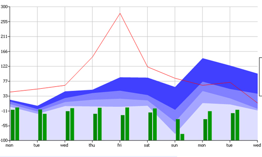
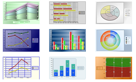
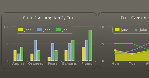
If you need to create a stacked area chart along with complete labels and legends, then ChartDemo is for you.

Chartstools4new in 40 Free Online Tools and Software to Improve Your Workflow

Flowchart
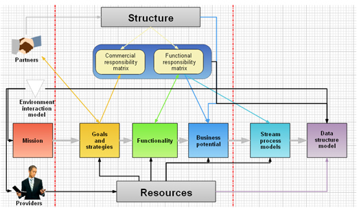
This tool not only lets you create charts and diagrams but also provides you a platform to collaborate with your colleagues. This does not require you to download any software rather it works in your internet browser.

Chartstools8new in 40 Free Online Tools and Software to Improve Your Workflow

Track-n-graph
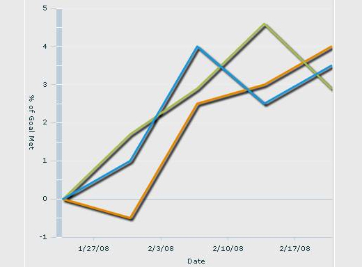
An easy to use web based tool for friends, family and colleagues to track and graph information

Chartstools19new in 40 Free Online Tools and Software to Improve Your Workflow

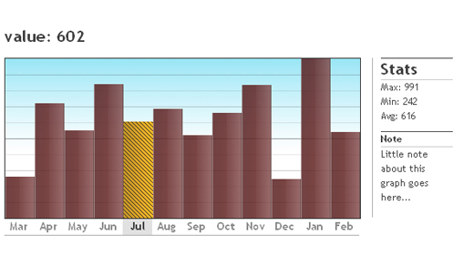
Barchart
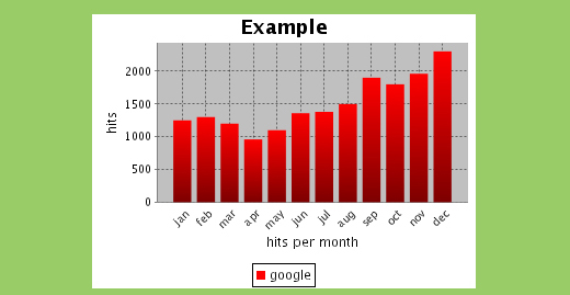
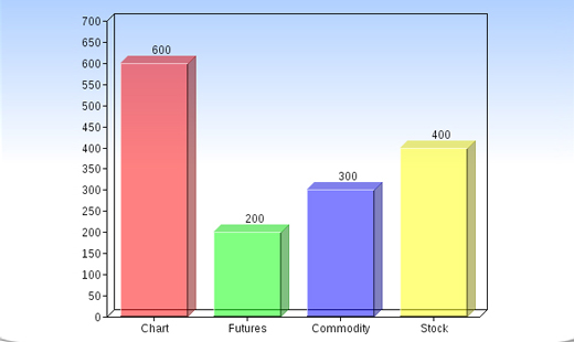
This online tool allows you to create bar charts without the need of an applet bar graph creator. An absolute must have tool for those who want to create bar graphs.

Chartstools2new in 40 Free Online Tools and Software to Improve Your Workflow

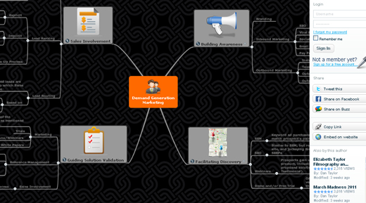
Bubbl
Create multicolored mind maps online, share and work on them with friends. With this tool, you can embed your mind map in your blog or website, can email it or have it in printed form.

Chartstools3new in 40 Free Online Tools and Software to Improve Your Workflow

ChartGizmo
A free web based application that lets you create charts for your websites, blogs and even for social network profiles.

Chartstools5new in 40 Free Online Tools and Software to Improve Your Workflow

CreateAGraph
CreateAGraph gives you five different types of graphs and charts that you can consider for your use. With this tool, you can work online right from your browser.

Chartstools6new in 40 Free Online Tools and Software to Improve Your Workflow

DrawAnywhere
As the name suggests, draw anywhere you like. You can create flowcharts, diagrams, organizational charts and on top of that you can export your charts and diagrams as an image file (jpg, png, pdf, etc).

Chartstools7new in 40 Free Online Tools and Software to Improve Your Workflow

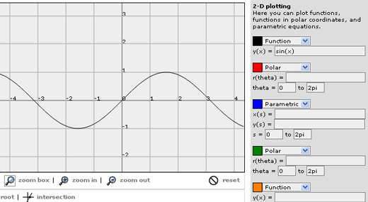
Fooplot
Fooplot is an online tool that lets you create charts & diagrams.

Chartstools9new in 40 Free Online Tools and Software to Improve Your Workflow

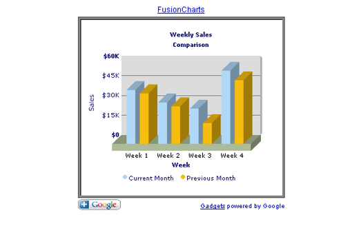
FusionCharts Google Gadget
Another useful web based tool to draw charts and diagrams with ease and comfort.

Chartstools10new in 40 Free Online Tools and Software to Improve Your Workflow

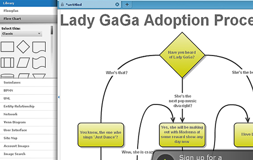
Gliffy
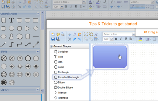
It is online diagramming software that allows you to create professional looking flowcharts, diagrams, floor plans, technical drawings, and more!

Chartstools11new in 40 Free Online Tools and Software to Improve Your Workflow

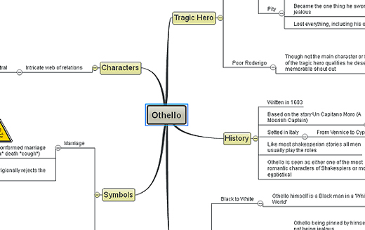
Mindomo
A versatile Web-based mind mapping tool for creating, editing and sharing mind maps. It offers the capabilities of desktop mind mapping software in an internet browser with no installation and maintenance required.

Chartstools12new in 40 Free Online Tools and Software to Improve Your Workflow

Mindmeister
This tool comes with all the customary features of a typical mind mapping tool with as many concurrent users as you like.

Chartstools13new in 40 Free Online Tools and Software to Improve Your Workflow

MGraph
MGraph is an online tool with which you can plot simple graphs.

Chartstools14new in 40 Free Online Tools and Software to Improve Your Workflow

Plotr
Draw simple charts with this lightweight charting framework which is based on Plot Kit. No use of Flash and no other interactive elements as you don’t always need them.

Chartstools15new in 40 Free Online Tools and Software to Improve Your Workflow

PlotKit
A comprehensive chart and graph plotting library for Javascript that comes with HTML Canvas, native browser and SVG support via SVG viewer.

Chartstools16new in 40 Free Online Tools and Software to Improve Your Workflow

Rich Chart Live
Use your web browser to create enjoyable and enchanting flash charts. High-impact charts can also be created with this absolutely free online tool.

Chartstools17new in 40 Free Online Tools and Software to Improve Your Workflow

SimpleSeating
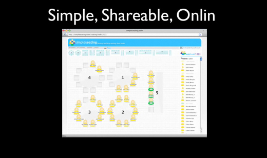
This is an invaluable tool for those who are responsible for planning an analyst event which can be a major time sink and massive pain without it.

Chartstools18new in 40 Free Online Tools and Software to Improve Your Workflow

Online Chart Generator
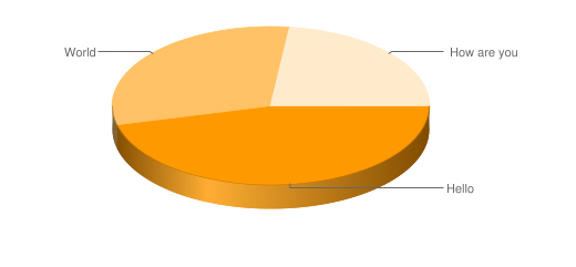
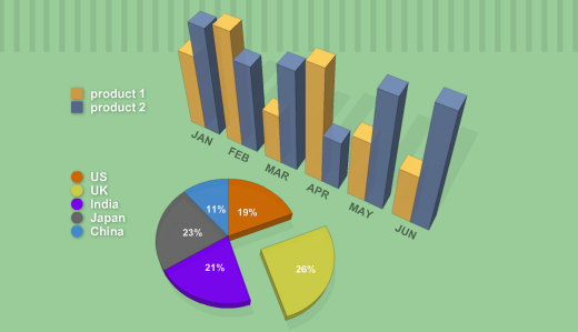
With this online tool, you can create amazing 3D graphs instantaneously.

Chartstools20new in 40 Free Online Tools and Software to Improve Your Workflow

DIY Chart
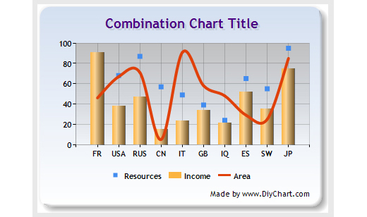
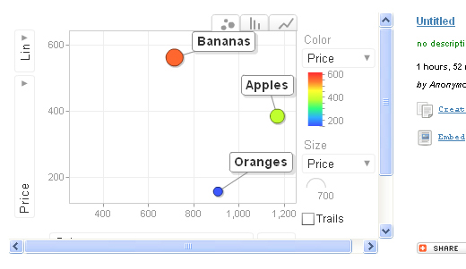
DIY (Do it yourself) Chart is an easy to use, simple yet powerful online tool that can be used to create interactive graphs and charts using static or dynamic data.

Chartstools21new in 40 Free Online Tools and Software to Improve Your Workflow

Chartle.net
This tool offers simplicity, ubiquity and interactivity to online visualizations, and tears down the complexity so that novices can also use it.

Chartstools22new in 40 Free Online Tools and Software to Improve Your Workflow

ChartGo
ChartGo permits users to generate charts online rapidly. Simply paste your data in the chart data area and hit the create chart button. It’s that easy.

Chartstools23new in 40 Free Online Tools and Software to Improve Your Workflow

JS Charts
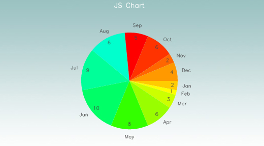
A JavaScript chart generator that lets you create charts in different templates. It is an easy to use tool that requires little or no coding.

Chartstools24new in 40 Free Online Tools and Software to Improve Your Workflow

Pie Chart Tool
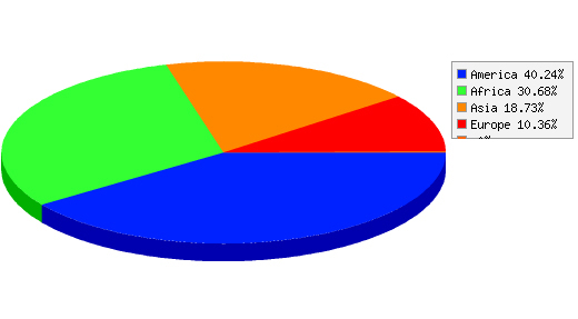
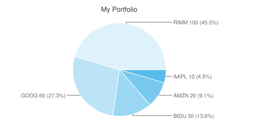
A simple and easy Pie Chart creator that creates pie charts based on the data that you provide. Simply type in your data and the name of the categories.

Chartstools25new in 40 Free Online Tools and Software to Improve Your Workflow

Piecolor
Piecolor is an online tool to create colorful pie chart with ease.

Chartstools26new in 40 Free Online Tools and Software to Improve Your Workflow

Hohli Charts
Hohli Charts lets you animatedly create charts.

Chartstools27new in 40 Free Online Tools and Software to Improve Your Workflow

CSS Chart Generator
Generate your charts on the fly with CSS Chart Generator.

Chartstools28new in 40 Free Online Tools and Software to Improve Your Workflow

CHARTPART
This is a simple and straightforward online tool for creating charts.

Chartstools29new in 40 Free Online Tools and Software to Improve Your Workflow

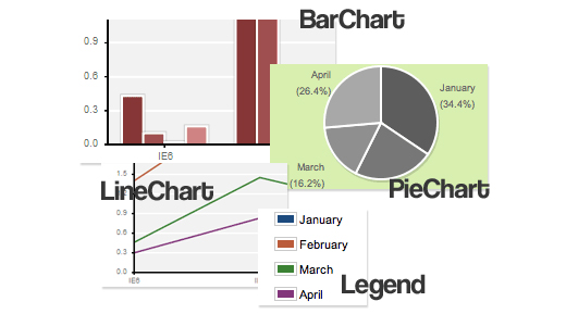
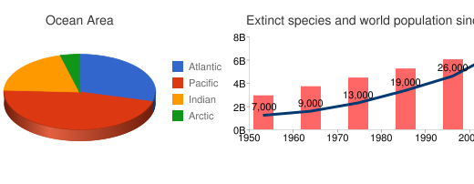
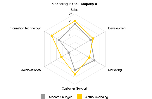
Google Chart Tools
The Google Chart Tools facilitate adding live charts to any web page.

Chartstools31new in 40 Free Online Tools and Software to Improve Your Workflow

amCharts Visual Editor
You can use amChats as a web service through this editor. Configuring the chart and pasting the generated HTML code to your HTML page is all you need.

Chartstools32new in 40 Free Online Tools and Software to Improve Your Workflow

Pie Chart Maker
The Pie Chart Maker lets you generate your own customizable pie charts. You can save your pie charts as an image on your computer as well.

Chartstools33new in 40 Free Online Tools and Software to Improve Your Workflow

Online Chart Tool
This online tool allows you to design and share your own graphs absolutely for free.

Chartstools34new in 40 Free Online Tools and Software to Improve Your Workflow

OWTChart Generator
The OWTChart Generator is yet another useful online tool that can produce charts. It displays a GIF image of the chart on the screen

Chartstools35new in 40 Free Online Tools and Software to Improve Your Workflow

Chart Maker
Chart Maker allows users to easily create charts according to their individual needs.

Chartstools30new in 40 Free Online Tools and Software to Improve Your Workflow

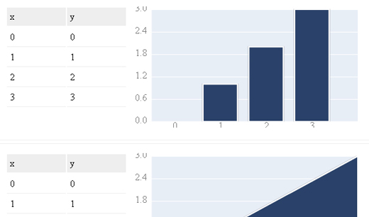
Highcharts
It is a JavaScript library for creating different types of charts including line, spline, area, areaspline, column, bar, pie and scatter charts. It offers an easy way to add interactive charts to your websites and even web applications.

Chartstools36new in 40 Free Online Tools and Software to Improve Your Workflow

Google Chart Generator
This tool creates a Google chart in seconds!

Chartstools37new in 40 Free Online Tools and Software to Improve Your Workflow

JGraphpad
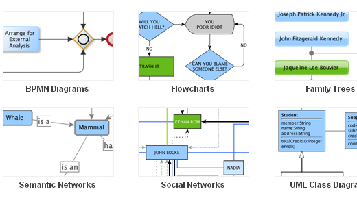
It is a feature-rich, online, standards-compliant and open source graph component available for Java that includes Process diagrams, workflow and BPM visualization, flowcharts, even traffic or water flow etc.

Chartstools39new in 40 Free Online Tools and Software to Improve Your Workflow

yEd Graph Editor
Another Java based graph editor that lets you generate drawings quickly and effectively. With this tool, you can implement automatic layouts to a wide range of different diagrams and networks.

Chartstools40new in 40 Free Online Tools and Software to Improve Your Workflow

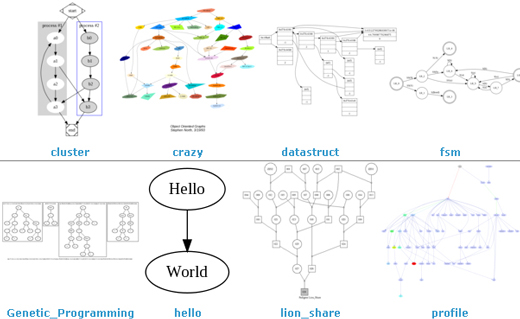
Graphviz
Graphviz is an open source graph visualization software that presents structural information as diagrams of abstract graphs and networks. You can employ this tool in networking, bioinformatics, software engineering, database and web design, machine learning, and in visual interfaces for other technical domains.

Chartstools41new in 40 Free Online Tools and Software to Improve Your Workflow

XML/SWF Charts
A simple yet powerful online tool that allows you to create beautiful web charts and graphs from dynamic XML data. You can either manually prepare the XML source or can generate it via any scripting language such as PHP, ASP, CFML, Perl, etc.

Chartstools42new in 40 Free Online Tools and Software to Improve Your Workflow

(rb)


  •   
  • Copyright © 1996-2010 BlogmyQuery - BMQ. All rights reserved.
    iDream theme by Templates Next | Powered by WordPress