Archive for July, 2011

Create a Medieval Knight Shield in Adobe Illustrator

Advertisement in Create a Medieval Knight Shield in Adobe Illustrator
 in Create a Medieval Knight Shield in Adobe Illustrator  in Create a Medieval Knight Shield in Adobe Illustrator  in Create a Medieval Knight Shield in Adobe Illustrator

Today we will will go through creation process of a Medieval Knight Shield in Adobe Illustrator. We will try to create nice, shiny Shield that can be used as the website icon or a company  logo. Creation process is quite simple. All we have to do is to use simple shape as ellipse, to distort it a little bit and to combine it with other shapes. Beside that we will get the chance to play with nice metal gradients, trying to create an impression of the light reflection on the shiny metal.

In the end, our shield should look something like this:
0371 in Create a Medieval Knight Shield in Adobe Illustrator

Now let’s get down to work!

Combining Elements in Order to Create the Shape of the Shield

Set the new illustrator document in 500 x 500 pixels in size.
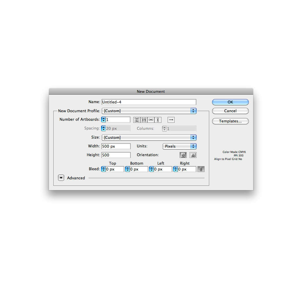
0011 in Create a Medieval Knight Shield in Adobe Illustrator

Grab the Ellipse Tool (L) from the Tool Panel and create the ellipse.
0022 in Create a Medieval Knight Shield in Adobe Illustrator

To distort the ellipse grab the Direct Selection Tool (A) from the Tool Panel and click on the lower anchor point. Hit the down arrow key on the keyboard to nudge the anchor points downwards for the few pixels.
0032 in Create a Medieval Knight Shield in Adobe Illustrator

Select the Convert Anchor Point Tool ( Shift + C ) from the Tool Panel and click on the nudged anchor point. It will make a sharp corner.
0042 in Create a Medieval Knight Shield in Adobe Illustrator

Use the Add Anchor Point Tool (+) to add the anchor point as it shown on the picture below.
0052 in Create a Medieval Knight Shield in Adobe Illustrator

With the Direct Selection Tool (A) remove few anchor points. Set the Fill color to none and for the Stroke color chose any color you like.
0063 in Create a Medieval Knight Shield in Adobe Illustrator

Under the Object select Transform > Reflect. Set the Axis to Vertical and hit the Copy button. This way we will reflect the path we have just created.
0072 in Create a Medieval Knight Shield in Adobe Illustrator

Holding the Shift key on the keyboard move the reflected path to the right. With the Direct Selection Tool (A) select lower endpoints and under the right click hit Join.
0082 in Create a Medieval Knight Shield in Adobe Illustrator

Grab the Pen Tool ( P ) from the Tool Panel and close the path.
0092 in Create a Medieval Knight Shield in Adobe Illustrator

Grab the Ellipse Tool (L) from the Tool Panel and create the ellipse. Place it as it shown on the picture below.
0102 in Create a Medieval Knight Shield in Adobe Illustrator

Select both objects and under the Pathfinder Panel hit the Minus Front button.
0113 in Create a Medieval Knight Shield in Adobe Illustrator

We have to do the same thing to the right side. But instead to trying to do exact the same thing and to create symmetrical shield we will simple divide our object to half, remove the right side and reflect the left side.

Grab the Line Tool (/) from the Tool Panel and create the vertical line (hold the Shit key on the keyboard for straight dragging). Select both objects and align them under the Align Panel by hitting Horizontal Align Center. After that hit a Divide button under the Pathfinder Panel. It will divide the Shield exactly to half. Remove the right side of the Shield.
0124 in Create a Medieval Knight Shield in Adobe Illustrator

Under Object select Transform > Reflect. Set the Axis to Vertical and hit the Copy button. Move the reflected part to the right until the middle parts meet. Under the Pathfinder Panel hit the Unite button. It will create the final shape of our Shield.
0133 in Create a Medieval Knight Shield in Adobe Illustrator

Applying Gradients

Select the Shield and under the Object select Path > Offset Path. Set the value for Offset to -10. It will create the scaled copy of the Shield.

0142 in Create a Medieval Knight Shield in Adobe Illustrator

Let’s apply a nice metal linear gradient to our Shield. Under the Swatch Panel open the Swatch Library. You can find amazing source of the metal gradients. Chose one of them and apply it to our Shield. In case you don’t like them feel free to adjust some of those gradients or to create your own metal linear gradient.

0153 in Create a Medieval Knight Shield in Adobe Illustrator

0163 in Create a Medieval Knight Shield in Adobe Illustrator

Select the red shape and under the Object select Path > Offset Path. Set the value for Offset to 2.

0172 in Create a Medieval Knight Shield in Adobe Illustrator

Apply linear gradient to the new shape as well. It will represent the inner part of the metal frame,

0182 in Create a Medieval Knight Shield in Adobe Illustrator

and the red radial gradient for the color of the Shield.

0192 in Create a Medieval Knight Shield in Adobe Illustrator

Select the Ellipse Tool (L) from the Tool Panel and create a small circle for the screw.

0202 in Create a Medieval Knight Shield in Adobe Illustrator

Scale it down and place it on the metal Part of the Shield. Duplicate the circle ( Ctrl / Cmd + C, Ctrl / Cmd + F ), set the Fill color to #58595B, nudge it downwards for 1 pixel and send it backward ( Ctrl / Cmd + [ ). It will be a tiny shadows from the screw. Group the circles.

0213 in Create a Medieval Knight Shield in Adobe Illustrator

Duplicate ( Ctrl / Cmd + C, Ctrl / Cmd + F ) the screw six more times in order to create enough of them for the entire Shield.

0222 in Create a Medieval Knight Shield in Adobe Illustrator

Creating Details

Roughly speaking, our Shield is done. At this point we have to try our best to improve the illustration as much as possible. First, we will create the reflection for the metal part of the Shield.

Select the largest part of the Shield and under Object select Path > Offset Path. Set the value for Offset to -1.

0232 in Create a Medieval Knight Shield in Adobe Illustrator

Select the Ellipse Tool (L) from the Tool Panel and create a big ellipse. Place it as it shown on the picture below. Select the blue ellipse and the scaled shape of the Shield we’ve made in previous step and under the Pathfinder Panel hit the Intersect button.

0242 in Create a Medieval Knight Shield in Adobe Illustrator

You should end up with something like this.

0253 in Create a Medieval Knight Shield in Adobe Illustrator

Select the inner part of the Shield, as it show on the picture below, and under the Object select Path > Offset Path. Set the value for Offset to 1.

0263 in Create a Medieval Knight Shield in Adobe Illustrator

0273 in Create a Medieval Knight Shield in Adobe Illustrator

Select the shape we have just created and the blue shape and under the Pathfinder Panel hit the Exclude button.

0284 in Create a Medieval Knight Shield in Adobe Illustrator

Ungroup ( Shift / Ctrl + Cmd + G ) the new shape and remove the lower part. Apply the same gradient we have used for the larger part of the Shield. You should end up with something like this.

0293 in Create a Medieval Knight Shield in Adobe Illustrator

Now we will change the gradient a little bit. Make sure to set the lower part of the reflection to light gray color. It will create a nice illusion of light reflection.

0302 in Create a Medieval Knight Shield in Adobe Illustrator

Let’s do create a similar reflection for the red part of the Shield.

Grab the Ellipse Tool (L) from the Tool Panel, create the ellipse and place it as it shown on the picture below.

0312 in Create a Medieval Knight Shield in Adobe Illustrator

Duplicate the red part of the Shield ( Ctrl / Cmd + C, Ctrl / Cmd + F ) and holding the Shift key on the keyboard select the gray ellipse as well. Under the Pathfinder Panel hit the Intersect button.

0333 in Create a Medieval Knight Shield in Adobe Illustrator

Set the Fill color of the new shape to white (#FFFFFF) and lower the Opacity to 5%.

0342 in Create a Medieval Knight Shield in Adobe Illustrator

Duplicate ( Ctrl / Cmd + C, Ctrl / Cmd + F ) twice the red shape. Scale them up and rotate both of them. Select them and under the Pathfinder Panel hit the Minus Front button. Set the Fill color of the new shape to white (#FFFFFF). You should end up with something like this.

035a in Create a Medieval Knight Shield in Adobe Illustrator

0353 in Create a Medieval Knight Shield in Adobe Illustrator

Create one more copy ( Ctrl / Cmd + C, Ctrl / Cmd + F ) of the red part of the Shield. Select it together with the white shape we’ve created in previous step and under the Pathfinder Panel hit the Intersect button.

0361 in Create a Medieval Knight Shield in Adobe Illustrator

Lower the Opacity of the new shape to 15%. Under the Object select Transform > Reflect. Set the Axis to Vertical and hit the Copy button. Move the reflected shape to the left and place it as it shown on the picture below.

0371 in Create a Medieval Knight Shield in Adobe Illustrator

There are many different shapes of the Medieval Shield you can create. Just feel free to be creative. Try out some other colors as well.

0382 in Create a Medieval Knight Shield in Adobe Illustrator

The Conclusion

There are many ways to create a nice shiny Medieval Shields. The great thing about creation process is that you can use different shapes and forms and to combine them in order to create nice Shields. Using the same technique try to create a Medieval Shield in perspective. Applying reflections, highlights and shadows will lead to professional look of the illustration. I hope you like this tutorial. If you have any questions or comments please post them in the comments section below. Thank you for following along!

(rb)


Free WordPress Plugins and Add-ons to Promote Your Blog On Autopilot

promote your blog for freeThere are WordPress addons available for just about any function — including automatic promotion of your blog posts! This article is specifically aimed at folks who are new to blog promotion or want to start their first website marketing campaign but aren’t sure where to begin. The great thing is, these plugins are so simple to set up, there’s absolutely no reason why you shouldn’t be using these tactics to increase your blog’s following.


Here’s a guide to some of the best WordPress plugins for automating your blog promotion tasks without spending a lot of money. 

continue reading Free WordPress Plugins and Add-ons to Promote Your Blog On Autopilot


© Barbara Holbrook for Tutorial Blog | 8 comments | Add to del.icio.us

Free WordPress Plugins and Add-ons to Promote Your Blog On Autopilot is a post from: Tutorial Blog


Definitive Daft Punk

A Blue Perspective: <p>

Download the "Definitive Daft Punk" MP3 (16MB)
This file has been removed due to record company demands

In honour of the fact that Daft Punk have composed the music for the new TRON: Legacy movie (which is out today) and also because of the fact that I've been at home with my arm in a sling all week, I decided to create an homage to the rocking robotic duo.

In true 139 Mixtape style, I've mashed up, edited and remixed 23 of my favourite Daft Punk tracks into 6 minutes of Daft bliss that I'm calling "Definitive Daft Punk".

Here's the tracklisting:

  1. Daft Punk - Da Funk
  2. Daft Punk - Aerodynamic
  3. Daft Punk - Too Long
  4. Daft Punk - Oh Yeah
  5. Daft Punk - Steam Machine
  6. Daft Punk - Television Rules The Nation
  7. Daft Punk - Tron Legacy
  8. Daft Punk - Alive
  9. Daft Punk - Burnin'
  10. Daft Punk - Around The World
  11. Daft Punk - Voyager
  12. Daft Punk - Crescendolls
  13. Scott Grooves - Mothership Reconnection (Daft Punk Remix)
  14. Daft Punk - Digital Love
  15. Daft Punk - Harder, Better, Faster
  16. Daft Punk - Human After All
  17. Daft Punk - Face To Face
  18. Daft Punk - Short Circuit
  19. Daft Punk - Daftendirekt
  20. Daft Punk - Revolution 909
  21. Daft Punk - Technologic
  22. Ian Pooley - Chord Memory (Daft Punk Remix)
  23. Daft Punk - One More Time

So download, listen, enjoy, and discover your inner robot.

Update (2010-12-19): Due to popular demand, "One More Time" has been added into the mix.

Update (2011-05-10): The mix has been remastered for smoother listening and an extra song added in: Harder, Better, Faster.


Desktop Wallpaper: Space Frames

A Blue Perspective: <p>

I'm a big fan of a black desktop. It's easy on the eyes and icons are highly visible. But you have to have a dash of colour to add personality, so it's a fine balance between style and stark.

A few years ago, when I was heavily into Processing I wrote a program that dynamically generated spacey looking spectrum wallpapers, with the aim of offering it to the public so that 6 billion people could each have their own unique desktop wallpaper. Didn't work out. (But I used one of its outputs as my own wallpaper for the last 4 years).

A bout of recent procrastination made me realise that I hadn't changed my wallpaper in far too long and this time instead of breaking open some code I headed to Illustrator to make some jaunty little geometrics.

Now, I've got a new wallpaper and you can have one too! I'm calling it Space Frames and you can download it by clicking on the image below. Bon appetit!

Space Frames wallpaper


Learning To Use The :before And :after Pseudo-Elements In CSS

Advertisement in Learning To Use The :before And :after Pseudo-Elements In CSS
 in Learning To Use The :before And :after Pseudo-Elements In CSS  in Learning To Use The :before And :after Pseudo-Elements In CSS  in Learning To Use The :before And :after Pseudo-Elements In CSS

If you’ve been keeping tabs on various Web design blogs, you’ve probably noticed that the :before and :after pseudo-elements have been getting quite a bit of attention in the front-end development scene — and for good reason. In particular, the experiments of one blogger — namely, London-based developer Nicolas Gallagher — have given pseudo-elements quite a bit of exposure of late.

Pseudo-element-icons in Learning To Use The :before And :after Pseudo-Elements In CSS
Nicolas Gallagher used pseudo-elements to create 84 GUI icons created from semantic HTML.

To complement this exposure (and take advantage of a growing trend), I’ve put together what I hope is a fairly comprehensive run-down of pseudo-elements. This article is aimed primarily at those of you who have seen some of the cool things done with pseudo-elements but want to know what this CSS technique is all about before trying it yourself.

Although the CSS specification contains other pseudo-elements, I’ll focus on :before and :after. So, for brevity, I’ll say “pseudo-elements� to refer generally to these particular two.

What Does A Pseudo-Element Do?

A pseudo-element does exactly what the word implies. It creates a phoney element and inserts it before or after the content of the element that you’ve targeted.

The word “pseudo� is a transliteration of a Greek word that basically means “lying, deceitful, false.� So, calling them pseudo-elements is appropriate, because they don’t actually change anything in the document. Rather, they insert ghost-like elements that are visible to the user and that are style-able in the CSS.

Basic Syntax

The :before and :after pseudo-elements are very easy to code (as are most CSS properties that don’t require a ton of vendor prefixes). Here is a simple example:

#example:before {
   content: "#";
}

#example:after {
   content: ".";
}

There are two things to note about this example. First, we’re targeting the same element using #example:before and #example:after. Strictly speaking, they are the pseudo-elements in the code.

Secondly, without the content property, which is part of the generated content module in the specification, pseudo-elements are useless. So, while the pseudo-element selector itself is needed to target the element, you won’t be able to insert anything without adding the content property.

In this example, the element with the id example will have a hash symbol placed “before� its content, and a period (or full stop) placed “after� its content.

Some Notes On The Syntax

You could leave the content property empty and just treat the pseudo-element like a content-less box, like this:

#example:before {
   content: "";
   display: block;
   width: 100px;
   height: 100px;
   float: left;
}

However, you can’t remove the content property altogether. If you did, the pseudo-element wouldn’t work. At the very least, the content property needs empty quotes as its value.

You may have noticed that you can also code pseudo-elements using the double-colon syntax (::before and ::after), which I’ve discussed before. The short explanation is that there is no difference between the two syntaxes; it’s just a way to differentiate pseudo-elements (double colon) from pseudo-classes (single colon) in CSS3.

One final point regarding the syntax. Technically, you could implement a pseudo-element universally, without targeting any element, like this:

:before {
   content: "#";
}

While the above is valid, it’s pretty useless. The code will insert a hash symbol before the content in each element in the DOM. Even if you removed the <body> tag and all of its content, you’d still see two hash symbols on the page: one in the <html> element, and one in the <body> tag, which the browser automatically constructs.

Characteristics Of Inserted Content

As mentioned, the content that is inserted is not visible in the page’s source. It’s visible only in the CSS.

Also, the inserted element is by default an inline element (or, in HTML5 terms, in the category of text-level semantics). So, to give the inserted element a height, padding, margins and so forth, you’ll usually have to define it explicitly as a block-level element.

This leads well into a brief description of how to style pseudo-elements. Look at this graphic from my text editor:

Styles-pseudo-elements in Learning To Use The :before And :after Pseudo-Elements In CSS

In this example, I’ve highlighted the styles that will be applied to the elements inserted before and after the targeted element’s content. Pseudo-elements are somewhat unique in this way, because you insert the content and the styles in the same declaration block.

Also note that typical CSS inheritance rules apply to the inserted elements. If you had, for example, a font stack of Helvetica, Arial, sans-serif applied to the <body> element of the document, then the pseudo-element would inherit that font stack the same as any other element would.

Likewise, pseudo-elements don’t inherit styles that aren’t naturally inherited from parent elements (such as padding and margins).

Before Or After What?

Your hunch on seeing the :before and :after pseudo-elements might be that the inserted content will be injected before and after the targeted element. But, as alluded to above, that’s not the case.

The content that’s injected will be child content in relation to the targeted element, but it will be placed “before� or “after� any other content in that element.

To demonstrate this, look at the following code. First, the HTML:

<p class="box">Other content.</p>

And here’s the CSS that inserts a pseudo-element:

p.box {
   width: 300px;
   border: solid 1px white;
   padding: 20px;
}

p.box:before {
   content: "#";
   border: solid 1px white;
   padding: 2px;
   margin: 0 10px 0 0;
}

In the HTML, all you would see is a paragraph with a class of box, with the words “Other content� inside it (the same as what you would see if you viewed the source on the live page). In the CSS, the paragraph is given a set width, along with some padding and a visible border.

Then we have the pseudo-element. In this case, it’s a hash symbol inserted “before� the paragraph’s content. The subsequent CSS gives it a border, along with some padding and margins.

Here’s the result viewed in the browser:

4589454789 in Learning To Use The :before And :after Pseudo-Elements In CSS

The outer box is the paragraph. The border around the hash symbol denotes the boundary of the pseudo-element. So, instead of being inserted “before� the paragraph, the pseudo-element is placed before the “Other content� in the paragraph.

Inserting Non-Text Content

I mentioned briefly that you can leave the content property’s value as an empty string or insert text content. You basically have two additional options of what to include as the value of the content property.

First, you can include a URL that points to an image, just as you would do when including a background image in the CSS:

p:before {
   content: url(image.jpg);
}

Notice that the quotes are missing. If you wrapped the URL reference in quotes, then it would become a literal string and insert the text “url(image.jpg)� as the content, instead of inserting the image itself.

Naturally, you could include a Data URI in place of the image reference, just as you can with a CSS background.

You also have the option to include a function in the form of attr(X). This function, according to the spec, “returns as a string the value of attribute X for the subject of the selector.�

Here’s an example:

a:after {
   content: attr(href);
}

What does the attr() function do? It takes the value of the specified attribute and places it as text content to be inserted as a pseudo-element.

The code above would cause the href value of every <a> element on the page to be placed immediately after each respective <a> element. This could be used in a print style sheet to include full URLs next to all links when a document is printed.

You could also use this function to grab the value of an element’s title attribute, or even microdata values. Of course, not all of these examples would be practical in and of themselves; but depending on the situation, a specific attribute value could be practical as a pseudo-element.

While being able to grab the title or alt text of an image and display it on the page as a pseudo-element would be practical, this isn’t possible. Remember that the pseudo-element must be a child of the element to which it is being applied. Images, which are void (or empty) elements, don’t have child elements, so it wouldn’t work in this case. The same would apply to other void elements, such as <input>.

Dreaded Browser Support

As with any front-end technology that is gaining momentum, one of the first concerns is browser support. In this case, that’s not as much of a problem.

Browser support for :before and :after pseudo-elements stacks up like this:

  • Chrome 2+,
  • Firefox 3.5+ (3.0 had partial support),
  • Safari 1.3+,
  • Opera 9.2+,
  • IE8+ (with some minor bugs),
  • Pretty much all mobile browsers.

The only real problem (no surprise) is IE6 and IE7, which have no support. So, if your audience is in the Web development niche (or another market that has low IE numbers), you can probably go ahead and use pseudo-elements freely.

Pseudo-Elements Aren’t Critical

Fortunately, a lack of pseudo-elements will not cause huge usability issues. For the most part, pseudo-elements are generally decorative (or helper-like) content that will not cause problems in unsupported browsers. So, even if your audience has high IE numbers, you can still use them to some degree.

A Couple Of Reminders

As mentioned, pseudo-element content does not appear in the DOM. These elements are not real elements. As such, they are not accessible to most assistive devices. So, never use pseudo-elements to generate content that is critical to the usability or accessibility of your pages.

Another thing to keep in mind is that developer tools such as Firebug do not show the content generated by pseudo-elements. So, if overused, pseudo-elements could cause maintainability headaches and make debugging a much slower process.

That covers all of the concepts you need in order to create something practical with this technique. In the meantime, for further reading on CSS pseudo-elements, be sure to check out some of the articles that we’ve linked to in this piece.

(kw)


© Louis Lazaris for Smashing Magazine, 2011.


  •   
  • Copyright © 1996-2010 BlogmyQuery - BMQ. All rights reserved.
    iDream theme by Templates Next | Powered by WordPress