Archive for August, 2011

Getting It Wrong: Edward Fella


“I am interested in graphic design as art,” Ed Fella says. “This is a kind of art practice that uses forms that come out of graphic design, decorative illustration, and lettering, all mixed together-forms that come out of Twentieth Century art, out of Miró and Picasso — all of it has a genealogy and a certain look — in the same way that artists today use comic books and graphic novels. I was an illustrator, so you see endless styles popping in and out of the books. The drawings are an unconscious discharge of all the styles and forms that I used as a commercial artist for 30 years — that was my profession — I did it every single day. So, my unconscious has all this stuff in it, and now, because I don’t have to make meaning anymore, I can just use the techniques, like a machine that has long ago stopped making widgets, but the machine is still running. I’m still making stuff. I love the craft of it — of carefully making some little thing.”

Ed Fella: A Lesson In Being Truly Creative

Many articles and interviews have been done with Ed Fella. It wouldn’t do him justice to do another… at least not the same way others have done it. Mr. Fella is different, and not in a good way… or bad way. It depends on how you view design. A base of commercial art led him to create design that is the very destruction of design. It broke every rule and he knew it.

The bad boy in me loves him for that because he chose to do it and keeps on doing it. Best of all, people in design worship him for it. My only sadness lay with his breaking the rules BECOMING the rules. Someone like Fella sets the high bar and eventually, it becomes the standard. Society, and certainly design, is too weird at times and eventually weirdness becomes the mundane.

But the tribute to Fella is that he did it first and for many years while other designers failed to “get it.� The greatest thing that can be said is that he thumbed his nose at the rules and kept doing it until it was accepted and even touted as greatness by his detractors. Bastards!

CalArts, where Mr. Fella teaches, lists his bio as:

“Edward Fella is an artist and graphic designer whose work has had an important influence on contemporary typography here and in Europe. He practiced professionally as a commercial artist in Detroit for 30 years before receiving a master’s degree in Design from the Cranbrook Academy of Art in 1987. He has since devoted his time to teaching and his own unique self-published work has appeared in many design publications and anthologies. In 1997 he received the Chrysler Award and in 1999 an honorary doctorate from CCS in Detroit. In 2007 he was recognized with a medal from AIGA. His work is in the National Design Museum and MOMA in New York. A recent monograph of his work, Letters on America, documents some of his extensive practice.”

I hope he laughs and prints that out to wipe himself with after each bowel movement he takes. Moreover, I hope those who believe hiring “young and cheap� choke on their own words when they say older designers have nothing to add to design. Mr. Fella was old and talented and set the tone many years ago that young and cheap designers now mimic. Take THAT Madison Ave!

Idiosyncratic And Juxtaposing.

Just looking at his work, one would think that he’s a lunatic. He forces contradiction yet still plays to the grid. Not because it’s there but because it serves his purpose to help pull the eye all over the place and still make pleasing, readable design. There is chaos and balance, existing side-by-side like identical Siamese twins – one good and the other evil.


His hand drawn type and inkblot icons are now Emigré font sets. Personally, I think it an insult to the man who hand rendered his own type to contradict the mainstream fonts of the time. Still, no innovation goes un-copied. No movement of rebellion is long lived as it often becomes commonplace with familiarity. The design world is always changing and eventually, Ed’s rebellion became the commerciality of later years.

It is not the lines or placement or type usage of Ed’s that designers should admire and mimic – it’s the strength of conviction, the exploration, the dedication and the utter balls the size of church bells.

When Crazy Becomes The Norm.

Fella is quoted as saying, “anything can be made in anything� and “everything is possible.�

That leaves little to no limitations in the creative process and Fella certainly saw no limitations in his work. His work is a forced contradiction and he revels in it. If red is the color a designer would use for a Valentine, Fella would no doubt use black or yellow. Considering Fella’s decades of work under strict control of both an ad agency and clients, someone of his creative talent… and needs, had a driving urge for a freer outlet or risk spontaneous combustion.

One of Fella’s early sketchbooks contains some telling clippings. One is an advice column in which a young creative sadly wrote that he is depressed by numerous rejections and being told his work is, not “with it.�

The columnist answered with a quote from Orson Wells. “I passionately hate the idea of being ‘with it.’ A true artist is always out of step with his time. He has to be.�

Obviously that struck a cord with Fella. Either it inspired him or just legitimized his entrenched belief in his own design sensibilities. Another clipping within his sketchbook was a quote from Marcel Duchamp. “I force myself into contradiction to avoid following my own taste.�

It was the strict guidelines of corporate design that forced Fella into his greatness and, I suspect, happiest place in his design career. He claimed to flourish with the erratic quality of cheap typesetting (before the years of the PC) and “quickie� offset printing. The arts community quickly grew to know and admire his work and because of the volunteer and low pay jobs associated with that community, he was able to control his own design decisions. By making grand images that were jumbles and unidentifiable, Fella’s work invited closer inspection of individual elements within the entire work.

Fella referred to his work as stylistically “getting it wrong.� His work is raw and obsessive. It has power and spontaneity. Born from the knowledge of layout, typography, design and theory, he seems to have ended up getting it very, very right.

(all images © Ed Fella)

(rb)


Create a Corn Cob in Adobe Illustrator


In this very interesting tutorial we will have the opportunity to create something unusual. We will create a Corn Cob by using Adobe Illustrator. We will use some great tools such as Blend Tool, Envelope Distort and of course the Pen Tool. Blend Tool will help us to create the grains, Envelope Distort will help us to form the cob and we will practice the usage of Pen Tool by creating beautiful green leaves.

Let’s get down to business!

Grains

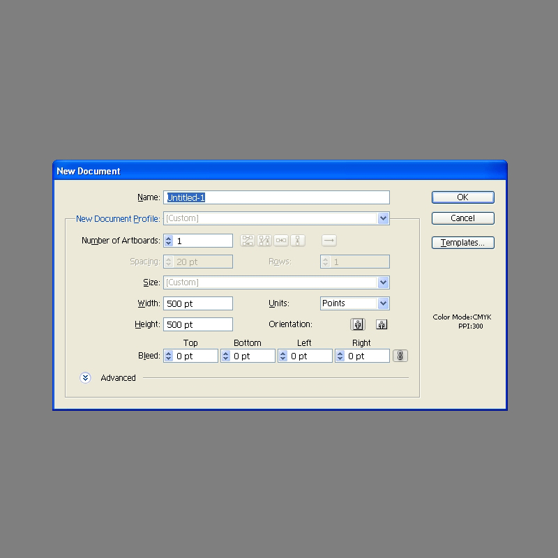
Create new illustrator document with 500 x 500 pixels in size.

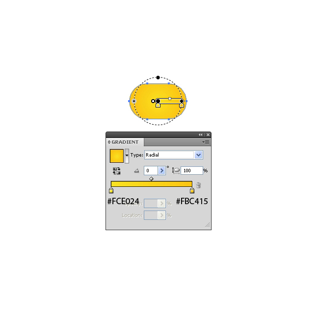
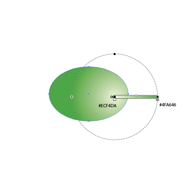
For the start grab the Rounded Rectangle Tool from the Tool Panel and create the shape as it shown on the picture below.

Apply radial gradient.

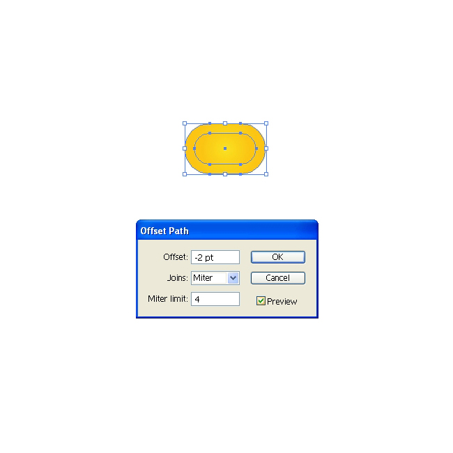
Let’s make a small reflection on the top. Under the Object select Path > Offset Path. Set the value for Offset to -2.

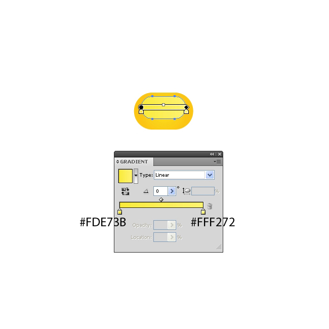
Apply a nice linear gradient and using the up arrow key on the keyboard nudge the new shape for the few pixels upwards. Group (Ctrl / Cmd + G) the grain.

Now we have to create the smaller grain for the top of the cob. Duplicate (Ctrl / Cmd + C, Ctrl / Cmd + F) the grain we already have, scale it down and holding the Shift key keyboard (for straight dragging) drag the scaled copy upwards.

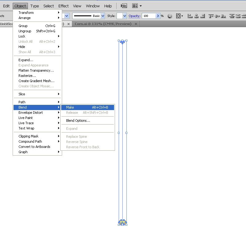
Select both grains and under the Object select Blend > Make.

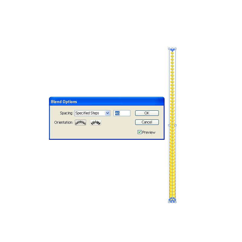
This will create the row of grains. Select Object > Blend > Blend Options. For the Spacing set the Specified Steps. In this case we will set the value for the Specified Steps to 46.

Expand the row of the grains (Object > Expand) and duplicate it (Ctrl / Cmd + C, Ctrl / Cmd + F). Move the copy to the right and rotate it a bit, as it shown on the picture below.

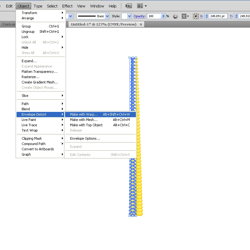
Let’s distort our rows a little bit. Select the left row of the grains and under the Object select Envelope Distort > Make with Warp. Under the Style select Bulge (Vertical) and set the value for the Bend to 1%.

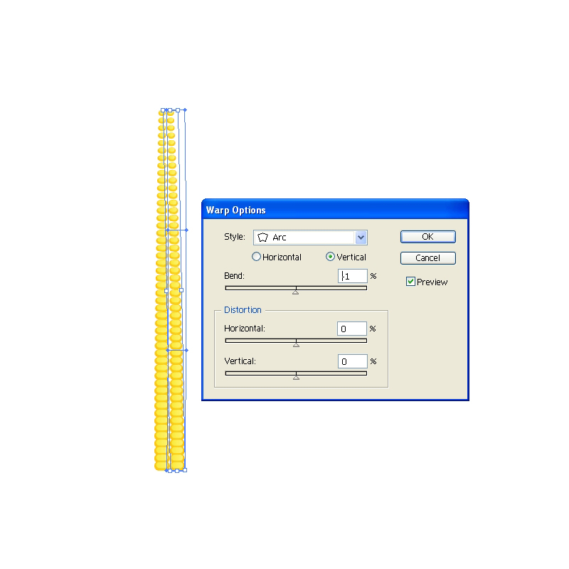
We have to distort the right row of grains as well. Select it and under the Object select Envelope Distort > Make with Warp. This time set the Style to Arc (Vertical). Set the value for Bend to -1%. This will bend the row to the left side. Under the Object select Expand.

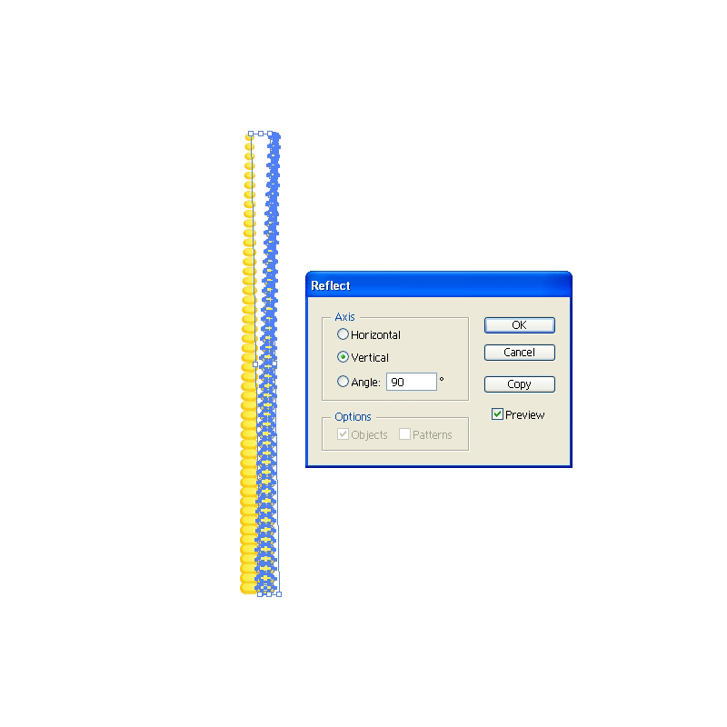
Reflection will help us to create more grains . Under Object select Transform > Reflect. Set the Axis to Vertical and hit the Copy button. This will create a mirror image. Place the reflected copy on the left side.

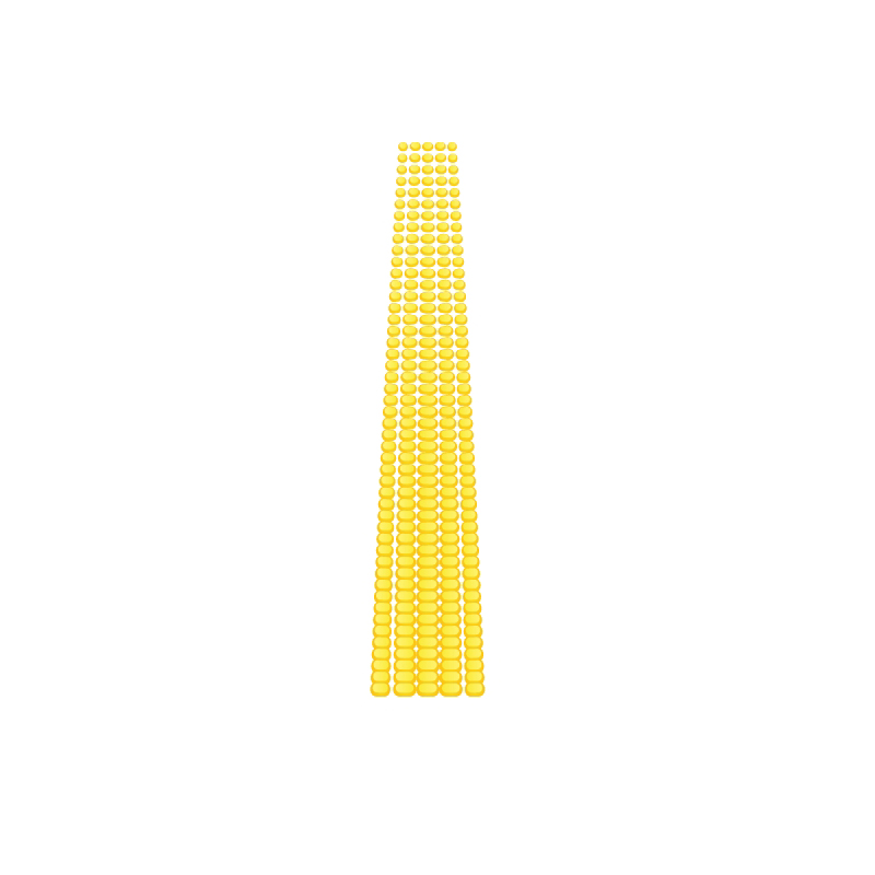
Create a copy ( Ctrl / Cmd + C, Ctrl / Cmd + F) of the left and the right row and place them as it shown on the picture below. Feel free to scale down the end rows by using non-uniforme scale.

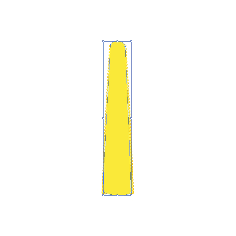
Group (Ctrl / Cmd + G) the grains. Grab the Pen Tool (P) from the Tool Panel and draw the shape as it shown on the picture below. Set the Fill color to #FFE73B.

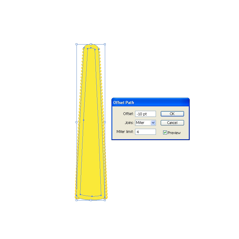
Under the Object select Path > Offset Path. Set the value for Offset to -10.

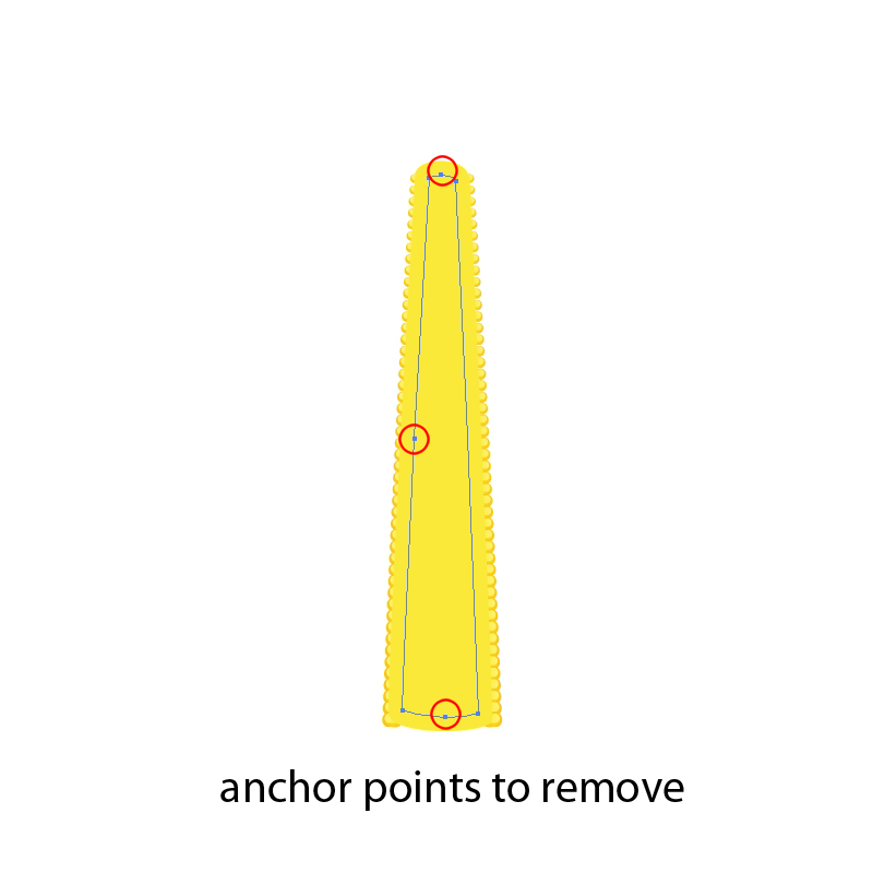
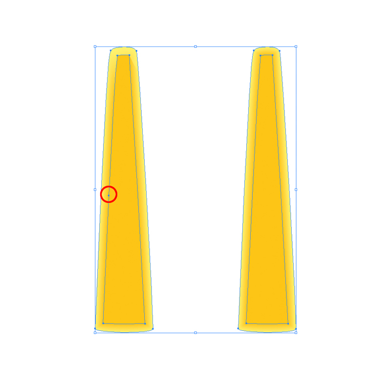
Take a good look at the shape we have just created. You will notice it contains more anchor points then the larger shape. Grab the Delete Anchor Point Tool (-) and remove some of the anchor points. Feel free to adjust the handlers of the anchor points in order to create nice and round corners.

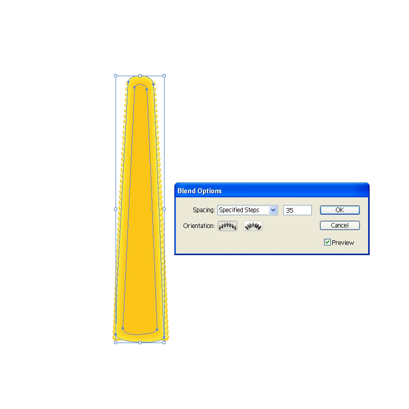
Set the Fill color of the smaller shape to #FBC415. Select both shapes and under the Object hit Blend > Make. Bring up the Blend  Option box and under Specified Steps set the number to 35. This will create a nice color transition.

Send the blanded object behind the grains (Shift + Ctrl / Cmd + [).

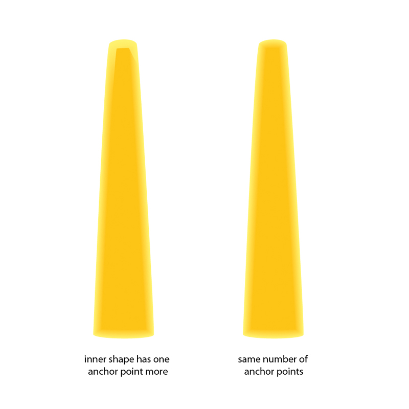
Blend Tool is amazing Illustrator feature. You can create a color transition for the objects with irregular shape. There is just one thing you should keep on mind. Make sure to create two objects or paths with the exact same number of anchor points. That way you will ensure that each anchor point of one object (path) has the correspondent anchor point on the other object (path).

Leaves

In this part we will exercise drawing with Pen Tool (P). Get ready for creating nice curved paths and combining some shapes inside Pathfinder Panel.

Let’s start!

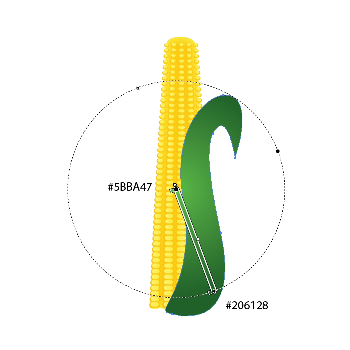
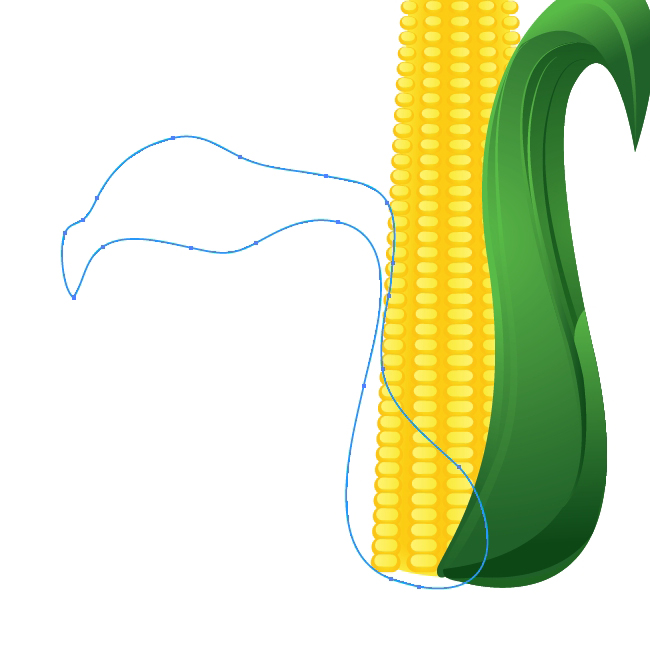
Grab the Pen Tool (P) from the Tool Panel and draw the shape as it shown on the picture below.

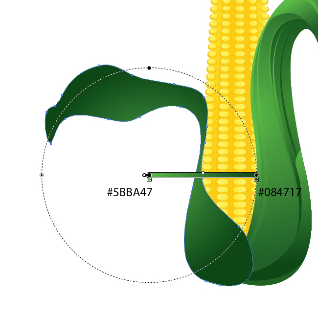
Apply a nice green radial gradient.

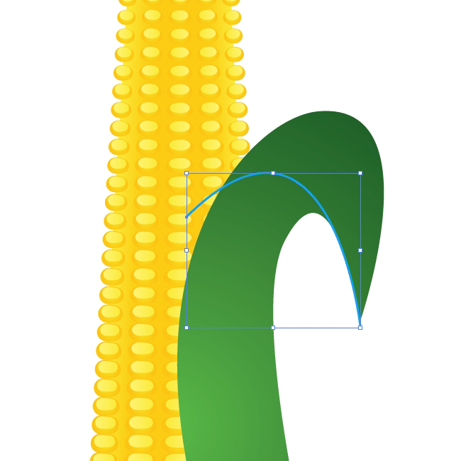
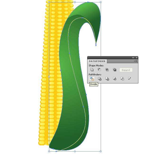
Duplicate (Ctrl / Cmd + C, Ctrl / Cmd + F) the leaf and create a small curved path. Select the copy of the leaf and the path and under the Pathfinder Panel hit Divide button

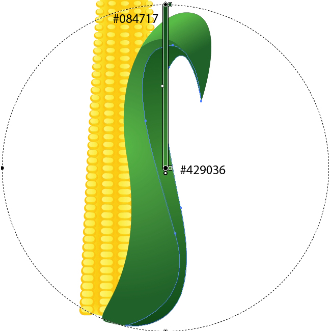
Ungroup (Shift + Ctrl / Cmd + G) the new shape and remove the lower part of divided leaf. Apply linear gradient as it shown on the picture below.

Hereafter we will try our best to create nice details which will make our leaves more interesting.

With the Pen Tool (P) create the path as it shown on the picture below.

Duplicate (Ctrl / Cmd + C, Ctrl /Cmd +F) the shape of the leaf. Select the copy of the leaf and the path from the previous step and under the Pathfinder Panel hit Divide button. Ungroup (Shift + Ctrl / Cmd + G) the new shape, remove the larger part of the shape and apply green radial gradient.

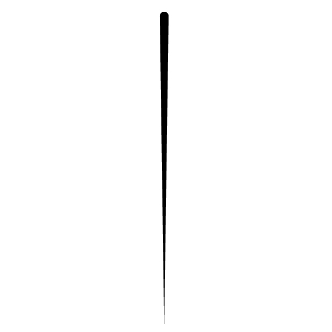
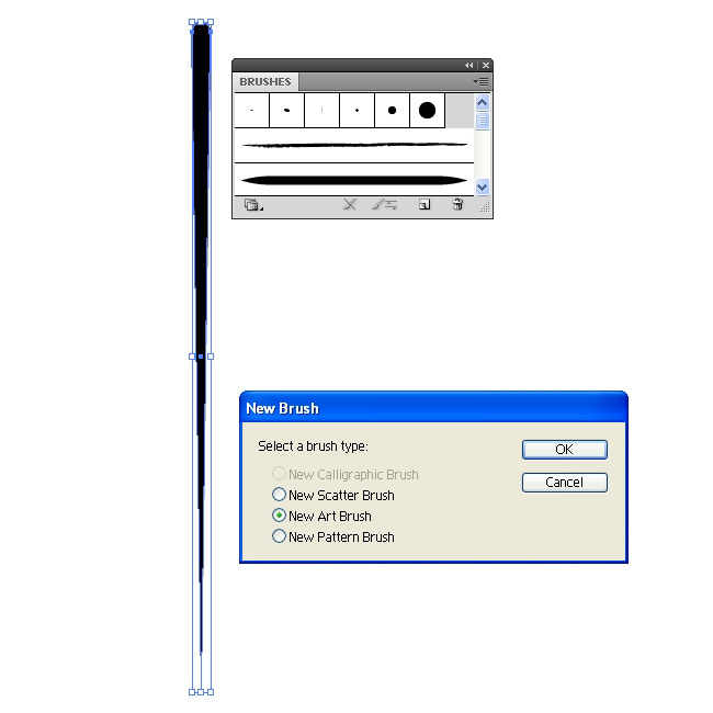
Grab the Ellipse Tool (L) from the Tool Panel and create a small black circle. With Direct Selection Tool (A) select the lower anchor point and drag it downwards (don’t forget to hold a Shift key on the keyboard for straight dragging). With Convert Anchor Point Tool (Shift + C) turn that anchor point into the sharp corner. This way we’ve created a brush that will help us to improve our leaf.

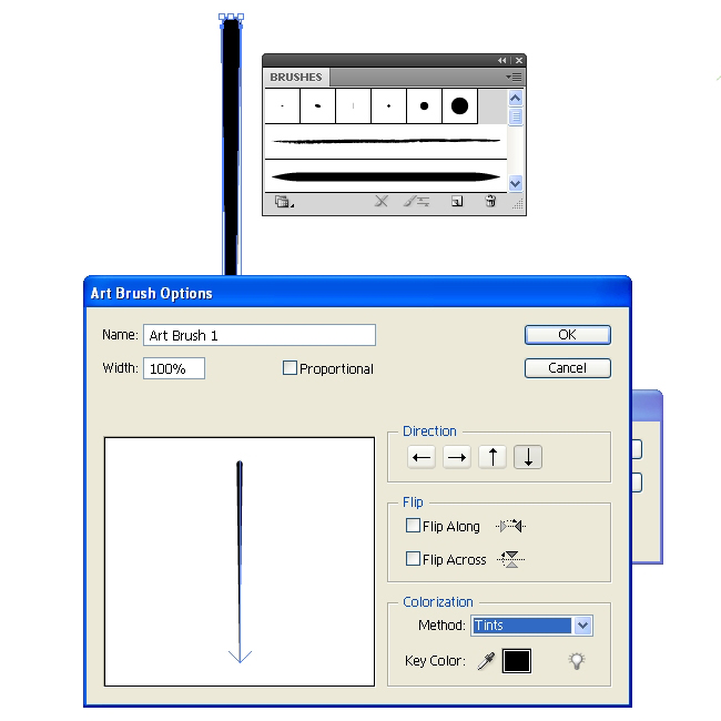
Grab the new shape and drag it to the Brush Panel. In the New Brush Panel check the New Art Brush and hit OK button.

Make sure to set the Colorization Method to Tint in the Art Brush Option Panel. This way you’ll be able to set the Fill color of the brush to any color you like.

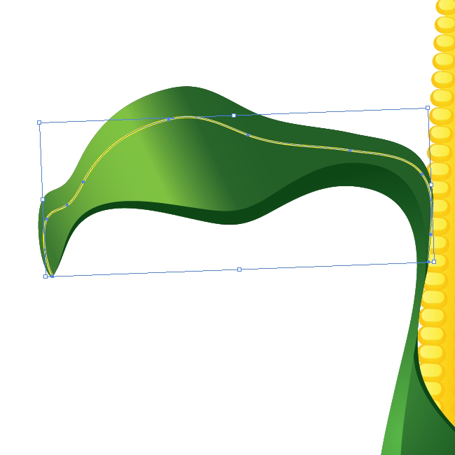
Now when we have the brush let’s create some interesting paths for our leaf. Grab the Pen Tool (P) from the Tool Panel and create a small arc.

Apply the brush we have created few steps earlier.

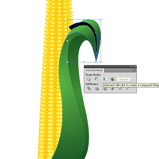
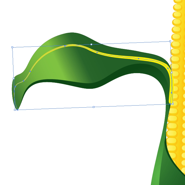
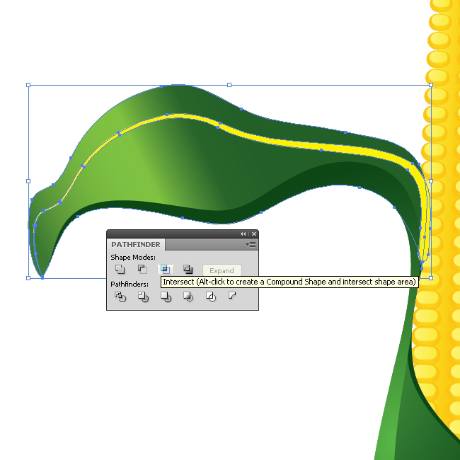
You will notice that the black shape we have just created overlap the upper part of the leaf . To fix this we will have to expand the brush (Object > Expand Appearance). Create the copy of the upper part of the leaf, select both objects and under the Pathfinder Panel hit the Intersect button.

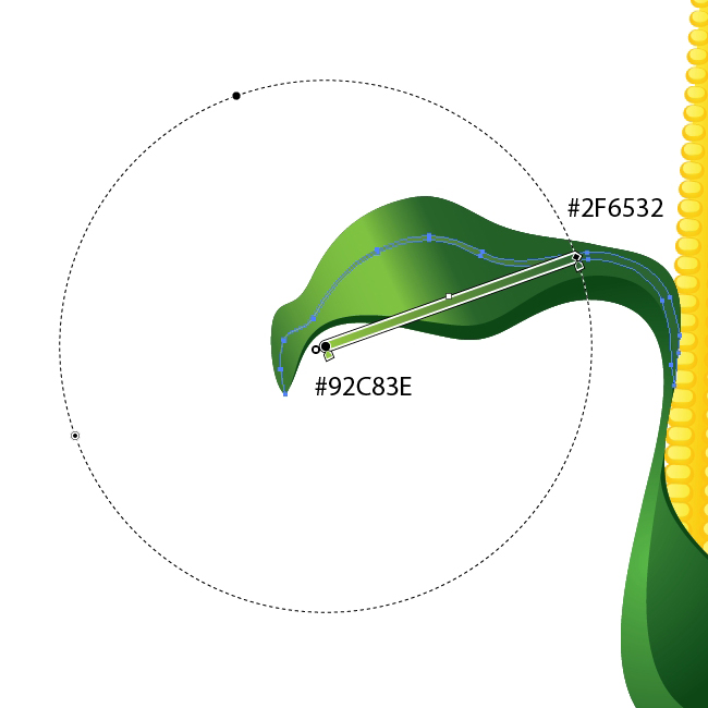
Apply a nice linear green gradient.

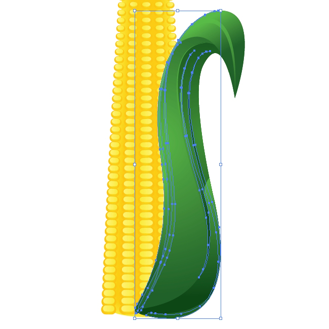
Use the same technique try to improve the illustration by creating interesting details. Just make nice curves and apply the brush. After expanding, apply nice green colors and gradients. You should end up with something similar like this.

Grab the Pen Tool (P) again and create the shape as it shown on the picture below.

Apply a green radial gradient.

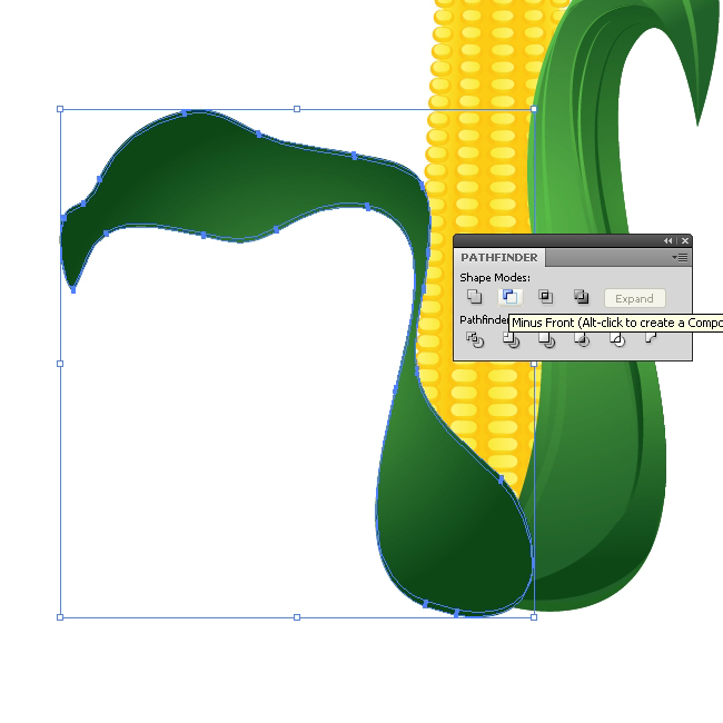
Duplicate (Ctrl / Cmd + C, Ctrl / Cmd + F) the new leaf twice. Nudge one of the copies downwards for 1 pixel and select them both. Under the Pathfinder Panel hit the Minus Front button.

Set the Fill color of the new shape to dark green (#0F4C1A). This way we’ve created a thickness for the leaf.

Create another copy of the leaf (Ctrl / Cmd + C, Ctrl / Cmd + F). We have to divide this shape to half. Grab the Pen Tool (P) and create a path as it shown on the picture below.

Select the copy of the leaf and the blue path and under the Pathfinder Panel hit Divide button. It will divide the leaf to half. Ungroup (Shift + Ctrl / Cmd + G) the leaf, delete the lower part and apply the linear green gradient to the upper part.

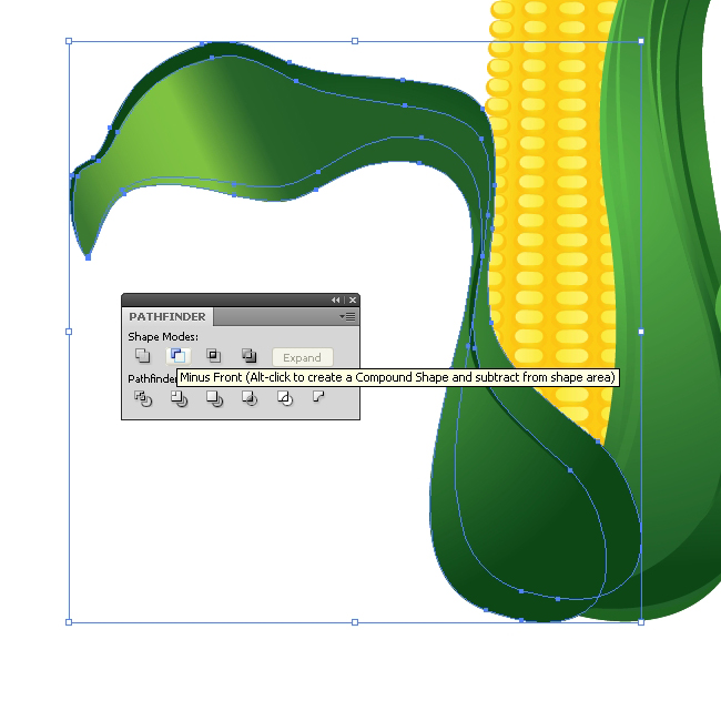
Few more details and the leaf is ready. Duplicate (Ctrl / Cmd + C, Ctrl / Cmd + F) the large shape of the leaf  twice. Rotate one of the copies (you can scale it up as well). Select both of the copies and under the Pathfinder Panel hit the Minus Front button. Apply radial green gradient.

With the Pen Tool (P) create the path as it shown on the picture below.

Apply the brush we’ve created earlier.

Let’s turn the path into editable shape. Under the Object select Expand Appearance. You will notice that the shape we have just created overlap the leaf. To fix that we will have to create a copy of the upper part of the leaf. Hit the well known shortcut to do that (Ctrl / Cmd + C, Ctrl / Cmd + F). Select the copy of the leaf and the yellow shape and under the Pathfinder Panel hit the Intersect button.

Apply nice radial green gradient

Creating a Water Drop

Select the Ellipse Tool (L) from a Tool Panel and create an ellipse. Apply nice radial white-green gradient. We are using a combination with green color because the water drop is semi-transparent and green color is reflecting from the leaf.

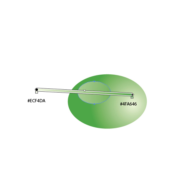
With the Ellipse Tool (L) create another, smaller ellipse and place it as you see on the picture below. For this ellipse we will use linear white-green gradient.

Select the larger ellipse and duplicate it (Ctrl/Cmd+C, Ctrl/Cmd+F). Set the Fill color to #206128 and nudge it for 3 pixels to the right. This will be the shadow that the water drop creates on the leaf.

Select all the three ellipses and Group them (Ctrl / Cmd + G). Place it on the leaf.

Use the same technique and create few more leaves with nice details.

And voila!

Conclusion

With the combination of different kinds of techniques, and with some nice colors and gradients we have created quite a neat Corn Cob. The Blend Tool was quite useful in creation process. We have learned how to use the Blend Tool in order to create nice and smooth color transitions. The Autumn is coming, so I am quite sure you’ll find this illustration very useful. If you have any comments or questions feel free to post them in the comment section below, I would be glad to answer them. I hope you like this tutorial as much as you liked Circus Tent and Piggy Bank tutorials. Thank you for following along.

(rb)


Stunningly Creative and Unforgettable Print Ads


Advertising is done in order to catch the attention of a target audience and deliver a specific message in a clear and concise manner. An effective ad is one that catches the attention of the onlooker with its added wow factor. Here we have put together a creative collection of tremendous advertisements for your marketing inspiration.

In this collection you will find tons of unique ideas to market your business and goods or services. This collection includes print ads as well as several other outdoor advertisements for your to get your marketing wheels turning. Feel free to share your thoughts and opinions about this post with us in the comments. Enjoy!

Print Advertisements

FEDEX: USA-BRAZIL
This ad is done for FedEx showing their services from USA to Brazil. The concept of using maps makes this ad so outstanding.

Screenshot

Homelessness Awareness: WOMAN
This clever advertisement is done by Publicis Conseil Advertising Agency for Homelessness Awareness (Samusocial company) in France that highlights the public awareness message.

Screenshot

Panasonic 3D TV: Dino
This ad for Panasonic reflects the 3D quality that Panasonic TV’s possess, giving you the illusion of the reality.

Screenshot

ThaiHealth Promotion Foundation: Bike
This ad promotes the awareness that one should not drive in a sleepy state.

Screenshot

Sabesp: Sachets Ad
This overly creative ad to promote awareness of wasting water, incorporated the message into the presentation.

Screenshot

Protex Antibacterial Soap: Sneakers
This is truly creative ad for an antibacterial soap that shows germs lingering under a fingernail.

Screenshot

Berger: Sky
A clever Berger paints billboard advertisement playing on the truly natural tones of their colors.

Screenshot

Lion show
This is a uniquely eye catching ad revealing the how close to the wildlife this park intends to get its visitors.

Screenshot

Fabercastell Truecolours: Shark
This ad is for Fabercastell Truecolurs and has been done with extreme creativity that shows the color pencil in the shape of a shark.

Screenshot

Pizza & Love: Fight for the Amazonas
This ad was done for the campaign Pizza & Love: Fight for the Amazonas. Showing a slice of pizza representing the Amazonian rain forests against a grease-stain map on a pizza board globe.

Screenshot

dig2go.com: Ear Glasses
This ad is for Ear glasses is for audiobooks and effectively conveys the reading with your ears. Creativity speaks!

Screenshot

Pilot: Mummy
This ad is for Pilot Ball Pen which uniquely demonstrates the water resistant nature of their pen and ink.

Screenshot

CNN Turk: Camera Man
This creative ad connotes that dozens of other news channels and media outlets get information from CNN.

Screenshot

Replenish
This ad really stands out as it somewhat painfully communicates its message. Truly inspired and punishing.

Screenshot

ITV Injustice
This ad using negative space for effect was done for a program where questions are raised as how to treat violent criminals.

Screenshot

Advertisers Without Borders: Forest
Loads of brainstorming went into the creation of this ad that shows if you destroy forest, you are actually destroying yourself. The message conveyed in this ad is whatever you do to the world you do to yourself.

Screenshot

Amnesty International: Fight With Signatures
This ad signifies the power of the pen equating them with bullets, saying that a signature can as powerful as a bullet. Think twice!

Screenshot

BAND AID: HULK
Band-Aid’s, use of the Incredible Hulk to demonstrate the stretch-ability of their flexible fabric.

Screenshot

Samsung MP3 Player: Elvis
With Samsung MP3 players, the sound is so realistic its as if the band is singing right into your ear. Or so the ad would have you believe.

Screenshot

Mambocino Coffee Co.: Mug
The Mambocino Coffee Co.: Mug ad exceptionally conveys the strength of the company’s coffee in a playful and attention grabbing manner.

Screenshot

Kerrygold: Feather

Screenshot

SONY COTTON STICK
This ad was designed to show how much cleaner and clearer a sound Sony can offer its users.

Screenshot

WWF: Lungs
The ad creatively blends imagery and message using disappearing forests (the planets lungs) to impact the viewer and stir them into action before as the ad says, it’s too late.

Screenshot

AFTER WHISKY DRIVING RISKY
Here is public awareness message trying to convey the risks of driving while impaired by alcohol.

Screenshot

EYE BANK
This ad gives you a clear picture of how eye bank makes a difference in someone’s life.

Screenshot

Auckland Transport: Kids see roads differently
This ad suggests how dangerously kids view roads, encouraging the public to be aware and to slow down.

Screenshot

Samsonite: Protection
This ad creatively positions Samsonite’s bags as being strong and virtually indestructible. Or to quote the add, worldproof.

Screenshot

Olympus Binoculars: Koala
This imaginative binoculars ad playfully conveys how they make the object appear as if it is right in your face.

Screenshot

Aquafresh flex top toothbursh: Cleans all gaps
This toothbrush ad does a fantastic job conveying the cleaning power of the product, having it appear as dental floss.

Screenshot

Sleeping Leopard
This ad for a wildlife park that is open until midnight cleverly combines simple and whimsical ideas and images for a cute message delivery.

Screenshot

Cafe Rico
The message of undisturbable comfort creatively comes to life in this ad.

Screenshot

Capture the Moment
This ad brilliantly puts forth the idea of capturing the beautiful moments life has to offer and holding on to them to savor all they bring.

Screenshot

Outdoor Advertisements

Denver Water: Channel
This ad was designed on the concept of saving water using a minimalist approach baring the message that you should use only what you really need.

Screenshot

Tropicana: Billboard powered by oranges
Creativity goes way outside the box for this ingenious ad that extracts electrical energy from a large panel of oranges to power a neon sign. To indicate how much energy the body can get from orange juice.

Screenshot

The Economist: Lightbulb
This very clever ad hints at the Economists’ ability to give its readers an idea. That they get you thinking.

Screenshot

KITKAT
With the popular candybar slogan, “gimme a break” deliciously transformed into a bench to sit down and relax on takes this slogan to a whole new level.

Screenshot

STRONGERMARRIAGE.COM: ME
A very powerful message for stronger marriages done so simply and cleverly that the impact and message stand out boldly.

Screenshot

Donatos Pizza: Newscaster
The ad effectively demonstrates how desirable and tempting this pizza is by ‘incorporating’ the fake ad beside it.

Screenshot

Headache?
By incorporating the poles on which these clever ads hang, the imagery delivers the message in an ideal way.

Screenshot

Tibits vegetarian restaurant: Fork
This ad was created for a large vegetarian restaurant chain in Switserland demonstrating the freshness of Tibits food to the people walking by.

Screenshot

You may also want to consider our previous posts:

(rb)


Utilizing The Power Of Recycling In Web Design

Advertisement in Utilizing The Power Of Recycling In Web Design
 in Utilizing The Power Of Recycling In Web Design  in Utilizing The Power Of Recycling In Web Design  in Utilizing The Power Of Recycling In Web Design

Truth be told, I am a philistine. When people talk about recycling, I don’t think of saving the planet.

In my earlier post, “Lessons Learned: Productivity Tips For Running A Web Design Business,� I wrote about how we can reuse and recycle what we do in the Web industry to save time and money.

Now let’s explore the subject further. We will look at how we can recycle existing work (done by ourselves or others) in order to be more efficient. By doing so, we can finish projects more quickly and generate a better profit margin. The great thing about recycling is that we can all do it, whether we are a developer, designer or website owner. Let’s begin our journey with the masters of recycling: developers.

Developers: The Kings Of Recycling

I was once told that all good developers are lazy. Having a design background, I thought this bizarre. And yet, good development involves discovering the most efficient way to do something. Of course, finding the most efficient way is not always easy. It largely comes down to constantly searching for new approaches and taking the time to try new ideas. The key is to never be satisfied with your current approach, but rather to always strive for and experiment with new approaches.

At the core of this “lazy’� approach to development lies the principle of “coding only once.�

Classes and Functions

Mid-project, it is easy to focus on the immediate challenge and fail to think long term. But a good developer writes code that is reusable in future projects.

1-screenshot in Utilizing The Power Of Recycling In Web Design
Functions that can be used in multiple projects can save developers a lot of time.

To recycle, write reusable functions and classes, not project-specific code. This involves ensuring that code is modular and self-contained, not dependent on project-specific elements.

The principle of a reusable code library isn’t limited to classes and functions. It also applies to other aspects of your code.

Starting Points

Whether simple HTML websites or .NET applications, most projects begin with the same set of files. For example, on a simple HTML website, you would have a CSS reset, a jQuery include and maybe some basic print and IE6 style sheets.

2-screenshot in Utilizing The Power Of Recycling In Web Design
Eric Meyer’s CSS reset should be included in the default code set of almost every Web project.

Setting up this default code for every project is time-consuming and unnecessary. Instead, create a generic set of code to use in every new project. This not only enables you to recycle code between projects, but it helps to keep your coding workflow organized.

Better still, you don’t even have to create these starting points from scratch. Projects such as HTML5 Starter Pack and HTML5 Boilerplate take all of the hard work out of getting started. They enable you to recycle the hard work of others.

This leads us right into libraries and frameworks.

Libraries and Frameworks

Many developers start learning how to code by adapting the code of others to their needs. But this just scratches the surface of what is possible. Today, Web developers have a big choice of libraries and frameworks that significantly reduce coding time, from JavaScript libraries such as jQuery to PHP Web application frameworks such as CodeIgniter.

3-screenshot in Utilizing The Power Of Recycling In Web Design
CodeIgniter is one of many frameworks that enable you to reuse the development work of others.

Some would caution developers against using libraries and frameworks unless they understand their inner workings. Certainly, debugging a library that you don’t fully understand can waste hours. However, the time-saving benefits of these libraries and frameworks is so great that they outweigh the drawbacks in most cases.

Even if you use a library or framework, wasting time by repetitively entering the same code is still possible. In such cases, snippets are a real-time saver.

Using Snippets

Snippets are commonly used pieces of code that you can insert quickly with a keyboard shortcut. For instance, a WordPress loop can be entered simply by typing wloop or by pressing Command + W. Many coding tools, including Coda and Espresso, support snippets. But even if your coding environment of choice does not, you can use a text expander to add this functionality.

Also, there is no reason to create snippets yourself. Instead, you can reuse the snippets of others by using an online library. Two are WP-Snippets and CSS-Tricks Code Snippets, but there are many more.

4-screenshot in Utilizing The Power Of Recycling In Web Design
Like many HTML coding tools, Espresso lets you save snippets of reusable code.

In addition to traditional snippets, plug-ins such as Zen Coding create a lot of code in a few keystrokes.

Of course, knowing about snippets is not enough. You have to take the time to learn them and then make a habit of using them. Many developers are aware of all of the options above and yet are always “too busy� to use them. That said, many developers are the kings of recycling, and you can learn a lot from them, whether you are a coder or even a designer.

Designers Can Recycle, Too

Most Web designers also code and so can use the tips suggested here. But they can recycle in other areas, too. Endlessly repeating the same action, whatever it is, wastes a lot of time.

Recycling Actions

Designers waste many hours laboriously resizing and reformatting images. And what about the time wasted saving titles as images? In fact, automating many of these tasks is entirely possible and can save the designer a huge amount of time and reduce the risk of repetitive strain injury.

Adobe Photoshop has some excellent tools for handling repetitive tasks. These “actions� are easy to build and can save hours in the long run.

5-screenshot in Utilizing The Power Of Recycling In Web Design
Veerle’s blog offers a great introduction to creating Photoshop actions.

Even if you do not use Adobe Photoshop, there are other ways to create macros to handle repetitive tasks in most applications. Once again, the problem is not the tools we use, but rather in taking the time to set them up properly.

Grid systems are another area where a little effort in recycling returns significant time savings.

Using the Same Grid

Anybody who understands basic design principles knows how important a solid grid is. It also makes building a website a lot easier. Unfortunately, many designers approach the grid afresh every time they begin a project. Instead, look for ways to reuse a grid structure from website to website. This is not to say that we should use the same number of columns on every website, but rather that we should have an underlying system with which to work.

Having a consistent starting point will help you overcome the “blank canvas� problem and will also speed up the build process.

The 960 Grid System (960.gs) is a perfect example of a grid structure that is reusable from one project to the next. It works well because it can be divided into a variety of column configurations, suiting most projects.

6-screenshot in Utilizing The Power Of Recycling In Web Design
960.gs demonstrates how the same grid can produce very different designs.

Designers also have opportunities to recycle the work of others and even themselves.

Recycling Is Not Stealing

There is a myth among designers that every new design should be fundamentally unique. In reality, nothing is truly original. All great designers know that their work is inspired and informed by design principles and by their own work or that of their peers. Think for a moment how many designs have been either cast aside as being inappropriate for the project or rejected by the client. This is an enormous waste of effort.

When appropriate, nothing is wrong with reusing old elements in new projects. Moreover, we should not feel ashamed for drawing inspiration from designs we have seen elsewhere.

I would urge every designer to keep a library of inspiration, including both their own work and the work of people they admire. Of course, we must be careful not to spend too much time obsessing over our inspirational libraries. Eventually, we need to stop thinking about our designs and just start producing them.

7-screenshot in Utilizing The Power Of Recycling In Web Design
I find Evernote an excellent tool for collecting bits of inspiration.

Speaking of clients who reject designs, there is also an opportunity to recycle the arguments that we put forth to justify our work.

Recycling Our Arguments

As Web designers, we all know that the same comments come up time and again when speaking with our clients, everything from “Make my logo bigger� to “Why is there so much white space?�

Despite knowing that these issues will come up repeatedly, we do nothing to pre-empt them and so waste time covering the same ground.

A better solution is to discuss these concerns before they become major stumbling blocks. By sharing documents such as “10 Tips for Ensuring Better Site Design� and “Where Are My Rounded Corners?� I’ve been able to bypass many such laborious conversations.

Rounded Corners-20110731-214756 in Utilizing The Power Of Recycling In Web Design
Producing documents that tackle recurring issues (such as progressive enhancement, covered here) saves time in the long run.

The last area in which designers can recycle is with design assets.

Reusing Your Design Assets

We have already talked about reusing grid structures. But reusing other design assets is also possible. Images, icons, color palettes and typography are a few examples. All we need to do is organize them so that we can find the relevant asset for a particular project.

Do you tag your library of images according to mood, color and other keywords to make it easy to see whether anything can be used in a given project? Do you have a library of images that you’ve purchased?

8-screenshot in Utilizing The Power Of Recycling In Web Design
By tagging your assets, finding ones to reuse becomes easier.

Also, is there any reason you cannot use the same icon set in multiple projects? This can save the time wasted searching for new icons and the money for purchasing them.

If you are reading this post, chances are you are either a designer or developer. But you’re probably also a website owner. There are significant recycling opportunities for this group, too.

Not Forgetting The Website Owners

Those of us who own websites are some of the worst recyclers. But we have two superb opportunities to simplify our lives. Whether you run a personal blog or a large corporate website, a bit of recycling goes a long way.

The area that offers the most possibilities is content.

Recycling Content

Whether you’re a humble freelancer or part of a large corporation, you produce content all the time, whether it’s an email about your latest work or a corporate announcement. There is potential to recycle every piece of content we produce.

There are interesting nuggets of information in what we produce that others may find useful and could be recycled on our websites.

Let’s say you respond to an emailed question about mobile websites. Instead of leaving the answer trapped in the email, with a little recycling, you can repurpose it into a blog post that everyone would find useful. The same is true for presentations, internal papers and even informal chats with colleagues.

9-screenshot in Utilizing The Power Of Recycling In Web Design
Many of the presentations I give began life in another format, such as a blog post or even a tweet.

We should also consider content that has already been published online. Try updating and reposting old articles. Text on your website that explains your unique selling points might be better represented in video. Repurpose Twitter conversations with customers into frequently asked questions.

The opportunities to recycle content are endless if we only open our eyes to the possibilities. And nowhere is this clearer than with email.

Email and Answering User Queries

Whether your website is big or small, you will find yourself answering the same types of inquiries. This repetition is not only time-consuming, but frustrating.

I for one get asked the same questions again and again:

  • Can I advertise on your website?
  • How do I start in Web design?
  • What books do you recommend?
  • Can I book a consultancy clinic?

The list goes on, and despite blogging on these issues and even having offered an FAQ section at one point, I still get the same questions.

You can save time by having stock answers to these questions ready to copy and paste. Taking a few seconds to store the answers will save you time later on.

10-screenshot in Utilizing The Power Of Recycling In Web Design
TextExpander is one of many tools that enable you to easily reuse answers to common questions.

Make your life easier by storing your answers in a text expander, such as the one above. Simply typing a few characters will give you a comprehensive answer that addresses all of the key points.

Recycling Does More Than Save The Planet

As I said at the beginning of this post, recycling is not just about saving the planet. It’s about saving time, money and, most of all, your sanity. By taking the time to find shortcuts and work smarter, you make your job more enjoyable and end up working less.

I like to think of myself as a bit of a recycling ninja, but I know there is always more to learn. I am sure you guys have identified some great recycling tips that enable you — in the words of my developer friend — to be lazy. I would love to learn them, too, so please share them in the comments below.

(al) (il)


© Paul Boag for Smashing Magazine, 2011.


  •   
  • Copyright © 1996-2010 BlogmyQuery - BMQ. All rights reserved.
    iDream theme by Templates Next | Powered by WordPress