Archive for August, 2011

New High-Quality Free Fonts

Advertisement in New High-Quality Free Fonts
 in New High-Quality Free Fonts  in New High-Quality Free Fonts  in New High-Quality Free Fonts

Every now and then, we look around, select fresh free high-quality fonts and present them to you in a brief overview. The choice is enormous, so the time you need to find them is usually time you should be investing in your projects. We search for them and find them so that you don’t have to.

In this selection, we’re pleased to present Tondu, Banda, Morning Glory, Matilde, Bohema, Weston Round Slab, Highlands, Cabin, Linden Hill and other fonts. Please note that while most fonts are available for commercial projects, some are for personal use only and are clearly marked as such in their descriptions. Also, please read the licensing agreements carefully before using the fonts; they may change from time to time.

New High-Quality Free Fonts

Bohema
Bohema is a unique art-deco typeface with a modern twist. The unpredictability of some glyphs makes it looks original and interesting, although sometimes a bit troublesome. Bohema is available in eight distinct styles and could be a great fit for headlines, editorial lettering, branding, merchandising and special occasions. You can download one weight, Bohema Regular Alternative, for free, although it’s not quite as useful as the rest of the type family.

Bohema-typeface in New High-Quality Free Fonts

Morning Glory
An experimental font by Luis Armesilla, released under a Creative Commons license. The font combines various unique geometric forms and shapes. Obviously, the font is not suited to traditional publications but could be useful in posters, artwork and creative brochures.

Morning-glory in New High-Quality Free Fonts

Highlands
Highlands is a charming slab-serif font that draws inspiration from the US’ good ol’ National Park posters. Designed by Tyler Galpin, the fonts could be a great fit for headlines and posters. Currently only an uppercase set is available. Released under a pay-what-you-want license.

Highlands-font in New High-Quality Free Fonts

Bender
The Bender font family is an extravagant Russian typeface for special occasions. Use it for your graphic design work, portfolio or print products. Eight font weights are available, all as free downloads. But registration on MySpace is required.

Bender-font in New High-Quality Free Fonts

Ovalian Type
An experimental, playful font based on oval and circle shapes. Obviously not a good fit for corporate or elegant projects, but Ovalian Type could be quite useful in projects that invite experimentation, engagement and creativity. Available in TrueType format.

Ovalian-font in New High-Quality Free Fonts

Linden Hill
Linden Hill is a digital version of Frederic Goudy’s Deepdene. This small serif family designed by Barry Schwartz includes roman and italic styles. Available in OpenType format, Linden Hill is available under the SIL Open Font License.

Linden1 in New High-Quality Free Fonts

Fanwood
Fanwood is a carefully crafted serif typeface with a flavor of classic roman typefaces. The font package includes roman and italic styles, both optimized for the screen. It’s an excellent typeface, making for a pleasing reading experience, including in headings and body copy. Released under the SIL Open Font License).

Fanwood in New High-Quality Free Fonts

Tondu
A bold yet versatile font that is based on classic proportions and chunky letter forms. The sharp, precise lettering makes it an interesting choice for signage, book jackets, packaging, posters and t-shirts. The small family includes an extended European character set. One font weight, Tondu Beta, is available for free downloading. Registration on MyFonts is required, though.

Pele in New High-Quality Free Fonts

Matilde
A friendly thin typeface with extra-tall capitals and subtle decorative elements. Matilde would work nicely for headings, short paragraphs, children’s books, posters and brochures. The family contains 212 symbols and glyphs. Two styles are available: Normal and Sketch. The font also contains decorative frames and patterns.

Matilde-font in New High-Quality Free Fonts

Weston Round Slab
This typeface contains rounded slab-serif fonts designed by Pavel Pavlov specifically for use in logos and headlines. Regular and light all-caps versions are available in OpenType formats for free downloading.

1-weston-round-slab in New High-Quality Free Fonts

Banda Typeface
Banda is a semi-serif typeface characterized by a tall x-height and rounded semi-serifs. Although first designed as a display typeface, Banda quickly evolved into a more complex set, consisting of seven weights plus their respectful italics. Banda can be used for short passages of text as well as fancy displays. Spanning the elegant finesse of the thinner weights to the almost childish bubbliness of the heavier weights, Banda is a great all-round performer, suitable for logos, headlines, packaging and food products and much more.

Banda-typeface in New High-Quality Free Fonts

Black & White (The link was removed due to copyright infringement. The original design is Calypso by Typolar type foundry.)
An experimental typeface with two font weights (regular and italic). The typeface has many distinctive, playful features that would give headings a unique retro feel. The typeface contains English and Cyrillic letters and is available in OpenType and True Type formats. Note that in both formats, the small “j� doesn’t work properly. We have contacted the designer about the issue, and hopefully the font will be updated soon. (The issue is fixed now.)

Black-and-white-screenshot in New High-Quality Free Fonts

Legion Slab
Legion Slab is a condensed slab-serif typeface designed by Phil Pham. The body copy set in Legion Slab is quite difficult to read because some letters were designed to be asymmetric, giving the typeface an original, perhaps “broken� appearance. However, Legion Slab could be a great fit for headings and product designs. In TrueType format; only a regular weight is available.

Legion in New High-Quality Free Fonts

Fabrica
Practice Foundry is an independent foundry that releases fonts under a pay-what-you-want license. The sans-serif font was intended to be the most legible typeface for mobile screens. Its details are drawn from the more systematic constructed Neo-Grotesques, giving it a neutral tone of voice. Although Fabrica was developed primarily for mobile screens, the typeface is suitable to any application, big or small. The font is available in OpenType format for Mac and PC.

Fabrica in New High-Quality Free Fonts

ARS Novelty
This typeface is a result of the unconventional approach of Angus R. Shamal. The designer has come up with a fun and by no means less-than-functional experiment in hybrid styles and historical influences, joining the baroque serif with the geometric sans, the formal with the decorative flourish. ARS Novelty is apparently a typeface that tries to make sense of it all. A single weight is available, with stylistic alternates, numerals, standard ligatures and discretionary ligatures, case-sensitive forms, ordinals and localized forms. In OpenType format.

Ars in New High-Quality Free Fonts

Bevan
Bevan is a reworking of a traditional slab-serif display typeface created by Heinrich Jost in the 1930s. In Bevan, Jost’s earlier letter forms have been digitized and then reshaped for use as a Web font. The counters have been opened up a little, and the stems optimized for use as a bold display font in modern Web browsers. It’s a good choice for bold headings and promotional brochures. Released under the SIL Open Font License and available in the Google Web Fonts repository. Designed by Vernon Adams. You might want to take a look at other free fonts by Vernon Adams: Rokkitt, Shanti, Muli.

Bevan in New High-Quality Free Fonts

Ostrich Sans
This typeface is a display sans-serif typeface with a variety of styles: the free family contains dashed (thin), rounded (medium), ultra-light, normal, bold (with racetrack-style double lines) and black font weights. Designed by Tyler Finck, available in TrueType format and open source (courtesy of The League of Moveable Type).

Ostrich-sans in New High-Quality Free Fonts

Sansus Webissimo
This typeface is a contemporary open grotesk typeface available in OpenType and TrueType formats. Sansus is a potentially great fit for both headings and body copy, both online and in print. Two font weights are available, regular and italic. The family is released under the Creative Commons Attribution 3.0 License.

Sansus in New High-Quality Free Fonts

Quattrocento Roman
Quattrocento Roman is a classic, elegant and strong typeface that perhaps lacks some maturity in certain details (the “g� and “e,� for example, do not quite seem to fit together). The typeface has wide and open letterforms, and the good x-height makes body text legible even at small sizes. As a classic Roman typeface, Quattrocento is a good choice for big bold headlines. Fontlab source files are included in the download package. Available as a Web font, Quattrocento Sans is a free download as well.

Quattrocento-screenshot in New High-Quality Free Fonts

Dancing Script
Dancing Script is a lively, casual script whose letters bounce and change in size slightly. The font references popular typefaces from the ’50s. It recalls Murray Hill (by Emil Klumpp, 1956) in its weight distribution and Mistral (by Roger Excoffon, 1953) in its bouncing effect. Dancing Script could be handy if you are looking for a casual, friendly, informal and spontaneous typeface, and it’s a pretty good replacement for Comic Sans, too! Also available as a Web font.

Dancing-script-screenshot in New High-Quality Free Fonts

Collator
Collator is a sans-serif typeface designed to achieve greater harmony between Chinese characters and Latin letter forms when set together. Drawing inspiration from the two traditions of type design, Collator aims to be a contemporary, balanced expression of both Western and Asian cultures. Created by Vince Lo and released as a pay-what-you-want license.

Collator-fonts in New High-Quality Free Fonts

Cabin
Cabin is a humanist sans serif inspired by Edward Johnston and Eric Gill’s typefaces, with a touch of modernism. Cabin incorporates modern proportions, optical adjustments and some elements of the geometric sans. As the designer puts it, “It remains true to its roots, but has its own personality.� An excellent typeface for body copy and headings on small and large screens. Four font weights are available, with corresponding italic styles.

Cabin in New High-Quality Free Fonts

Logisoso
Logisoso is an ongoing type design project. Created during a signage project for a logistics center, where it was used to identify different buildings, the font was later completed with Inkscape and generated with FontForge. The download package contains the source files for you to improve and optimize the font.

Logisoso-font in New High-Quality Free Fonts

Novecento
Novecento is an uppercase-only font family inspired by the European typographic trends of the first half of 20th century. The typeface looks rational, geometric and blocky. But it is based on optical, not geometric, proportions. Novecento could be used for headlines, visual identities and short sentences. The lighter weights provide a more contemporary look and feel, while the bolder ones have a retro flavor.

Novecento-font in New High-Quality Free Fonts

Ubuntu
The Ubuntu font family is a set of new open sans-serif fonts. The family includes all of the languages used by Ubuntu users around the world. Designed by Dalton Maag for the Ubuntu operating system, and open source.

Ubuntu-sans-serif in New High-Quality Free Fonts

Ultra
Ultra’s beauty lies in its boldness. This decorative Western font with elegant serifs has a sharp and inviting presence, especially in the subtleties of the “J,� “7� and “f.� The font has an extended European character set and is available as a free download in TrueType format. Licensed under the Apache License version 2.

Ultra-family in New High-Quality Free Fonts

CS Benwood
This font is unique and would serve a large variety of print design work, be it posters, CD covers or any other project that requires a non-traditional typographic spin. Each glyph has its own unique “woody� appearance. Designed by BenChalit Sagiamsak, and available in OpenType format.

Cs-benwood-font in New High-Quality Free Fonts

Five Minutes
This font was created by Oleg Zhuravlev and is meant for illustrations that display your brainstorming and other creative ideas. The letters are not quite optimized and appear to be a bit loose, but you wouldn’t expect anything more from your own scribbled notes either. The font contains 151 glyphs, including Latin and Cyrillic alphabets, numerals and some special characters.

5minutes-font in New High-Quality Free Fonts

DOCK11
Lukas Bischoff has released this heavy, elegant headline typeface for private use only. The typeface would work well for headings, short paragraphs and any type of graphic design in your personal portfolio.

Dock-11-type in New High-Quality Free Fonts

Maven Pro
Maven Pro is a free sans-serif typeface with a unique curvature and flowing rhythm. The extensive collection of characters totals over 530 glyphs! Many languages are supported (too many to list), including basic Latin and Western European diacritics. The vast number of glyphs make it highly usable for just about any textual content: spreadsheets, documents and especially websites. The typeface is also great for printed collateral and can scale down very small while maintaining legibility. Available in four styles: black, bold, regular and medium.

Maven-pro in New High-Quality Free Fonts

TypoFlat
Typoflat’s founder, Branislav S. Cirkovic, loves experimenting with type. The company’s website contains a number of experimental vector typefaces (only EPS format is available), all available for free downloading and use.

Random-type in New High-Quality Free Fonts

Nikaia
The Miller Type Foundry has released three font weights of its type family Nikaia for free downloading. Nikaia is a futuristic geometric typeface for headlines and body copy. Nikaia, Nikaia Regular Italic and Nikaia Script have been released for free. To download the files, you will need to register on MyFonts.

Nikaia-font in New High-Quality Free Fonts

Eau Sans
This sans-serif typeface was originally designed by Yamaoka Yasuhiro in 1992, yet the nicely shaped glyphs make it a timeless, sturdy tool for any typographic work. The family consists of six font weights, with numeric characters in three variations: proportional, old-styled and lining numerals.

Podkova
Podkova is a monoline slab serif with diagonal terminals. Wide proportions and clean features aid with legibility at small sizes. The unusual letterforms provide enough character to be used at display sizes. Designed by Ilya Yudin in 2010.

Last Click

The Force of Typography
May the force of typography be with you! Matteo Civaschi and Gianmarco Milesi have proved that the power of typography can go far beyond traditional text and headings. Have you ever tried to design Yoda, stormtroopers or Darth Vader with type? Well, they have. And the result is nothing less but spectacular!

Darth-vaider-typo in New High-Quality Free Fonts

Related Posts

You might be interested in the following related posts:

(al)


© Smashing Editorial for Smashing Magazine, 2011.


Extending the Functionality of WordPress (Part 1)


For a platform that started its life as solely a platform for blogging, WordPress has come a long way over the last few years. It’s certainly earned the right to be known as the most popular Content Management System (CMS) on the net with speculation that between the self hosted script and its hosted service WordPress.com, it powers over 25% of the web (WordPress.com exceeded 50 million websites last week!).
Theme designers and plugin developers have been pushing the boundaries of what WordPress can do for some time. This has accelerated since the introduction of Custom Post Types into the WordPress core as it allows developers to use WordPress in a lot of weird and wonderful ways.

Today we will begin showing you examples of themes and plugins that let you use WordPress in ways you may have never thought possible. Most of the newer themes and plugins in this list use custom post types however some older scripts still use a custom solution.

One of the main benefits of using WordPress instead of a stand alone script is the versatility it offers you. You quite literally have thousands upon thousands of plugins and themes that you can use on your site. You shouldn’t underestimate how useful this is!

Many plugin developers use the freemium business model so if a lite version of the plugin you want to purchase exists, it makes sense to download that first and try it out.

In this first installment we will look at ways to expand your WP site into a Discussion Forum, an Online Shop, and a Helpdesk. So without further ado, let’s get the show on the road

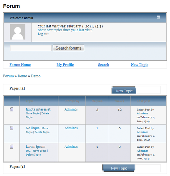
Discussion Forum

Due to the popularity of WordPress, there are bridges available for most popular discussion forums such as IP Board, phpBB and vBulletin. These bridges allow you to merge the user database from WordPress and the forum software.

Sadly, most forum solutions for WordPress are quite basic. This is not necessarily a bad thing in my opinion as there are lots of stand alone alternatives available with many features. They do however tend to have more features than is always necessary therefore if you are looking for a lighter solution you may want to try one of the solutions below. Here’s hoping that the conversion of Automattics forum bbPress from a stand alone script to a WordPress plugin will prove to be a success.

Themes

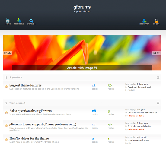
The G Forums – $29

In A Nutshell: A premium design that uses WordPress as a backend for a discussion forum.

The G Forums

Pros

  • PSD of theme and icons included with purchase.
  • Ability to add a slideshow on set areas of the forum.

Cons

  • Basic design.
  • Better free stand alone alternatives available therefore no real need for using WordPress instead of a more developed feature rich script.

Plugins

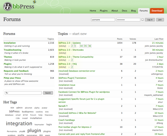
bbPress – FREE

In A Nutshell: Automattics forgotten bulletin board project.

bbPress

Pros

  • Allows you to add a WordPress forum to your existing WordPress site at the click of a button.
  • Forum integrates directly into your existing design.

Cons

  • Very slow development and the community is very quiet.
  • Very little documentation.
  • Very few plugins available at the moment.

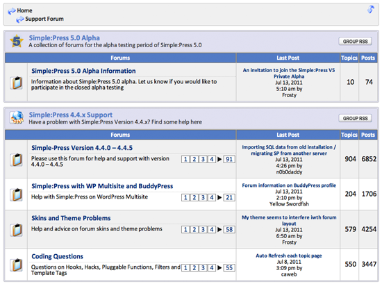
Simple Press – FREE

In A Nutshell: A forum plugin that integrates with your WordPress website.

Simple Press

Pros

  • Integrates with your existing WordPress installation.
  • Updated regularly and well supported by its developers.
  • Boasts many features that simple solutions such as bbPress lack.

Cons

  • Forum design feels a little outdated.

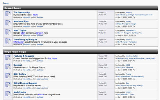
Mingle Forum – FREE

In A Nutshell: Another open source forum solution that plugins directly into your existing WordPress design.

Mingle Forum

Pros

  • Works with WordPress 3.0+.
  • Integrates with your existing WordPress installation.
  • SEO friendly URLs.
  • Can create a corresponding forum post whenever a new post is added on your WordPress website.

Cons

  • Default forum design looks very dated.
  • Developer has indicated he no longer has time to update plugin.

WP Forum Server – FREE

In A Nutshell: A WordPress 3.0+ compatible discussion forum plugin.

WP Forum Server

Pros

  • Integrates easily into your existing WordPress website.
  • A basic forum though it should be more than sufficient for many users.

Cons

  • Default forum design is very basic looking.
  • An improved version of the plugin exists. Strangely, the purchase link does not work therefore there is no way to actually buy and no details of what the price is.

You May Also Want To Consider…

Online Shop

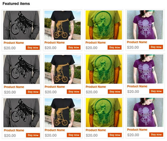
E-commerce is one of the areas where WordPress is leading the pack with many solutions matching or even bettering popular free alternatives. There are a few good plugins available however most developers tend to be integrating their shopping cart into a unique theme. With more than 50 premium e-commerce themes available and more being released every month, WordPress is a great choice for launching an online shop.

Themes

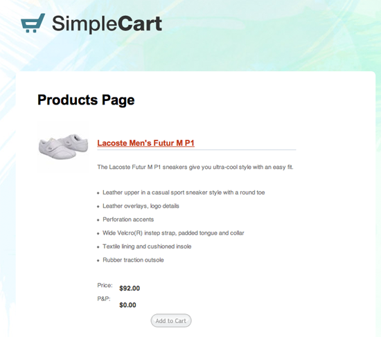
SimpleCart – FREE

In A Nutshell: A free e-commerce theme from developer Chris Wallace

SimpleCart

Pros

  • One of the few existing free e-commerce designs.

Cons

  • A very basic design.
  • Hasn’t been updated for years.

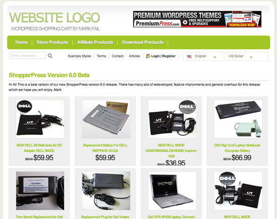
ShopperPress – $79

In A Nutshell: A premium e-commerce solution for WordPress.

ShopperPress

Pros

  • Product is open source therefore can be used on an unlimited number of websites.
  • Package comes with over 20 online shop designs.
  • Huge amount of features. Is Google Adsense and Analytics ready, works with over 20 payment gateways and has data import tools for Amazon, eBay and CSV files.

Cons

  • Many designs have a similar feel and look.

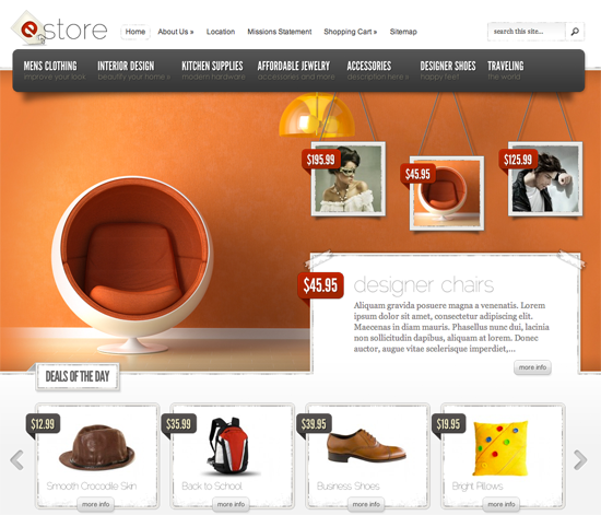
eStore – $39

In A Nutshell: A beautiful e-commerce design from theme developers Elegant Themes.

eStore

Pros

  • Comes with 5 unique colour schemes.
  • Comes with it’s own unique options page to give you complete control over your site.
  • Additional features such as shortcodes, thumbnail resizing and advertisement integration.

Cons

  • Is not a complete e-commerce solution. You will have to find a suitable e-commerce WordPress plugin in order to use the design efficiently.

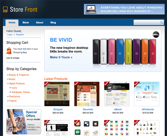
Store Front – $65

In A Nutshell: A complete e-commerce solution from theme developers Templatic.

StoreFront

Pros

  • Store lets you sell physical products or digital products such as e-books, digital art etc.
  • Includes 5 colour schemes.
  • Multiple payment gateways.
  • Built in affiliate module

Plugins

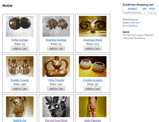
DukaPress – FREE

In A Nutshell: An open source e-commerce solution.

DukaPress

Pros

  • Allows you to sell physical or digital products.
  • Multiple payment gateways available.
  • Integrates with your existing WordPress website.

Cons

  • Lacks many advanced features.
  • Default design is very basic.

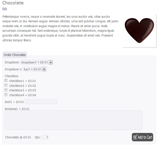
eShop – FREE

In A Nutshell: A versatile open source e-commerce solution.

eShop

Pros

  • Various methods for listing products.
  • Multiple payment gateways.
  • Includes stock and tax options.

Cons

  • Default design is very basic so best used with a good e-commerce theme.

GetShopped – FREE

In A Nutshell: A feature rich free e-commerce solution that’s been downloaded over 750,000 times.

Pros

  • Integrates with any WordPress design.
  • Multiple payment gateways.
  • Marketing tools built in that allow you email customers, blog and post about your products on Facebook.
  • Well documented, regularly updated and active support community.

Cons

  • Would have to customise your existing design or purchase a suitable e-commerce design in order to launch your shop.

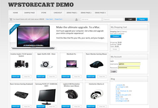
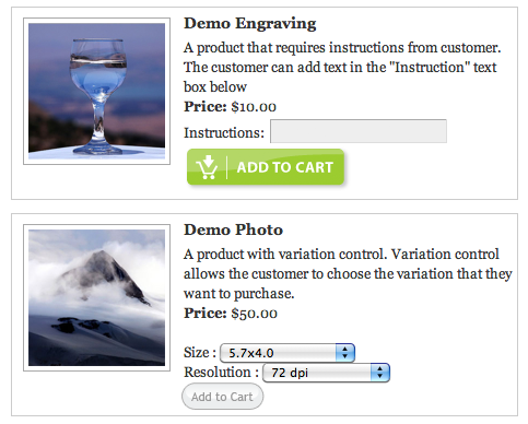
WP Store Cart – FREE | WP Store Cart Pro – $29.99

In A Nutshell: A flexible, featured rich e-commerce solution for WordPress.

WP Store Cart

Pros

  • Easy to setup due to a web based ‘Setup Wizard’.
  • Size and colour of products can be set.
  • Can be used to sell physical or digital products (or both).
  • Coupon and discount system bult in.

Cons

  • Limited number of payment gateways currently available.

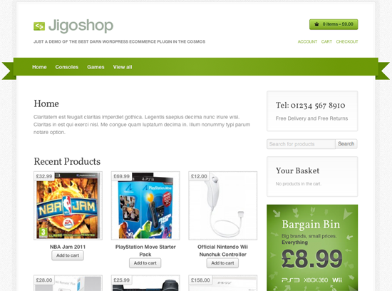
JigoShop – FREE

In A Nutshell: Another great open source e-commerce solution that you should consider.

Jigoshop

Pros

  • Localisation options that allow you to set your currency, tax by location and modify shipping costs accordingly.
  • Very easy to setup and use.

Cons

  • Limite number of payment gateways compared to alternatives that are available.
  • Integrates perfectly with the Jigotheme however that will set you back $79.

Cart66 Lite – Free | Cart66 – $89

In A Nutshell: A good premium e-commerce solution which has a limited version of the script available for free.

Pros

MarketPress – FREE | MarketPress Premium – $39

In A Nutshell: A flexible e-commerce solution that integrates with WordPress, WordPress MU and BuddyPress.

MarketPress

Pros

  • Can be used to sell physical or digital products.
  • Free version of the script boasts a lot of great features such as temporary sale prices, coupon codes, order management alerts and much more.
  • Ability to link to external websites such as Amazon, ClickBank and E-Junkie in order to increase affiliate commissions/li>
  • 3 CSS themes included with the premium version.

Cons

  • In comparison to some other e-commerce plugins, the number of payment gateways available to you is quite limited.

WordPress eStore – $49.95

In A Nutshell: A premium e-commerce plugin that fails to justify its price.

WordPress eStore

Pros

  • Easy to use.
  • Will work with your existing WordPress design.
  • Integrates well with a number of other WordPress plugins.

Cons

  • There are free alternatives that have more features.

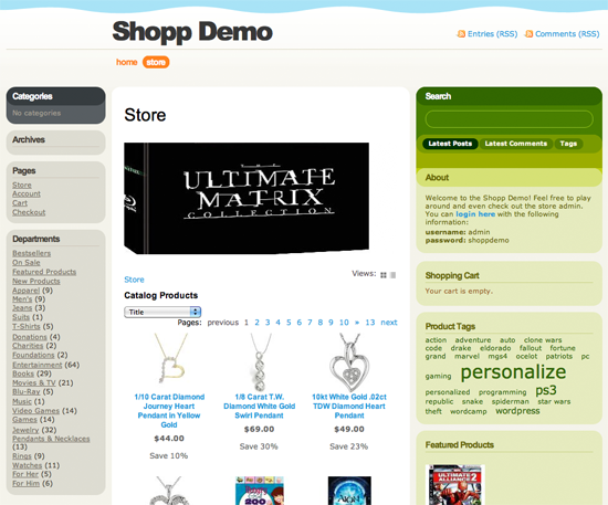
Shopp – $55

In A Nutshell: A feature rich premium e-commerce solution for WordPress.

Shopp

Pros

  • Supports the sale of physical and digital products.
  • Automatically calculates shipping rates for numerous mailing services.
  • Works with a huge amount of payment gateways.
  • Regularly updated and quick response times for customers who need support.

You May Also Want To Consider…

  • Ecwid Shopping Cart – A fully functional e-commerce solution that lets you add a shopping cart to your website in minutes.
  • WordPress Simple Paypal Shopping Cart – Lets you add an ‘Add to Cart’ button to any page or post.
  • ArtPal – Integrates PayPal into your WordPress powered website.
  • Google Checkout Shopping Cart Plugin – Easily add Google Checkout buy buttons to your website.
  • TheCartPress – A flexible open source e-commerce solution.
  • Zingiri Web Shop – A free e-commerce plugin that lets you sell digital or phyiscal products online.
  • Quick Shop – A WordPress MU compatible e-commerce plugin that shows what the user has in their cart via a sidebar widget.
  • FoxyShop – A plugin that lets you integrate the FoxyCart shopping cart into your website.

Helpdesk

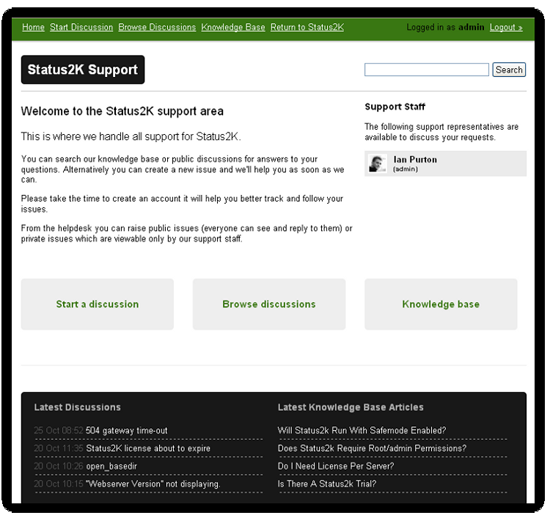
There haven’t been too many A+ helpdesk products released for WordPress as yet though WooThemes recent release SupportPress is encouraging and is a great example of what can be achieved using custom post types.

Theme

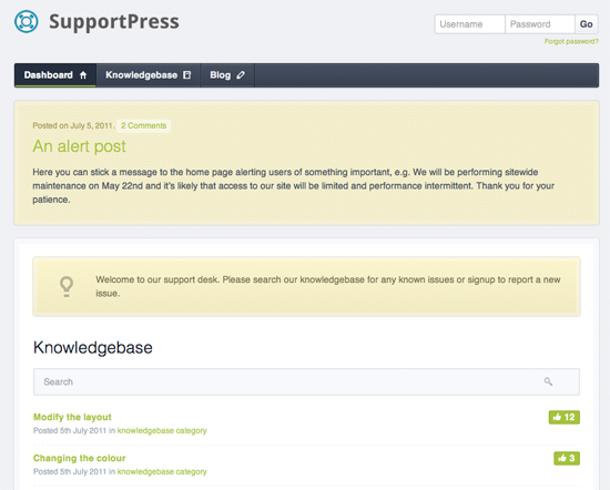
SupportPress – $100

In A Nutshell: A premium design that uses WordPress to power a fully functional helpdesk.

SupportPress
Pros

  • Has a fantastic knowledgebase feature built in. Customers are asked to check the knowledgebase before submitting a ticket and existing tickets can be converted into knowledgebase entries too.
  • Email notifications can be customised.
  • Optimised for use on mobile phones.
  • Very easy to use.

Cons

  • Those of you on a budget may find $100 expensive for this product when there are free stand alone alternatives such as SysAid and SpiceWorks.

WebHelpDeskHQ – $55

In A Nutshell: A premium WordPress helpdesk design.

WebHelpDeskHQ

Pros

  • Support requests can be turned into knowledgebase entries.
  • Support tickets are stored in a forum and can be set to be viewed publicly or just privately by staff.
  • Includes a WordPress iPhone application.

Cons

  • Not as advanced as some other helpdesk solutions.

Plugins

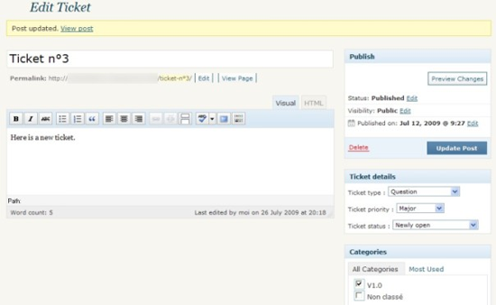
WordPress Advanced Ticket System – FREE | WordPress Advanced Ticket System Premium – €50

In A Nutshell: A free plugin that adds a complete ticket system to your existing WordPress website.

WordPress Advanced Ticket System

Pros

  • Users can create tickets without having to sign up as a member.
  • Each ticket can be assigned a category and priority.

Cons

  • Basic looking design.
  • Most features are only available in the premium version of the script.

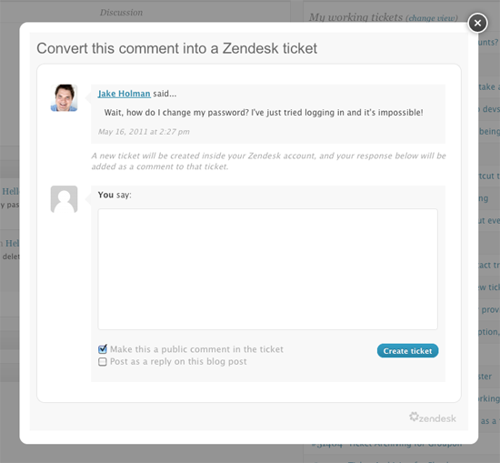
Zendesk for WordPress - Plugin is FREE though ZenDesk prices start from $9 per month

In A Nutshell: A plugin that helps you integrate the feature rich ZenDesk helpdesk service into your WordPress website.

Zendesk

Pros

  • Logins are synced between your website and ZenDesk i.e. no need for customers to sign in twice.
  • Can turn blog comments directly into helpdesk tickets.
  • Access tickets directly from your WordPress dashboard.

Cons

  • Whilst the plugin is free, ZenDesk packages start from $9 per month. The service is worth the money however those on a budget may prefer a solution with no recurring costs.

You May Also Want To Consider…

To Be Continued…

That wraps up this installment of ways to expand your WP based site. Be sure to check in next week as we deliver more ways you can use this powerful CMS to create a Wiki, an Arcade, a Job Board, a Membership based site, a Review site, or just a Q&A site.

(rb)


Deploying: Then & Now

A couple months ago I got up on stage during lightening talks at CodeConf 2011 to talk about our friendly robot, Hubot.

Inside of five minutes I logged into our Campfire room with spotty WiFi, asked Hubot a favor, and he deployed a major new feature to our site — Issues 2.0. A deploy spanning around 30 servers that changed a major feature for 800,000 users. It was pretty awesome and kind of a ridiculous thing to do.

Rewind the clock 7 years ago and I had just landed my first steady job in the tech industry — a front end developer for a big interactive agency.

I remember one of our clients had a static HTML website that I was in charge of maintaining. We had a 45 minute window occurring once a week where we could deploy their site.

Once a week, I generated a list of files I’d changed since the last week so a System Administrator could FTP the files over to production. Any changes to production I needed that occurred outside that 45 minute window required manager intervention.

Recap time.

2004

  • System Administrator time required to deploy every website.
  • Deploys scheduled by managers once a week.
  • Manually generating lists of changed files.
  • Simple deploys take 30+ minutes.

2011

  • Deploying on stage for the hell of it.
  • System Administrator probably drinking whiskey.

2011 is pretty fucking awesome.

Deployment is an art. And the style in which you deploy impacts your company culture more than you think. Deploy with style.


Create an iPod Nano Illustration with Photoshop

In this tutorial we will be creating a detailed iPod Nano illustation in Phoroshop complete with menus and on-screen icons. Througout this tutorial we will be utilizing the Drawing and Pen tools along with Gradient Overlay Styles to make our Nano as realistic as possible.

Step 1

The first step is to draw a shape layer, a square to be precise.Go to the Tools bar and select the Rectangle Tool (U) and draw a square (its colour doesnt matter now since we’ll be applying a Layer Style over it). Name this layer ‘Base.’


Step 2

Double-click the ‘Base’ layer and choose the Gradient Overlay style. Set the parameters of the Gradient as shown below:


Step 3

In a new layer, use the Rounded Rectangle Tool to draw a shape within the ‘base’ shape. On its Options bar, set the shape type to ‘Fill pixels’ and the Radius of the corners to 19 px. For greater accuracy, you should enable Rulers (Ctrl+R) and drag from the margins of the ruler, the Guides. Position these Guides within the base shape.

Drawing the rounded square within the guides automatically snaps to the lines of the guides when ‘Snap To’ is enabled from View>Snap To>Guides. Name the layer ‘Bevel.’


Step 4

For a ‘Screen’ layer, draw a square and add both a Gradient Overlay and Stroke Layer styles using the parameters below:


Step 5

To add droplets of water on the screen, download any of these images of your choice from either wallpapers.com or www.sxc.hu.


Step 6

Drag the image into your working window. Desaturate the image of the droplet by pressing Ctrl+Shift+U and have it resized to fit the Nano’s screen. Add a Layer Mask to water droplets image and erase a quarter of its bottom part unevenly. That done, reduce the Opacity of the layer to 54%.


Step 7

For the on-screen menus, draw a rounded square with the Radius of the its corners set at 11 px.


Step 9

Add a Gradient Overlay style to the rounded square and follow up with a Drop Shadow style:


Step 10

Draw three other menus each with its own Gradient Overlay styles as shown below. The settings for the Drop Shadow style are pretty much the same as above.


Step 11

Create a Group for these menus by clicking the fifth icon from the left below the Layers Palette.


Step 12

Now for the text. With the foreground colour set to white. Select the Text Tool (T) and set the text type to Arial Rounded MT and Font Size to 4.0pt from the Character Palette. Type ‘Playlists’ for of course, the ‘Playlist’ menu.

The completed texts for all menus:


Step 13

To add a glossy or shiny overlay to the menus, select the Rounded Rectangle Tool and draw an outline of  the same size as the menu’s. Right-click and select ‘Make Selection.’ Select the Paint Bucket Tool (G) to fill the selection with white. Press Ctrl+D to deselect and with the Rectangular Marquee Tool (M), cut out right about half of the shape by hittting the Delete key.


Step 14

Press Ctrl+T to enter Free Transform mode and then select the Warp Tool. In warp mode, drag the two bottom points downwards to create a slight curve.


Step 15

Create a Layer Mask and then select the Gradient Tool (G). On its Options bar, set the Gradient Preset to a ‘black to white’ one and its style to Linear. Making sure the mask thumbnail is selected on the Layers Palette, drag with the tool upwards within the menu icon, for a fading transition effect.

For the other menus, just simply duplicate your gloss effect and reposition them appropriately.


Step 16

At the bottom of the screen, draw four circles with the Ellipse Tool. One white, the other three, black. You may want to set the Ellipse Options to Circle for a perfect circle if you find holding the shift key while drawing tricky.


Step 17

For the black tabs, apply a Gradient Overlay style to them with the parameters below:


Step 18

For the ‘Now Playing’ menu, select the Polygon Tool and set its Sides to three for a triangle; its fill colour should be #2f2e2e. Drag a Guide to the centre of the menu and draw a triangle along the planes of the Guides. The triangle snaps to the Guides at its axis perfectly.


Step 19

Draw two more triangles and a standing rectangle all partially mashed together. Merged these shapes (Ctrl+E) and then duplicate them pressing Ctrl+J. For the duplicate, ‘Flip Horizontally’ when in Free Transform mode.


Step 20

For Playlist menu, in a new layer, use the Rectangle Tool to draw horizontal bars like the ones below:


Step 21

As part of the musical notation we’re trying to create, draw a standing rectangle as a shape layer and rotate it at an angle with the Direct selection Tool.

(A). Click on the shape to reveal its Anchor points and then select the ‘Add Anchor Points’ Tool from the Pen Tool fly out.


B. Add a couple of more Anchor points to the shape and reposition them along with adjusting their handles. Work on this until you get a curved shape as shown below:


C. Add other shapes such as a standing rectangle and a circle.


Step 22

Next is the ‘Mixes’ menu where we’ll create an atom symbol over it. Select the Custom Shape Tool and then pick a circle shape. With a foreground set to white draw a narrow circle or ellipse.


Step 23

Duplicate this shape and entering Free Transform mode, rotate it. Make another copy of the rotated shape and ‘Flip Horizontally in Free Transform mode.


Step 24

Follow up with white circles (atomic particles supposedly) drawn about the shape. And we have our atom symbol.


Step 25

On the Artists menu, draw a rounded rectangle with radius set at 1 px. Add rectangle for the mic stand and flat ellipse for the mic subsequently in separate layers and merge them all – its just that simple.


Step 26

And now for the tough part: Use the Pen Tool to map out the silhouette of a singer (head and shoulders). Click and drag each new Anchor Points to create curves and adjust these points afterwards to fine-tune the contours of the shape. A ‘Delete Anchor Points’ Tool can be used as well but sparingly that is, to delete unwanted anchor points for smoother curves,

The look of our ipod nano so far:


Step 27

Creating the top buttons of the Nano, draw a rectangle behind the “Base’ layer and make the following adjustments shown below for the Gradient Overlay and Inner Glow Layer style.


Step 28

Add two more buttons and just copy and paste the previous Layers styles of the first button to these buttons. And edits their Gradients by repositioning the Color Stops.


Step 29

For a shiny screen, draw a rounded square outline of the same size as the black bevel and make a selection from it. Fill the selection with white colour with the Paint Bucket Tool.


Step 30

With the Rectangular Marquee Tool, create a large selection and rotate it by transforming it (Ctrl+T, right-click and Free Transform selection).


Step 31

Clear by hitting the Delete key.


Step 32

Create a Layer Mask and with the Gradient Tool (black to white), draw a gradient from the bottom to the top. Also reduce the layer’s Opacity to 43%.


Step 33

We’ll now set out to create a reflection. Group both Bevel and Base layers and copy.


Step 34

Select the Group, ‘Main Copy’ move its contents below the Nano.Delete most part of the Nano copy.


Step 35

Add a Layer Mask and use the Gradient Tool to fade the Nano copy from bottom to top.


Step 36

Not forgetting, we add a clock, mini play button and a battery status icons at the top of the screen. And we have our spanking new ipod Nano!

The post Create an iPod Nano Illustration with Photoshop appeared first on Design Reviver.


Showcase of Web Design In Argentina Pt.1


Argentina is a melting pot of races and cultures, and its people have developed a complex identity. Tango, political passion and soccer are just some of the features of this South American country’s make-up.

Argentina is an important cultural center, with a plethora of museums and art galleries where the European influence on design, architecture and lifestyle is palpable. Since 1981, UNESCO has distinguished Argentina by including certain properties of natural and cultural significance on the World Heritage List.

And what about the design industry? I asked Claudio Lucero, Creative Director of Naked, for an insider’s take on Argentina’s design scene:

“Creative types and developers working on interactive projects in Argentina have accumulated loads of experience thanks to the dot-com bonanza in our country at the end of the ’90s. All of a sudden software developers and graphic designers who were used to offline assignments were hired by dot-com companies to produce new portal websites that probably made them millionaires.

“Thus, a huge number of developers were forced to learn HTML, JavaScript, ASP and PHP. And designers whose only experience was letterheads and posters, tried to figure out how a navigation scheme works.

“Finally, when the bubble burst and investors refused to offer new rounds of money, most of those dot-com companies disappeared but the know-how and experience remained. This is why Argentina has one of the highest levels of IT experience worldwide, and in 2005 UNESCO declared Buenos Aires its first ‘City of Design’ and ‘one of the most viable and productive design industries on the South American continent’, giving local interactive firms and freelance designers a big opportunity to transcend the local market.â€�

The design industry in Argentina consists of thousands of freelancers and agencies. Through commentary, interviews, links and a big showcase of websites, we’ll introduce you to some of the most talented designers and studios in the country. Your opinions and suggestions are welcome. Please share your thoughts in the comments section at the bottom.

Freelance Designers In Argentina

Freelancers are a growing force. The Argentinian design market is expanding quickly. I interviewed Gisele Jaquenod and Ricardo Teruel to get their thoughts on the domestic Web design scene.

Ricardo is the interactive and graphic lead designer at RTDG. During his professional career he has overseen several projects, ranging from institutional design to producing and publishing dynamic websites. Gisele has been featured in Lee Munroe, Smashing Magazine, Web Creme, Blog and Web, Blogger Buster, Weblog Tools Collection, Vandelay Design, CSS Drive, CSSelite, Best CSS Gallery and FantastiCSS. She has a strong artistic background, and her designs are an inspiration to the entire Web design community.

Q: Could you please describe the life of a freelancer, developer and designer in Argentina?

Gisele Jaquenod: I think it depends; mainly because, unless you live in a very commercial area—which I never did—getting clients to invest in design is the most complicated part of the process. However, I have always been grateful that whatever the economic situation is, I have always been able to live off of design. But it can be complicated at times, for sure. Design in general is still underestimated by most small companies, and the fact that you have to sometimes work hard just to make them understand its potential (and costs) really doesn’t work in favor of the designer.

Ricardo Teruel: I don’t think the life of a freelancer in Argentina differs much from that of any other worker. The difference is that the designer’s job is still not appreciated by the customer. Argentina’s design clients are not trained to appreciate the results of investing in design and building an identity. Working in the domestic market is not always easy because of the complications in charging rates and setting priorities for a project. Working abroad is almost always more desirable, either because of the favorable exchange rate or the culture among clients who are used to paying for such services.

Q: What made you decide to become a freelance Web designer?

Gisele Jaquenod: It was actually just the fact that freelancing is open to anyone to try it. I was already working part-time as a designer at the local university, and the type of project I was required to do was not really related to what I wanted to try, or do, in design. This made me try some personal projects on the side, like illustrating and actually building websites and blogs for some of my artist friends. And while doing that, I found what I liked working on the most, so I just thought, “Hey, this is worth trying.” And, well, that’s how it all sort of started.

Ricardo Teruel: The profession allows remote work and makes face-to-face relationships secondary (they’re important, but not critical). Operational costs are low and allow anyone to get started in the business—and be competitive—without taking major risks.

Beyond their function, there’s the professional issue. The world tends to over-exhaust agencies and suffocate designers. Plus, a very low percentage of media staff really know what they’re working with, so the equation always seems to fit: design + no extra pressure on client + flexible hours + chance to improve economic standing + independence = freelancing.

Gisele Jaquenod

Gisele Jaquedod On Showcase Of Web Design In Argentina

Q: What’s the condition of Argentina’s market, in your opinion?

Gisele Jaquenod: I think the design market in Argentina is growing, and new technologies keep opening up new areas for designers to enter. However, as I said before, all of this is concentrated in the biggest commercial areas of the country, so for a designer who is looking for a challenging and well-paying job (or should I say, decent-paying job), relocating to one of these areas is almost a requirement.

Ricardo Teruel: It’s a growing market that has yet to explode in infrastructure, which would lead to an increase in use of Web services. The country remains reluctant to commit to the online world, still deeming the printed page more secure and profitable than a 24/7 digital presence.

Gradually, we’re seeing more flirting with Web development, but it’s still a young market in terms of the quality of design and power of Web applications. This is not a critique of Argentinian designers (we have excellent designers and commentators on the subject). It’s a critique of Argentinian clients who do not ask for, or understand, high-quality design. And, as in all other work, excellence comes with a cost that few are willing to pay.

Q: How usable are Argentina’s websites, in your opinion? Do you give a high priority?

Gisele Jaquenod: I think usability is a minor consideration on many of Argentina’s websites. But it’s also a minor consideration in most design-related careers where designers learn their craft. Of course, there are exceptions: many design studios and independent designers stay up to date and challenge themselves in this area, providing great examples of Web design. But the truth is that most of the time budgets are limited, and that means that this aspect of design is not prioritized. Personally, I try to give it my best shot, but I am not an expert in any way!

Ricardo Teruel: Projects are becoming more focused and receiving greater functional planning. But usability is still a problem that remains to be solved. For the new generation of Web designers, usability is a pillar of design itself. Design is communication and because of this, designers must adjust to the needs of clients. Usability makes this dialogue easier and allows for that comfort and safety that is needed in order to not be on the defensive and to let the message get across. Obviously, there has been a large deficit in this area, but today both usability and design are becoming a focus for websites.

Q: Do designers still use tables for layouts?

Gisele Jaquenod: For sure, a large number of old websites in Argentina still use tables for layouts, but as far as I can tell new designers do not use them anymore.

Ricardo Teruel: Each tool has its specific use. The Argentinian designer, like every designer in the world, becomes informed and aims for the highest standards of quality. As for myself, I respect the common standards of most browsers when working on a website’s structure. There are certain circumstances in which tables can be useful, faster to create and more lightweight, without having to maintain such a strict separation of aesthetics and content. In such cases, I use tables.

Not everything has to be HTML and CSS. I remain a believer in the power, versatility and beauty that Flash offers as a platform for website development. It’s up to every developer to choose which tool is appropriate for the project.

Q: How do Argentinean designers handle typography?

Gisele Jaquenod: Well, I know that typography has always been a basic teaching and interest at Argentinian design schools, so a lot of well-educated designers of typography are out there. We also have some amazing font designers, such as Sudtipos, that do a lot to raise standards. And when it comes to usage, I can say that I have seen a lot of creativity, perhaps because a lack of resources forces designers to be creative with what they have.

Ricardo Teruel: The Argentinian designer is a great typographer and a design lover. Perhaps because Web design is still emerging in Argentina, the technical and aesthetic richness of local professionals is still unknown.

We have had great printers, publishers and artists whose skills have been passed on to all who have grown up studying them and following their work.

RTDG

Ricardo Teruel On Showcase Of Web Design In Argentina

Q: Which design-related Argentinean blogs and magazines do you read?

Gisele Jaquenod: To be honest, most of what I read online is from outside Argentina, except maybe Foro Alfa, and several blogs by illustrators who I follow (but not particularly design-related). As for print magazines, unfortunately my favorite, Tipográfica, is not published anymore.

Ricardo Teruel: More than anything I read blogs: they’re easy to save and share. In any case, you can’t miss Foro Alfa. And some more are Diego Mattei, ilovecolors, Designio Studio’s blog, Creative Closeup and elWebmaster.

Q: What is your main source of inspiration? What is your best method of overcoming a creativity block?

Gisele Jaquenod: For inspiration, I can’t say that I have a particular technique. In my Reader, I follow a lot of artists, illustrators, photographers, designers, interior decorators, home improvement websites, fashion blogs, and I make sure to get a daily dose of that. I have also always been a fan of collecting “beautiful objects,� and those things have a way of coming out in the work that I do.

Creativity blocks: when I get one of those, I just need to get out for a bit. Go for a ride, get a breath of fresh air, pick up a book, something that takes me away from the computer. I think the overworking that sometimes results from the insecurity of working freelance, and the ups and downs of the economy, cause these creativity blocks. But often it’s just from being plain tired, you know? Not really a creativity problem, but more a need-to-rest situation.

Ricardo Teruel: Working on two projects at the same time. Staying focused on two or more projects helps me to think differently and not stagnate. The projects don’t necessarily have to relate to design. It could be programming, layout, personal projects. The point is to force your brain to face a different situation than the one it is comfortable with.

When this fails, it’s always useful going for a walk, playing the guitar or cooking. What matters is doing the opposite of what your brain is used to.

Q: What are your expectations for your work and experience in the Web design field?

Gisele Jaquenod: Personally, I take each day as it comes. There are days when I wish I was not freelancing but in a steady job. Other days I want to get a bit closer to the roots of my interest, which are more art-related. I just try to get as much as I can from every job, even if the projects are very short (which they have been because I have been focusing on blog theme designs). Of course, I still want to learn the trillion things that I don’t know, so I feel there is still a lot left for me in the Web design field, for sure.

Ricardo Teruel: I have high expectations of the sector’s growth and the profession’s growth and the role of the designer in the market and in the culture of Argentina.

There is a growing demand for design. Even better, there is growing demand for knowledge and excellence. This is the way we’ll evolve.

It represents a great challenge, but at the same time it is an excellent opportunity to position local design to the world, not only because of the favorable cost (against the dollar or Euro) but for the high quality of design, creativity and development.

Q: What would you do to improve Argentina’s design community?

Gisele Jaquenod: For sure, invest in design education. As someone who has been teaching for a few years at the local, and public, university, I can tell you that a lack of resources is the biggest issue to solve. And not just at the lower stages of education. Investment in the development of post-degree courses for graduates, and of training courses that keep the designer up to date on current technologies, is seriously needed.

Ricardo Teruel: It’s improving, but the Argentinian designer is caring and shares his knowledge. I would start by bringing together all of the industry’s workers (designers, programmers, writers, photographers) so that they can share their experiences and projects. That would definitely enrich everyone. Something like that already exists, still in its infancy, called CamaraFree.

Showcase Of Freelance Designers In Argentina

The showcase below gives you a glimpse into some of the freelancers working in Argentina’s design industry. Some of them have been recognized or awarded by NewWebPick, Netdiver Mag, American Design Awards, DesignTAXI and DOPE Awards.

Emiliano Rodriguez

Emiliano Rodriguez On Showcase Of Web Design In Argentina

Colorium

Colorium On Showcase Of Web Design In  Argentina

Vic Perales Creative Factory

Vic Perales On  Showcase Of Web Design In Argentina

Bytal

Bytal On Showcase Of Web Design In Argentina

Matias Najle

Matias Najle On Showcase Of  Web Design In Argentina

Matias Najle’s website will soon be online. In the meantime, you can follow him on Twitter.

Also, check out niceslice and Damian Lubenfeld.

Blogging In Argentina

More than 260,000 Argentineans have their own blog. Argentinean bloggers can be characterized as technology lovers, and social and information consumers.

I spoke with Elio Rivero, the graphic designer, Web developer, illustrator and blogger behind ilovecolors, about Argentina’s blogosphere. ilovecolors has been featured on Smashing Magazine, Webdesigner Depot, InstantShift, Hongkiat and Vandelay Design.

Q: How did you get into blogging? And in your opinion, is blogging a good way to make money?

ilovecolors: I’ve always wanted to give something back to the design community. I’ve gotten a lot from websites such as Smashing Magazine and Tutorial9, and I’ve thought about sharing some of that knowledge with everyone.

If done properly, you can make really good money by blogging, but you must be a good writer or find the right people to write. A blog is just like a printed magazine except that it’s open to everyone. In addition, technical blogs have the luxury of being able to present live examples of jQuery, PHP, you name it, right next to the article, instead of sending the reader to look for them in a separate CD or DVD.

Q: Do design-related blogs have a big audience in Argentina? Do people tend to follow Argentinean bloggers or foreign ones?

ilovecolors: Nowadays, yes, a lot of people follow blogs from all over the world that deal with assorted themes. One friend will follow non solo Kawaii, another will follow Design*Sponge or DIY blogs. Designers mostly follow Smashing Magazine, Tutorial 9, Design Reviver, Go Media Zine.

Q: Name a few of your favourite blogs from Argentina.

ilovecolors: Although they are not related to Web development, I often check Jessica Hemingway, unblogged, Vitamina Ce.

ilovecolors

I Love Colors On Showcase Of Web Design In Argentina

Q: In which language do you currently blog? Explain to us the reason for your choice.

ilovecolors: I’m blogging in English, although it’s my second language. It was natural. I learned everything by reading English blogs and forums, so I didn’t thing much about it. I mean, I never thought about whether to write in Spanish or English. It just happened.

Q: Where does your blog traffic come from? Would you like to share with us a tip to drive traffic to our own blogs?

ilovecolors: Initially, a huge amount came from the dozens of websites that where so kind to feature my blog’s design. After the hype, most traffic came from people looking for jQuery tutorials on Google. Also, I’ve written about interface elements and about WordPress.

I think a good tip would be to try to write articles as generally as possible, so that they appeal to most people. Focused articles appeal to only a small niche. Write general articles, and don’t forget the golden formula for titles: “How to Influence People,” “Ten Steps to Success,” “Why This or That Will Fail.”

Q: How much time do you spend updating your blog? How often do you write?

ilovecolors: I try to write often, at least once a week. A big part of what I write arises from working on some tricky thing and finding that articles about it are scarce, if not non-existent.

JoyColors

I Love Colors On Showcase Of Web  Design In Argentina

Winning design by ilovecolors for the ColorLabsProject Contest.

Q: Because your writing concerns design topics, where does all that content come from? Are you practically experienced in Web design, or is it just a topic you enjoy writing about?

ilovecolors: I work mainly as a graphic designer and Web developer, and I’ve got a career in graphic design. Before that, I followed computer science, while preferring graphic design. I’m finishing my studies in graphic design, focusing on typography, in order to get a title.

Q: On the Argentinian scene, is visual design considered more important than standards-based Web design?

ilovecolors: In my humble opinion, design is like falling in love. No, not the chemistry, birds and butterflies. It’s the inner process that takes place in our heads, and it all starts through our eyes. In short, visual design will always be more important than standards. It’s the bait. Argentina is no exception.

Q: South America is a vibrant and colorful continent. When it comes to the Web design process, does the focus lie on visual design or typography or well-coded semantic CSS-based designs?

ilovecolors: The focus might have once been on well-coded design, because most people doing it were Web developers who did not have graphic designers to take care of the visual side. But in the last couple of years, many agencies have appeared on the Latin American scene who are bringing a visual freshness to the Web.

Q: What’s the powerplay between Flash-based and CSS-based designs like? How strong is Flash in Argentina, in your opinion?

ilovecolors: Flash was quite popular but it’s being replaced by CMS-powered websites, in which clients have control of the website and don’t have to depend on an agency or freelancer to update it. Maybe when CMS’s for Flash websites become more developed, it will come back to the center of the scene.

Argentinian Blogs

Blogs are one of the most useful tools to find out what’s happening in Web-related fields. Here is a list of some design-related blogs in Argentina that will certainly give you an overview of the scene.

  • Diego MatteiDesign blog with tutorials, tips, tricks, Photoshop resources and Internet trends.
  • XyberneticosResources, themes and WordPress tips and hacks.
  • KabytesWritten by Tamara Druetta and Pablo Javier Suárez.
  • WebnovaWritten by Leonardo Correa, this blog covers graphics- and Web design-related topics.
  • Visual BlogThe blog of Visualpoint’s studio.
  • Codigo GeekCodigo Geek On Showcase Of Web Design  In Argentina
  • Blonk!Written by Web and graphic designer and illustrator Raul Reimer.
  • Diego GiacconeThe blog of designer Diego Giaccone, director of SURe Brandesign.
  • Gran ImpetuGran Impetu On Showcase Of Web Design In  Argentina
  • BaddBadd is a blog written by Irene Fernández, covering topics such as graphic design, communications and Web design.
  • CSS BlogCSS Blog is focused squarely on CSS and is brought to you by Ignacio Ricci. It aims to be a great source where CSS beginners can find experiments, tips and tricks and tutorials.
  • Designio StudioA blog written by designer Daniel Migliorelli.
  • GancèGancè On Showcase Of Web Design In Argentina
  • ThüerDesigner Sebastián Thüer blogs about a wide range of topics, from IT to social media.
  • dzignWeb resources, design, Joomla and tutorials brought to you by Leandro D’Onofrio.
  • Retype’s WeblogAn “unblogâ€� by Ramiro Espinoza.
  • unbloggedA blog about nothing, but where you will find the latest about technology, Internet, design and style.
  • Trazo LàserThe blog of Homonym studio.
  • Alfonso CatrònAlfonso Catròn’s blog about culture, communications and design. He also works as a Web designer at Mood Studio.

Showcase Of Websites in Argentina

Here is a selection of websites made by Argentinean designers or for an Argentinean audience. You will find personal websites, corporate websites, portfolios, blogs and a wide range of styles and platforms.

Twisted

Twisted On Showcase Of Web Design In  Argentina

Visual Sum

Visual Sum On Showcase Of Web Design In  Argentina

Aserrin Aserran

Aserrin Aserran On Showcase Of Web Design In  Argentina

Yo Tambièn Tengo Unas Converse

Yo Tambièn Tengo Unas Converse On Showcase Of Web Design In  Argentina

Pablo Olivera

Pablo Olivera On Showcase Of Web Design In  Argentina

Molestown

Molestown On Showcase Of Web Design In  Argentina

Cheetos

Cheetos On Showcase Of Web Design In  Argentina

Prüne

Prüne On Showcase Of Web Design In  Argentina

Hellmann’s

Hellmann's On Showcase Of Web Design In  Argentina

DirectTV Plus

DirectTV Plus On Showcase Of Web Design In  Argentina

Lays Restò

Lays Restò On Showcase Of Web Design In  Argentina

Save the Turtles

Save The Turtles On Showcase Of Web Design In  Argentina

Colorin Simulador De Ambientes

Colorin Simulador De Ambientes On Showcase Of Web Design In  Argentina

Corre Lola

Corre Lola On Showcase Of Web Design In  Argentina

El Rock De Tu Vida

El Rock De Tu Vida On Showcase Of Web Design In  Argentina

ElecBa

ElecBa On Showcase Of Web Design In  Argentina

Hoy No Cocinas

Hoy No Cocinas On Showcase Of Web Design In  Argentina

Juan Vellavsky

Juan Vellavsky On Showcase Of Web Design In  Argentina

Philips Argentina Car Entertainment

Philips Argentina Car Entertainment On Showcase Of Web Design In  Argentina

Togo Hombres

Togo Hombres On Showcase Of Web Design In  Argentina

Playful

Playful On Showcase Of Web Design In  Argentina

Pattern

Pattern On Showcase Of Web Design In  Argentina

Gazz

Gazz On Showcase Of Web Design In  Argentina

Where to Study Design in Argentina

There is still no complete and well-conceived career path for aspiring Web designers, but Argentinians who want a career in design, animation or the arts still have some valid options. Here are just a few of them (more to come in part two).

Universities:

What’s Happening in Argentina?

A few design-related events take place in Argentina. Some infamous ones are:

Trimarchi

For eight years, Pablo and Seba have been shaping TMDG, a meeting about graphic design that, because of its audience, has been regarded as the best in Latin America. Its size has also been recognized by international media, having brought more than 5,000 designers together for the conference. Beyond the titles and praise, TMDG remains essentially a meeting place for students and professionals in design. The same spirit that launched TMDG in 2002 in front of 400 people, is present today with the massive audience.

Pecha Kucha

Created by KDA in Japan, PKN has emerged as an event for “showcasting and networking� among creatives. Twelve presenters talk about their ideas, projects and designs using 20 images and spending 20 seconds on each, adding up to 6 minutes and 40 seconds total, per presenter. The event then becomes a space to talk, listen to music and have a good time. PKN has taken place in over 200 cities worldwide, and three years ago it was organized in Buenos Aires.

BarCamp Buenos Aires

BarCamp is an international event consisting of small talks and lectures given by the participants themselves. BarCamp Buenos Aires is currently positioned as the Web 2.0 event of the year, bringing together entrepreneurs, developers, designers and investors.

TEDx Buenos Aires

TEDx is a local event, independently organized, to gather an audience for an experience similar to that of TED. The “x� in TEDx indicates that the event is being organized independently. TEDx Buenos Aires combines TED’s video talks and live speakers to trigger a deep conversation and connection among attendees. TED gives general guidelines for TEDx programs, but the programs are organized locally.

Creatividad & Ética

The Creativity & Ethics forum is designed as an open space in which to reflect on creativity, values and on participants and their context, in order to identify useful avenues for social development and for design in particular. In Argentina or abroad, in conferences, lectures, courses or indirectly through documents, it tries to give society a space to ensure the appreciation of sensitive issues related to the construction of a wide design horizon. The Creativity & Ethics forum is a hallmark of academic quality, consensus-building and constructive contributions to democratic design.

Feria Puro Diseño

Feria Puro Diseño was created to be a major platform to showcase Latin American design talent, a place where design is the protagonist: apparel, accessories, jewellery, equipment, objects, contemporary crafts, textile design, lighting, digital design, graphic design. The meeting brings together all industry participants in a lively setting.

Encuentro Latinoamericano de Diseño

Palermo’s University of Design and Communication organizes Design in Palermo, a Latin American meeting of design that was created in 2006 to be a space for training, networking and sharing experiences between professionals, academics, students and companies in the design field. The 2006, 2007 and 2008 editions were great successes, and 4,000 people from over 20 countries in Latin America and Europe participated in each of them. The 2009 edition had to be suspended because of the N1H1 outbreak in Argentina. However, its contents have been poured into the event’s website, putting it in virtual editing mode. The 2010 meeting awaits participants with renewed energy and various participatory spaces: over 300 conferences and workshops, talks by guests of honor, test laboratories.

Inspiration Fest

Inspiration Fest Buenos Aires is a new space for inspiration of professionals and students working in various creative industries: design, illustration, photography, gaming, multimedia and animation, avant-garde music and applied technology.

More To Come!

With so much information shared and wonderful sites to feature, this showcase of Argentinian web design is just getting underway. There is another installment coming next week with more to complete this glimpse into this creative and expansive scene.

(al)(rs)(rb)


  •   
  • Copyright © 1996-2010 BlogmyQuery - BMQ. All rights reserved.
    iDream theme by Templates Next | Powered by WordPress