Archive for August, 2011

Introducing Smashing UX Design: Changing The Conversation

Advertisement in Introducing Smashing UX Design: Changing The Conversation
 in Introducing Smashing UX Design: Changing The Conversation  in Introducing Smashing UX Design: Changing The Conversation  in Introducing Smashing UX Design: Changing The Conversation

In the Web industry, a lot of exciting knowledge and diverse opinions are shared daily. They are delivered in fragments across hundreds of blogs, feeds, Twitter accounts and apps. In addition, the number of topics seems to multiply daily. We are building and designing for moving targets. Technology is constantly forking and disrupting the way we interact and do business. This is our industry, and I love it. I also know it could be better.

Why does finding and reading content have to be so painful at times? We set out to build great (user) experiences, yet our own experience of reading and learning from blogs is not always so pleasant. We end up relying on our peers and trending topics to see what we should be reading. Just knowing how to get a handle on what’s going on becomes a job requirement — more of a distraction than a good use of time when we have project deadlines, among other responsibilities.

An Evolving Industry

Before Web industry blogs such as Smashing Magazine, the conversation was a lot smaller, and much different. It wasn’t about followers or how many RSS subscribers you had: it was about experimenting, discovering and then sharing with others. Things were a bit more personal.

K10k in Introducing Smashing UX Design: Changing The Conversation
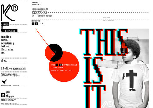
Early Web design blogs like Kaliber 10000 shared interesting links, with unique designs that paved the way. (Image: Ida Engholm)

Finding unique and beautiful websites was something rare and exciting, not fodder for an hourly tweet. It was fun figuring out how someone was able to make an HTML table look… well, not like a table at all. It gave us an amazing sense of discovery, while constantly challenging our notion of what the Web could be. With the exciting new devices and design challenges popping up in the world today, that feeling of discovery is returning.

Today, our once fledgeling community is bursting at the seams with information and people trying to make a career of it. Although there are a lot more blogs, many are saying the same things and delivering the same broad-stroke discussions. Finding valuable content in a sea of generic posts is becoming a challenge. It’s time we evolve. Over the course of the next few months, Smashing Magazine will break out sections, like this one, dedicated to specific topics and focused content.

Shaping New Conversations

When Smashing Magazine presented me with this opportunity to help it build a new section focused on UX design, my reaction was, “Absolutely!� After the initial excitement, though, my next thought was, “How the heck will I pull this off?� I realized that just as an experience has no value without users, a blog has no value without readers or contributors.

We have been working on building a solid group of authors who have a fresh outlook and experiences to share. I believe that by presenting great content, audiences will find us. We have an opportunity to continue shaping the future of UX by educating and sharing our experiences with others. The team here at Smashing Magazine is up to the challenge of shaping this new conversation in the community and of contributing great content and ideas.

We will be covering the many dimensions of user experience design, with a deep focus, exploring some new article formats to tell the story of UX. You might find an article that introduces best practices for interface design or perhaps a case study of something surprising that we learned in our user research. We look forward to your feedback, suggestions and commentary. You, dear reader, are what inspires and drives this magazine. And if you think you’ve got what it takes to contribute, please contact us.

Welcome to the new UX Design section of Smashing Magazine!

About Our New Editor: Francisco Inchauste

F in Introducing Smashing UX Design: Changing The Conversation

Francisco has been designing websites and applications for over a decade — initially in print design and then in interaction design. He now works as a senior UX designer for Universal Mind, guiding companies in designing applications that meet the needs of their customers through a desirable user experience.

In the past few years, he has continually contributed to the Web community, writing for many industry publications and his personal blog, Finch. He most recently co-authored the Smashing Book 2, with the chapter “Visible vs. Invisible Design.�

(al)


© Francisco Inchauste for Smashing Magazine, 2011.


Showcase of Italian Web Design Pt.1


It all started in the middle 90s. The Internet in Italy was slowly coming out from its early age when it was somehow still synonymous with cyber-culture. World Wide Web was becoming larger known and young dudes with 14k remote modem connections were spending their nights updating rudimentary personal pages on Geocities all along the Belpaese.

As soon as the potential of the new medium was revealing itself, more and more geeks with different backgrounds began experimenting deeper with HTML, Photoshop, Flash and the first releases of web-oriented programming languages. Those pioneers were soon generically renamed ‘webmasters’ without any proper distinction if they came from design, computer science, art or marketing.

25-italian-web-designs in Showcase of Web Design in Italy

Italian Web Design: HumanLab

Outside, in the meantime, a global new economy was rising and the italian industry (as well as the most far-sighted Italian middle and small entrepreneurs) started to invest money for having their magic window on the new virtual world.

Then it happened, in Italy as elsewhere in the world, the whole thing got more complex and challenging. Different needs were surfacing and new professional profiles with specific skills needed were flowering (web designers, web graphics, web developers, web marketers, web project managers and so on). In this scenario, a new awareness was growing: the look and feel of websites mattered as much as their content, as much as their usability. And getting to this place has probably been the tipping point that has consecrated ‘webdesigner’ as a profession itself.

53-italian-web-designs in Showcase of Web Design in Italy

Valentino Petrolati

From that point on, Italian web design in its brighter examples, has always tried to go hand in hand with the current state of the art. Despite a low national attention on any kind of web culture that makes it somewhat difficult to spread any new media to the masses and in attracting higher levels of investment, in comparison for example to TV advertisement, it’s still a fairly active and dominate market in Italy.

State Of Things

From art to fashion, from food to crafts, motors and boats, Italian style and creativity have always been pretty appreciated around the world. Sometimes ‘made in italy’ has even ended up being considered a virtual brand in and of itself. But what about in the area of web professions and digital arts? Could Italian contributions in web design become as relevant as in those more traditional fields one day?

Trying to get a snapshot from the real-world situation in Italy, we contacted three Italian freelance web designers to hear what insights they could provide. Three people with different backgrounds and approaches, but all of them sharing a real passion for their work: Antonio Moro (aka Itomi), Laura Gargiulo (aka Lauryn), Giuliano Ambrosio (aka Julius).

04-italian-web-designs in Showcase of Web Design in Italy

Dora Mes

Q: How do you feel the standards of Italian web design compare to the rest of the world? Which are the main analogies and differences?

Antonio Moro: The problem in Italy is that we never came out of the big ’2001 web industry boom’. Until the year 2000 there were big agencies in Italy with hundreds of people working, I was one of them and I was enjoyng the end of my ‘freelancing’ era in a big bang agency.

Then the bottom fell out and a lot of agencies closed down or resized to small companies producing a lot of unemployed wedesigners that recycled themselves as hungry freelancers.
And after 8 years we’re still there: lots of freelancers and just small-to-mid sized agencies.
This is a shame because lots of freelancers and small agencies means that the market is tumultuous: there’s a price-war where the clients started to think that the cheapest one is the best one. But as you probably know this isn’t true, at all.

We have a lot of talents in Italy, but without good agencies it’s hard to grow up from a talent to a real professional. The difference is easy to understand:
if you work at home, with your mac near the bed as a freelancer it’s hard to fully understand the market and to become a real professional web designer.

The other problem is the lack of good web design schools. The situation is changing and there’s a bunch of new good private schools around, but they’re really expensive and (as all private schools in Italy) they’re not selective with students.

If you pay your dues, you’re good. We need more involvement by the State’s university (college) system. We need to start new web design courses in our art colleges. And, above all, we need to integrate our school system with the real world (the web agencies) as there is no better place to learn a job other than being on the job.

Laura Gargiulo: Italy is still a step behind in web standards. There are lots of companies that boast of selling web services without having any skills to do it. So customers are still skeptical about these new technologies. But things are changing…

Giuliano Ambrosio: Personally I don’t think there are some standards, web design for me it’s art, and as an art it can be expressed with different techniques depending on the artist. Every person gets tainted by various inspirations and this permits to create and expand unique projects.

Internet gave the possibility to share with other people our own art and consequently inspire passion.

31-italian-web-designs in Showcase of Web Design in Italy

Daniele Cascone

Q: Do you feel any kind of “national identity” or “similar attitude” existing between web design and other more traditional creative disciplines made in Italy? (photography, illustration, architecture, fashion, …)

Antonio Moro: Italians are creatives, this is an old adage, but it’s still true. So we put our creativity in each thing we try to do, from photography to fashion, from architecture to… web design.

I don’t think there’s an “Italian style” in web design, just as there’s no “American style” or “Nordic style” or “French style”. The inspiration and the melting pot of web design comes from the whole internet so it’s really difficult to develop a national style if not completely impossible.

Designers from all around the world share styles and techniques almost in real time. I see this as a really good thing by the way.

Laura Gargiulo: Yes, I think Italians try to do everything with style. The common stereotypes are that Italians are good in fashion and arts such as painting and sculpture… well, we try to be creative also in web design, sometimes going beyond the trends.

Giuliano Ambrosio: For me there are many and various contaminations of inspiration between different disciplines, especially photography and fashion.

In these disciplines we can notice similar techniques and effects to web design. Moreover we can all agree that the Internet gave us the possibility to soak in inspiration every moment from every kind of art comfortably with a click.

24-italian-web-designs in Showcase of Web Design in Italy

Giorgio Armani

Q: Do you think Italian, our beautiful mother tongue, is somehow a limit to the potential of web projects made in Italy? Do you usually join resources (I mean blogs, tutorials, forums, social networks, …) in Italian or in the English language?

Antonio Moro: Our medium is the internet and the mother tongue of the internet is English, that’s it. If you’re going to create a web project you’re probably going to do it in English. It really depends on the target, by the way, and I don’t think that we need to push our mother tongue too much.

Laura Gargiulo: I join different resources, both in Italian and English, but new web designers are reluctant to learn this language, even if it’s a door open to a million resources and learning new techniques.

That’s why I decided to open an Italian mother tongue blog, to help people find the resources they usually don’t explore because of the language barrier. Instead some Italian bloggers write in English to let in people from all over the world. It’s a choice that I agree with.

Giuliano Ambrosio: Unfortunately writing in Italian on some subjects can limit your own diffusion, so I usually try to bring barriers down with translation services that I put in my blog. Certainly beginning by writing in English can permit you to open the doors of your place to a vaste audience.

Often I read blogs like Smashing Magazine and foreign tutorials where it’s possible to notice a great creativity and inspiration, which are basic to continue in developing.

44-italian-web-designs in Showcase of Web Design in Italy

Vicmatie

Q: Are there any regular meetings or events about web design in Italy?

Antonio Moro: There used to be some, I was one of the organizers of the first one, PixelDNA 2001, attended by thousands of professionals. Then the scene collapsed a bit and now is reorganizing something.

The focus of the events now are mainly on other aspects other than design, like web marketing and SEO, but I hope that something new, something better will be organized in the near future.

Laura Gargiulo: Not specifically, but there are more and more events growing, like VeneziaCamp or Wif Italia. I believe in future there will be more attention on this profession.

Giuliano Ambrosio: I often follow some seminars and meeting in Italy organized by Adobe and other associations, because I mainly use their products for my work.

These meetings permit to increase our knowledge base and meet new realities. At present I’m organizing a workshop dedicated to the world of Web Design that will be included in the Web Design International Festival event for the first time in Italy.

57-italian-web-designs in Showcase of Web Design in Italy

Don Juan de Marco

Q: Web Designers VS Web Developers. Is there any open war between them in Italy? Do you see their interaction as a limit or a benefit for creativity?

Antonio Moro: There’s an endless war and this is part of the game. But the result of this is that the final product usually is better. When two worlds collide, something better will grow.

I started as a programmer and then moved to the other side, I can understand both points of view and this is a great advantage for me at work.

Laura Gargiulo: Eh eh there is a thin war, but in a proven team web designers and web developers try to find solutions together without limits to creativity or functionality.
Open source CMS has limited these interactions, and web developers are working less I think :(

Giuliano Ambrosio: We often talk about an open war between Web Designers and Web Developers, useful to compare and understand the needs between the two professional figures.
My professional figure permits me to be in both categories, this involves a different point of view in creating web services, because of this I understand the requirements of a Web Designer and of a Web Developer.

As we say, “Union makes people stronger” and it’s logic that sometimes more professionalities permit to optimize times and costs to reach a common objective.

33-italian-web-designs in Showcase of Web Design in Italy

Nuova DesignLab

Q: What about SEO and Web Marketing in Italy? Do you think these discliplines are somehow influencing the look and feel of websites?

Antonio Moro: Absolutely. You can design the best website in the world but if nobody accesses it there’s no sense in it, right? So SEO and Web Marketing must be not only understood by a good designer, but they must influence a lot the design itself and this is good.

Now I’m finding myself designing what are basically WordPress themes with CSS+PHP+HTML in Coda with super optimized SEO elements while only 4/5 years ago I was usually starting the process by launching Macromedia Flash. This is no more and you have to adapt to it if you want to create a good product.

Flash websites are dead. Death to full flash websites.

Laura Gargiulo: Yes, good web marketing is coming out more and more, and web design is going that way but only for commercial sites. SEO is growing, more people believe in search engine and indexing.

Giuliano Ambrosio: SEO and Web Marketing changed formats, content got conformed to graphics. I had the chance to collaborate with different agencies in this sector, graphic and content have to adjust themselves with some good tips to get well index/linked.

From 2007 I’m the author of JuliusDesign.net a personal blog where I share with my readers, experiences and usefull services in the domain of the web design. This blog and other projects gave me the possibility to try some index/link and marketing techniques connected with design.

14-italian-web-designs in Showcase of Web Design in Italy

Aretè ShowRoom

Q: Let’s think about a typical Italian web design customer. How much freedom are you usually able to get for the creativity of the project? Is it hard to impose your choices to marketing managers or small entrepreneurs?

Antonio Moro: It really depends on you and on your skills. And I’m not only talking on design skills, but on your communication and marketing skills: you have to push your ideas, you have to be able to justify them and to be clear on the purposes, the medium and the target. You have to explain to your client what he needs, what his customers needs and why what you have created is the best solution.

I refuse the “three proposals” way because by creating three completely different solutions you’re basically saying that there’s three perfect solutions. That’s obviously not true. The usual result is that your client will start to merge ideas and you don’t want to give him this creative freedom, they don’t have to be creative, they have to be objective and just say “it’s ok for my needs” or “it’s not ok”.

I don’t know very well the foreign clients, but I think this is a worldwide problem.

Laura Gargiulo: Maybe I’m lucky, but usually when I suggest two or three layouts they choose between them with few modifications, limits are only defined by functionality and usability.

Giuliano Ambrosio: My experience permits me to say that sometimes there are clients which have fixed ideas for some specific projects where you cannot put a piece of you in it, but just give back the work finished.

There are also clients that leave it completely in your hands, all the Web comunication, because they recognize an experienced person with talent in the web design domain. This gives the possibility to have a lot of freedom, maybe with just some guidelines.

15-italian-web-designs in Showcase of Web Design in Italy

Armando Testa

Q: How “hard” is it to be a web design freelancer in Italy today? I mean, is being a Web designer considered high-level, sophisticated work?

Antonio Moro: Not at all. That’s because there’s way, way too much freelancers in Italy. It’s way too easy to start your personal one-man-show studio and the small agencies around usually force you to start one.

The result is that the demand never meets the offer and the price of the services offered falls way too much. I know this is a worldwide problem, but in Italy we suffer it a lot because our clients don’t have the design culture to evalute the service.

And when you miss it your only parameter is the price. That’s not good at all.

Laura Gargiulo: Not at all, it depends on the customer. Professionals of other sectors know the value of your work, but they want always to discount prices…most think that a web designer is a nerd closed in his bedroom like Neo of the Matrix so you need only food and dvds, and they would like to pay you in proportion :)

Giuliano Ambrosio: Unfortunately in Italy web designers as a professional figure it’s less recognized compared with other countries, because the term “Web Designer” is connected just with the creation of a website.

We all know that sometimes Web Designers freelance, performing more than one role. Creating a website does not mean just creating graphics, but there’s a study of web communication, index-linking, development of ideas, different professional figures which are portrayed by different persons in a web agency.

Nowadays having more than one professional figure, certainly helps in finding new clients.

30-italian-web-designs in Showcase of Web Design in Italy

Million Frame

Q: Based on your experience, which tools or resources in web design (i mean a software, a programming language, a framework, a technique, a technology …) do you think are more overestimated and which ones more underestimated nowadays? Why?

Antonio Moro: Uh. There’s not that big choice of services/software around to justify this question in my opinion :) On the software part you have just one big choice: Adobe Creative Studio, that’s it. This is good because you just have to learn one suite of software and bad because there’s no more competition.

About programming… there’s PHP. Using something else is possible and maybe encouraged by someone, but you will find way more resources, frameworks, etc. if you develop in PHP. Flash is used for video and for small animations/skits inserted inside HTML websites. “Yugo Nakamuras” are no more needed, I’m sorry. We’re in the web 2.0, where webservices, blogs and content are the main subject of interest.

If you have to create a blog/website use WordPress. If you need a CMS use Joomla. It’s better to choose the most standardized one as it’s easier to find resources, help, new freelancers that know it and so on.

Laura Gargiulo: Fortunately my experience is going the same way of web design trends: ajax and xhtml-css languages, Adobe software, sprites and WordPress are the best way to make web designs.

Giuliano Ambrosio: There are various and very good programming languages as Ajax or libraries as jQuery with whom it’s possible to build real killer applications.

These languages often remain unknown by the bigger part of inexperienced web designers. In fact sometimes I believe there’s a preference in using languages as Actionscript, that permit to create interactive applications, but less idex/linked compared with the ones created with other languages.

I love Adobe Flash technology for its intuitive UE but sometimes it’s necessary to know other languages that could give more and better results. The choice and the knowledge of what tools to use for making a project are basilar to realize it.

35-italian-web-designs in Showcase of Web Design in Italy

Piaggio Aero

Q: What advice would you give to a fellow Italian teenager that dreams of becoming a rockstar web designer one day?

Antonio Moro: Finish your school, go and knock on every major web design studio’s door in Italy and beg for an internship. Don’t hesitate to move from your city: move to a bigger city and find your dream job by starting from the base. Don’t listen to your friends, to your girlfriend, to your parents, just do it.

Start by creating something and by learning the basics (see the previous answer), create your niche expertise by learning a framework or a technique. Develop you personal website and blog, learn to write a post correctly, learn to write. You don’t need a college, you need to find out what you’re good at and you need to do it in a real studio.

Join communities and create your network of contacts and friends in the field. Use your college money to move to a bigger city, buy a decent workstation (Macintosh please), browse the web for resources, help and tutorials.

Don’t think that design is just designing something in Photoshop or Illustrator: it’s not. You have to learn marketing. You have to learn basic programming. You have to learn a lot by creating something concrete.

Don’t waste your time on books, you don’t like it, right? So you’re not learning. It’s that easy: otherwise when you create something real you can appreciate the results, you can appreciate the feeling in finding the solutions to concrete problems and finally you can become a real web designer.

Laura Gargiulo: First: browse, browse, browse. Only loving websites you will learn techniques, usability and learn design trends. Second: find web design resources like Smashing Magazine and more that can teach you all that you need. Third: buy 2 or 3 book, pillar of web design like “Don’t make me think” by Steve Krug, “Designing with web standards” by Zeldman, “The Zen of Css webdesign” by Dave Shea and in Italian: “Guida completa ai css” by Gianluca Troiani.
Fourth: if you can, follow a web design course of study and improve your techniques.

Giuliano Ambrosio: First tip I would share, study and always stay up-to-date with new tendencies in the web design field. Apply what you learn, it’s fundamental to put into concrete form what you’ve learned, then it’s always useful. When you learn a new technique, apply it immediately.

Internet it’s a big canal of inspiration where everyday thousands of web designers are offering advice, ideas and interesting points of view. Good to use with shrewdness and cleverness.

17-italian-web-designs in Showcase of Web Design in Italy

Bugo

Q: In the end, let’s play a game. If you should select one (and only one) current Italian website to better represent Italy to a hypothetical World Web Design Award, which one would you choose? Explain your choice and please note that none of your works are allowed to participate in the competition, you’re the coach!

Antonio Moro: I think diesel.com (and the pletora of sub-websites) is the best example of what a company should do to create a strong presence, and how web design can help it to further expand the brand awareness by integrating different media, different approaches, different techniques.

It’s funny how a lot of Americans think that Diesel is an American company, most of them don’t know that it’s from Treviso, Italy and that the site is largely developed in house or by italian freelancers. Keep up the Italian pride! (and sorry for my bad English…)

Laura Gargiulo: Mmmm good question. I think Stefano Scozzese Design will win forever for his flash designs (Laura Pausini, Federica Panicucci and more) but it’s not really web design… for that I think we have to wait. Maybe this: David Salvatori ;)

Giuliano Ambrosio: I’m passionate to Adobe Flash technology and so my choice falls on a website realized by Stefano Scozzese Design, a team specialized in creating and building dynamic and interactive websites. The website of Andrea Bocelli, one of the most known Italian singers in the world. The website passes a lot of emotions to the visitor also because of the use of original images and graphic elements.

Diesel

50-italian-web-designs in Showcase of Web Design in Italy

David Salvatori

51-italian-web-designs in Showcase of Web Design in Italy

Andrea bocelli

52-italian-web-designs in Showcase of Web Design in Italy

Showcase Of Web Agencies

Within the Italian panorama, we can find different kind of web agencies. We have traditional creative agencies which have reinvented themselves with digital departments, we have local branches of international Ad networks, we have midlle/small independent agencies strictly devoted to web design and others also offering more integrated services.

Having said that this showcase shouldn’t be considered as an exhaustive one, here you can find a list of some good web agencies in Italy with nice portfolios of web design works on their websites.

Scozzese

02-italian-web-agencies in Showcase of Web Design in Italy

DodiciTrenta

00-italian-web-agencies in Showcase of Web Design in Italy

BitMama

01-italian-web-agencies in Showcase of Web Design in Italy

Mutado

03-italian-web-agencies in Showcase of Web Design in Italy

Webgriffe

04-italian-web-agencies in Showcase of Web Design in Italy

Binario

05-italian-web-agencies in Showcase of Web Design in Italy

MagickSocket

06-italian-web-agencies in Showcase of Web Design in Italy

Maison,the

07-italian-web-agencies in Showcase of Web Design in Italy

Hangar

08-italian-web-agencies in Showcase of Web Design in Italy

2Slides

09-italian-web-agencies in Showcase of Web Design in Italy

Adacto

10-italian-web-agencies in Showcase of Web Design in Italy

Domino

11-italian-web-agencies in Showcase of Web Design in Italy

O-One

12-italian-web-agencies in Showcase of Web Design in Italy

IconMedialab

13-italian-web-agencies in Showcase of Web Design in Italy

D-Sign

14-italian-web-agencies in Showcase of Web Design in Italy

Oot

15-italian-web-agencies in Showcase of Web Design in Italy

WorkUp

16-italian-web-agencies in Showcase of Web Design in Italy

Kora

19-italian-web-agencies in Showcase of Web Design in Italy

FullSix

17-italian-web-agencies in Showcase of Web Design in Italy

Nextep

20-italian-web-agencies in Showcase of Web Design in Italy

Showcase Of Freelancers

There are many web design freelancers in Italy working on different levels. Some ones are skilled enough to manage big projects for important clients, some others do their best on smaller projects with limited budgets. However, it’s not unusual to find very good pieces of web design on portfolios at every level. The following is a selection of some of them.

Virgilio Ragazzi

02-virgilio-ragazzi-freelancer in Showcase of Web Design in Italy

Massimo Galleri

05-massimo-galleri-freelancer in Showcase of Web Design in Italy

Luca Pignataro

06-luca-pignataro-freelancer in Showcase of Web Design in Italy

Alberto Antoniazzi

08-alberto-antoniazzi-freelancer in Showcase of Web Design in Italy

Elena Gargiulo

24-elena-helenchan in Showcase of Web Design in Italy

Simone Maranzana

04-simone-maranzana-freelancer in Showcase of Web Design in Italy

Nicolò Volpato

12-nicolo-volpato-freelancer in Showcase of Web Design in Italy

Francesco Prosperi

10-francesco-prosperi-freelancer in Showcase of Web Design in Italy

Sara Presenti

31-sara-presenti-freelancer in Showcase of Web Design in Italy

Libero Cavinato

13-libero-cavinato-freelancer in Showcase of Web Design in Italy

Giuseppe Moretti

28-giuseppe-moretti-freelancer in Showcase of Web Design in Italy

Alessandro Giammaria

17-alessandro-giammaria-freelancer in Showcase of Web Design in Italy

Paolo Franzese

18-paolo-franzese-freelancer in Showcase of Web Design in Italy

Igor Trovato

27-igor-trovato-freelancer in Showcase of Web Design in Italy

Massimo Kunstler

22-massimo-kunstler-freelancer in Showcase of Web Design in Italy

Luca Cighetti

19-luca-cighetti-freelancer in Showcase of Web Design in Italy

Showcase Of Blogs And Communities

Together with web designers, in Italy there are plenty of web developers, SEO and web marketers. They are online with their blogs, forums or side projects where they share their experiences, tips and tutorials. Around these websites several communities are growing, sometimes with members also socializing offline thanks to periodical events, workshops or annual meetings. Here are a few representatives for this category.

Italian Web Design

10-italian-web-designs in Showcase of Web Design in Italy

Forum GT

02-italian-web-designs in Showcase of Web Design in Italy

MasterNewMedia

03-italian-web-designs in Showcase of Web Design in Italy

DesignRadar

05-italian-web-designs in Showcase of Web Design in Italy

Edit

06-italian-web-designs in Showcase of Web Design in Italy

JuliusDesign

11-italian-web-designs in Showcase of Web Design in Italy

Napolux

12-italian-web-designs in Showcase of Web Design in Italy

OnlineMarketingBlog

13-italian-web-designs in Showcase of Web Design in Italy

Blographik

14-italian-web-designs in Showcase of Web Design in Italy

TagliaBlog

17-italian-web-designs in Showcase of Web Design in Italy

TomStardust

20-italian-web-designs in Showcase of Web Design in Italy

Codice Internet

23-italian-web-designs in Showcase of Web Design in Italy

Showcase Of Italian Web Designs

Ducati

61-italian-web-designs in Showcase of Web Design in Italy

Pirelli

60-italian-web-designs in Showcase of Web Design in Italy

Pal Zileri

45-italian-web-designs in Showcase of Web Design in Italy

Patrizia Pepe

34-italian-web-designs in Showcase of Web Design in Italy

Davide Cenci

02-italian-web-designs in Showcase of Web Design in Italy

Ermenegildo Zegna

05-italian-web-designs in Showcase of Web Design in Italy

Guzzini Engineering

07-italian-web-designs in Showcase of Web Design in Italy

Maserati

29-italian-web-designs in Showcase of Web Design in Italy

Aristocratic

09-italian-web-designs in Showcase of Web Design in Italy

Notte e Dì

13-italian-web-designs in Showcase of Web Design in Italy

Lega Nerd

63-italian-web-designs in Showcase of Web Design in Italy

Art Directors Club

48-italian-web-designs in Showcase of Web Design in Italy

Marlene Kuntz

28-italian-web-designs in Showcase of Web Design in Italy

East Coast Yacht Brokers

23-italian-web-designs in Showcase of Web Design in Italy

Aquiblue

58-italian-web-designs in Showcase of Web Design in Italy

Hotel Lerici San Terenzo

62-italian-web-designs in Showcase of Web Design in Italy

Margo Travel

43-italian-web-designs in Showcase of Web Design in Italy

Iab Forum

49-italian-web-designs in Showcase of Web Design in Italy

Martini Soda

08-italian-web-designs in Showcase of Web Design in Italy

Lakshmi

10-italian-web-designs in Showcase of Web Design in Italy

Valery Extreme Team

11-italian-web-designs in Showcase of Web Design in Italy

Incastonature Magrin

26-italian-web-designs in Showcase of Web Design in Italy

Damiani

59-italian-web-designs in Showcase of Web Design in Italy

Buitoni

18-italian-web-designs in Showcase of Web Design in Italy

Carmencita

19-italian-web-designs in Showcase of Web Design in Italy

Mulino Bianco

32-italian-web-designs in Showcase of Web Design in Italy

Peroni

46-italian-web-designs in Showcase of Web Design in Italy

55dsl

12-italian-web-designs in Showcase of Web Design in Italy

Radio Capital

36-italian-web-designs in Showcase of Web Design in Italy

Rai TV

37-italian-web-designs in Showcase of Web Design in Italy

Le Iene

27-italian-web-designs in Showcase of Web Design in Italy

SoleLuna

41-italian-web-designs in Showcase of Web Design in Italy

Mtv.it

31-italian-web-designs in Showcase of Web Design in Italy

RockIt

39-italian-web-designs in Showcase of Web Design in Italy

Roberto Saviano

38-italian-web-designs in Showcase of Web Design in Italy

Carmen Consoli

55-italian-web-designs in Showcase of Web Design in Italy

(rb)


Mastering Photoshop Techniques: Layer Styles

Advertisement in Mastering Photoshop Techniques: Layer Styles
 in Mastering Photoshop Techniques: Layer Styles  in Mastering Photoshop Techniques: Layer Styles  in Mastering Photoshop Techniques: Layer Styles

Layer Styles are nothing new. They’ve been used and abused again and again. Despite their ubiquity, or perhaps because of it, many designers do not yet realize the full potential of this handy menu. Its beauty lies in our ability to create an effect and then copy, modify, export, hide or trash it, without degrading the content of the layer.

Below we present, step by step, several practical techniques to help you refine your designs, increase productivity and reduce layer clutter. You will find more useful Photoshop techniques and tutorials in our hand-picked selection, Best of Photoshop on Smashing Magazine.

Download the source files (.zip, 1.6 Mb).

Fx-complete in Mastering Photoshop Techniques: Layer Styles

The Bump Map Effect

“Wait, what?” you exclaim, “There’s no bump map effect in the Layer Styles menu!” That’s true, but by combining Pattern Overlay and Bevel and Emboss, we can achieve a textured, bump-mapped surface with a controllable light source.

This technique requires two images: one for texture and color, and the other to serve as a depth map. The depth map needn’t have any hue because it determines depth based on a composite value, black being the lowest, white the highest. In some cases, you may be able to use the same image for both, but in our example we’ll use completely different ones.

Step by Step

  1. We’ll start by creating our bump map pattern. Open the diamond-plate.psd file.
  2. Inside you’ll find a number of white shapes on a black background. Create a pattern from this document: Select All (Cmd/Ctrl + A), then “Edit” → “Define Pattern.” Name it “diamond plate bump map” and click okay.

    Bump-step-02 in Mastering Photoshop Techniques: Layer Styles
    Creating the diamond plate pattern.

  3. Now, open the start.psd file.
  4. Repeat step 2 to create a pattern from the “patchy gray” layer. This will be used later to add texture to our background.

    Bump-step-04 in Mastering Photoshop Techniques: Layer Styles
    Defining the texture pattern.

  5. After creating the pattern, delete the “patchy gray” layer. It’s no longer needed.
  6. Use the Rectangular Shape tool to create a shape layer about 20 pixels wider and 20 pixels higher than the canvas. Change the color of this layer to a dark, brownish, chromatic gray.

    Bump-step-06 in Mastering Photoshop Techniques: Layer Styles
    Creating the shape layer for our background.

  7. Be sure that the shape layer doesn’t have any Layer Styles already applied to it (Photoshop will often apply the most recent Layer Style automatically). Then, begin the new Layer Style by adding a Pattern Overlay.

    Bump-step-07 in Mastering Photoshop Techniques: Layer Styles
    Adding a Pattern Overlay effect.

  8. Choose the “patchy gray” pattern from the pattern picker, and change the Blend Mode to Soft Light. This will add the texture to our background layer.

    Bump-step-08b in Mastering Photoshop Techniques: Layer Styles
    Bump-step-08 in Mastering Photoshop Techniques: Layer Styles
    Adding a pattern overlay effect.

  9. Next, add a Bevel and Emboss, along with the Texture effect. This time, change the Texture effect’s Pattern to the “diamond plate bump map” pattern created in step 2. We now have a grungy diamond plate background.

    Bump-step-09b in Mastering Photoshop Techniques: Layer Styles
    Bump-step-09 in Mastering Photoshop Techniques: Layer Styles
    Applying the Bevel and Emboss texture effect.

  10. As with most Layer Style effects, the default values are rarely ideal. By tweaking the Bevel Type and Size, Gloss Contour, Highlights, Shadows and Light settings you can achieve some dramatic results.

    Bump-step-10b in Mastering Photoshop Techniques: Layer Styles
    Bump-step-10 in Mastering Photoshop Techniques: Layer Styles
    Tweaking the Bevel and Emboss settings.

  11. With a few extra effects, you can shape the background layer even more. The example has a Gradient Overlay to simulate reflected light by darkening certain regions of the image.

    Bump-step-11b in Mastering Photoshop Techniques: Layer Styles
    Bump-step-11 in Mastering Photoshop Techniques: Layer Styles
    Using the Gradient Overlay to darken some regions.

  12. You may notice that the highlights from the Bevel and Emboss filter all seem to have the same value. This is because the Bevel and Emboss effects are very high on the Layer Style’s stacking order. To darken the highlights that lie outside our main light source, simply paint a Layer Mask using the Brush tool.

    Bump-step-12 in Mastering Photoshop Techniques: Layer Styles
    Painting a mask to increase the appearance of light in the background.

We now have a textured, bump-mapped background that is completely dynamic; everything about it can be modified easily from within the Layer Styles menu. Consolidating complex imagery into one dynamic layer like this can reduce layer clutter dramatically and allows you (and whoever else may be using the file) to easily find and modify things. Now, let’s move on to creating our icon.

3-D Modeling

By combining some interior effects, we can use the Layer Styles menu to create simulated 3-D objects: great for icons, buttons and other interface objects. We’ll now model the base of the round icon in the example image using a single layer.

Step by Step

  1. Begin by creating a circular shape layer with a rich red fill.

    3d-step-01 in Mastering Photoshop Techniques: Layer Styles
    Creating the shape layer for the icon’s base.

  2. As is often the case when modeling a 3-D shape, let’s begin by adding a Gradient Overlay to our Layer Style. A white-to-black Radial-styled gradient set to Linear Burn works best for our implementation. Be sure the white area of the gradient is at the origin.

    3d-step-02 in Mastering Photoshop Techniques: Layer Styles
    Adding Gradient Overlay set to Linear Burn.

  3. We now have a dramatically shaded sphere with a head-on light source. By decreasing the opacity of the gradient, we can flatten the shape to a more concave button.

    3d-step-03 in Mastering Photoshop Techniques: Layer Styles
    Reducing the Opacity for a subtler effect.

  4. Let’s also move the direction of the light to the upper-left. While leaving the Layer Style menu open, move the mouse over the image itself (the Move Tool icon should appear). Simply click and drag the epicenter of the gradient to the upper-left of the shape layer.

    3d-step-04 in Mastering Photoshop Techniques: Layer Styles
    Repositioning the gradient within the Layer Styles menu.

  5. While Bevel and Emboss may seem like more logical tools, you can often get a cleaner, more customizable beveled look by using a combination of other effects. First, add a black Inner Glow, set to Multiply. Adjust the Choke, Size, Opacity and Contour until you have a softened edge inside the shape.

    3d-step-05b in Mastering Photoshop Techniques: Layer Styles
    3d-step-05 in Mastering Photoshop Techniques: Layer Styles
    Adding a Glow to darken the edge of the base.

  6. Like for any well-rendered spherical surface, we have to add some reflected light in our shadow region. This is easily achieved with the Inner Shadow effect. Change the color to white and the Blend Mode to Linear Dodge. Adjust the angle so that it appears in the lower-right of our shape. Tweak the Contour, Distance, Size and Opacity to create a subtler effect.

    3d-step-06b in Mastering Photoshop Techniques: Layer Styles
    3d-step-06 in Mastering Photoshop Techniques: Layer Styles
    Adding subtle reflected light using Inner Shadow.

  7. To enhance the feeling that the shape is part of the document’s “environment,” we can add some effects to interact with the background. Drop Shadow is usually the easiest tool to use for this. Massage the settings until everything feels right.

    3d-step-07b in Mastering Photoshop Techniques: Layer Styles
    3d-step-07 in Mastering Photoshop Techniques: Layer Styles
    A simple Drop Shadow goes a long way.

  8. Using the Outer Glow effect, we can simulate the reflected red light that our background image would absorb if this were an actual setting. Change the glow’s color to a darker red, and change the Blend Mode to darken. Again, work with the Size and Opacity settings to create the desired effect. This is one of those effects that, when used correctly, no one should notice because it just looks natural.

    3d-step-08b in Mastering Photoshop Techniques: Layer Styles
    3d-step-08 in Mastering Photoshop Techniques: Layer Styles
    A red Glow to add more “environment.”

Please notice that Layer Style gradients can’t be dithered, which can make them lower quality than their Gradient Layer and Gradient Tool counterparts (— Marc Edwards).

Diffuse vs. Specular Light

Now, our icon reflects a simulated diffuse light, which gives it the look of a matte-finished surface. If you prefer a glossier appearance, you can easily create a specular highlight using (what else?) Layer Styles.

Step by Step

  1. Duplicate the current shape layer (Cmd/Ctrl + J).
  2. Clear the new layer’s Layer Styles: right-click the layer in the Layers palette and select “Clear Layer Style.”
  3. We also need to modify the shape of the layer to give the reflected light a sharper edge. Using the Direct Selection Tool (A), select the shape path in the layer’s vector mask. Copy it (Cmd/Ctrl + C) and paste it (Cmd/Ctrl + V) above the current path. Change this path’s mode to Subtract from shape area (-). Then move the shape down and to the right to create a crescent shape. You may also want to make the negative shape larger to create a more natural inside curve: simply Free Transform (Cmd/Ctrl + T) and then scale the shape up.

    Spec-step-03 in Mastering Photoshop Techniques: Layer Styles
    Modifying the shape of the specular highlight.

  4. Because we need this layer only for its Layer Styles, we can set its Fill Opacity to 0%.

    Spec-step-04 in Mastering Photoshop Techniques: Layer Styles
    Dropping the layer’s fill to 0%.

  5. We also want this layer to inherit the Layer Styles of the underlying layer, so create a Clipping Mask on the new layer (Cmd/Ctrl + Option + G).

    Spec-step-05 in Mastering Photoshop Techniques: Layer Styles
    Creating a Clipping Mask to inherit effects.

  6. Now, begin the Layer Style with a Gradient Overlay. Use the default black-to-white gradient, and set the Blend Mode to Screen. Knock the Opacity down to about 50%, and change the angle to about 115°. You may need to change the positioning of the gradient, which you can do by clicking and dragging inside the document window, just as you did in the 3-D modeling section.

    Spec-step-06b in Mastering Photoshop Techniques: Layer Styles
    Spec-step-06 in Mastering Photoshop Techniques: Layer Styles
    Setting the Gradient Overlay to Screen.

  7. This is a good start for the highlight, but it still looks somewhat unnatural. Using a transparent inside stroke, we can shrink the perimeter of the interior effects. Add a Stroke effect to the layer and drop its opacity to 0%. Change the position to Inside, and work with the size slider until the highlight begins about where the darker inner glow ends on the underlying layer (the example image uses 5 pixels).

    Spec-step-07b in Mastering Photoshop Techniques: Layer Styles
    Spec-step-07 in Mastering Photoshop Techniques: Layer Styles
    Using a 0% Inside Stroke to shrink the perimeter of interior effects.

  8. To add a more dynamic look to your highlight, you can add a white Inner Shadow set to Screen with a custom contour. Tweak the distance and size settings to finish off the effect.

    Spec-step-08b in Mastering Photoshop Techniques: Layer Styles
    Spec-step-08 in Mastering Photoshop Techniques: Layer Styles
    The Inner Shadow creates a more dynamic specular reflection.

X-Ray Vision

Step by Step

To create the die-cut type inside our icon, we could turn the text layer into a shape layer and use the paths to mask away areas from the base. However, this would result in degenerated content; we would no longer be able to modify the type. Instead, we’ll simulate a mask using the Knockout Blending Option. This will also allow us to apply custom effects to the cut-out area.

  1. Create a new Type Layer with the text “fx”, and position it within the circular base. The example uses 120 point Garamond Bold Italic.
  2. Drop the Fill Opacity to 100%.
  3. Begin your Layer Style by adding an Inner Shadow. Increase the size, and increase the opacity to about 90%. You may also want to modify the distance and contour to your liking.

    Xray-step-03 in Mastering Photoshop Techniques: Layer Styles
    The beginnings of the die-cut effect.

  4. We now have the beginnings of a die-cut effect, except that the text still shows the base below it. To fix this, go to the Blending Options section in the Layer Styles menu. Change the Knockout from None to Shallow (this setting samples pixels from the layer directly beneath the current layer’s group). Because our text layer doesn’t belong to a layer group, it samples instead from the Background layer. (Using a Deep Knockout would always sample from the Background layer, regardless of the layer’s group.)

    Xray-step-04b in Mastering Photoshop Techniques: Layer Styles
    Xray-step-04 in Mastering Photoshop Techniques: Layer Styles
    Shallow Knockout samples pixels from the layer directly beneath the current layer’s group.

  5. To get the text layer to sample from our diamond plate layer, start by clicking “Okay” to close the Layer Style menu. Select the text layer and both of the buttons that make up the base, and group the layers (Cmd/Ctrl + G). As you can see, the “fx” shapes are now drawing pixels from the textured layer directly below the new layer group.

    Xray-step-05 in Mastering Photoshop Techniques: Layer Styles
    Grouping the icon so that the Knockout samples from the diamond plate layer.

  6. The knockout effect is very convincing, but the type still feels detached from the base. Let’s add a beveled effect to simulate the surface quality of the base. Start by adding an outside Stroke with a size of 2; then drop the opacity to 0%. This doesn’t achieve anything but is necessary for the next step.
  7. Now add a Bevel and Emboss effect. Change the Style to Stroke Emboss and Technique to Chisel Hard. This will apply the bevel’s lighting effects within the stroke area created in the step above. Modify the settings to achieve a subtle and smooth edge.

    Xray-step-07b in Mastering Photoshop Techniques: Layer Styles
    Xray-step-07 in Mastering Photoshop Techniques: Layer Styles
    Adding a Stroke Emboss.

  8. Let’s take the bevel one step further by adding a thin specular highlight to the bottom-right edges of the shape. We can use a white Drop Shadow effect, set to Screen, to add a bright highlight just at the edge of the bevel. You’ll want to modify the distance and size to give the highlight a sharp edge.

    Xray-step-08b in Mastering Photoshop Techniques: Layer Styles
    Xray-step-08 in Mastering Photoshop Techniques: Layer Styles
    Adding a thin specular highlight using a Drop Shadow.

  9. Finish off the Layer Style with more shading within the die-cut letters by adding a simple black-to-white Gradient Overlay, set to Multiply.

    Xray-step-09 in Mastering Photoshop Techniques: Layer Styles
    Finishing off the die-cut.

Quick Tips

Despite frequent misuse, the Layer Styles menu really is a powerful tool that every designer should learn to work with. Not only does it provide a level of speed and control not easily found through other means, but it provides invaluable flexibility. Our example shows how a multi-dimensional icon and a completely dynamic background can be consolidated within four simple Shape layers, allowing them to be easily modified, reused and repurposed throughout your designs. Below are a few extra tips to remember when working on your next project.

Effects Stacking Order

You may have noticed sometimes that an effect isn’t visible when another effect is being used. For example, a Color Overlay seems to override a Gradient Overlay. This is because of the Layer Styles Stacking Order. Just as with the Layer’s Palette, one layer will cover another that is lower down in the stacking order. Unfortunately, the Layer Styles menu doesn’t allow you to rearrange the order of effects. One way around this (even if you sacrifice the ability to edit) is to use Create Layers, which turns all of your Layer Style effects into actual layers that you can move.

Interior Effects Stacking Order:

  • Stroke
  • Bevel and Emboss
  • Inner Shadow
  • Innger Glow
  • Satin
  • Color Overlay
  • Gradient Overlay
  • Pattern Overlay

Exterior Effects Stacking Order:

  • Stroke
  • Outer Glow
  • Drop Shadow

Non-Color-Specific Styles

Though not always possible, you may want to use black, white and grays for your effects. Using monochromatic colors in conjunction with the proper Blend Mode allows you to create styles that are non-color-specific, meaning you can modify the color of the actual layer, and your Layer Style will update appropriately.

Scaling Effects

There may be times when you’ve created a Layer Style that looks great at the original size, but when the shape is increased or decreased, your beautiful style is destroyed. Fortunately, Photoshop provides a method to adjust styles that are out of whack. Simply choose Layer → Layer Style → Scale Effects, and then input the percentage you need.

Inconspicuous Menu Options

A number of hidden commands are available to you from within the Layer Styles menu. Depending on the effect, you will have access to either the Hand tool or the Move tool by simply mousing over the document window. The Hand tool allows you to move the document around just as you would outside the Layer Styles menu, and the Move tool repositions the current effect and updates the settings automatically. When using the Move tool, you can still access the Hand tool by holding the space bar. While using either of the tools, you can zoom in and out by holding Space + Cmd or Space + Option respectively. Don’t forget, as with most other menus in Photoshop, holding “Option” will change the “Cancel” button to a “Reset” button, allowing you to undo any changes.

Thanks to Marc Edwards and Ricardo Gimenes for their assistance in editing the article.

(al)


© Thomas Giannattasio for Smashing Magazine, 2011.


Showcase of Gorgeous Black and White Websites


These days, black and white website designs are becoming a trend because of their simplicity and attractiveness. Black and white website layouts are especially elegant, efficient and effective for creating expansive typographic layouts that create a huge impact when partnered with the freshness and mystery these two simple colors bring to the design.

Today, we have compiled a list of some exceptional and attractive black and white websites for your viewing pleasure. Check them out!

Black and White Websites

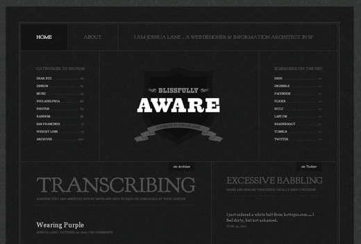
Blissfully Aware
Black is used for the background, meanwhile white bold typography is used to grab the reader’s attention. The layout of the website is simple yet appealing.

Screenshot

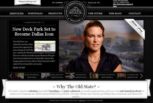
The Old State
This is one of the most interactive black and white websites in the list with a very sylish and elegant look.

Screenshot

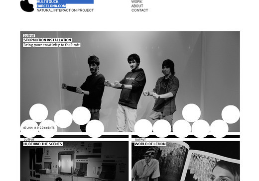
Multitouch Barcelona
A very simple and beautiful website design. As you scroll down through the website, there are elements that playfully follow you down the site.

Screenshot

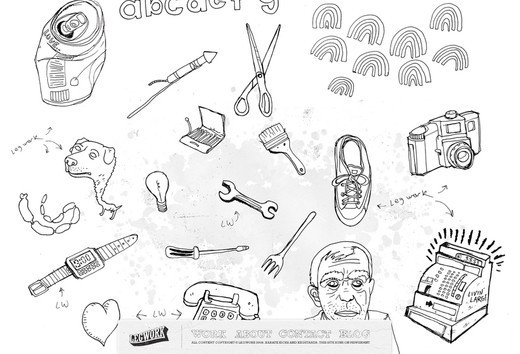
Leg Work Studio
The website is full of sketched elements that are actually clickable, and help to navigate the users to all of the relevant content.

Screenshot

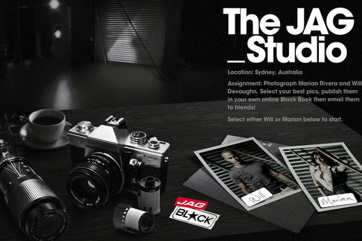
Jag Jeans
This is not a conventional black and white website. The designer has put loads of creativity and imagination into this site.

Screenshot

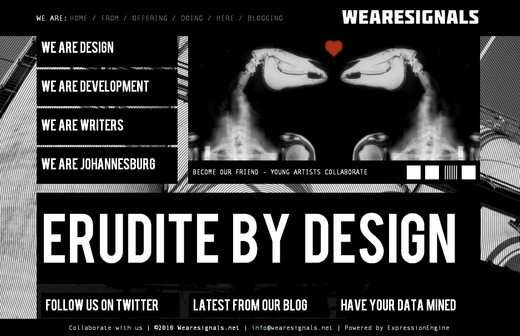
We are Signals
A very interactive web design that uses lots of bold typography throughout the site. Mouse over effect is great.

Screenshot

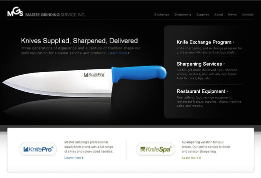
Master Grinding
The website only contains black and white colors which puts the emphasis on the key ingredients of the design and grabs the attention on the first look.

Screenshot

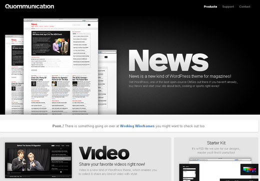
Quommunication
White color font is used against black background that looks awesomely appealing. The images used also add a visual interest to the overall look.

Screenshot

Made by Sofa
A black and white website design that is created on the concept of minimalism. Simple and effective.

Screenshot

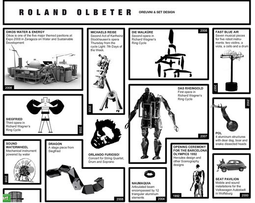
Olbeter
A very unusual design concept that sets this website apart from others. Special attention is given to the graphics used that is truly inspirational.

Screenshot

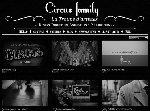
Circus
The hover effect on this website is simply marvelous that even makes you forget the absence of colors.

Screenshot

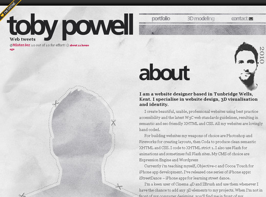
Toby Powell
This is not a pure black and white website design rather the mixture of white and grey color to give the design a much more subtle look.

Screenshot

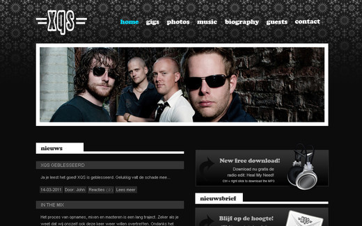
XQS Band
Here the designer brilliantly uses the black and white to set off the touch of light blue color which adds a nice spark.

Screenshot

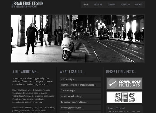
Urban Edge Design
A pure classic black and white website design using an emotive and beautiful black and white photograph to set off the introduction to the site.

Screenshot

CSS Tinderbox
Excellent use of typography that is the main attraction of this web design. Apart from the typography, the layout of this web design also adds beauty to the overall concept.

Screenshot

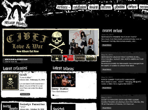
Hell Cat
You will find a bit of color variation in this web design, with splashes of red thrown in here and there, but overall the site sticks to the use of black and white.

Screenshot

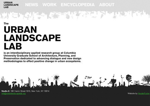
Urban Landscape Lab
In this web design the main color that was used is white. Clear and bold black typography is used against the white background which stands out brilliantly.

Screenshot

Leahhaggar
This is one of the simplest yet most appealing and effective black and white website designs featured. The precision and neatness is the main attraction for this web design.

Screenshot

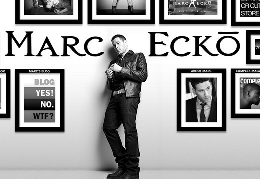
Marc Ecko
This particular design of black and white website is a milestone that inspires loads of designers to create something out of the ordinary.

Screenshot

Marcin Kaniewski
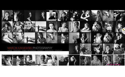
So many images are incorporated within the design yet look so appealing even without the colors. This website design proves that colors are not necessarily required to showcase your creativity.

Screenshot

The Old Fashioned
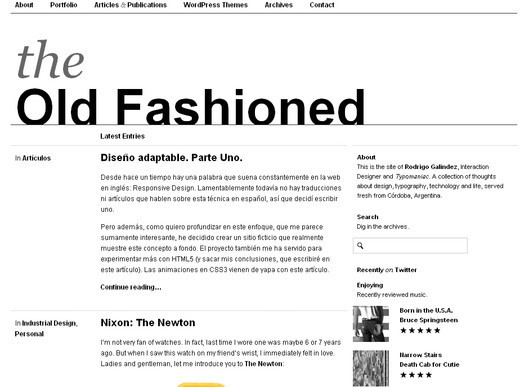
A very neat and clean black and white website design that not only captures the attention of the onlookers but also displays the information in the cleanest of ways.

Screenshot

M1k3
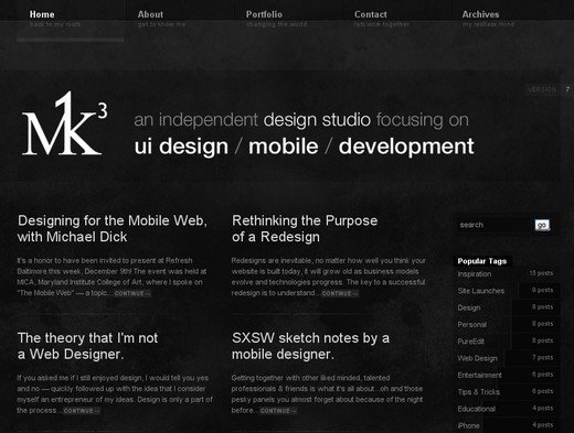
A simple and minimalist website design that although does not showcase loads of graphical elements, the presentation of text and the typography make this website compelling.

Screenshot

Dragon Interactive
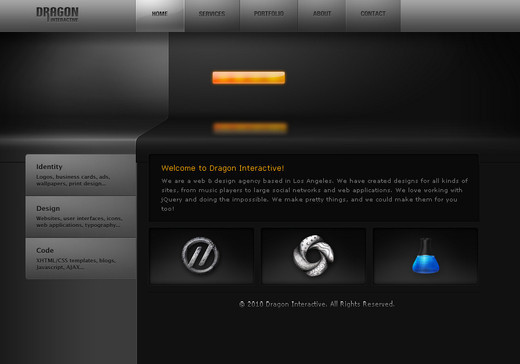
This website design comes with an interactive header. Although the website main colors are black and white, the hover effect brings a very beautiful blue shade to the design.

Screenshot

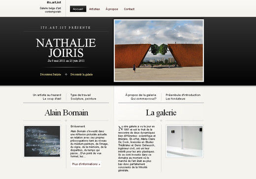
Its Artist
A very neat and clean website with a white background and minimal graphical element to put emphasis on the content of the site.

Screenshot

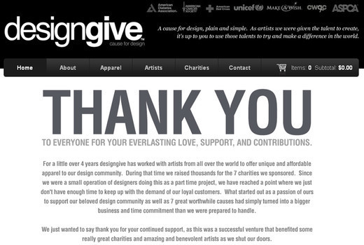
Design Give
A very unusual website design that mainly focuses on the products the website offers, and uses the design to help place this emphasis.

Screenshot

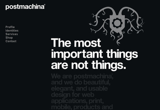
Postmachina
A black and white website that is designed on the concept of minimalism having a single insignia as the only graphical element.

Screenshot

Expression Tints
Another beautiful example that proves creativity has no limit. Appealing typography is used against the black background.

Screenshot

So Your Style
This website has created its own style. The only clickable area is the upper left corner of the website while the rest of the web page does not contain any element or content.

Screenshot

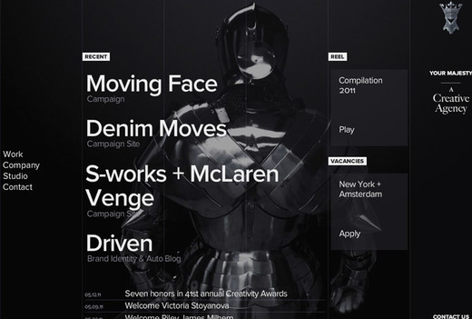
Your Majesty
The website takes some time to load but once it is loaded completely, you can see how differently the artist has designed it making the site stand out from the rest.

Screenshot

Toopix Creative
This web design is full of interactive and creative elements. Click on the element you wish to browse through and experience a whole new world of creativeness.

Screenshot

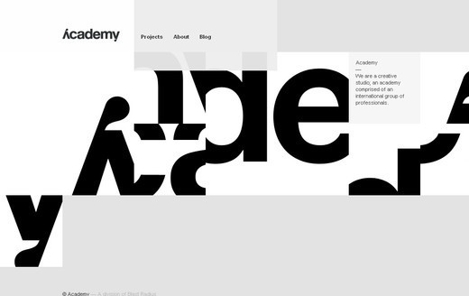
We are Academy
The main area of focus is their projects that they completed with flying colors. The background of the website changes every time you visit.

Screenshot

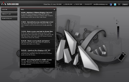
Moxie Displays
Main emphasis is on the graphics and visual representation of the web elements. You will not only enjoy browsing through the website but will also be amazed to see the creative approach of the designer.

Screenshot

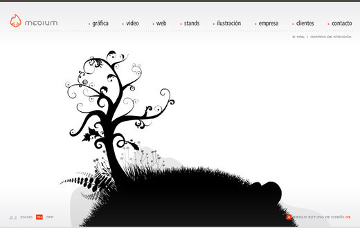
Medium
Adobe Flash is required to view this website properly. Extremely awesome graphics are used here that grabs the attention.

Screenshot

Establishednyc
Images and graphics will appear as you move your mouse with the arrows present at the corner of the website. The main area of the web page is occupied with the text links.

Screenshot

Store Comintl
This website is divided into two colors; the upper half has white background with black text links and the lower half has the black ground with white text links and interactive graphics.

Screenshot

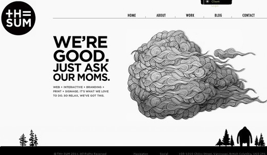
The Sum
The pure white background is the most appealing element of this web design. Neat and clean web design.

Screenshot

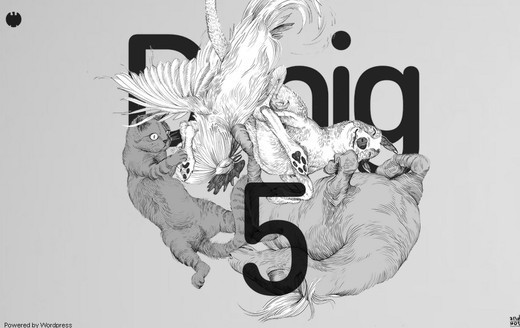
Design made in Germany
The website is designed with two colors in such a way that you do not even realize that there is no other color present in the web design.

Screenshot

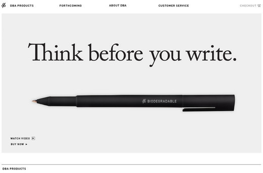
DBA Co.
A very elegant web design that not only appeals to your eyes but also gives you a soothing feeling.

Screenshot

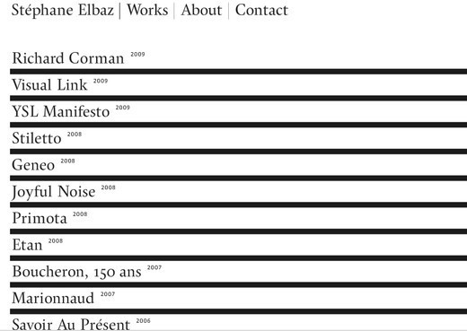
Stephaneelbaz
Again, this site has a very unusual use of the hover effect. No clichés and clutter elements, only the necessary elements are placed here.

Screenshot

You are Beautiful
A very unique navigation style is employed on this bold, clean design, with light splashes of color thrown in for contrast.

Screenshot

You may also want to consider our previous posts:

(rb)


How To Build A Better Web Application For Your Business

Advertisement in How To Build A Better Web Application For Your Business
 in How To Build A Better Web Application For Your Business  in How To Build A Better Web Application For Your Business  in How To Build A Better Web Application For Your Business

Are you fed up with hearing about yet another Silicon Valley Web application built with fairy dust and funded by magic pixies? If so, this post is for you. Most of us will never get to work on a Web application that is funded by venture capital and for which the business aims are a secondary consideration. For us, developing a Web application is about meeting a particular business need as part of our job working with some large organization.

Whether as an in-house developer or as part of an agency, we work under strict business constraints and with limited budget and time. Personally, I thrive on this. But it is challenging, so finding the right approach is crucial. In my time of working on Web applications for businesses, I have identified three secrets that seem to make things go a lot smoother:

  1. Focus on user tasks and not features,
  2. Don’t try to solve everything and
  3. Ask the right questions early on.

Let’s begin by looking at user tasks:

Focus On User Tasks, Not Features

When you’re asked to build a Web application, you do exactly that: build a Web application. You have not been asked to solve a business problem, nor to make it easy for the user group to complete a particular task. Instead (at least in my experience), your job is to add certain features and build a specific type of application.

Unfortunately, this is a dangerous approach. By focusing on the application you are building, the emphasis is firmly on technology and functionality, not the users’ needs or the underlying problem to be solved.

Take a Step Back

A good development team will step back at the beginning of a project and look at the underlying issues that have led to the application being initiated.

  • Spend time with those who will use the application. Observing how users complete the tasks you are trying to simplify is more enlightening than any specification document.
  • Actually speaking to those who will be interacting with your application on a daily basis will create a much more effective solution than blindly following the directives of whoever commissioned the project.

Make User Testing Part of the Development Process

User testing is key to getting to know the user. Aim to test the application at least once a month throughout the entire development cycle. This does not need to be expensive or time-consuming. Rather, each session needs only three or four users and should be easily completed within a morning. This allows the entire development team to take part in these sessions and be involved in the debriefing, which can happen over lunch.

Books1 in How To Build A Better Web Application For Your Business
For more information on this “budget� approach to usability, I recommend Steve Krug’s latest book Rocket Surgery Made Easy.

When it comes to building Web applications for the business, task completion is king. Features merely exist to help users complete tasks.

Which brings me to the next secret…

Don’t Try To Solve Everything

If you fail to stay focused on user needs and business goals, things can get out of hand. These kinds of projects tend to suffer particularly badly from scope creep. Once people in your organization see the potential of the application, they will start suggesting ideas for new functionality. The problem is that with every new feature comes more complexity. This can ultimately undermine the effectiveness of the app. When developing a Web application, I urge our clients to start simple.

  • Predicting how users will respond to your application can be hard, and a lot of time and money can be wasted building features that no one actually uses.

Monitor Your Key Performance Indicators

Once the simple application has launched, move into a phase of monitoring key performance indicators. This will help you judge the success of the app.

The indicators will vary between projects. However, establishing at the beginning of the process how the success of the app will be measured is important. Combined with user feedback, this monitoring provides a clearer picture of where you should go next. But be careful with user feedback.

Don’t Overreact to User Feedback

Users often react negatively to change. Learning a new system takes time, even if it ultimately is easier to use. Users will inevitably complain and make a plethora of suggestions.

Don’t react too quickly to these suggestions. Daniel Burka once told me from his time at Digg that they allow at least two weeks before reacting to user feedback. Allow users time to adjust to the application before making changes.

Facebook-changes in How To Build A Better Web Application For Your Business
Users don’t like change, as Facebook has discovered.

But that is not an excuse for ignoring the opinions of users. In fact, you should carefully gather as much feedback as you can.

Sometimes Technology Is Not the Answer

Interestingly, many of the suggestions made by project stakeholders (not users) revolve around management issues, such as reporting, workflow and monitoring.

While these suggestions are sometimes valid, I have found that the simplest solution to these problems is usually managerial, not technical. For example, a number of clients have asked me for workflow functionality in their content management systems, so that documents cannot be published without approval from elsewhere in the organization. Of course, this is entirely possible to build. In fact, it comes standard in most content management systems.

But I usually wonder whether it would be easier just to tell content providers not to publish a document before it’s checked by someone else. Does this really need a technical solution when a simple policy would do the job?

If more features add more complexity, perhaps we should not solve every problem with a new feature. We could always add that functionality later if it really is required. Of course, that depends on whether the application is easy to expand.

Make It Expandable

Because our feature set is likely to change based on user feedback and business aims, building the application in anything but the most flexible way would be unwise, especially if we purposely haven’t added all of the intended functionality for launch.

Making an application flexible is obviously not easy. But if the application has a plug-in infrastructure from the beginning, then adapting it over time becomes easier. The trick is to recognize from the outset of the project that you do need flexibility. Which brings us to the next point:

Ask the Right Questions Early On

When building a Web application, nothing is worse than surprises. Make sure you have all the facts before beginning. Of course, you cannot know what you don’t know. But the trick is to know the right questions to ask before building. Too often, we focus on the wrong types of questions, such as:

  • Will this application get internal approval?
  • How will person X respond if we take this approach?
  • Does this conform to our branding guidelines?
  • How will this content be managed internally?

Focusing on these kinds of internal-facing questions may get the project approved faster, but it will lead to a far less effective application. In my experience, four particular questions, if neglected, will cause most problems in the development process:

  1. What is the hosting environment?
    When dealing with complex Web applications, knowing the hosting environment is important. Without knowing the environment, you cannot replicate it exactly on your development server, which increases the risk of incompatibilities down the line.
  2. How will users be authenticated?
    Most Web applications require users to identify themselves. Realizing late in the game that this authentication has to happen a particular way or be integrated with some legacy system creates all kinds of headaches. Many companies have a central user-authentication system, and your application will probably have to use it.
  3. How will data be backed up?
    Web applications often hold valuable data, some of which is confidential. This means that having a solid back-up plan is both business-critical and potentially complicated. By considering from the outset how to handle back-ups, you keep this from becoming a serious problem later in the development process.
  4. Is there any legacy data?
    Many new applications will replace existing systems that contain a lot of legacy data. Knowing exactly what this data is and having a plan in place to migrate it to the new system is important.

Learn From Your Mistakes

Every Web application presents unique challenges. Over time, though, you learn from your mistakes and discover the key issues. Whether it is focusing on users’ needs, keeping things simple or asking the right questions, these lessons will be invaluable going forward.

However, there is also an opportunity to learn from one another. Unfortunately, many development teams toil away in isolation within large organizations. Articles like this should stimulate discussion and encourage us to share our experiences — both good and bad — of working on these little-heard-of Web apps.

I hope you will take the time to share your experiences in the comments, so that we can come up with new best practice for developing Web applications in our businesses.

(al) (il)


© Paul Boag for Smashing Magazine, 2011.


  •   
  • Copyright © 1996-2010 BlogmyQuery - BMQ. All rights reserved.
    iDream theme by Templates Next | Powered by WordPress