Archive for December, 2011

How Do You Deal With Overstressed, Irrational Clients? An Entrepreneur’s View


As an entrepreneur who has been on the client’s side of the design and development process, I’d like to discuss the thought process of the client, as well as some effective ways to interact with them. For example, why do they ask for Shakira music on the home page? And how do you respond to that?

I was recently referred to Sam Barnes’ piece on Smashing Magazine “How to Explain to Clients That They Are Wrong.� The article was well written and made a lot of sense to me, but there are two sides to every story, and I’d like to add value to the argument by responding from the client’s point of view.

For the most part, Sam did a great job of discussing how to evaluate and act on poor decisions made by clients. What he missed, however, was the impact that the nature of the relationship between clients and creatives has on how decisions are made by both sides. By “creatives,� I mean anyone involved in the design or development of a website or application. Understanding this relationship will enable you, and your clients, to make better decisions about the product.

What’s On the Line For Us

Before getting into the decisions that entrepreneurs make, let’s look at some of the factors that motivate these decisions. Setting the scene will shine a light on the thought process of entrepreneurs and give you a better idea of how to deal with them.

You’ll notice I use the terms “entrepreneur� and “client� interchangeably. Even if your client works within the confines of a corporation, as opposed to at the top of a new venture, it would not be unusual for them to act in an entrepreneurial capacity. And even if they aren’t entrepreneurs, but middle men who were assigned the project, chances are they will still behave accordingly.

Formal design reviews
How do you deal with clients who often come up with weird, irrational requests? Image source

First, let’s think about the person you’re working with. They believe in an idea. They believe in it so much that they’ve left a paying job for it. They’ve worked nights and weekends for it, alienated their spouse, friends and family for it. They’ve begged, borrowed and stolen for the opportunity to pursue it. They’ve put everything on the line for their idea, their vision. And you know what the most important part of their vision is?

You.

It’s not them. And to be honest, it never really was. The first question investors ask after hearing someone’s idea is, “OK, who’s building it?� Your client knows that their creative team is the only thing that can make their idea a reality.

You’re the most important piece of their puzzle, and, despite what they tell themselves, what they know about you before starting the project is often limited.

So, how did they find you?

Clients turn over every stone in search of a designer or developer, because, by that time, the necessity of a good creative team has settled in. Entrepreneurs might look harder than others because of the pressure of their particular situation, but the importance of a good creative team is lost on no one. And this isn’t like finding a lawyer, a doctor or even a girlfriend.

It’s way harder.

The Leap of Faith

There are three gigantic problems with the process of finding a creative team. First, the client has probably never done this before. Secondly, finding a creative team is tough. Products such as Elegant.ly will help, but because clients generally don’t speak your language, assessing the strengths of a firm and how it would mesh with their product is difficult. When the team I picked told me they were experts in Ruby on Rails, my first thought was, “Is that a train or a restaurant?� Thirdly, and by far the most important point, for those of us not in the Web design or development community, feeling comfortable with our evaluation of creatives is impossible.

This is a relatively young industry, one with very low barriers to entry. Heck, my designer took his first client when he was 13. There are very few, if any, metrics we can use to evaluate a creative team. We can look at its past work, speak with the head of the team and maybe get some sort of sample or mock-up, but for the most part, we are flying blind. There are no requisite degrees, certifications or guarantees. If you go to a physician who hasn’t finished college, you probably wouldn’t be willing to let them operate on you. A developer who hasn’t gone to college could build you the next Foursquare.

The Search

In our search for a creative team, we come upon cousins and uncles of acquaintances, people who have designed investor-relations websites for Fortune 500 companies, people who wait tables but build iPhone apps on weekends. We have absolutely no idea what to think of all this.

First-time clients especially don’t understand how hard their product is to create, or how long creative design takes, or even if you’ve done this sort of work before. It’s all Japanese to them, and it’s an enormous leap of faith. All we can do is look at some of your prior work and decide whether we like it. In what other sphere of life would you make a decision this important on a gut reaction? (Wait, don’t answer that.) It’d be like grabbing someone at the grocery store and asking them to marry you because you both have Fruit Loops in your carts.

Even when we look at successful companies in our fields, their success is not always commensurate with the development or design of their products. Take Craigslist: great business idea, poor design; but it doesn’t matter because the content is great. On the other hand, Flipboard’s design is fantastic, and that’s enough to make the product successful, even although its functionality isn’t really revolutionary.

Flipboard
Flipboard.

Grasping For Control

With reservations and doubts lingering in the back of the client’s mind, in steps the creative team. You start pumping stories into Basecamp, PivotalTracker or some other product-management system that the client’s never heard of, and suddenly they are on your turf. Now the client works when you work, and often sits quietly on their hands when you don’t. The product goes when you say it goes, and their input is limited. Worst of all, we flat out don’t understand what you’re doing.

This is extremely hard for people who are used to complete control. Your client has gained so much momentum to get to this point that, when the creative team takes charge, the ground drops from under them like they’re some unfortunate cartoon character. This reversal of control is jarring.

This would be fine if the entrepreneur was working with a lawyer, an accountant or even a bank. But early on in the life cycle of a company that depends on a creative team for its success, nothing, and I mean nothing, is as important as the creative team. And our control over the success of this phase is so limited. That’s why we make uninformed suggestions like, “Let’s make that @ symbol spin,� and “I think users would like some Shakira playing when they land on the home page. I know I would.� Because we’re grasping at straws.

We are trying to hold onto our vision, because suddenly it’s in your hands. We may know what we want, but we often don’t know how to do it, and we have trouble expressing it. I’ve often found myself telling my developer things like, “I want a magic search box that pulls information from the Facebook API [I learned that term a few months ago, no big deal], Twitter and Foursquare and spits out relevant people based on our compatibility algorithm,� only to have him respond, “… Yeah. Let’s start by allowing users to log in with their Facebook account.�

I know how I want the product to feel to the user, but I have no idea how to get there without my team’s help. Saying, “I want it really simple, easy to use and elegant� is not helpful. Grasping at some visual element that we comprehend is sometimes the only bullet in our gun.

So, How Do You Deal With Overstressed, Irrational Clients?

Now you have an idea of the sometimes fragile psyche of the client. The question is, how do you handle us when we say we want Shakira?

Sam’s points are all well taken and, for the most part, right on. But they are directed at a rational, faceless client. The overview is good, but implementing it in real life would be difficult. So, here is the perspective of a client with a face. The following five actionable tips should drastically help your client relationships.

  1. Show us.
    This one is the most important. It’s very hard for us to visualize our idea. We know how we want the product to feel, but we don’t know how to get there. We would certainly recognize that Shakira isn’t the answer if you showed us this on our website — or on a comparable website if building our mistake would be too time-consuming. Usually, if the client was savvy enough to get to this step in the process, they would know what works and what doesn’t. And if they don’t, their idea is hopeless anyway.
  2. Tell us.
    This one wasn’t in Sam’s points. Good entrepreneurs are flexible and can adjust their vision to meet the reality of the situation. If we want something, but you think it would take too long and not be worthwhile, tell us. Suggest a workaround if you want, or just ask us if there’s another way. Entrepreneurs are usually great at creative solutions; we make our living by avoiding barriers. But we can only avoid barriers if we know what they are.
  3. Explain the rules of the game.
    If you’re building a basketball, you know what you can and can’t do. You could probably make one that’s bouncier or more durable than competing products. But you couldn’t make one that goes in the basket every time. You know your limitations, but sometimes we don’t, and creativity is only able to flourish inside the box of reality. Because we don’t know the rules of the design and development game, we often don’t know what’s possible. More often than not, we’ll assume that something isn’t possible when it actually is. The head of my creative team had a good solution for this: he created a folder of ridiculous ideas that I wished could be part of the website, and I dumped stuff in there from time to time. More often than not, he’d ping me saying, “Hey Brian, that’s possible. Let’s try it out.� Being creative is difficult when the canvas is blank. If you can give us a line to start with, some sense of what you are capable of, it’ll help us enormously on the creative side.
  4. Be confident and enthusiastic.
    Everyone appreciates an expert. Sam touches on this, and it’s extremely important. When I told my designer that I was considering profile pages that end users could design, he said something like, “Well, it certainly worked for MySpace.� Point taken. Demonstrating your expertise puts clients at ease and instills trust in your decision-making abilities. Also, don’t be afraid to occasionally ask for forgiveness rather than permission (as long as the change is not customer-facing). It will reaffirm that we made the right decision. Nothing is more invigorating than someone who believes in your vision.
  5. We can’t act like locals.
    Clients aren’t completely oblivious to their mistakes, either. They know that some of their suggestions are absurd. They know that they don’t understand this stuff one-tenth as well as you do. They know they’ve stepped into a subculture that they couldn’t possibly fit into. It’s like when you go on a ski vacation and try to act like the locals. No matter what you do, you won’t be one. And we hate that we are an outsider in your world. That manifests itself in a number of ways: weird suggestions, holding firm on an irrelevant point, demanding certain color schemes that probably don’t matter (but sometimes do). This will still happen, but now that you know where they’re coming from and how to assuage them, you should hopefully have a more effective connection with clients. On the flip side, expect to be treated with the same level of suspicion and hesitation when you step into our world. Sam urges you to speak the client’s language, to set goals in business terms. Be very careful with that one. Misusing one business buzzword can waste your credibility, just as one suggestion for a spinning @ symbol will make you wary of any other design ideas. Discussing markets that you have exposure to but aren’t immersed in can have adverse effects. Know that we are all tourists. Which leads to the final point.

The Odd Couple

In writing this article, I realized how odd the relationship is between creatives and clients. Without my creative team, I would have no shot at getting my company off the ground. I rely on them 100%, but I have no clue what they do, how they do it or if the work they do is reasonably priced. This forces me to try to speak their language, to attempt to enter their world by learning quickly, and to try to maintain control of a vision that they are responsible for bringing to life.

Creatives, on the other hand, rely on clients only somewhat. They don’t live and die by each project, as clients do. Their work is in great demand; many of the firms I considered are growing quickly in this recession.

However, bits and pieces of Web design and development work are slowly being fragmented and commoditized, and for the same reasons that evaluating designers and developers is difficult: the barriers to entry are low. This opens the door for 99Designs to pick off clients, especially vulnerable entrepreneurs. These services leverage the crowdsourced model by matching designers who have little or no experience with clients who don’t understand the nuances of the craft well enough to be able to tell. This pushes creative firms to differentiate themselves through means that clients can understand. Business acumen is an incredibly helpful skill for creatives to have, and something 99Designs can’t offer.

Summary

So, we’re left with two groups, each possibly operating in unknown waters, working to create a product that requires both of them to be firing on all cylinders in order to succeed. That being said, do business-savvy creatives exist? Heck, yeah. I’ve got them helping me build my company, and it makes all the difference in the world. Do design- or development-savvy entrepreneurs exist? Probably. I’ve got a Mac — does that count?

The goal is to establish a working relationship between the two parties that leverages the strengths of each to quickly and effectively create a product and bring it to market. The tips above should help those working on the creative side. I’d be interested to hear a designer or developer’s take on what I should be doing to get the best out of my creative team. After all, we’ve got to have more in common than liking Fruit Loops for this thing to work.

Go easy on us poor entrepreneurs. I realize we make dumb suggestions sometimes, but it’s just an attempt to maintain some control over a process that we occasionally feel we’ve lost control over. And consider the business decisions that clients make from both sides. We’ve had a lot of practice with this stuff.

Related Articles:

You might be interested in the following related articles:

(al)


© Brian Scordato for Smashing Magazine, 2011.


An Inspired Collection of Free Live Wallpapers for Android


Since we have been compiling wallpapers for our readers, we wanted to turn our decorating eye towards the Android series of devices as we have not had a dedicated wallpaper post for those users. Today we address this with a collection of wonderful live wallpapers specifically targeted at the Android line. These animated backgrounds have been a big draw for users since Android introduced them with version 2.1.

The problem many Android users run into is that there are so many of the live wallpapers out there and loads that are not very stable, or worse, just do not work. Then there are those which are somewhat uninspired. So we decided to sort through the hordes and bring our readers some of the cream of the crop. Below is a selection of backgrounds that we hope you will get some use out of. Or at least a little inspiration.

Get Live

White Christmas

Get it here!

Steampunk Skull

Get it here!

Captain America

Get it here!

Rotating Live Wallpaper

Get it here!

Nicky Bubbles Lite

Get it here!

Digital Wall

Get it here!

Butterfly Dream-Cool Free

Get it here!

Blooming Night

Get it here!

Biomechanical Bog Free

Get it here!

Christmas Tree

Get it here!

Melody

Get it here!

Biomechanical Skull

Get it here!

Summer Time Scene Lite

Get it here!

Lake View Scene Lite

Get it here!

Aquarium

Get it here!

Night Shadow Lite

Get it here!

Analogy Clock

Get it here!

Fractal Clock

Get it here!

Dandelion Field

Get it here!

Feng Shui Yinyang

Get it here!

Mystical Life Basic

Get it here!

WP Clock Light

Get it here!

NeonGears Basic

Get it here!

Mystic Halo

Get it here!

Musical Note

Get it here!

Sweet Tree Free

Get it here!

Love Creatures Lite

Get it here!

Celtic Garden Free

Get it here!

Pixel Rain

Get it here!

Ladybug

Get it here!

(rb)


Secret Symphony: The Ultimate Guide to Readable Web Typography

Right now, there’s a mathematical symphony happening on your website.

Every single one of your readers is subconsciously aware of this symphony, and more important, they are all pre-programmed to respond to it in a particular way.

The question is this:

Is your site’s symphony pleasing and inviting to your readers, or does it turn them off and make it harder to communicate with them?

The Mathematical Symphony of Typography

As it turns out, this symphony is not unique to websites. You “hear” it every time you read a book, newspaper, magazine, or web site—every place where typography exists.

At first glance, you might think that typography and math have nothing to do with one another. After all, typography consists of letters and words, and math is…well…numbers.

But the truth is, typography is a combination of artistic letterforms and mathematical proportions, an exquisite marriage of form and function.

When the mathematical proportions of your typography are harmonious, your site—and your content, specifically—look appealing to readers.

Conversely, when the proportions of your typography are imbalanced, your content isn’t as attractive to readers, and your site seems cluttered and disorganized.

The bottom line is this:

The mathematical proportions of your typography are vitally important to how readers perceive both your site and your content.

So how can you tweak the proportions of your typography to create a beautiful mathematical symphony?

Let’s take a trip down the typographical rabbit hole and find out!

The 3 Fundamental Dimensions of Typography

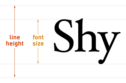
Every paragraph you’ve ever seen has 3 primary dimensions. The first two, font size and line height, are vertical in nature.

Font size and line height

Figure 1. How font size and line height work in web browsers. Font size is measured from the top of a capital letter (S) to the bottom of descending characters (y). Half the line height extends both up and down from the centerline of the text.

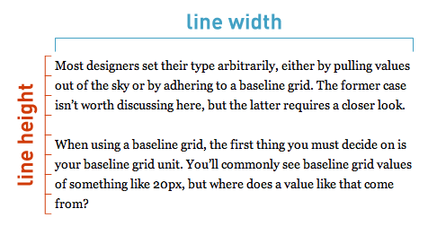
The third dimension, line width, is horizontal.

Line height and line width

Figure 2. Line height and line width form the vertical and horizontal dimensions of typography.

Taken together, these 3 dimensions are responsible for how you perceive typography.

To get a feel for how these dimensions work together, it’s helpful to look at a few text samples where one dimension is varied and the others are held constant. This way, you’ll be able to see the effect that each dimension has on the other two.

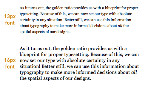
In Figure 3 below, the line height and line width are fixed, and the font size is varied from 13 to 16px.

Variable font size with constant line height and line width

Figure 3. With the line height and line width held constant, it’s clear that larger font sizes require larger line heights to maintain both proportion and readability.

In the first paragraph of Figure 3, the line height is large enough relative to the font size to produce generous whitespace between the lines of text. However, in the second paragraph, the line height is not large enough relative to the font size to yield sufficient whitespace, and it looks cramped as a result.

This leads to an important conclusion: As font sizes increase, line heights must also increase in order to maintain the geometric proportions of a paragraph. In other words:

Font size and line height are proportionally related.

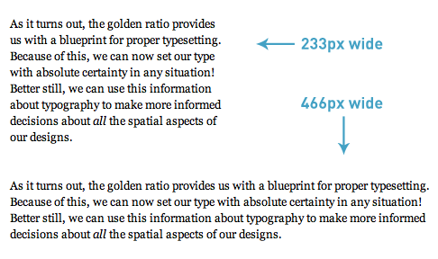
In the next example, the font size and line height are fixed, and the line width is varied from 233 to 466px.

Variable line width with constant font size and line height

Figure 4. As the line width is increased, the text becomes harder to read because the line height has not been increased to offset the effect of the width.

Despite the fact that the line heights are the same in the two paragraphs of Figure 4, their readability is quite different because of the differing line widths.

As the line width gets longer, it becomes more difficult to perform a return sweep (the movement of the eyes from the end of one line to the beginning of the next) unless the line height is also increased to account for this effect.

Research confirms this conclusion, too. In a 2004 study from the University of Reading (how ironic), Mary C. Dyson states:

Long line lengths are said to need more interlinear spacing to ensure that the eyes locate the next line down accurately when executing a return sweep…

Bottom line? It’s clear that line heights and line widths are mathematically related in some way. More specifically:

For any font size, the line height must increase as the line width increases.

But what is the exact mathematical nature of this relationship?

Harmonious Proportions and the Golden Ratio

Answering this question might be easier than it first seems because nature has given us a remarkable blueprint for beautiful and effective proportionality.

Evident in plants, animals, the shape of galaxies, and even your DNA, this proportionality blueprint is so pervasive that humans have noticed it for thousands of years. We’ve used it, too—it can be seen in art and architecture throughout history.

So what is this incredible proportion that “really ties the room together?”

I’m talking, of course, about the golden ratio.

When nature needs a proportion to relate things and to provide order on any scale, it tends to use the golden ratio.

With typography, the goal is to relate font size, line height, and line width in an aesthetically pleasing and orderly way.

Could it be, then, that the golden ratio is applicable to typography as well?

The Mathematics of Golden Ratio Typography

As you probably guessed, the answer is an emphatic yes! Here’s how it works:

First, the font size (f) and line height (l) are proportionally related through a ratio (h). Mathematically, this is about as simple as it gets, and the basic equation looks like this:

Line height equation

In the equation above, the optimal line height is produced when h equals the golden ratio (φ). This insight gives us the following equation:

Optimal line height equation

Unfortunately, just knowing the optimal line height for a given font size is not enough.

Earlier, you saw that all 3 typographical dimensions—font size, line height, and line width—affect one another. Therefore, you cannot talk about line height or font size without also considering the line width.

Based on this reasoning, there must also be an optimal line width that corresponds to the optimal line height from the equation above.

Problem is, you don’t know the exact relationship between line width and line height. All you know for sure is that the line width is significantly greater than the line height.

With the help of basic mathematical modeling, you can make an educated guess that the relationship between the optimal line height and line width is exponential. Here’s the simplest equation to express that:

Optimal line width equation

This is remarkable because now, for the first time, you have a solid mathematical basis for the relationship between font size, line height, and line width.

Note to designers: Golden Ratio Typography is intended to serve as a basis for proper typesetting. Factors such as x-height and other typeface metrics also influence typography and should be considered in finalized designs. Golden Ratio Typography provides the most rational starting point for adjustments of this nature.

There’s one little problem here, though: The web isn’t nearly as precise as these equations.

You see, web designers are constrained to using integer values for things like font size, line height, and line width (this will be the case until sub-pixel rendering becomes a reality).

The above equations all yield highly precise decimal values, and simply rounding the answers to the nearest integer produces significant errors that will cause your resulting typographical proportions to be imprecise.

The bottom line is that the web is not optimal, and therefore, the optimal equations presented above are insufficient for fine-tuning your typography in the real world.

Ultimately, if you want precise Golden Ratio Typography on your website, then you’re going to need some tuning equations.

Fine-tuning Golden Ratio Typography for the Web

To understand how typographical tuning works, let’s look at an example.

For a font size of 16px, the perfect line height is achieved when h equals the golden ratio. This yields a value of 25.88854px for the optimal line height. Using this value, you can then determine that the associated optimal line width is 670.21670px.

Optimal line height calculation for size 16 font

Optimal line width calculation for size 16 font

If you tried to use these values in your site’s CSS, you’d encounter problems.

Because it only resolves integer values, the web cannot display a line height of 25.88854px. Instead, the best you could do for the line height is 26px.

But 26px is greater than the optimal line height given by the equations, and as you’ve seen, you cannot change the line height—not even a little bit!—without also changing the associated line width (otherwise, the resulting proportions would not be precisely “golden”).

Therefore, the process of rounding the line height from 25.88854px to 26px requires that the resulting line width be greater than 670.21670px.

This is the essence of typographical tuning:

If your line width is shorter than the optimal width, then your corresponding line height must be less than the golden ratio. Conversely, if your line width is longer than the optimal width, your corresponding line height must be greater than the golden ratio.

Here’s a graph to help illustrate this concept for the most commonly-used font sizes:

Line height vs. line width for common font sizes

Figure 5. As line widths increase, line heights must also increase to preserve geometric proportions and readability. The horizontal gray line in this graph represents the golden ratio (φ), and you can see how line heights behave relative to this value for the most commonly-used font sizes. Click to enlarge.

Mathematically speaking, the typographical tuning equations are more complicated than the equations you’ve already seen. Fortunately, I’ve done the heavy lifting here, so you can focus on the concept and the results.

Ultimately, you need two tuning equations for the different scenarios you will encounter while setting typography. Depending on the situation, you’ll need to determine:

  1. The adjusted line height, given a font size and line width
  2. The adjusted line width, given a font size and line height

Here are the equations to do just that:

Line height ratio tuning equation
Line width tuning equation

Using the second equation above, you can determine the adjusted line width for the aforementioned example situation of a 16px font size with an integer line height of 26px.

Adjusted line width for 16px font with a line height of 26px

The adjusted width, which will maintain golden typographical proportions for this scenario, is 685.32505px. For use on the web, this must be rounded to 685px.

Let’s look at another example that will hit closer to home (and this is how you can tune the typography on your own website right now):

What if you wanted to use a 16px font size in a content width of 550px? What should your adjusted line height be in this case?

Here’s how you’d solve that problem:

Sample line height ratio calculation

Sample line height calculation

The answer here is 25.00169px. Once again, this value must rounded to the nearest integer for use on the web, and this results in an adjusted line height of 25px.

Golden Ratio Typography Calculator

Obviously, doing a bunch of math every time you deal with typography will get tiresome very quickly.

To remedy this, I’ve created the Golden Ratio Typography Calculator, which makes it incredibly easy to determine the perfect typography for any situation!

Smart and versatile, the calculator will give you golden typographical recommendations based on the input you provide.

If you enter only a font size, the calculator will show you the optimal line height and line width for that font size.

If you enter only a width, the calculator will show you the best and second-best font size/line height combinations for that width.

If you enter both a font size and a width, you get the whole shebang:

  • Optimized typography for your font size and width
  • The best typography for the width you’ve provided
  • The second-best typography for the width you’ve provided
  • The optimal typography for the font size you’ve provided

Go play around with the Golden Ratio Typography Calculator and explore finely-tuned typography like never before!

The Incredible Impact of Golden Ratio Typography

I hinted at this earlier, but I want to make it clear: The stuff I’ve shared with you today doesn’t just apply to the web. In fact…

Golden Ratio Typography can be used to fine-tune the typography of any medium!

Books, newspapers, magazines, websites, e-readers, you name it—they can all benefit from the improved proportions that Golden Ratio Typography provides.

And now, as you begin to view the world through the lens of Golden Ratio Typography, you’ll notice countless opportunities for typographical optimization.

The Bottom Line

Golden proportions are evident throughout the universe, and they occur in places where form and function combine to produce a beautiful, effective, and useful result.

Remember the mathematical symphony of typography?

By employing Golden Ratio Typography, you’ll ensure that your site has a golden symphony that will appeal to everyone.


The Smashing Deals Countdown: Three More Days Till Christmas


As the end of the year approaches and the holidays near, many of you might already be pondering your new year’s resolution for 2012. Before you get back to serious business in the new year, you should lean back, relax, spend some quality time with loved ones, and give a good book or eBook a closer look. After all, you don’t want to fall behind just as the year begins, do you? This is an occasion to catch up on developments in the fields of Web design, Web development and coding.

The Smashing Bundle Countdown To Christmas

For each of the last seven days, we have been offering a different special bundled deal. We hope many of you have found an appealing offer in there, and we hope we were able to inspire some of you to get your colleagues and office friends a resourceful printed book or an eBook for the new year. In this post we’d like to kindly inform you about the books we’ve prepared for the last three days of our Bundle Countdown to Christmas and we are confident that they will make your visit to the Smashing Shop worthwhile.

The last three Smashing Christmas Bundle Deals
The last three Smashing Bundle Deals of the year.

December 22nd – “Mobile Bundle” for just $9.99 instead of $20.93
Today Santa is mobile and so you should be, too. The “Mobile Design” eBook offers everything you need to keep up in the mobile Web game. Insights, techniques, trends and tips on getting your own mobile app set up are only a few clicks away. In addition to that, we threw in a mobile portfolio for your work. Be prepared and start the new year by optimizing your future projects for mobile use.

December 23rd – “Coding Bundle” for $9.99 instead of $17.82
Coding night, jQuery bright… This bundle is a treat for all truly smashing coders. It covers CSS, jQuery and JavaScript at an intermediate level. The eBooks are all authored by experts of the respective field and offer the Smashing quality you are used to. Two of the three eBook have just been published. Be one of the first to enjoy the still dewy read!

December 24th – “Smashing Book Super Bundle (Print + Digital)” for $34.99 instead of $89.96
Finally, the Christmas Eve bundle deal is the grand finale. We are proud to present the Smashing Book Super Bundle with both printed and digital versions of the Smashing Book #1 and Smashing Book #2. Each book comes in a printed and a digital version (EPUB, PDF and MobiPocket formats). If you’ve been avoiding the Smashing Books until now, you won’t be able to pass them up any longer. Read some of the outstanding reviews that the Smashing Books have received, and let the readers themselves convince you.

Let’s Get Merry!

Now you’re all set for these last Smashing special bundled deals of the year. We sincerely hope you find our offers valuable to you and your colleagues, and perhaps you’ll find gifts for people who you never know what to give. Please keep in mind that all Christmas deals are valid only for 24 hours and then will be offered at the normal price.

Thank you for reading, dear friends. We wish our worldwide Smashing community a blissful last couple of weeks of the year. Enjoy the countdown to Christmas Eve and always remember to stay Smashing!

Yours sincerely,
The Smashing Team

(al)


© Smashing Editorial for Smashing Magazine, 2011.


Freebie: New Twitter Profile Page GUI PSD


Today we are glad to release a yet another freebie: a Twitter GUI PSD for the recently released Twitter UI update, designed by Jon Darke of Every Interaction and released exclusively for Smashing Magazine and its readers. The PSD provides the full mockup with all layers in vectors, allowing you to scale up the design elements without loss of quality. The set includes two versions: one for personal accounts and also the new Twitter Enhanced profile page with 835×90 header image for brands and advertisers. The set is compatible with Adobe Photoshop CS4+.

Twitter GUI Preview

Download the Set for free!

You can use the freebie for all your projects for free and without any restrictions. Please link to this article if you want to spread the word. You may modify the file as you wish.

Features

  • 100% pixel-accurate
  • 2 versions: personal and enhanced profile pages
  • All assets redrawn in vector, hence scalable
  • All layers labeled and grouped
  • Adobe Photoshop CS4+ compatible

Behind the Design

“As designers, we often produce various assets for our clients, be it their online presence on their Web pages or in social media. Hence, often we need to skin pages such as the Twitter profile pages for brands that we are working on. When those sites update their UI, we also need to update our resources in order to be able to display an accurate representation of what a client’s Twitter page would look like. So we thought that we could share the PSD file we created with the rest of the design community. Hopefully, it will help you save some time to focus on the creative work!”

Thanks Jon, we sincerely appreciate your time and your intentions!

(vf)


© Smashing Editorial for Smashing Magazine, 2011.


  •   
  • Copyright © 1996-2010 BlogmyQuery - BMQ. All rights reserved.
    iDream theme by Templates Next | Powered by WordPress