Archive for March, 2012

Desktop Wallpaper Calendar: April 2012


We always try our best to challenge your artistic abilities and produce some interesting, beautiful and creative artwork. And as designers we usually turn to different sources of inspiration. As a matter of fact, we’ve discovered the best one — desktop wallpapers that are a little more distinctive than the usual crowd. This creativity mission has been going on for over four years now, and we are very thankful to all designers who have contributed and are still diligently contributing each month.

We continue to nourish you with a monthly spoon of inspiration. This post features free desktop wallpapers created by artists across the globe for April 2012. Both versions with a calendar and without a calendar can be downloaded for free. It’s time to freshen up your wallpaper!

Please note that:

  • All images can be clicked on and lead to the preview of the wallpaper,
  • You can feature your work in our magazine by taking part in our Desktop Wallpaper Calendar series. We are regularly looking for creative designers and artists to be featured on Smashing Magazine. Are you one of them?

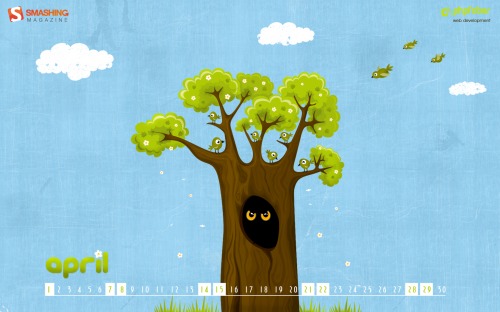
Noisy Neighbors

Designed by Katerina Bobkova from Ukraine.

Smashing Wallpaper - April 2012

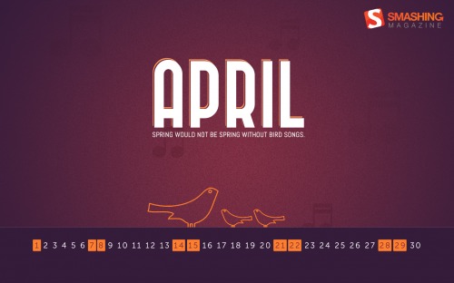
Bird Songs

"”Spring would not be spring without bird songs.” – Francis M. Chapman." Designed by Raymond Lopez from USA.

Smashing Wallpaper - April 2012

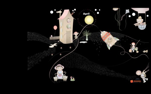
Bear On The Moon

Designed by Oxana Kostromina from Germany/Russia.

Smashing Wallpaper - April 2012

Retro Light Wall

Designed by Marian Cepa from Slovakia.

Smashing Wallpaper - April 2012

Happy In April

"Here’s to a cheery-even-when-it’s-raining kind of April!" Designed by Candace Jones from USA.

Smashing Wallpaper - April 2012

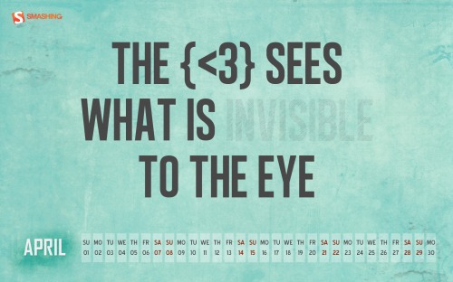
The Heart Sees What Is Invisible To The Eye

"What your sees and what your heart feels may not be same.The heart sees things more clearly than the eye. Best Example is feeling of love which can be feel and can never be seen. In Love, you will see what your heart wants you to see, to feel, to make you happy which an eye can’t see." Designed by Harshi Shah from India.

Smashing Wallpaper - April 2012

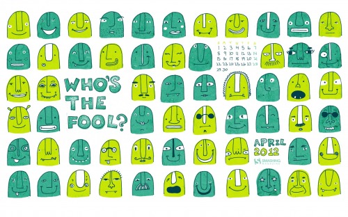
Who’s The Fool

Designed by Julia Factor from Israel.

Smashing Wallpaper - April 2012

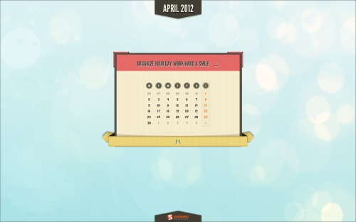
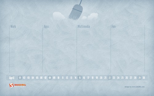
Tidy Desktop

"Spring time, cleaning time! Here’s a simple and clean calendar to help you keep your desktop nice and tidy." Designed by Axura from Italy.

Smashing Wallpaper - April 2012

Scrap April

"April is a month of love,dates and flowers." Designed by Irur from Ukraine.

Smashing Wallpaper - April 2012

Circus

"There are 48 more clowns in this picture. Find them all." Designed by Cheloveche.ru from Russia.

Smashing Wallpaper - April 2012

Vintage Times

Designed by Pietje Precies from The Netherlands.

Smashing Wallpaper - April 2012

The Big Burn

"Indoor Tanning is more risky than you think! It’s true! Before you go back to the tanning bed, get the real facts from real sources. Find out why youth are more at risk and discover the burning truth about indoor tanning." Designed by Zgm from Canada.

Smashing Wallpaper - April 2012

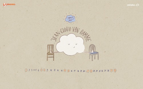
Jean-cloud Van Damme

"Hope that this little cloud will make you laugh. Happy Fools’ Day everybody)." Designed by Marika Smirnova From “oblako Studio” from Russia.

Smashing Wallpaper - April 2012

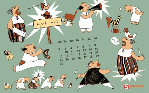
Busy April

"This wallpaper based on idea of Estonian folk tale. We want to believe we are very busy nation and that is our goal to be the best in everything :-)Springmonth is a good start to change life more active and busy. Of course there are little detail focused on Easter Holiday, too." Designed by Anne Pikkov from Estonia.

Smashing Wallpaper - April 2012

Graceful Descent

"Ahh, the warm, fat raindrops of Spring, gently floating to Earth. Don’t they look happy?" Designed by Matt Mink from USA.

Smashing Wallpaper - April 2012

Cherry Blossom

"The photo was taken in Toronto High Park in 2011." Designed by Tetyana Kovyrina from Canada.

Smashing Wallpaper - April 2012

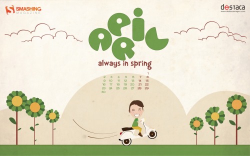
Always In Spring

"Color and optimism for everyone this spring." Designed by Destaca Imagen from Spain.

Smashing Wallpaper - April 2012

Spring Up !

"Energy-efficient wallpaper." Designed by Anna Pochodaj from Poland.

Smashing Wallpaper - April 2012

Dyed Easter Eggs

"Colored Easter Eggs were a really special part of my family’s Easter traditions. The eggs symbolize new life offered by Jesus’ death and resurrection on Easter." Designed by Evan Chiu from Cincinnati, OH, USA.

Smashing Wallpaper - April 2012

Bulbs

"April light is coming…" Designed by Dennis Nielsen from DK.

Smashing Wallpaper - April 2012

Sky Buster

"Get ready to lift you mood and get some new energy!" Designed by Pixeltoxhtml Team from India.

Smashing Wallpaper - April 2012

Funny Bunny

"Our funny bunny takes a look at the giant carrot in shape of an easter egg." Designed by Adconcept Werbeagentur Gmbh from Germany.

Smashing Wallpaper - April 2012

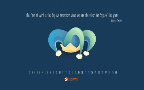
Fools Month

"Really liked this quote from Mark Twain, so wanted to design something around fools day on the first of the month." Designed by Martin Lucas from UK.

Smashing Wallpaper - April 2012

Spring Invasion

"Spring is here and you can’t hide! Just beware of viruses ‘cause you don’t want to stay inside on such a beautiful day." Designed by Nose Invaders from Sweden.

Smashing Wallpaper - April 2012

Life Is Beautiful

Designed by Christine Bradway from USA.

Smashing Wallpaper - April 2012

Skate Boarding Into April

"Brownie Bunny wishes all a blast into the 2nd quarter of the year! Stay cool, cute and green! =)." Designed by Lew Su-ann from Brunei Darussalam.

Smashing Wallpaper - April 2012

Along Came A Spider

Designed by Octavo Designs from USA.

Smashing Wallpaper - April 2012

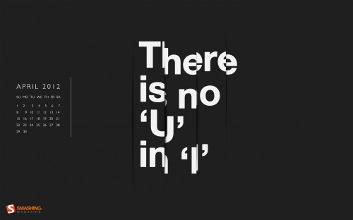
There’s No You In I

"There’s No You In I wallpaper typography, helvetica, minimal." Designed by Dan Ciobanu from UK.

Smashing Wallpaper - April 2012

Join In Next Month!

Please note that we respect and carefully consider the ideas and motivation behind each and every artist’s work. This is why we give all artists the full freedom to explore their creativity and express emotions and experience throughout their works. This is also why the themes of the wallpapers weren’t anyhow influenced by us, but rather designed from scratch by the artists themselves.

A big thank you to all designers for their participation. Join in next month!

What’s Your Favourite?

What’s your favorite theme or wallpaper for this month? Please let us know in the comment section below.

Stay creative and keep on smashing!

(il) (vf)


© Smashing Editorial for Smashing Magazine, 2012.


Exceptional Dribbble Invite Shots


Dribbble is one of the most famous online designers community. It’s an amazing gallery where people can show screenshots of their recent or upcoming works and share high-quality freebies with others. But Dribbble is not only place where you can show off your skills, it is also a source for inspiration, and a place where you can ask for an opinion or help from professionals in the field. Thus, this community can help you to become a more mature designer.

Since this site is a concentration of serious people not everyone can become a part of it. This is an invite only community, so the only way to get in is to earn a special invitation that can come either from players (invited members) or team.

What To Do To Become a Player?

First of all, prepare several mind-blowing designs or make screenshots of your best of the best previous works. Type of design does not matter. Your samples can be dedicated to website design, graphic design, icons design, typography, illustrations etc.

Secondly, sign up as a prospect and surf for a spare invitation in order to enter into the game. Be prepared, there will be a plenty of people who want to become a Dribbble player so you have to be very quick since invitations tend to go like hotcakes.

But never fear, members give away at least one invitation fairly often so you can bump into it anytime and someday become a proud part of all the action.

So What Should You Look For?

In order to facilitate your search we want to give you an idea of what these Dribbble invite shots tend to look like. With so many talented people involved in the community it should be no surprise that they create really unique and remarkable “invite to give away� shots. Many of them use this opportunity to create something special and show their creativity. Below is a showcase of some of these fantastic designs.

The Invite Shots

Lots of designers use brand colors and logos to draw attention.

1. By Eddie Lobanovskiy
Dribbble invite shot by Eddie Lobanovskiy

2. By Mike
Dribbble invite shot by Mike

3. By Christophe Tauziet
Dribbble invite shot by Christophe Tauziet

4. By Alfie Robles
Dribbble Invite shot by Alfie Robles

5. By Giorgio Pia
Dribbble invite shot by  Giorgio Pia

6. By Miika Fabritius
Dribbble invite shot by Miika Fabritius

7. By Román Jusdado
Dribbble invite shot by  Román Jusdado

8. By Catalin Fertu
Dribbble invite shot by  Catalin Fertu

9. By Nicola Felaco
Dribbble invite shot by  Nicola Felaco

10. By Simone Marcarino
Dribbble invite shot by  Simone Marcarino

11. By James Oconnell
Dribbble invite shot by James Oconnell

12. By Alessio Atzeni
Dribbble invite shot by Alessio Atzeni

13. By Silviu Stefu
Dribbble invite shot by Silviu Stefu

14. By Krzysztof Koziol
Dribbble invite shot by Krzysztof Koziol

15. By Gert van Duinen
Dribbble invite shot by Gert van Duinen

16. By Shota Mickaia
Dribbble invite shot by Shota Mickaia

17. By Vadim Sherbakov 
Dribbble invite shot by Vadim Sherbakov

18. By Michael Shanks
Dribbble invite shot by Michael Shanks

19. By Jesse James Pocisk
Dribbble invite shot by Jesse James Pocisk

20. By Olga Epikhina
Dribbble invite shot by Olga Epikhina

21. By Michele Giorgi
Dribbble invite shot by Michele Giorgi

22. By Linus Carlsson
Dribbble invite shot by Linus Carlsson

23. By Clément Paquette
Dribbble invite shot by Clément Paquette

24. By Wes O’Haire
Dribbble invite shot by Wes O'Haire

25. By Roberto Torres
Dribbble invite shot by Roberto Torres

26. By Taly Emmanuela
Dribbble invite shot by Taly Emmanuela

Since the invite is a kind of entrance ticket, many designers go that route.

1. By denorme jerome
Dribbble invite shot by  denorme jerome

2. By Jan Luts
Dribbble invite shot by Jan Luts

3. By Christophe Tauziet
Dribbble invite shot by  Christophe Tauziet

4. By Daniela Alves
Dribbble invite shot by Daniela Alves

5. By Kim Wouters
Dribbble invite shot by  Kim Wouters

6. By Dave Finger
Dribbble invite shot by  Dave Finger

7. By Daniel Klopper
Dribbble invite shot by Daniel Klopper

8. By Diego Monzon
Dribbble invite shot by  Diego Monzon

9. By polevaultweb
Dribbble invite shot by  polevaultweb

10. By Alexander Spliid
Dribbble invite shot by  Alexander Spliid

11. By Ignazio Lacitignola
Dribbble invite shot by Ignazio Lacitignola

12. By Dime Kuzmanovski
Dribbble invite shot by Dime Kuzmanovski

13. By Alex Castro
Dribbble invite shot by Alex Castro

Some designers go more traditional and draw an Dribble invite in an envelope.

1. By Jamie Brightmore
Dribbble invite shot by  Jamie Brightmore

2. By Ney Ricardo
Dribbble invite shot by  Ney Ricardo

3. By Seth Terpstra
Dribbble invite shot by  Seth Terpstra

4. By Gadzhi Kharkharov
Dribbble invite shot by Gadzhi Kharkharov

5. By Matteo Di Capua
Dribbble invite shot by Matteo Di Capua

6. By James Graves
Dribbble invite shot by James Graves

7. By Yakim van Zuijlen
Dribbble invite shot by Yakim van Zuijlen

Some resort to a simpler way using only typography.

1. By Leandro Bernardini
Dribbble invite shot by Leandro Bernardini

2. By Courtney Joy Jemison
Dribbble invite shot by Courtney Joy Jemison

3. By Alexey Masalov
Dribbble invite shot by Alexey Masalov

That wraps up this collection of invite shots. Good Luck in finding your ticket to the famous designer’s community!

(rb)


Publish What You Learn


I don’t think anyone can deny that the Web has changed the way people teach, learn, and do research. Of course, this doesn’t mean that everything we read online is true and accurate—far from it. But I believe that through honest discussion and objective collaboration, accurate and useful information is much more likely to be the end result of any educational endeavor.

In the final week of November 2011, a smart group of developers launched a project called Move The Web Forward, which you can read more about in Addy Osmani’s Smashing Magazine article.

For this post, I want to focus on one piece of advice given by those developers in that project, under the heading “Writeâ€�.

The advice is: Publish what you learn.

As soon as I read that exhortation (which originated with this tweet), I knew this was a project made by a group of people who cared about the Web and that they understand what it takes to move forward as developers, and as an industry.

Let’s explore those four simple words, because I believe that concept is at the heart of how much progress has been made in the front-end development niche. And it’s something that could help almost any industry, in any field.

Just Do It

Very few blogs start out with much traffic at all. Unless the blog is based on an already existing brand that has a lot of exposure, most blogs will begin with very few readers. Even Smashing Magazine, who now has millions of readers, subscribers, and followers, started out with nothing.

CSS-Tricks is another good example of a blog that started out as nothing, and has grown into a thriving, collaborative community. Its founder and curator, Chris Coyier, certainly couldn’t have predicted how much that website would grow. And I’m sure we could come up with additional examples of websites that went from zero to hero in a relatively short time.

Why did they become successful? Because they published what they learned. At one time I somewhat favored the view that too many blogs were being launched. But I think the benefits of so much being published in so many different places outweigh any drawbacks.

Of course, this is not to suggest that the reason you want to publish your thoughts is to “make it big”—that should be secondary, if considered at all. In fact, what you publish doesn’t necessarily have to be on a run-of-the-mill monetized WordPress blog. It could be a GitHub account, a Wiki-style website, a Tumblr feed, or even a bunch of quick tips on a simple Twitter account.

Which brings us to another important supplement to this theme. Immediately after the folks at Move The Web Forward told us to publish what we learn, they made an equally important statement.

Don’t Be Afraid To Make Mistakes

You might be thinking: “Wait. What? Me? Publish a blog? I’ve been coding websites for a measly six months (or some other ostensibly short period of time). Even if people visit my website and read it, my articles will probably get torn to shreds!”

That doesn’t matter. What’s important is that you recognize the value in researching, teaching, collaborating, and correcting mistakes. That’s why the Move The Web Forward folks went on to encourage writers to “keep your posts updated.”

And that’s why Rebecca Murphey, when discussing how to get better at writing JavaScript, said:

“The number one thing that will make you better at writing JavaScript is writing JavaScript. It’s OK if you cringe at it six months from now. It’s OK if you know it could be better if you only understood X, Y, or Z a little bit better. Cultivate dissatisfaction, and fear the day when you aren’t disappointed with the code you wrote last month.”

In this case, Rebecca was talking about actually writing code, not writing about code. But the same principle applies: you will get better when you make mistakes and correct them.

And if you think you’ve made some progress and you have something unique and educational to share, don’t be afraid to offer it to one of the many design and development blogs that will gladly pay you for content.

Comments Are Part Of The Content

There are too many websites that view the readers’ comments as secondary content that is not nearly as valuable as what the author has to say in the main article. Every website should continually make changes or updates to content that is clearly shown to be incorrect. This shows that the publisher wants to provide accurate information, and that they respect the views of their readers.

In fact, you could make the argument that without reader comments, the quality of content on many design and development blogs would not be as strong as it is today. On my own website, I’ve written so many things that were just downright wrong. In some cases, things can be a matter of opinion and personal preference. But in other cases, they’re just factually incorrect. In indisputable cases, I’ve always tried to post updates to articles and credit the commenters who pointed them out.

Teachers Learn By Teaching

Randy Rhoads, a popular rock guitarist (who died in a plane crash in 1982), was well-known for being a guitar teacher. He once said:

“I’ve been playing about 18 years and I started to get a style when I started teaching.”

In other words, he believed that his success as a guitarist was largely impacted by the fact that he spent time teaching his skill to others. The same can be true for any one of us.

I’ve learned so much from readers’ comments and from doing research on stuff that I plan to publish. I’ve even learned from content I never actually did publish. The Move The Web Forward project, once again, summarizes this point quite nicely:

“Teaching is a great learning tool as well. So, even if you are getting started in an area, you’re helping yourself by writing about it as well.”

GitHub Gets It Right

The collaboration level on many projects from the “social coding” website GitHub is truly amazing, and is something that shows how revolutionary the Web really is.

GitHub's method of social coding is revolutionary

Think about a large project like HTML5 Boilerplate. When that project was first released, many front-end devs were amazed at how much front-end knowledge had been packed into a single starting template. Many were even intimidated by it. But what it is today is nothing compared to what it was when it first launched.

Why? Because from the get-go the contributors to the project had the same attitude that Paul Irish expressed in the launch post of his blog:

“I’m very interested in your contributions… what else deserves to be in this base template?”

With those words, Paul began what might be the most important front-end development project in the Web’s short history. And the collaboration continues today. In fact, there have been over 1000 issues opened and closed on that repo. All because Paul Irish—who has every right to never solicit feedback, because he’s so dang smart—encouraged collaboration.

Blog Posts Should Be Like GitHub Repos

The collaboration on apps like GitHub should be exactly what happens on blog posts. The readers posting comments should read the entire article, and should offer constructive, polite criticism and suggestions, without any unnecessary negativity.

An end to negativity

If the author feels the advice is not accurate or best practice, than he should explain why. If it’s established that the point needs clarification and/or correction, then he should humbly accept this and post an update, crediting the person or persons that brought it up. Personally, I’ve seen too many posts where the author doesn’t make corrections, even when clear technical or factual errors are pointed out.

This doesn’t mean that “majority rules”—that would be ridiculous, and would probably cause more problems than it solves (particularly in matters of opinion, where often there are no hard-and-fast rules).

But if it’s a technical matter, then the author has the responsibility to make updates and keep the information fresh, practical, and relevant. This is especially important if readers are finding the article via search. The “copy-and-paste-but-don’t-read” mentality is common among developers looking for quick solutions. We all face tight budgets and even tighter deadlines, so the last thing we want to do is verify a piece of code’s quality by reading a 900-word accompanying article along with 50+ comments.

If you notice a lot of search traffic coming in for older articles on your website, that might very well be incentive to update those older posts, and ensure you’re not promoting something that you no longer believe is accurate or best practice. And this has a twofold benefit: It will get you even more traffic, and your readers will have accurate information that they can trust.

So let’s do our best to imitate collaborative communities like those found on GitHub and StackOverflow, and continue making progress by correcting our errors. This will help all of us overcome the fears inherent in publishing what we learn.

The “TL;DR” Conclusion

If you don’t read this entire post, or if you take nothing else away from it, then just remember these points:

  • When you learn something, write about it, and don’t do it just to make money off it.
  • Don’t be afraid to make mistakes.
  • Teaching others will help you learn.
  • Encourage collaboration by allowing a free flow of constructive comments.
  • If you make a mistake, fix it.

I think this is a winning strategy for all those who are involved in design or development blogging, as well as tutorial writing.

When we’re willing to put ourselves out there, listen to what our peers have to say, and improve as needed, we will become better developers, and will help each other solve design and development problems in a more effective manner.

As this article suggests, your voice is just as important in this discussion. What do you think? Are you motivated to publish what you learn? Do you think collaboration and constructive feedback is an important part of moving the Web forward? We’d love to hear your thoughts.

Image used on frontpage: opensourceway.

(il) (jvb)


© Louis Lazaris for Smashing Magazine, 2012.


Selling Digital Goods Online: E-Commerce Services Compared


There’s a realization that every freelance designer must go through at some point: client work isn’t enough to ensure your long-term financial security. What if you get sick? What if you can’t find clients? What if you want to take a vacation?

One possible answer to this problem is earning passive income — i.e. selling products or services instead of selling your own time. A common way to do this is to sell digital goods such as eBooks, PSD templates, WordPress themes, icons, and so on. But how exactly should you sell them?

Although there are lots of marketplaces for selling digital goods, they often take a big cut of the profits. What’s more, they don’t let you customize the sales page, or let you use your own brand. This is where digital goods services come in. These services only take care of the payment, file storage, and download, and let you do the rest. This means you can easily sell your products from your own website, or through social networks.

I recently wrote an eBook about UI design and needed to find a way to sell it, so I compared five such services: Quixly, FetchApp, Pulley, E-junkie, and Gumroad. I’ll tell you which one I picked at the end… but in the meantime, here are the results of my research.

How Does This Work?

First of all, let’s see how those systems actually work. Simply said, all these services let you upload some files, provide you with a link that you put on your site, and take care of the rest. The customer flow usually looks something like this:

  1. Alice clicks the “Buy” button on your website
  2. Alice briefly goes through the digital goods website, and is automatically redirected to the payment processor
  3. Alice pays for your product with Paypal, Google Checkout, etc.
  4. Alice is then redirected to the digital goods service, where she can download the product

Payment Processors

Let’s take a moment to look at that second step. Most digital goods services do not deal with the big credit card companies directly, but instead go through payment processors such as Paypal or Google Checkout.

This means that you need to take into account the additional fees charged by these companies (the standard fee for both service is a 2.9% charge plus a $0.30 fixed fee per transaction). The only service which does notgo through a payment processor is Gumroad, meaning it lets customers pay right there on Gumroad. Now that we have a basic understanding of how things work, let’s take a look at each service.

Quixly

Quixly
Large view.

Quixly is the brainchild of the tireless Drew Wilson, who’s also the man behind BuildItWith.me, Pictos, and many other projects.

  • Supported payment processors: Paypal, Google Checkout
  • Used by: Kyle Steed, others
  • Pros: cheapest option in many cases; nice UI
  • Cons: limited bandwidth
  • Special feature: sales reports and visualizations

FetchApp

Fetch App
Large view.

FetchApp was originally — and still is — a Shopify app (in fact, the first ever!) but has since taken a life of its own. According to FetchApp’s Mike Larkin, it’s “simple enough to be used to sell a single product, but large enough to also accommodate record labels selling hundreds of tracks”.

Pulley

Pulley
Large view.

Pulley is an offshoot of BigCartel; a hosted shopping cart system similar to Shopify.

E-junkie

E-junkie
Large view.

E-junkie has been around for quite a while, and it shows in its homepage and dashboard’s design. But it’s also the most full-featured service by far.

Gumroad

Gumroad
Large view.

Gumroad is a relative newcomer in this field, but has been generating a lot of buzz. Unlike the other systems, it doesn’t have a monthly fee, and instead charges a fixed cost plus a percentage on each transaction.

What’s more, Gumroad founder Sahil Lavingia points out that his service is the only one to deal with credit card companies directly: “everyone else uses PayPal as their main processor or sole processor. This means that they’re just making PayPal bigger, and will never own the entire experience.”

This is a strong argument in Gumroad’s favor, since having to deal with less intermediaries is always better. And this means Gumroad works even in countries where Paypal isn’t available, such as Serbia or Pakistan.

  • Supported payment processors: credit card
  • Used by: 39Argyle, others
  • Pros: no monthly fees; supports credit cards; works in countries where Paypal doesn’t (Serbia, Pakistan, etc.)
  • Cons: expensive for cheaper, high-volume products
  • Special feature: pays you all of your profits at the end of the month

Other Options

Of course, there are a lot of other options, such as Payloadz, Digital Delivery, and one of Paypal’s many confusing services. But I decided to focus on these five because they seem to be the most commonly used among Web designers. Hopefully this article will give you the tools to evaluate other options by yourself if you need to.

Pricing

FetchApp, Pulley, Quixly, and E-junkie all work the same way — they have pricing tiers corresponding to file sizes (and sometimes the total number of files you’re selling), but all have unlimited bandwidth.

Note that Quixly has relatively cheaper pricing tiers (free, $10 / month, and $30 / month), but charges $0.40 extra per GB of bandwidth when over the limit for each tier.

On top of this, all four services require a payment processor, which charges its own fee (usually 2.9% + $0.30).

On the other hand, Gumroad’s pricing model is completely different. Instead of charging a fixed monthly fee, Gumroad takes a fixed fee ($0.30) plus a percentage (5%) for each sale. It’s important to point out that Gumroad does not charge Paypal’s 2.9%, even when it’s time to transfer your earnings to your Paypal account.

For this comparison, I’ll imagine three use cases and then see which service works best for each of them.

Use Case #1: Selling A Short eBook

Let’s say we’re selling a short eBook for $10. The file is pretty light, let’s say 9MB, and we sell 100 a month, using up 900MB of bandwidth, earning a total of $1000.

Website Monthly Fee Bandwidth Costs Percent Charge Fixed Fee Total
Quixly $0 $0.40 $29 $30 $59.40
FetchApp $5 unlimited $29 $30 $64
Pulley $6 unlimited $29 $30 $65
E-junkie $5 unlimited $29 $30 $64
Gumroad - unlimited $50 $30 $80

Quixly is the cheapest option, since we’re within the limits of its free plan. Although FetchApp also has a free plan, it’s only for files up to 1MB. So for small files, Quixly comes out ahead unless you really plan to use up a ton of bandwidth.

And what about Gumroad? Well, since they charge you extra for each sale, it doesn’t make sense to use them in this case unless you know you’re only going to sell your product a couple of times.

Use Case #2: Selling A WordPress Theme

Our WordPress theme comes with all the PSD sources and a lot of documentation, so it weighs in at 70MB. We sell 50 per month for $30, coming up at 3.5GB of bandwidth per month and $1500 of revenue.

Website Monthly Fee Bandwidth Costs Percent Charge Fixed Fee Total
Quixly $10 - $43.50 $15 $68.50
FetchApp $5 unlimited $43.50 $15 $63.50
Pulley $6 unlimited $43.50 $15 $64.50
E-junkie $5 unlimited $43.50 $15 $63.50
Gumroad - unlimited $75 $15 $90

For our second use case, Pulley is the best option, thanks to their entry plan that goes up to 100MB in storage. That being said, for a couple of megs (more or less) another service might reveal itself cheaper.

So I’d say the mid-size files category has no clear winner — but Quixly, FetchApp, and Pulley are all safe bets.

Again, Gumroad’s model reveals itself a little expensive for our use case. So who exactly is that service for? Read on to find out…

Use Case #3: Selling A High-Def Video

Our video is high-def, 1080p goodness and it’s a whopping 4GB. We expect to sell 10 per month at $50, so that’s 40GB of monthly bandwidth and we’ll earn $500.

Website Monthly Fee Bandwidth Costs Percent Charge Fixed Fee Total
Quixly $30 - $14.50 $3 $47.50
FetchApp $49 unlimited $14.50 $3 $66.50
Pulley $49 unlimited $14.50 $3 $66.50
E-junkie $185 unlimited $14.50 $3 $202.50
Gumroad - unlimited $25 $3 $28

The clear winner here is Gumroad, since it doesn’t care about bandwidth or file size. For files that you only expect to sell a couple of times, it can be a very interesting model, especially if those files are big and you sell them for a low price.

Quixly is also an attractive option, but if you’re dealing with big files, watch out for Quixly’s extra bandwidth costs! Let’s say instead of selling 10 videos, we sell 100, putting our bandwidth at 400GB. That’s 400-60=340GB over the limit, which will cost us 340*0.4=$136 extra!

Thankfully, Quixly will warn you before you reach that limit, which will give you the time to switch to another provider. Still, if you expect to have big bandwidth costs, you might be better off choosing another service from the start.

What About Marketplaces?

Marketplaces, like ThemeForest or the other Envato websites, are also a great way to sell digital goods, and should be seriously considered. Sure, you give up a big chunk of your earnings (one usually keeps between 50% and 70% of each sale). But on the other hand, a lot more people will see your product and buy it.

And don’t forget you can also sell your stuff non-exclusively (i.e. in addition to one of the services we’ve already discussed), although be warned that if you choose to go that route, you’ll get an even lower cut of the profits (only 33% on Envato websites).

I would say that marketplaces are a good fit for people who would prefer not to take care of their product’s marketing, or are selling a lot of similar items. They also make more sense for certain items (like WordPress themes, or stock photography) than others.

The Self-Hosted Solution

Another solution is hosting the whole thing yourself. For example, WordPress users can get the free WooCommerce pluginto set up a shopping cart and then hook it up to Paypal or many other payment processors.

While this approach is cheaper in the long run, it does take a lot more time to set up, and requires more technical skills (so it’s not for everybody). But if you’re trying to build a business out of selling digital goods, it can be a very interesting option.

Conclusion

So which service is best for you? Without generalizing too much, here are some broad guidelines:

You might be wondering which service I picked for myself. I hesitated between Quixly, Pulley, and FetchApp because they all looked great, but in the end Quixly’s beautiful user interface and detailed reports won me over.

After using it for a few days, I have to say the visual reports, although not a core feature, are a very nice touch to see how your sales are doing. But I did get a sizable number of people who encountered problems with Paypal, or didn’t buy altogether because they didn’t have a Paypal account.

So I’ve decided to let people choose for themselves between Gumroad (if they want to pay by Credit Card) or Quixly (if they want to pay via Paypal). The great thing is that since Gumroad doesn’t charge a subscription, there’s no extra costs in adding it as a second service. And I will probably give FetchApp and Pulley a try soon as well to compare them with Quixly.

The great things with having so many options is that everybody can find the one that suits them the best. So I encourage you to try out and compare these services for yourself!

What I’d like to see

This is clearly a very dynamic space, and I’m sure we’ll see lots of evolution in these products in the coming month. Here’s some of the features I’d love to see:

  • Let user pick their own preferred way of paying: Even though most services support multiple ways of paying, the seller can only pick one at a time. I would love to see an intermediary step that lets users choose their own favorite payment method.
  • Improve stats and reporting: I would love to see reports generalized across every product, as well as more advanced features like filtering, export, etc.
  • Discount code support: When marketing an online product, you need every tool in the arsenal!
  • No fixed fees: Paying a fixed $0.30 fee on every transaction is a killer when you’re selling something for under $5.

I’m definitely going to keep an eye on all five services to see what they come up with. In the meantime, I hope this guide has been useful to you, and that you’re now ready to start making money!

(jvb)


© Sacha G for Smashing Magazine, 2012.


Into the Light: A Collection of Light Fixed Photomanipulations


With so many talented artists working in the photomanipulation arena, the internet is positively teeming with amazing works. Some artists decide to opt for darker, more macabre imagery and pieces, while others tend to turn towards the light. Weilding this element with authority and oh, so much talent to bring their manipulations to life.

So take a look below through the inspiring collection of photomanipulations featuring light in some form or fashion. Be it bursting forth, shining poignantly, or any other inclusion, these light fixed photomanipulations are sure to tickly your creative fancies.

Into the Light

Forget-you-not… by frizzle-pop

Let Your Light Shine Down by Emerald-Depths

Zepta by Khamal25

Still Waiting by Ravenfire711

By The Thames River by Shue13

Red passion by Kalosys

The Unknown by DXPO

Touch of wonder by iluviar

A New Hope by j3ff3rson

Steampunk Teddy by beyzayildirim77

The Saints Home by Death-Summoner

Light by AFineWar

Fishing at Sunset by crilleb50

The beauty of life by Dream-SweetDreams

Queen Mab by paperfaith

Paradise by Mysterykids

Inception by Sidiuss

If I could Fly by Pygar

sheltered nest by beyzayildirim77

Scale of Life by visio-art

Moon Tree by Methevas

Golden hours by Brumae

Brave New World by K-Jenkins

Swan Lake by Nathalie-Bennet

Snow Bride by MidsummerDream

run by EricaMarieArt

Think by guilpejon

Dark Angel by Krzychu08101993

Trying to Forget You by EnchantedWhispers

Far away by Demonia-Mort

Trust in Me by Aegis-Strife

Lady of the lake by PerlaMarina

The Wandering Empress by Colorkiller

Alone in the Storm by Senderosolvidados


  •   
  • Copyright © 1996-2010 BlogmyQuery - BMQ. All rights reserved.
    iDream theme by Templates Next | Powered by WordPress