Archive for July, 2012

Beyond Usability Testing

Beyond Usability Testing

Usability testing and its discontents

As web professionals, we’re accustomed to putting out fine websites based on best practices, analytics data, competitor review, secondary research, and our own expertise. Talented as we may be, though, it can be hard to stay aggressively committed to optimizing the user experience when more powerful and immediate success indicators like client satisfaction, aesthetic appeal, and ease of development and maintenance all compete for our attention. To overcome these boundaries on the empathy that we can extend to our sites’ imagined visitors, there’s no substitute for research conducted with actual users.

Dana Chisnell rightly noted in 2009 that usability testing allows us to “make good, solid, confident decisions about design.� By putting our best guesses about what works in front of our target audience, we get to see where we were right and where we were wrong. I don’t know anybody who’s seen their work tested without being surprised about how wrong some of their best guesses were.

Like any research method, though, usability testing has its drawbacks. Most importantly, it isn’t cheap. In a classic study, you’ve got the expenses of developing the testing plan, recruiting and compensating the participants, sometimes even travel. Even remote testing—which has its limitations—can be expensive, because analysis of the testing data is still no easy feat. In fact, analysis is often the biggest component of the project. Going through all those testing videos and cataloging the qualitative data just can’t be sped up without undermining the integrity of the study.

Moreover, the effectiveness of those typically costly methods depends on an organization putting its best foot forward. Conducting usability testing on a website with “low-hanging fruit� issues—those that could have been identified some cheaper way—means wasting the extra dollars on a project that, all else being equal, won’t yield the best possible website.

Fortunately, we have other usability research methods at our disposal. The standouts, expert review and heuristic evaluation, are both easy to add to a design and development process almost regardless of budget or resource concerns. Both involve minimal costs, as compared to full-scale usability testing, with expert review in particular being scalable to almost any project. For projects with fuller budgets, both techniques can maximize the cost-benefit ratios of subsequent usability testing. In the rest of this article, I’ll take a close look at each of these two techniques, their advantages and disadvantages, and the details of how to include them in your projects.

Expert review: The ultimate in discount usability engineering

In the world of usability research, expert review is known as a “discount usability engineering� method [1] because of its sometimes dramatic cost-benefit ratios. Think about it this way: On a website with enough traffic, even a 1 percent increase in conversion rate is bound to outweigh the cost of one expert spending a week or two on a review. That’s not to speak of the decreased user frustration and increased satisfaction and loyalty that also tend to accompany well-implemented findings from all kinds of usability studies.

Expert review relies on the expertise and judgment of the evaluator rather than the feedback of an army of usability testing participants—as mediated, in larger firms anyway, by a brigade of analysts and account executives. Since different evaluators bring different backgrounds and subjectivities to the table, this literally single-minded approach limits the value of expert review to some extent. For this reason, projects with medium or large budgets sometimes include multiple reviewers.

Even with a single expert, though, this method’s advantages make it worthwhile on nearly any project. It’s blazing fast and perhaps the most cost-effective piece of usability engineering out there. It allows you to catch low-hanging fruit in preparation for a larger study (like usability testing) or to go after major issues on a site, whether it's in the design stage or has been live for years. It works on projects of any size, since even a few hours of an efficient expert’s time will likely buy you substantial improvements in the areas most often affected by usability issues: conversion, satisfaction, and loyalty.

Heuristic evaluation: Where rigor meets ROI

In heuristic evaluation, an evaluator assesses the conformance of a website to a predefined set of usability heuristics, or guidelines for ensuring optimal usability. Like expert review, heuristic evaluation is considered a discount usability engineering method because of its typically favorable cost-benefit ratios [2].

Also like expert review, a heuristic evaluation can be undertaken with just a single evaluator, with all the advantages and risks discussed above. The difference is that the structure of a set of heuristics allows you to bring in multiple evaluators without dramatic cost increases. While it’s good to have at least one usability expert to coordinate the study, you needn’t pay for the expertise of a team, since it’s typically baked into the heuristics themselves. Luckily, the good people at Userfocus have put together a list of 247 novice-friendly guidelines, and have even put them into a nifty spreadsheet with spider charts and easy-to-follow instructions.

You’ll note that some of the heuristics in the Userfocus example cover topics like the overall appeal of the design and quality of the content. It’s worth noting that these areas fall outside the traditional purview of usability methods. Heuristic evaluation’s historical association with the goal of improving interface usability may have arisen because of the youth of web copywriting, for example, as compared to interface design. After all, research on software interface usability predates the advent of the web—let alone the study of it—by decades. It’s also a more direct precursor to the field of web usability than print design and copywriting are to their, um, digital analogs. So it makes sense that, in the early history of the web, methods like heuristic evaluation would be applied only within the usability field.

However, no principle demands such an exclusive relationship between heuristic evaluation and interface usability. In fact, heuristic evaluations that also cover things like design and content can benefit your work in those areas tremendously. Not surprisingly, many have recently attempted to generate useful heuristics for other domains (again, like copywriting). My own set of heuristics covers the following areas:

  • Appearance: The appeal and effectiveness of the site’s look and feel, from major layout features to small typographical details.
  • Content: The quality and strategic significance of the site’s content—including not only page copy but page metadata, PDFs and other files, and element-specific content (e.g., image descriptions).
  • Interface Usability: Ease of use of the site’s interactive components, from the simplest navigation structures to the most complex forms.
  • Accessibility and Technology: On a basic level, the site’s ability to adapt to diverse user needs, encompassing not only accessibility guidelines compliance but also browser compatibility and mobile- and tablet-friendliness.

Naturally, the heuristics you use should reflect your situation. If nobody in your study knows how to write, you may shy away from assessing content quality. If you haven’t got access to a tablet, you shouldn’t be considering tablet-friendliness.

It’s not enough to have a set of heuristics and a group of evaluators: The evaluators need to understand what to do with the heuristics. For that, you need some kind of rubric. Studies involving novice evaluators are best kept simple. The Userfocus format, for example, includes just a three-point rating system for severity, along with room for some notes.

Having experts as your evaluators allows you to include elements in your rubric besides severity rating and notes: the importance of each issue as perceived by the evaluator, for example, and a list of audiences affected by each one. However, there may be no reason to overcomplicate an admirably lean method. If needed, you can make sure the evaluation report covers these more nuanced topics.

Regardless of who’s working on the project, your severity rating system—which tells you something like, “How bad is it, Doc?�—should never have more than three or four points. Heuristic evaluation helps you distill a rich and thorough data set into an accurate high-level view of a site’s strengths and weaknesses. The not-quite-black-and-white scoring is integral to that process. A seven-point scale, let’s say, would make it much harder to distinguish between severe, moderate, and minimal issues. (Imagine your doctor saying, “It’s not a very serious problem, but it’s also not totally fine. I’d call it Moderately Serious Plus.�)

Finding help

Once you have a sense of the kind of work your project needs, it’s time to look for help. You can start within your own organization, but internal reviewers can be burdened by internal politics and too familiar not only with the design up for review but even with your house style and design patterns. Still, usability professionals within your company who aren’t assigned to the project can sometimes provide productive expert reviews.

If you choose to look externally, just ask around. Your professional and social networks are likely to come through for you. Usability professionals don’t often get the kind of reputations hotshot designers do, but if you work in any corner of this business, chances are you know somebody who knows one of us. Failing that, the surprisingly helpful usability.gov lists a few directories you can use to find services like these.

No matter where you find your consultant, you might consider these few questions:

  • How much experience does the consultant have doing usability reviews? Some usability consultants focus more on the planning stage, delivering things like wireframes, personas, and information architectures. They may be rusty when it comes to reviewing existing work.
  • On the other hand, does the consultant do anything other than reviews? I’ve found that my reviewing skills are kept sharp by my other tasks, which give me different perspectives on what works and what doesn’t. You may also have other needs (like content strategy or technical writing) that some consultants would be able to fill; many of us wear a few different hats.
  • Do the consultant’s particular strengths appeal to you? For example, some consultants have brilliant minds for usability but write sloppy reports. If you’re going to have to use the report to get buy-in for a new design project, that might not work for you. If the report is for your eyes only, you might be able to make do.
  • How much experience does the expert have in the industry or sector relevant to your project? It’s far from critical, but for very complex interfaces, a little prior knowledge of your users and their basic needs and dispositions can go a long way.

Baby steps toward a perfect world

In a perfect world, our understanding of our users and how they work with our websites would mean conducting not only a lot more usability testing, but also more interviews, more ethnographic observation, more... everything. In our actual world, though, tight budgets and schedules still too often mean cutting users out of the process, abandoning our empathy for them, and relying on “best-guess design.� But it doesn’t have to be that way. The typical ROI for discount usability engineering methods is stratospheric [3]. Again, without talking to users directly, we can only come so close to perfect. But if we can’t afford usability testing, let’s at least set aside a small percentage of our budgets for methods like expert review and heuristic evaluation, fast and effective processes designed to make our best guesses that much better.

References

[1] Jakob Nielsen, known as the godfather of web usability, coined this term in a seminal 1994 paper.

[2] Nielsen cites one of his own heuristic evaluation studies as costing approximately $10,500 and generating anticipated benefits of around $500,000.

[3]In an article also cited earlier, Nielsen writes of one heuristic evaluation project yielding a massive benefit-cost ratio of 48.

Translations:
Italian


RSS readers: Don't forget to join the discussion!


Product Management for the Web

Product Management for the Web

Whether we prototype, write, design, develop, or test as part of building the web, we’re creating something hundreds, thousands, or maybe even millions of people will use. But how do we know that we’re creating the right enhancements for the web, at the right time, and for the right customers? Because our client or boss asked us to? And how do they know?

Enter product management for the web.

For the web, product management bridges the gap between leadership and customers on one side, and the user experience, content strategy, design, and development team on the other. Product managers develop and maintain close relationships with customers and colleagues that help them identify and plan for new product or product enhancement opportunities. Product managers express these opportunities as user stories and present them to the UX, writing, design, and development members of the team, who then identify and produce solutions to address the user stories.

So how does a team or organization get started with product management for the web? It needs to start with people.

People and relationships: the sources of knowledge for product management

Writers, designers, and developers often prefer to work alone or in small groups. Creative and detailed work requires focus and isolation to be done well. We prefer to get our work done quietly at our desks, but when we’re evaluating UX and usability we must step away from our desks and spend time with customers.

The importance of anyone and everyone—regardless of their role on a team—doing UX and usability evaluation will never go away. But practically, we know there are limits to how much evaluation writers, designers, and developers can do. That’s why there’s a growing community of user experience practitioners who focus exclusively on user‑centered analysis and prototyping. On many teams, they fill that role exclusively.

But there’s more work to do before user experience analysis and even writing, design, and development should begin. It’s product management work.

The product manager forms and maintains the extensive network of relationships required to make sure the team understands problems so that it can propose, prioritize, design, build, and test the right solutions. For this, you need diplomacy, time, and communication skills. And that’s on top of being able to relate to leadership, customers, writers, and developers to earn everyone’s trust.

For example, the range of people included in the product management process is wide. As the product manager, you meet regularly one-to-one with the president, chief information officer (CIO), chief marketing officer (CMO), and, perhaps most importantly, the director of technical support or customer service of your own or your client’s organization. Documenting these meetings thoroughly is critical—the product suggestions and pain points you discover become your data for making product decisions.

The other value of these relationships is that these are the people to whom you need to communicate and evangelize your product throughout its lifecycle. These people serve a dual role: they’re not just sources of key ideas and information; they’re also the audience for your communications about priorities and, later, product performance. So how does all of that get done?

More communication!

Data and communication: the credibility of product management

What and how you communicate is a critical aspect of being a product manager:

  • Research: If writers, designers, and developers spend most of their time at their desks and supplement that with time spent with customers, product managers do the exact opposite. Product managers spend most of their time meeting with others to discover new needs, and research the needs that others have voiced.
  • Analysis: Product management also involves using surveys and web analytics tools to reveal more product data. Analyzing results reveals trends that will help you prioritize everyone’s work.
  • Reports: Product managers should write short reports regularly, and long reports quarterly. Fill them with graphs, charts, and summaries of your findings and opinions. Filter all of the data you collect and share it with the people who’ve informed you. This makes your analysis and growing expertise visible, which builds trust in your product decisions.
  • Presentations: Finally, don’t underestimate the value of face time in front of your organization’s leadership, customers, and creative and development teams. To complement your research, analysis, and reporting, be sure to schedule plenty of time to present your findings, ideas, and product priorities in person.

Giving equal weight to these tasks ensures that your product management process is a valuable and visible layer for the organizations and teams involved in satisfying user needs. The better you do this work, the more trust everyone will have in your product decisions.

So besides relationship building, data collection, analysis, and communications, is there a secret sauce of product management?

Yes, there are actually two secret sauces: user stories and road maps.

User stories: the currency of product management

Writers, designers, and developers are always concerned about deliverables, and web product managers are no different. The product manager's main deliverable is the user story.

User stories are not requirements, specifications, or designs. In fact, they’re explicitly not any of these. They can’t be—because then they wouldn’t be user stories. They’re a lot simpler than that, yet the work required to create good user stories should be substantial if you’re being thorough. Here is an example of a good user story:

As a Type G customer, I need to be able to register for Program Q in both office and mobile contexts.

For comparison, here’s a poor user story:

Customers need to use a jQuery-enhanced web form for online registration, and a link to the form should be on every page in the top nav as well as in a big red box on the homepage.

Here are some of the elements that make the first example a good user story:

  • The customer is identified as a specific type. Sometimes a product enhancement is not for everyone. So if it isn’t, it’s important to identify the customer or audience.
  • Similarly, we’ve described the task with comparable detail. This category of customer needs to register for something online, and a particular type of something—Program Q.
  • There is some additional clarification about the context in which this work needs to be done—in this case, regardless of whether they’re at a desktop computer in the office or using a mobile device.

Just as important to note are the things that are absent. It bears repeating: there are no detailed requirements, specifications, or design details in user stories. That’s because as a product manager, you craft stories based on people’s needs. It’s everyone else’s job to create solutions that address the needs articulated in the user story.

Be sure to avoid expressing design solutions as in the second example. The second example is also poor because it addresses customers in general, and registering for any program. General customer and task types can be okay, but the more specific a need definition can be, the better. Once you’ve created a few user stories, you can assemble them into a road map.

Road maps: the itinerary of product management

Uncovering the need for new or enhanced products, and capturing those needs in user stories, is one thing. How about when there are a lot of new products or enhancements, and it’s too much for a team to get done at once?

This is a problem, but it’s a good problem. And it means that as product manager, you have more work to do. You must set priorities. But this isn’t like dealing with a bushel of Halloween candy after trick or treating: the designers and developers don’t just get to reach into the user story container and choose the ones that look good to them. That is not very objective, and personal preferences shouldn’t be the source of priorities for team members.

As the web product manager, it’s your job to set user story priorities, and to organize these priorities in road maps and release schedules. A road map is a visual representation of the top user stories in the user story backlog, and it depicts priorities and groups of related priorities, called “epics.” A release schedule is a version of a road map, sometimes not as visual but always in some kind of timeline format. As the name implies, a release schedule is where you would communicate your intent to have Improvement A available to customers in the first quarter of year 20XX, Improvements B and C in the second quarter, and new Product D available in the third quarter.

Also, it’s important to understand that you can objectively set priorities, even if they are actually subjective priorities to your customers and stakeholders. In fact, this is where the art and science of product management intersect: you must be passionately committed to your customers and colleagues, yet objective about setting priorities that help them. Choosing the right tools and mechanisms for making decisions can help with this process. The Kano Model is one such tool.

The Kano Model: a tool of product management

The Kano Model is a theory that was developed in the 1980s within the Japanese automotive industry. It’s a great tool that product managers can use to analyze and compare product attributes in three categories:

  • Basic: A basic product attribute is one that is essential for a product. Using the automotive industry, a basic product attribute for a car would be a steering wheel or an engine. A car needs both to function.
  • Performance: These attributes are ones that can be compared between examples of a product because they differ substantially. A performance attribute for a car is fuel efficiency, or how well it performs using a gallon of fuel. People tend to prefer cars with a better fuel efficiency attribute.
  • Delightful: Delightful attributes are ones that go beyond basic or performance attributes, and sometimes they aren’t necessary at all but can excite customers. For a car, a delightful attribute could be a convertible roof. On the right sporty car and for the right customers, a convertible roof can be really fun. But it’s not essential for the car to work, and also doesn’t enhance the car’s performance.

Using these three attributes, a product manager can analyze a variety of potential enhancements using a metric such as a five-point scale. And the more customer and analytics input you have, the better.

For example, if you want to make a website mobile optimized, you might have the following list of user stories you’d like to implement:

  • Users on iPhones should be able to use the website without pinching and zooming.
  • Users on Android handsets should be able to use the website without pinching and zooming.
  • Users should be able to complete web forms on mobile devices with minimal effort.
  • Users of seven-inch tablets should be able to use the website comfortably, with navigation scaled to the screen and their fingers.

I’m not going to tell you which user stories should have priority over others because those priorities should be specific to the needs and preferences of both your organization’s leadership and your product's customers. But if you’re getting input from your organization, asking your customers how they use your web product, and verifying activity via analytics, a product manager should be able to discern which enhancements will deliver the most value and whether that value is basic, performance-enhancing, or perhaps even a delightful improvement that will surprise your customers and generate some enthusiasm for your product.

This example shows how you can take a longer list of user stories and break it down into smaller amounts of work that can be spread across a team. Those smaller amounts of work can be communicated in release schedules, and you can report on those schedules in a product road map. All of this helps organizations, design teams, and development teams navigate product markets with more intention and certainty.

Minimal viable product: a goal of product management

The goal of product management is to deliver smaller improvements more continuously to those who use your website, mobile app, or other software. When design and development teams bite off more than they can chew quickly, a website or app can stagnate.

In a world of constantly changing web technologies, product management can provide the clarity you need for design and development to take place more efficiently. It aims for a minimal viable product: one that meets people’s needs as best as possible, and meets them today. But then on the very next day, you don’t just sit back and call the product complete: you user-validate what you’ve done, and see what needs to be improved next. Then the product manager prioritizes new user stories and sets new release dates to continue improving the site or the app.

The web is a big place, and it’s only going to get bigger. But people do not need a bigger web, they just need a better web. Product managers help the web get better, and keep organizations and teams focused on what people need the most. By investing in relationships with people inside and outside an organization, web product managers learn what’s needed to set smart product priorities that gradually but steadily make the web better.

Because the web is never done.

Translations:
Italian


RSS readers: Don't forget to join the discussion!


Desktop Wallpaper Calendar: August 2012


We always try our best to challenge your artistic abilities and produce some interesting, beautiful and creative artwork. And as designers we usually turn to different sources of inspiration. As a matter of fact, we’ve discovered the best one—desktop wallpapers that are a little more distinctive than the usual crowd. This creativity mission has been going on for over four years now, and we are very thankful to all designers who have contributed and are still diligently contributing each month.

We continue to nourish you with a monthly spoon of inspiration. This post features free desktop wallpapers created by artists across the globe for August 2012. Both versions with a calendar and without a calendar can be downloaded for free. It’s time to freshen up your wallpaper!

Please note that:

  • All images can be clicked on and lead to the preview of the wallpaper,
  • You can feature your work in our magazine by taking part in our Desktop Wallpaper Calendar series. We are regularly looking for creative designers and artists to be featured on Smashing Magazine. Are you one of them?

The Lady With Red Coat

Designed by Viktor Mazhlekov from Bulgaria.

Monthly Quality Desktop Wallpaper - August 2012

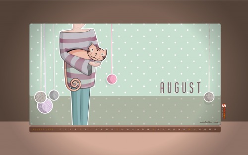
August Cat

Designed by Soodabeh Amirakbari from Iran.

Monthly Quality Desktop Wallpaper - August 2012

Fly

"Colors!!" Designed by Lotum from Germany.

Monthly Quality Desktop Wallpaper - August 2012

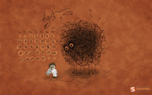
Searching for Higgs Boson

Designed by Vlad Gerasimov from Russia.

Monthly Quality Desktop Wallpaper - August 2012

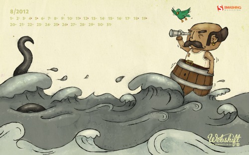
Ahoy

Designed by Webshift 2.0 from South Africa.

Monthly Quality Desktop Wallpaper - August 2012

Through Happy Shades

Designed by Mihai Fischer from Romania.

Monthly Quality Desktop Wallpaper - August 2012

Colorstrike

Designed by AndrР№ Presser from Germany.

Monthly Quality Desktop Wallpaper - August 2012

Let’s Go Great Britain

"”Let’s go Great Britain!” typographic wallpaper to cheer at the 2012 London Olympic games." Designed by Paula RГєpolo For Garment Printing from United Kingdom.

Monthly Quality Desktop Wallpaper - August 2012

Childhood Memories

Designed by Francesco Paratici from Australia.

Monthly Quality Desktop Wallpaper - August 2012

Olympic Games

Designed by Cortando Pixeles from Argentina.

Monthly Quality Desktop Wallpaper - August 2012

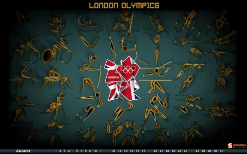
London Olympics

Designed by Meenal Jain from India.

Monthly Quality Desktop Wallpaper - August 2012

Deer Summer

Designed by Resko Elena from Russia.

Monthly Quality Desktop Wallpaper - August 2012

Late Summer

"Butter yellow daisies for the last of summer days!" Designed by Karen Keung from Canada.

Monthly Quality Desktop Wallpaper - August 2012

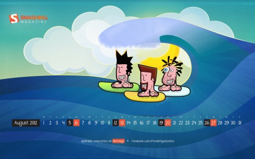
Frederique’s Summer

"Frederique is a satiric comic strip about hanging around at beaches, getting rejected by hot chicks and enjoying life with full blown optimism." Designed by Richard Dancsi from Hungary/Germany.

Monthly Quality Desktop Wallpaper - August 2012

Forest

"A trip into the woods. August 2012." Designed by Timothy J. Reynolds from USA.

Monthly Quality Desktop Wallpaper - August 2012

Team Gb

"August 2012 is here which means it is time for the Olympic Games! This calendar incorporates various aspects of London, the UK and the Olympics." Designed by Donna Hall And Loren Grosvenor from United Kingdom.

Monthly Quality Desktop Wallpaper - August 2012

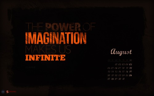
Infinite Imagination

"The Power of Imagination makes us Infinite." Designed by Roland Szabo from Hungary.

Monthly Quality Desktop Wallpaper - August 2012

World Traffic Lights Day

Designed by Cheloveche.ru from Russia.

Monthly Quality Desktop Wallpaper - August 2012

Cycling Holidays

"“Nothing compares with the simple pleasure of a bike ride.” – President John F. Kennedy." Designed by Simona Gosu from Romania.

Monthly Quality Desktop Wallpaper - August 2012

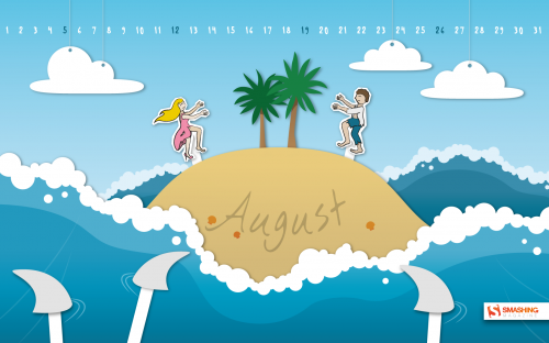
Lucky August

"Life is a game. Are you feeling lucky in August?" Designed by Marina-art from Russia.

Monthly Quality Desktop Wallpaper - August 2012

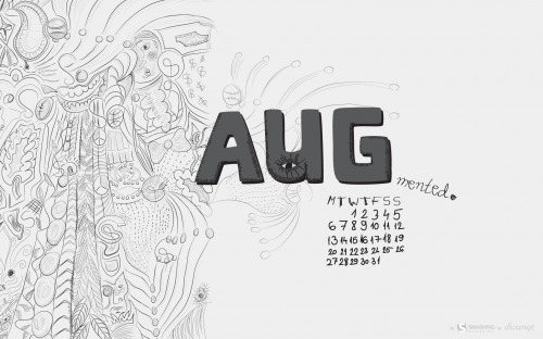
Augmented August

"In summer things may seem different then they really are. Which is not necessarily a bad thing." Designed by Sanja Vukasinovic from Serbia.

Monthly Quality Desktop Wallpaper - August 2012

Summertime

"It’s summertime so enjoy the weather!" Designed by Christina Mokry (allaci Gmbh) from Germany.

Monthly Quality Desktop Wallpaper - August 2012

Your Title Holed

Designed by Agata Maciљgowska from Poland.

Monthly Quality Desktop Wallpaper - August 2012

Summer Rain

Designed by Virginia Saint from USA.

Monthly Quality Desktop Wallpaper - August 2012

Responsive Wallpaper

"I was thinking to make the wallpaper as a responsive design, i’d add more interaction next month." Designed by Mondedesign.net from France.

Monthly Quality Desktop Wallpaper - August 2012

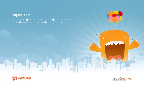
Monster Attack

Designed by MicroCreatives.

Monthly Quality Desktop Wallpaper - August 2012

Join In Next Month!

Please note that we respect and carefully consider the ideas and motivation behind each and every artist’s work. This is why we give all artists the full freedom to explore their creativity and express emotions and experience throughout their works. This is also why the themes of the wallpapers weren’t anyhow influenced by us, but rather designed from scratch by the artists themselves.

A big thank you to all designers for their participation. Join in next month!

What’s Your Favorite?

What’s your favorite theme or wallpaper for this month? Please let us know in the comment section below.

Stay creative and keep on smashing!

(vf)


© Smashing Editorial for Smashing Magazine, 2012.


Creatively Clad: A Showcase of Creative Costume Design


One area of design that tends to constantly be producing innovative and impressive results is the field of costume design. With so many important scenes relying heavily on the costumes to help create and solidify the tone and feeling of the piece, costume designers have a lot to carry on their shoulders. So much has to be conveyed through the clothing the models are clad in, and sold through them as they are often more than just the focal point of the piece, they are often the only engaging element in the foreground.

So below is a fantastic collection that explores so many talented designers’ work in this field for you to refill your inspirational well. From all of the everyday casual fashion that surrounds us, it is always nice to break into new worlds through the art of creative costume design.

Creatively Clad

Treadwear by Carl Elkins

Exoskeleton by Janina Alleyne

RANDOM RAINFALLS (photographed) by Julie Marie Gene Gobelin

SUMMER LAWN COLLECTION 2010… by Noori Worldd

Triumph by Olga Baturina

Nekromantik collection by Katarzyna Konieczka

Nintai by Lucia Benitez & by Mercedes Arocena

Tequia – Goddess of Aztec (photographed) by Gabriella Gertruida

Zignatories by Tarveen & Vikul

Geometric corporal expansion by Marcos Paulo Piccoli

AArambh by Yatin Gandhi (photographer radhakrishna)

Serie Guerreras “Joya nunca taxi” by Samantha Otheguy

Poupée de la Lune by Jesica M. Almaguer

Triumph by Olga Baturina

Medical Costumes by Katarzyna Konieczka

Treadwear by Carl Elkins

50ft. McQueenie by Gerwyn Davies

Accordian by Marcos Paulo Piccoli

Noi.se by Zuza Sowinska-Bania

The birds, fashion design, 2004 by Baiba Ladiga

Buy it, use it, break it, fix it, by EL NIDO

Geometric corporal expansion by Marcos Paulo Piccoli

Exoskeleton by Janina Alleyne

Zignatories by Tarveen & Vikul

The Runway’s End

We are finished with our side of the showcase, but now we want to hear from you. What pieces really moved you or caught your attention from this collection of creative costume design? Do you know of any others that we should see? Leave us your thoughts or links in the comments.

(rb)


Images from the Mind’s Eye: Showcase of Conceptual Photography


For many photographers, capturing an exquisite moment is the dream. For others, conveying an exquisite idea is what they set out to do through their pictures. That dream can be just as challenging, as concepts in your own mind may appear clearer than when presented to others. But even if the interpretation isn’t spot on, conceptual photography can still prove to be an overly inspiring medium.

Today we hope to tap into that well of inspiration for our readers through this showcase of conceptual photography. These highly interpretive and, at times, abstract photos are born from the imaginations of the photographers, and below are the realizations of these images from the mind’s eye. Take a look through these stunning photos and bathe in the beauty they have to offer.

Images from the Mind’s Eye

Le moustache by lieveheersbeestje

i saw that by Shutter-Shooter

The only way by naked-in-the-rain

:feel the music: by candymax

Imaginarium by Obsessed-by

Last seconds of light by Invi-Light

Samantha by triciavictoria

The Rite by Nelleke

aRt by shljivo

ARL.06 by MohamedTalaat

Fly with me by Alessia-Izzo

Syringed love by prosaix

Like a lady by ScarletteDeath

Shadow of the past – I by cuzco07

Escape from myself by Julie-de-Waroquier

No Directions by girltripped

Invaders by syda-ginger

The Chair Project by uglybug

Colorful Urban Surpassing by oO-Rein-Oo

Life over Death by MD-Arts

Gift for you. by Lukreszja

A Photographer’s Provocation by kittycrime

day seventeen by mary-by

||||-/\-|||| by y5y6

underscore by henriquefrazao

home by loganart

closed by sternenfern

Bigfoot by BlackJack0919

last puff by Altingfest

Notes on a Dream by MD-Arts

Departure Of Dimensional Foresights by oO-Rein-Oo

Razorblade by Pelicanh

Papers everywhere 3.14 by DorottyaS

bed time story II by felixheru

m e l a n c h o l y by cemalsamli

The Collection’s End

Now this collection has wound down to its end, but that doesn’t mean that we are finished. Now that we are armed with inspiration, we can get to work and use that creative charge. What were some of your favorites from this collection? Leave your thoughts below.

(rb)


  •   
  • Copyright © 1996-2010 BlogmyQuery - BMQ. All rights reserved.
    iDream theme by Templates Next | Powered by WordPress