Archive for September, 2012

Changing Perspective: A New Look At Old Problems // Creativity


Insanity: doing the same thing over and over again and expecting different results.

– Albert Einstein

There is an old story of blind men and an elephant. The blind men all meet and are asked to describe the elephant. One says that an elephant is long and skinny like a snake. The other says that the first doesn’t know what he is talking about and says an elephant is like the trunk of a tree, round and thick. The third says they are both wrong, that an elephant is wide and circular like a giant disc.

In some versions, they stop talking, start listening and collaborate to “see� the full elephant. When a sighted man walks by and sees the elephant, they also learn they are blind.

It doesn’t take us very long to figure out that each of the men is talking about a different part of the elephant (trunk, leg and ear, respectively). The men are blind, so they fail to take in the whole elephant. Because their experience was limited to a certain part of the elephant, they assumed that the elephant was the part they could see. One could only feel that the elephant was a trunk, so he thought it was like a snake.

Blind Men And An Elephant

Being a creative is often like being a blind person. We are dealing with a problem that we cannot see. We talk about it, we look at it, and then we try to solve it understanding only the parts that we can see. The problem is that we can get in a rut and start seeing the same problem and offering the same solution. What happens, though, when, either by choice or by circumstance, we need to come up with new solutions? What happens when we need to innovate? Innovation by its very nature entails coming up with a new approach to an old problem.

To come up with a new approach to an old problem, we often need to look at the problem differently. If we do the same things, we will get the same results. If we use our same bag of tricks, we will end up with the same magic show. In my experience, when a new solution was required, the best thing I could do (whether I was stuck or not) was to change my perspective on the problem. This could mean looking at new visuals, asking different questions or simply refining my language. Once you have explored new angles of a problem, be they visual, functional or strategic, you will often see something new, which will set you off on the road to creativity and true innovation. When all you see is the ear and leg, you usually just need the trunk to complete your view of the elephant.

A Little Neuropsychology

To answer the question of how a different perspective leads to a creative solution, we need to understand a little neuropsychology and what happens in the brain when you are solving a problem. According to Jonah Leherer in his book Imagine, the “A-ha� moment is essentially an abstract connection that the right brain makes between two disparate ideas. History has countless stories of people having amazingly innovative ideas from seemingly insignificant events. One of my favorites is the story of how Robert Sherman came up with the song “A Spoonful of Sugar� when his son came home from school one day after having his blood taken (they had given him a cube of sugar). Another story is Newton theorizing about gravity after an apple dropped on his head, or Archimedes and the bathtub, and on and on. Some event triggers an idea and the brain makes a connection to creatively solve the problem.

How does this process work? When you are faced with a puzzle, be it visual or functional, you solve it by first running through all of your usual solutions that are obvious — such as the e-commerce layout that you have used a million times, design patterns that you know, the button style that you love, the font that always works, etc. You first engage your left brain by recalling the obvious tried and true solutions. Sometimes these ideas work, sometimes they don’t. As soon as your left brain has exhausted all ideas that don’t work, you get frustrated and you hit the wall. The wall is the inability of your left brain to create new connections from your old ideas. You are unable to connect the old ideas with fresh ones, to find different solutions with the same methods. The only way to get unstuck is to try to see the problem in a new way.

At the point of total frustration, your right brain engages. Your right brain solves problems with images. Once the left brain has gotten out of the way in total frustration, your right brain is able to freely associate in the language that it knows: pictures. Then, it hits — the connection is made, and all of a sudden, like magic, you are off and running, and everything falls into place. What you have just done is create a new connection in your brain, literally.

It usually happens at the most unlikely of times — when a participant in a research session says something that tips you off, or when your spouse shows you something, or when a friend tells you of a frustration and how they solved it. It comes unexpectedly, and two different objects are connected to create something new. Ultimately, most of the research and strategy phase is simply there to create these “A-haâ€� moments, which we then execute on once we reach the concepting phase.

How To Gain New Perspective

Below are a few of the tricks I have learned to inspire creative thought and to look at problems differently in order to help the brain create connections. While the first few suggestions are mainly for visual design, I find all of these useful for figuring out feature sets and defining scope, and they are completely appropriate for UX and visual designers alike.

Print Out Visuals

Printing a bunch of stuff and throwing it up on a wall is the single best way to see a new solution to your problem. Recognizing patterns is much easier when you are able to see visuals in close proximity than when relying on memory. Print-outs laid out in close proximity help the brain to make connections and generate ideas instead of merely retaining information.

What to print out? Two things in particular help: competitors and inspiration.

Printouts

For competitors, if you are working on a product detail page for an e-commerce website, pick out 10 to 15 product pages from competitors and print them out on 11 × 17-inch paper, and look for things that work well. Also, observe things that do not work well. Your competitors have done you the good service of trying ideas before you, and you get to test drive their websites and evaluate their ideas without putting in months of development. Group together methods and design ideas that work well for competitors — and note your findings. There will also be a lot of failures to learn from, so note those as well. Seeing what is wrong on other websites could cause you to try something completely new. Seeing the cliches will free you from those tired ideas and allow your brain to run free on different ideas. Even if you are not in “competitionâ€� with anybody else, find the nearest verticals and you will make connections faster.

For inspiration, take 10 to 15 pages with various UI elements, print out the pages, cut out the pieces that you want to use, and put them on a board. Record your ideas on sticky notes, After doing this, you will start to see patterns, which you can use to visualize a solution. If you have done this and you are still stuck, put up some other relevant inspiration — be it a vibe, a similar layout or a design pattern — and see what happens. Just keep printing stuff out and rearranging it until you see something. When printing out inspiration, include some things that are totally different from what you saw in competitors to avoid copying what they did.

Refine Your Language

People often describe the same thing using different language. Individuals will get attached to the words they use to describe a problem, and then the group will get stuck on semantics. This is especially true when defining new products and features. We’ll often use a different word or two, and then everything will freeze. It could be the language used to describe user instructions, or it could be the label for a button. It could also be your names for particular objects in your project or particular attributes of those objects. Language is incredibly powerful. As visual designers, we might not be as tuned into it as we need to be, and we’ll shrug it off as the domain of copywriters. But copy and visuals are intertwined so intricately that separating one from the other in Web design is impossible.

So, we need to make sure we’ve got exactly the right language, and we need to experiment. Start by changing the language on the page or refining the instructions. Additionally, you could labels things that did not previously have labels or update existing labels.

If you are working with a copywriter, get them involved in refining any language issues you have with the website. They will be a fabulous source of ideas on language, product terminology and refining instructions.

Language can also block teams. Using different words or phrases for the same thing, especially when working on products that don’t yet exist, can lead to internal confusion. Using different terminology will divide a team rather than unify it. So, having team members define their use of words could help. If you step back and take a deep breath, you might find that you have already solved the problem and just needed to clarify the language in order for everyone to see it.

Ask Different Questions

If you are stuck, it is probably because you need an answer. Trouble is, you might not be asking the right question. If you ask the same question over and over, you will most likely get the same answer. So, how do you rephrase the question or ask a new question to gain new insight?

Sometimes the problem is visual. Something in the layout is distracting or causing it not to work, so you need to address a different part of the layout. The root of the problem might be not the element you are working on but the surrounding elements. Here are a few things to try:

  • Delete or remove other items on the art board and see what happens. This could reveal a solution to the problem.
  • Try an illustration instead of a photo.
  • Change colors.
  • Break the grid.
  • Emphasize different parts of the page.
  • Try a whole new approach to the navigation, not just a new menu bar.

Document Data in a New Way

On a project I was on, we were having trouble pinpointing how to compare feature sets between products. We had several options but kept going around in circles debating on the right direction. Finally, I found a new way to display the comparisons and tried it out as an experiment. Wham! It showed the information in a new way that made sense to the team, and we all got it. So if you are working with data, how can you display or visualize the data in a new way? Could you look at new parameters? Could you reformat your deliverables? Looking at the data in different formats enables you to see new things.

Competitive Analysis
The magical data visualization: overlaying rankings of competitors based on key opportunities.

Analyze Something New

With there being so many techniques and models to display data, exhausting the entire bag of tricks in every project is impossible. If you are looking to see the problem differently, put the problem in a new model: a storyboard, a mental model, a new analytics report, perhaps even changing the format of the data. You will see different things with different models. It will add more detail to the strategy and help you understand the design challenge in the big picture, helping you discover new risks and solutions. Adding data models could also help the business’ decision-makers and team members uncover crucial risks earlier in the process.

Zoom Out to the Next Largest Context

Looking at the big picture can also lead to a new way of seeing the problem. When a problem is very specific, look at how it fits into the next largest context. In product or Web design, this could mean storyboarding how the app or website is to be used, including the location and psychographics of the user and what they are trying to accomplish. Better understanding how the business works might also help. Understanding design in the context of how the app fits into the big picture of the business can help you refine the strategy and eliminate options to arrive at a solution more quickly.

Zooming out sometimes helps me realize that I am asking the wrong question. If you are asking how your problem (say, one about a feature set or product requirements) fits into the big picture, you might find that the big picture is not big enough and has to be expanded (such as by revising the strategy or the user flow). Perhaps the feature set or product requirements don’t make sense because you haven’t zoomed out wide enough and don’t understand the product in context. Once you look at it in the big picture, your entire team might realize that its approach is wrong — or perhaps right!

Final Thoughts

When approaching your next project, try to build in new ways to look at the problem. We’ve explored just a few here. You could also try new project workflows (such as lean or agile) or new tools (such as eye-tracking or usability tests or different software) or new music or whatever.

Going back to our story of the blind men, where is your team blind? Where can you look to make this elephant a little clearer. Design work is very much about feeling your way around and imagining the elephant. By looking at different dimensions (data, competitors, inspiration, language, context), you are able to see a problem more three-dimensionally. No design challenge is so simple that it lacks additional facets for exploration. You might just find the “A-ha� moment you were looking for or discover a major innovation as Newton did or uncover something small that allows you to focus and prioritize your team.

Remember, if you do the same thing, you will usually get the same results. Conversely, if you try new techniques, you may never go back.

(al)


© Stuart Silverstein for Smashing Magazine, 2012.


Taking A Closer Look at Twenty Twelve: WordPress’ Latest Flagship Theme


Every year, the WordPress team releases a flagship theme, that goes by the name of Twenty-Something. We’ve had Twenty Ten and Twenty Eleven so far, and this past week, WordPress provided us with another addition to the line-up: Twenty Twelve! It’s an easy guess to relate the names to their release years. Even though it is a bit late and we are already in the later half of the year 2012, who wouldn’t want a good WordPress theme?

Following in the footsteps of its predecessors, Twenty Twelve has a lot of expectations to meet and shoes to fill. In this article, we shall take an in-depth look at the latest flagship from Automattic.

Introduction

Designed by Drew Strojny of The Theme Foundry, Twenty Twelve is an elegant and responsive theme. If you take a casual look at the theme, you’ll notice that it isn’t entirely like those blogging themes out there.

Twenty Twelve WP Theme

Of late, WordPress is being used to create websites of different genres — enterprise entities, news and magazines and even e-commerce sites. One can safely conclude that WordPress is no longer a mere blogging tool. Obviously, Twenty Twelve acknowledges the fact, that WP now has a user base beyond blogging. The home page does not list blog posts in the traditional style by default — instead, it has special areas and widgets for text and other content.

Digging Deeper

So, what does this theme have in store for us? Let’s take it for a spin!

Mobile-First Layout

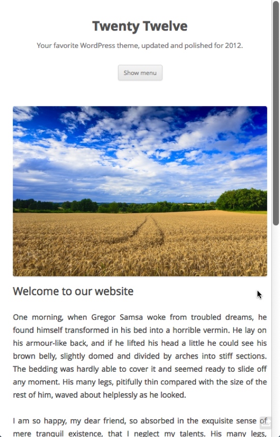
When WordPress 3.4 was released, one of the most talked-about features was the support for retina displays. Twenty Twelve does not disappoint in this section. The theme has a mobile-first layout and is totally responsive. It can be viewed on any device (well, almost) — smartphones, tablets, HiDPI screens — you name it!

TwentyTwelve scaled down to mobile client size

Special Homepage Template

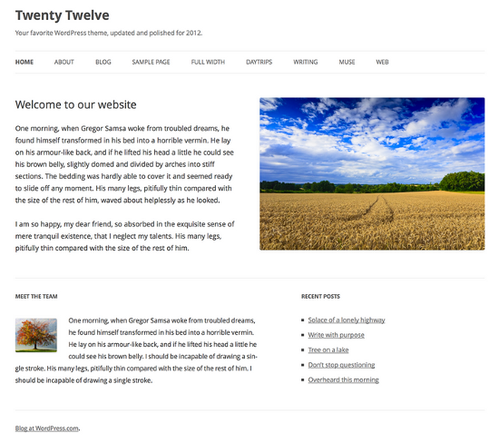
As mentioned above, the homepage does not enlist blog posts in the traditional style. Instead, it serves as an introductory or landing page for your website. You can add text, images and other media in the upper section, and use special homepage widgets in the lower region.

Homepage of Twenty Twelve

Pictured: BlueCrabYoYo Homepage using Twenty Twelve

The custom homepage of Twenty Twelve is definitely one of the most loved (and hated) features. While some users are enthusiastic about its layout, others are genuinely unimpressed. In hindsight, not so long ago, WordPress itself claimed to be a blogging tool first, and anything else afterwards. The homepage layout, while looking absolutely impressive and useful, quashes the earlier claim. Of course, you can always retain the blog-based layout.

Typography

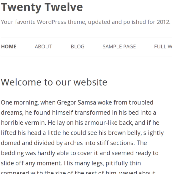
Nothing much to talk about here except for the fact that Twenty Twelve comes with the Open Sans typeface.

Open Sans Typeface in Twenty Twelve

Post Formats and Widgets

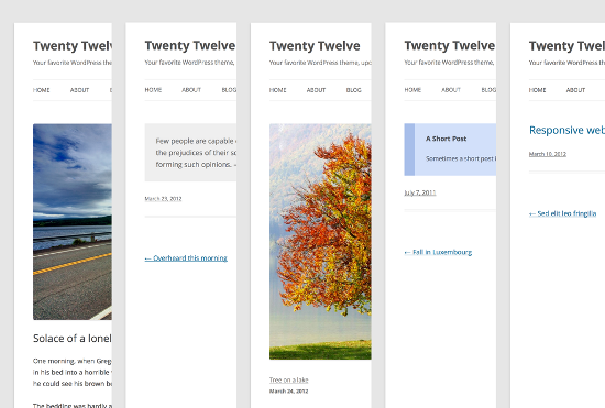
Obviously, Twenty Twelve comes with support for multiple post formats. Depending on the format, posts are formatted differently than standard blog posts.

Multiple Post Formats in Twenty Twelve

Speaking of widgets and sidebars, Twenty Twelve has a No-Sidebar template. In fact, even the Primary Sidebar won’t show up on standard page templates if it does not have any widgets.

Header Images

Both Twenty Ten and Twenty Eleven loved header images — they went as far as having their own set of pre-loaded header images. Twenty Twelve, however, does not come with default header images. Furthermore, unless you yourself upload a header image, the header image section itself is not displayed.

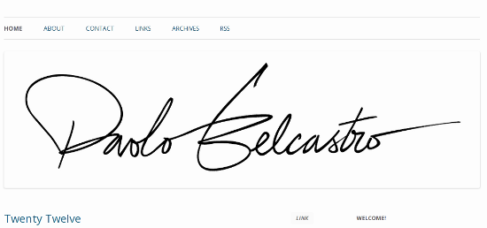
Header Image in Twenty Twelve

Pictured: Paolo Belcastro’s Blog using Header Images in Twenty Twelve

Along similar lines, featured images are not displayed as gigantic banners at the top of posts and pages.

Conclusion

As of now, Twenty Twelve is available only for WordPress.com users. However, users of self-installed WordPress will be receiving this theme in the official repository soon enough (though at the moment, no fixed date has been provided). Interested in the theme and not willing to wait? Check out the demo!

What do you think of Twenty Twelve? Impressive or not? Feel free to share your thoughts with us in the comments!

(dpe)


Darktable: The free Alternative to Photoshop Lightroom goes Mac OS X


Photographers considering using a computer based on Linux not seldom have exactly one reason to do so: Darktable. Darktable is an open source project, best compared to Adobe Lightroom. It is a photo editor following the workflow of photographers, thus having them easily feel familiar with the app. Beginners will be overwhelmed by its feature richness. Now there is another option, if you don’t want to use a Linux-system. A few days ago, Darktable has been made available for Mac OS X

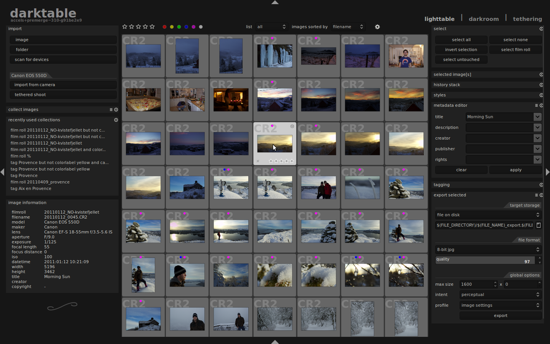
Darktable: Lighttable, darkroom, tethering

It almost sounds too good to be true. But the project Darktable doesn’t need to hide behind the functionality of its commercial competitor Lightroom. Some even say, that Darktable’s RAW Tools are even better than those Adobe has to offer. Adobe recently changed the name of its product to Photoshop Lightroom and dropped the price for the most recent version 4 to an affordable 149 USD. As the competitors show similarities in the look of the whole user interface, I wonder who got inspired by whom…

Darktable’s lightroom in standard view

Darktable, available in several languages, that are automatically invoked, according to the operating system it detects, follows a modularized workflow. Lighttable lets you do administrative tasks in the likes of Bridge or Picasa or … Lightroom. Meta-data can be viewed and changed. Categorization can be done from here, as well as sorting operations in a variety of ways.

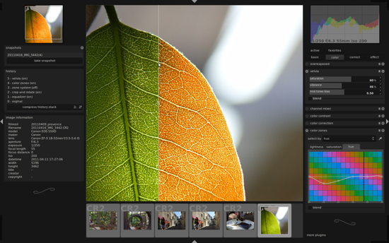
The module darkroom is responsible for the manipulative work. As darktable is limited to tasks that real photographers would do in real darkrooms, we don’t have the opportunity to work on collages or other montages. All effects, corrections and related functionality can only be invoked on photographs. Darktable’s methods are powerful and very finely tunable. The results are often described to be better than what can be achieved using so-called professional software such as Lightroom. The last module, called tethering, is used to connect cameras to Darktable in a way that their contents can be imported automatically.

Darktable’s darkroom with an image opened

The product is comfortable and fast, the results are high-class. Moreover, Darktable is completely free. If you’re into one of the many Linux-derivatives, you probably know that the software has been available for quite a long time to the users of the open source OS. Ubuntu-users will even find a version of Darktable pre-installed. Be aware that these usually are older versions, so make sure you update soon as possible, using one of the many repositories available. If your OS carries names such as Fedora, Suse or Gentoo, the same applies to you. Fit as a fiddle programmers of course just compile their own version using the Sourcefourge- or Github-sources, just like Chuck Norris would do. Wait, probably with Chuck Norris sources compile themselves to avoid having Norris compile them. Anyway…

Freshest member of the family is the Darktable-version for Mac OS X, which is available as a DMG using this link. If you read the blog entry that announces the availability of the Mac-version, you’ll feel flooded with comments of users stating to have a wide variety of problems using, configuring, but also even installing the app.

Darktable for Mac OS X: a little self-test

Gotten insecure from the comments I mentioned before, I decided to give Darktable a spin, so none of our readers would run into trouble and probably blame me for having gotten their MacBooks damaged. I installed Darktable as is usually done using the downloaded DMG. Darktable went from a lean 15,5 MB DMG to a not so much fatter 52 MB app. And I did not experience any problem whatsoever. I imported over 1.000 pictures into lighttable and I was able to fire effects and filters at chosen pictures without any misbehaviour on the side of Darktable. Everything worked absolutely flawlessly, until I tried to connect my camera via the tethering-module. I couldn’t get that to work, but a workaround for this problem is already in existence. As I never use automatic importing of pictures, I didn’t give this workaround a spin, though.

The recent version of Darktable carries the number 1.05. The whole project is organized professionally und comes with a documentation, that leaves no stone unturned. You should definitely check out the project’s ressources-section.

People seeking a solution to professionally manipulate their photos, need not push out cash any longer. As cash always tends to vanish as soon as you look at it, Darktable might save you from premature bankruptcy and help you lead a happier life. You should have a 64-bit OS, though. It still runs on 32, but you know…


Metro UI CSS: You can have a tiled website too


Microsoft’s new UI, once known by the name of Metro, has caused quite some buzz in the tech world. Meanwhile the name has been dropped, which again caused quite a buzz in the tech world. We don´t know why this was done nor do we know if the next Windows will be a market success. What we know is, that Metro as a design style has its fans. If you are one of them, we have great news for you. Thanks to Metro UI CSS you can give your very own website the same tiled look, the interface of the next generation Windows will have. Go ahead!


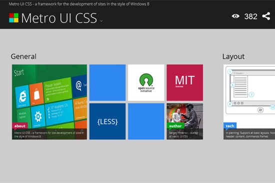
Metro UI CSS

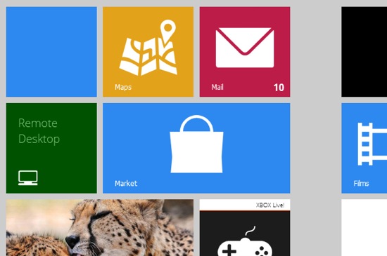
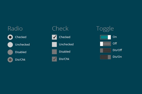
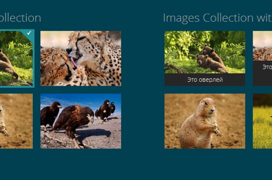
Metro UI CSS is actively developed by Sergey Pimenov, who proves generous enough to leave the tool for us to use free of charge under the MIT license. Pimenov not only copied the typical Metro design, but also implemented a variety of effects from the original Microsoft product, for example the fade-in of subtitles on pictures or the switch buttons.

Metro UI CSS: A feature-rich framework

Get your own impression of what Metro UI CSS is capable of by visiting the demo. You’ll find several pages with examples of how pictures, forms, buttons and the typical tiles, bound to substitute the former Windows icons, look and interact.


Metro: Tiles

Ever seen Metro on a tablet? On these devices, Microsoft implemented vertical scrolling as the standard scroll direction. That’s just the way Pimenov implemented it in Metro UI CSS. Using a touch-device you can elegantly scroll through your website. You’re not forced to, though, as mouse scrolling is also supported.


Metro: Buttons

Metro UI CSS: Made with, yes, CSS and JavaScript

Metro UI CSS is not pure CSS, but relies on several JavaScript libraries for advanced functionality. The foundation is, as it often is, jQuery with some complementing plugins and the new superstar Bootstrap. Pimenov wants it mentioned, that he also integrated some of his very own JavaScript functions.


Metro: Pictures

If you like to learn along the guidelines of a thorough documentation, Metro UI CSS is not for you. Because there simply is no documentation. The demo can be downloaded, that’s it.  But it contains all elements for which the Metro style is available and thus should be a good starting point for the first steps to your very own tiled website. Several effects are invoked simply by calling the corresponding classes. You can easily find out by sneaking through the source code. Metro UI CSS needs a modern browser. Microsoft’s own Internet Exploder is supported from version 9 onwards.

(dpe)


Brand-new Firefox 16 Beta lays a sharp focus on web developers


It’s been merely a few days, since Firefox 15 has seen the light of day in its final version. But the Mozilla crew isn’t lazy and has already pushed out the beta of Firefox 16. Since August 30th Firefox 16 can be downloaded for all the usual platforms. Even a version for Android is already available. This time Mozilla doesn’t only target the end-user with some shiny new functionalities. This time Firefox is all about the web developer. Improved developer tools, including a brand-new command-line, and the unprefixing of several important CSS properties will have the community cheer.

Mozilla Firefox 16: It’s hyperactive developers code like crazy

It’s not always the case that shortened release cycles lead to a higher speed of innovation. Regarding Firefox, though, it does. Looking back at the times where Firefox got updated twice a year, we can clearly see how fast-paced they go now. Say thanks to Google’s Chrome for starting a new era. No browser vendor can afford slow-paced development any longer, if they don’t want to get lost along the way. Firefox is going full throttle. Of course that’s nothing to complain about. The product is improving faster than before and the changes make for a better user experience with every new release.

As Firefox is a product for the masses, the average internet user, we as developers shouldn’t wonder that most updates target the end-user. Higher speed, new user interface, improved sharing, mobile clients and what not. But this time Firefox focusses on the developer community.

Firefox 16: Unprefixing of important CSS properties

CSS3 is constantly gaining momentum. Vendors are implementing the functionality faster than could have been hoped for. It’s mobile browsing on Android and iOs that’s forcing for a faster innovation speed. Firefox got a little behind as of lately and is now hoping to gain some ground in it’s constant battle against Chrome. Version 16 brings the possibility to unprefix several important CSS properties as there are:

  • CSS3 Animations
  • Transforms
  • Transitions
  • IndexedDB
  • Battery- and Vibration API
  • Image Values (The Image Values module defines how properties link to pictures via URL. All properties taking pictures as values use this module, e.g. “background-imageâ€� and “list-style-imageâ€�)
  • Values and Units (…that CSS properties can have)

Firefox 16: Developer Tools introduce new command-line

Is it the best invention since canned beer? I don’t know. But what I know is, that the improvements to the Developer Tools will be enjoyed by the community, to say the least. Mozilla has further centralized tools that where somewhat cluttered around the interface. Now it’s even easier to access all developer related functionality from one place. Even better than that is the implementation of what Mozilla calls the Graphical Command Line Interface (GCLI), which is a command line tool for accessing most of the browser’s functionality right from the keyboard without having to click around. We all know that a lot of developers claim to be much more productive when they are able to leave their fingers on the keyboard.

The command line can be called using the navigation menu or by a keyboard shortcut (see where that leads?). Once opened, developers can use simple commands to call whatever functionality they like to address. The command line is not limited to control the Developer Tools though. The command help console tells you the available commands and their parameters. After fiddling around a little, you’ll soon notice, that the functionality of the command-line is much more powerful than can be seen at first sight. You can even address CSS selectors oder HTML elements individually.

The command pref, combined with corresponding parameters can be used to change configuration options directly. Using the command resize to responsive designs can be tested. You can even take screenshots right from that tiny little command line. What’s even better, Mozilla promises to improve the command set of the GCLI in upcoming releases.

Watch Mozilla’s video for a first impression:

Web developers should really take a thorough look at Firefox 16 now. It’s well worth it!

Related links:


  •   
  • Copyright © 1996-2010 BlogmyQuery - BMQ. All rights reserved.
    iDream theme by Templates Next | Powered by WordPress