Archive for September, 2012

Creating A Pattern Library With Evernote And Fireworks // Workflow Tips


A well-functioning pattern library is a beautiful thing. It is a powerful resource that you and your entire team can use to efficiently create consistent user experiences for your website or service. It cuts out repetitive design work, allowing you to focus your energy on creating new user experiences; and it creates a common UI language for your team, reducing communication issues and keeping everyone on the same page.

But to many designers, creating a pattern library can feel like a daunting academic pursuit, or simply useless overhead documentation. To make matters worse, getting consensus on which technology to use and how to get started is hard.

After experimenting with various options, our team has found that using Evernote to house our pattern library of Adobe Fireworks PNG design files has proven to be a winning combination. We’ll outline how you can use Evernote and Fireworks to easily build your own pattern library and reap the benefits mentioned above.

Creating A Pattern Library With Evernote And Fireworks

Patterns With Benefits

To get fueled for the journey ahead, let’s dig a little deeper into what makes pattern libraries so awesome. Here are some of the top reasons why a library is worth the investment:

  • Consistency
    A pattern library spreads consistency across your products. As they say, “the interface is the brand,� and creating an interface that is consistently good is critical to creating a great brand. This benefit is not trivial.
  • Efficiency
    A pattern library frees designers from the heavy lifting of repetitive design work and allows them to focus on building new interactions and improving existing patterns.
  • Speed
    A pattern library gives designers and developers the building blocks to quickly build complex interactions. Which also facilitates rapid prototyping of new ideas.
  • Vocabulary
    A pattern library gives team members a shared understanding of the product’s primary building blocks, and it gets new team members ramped up quickly on how the product is built.
  • Evolution
    A great pattern or component library helps your website evolve. The nature of components is such that if you make a change to one component, it is updated across all instances in the product. This helps you respond quickly to customer needs and iteratively refine the user experience.

If They’re So Great, Why Don’t You Marry Them?

In light of all the benefits, why doesn’t everyone have a pattern library? From my experience, two of the main factors that hamper the creation of a pattern library are lack of knowledge and lack of tools. Learning about patterns, components and frameworks can feel like a daunting academic pursuit, and there doesn’t seem to be solid consensus on what technology to use.

In addition, if a pattern library is hard to maintain or hard to use, it won’t gain any traction. Updating the library with new patterns and modifying existing patterns have to be easy, because as soon as the library gets out of date or becomes cumbersome to use, it will be useless. We have found that using Evernote and Fireworks together makes for a system that’s easy to manage and easy to use and that overcomes these obstacles very well.

Evernote + Fireworks = Winning Combination

Numerous websites and services have sprung up to help companies build their own pattern libraries, but after experimenting with Quince, Patternry and a few others, our design team landed on using Evernote and Fireworks. Here are the reasons why they are the best fit for us.

(Unique) Fireworks Features

While Evernote will get a lot of attention in this article, the pattern library we have created would not be possible without some of the excellent features in Fireworks:

  • Fireworks uses the PNG format as its source file type. This means that Evernote (and any Web browser) is able to display Fireworks PNG files natively, while still retaining all of the data from Fireworks vectors, bitmaps, layers and effects inside the files. This is not possible with PSD, AI, INDD or any other proprietary file type.
  • Because the PNG file format is open, Evernote is also able to “read” and index text inside every Fireworks PNG in the library, and this gives you the ability to search for text strings that appear in the individual components. Again, this is something that would not be possible with any other “closed” file type.
  • Another awesome feature of Fireworks is that it allows you to drop a PNG file directly into any other PNG file that is open. This allows you to seamlessly drag and drop patterns from Evernote into Fireworks without missing a beat. Combining this with the rich symbols feature in Fireworks makes for a powerful workflow.
  • Fireworks’ editable PNG files are typically very small in size, which makes opening and syncing files extremely fast and easy.

Fireworks is the only app that has all of these features, making it a critical component to this workflow.

Organization

In addition to being able to display PNG files natively, Evernote has robust tagging and search capabilities, which have allowed us to relax about organization. Even without tagging, finding the pattern you are looking for is quick and easy. Because Evernote is able to index text inside Fireworks PNG files, you can search for text within the patterns, which makes finding most things lightning quick, with zero organizational overhead.

Syncing and Accessibility

A final distinction between Evernote and most other pattern library services is that Evernote is an app that runs locally, which makes it much quicker and easier to use than any Web-based service. With Evernote, no uploading or downloading of files through a browser is involved — just drag and drop from Evernote to Fireworks. Evernote works across multiple platforms, so no matter where you are, you can access it (and even when offline, you can still access local copies of your assets). Any changes to existing patterns are near-instantly synchronized for everyone else, so it really is the best of both worlds.

Pattern Recognition

Hopefully, you’re sold on the benefits of creating a pattern library, and on why Evernote and Fireworks are great tools for the job. But before jumping into how to implement the pattern library, we should understand what exactly patterns are. A good definition from Erin Malone is:

[A pattern is] an optimal solution to a common problem within a specific context.

Tabs, pagination, table data, breadcrumbs — these are all solutions to common problems in specific contexts (our very definition of patterns!). Patterns are the fundamental interactions that make up a user experience. Combined, they can create rich, complex user experiences. Any given YouTube page shows multiple patterns in use:

YouTube Patterns
Some patterns that YouTube employs to create a rich user experience. (large view)

Patterns vs. Components

A quick note on patterns versus components. In general, patterns describe the overarching concept behind an interaction. They typically don’t call out a particular visual design or code.

A component, on the other hand, is a specific skinned implementation of a pattern. Also known as a widget, chunk or module, it typically consists of a visual design asset and a code snippet that renders the component. In other words, components are how patterns become real. Looking again at YouTube, here is the same page, this time with components highlighted:

YouTube Components
Calling out some of the many components that make up a YouTube page. (large view)

The library we’re focusing on in this article is actually a pattern and component hybrid. Here’s how Nathan Curtis describes this type of library in his excellent article “So, You Wanna Build a Library, Eh?�:

Choosing between patterns and components may not be an either/or question… [Teams] have hedged their bets by embedding aspects of one approach into the guidelines and spirit of the other, most commonly via pattern-like guidelines incorporated into the more specific component definitions.

Embedding pattern-like guidelines into a component library is the exact approach we have taken, and it has served us well. If you already have a product and are looking to build a library, this approach is a great way to get started because it yields the immediate benefit of components (reusable visual design assets and code), while enabling you to invest in adding pattern-like guidelines over time.

The Library In Action

Here’s how we have set up our pattern/component library. In Evernote, we have a shared notebook named “Pattern Library.� I own the notebook and share it (read only) with all members of the UX and Web development team. Each pattern/component has these sections defined:

  1. What the pattern is;
  2. When and why you would use it;
  3. A visual example (Fireworks vector PNG);
  4. Basic functionality (describing the component’s behaviors);
  5. An example in context (to show alignment, etc.);
  6. A link to the Web development component (live example and HTML snippet).

Here’s what that looks like in Evernote:

Evernote Anatomy
In the shared notebook, each pattern/component contains all of the information needed to understand when, why and how to use it. (large view)

A key to making components work is to have available the corresponding code snippets and CSS needed to bring them to life. Each component in the library has a link to an internal Web development page where we keep live working examples, as well as the code snippets required to generate the component. This way, our developers can easily find the code they need to implement the components that they see in the mockups.

Web Development Page
Each component has a corresponding page that our Web Development team uses to implement each component. It documents the behavior of the component and allows developers to copy and paste the code. (large view)

Drag, Drop And Roll

So, what does using this type of a pattern/component library on a daily basis look like? Here’s what our process looks like in practice:

  1. When a UX designer needs to use a component in their Fireworks mockup, they find the pattern in Evernote by searching or by visually browsing to the one they want.
  2. The designer then drags and drops the Fireworks PNG image from Evernote into their layout in Fireworks, places it where it needs to go, and makes any necessary adjustments.
  3. Once the mockup has been finalized, the designer hands it over to the Web developers for implementation.
  4. The Web developers implement the mockup by visiting the Web development page for each pattern being used, copying the component’s code to their project and hooking it up to the back end. Done!

The easiest way to describe the design process is to see it in action. Here’s a screencast (should open in a new tab or browser window; .SWF, requires Flash):

screencast on Fireworks and Evernote

One Final Note(book)

Once we started using Evernote for our pattern library, we realized we could apply the concept to other useful areas. We have since created several other shared notebooks, which come in really handy for the design team:

  • “Design Resourcesâ€�
    This notebook contains everything that might help designers make mockups quickly: browser chrome, cursors, icons, scroll bars, company logos, templates, etc. Designers just drag and drop them into their mockups.
  • “Design Inspirationâ€�
    This notebook (which anyone can add to) is full of screenshots of inspiring designs. Evernote allows you to search text inside images, which works beautifully when you want to research how other websites handle interactions (for example, we can search screenshots for “Sign up� or “Buy now�).

I hope this article has shed a little light on how pattern/component libraries can be useful and on how combining Adobe Fireworks and Evernote makes for a simple, fast and flexible solution. Hopefully, you feel more comfortable now creating your own pattern library and reaping the benefits it offers.

Further Reading

(mb) (al)


© Kris Niles for Smashing Magazine, 2012.


Secrets Of High-Traffic WordPress Blogs // Study


We all know that WordPress is awesome — but being awesome isn’t always enough. Does it perform well under pressure? Can it deal with traffic from millions of visitors every month? There’s no question that WordPress can be used for your or my blog, but what about multi-author blogs with thousands of comments? How do developers make it scale and perform?

I spoke with the developers behind some of the biggest WordPress blogs on the planet and asked them to tell me their secrets. Now I get to share them with you.

The Blogs

Website Monthly uniques Monthly page views
Digital Trends 10 – 12 million 33 million
iPhoneclub.nl 2.5 million 5.4 million
The Next Web 4 million 8 million
Neatorama 2.5 million 4.5 million
Slashgear 6 million 10 million
Hot Air 2 – 3 million 35 – 45 million
Laughing Squid Undisclosed Undisclosed

In The Beginning

The first thing I asked the developers was whether they prepared for the heavy traffic that now flows through their website. In almost all cases, the answer was a resounding no. From The Next Web, CTO Arjen Schat and lead developer Pablo Roman said they had planned for growth but didn’t expect growth to happen on such a large scale. “There were few large WordPress sites at the time, so we learned as we went along.�

Neatorama started out in late 2005 on cheap shared hosting until it got kicked out. It moved to a VPS and got kicked out again. In 2007, it moved to a dedicated server with a CDN, which eventually was insufficient, until finally it moved onto load-balanced servers with a CDN. Similar stories are echoed by iPhoneClub.nl and Laughing Squid.

Hot Air’s developer, Mark Jaquith, also a lead developer at WordPress, had to migrate his website to a new server within 48 hours of launching. Only SlashGear planned for a 30% increase in traffic per year.

Digital Trends

Digital Trends started out with around a million uniques a month and has since risen to 10 to 12 million uniques. Tom Willmot, of Human Made, the development shop behind Digital Trends, said this of starting out:

When I started work on the website, there were some pretty big performance sinks in the code base that needed ironing out. A clean code base takes you only so far, however. I don’t think it’s something that should be too heavily focused on at the outset as you don’t know what specific features will need performance considerations. Coding well plus some persistent object caching are enough to begin with.

Server Shred And Burn

High-traffic blogs have to deal with things that regular bloggers only dream of: loads and loads of visitors, eager to read all of the latest news. Neatorama held up when it was featured on the front page of Digg, but was shredded within a few minutes of being featured on Yahoo’s front page — over 2 million visits in the space of a few hours. To deal with that, it had to make a static page on a CDN and redirect traffic there.

Other blogs face challenges related to major events. Visitors flock to their websites to follow what’s happening and hear the news. iPhoneClub.nl and SlashGear are particularly affected during Apple’s live broadcasts. SlashGear experiences traffic of more than 4 million uniques within the two hours of a broadcast’s duration; to deal with this, it adds Amazon EC2 to its normal infrastructure.

iPhoneclub.nl

Jean-Paul Horn, whose iPhoneclub.nl started out on WordPress 2.0.5, had to learn to deal with these problems on the fly:

We used to run a standard LAMP stack with WP Super-Cache, since the site was already growing rapidly when the iPhone started to get really popular. Our main problem was that the server ran perfectly fine on normal news days, but almost literally burned whenever Apple had a keynote or another big iPhone-related announcement. We tried preparing for these short avalanches by temporarily adding more cores and RAM, but it was never really enough, and I wasn’t really keen on investing in a big-ass server just for two to three days of insane amounts of Web traffic a year.

While moving to a Web server and database server with MySQL stored on a separate server helped in its continuing growth, it was still dealing with the same issues when Apple held a press conference. Enter Frederick Townes of W3 Total Cache and Mashable fame. Jean-Paul met Frederick at WordCamp Netherlands, and Frederick went on to help them set up their current configuration:

  • The app server hosts the Varnish front end.
  • They use two nginx Web servers: one with PHP-FRM, the other with static content, like a CDN.
  • The database server runs a highly tuned MySQL server, in which some of the WordPress tables, such as wp_posts, have been transitioned from MyISAM to InnoDB. Because InnoDEV doesn’t have full text search, Sphinx Search was implemented.

Jean-Paul has been using this configuration since November 2011 and has survived two major Apple events without any of the previous load issues or other performance troubles. They’ve also been able to accommodate more traffic and have beaten all of their previous traffic records.

Dealing With Growth

Hot Air

Hot Air

US political blog Hot Air has gone through some major performance and scaling sprints, particularly in advance of US election years. An election guarantees a larger than average flurry of activity around politics. Given that politics is already one of the most popular topics on the Internet, this means some hardcore scaling. Mark Jaquith explained to me the steps he has taken to cope with scaling:

  • Deliver all static assets through a CDN.
  • Set up a load balancer, with multiple Web back-ends behind it.
  • Cache the front page proactively
  • Cache page fragments (such as sidebars) proactively, so that they can be loaded statically.
  • Cache recent posts proactively (mostly the ones displayed on the home page). Every time a post is updated or a comment is left, a back-end process generates a new static snapshot of the page and distributes it to the Web machines.
  • Eliminate the cache differentiation between logged-in and anonymous viewers. Most caching plugins don’t cache pages for logged-in users, or if they do, they cache a different version for each viewer. Hot Air’s templates are modified so that there is no difference in the HTML generated for logged-in and anonymous users, so there can be one shared cache pool.
  • Use Batcache (with a Memcached object cache back end) to cache views of old content.

The Next Web

The Next Web

As with most of these other blogs, scaling was forced upon The Next Web. The founders did plan for growth, but not on the scale they encountered. Arjen and Pablo went into detail on how they dealt with it.

The team’s essential tools are:

  • Varnish as a reverse proxy and for ESI (Edge Side Includes);
  • Memcached to store the results of heavy queries, such as popular stories;
  • Munin for monitoring.

Setting this up wasn’t enough, though. All of this had to be tuned, and poorly performing plugins and code had to be identified. To do this, they did the following:

  • Use MySQL slow query log with no-index enabled.
    Keeping your MySQL slow logs empty is essential. Your key cache suddenly might not be sufficient anymore if your data is growing.
  • Use XHprof for code path analyses.
  • Keep Apache logs clean.
    External referrers will link to pages on your website that don’t exist anymore. If a WordPress 404 page is loaded every time, then you’re doing work that can be avoided. Generating a 404 page can be heavy, so it needs to be cacheable in Varnish as well.

The team at The Next Web also uses additional tools with Varnish to improve cache hit rate. These include:

  • varnishtop
    Lets you look into Varnish.
  • varnishtop -i txurl
    This shows you all of the requests that make it into Apache that aren’t cached by Varnish. This helps you to identify different cases:

    • Whether the back end sends a header that Varnish can’t cache;
    • Whether the back end starts a session that isn’t needed;
    • Partially malformed links to your website, such as http://thenextweb.com/apple/http://referrer.com/my/cool/article;
    • Small variations of a normal request that you can normalize in Varnish, so that you can serve the standard page, such as http://thenextweb.com/correct/article/link?utm=campaign.
  • WP-VCL
    Their basic VCL, which normalizes many different request into the standard versions.

An essential step for The Next Web was developing the ability to serve cached content to logged-in users. To do this, it pulls in all of the user-specific parts of the page and loads these through an AJAX call. This means that content doesn’t need to load all of WordPress. The developers have duplicated all of the code that is needed to handle logging in and basic user-profile stuff in WordPress into its own tiny login class. The class takes 1 millisecond to load, instead of 100 to 200 milliseconds to load through the whole WordPress stack. This prevents WordPress from loading for a trivial request, which can degrade the overall performance of your website by eating CPU cycles that should be used to render pages that are not cached. An added benefit is that WordPress can render all pages in non-logged-in mode.

This is used simultaneously as a feature of Varnish called ESI, which lets the team cache different sections of a page separately with different expiration times. This lets them show fresh content in the sidebar widgets even if the main content has a long expiration time.

Essential Plugins

Essential Tools And Services

Challenges

High Levels of Caching

All of the blog owners I spoke with have high levels of caching. Digital Trends deals with this by using Akamai Distributed, Varnish and Memcached. When this is combined with user log-ins and registrations, it can be difficult to make sure that everyone is seeing what they should be seeing while caching as many things as possible.

Mobile

iPhonclub.nl has to deal with a relatively high number of mobile visitors. In the past, it used WPTouch for iPhone visitors (along with its native app). The server team had to do major work with Varnish, nginx, and W3TC to keep the caches for desktop and mobile visitors separate, thus making user configuration more complex. However, later this year iPhoneclub.nl will merge with iPadclub.nl to become iCulture.nl. In addition to the merge, they are moving to a responsive design, which will better suit the new website and solve the issue of dealing with mobile visitors.

Built to Work, Not to Perform

A challenge raised by The Next Web is the actual architecture of WordPress. While using all of the options and all of the plugins is easy, they are built to work, not to perform. With every code change, you have to make sure it doesn’t cripple performance.

Security

Security is a big issue for every WordPress user, particularly for high-visibility websites. As Neatorama points out, keeping WordPress up to date isn’t always enough. You also have to keep your server’s operating system up to date as well.

Huge Servers
Some websites need a huge server. (Image: Skimaniac)

Scalability

Slashgear has found it challenging to scale WordPress without chucking more hardware at it. It uses a caching system, but WordPress is built to be dynamic, and caching in a dynamic environment does not always work smoothly. The developers have overcome this by modifying their plugins to use AJAX to pull live data on statically cached generated pages.

Comments

A website like Hot Air can receive hundreds or even thousands of comments for a single post. There are dozens of posts every day, and the website has been live for six years. “With that many comments,� says Mark, “you really have to look at database optimization. We have a few custom plugins that intercept comments queries and rewrite them to be simpler. And you want to limit the number of queries you make against that table. For instance, I killed the ‘Right Now’ and ‘Recent Comments’ sections of the Dashboard.�

Events

As discussed regarding iPhoneclub.nl and SlashGear, Hot Air has to deal with its own major events. When a big political event is happening, just a few minutes of downtime can do damage. Mark has warning systems and automated responses in place. In the event of an problem, he can set up something to automatically fix it if it recurs or to notify him when something indicates that a performance issue is imminent.

Would You Say Goodbye To WordPress?

I asked all of the blogs whether they’ve ever conceived of a situation in which they would have to move beyond WordPress. Here’s what they had to say.

Tom Willmot, Digital Trends

I really don’t like the whole “WordPress is slow� rhetoric. It’s just PHP plus MySQL — so is Facebook. It is possible to move beyond certain things that WordPress does (for example, perhaps you replace the rewrite engine with something more efficient), but to decide fundamentally that WordPress is somehow slow and needs to be gotten rid of is probably avoiding the specific issue that is the problem. Sure, there are aspects of WordPress that can be slow if you don’t do anything about them, but this is far outweighed by everything that you do get.

Writers love the WordPress back end; WordPress.com runs some of the largest websites in the world. Digital Trends servers 33 million pages a month for a website that is hugely more complicated (from a technical point) than a blog.

Jean-Paul Horn, iPhoneclub.nl

I can’t for the life of me think why I would want to do this. I have been using WordPress since early 2.0. My wife started iPhoneclub.nl in December 2006 on WordPress 2.0.5 and we haven’t looked back since. I had some previous experiences with PHP-Nuke and Joomla, but WordPress has really grown on me for its simplicity and huge developer community.

For almost every missing piece of functionality in core, a plugin is available or so easy to patch that you could write your own theme-specific function. I evaluated both Drupal and ExpressionEngine (then called pMachine) when we faced our performance issues, but stuck with WordPress because of its extensibility and there was already a clear vision laid out for WordPress becoming more of a full-featured CMS.


The Next Web

I don’t see a situation where you need to move beyond WordPress, as long as you don’t fall into the trap of thinking you can do everything with a plugin.

Laughing Squid

WordPress continues to evolve along with us and is still the best platform out there for blogging. There is every indication that it will continue to be so in the future.

SlashGear

[We would leave] when WordPress becomes too bloated. As you can see, each major WordPress version comes with more hooks (WordPress 3.0 had a little over 750 hooks, and 3.4 has over 1500 hooks). At this point, we prefer scalability and platform robustness over features that are not commonly used.

Mark Jaquith, Hot Air

No way. Comments are the hardest thing to scale, and there are solutions for that, such as using an external service or even sharing comments between multiple tables. I haven’t yet come across a problem that I didn’t think could be solved, and the flexibility and extensibility of WordPress have proved invaluable.

Saying Goodbye

Why would anyone ever want to leave WordPress? One of the blog owners I spoke with was in the process of doing just that. Neatorama’s e-commerce operation, NeatoShop, has grown, and it has decided to integrate the blog and the shop into one platform. This makes it possible for it to tailor its publishing process to fit its particular needs, such as scheduling and queueing multiple posts, maintaining multiple blogs with a single dashboard, cross-posting and having an inline commenting system. For Neatorama, the problem wasn’t WordPress itself, but that they couldn’t implement large-scale e-commerce.

Neatoshop

I asked Alex Santoso of Neatorama why he hadn’t considered using a WordPress e-commerce plugin such as WooCommerce or WP E-Commerce. Here’s what he had to say:

Because e-commerce isn’t just a shopping cart — there’s a whole other logistics fulfilment and shipping back end to it. We grew NeatoShop from selling just 12 t-shirts to over 5,000 items today, and we had to write our own software to enable us to process (i.e. ship) orders efficiently.

I’m doubtful that you can do large-scale e-commerce with plugins. Selling a dozen items or so should be no problem, but keeping track of thousands of items in inventory, minimizing fraud, automating, and the logistics would be.

It’s interesting that Neatorama feels that plugins aren’t sufficient to carry out large-scale e-commerce. But how does Alex feel about WordPress as a publishing platform?

We’re not moving away from WordPress because it’s failing us as a blogging platform. Rather, our business evolved from being a pure publisher into a side-by-side e-commerce and blogging operation. WordPress and its vibrant community continue to be a great choice for most publishers big and small.

Learning From The Pros

It’s great to hear about what all of these websites are doing, but what advice can they offer you?

Servers

Learn how to deal with servers, or get someone who does. You should know how to configure nginx and PHP-FPM, MySQL slaved with HyperDB, Varnish VCLs, and NFS. “If you don’t know how to deal with the stuff in between a browser sending the request and your code running,� warns Tom Willmot, “it will seriously limit you in terms of how things can be improved and also debugging issues. Server issues can be extremely frustrating; if you don’t have a handle on it, it will come back to bite you.�

Read and Learn

Jean Paul Horn advises that you should keep up with the latest performance recommendations, and he particularly recommends the following:

Ask for Help

“Don’t be afraid to ask for help,� says Jean Paul. “The community out there is exceptional and truly supportive.� Spend money hiring WordPress performance experts. This provides an excellent return on investment. If your website goes down or is unreachable, potential readers could end up with the competition. Trying to visit a website that is constantly down is frustrating for the visitor, and they won’t stick around.

Shop Around

Alex Santoso suggests that you “Shop around for hosting costs. Similar hardware configurations can have vastly different pricing from different hosting companies.�

Trail and Error

SlashGear suggests that you use trial and error to get your configuration right. Decide whether a plugin is really necessary. Many plugins use many resources for a simple function that could be hard-coded into the theme. “Adding new hardware and server resources isn’t always the solution,� said Ewdison Then, “but sometimes it’s the only solution.�

Optimize What Matters

Mark Jaquith recommends that you don’t optimize blindly. “Find out what the biggest bottlenecks are and eliminate them. Rinse and repeat.�

WordPress Performance Resources

If you feel inspired to start scaling, here are some resources to check out:

Many thanks to all of the people who contributed their knowledge to this post:

(al)


© Siobhan McKeown for Smashing Magazine, 2012.


How to Create a Great Timeline Cover Photo for Your Brand


Facebook’s latest enhancements for both individuals and brands have changed the way to interact on the network. Besides lots of remarkable features like Timeline for brands, they also introduced Cover Photo, which is the first image a user sees after reaching the page. Cover Photo is the place where, for many, creativity begins. It is kind of a visual status update, which determines the voice and theme of the brand’s page. It is perfect to use this area for announcing new upcomings. You should of course update it frequently to retain the freshness and appeal for your fans.

For brands, the cover photo provides an immediate and great opportunity to convey a message in a creative way. Many geeks have presented creative takes and techniques to exploit the space to produce surprising results. People and brands are now featuring more on their cover photo and profile photos are becoming less important. The new Timeline era is all about visualization, where brands are using formatted media, like images, videos etc. in their daily posts. These entice visual interest and are more likely to be featured by the community.

There is lots of creative potential for brands in the new Timeline format. The message and image of the brand is not as momentary as it was previously. The large cover photo has created a huge canvas for the brands, which enable them to show stuff in a broader width. Brand pages are now more visually appealing and allow greater branded experience. In this article, we will present practical guidelines, which are easy to follow and will lead you to design your best Timeline Cover Photo. Let’s start.

Steps to Create a Great Timeline Cover Photo

1. Get Inspired

Before you start making your cover photo, visit Facebook and see a few other brands’ cover photos that catch your eye. Go to the pages of popular brands. Ask yourself, WHY they grabbed your attention, what is it?… The photo? The layout? The font usage? The colors, voice, theme or tone of the brand? Or the combination of it all? Utilize the same elements that fascinated you in other brands’ cover photos to inspire your cover photo’s design. Let your inspiration drive you and make sure you don’t get limited by your tools.

2. Select The Right Photo

Never save your time or money while considering the cover photo. A well-designed cover photo will get your brand’s page acknowledged and, more significantly, liked and followed up! That’s why your cover photo should be of a the best possible, high-resolution quality. Your cover photo should address the interests of your community or tell a story. A carelessly chosen photo can not help you in building the community. Select a photo, which has some direct association with your community, shows action, has unusual colors, was captured from unusual angles or a blend of all of these; remember the word “�UNUSUAL�.

In 99 of 100 cases, it’s the first impression that expands your community. Therefore, you must exploit the powerful medium of photos to make a very good first impression.

3. Select A Font (If Necessary…)

If you can’t avoid to use text in the cover photo, select fonts carefully. The selection of fonts has a great impact on the entire professionalism of a cover photo. Avoid excessive use of font faces as it will visually confuse your community. The reader will get into trouble finding the real story. Too much “stuff” will be tiring for the readers’ eyes. If you need to put in text at all, use fonts that are comfortable in reading and don’t put stress on the eyes. For example, serif fonts, particularly small form, are read easily as compared to the san-serif fonts. The eye moves across the serifs of the alphabet, which makes them easy to read. Also, avoid using CAPS, as CAPS of any font are hard to read. If there is a need to emphasize on any word, consider making it bold. Don’t stretch or compress words, it does not look good and causes inconvenience.

4. Make Heavy Use Of White Space

Use “white space� generously, though your creativity may not let you do this. You should consider leaving sections of the photo blank. Stuffing to the maximum will make your cover photo visually overwhelming to the visitor. Experiment with white space in different areas of your photo, like, try showing text on one side and leave the other side without text or try putting your text down the photo and reserve the upper half for a photo.

5. Don’t Pass The Border

You will see many cover photos with images or text too close to the border of the photo, which is not good aesthetically. Again, avoid filling up the whole space. It is suggested to keep a 50 to 60 pixel margin on both sides. This will also add to white space giving your cover photo a more professional look.

6. Carefully Select Your Profile Photo

The profile photo must work on its own. Remember that your profile picture is displayed as a 32 x 32 pixel thumbnail everywhere else on Facebook, e.g. with the comments you leave on other pages. Therefore, select a profile picture that can also work outside of the surrounding of your brand page and has its own identity. Seen that way, combining cover photo and profile photo is not a very good idea in most of the cases. That’s only half the truth, read on…

7. Be Surprising

As the cover photo overlaps with the profile picture, which comes in at 160 x 160 pixels on the Timeline, it is clever thinking to combine them together to make a single image. Do some experiments by swapping different images and checking which ones your community likes the most, i.e. by getting their response. Cover photo does not limit you to use just images. You might consider using text, charts, or graphs. Best is always what supports your brand’s message most. But keep the above mentioned tips for better creativity in mind .

Do you want to create a new cover photo for your brand? Start with getting some inspiration. Below are a few selected individuals’ and brands’ pages, which are creative and beautiful and show different approaches in designing the cover photo.

Best Practice for a Brand Page: Real Life Examples

Smirnoff

Ferrero Rocher

Louis Vuitton

Kinder Sorpresa

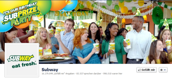
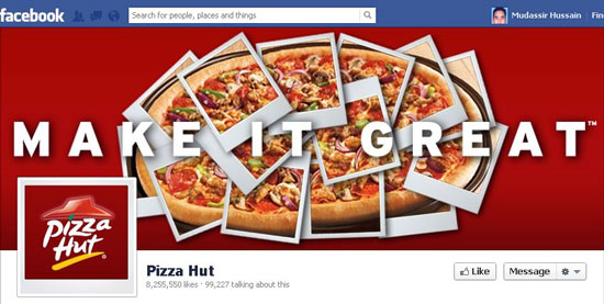
Pizza Hut

Whole Foods

Yogurtland

Method

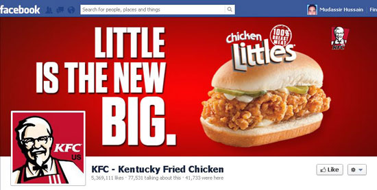
KFC – Kentucky Fried Chicken

User Voice

Tiffany & Co.

Diesel

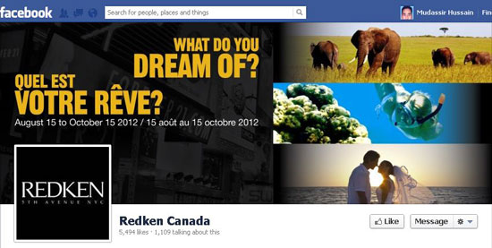
Redken Canada

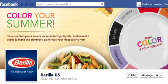
Barilla US

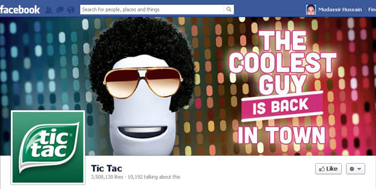
Tic Tac

Walmart

Nike

Ray-Ban

Gap

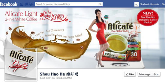
Shou Hao He


Examples of Unification of Cover and Profile Photo

Google

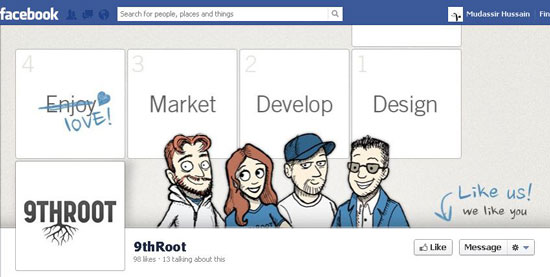
9thRoot

Designs 2 Develop

Espionage Cosmetics

Mathew Clay Freeman Studio

MPREIS

Stealth Web Designs

UNC Charlotte Dining Services

(dpe)


Sticky Menus Are Quicker To Navigate // navigation usability


Most designers would agree that navigation is one of the most critical components of a website. Despite this, it is not always easy to use or access. Traditionally, users must scroll back to the top of the website to access the navigation menu. I recently wondered whether sticky menus makes websites quicker to navigate, and I conducted a usability study to find the answer. Let’s look at the results of the study, a few implementation techniques and some related challenges.

Sticky Navigation Sign

Sticky Navigation Defined

Sticky, or fixed, navigation is basically a website menu that is locked into place so that it does not disappear when the user scrolls down the page; in other words, it is accessible from anywhere on the website without having to scroll. Although sticky navigation can be applied to any menu, such as the footer or social media buttons, we’ll focus on the main (or primary) navigation of a website. The image below shows the difference between standard and sticky navigation on a mobile device.

Standard Vs Sticky Navigation


Usability Study

Research Conditions

For the study, I created two test websites that were nearly identical. The only difference was that one of them had standard navigation and the other had sticky navigation. Forty participants were timed in completing five tasks on the first website. Then they were asked to complete five different taks on the second website. The order of the tasks was alternated between users to balance out the familiarity factor. The websites were tested on desktop machines, and participants were not told the differences between the websites until the end of their session. Data was not analyzed until the testing was completed. The results of the study yielded two interesting conclusions.

1. Sticky Menus Are 22% Quicker to Navigate

The data from the study indicated that participants were able to find what they were looking for quicker when they didn’t have to scroll back to the top of the page. 22% might not seem like a big number, but it can have a big impact on visitors. According to this data, sticky navigation could cut 36 seconds off of a five-minute visit to a website. Of course, keeping visitors on the page longer is only a benefit if you are enhancing the user experience along with it. Forcing people to dig through a website to find something does not qualify as such.

2. 100% Preferred Sticky Menus Without Knowing Why

At the end of each session, users were asked whether they noticed the difference between the two user interfaces. No one was able to identify it. The changes were subtle, and none of the users caught on because they were focused on completing their tasks. Participants were then asked whether one of the websites felt easier to use. Six of the 40 participants had no preference, but of the 34 that did have a preference, 100% of them indicated that the website with the sticky navigation was easier or faster to use. Many comments along this line were made, such as “I don’t know how the websites were different, but I felt like I was spending a lot less time clicking with the first one.� Such comments indicated overwhelming favor for the sticky navigation.

Desktop Software Navigation Menus

Imagine typing a document in Microsoft Word and having to scroll up to the top of the first page every time you wanted to bold a word or widen the margins. Just the thought of that sounds frustrating. Most desktop software provides access to the entire navigation menu no matter what you are doing in the application. The Web browser is no different; we would find it ridiculous to have to scroll to the top of a website to access the address bar of a browser.

Some Good Examples

Facebook and Google+ recently adopted sticky navigation, but they are among the minority. Of the 25 most visited websites in the US, only 16% currently have sticky navigation. Below are some examples of other websites that do an excellent job of pulling this off.

Fizzy Software
This is a perfect example of horizontal sticky navigation at the very top. Everything feels comfortable while you’re using the website.

Fizzy Software Navigation

Web Appers
The navigation here is vertical and on the left, somewhat resembling Google+’s navigation. The only downside here is that if the screen’s height is shorter than 560 pixels, then the bottom portion of the menu could become inaccessible, which was the case when I tested the website on a netbook.

Web Appers Navigation

MakeBetterApps
Here is another great example. Making the navigation slightly transparent, giving a hint of the content beneath it, is a nice touch.

Make Better Apps Navigation

Rodolphe Celestin
This sticky navigation spreads all the way across the top, but when you scroll down the page, the design of the menu changes slightly. Simplifying the design like this can be a good technique, as long as it doesn’t feel inconsistent. Also, the designer has taken an increasingly popular approach by making the entire website just one page; the menu links are anchors that bump you down the page. Some nice transitions and hover effects make this website enjoyable to use.

Rodolphe Celestin Navigation

Ryan Scherf
The navigation on this website is vertical and only icons. The creativity here is impressive.

Ryan Scherf Navigation

Web Designer Wall
The sticky vertical navigation works well on this website because the menu has only four items. This works well enough for blogs that I wonder why others don’t adopt this approach.

Web Designer Wall Navigation

While sticky menus aren’t the most popular form of navigation, more and more examples are popping up all the time.

Getting Started

Avoid iFrames

Are You Serious? iframes?
Avoid iframes when implementing sticky navigation.

This might seem like a straightforward way to implement sticky navigation, but avoid this method. iFrames cause more problems than they solve, particularly with cross-browser compatibility, security and search engine optimization. iFrames have their place, but they shouldn’t be a major part of your HTML layout.

CSS

CSS is a great way to implement sticky navigation. It also seems to be the most straightforward, most lightweight and quickest to code. The three things to pay attention to are position, margin-top and z-index. Setting the menu’s position to fixed disables the element from scrolling with the rest of the page. This will likely throw off your margins if your navigation is horizontal, so you’ll want to adjust for that. Finally, use z-index with a horizontal menu to make sure the navigation sits on top of everything; this will make the other content slide underneath the navigation as you scroll. Here is the general idea:

#navigation {
   position: fixed;
   z-index: 10;
}

#header {
   margin-top: 50px;
}

You will have to play around with the CSS to make this technique work right for your website. Additional information can be found on the W3C’s website.

jQuery and JavaScript

Smart Sticky Bar Navigation
The Simple Smart Sticky Navigation Bar is one of many good JavaScript implementations.

If you would prefer a jQuery or JavaScript solution to a CSS one, then you could try out one of the following options:

Many other solutions and scripts are out there. Please include your favorites in the comments below.

What’s The Bad News?

Give Me The Bad News

There are many opinions on this topic, and some would argue that sticky navigation isn’t worth it. Here are some things to be aware of.

Design Limitations

Going with sticky navigation could rule out some design choices that your team might not be willing to give up. For example, the most logical place for horizontal sticky navigation would be at the very top of the page, above everything else. While easy to implement, it might not be what your users need.

Distracting and Intrusive

If not done carefully, sticky navigation can be distracting. Some sticky elements get delayed when bouncing back into position as the user scrolls down the page. Others are so tall or wide that they dominate the layout and impede access to the content. Navigation should be easily accessible but should not compete with the content for attention.

Mobile Compatibility

Fixed-position CSS and certain JavaScript implementations lack support in some mobile browsers, which is a cause for concern among some developers. The article “Organizing Mobile� by Luke Wroblewski has some great principles to keep in mind when creating navigation for mobile devices. Responsive design techniques also offer some solutions for adjusting the navigation based on the size of the screen.

Be aware of the level of support offered by each device. Knowing compatibility issues beforehand will save you time in the end. When Can I Use? has some interesting information on support for position: fixed. Brad Frost has also done some of his own testing and analysis, providing some interesting insight in his accompanying video.

Conclusion

Why do we Web designers and developers continually force our users to scroll up and down the page in search of the navigation? This is not a problem in desktop software, and we now have the statistics to show the benefits of sticky menus. Navigation on 84% of the top 25 most visited US websites could be made quicker by implementing sticky navigation.

Of course, it’s not appropriate in every situation, especially when real estate is tight. But do seriously consider sticky navigation, while always accounting for usability and the overall user experience.

(al)


© Hyrum Denney for Smashing Magazine, 2012.


What Ate the Periodical? A Primer for Web Geeks

What Ate the Periodical? A Primer for Web Geeks

We’ve all heard an awful lot about the painful transition newspapers and magazines are going through. Two decades after the arrival of the web, the search for durable, profitable business models that make sense in the digital age goes on.

And in case you hadn’t noticed, it hasn’t been going particularly well. Most of these organizations still haven’t figured out how to fend off the gremlins gnawing away at their balance sheets—to say nothing of how to reverse the trend.

The internet changed the business of publishing in ways that are excellent for readers, authors, designers, and publishers, but it’s kicked the proverbial chair out from under lots of business models that were established prior to its arrival. Everyone can feel the effects of the publishing industry’s struggle to figure out exactly what value it offers, how to deliver it, and where to go from here.

There is a real need for the services these organizations provide, and a real opportunity for those of us who make our living working on the web to help guide the way. But before we can help solve the problem, we need to understand its history.

“Newspaper” and “magazine” are labels that speak to format and topicality, and plenty has been written about both. But they also speak to how those entities are structured as businesses. What, if anything, did the internet change about those things? And what qualities endure despite the shifting tides? Let’s take a look.

Advertising

Ads have long been central to how mass-market periodicals make money. But late in the last century, advertising’s share of revenue began accelerating. Today it’s not uncommon to crack open the ledgers of a mainstream periodical and find ad revenue making up 80 percent of its total income.

Under this kind of influence, publications—the best of which always excelled at targeting audiences—evolved into exceptional ad delivery vehicles for their tidy bundles of demographic joy. While the ad market was flush, there were few attempts to check this trend and diversify revenue sources. The industry cast its lot with advertising.

Then the internet ate advertising.

The last decade has seen a total cratering of the advertising market for newspapers and magazines. What happened?

On the one hand, precision metrics arrived with the internet. Clickthrough rates, time spent on site, and a host of other statistics became directly measurable and easily comparable, letting us evaluate the effectiveness (and arguably the real value) of ads. This information could only be guessed at a few decades ago, when ad pricing leaned on hefty doses of speculation and artful salesmanship. The web’s data-friendly nature forced ad sales departments to quantify and show their work.

On the other hand, the highly tuned, ultra-targeted advertising practiced by the likes of Google and Facebook brought new competitive pressures. The previous generation of advertising targeted fairly broad demographic tranches: “eighteen- to thirty-five-year-olds,” “Esquire readers,” or “jogging enthusiasts.” To a potential ad buyer, those targets can seem hopelessly crude compared to putting a barbecue ad in front of someone who just searched for backyard grills (the Google play), or feeding the right concert ad to someone whose musical preferences and social calendar you’re keeping tabs on (the Facebook approach).

There’s plenty of debate over whether these approaches really work, or possibly even constitute a paradox, but the economic effect is the same: They drive the price of old-fashioned, mass-market ads—and the per-capita profits thereof—down. (Oh, and it just so happens that Google and Facebook also have unprecedented audiences, so they can compete head-to-head with those good old-fashioned mass-market ads on reach, too.)

Subscriptions

Many of us have been trained to think the internet set the expectation that newspapers and magazines should be free online. That’s partly true, but the fact is that subscriptions were already highly undervalued at most organizations by the time the internet arrived. And it’s largely because of advertising that this happened.

You see, while the ad dollars were piling in, many media companies doubled down, deliberately lowering their newsstand and subscription prices below the break-even point in a gambit to increase circulation. The bigger your circulation, the more you can charge for all those ads you’re packing in—the prevailing wisdom being that the more people saw an ad, the more it was worth. (That circulation number was so important to the bottom line that an industry scorekeeper was set up just to keep tabs on it.)

And the loss they were taking on those dirt-cheap subscriptions? You guessed it—covered by the resulting gain in advertising sales. Publishers were incentivized to gut the price of their own consumer products. Drop the price, sell more issues, get more money back in the form of higher ad rates. To the point where some periodicals were (and still are) handed out for free, just to be carriers for ads.

Insert incredibly vicious cycle here.

The deeply subsidized status of subscriptions meant their perceived value was quite low in the eyes of many publishers. When it came time to decide whether or not to offer subscriptions online, plenty of advocates saw it as a no-brainer. Their play was already about volume, and the internet looked like the biggest volume play in history. Subscriptions online? No thanks, we’ll go free and make up the difference with ads that will reach an even larger audience. You don’t miss what you never really thought you had, right?

And it worked, for a time. But now that the bottom has fallen out from under ads, companies are looking for ways to claw their way back to healthy subscription businesses. A select few are just starting to show signs of progress, often by offering services in addition to subscriptions.

Data transformed into services

Subscriptions and ads weren’t the only legs of the stool that got broken. The other one was data. What exactly does “data” mean in the context of a periodical?

For a newspaper or magazine, data is valuable information collected and presented to the reader that falls outside the purview of core news and editorial content. Think classifieds, want ads, job listings, apartment rentals—even the weather report.

In the past, it was enough for a publication to spend a little time and money gathering this data up and printing it. It was a front-loaded activity, resulting in a largely passive (but useful) product. Readers did most of the footwork, leafing through pages and following up whenever they spotted something useful. And it was damn lucrative.

But this enterprise was quickly outdone by savvier players on the web. Startups that understood passive information has far greater value when it’s transformed into something you can act upon immediately, and in context. Get rid of that highlighter, pal. See that job listing? Just click on it. Boom, you’re done.

Data that’s turned into something actionable via included tools becomes a service. And that service has greater value, both to the end user and to the bottom line of the company presenting it, than passive data alone. The likes of Monster.com, Craigslist, and eBay took data to its next logical step online.

There’s nothing about this that newspapers or magazines couldn’t have done; they just didn’t realize the potential fast enough. The possibilities weren’t self-evident to the leadership at many of these companies, and others surmised audiences would keep coming to them just like they always had. That didn’t turn out to be the case, and static data no longer pulls its own weight at most operations.

A way forward: separating business from presentation

The most obvious thing the internet changed for newspapers and magazines is the physical manifestation of the medium itself. But while the internet introduced new material forms—webpages, device apps, APIs, and the like—they actually speak very little to the damage we’ve just surveyed.

Instead, when it comes to the business side of things, creating new paths for periodicals means recognizing which parts of the equation no longer exist, which new pieces replace them, and which components aren’t coming back at all. As web and app design capabilities evolve to include those of previous media, it’s important to recognize that those things do not constitute business solutions in and of themselves. Conflating presentation-layer technology with business models can be a costly distraction.

Now is the time for web developers, designers, and digital strategists of all stripes to lead experiments with making (and saving) money from the things technology and the web are good at: reach, scale, disintermediation, and a multiplicity of sources, both institutional and civilian. Smartly used, these attributes can help construct the next generation of newspaper and magazine businesses—ones that focus more on opportunity than on loss.

While the game may have changed for publishing’s old economic mainstays, the potential of its digital future remains largely unrealized.

It’s up to folks like us to help write it.

Translations:
Italian


RSS readers: Don't forget to join the discussion!


  •   
  • Copyright © 1996-2010 BlogmyQuery - BMQ. All rights reserved.
    iDream theme by Templates Next | Powered by WordPress