Archive for October, 2012

Desktop Wallpaper Calendar: November 2012


We always try our best to challenge your artistic abilities and produce some interesting, beautiful and creative artwork. And as designers we usually turn to different sources of inspiration. As a matter of fact, we’ve discovered the best one—desktop wallpapers that are a little more distinctive than the usual crowd. This creativity mission has been going on for over four years now, and we are very thankful to all designers who have contributed and are still diligently contributing each month.

This post features free desktop wallpapers created by artists across the globe for November 2012. Both versions with a calendar and without a calendar can be downloaded for free. It’s time to freshen up your wallpaper!

Please note that:

  • All images can be clicked on and lead to the preview of the wallpaper,
  • You can feature your work in our magazine by taking part in our Desktop Wallpaper Calendar series. We are regularly looking for creative designers and artists to be featured on Smashing Magazine. Are you one of them?

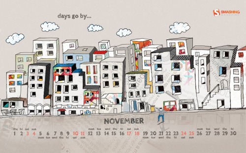
Days Go By

“Days go by so slowly in Autumn.” Designed by Mirjana Bajic from Serbia.

Smashing Wallpaper - november 12

Remember November

“This wallpaper is our tribute to great movie and graphic novel.” Designed by Agence Studio and German Ljutaev from Ukraine.

Smashing Wallpaper - november 12

A Sea Of Leaves

Designed by Arkadiusz Radek from Poland.

Smashing Wallpaper - november 12

November 2012

Designed by Vlad Gerasimov from Russia.

Smashing Wallpaper - november 12

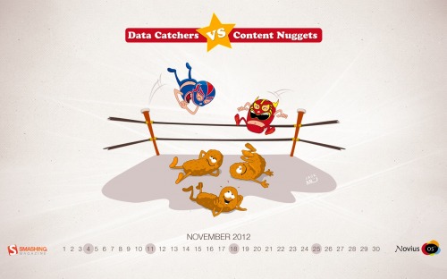
Content Nuggets vs. Data Catchers

“Novius OS is a new CMS built-on “Create Once Publish Everywhere” principle and is powered by these stranges creatures called content nuggets and data catchers.” Designed by Jack Mü – Novius Os from France.

Smashing Wallpaper - november 12

Smoke Kills

Designed by Cheloveche.ru from Russia.

Smashing Wallpaper - november 12

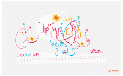
Primavera

“Here is a wallpaper that celebrates the arrival of the spring in the southern hemisphere.” Designed by Finxduvey from Argentina.

Smashing Wallpaper - november 12

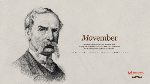
Moustache Movember

“Movember is a moustache growing charity event held during the month of November each year that raises funds and awareness for men’s health.” Designed by Michael Jones from Australia.

Smashing Wallpaper - november 12

Bursting Chestnut

Designed by Vlad Dusa from Romania.

Smashing Wallpaper - november 12

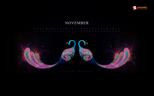
Abstract Peacock Wallpaper

Designed by Faria Malik from United Arab Emirates.

Smashing Wallpaper - november 12

Autumn Leaves

“Fall season brings out the best colors in nature. Even after rainfall, the bright fiery leaves still maintain their warmth and beauty.” Designed by Shay Pessah from USA.

Smashing Wallpaper - november 12

Give Thanks

Designed by Jeny Dowlin from USA.

Smashing Wallpaper - november 12

Autumn Choir

Designed by Hatchers from Ukraine / China.

Smashing Wallpaper - november 12

First Icicles Of The Coming Winter

Designed by Aleksandra Sivoronova from Latvia.

Smashing Wallpaper - november 12

Through The Looking Glass

Designed by Andrei Terbea from Romania.

Smashing Wallpaper - november 12

Ethereal

Designed by Forsaken from France.

Smashing Wallpaper - november 12

Night Dragon

“A hand-drawn dragon flying through the galaxy.” Designed by Bronte Allen from Australia.

Smashing Wallpaper - november 12

Fall Harvest

“For this month, the Fall Harvest theme is done using a scan of my original oil painting.” Designed by Beth Jenna from USA.

Smashing Wallpaper - november 12

Under The Mask

“Dreamy look under the half mask.” Designed by Goran Kojadinovic from Serbia.

Smashing Wallpaper - november 12

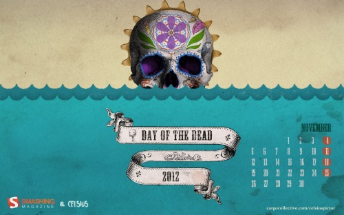
Calaca. The Day Of The Dead.

“This illustration was created to celebrate the dawn of one Calaca, in the Day of the Dead (El dia de muertos) this year this year that the world ends, as some say.” Designed by Celsius Pictor from Spain.

Smashing Wallpaper - november 12

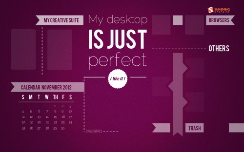
Perfect Desktop

“Because a perfect desktop is an orderly desktop!” Designed by Elise Vanoorbeek from Belgium.

Smashing Wallpaper - november 12

Mustache Movember

“It’s time to grow out your mustache and celebrate mustache Movember!” Designed by Marina Zhukov from USA.

Smashing Wallpaper - november 12

Thanksgiving

Designed by Cortando Pixeles from Argentina.

Smashing Wallpaper - november 12

My Sweet Home

Designed by Paarva Creations from India.

Smashing Wallpaper - november 12

Rainy Days

“I love penguins!” Designed by Vihra Petrova from Bulgaria.

Smashing Wallpaper - november 12

Join In Next Month!

Please note that we respect and carefully consider the ideas and motivation behind each and every artist’s work. This is why we give all artists the full freedom to explore their creativity and express emotions and experience throughout their works. This is also why the themes of the wallpapers weren’t anyhow influenced by us, but rather designed from scratch by the artists themselves.

A big thank you to all designers for their participation. Join in next month!

What’s Your Favorite?

What’s your favorite theme or wallpaper for this month? Please let us know in the comment section below.

Stay creative and keep on smashing!

(vf) (il)


© Smashing Editorial for Smashing Magazine, 2012.


Pixabay: More Than 40,000 Completely Free Photos And Illustrations


´

As designers we are always on the hunt for good pictures. Noupe certainly needs fitting imagery now and then and even more often. That's where photo-services, stock image providers and the like come into play. There are big marketplaces, offering you high-grade imagery at more or less affordable rates. Then we find repositories with free usage policies but varying licenses, which at times are not easily comprehensible. I have certainly been in trouble with this kind of mine-seeking. Pixabay, a fresh repository with a quickly growing selection of excellent imagery, is different, dead-simple. All the pictures are free, no license conditions apply. Pixabay delivers pure public domain photos.


Motion And Animation: A New Mobile UX Design Material


Growing up, weekends were about worship in the Hinman household. Sunday mornings were reserved for a laborious worship ritual dictated by my parents. It required dressing up in uncomfortable clothes, going to church and pretending to listen to long-winded sermons about Jesus (while I drew doodles in the hymnals).

Saturday, however, was reserved as my day of worship, and I was a proud and dedicated disciple of the church of Saturday Morning Cartoons. Every Saturday, rain or shine, healthy or sick, I’d jump out of bed, run downstairs to the living room, plant myself in front of the TV, and celebrate the gospel of Wonder Woman, Captain Caveman, Scooby Doo and Papa Smurf for hours on end. While my parents were far from enthusiastic about my choice of religion, they tolerated it as a form of quid pro quo for Sunday church attendance.

Little did either of us know that those hours of fanatical dedication to the gospel of Saturday morning cartoon programming would eventually turn into a valuable vocational asset. I imagine that many of you reading this are members of the very same congregation — the group of us who recognize the subtle yet important religious differences between still-frame cartoons (like those found in the funnies section of the Sunday newspaper) and the animated TV cartoons before, which we gladly took the communion of orange juice and cereal every Saturday morning. We are the ones who understand what adding movement to something flat and lifeless can do. Movement breathes life into everything it touches.

Wonder Woman

Scooby Doo
Animated cartoons such as Wonder Woman, Scooby Doo and Captain Caveman taught me how movement can breathe life into drawings.

Adding movement to anything — whether a series of drawings or the transitions between the screens in a digital experience — is not just as easy as “adding water.” It’s an art that requires patience, an eye for subtlety and careful study of how objects and people move through space and time.

Transitions and subtle motion-based animations are emerging as a new and compelling mobile design material, worthy of being learned and being used with efficiency and grace. The addition of movement to a mobile experience can provide clarity, information about context and, frankly, a dash of joy and fun. However, too much animation or funky transitions can destroy a perfectly good mobile experience. This makes understanding the guiding principles behind the art of animation the best first step to artfully applying motion to your design work.

The people who understand this better than anyone are the legions of brilliant animators who have worked at Walt Disney. Thankfully for us, two animators by the names of Ollie Johnston and Frank Thomas decided to put pen to paper and share with the world the basic animation principles used by Disney animators during the filmmaking process in their book, The Illusion of Life: Disney Animation.

You may wonder what animation has to do with the mobile user experience. While the art form of animation was once the provenance of animated films and television, it has found its way into the computer and digital user experience realms. Artful animation has all but invaded the mobile user experience field. Whether it is the transitions between screens of a mobile experience or the behaviors applied to UI elements that can be interacted with using gestures, motion has become a significant mobile design element. It’s a design material you can use to help guide users through the mobile experiences you create.

Taking cues from Johnston and Thomas, this chapter explains the 12 basic principles of animation, borrowed from their 1981 book The Illusion of Life: Disney Animation. Although originally developed for animated film and television, these principles are completely applicable to screened-based experiences, too. If applied with subtlety and finesse, motion can elevate your mobile work, giving it that little touch of magic that you experienced every Saturday morning as a child.

The Illusion Of Life Disney Animation
The Illusion of Life: Disney Animation, by Frank Thomas and Ollie Johnston, outlines 12 basic principles of animation.

Here are the 12 basic principles of animation:

  1. Squash and stretch
  2. Anticipation
  3. Staging
  4. Straight ahead and pose-to-pose
  5. Follow through and overlapping action
  6. Slow in and out
  7. Arcs
  8. Secondary action
  9. Timing
  10. Exaggeration
  11. Solid Drawing
  12. Appeal

The 12 Principles Of Animation

Principle 1: Squash and Stretch

People and objects have an inherent mass. When an object moves, the quality of the movement often indicates the rigidity of the object. Manmade real-world objects, such as a bookshelf or wooden chair, are rigid and have little flexibility. Soft surfaces, such as clothing, organic objects and plant leaves, have less rigidity and higher flexibility. Squash and stretch is the animation principle used to accurately express the rigidity of an object.

Squash And Stretch
Organic and soft-surface objects, such as a balloon full of water, have some level of flexibility in their shape. Squash and stretch is the animation principle that helps depict this quality in animation.

Consider using this principle when you decide what feeling you want your mobile experience to evoke as users engage with it. Is your mobile experience a world of solid planes, rigid surfaces and sharp, exact movements? Or is it a world that’s more organic, with softer, pliable surfaces and easy, graceful movements? Squash and stretch can help you express those movements.

Flipboard

Apple's iBook
Screen transitions on Flipboard exhibit the principle of squash and stretch to express that the surfaces inside the world of the application are rigid and board-like. By contrast, the screen transitions in Apple’s iBook use the principle of squash and stretch to echo the flexible and organic movement of turning the pages of a real paper book.

Principle 2: Anticipation

When an illustrator depicts a moving object or character, three distinct phases should be considered to make the object’s movement realistic:

  • The preparation for the action,
  • The action itself,
  • The results of the movement.

Whether it’s a baseball batter winding up before a swing or the recoil of a spring before it’s sprung, anticipation is the animation principle used to prepare an object for movement. Anticipation is about orchestrating the components of a scene — lighting, composition or even the form of an object or character — in order to give the viewer a clue of what is about to happen.

Bowler
The crouch of a bowler, winding up before swinging a bowling ball, is an example of a pose and motion that the principle of anticipation captures.

Similar to its application in animated film and cartoons, when applied to the realm of mobile UX, anticipation is all about giving the user insight into what is about to happen next. For example, the principle could be applied to the visual treatment of the interface as the user opens an application. It could also be applied to the transitions between experiences. Because gesture languages are relatively new to users, the principle of anticipation could also be used to provide affordance for gestural UIs. Anticipation gives clues about the speed and direction that objects in a UI can move and the gestural possibilities of those objects.

Aperture Animation
The aperture animation found in the camera application of many smartphones prepares the user for the action of taking a photograph.

Palm Pre
The way the cards in the Palm Pre’s UI move is an affordance for users, giving them insight into the gestural language of the UI.

Window Shade Animation
The window shade animation on the home screen of the Windows Phone 7 employs the principle of anticipation by giving users a peek into the phone’s dynamic tiled UI.

Principle 3: Staging

People keen on selling property often “stage” a home, meaning they arrange each room in such a way that its purpose is completely clear. The principle of staging in animation is similar, because good staging makes the central idea of an animation completely clear to the viewer. In the world of mobile user experience, the principle of staging is most relevant when considering the transitions between screens and interactions. An interaction that is well staged combines light, color, composition and motion to direct the user’s eye to exactly where it needs to be as they interact with the experience. Well-staged mobile experiences have a sense of flow and ease, whereas poorly staged ones feel disjointed.

Staging
The well-staged illustration on the right makes the central idea — of two characters engaged in conversation — completely clear. The poorly staged illustration on the left leaves the dynamic between the two characters open to interpretation, making the central idea unclear.

Staging is a subtle yet important consideration when applying animation and motion to a mobile experience. A key challenge in creating natural user interfaces is that they lack a strong conceptual anchor. As a result, users who are new to natural UIs often feel anchorless as they navigate touchscreen experiences. If you apply good, strong staging to the animation and transitions of your mobile experience, then users will likely feel more grounded when they interact with it.

Mobile UX Staging
Good staging used in the iPad version of Keynote enables users to see exactly where the file they are currently working on lives in the application’s file structure. This subtle use of staging makes the user feel grounded in the experience.

Principle 4: Straight-Ahead and Pose-to-Pose

Straight ahead and pose to pose are techniques related to the animation drawing process. In order to capture fast dynamic action with unusual movement, animators will use the straight-ahead technique and draw every single frame of an animation. The pose-to-pose drawing technique employs the use of keyframes (i.e. the important frames of a sequence) and in-betweens (i.e. the intermediate frames that express movement between the keyframes).

Straight Ahead
The illustration on top depicts the straight-ahead technique in which every single frame of an animation is rendered. The illustration on the bottom represents the keyframes that will be used in a pose-to-pose animation.

The vast majority of animations and transitions used in mobile experiences employ the pose-to-pose animation technique. Pose-to-pose usually suffices for transitions that are not overly complex and that can be described easily. If you’d like to incorporate unusual or dynamic movement in your experience that can’t be achieved using pose-to-pose, then you’ll likely need to incorporate the straight-ahead technique.

Plants Vs. Zombies
Popular games such as Plants vs. Zombies for the iPad employ pose-to-pose animation techniques.

Fruit Ninja
Games with more complex movement, as in the iPad game Fruit Ninja, use straight-ahead animation techniques to capture dynamic motion.

Principle 5: Follow-Through and Overlapping Action

Imagine a big dog with giant jowls shaking his head side to side. The dynamic movement of the flabby skin on his face as he shakes his head to and fro is an example of the fifth animation principle: follow-through and overlapping action. While anticipation has to do with the preparation of an action, follow-through involves the end of an action. Actions rarely come to a sudden and complete stop, but rather come to a gradual end. Follow-through captures how parts of an object (like the dog’s jowls) continue to move even after other parts of the object (like the dog’s head) have stopped moving.

Follow-through
Follow-through captures how different parts of an object move at different rates (such as a dog’s head moving at a different rate than its ears or jowls).

Now imagine that dog walking down a sidewalk with his owner. His entire body is moving, but the timing of his legs is different than the timing of his tail or head. Overlapping action is the animation principle that captures how parts of an object — such as the dog’s head, tail and legs — move at different rates. Capturing the movement, as well as the slight variations in timing and speed of these parts, makes the objects seem more natural. An action should never be brought to a complete stop before another action has begun. Overlap maintains a flow between self-contained phrases of action.

While UI elements of a mobile experience should work together to form a whole, follow-through and overlapping action can help you define and communicate the relationship between UI elements. Transitions and animations are a great way to express how elements of a UI interrelate.

Windows Mobile
The transitions to and from the dynamic tiles on a Windows phone employ the principle of overlapping action. The tiles do not travel as one unit, but rather each tile moves at a different rate.

Principle 6: Slow In and Out

Whether it’s a car peeling out from a dead stop or a sprinter bursting out of the blocks and making tracks in a race, objects need time to accelerate and slow down. The sixth animation principle, slow in and out, deals with the spacing required to accurately depict the inherent law of inertia that governs all objects and people.

Objects in the world need time to accelerate and slow down. A strategy to accurately depict this type of motion is to add more frames of the object near the beginning and end of the movement and fewer in the middle.

Inertia
Adding more frames of the object near the beginning and end of a movement and fewer frames in the middle creates the illusion of the effect of inertia.

This principle works for characters moving between two poses, such as sitting down and standing up, and for inanimate moving objects, such as a bouncing ball. While the experiences we create for mobile UX often live in another world — the world behind the glass of the mobile device — allowing some of the laws of physics to exist in that world will make those experiences more relatable to users. Whether it’s a subtle difference in timing in how a list of data scrolls or the animated transition that appears as an application opens, slow in and out will make the motion phrases of your experience flow in a way that feels natural to the user.

Scrolling List

Scrolling List
The principle of slow in and out is applied to the scroll of lists in many mobile UIs. More frames are at the beginning and end of the movement. This effect makes the UI appear as if it is governed by the laws of inertia.

iPhone Home Screen

iPhone Home Screen
More frames are at the beginning and end of the scrolling transition of the home screen on the iPhone, making the application icons feel as though they adhere to the laws of inertia.

Principle 7: Arcs

Objects don’t move through space randomly. Instead, they move along relatively predictable paths that are influenced by forces such as thrust, wind resistance and gravity. The outline of a sparkler on the Fourth of July or skid marks on the pavement from a braking car are rare physical traces of these paths; usually, an object’s trajectory is invisible.

Sparkler
An object’s trajectory is largely invisible, except on rare occasions, such as a lit sparkler whose glowing sparks trace its path.

While these paths are largely unseen by the human eye, patterns exist for trajectories based on whether the object is organic or mechanical. Objects that are mechanical, such as cars, bicycles and trains, tend to move along straight trajectories, whereas organic objects, such as plants, people and animals, tend to move along arched trajectories. The object you want to animate should reflect these characteristics for greater realism.

When integrating motion into a mobile experience, consider whether the object being animated should reflect organic or mechanical qualities. If the former, then the arc animation principle suggests that the object should move along an arched trajectory. If the latter, then the object would move along a straight path.

Fish And Water
Natural elements such as the fish and water in this iPhone application move along arched trajectories.

Interface Elements
Interface elements in the Android mobile platform tend to move along straight lines, giving the UI a mechanical feeling.

Principle 8: Secondary Action

Imagine a squirrel running across your lawn and then leaping into a tree. The movement of the squirrel’s legs (considered the primary action) would be animated to emphasize the animal’s light, nimble, spry gait. The agile, undulating movement of the squirrel’s tail (the secondary action) would be a separate and slightly different type of movement that supports the primary action.

Secondary Action
The primary action of this animation is the movement of the squirrel’s body and legs. The shape and character of the squirrel’s tail as it moves is the secondary action. Together, they make the animation feel more realistic.

The squirrel’s tail is an example of secondary action, which supports the primary action of an animation sequence without distracting from it. Secondary action is applied to reinforce the mood or enrich the main action of an animated scene. The key to secondary action is that it should emphasize, rather than draw attention from, the main action.

The transition that occurs when a user clicks on a URL in an email, activating the browser on an iPhone, is an example of secondary action. The primary action is the browser window swinging forward into view. The secondary action is the email application receding into the background. Both actions occur simultaneously, but the secondary action of the email application supports the primary action of the browser window.

Mobile UX Secondary Action
An example of secondary action applied to an animated transition between application windows.

Principle 9: Timing

In animation, as in life, timing is everything. The frustration and awkwardness we feel when objects, characters or life itself move too slow or too fast is a testament to the innate importance of timing. In the world of animation, timing refers to the number of drawings or frames of a given action, which translates to the speed of the action on film. Timing is an important technique to master because it helps define the physical characteristics of an object, such as weight, size and scale. It can also make objects appear to abide by the laws of physics — as seen, say, in the speed of an object when pushed.

In addition to expressing physical characteristics, timing helps communicate the emotional state, mood and personality of an object or character. For example, subtle adjustments in timing can communicate the physicality and mood of the focused and deliberate Wile E. Coyote as he feverishly chases the quick, good-natured Road Runner, who by contrast moves with ease.

Timing
Timing — the mere speed at which the Road Runner moves — expresses both the physicality of the character (weight, height and scale) and the mood of the chase between the Road Runner and Wile E. Coyote.

Whether it’s the speed at which a list scrolls or the pacing of a transition between screens in a mobile application, timing is subtle yet important to master. Timing, as it applies to the mobile UX, is an art that requires finesse and practice. Take the time to understand what is being communicated through the movement and speed of the interface elements in your design. Also, take time for experimentation and trial and error as you begin to work with animation.

iPad Photo App

iPad Photo App
The timing in the iPad’s photo application is akin to the quick shuffling of a deck of cards. It expresses lightness, buoyancy and hyper-realistic speed.

Principle 10: Exaggeration

The principle that I feel brings the most fun to the animation party is exaggeration. It’s the element that makes movement feel dynamic, alive and just plain fun — much like the iconic characters Ren and Stimpy.

Ren And Stimpy
Canadian animator John Kricfalusi masterfully used exaggeration in the Ren and Stimpy animated television series.

An animation without some level of exaggeration might look accurate, but will likely feel stiff and mechanical. Mastering this principle involves identifying the relevant design element, figuring out how that element moves, and then tweaking the shape, scale or composition of the element so that it reinforces the movement, while adding a layer of drama. Exaggeration does not necessarily mean extreme distortion.

The classic definition of exaggeration, employed by Disney, is to remain true to reality but to present a wilder form. When applying this principle to movement in a mobile experience, exercise a certain level of restraint. If a scene contains several elements, then the exaggeration of those elements should be balanced relative to each other, to avoid confusing or annoying the viewer.

Trampoline

iPad Transition

iPad Transition

iPad Transition
The transition between the home screen of the iPad and the opening of an application is exaggerated. It makes opening an application feel springy and fun, like bouncing on a trampoline.

Principles 11 and 12: Solid Drawing and Appeal

Of the 12 animation principles outlined by Johnston and Thomas, the last two — solid drawing and appeal — are the most specific to character animation. Thus, they have slightly less relevance to mobile UX. Solid drawing is about honoring the rules of three-dimensional space and giving objects and characters appropriate dimensionality through volume and weight. Solid drawing requires animators to understand the basics of three-dimensional shapes: anatomy, weight, balance, light and shadow.

Solid Drawing
Solid drawing emphasizes three-dimensional shapes, accurate anatomy and animation that has a sense of weight, balance, light and shadow.

The appeal of an animated character is similar to the charisma of a live actor. A character who is appealing is not necessarily sympathetic — because villains or monsters can also be appealing. The important thing is that the viewer feels the character is real and interesting.

Methods Of Conveying Motion In Your Work

While the 12 principles developed by Johnston and Thomas are helpful for providing a vocabulary for motion and giving a sense of what’s possible, the core question of how to integrate motion into a design remains. The first step is to be aware of motion as a design material. The next step is to begin to integrate motion into the design process. Here are three key places in the design process where you can begin working with the magic of motion:

  • sketching,
  • wireframing,
  • prototyping.

Sketching

The time to start thinking about motion is during the sketching phase of your design process. Similar to how the movement of an animated character expresses its personality, the movement of screens and interface elements are powerful ways to express the personality of the mobile experience you’re creating. Sketching ideas for transitions and movement phrases early on will help you think about the personality that you want your mobile experience to convey and how you can use motion to communicate it.

Sketching
This motion storyboard sketch for the “opening iTunes details� transition is done with basic sticky notes.

Wireframing

Wireframing is yet another phase in the design process to work out the motion you want to integrate into the mobile experience. Because wireframes often convey the flow of screens, transitions — i.e. the motion between screens — fit naturally into wireframe documents. Using images and illustrations, you can begin to draw out the movements you have in mind. Because wireframes are documents that communicate design ideas to both developers and stakeholders in an organization, simply including motion specifications in the document will make everyone aware of motion and get them talking about it.

Wireframe
This motion specification in a wireframe document relies on images and illustrations.

Prototyping

Sketching and wireframing motion are good first steps, but nothing beats the real thing. Using prototyping tools whose vocabulary includes motion is one of the most powerful ways to foster your own fluency with motion as a design medium. Tools such as presentation software (Keynote, PowerPoint, etc.) include motion in their vocabulary. Instead of sketching motion, create low-fidelity prototypes using this software, which will help you experiment with motion and communicate your animation ideas more accurately to the design team.

Keynotopia
Creating prototypes with software such as Keynotopia allows you to animate user interactions and transitions between screens, enabling you to experiment with your motion ideas using the real thing.

Tips For Applying Animation Principles To Your Mobile UX Project

  1. Exercise restraint.
    Few things are more annoying than a mobile experience with too much animation pizazz. While animation is fun and exciting, don’t over-apply it, otherwise you might turn a great experience into a train wreck. Instead, rely on subtlety and finesse to convey motion.
  2. Complementary principles
    Whether it’s a scene in an animated movie or the transitions between screens in a mobile experience, animation principles rarely exist in isolation. Rather, most effective animations are an orchestration of many principles applied together. As your animation skills grow, you’ll learn how to artfully combine these principles like great recipes.
  3. Animation in a supporting role
    In film, animation supports the story. The same is true for mobile UX. Animation should complement the mobile experience, not be the star. Make sure your animation supports the interactions in the experience and doesn’t detract or confuse.

Summary

Once reserved for cartoons and movies, motion is a new and powerful design material in the mobile UX landscape. In addition to bringing focus and clarity, it can add a bit of character and even magic to the experiences you create. While any new design material can be time-consuming to learn, getting up to speed on animation and motion will probably feel intuitive and not feel like a chore, and it will make all those hours of watching Saturday morning cartoons as a child seem like a wise investment.

To sum up:

  • Transitions and subtle motion-based animations are emerging as a new and compelling mobile design material that can add efficiency and grace. The addition of movement to a mobile experience can bring clarity, information about context and a dash of joy and fun.
  • Although originally developed for animated film and television, the 12 basic principles of animation from the 1981 book The Illusion of Life: Disney Animation apply to screen-based experiences, too. These principles are listed below.
    1. Squash and stretch
    2. Anticipation
    3. Staging
    4. Straight ahead and pose to pose
    5. Follow-through and overlapping action
    6. Slow in and out
    7. Arcs
    8. Secondary action
    9. Timing
    10. Exaggeration
    11. Solid drawing
    12. Appeal
  • Three key point in the design process where you can begin working with the magic of motion are sketching, wireframing and prototyping.

(al)


© Rachel Hinman for Smashing Magazine, 2012.


The Freshest Free WordPress Themes From October 2012


Last month we brought you a collection of the best themes, released in the month of September 2012. Today, we shall be taking a look at the top free themes from the current month, that is, October 2012. This comes down to a series and will provide you with all the best WordPress themes monthly.

A Designer’s Plea: Why Should Web Design Be A Profession?


When one goes to the professional, one expects to invest in his expertise. This investment requires no great leap of faith, as it is supported by a trust acknowledged among the general populace and duly warranted by the traditions of the profession. The standards and practices of an individual professional in the fields of, say, law, medicine, or aviation seldom present any great challenge to their clients’ preconceptions. Strict standards and regimented practices are the baseline assumption for all involved. Moreover, the results of those relationships generally support the ideal.

Unless we’re referring to the design profession. In which case, you can discount all of that.

Design, by comparison to other professions, is an odd and disappointing institution. While design exists as a profession in name at one end of the institutional spectrum, it also exists as a commoditized technical service industry at the other. And this is not necessarily a bad thing; it’s a construct of the market. It’s appropriate only within a very narrow context and far narrower than is generally assumed. But as I’ll argue in detail later, both designers and the public benefit from this commodity service aspect to the industry.

The problem with this situation is that there is no definitive guide for potential clients, detailing the differences between the commodity designers/agencies and the professional designers/agencies. To make matters worse, many who claim to be design professionals lack any understanding of the term and, therefore, erroneously claim it. As a result, those paying for a designer’s expertise often don’t know whether they’re working with a professional or a nonprofessional until some matter of vital import in the midst of a project makes it abundantly clear. At that point, the entire community of designers either triumphs or fails in the eyes of some very important people: those who need our responsible expertise and have gone to the trouble to pay for it.

You see, the uncompromising standards of design professionalism are highly constraining, expensive, and sometimes even off putting. Yet for the sake of our reputations and our clients’ fortunes they are our industry’s most essential traits. Therefore, the constraints of professionalism must be embraced and the costs paid. I submit to you that the design profession is an imperative.

It's Rough for Web designer.
The lack of transparency regarding professional standards in the industry means that the entire Web design community is held responsible for the mistakes of individuals. Image source: Andrew Mager.

Many would disagree. I understand that for any of this to make sense or even matter to you, you’ve got to believe that design should be a profession. Moreover, you’ve got to know why it should so that you can substantiate your belief. But why hold with this belief? It begs the question: why can’t design simply be a technical service industry, free from the fussy standards and constraints peculiar to a profession? It so often does fine as just that! Why is it important that design be a profession?

My effort here will be to answer that important question in a compelling and convincing way. I believe that in order to understand the profession’s imperative and place, we must fully understand how nonprofessional services fit into our industry and, by the same token, understand the voids created by the inadequacies of that approach. I also believe that this examination must take into account the motivations behind factors that promote unprofessional ideas and practices. So to start, let’s look at the most familiar and most commonly encountered facet of the design industry: the nonprofessional world of technicians.

Design as Commodity Service Industry

The opposite of professional is not unprofessional, but rather technician.
– David Maister, True Professionalism

Designers and just about everyone who employs them are familiar with the concept of designer as technician or service provider. Need a graphic? Tell the designer what it should look like and he can bang it out for you. Need an image gallery on a web page that wasn’t made to accommodate it? Show the designer how it should work and she can make it happen. Need a newsletter head mast font that communicates authority? Call the designer and he’ll send you 5 new authoritative candidates from which you can pick your favorite.

Multitudes of bosses, supervisors, and would-be clients already know what they want; they just don’t have the technical ability to make it. Call the designer!

Employing designers as technical service providers is an attractive prospect because it’s relatively easy, quick, and inexpensive. It’s easy for the designers too. Nonprofessional production service is light on obligation, plentiful, and often profitable. Design as a technical service industry addresses a market need and in this respect it’s necessary and beneficial. One could build a business doing this sort of work exclusively, and many freelancers and even agencies do just that. So long as the project’s scope and process aren’t too complex and the object of the work not significantly critical to anyone’s success, nonprofessional technical service may just fit the bill.

Keep in mind, though, that one feature of technical service employment, in contrast to professional employment, is that the designer gets managed. Working in a technical service capacity means the designer is there to provide little more than technical service, according to the standards, instructions, or whims of the one employing him. Design technicians need to be kept on task, on time, and their work moderated to reflect fluctuating supervisor preferences or customer preferences—whichever carries more weight. As in, “WAIT, lemme see… Well, the circle needs to be a darker blue. And can we make it more of an oval? Great. That page is going live in 30 minutes. Just send the graphic off to Jan when you’re done and she’ll put it up.”

Design As Commodity
The non-professional designer can provide quick, cheap fixes necessary to fast-paced businesses. As a design technician they aren’t constrained by artistic integrity. Image source: Jason Hickey.

This plentiful, light-on-obligation technical-service work brings with it certain tradeoffs. Costs, to use professional parlance. These costs are paid almost entirely by the customers, as they get results that are fractional to what could be realized in a professional relationship. The designers in these instances function merely as enablers to those costs and maybe even get paid well in the exchange. But there are some costs for the designers, too. They must suffer the potential indignity of having much of their expertise ignored and discounted, for instance.

For many, the benefits outweigh these costs. One of the more popular benefits is liberation from professional standards and constraints. For example, as technical service workers, designers and agencies have the luxury of taking on customers rather than clients. One does not discriminate among customers; all are welcome. In the commodity-design service realm, designers are engaged for their technical skill rather than for their uncompromising standards, depth of understanding, or ethical scruples. Therefore, one need not have years of experience or a rock-hard backbone to meet the minimal project requirements, which seldom include more than technical expertise. Technical skills are comparatively easy to project and maintain. Uncompromising moral and ethical standards, not so much. Those professional traits tend to chafe against the customer’s authority and strong will anyway (the customer is always right) and could jeopardize customer satisfaction and designer income opportunities. By contrast, the “I can do whatever you want me to do” approach is often more attractive.

Perhaps the most common articulation of nonprofessional design is subcontracting. Many designers and even agencies devote the majority of their project work to employing or being employed as subcontractors. Sadly, most subcontracting arrangements are not just nonprofessional but highly unprofessional, as they are set up to circumvent designer authority and critical communication in a fog of dishonesty. However, as long as the project context accommodates expediency and requires no significant investment or obligation, nonprofessional subcontracting (and no, there’s no such thing as professional subcontracting) can bring relative ease and speed to a simple project.

Subcontracting also extends the liberation of commodity service to larger projects and can thus expand profit opportunities. The results are inevitably mediocre, but there can be no denying that economy and expediency often outweigh quality concerns. There is a large and thriving market for “good enough,” especially when it preserves a strong-willed customer as the decision maker or obviates uncomfortable complexity in a project.

This arrangement can work so long as the results need be no better than what the customer or subscontractee can conceive of and allow. In these instances the designers are not expert decision makers, but rather the idea presenters and technical tool operators. Many designers are quite happy in this limited and comparatively safe capacity. Sometimes (most times?), however, clients need or are looking for something more dependable and more substantial than commodity design service. Professionalism is hard and many of its constraints present hurdles too great for designers to consider. But while designers typically balk at its constraints and obligations, the idea of professionalism is certainly attractive.

The Idea of Professionalism in Design

Without question, designers of all stripes love the idea of professionalism. It’s just that most prefer that idea remain as vague as possible in practical definition and application. The result is that the concept gets relegated to a station of subjectivity and cited merely for its halo effect.

I find that the vast majority of designers, when asked to define it, associate professional design practice almost exclusively with technical quality or “seriousness,” ignoring the uncompromising ethical, process, discrimination, and accountability factors. This is an unfortunate and disappointing sentiment, as professionalism has absolutely nothing to do with technical quality; which should merely be one positive result of projects involving professionals.

The reason for this preference is not so deep or difficult to understand: professionalism is expensive for designers. Proper preparation takes years and requires institutional guidance from senior professional peers. Professional standards impose grave responsibilities on the designer and are difficult to uncompromisingly maintain. They also tend to challenge the preconceptions of just about everyone who encounters them; designers included. According to the character of those brushing up against them, requirements for the professional conduct of design projects can be refreshingly positive or intensely off-putting.

Design is craft
Design is craft, but no matter how skilled you are as a designer, unless you are equally prepared in professional matters, your prospects will be limited and your circumstances compromised. Image source.

The refreshingly positive part is easy enough to understand. The off-putting part is due to the fact that few people inside or outside the industry expect designers to employ discrimination or to eliminate compromise with regard to moral, ethical, business, or process standards. Most potential clients and most designers believe that designers should simply behave as merchants; eagerly following whichever path the profit opportunity leads. Because unprofessional and nonprofessional employment has ever dominated our industry, most potential clients believe they should run their own project and make the design decisions after being presented with options. Most designers believe they should simply be told how high to jump and which hoops to jump through. Note: there exists no profession within those ideas.

As to expense, one unpopular result of maintaining professional standards is that a freelancer’s or agency’s viable client pool gets significantly reduced…which is nuts in the minds of most folks. Prevailing wisdom finds fault with any practice that deliberately limits opportunity for profit by applying what cultural convention perceives or defines as obtuse discrimination. Going along to get along makes far more sense. Why would anyone invite the difficulty of uncompromising standards into their life or their design practice? How does it even make sense that design should be a profession?

The Professional Imperative

When you think beyond the apparently easy money, cultivated expediency, and low-obligation assumed for some design projects, a couple of things beg for consideration:

  1. these qualities can ethically describe only the most insignificant of projects, and
  2. design results and the processes required for realizing them impact the experience and fortunes of real people.

People’s household incomes, staff payrolls, and economic futures often hinge upon how competent, how ethical, and how uncompromising their designers are.

These facts place a grave obligation on designers and on the industry itself. Every employment of a designer is an investment that demands a positive and profitable return. Designers have an obligation to meet that demand in prepared fashion. The fact is many projects—most, I’d argue—require understanding, skills, standards, and obligations beyond what is typically assumed. The commodity design service industry ignores this fact.

Uncompromising standards are the rule where quality and ethics matter, because these things are not bargaining chips. A designer’s comfort with or allowance for compromise has no place in a consequential design project. Since the commodity service approach is built on compromise and expediency, consequential projects can in no way be served by that segment of our industry. What’s more, common customer assumptions brought to commodity services are inappropriate in professionally run projects.

The ethical constraints for such projects do not allow for clients to compromise or circumvent the professional’s standards and prescriptions. This logical standard reflects the extension of the profession’s obligations into society and allows a design professional to demonstrate responsibility by not allowing the client to harm himself or others by deliberate choice and yet remain as a client. Despite how design organizations typically choose to define social obligation, it is established not on emotional or preferential grounds, but on moral and ethical grounds.

These moral and ethical grounds reflect practical mechanisms. For instance, clients need some acknowledged institutional assurance that their designer or agency will not abuse their relationship for financial advantage; that the fees paid and the work delivered amount to a mutually profitable exchange and not simple opportunism. They need the same reasonable assurance that their designer’s or agency’s work or process is not tainted by any conflict of interest. Moreover, clients need some acknowledge institutional assurance that their designer is worthy of the authority they’ve invested in him and that he is qualified to make the many crucial decisions in the project.

These qualities should be widely understood to be as associated with a specific segment of our industry; gathered up as the acknowledged professional qualities of members of the profession rather than happy exceptions that clients find by hit or miss. The term “design professional” should have an objective definition acknowledged by the public. Therefore, this segment of our industry must be devoted to a codified set of uncompromising standards. Design professionals should be identifiable to their client pool not because of how they lay claim subjectively to the term, professional, but by how they approach their dealings according to vital moral ideals and how they publicly proclaim adherence to an objective, ethical, social contract.

There is no Moral Compass App
Ethical responsibility is not a now-you-use-it now-you-don’t proposition. To secure the long-term trust of clients professionalism requires that standards be rigorously kept. Image source: Jason Tester.

To survive, these qualities must be cultivated in institutional fashion. Otherwise they reside only in individuals, locked up rather than compounded among peers over time. The profession and its culture are created in agencies and studios run by design professionals. It is not created in schools or universities, organizations, or magazines; despite what those merchants would otherwise proclaim.

As professionals, designers then have obligations to society, to their clients, to their peers, and to the profession itself. These obligations are imperative and they require a culture that respects, upholds, and reinforces them with a frequency and pattern not dependent on individual-member whim. Ultimately, professionals are defined by how they meet and uphold the fullness of these obligations in the conduct of their work, and by no other measure (as great design quality must be one’s baseline assumption).

Though this is not the primary thrust of my article, I’m compelled to suggest here that few are well served and a great many ill served by the existence of a design profession in name only. With the character and concept of “professional” so greatly varied throughout our industry, designers’ self-described professional efforts often undermine the ideal. Far too many potential clients have rightly developed a cynical view of the design profession. Designers of all sorts fight this view and sadly have to shape their approach and process to mitigate it. This is a failure, as our practices should not be shaped by cynicism.

This is what you get when truly professional practice is represented and perpetuated not by thriving, consistent culture inside agencies and studios as a rule, but by disparate examples that are often refuted by the most common case. So while an actual design profession exists, it doesn’t in any cultural sense in the industry. This must change if our profession is to have any articulate and objective meaning in society.

As I referenced at the start of this article, it requires no great leap of faith or perceived gamble for a client of a legal, surgical, or aviation professional to invest requisite trust and confer full contextual authority in their dealings. These investments are assumed and required if a professional is to cultivate a positive or successful outcome for his clients. The cultures and traditions of those professions facilitate that permission. The cultural tradition of design is inconsistent on this point and that must change if designers are to be widely allowed to deliver the fullness of their expertise.

Technical service in a commodity market can work and can produce positive results. Designers can find profit and many customers can find satisfaction there. I submit to you, though, that the design profession as a distinct and conspicuous segment of the design industry is not just a commercial imperative, but a cultural and moral imperative. Professional should be not some vague, inarticulate idea or an exclusive and elite qualification beyond the reach of the average designer. It should be an expected compulsory station for most designers, fueled and perpetuated by the mainstream culture of our industry.

Image source of picture on front page.

(al) (jc)


© Andy Rutledge for Smashing Magazine, 2012.

  •   
  • Copyright © 1996-2010 BlogmyQuery - BMQ. All rights reserved.
    iDream theme by Templates Next | Powered by WordPress