 The meaning of a street artist’s work comes not only from its content, but also the laws, politics and religion, both official and unofficial, that govern the region. In Chiang Mai, in Thailand, street art is not necessarily illegal – the streets are filled with trash, good luck symbols and homemade signs – but many natives will tell you it is a form of expression that has no connection whatsoever with their country. They claim the few working artists are either westerners or Thais – mostly students – obsessed with western culture. But...
Archive for November, 2012
Street Art In Thailand: Chiang Mai Graffiti
 The meaning of a street artist’s work comes not only from its content, but also the laws, politics and religion, both official and unofficial, that govern the region. In Chiang Mai, in Thailand, street art is not necessarily illegal – the streets are filled with trash, good luck symbols and homemade signs – but many natives will tell you it is a form of expression that has no connection whatsoever with their country. They claim the few working artists are either westerners or Thais – mostly students – obsessed with western culture. But...
Desktop Wallpaper Calendar: December 2012 (Christmas Edition)
We always try our best to challenge your artistic abilities and produce some interesting, beautiful and creative artwork. And as designers we usually turn to different sources of inspiration. As a matter of fact, we’ve discovered the best one—desktop wallpapers that are a little more distinctive than the usual crowd. This creativity mission has been going on for over four years now, and we are very thankful to all designers who have contributed and are still diligently contributing each month.
This post features free desktop wallpapers created by artists across the globe for December 2012. Both versions with a calendar and without a calendar can be downloaded for free. It’s time to freshen up your wallpaper!
Please note that:
- All images can be clicked on and lead to the preview of the wallpaper,
- You can feature your work in our magazine by taking part in our Desktop Wallpaper Calendar series. We are regularly looking for creative designers and artists to be featured on Smashing Magazine. Are you one of them?
Delivery
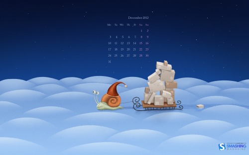
Designed by Vlad Gerasimov from Russia.
- preview
- with calendar: 800×600, 1024×768, 1024×600, 1152×864, 1280×800, 1280×960, 1280×1024, 1366×768, 1400×1050, 1440×900, 1440×960, 1600×1200, 1600×900, 1680×1050, 1920×1080, 1920×1200, 1920×1440, 2560×1440, 2560×1600, 2880×1800
Holiday Hand-lettering
“A hand-drawn snowflake to get you in the holiday spirit!” Designed by Stephen Kistner from USA.
- preview
- with calendar: 640×1136, 640×960, 1024×768, 1024×1024, 1280×800, 1600×900, 1920×1080, 2048×2048, 2560×1440
- without calendar: 640×1136, 640×960, 1024×768, 1024×1024, 1280×800, 1600×900, 1920×1080, 2048×2048, 2560×1440
Christmas Snake Surprise
Designed by Cheloveche.ru from Russia.
- preview
- with calendar: 1024×768, 1280×800, 1280×1024, 1440×900, 1680×1050, 1920×1200
- without calendar: 395×512, 1024×768, 1280×800, 1280×1024, 1440×900, 1680×1050, 1920×1200
New Year Is Near
Designed by Ljubinka Fuzinato from Bosnia and Herzegovina.
- preview
- with calendar: 1024×768, 1280×720, 1280×800, 1366×768, 1440×900, 1920×1080
- without calendar: 1024×768, 1280×720, 1280×800, 1366×768, 1440×900, 1920×1080
Christmas Wishes
“Ever since my childhood I have always imagined santa and snowman dancing & celebrating for christmas. Here’s an illustration of that. Merry Christmas to one and all :).” Designed by Bharat Kv from India.
- preview
- with calendar: 320×480, 1024×768, 1024×1024, 1280×1024, 1366×768, 1440×900, 1680×1050, 1920×1080, 1920×1200, 2560×1440
- without calendar: 320×480, 1024×768, 1024×1024, 1280×800, 1280×1024, 1366×768, 1440×900, 1680×1050, 1920×1080, 1920×1200, 2560×1440
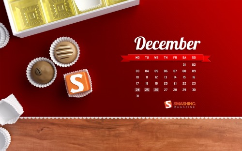
December
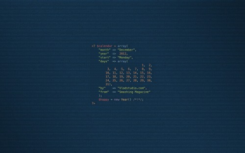
Designed by Vlad Gerasimov from Russia.
- preview
- with calendar: 800×600, 1024×768, 1024×600, 1152×864, 1280×800, 1280×960, 1280×1024, 1366×768, 1400×1050, 1440×900, 1440×960, 1600×1200, 1600×900, 1680×1050, 1920×1080, 1920×1200, 1920×1440, 2560×1440, 2560×1600, 2880×1800
Tree Of Lights
Designed by Vlad Gerasimov from Russia.
- preview
- with calendar: 800×600, 1024×768, 1024×600, 1152×864, 1280×800, 1280×960, 1280×1024, 1366×768, 1400×1050, 1440×900, 1440×960, 1600×1200, 1600×900, 1680×1050, 1920×1080, 1920×1200, 1920×1440, 2560×1440, 2560×1600, 2880×1800
Merry Christmas
“Christmas greetings from Santa and his reindeer.” Designed by Eddie Wong from Ireland.
- preview
- with calendar: 1024×768, 1280×800, 1440×900, 1600×1200, 1680×1050, 1920×1200, 1920×1440
- without calendar: 1024×768, 1280×800, 1440×900, 1600×1200, 1680×1050, 1920×1200, 1920×1440
Illustration (Underwater Paradise)
“Depending on our location on the globe, winter is lived differently. What about the underwater world?” Designed by Roxane Fiore from Canada.
- preview
- with calendar: 1024×768, 1280×800, 1280×1024, 1680×1050, 1920×1200
- without calendar: 1024×768, 1280×800, 1280×1024, 1680×1050, 1920×1200
Trailer Santa
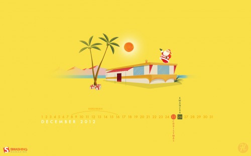
“A mid-century modern christmas scene outside the norm of snowflakes and winter landscapes.” Designed by Houndstooth from USA.
- preview
- with calendar: 1024×1024, 1280×800, 1280×1024, 1440×900, 1680×1050, 2560×1440
- without calendar: 1024×1024, 1280×800, 1280×1024, 1440×900, 1680×1050, 2560×1440
Frosty Globe
Designed by Adrian Limbasan from Romania.
- preview
- with calendar: 1024×768, 1280×800, 1280×1024, 1366×768, 1440×900, 1680×1050, 1920×1080, 1920×1200, 2560×1440
- without calendar: 1024×768, 1280×800, 1280×1024, 1366×768, 1440×900, 1680×1050, 1920×1080, 1980×1200, 2560×1440
Snowforest
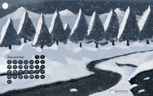
“For those who love snowy days.” Designed by Bas Fellerhoff from Netherlands.
- preview
- with calendar: 1024×768, 1280×800, 1366×768, 1440×900, 1680×1050, 1920×1080, 1920×1200, 2560×1440
- without calendar: 1024×768, 1280×800, 1366×768, 1440×900, 1680×1050, 1920×1080, 1920×1200, 2560×1440
Leaf Margins
Designed by Benga from Israel.
- preview
- with calendar: 320×480, 1024×768, 1024×1024, 1280×800, 1280×1024, 1366×768, 1440×900, 1680×1050, 1680×1200, 1920×1080, 1920×1200, 1920×1440
Winter City
Designed by Sarfaraz Ansari from India.
Fire Potion
“Fire Potion for sweet kisses and warm hugs.” Designed by Lin Chervenkova from United Kingdom.
- preview
- with calendar: 320×480, 640×960, 1024×768, 1024×1024, 1280×1024, 1440×900, 1680×1050, 1920×1080, 1920×1200
- without calendar: 320×480, 640×960, 1024×768, 1024×1024, 1280×1024, 1440×900, 1680×1050, 1920×1080, 1920×1200
House Of The Birds
Designed by Pietje Precies from The Netherlands.
- preview
- with calendar: 320×480, 1024×768, 1280×800, 1280×1024, 1440×900, 1680×1050, 1920×1200
- without calendar: 320×480, 1024×768, 1280×800, 1280×1024, 1440×900, 1680×1050, 1920×1200
White Playground
Designed by Kate Jones from Brighton, UK.
- preview
- with calendar: 1024×768, 1024×1024, 1280×800, 1280×1024, 1440×900, 1680×1050
- without calendar: 1024×768, 1024×1024, 1280×800, 1280×1024, 1440×900, 1680×1050
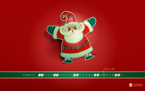
Santa Claus Is Coming…
“Santa Claus is coming with lots of happiness and blessings for you and wish you Merry Christmas!” Designed by Debobrata Debnath from India.
- preview
- with calendar: 1024×1024, 1280×1024, 1440×900, 1920×1080, 1920×1200, 2560×1440
- without calendar: 1024×1024, 1280×1024, 1440×900, 1920×1080, 1920×1200, 2560×1440
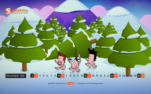
Ready For Christmas
“Frederique is a satiric webcomic series about the day-to-day adventures of three friends: going to school, getting rejected by hot chicks and enjoying life with full blown optimism.” Designed by Richard Dancsi from Hungary/Germany.
- preview
- with calendar: 1152×864, 1280×720, 1280×800, 1280×960, 1280×1024, 1400×1050, 1440×900, 1600×1200, 1680×1050, 1680×1200, 1920×1080, 1920×1200, 1920×1440, 2560×1440
- without calendar: 1152×864, 1280×720, 1280×800, 1280×960, 1280×1024, 1400×1050, 1440×900, 1600×1200, 1680×1050, 1680×1200, 1920×1080, 1920×1200, 1920×1440, 2560×1440
Kemono Ninja
“Kemono Ninja is the title of our new game and the kemonos are the characters of our game, we are launching soon and here you can see the kemonos been ready for the next Christmas Day.” Designed by Hector J. Sanz, Virtualmind from Spain.
- preview
- with calendar: 1024×768, 1280×800, 1280×1024, 1366×768, 1440×900, 1680×1050, 1920×1080, 1920×1200, 2560×1440
- without calendar: 1024×768, 1280×800, 1280×1024, 1366×768, 1440×900, 1680×1050, 1920×1080, 1920×1200, 2560×1440
Christmas In Advance
Designed by Elise Vanoorbeek from Belgium.
- preview
- with calendar: 1024×768, 1280×800, 1280×1024, 1366×768, 1440×900, 1680×1050, 1920×1080, 1920×1200, 2560×1440
- without calendar: 1024×768, 1280×800, 1280×1024, 1366×768, 1440×900, 1680×1050, 1920×1080, 1920×1200, 2560×1440
Decemberist
“December is plowing yet. When the smoke-clouds break,High in the sky shines a field as wide as the world.There he toils for the Kingdom of Heaven’s sake.Ah, he is taller than clouds of the little earth.Only the congress of planets is over him,And the arching path where new sweet stars have birth.Wearing his peasant dress, his head bent low,December, that angel of Peace, is plowing yet;Forward, across the field, his horses go.(Based on Chinese Nightingale, 1917).” Designed by Dynomite from Germany.
- preview
- with calendar: 1024×768, 1280×800, 1280×1024, 1366×768, 1440×900, 1680×1050, 1920×1080, 1920×1200, 2560×1440
- without calendar: 320×480, 1024×768, 1024×1024, 1280×800, 1280×1024, 1366×768, 1440×900, 1680×1050, 1920×1080, 1920×1200, 2560×1440
Xmas Time
“I wish you a Merry Xmas and a Happy New Year 2013 full of joy, happiness and prosperity ! :).” Designed by Tatyana Alexandrova from Russia.
- preview
- with calendar: 320×480, 1024×1024, 1280×800, 1400×1050, 1680×1050, 1920×1080, 2560×1440
- without calendar: 320×480, 1024×1024, 1280×800, 1400×1050, 1680×1050, 1920×1080, 2560×1440
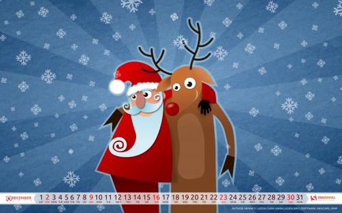
Best Friends
“Best friends posing for a photo.” Designed by Nenad S. Lazich from Serbia.
- preview
- with calendar: 640×480, 800×600, 1280×720, 1280×800, 1280×1024, 1440×900, 1600×1200, 1920×1080, 1920×1200, 1920×1440, 2560×1440
- without calendar: 640×480, 800×600, 1280×720, 1280×800, 1280×1024, 1440×900, 1600×1200, 1920×1080, 1920×1200, 1920×1440, 2560×1440
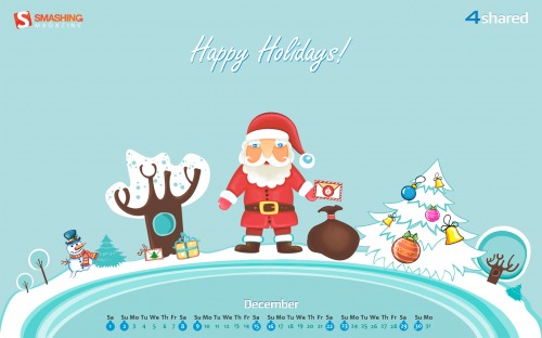
Happy Holidays
“It’s that time of the year, when we forget our tears, rejoice, love and cheer!” Designed by Webinnova from India.
- preview
- with calendar: 1024×1024, 1280×1024, 1440×900, 1920×1080, 1920×1200, 2560×1440
- without calendar: 1024×1024, 1280×1024, 1440×900, 1920×1080, 1920×1200, 2560×1440
Surprise
“Happy Holidays!” Designed by Zgm from Canada.
- preview
- with calendar: 1024×1024, 1280×800, 1280×1024, 1440×900, 1680×1050, 1920×1080, 1920×1200, 2560×1440
- without calendar: 1024×1024, 1280×800, 1280×1024, 1440×900, 1680×1050, 1920×1080, 1920×1200, 2560×1440
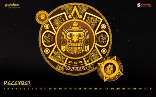
Maya
Designed by Katerina Bobkova from Ukraine.
- preview
- with calendar: 320×480, 1024×768, 1024×1024, 1280×800, 1440×900, 1680×1050, 1950×1080
- without calendar: 320×480, 1024×768, 1024×1024, 1280×800, 1440×900, 1680×1050, 1950×1080
Happy Holidays
Designed by Christina Mokry from Germany.
- preview
- with calendar: 320×480, 1280×800, 1280×1024, 1600×1050, 1920×1080, 1920×1200, 2560×1440
- without calendar: 320×480, 1280×800, 1280×1024, 1600×1050, 1920×1080, 1920×1200, 2560×1440
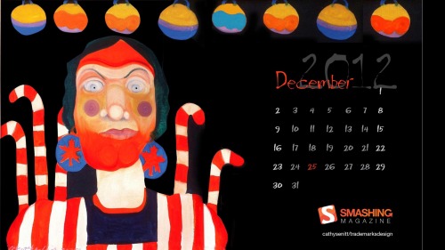
Crazy Elf
“We’ve had a lot of fun creating designs based on the paintings of our good friend Cathy Senitt. This is from one of her fantastic 70s portraits.” Designed by Shirley Al from Canada.
- preview
- with calendar: 1024×768, 1024×1024, 1280×1024, 1920×1080, 1950×1200, 2560×1440
- without calendar: 320×480, 1024×768, 1024×1024, 1280×1024, 1920×1080, 1950×1200, 2560×1440
Show Some Guts
“Sometimes you just have to show some guts; even if it’s not what other people have in mind!” Designed by Kristjan Ait from Estonia.
- preview
- with calendar: 1366×768, 1280×1024, 1680×1050, 1920×1080, 2560×1440
- without calendar: 320×480, 640×960, 1366×768, 1024×1024, 1680×1050, 1920×1080, 2560×1440
Sweet December
“Wish you a nice and sweet december 2012 :).” Designed by Claudio Lione from Germany.
- preview
- with calendar: 1280×720, 1280×960, 1680×1050, 1920×1080, 2560×1440
- without calendar: 1280×720, 1280×960, 1680×1050, 1920×1080, 2560×1440
Christmas Snowflakes
“Everything has its own magic during the Christmas.” Designed by Magdalena Vinterova from Slovakia.
- preview
- with calendar: 320×480, 1024×1024, 1280×1024, 1680×1050, 1920×1080
- without calendar: 320×480, 1024×1024, 1280×1024, 1680×1050, 1920×1080
Happy Holidays
“The wondrous Christmas celebrations and the immense genuine excitement fulfill our souls every single year, as soon as December begins. The magic spirit, brought up by the holiday can’t ever be compared to anything, likewise as the expectations for presents from Santa can’t ever be beaten with any other possible presents.” Designed by Maria S. from USA.
- preview
- with calendar: 1024×768, 1024×1024, 1280×800, 1280×1024, 1680×1050, 1920×1080, 1920×1200, 2560×1440
- without calendar: 1024×768, 1024×1024, 1280×800, 1280×1024, 1680×1050, 1920×1080, 1920×1200, 2560×1440
Winter Garphee
“Garphee’s flufiness glowing in the snow.” Designed by Razvan Garofeanu from Romania.
- preview
- with calendar: 320×480, 1024×768, 1024×1024, 1280×800, 1280×1024, 1366×768, 1440×900, 1680×1050, 1920×1080, 1920×1200, 2560×1440
- without calendar: 320×480, 1024×768, 1024×1024, 1280×800, 1280×1024, 1366×768, 1440×900, 1680×1050, 1920×1080, 1920×1200, 2560×1440
Join In Next Month!
Please note that we respect and carefully consider the ideas and motivation behind each and every artist’s work. This is why we give all artists the full freedom to explore their creativity and express emotions and experience throughout their works. This is also why the themes of the wallpapers weren’t anyhow influenced by us, but rather designed from scratch by the artists themselves.
A big thank you to all designers for their participation. Join in next month!
What’s Your Favorite?
What’s your favorite theme or wallpaper for this month? Please let us know in the comment section below.
Stay creative and keep on smashing!
(vf) (il)
© Smashing Editorial for Smashing Magazine, 2012.
16 Free WordPress Themes Released In The Month of November 2012
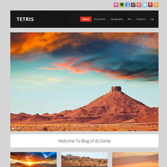 You’re right folks, it is the end of another awesome month, and I’m back with a collection of WordPress themes released during November 2012. Thanksgiving, Black Friday, Cyber Monday... and what not! The month of November was full of activity, and in terms of free themes as well, WordPress users received many treats! To begin with, Web2Feel released four free themes, followed by WPExplorer’s three awesome themes, along with many others by various developers and theme providers. So let's delve right into the WP themes released during the month of November 2012.
Tutorial: Introducing The Magento Layout
In this tutorial, we introduce the Magento layout by creating a simple module that will add some custom HTML content to the bottom of every customer-facing page, in a non-intrusive manner. In other words, we will do so without actually modifying any Magento templates or core files. This kind of functionality is a common requirement for many things such as affiliate referral programs, customer tracking analytics, adding custom JavaScript functionality, etc.
We will be covering a number of interesting topics, including:
- Magento layout handles
- Layout XML files
- Blocks and templates
- An alternative to Widgets
Once you have understood this article, you will have all the information you need to integrate popular third-party tools such as:
- Google Analytics
- Reinvigorate
- CrazyEgg
Before We Start
This tutorial assumes that you are already familiar with creating your own Magento module, so if you haven’t already done so, I recommend reading our previous article on Creating a Magento Module.
Okay, lets get started. The file structure of our new module should look like this:
app
  - code
      - local
          - SmashingMagazine
              - Layout
                  - etc
                      - config.xml

  - etc
      - modules
          - SmashingMagazine_Layout.xml
We can leave config.xml empty for now, as we will be populating it later on in the tutorial, but we can already complete the content of SmashingMagazine_Layout.xml, with:
<?xml version="1.0" encoding="UTF-8"?>
<config>
    <modules>
        <SmashingMagazine_Layout>
            <active>true</active>
            <codePool>local</codePool>
        </SmashingMagazine_Layout>
    </modules>
</config>
Introducing The Magento Layout
The content that is displayed on each Magento page is largely determined by the layout XML files, which can be found in app/design/frontend/base/default/layout. In these XML files, you will see a number of snippets of XML enclosed in layout handle parent nodes, which are used to determine the type of page being displayed. For example, the handle catalog_product_view is used to add content to the product detail page, and checkout_cart_index the basket page.
Child nodes are then created inside these layout handles to determine which content should appear on any particular page. These child nodes are called blocks, which may in turn contain child blocks of their own. For example, in a layout XML file for the product page (see app/design/frontend/base/default/layout/catalog.xml), under the catalog_product_view layout handle, we might find a block for displaying the product wrapper template. Then as children of that block, we would find a block for the product image template, a block for displaying the price template and another for displaying the add to basket template.
Each of these blocks has a template associated with it. In Model–View–Controller (MVC) terms, the block acts as a mini controller and the template acts as the view. All of the logic for displaying dynamic content is found in the block, which is requested by the template and displayed in HTML form.
The Magento layout is quite a complex, yet very powerful, beast, and as a result we will only cover the parts that are relevant to this tutorial. There is a layout handle named default which is included on every page, and since we want our module’s HTML content to appear at the bottom of every page, this is the layout handle we will use.
Adding A New Layout File
We need to define a new layout file to contain our updates, so first we need to modify our module’s config.xml to cater to layout updates:
<?xml version="1.0" encoding="UTF-8"?>
<config>
    <modules>
        <SmashingMagazine_Layout>
            <version>0.0.1</version>
        </SmashingMagazine_Layout>
    </modules>

    <!-- we are making changes to the frontend -->
    <frontend>

        <!-- we are making changes to the layout -->
        <layout>

            <!-- we are adding a new update file -->
            <updates>

                <!--
                    this child node name must be
                    unique throughout Magento
                -->
                <smashingmagazine_layout
                         module="SmashingMagazine_Layout">

                    <!-- the name of the layout file we are adding -->
                    <file>smashingmagazine_layout.xml</file>

                </smashingmagazine_layout>

            </updates>

        </layout>

    </frontend>

</config>
Now let’s create this layout XML file here:
app
  - design
      - frontend
          - base
              - default
                  - layout
                      - smashingmagazine_layout.xml
Now those of you who have a little Magento experience, or have read any more noteworthy Magento tutorials, may be gasping at the fact we are making changes in base/default since this is where Magento core files are located. However, we are not modifying any files here, we are creating new ones, and furthermore we are prefixing our file name with “smashingmagazine,” so there is very little chance of this conflicting with other modules or causing any issues with upgrading Magento in the future.
The content of our new layout file will be as follows:
<?xml version="1.0" encoding="UTF-8"?>

<!-- all layout files begin with this node -->
<layout>

    <!-- this is the layout handle we are interested in -->
    <default>

        <!-- this is the name of the block we want to add to -->
        <reference name="before_body_end">

            <!--
                here we define our new block and template
                to be added to 'before_body_end'
            -->
            <block type="core/template"
                   name="smashingmagazine_layout_footer"
                   template="smashingmagazine_layout/footer.phtml" />

        </reference>

    </default>

</layout>
Here we have referenced an existing block, before_body_end, in order to add our own block, smashingmagazine_layout_footer, as its child. before_body_end is the name of a block that has its content output just before the </body> tag of the page HTML. You can find the definition of this parent block by looking in app/design/frontend/base/default/layout/page.xml, and the content of this block is output in the .phtml templates within app/design/frontend/base/default/template/page.
By using reference, we are able to add content to existing blocks without needing to modify core Magento files. For example, we could achieve the same result as the above snippet by modifying app/design/frontend/base/default/layout/page.xml directly and adding our block code, but this is not good practice:
<default translate="label" module="page">
    <label>All Pages</label>
    <block type="page/html" name="root" output="toHtml"
           template="page/3columns.phtml">

        ...

        <block type="core/text_list" name="before_body_end"
               as="before_body_end" translate="label">

            <label>Page Bottom</label>

            <block type="core/template"
                   name="smashingmagazine_layout_footer"
                   template="smashingmagazine_layout/footer.phtml" />

        </block>

        ...

    </block>
</default>
Adding A New Template File
We have now defined a new block, smashingmagazine_layout_footer, and assigned the template smashingmagazine_layout/footer.phtml to contain our HTML content. Let’s create that template file now:
app
  - design
      - frontend
          - base
              - default
                  - template
                      - smashingmagazine_layout
                          - footer.phtml
The content of footer.phtml can be whatever we like, but for this tutorial we will create a very simple template containing an image, functionality which is often required by affiliate tracking integrations:
<img
    src="http://media.smashingmagazine.com/themes/smashingv4/images/logo.png?date=YYYY-MM-DD"
    width="459"
    height="120"
/>
Now it’s time to take a look at the front end. Upon viewing any customer-facing Magento page, you should see an image displayed at the bottom, and upon viewing the source of the page, you will see it has been included just before the <body/> tag.
Creating A New Custom Block
Now we want to tie in some simple logic to our template. The source of the image in our template includes a parameter “date” which currently contains a static value of “YYYY-MM-DD.” We want to be able to dynamically populate this parameter with the current date, for which we require some logic from our associated block.
At the moment, our template is associated with the default block type core/template, which only allows us some basic abstract block functionality. Therefore we must create our own custom block.
First let’s modify the block type definition in smashingmagazine_layout.xml:
...

<block type="smashingmagazine_layout/footer"
       name="smashingmagazine_layout_footer"
       template="smashingmagazine_layout/footer.phtml" />

...
Next let’s update our module’s config.xml to cater to custom blocks:
<?xml version="1.0" encoding="UTF-8"?>
<config>
    <modules>
        <SmashingMagazine_Layout>
            <version>0.0.1</version>
        </SmashingMagazine_Layout>
    </modules>
    <global>

        <!-- we are adding a new block definition -->
        <blocks>

            <!-- a unique short name for our block files -->
            <smashingmagazine_layout>

                <!-- the location of our module's blocks -->
                <class>SmashingMagazine_Layout_Block</class>

            </smashingmagazine_layout>

        </blocks>

    </global>
    <frontend>
        <layout>
            <updates>
                <smashingmagazine_layout
                         module="SmashingMagazine_Layout">
                    <file>smashingmagazine_layout.xml</file>
                </smashingmagazine_layout>
            </updates>
        </layout>
    </frontend>
</config>
Now let’s create this custom block PHP file:
app
  - code
      - community
          - SmashingMagazine
              - Layout
                  - Block
                      - Footer.php
Finally, let’s define our block class and add a simple method for retrieving the current date:
<?php
class SmashingMagazine_Layout_Block_Footer
    extends Mage_Core_Block_Template
{
    public function getDate()
    {
        $date = date('Y-m-d');
        return urlencode($date);
    }
}
Retrieving Dynamic Content From A Block
Inside a Magento template, PHP’s $this keyword contains a reference to the associated block object, so we can call the method $this->getDate() directly from our template:
<img
    src="http://media.smashingmagazine.com/themes/smashingv4/images/logo.png?date=<?php echo $this->getDate() ?>"
    width="459"
    height="120"
/>
Other Handles And Parent Blocks
Try experimenting by changing the layout handle from default to catalog_product_view or cms_index_index to see the HTML content appear only on the product page or the homepage respectively.
You can also try changing the location the content appears in our page’s HTML by modifying the parent block from body_before_end to after_body_start or content.
Summary
This is a very simple example aimed at showing you the basics of how to make use of the Magento layout without needing to modify existing templates, which would potentially cause you problems when upgrading your Magento instance.
Using the techniques outlined in this tutorial, you could easily add something like Google Analytics tracking to every page, without needing to modify a single line in Magento’s core templates. What’s more, if you no longer wanted the custom HTML content on your website, you could simply disable the module and hey presto, it’s gone!
The Magento layout is quite complex, and new developers might be tempted to simply “hack” the changes into the appropriate templates for the time being. However, the Magento layout is written in such a way that once we are familiar with it, we can unobtrusively add our custom content while not jeopardizing the ability to install community modules or to upgrade Magento without worrying, “will this work on my hacked-up Magento?”
Feel free to download the source code (ZIP).
Try It Yourself
Now that we are all experts on the Magento layout, here are some very simple examples which follow the very same pattern, but demonstrate how easy it is to integrate third party software with Magento.
Since all of the information you need is detailed in the above article, I will provide some pointers on how you should approach each integration.
Google Analytics
Magento actually ships with Google Analytics, so it is in fact as simple as entering your tracking code in the admin panel; however, this does not make it any less useful as a try-it-yourself example.
The first step is to visit the Google website to retrieve the snippet of code that you need to include on your website. You will notice the only dynamic element of the standard tracking code is the account number (e.g. UA-12345678-90), so for the purpose of this example I would suggest making this number the dynamic content to be retrieved from the block. In a future article, we will cover the topic of making this kind of content admin panel configurable, so abstracting it to the block for now makes good sense should you wish to revisit this example.
Now on to creating your module. I would suggest keeping the same namespace for all of these examples, “SmashingMagazine,” and a fitting module name would be “GoogleAnalytics” in this case. You will need all of the elements of the main article above, so make your way through the article once more, adjusting as required. Since you want your code to appear on every page, you should now know the best layout handle to choose.
If you encounter any problems, check and double check that you have followed the main article exactly, as most beginner issues with Magento are typos and syntax-related mistakes.
Reinvigorate, CrazyEgg and Everything Else…
You should now see a pattern emerging! You can simply follow exactly the same steps again to integrate other popular third-party software with your Magento website, all without modifying a single core Magento file or having to copy and paste content directly into the admin panel, where somebody could accidentally delete it one day.
I welcome any questions and would love to hear any feedback in the comments area below.
(cp)
© Joseph McDermott for Smashing Magazine, 2012.
Making Advertising Work In A Responsive World
Advertising has always had an uneasy relationship with the media because of ethical considerations on both sides of the printing press. On the one hand, journalists are reluctant, quite rightly, to be seen as under the thumb of an advertiser, and on the other side, advertisers don’t want to be seen to be enforcing their views on the free press.
The relationship between the media and marketeers is the greatest sham marriage of all time: convenience, rarely love. We need each other. Writers need to be paid, and people making products need to be paid too. That being said, the journalism profession has been somewhat eager to hand a lot of control of their content to advertisers for some time now.
The invention of the Web and the democratization of the publishing process have meant that audiences and readerships have become dispersed. In particular, the last 20 years have been difficult years for the media because changes in publishing came at the same time that everyone started to herald the death of print and the looming salvation of the trade by citizen journalists.
That caused publishers to drive down the price of ads, pack their websites full of bells and whistles and generally devalue their content. It’s because we’ve had this mindset for at least the past 10 years, if not 20, that we often find ourselves with absolutely irrelevant advertising which burns holes in our eyes when we try to read the smidgen of content that’s actually left on the page.
Of course, it’s not all bad news… just mostly bad news.
Mobile Advertising Is Big Business
First things first, mobile advertising is a very important industry in its own right. The sector is predicted to be 3.5 times more popular with marketeers by 2016 with the growth of mobile commerce already up 300% (PDF) from the previous year (figures relate to the UK).
It’s a business that analysts are expecting to grow greatly over the next few years, as the following data shows (Mobile Advertising Revenue by Region, Worldwide, 2010-2015 (Millions of Dollars), according to Gartner via mobiThinking.):
| Region | 2010 | 2011 | 2015 |
|---|---|---|---|
| North America | $304.3 | $701.7 | $5,791.4 |
| Western Europe | $257.1 | $569.3 | $5,131.9 |
| Asia/Pacific and Japan | $868.8 | $1,628.5 | $6,925.0 |
| Rest of the World | $196.9 | $410.4 | $2,761.7 |
| Total (Millions of Dollars) | $1,627.1 | $3,309.9 | $20,610.0 |
How Do The Users Feel?
Although you may often notice many people on Twitter getting antsy about mobile advertising or advertising in general, the research tells that users do pay attention to mobile advertising. In May 2012, Google partnered with analysts at Ipsos to find some rather telling statistics about mobile advertising and consumers:
- 84% of mobile users notice advertising;
- 31% of smartphone users have bought a product in response to a mobile ad;
- 56% of users have performed a search related to an ad they have seen on a mobile device — compared to 51% for TV, 41% for magazines and 34% for billboards.
In his article “Nielsen is wrong on mobile“, Josh Clark said:
“First, a growing number of people are using mobile as the only way they access the Web. A pair of studies late last year from Pew and from On Device Research showed that over 25%of people in the US who browse the Web on smartphones almost never use any other platform. That’s north of 11%of adults in the US, or about 25 million people, who only see the Web on small screens. There’s a digital-divide issue here. People who can afford only one screen or internet connection are choosing the phone. If you want to reach them at all, you have to reach them on mobile.”
The question for all parties involved is how to meaningfully integrate advertising into mobile experiences to ensure a healthy balance between user’s needs, publisher’s requirements and advertiser’s interests. Also, the people who facilitate the serving of ads care about getting the maximum number of people to click on the ad directly. This is where it’s getting difficult.

See also “The Mobile Performance Landscape” by Affiliate Window. Large preview (PDF).
Relationship Status: It’s Complicated
The relationship between advertiser and publisher is not without mediators. In the theoretical world, there are only three players (advertiser, creative, publisher), but in the wild, there are a lot more characters to factor into the equation.
Rob Flaherty, who has also written extensively on and tested some of the technical solutions to the problems presented by responsive design and advertising, points out that the relationship passes through as many as six actors before appearing on our devices.
This means that the theory of responsive design must also meet with the pragmatism of existing ad management solutions and requires advertiser’s willingness to change the existing model. And even if we manage to meet all of these requirements, we’re still assuming that the reader isn’t going to be annoyed by the ad — which, no matter how we deal with it responsively, is still going to take up a lot of screen real estate — and that’s not something that readers are looking forward to.
Problems
It’s not just publishers who are affected by this change in the way that ads are sold. It’s also the designers behind the websites, apps and digital products that advertising is sold on. Ultimately, it’s down to us to make sure that:
- Design looks good
After all, aesthetics are still at the heart of design. - Design is functional
Form follows function. We need the ad to work nicely across all of our platforms. - Design is helpful, and not distracting
The focus of the experience should be the content, not the advertising.
Let’s discuss each of these issues in more detail.
Looking Good
The main complaint about advertising on the Web is that it usually looks terrible — distracting, disturbing, almost ridiculous — in online magazines and blogs. Even if we discount the ubiquitous Google Ads products, we still can’t ignore the numerous flashing boxes, animated ads or complete takeovers of all the white space that are on a disproportionate number of many websites today. No wonder that many of us use an ad-blocker to avoid all these flashy distractions when reading online.
Essentially, in terms of the actual aesthetics of the ads, most of us will never have any say — that buck stops with the marketing department of the advertiser. However, designers and publishers should work together to make sure that a sensible strategy and the design of the website go hand in hand.
Take the aforementioned website takeover as an example. Although it is usually the most valuable of all the ad options, it is also the worst possible outcome in terms of design. All of that wonderful white space that you wanted to include into a beautiful front page design is, in just a few clicks, swallowed into the oblivion of an airline ad wrapped around your entire layout.
More importantly, these ads, which are usually extremely large and often animated, are so hefty in the actual size and performance that they often cause the browser to slow to a snail’s pace, hence significantly impairing user experience. So the ad not only robs publishers of a reader, it also robs the advertiser of the almighty click. Obviously if the advertising never loads, nobody sees it.
Being Functional
Being functional is obviously quite important, and it’s here that designers have been turning their attention to advertising. Late last year, Mark Boulton wrote a formative piece on responsive advertising, which really put the debate into the context of the designer’s world.

In his article article on responsive advertising Mark Boulton suggest to sell advertisers ad packages rather than a specific ad slot.
Some of us have been busy adapting, and that’s great. While everyone else has been coming to grips with cat videos and memes, we’ve been making sure those cat videos will fit onto all of their screens neatly.
Responsive design is now in a position where websites can look as if they were intended to be seen only on a mobile device or only on a desktop. Our world is great. Unfortunately, the advertising world hasn’t yet worked out quite what it’s going to do about that.
The problem, as Mark rightly points out, really is that advertisers pay for an ad space rather than for having their ad on a website. Although the difference is linguistically subtle, the implications are significant.
Currently, an advertiser is handed a rate card and is told that it will cost them X amount to have a vertical skyscraper ad on the front page’s primary sidebar. This is a system that works perfectly until that sidebar disappears when you look at the page on your mobile device. All of a sudden, an advertiser realizes they’ve been conned, and that a relatively large chunk of visitors never get to see the ads because they read them on mobile devices.
Of course readers are easily distracted, and if the website is blocked by a large annoying advertisement, they might want to check other similar online resources instead. If we try to solve our above problem by simply whacking a 160 × 600 pixel image into a mobile website, we will lose a lot of readers. Equally, if we scale it down to a more manageable size but serve the same ad, we’re going to lose a lot of advertisers when they realize no one can read that miniature text that looks fine on large desktop screens.
Let’s Not Distract The Readers
The main focus of a website should always be its content, and as far as possible, it is our job to stop readers from being distracted by things other than the content. However, that’s not something most traditional publishers are doing at the moment. Take this table for example:
| US Broadsheet | UK Tabloid | UK Broadsheet | |
|---|---|---|---|
| Number of stories on the front page | 120 | 120 | 100 |
| Number of ads on the front page (including classifieds and promotions) | 20 | 15 | 25 |
| Story to ad ratio | 6:1 | 8:1 | 4:1 |
Those story to ad ratios are alarmingly high. Particularly interesting, is that the UK broadsheet and the US broadsheet are alleged to be in the most financial trouble.
As an interesting side note, an equally telling figure is the astronomically high number of stories on the front pages of news websites. They are jam packed with stories and links, which all demand attention and detract from the overall reading experience.
We can’t carry on our publishing or design careers being continually pushed around without using well-reasoned, informed arguments to get clients a better end product. There must be a better way to marry great design and reliable publishing with the advertising world.
Solutions
There has been a fairly lively discussion of some of the approaches that advertising could take in an era of responsive design. The main contributors have been Mark Boulton, who initially floated the idea that there should be a new way of handling Web advertising in “ad packages”, and Paravel’s Trent Walton.
Mark Boulton’s Idea: Packages Rather Than Spaces
Boulton first championed the idea of a responsive advertising approach back in the latter half of 2011, when his company, Mark Boulton Design, had been working on a redesign of a major sports network website. He came up with the idea that you could possibly sell advertisers a package rather than a specific ad slot.
As mentioned earlier, there’s really very little distinction between these two approaches in terms of linguistic value. However, when it comes down to the numbers, in a responsive world, it makes a huge difference.
Mark notes that the world of advertising is pretty complicated, and not everyone wants a banner ad that simply sits there and looks pretty. Most advertisers actually want some sort of interactivity: from animated GIFs right through to the increasingly popular type of ads where two separate ad spaces interact with each other.
Trent Walton Gets In On The Game
While being the biggest proponent of a responsive advertising solution, Mark Boulton is not the only one looking for a solution. Many people are. Including Trent Walton, who wrote a response to Boulton’s original blog post raising some concerns (but also adding praise) to Mark’s approach:
“What happens if ads become fluid and text is designed into the images or movies? Readability will certainly suffer, as will clicks. I wonder if advocating a similar image + HTML text approach much like The Deck or Fusion Ads would be a possibility. That may be a lot to ask, but if things need to be redefined, let us not be short-sighted.”
In fact, images usually don’t work very well on small screens. The main problem is that images don’t scale well across devices. A banner ad which is very legible at a certain size won’t look optimal on all mobile devices. We can’t create a number of ad assets for the various resolution and at some point rescaling existing ad images will be necessary. Preparing ads in basic “image + HTML” format might be a more appropriate fit for responsive websites but would require the advertisers to be more flexible about the ways the ads behave in the responsive layout.
Josh Clark’s Approach
While working on their redesign of People Magazine’s mobile website, Josh Clark’s Global Moxie encountered the problem of advertising and started to think of ways around the problem:
“Traditional expectations continue to apply: advertisers want ‘above the fold’ banner ads, but those usually choke out content or flick by so fast you don’t see them. Both the advertiser and the reader are poorly served. I came up with a new ad format to try to address this.”
Instead of experimenting with existing ad models, Josh Clark came up with a new one. They created what they call “snap banners,” which are essentially a temporary model that closes the gap between where responsive advertising is now and where we should be in a few years time.

Josh Clark introduced snap banners. Initially, the banner is fixed to the bottom on a mobile device (left). When the user scrolls, the ad fixes into a “normal” position (middle) and then expands to full screen when clicked (right). Large view.
Snap banners solve the problem of the advertiser wanting to be “above the fold” and the user not wanting to see ads everywhere that they go. Initially, the banner (just an image) is fixed to the bottom of the browser window on a mobile device. When the user scrolls, the ad eventually fixes into a “normal” position on the page and then expands to full screen when clicked.
This gives a little something back to the advertisers who have paid good money to have their ad there, and also goes a long way toward not annoying the reader, who — generally speaking — is not interested in seeing ads in the middle of an article.
In his article, Josh presents very good points on advertising that are similar to Trent’s idea of responsive ads:
“We need more flexible ad creative: messages that are delivered in fluid HTML rather than static images. Ad agencies and networks need to step up here. It will open bigger opportunities for them, and unlock design freedom for publishers along the way. A well-crafted snippet of ad HTML can flow into any space it’s placed, adapt to any screen resolution, and target any device. Instead of juggling a ton of assets for a single campaign, you’ve got one tidy package. It’s better for everyone.”
Hybrid: What About Looking Backwards?
There are great ideas in all of the suggestions above and they might work well in your projects. But is there something else that we can do to make advertising work better in responsive projects?
If we look at advertising over the years, we can see that it hasn’t always been image-based. In fact, it hasn’t been image-based for very long. For example, in the old magazine issues you’ll find ads that are actually carefully-chosen images accompanied by very carefully-written editorial, below or beside the image. This approach was supposed to help advertising and publication to deliver a special value to the reader: it fit better with the editorial of a magazine.
The chances are if a reader is buying a magazine, they like the brand and also trust the advertising choices of the publisher. However, if you can design an ad which looks as good as the magazine and is written in the same editorial tone as the magazine itself, you’re probably onto a winner for the reader and the advertiser.

A picture and a thousand words.
Replicating this approach could work very well on the Web:
- On a standard desktop screen, the viewer would see a plain image. An image works well for a screen where you can easily read the content of the ad.
- On tablet screens, the image would also be displayed with an editorial — text written by or together with editors; it could be hidden when the screen size is over a certain resolution.
- On mobile devices with small screens, you could also include a “Read More” link — again, hidden from bigger screens.

An example of how our hybrid might look practically.
An alternative approach to using the hybrid method with a small mobile screen could be to launch a splash screen. In this approach, which is a variation on Josh’s method, we would detect the screen size of the browser, and, if it is a small screen, load a full-size splash screen with options to dismiss or learn more.
That’s not an ideal approach, because loading a full splash would be disruptive to the user, echoing the “word from our sponsor” ads that are so commonplace on newspaper websites. However, on a mobile device, a “show more”/”show less” option would be potentially tricky to use, given the small screen real estate.
Still, I strongly believe that this approach incorporates the good parts from all of the three approaches already discussed. In fact, by combining some of the ideas behind Trent’s suggestion of using HTML and images with some of the approaches taken by Rob Flaherty in his blog post on responsive advertising, we could have a pretty good kind of ad.
It’s A Problem With Communication, Too, Not Just The Design
Unfortunately, we’re not going to be able to solve the responsive advertising issue only with code — mostly because it’s a case of changing a cultural and commercial paradigm that comes with advertising, too. It goes right back to the original problem of finding a balance between a revenue stream and non-disruptive experience on the site.
An excellent comment left by Derek Johnson on Flaherty’s solution reads:
“There’s no natural starting point with that list, each influences the other one way or another, so they need to be brought on board together.
If some ad servers accommodate responsive ads and others don’t, then some publishers will be left out in the cold. It wouldn’t matter anyway if agencies aren’t convinced, and they in turn have to justify the inevitable extra cost to advertisers, who may just be the hardest to convince without solid proof of increased ROI.
Organizations such as DFP, Ad:Tech, the big agencies and advertisers representatives have to be made stakeholders in this as soon as possible. We need to explain this wonderful thing Ethan Marcotte discovered [..] and how it will benefit them, and we need their input to solve the problems we have.
In a sense, responsive ads is the easy part — it’s our thing after all. Without the rest (almost all) of the advertising industry on board we are merely piddling into the wind.”
We have to communicate the issue with responsive advertising more clearly to advertisers and publishers, so that we can start working on a solution which gives equal weight to good design, readability and advertising.
One of the most urgent things that needs to happen is to find a way to educate advertisers on the way that websites work today, and, as Josh Clark points out, that:
“It’s not just a technical issue. It’s also a sales issue. ‘Separate creative for separate devices’ is a reflection of the way these ads are sold. Mobile, tablet, and desktop versions of websites are presented as completely separate properties instead of simply ‘the website’. Trouble is, it’s people who form market segments, not devices. Segmenting by device — whether that’s for content or for advertising — just doesn’t reflect the way we consume information today.”
Until advertisers become aware that the way that we used to design and people used to use websites has changed, we’ll always have a problem with making ads work on mobile devices.
What Can We Do About That?
Creating a new paradigm is hard because the advantages of the new model have to be seen by a number of players involved in the advertising mechanics. That being said, we can help everyone involved see that packaging up a visual and supplying it to a media agency that places an ad on a single screen just doesn’t work anymore. That’s what we can do:
- Provide information about mobile browsing.
All actors in the process of selling an ad (advertisers, agencies, publishers and ad server managers) need to keep in mind the sheer number people who could be seeing their ads on a mobile device. If you are unsure where to direct them, Google’s mobile research is a great place to start. - Inform about the benefits of responsive design.
Most people outside of the design community don’t know what “responsive design” actually means. Ask media agencies and advertisers if they are familiar with the concept, and make sure to provide enough arguments to explain the advantages of the technique. Feel free to explain when responsive design makes sense and when it might be not the best approach, to help them make informed decisions. - Create something that will demonstrate what can be accomplished.
One of the best ways to demonstrate what can be achieved using responsive design is to demonstrate a working example. It might be useful to point your colleagues and advertisers to Rob Flaherty’s solution or the solutions outlined in this article as a starting point.

Our Mobile Planet research: an example of how to provide information about mobile browsing.
What If Advertising Isn’t The Right Model At All?
Most publishers probably will tell you that working without a heavy reliance on advertising would be the optimal solution. In fact, advertising revenue can be very difficult to predict and work with, especially if you have just a few regular advertisers on the site. E.g. the New York Times Company recently reported a 6.6% drop in print and digital advertising. What if advertising doesn’t work any longer? This question brings us to some very interesting ideas about new revenue models which would enable us to completely remove the ad revenue from the equation.
The Sponsorship
Probably the most widely used revenue stream apart from advertising at the moment is the sponsorship model. It is based on a simple principle from economics: instead of selling a high quantity of spots at a low price (advertising), sell a low quantity of spots at a high price (sponsorship).
The sponsorship model is derived from the idea that content wins affinity for a brand better than an ad. It says, “I trust the content of XYZ Magazine, therefore, I also trust ABC Brand.” The sponsor supports the site which puts their name on a special series of posts or a category on a website in order to provide good content, which is loosely a sell for a product or service that they administer or sell.
The main difference of the sponsorship model for sponsors is that they don’t try to force a marketing message upon the reader and use a “friendly” advertising approach instead. On the other hand, publishers keep the number of ads to the minimum and focus on good reading experience for readers instead.
This model is particularly effective for large publishers. Some prime examples include:
- Mashable
Mashable has worked with many blue-chip brands to provide content that is of interest to their readership and fitsto the style of Mashable. As they explain on their website, “Sponsored posts deliver information that is written by the advertiser, but approved by the Mashable editorial team. The Mashable editorial team has no direct relationship with the advertiser and does not influence the message.” Mashable gives up on editorial independence to provide third-party content to their readers but keep the right to decline a sponsored post if they feel that it’s inappropriate for the site. - Vice
Vice have always been very good at the sponsorship model. Big brands like Mini put their name on content which would often be considered too risqué to provide as a standalone advertising campaign.
The Paywall
Several years ago, the paywall was a hot topic for publishers, discussed by journalism schools all around the world. The idea of paying for content that you can get for free elsewhere on the Web does, you have to admit, appear to be absurd. It’s still not clear whether this model actually works in practice.
However, the approach is still worth discussion. After all, if no money passes between the readers and the publisher directly, we’ll always depend on sponsors and advertisers.
The paywall works by creating a “wall” around certain articles and making them available only to people who are willing to pay for them. This could work in several ways:
- The Times (UK)
The Times’ paywall works with a “quasi”-subscription model. Readers pay a small fee (there are several options) and then choose how they want to be able to access their content. Some packages include access to apps, some include only Web access. Particularly pertinent is the response on Twitter when The Times lowers its paywall as a teaser — there are suddenly a lot of tweets about The Times. This probably is a good indication that not everyone who wants to read The Times is willing to pay for the content. However, figures released by publisher News International last year suggest that the paywall approach is very reasonable — over 100,000 subscribed users is quite a number. - Le Monde (France)
When the idea of a paywall was first floated, French newspaper Le Monde came up with an interesting model which they have since substituted for a flat subscription fee. The model worked on a system of micropayments, where you buy a package of credits with which you can access paywall articles. This encouraged people to get into the habit of paying for news online, and I always found it preferable to putting all articles behind the paywall. However, it would seem that the fact they have moved onto a flat subscription means the micropayments paywall didn’t work for them.
The Content Partner
Finally, the content partner model works similarly to the sponsorship model. In exchange for a hefty sum of money, the publication provides publishing and content services for a large brand. This model completely eliminates the need for advertisers or sponsors. The idea is simple: you provide the resources such as your publication’s staff to promote another brand in a meaningful and professional way. For publishers, this means that there is a good revenue stream and a stable one. For partners, the model offers well-written content and a skill set that no one else in their organization has.
In Conclusion
We need to come up with a solution for advertising in responsive environment. Currently, no one has it exactly right, but we have highlighted several ideas that could be helpful in the emerging discussions on the issue. That being said, we’ve also discussed the opportunities available to bypass the advertising model, which, although now very established, is certainly not without its flaws.
In reality, as with all things in life, we need to strike a balance between passive and active income streams for publishing. In a world where people increasingly trust content and increasingly distrust marketing messages, this is now more vital than ever.
(cp) (vf)
© Marc Thomas for Smashing Magazine, 2012.

