Any web designer or developer with her heart in the right place knows that, to be accessible, every image requires an alt text. Except when it doesn’t.
Consider the common bio. For instance, this bio of Faruk Ateş. Among other elements, it contains an author photo, a page title (an h1 headline containing the author’s name), and a paragraph of biographical content beginning with the author’s name.
According to WCAG (not to mention every standards-oriented web design book ever written, including mine), it is good accessibility practice to provide alt text for those who cannot view an image.
But in this case it would be bad, because a blind reader would have to listen to Faruk’s name three times in a row: first, when the screen reader reads the alt text (“Faruk AteÅŸ”), then when it reads the h1 title (“Faruk AteÅŸ”), and lastly when it begins reading the paragraph.
In this case, then, it is better to use the null alt (alt=”“), and that is what we did in the A List Apart redesign. [Actually we use a modified null alt (alt=” ”) because several popular older screen readers mistakenly speak the file name in the presence of a true null alt.]
As we crafted our templates, we discovered many places where an alt text would have been redundant, offering a blind user no new information not already provided by the page’s HTML text, and merely annoying that user with needless redundancy. Markup is an art, and the soul of that art (as with all design) consists of creating the best possible experience for the user.
The more you know…

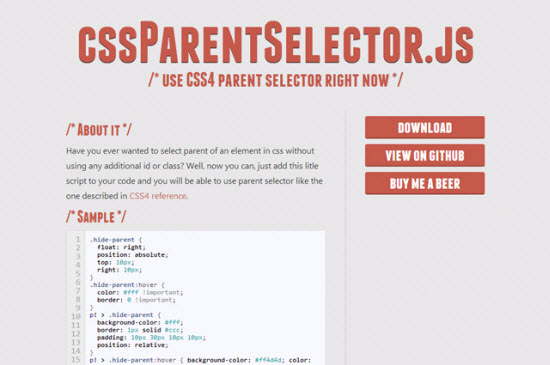
 CSS makes it easy to address child and sibling elements. Parent elements cannot be addressed by the use of CSS though, at least not today. CSS4 will introduce this possibility, but do not hope to see any browser supporting that any time soon. The jQuery plugin