Archive for July, 2022

A Guide to Optimizing your YouTube Business Channel

Running a YouTube business channel is a really challenging but rewarding undertaking.

That is because your channel could become a massive success over night. However, there are a lot of factors that impact how well your content is ranked on YouTube. Perhaps you have seen well-established channels which have great content, but that is only one part of the story. Apart from improving the quality of your videos, there are several things that you need to understand in order to truly master running an optimal YouTube business. This optimization process usually revolves around figuring out how the YouTube search engine works under the hood. If done right, you will be able to maximize your YouTube revenue but also promote your business to a bigger audience, with the possibility of attracting many new investors and forging new powerful partnerships. Here is a guide on how to optimize your YouTube business channel. 

Use subtitles and CC

YouTube subtitles are a great opportunity for you to add keywords to boost the ranking of your videos. This is essentially a video script in the form of a text which can be uploaded as a Subrip Subtitle File (SRT). This has some additional benefits which indirectly boost your YouTube ranking, such as improving the viewing experience for people with audio impairment. This way you can actually say your keywords, which is going to come across way more smoothly. In a way, this also creates a sense of cohesion because your video will reflect your title and video description, which is a big plus in Google’s book. 

Your thumbnails make a huge difference

One of the latest additions to YouTube is the animated thumbnails, which just used to be a static image. This has become a massive factor that many big YouTubers leverage in order to gain a massive ranking on this rapidly-growing platform. This is important because your thumbnail means much more than just a fancy image that represents minimal information about your video. It is an actual preview of your video, which means that if your thumbnail fails to capture the attention of a potential viewer your video won’t even receive a view. To some extent, on the initial search engine results page (SERP) the video itself doesn’t really mean much, but it is actually the thumbnail that makes all the difference. Your viewers don’t even have to watch the full video, but it is worth noting that every click on your video counts towards driving the click-through rate. In human psychology, first impressions matter, because people are after all superficial when browsing the internet. Luckily, there are ways you can stand out from your competition. The first thing to consider is that you should use an interesting color scheme since bright inviting colors can be truly captivating. In addition, you should use the dynamic banner and design patterns. Most of all, your thumbnails should not over-promise either since people have developed a good sense of what a clickbait video is. 

Select relevant keywords

Metadata on a YouTube page works the same as on any other site. This means that the engine will heavily rely on using keywords. This sounds complicated, but it is actually a game-changer. One of the first things to consider is adding a suitable keyword to your company name. This will make it easier for people to find your business online, as they will be hitting the relevant terms in their searches most of the time. In order to find the most relevant terms for YouTube keyword search, you should check out the amazing online tool that allows you to understand which terms are most popular for your niche. With this information, you will be able to add powerful new keywords to almost any part of your YouTube content. The description section below your videos should also include these keywords. In addition to that, you can also implement these magic keywords into your titles. This ensures that people will find your videos among the top few results.  As more and more people discover your channel using these terms you are basically teaching the YouTube and Google algorithm to retrieve your channel on the search engine results page (SERP). 

Publish longer videos

One often overlooked part about creating YouTube content is the length of the video itself. People treat this hidden feature as if they do not have any choice over it. When their ideas run out, that’s it, they end the video in a really short period of time. It has been found that the ideal length is around the 10-minute mark because it achieves a drastically higher watch time. Ten minutes is the sweet spot because people feel it is not too long so they can easily afford 10 minutes of their time, and it feels like just the right amount to actually find out something new. This is especially true in the business world, where it is of essential importance to convey your message across as concisely as possible. A great type of video for this length of time comes in the format of how-to videos. You can easily create a few main points that are going to really capture the viewers’ attention as they catch on to the pattern that you create.

Use end screens 

In 2017 video annotations have been discontinued and this created a massive change in the way people watch YouTube. This is because with the rise of mobile viewing people have realized that it is nearly impossible to watch a video with annotations popping on the screen. This means that your strategy has to change. Luckily, YouTube cards and screens have been found to drive much higher click rates and they are much easier to implement. This has another benefit as people won’t have to click off your videos because of annoying popups. In addition, you can now point to your other videos using the amazing functionality of End Screens which can also link to other website domains. This is a great option for businesses because they can link to their online shops so that viewers that watched all the way through the end have an amazing opportunity to actually get their hands on their product or service. This is, in a sense, an instant way to get qualified leads.

Managing a business over YouTube is an extremely smart move because there are loads of things you can do to maximize your business success; use closed captions, make captivating thumbnails, select relevant keywords, publish videos that are around 10 minutes long, and use end screens.

The post A Guide to Optimizing your YouTube Business Channel appeared first on noupe.


Design Thinking in Data-Driven Marketing

In design thinking, there is one principle more vital to success than any others. That is creative problem solving centered around improving the human experience. Fortunately, data provides a means to access and improve upon this principle for businesses that apply it. 

As companies strive to incorporate more data-driven decisions into their operations, the role of design thinking should not be neglected. Data as a means of understanding user experience enables businesses to streamline their marketing strategies. Where design thinking and data analysis intersect, the results are actionable insights. Data-driven marketing is about using these insights to form a more relevant and impactful platform for your business. 

But what exactly does design thinking entail? How can you use these concepts in data-driven marketing? And how can your business grow as a result?

Here, you can explore these questions and more as you learn how design thinking powers data-driven marketing. From principles to potential, these insights can elevate your marketing for greater success. 

What is Design Thinking?

Let’s start by defining what design thinking is and how it can relate to data-driven analysis procedures. This ideology informs your ability to solve problems in terms of your audience, helping you to frame solutions around real and impactful strategies. In marketing, it can be the most effective tool in your toolkit. 

In short, design thinking is a multi-stage set of tools and principles that puts a target audience at its forefront. It assesses who you’re designing for and centers actionable solutions around real needs and problems. Attributed to former Boeing engineer David Kelley, this philosophy/toolkit is your key to better marketing strategies. 

Design thinking makes this possible through its unique principles. These include

  • Empathy. Because real people are at the center of all business, design thinking places the user’s or customer’s needs at the center of the work.
  • Collaboration. You need the input and opinions of customers and partners to build an effective and empathetic design.
  • Innovation. Solutions and scalability require thinking outside the box.
  • Experimentation. Trying out new ideas alongside your target users is key to generating greater success.
  • Actionability. The design thinking process focuses on hands-on strategies for improvement and innovation, actions you can take to explore business improvements. 

Central to all these principles is empathy. Design thinking is all about putting yourself in the place of your users and customers to better provide solutions. Through it, you make it easier to experiment and innovate in ways that can make a real difference. In marketing, this often revolves around content and messaging that is especially relevant to your audience.

Big data, or information sets too vast to be analyzed by a human being, can be an effective means of supplementing user-focused design thinking for even more powerful results. That’s because data itself can be a source of ideas and actionable strategies. 

Where Design Thinking and Data Analysis Meet

The data you gather (big or small) represents information. As a result, you can plug that information into the stages of design thinking to help you identify areas of improvement. From here, an empathetic approach to problem-solving elevates your ability to derive actionable insights. 

The intersections between design thinking and data analysis are many. These are the situations you’ll need to focus on as you look to improve your marketing and grow your business. From making your marketing data more palatable to enhancing overall visibility, the combination of data analysis and design thinking makes it easier to avoid analysis paralysis and come away with real-world improvement strategies. 

Businesses in all kinds of industries have made use of these intersection points to great success. For example, Airbnb transformed itself into a household name by applying design thinking, experimenting, and analyzing the data. The vacation rental platform found itself stuck at a flat revenue of $200 a month, but by exploring non-scalable solutions to the problems it found itself in, it was able to turn things around. 

This was a risk that gave the company the resources it needed to derive more scalable features and design a user-focused platform that grew with time. Similarly, PillPak went from a start-up to a $1 billion Amazon acquisition with design-thinking innovations applied to data from the pharmaceutical industry. 

With growth potential like this, applying design thinking to customer-centric marketing is one of the best things you can do for long-term business success. But how can you use design thinking in data analysis to produce the kinds of results Airbnb or PillPak did?

How you can use Design Thinking in Data Analysis

To understand the applications of design thinking in marketing, it helps to understand data analysis. This is a multi-step process that requires first specifying data collection requirements and then cleaning and organizing that data for assessment. Ultimately, you’ll have to effectively communicate your data-driven insights to your marketing team and even your customers if you hope to maximize the potential of data-driven design thinking. 

You can even pair the data analysis process with the stages of design thinking to inform a customer-centric experience from the start. Through the intersection points of these ideologies, it’s easier to identify real customer pain points and problems.

These are a few of the ways you can go about applying design thinking in data analysis for better, data-driven marketing:

Framing your analysis questions

To start, design thinking should frame the questions you ask of your marketing campaign. These should be questions you can answer with data, complete with built-in indicators of success. You want your approach to data to be targeted and focused on real solutions.

That’s why even the data requirements you specify for your marketing campaigns should be tied to design thinking. You want to evaluate which data informs customer outreach, success, loyalty, and more to ensure you maintain relevant messaging.

Then, the areas of improvement identified by the data you collect frame the ways you proceed with innovation. Examples of effective analysis questions that result might include

  • How can customer engagement be improved by at least 5%?
  • What ad strategies can we employ to boost conversion rates by 2%
  • What UX improvements can be made to reduce landing page bounce rates by 3%?

These and many more analysis questions like them combine the power of data with the empathy of design thinking. Above all, improvements in customer engagement come from adding value to the experience. Assisted by data, you can see the monetary implications of these improvements as well. 

Creating a data-driven workflow

Similarly, design thinking and data analysis can be combined to produce a more efficient workflow. This is because more convenient and collaborative ways to work give employees more time to focus on the customer and evaluate issues. 

This is why Agile development has taken off in the Software as a Service (SaaS) industry. Agile development (like design thinking) is all about collaboration and empathy, allowing developers to focus on the end-user experience throughout the process. A reported 41% of marketers already employ this flexible and customer-centric framework, with another 42% of marketers looking to implement it. 

Design thinking in data-driven marketing can offer similar flexibility in an empathetic context. By collaborating with employees, customers, and clients, you can generate higher-quality data directly from your most important sources. 

From here, your marketing approach can cater to actionable and highly relevant strategies. 

Targeting marketing success

Data analysis is also an essential method of segmenting your marketing audience to focus more specifically on niche marketing or certain demographic pain points. Any marketing strategy worth its salt includes customer personas. Each of these entails its unique data points.

From here, design thinking can be applied to each targeted group to help form narratives around needs and challenges. The metrics you evaluate through the data analysis process reveal your audience and the ways your marketing is or isn’t meeting their needs. 

For example, higher rates of abandoned carts for a certain demographic could indicate that your marketing to this group is misleading in some fashion. The data allows you to go back, reassess, and reevaluate. 

The focus, no matter what the application, is to take the collaborative and customer-focused aspects of design thinking and apply them wherever the data indicates a need. Whether this data comes from page analytics, customer surveys, or a healthy combination, its potential can mean more effective marketing strategies. 

The Potential of Design Thinking in Data-Drive Marketing

Design thinking is vital to every element of business success. That’s because it combines a customer-focused approach to business with innovation, collaboration, and data analysis to create the most relevant solutions to any given problem.

McKinsey research even found that high design scores correlated with higher revenue growth. The top quartile of these businesses experienced an average revenue that was 10% higher than their competitors. 

The key is empathy. Data helps us understand and collaborate. By applying these concepts to a marketing strategy, you stand to elevate your business as a whole. Indirect results may also include a better brand perception overall, a feature you can’t put a price on. 

Explore the potential of design thinking in your data-driven marketing campaigns and reap the rewards of a customer-centric business model.

The post Design Thinking in Data-Driven Marketing appeared first on noupe.

Eye-Catching Typography To Get More Leads

Typography has been an ongoing trend in graphic design for the past five years. There are typography and font tools, font generators, and even courses on how to use them, all over the internet. The chances are that if you’ve seen a colorful, eyecatching infographic, you’ve also seen a good example of typography. This design approach has become indispensable in both web copy and web design, as it draws attention, sets the tone, and even underscores the overall theme and design of a website.

Typography’s Effects on the Mind

Image source: https://www.pexels.com/photo/framed-picture-with-inspirational-text-hanging-on-wall-6430730/

You’ll hardly find a contemporary website these days that doesn’t utilize some form of typography, whether it’s within the site design, banner, or the company logo. But typography is more than just artistic and creative methods of placing text in a graphic. It’s an art form that aids the onlooker in absorbing information better.

Fonts are the core of typography, and the right one can even affect a user’s mindset or impression of a company. There are many ways that fonts can affect the psychology of a user.

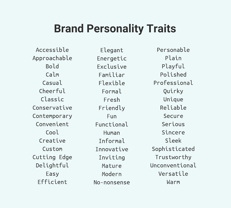
Expresses Brand Personality

You need to determine what identity and personality your company is trying to project on its site visitors and choose the right fonts. Using the right type or class of font becomes a reflection of the brand itself. And this personality is what customers will innately detect from the moment they see the typography on your webpage upon arrival.

Grabs Attention

Depending on the type of font used, it is also a method to gain the user’s attention. For example, a heavy, slab-type font is ideal for headings and headers as it’s bold, strong, and immediately draws the eye. For example, a site for podcast tools can highlight brand names with different font usage.

Another way is to use a serif font as a header and then a sans-serif font to create a hierarchy between the texts. It distinguishes which area is vital for readers to note in the body text.

Triggers a Visual, Emotional Response

Great typography can make your customers react. Your website’s text may be easier to read because of the typography elements compared to what your competitors do. It makes customers want to stay on your website and read more. They will become leads, which is a step closer to eventually converting them.

Typography also sets the mood for your readers’ emotions. This applies to all industries, whether using fonts in a formal website for lawyers, an elegant site for corporate gifts, or a playful dog walker’s site.

Weaponizing Typography

MINOLTA DIGITAL CAMERA – Image source: https://www.freeimages.com/photo/typograpgy-1242973

Today, many of the best graphic design software helps designers weaponize typography as a means of growth hacking, assisting websites in gaining more leads and conversions. Like other marketing methods, typography changes with different trends every year, going with what appeals to customers. It may only continue to evolve in the future.

In its most basic sense, typography is defined as the art of appealing to a user’s aesthetics through the appearance and style of the text. Typography applies to any form of text and any usage the text may have. It can apply to a single word, a phrase, a sentence, or even an entire paragraph.

The crucial elements of typography to know are:

  • Kerning — It specifically refers to the space between every letter and every word, which makes it legible and clarifies that they are separate words.
  • Hierarchy — An easy example of this is considering the differences between subheadings and body text. Headings typically have a different font, weight, and style than the body text, indicating that they are important pieces of information that categorize the rest of the body text below it.
  • Alignment — This unifies all the designs on the page, whether it be the images, videos, and other forms of media, with the text.
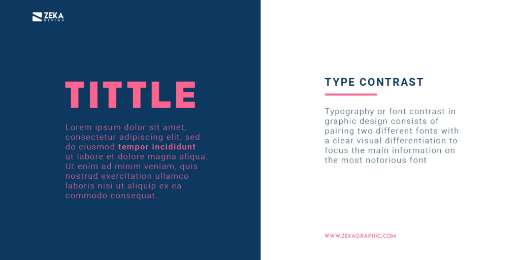
  • Contrast — Similar to hierarchy, contrast creates elements for the reader to focus on. A header might have a bright pastel color to draw attention, while the body text remains plain.
  • Line Length and Tracking ??— Tracking specifically refers to how much space there is between letters in the line. This is how long each line of the text becomes. With more spaces between letters and words or more flourishes in the fonts, the line becomes longer.

These elements affect the customer’s or reader’s personality and their perception of your brand. The text is what helps them assign and associate values with your business. This means typography must be used wisely as a weapon for conversion. Below are some tips you can apply: 

1. Choose a Font that Visually Reflects your Message and Identity

Remember that 93% of consumers rely heavily on the aesthetic and overall appearance of a product, site, or service before they judge it. Therefore, your choice of typography lends an image to your brand from the moment customers see it.

Consider your brand’s personality, values, and target audience. You don’t want to choose a curly, cursive, or informal font for a serious website such as one for medical services. You want elegant, straightforward types like serif and sans serif fonts.

2. Make Wise Usage of Font Contrast

As mentioned in the section above, font contrast refers to how a different font, weight, or color can create a highlight to the overall design. Use this to your advantage by contrasting through white space, color, and dark body text to draw your reader’s eye to crucial areas of the page.

If you have a lot of information on the page, make it more legible and easier to read with a light or white background and dark or black text. Colored types can be used to get attention on headlines.

3. Choose your Main Fonts and Get to Know Them

Every site’s overall design should have no more than two to three fonts. There are major fonts, and they can express different identities.

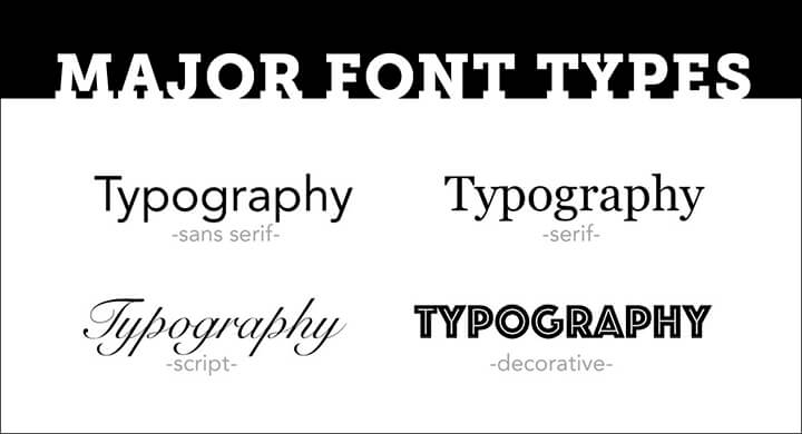
Fonts, for example, are typically categorized as

  • Serif (with the decorative lines or serifs at the tips of each letter),
  • Sans serif (with clean, modern endpoints),
  • Scripts (which mimic human handwriting and are full of curling flourishes),
  • Slab (with strong, heavy type), and
  • Modern (which are expressive, with chic, stylish cuts).

These different fonts give the brand different characteristics, whether it’s familiar and friendly, sophisticated and elegant, or blunt and straight to the point. Choose the type with the correct representation for your brand.

4. Consider your Font Stress

Font stress refers to the visual change of direction that affects every stroke of the type. Similar to the usage of contrast, font stress will depend on the hierarchy of your website. Some brand names and logos you see sometimes change font styles within the same name.

Quirky details like these can add to the personality of your products and your site. Clever usage of multiple old-type fonts can give a label or a brand a rustic or antique feel. Closely-fitted words in various weights add creativity and interesting depth.

5. Mobile Typography Matters

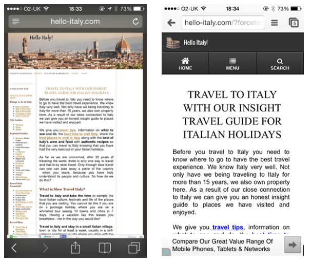
Remember that many users now visit your brand’s site through mobile devices. Just as a developer has to consider the site’s appearance between PC and mobile platforms, the typography should also accurately reflect the brand on both platforms.

Mobile is often smaller and more compact, so there isn’t much room for flourishes, so choose the logos and labels wisely without compromising character. Moreover, legibility is more important on smaller screens.

6. Use Safe Typefaces

What are websafe fonts? These are fonts that you can conceivably expect to appear on every user’s computer or mobile correctly. Some custom fonts won’t appear on a customer’s webpage because they haven’t been installed there. But websafe fonts can display correctly with everything.

Be familiar with the different varieties of websafe fonts and utilize them when possible. This ensures that your website appears as intended on any platform.

Eight Examples of Modern, Eye-Catching Fonts

Modern typography has come a long way, adapting to the ever-changing needs and moods of the online audience you’re trying to attract. Here are some crucial examples to study.

Moon

This rounded, sans serif font is wide with circular themes and comes with three different weights. As the name suggests, it’s a modern font that evokes futuristic and fun images. It’s an excellent, legible font for reading and is simple in its appearance that it can be used as a font to underscore more highlighted text.

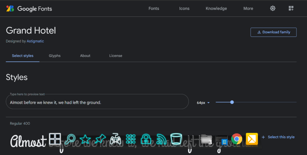
Grand Hotel

It’s a highly versatile script font that is both elegant and fun. It’s ideal for headers and titles for the menu as it evokes comfort and softness while displaying elegance. Best of all, it’s a websafe font as it can be installed through Google Fonts, making it easily available for display on various platforms.

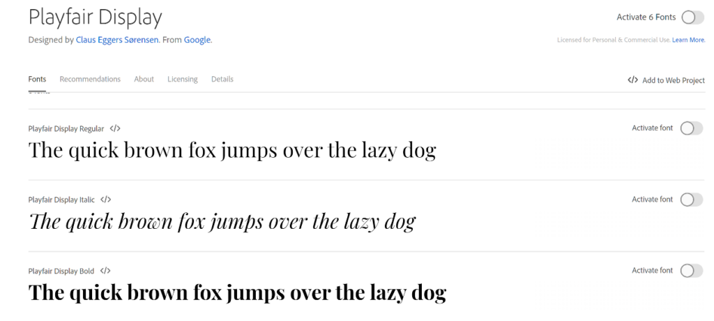
Playfair Display

This is another websafe font readily available on Google Fonts and multiple online design tool platforms. It has feminine appeal and pairs well as a header for sans serif fonts. It’s elegant with good height and available in multiple weights, creating an image of a fashion magazine and aesthetically pleasing.

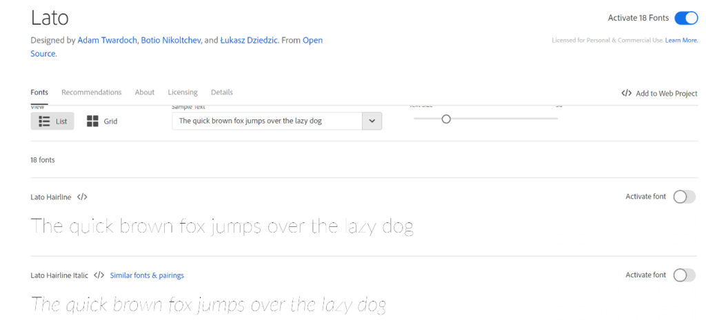
Lato

Lato is also websafe and available on Google Fonts. It’s ideal for body text because of its crisp, slim lines and rounded ends. The overall appeal is high professionalism and great readability while remaining modern and friendly. It’s a popular font of choice for corporate or informative websites.

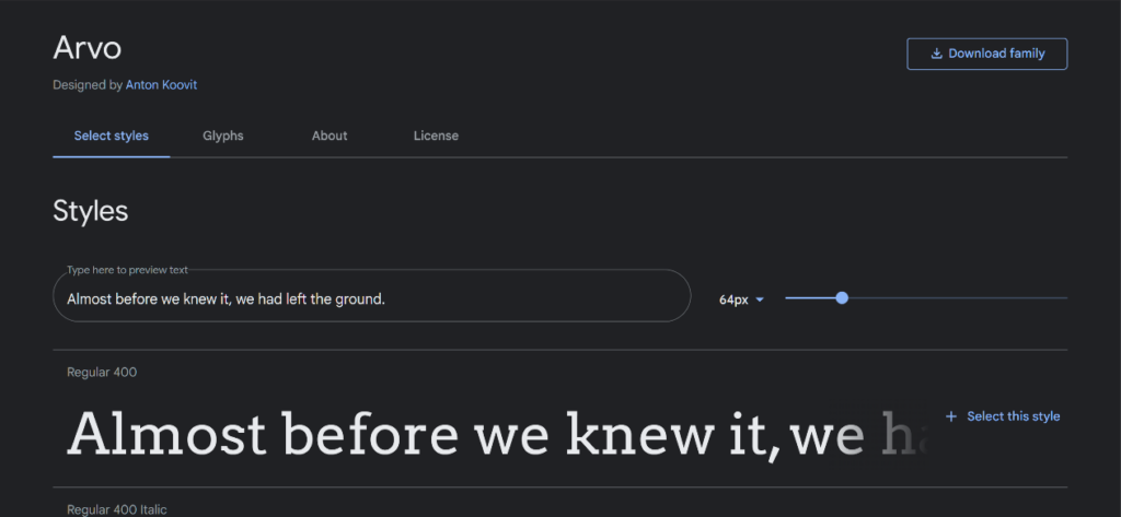
Arvo

It is a free font named after the Finnish term for “number” or value. It’s reflected in its heavy serif ends that are almost geometric and symmetrical, especially with its capital letters. It’s become popular for areas of emphasis like titles and headings. It’s attention-grabbing and versatile for various approaches but is best used for home or food-related goods. It’s ideal for promo graphics, banner work, and flyers.

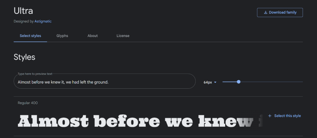
Ultra

Ultra is an extra-bold, heavy, serif font that has been designed for headlines. It has a semi-retro approach and is great for creating a large headline that is ideally only one to a few words long. Music festivals, major events, and other celebrations benefit from this font as it evokes excitement and activity.

Odachi

This free font is a “brush” type font that mimics handwriting from a paintbrush. It’s semi-calligraphic in appearance but is in print type rather than script. It’s very visual, easy to use, and is Japanese-calligraphy-inspired. It’s another great title font or can be used for bold texts, lines, and graphics. It can easily be used as a decorative font for shirts, mugs, and other merchandise.

Bite Chocolate

This sweet script-type font shows the familiar swirls people associate with bonbons or chocolate and food swirls. It’s a script with flourishes but still comfortably readable, making it warm and enticing. Though it has gotten the best usage from food production sites and headlines, it’s also useable as a header for per7sonal websites or aesthetic services.

Final Words 

Make your text more than just a means to convey information. Turn it into an active, visual part of your design, evoking emotions and positive feelings about your company and brand. Let it become an intrinsic part of your brand identity, and improve customer conversion by the aesthetic appearance alone. You can gain more leads and draw more interest through typography, all before your customer even reads what’s on the page.

Is your typography poised to help you grow? Sound off in the comments below.

The post Eye-Catching Typography To Get More Leads appeared first on noupe.

How Enterprises Establish Digital Trust with SSL Certificates

In a fast-paced hybrid-multi-cloud world where remote work and online communications are the norm, increasingly sophisticated cyberattacks continue to disrupt enterprises on a daily basis.

Crucially, to mitigate the risks, enterprises must protect the sensitive data being shared online. This requires SSL certificates, the gold standard to authenticate the identity of a website and ensure secure, encrypted communications over the internet. 

But what exactly does this look like and how do SSL certificates benefit an enterprise? 

SSL stands for Secure Sockets Layer, and these certificates are also referred to as TLS (Transport Layer Security) certificates. Issued by Certificate Authorities (CAs), SSL certificates create safe connections between a server and a browser. They’re powered by public key infrastructure (PKI) cryptography, which has kept sensitive data private and secure for organizations for more than 50 years. 

PKI relies on two sets of keys, one private and one public, to encrypt and decrypt information exchanged online without giving access to unauthorized users. Think of a PKI-based certificate like a digital passport — SSL/TLS is the ‘S’ in ‘HTTPS’ that shows a visitor of a website it is safe and secure. 

Who needs SSL certificates? In the past, the answer to this question was quite different. An enterprise could get away with simply having a certificate on its login or payment pages. Today, with the massive amounts of users and the machines they leverage (software, devices, bots, etc.) – aka human and machine identities – communicating online, the reality is every website needs a certificate. Browsers are moving to the idea that security is the default. It doesn’t matter if the website is an e-commerce site asking for credit card information, or a personal blog with little to no data collection.  The benefits are real for everyone:

  • Increase Website Transaction Rates: Research shows that visitors who see trust indicators in a company’s address bar are more likely to transact and associate positive attributes like superior customer service and trustworthiness to the business.
  • Eliminate Web Browser Security Warnings: Firefox and Google Chrome require all web pages to be encrypted by SSL certificates. Any page that does not have a certificate will receive a “Not secure” warning to visitors. 
  • Boost SEO Ranking: SSL certificates are a simple and cost-effective way to boost a site’s SEO. Popular search engines improve the search rankings of SSL pages algorithmically.
  • Maintain Compliance: Businesses can be penalized if they do not meet the regulatory and industry standards to protect personally identifiable information (PII), personal health information (PHI), credit card numbers, and other sensitive data.
  • Enable Modern Browser Features: Browsers are increasingly tying newer features to the requirement for ‘secure contexts’ where sites and pages need to use certificates in order for those features to function correctly.  

Categories of SSL Certificates

There are several different SSL certificate types for any enterprise need, the main differentiator being the level of authentication by the CA. 

  • Domain Validation (DV) SSL Certificates: This is the fastest, easiest, and most cost-effective solution to industry-standard encryption. DV certificates require proof of ownership for the secured domain and can be issued within minutes. These certificates display trust indicators in browsers like the padlock icon and the ‘https://’ string before the domain name. Since these are the easiest certificates to obtain, the legitimacy of the organization is not vetted by the CA, therefore they are not recommended for business websites. Rather, they are ideal for internal sites and test domains and servers. 
  • Organization Validation (OV) SSL Certificates: OV certificates are the next step up from DV certificates because an organization must prove it is the owner of the domain it wants to secure and confirm it’s a legally registered business. OV certificates can only be issued to registered organizations, not individuals. This makes them ideal for public-facing websites. OV certificates can be issued in one to three days. 
  • Extended Validation (EV) SSL Certificates: These certificates are the industry standard, providing the highest level of digital trust for business websites. They provide all the trust indicators of DV and OV certificates, in addition to a green address bar in select browsers that displays the authenticated company name in green next to the web address. Website owners must go through a stricter vetting process which is conducted by a human specialist. EV SSL certificates are recommended for all business sites, especially ones that ask for personal information from users because website visitors who see the green address bar are more likely to make online transactions. These certificates can be issued in one to five days. 

There are also a variety of SSL certificate variations to choose from, based on a website’s number of pages, domains, and subdomains. These include: 

  • A standard single SSL certificate: As the name suggests, these are issued for just one domain name. 
  • A multi-domain SSL certificate: These can secure up to 250 domains, including subdomains, and are available in DV, OV, and EV validation options. 
  • A wildcard SSL certificate: Wildcard certificates can secure the main domain and an unlimited number of subdomains under the main domain. These are available in DV and OV options. 

How Long Are SSL Certificates Valid? 

The industry surrounding certificates is tightly regulated by groups such as the CA/B Browser Forum, and certificates must be renewed every 398 days (or sooner). SSL certificate subscriptions are available for up to a five-year period. It’s important to note the actual certificate in the subscription is still only valid for a maximum of 398 days. 

A Macro-Level View 

Now let’s put SSL certificates into the grand scheme of today’s modern enterprises. They are just one of several digital certificate types enterprises rely on to establish digital trust. 

As enterprises fully embrace remote and hybrid work environments and security perimeters are massively expanding far beyond corporate firewalls, securing and authenticating all human and machine identities requesting access to networks is mission-critical to conducting business securely. 

As such, digital certificates can also be used to manage multiple aspects of a user’s (human or machine) digital identity –anything from age, address, and email address, to digital signature, geo-location and more. Without going into all the technical details about the many other certificate types used today, think of it this way: certificates secure the digitization of many new businesses processes like:

  • Securing cloud environments 
  • Using digital signatures to ensure trust in documents, emails, and code 
  • Securing DevOps containers 
  • Hyper-automation initiatives like Robotic Process Automation

The list goes on. With this explosion of identities requiring certificates, it’s critically important for businesses to effectively manage the certificates within their environments, regardless of which CA they originated from. This requires automated Certificate Lifecycle Management (CLM). Enterprises can’t rely on outdated or manual approaches like spreadsheets, because just one certificate outage can lead to devastating damage and loss of revenue and reputation (like the recent outage caused by Spotify’s failure to renew an SSL certificate). 

Establishing digital trust today requires an identity-first security approach. From enabling secure online communications via SSL certificates to remotely signing documents, digitally signing emails, securing bots and DevOps containers – and in the very near future, navigating the new world of Web3 and the metaverse — digital certificates are front and center. 

Nick France, CTO of SSL, Sectigo
Photo by regularguy.eth on Unsplash

The post How Enterprises Establish Digital Trust with SSL Certificates appeared first on noupe.


Best Practices To Manage A Scholarship Program Easily

The effort involved in managing a scholarship is extensive, ranging from creating criteria for selection and recruiting applicants to analyzing entries and reporting results.

Administrators of scholarships always keep the needs of the students in mind. The objective is to encourage hard working students as much as possible with those scholarship grants. The entire scholarship administration procedure must be reviewed and streamlined to enhance the experience of the students who are the scholarships’ primary beneficiaries. Let’s look at some best practices modern scholarship managers use to answer your ‘How to manage a scholarship program.’

How To Manage A Scholarship Program?

Here are the best practices you can use along with a top-rated scholarship management software like SmarterSelect to efficiently manage a scholarship program, target the right applicants, award the rewards, and so much more. 

Smart Select is a self-funded, profitable organization that assists individuals with the creation, management, analysis, application, and evaluation of online applications. This tool helps make the scholarship management program and application process easier to handle, manage, and evaluate. 

This, along with the following best practices, can help your scholarship program reach its intended applicants and attract worthy students. 

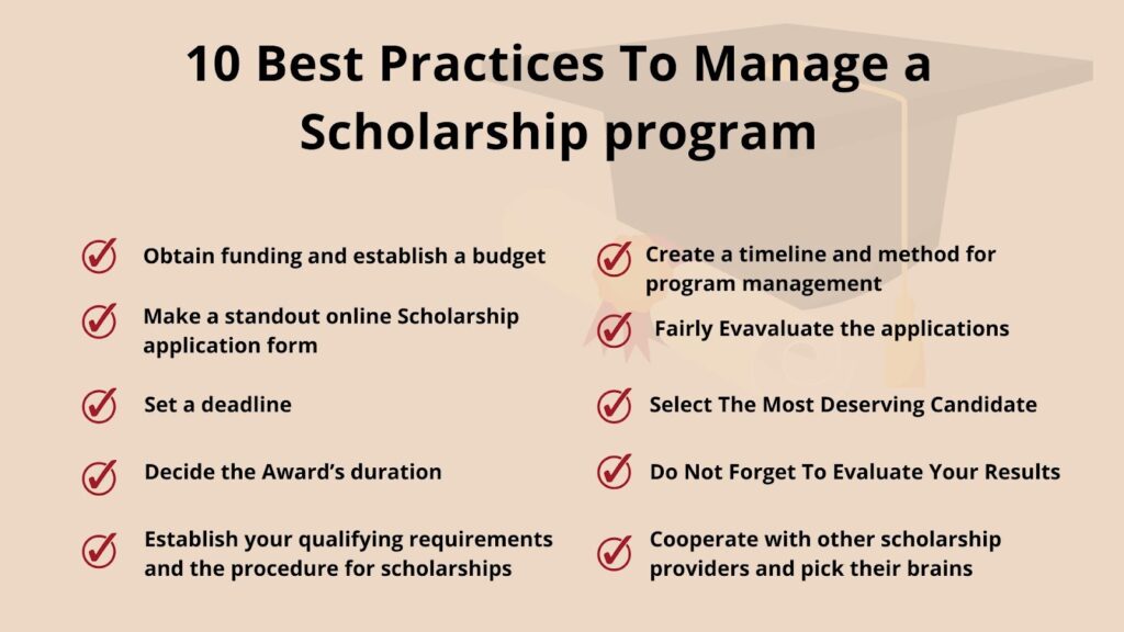
  1. Obtain funding and establish a budget

Without a pool of money to draw from, there is no scholarship.

Securing funding and creating a budget is a crucial first step in managing a scholarship fund. (We’ve written tips on establishing a scholarship fund.) You must decide up front whether you will manage the scholarship yourself or through a scholarship administration agency.

Directly managing the scholarship will naturally need a huge amount of resources from inside your organization, but you’ll have complete control over how well it’s managed. A significant benefit is that.

You can estimate how many students will receive the scholarship and make plans for the management of the scholarship monies by laying out a precise budget.

  1. Make a standout online Scholarship application form

The most important practice to follow is to make your institute’s own standout online scholarship application form. Does your department or school have any distinctive values? 

To provide students the chance to explain why they are a good fit, make sure to include examples of these in the online application. Ask questions regarding how the core mission of your institution or certain subjects relate to the lifestyles of the applicants.

Long, cumbersome applications can be difficult for applicants to complete and much harder to sort through when it comes time to review the responses. Consider requiring interested candidates to upload files for essays and lengthy text questions. You can print out feedback and read them away from the computer more easily as a result.

  1. Establish your qualifying requirements and the procedure for applying for scholarships — Make it clear to whom you are serving.

Exceptional kids who are just one life-changing chance away from achievement are the foundation of your candidate pool. Give your team a chance to compare notes after you’ve given yourself some time to reflect on the types of people you want to draw to your program. 

Once your ideal candidate has been identified, think about how your application will aid in finding them and how you can make their experience rewarding.

The precise standards by which qualified candidates are found and ultimately suggested as scholarship recipients are known as the selection criteria. It is advised that you rank the eligibility criteria once you’ve determined what they are so that the scholarship recipient’s profile can be readily understood.

When defining eligibility requirements for candidates for scholarships, many aspects must be taken into account, including financial need, achievement, geographic dispersion, and demographic traits.

  1. Decide the Award’s duration

You must choose whether the scholarship is a one-time prize or a revolving one. You might want to provide a maximum number of years a student can reapply for and be granted a renewal if the scholarship is renewable. 

You should think about whether or not it is crucial that a fresh scholarship be given out every year as you address this matter. Scholarship rules that allow for renewal typically call for the recipient to submit an application each year rather than allowing the scholarship to be automatically renewed.

  1. Set a deadline and solicit many candidates for your scholarship

Setting clear application deadlines is crucial because nobody likes being late. Make sure deadlines are clearly marked and think about utilizing other tools to remind participants as time runs out, regardless of whether your program is based on a rolling, annual, or other intervals of time. When deadlines are approaching, helpful online alerts like a clock ticking down in the application portal or email or text alerts can make a significant impact.

Next, come up with a plan for promoting your scholarship. Right today, everyone is online, especially students. Therefore, spread your message on the websites and apps where students are active.

  1. Create a timeline and method for program management to assist your team

You should have a project management strategy that is efficient and defined review schedules in place before applications begin to pour in. You can take help from project management tools in this regard to abide by the deadlines and maintain efficient workflow. 

Reviewers may access information, examine applications, and assess candidates all in one location with the help of an online scholarship administration system. 

Through a series of review steps, this enables reviewers to collaborate (and work remotely), saving your important business time.

  1. Fairly evaluate applications

Make sure you put policies in place during the review process that permit fair application review. Knowing that implicit prejudice exists will help you to combat this widespread issue.

By randomly assigning reviewers and enabling blind reviews, your scholarship management software can aid in ensuring a fair review procedure. To include a range of people in the selection debate, you can also establish a review panel. The most qualified candidates have the chance to move to the top of the list thanks to these fair assessment procedures.

  1. Select The Most Deserving Candidate

Recall the scholarship’s goals and criteria for awarding it. As you look for the students most deserving of the scholarship, let those two principles serve as your compass. Additionally, by doing this, you can guarantee that each application is evaluated using the same criteria, which is crucial for equity.

Provide a personal touch when announcing the winners. A little bit makes a big difference, whether it’s a genuine phone conversation from a supervisor or a direct email encouraging applicants to continue working hard.

Spending time at this stage of selecting winners will result in better applicants down the road unless you are handling piles of submissions.

  1. Do Not Forget To Evaluate Your Results

Software for managing scholarships offers non-profit organizations a rare chance to gather, examine, and contrast data. The power of the data, though, is in how you use it; gathering the data is just one aspect.

Personalized dashboards help to track progress and produce real-time reports for reporting both during and after the cycle. This information can serve as the catalyst for your scholarship program’s improvement when combined with post-cycle in-depth analyses and conversations on what worked and what didn’t.

Watch out for applications that are never submitted, and look for patterns in where applicants stopped applying so you may streamline the application process or explain any ambiguous questions for the following cycle. Look over your demographic information; is there a region you aren’t reaching as effectively as you would like?

  1. Cooperate with other scholarship providers and pick their brains

Our list of practices to answer ‘How to manage a scholarship program?’ is incomplete without this step. 

Nobody is more familiar with the problems that scholarship providers face than another scholarship sponsor. Reach out to other organizations that operate locally or support causes that are similar to yours; you might be surprised at how eager they are to share their knowledge and lessons learned.

Scholarships are now essential for empowering the following generation of innovators and civic leaders, and your organization deserves the tools and resources necessary to serve as that first step.

Bottom Line

It is not necessary to start a non-profit organization to give scholarships for higher education. A scholarship or scholarship program for higher education can be started by anyone. This kind of scholarship program can be started by foundations, companies, community organizations, and even individuals or groups of individuals.

You might wish to think about setting up a scholarship program to be executed by your local community foundation, a particular college or university, or a scholarship administration agency as an alternative to developing a nonprofit organization to provide scholarships for higher education.

We hope this article answers your question ‘How to manage a scholarship program?’ Whatever you do, just remember the 10 practices we mentioned above and invest in a good scholarship management program to help you achieve your desired results. 

The post Best Practices To Manage A Scholarship Program Easily appeared first on noupe.


  •   
  • Copyright © 1996-2010 BlogmyQuery - BMQ. All rights reserved.
    iDream theme by Templates Next | Powered by WordPress