Author Archive
50 Beautiful Blog Designs From All Over The World
Get Your Form On: Modern Web Forms Tutorials
This article is designed to show you (through tutorials) how to create and better understand CSS forms. With a proper understanding of each element (radio buttons, checkboxes, textareas ..), CSS know-how, a little patience and some creativity you can create beautiful and appealing forms.
Having a website with beautiful and functional forms is vital for managing a web business. Keeping your visitors and potential customers satisfied and making your website more accessible should be one of the primary focuses to any website owner. As a designer, the contact form is the first step a client takes to communicate with you, but it can also be the final step a user takes on your website. Having a good and functional contact form is vital to convince the client you are the right choice.
Whether you are looking for tips and tricks for creating contact forms, sign-up / sign-in or checkout forms this article will help you find what you are looking for; or at least inspire you.
Below you can find a showcase of beautiful web forms tutorials:
Get Your Form On
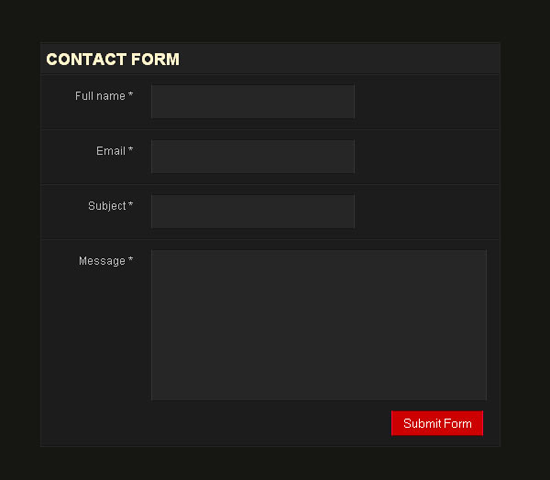
This tutorial explains how to design a good contact form using a clean CSS design with only label and input tags to simulate an HTML table structure.
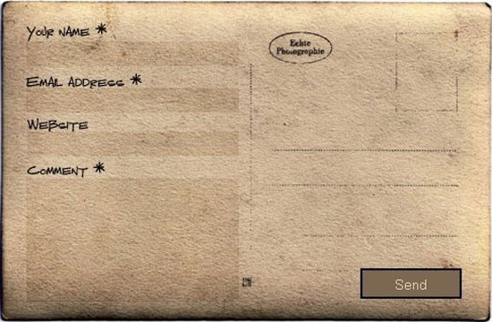
This tutorial will show you how to create a stunning comment form using an old postcard image.
Stylish Responsive Form With CSS3 And HTML5
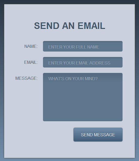
This tutorial shows you how to create a stylish contact form in CSS3 and the details of working with gradients, drop shadows and rounded corners.
Facebook-like Registration Form with jQuery
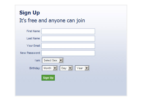
Probably the most known registration form is the sign up form of Facebook. Learn how to create it.
A simple and stylish HTML 5 and CSS 3 contact form
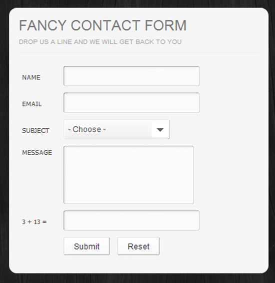
Step by step tutorial on how to create a beautiful contact form using Photoshop, HTML5 and CSS3. The tutorial starts from scratch with the Photoshop mock-up.
Build a Neat HTML5 Powered Contact Form
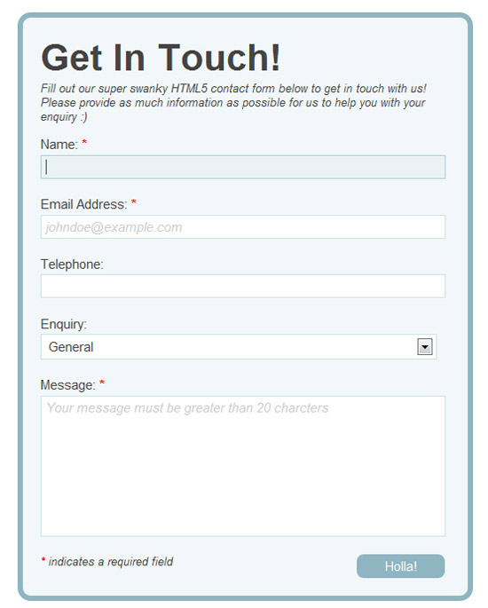
This form tutorial is built using HTML5 for the input elements and uses the browser’s built-in form validation. Also for older browsers the tutorial uses jQuery and Modernizr and PHP on the server side to validate the input.
AJAX contact form that uses PHP, CSS, JQuery, formValidator and JQTransform plugins to style input fields and buttons and make the form functional. In addition it uses the PHPMailer class to send out the contact form emails.
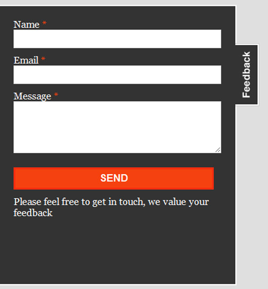
Floating Feedback button contact form
This tutorial features the creation of an AJAX contact form. The form is not visible initially and is activated by clicking on a Feedback button floating to the left of the website.
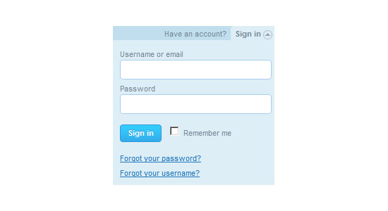
Sign-in dropdown box likes Twitter with jQuery
This tutorial helps you create a JQuery Dropbox sign-in box, just like on Twitter.
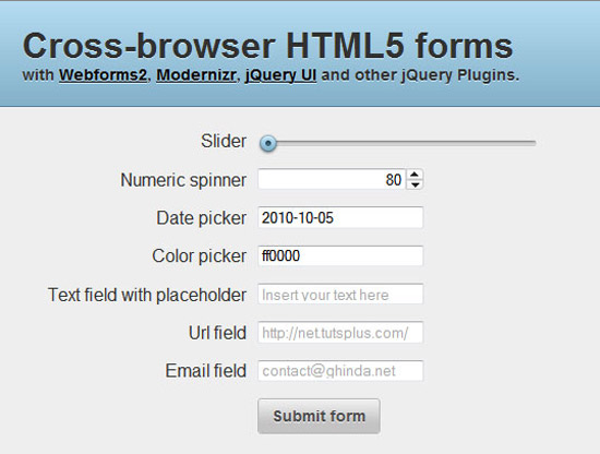
This tutorial teaches users to create beautiful HTML5 forms for modern browsers and how to use a mix of Webforms2, Modernizr, jQuery UI and assorted jQuery Plugins for compatibility with older browsers.
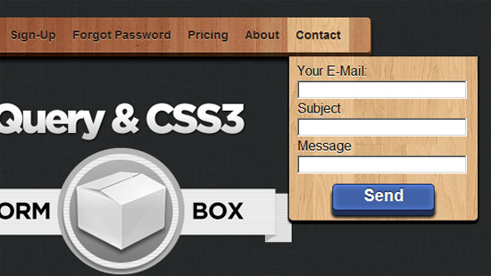
JQuery and CSS3 drop-down menu with integrated forms
A jQuery and CSS3 tutorial that creates a drop-down menu where each sub-menu has a different form integrated (login, contact form or sign up).
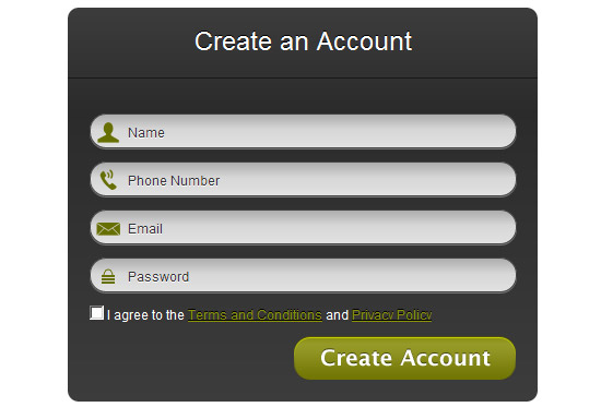
Modern Web Forms with HTML5 and CSS3
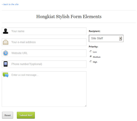
A beautiful sign-up form with rounded input boxes and button. Also each textbox includes a small icon relevant to the given field.
CSS3 forms with HTML5 validation
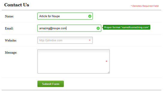
This form validates itself in real-time whether the completed data fits the recommended format for name, email or website.
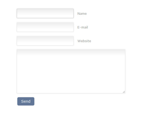
A simple CSS3 form tutorial explaining the usage of shadows and gradients in HTML5 contact forms.
Conclusion
Contact forms have come a long way in the past years, especially after the release of HTML5 and CSS3. You should always be up-to-date with technology and this is an essential part of your online presence. Hopefully you found these tutorials useful, maybe even convincing enough to change the ones on your own websites. We would love to hear your opinions below.
(rb)
From Head to Foot: Showcase of Beautiful Header and Footer Designs
Studies show that the website header is one of the first things a visitor sees on your website. That is mainly due to the way we are used to browser information on the computer presented from top to bottom, and due to the way HTML is built with the header being the first thing it’s loading on the page. Thus the importance of the header.
A beautifully designed one can help make a difference when attracting visitors to your website and getting them to stay awhile. Of course, content is still the most important website element, demonstrated by the latest Google algorithm updates, Panda and Penguin. But no matter how good your content is, if the visitor decides not to stick around long enough to see it, then your website suffers.
A visually appealing header design can assist in this department. To further add to its importance, a header often contains the website’s navigation and logo. Having solid, user-friendly navigation facilitates the browsing of your content and keeps users on your site for longer.
A website footer is like a book’s foot note. When you need more information, usually you find it there. In the case of a website, a footer usually features copyright information, a second navigation and in some cases contact details. But the footer has a more important role than that. If a visitor has made it to the bottom of the page, that tends to mean they are hooked. They have gone through your offerings, and are now looking for more. So it is important to keep that in mind as you build yours.
Below are a few examples of beautiful header and footer designs that stand as effective testaments to the roles these web design elements play.
Header Designs
Cult-Foo has probably one of the most well known header designs around the design community. The use of colors and pixelation effects is stunning.
Corvus Art uses a beautiful canvas effect with awesome illustrations and a functional menu to achieve the desired visual impact.
Merchand de Trucs is like a story of its own. The overall feeling of the header is simply “Welcome! What would you be interested in?”
Viget Inspire has a simple yet powerful header. The menu is basic and very functional.
Glamping‘s vivid illustrations give an overall feel of delight. It bids you to stay longer and see what it’s about.
Ten 24 Media‘s header invites you to “Enter the Show”, and join the game if you will. Hurry if you don’t want to be left out.
Komodo Media‘s header is a preview for the wild and beautiful design resources available there. Brilliant use of illustrations.
Octwelve is another great example of the use of an illustrated header. The author uses the header to introduce himself and his skills.
That Indie Dude features one of the best uses of Twitter integration in the header around the web.
Ozon 3, the header makes you think of ecology and the concept of “eco-design”, as one of the categories of the blog also suggests.
Pixel Resort has a beautiful animated header. The overall feeling is, as the title suggests, one of relaxation and joy.
Helmy Bern features one of the most innovative headers and menus on the web. The stitched cardboard design does the job well, and raises the eyebrow of the visitor; making them want to see more.
PSD Layout‘s header suggests many things coming together in harmony and creating the web layout. The message is clear and the design is great.
Koko Digital has another header that makes excellent use of illustration and really stands out on the web.
Larissa Meek uses a very simple, personal, and efficient header. Need we say more?
Dana’s Garden…as the subtitle says: “A storybook setting for memorable events”.
Blog Solid makes excellent use of Photoshop brushes and effects.
Sprintime Tennessee, “Tennessee is calling”…the beautiful landscaped header almost single-handedly makes you want to be there.
Bits and Pixels has a simple, yet effective design. This header features a beautiful logo and diagonal menu.
Toucoleur‘s header is an amazing blend photo-manipulation and illustration.
Veerle’s Blog is probably known by nearly every designer. Not just the website, but also the talented designer behind it. Nothing more to say than an amazing website overall with a beautiful illustrated header.
20CM Records‘ header is for a Romanian hip-hop band, and the functionality is quite stunning. On the push of the button the light is turned on or off and the disk is rotating and playing one of their beats. Truly beautiful.
Ernest Hemingway Collection has an amazing storybook-like header featuring the journey through the life of one of this highly regarded American author.
Footer Designs
Black Sheep Brewery‘s beautiful use of footer space features the mascot of the brewery reading a sign saying “To the Baa..r”. Excellent integration of Twitter here also.
 Ready made Designs features another great integration of Twitter in the footer, this time with Facebook also. The middle of the footer is used for the most recent blog posts.
Sand and Starfish has a beautifully illustrated postcard blog footer, inviting users to subscribe to the posts RSS and comments RSS.
Golden Boy Media‘s organized footer with a good Twitter and newsletter subscription integration shines. The left column is used for information where you can reach the company both online and offline.
Inchoo has a beautiful multiple row, multi-column footer featuring a contact form, Twitter integration, social media reach and services offered.
Pound and Grain uses the footer to summarize the services they offer to effectively drive the point home.
Visionssuche is an example of a simple, yet beautiful, use of the footer to display the copyright information and website sections.
V Dezign Studio‘s footer features a beautiful and creative “Back to top” section.
Chriswi has an amazing illustrated footer which includes a contact form and social media information.
Keith Cakes uses the footer in a very efficient way, displaying the running schedule, address, map and telephone information for the business.
InfinVision uses a creative footer featuring social media info and contact information.

Gauvain Bricoult‘s footer doesn’t do much in terms of functionality, but it sure says something in terms of beauty. Amazing design with a “Back to top” button for user’s convenience.
Matthew D. Jordan has a clever and impressive footer. First of all the message “It’s You, It Was Always You” brilliantly fits the site, and the contact box…well, we’ll let you discover that on your own.
Munch 5-A-Day employs a beautiful, organized footer featuring a newsletter subscription module, social media links and copyright information.
Mike Dascola has an amazingly creative footer displaying the different awards won by the website as well as social media info.
Simply Artifice‘s extensive footer features a beautifully designed contact form.
Jay Hafling is another extensive footer example with 2 sections. A section presenting the services the website offers and another with the most recent blog posts organized in columns.
What Do You Think?
We would really love to hear your opinions on the importance of header and footer designs. Do you know of other websites with amazing header and/or footer designs that were not featured here? What were some of your favorites from the showcase?
(rb)
Origami, The Art of Designing and Manufacturing Masterpieces
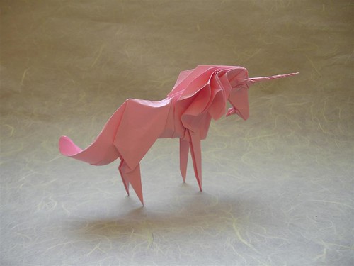
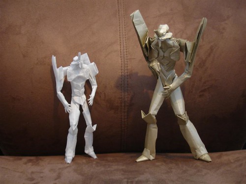
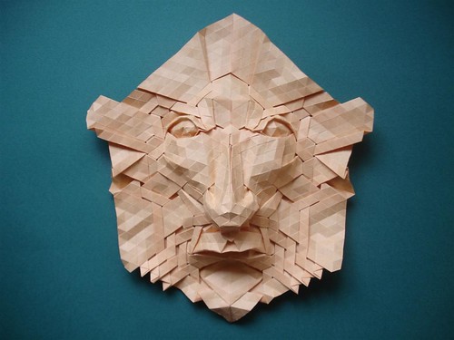
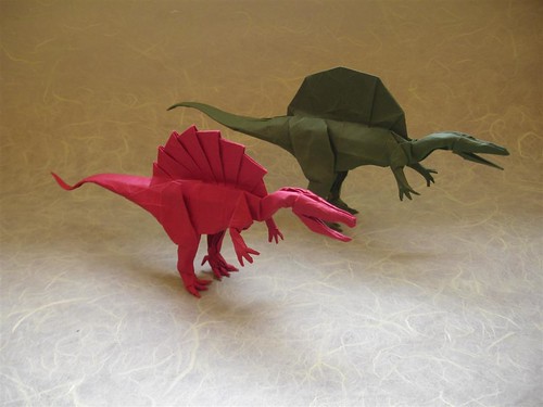
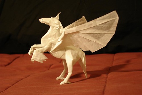
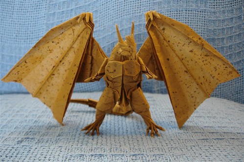
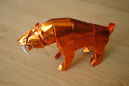
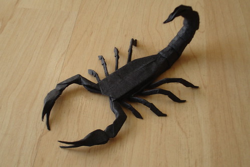
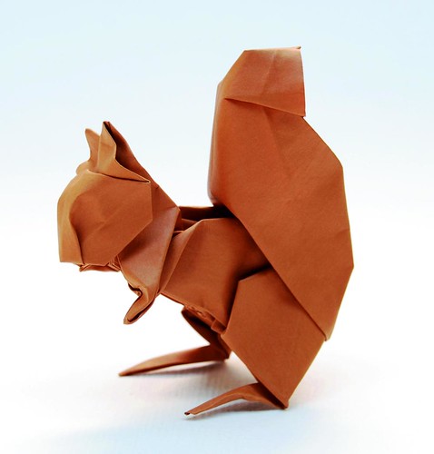
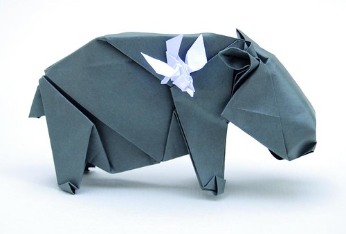
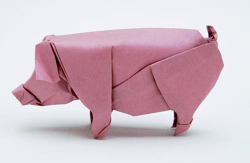
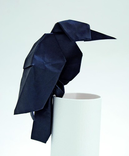
Nowadays there are so many forms of art, where it is really hard to distinguish real artistic value from kitsch. But when comes to a form of Japanese artistic expression, Origami, which is hundreds of years old we can be sure there’s no room for bad taste.
Origami is the traditional Japanese art of paper folding. It started in Japan in the 17th century and was introduced to western culture in the 1900s. It has since evolved into a form of modern art. One might be inclined to consider this artform easy given that many of us have been folding paper since childhood. Far from it. After spending about 4 hours with an Origami book, and armed with the one hour Youtube tutorial, and still being unable to get it right; I can safely say Origami is not for everybody.
Each piece is a wonderful tale of precision, beauty, sophistication, mystery and enthusiasm that transforms something ordinary like a piece of paper into a masterpiece. Which is the very essence of art. Origami itself is a great learning tool for every designer, of any kind.
As a designer, you create something visually beautiful from nothing, just as this amazing art creates masterpieces from a simple piece of paper. The millimetric precision, the careful design, the perfect proportions, the symmetry present in every piece can and should be a real inspiration for every designer.
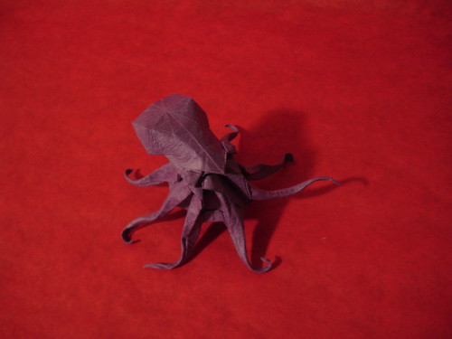
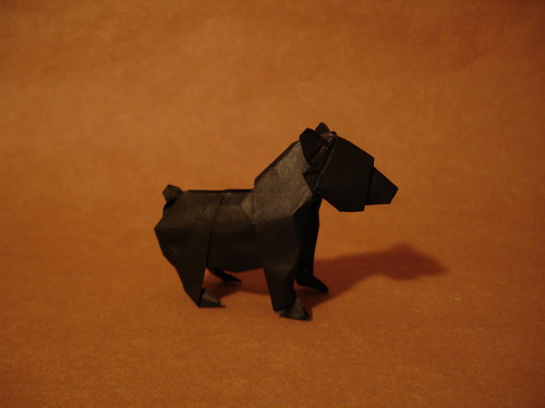
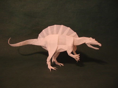
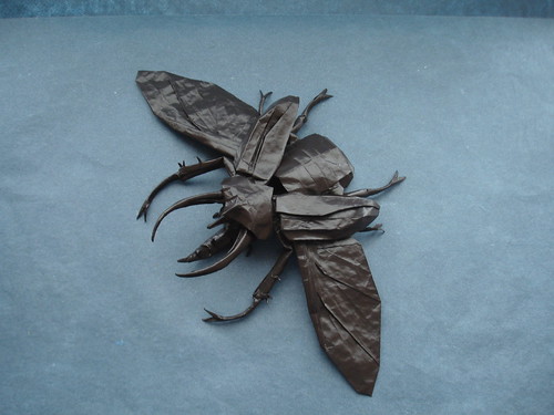
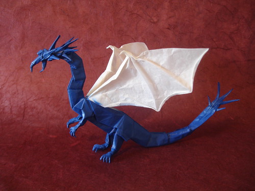
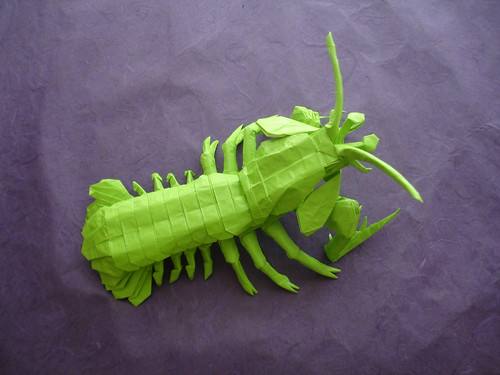
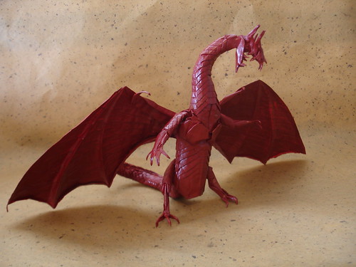
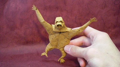
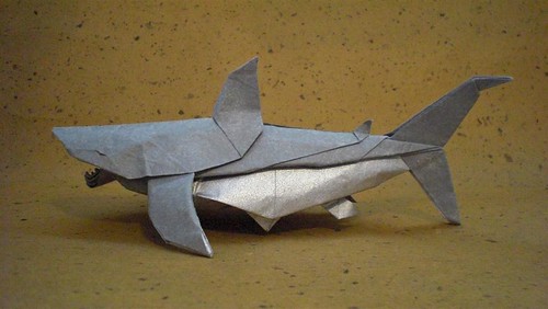
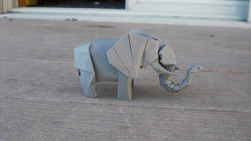
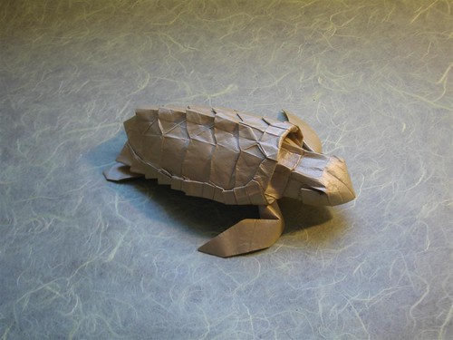
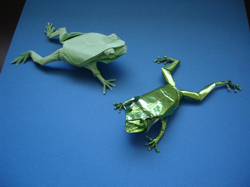
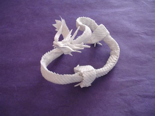
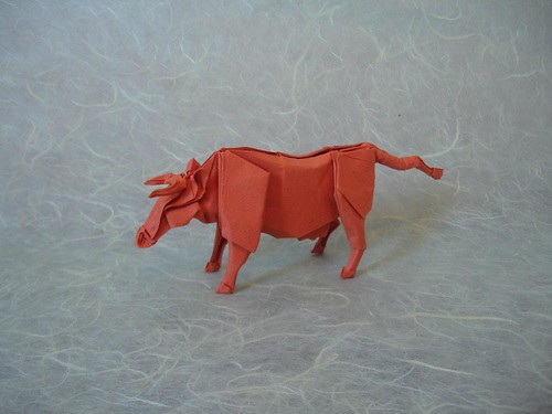
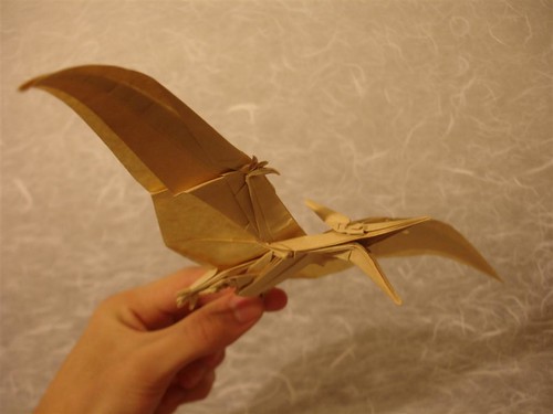
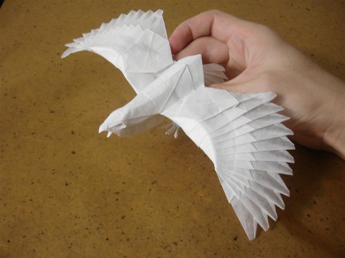
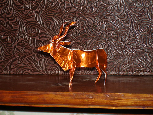
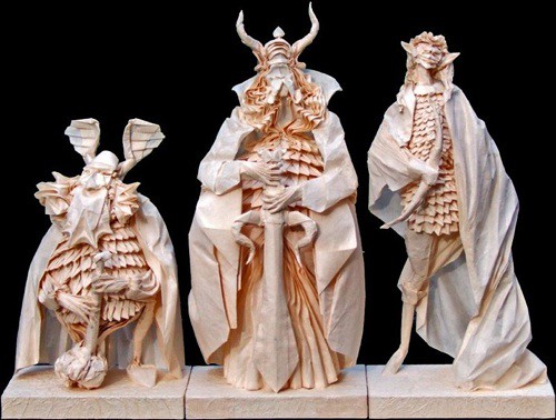
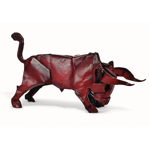
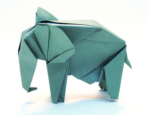
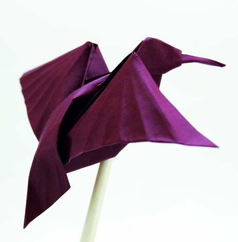
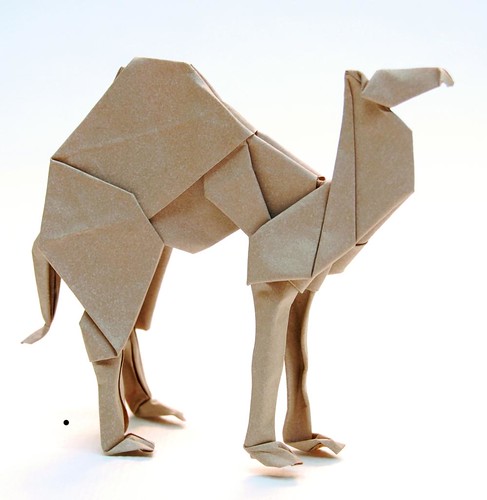
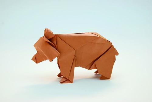
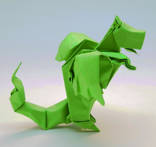
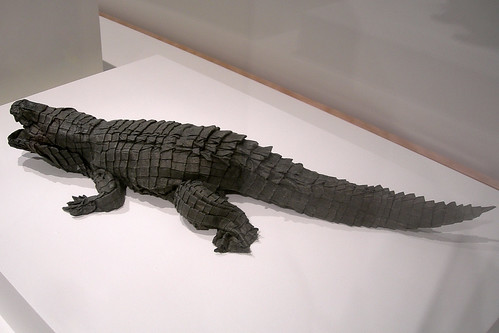
Below we present you a number of Origami masterpieces for your inspiration.
Gallery of Origami Creations
Additional Origami Resources (Making of videos)
- Origami Instructions: vixen / fox (Román DÃaz)
- Origami Fiery Dragon (Kade Chan)
- Origami Ant (Robert J. Lang)
- Origami Tarantula (Robert J. Lang)
- Origami Fish (Jo Nakashima / Davor Vinko)
- Origami Jedi Master Yoda (Fumiaki Kawahata)
- Origami Scorpion Tutorial (Tadashi Mori)
- Origami Lotus Flower
What Did You Think?
After trying to make the Origami Fox, presented in the first video above, a new found respect for this form of art was gained. It takes a lot of patience, skill and sense of proportions to create a beautiful masterpiece like these. Have you ever tried your hand at Origami? What were some of the pieces from this showcase that really stood out to you?
(rb)
Lasting Impressions: Unusual Business Cards That Will Definitely Be Kept
As a designer creating a good business card for yourself can be quite task. The need for a visually appealing business card design is greater than in other work fields. There are 2 steps to giving a business card, not only as a designer, but as a business individual in general. The first step, and most important is ensuring the business card is kept. The second step is, of course, getting the project.
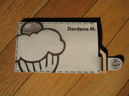
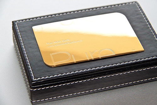
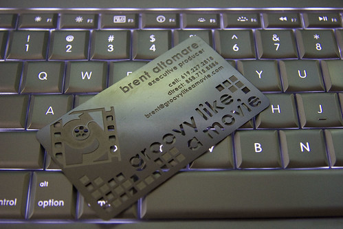
Sharing a great looking business card with a partner can often make the difference between getting the job or not. Not to mention that most, let’s say ordinary business cards end up in the trash after awhile. An unusually creative card made out of metal, plastic or rubber can ensure you a permanent slot in that ever-growing pile of business cards of your potential business partners.
There is a growing trend of digitizing business cards through card scanners. Though there are some advantages to having the cards scanned such as the space gained and ease of search, the lasting impression of receiving an appealing and unusually creative business card cannot be matched.
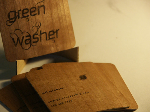
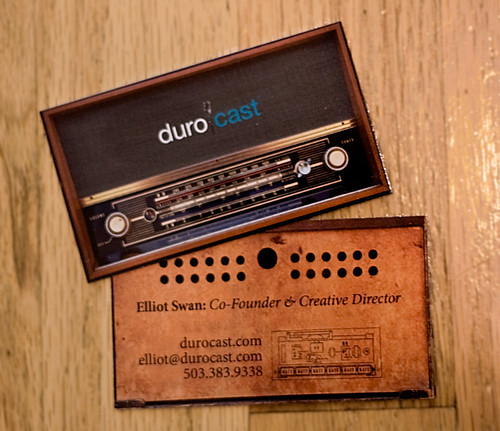
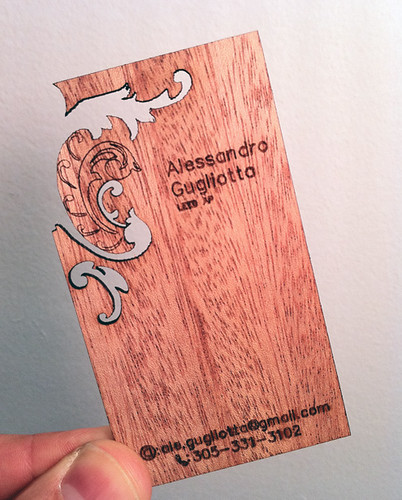
Feeling the unusual shape, the embossed metal or letterpressed paper will certainly help gain you the appreciation and respect needed to start or cement a good business partnership. So take a look at the showcase we have prepared of unusual business cards.
Lasting Impressions






More business card  inspiration
- behance.net
- crdna.com
- cardobserver.com
- creattica.com
- cardgala.com
- cardonizer.com
- cardview.net
- deviantart.com
- flickr.com
- tumblr.com
(rb)

