Author Archive

Designing For Start-Ups: How To Deliver The Message Across

Advertisement in Designing For Start-Ups: How To Deliver The Message Across
 in Designing For Start-Ups: How To Deliver The Message Across  in Designing For Start-Ups: How To Deliver The Message Across  in Designing For Start-Ups: How To Deliver The Message Across

Start-up organizations provide an extraordinary example of chaos organized into manageable chunks. Perhaps more than anyone else, the individuals who comprise a start-up team are required to understand their team’s goals across a variety of disciplines — research, marketing, design, development, architecture, etc. — as well as their own responsibility to move the company’s overarching objective forward. Entrepreneurs must choose the direction, designers must think through the options, and developers must cull a functional product or service, all while giving feedback to and receiving it from their colleagues.

At least, that’s the idea. Most start-ups tend to take liberties somewhere along the way. Some start-ups begin with a novel business model, whereas others begin with a beautiful design. Still others try to test things out first with a functional prototype, even if it is a bit ugly. All of them — regardless of their initial approach — adapt their process over time in order to create a well-rounded product or service. And for this reason, most of today’s start-ups describe themselves as “agile.â€�

Agile start-ups, as the name implies, should be capable of changing their design, development and/or business objectives on a dime. This is much easier said than done — especially for today’s user experience designers. The user experience (UX) designers who work at agile start-ups are required to do two things exceptionally well: (1) grasp the intent of the product or service being developed, and (2) effectively communicate those good intentions to end users in a language they’ll understand. Neither of these is as straightforward as it might sound.

Ideally, designers will jumpstart their design process by carefully selecting well-reasoned entrepreneurs to work with; but what happens when the designer is altogether alien to the community he is designing for? The breakneck speed of agile start-ups makes it incredibly difficult for designers to craft appropriate messages to their audience at large. Only by understanding the processes and opinions that dominate start-ups can designers begin to reach out and make a difference for the end users of their product or service.

User-Centered Design, Sans User

Designing with a clear idea of who the users are has never been simple. Most designers who have experience with the trial by fire known as a “lean start-up� will almost vehemently agree: because there are more than a few fires to fight, adopting a big-d Design process at start-up organizations is, simply put, exceedingly difficult. Invariably, this means that most start-up organizations devolve to the point that salability reigns supreme, or form trumps function. But whereas flexible, agile environments are very good for getting those things done, good design takes time, which makes the design process of start-ups almost universally hamstrung.

User-Experience in Designing For Start-Ups: How To Deliver The Message Across
Keep the levels of UX in mind. (Image: Jon and Barb)

In short, agile, user-centered design tends to ignore the aesthetic, intangible, ambient qualities that good experiences are all about. As a consequence, budding artistic directors, brand ninjas and interaction designers have been apt to worry. Without the ability to intimately understand the audience for whom they’re designing, these team members can’t do their jobs. The logical question becomes, how can they? How can designers effectively communicate with an audience they’ve yet to meet?

The textbook definition(s) of UX design yields some clue. User-centered designers are encouraged to perform design research and then create personas as well as other deliverables. Certainly those would spotlight the factors that affect a company’s relationship with its users… right? Perhaps. While research is undoubtedly necessary to the design process, its deliverables are not.

I’ve written before that designers should bootstrap their own culture of UX within an organization. In this article, I’ll take that idea one step further: in order for a start-up to effectively communicate with its target audience, a spirit of empathy must pervade its every design decision — empathy cultivated by engaging in an ongoing, outward, user-centered conversation.

Where Has All The Empathy Gone?

The task of any designer who works in a start-up environment requires empathy. The designer, perhaps more than any other team member, must empathize with stakeholders (to understand the project’s business objectives), developers (to understand its technical requirements) and, of course, users (to understand the nature of the problem they’re solving), all at once. Designing with consideration for all three parties effectively frames their strife.

Valuable though it may be, however, most start-up environments discourage empathy. Consider the number of times you’ve heard something like, “We’re targeting wealthy single males, ages 45 to 55,� or “We’re just like Amazon, but for baby boomers.� Well, that’s just great. A product description like that might initially help a team grok (a word that, ironically, means “understand by empathy�) an idea, but as far as rhetoric goes, merely saying that you know what segment you’re targeting isn’t enough.

Every e-commerce company sells products. Newcomers to the space can, and often do, learn a lot by studying the desire paths paved by industry notables (indeed, entire books are written on the subject). But let’s be clear: “I want to be Amazonâ€� doesn’t imbue the designer with empathy. Creating something that looks and feels like Amazon will, of course, look and feel like Amazon. If that website is then marketed to a wholly different crowd, then the resulting outfit will be disingenuous — the polar opposite of empathetic.

In order to create something real, unique, of lasting value and with a look and feel of its own, members of start-up teams must vacate their cubicles.

One… Erm, Three Processes

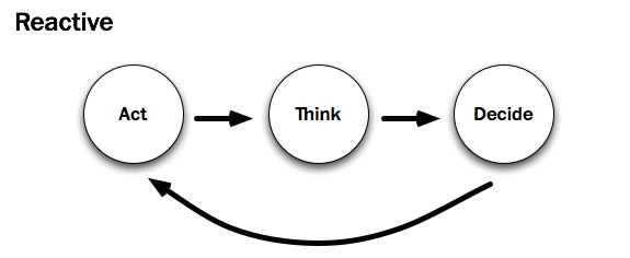
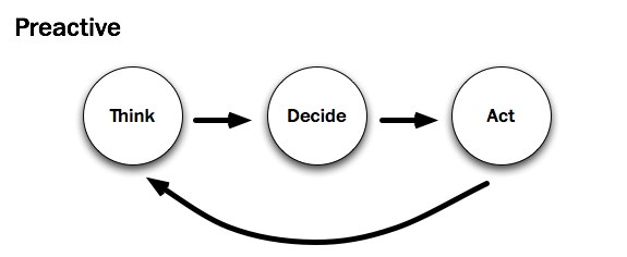
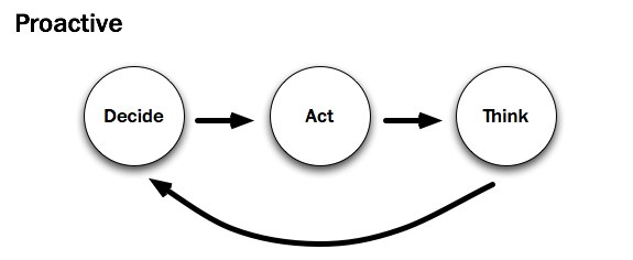
Adding to this perceived resistance are the various processes that drive start-up organizations at any given time. A recent blog post by Whitney Hess contrasts three specific types. It’s worth noting that all of the approaches detailed below show the exact same verbs in the exact same sequence. What’s different in each is the primary action that drives change along the way.

To cite Hess:
Reactive in Designing For Start-Ups: How To Deliver The Message Across

I see a lot of products developed using the Reactive Procedure:

  1. I’m scratching my itch.
  2. Should I keep scratching this itch?
  3. I’ll scratch this other itch.

As a designer who frequently consults with agile start-ups, I concur with Whitney’s sentiments: the reactive approach (“build it and they will comeâ€�) is far and away the most common. There is, of course, a good reason for all that action: development drives change. Start-ups act in order to build an initial prototype. Prototypes, in turn, move the company — indeed, the user feedback loop — forward.

Unfortunately, the prototypes developed by most start-ups exhibit a keen lack of consideration. Who is the prototype targeted at? 40 to 50 somethings? There are certainly a lot of them. Will those 40 to 50 somethings be able to grok it? That is, will users be able to tell what it’s “all about� from the design? Because this kind of subjectivity is incredibly nebulous, prudent start-ups rely on experienced UX designers to help them uncover the answers. It’s no wonder that Whitney and I see this in our line of work.
Preactive in Designing For Start-Ups: How To Deliver The Message Across

As a user experience designer, consultant and member of the New York tech community, I instead advocate for using the Preactive Procedure:

  1. Who’s itchy?
  2. That itch isn’t being scratched.
  3. This is how to scratch that itch.

I believe that most UX designers would agree — dare I say, empathize — with Whitney’s prescribed preactive approach. Beginning with thinking — with research — is in a user-centered designer’s blood; it helps them understand their audience and voice their messages appropriately. Further still, “preactivityâ€� appears to be the only real way for designers to gain empathy. But most start-up environments run counter to this approach. Acting and then thinking usually leaves little room for the voice of research. Has Whitney encountered a start-up that tries to reconcile the two?

As luck would have it, she has. Whitney recently worked with an entrepreneur who marches to a different beat:

Campbell McKellar, founder of Loosecubes, is the first person to make me realize that there’s something even better than the Preactive Procedure — the Proactive Procedure.
Proactive in Designing For Start-Ups: How To Deliver The Message Across

By acting sooner, you are actually achieving more. You are creating the future instead of just predicting and accommodating for it. You are inventing a new reality, based half in what people need, and half in what you want them to have. You can observe behavior sooner and course-correct. It is the most transformative of all three procedures for both the subject and the object.

An entrepreneur at heart, I want to agree here, too. The proactive process appears to be a viable alternative to the unenviable tension between designers and developers at start-ups. But just because a group is humming along with a decision-based proactive process doesn’t mean that the organization’s designer understands its users any better. By UX standards, this process almost seems to disenfranchise them: it moves “thinkingâ€� — and here, I presume, research — all the way to the back of the bus.

In sum, it’s easy to envision scenarios at a start-up in which a given development process proves more valuable, more productive, than its alternative. Should the team think, act or decide? It depends. Regardless, as designers join start-ups, they’re very likely to find that design is secondary to the process unless, of course, their organization follows a preactive process. But for most start-ups, that’s simply not the case.

In order for an organization to learn more about its users, the design-minded members must advocate to that effect, changing the way that design is approached. Designers must stand up for their part of the process. As UX designer Joshua Porter attests, “The further a designer is from the people they’re designing for, the harder it is to design for them.�

Start-ups — or more specifically, the designers at start-ups — need to get as close to users as they can. Product development can’t rest in the entrepreneurs’ and/or the developers’ hands alone.

Why Design Fails

When asked, most designers don’t take long to provide honest, valid reasons why the design process is important to developers and entrepreneurs alike. There is firm precedent to that end, and they are designers by choice, after all. But just because the truth and beauty of good design is evident to most designers doesn’t exactly mean that their colleagues share their sentiments.

Making-dollars in Designing For Start-Ups: How To Deliver The Message Across
If it isn’t making Dollars… (Image: Kristian Bjornard)

Start-ups — and more importantly, the individuals who comprise them — have a great number of mental hurdles standing in the way of their empathy with end users. The aforementioned quickened pace and changing processes aside, here are those hurdles:

  • Start-up teams have strong convictions.
    Anyone who believes strongly in a cause (be it an idea or a Web application… or both) will identify with it. If a designer questions the validity of an idea, then they are questioning the team. This is a difficult, integral part of the design process.
  • Research doesn’t (immediately) sell.
    It doesn’t take weeks of research to sell a product to someone, and given enough time a good marketer can sell anyone almost anything — especially something beautiful. As a consequence, team members are likely to judge the design book by its cover. Research rarely affects their notion of beauty.
  • Start-ups trust results they can measure (preferably in dollars).
    Web metrics are currently the bread and butter of today’s Web-savvy marketers. Saying that a design is good is one thing. Saying that a design has increased conversions by 200% is another. Attaching a number to something makes entrepreneurs (and, yes, designers, too) feel better about the problem being addressed. If the current process is measurable, should an up-front design process be allowed to slow that down?

In sum, short-term, yes-or-no, go-or-no-go (Decide! Act!) thinking pervades the start-up space. The reality is that most agile start-ups favor a “design-less� process. While UX designers might trust that empathy (or understanding) is tantamount to a start-up’s success, their teammates won’t necessarily believe so. In order to effect change, designers must fight for the integrity of their design from the inside out.

Leading The Way With Empathy

To be clear, good design doesn’t come about at start-ups just by studying the metrics generated from a prototype or by talking to users through a proxy — say, support emails. That isn’t to say that these things aren’t valuable — they certainly can (and often do) point to the consequences of prior decisions. But feedback, by definition, cannot determine the company’s next — or, more importantly, first — steps. There’s the rub. Unfortunately, that is the problem routinely faced by start-up designers.

Create-Empathy- -Inclusion in Designing For Start-Ups: How To Deliver The Message Across
Create Empathy and Inclusion. (Image: Kristian Bjornard)

No one would argue that determining what’s “good� for a Web design is subjective, which makes it a frightening prospect. As D. Keith Robinson wrote on A List Apart all the way back in 2005:

Knowing what people want on the Web can be hard. You either need to have incredible empathy or have done fairly extensive research. This empathy I’m talking about, in my opinion, can really only be built up over time observing all kinds of people doing all kinds of things on all kinds of websites and applications. Even then, as you move from project to project, the people, problems and needs change.

With every new project comes a new target user, a new person to empathize with. And just as with meeting a new person, understanding what they like and don’t like takes time. If designers are to appeal to this new person, they first have to get to know them. As both Whitney Hess and Cennydd Bowles have asserted, focusing on a rapid proactive process — decide, act, think — gives most start-ups a solid plan of attack. Not only do teams get to test market viability first, they can then think about how they’ll differentiate the product shortly thereafter.

Yes, this process makes brand-conscious designers uneasy, and understandably so. In the beginning, though, without the context that a prototype creates, designers must lean towards the relatively “safe� side, where all interaction design begins: buttons look like buttons, drop-downs look like drop-downs and perhaps even the names of start-ups sound like start-ups. Robert Hoekman, Jr. calls this Designing the Obvious. I call it designing the boring bits.

Because what this approach makes up for in usability, it certainly lacks in propriety. To determine what’s appropriate (which is subjective), designers must conduct field research.

Hold Your Own Convictions

Plenty of UX designers preach preactivity; they are the ones who want to understand — to empathize with — their audience and build something tailored to them. Moreover, these designers have the relative luxury of working within organizations. For them, Cennydd Bowles and James Box have written a lovely book, Undercover User Experience Design. If you’re at a company where design is ailing and you want to fix it, I suggest picking up a copy right away.

If you’re an independent consultant or a designer working with a start-up that’s out to craft the best possible experience, then I would suggest a couple of things, all centered on the same concept, which is to make listening a part of the company’s design process:

  1. Create a design strategy.
    Articulate who you’ll be designing for (even if they’re only make-believe) and how they’ll use the website. I’ve written before how I do this. Regardless of how you do it, know who you’re trying to know.
  2. Have a solution.
    Work with a development team to generate a quick prototype that demonstrates your best (albeit uninformed) solution. Have at least two people use the prototype the way it is intended to be used. Befriend them, and see if they’ll contribute feedback as you refine your vision.
  3. See for yourself.
    Finally, and most importantly, see for yourself. Visit your users in their natural environment, and make sure their concerns are addressed. If you’re in a position to do this, ask them questions related to the problem your start-up addresses.

In all cases, start-up designers should center their design process on listening to users. Instead of speaking to users by way of the design, converse with users to inform the design. Empathy, the human connection, makes or breaks an informed experience.

Because most of us work behind computers for hours, days or weeks at a time, gaining empathy is obviously easier said than done. However, empathy is the only way to turn a good business idea into a well-articulated design conversation. Respect is earned, a brand is born, when every interaction that an organization has with its users is open, earnest, honest and, most of all, appropriate.

Related Resources

(al) (sp)


© Andrew Maier for Smashing Magazine, 2011. | Permalink | Post a comment | Smashing Shop | Smashing Network | About Us
Post tags: ,


Complete Beginner’s Guide to Content Strategy

A common occurrence: you or someone you know wants to create content and have it published online. A slightly less common occurrence? Having that same someone articulate high aspirations for their content. For those select few, instead of creating content destined for some digital landfill, their content is special; it’s going places and it’s taking them, their brand, and their experience with it.

Consistently publishing content requires that we deal with a foe known as content management. Content management is just what it sounds like: a way to manage the creation and dissemination of content. To systematically do that, it’s imperative that publishers employ what’s (aptly) known as content management systems (CMSs). The most common of kind of which is called a blog.

To be sure, all this jargon is difficult to succinctly summarize; I have to assume that you, dear reader, know the basic mechanics of blogging and content management. That way we can discuss the larger issues at hand, such as strategy. If you don’t, you might want to turn back now …

But back to content. If you or someone you know is getting ready to unleash content on the world, what guides the creation efforts?

At this point, visual design—design of the actual CMS itself—is irrelevant. Nobody should really discuss what the system will look like (expect, maybe, the visual thinkers in the room), but instead, the heart of the matter: what’s this all about? What content will this website deliver? Moreover, when will it deliver it?

And everyone wants to add their $0.02. It’s kind of like debating what content should be on the homepage. Which is another thing: what content should be on the homepage?

Egads. Content, you’ll find, is everywhere.

In this article, we’ll take a brief look at Content Strategy—that odd amalgamation of Web Savvy, Information Architecture and editorial process that adds up to something infinitely greater than the sum of its parts. You’ll learn when and where to apply strategy to your content endeavors and when you should simply raise your hand and start asking the important questions.

Back to topWhat is Content Strategy?

“Content strategy plans for the creation, publication, and governance of useful, usable content,” says Kristina Halvorson, author of the book Content Strategy for the Web.

“It plots an achievable roadmap for individuals and organizations to create and maintain content that audiences will actually care about. It provides specific, well-informed recommendations about how we’re going to get from where we are today (no content, or bad content, or too much content) to where we want to be (useful, usable content people will actually care about).”

Taking a step back, Louis Rosenfeld adds:

“If [Information Architecture] is the spatial side of information, I see content strategy as the temporal side of the same coin.”

This abstraction is important: If Information Architecture helps us say “where” content lives, Content Strategy tells us decide “when” it lives. The combination, in due course, helps us as well as our clients understand “why” it’s there in the first place.

This quote from Louis carries extra significance because it’s based on actual experience. You see, Louis is the guy behind the UX publishing house Rosenfeld Media. His company makes real, honest-to-goodness books. You can hold them in your hand.

So if I had to guess, Louis knows quite a bit about Content Strategy—even though he might not identify someone well-versed in it—because Content Strategy is part and parcel to the publishing world.

Digital Publishing

The distance between print and the web, when it comes to a prudent publication process, isn’t all that vast. In fact, if you think about all of the stuff required to publish books—authors, reviewers, technical editors, copy editors, publishers, graphic designers, distributors, etc.—you begin to see that their analogous roles on the web are just, by default, not designed into the process …at least, not when everyone and their mom can publish content.

Content Strategy is the way forward. It helps both clients and project teams understand what content is being produced, how it’s being produced, by whom, when, and why.

Back to topHow is Content Strategy Done

Kristina Halvorson, in her article The Discipline of Content Strategy, says that “at its best, a content strategy defines:

  • key themes and messages
  • recommended topics
  • content purpose (i.e., how content will bridge the space between audience needs and business requirements)
  • content gap analysis
  • metadata frameworks and related content attributes
  • search engine optimization (SEO), and
  • implications of strategic recommendations on content creation, publication, and governance.”

That means that, at their best, strategists will provide a document explaining how their teams will accomplish these goals.

Relly Annett-Baker, in her article Why you need a Content Strategist, points to a rough methodology:

When we first meet, I ask a lot of questions about how your business works, what messages you want to get across and what your business’/products’ best features are. I look at (and sometimes create) the wireframes and the proposed information architecture of your website, consider interaction instructions, and [determine] whether a message is best explained with a screencast or a series of step-by-step by pictures.

The Content Lifecycle

Content, just like the websites they inhabit, are living, changing things. When strategists seek to assess and improve the quality of a website’s content, they typically follow a four-part process. The following diagram (used with permission) was created by Rahel Bailie while the descriptions of the phases were borrowed from Jonathan Kahn’s articles Content Strategy for the Web Professional:

  1. Analyze

    In this phase, strategists figure out what what kind of content they’re dealing with. Jonathan suggests: Ask questions about content, right from the start. Utilize user research or personas to decide what content is needed. Answer the question, “who cares?” Carry out a content audit, and/or a gap analysis.

  2. Collect

    Here we figure out (or plan for) the commonalities across our website’s content. Jonathan recommends: Establish key themes and messages. Write a plan for creating and commissioning content. Insist that the client plans for content production over time (an editorial calendar).

  3. Publish

    In this phase, we’ll see our content through to publication: where does it live on the website and how does it get there? Jonathan recommends: Annotate wireframes and sitemaps to explain how both interaction and content will work. Specify CMS features like content models, metadata, and workflow based on the content strategy. Write and aggregate your killer content.

  4. Manage

    After we’ve published content, it’s time to look back, see what worked, and plan for the future. Jonathan says: Write comprehensive copy decks, based on common templates. Write a style guide for tone of voice, SEO, linking policy, and community policy.

Back to topContent Strategy Luminaries

Rahel Anne Bailie

Rahel is the principal of Intentional Design, a Content Strategy consultancy. There, she and a select group of professional partners help organizations create and better manage their communication products. Her blog posts spark great discussions on the nature of content strategy.

Learn more about Rahel

Margot Bloomstein

Margot Bloomstein is an independent brand and content strategy consultant based in Boston. She focuses on crafting brand-appropriate user experiences to help organizations effectively engage their target audiences and project key messages with consistency and clarity. She’s presently on the road.

Follow Margot’s travels

Kristina Halvorson

Kristina is widely recognized as one of the country’s leading web content strategists. She is the founder and president of Brain Traffic, a web content agency, and the author of Content Strategy for the Web.

Checkout Kristina’s Consultancy

Colleen Jones

Colleen Jones is a Content Strategist based in Atlanta, GA. For more than 13 years, Colleen has created successful interactive experiences for a variety of industries and brands. She’s presently working on a book about Content Strategy (CLOUT: The Art and Science of Influential Web Content) due this December.

Learn more about Colleen

Jonathan Kahn

Jonathan is a self–described web developer, user experience designer, and basmati rice maestro. He lives in London. At his blog, lucid plot, he writes about working on the web, covering subjects such as web standards, user experience design, and content strategy.

Read Jonathan’s Blog

Erin Kissane

Erin Kissane is a writer and editorial strategist who focuses on clear and precise business communication as a prerequisite for strong relationships with employees and customers. Erin serves as an editor of the quaint little publication, A List Apart.

Read Erin’s Blog

Rachel Lovinger

Rachel is a Senior Content Strategist at Razorfish. She’s on a never-ending quest to understand how people make sense of information, and how to make it easier for them. She recently finished NIMBLE, a report on publishing in the digital age.

Read Rachel’s Blog

Jeffrey MacIntyre

Jeffrey is a New York-based freelance journalist and interactive media consultant. He’s worked in various editorial positions over the years, spanning print, web and television production. Currently, he manages the content strategy agency Predicate, LLC.

Read Jeffrey’s Blog

Karen Mcgrane

Karen McGrane is a user experience professional, content strategist, information architect, and interaction designer. She runs a company is called Bond Art + Science. In addition, she’s a professor of the MFA program in Interaction Design at SVA. Phew.

Read Karen’s Blog

On Twitter

@rahelab

@mbloomstein

@halvorson

@lucidplot

@kissane

@leenjones

@rlovinger

@jeffmacintyre

@karenmcgrane

Back to topTools of the trade

Content strategists are always discussing better ways to get valuable content from their clients to their audience. So, while the list below is indicative of the tools that a strategist might use, they’re by no means prescriptive.

Wordpress

WordPress is a state-of-the-art publishing platform with a focus on aesthetics, web standards, and usability. It’s far and away the most popular blogging platform, and its vibrant community is committed to helping authors spend less time reading documentation and more time writing their content. Creating a publishing process with Wordpress is a (relative) snap. (And hey, it runs this blog, so how bad could it be?)

Learn more about Wordpress.

Expression Engine

Expressions Engine is a full–featured CMS. That is to say, if your organization wants to publish more than just blog entries, they should give this a look. Expression Engine is nice because it allows for for segmentation: particular people can edit particular parts of your website. Although newer, shinier CMSes are born everyday, EE is still a formidable workhorse.

Learn more about Expression Engine.

Facebook

Facebook has helped define a social revolution. Regardless of whether you think that’s good or bad, it’s far and away one of the best channels to meet with and engage your website’s audience.

Learn more about Facebook Marketing.

Twitter

Twitter is a micro-blogging service that allows an individual or organization to send timely updates out into the world. Like Facebook, it’s helped define what it means for someone to be social in the digital space.

Learn more about Twitter for businesses.

Microformats, Metadata, Tagging

Microformats, Metadata, and Tagging mechanisms help content authors (and publishers alike) append information about the content that they’re publishing. In turn, this provides anyone looking for that content and easy way to find it.

Learn more about Microformats.

Google Analytics

Google Analytics is the self–described enterprise-class web analytics solution. What does this mean to you? Google Analytics gives you insight into your website’s effectiveness through a variety of metrics; including bounce rate, keyword frequency, etc. Married with web analytics and measurement, this enables content strategists to gauge contents efficacy.

Back to topRelated Resources

Writing Content Templates

One of Erin’s older posts, this describes how to create and utilize content templates in your production process. From the article:

A content template is a simple document that serves two purposes: it’s a paragraph-level companion to your website’s wireframes … and it’s a simple, effective means of getting useful information from your experts to your writers … you might think of content templates as a kind of wizard for content development.

Example Content Strategies

In this post, Colleen Jones provides a couple of short examples of what might be found in a content strategy. Consider these as good “jumping off” points as you author your own.

Back to topContent Strategy Books

Back to topFurther Reading


Complete Beginner’s Guide to Web Analytics and Measurement

Because each website appeals to its audience differently, the prudent user experience designer takes a measured approach when communicating, especially when they do so on behalf of their client. No matter what the vision and no matter how it’s executed, a design can always communicate more effectively.

Online and off, we gauge the effectiveness of design—of communication—by its affect; in other words: what action(s) do people take after they give us their attention? Properly utilized, Web Analytics and Measurement helps us answer this fundamental question.

In the early days of the Internet, webmasters used hits (remember counters?) to gauge their website’s success. The logic went like this: if people liked what was written on a site, they would request that content more often. This made sense because, at the time, the web was largely state-driven. People navigated the Web one page at a time.

Today, however, that’s far from true.

As a consequence, analysts have turned their attention towards the constant in the Internet + User equation: the User. Instead of simply tracking hits, analysts track user behavior. Emphasis has appropriately gone from answering the question “what is the web server doing?” to “what is the user doing?” (Joshua Porter details this trend in his post User Engagement Metrics.)

Both the metrics and methods required to illustrate what our users do are nuanced. In this article we’ll take a closer look at how these methods inform our design process.

Back to topWhat is Web Analytics?

It’s nearly impossible to understand why someone does something online. How, then, can we possibly hope to evaluate trends across (potentially) thousands of viewers? As it turns out, it’s not so difficult.

Even with only a modicum of traffic, web servers generate a tremendous amount of data. Web Analytics tools were created to collate and refine this data. Typically manifested as web-based applications, Web Analytics tools (such as the popular Google Analytics) take data and, through a variety of computations, generate insightful charts and reports.

Unlike research methods—which are typically qualitative in nature—web analytics methods are decidedly quantitative. So instead of dealing with warm, fuzzy descriptions of problems (practically written by our users) web analysts look at reports based on cold, hard data about them. Where’s the love?

Louis Rosenfeld explains the conundrum:

…analytics tell us what is happening, not why. After detecting data patterns, we might guess what’s going on with reasonable accuracy. But we can’t know for sure unless we conduct qualitative analysis, such as actual user testing, where we can ask people why they do what they do.

Louis Rosenfeld

As a consequence, Avinash Kaushik motions to combine the two heretofore disparate disciplines with his definition of “Web Analytics 2.0:”

“[Web Analytics 2.0 is] the analysis of qualitative and quantitative data from your website and the competition, to drive a continual improvement of the online experience that your customers, and potential customers have, which translates into your desired outcomes (online and offline).”

Avinash Kaushik, Web Analytics 2.0

Marko Hurst calls this behavioral metrics. He explores this amalgamation in his recent presentation, User Experience by the Numbers.

Back to topWhat is Web Measurement?

If Analytics provides the tools, Web Measurement is the process by which those tools are utilized. Thus, Web Measurement helps us make and act on inferences from the aforementioned tools. Marko Hurst makes an uncanny parallel in his presentation Analytics & Gambling—How Similar They Really Are.

Because analysis is rooted in mathematics, it’s typically accomplished following a logical, deductive process. We start by defining outcomes, then we proceed to measure, monitor, and act on our analysis. Let’s briefly cover each:

Outcomes

We begin measurement by establishing a desired outcome, or goal. In other words, what do we want to accomplish?

For example, say you want to improve your company’s next email blast. Their mailing list contains 150,000 members; what action do they want recipients to take? Fortunately for us, this email contains a coupon—perfect.

Outcomes are best when they are both specific and quantifiable. Let’s set a hypothetical goal of six percent. That is, six percent of our 150,000 members should convert (9,000). Next, let’s set a deadline: if we send this email out on Friday, let’s give users 1 week to determine whether or not they found our offer valuable to them.

Measure

We begin measurement by determining what’s quintessential to our desired outcome. In other words, a metric is anything we can track, but we’re looking for what we should track. For email, we’ll want to take a look at delivery rate, open rate, bounce/invalid rate, click-through rate, etc. Based on our desired outcome, though, we’ll put supreme emphasis on conversions. Thus, conversion (using our coupon) becomes our Key Performance Indicator (KPI).

Monitor

Monitoring keeps you aware of and lets you know three things at all times:

  1. Where you are at—1,000 successes after 3 days.
  2. Where do you want to be?—9,000 in 7 days. At the current rate you’d need 27 days to achieve your goal.
  3. How you will get there?—Your current path and actions are not going to cut it, so you’ll need to change something to still have a chance to achieve the desired outcome of 9,000 conversions in the next four days. This is your output or delivery item for this phase. It tells what item or items can and should be acted upon to still achieve your goal.

Remember—the greatest gift monitoring can give you is time to make adjustments and manage expectations before it’s too late, in this case after the seven days.

Act

Action helps us refine measurement endeavors based on the data we’ve received thus far. In the case of our hypothetical email blast, we could:

  • inform stakeholders of this campaign’s outlook.
  • send a blast to a new set of subscribers (in case we’re not approaching our goal).
  • send a blast to the same set of subscribers (minus those that have already converted) as a reminder.
  • change the title of the email or the call-to-action in the email—the equivalent to an A/B Test.

Back to topWeb Analytics luminaries

Gary Angel

Gary co-founded Semphonic and is president and chief technology officer. He helps companies like WebMD, Intuit, American Express and Charles Schwab maximize their web channel marketing through intelligent use of Enterprise Web Analytics

Read Gary’s Blog

Ilya Grigorik

Ilya Grigorik is the CTO of PostRank, a company providing social engagement analytics. A tinkerer at heart, Ilya is a hopeless, proverbial early-adopter of all things digital. He is both a blogger and a developer.

Read Ilya’s Blog

Marko Hurst

Marko Hurst is a consultant, author, and speaker in fields of Web Analytics, Search, and User Experience. His clients include various U.S. Government agencies and some of the largest Automotive, Financial Services, Media, Technology, Mobile, & CPG companies in the world. He authored the book Search Analytics: Conversations with Your Customers.

Read Marko’s Blog

Hurol Inan

Hurol Inan is Managing Director of Bienalto Consulting, a consulting firm specialised in Online Analytics, Direct Response Campaigns, and Information Architecture. He authored the book Search Analytics: A Guide to Analyzing and Optimizing Website Search Engines.

Learn more about Hurol

Avinash Kaushik


Avinash Kaushik is the co-Founder of Market Motive Inc and the Analytics Evangelist for Google. Through his blog, Occam’s Razor, and his best selling books, Avinash has become recognized as an authoritative voice on how marketers, executive teams, and industry leaders can leverage data to fundamentally reinvent their digital existence.
Read Avinash’s Blog

Joost de Valk


Joost de Valk is an SEO consultant and web developer living in Wijchen, near Nijmegen, the Netherlands. He is responsible for the Google Analytics plugin for Wordpress, as well as a highly–regarded blog on optimizing the performance of Wordpress blogs.
Read Joost’s Blog

On Twitter

@garyangel

@igrigorik

@markohurst

@hurol_inan

@avinashkaushik

@yoast

Back to topTools of the trade

Many different tools enable Web analysts to do their jobs. Here’s a selection of some of the most popular:

Google Analytics

Google Analytics is the self–described enterprise-class web analytics solution. What does this mean to you? Google Analytics gives you insight into your website’s traffic and marketing effectiveness through user session metrics, including bounce rate, keyword frequency, etc.

Google Website Optimizer

From their product page:

Which phrase will earn more clicks: “Add to Cart” or “Buy Now”? Should you use a photo of your product or a photo of someone using it? Or no photo at all?
Website Optimizer will find out. It shows the alternatives at random to your website visitors, then measures which versions lead to the conversions you want. And it’s all free.

MINT

Mint is an extensible, self-hosted web site analytics program. Its interface is an exercise in simplicity. Visits, referrers, popular pages, and searches can all be taken in at a glance on Mint’s flexible dashboard.

KISS Insights

KISS Insights is a tool that allows designers to place a small survey bar across the bottom of their websites. Curious visitors can take a peek and are then presented with a simple survey in which they can evaluate the experience design of your website.

4Q

The 4Q Online Survey is a free online survey solution that allows you to find out why visitors are at your website, and whether or not they are completing their tasks (and if they aren’t, what’s getting in the way?).

ClickTale

ClickTale captures every mouse move, click, scroll, and keystroke that a visitor makes inside a webpage, and then sends this information back to the ClickTale servers in a highly compressed package. In addition, ClickTale takes a snapshot of the webpage as it was experienced by the visitor, and combines it with the recording to recreate the original browsing session.

PostRank Analytics

Engagement events are individual activities performed using specific social networks, sites, or applications. One tweet is an engagement event, for example as is posting one comment, or voting one digg. PostRank tracks these events and gives analysts the tools to extrapolate meaningful insights from this data.

Compete.com

Compete.com is a simple tool for gauging a website’s traffic versus that of its competitors. Compete also allows members to track that data over time to make calculated decisions based on their competitor’s strategy.

Quantcast Planner

Quantcast Planner lets you search, rank, and sort millions of Web properties in real-time according to the criteria that matter to you, including audience age, gender, ethnicity, income, education, and geographic location as well as constraints such as property size, content category, and ad acceptance. They claim that once you identify your audience, you can “buy” that audience.

Icerocket.com

Icerocket is a simple off–site analytics tool that gives interested parties a glimpse into the latest chatter going on around their website.

Back to topWeb Analytics Books

If you’re itching for more UX tools, checkout our articles: Top 29 Free UX Tools and Extensions and Information Gathering: a Roundup of UX Applications.

Back to topAdditional Resources

Editor’s Note

Many thanks to Marko Hurst and Louis Rosenfeld for their contributions to this article.


  •   
  • Copyright © 1996-2010 BlogmyQuery - BMQ. All rights reserved.
    iDream theme by Templates Next | Powered by WordPress