Author Archive

How to Balance Creativity and Functionality in UI/UX Design

Any developer’s North Star for designing a smartphone app or website is the right combination of style and substance.

Good user interface (UI) and user experience (UX) rely on creating something with good visual appeal backed by robust functionality.

Both are essential because creativity attracts a user, and functionality keeps them returning for more.

The problem?

Integrating creativity and functionality in the design process is challenging. Developers have wild and vivid imaginations that they want to bring to life–they’re just not always practical from a user’s perspective.

This blog will discuss six ways to let your creativity blossom while delivering an end product people actually want to use.

Identify the Problem

As a developer of any digital product, the first question you need to reflect on is: “What problem am I solving for the user?”

Your answer to the above question becomes your blueprint. It becomes your guide when making design decisions. It ensures you’re creating functional designs and not getting too carried away with bells and whistles.

The only way to identify the problem is to speak to your potential users.

woman in gray button up shirt holding white ceramic mug
Image source

Airbnb was going to go out of business. The only thing that turned their fortunes was listening to their users.

This story is taken from an e-book called The Way to Design.

It highlights how Joe Gebbia, Airbnb’s co-founder, mistakenly thought the key to solving user’s needs was to “code our way through problems.”

Only when Joe and his partner visited their users did they gain priceless insights into their users’ experience. And the rest is history.

If you want to read the full story, go to page 48 of the book.

User research is a non-negotiable. Do not write a line of code (or use a no-code app) until you’ve spoken to your would-be users.

Prioritize Functionality Before Creativity

This is Design 101.

When constructors build houses, they build the foundations and the structure first. They make sure everything works as it should before bringing in the painters.

The same applies to apps and websites.

Make a bullet point list of every function your product is supposed to perform. For example, if you’re building an e-commerce app, some of the core functions will include:

  • Being able to register for an account.
  • Purchasing a product.
  • Contacting support.
  • Managing your order.

Before you start to think about creativity, make sure your code permits a user to complete the essential actions. Once things work as they should, you can start to coat the functions with a lick of creativity.

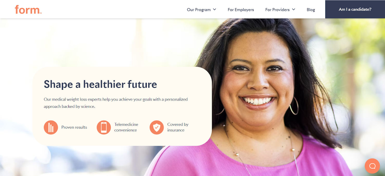
Form Health’s Wegovy page is a good example of how to balance creativity and functionality in UI/UX design. The design is clean, simple, professional, and easy to navigate. It uses visual cues like color, typography, and spacing to guide users’ attention and help them navigate the page easily.

Due to the sensitive nature of the topic and the need to project medical authority, it prioritizes functionality and trustworthiness over highly creative or flashy design, effectively communicates key information, and provides clear calls to action like “Get Started,” which redirects to the onboarding 3-minute quiz. The focus is on building trust and providing reliable information, which is crucial in the healthcare space.


Image source

It’s now possible to create fantastic forms, like Wegovy’s, using an artificial intelligence (AI) form generator.

Prioritize Performance and Responsiveness

There is little value in a visually stunning UI that slows down the app or website.

While implementing features like dark mode should be fine, other forms of creativity can hamper functionality.

We live in impatient times. Users want things yesterday. They are not likely to hang around if a page takes too long to load or if their interactions with the app are clunky.

Creative design elements that come at the cost of usability are too high of a price to pay.

To hit the perfect balance and sweet spot in your visual elements, avoid the following:

  • Excessive animations that slow things down.
  • Using uncompressed images that increase load times. Compress them and opt for SVG files as they’re lightweight compared to the commonly used PNG and JPEG formats.
  • Using different fonts. Too many fonts hurt your branding and slow down page rendering because each font loads an extra request onto the server.
  • Combine CSS and JavaScript files to, again, reduce the number of requests.

One key optimization every app and website needs is lazy loading. This is where you load only what is visible on the screen instead of everything on the page.

For example, an e-commerce site displaying product images should load images as users scroll, rather than preloading all images at the start.

Prioritize Mobile

This one is specifically for websites. Most of us use our phones to browse the Internet. As a result, it is essential to optimize for mobile. Google also likes mobile-friendly websites, so it can help your search engine optimization (SEO).

If you’re using a content management system (CMS) like WordPress or Shopify, many of their templates and styles are already mobile-friendly.

Of course, the designer in you wants to tinker. Just don’t inadvertently make the site difficult to use on mobile.

a person holding a cell phone in front of a laptop
Image source

One core thing to remember is that mobile users click with their fingers, not a mouse pointer.

Buttons should be large enough to tap without misclicking. A form with small checkboxes works fine on a desktop but is difficult to tap on mobile, which leads to poor mobile responsiveness. 

At the same time, make sure text and images adjust to different orientations.

Security Considerations

A visually striking interface can draw users in, but if it’s not functional and secure, it won’t keep them there. The real challenge in UI/UX design is blending creativity with practicality—making an interface engaging without introducing usability issues or security risks. This becomes even more critical in cloud-based applications, where cloud security assessments ensure that a seamless user experience doesn’t come at the cost of data protection.

Too often, designers push the boundaries of aesthetics while security takes a backseat.

But a well-designed product isn’t just about how it looks—it’s about how it performs under real-world conditions. Cloud security assessments help identify potential vulnerabilities early, so security is integrated into the design rather than patched in later.

User Testing

Finally, you should create a culture of testing. Whether you’re at the pre-design, prototype, or post-launch phase, invite users to test and create that open feedback loop.

Usability testing is a non-negotiable that ensures your app/website remains fit for purpose.

Final Thoughts

Any app or website’s ultimate goal is to help someone use it for its intended purpose in a way that delivers an enjoyable experience without any frustration or hair-pulling.

If you keep this idea in mind and follow the principles outlined in this blog, you are most likely to create something that balances creativity and functionality.

Featured image by Ilham Malik on Unsplash

The post How to Balance Creativity and Functionality in UI/UX Design appeared first on noupe.


Typography in Web Design: Choosing Fonts that Enhance User Engagement

A professional font can improve the user experience by 40%. Choosing a font for your website may seem like a minor issue.

In reality, typography is a pretty important web design element to pay attention to.

Think about it. Your marketing messages consist of words. If your target audience can’t read those words, then what good is your message?

How can people know how awesome your product is if something as simple as a font can get in the way?

In this article, we’ll explain the importance of an attractive, readable, brand-consistent font and how to choose the right one to boost user engagement.

Why Is Typography in Web Design So Important?

Typography in web design because it impacts how your audience perceives and interacts with your content. 

A well-chosen font can enhance readability, convey your brand’s personality, and improve user engagement.

Helvetica, for example, is a popular font known for its clean, modern look and excellent readability. This makes it effective for engaging users.

Beaches of Normandy Tours, a tour agency focused on WWII historical tours, uses Helvetica in its blog articles to attract history enthusiasts, veterans, soldiers, and relatives. They use Helvetica’s clear and simple design to create a sense of professionalism and trust. 

For example, their article about The Liberation of Paris combines Helvetica with historical photos, making the content easy to read and visually appealing. This approach makes blogs more user-friendly and keeps readers engaged by presenting reliable historical information in an attractive way.

The Liberation of Paris blog post
Image Source

The Psychological Impact of Fonts: How Different Fonts Evoke Emotions

Different fonts can evoke various emotions and perceptions, which influence how users feel about a website and its content. This is called font psychology.

With their traditional and elegant look, Serif fonts often evoke feelings of reliability and sophistication. With their clean and modern appearance, it’s no wonder why about 85% of fonts on the web are Sans-serif fonts.

Their simplicity and clarity make them universal fonts to use in a variety of industries and websites. 

On the other hand, script fonts can appear personal and creative, while decorative fonts add a unique and distinctive flair. 

StudioSuits, a brand that sells seersucker suits for men, uses simple fonts on its website. It uses the custom font Unna for its headings and a Sans-serif font for its text. This combination creates a sophisticated and engaging experience that aligns with the brand’s simplistic design ethos.

Screenshot of StudioSuits homepage
Image Source

How to Choose the Right Fonts for Your Website

Now, with that out of the way, let’s look at some best practices to consider when selecting website fonts for a beautiful, user-friendly design.

Understand Your Audience 

Understanding your audience can help you choose the right font for your website because different demographics have varying preferences and expectations. Knowing your audience’s age, interests, and cultural background can guide you in choosing fonts that resonate with them and enhance their user experience. 

For example, Cruise America, a leading provider of RV rentals in Denver, serves the travel industry and aims to evoke a sense of adventure and freedom. The brand incorporates a script-type font for its headings to create a stylish and inviting feel while keeping the remaining fonts simple for readability. 

It uses a custom font called Recklame Script, a handwriting font that adds a unique, stylish look, helping to engage its audience and reflect the excitement of travel.

Screenshot of Cruise America homepage
Image Source

Some tips for choosing fonts that resonate with your audience:

  1. Look at the fonts your competitors use.
  2. Consider your industry. (e.g. Tech = sleek, modern; Luxury = elegant, serif)
  3. Analyze website analytics to understand how your audience will interact with your content.
  4. Conduct A/B tests with different fonts to see which ones perform the best in terms of conversions.

Match Your Brand Personality

Marketers see a 30% increase in customer engagement when they use fonts that are consistent with their brand. 

So, when your font choices reflect the personality of your brand, it creates a sense of authenticity that resonates with your target customer. 

For example, a professional corporate brand might benefit from clean, Sans-serif fonts that convey reliability and a sense of trust.

On the other hand, a creative brand might opt for decorative or handwritten fonts that convey innovation and playfulness.

A marketing agency would be a perfect example of a brand that can use more expressive typography. Note the screenshot below. Level Agency uses a bold, creative font to grab attention and convey its innovative approach to marketing.

Level agency fonts
Image Source

Prioritize Readability

Only 30% of websites consider font accessibility for visually impaired users. Don’t be part of the other 70% with incorrect letter spacing or Times New Roman font at 8 points with no white space.

No matter how attractive a font is, if it isn’t easy to read, it’s not going to delight your visitors. That means they’re more likely to leave your site, especially if they have a visual impairment.

So, test your chosen fronts across different devices and screen sizes to ensure legibility. Avoid decorative fonts for body text. If you must use them, save them for headings or accent elements.

Make sure there’s enough contrast between your text and background. Dark text on a light background, or vice versa, usually works best.

Consider Font Pairing

Add visual interest to your web design by choosing complementary fonts. Consider using a more expressive, bold font for headings. Choose a simpler, more readable font for body takes. Make sure the fonts you pair have contrasting but harmonious styles. 

You can also use different font weights (bold, regular, light) to establish a visual hierarchy. This can help you guide users through the content smoothly.

Final Thoughts

The font(s) you choose can take your website design to the next level. It’s a small piece of the web design puzzle, but an important piece nonetheless.

Test out different styles and capture the essence of your brand. Think about your customers and the industry you serve. 

Following these tips can help you find the right font combination that complements your overall web design and ensures a smooth user experience.

Here’s to your success!

Featured image by Natalia Y. on Unsplash

The post Typography in Web Design: Choosing Fonts that Enhance User Engagement appeared first on noupe.


How to Use Color Psychology in Web Design for Marketing

Most people are visual creatures. That’s why when many of us see an aesthetically pleasing product, we have to buy it.

What do you think makes up a product’s visual appeal? A lot of it has to do with color.

The same is true for web design. Marketers use color psychology to attract their audiences’ attention and stand out among the sea of noise.

We’re going to explore the benefits of using color in web design and uncover a few tips and tricks for using color psychology to drive conversions and sales.

What Is Color Psychology?

Color psychology is the process of using colors to incite action or emotion. Often, visual stimuli influence how we feel and perceive things.

How is this possible? Well, without getting too scientific, there’s a pretty intricate connection between the visual cortex and the limbic system, which regulates emotions in the brain.

That’s why many people can have a strong emotional response just by looking at something, including colors. These include warm colors, cool colors, and neutral colors.

Different colors evoke different human emotions.

Red

We tend to associate red with energy, passion, and excitement. So, red has the power to stimulate the senses and convey feelings of urgency. It’s a dominant color. 

red colors
Image source

Orange

Orange is also a vibrant and energetic color. It can evoke feelings of warmth and creativity. Orange is a popular choice for grabbing attention, perfect for times when red’s intensity can be too strong.

Orange colors
Image source

Yellow

Yellow represents happiness, sunshine, and optimism. When people see the color yellow, they may feel joy and excitement.

yellow colors
Image source

Green

People tend to link green to nature, growth, and harmony. It’s a calming color that symbolizes freshness and balance.

Green colors
Image source

Blue

Blue can evoke feelings of peace, trust, and reliability. Like green, blue also has a calmness about it. Companies often use blue in their digital branding to convey professionalism and dependability.

blue colors
Image source

Purple

Purple is a versatile color. It can either be calming or stimulating, depending on the shade. Purple often adds a sense of elegance to a design.

Purple colors
Image source

Pink

Pink is a soft color. For that reason, it often instills feelings of love, nurturing, and compassion.

Pink colors
Image source

Brown

Brown conveys a sense of groundedness and authenticity. People tend to feel warmth, security, and comfort when they see the color brown.

brown colors
Image source

White and black aren’t technically colors. But they still play a key role in color psychology.

The presence of all colors in the light spectrum, white symbolizes purity, cleanliness, simplicity, and innocence. In design, people associate white with minimalism and airiness.

On the other hand, black, the absence of light and color, absorbs all colors on the spectrum. It represents mystery, power, sophistication, and seriousness.

Why Is Color Psychology Important in Web Design?

So, what does this all mean? Why do colors matter so much in web design? Can’t you just choose a nice-looking color scheme and call it a day?

Sure, you can. But you could be missing out on a big opportunity, especially if you’re trying to achieve a certain look or convey a particular message.

Nearly 40% of consumers focus on color schemes when visiting a website. So, when potential customers land on your website, they’ll typically form their first impression of your business based on what they see.

Do the colors go well together? What human emotions do the colors evoke? These are some of the questions marketers and web designers ask when they consider color psychology.

Let’s look at an example.

Adidas heavily uses black and white in its branding. Black helps communicate the brand’s commitment to timeless style and premium quality.

White gives Adidas’ branding and web design a modern look and feel, whether it’s through white space or a hero image.

This sense of timelessness, luxury, and exclusivity is what draws customers to Adidas.

Take a look at the brand’s webpage. Notice how it doesn’t fully rely on black and white to evoke strong emotion. Adidas still incorporates color to bring balance and avoid appearing sterile and cold.

Screenshot of Adidas new arrival page that uses monochromatic colors
Image source

How to Use Color in Web Design

Now, let’s talk about some strategies to use color in web design to ease navigation, create a connection, drive conversions, and improve the overall user experience (UX).

Choose Colors That Reflect Your Brand Personality and Values

Branding can increase a website’s conversion rate by 33%. In a study on logo recognition, 78% of participants were able to recall a logo’s primary color, while only 43% could remember the company’s name.

The moral of the story? Choose colors that make your brand memorable and stand out. And use those colors throughout your marketing materials and strategies, including your website.

It’s okay to vary your colors to keep things interesting and prevent your branding from becoming two-dimensional, but try to keep a general color scheme.

Creating a color palette can help you choose colors that allow you to have creative freedom and set standards at the same time.

The different types of color palettes are:

  • Analogous: Colors that are opposite each other on the color wheel and complement each other well (aka complementary colors).
  • Contemporary: A mix of bold, vibrant hues and light/muted tones to create contrast.
  • Monochromatic: Consists of different shades, tints, and tones of a single color.

Tip: Combine primary colors, secondary colors, and tertiary colors to give your website a dynamic look and feel.

Orange, for example, symbolizes enthusiasm and optimism, which could be perfect for a nutrition program that seeks to inspire optimism in patients.

Form health with orange accents
Image source

However, you can always combine colors. Let’s say this nutrition program wants to create a page dedicated to the weight loss medication Zepbound. They can combine both orange and blue for a better impact.

Combinations of colors
Image source

Consider Your Industry

Because different colors can communicate varying messages and evoke certain emotions, your industry matters.

For example, since blue creates a feeling of trust, a law firm might use this color in its branding and website design.

This divorce mediation firm, specializing in a wide range of areas, such as medication, child custody, and child support, uses blue to demonstrate reliability and trustworthiness.

Blue colors in for divorce firm
Image source

In this type of industry, this is key because clients put their future (and their kids’ future) in the hands of lawyers. And to do that, they need to trust them.

Looking at another example, let’s say a bride-to-be is looking for the perfect wedding bouquet.

What colors do you think the businesses that offer wedding flowers would use? You guessed it: soft, feminine colors like pink or purple.

Screenshot of pink in flower website
Image source

Here are some other examples of different industries and colors that evoke the desired emotion:

  • Red: Fashion, cosmetics, cuisine, relationships, gaming, merchandise, automotive
  • Orange: Drinks, retail, fitness
  • Yellow: Automotive, retail, food, construction
  • Blue: Medicine, science, utilities, government, technology, dental, corporate, construction 
  • Green: Medicine, science, government, human resources, finance, sustainability, tourism
  • Purple: Yoga, education, marketing
  • Pink: Cosmetics, food, retail
  • Brown: Natural and organic products, outdoor creation, coffee and drinks, real estate
  • Gray: Automotive, software and programming, entertainment, construction
  • White: Fashion, restaurants
  • Black: Nightlife, entertainment, technology, fashion

Use Color to Evoke Emotion in Your Target Audience

As you saw in the section above, the colors you incorporate into your website design will depend on the message you want to convey, which strongly relates to your industry.

Now, we can get a little more granular with it by using colors to meet a certain goal or evoke a certain emotion. 

For example, if you run an online cosmetics store, pink is one of your brand’s colors. You also incorporate the feminine color on your e-commerce website to attract women, your primary target audience.

But let’s say you want to build trust because you know that a lot of consumers are hesitant to enter their card information online. So, you decide to incorporate the color blue somewhere. This could be a call to action (CTA) button or a trust badge.

Or, if you want to promote a time-sensitive sale, you might use yellow to draw attention and create a sense of urgency.

Use Color to Influence Conversions

When designing for conversions, color can be a powerful tool to guide user attention and influence their actions. 

Warm hues like red and orange often evoke a sense of urgency, prompting users to take immediate action, such as clicking a call-to-action button. In contrast, cool colors like blue and green can convey a sense of trustworthiness, which is crucial for building user confidence and encouraging conversions.

Take the example of Dyte, a react video SDK platform. Dyte’s website prominently features a clean, white background that creates a minimalist, modern aesthetic. 

The primary call-to-action buttons are styled in a vibrant blue, aligning with the brand’s color palette and helping these important elements stand out and capture the user’s attention. 

CTA button colors
Image source

This strategic use of color helps to highlight Dyte’s key offerings and drive users towards desired conversion actions, such as signing up for the platform.

Conduct A/B Tests for Colors

You can make an educated guess about the colors that might resonate with your target audience. 

But there’s a way to make you feel more certain about your color choices, and that’s by conducting A/B tests.

Just choose a specific website element you want to test. That could be your CTA, headline, background color, or any other essential element you believe color could impact.

Then, create different variations of the element. Each should have a different color scheme to see which one gets the best response from your audience.

Split your website traffic so that some of your site visitors will see one color scheme (the control group) and the rest will see another (the experimental group). Evaluate the performance of each variation.

If one variation significantly outperforms the other, consider using it permanently on your website.

Select the Right Color Combos to Improve Site Navigation

Use colors to create visual hierarchies and guide users through your website. Implement bright hues and contrasting shades to draw the eye to important elements and drive action.

Notice how Shopify uses white text against a dark background overlay to draw users’ attention to its marketing message. This is a wonderful use of a monochromatic color scheme. 

You can also see that the menu options and the CTA buttons are white so that potential customers know exactly what to click to reach the desired page.

Shopify uses white text against a dark background overlay to bring users’ eyes to its marketing message.
Image source

Conclusion

Colors are everywhere. They’re in the clothes we wear, the food we eat, the places we go, and the products we buy.

They’re also on the websites we visit. These hues, shades, and tones influence how we feel, how we act, and what we see.

Are you using accent colors in web design to serve a certain purpose or incite emotion? If so, then you’re already taking the first step to using color psychology in marketing and design.

What color combinations will you use on your next web project?

Featured image by Mario Gogh on Unsplash

The post How to Use Color Psychology in Web Design for Marketing appeared first on noupe.


  •   
  • Copyright © 1996-2010 BlogmyQuery - BMQ. All rights reserved.
    iDream theme by Templates Next | Powered by WordPress