Author Archive

Create an iPod Nano Illustration with Photoshop

In this tutorial we will be creating a detailed iPod Nano illustation in Phoroshop complete with menus and on-screen icons. Througout this tutorial we will be utilizing the Drawing and Pen tools along with Gradient Overlay Styles to make our Nano as realistic as possible.

Step 1

The first step is to draw a shape layer, a square to be precise.Go to the Tools bar and select the Rectangle Tool (U) and draw a square (its colour doesnt matter now since we’ll be applying a Layer Style over it). Name this layer ‘Base.’


Step 2

Double-click the ‘Base’ layer and choose the Gradient Overlay style. Set the parameters of the Gradient as shown below:


Step 3

In a new layer, use the Rounded Rectangle Tool to draw a shape within the ‘base’ shape. On its Options bar, set the shape type to ‘Fill pixels’ and the Radius of the corners to 19 px. For greater accuracy, you should enable Rulers (Ctrl+R) and drag from the margins of the ruler, the Guides. Position these Guides within the base shape.

Drawing the rounded square within the guides automatically snaps to the lines of the guides when ‘Snap To’ is enabled from View>Snap To>Guides. Name the layer ‘Bevel.’


Step 4

For a ‘Screen’ layer, draw a square and add both a Gradient Overlay and Stroke Layer styles using the parameters below:


Step 5

To add droplets of water on the screen, download any of these images of your choice from either wallpapers.com or www.sxc.hu.


Step 6

Drag the image into your working window. Desaturate the image of the droplet by pressing Ctrl+Shift+U and have it resized to fit the Nano’s screen. Add a Layer Mask to water droplets image and erase a quarter of its bottom part unevenly. That done, reduce the Opacity of the layer to 54%.


Step 7

For the on-screen menus, draw a rounded square with the Radius of the its corners set at 11 px.


Step 9

Add a Gradient Overlay style to the rounded square and follow up with a Drop Shadow style:


Step 10

Draw three other menus each with its own Gradient Overlay styles as shown below. The settings for the Drop Shadow style are pretty much the same as above.


Step 11

Create a Group for these menus by clicking the fifth icon from the left below the Layers Palette.


Step 12

Now for the text. With the foreground colour set to white. Select the Text Tool (T) and set the text type to Arial Rounded MT and Font Size to 4.0pt from the Character Palette. Type ‘Playlists’ for of course, the ‘Playlist’ menu.

The completed texts for all menus:


Step 13

To add a glossy or shiny overlay to the menus, select the Rounded Rectangle Tool and draw an outline of  the same size as the menu’s. Right-click and select ‘Make Selection.’ Select the Paint Bucket Tool (G) to fill the selection with white. Press Ctrl+D to deselect and with the Rectangular Marquee Tool (M), cut out right about half of the shape by hittting the Delete key.


Step 14

Press Ctrl+T to enter Free Transform mode and then select the Warp Tool. In warp mode, drag the two bottom points downwards to create a slight curve.


Step 15

Create a Layer Mask and then select the Gradient Tool (G). On its Options bar, set the Gradient Preset to a ‘black to white’ one and its style to Linear. Making sure the mask thumbnail is selected on the Layers Palette, drag with the tool upwards within the menu icon, for a fading transition effect.

For the other menus, just simply duplicate your gloss effect and reposition them appropriately.


Step 16

At the bottom of the screen, draw four circles with the Ellipse Tool. One white, the other three, black. You may want to set the Ellipse Options to Circle for a perfect circle if you find holding the shift key while drawing tricky.


Step 17

For the black tabs, apply a Gradient Overlay style to them with the parameters below:


Step 18

For the ‘Now Playing’ menu, select the Polygon Tool and set its Sides to three for a triangle; its fill colour should be #2f2e2e. Drag a Guide to the centre of the menu and draw a triangle along the planes of the Guides. The triangle snaps to the Guides at its axis perfectly.


Step 19

Draw two more triangles and a standing rectangle all partially mashed together. Merged these shapes (Ctrl+E) and then duplicate them pressing Ctrl+J. For the duplicate, ‘Flip Horizontally’ when in Free Transform mode.


Step 20

For Playlist menu, in a new layer, use the Rectangle Tool to draw horizontal bars like the ones below:


Step 21

As part of the musical notation we’re trying to create, draw a standing rectangle as a shape layer and rotate it at an angle with the Direct selection Tool.

(A). Click on the shape to reveal its Anchor points and then select the ‘Add Anchor Points’ Tool from the Pen Tool fly out.


B. Add a couple of more Anchor points to the shape and reposition them along with adjusting their handles. Work on this until you get a curved shape as shown below:


C. Add other shapes such as a standing rectangle and a circle.


Step 22

Next is the ‘Mixes’ menu where we’ll create an atom symbol over it. Select the Custom Shape Tool and then pick a circle shape. With a foreground set to white draw a narrow circle or ellipse.


Step 23

Duplicate this shape and entering Free Transform mode, rotate it. Make another copy of the rotated shape and ‘Flip Horizontally in Free Transform mode.


Step 24

Follow up with white circles (atomic particles supposedly) drawn about the shape. And we have our atom symbol.


Step 25

On the Artists menu, draw a rounded rectangle with radius set at 1 px. Add rectangle for the mic stand and flat ellipse for the mic subsequently in separate layers and merge them all – its just that simple.


Step 26

And now for the tough part: Use the Pen Tool to map out the silhouette of a singer (head and shoulders). Click and drag each new Anchor Points to create curves and adjust these points afterwards to fine-tune the contours of the shape. A ‘Delete Anchor Points’ Tool can be used as well but sparingly that is, to delete unwanted anchor points for smoother curves,

The look of our ipod nano so far:


Step 27

Creating the top buttons of the Nano, draw a rectangle behind the “Base’ layer and make the following adjustments shown below for the Gradient Overlay and Inner Glow Layer style.


Step 28

Add two more buttons and just copy and paste the previous Layers styles of the first button to these buttons. And edits their Gradients by repositioning the Color Stops.


Step 29

For a shiny screen, draw a rounded square outline of the same size as the black bevel and make a selection from it. Fill the selection with white colour with the Paint Bucket Tool.


Step 30

With the Rectangular Marquee Tool, create a large selection and rotate it by transforming it (Ctrl+T, right-click and Free Transform selection).


Step 31

Clear by hitting the Delete key.


Step 32

Create a Layer Mask and with the Gradient Tool (black to white), draw a gradient from the bottom to the top. Also reduce the layer’s Opacity to 43%.


Step 33

We’ll now set out to create a reflection. Group both Bevel and Base layers and copy.


Step 34

Select the Group, ‘Main Copy’ move its contents below the Nano.Delete most part of the Nano copy.


Step 35

Add a Layer Mask and use the Gradient Tool to fade the Nano copy from bottom to top.


Step 36

Not forgetting, we add a clock, mini play button and a battery status icons at the top of the screen. And we have our spanking new ipod Nano!

The post Create an iPod Nano Illustration with Photoshop appeared first on Design Reviver.

Modal Windows – Good Practice or Just Glorified Pop Ups?

As web design matures, so do the tools used for web pages. As with any industry there are standards that are widely accepted and used. There are also trends that become popular over time. Modal boxes have recently become a popular tool for Internet marketing websites.


Trends

Internet, network and MLM marketing is big right now. With the recent recession, more people are either out of work or looking to make extra income. This business model revolves around offering expertise or informational products that are easy and cheap to reproduce – to others for a fee. The way to really make money in this type of business to not only increase traffic to your website, but also to convince people to ‘opt-in’ to your email list. This basically gives Internet marketers permission to advertise, instead of spam, a large group of people.

The main reason modal boxes are such a trend right now is that they offer an easy, fast and in your face way to encourage web page visitors to sign up a site’s marketing list.

Modal Box or Window

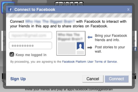
facebook connect MODAL ANON

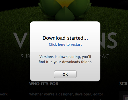
So what is a modal box exactly? Basically, it is a mini window that comes up when a user visits a website that requires the user to do something before the main page is accessible. They can be used for a variety of purposes – including asking for the user’s personal information, stating emergency or error messages, or to show an item more closely and with greater detail.

Modal vs Pop Up

Of course, the modal box probably sounds very similar to the dreaded pop up boxes scammers and Internet advertising companies are known for. The pop up is such a dirty word in web design that all the Internet browser companies now include features that will block all of them for you.

So, what is the difference between a modal box and a pop up? Technically, they are both miniature windows that ‘pop up’ when you visit a website. However, annoying pop ups are typically used to force advertising onto web traffic or to keep a person at a website longer than they intended to stay. This is why they are so dreaded – the pop ups are distracting, unwanted, time wasting elements of web design.

A modal box, on the other hand, can be welcoming and effective if planned and used to benefit the visitor and not the site owner. For Internet marketers, it is used as a way to encourage visitors to sign up for their email lists. A great Internet marketer then uses these permission based lists to send valuable information to those who signed up. Or a modal box can be used to better display inventory so that customers shopping online can get a real sense of their purchase before committing. Maybe there is an important part of the website that the owner wants to draw attention to? It can also be used to protect a page by requiring a user ID and password before permitting access. A modal box should not pop up randomly and should have purpose.


Design

In order to create a modal box, many users incorporate Javascript, CSS, XHTML and AJAX programming. This means the new web designer will need to have a bigger understanding of design than just basic HTML to pull off a good modal box.


Drawbacks

Of course, user traffic has a limited time span. With statistics stating that the average Internet surfer spends mere seconds on a web page – incorporating a box that requires interaction to go away could mean the website will lose traffic. No matter how well a web designer and site owner justify the modal box – some people will cruise on instead of interacting with the box to make it go away. Some users argue that the modal box is just a fancy upgrade from the pop up and is still undesirable. This is a drawback to using the modal box in your design.

Also, overuse of the modal box on a website will make users naturally compare them to the annoying pop ups of old. The overuse of any design element is unappealing and will affect your site in a negative manner. On top of that, spammers have caught on to the appeal of the modal box and are increasingly using this tool to trick visitors into believing what they offer is more legitimate or interesting. As time goes on, the modal box will become just as offensive as the pop up and something new will be created to fill this need instead.

How do you feel about modals windows how do your feel they are better or worse than traditional pop-ups, please discuss in the comment we would love to hear your perspective.

The post Modal Windows – Good Practice or Just Glorified Pop Ups? appeared first on Design Reviver.


7 Free Metal Textures

Textures can form a principal element in your designs. They add details to images, giving a great deal of depth to a composition. Textures could come in the forms of high resolution images such as detailed surfaces of rocks, fabric, wood etc or can just be regular pictures. We have produced 7 exclusive free metal textures for you to download along with a step by step tutorial showing how they were made.

Step 1

In this short tutorial, we’ll go into the basics of creating one of the metal textures. Starting off with a new document with a size of  500 x 500 pixels, create a new layer. Then go to Filter >Render > Clouds to add a Clouds effect to this layer. Press Ctrl+F twice to apply this effect twice.

Step 2

Head on over to Filter  > Texture and select the Texture type as Sandstone and make the following adjustments below:

The result:

Step 3

Adjust the tone of the image a bit to reduce its brightness by pressing Ctrl+M for the Curves Dialog box.

Step 4

With the Ellipse Tool (U) selected, draw a circle while holding the Shift for a perfect circle and then fill with black.

Step 5

Add another layer and select the Elliptical Marquee Tool (M). Draw a circle slightly larger than the previous one and with the Gradient Tool (G), create a gradient transiting from grey to white. Merge the ‘gradient’ layer with the black circle layer by pressing Ctrl+E.

Step 6

Go to Filter > Blur > Gaussian Blur and set the Blur Radius to about 1.8 pixels.

Step 7

Duplicate the circles six more times by pressing Ctrl+J. Hitting Ctrl+R, the Ruler Bar pops up; Guides can be dragged from both the vertical and horizontal sides of the document window.

Step 8

Select the Crop Tool (C ) and drag it right about the guides. The selection snaps automatically in place but only if you’ve enabled ’Snap to Guides’ from View > Snap.

Step 9

At this point, go to Image > Crop to create a tile.

Step 10

Select the background layer and then go to Edit > Define Pattern. Name the pattern in the box that comes up.

Step 11

In a new document, you can either go to Layers > New Adjustment Layers  > Pattern. Or apply your new pattern as a Layer Style to an object. Whatever use you have for your patterns, they can be scaled to your liken.

Applying Adjustment Layers among all other techniques and effects further enhances the look of your patterned textures.

Metal themed textures: Meshes and Grids

Grater

Grater detail

Mesh

Mesh II

Speakers Grid

Speakers II

Carbon

This one isnt metal as such, but what the heck! I had fun making it anyway.

Steel Mesh

Steel Split

Steel

Compared to the first steel texture above, this one’s seemless as it does not have those tiling hat make up the entire image visilible. This was possible using  the Offset Filter after making the pattern. Seemless textures are perfect for 3D for they give smooth appearance textures all round.

Downloads

Metal Textures Jpgs Zip file


Influence of Print: Incorporating Newspaper & Magazine Layout Design

New web pages are being designed every day. Great web designers not only keep up with the rest of the pack, but stays ahead of it by tracking what the current trends in web design are. Right now the influence of print design on the web is making quite an appearance in online page design. While many consider the days of newspaper to be archaic and magazines to be a waste of trees, there is great design to be found in these publications. Using that as inspiration for your web pages could jump you up to the cream of the web designer crop.

Print publications have decades worth of experience in the type of design that works and is the most impactful. The best design is always powerful, clear, simple and easy to understand. Negative or white space is king when you are talking about print advertisements including billboards, magazine layouts, newspaper ads and other forms of visual marketing.

The Internet has not necessarily followed this method of reaching their target audiences and making a strong statement to their traffic. One of the greatest benefits to web design is that users are not restricted in what they can say. There is no per word charge when designing a webpage. There was also a lot of flexibility in what graphics could really do. Print advertising does not allow users to incorporate audio, video or Flash. The novelty of being able to design and use these tools is really the fuel for early webpage design.

Today, however, the market is asking for less clutter. They are overloaded with all the information available on the Internet. There is a demand for better search engines, easier to navigate websites, and simply less animation and distracting graphics in modern web design.

This type of design is especially frustrating and ineffective for businesses and marketers who are trying to get one message across. It is too easy for that simple message to get lost in the bells and whistles of an overly design website.

Instead of reinventing the wheel, web designers are going to the experts of old. Print publications have mastered these challenges and understand what it takes to get an audience’s attention.

Typography


The selection of a font is crucial in web page design. Designers need to have an understanding of how fonts affect a design in general, how they affect readers and how best to use them. Typography is design’s way of communicating without speaking. It is common knowledge that the written world can be easily misinterpreted since there are know vocal inflections or an idea of tone.  If your message is not clear or can be easily miscommunication, you lose impact. If you have a great message, but it does not stand out in your design, you lose impact. Designers have to find the right balance in order to properly communication with their target audience and traffic.

Editorial Layouts

When web design began, traditional layout rules were thrown out the window. Frames and tables were the thing and design revolved around creative ways to use them. However, with the demand for simplification and the popularity of blogs – today’s websites more closely resemble their print ancestors.

Print layout design, especially magazine layouts, is great for controlling content heavy sites as well. Not only are the advertisements influential, but the editorial content and design is becoming the go to for blogs, ezines and other content rich websites.

Big bold headlines are common using keywords that enhance SEO techniques. However, the art of the headline is the offspring of newsprint. Other common print approaches that are being used more in web design include indented text, quotations, text in multiple columns and sidenotes and footnotes.

Striking and interesting graphics and photography have always been fundamental parts of design. The layout of these images is also being influenced by traditional print layouts.

Of course, the reason websites were not using these techniques originally is the complication of creating pages using this design style. This is no different today. Beginning web designs may find it difficult to code this kind of layout since the advanced HTML and CSS can take up much more time than more common design approaches.

However, those designers who are familiar with traditional web design are looking for ways to make their sites more appealing and interesting. Incorporating print design ideas and layouts is one of the ways to make a designer’s work stand out. Magazine layouts are known to have even more impact than television advertising – this means spending time studying magazines and using them for inspiration and motivation.

1 Comment more...

Mac App Store: Our pick of the best launch apps

With little in the way of fanfare the new Mac App Store launched this morning. Only time will tell if it will ever match the success of its big brother the iOS App store but it is safe to say its going to revolutionize the way software is distributed on the Mac at least.

You will probably already be familiar with much of whats on offer here (many of the launch titles are ported iOS apps) but we thought it would still be useful to compile a list of stand out launch titles.  If you think we have missed any please let us know in the comments and we will get them added.

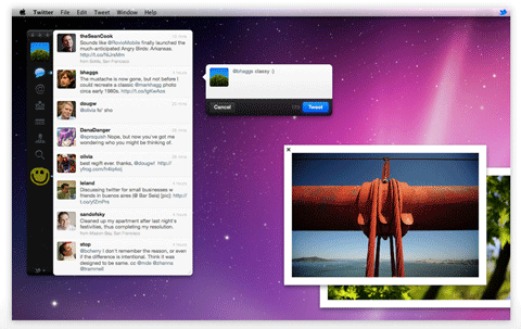
Twitter

Pixelmator

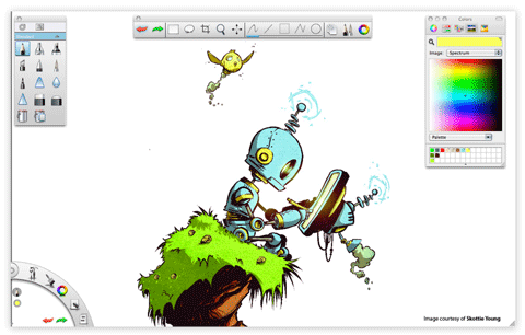
Autodesk SketchBook Express

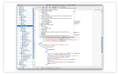
TextWrangler

Aperture 3

Pixelruler

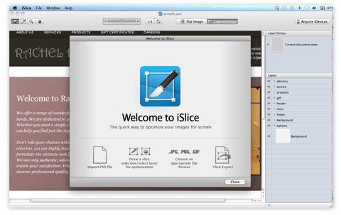
iSlice

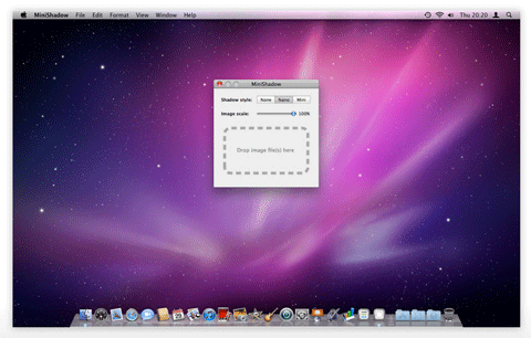
MiniShadow


  •   
  • Copyright © 1996-2010 BlogmyQuery - BMQ. All rights reserved.
    iDream theme by Templates Next | Powered by WordPress