Author Archive

Your Photos Retro Style with HTML5 Canvas and Vintage.js


HTML5, JavaScript and Canvas are gaining momentum when it comes to image processing. It’s only been a few days since we introduced you to the jQuery-plugin tiltShift.js, which, you can easily guess by its name, applies the popular effect of miniaturizing to whatever image you fire it on. Today we’ll show you vintage.js. This jQuery-plugin, which is available as a web service also, enables you to let your images look as if they were taken ages ago. It doesn’t only do that good, it does a fantastic job.

Vintage.js: Webservice plus Gallery

German developer Robert Fleischmann introduces an extremely flexible way to expose photos to virtual digital aging. Lots of parameters help you finetune the results. If you’re thinking about implementing the plugin into your own website, but are unsure regarding its capabilities, you should take a look at the project’s website. This is also true, if you’re just searching for a quick and easy way to retro style your photos.

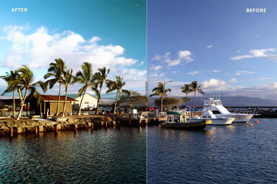
Vintagejs.com provides a web app, where you can upload your own pictures, manipulate them via simple value sliders and even expose them to the public eye in an ever growing gallery. This last aspect is totally optional. The following image shows a possible result vitage.js is able to achieve:

Before applying heavy filtering the image looked like this:

Check out the online service. You’ll notice that the manipulation is comfortable and that you’re working in an wysiwyg surrounding, at least almost. Looking at the user interface you’ll feel at home quite quickly. You don’t need any academic background to use it:

After you’re finished firing effects to your photos, you can download it and/or save it publicly in the online gallery. You’ll find thousands of pages with photos there. The quality of course, as usual with user-generated content, is varying…

Vintage.js: Plugin for your own Website

After you’ve convinced yourself that vintage.js is powerful enough for your needs, let’s take a look at the technical implementation of the plugin. Vintage.js requires jQuery. Furthermore you’ll have to embed the plugin and the accompanying CSS stylesheet:

1
2
3
<script src="src/jquery.js"></script>
<script src="src/vintage.js"></script>
<link rel="stylesheet" type="text/css" href="css/vintagejs.css" media="all" />

Vintage.js is called only once, which makes is generally available and easy to maintain. If you want to invoke it on an image, you add the class “vintage” to it. That way, the JavaScript identifies where to get active. The function call can most basically look like this:

1
2
3
4
5
6
7
<script>
$(function () {
    $('img.vintage').click(function () {
        $(this).vintage();
    });
});
</script>

There are three different presets to choose from. You’ll easily guess what these will achieve, as they are called sepia, green and grayscale. If you’re into more flexibility or a full blown control freak even, vintage.js is for you, too. You won’t be working with a preset, you’ll pass custom parameters to the function call.

Using this variant you’ll feel reminded of the possibilities of the online service. While you can change all the parameters that alter the imagery, you are also able to change the file format. A callback funktion allows you to decide which further steps should be invoked after execution of the main task. A function call with a reasonable amount of parametrization could look like this:

1
2
3
4
5
6
7
8
9
10
11
12
13
14
15
16
17
18
19
20
<script>
$(function () {
    $('img.vintage').click(function () {
        $(this).vintage({
            vignette: {
                black: 0.8,
                white: 0.2
            },
            noise: 20,
            screen: {
                red: 12,
                green: 75,
                blue: 153,
                strength: 0.3
            },
            desaturate: 0.05
        });
    });
});
</script>

Vintage.js works in all modern browsers and the Internet Exploder 9. Crucial is support of the canvas element. Developer Robert Fleischmann provides you with the plugin without charging for anything. The plugin as well as the online service can be used totally free, for personal and commercial projects alike, as it is double-licensed under MIT and GPL.

Related Links:


Typography rules: Eye-Catching Headlines with slabText for jQuery


Typography in web design has long been treated as an orphan. With the rise of web fonts the situation changed and thanks to jQuery we have loads of elegant little helpers to make our sites prettier. The more advanced plugins even introduce possibilities formerly only known to print designers. Today we are going to take a look at slabText.js. This tool will split longer headings into two or more rows and set these rows to full justification, where each row is scaled individually, which guarantees for an eye-catcher.

slabText: FitText clone at first, but not at second sight…

You might have already put your hands on FitText, a very popular plugin, that at first sight seems to achieve the same tasks slabText intends to. The difference is small, but profound. FitText only scales one-row headings to the size of its container.

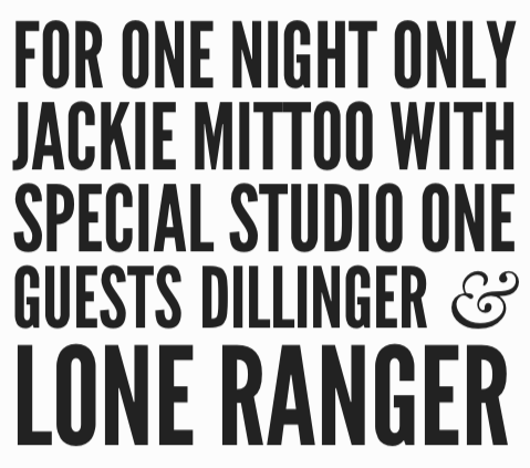
slabText takes the next step and provides almost the same functionality for longer headings. Taking a longer title marked H1, slabText will split it in rows. Then it takes these rows and justifies them to the left and to the right, which obviously requires changes in font-size, as not all words are created equal. In doing so, slabText calculates by itself where to fill in the line breaks. Thinking of event announcements or other layouts with a focus on structured information, automatic line breaking will usually not lead to intended results. We don’t need to worry about that as slabText allows for manually set forced line breaking, too. All you need to do, is fill in the text between this markup:

<span class="slabtext"></span>

You can even preset line breaks using JavaScript. We’ll refer to the following example later on:

1
2
3
4
5
6
7
8
9
var stS = "<span class='slabtext'>",
    stE = "</span>",
    txt = [
        "For one night only",
        "Jackie Mittoo",
        "with special Studio One guests", 
        "Dillinger & Lone Ranger"];
 
$("#myHeader").html(stS + txt.join(stE + stS) + stE).slabText();

If you’re puzzled as to where the problem might lie, let’s take a look at an eye-catching heading. The first variant is based on the automatically calculated line breaking of slabText, whereas the second alternative shows forced line breaking depending on manual settings. I think you’ll agree that the second variant is much more attractive, readable, world-changing, what else:

slabText’s proposal: Not optimal under communication aspects

Manually set line breaks transport the important information way better

Using the function viewpointBreakpoint, we are able to define the minimum resolution for the plugin to be invoked. You’ll usually not want to have scaled heading if your browser’s viewpoint is below a certain resolution, say 300 to 400 pixels in width. With the definition of a breakpoint, slabText stays completely idle (if invoked in the defined range), whereas it interprets all other resolutions responsively.

Important note for web font users: Make sure all fonts are loaded before you fire up slabText. The product’s website doesn’t stick to this rule, but intentionally. The developer wants you to see the untouched heading for a short period of time before slabText goes into effect. Live websites shouldn’t risk to work that way.

slabText is under active development. The latest changes happened only a few days ago. slabText can be used free of charge under a MIT-/GPL-license.

Related Links:


Freebie of the Day: Photoshop Action ‘The Wise Watson’


The nice folks over at Lookfilter.com want to promote their yet to be finished collection of fresh Photoshop actions. Of the announced four actions only one is already available by now. Good for all of us, they give it away for free. Who wouldn’t appreciate a professional photography effect? And that’s exactly what you get for giving away your email address.

Photoshop Action: The Wise Watson adds Drama to your Photos

Lookfilter gave some interesting names to their collection of photographic effect filters. We have “The Wise Watson”, “The Loaded Leibovitz”, “The Awesome Avedon” and “The Early Eggleston”. People with a little knowledge in photography will probably notice that these all relate to the names of famous photographers. What Lookfilter tries to replicate with each action set is nothing less than the atmosphere that was typical for these photographers. Several different images shown for each action let you judge for yourself how well you think the goal has been met.

An impressive example taken off the Lookfilter website

It’s easy to show impressive imagery on a website. As it’s a wicked world out there, I was not sure whether the promised effects would really be achieved. So I went ahead and traded off my email address against a download of “The Wise Watson”. The installation ist simple. After having signed up for the newsletter, Lookfilter will send you an email in which you are asked to confirm the subscription. Clicking on that link will take you back to the website, where your download is initiated. You’ll notice the download of a zip-file. Unzip the contained Lookfilter.com.atn and drag and drop it into the actions window of your open Photoshop installation. Not open? Okay, then. Start Photoshop, from the top navigation choose Window, then click Actions. In the Actions window click on the down-arrow situated right under the x-symbol for closing the window on the top right corner. A dropdown opens, where you’ll want to choose “Load Actions”. Your file system opens and you navigate to the folder you unzipped the action to. Choose it, click load, that’s it.

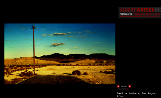
An original photography by Albert Watson (Source: Official Website)

Now you’ll find The Wise Watson at the end of the actions list. All you have to do now, is open an image, open the actions window, highlight The Wise Watson with a single click and press the play button located in the status bar of the actions window. A lot of steps will now automatically be initiated and finally you’ll be presented with the new look of your original.

The Wise Watson is named after photographer Albert Watson who is best known for his dramatic use of colors and lighting. I’m not a professional know-it-all in contemporary photography, but in my humble opinion, Lookfilter’s action does indeed catch the atmosphere of a might-be Watson very well. Again, judge for yourself.

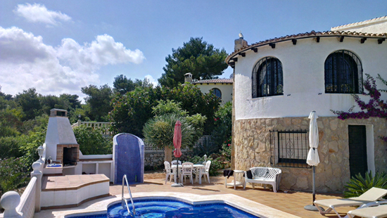
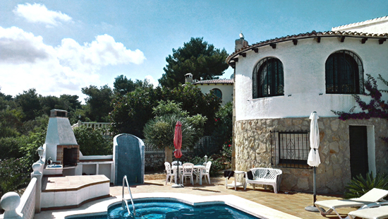
To give you an idea of how the action changes the look of an ordinary photo. I took one of the images of my sadly already passed by vacation and fired the Watson-effect at it. Here is what the picture looks like, before and after:

Before: My little pool villa as my camera really saw it

After: My little pool villa as Watson might have seen it

The Wise Watson is offered free of charge as long as the collection has not been officially launched. At the time of this writing that hasn’t been the case, obviously. So better be quick and download while you still can. As the other filters don’t exactly drive you into bankruptcy either – they accumulate to an affordable 19 USD – you might as well stay relaxed and wait for the day. I’m glad I took The Wise Watson while it was hot, though, and so should you…

Related Links:


tiltShift.js: Tiltshift-Effects with CSS3 and jQuery


tiltShift.js is nothing short of a little sensation. Using the new CSS3 Image Filters, developer Noel Tock realized a tiltshift-effect for any image you’d want to apply one to. It has of course to be said, that at the time of this writing only Chrome and Safari 6 are able to visualize the effect. Furthermore the pictures have to be generally qualified for the use of tiltshift. But this proves true for all possible fake tiltshifts, as can be achieved by Photoshop and others.

tiltShift.js: Very Clever Use of CSS3 Image Filters

To be absolutely honest, Noel Tock’s jQuery-plugin is more or less a wireframe. The effects applied only work in Chrome and Safari 6 and are generally dependent on being invoked on suitable photos. These should be taken from quite a distance and a higher angle of a subject that is best to be found in the middle of the photo. Of course you could apply tiltshift.js to any other photo, but wouldn’t achieve a visible tiltshift-effect in these cases.

That said in advance, Tock’s little javascript can be steered rather finely by using several parameters. Parameters are passed through the use of the new HTML5 data-attributes. Using data-position you define the position of the image section that should stay in focus. Valid values range from 0 to 100. A value of 50 would center the focus in the middle of the image. Combine that with data-focus, also ranging from 0 to 100, to set the size of the focus. Setting a value of 10 would mean, that 10 percent of the image would stay focussed, while the rest would appear blurred.

Having set that, data-blur is there to define the radius, while data-falloff will control the size of the area between full focus and full blur. You see, there’s nothing left to chance. For invoking the effect you fire it on a div-wrapper, that should be styled via CSS to avoid unwanted behaviour designwise.

tiltShift.js is made available under the GNU GPL license. Thus it is freely usable for any legal purpose. The project has just been setup on Github and shows a glimpse of the bright future, we as web developers are moving to with accelerating velocity.

Related Links:


jQuery Socialist: One-Stop Shop for Social Media Stream Aggregation


Life can be easy. With the brand-new jQuery plugin Socialist you’re able to aggregate a plethora of streams stemming from different social networks into one, modern and elegant grid-based layout. If you haven’t been living under a stone lately, you’ll have a strong deja vu looking at Socialist’s default output. Yes, you’re right. It does look like Pinterest. If you’re not into Pinterest though, you can have Socialist display the various streams in plain old-school list view.

Socialist: Just Add Water Streams to an Array, they’ll automagically be beautified

As of the time of writing Socialist aggregates the streams of Facebook, Twitter, LinkedIn, Flickr, YouTube, Tumblr, Pinterest, Craigslist and Google+. But this is only half the truth as Socialist is able to process each and every RSS feed. This way sky is the limit. With Socialist you can have streams displayed separately or in any combination.

You’ll achieve this simply by defining an array of data, that represents the streams to be aggregated. After definition the array is invoked on any div container your site has to offer. Look at this example:

$(‘#mydiv’).socialist({
networks: [
{name:'facebook',id:'in1dotcom'},
{name:'tumblr',id:'in1blog'},
{name:'twitter',id:'in1_'},
{name:'pinterest',id:'potterybarn/Fall-Weddings-by-Pottery-Barn'},
{name:'youtube',id:'potterybarn'},
{name:'googleplus',id:'105588557807820541973/posts'},
{name:'rss',id:' http://feeds.feedburner.com/good/lbvp'}
],
maxResults:4
});

In this case, we would have the streams of Facebook, Tumblr, Twitter, Pinterest, YouTube and Google+ pulled together, accompanied by an RSS feed provided through Feedburner. The array networks, is responsible for the functionality. I believe the code to be more or less self-explanatory, don’t you?

We see one stream per row. Parameter name contains the source of the stream, e.g. Facebook, while id is equipped with the targeted account. Speaking of Facebook we pass the targeted profile, which of course need not be your own. Google+ still forces us to pass the cryptic number combination, they use to identify your account. If you’re pulling in RSS feeds, the id simply carries the feed url. The parameter maxResults lets you limit the number of to be called content items per stream. The above example contains a limitation to four items per stream. The parameter is completely optional and need not be used if you don’t want to limit the input.

A few more parameters exist. These for instance define which parts of the stream content shall be imported. Thus it is possible to have the grid show photos only and abandon all text or the other way round. You can define the size of the tiles or if don’t want any tiles at all. To guarantee for a consistent look you might want to set maximum lengths for headings or texts.

Socialist needs jQuery version 1.6 and up. It integrates the plugins Isotope and Cross Domain Ajax. Both of them need not be called separately. That way the following call is sufficient to set Socialist into effect:

<link href=”jquery.socialist.css” rel=”stylesheet” />
<script src=”jquery.socialist.js”></script>

Socialist is published under the MIT license, which means, it can be used free of charge in private as well as in commercial projects. As it frequently is, again it’s the Isotope plugin which limits Socialist to private use, as Isotope is free only for private and non-profit use. If you want to utilize Socialist in a commercial environment without paying for an Isotope license, you can still do so, but need to relinquish the grid view, as this is achieved by Isotope. The list view is not affected by this limitation.

Related links:


  •   
  • Copyright © 1996-2010 BlogmyQuery - BMQ. All rights reserved.
    iDream theme by Templates Next | Powered by WordPress