Conversion rate optimization (CRO) denotes strategies to persuade website visitors to become clients. What influences customers’ shopping behavior? In the world of B2B SaaS, you need to present a product that serves the following primary purposes:
- enhancing business performance;
- solving common pain points;
- increasing sales;
- reducing costs;
- providing a team with the needed capabilities that are easy to comprehend.
But even having the best and most useful product doesn’t guarantee conversions. You need to succeed in the challenging CRO process, improving the user experience on the website and removing any barriers on the purchase journey. For example, online store owners follow eCommerce UX design best practices to achieve it. What can a B2B SaaS company do?
A great customer experience begins with understanding the path a potential buyer follows when interacting with a brand. It involves all of the company’s points of contact with a prospect. Ideally, these paths should be well thought through from many perspectives: UX\UI, sales, and marketing, to name a few.
By investing time in conversion rate optimization, a company can pave the optimal way for a potential client to buy more. In this article, you’ll find out what software as a service (SaaS) companies can do to increase their website’s conversions.
1. Analyze Your Landing Pages
B2B clients need more time to convert compared to direct consumers. They avoid impulsive purchases, so having a good landing page with essential information about the product is a must for a B2B SaaS company. These are pages intended to trigger a particular action:
- subscribing to an email newsletter;
- signing up for a demo version of the software;
- opting in for a trial period;
- buying the tool.
So they should be powerful in marketing terms. Here are some pointers for designing a landing page:
- Let people sign in with a single click.
- Use a strong copy, with headlines and subheadings defining your unique value proposition (UVP).
- Include engaging elements, such as videos, to tell about your product more.
- Highlight the benefits for a potential business client (not only the features of the product/service).
- Reduce doubts and increase trust with social proof (testimonials, achievements, awards, partners, etc.).
- Personalize communication with pronouns and tailored content.
- Remove the website’s navigation from a landing page to double the conversion rate.
FreshBooks increases the number of conversions by stating the ability to cancel subscriptions and not to insert credit card data. It also displays product ratings and reviews. At the bottom of the page, there is a Frequently Asked Questions section and product benefits for businesses, helping prospects decide.
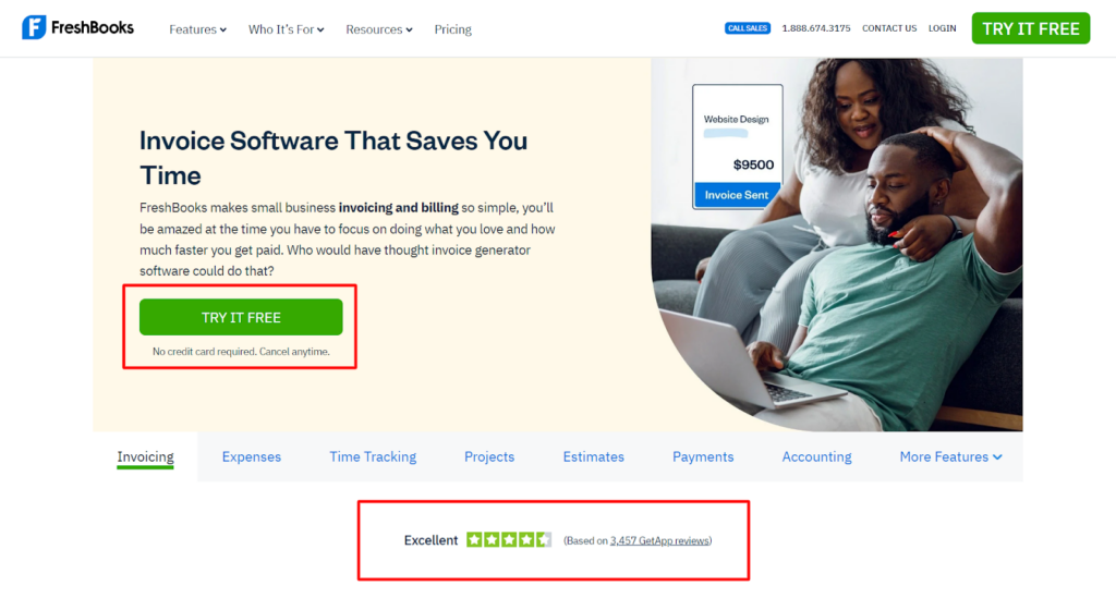
Screenshot taken on the official FreshBooks website
2. Give an Idea About Your Product with a Short Free Trial
Gaining awareness of your product and stimulating interest in it typically constitutes the first step in lead generation. That’s where the opportunity to test the software becomes of the utmost importance. If you neglect this step, most consumers will skip your product and turn to your competitors. As most SaaS companies provide an opportunity to run the product for free, you need to follow their suit.
In light of this, work on improving visitor-to-free trial/freemium conversions. It includes offering a complete product for a brief period (a trial) or providing a minimal, non-time-limited version of your product (freemium). So customers will need to either pay for the service after a certain period or complete access to all features without any limitations or watermarks.
A case in point is MailChimp, a marketing platform for small businesses. You can utilize the tool for free, but it’s limited to 2,500 monthly emails sent, one user, and some advanced features.
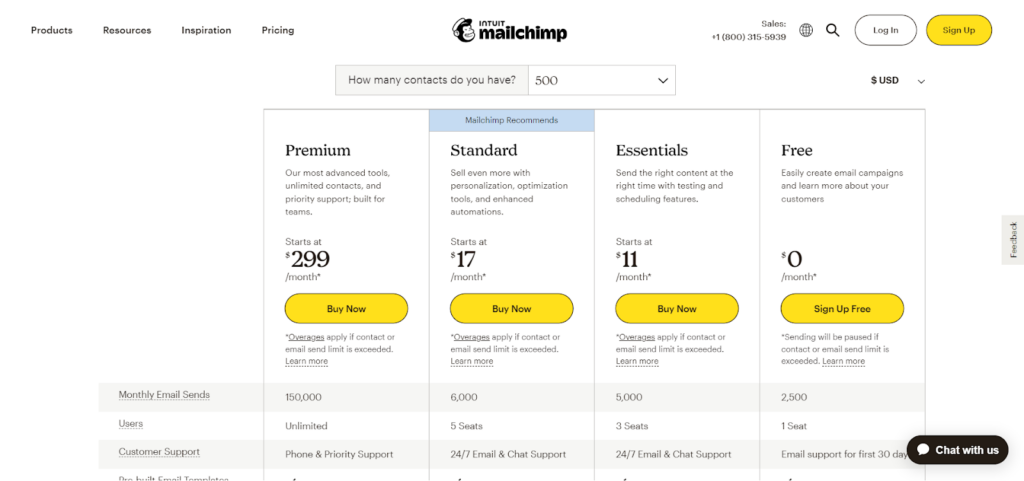
Screenshot taken on the official MailChimp website
People need to understand the tool fast. Ensure a smooth onboarding process. Let consumers complete their tasks and get to grips with the software to encourage them to purchase it for a longer time. The bottom line is that the product should solve customer problems before the end of the trial. That’s where the following tips may help:
- display the value of the products with the help of metrics and reports;
- instill a sense of urgency when the trial is coming to an end;
- follow up with those who don’t subscribe to discover reasons for abandoning the service.
3. Use Clear Calls-to-Action
Suppose you’ve convinced visitors to subscribe or buy. Where should they click to get the desired solution? To encourage visitors to stay on a website and submit a contact form with an inquiry or download a whitepaper, include the CTA to catch their attention immediately. While it may seem obvious, organizing the CTA is a critical step on the CRO list. Take this information into consideration when improving CTAs:
- These can be links or buttons, leading people to other sales funnel stages.
- They may differ in prominence, with the most important being highlighted.
- As clicking the button denotes conversion, you need to place them front and center on your pages.
- The wording should be understandable and give clear directions.
- Generate FOMO by advertising innovative features or limited-time deals.
- CTAs should be concise, stating the product value in several words.
Look at how DocuSign emphasizes CTAs by increasing their size or spacing them out. This strategy is especially successful as there are minimum elements in the above-the-fold area.
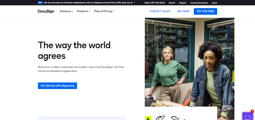
Screenshot taken on the official DocuSign website
4. Cut Down on Your Lead Form Fields
Analyze your website forms. Is all information necessary to initiate the first contact with your company? Stick to the minimal number of fields. Allow users to complete them in a couple of seconds. Ask for the essential information only and make it up to clients whether to insert some details. For example, asterisks above specific fields will denote their importance. You may either hide the rest in accordions, remove them, or leave them without any marks.
Zoho enables prospects to sign up by inserting an email address, password, and country. But there is a quicker path. You can use a Google or Microsoft account to access Zoho CRM.
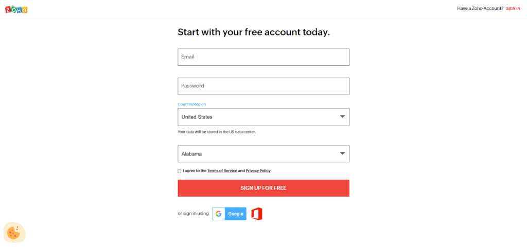
Screenshot taken on the official Zoho website
The fewer fields you show, the higher your chances of converting people into customers. If it’s necessary to collect such information, try separating forms across several pages. According to statistics, choosing multi-page over single-page forms can increase conversions from 4.53% to 13.85%.
In most cases, successful conversion in B2B SaaS will involve starting a conversation with your sales team, not purchasing. Keeping that in mind, you need to reduce the effort of making an appointment.
5. Practice A/B Testing
What should you pay the most attention to in terms of marketing? Your messages. A\B testing gives a great hand at determining which elements, phrases, and layouts bring back a higher response. As such, using tools such as Visual Website Optimizer and similar, you can test the components on your landing pages to get an insight into customer behavior. These include calls to action, color schemes, texts, and visuals.
Such variation test campaigns allow for splitting your audience and showing them different options. For instance, you can build a hypothesis on the wording used for sign-up forms or even the subject lines of your newsletter send-outs.
As the business grows, you may conduct polls and surveys or analyze heatmaps to gather user feedback on your business. Implement the results on your touchpoints, including the website, app, social media, email, etc. It can involve making minor adjustments like changing the look of your landing pages or adding CTAs that are simpler, clearer, and more effective at boosting conversion rates.
You may find out what works best by comparing the results of gathered data like the number of clicks, downloads, filled-out forms, etc. You can also discover the bottlenecks that need fixing and underperforming solutions to replace. This way, your marketing efforts will bring back a more effective resonance.
By analyzing data of this kind, you can optimize the customer journey map and build stronger relationships with your clients. Not to mention that such an approach saves marketing resources and gets a better return on investment.
Major Takeaways
B2B SaaS companies should start optimizing their websites and solutions for conversions by analyzing customer psychology. What do people seek when inserting specific keywords in search and landing on your page? Leverage website analytics and tools to determine their interests and pain points.
We’ve described several ways to enhance conversion rates and sales, such as:
- organizing landing pages;
- adding a free version of the software to evaluate it before buying;
- improving CTAs, their position, color, wording, and so on;
- simplifying the registration process;
- finding the best variant with the help of A/B testing, website analysis, and heat mapping.
Generate high-quality content and ensure website usability. Attract the target audience and solve people’s problems. If you follow these pieces of advice in addition to the CRO best practices, you will get more qualified leads for your B2B SaaS business.
Featured image by Stephen Phillips – Hostreviews.co.uk on Unsplash
The post 5 Best CRO Tips for B2B SaaS Websites appeared first on noupe.