Author Archive

Notion: What Is It and How do you Create a Template there?

Modern people are constantly in a race, trying to match the rhythm of our frenzied lives.  In this cycle of affairs and events, it’s very difficult to concentrate, which leads to stress and lack of coordination. Smart thoughts, which are so important for our work, study, and creativity, as a rule, come suddenly and, most often, at the wrong moment.

For a long time, an ordinary notebook, or a piece of paper helped to not miss great thoughts. But these days, most often a smartphone or computer are at our fingertips! Gadgets allow us not only to save important thoughts but also to arrange them correctly. One of these useful applications is Notion. This article will tell interested users how to apply their own Notion templates.

How to Add Your Own Notion Templates on Windows, Mac, or Chromebook: Simple and Quick Instruction

If you want to add aesthetic Notion templates to your computer, follow the instructions below:

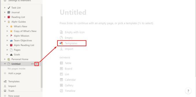
  1. Add a special button to the screen (click on the corresponding symbol on the panel).
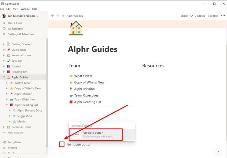
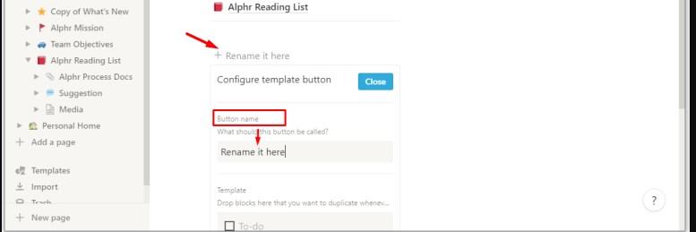
  1. Change the name of the button.
  1. Include the elements that you want to use in the future template. Users have the opportunity to add text, checkboxes, markers, headers, and other tools for comfortable use.
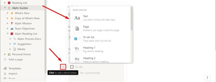
Just like that, free Notion templates have been added to your profile. The scope for the personal use of the app is huge. You can use it as a service for taking notes, making a to-do list, keeping a personal diary or a habit tracker, organizing household chores, or keeping a list of goals for the year, and so on.

How to Create a New Template in Notion on an iPhone or Android Device

Using your favorite app from a mobile device is convenient and simple, but creative fans of Notion are out of luck in this case — it’s impossible to create your own templates from gadgets (phone, tablet). However, there are many high-quality templates that can be used for free!

Among them are a variety of options:

  • various kinds of notes (reminders of scheduled meetings, for example)
  • the intended list of books to read
  • plans (schedules of classes, lessons)
  • to-do lists for the day

Despite the lack of ability to work from a phone with your own options, you can experience the full functionality of the application using the built-in free Notion templates.

How to Edit the Content on Your Template Button in Notion

This process is as simple as creating a new template and it’ll be completed in a few minutes if you follow the instructions:

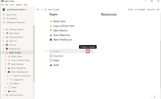
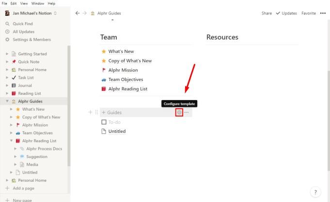
  1. Click on the gear icon.
  1. In the configuration settings, enter the required parameters (you can remove some existing elements there or add your own).
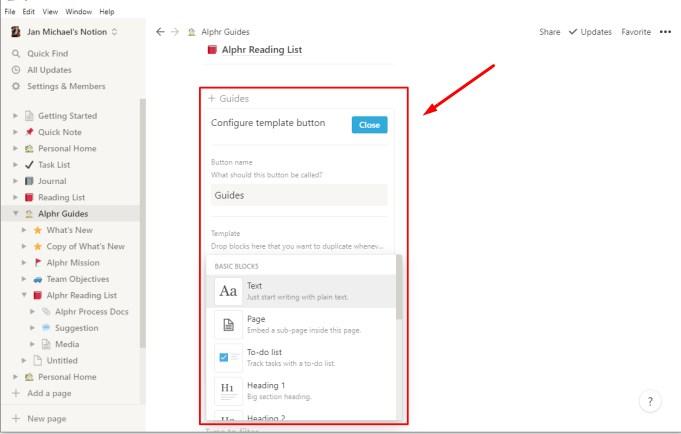
When all the parameters are saved, the changes will take effect on the selected templates.

What Other Actions Can Be Performed with a Template Button?

In fact, a template button is a universal tool. It can be used on one or several different pages. Also, the client can easily delete it altogether if the button is no longer needed. To get access to a wide range of functions, use this instruction:

  1. Swipe the computer mouse pointer over the button and click on the gear icon, which is located to your right. To view the list of functions offered for use, just click on the right mouse button.
  1. Open the comments. To do this, tap on the corresponding button from the list.
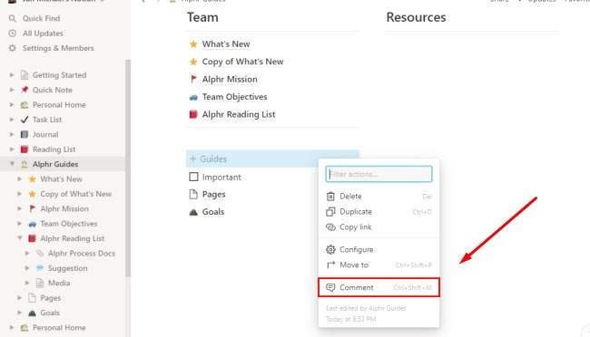
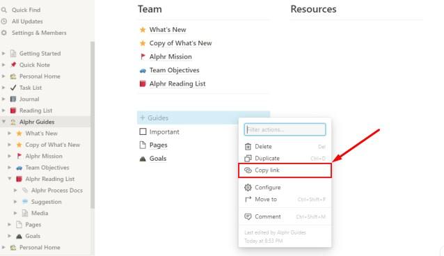
  1. The “Copy Link” function will help you copy the links to the button and paste them anywhere else in the template. To connect, just click “Copy link.”
  1. If necessary, the template button can be completely removed. It’s easy to do — there’s a “Delete” button for this. Click on it.

As you can see, there are enough functions to quickly and efficiently solve any issues and create the necessary templates. Users should only give free rein to their inspiration!

How to Generate Nested Content Templates

Nested content is the content that is included in other elements of the template (it can be text or an image, for example). To create this, a user needs:

  1. Come up with your own content that you plan to duplicate later in the template.
  2. Move all the content to the switch list or to the page itself.
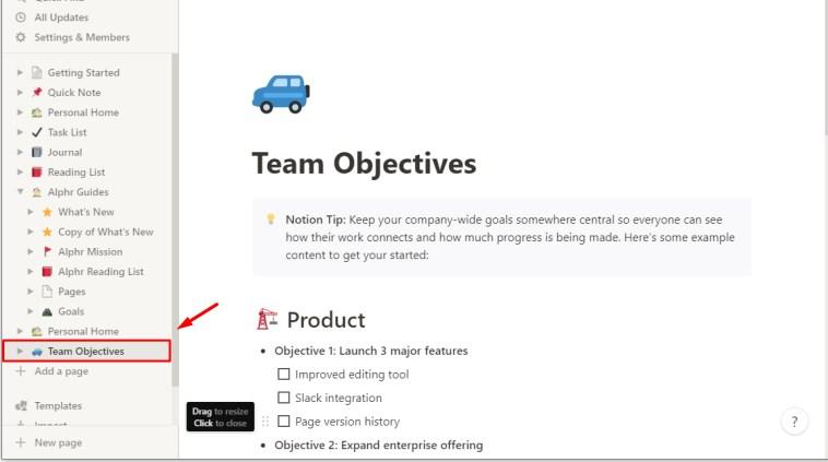
  1. Generate a template button and add a list of radio buttons or a separate page to it. This should be included in the segment of the configuration section.
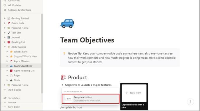
By clicking on the “Close” button, you’ll save the changes and your template will have multifaceted content, which will greatly simplify working with it!

Can Weekly Agendas Be Created Using Notion Templates?

A weekly plan is an important element of a person’s life, allowing you to distribute things and find free time for hobbies, family, and self-care. Notion offers the option to create a weekly to-do list as follows:

  1. Create a new page in the app.
  2. Generate the template you need.
  1. Add a link called “Start a new day” to the “Button Name” field.
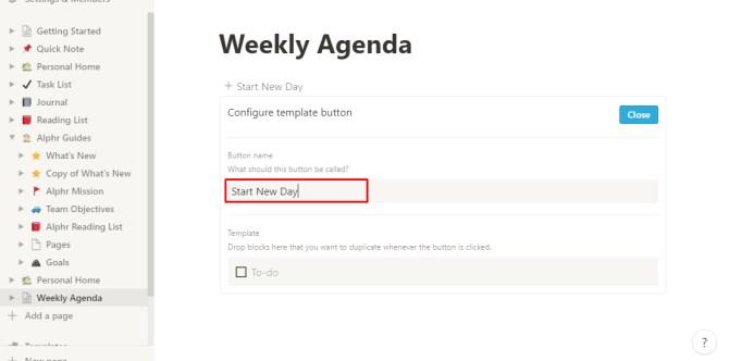
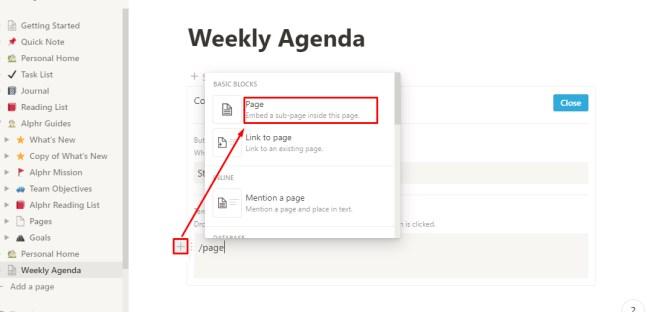
  1. Click on the button with the “+” sign. In the template field, include another page.
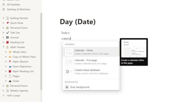
  1. On a blank page, write “Day/Date.” Fill the page with all the necessary content (calendar, planner, notes).
  1. Go back to the “Agenda for the Week” page.
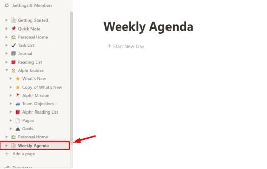
  1. Click on the “Start a New Day” function bar every morning.

This template and its wide functionality will greatly simplify your day and streamline all your daily activities.

Top 5 Best Notion Templates

Not every user can create an original high-quality template due to different circumstances. That’s why there are special services for such cases. MasterBundles offers customers the Top 5 Best Notion Templates:

  1. Minimalist Weekly Planner — create plans and free up the day for your favorite things simply and quickly!
  2. Meal Planner + Groceries List Generator — a convenient option for anyone who carefully monitors nutrition. Now your entire diet for the day is on your smartphone or computer!
  3. Weekly Planner — a high-quality calendar where you can take notes and make plans every day of the year.
  4. Reader’s Template — bookworms can organize their favorite process and even set goals related to reading.
  5. Weight Tracker — set goals, record your weight, and achieve the desired results conveniently!

This is just a small list of what the service offers. On the site, everyone, even the most demanding client, will find a suitable template!

Conclusion

As a service for working on a team project, Notion will bypass many competitors. This is a great tool for putting things in order in your notes and affairs. We hope this article helped you to understand how to quickly and easily create or install the necessary templates.

The post Notion: What Is It and How do you Create a Template there? appeared first on noupe.


Web Design Trends For 2022: Expert Opinions

The world does not stand still and things change every year, if no color daily. There are new technologies, trends and growing interests in many areas.

Design is no exception. It is probably the most unpredictable trend there can be. Just yesterday your T-shirt was the hottest fashion trend, and now you need something new. Or just recently we could see a revival of retro styles in fonts, posters, and logos, even though it seemed impossible.

When it comes to web design, it is always looking to the future. Due to its fairly dense relationship with innovative technology, the digital sphere can delight all of us every year with something new in animation, user interfaces, and immersion depth. The year 2022 will also be promising in this regard, as we will soon see.

Besides visual trends, we also mention technological ones, keeping in mind that design is a planning job, actually engineering, and not just gradient selection. We appreciate things primarily not just for their color, but for how well they solve their tasks.

Dynamic Content

At the moment, many users are getting a bit fed up with the old type of sites and want to see a new level of personalisation. For this, it is a great idea to add dynamic content (also called adaptive) to your website. In this way, some sort of chip is added to your website and all your content changes depending on user demographics, behavior, preferences and interests.

In other words, the site will shine with new colors, not only visually but also technically. Changing headlines, subheadings, parts of text and images to suit the needs of potential customers will have a positive impact on your project. Using dynamic content, you can also easily create modules without programmer help. For example: with this solution, it’s possible to display a list of available products, manufacturers, or categories (by various criteria) in a modern eCommerce template.

Retro

Remember what we feel when we look at old photographs, games, things. A warm feeling of nostalgia comes over us. Designers love to play on users’ feelings, so they apply this trick in web design.

As the emergence of the Internet becomes an increasingly distant memory, up-and-coming web designers of today draw inspiration from those early days. The so-called ’90s style was characterized by bright background colors, visible table markings and robotic fonts.

While all that was implemented back then with pretty fun results, web designers of 2022 are reviving that trend, while still having the benefit of nearly 30 years of collective design experience.

As well as being a showcase for a variety of tricks, graphics and color, the web of the 90s was also an era when there were no rules and very few professional web designers. Designers who have emerged since then and work to industry standards now see those early days as a breeding ground for unrestricted creativity (for better or for worse).

Three-Dimensional Colors

Color schemes in web design have been trending towards gradient for a long time, and this year’s trend seems to be the next evolution, with color transitions becoming more realistic than ever. Following Apple’s Big Sur OS example, we expect colors to be rich and three-dimensional, almost like fruit that you can pick right off the screen.

This trend is achieved by a darkening that gives roundness to the flat icons of years gone by. While we expect this to appear more often on app icons, web designers are also eschewing neat gradient transitions for mixed background colors that seem more imperfect and natural. Two colors next to each other can suddenly blend together, or can retain the shadows and depth of colored objects. Overall, this trend suggests that 2022 web design colors aspire to higher levels of realism.

3D Elements

Visual effects successfully attract the attention of the potential audience, fully showcasing the virtual space. The design trends of 2022 are aimed at shortening the time it takes to open a resource. In the future, the emphasis will be on small frameworks. Three-dimensional elements will be a useful addition, and may increase usability. Design will look more original and unusual. In 2022, development specialists will be looking for new tools for fast loading of information on the page, including graphic images.

At the moment, they are creating interactive animations that are more memorable for the user, but do not slow down the loading speed of the site. The main purpose of such a picture is to attract the attention of visitors . The motion effect has a positive effect on a company’s reputation and promotion, increasing the number of target audiences.

Dark Design

This trend will only strengthen its position and progress this year. Many users have noted that it is the dark theme that they activate in their daily lives. This light is known to feel less strain on the eyes. It is also recommended activating the dark background if you use the device before going to bed. This promotes easy falling asleep and also has little effect on the quality of sleep. And, in general, a lot of people like dark mode. 

Dark mode combined with OLED (organic light-emitting diode) can prolong battery life. Many large companies have already introduced a dark theme to their own digital designs in UI/ UX design. The popularity of the feature will only increase. In addition, in 2022, companies will offer several design options. The user will be able to choose the interface that suits his or her preferences in the most pleasant way.

Animated Logos

The year 2022 does not abolish business cards, notepads, pens and booklets: animated logos make no sense for print products. But online brands are facing new challenges and looking for new solutions, one of which is creating animated logos.

And this is a legitimate expectation because they have many advantages, such as:

  • They attract attention. It means that they help increase brand awareness.
  • They look good on mobile devices. Catchy animations look more interesting than a static logo.
  • Most importantly, they showcase a story. The idea of a static logo evolves into an animation. It allows you to show not only the mission of the brand, but also its values in a few seconds!

Minimalism

Of course, good old-fashioned minimalism has not been abandoned. Sometimes you get the impression that it will always be on trend.

These days, end-users prefer minimalist and clean websites because they help them focus on what is most important, rather than being distracted by insignificant details.

With a lot of information already present everywhere, the modern user is looking for accurate “no water” information, seeking to eliminate unnecessary wandering around the web.

Websites with a huge number of elements can not only distract the user from getting the information they need, but also get forgotten rather quickly. After all, when instead of searching for certain information it is necessary to leaf through a huge amount of content, the user is more likely to choose only the button to close and forget the site.

On the other hand, a minimal, clean and dynamic website, complete with bold font where appropriate, helps the user to access the information they need very quickly without much effort.

New Fonts

Typographic trends change direction every year. In 2022, designers will no longer welcome classic fonts and are more likely to use custom typefaces as well as serifs (a short, usually perpendicular stroke at the end of a letter that begins and ends the main stroke of the character). The size will also change quite frequently. From word to word, the semi-transparent font will overlap the non-transparent one. Plus, boldness and italics will be added. You can see this trend in MasterBundles, CreativeMarket and Etsy.

Authenticity

Does it seem to you that sometimes you visit almost identical websites? More online platforms have become similar to each other. Finding something out of the ordinary is becoming almost impossible. A new trend was born out of this — authenticity. The essence of this trend is to combine things that are very difficult to match, to be unusual, to be out of the box, leaving the users baffled by what they see. It is about working with meanings, ideas and the presentation of information.

Parallax Effect

The “parallax effect” is still a popular design solution today. It is one of the trends of the 2022 website, and has been for years. It is not surprising as it is a really worthwhile move to get users’ attention. Parallax is commonly referred to as an optical illusion that occurs when floating parts are formed. Presented method is commonly used in the design of web pages. This effect allows visitors to the site to feel the effect of immersion to the fullest extent.

Conclusion

We can say for sure that most of the trends will, of course, take over from previous years, but they will also have higher quality content using new, modern technology. But what is really fresh about these trends is that they are aimed at creating excitement.

Whether they bring back a forgotten decade, delight the user with interaction and animation, or offer something created by hand, the goal of this year’s web design trends is to create an instant sense of wonder, no matter how unconventional the approach may be.

The post Web Design Trends For 2022: Expert Opinions appeared first on noupe.


  •   
  • Copyright © 1996-2010 BlogmyQuery - BMQ. All rights reserved.
    iDream theme by Templates Next | Powered by WordPress