Author Archive

How To Spend Less Time With Social Media


With Google+ hitting the scene, many in the design and development communities have had their productivity schedules thrown up in the air. This latest development in the social media networking waters has caused many to once more, begin losing themselves and their time to that old familiar interloper. So we have had requests from readers, on ways that we can spend less time with social media and actually get some work done.

This tends to happen with any major development in the social media fields. Suddenly, that finely tuned balance many of us worked to strike for the sake of our professional productivity has to be reworked so we do not fall behind the trends that steer the conversations in the community, or on our responsibilities at work. Some of us have yet to find that balance, and now have a new wrench in the equation to cope with and consider.

Below are some tips that we hope will help out in this respect. There are several suggestions that can keep us on track beyond downright avoidance. And given that most of us rely on social media in one way or another for some aspect of our business lives, we have to make time for this tool.

Rigid Scheduling

One of the most obvious turns that helps with this is to adopt a strict schedule for when to visit these networks, and more importantly, when to unplug and stay away from them. This can be tricky, especially when we consider how effective we need our social media exploits to be, the optimal times for being on to interact with those we follow, and all the other considerations that end up figuring into this equation.

Once you consider these factors, you may find that there are days you can possibly avoid any kind of serious social media engagements altogether. Days where you simply check in and skim the surface. Naturally, it would take some work to get there, but it may be vital to keep this necessary evil from taking over our days. The most important factor to the scheduling though, is keeping to it. Not letting time get away from us, causing us to spend more time than we intended there.

Make it About Interacting

One way to help cut down on the time you end up wasting via the various social media circuits is to strictly make it about the networking. It can be easy to lose sight sometimes that these networks are not about the gaming or anything else that turns meaningful business building time into a time suck. We need to make sure that our time is well spent, and to do so, we have to focus on the interactions. Often the promotion of our content takes precedence, but the two are not mutually exclusive.

The great thing about these platforms is the way that they lend themselves as instigators of discussions. There is so much that we can accomplish for our fields, our businesses, and ourselves through sharing and engaging with our followers and colleagues. So we cannot just write off the benefits of using these platforms effectively to enhance our overall experience in our respective fields by communicating and connecting with others through them.

Ignore the Mobile Draw

One of the reasons that many of us have a hard time turning away from the different networks is because of the amount of access to them we have these days. With so many mobile web devices on the market and in use throughout the field, it is increasingly getting easier to lose an hour or two down the social media rabbit hole. Just as we need to stick to our schedule, we also need to not take the networks with us everywhere we go. The more access we have, the more temptation we face.

Now with the number of apps designed specifically towards allowing for this uninterrupted access, our initial instincts tend to push us in that direction. But just as the old saying goes, ‘too much of a good thing can be bad’, that rule of thumb applies here as well. If we find that we have to have our mobile devices outfitted with social media access, then we might need to try and isolate our network use to only those times when we are using our mobile devices.

Filter Out the Noise

Given that we are now trying to scale back the time we invest, we want to ensure that we are not undercutting our experience overall. So we want to try and filter out the noise from our various social media streams, and cut those followers that are not actually adding any true value to the discussions. Making these cuts is essential for saving time while getting the most out of the interactions. To maximize our social media input/output.

Naturally we will each have to gauge on our own, which followers end up on the cutting room floor, so to speak, and which ones last. Only we know the true value of those we follow, so it will take somewhat of an investment on our part to get the ball rolling. Once we have trimmed the fat from our lists, we can maintain them on a regular basis to ensure that the time we invest continues to yield the best results.

Foster Connections Out of the Arenas

One of the things that we have to start learning to do more with social media, is to use it as more of a launching pad for connections and conversations, but then move those interactions out of those arenas to further develop them. This will also help to prevent us from being distracted from the ongoing dialogs by unrelated interruptions that tend to crop up from our various streams. The various networks may have made the connections possible, but taking them out of those waters can allow them to evolve in new ways. Stronger ways.

Quality Not Quantity

With all of the social media networks that are out there, it is easy to fall into the trap of trying to populate and establish a presence in them all. What is a much better approach is to chose only those networks that suit our needs and business interests the best. More often than not, if we try to take on every network we can get into, we will quickly diminish our voices in them all until we are just part of the noise that others end up filtering out.

Just like we do not tend to just follow back every person or brand that follows us, we cannot try to take our brand effectively across each available network without a dedicated team to tackle only this task. So we have to be somewhat choosy. Not to mention wise, with our choices.

Show Up to the Game

One tempting evolution in the social media playing fields is the automated sharing systems that have cropped up all over, giving users the opportunity to setup their accounts to share information even when they are not actually there. This does little for improving our social media interactions, and in fact, can build the amount of noise we come into when we actually do check in. If we have had our account working in our absence, then by the time we are back in the driver’s seat, we could have a large supply of replies and responses to sort through sapping our time.

Not only do these automated services keep our interactions one-sided and can prevent us from getting much of a return on our social media investment, they can make us seem as though we are ignoring any of our followers who are attempting to connect with us at the time they see us sharing. So it might serve our business interests best to only have our accounts being active and sharing when we are there to actively steer and engage our feeds and followers.

Tools to Help

HootSuite will save you time by allowing you to view all of your social media profiles in one place

LeechBlock is a Firefox addon that allows you to block any site for any time period

StayFocused will do the same thing for Chrome users

The article Automatically Block Websites On a Schedule links to a script that allows you to block sites on your Mac complete with instructions on using it

K9 Web Protection is meant to be used as a parental control but can also easily be used as a productivity booster

To Conclude

Armed with these various tips, we hope that you will find a bit more productive social media endeavors coming your way. We understand that not every tip will work for everyone, but with a combination of one or two you might find a recipe that yields some success. What tips would you offer for spending less time on social media networks, and more on actual design and development work? Leave your thoughts in the comment section below.

(rb)


Websites Shouldn’t Look The Same Across Different Browsers…Here Is Why


Not long ago, on our sister site Smashing, we had a post discussing the communities adoption of HTML5 and CSS3 before they have become standards, and during that dialog we stumbled across another point that needed a bit more diving into. It was proposed that client’s expectations are somewhat unrealistic when it comes to their websites looking the same across all browsers and systems. This is not only something that the client is more than likely not going to be too happy to hear, but as it turns out, this is also a topic that some of us in the design and development communities are uncomfortable broaching with our clients.

We believe that the client will not want to hear what we have to say or that they will see this as a positive, so we often refuse to speak such evil. Image Credit

For whatever reasons, some members of the community, who may believe in this idea themselves, find it nearly impossible to explain to the client so they make no attempts to. They simply spend countless hours and suffer through numerous headaches trying to appease this unreasonable and unnecessary client standard which is in point of fact, looked on as an impossibility within the community. So why is it that we have a hard time explaining this understood truism to clients? The answers to that question are nearly as numerous as the reasons themselves that a webpage cannot look the same. So we hope to handle this for you.

This post came about with a focus on our clients and getting them to understand this idea, so that we can use this article as a guide for when we need to explain this to them, or as a reference that we can direct our clients straight to for their own benefit. We have approached the post with two basic fronts to take on in this discussion. Why a site can not look the same across different browsers. And why a site should not look the same across multiple browsers. Both of which are important to understand as we move forward in this dynamic and ever-changing landscape.

The Reasons Why it Can Not

First we are going to look at a few of the reasons why a website simply can not look the same across multiple browsers, because at the core, these are really the ones that should matter the most. It would be one thing if we were misleading the client or fooling ourselves into accepting this idea when it actually were possible to achieve, but that just is not the case. And here is why…

Vendors and Standards

One of the main reasons that a site will have some variance comes down to the basics, the multiple vendors and the standards they adopt per each version they release. Given that there are so many different options for browser, each with their own set of out of the box specs, you have to expect that there will be elements and design accents that do not fully display or function the same way across the various machines it will be viewed on. That is just an unfortunate truth of the industry right now.

Instead of looking passed this roadblock at all of the potential and possibility that lies beyond it, we allow these vendors and slow standard adoption to stop us in our progress. Image Credit

Especially given the W3C’s slow process of implementing new standards, vendors are often reticent to dive right in and put these cutting edge techniques into full practice. Which is decidedly their choice, but it has been said that the more the design and development community push the vendors to move forward, the better our chances of getting these new standards put into practice will be. But we need our clients to be on board with us to allow for this growth, and we need to help them to understand this landscape we are working in. One where certain areas of consistency have to be sacrificed.

Plugins and Addons

Not only are there multiple vendors making different browsers for the online market, there are also a massive amount of plugins and addons that will not only enhance the experience for the user, it can effectively alter the look of the sites opened up within its tabs. This is something else that we have to consider when trying to achieve this uniformity of presentation across the vast spectrum of browser options.

One of the main areas where we see concern from clients on this tends to come from that handy little ad blocker plugin which prevents ads from displaying and often times stops pop-ups from showing up on the page as well. When clients are seeing this for the first time, without any kind of heads up or a warning from us, they are not always going to have the best of reactions. This is why it is important to explain to our clients the various ways that their site can be impacted, or even just that they can be impacted by said addons and plugins. This way they have an idea of what to expect.

Individual User Preferences

Not only can the different browsers and browser addons effect the way a site is rendered from machine to machine, but so can numerous other individual user preferences. This can be a wildcard that can have various impacts on the site’s presentation that most clients may not consider when they are planning the approach they want to take on their site. Most of us take our own experience for granted, believing that this is the same experience every user has when they venture out on the interwebs, and that goes the same for our clients. They may be operating under this same assumption and we need to point out how unrealistic and unreasonable this perspective is.

Standard and Widescreen Devices

Another factor that can have more minor impacts on the way the site looks in the browser, but impacts nonetheless, are the plethora of screen sizes from device to device and user to user. From standard to widescreen devices, the screen size can determine how much of your site is displayed at any given time. Controlled by the user, who can freely adjust their browser window to further relegate your site into a smaller viewable surface. Clients might forget to take these considerations into account when they are formulating their ideas to kick off the process.

Sometimes we forget that our setup is not always reflective of every users hardware and we forget that there is more than one kind of display device in use. Image Credit

They need to know about these possibilities and the impacts they could have on the site. For instance on a blog, some designs with sidebars have the sidebar move to beneath the main content area should the browser window be scaled down enough. This is not often something we think about letting the client know, but if they happen across it on their own they may become slightly disturbed with no context or understanding about said positioning adjustments. Though these may not be regular issues faced, these are just further examples of the small details that can impact a site’s presentation from browser to browser.

The Mobile Market Factor

If ever there has been an entire market that has opened up beyond expectations to completely flip this truism on its head and give us an easy example that helps to prove this rule, then the mobile market would be the one. This quickly growing market has taken the web to interesting new heights and altered the basic approaches that we have taken to designing and developing websites And the entire market exemplifies the point we are trying to get our clients to see. Especially in the wake of this unforeseen X factor.

Not only has the mobile web caused us to see this idea much more clearly, but it also allows for the idea to be more easily digested and embraced by our clients. Mobile devices have seen a much more scaled back approach to the web being taken on sites, not just with the appearance, but also with the usability of the overall experience. The way users interact with a site and relate to and receive the content is much different, and thus requires an approach that compliments this smaller, generally touch navigated presentation. Once clients can see and accept this variance, others might be easier to digest as well.

The Reasons Why it Should Not

Now that we have gone over a handful of the reasons why having a site look the same across multiple browsers and devices can not be done, we are going to go through a few reasons why we should not even make this attempt at a visual consistency that will not be achievable. Beyond just the fact that it is not possible, that is…

Usability Matters Most

First up we are going to talk about usability. The look is certainly important to any website, but the look is always trumped in importance by the overall usability of the site. That is just a given. We can have all the fancy design elements in our work that we want, but in the end, how it works is the more vital aspect that needs to be consistently looked after. That is how we should view these projects, focusing not on if they look the same in every browser, but that they basically function the same way in every browser.

We have to remember that the way it looks is not as vital as the way it works. Every cog should be firmly in place. Image Credit

This is the point that we should be stressing to our clients when we are trying to get them to accept and allow for this variance in the look of the site. That these minor differences in the form are not going to be the main focus of the user, and that is who should matter to the client. No, the users are going to be concerned mainly with the function, and so should we. In this case, the appearance of the site is completely secondary.

It is What Necessity Demands

Just as necessity is the key to innovation, it is also key in steering our design and development decisions, or rather it should be. In other words, necessity should always be the key to our motivation when we are designing or developing a project. And just as we discussed, with the mobile web explosion, it is necessary to have and allow for these variances in the sites that we build. Otherwise, we are relegated to a much more stagnant industry that refuses to grow because we are sacrificing innovation to achieve a uniformity that is unnecessary and unreasonable.

So long as we are operating under this principle of doing whatever is necessary to deliver the best possible solution for our client’s and their user’s needs, then we should have an easier time explaining to the client why these differences have to be allowed. There is no since in wasting valuable energy trying to pull off something that is not going to come together in that idealistically dreamy way, when we can clearly see it is not necessary. For it is impossible.

Every User Counts

Another reason that we should easily be able to get the client to see why this approach should not be attempted is because every user counts. In trying to achieve this universal presentation, there are often going to be compromises made that will inevitably slight one segment of the audience in favor of another. However, it does not have to be that way. We need to remember that every user’s experience matters, and they should be able to get just as much enjoyment and use from the site as everyone else.Even if that means helping them along to a better browser that will allow them to do so.

We want to keep each user in mind and try to find the best way to deliver a solid experience to them that we can. Image Credit

This is not always in the user’s control as they are not always using their own machine, however, as long as we provide them with a quality experience then letting them know it could be even easier and more enhanced via another choice of browser is not forcing their hand in any way. We have simply provided them with an alternate course of action in a friendly, unobtrusive manner that shows we care about the experience they had on the site and are looking for ways to give them more. If we hold back anything from a segment of the online audience because others are not caught up with them, then how is that giving every user the optimal site performance? It’s not.

The Hack Factor

Though it is done on a fairly large scale, having to include vendor specific hacks in your code in order to have the site rendered ‘properly’, which in this case just means the same as it does every where else, is not the best course of action. Instead having natural degradations of effects and elements is the more preferred and natural way to have the site coded and presented. Sacrificing this idea of having the site look the same across the board tends to call for a bit of hacked code, which if you or your clients are concerned with validation, may not work to your overall advantage.

A Sign of Being Behind the Times

Another consideration that needs to be made by the client is that if we have to hack, and slight our way to this visual synchronicity then the site may be compromised into a more dated, less than cutting edge style and feel. By not allowing for the pushing of envelopes for those users who can gain the full experience the site could seem like it is somewhat behind the times, at least in comparison to other competitors that your client is up against.

Clients tend to want to put forward an up to date, fresh face to the world. They want to remain relevant, not feel like a relic. Image Credit

Not saying that is how it will always be seen, but there may be instances where it does reflect poorly on the company and their ability to stay ahead of the game and on top of the markets they are operating in. Users are going to be more apt to put their trust in a brand that they view as able to keep up with the changes in technology. If your site gives the impression of being behind the times, then you might find that users are going to be moving on and looking for a company that they feel is more on the edge, not sluggishly bringing up the rear.

Never Fear: Benefits Made Clear

Now sometimes we find ourselves afraid of accepting this idea, believing that we are still somehow compromising the site, but never fear, we have singled out a couple of points to briefly retouch on below to make sure that we drive them home and perhaps help put your minds at ease helping you to see some of the benefits of this acceptance to point out to clients.

Still Connects with Consistency

Though the site may slightly change in appearance between browsers and devices you can still have that connection of consistency through other elements that are able to remain unchanged. So this approach does not sacrifice the consistency that we have all held up as a guiding principle in our work, it just comes at it from a different approach. One that keeps after what tends to matter most to your users, the usability.

Time and Money Saver

By accepting this path of variance the project can actually be offered a bit of a break on the time it takes to put together and test out. Which tends to translate into money saved on the client’s end, which is usually an easy sell. Without having to track down hacks and such to keep the site visually identical between browsers the project can progress more smoothly and in a more timely fashion.

Embracing Innovation

As previously mentioned, by compromising the site to keep up this universal appearance regardless of the browser it is displayed in can make the site feel less than innovative, and can thereby reflect poorly on the client’s business. So by allowing for this visually varied approach you can create a sense of embracing innovation, making the company seem more progressive and forward thinking to some of their users.

That’s a Wrap!

So that is a basic breakdown of the reasons why we can not and should not try to make a website appear the same across the vast spectrum of browsers that populate the market today. Hopefully it has given you some ideas on how to broach this subject with your clients, or allowed for a place that you can direct them to read up on this discussion for themselves. Go ahead and let us know what approach you have taken or would take with your own clients in the comment section below.

Consider Some of Our Previous Posts

(rb)

Resources for Styling Lists


In our continuing quest to listen to our readers and give them what they are looking for, we have a post of resources that we were asked to compile. With the amount of content being shared through the web, so much of it is presented in lists, designers are constantly looking for stylish ways to deliver these listings. Below are some resources and more to help you out in this arena.

We have collected some valuable tools that designers can use to creatively get this done, and have also gathered a showcase of some unique and inspiringly crafted lists. First you can get some interesting ideas for creating lists for your own design projects via the showcase, before you dive into the resource section of the post in order to bring those ideas to life.

Showcase

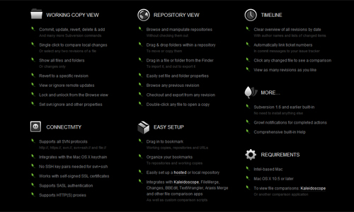
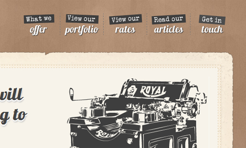
Versionapp

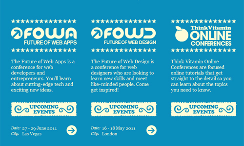
Carsonified

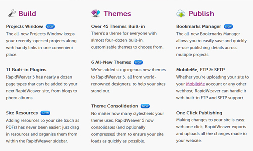
Rapidweaver 5.0

Worry Free Labs

Three Penny Editor

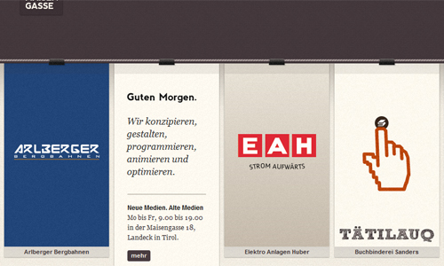
Maisengasse

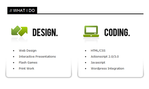
Dan George

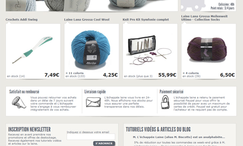
L’Echappee Laine

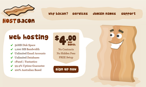
Host Bacon

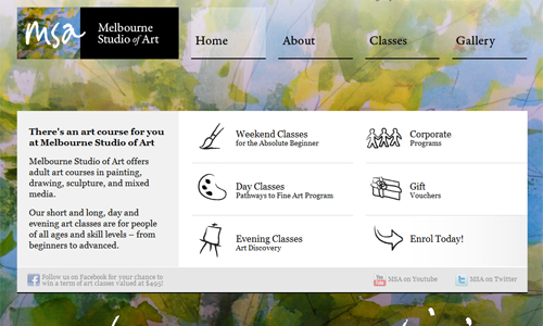
Melbourne Studio of Art

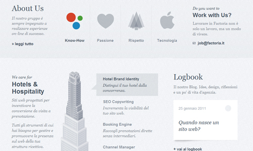
Factoria

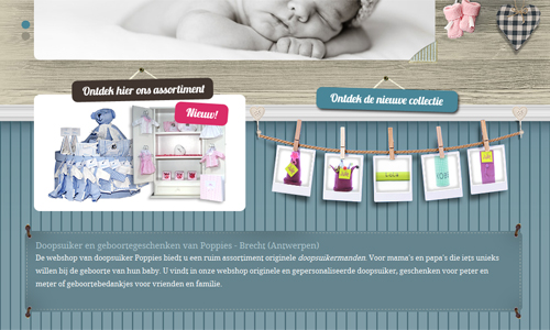
Poppies

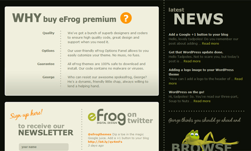
eFrog Themes

Ideaware

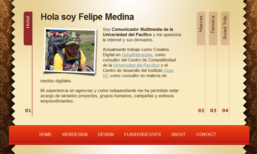
Felipe Medina

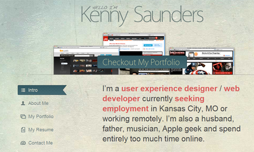
Kenny Saunders

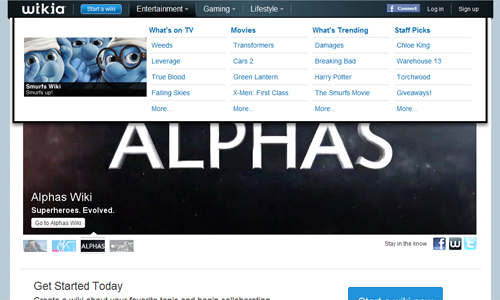
Wikia

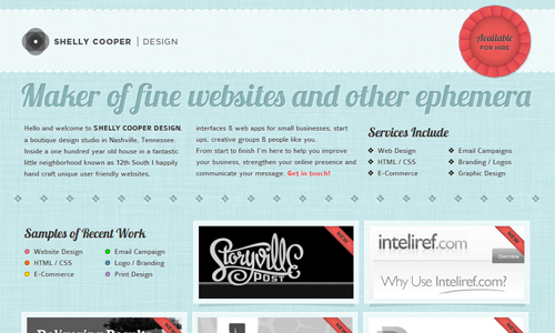
Shelly Cooper Design

Smorge

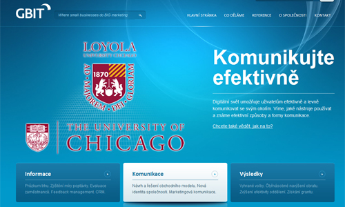
gbit

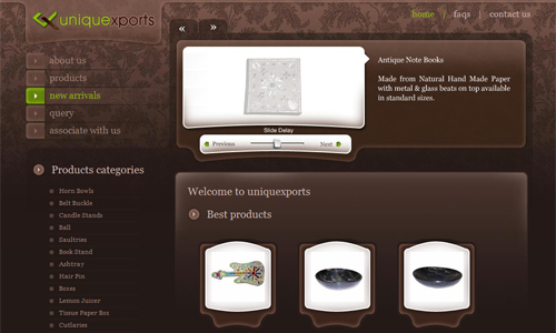
Uniquexports

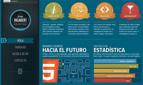
Jorge Rigabert

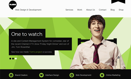
Pandr

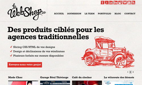
La Web Shop

Tutorials

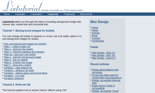
Listutorial

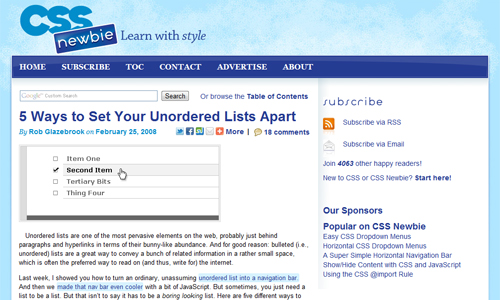
5 Ways to Set Your Unordered Lists Apart

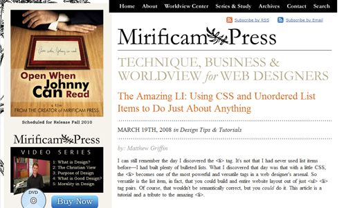
The Amazing LI: Using CSS and Unordered List Items to Do Just About Anything

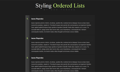
Sexy Ordered Lists with CSS

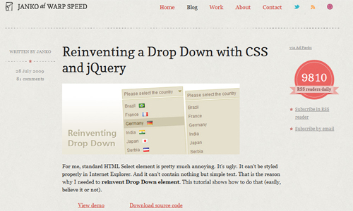
Reinventing a Drop Down with CSS and jQuery

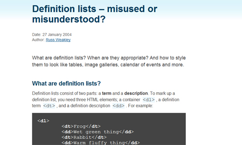
Definition lists – misused or misunderstood?

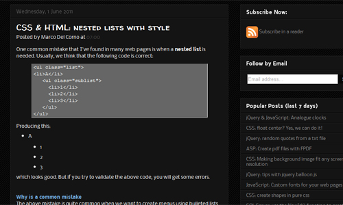
CSS & HTML: nested lists with style

Tools

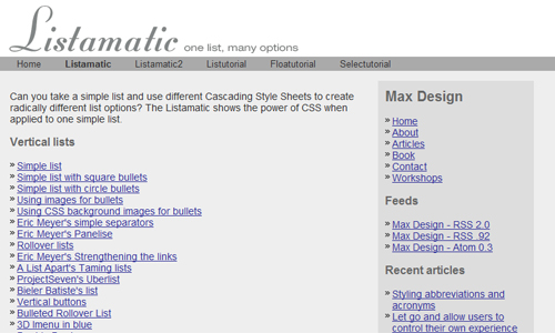
Listamatic

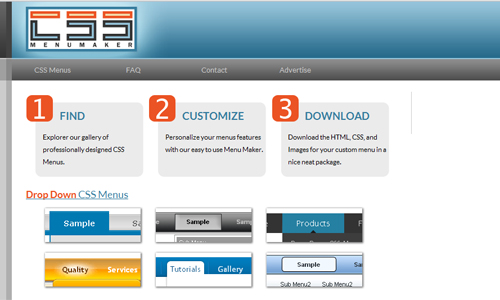
CSS Menu Maker

List-O-Matic

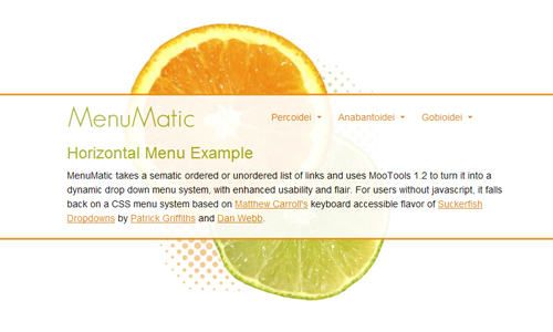
MenuMatic

(rb)

Obscure and Valuable Keyboard Shortcuts

Advertisement in Obscure and Valuable Keyboard Shortcuts
 in Obscure and Valuable Keyboard Shortcuts  in Obscure and Valuable Keyboard Shortcuts  in Obscure and Valuable Keyboard Shortcuts

If there is one thing that many of us in the design and development fields love, it is shortcuts. Those lovely little timesavers and workflow improvers that quickly get us where we need to go in fewer motions. Effectively keeping us in stride, as we navigate our computers and various apps using the shortcuts that we have picked up along the way. But even the most alert of those among us will have numerous hotkeys go under our radar, as there are just so many out there.

Keyboardshortcutsheader in Obscure and Valuable Keyboard Shortcuts

So in this quest to find some useful and obscure hotkeys we turned, as we do from time to time, to the faithful followers and friends of the Smashing team. With days of amazing answers to sift and sort through, we have compiled a truly exciting list of keyboard shortcuts that may not be that widely known. So we hope that our readers find this post as helpful as we imagine that they will.

Mac

  • ALT + CMD + SPACE to search in finder
  • CMD + ALT + Left/Right to switch between tabs
  • CMD + L to access the input field
  • CMD + ` on a mac to tab through application windows
  • CMD + OPT + ESC to Force Quit apps
  • CMD + Tab to cycle through open apps on Mac
  • CMD + H to hide the window
  • CMD + ALT + H to hide other windows
  • Shift + CMD + I when in safari opens a mail with the link of the current page in it
  • CMD + T followed by CMD + K to perform a search in a new tab
  • ALT + CMD + Eject put the mac to sleep
  • CMD + Shift + A to autofill forms in Safari
  • OPT/CMD + arrow keys – also hold Shift to select. Makes it easy to delete multiple words/lines quickly
  • CMD + OPT + Shift and V to paste without coping the formatting of what you pasted
  • CTRL + OPT + CMD + 8. Inverts Mac screen colors
  • CMD + Shift + 4. Saves a snapshot of a selected area to the desktop (You can then press spacebar to cycle between a crosshair or window selection)
  • CMD + CTRL + Shift + 4 = snap a screen a picture of a marquee area of the screen and copy it to clipboard
  • CMD + SPACE to open spotlight
  • CTRL + OPT + CMD + Eject Quits all applications and shuts the computer down
  • CMD + E to eject selected volume on the Mac
  • CTRL + Shift + CMD + 3 for clipboard – screenshot, compared to print-screen on PCs
  • CMD + , on a Mac to access current app preferences
  • CMD + OPT click and drag creates an alias of the file where you drag it
  • CMD + Delete to move to trash
  • CMD + Shift + Delete to empty the trash from Finder
  • CTRL + OPT + CMD + . = increase contrast CTRL + OPT + CMD + , = decrease contrast
  • CMD + OPT + D to hide/unhide the dock

Windows

  • CTRL + INS to copy, Shift + INS to paste, Shift + Delete to cut. Such an underappreciated series of hotkeys.
  • CTRL + 0 to return web page to 100% (default) zoom level
  • CTRL + Shift + Eject to turn off monitor
  • CTRL + Shift + ESC on windows to get to task manager directly
  • Win7: WIN + M to minimize all opened windows
  • WIN + Left/Right to put windows side by side. Nice live coding method.
  • CTRL + K + D this hotkey indents html and c# code nicely
  • WIN + D (return to desktop)
  • ALT + BACK to backspace by the word rather than by the character
  • win: Shift + Delete delete files without saving to trash bin

Linux

  • CTRL + ALT + T to open Terminal on Ubuntu. I can’t live without it now

Photoshop / Illustrator

  • CMD + Shift + C in Photoshop to copy the merged selection (save’s you the step of merging your file then undoing!)
  • In Photoshop – CMD + ALT + 0 to resize the window to 100% is essential for web designers!
  • Shift + ALT + CMD + S (win: CTRL + Shift + ALT + S)… Save for web in Photoshop
  • CTRL + Shift + C flatten and copy with transparency, Photoshop
  • Illustrator CTRL + 7 to crop image
  • Photoshop: CTRL + Shift + ALT + E merges all visible layers to a new layer on top of the others without deleting them

Firefox / Chrome

  • CTRL + Shift + E for Edit CSS (Firefox/Webmasters Toolbar)
  • CMD + Shift + C Inspect Element // Firefox—Firebug // Chrome—Developer Tools
  • CTRL + Shift + T to open closed tabs FF Chrome, and CTRL + Shift + N to open closed windows FF
  • Firefox CTRL + L to enable retyping of a web address
  • ESC hides the mousepointer (in browser). Great for Screenshots

Honorable Mention: Mouse Gestures

“I almost stopped using hot keys when started using mouse gestures, both in ff and chrome”

  • Press Shift and scroll your mousewheel. Scrolls horizontally on the page
  • Click on links using mousewheel in FF & Chrome and links open automatically in new tab

(rb)

Digital Artwork Inspiration for the Weekend

Advertisement in Digital Artwork Inspiration for the Weekend
 in Digital Artwork Inspiration for the Weekend  in Digital Artwork Inspiration for the Weekend  in Digital Artwork Inspiration for the Weekend

In our continuing journey to offer our readers an artistic dose of inspiration to help carry them through the weekend and get them recharged and ready to go for the coming week ahead, we have put together another fantastic showcase to serve just such a purpose. This time around we have gone fully digital! Turning to that online hangout for artists who tend to walk the more anomalous path, we scoured through some of the freshest uploads over at Deviant Art recently to find some inspired pieces to pile into this imagination stirring post.

Given the volume of artwork being shared through the DA site, and the number of categories to sift through, for this inspirational installment we decided to narrow our focus and present our readers with only a slice of an expansive header like digital art. So for this post we have gathered some stunning fractals to kick things off, then we have a few vexels squeezed in, before we move on to wrap things up with a handful or two of digital paintings and airbrush pieces. Hopefully these will prove useful in reigniting your inspired fires so you can start your work week in the right frame of mind.

Fractal Art

We begin the showcase with a look at Fractal art. Fractals are an artform which uses algorithms to create and manipulate fractal objects represented by transforms that are assigned certain artistic properties by the artist. This complicated medium has been made more accessible for years now as the community has given rise to several fractal programs that while they may contain different levels of learning curves, they tend to be easier than working out the complex algorithms involved in the creations.

hyperben2

The first artist that we are featuring is hyperben2 on Deviant Art. An extremely talented fractal artist who manages to create pieces with such depth and an intricate nature that we could not put together this showcase without shining our spotlight on some of the pieces in their gallery.

Zen by: hyperben2

Zen By Hyperben21 in Digital Artwork Inspiration for the Weekend

Nether net by: hyperben2

Nether Net By Hyperben21 in Digital Artwork Inspiration for the Weekend

Node of Yesod by: hyperben2

Node Of Yesod By Hyperben21 in Digital Artwork Inspiration for the Weekend

krigl

Next up on the showcase, we have a few pieces from another fantastic fractal artist, krigl on Deviant Art. While most fractal work tends toward the abstract, these next pieces demonstrate how harmoniously these fractal elements can all be pulled together with a seemingly effortless ease to shape the abstract into something solid almost tangible.

Ivory Tower cracks by: krigl

Ivory Tower Cracks By Krigl1 in Digital Artwork Inspiration for the Weekend

Each-a-gweenz by: krigl

Each A Gweenz By Krigl1 in Digital Artwork Inspiration for the Weekend

Sister by: krigl

Sister By Krigl1 in Digital Artwork Inspiration for the Weekend

HalTenny

Speaking of a more tactile feeling to some fractal artists’ work, our next bunch of breathtaking pieces are from the gallery of HalTenny on Deviant Art. With Hal’s work, we find ourselves more inhabiting strange new worlds with landscapes unlike anything we have seen beyond the scope of science fiction.

Temple Of Doom by: HalTenny

Temple Of Doom By Haltenny1 in Digital Artwork Inspiration for the Weekend

Momma Spider Tending Egg by: HalTenny

Momma Spider Tending Egg By Haltenny1 in Digital Artwork Inspiration for the Weekend

Tree Tops by: HalTenny

Tree Tops By Haltenny1 in Digital Artwork Inspiration for the Weekend

Random Artist Fractals

Before we check out of the fractal headspace and move into another digital artistic medium, we have a handful of other awesome fractals that we felt should be featured in the post. Though we only have taken one piece from each of the artists below, their contributions are just as inspired as the other works that wound up filling the spotlight, and we wouldn’t have felt right about passing them by.

Mold by: insaine

Mold By Insaine1 in Digital Artwork Inspiration for the Weekend

Expanded mandelbulb virus by: carlahoon

Expanded Mandelbulb Virus By Carlahoon1 in Digital Artwork Inspiration for the Weekend

Cybernetika by: Complete-Loser

Cybernetika By Complete Loser1 in Digital Artwork Inspiration for the Weekend

Fractal 365: Day 172 by: wildekyote

Fractal 365 Day 172 By Wildekyote1 in Digital Artwork Inspiration for the Weekend

Silk Curtains by: kon16ov

Silk Curtains By Kon16ov1 in Digital Artwork Inspiration for the Weekend

Vexel Art

The next digital artform that we are going to explore on this inspirational journey, is Vexel art. No, not vector, vexel. Vexel art is an entirely pixel-based form of raster art that has the look and feel of being comprised of vectors. This mimicking of a vector graphics technique gives these pixel perfect pieces of art a much less whimsical tone than most of what we think of when we hear pixel art.

Pedro-92

The first vexel artist on our list today is Pedro-92 on Deviant Art. Pedro’s detailed face work, while maintaining a smidgen of that playful nature that one might expect from pixel work, combines an almost photo realistic contouring to give life to some spectacular examples of this artform.

Scarface 2 by: Pedro-92

Scarface 2 By Pedro 92 in Digital Artwork Inspiration for the Weekend

Desire by: Pedro-92

Desire By Pedro 92 in Digital Artwork Inspiration for the Weekend

Unidas by: Pedro-92

Unidas By Pedro 92 in Digital Artwork Inspiration for the Weekend

hextupleyoodot

The next artist on our showcase is another skilled vexel visionary who flawlessly gives life to three teens in vexel form. hextupleyoodot on Deviant Art breathes character into these three faces through this somewhat contoured artistic approach.

Becca by: hextupleyoodot

Becca By Hextupleyoodot1 in Digital Artwork Inspiration for the Weekend

Brady by: hextupleyoodot

Brady By Hextupleyoodot1 in Digital Artwork Inspiration for the Weekend

Amy by: hextupleyoodot

Amy By Hextupleyoodot1 in Digital Artwork Inspiration for the Weekend

Alvaro59

If it is the more whimsical works that you are looking for from your vexel viewing inspirational pleasure, then the work Alvaro59 on Deviant Art is right up your proverbial alley. With such vibrant and colorful work, Alvaro’s work taps brilliantly into the roots of the pixel art world.

My World by: Alvaro59

My World By Alvaro591 in Digital Artwork Inspiration for the Weekend

Be Happy by: Alvaro59

Be Happy By Alvaro591 in Digital Artwork Inspiration for the Weekend

Cookie Monster by: Alvaro59

Cookie Monster By Alvaro591 in Digital Artwork Inspiration for the Weekend

pai-thagoras

In keeping with the cute and fun theme we have going after our last vexel artist, the whimsy rolls on in a much more macabre way via the artistic creations of pai-thagoras on Deviant Art. While still maintaining the playfulness one might expect, the artist beautifully illustrates from a small corner of the darkside.

Zombie Head by: pai-thagoras

Zombie Head By Pai Thagoras1 in Digital Artwork Inspiration for the Weekend

Zombie Bride by: pai-thagoras

Zombie Bride By Pai Thagoras1 in Digital Artwork Inspiration for the Weekend

Mexican Wrestler: The Yeti by: pai-thagoras

Mexican Wrestler The Yeti By Pai Thagoras in Digital Artwork Inspiration for the Weekend

Random Artist Vexels

Once more we wanted to check in on a few more random pieces before we completely moved on to the next section of the post. So below are a few more examples of this artform being wonderfully explored and mastered. These final pieces further demonstrate the flexibility of this artistic arena.

Eye of Horus by: brobizzy

Eye Of Horus By Brobizzy1 in Digital Artwork Inspiration for the Weekend

Steam by: Kaesa

Steam By Kaesa1 in Digital Artwork Inspiration for the Weekend

Victory by: olivv

Victory By Olivv in Digital Artwork Inspiration for the Weekend

Digital Paintings and Airbrushings

The final category of digital artwork that we are going to dive into for an inspirational recharge is digital paintings and airbrushed works. This expansive, and often breathtaking medium produces some truly imaginative and inspired works, which will hopefully rub off on our readers just as we planned. We wanted to finish strong, and feel that we have found stumbled onto some works that will allow us to do just that.

Valadrel

The first artist we have featured in this section of the showcase is the immensely talented Valadrel on Deviant Art, whose intricately detailed digital paintings virtually come to life off of their digital canvases. An easy addition to this round-up for sure.

T-rex tiral by: Valadrel

T Rex Tiral By Valadrel in Digital Artwork Inspiration for the Weekend

Trio-Piano by: Valadrel

Trio Piano By Valadrel1 in Digital Artwork Inspiration for the Weekend

Leviathan Vs Gabriel by: Valadrel

Leviathan Vs Gabriel By Valadrel in Digital Artwork Inspiration for the Weekend

translucid

Speaking of easy additions to the inspirational showcase, the fantastic work of translucid on Deviant Art quickly found this interesting artist’s voice a spot. Technically, the third piece is a photomanipulation, but it shows the dynamic reach of the artists voice so we added in.

Station Windows by: translucid

Station Windows By Translucid1 in Digital Artwork Inspiration for the Weekend

A million lights flicker by: translucid

A Million Lights Are Flickerin By Translucid in Digital Artwork Inspiration for the Weekend

60 by: translucid

60 By Translucid1 in Digital Artwork Inspiration for the Weekend

Hypa00

The next artist up on the showcase briefly takes us into space for a short journey through a fantastically rich verse in the gallery of Hypa00 on Deviant Art. With some spectacularly breathtaking scenery painted onto the digital canvas these looks beyond our world are inspiring to say the least.

Destroying planet and moon by: Hypa00

Destroying Planet And Moon By Hypa001 in Digital Artwork Inspiration for the Weekend

Earth Like by: Hypa00

Earth Like By Hypa001 in Digital Artwork Inspiration for the Weekend

A Cold World by: Hypa00

A Cold World By Hypa00 in Digital Artwork Inspiration for the Weekend

Vihola

Turning to somewhat of a darker place, at least in tone, we present the next artist on our showcase, Vihola on Deviant Art. The brilliant and bold artist’s brush breathes life into a much more sinister feeling world than we have come from, but does so with such grace it is hard not to admire the artistry.

Hideous Saber-Tooth Rat by: Vihola

Hideous Saber Tooth Rat By Vihola1 in Digital Artwork Inspiration for the Weekend

Death’s Diary by: Vihola

Death S Diary By Vihola1 in Digital Artwork Inspiration for the Weekend

Old Hero by: Vihola

Old Hero By Vihola in Digital Artwork Inspiration for the Weekend

nerdiesid

Lets keep this more macabre and somber train rolling as we unveil the work of the next artist in our showcase, nerdiesid on Deviant Art. This is another artist whose voice is so versatile and unique, even though it tends towards the dark, that we could not pass them by with our spotlight.

So Dead by: nerdiesid

So Dead By Nerdiesid1 in Digital Artwork Inspiration for the Weekend

Earth by: nerdiesid

Earth By Nerdiesid1 in Digital Artwork Inspiration for the Weekend

Kampung by: nerdiesid

Kampung By Nerdiesid1 in Digital Artwork Inspiration for the Weekend

Random Artist Paintings and Airbrushings

As we wind up the post here we figured we would throw a few more digital paintings and airbrushed works at you just for good measure. Below are several more noteworthy additions to the Deviant Art archives that fall under this artistic heading that we could not let slip by under our reader’s radars! Hopefully you got the inspirational recharge you needed and if not, then perhaps these final few works will help get you there.

Kiss the Rain by: BecPriestess

Kiss The Rain By Becpriestess in Digital Artwork Inspiration for the Weekend

Fire Mountains by: elvenfall

Fire Mountains By Elvenfall1 in Digital Artwork Inspiration for the Weekend

Venom by Broken-Orange

Venom By Broken Orange1 in Digital Artwork Inspiration for the Weekend

Peskett loses his head by: MayPylb

Peskett Loses His Head By Maypylb1 in Digital Artwork Inspiration for the Weekend

That is a Wrap

That does it for this showcase of digital art, we hope that it has helped to once again get your flames of inspiration raging through your imagination. If there are any of the works featured that really stand out and speak to you, please feel free to let us know in the comments which ones those were. Also feel free to hit us up with your thoughts on the various works overall, not just the ones that you were moved by. So it is with that in mind that we now turn the post over to you!

Consider Some of Our Previous Posts

(rb)

  •   
  • Copyright © 1996-2010 BlogmyQuery - BMQ. All rights reserved.
    iDream theme by Templates Next | Powered by WordPress