 One knack that photographers have is taking so many of the items that make up our everyday lives and capturing them in ways that makes them artistic. Allowing us to see them in a whole new light, and in completely different ways than we are used to. Take for instance some of the ways that we get around. When photographers start capturing various modes of transportation, something magical happens. Those normal, at times frustrating, vehicles become so much more. In this showcase we have gathered an array of pictures that focus on revealing some of the more artistic sides of planes, trains and cars. With those that are currently on the move to those that have long been retired their transformations will surely get your creative wheels spinning!
Author Archive
Planes, Trains, Cars: 35 Views and Sights
 One knack that photographers have is taking so many of the items that make up our everyday lives and capturing them in ways that makes them artistic. Allowing us to see them in a whole new light, and in completely different ways than we are used to. Take for instance some of the ways that we get around. When photographers start capturing various modes of transportation, something magical happens. Those normal, at times frustrating, vehicles become so much more. In this showcase we have gathered an array of pictures that focus on revealing some of the more artistic sides of planes, trains and cars. With those that are currently on the move to those that have long been retired their transformations will surely get your creative wheels spinning!
Up Close and Personal: A Showcase of Macro Photography
In the world of photography, one area brings attention to life’s finer details by focusing in a bit tighter on them. Macro photography gets up close and personal on the object before the lens, and delivers some truly moving and inspiring works of photographic art. Whatever effects are added in post, the base of these images is usually what shines through. A closer look at life through the everyday objects around us.
Today we have a treat for you, that is made up of a variety of pieces from a range of artists. Below is a collection of macro photography that shows you the inspiration that these images can contain. It is interesting to see some of the repeating themes among the pieces. Seemingly themes of choice among those who play in this field. We hope that you find the showcase as inspiring as we do.
Up Close and Personal: The Contestants
A Bottle full of Magic by cloe-patra
All Other Lights by goRillA-iNK

Can everybody see me? by AljoschaThielen

A r c h e r ‘ s T i m e T u r n e r by EclipxPhotography

sing a summer song by xChristina27x

Marbles are Cool II by kingyousy

I Mustache You a Question by TheLaughingSandwich

You make me smile by Erushilnsento

When you have forgotten everything.. by sugar-coatedinsanity

Holding on To You by MyLifeThroughTheLens

Sparkles by Hearts by KikuElric

Bonjour, Je T’aime by regineanastacio

heart of the book 2 by DomsahSayorii

diamonds and lace by sugaredchaos

Back to farther out
Now that the up close and personal journey has ended, we would certainly like to hear from all of you. What pieces really spoke to you? Do you have any favorite pieces of macro photography that you want to point us to? Fill us in using the comment section below.
(dpe)
Over Troubled Water: Showcase of Bridge Photography
One photographic centerpiece that most certainly ends up in front of a photographer’s lens are bridges. And for good reason. Bridges capture our attention and often, because of their sheer size, they force us to take note of them. We marvel at their architectural majesty or we wonder over their history and the lives that have touched their surface. This is perhaps one of the secrets behind the popularity of bridge photography.
Below is a brand new showcase which features bridges of all shapes and sizes. From the modern to the old, these carriers across gaps in our paths are the subject of this gallery of pictures. Whether they be stone, metal or made of wood, bridges are not always inspiring on their own. For some, it takes the photographer’s skills and lens to give these common structures more creative energy.
Over Troubled Water: The Ferryman’s Foes
Ha’Penny Bridge, Dublin by Pajunen

Bridge over Untroubled Water by Huicca

Burlington Bristol Bridge HDR Edit by tatt2ed13

Cologne Skyline by AljoschaThielen

A Sunset Bridge by susannamaryi

Bridge of Destiny by Brandeno45

Golden Gate Bridge by wonderlandslost

Water Under the Bridge by Lowe-Light

The Ben Franklin Bridge by nanshant

old welsh mining bridge by GazPoo

Bridge in bath by PhotographicJaydiee

Natural Bridge by Il-Lupo-Grigio

bridge state of mind by frankgtrs

Famous Forth Rail Bridge by LyndaWithaWhy

The Port Of Murray Bridge by djzontheball

While the showcase closes, the conversation doesn’t have to end here. Give us your thoughts on the collection, or point us in the direction of some other works that we missed. Show us your favorites. Either way, keep the inspiration going.
(dpe)
All of Us are Students: Interview With Designer and Podcaster Tim Smith
For years Tim Smith has been vocal part of the design community. From the various projects and blogs that he has been a part of, to the even more literal interpretation of him being a part of the community as the voice behind the design and development related podcast, The East Wing. His enthusiasm and insights make him a valuable asset to the community, but beyond that, they make him an inspiration to all of those in this ever evolving field of web design.
We had the opportunity recently to turn the tables on Tim, and put him on the other side of the interview. He was gracious enough to take time out of his busy schedule to provide some of his insights for noupe’s readers. Below are the answers he shared.
Interview With Tim
Thanks again for agreeing and taking the time to answer these questions. So Tim, if you don’t mind, take a moment and introduce yourself.
Thank you! It’s a huge honor! My name is Tim Smith and I’m a Designer, Talker and Coffee Addict. I also run a small podcast called The East Wing, a podcast that talks about design with some very smart people.
Who are some of your biggest influences in web design?
This is always a tough question for me. I have a lot. I’d say anyone I’ve had or will have on The East Wing. Carl Smith, Jason Van Lue, Tim Van Damme, Janna Hagan, Aarron Walter and the list goes on. The way they think inspires me. They help me approach projects and design from a new angle, keep focus on the details and always remember that I design for people and that their experience with what I’m designing is of utmost importance.
You’ve been working in design and part of the online community for several years now, in your opinion, what have been the best developments and worst developments in the field since you first dove in?
I think for the most part, they’ve been great developments. I’m glad to see that design isn’t being seeing as decoration and that we as designers have been urged to recognize problems, assess personal and business goals and create designs that meet these goals. This has brought on new ways of thinking like responsive web design, designing for mobile and injecting emotion into designs. All of these developments come from knowing that our job extends far beyond making things beautiful. We want to make websites that are functional, accessible and alive. As we move forward, I’ve been doing a lot of thinking around constructive criticism and critique. In fact, I talked with Aaron Irrizary and Adam Connor about this on The East Wing.
Given your proclivity for radio, The East Wing is something of a natural step for you. How did the show come about?
Well, a podcast is something I had been trying to start. I had two failed attempts to start one and now that I look back, I’m glad it worked out the way it did. It gave me time to think about a solid idea. The show was the result of me wanting to educate myself more. I realized that there are so many smart people doing some amazing things in our field and I wanted to talk to them. My point was never to establish myself as an expert, but more as a student. I love the opportunity to pick the brains of these people and it makes me very happy to see that there are people who enjoy the show and listen to it every week. I’m very grateful to the listeners.
How do you approach beginning a new podcast? Does the idea for each show stem from the guests you have on it, or do the guests you have on stem from the idea you wish to cover for each episode?
It depends. Sometimes, I want to cover a particular topic so I contact a person who I know is well versed in it. Other times, I like someone and have been following their work and would like to know more about them and how they do what they do. For the most part, I only get the guest talking. It’s all them for there. Everybody is passionate about something, the art is finding the string so as to pull it.
With so many steps to the design process, what would you consider the most important? Why?
That’s a tough one. My gut feeling is to say each one and that would be true. You can’t do a good job by skipping steps. I do believe that a part of the process that get’s neglected is user experience. Unfortunately, some designers have the mentality that it’s not their job, but that of the “UX Designer”. I say that’s false. Wireframing, user testing, information architecture and more are all things a designer should be involved and actively participating in. This stage of the process is crucial and drastically affects the success of the project. I wrote an article about the importance of wireframing(http://timlikestowrite.com/the-importance-of-wireframing) actually.
What do you think that the design field’s biggest strength is? What does the field really have going for it?
Community. Although as in every place, there are jerks, I have never met such a friendly and willing to help group of people. I would’ve learned so many things the hard way if it hadn’t been for the openness of a lot of designers and developers. Not to mention, when I first started The East Wing, the guests were really nice and didn’t hesitate in coming on. I hadn’t published my first episode and I already had 7 guests lined up.
In that same respect, what do you think that the field’s biggest drawback or weakness is?
I think it’s constructive criticism. We have to get better at this. It’s usually one of two things. 1) Everybody loves something. 2) Everybody hates it. This helps no one. “Good job”, “Awesome” and similar things don’t really help people get better. Neither do statements like “Wow, this is ugly”. I think we should be helping each other with solid critique without ridiculing anyone. We make our community stronger and it helps us all put out amazing work.
You work on a project that promises to teach Drupal to users, which is a slight change with WP monopolizing so much of the market. What would you say are some of the draws to Drupal that the average user/designer overlooks?
Well, it’s a different type of problem. At Lullabot, where I used to work, we were solving complex editorial problems for huge companies that had a staff of writers, editors, managers and Editor-in-Chief. Drupal does extremely well with handling a variety of types of content and contrary to popular belief, scales very well. Lullabot has been doing the Grammy website for four years now and not once has it been down on event night. The way I see it, WordPress and Drupal are just tools. It’s a matter of deciding what’s the appropriate solution for a project.
People talk all the time about how ‘we learn something everyday’. What have you learned recently that has impacted your workflow or usual methodologies?
Fireworks and “box-sizing: border-box;”. They’ve changed everything for me recently. I use Fireworks to create wireframes which is a helpful tip from my pal, Jared Ponchot. It’s really fast and doesn’t make your wireframes ugly like OmniGraffle. The other tip has been really useful. I hated having to calculate the padding into the final width/height of a box. I hate math in general. That’s been a huge time saver.
Speaking of learning, what is the one thing you wish someone had told you before you got into the design game?
First off, I’d like to say I wish there was the Student’s Guide to Web Design when I was a student. I would also say that my recommendation is to be honest about who you are and where you’re at in your career. There is no shame in saying you’re a student or that you’re just starting out. All of us are students. If we don’t constantly have a hunger to learn, the web is going to leave us behind. Talk to people. If you like this interview, talk to me. I’d be more than happy to help out with questions or problems.
After watching the web design field evolve over the years, what do you expect to see in the future of the web?
I’m excited to see more and more an acceptance of mobile. Not from our side but, from the client side. We’re all on board but I look forward to seeing more and more people out of our circle embracing it and investing in better solutions that span different screen widths and devices. It’s a huge learning process, we’re all learning on how to organize and display the many different types of content appropriately.
Speaking of the future, what can we expect to see from you in the future?
That’s a good question. I want to see myself grow more as a designer. Hopefully be of more help to others by means of my podcast and my writing and also do some speaking. If you haven’t noticed, I love to talk so I’d welcome that opportunity. Other than that, time will tell.
All For Now
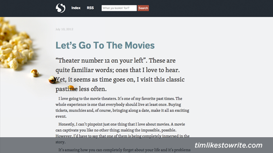
That closes this interview with Tim Smith, but you can get more from him and the design community through his blogs Timothy B Smith, Time Likes to Write, and the podcast The East Wing. Share your thoughts on the collected insights shared throughout this interview in the comment section below.
(dpe)
Creativity Illustrated: Collection of Imaginative Vector Posters
Vectors are quite the popular format to use for many graphic designers looking to create interesting character illustrations and more. With the versatility that continues to be offered with each generation of illustration programs that are on the market, the growing body of work being produced is not only quite stunning, it is creatively inspiring.
Below we take a look at just a sampling of this format with a showcase of imaginative vector posters that demonstrate the reach of this inspiring artform. With so many talented artists and designers calling this arena home, there are sure to be pieces that have wide appeal. Enjoy!
Creatively Illustrated
petersen automotive museum : aerodynamics poster by strongstuff
poster design by etrix
The Vector Creatures poster by grelin-machin
Welcome to Rapture Poster by v12r
ULTRAVIOLET LA by benestrada
Bang, Bang, You’re Dead by KairNeko
Flight of the Conchords – 2 by OH-Deviant-One
Batman Begins Movie Poster by Onizzuka
SONICA Poster Front by strych9
“fly with U.S.” poster by strongstuff
Snorri – poster by recycledwax
One nation under Candy by grelin-machin
Colour Wheel Poster 2011 by sALuUm
NOBODY’S HERO by benestrada
Aoeb poster by f0xyme
Green Lantern OA travel poster by MikeMahle
“1985:1up” poster by strongstuff
Little Monsters by recycledwax
Sausages frome the depths by grelin-machin
MILLENCOLIN by benestrada
The Hunger Games – Art Deco Vector Concept Poster by LadyBug-17
Velvet Drive by chibighibli
House of Secrets Poster by BrandonRagnar
“murmaider 12.21.12″ poster by strongstuff
Food Fight by recycledwax
The monster of the swamp by grelin-machin
PSYCHOBILLY SHOW POSTER by benestrada
Munny – Change Poster by OH-Deviant-One
‘Coffee and cigarettes’ poster by Hertzen
THE MARIGOLD SANCTION poster by rodolforever
All For Now
This finishes off our collection for now, but as always we are looking to hear from our readers on the posters we shared. If you have anything that you would like to share, be it your two cents, or a link to a favorite of yours, scroll on down to the comment section and share.
(rb)


