Author Archive

The World Up Close: Showcase of Beautiful Macro Photographs

Advertisement in The World Up Close: Showcase of Beautiful Macro Photographs
 in The World Up Close: Showcase of Beautiful Macro Photographs  in The World Up Close: Showcase of Beautiful Macro Photographs  in The World Up Close: Showcase of Beautiful Macro Photographs

As designers we are often told to think outside the box when we approach any new project. This change in perspective is supposed to grant us access to seeing the design differently than we normally would. To break out of that mold or routine that we can easily get sucked into, and have a fresh new view of it all. Photographers have a knack for changing the way we see the world, and one way they do so is through macro photography. Showing us the power and beauty in this alternate perspective.

Today we have collected some stunning examples of macro photography that are sure to inspire, and can hopefully stir you from your routine and usual perspective. These wonderful captures demonstrate the delicate and subtle construction of nature, ones that we often overlook from our usual perspective. But with the aid of the photographers lens, we can get a closer look and see the world from a completely different angle.

A Closer Look

Foxglove by Lookalive-sunshine
Foxglove in The World Up Close: Showcase of Beautiful Macro Photographs

Not all tears are an evil by Annarigby
Notalltearsareanevil in The World Up Close: Showcase of Beautiful Macro Photographs

Tiny Droplets by Nitrok
Tinydroplets in The World Up Close: Showcase of Beautiful Macro Photographs

Broccoli Macro by Johan J. Ingles-Le Nobel
Broccolimacro in The World Up Close: Showcase of Beautiful Macro Photographs

rainbow in my life by magnesina
Rainbowinmylife in The World Up Close: Showcase of Beautiful Macro Photographs

Macro Flor by Andrés Nieto Porras
Macroflor in The World Up Close: Showcase of Beautiful Macro Photographs

- by kingdaughter
Bykingdaughter in The World Up Close: Showcase of Beautiful Macro Photographs

Macro of a bee by Tambako the Jaguar
Macrobee in The World Up Close: Showcase of Beautiful Macro Photographs

Hello, My Name is Spike by tacou
Hellomynameisspike in The World Up Close: Showcase of Beautiful Macro Photographs

Damselfly by vlastas
Damselfly in The World Up Close: Showcase of Beautiful Macro Photographs

3D 2x Macro shot of my Toothbrush by syvwlch
Macrotoothbrush in The World Up Close: Showcase of Beautiful Macro Photographs

Money-tree flower- macro lens – HTC Desire by Alpha
Moneytreeflower in The World Up Close: Showcase of Beautiful Macro Photographs

Clematis macro by Renate Dodell
Clematismacro in The World Up Close: Showcase of Beautiful Macro Photographs

Colored by xsunnygirl83w
Colored in The World Up Close: Showcase of Beautiful Macro Photographs

bluebottle macro by Fiona Wilkinson
Bluebottlemacro in The World Up Close: Showcase of Beautiful Macro Photographs

Tiny Droplets II by Nitrok
Tinydroplets2 in The World Up Close: Showcase of Beautiful Macro Photographs

Amazing Raindrops by matthewpoland
Amazingraindrops in The World Up Close: Showcase of Beautiful Macro Photographs

Antares by Stoppelbart
Antares in The World Up Close: Showcase of Beautiful Macro Photographs

flamingo by `tragicmistress
Flamingo in The World Up Close: Showcase of Beautiful Macro Photographs

yellow flower by loLaurer
Yellowflower in The World Up Close: Showcase of Beautiful Macro Photographs

Macro: Sunflower Petals against a Blue Sky by The Green Party of Ireland Comhaontas Glas
Sunflowerpetalsmacro in The World Up Close: Showcase of Beautiful Macro Photographs

Sigma 17-70mm DC Macro spider
Sigmamacrospider in The World Up Close: Showcase of Beautiful Macro Photographs

A lonely water drop by Louserz
Alonelywaterdrop in The World Up Close: Showcase of Beautiful Macro Photographs

Blue Bird by Vellocet-Photography
Bluebird in The World Up Close: Showcase of Beautiful Macro Photographs

Lichen Macro by Johan J. Ingles-Le Nobel
Lichenmacro in The World Up Close: Showcase of Beautiful Macro Photographs

Macro @ 24mm by Dino Quinzani
Macro 24mm in The World Up Close: Showcase of Beautiful Macro Photographs

In the dark there is life by bagba
Inthedarkthereislife in The World Up Close: Showcase of Beautiful Macro Photographs

pearled arc by keineAnhung
Pearledarc in The World Up Close: Showcase of Beautiful Macro Photographs

Peekaboo by Minnie-Mocha
Peekaboo in The World Up Close: Showcase of Beautiful Macro Photographs

Macro Cactus Thorn by jnyemb
Macrocactusthorn in The World Up Close: Showcase of Beautiful Macro Photographs

Calm by Midnite-myknee-Blu
Calm in The World Up Close: Showcase of Beautiful Macro Photographs

Caged Flower by Stars-and-Skulls
Cagedflower in The World Up Close: Showcase of Beautiful Macro Photographs

pure orange by LaPlumellDisait
Pureorange in The World Up Close: Showcase of Beautiful Macro Photographs

Flower by devilish89
Flower in The World Up Close: Showcase of Beautiful Macro Photographs

Macro Purple by BusterBrownBB
Macropurple in The World Up Close: Showcase of Beautiful Macro Photographs

Butterfly 2 by MonjaraM
Butterfly2 in The World Up Close: Showcase of Beautiful Macro Photographs

ladybug15 by RaphaelDES
Ladybug15 in The World Up Close: Showcase of Beautiful Macro Photographs

first by ankyl
First in The World Up Close: Showcase of Beautiful Macro Photographs

taraxacum by AlenaDudareva
Taraxacum in The World Up Close: Showcase of Beautiful Macro Photographs

Stuck in the middle by Annarigby
Stuckinthemiddle in The World Up Close: Showcase of Beautiful Macro Photographs

(rb)


How to Grow as a Designer or Developer

Advertisement in How to Grow as a Designer or Developer
 in How to Grow as a Designer or Developer  in How to Grow as a Designer or Developer  in How to Grow as a Designer or Developer

For many of us in the design and development communities, when we first begin down this path, we tend to go in hungry searches for knowledge and like a sponge we soak up all we can find. However, at times we can come to a plateau where we comfortably set up our virtual camp and we work from this place.

Our quest for knowledge somewhat settles as does our thirst as we become distracted by trying to make our mark and establish ourselves in the community. We do this so that we might find a steady source of income through our skills that we have nurtured and grown to this point. And it is through this time consuming process that the growth of our skillsets ends up on the proverbial back burner.

Growth in How to Grow as a Designer or Developer

This is not a blanket pandemic, but it does happen, and it is in these times that we need the subtle reminder that we should always be moving forward, reaching for that next plateau. Even when we feel as though time for such things is not available, we must make time. Otherwise that excuse will continue to crop up each time we feel the pangs of guilt over our growth stagnation, and our learning process will stay on the back burner indefinitely. So we have to be sure that we actively pursue these opportunities for growth whenever and wherever we can. First, to do so, however, we have to address the roadblock that is in the way preventing our progress.

Fighting Complacency

Life has a tendency of getting in our way from time to time, but generally the problem that we are dealing with when we find ourselves comfortably resting on our laurels is one of complacency. For whatever reason we have become satisfied with the level that we are at, and are no longer feeling that drive that used to fuel our quest for knowledge, and that passion to conquer every challenge that the design or development landscape had to throw at us. And it is this space that we need to get our heads back into so that we can get the wheels turning once more. Below are a few of the problem areas to keep an eye on when you find yourself in the learning lurch.

Time Management

As already mentioned, one of the main excuses we fall back on when we become complacent, is one of a lack of available time. Which does not mean that we should just resign ourselves to the fact that our progress is done, it just means that we have to better learn how to manage our time. If our schedule will not allow for any learning opportunities, then frankly, we need a new schedule. There are going to be places that we can find to fit in these knowledge seeking exploits, we just have to look harder at the division of our time and labor in order to make it happen.

Time-Maschine in How to Grow as a Designer or Developer

You want to manage your time effectively or before you realize, it will have all slipped away. Image by Sachin Sandhu

Before we start rearranging our schedules though, we can first look for areas that can be easily cut down to make room for this needed opening. Whether it is a matter of cutting things short, small things like brainstorming sessions or big things like sleep, there might be areas of our daily/weekly schedules that we can squeeze some time free from to shift over for growth and learning experiences. If we cannot find any time to shave away, then we have to look at what can be rearranged to work them in. However we approach it, if time is not on our side and keeping us from moving forward, then we have to work to change that.

Ego Check

Sometimes the complacent nature that keeps us grounded on this virtual plateau is brought on, not by a lack of time, but more by a surplus of ego. We get to the point where we think we have mastered our field, and there is nowhere left for us to go. We believe we have reached the top level, the peak, and that there is no higher place that we can get to from here. And at that point, we just give up even trying. Our search is over. But that is a horrible disservice that we are doing to ourselves and our skills, for there is always more to learn. Especially in these dynamic of fields.

And even if we are at the top of our game, then the only way that we can ensure that we stay there is to keep fine tuning our skills through practice and repetition. Just like a muscle, if we do not give our skills a regular workout, then they will not maintain their strength. We will begin to forget the little things that once took our work to the next level if we let our egos get in the way and keep us from putting them into practice every now and again. At first, we become rusty. Then we just become forgetful, and we begin slipping. So we need to keep our ego in check otherwise it could become a liability to any future forward progress in our fields.

Perspective Adjustment

Another way that we can try to combat this complacency that keeps us from continuing to grow in the design or development field is to give our perspective somewhat of a refresh. Could be the rut we have dug ourselves into stems from the way we view the work we are doing on a daily basis. It has lost some of its appeal and excitement for us as we have settled into a comfortable work routine. Designing or developing has become a regular job and that label may have tarnished the way we look at it. So we have to try and bring some of that original excitement back into the picture.
Perspective in How to Grow as a Designer or Developerd. FUKA

Sometimes we just need to come at things from a different perspective and see how they unfold from there. Image by

This can be a self correcting problem of sorts. Usually the reason that we no longer see the excitement in our jobs is because that they have gotten stagnant themselves. We find ourselves doing the same sort of task time and again, until it becomes monotonous. So once we set out to learn once more, and new doors open in the design or dev world, then things are going to get back to that exciting place again.

Getting that fire going can take a perspective flip. So try and see the work differently. Do not look at this continued knowledge quest as some sort of schooling, but more as leveling your character or anything fun like that. Whatever flips the script on your view of the path ahead for you is what you need to do to move forward.

It’s Time for Growth

So what can we do once we have taken care of the complacency issues? What are the most effective ways forward? Well that depends. More than likely there is no one recipe for success. So we have to look at a variety of approaches to get our learn on. Below are several ways that one can get started on immediately to continue on the path for professional growth and expansion of their design/development skillsets.

Experiment

One of the first things that we can do to ensure that we are still learning and growing in our field, is to experiment. Naturally, the more repetitive our daily work becomes, the less it is challenging us or daring us to step outside of our comfort zones to try something new. If we are experimenting with new styles or techniques, programs or tools, whatever the case may be, then we are guaranteed to be learning something and pushing our skills to new heights. Connect with your inner scientist and begin branching out from your established routine to try something that you have not within your field.

Experiment in How to Grow as a Designer or Developer

There is a subtle science to design and developing, so why not experiment and try something something new. Image Credit

When you experiment, do not be afraid to reach outside your area of expertise and try new areas of the field that would normally avoid playing in. This is not to suggest that you in any way begin altering the course you are on or change your specialty. Just that you reach into places that you often don’t. Especially those that intimidate or fluster you. Those should be some of the first places that you turn.

Also remember that keeping personal projects often helps because in these projects we tend to feel freer to take chances and try new things. This challenge will keep you from being able to grow complacent as you will never be settled, but rather always in motion.

To Sum Up:

  • Challenge yourself in and outside your field of focus within the design or development arenas.
  • Keep forcing yourself to try something new (styles, techniques, apps, etc…)
  • Reach outside your comfort zone to expand on your base of knowledge to find new opportunities to learn.
  • Keep up personal projects to keep the work in your field fun and allow for taking risks your professional work doesn’t afford.

Study Work You Admire

Another way to grow as a designer or developer, and ensure that you do not stagnate upon the plateau where you landed is to study the work of those you admire who came before you in the field. This is a proven way to keep yourself inspired to progress and learn more. Besides the concepts work so well together anyway. Studying and learning go hand in hand, so why not apply it here as well. The internet makes this studying endeavor an easily achievable chore. One that can also help to further our appreciation for our fields. Which never hurts at keeping complacency at bay.

Now when we say study other works, this is means more than simply checking them out and admiring the quality they hold. This is an in-depth examination of the techniques and styles that were implemented in some of our favorite designs. Or a deeper look into the code that powers and feeds some of our favorite applications, sites, etc…

You can also turn to the online galleries and showcases for a plethora of work to browse through if you need to track down some subjects for your studies. And so that you can get an idea of how to dissect the work you can look at forums and feedback sites for others breaking down pieces and highlighting what you can focus on.

To Sum Up:

  • Focus on studying the implementation of techniques and styles, or studying the code behind the scenes.
  • Look into online galleries and showcases for work to dissect.
  • Check into forums and feedback sites to find work and what to key in on as you break down the work for learning purposes.

Keep Up With Your Field

Especially in the design and development worlds, the landscape changes with a fair amount of rapidity, so keeping up with all of the changes can be a daunting task, but it is one of the most sure fire ways to grow in your field. When you are following along with the way the field is developing, then by default you will develop in suit. That is providing that you are actively working to learn the ins and outs of the new developments and are not just watching from the sidelines. You need to be in the game, so to speak.

Sidelines in How to Grow as a Designer or Developer

We cannot just be passively waiting on the sidelines, we need to be engaged in our community to stay ahead of the game. Image by Westside Shooter

Most industries have trade magazines that closely monitor and report on the trends and shifts that shape and steer said industries. The fields of development and design are no exception this rule. This is a great place to begin your search for any of these game changing happenings, and most of them are conveniently available online.

Beyond the trades, there are social media and the blogosphere among others that can also help you find out what is happening in the field that is to be the shape of things to come. No matter the method you choose, if you want to grow into your field and continue to learn, then strive to keep up with your industry.

To Sum Up:

  • Follow along with the trade magazines and dedicated sites/blogs of your field.
  • Use social media to track the trends and game changers popping up in your chosen field.

Seek Feedback from Others in Your Field

A further way that you can ensure that you are always on the path of learning is by reaching out to those in your field whom you trust and admire for feedback on your projects and pieces. When we become complacent or simply just ignore our growth, a mindset can take over wherein we believe that we do not need to get any sort of critiques for improving our work. Honest and insightful feedback can be a desi/dev godsend and can do a lot to not only improve our work, but our own processes or techniques. So always being open to and looking for critiques can really help to keep us growing and improving.

Once again, the internet does really facilitate this feedback outreach. There are numerous sites dedicated to this area of the design and development communities, where you can submit your work to be critiqued by the other users of the site. Not only that, but through social media networking, professional relationships are fostered which can help in this area as well. You connect with others in your field who are willing and able to provide you with the insightful feedback you are looking for. Generally, all you have to do is ask. Never be afraid to do so, and always take the feedback in the spirit and tone in which you requested it, not always the way in which it was intended. This will hopefully help remove any of the harsh edge that could accompany some of the less than constructive feedback that may come your way.

To Sum Up:

  • Use forums and dedicated sites or services to get feedback from throughout the community.
  • Foster relationships with others in your field via social media and ask them for critiques.
  • Take the feedback in the spirit with which it was requested, not necessarily the way it was intended.

Collaborate with Others

Another way that we can continuously push ourselves along in this quest for knowledge and professional growth is to collaborate on projects with others of a compatible nature. Now when saying compatible, this is more about finding those who will push you to challenge yourself, and through this collaborative effort they will effectively bring out the best in you. Finding a person to fit this bill is not always the easiest to do, but they are certainly out there. And to be fair, and keep things balanced, you want to be sure that you are going to return the favor and be the same type of partner.

This is another area where you not only want to challenge yourself, but you also want to reach outside your comfort zone or area of expertise in order to get the most out of these collaborations. This way you get to push yourself to venture further than you might get to in your normal professional projects.

Seek out an unusual partner for someone in your field, an unexpected pairing, in order to find new and interesting directions to take your work. This can also help to challenge you to find exciting new ways to work. Presenting your work in ways you had never considered or thought of before the collaborations began. This can then bleed over into your other work, continuously keeping your thinking fresh and outside of the box.

To Sum Up:

  • Collaborate with those you know will push you further in your quest for knowledge.
  • Don’t feel like you have to stay within your field for your pool of potential collaborators.
  • Be the kind of partner you wish to be paired up with, to keep the partnership fair and in balance.

Be Active in the Community

The final area that we will discuss for ensuring that you are always moving forward as a designer or developer, we have already touched on a bit in more indirect ways, and that is to be an active member of the community. This alone can not only help to ensure that we continue to grow professionally, but it can also provide us with an outlet for growing our business too. The design and development communities are such diverse and dynamic collectives that there is so much growth you can gain just by being a part of it.

Community in How to Grow as a Designer or Developer

The online communities are an extremely creative outlet that we can usually plug right into. Mark Sebastion

By maintaining a blog of your own, or writing for others who do, you have a unique opportunity to give back to the community that helped you, while also keeping you informed and well researched as you put together your posts. Beyond that, you can also contribute to the discussions being carried out in the comment sections of said sites. Another way that you can be an active member of the community is through the various social media channels. Either through sharing helpful information or posts you can enrich the community experience for others. As the community grows and is shaped through such interactions and connectivity, so are its participants.

To Sum Up:

  • Run a blog or contribute to one so that you can enrich the community via this outlet.
  • Contribute to the discussion being had across the blogosphere when and where you can.
  • Use social media to share and contribute useful information to the community at large.

In the End…

There are several ways that we can ensure that we remain excited and intrigued by the vast fields that we operate in so that we maintain our desire for professional growth. No matter which approach you take, the important thing is that you keep this passion driving you each step of the way so that we never allow ourselves to level off. What do you find helps in keeping you on the path for growth? What do you think leads to this complacent place where we discontinue our pursuit for knowledge?

(rb)


Showcase of Online Artist and Design Portfolios

Advertisement in Showcase of Online Artist and Design Portfolios
 in Showcase of Online Artist and Design Portfolios  in Showcase of Online Artist and Design Portfolios  in Showcase of Online Artist and Design Portfolios

Throughout the creative fields, like with art and design, getting your work out there for an audience to find and connect with is essential. Taking your work online is a major outlet that many designers and artists opt for, especially given the versatility that the web offers. With so many options for displaying their work, the internet has a bevvy of brilliantly designed and developed portfolios that we can sort through for inspiration.

But what is more, is that we can also look through them to gain some hints on what works and what doesn’t for those times when we have to put together a portfolio for ourselves or our clients. There are not many tricks to remember that go beyond the usual ones we apply when designing. One that does stick out is to not allow the design to steal focus from the work it is meant to be highlighting.

Below we have gathered a mere handful of the online portfolios that are available fodder for this type of showcase, and presented them here with a slight breakdown of the designs. Take a look down through them and see the highlights that we have offered before you check out the portfolios for yourselves to see just what exactly we are talking about here.

Daarken

The portfolio of fantasy artist, Daarken is filled breathtaking works, and are arranged and highlighted wonderfully by the site’s design. With large previews of the work, and a java based side scrolling setup, the site is very simple and throws all the focus on the work. However, the scrolling could cover more ground with each click. As it stands, the scrolling only moves through a couple of images at a time which gives it somewhat of a jumpy sort of feel.

Daarken in Showcase of Online Artist and Design Portfolios

Lesly Garreau

Lesly Garreau’s web design portfolio site is graphically great, and nicely compact. The small previews of Lesly’s designs being taped up to the page work well to compliment the site and the whimsical nature of his work. The site itself further acts as an extension of the portfolio, which is one of the rare occasions when the site can steal focus from the work and not have it become a portfolio no-no.

Leslyg in Showcase of Online Artist and Design Portfolios

Micah Lidberg

Micah Lidberg’s illustrations and other works are the main highlight of this very minimalistic site, just as they should be. The navigation is very understated which works for the most part, but as it follows you down the page, it easily becomes lost in the works scrolling behind it. When you click on the previews and go into the deeper pages, there is a largely exaggerated and unnecessary gap at the bottom of the page. This makes it feel like there should be more on the pages than there is.

Micahlidberg in Showcase of Online Artist and Design Portfolios

Dropr

Dropr is a relatively new service for creatives that is still in beta, but still worth checking out. Very much in the style of Behance, this network is easy to use, and promises to be more powerful than most. The design is both stylish and imaginative, and on the main page, does stand in the spotlight which should be falling on the work. In fact the works being showcased are somewhat buried at the bottom of the page below the bells and whistles of the main site header. Unlike other portfolio communities which always seem to be highlighting the work, Dropr takes the center stage when you first arrive. The inner pages which display the work are much simpler and do not take the attention off of the work like the main page.

Dropr in Showcase of Online Artist and Design Portfolios

Zuttoworld

Russian illustrator Zutto’s portfolio is another fantastically minimal site design which lets the artists work do most of the heavy lifting. The large bold font on the plain, expansive background make the site feel open and comfortable for the viewer. The pieces drop down below the titles when you click on them, and the images remain open until you click on another title. The one flaw here is that you cannot click on the same title to close the image once it is opened. Clicking on the title of the open piece causes a jumpy effect as the piece effectively re-opens over the top of itself, rather than just closing the preview.

Zuttoworld in Showcase of Online Artist and Design Portfolios

Made By Water

Made By Water is the online portfolio of designer and digital artist Jordan Vitanov. With big, bold typography filling the screen in the header, the site gives the impression of a large scope portfolio, which it is. Sort of. With a few pages of design previews to cycle through, the work feels somewhat slighted by keeping it in such a small display window. Clicking on the pictures, simply brings up the next preview image for the project, but never do you get a larger presentation of each piece. This kind of breaks from the inferences that can be drawn from the over sizing of the other site elements.

Madebywater in Showcase of Online Artist and Design Portfolios

Beaver Lab

Beaver Lab is a colorfully illustrated site that takes great advantage of the whitespace going for an extremely simple approach. The javascript navigation is smooth and overall, the site stands as a fine example of their web design work for the portfolio. Which is good, because the websites in their portfolio actually take you offsite and to their clients page. And as long as the client keeps the design Beaver Lab made them, the links are not that bad. But given that the rest of their work comes up in a nice shadow box on their site, it seems that they could have done the same for the websites with a images of the page rather than sending them elsewhere. The links for the work in their portfolio are also a bit too small and could stand to a size or two larger for the benefit of the user.

Beaverlab in Showcase of Online Artist and Design Portfolios

Checkland Kindleysides

Checkland Kindleysides is an extremely elegant and imaginative portfolio. The site is wonderfully built, very sharp and clean which compliments the teams style and image. This is another example where the entire page stands as a much more shining example of their work, with its imaginative carved paper cutout elements, than the pieces that sit somewhat lifelessly in their gallery.

Checklandkindleysides in Showcase of Online Artist and Design Portfolios

Beastman

Australian artist Beastman has such an intricate and detailed style, and the site is very plain as to offset this characteristic of his work. The images are setup in large enough previews that the detail in the pieces comes out, without having to enlarge the images in any way. Overall the site perfectly contrasts the artists voice, and allows it to speak out through the gallery.

Beastman in Showcase of Online Artist and Design Portfolios

Online Portfolio of Sander Schuurman

The online portfolio of Sander Schuurman looks to be a very simple design, when in reality, it is anything but. This minimally styled portfolio has an interesting javascript presentation that allows the user to virtually flip through the various preview images contained under each project heading. The only somewhat cumbersome element of the site is the flash intro which the site could easily do without and still remain as impressive.

Sentoplene in Showcase of Online Artist and Design Portfolios

Square Circle

The design team over at Square Circle certainly let their skills take center stage when they crafted their site. This is an impressive and very original design for sure, and serves as an outstanding portfolio for the most part. However, part of what makes it great, is also part of its biggest flaw. As imaginative as it is, it is also very resource heavy. Not to mention that it takes over sound immediately upon entering which tends to turn a lot of users off.

Squarecircle in Showcase of Online Artist and Design Portfolios

Grzegorz Kozak

Grzegorz Kozak’s portfolio is another site where the fun, and whimsical nature of the page actually stand out more so than the works in the gallery. Which can have its downsides. However this is slightly offset by the large lightbox that opens up to display the work once you click on the previews. This does bring the focus and attention back to the work quite well.

Gkozak in Showcase of Online Artist and Design Portfolios

Paul Noble

When it comes to portfolios that place the focus specifically on the work, the site of interactive designer Paul Noble shines. This is a near flawless design, both in form and in function. Putting the work at the forefront. With an interesting navigational system built around displaying the portfolio pieces, the site has a very sleek and professional feel to it. Though the small navigation bar that shows the arrangement of the gallery, and even displays a thumbnail of each piece when you click on its corresponding bar, does not automatically shift the gallery over to that project. This feels like an oversight or worse a malfunction.

Paulnoble in Showcase of Online Artist and Design Portfolios

Carl Warner

The portfolio of photographer and artist Carl Warner looks amazing on the surface. But the beauty does not go much deeper than that. Do not get us wrong, the flash based site is actually very unique and sleek. However, there is a huge problem with the functionality of the site, which spells trouble for his portfolio. Once you click on a preview image in one of the galleries and it takes you into the full image, there is no way back out. The back button in the browser is not applicable as you have not left the page, just gone deeper into the flash. There are no navigational elements present or any other ways to exit out. Also, this site does resize your browser, which gets under some users skin.

Carlwarner in Showcase of Online Artist and Design Portfolios

Anna Anjos

The portfolio of Anna Anjos is another fine example of the design freeing up the space to let the work speak for itself. Anna’s irreverent style and artistic voice is so unique that the design just steps aside brilliantly, with its complete minimal approach, and lets the work shine through. The navigation sits unobtrusively at the side, leaving the wide expanse of space to display the work. However, the nav elements are very light and overall subtle. Perhaps a bit too much so. Maybe a larger font or even just a bolder one would make it stand out a little more.

Annaanjos in Showcase of Online Artist and Design Portfolios

Fernando Volken Togni

Illustrator Fernando Volken Togni is another fantastic artist with a minimal portfolio design to allow for the work to take the proverbial center stage. Just like the last site, the simple site navigation stays off to the side, keeping the user’s eyes where they should be, on the preview images. Clicking on a preview not only opens a large version of the project, but it also provides you with a fullscreen viewing option which few portfolios have offered. The neatest part of the large view opening, is that though it seems like a new page has opened, the rest of the portfolio previews have simply moved below the large project image so that there is no need for the user to have to retrace their steps by going back.

Fernando in Showcase of Online Artist and Design Portfolios

Jeremy Geddes

Jeremy Geddes is a magnificent painter, whose portfolio site wonderfully captures the tone and feel of his work. With a simple compact page design, Jeremy’s work remains always remains the center of attention, having at least one large close up acting as a sort of header image as you browse the gallery of works. However, at first glance, and probably to some user’s confusion, the header like preview image is not clickable at all. Instead the user has to click on the small thumbnail preview, which then, instead of taking the header position, opens the image in full size in a new browser window.

Jeremygeddes in Showcase of Online Artist and Design Portfolios

Piipe

Piipe serves as the portfolio of graphic designer and illustrator Felipe Barriga. This is a very colorful and compact site which stands out more so than most of the work that sits in the portfolio. Giving the visitor a sense of Felipe’s humor and style right off the bat, but again, in a much stronger dose than is found in the works being displayed. The window that opens up allows the user to scroll through the portfolio while still keeping the overall site compact, and from pouring down below the fold.

Piipe in Showcase of Online Artist and Design Portfolios

Roya Hamburger

Roya Hamburger is a freelance illustrator and designer whose colorful, abstract works are wonderfully complimented by yet another very minimal design that overly embraces the whitespace at its disposal. Though again, this is another site where their attempt to make the navigation unobtrusive borders on too good. The small text and subtle coloring makes the navigation at times a little difficult to read.

Royahamburger in Showcase of Online Artist and Design Portfolios

Aleksandra Wolska

Aleksandra Wolska is a photographer and web and graphic designer with an extremely sleek and professional portfolio design that places the right amount of focus just where it is needed. On the work. Offering the viewer various options to allow them to wade through the massive gallery sorted to their preference. Each of the previews opens up into a large, widescreen lightbox to display Aleksandra’s work in all its glory.

Aleksandrawolska in Showcase of Online Artist and Design Portfolios

Identity Withheld

Identity Withheld is the portfolio of designer Temi Adeniyi, whose style and work fit together with the design of the site in a very complimentary fashion. The oversized header makes the site a little bulkier than most of the others we have featured, but with her style it really does work well. It sets the tone for the work to come. The deeper pages that display and explain the various portfolio projects keep the header, which put the majority of the work below the fold. This might feel like more of a slight to the work than it does feel like complimenting it to some.

Identitywithheld in Showcase of Online Artist and Design Portfolios

Dan Witz

Artist Dan Witz has a subtle, yet sleek portfolio that more plays into his traditional oil preferences than his often times semi punk-rock nature. The galleries are arranged by categories and presentation, with the deeper pages and previews arranged in thumbnail galleries. The full window lightbox that the larger previews open up in, is equally sleek and professional.

Danwitz in Showcase of Online Artist and Design Portfolios

Bright Bulb Design Studio

Bright Bulb Design Studio is an extremely fun site the overflows with whimsy, and even the design boldness to use Comic Sans. Though given the old school comic book style and nature of the site, believe it or not, the Comic Sans font works, which a lot of designers would consider an impossible sin. Though the site does stand out so much more than most of the work as we have seen with a few others we have featured. This is also a case where the site style and nature does not really mesh well with the work it is displaying. This is handled nicely by a completely unobtrusive lightbox effect with the tiniest of this style bleeding over with the inclusion of the close button.

Brightbulbstudio in Showcase of Online Artist and Design Portfolios

Molecube

Molecube is the portfolio of a mobile game development team that fits perfectly with the playful nature that you would expect from their work. However, as far as portfolios go, there is very little featuring of their work. Given that they only have one title completed and released and one on the way, there is not much to expect, but some screenshots would be nice. Something other than the explanation and a small sample image like you would expect to be on the cover of any packaging. So though the site gives you a hint as to the nature of their work, they give you little else to showcase it.

Molecube in Showcase of Online Artist and Design Portfolios

Artsybury

Artsybury is the portfolio of a designer and artist from London, whose style and sense of whimsy come through in his uniquely presented work. The shelves and photographs that hold Bradbury’s work compliment the artist and his voice, while also giving the viewer a different sort of experience than most portfolio sites offer. While the site does stand out quite noticeably, the work it displays does still rise to that same level, so the site does not overshadow the work as we have seen in others.

Artsyburys in Showcase of Online Artist and Design Portfolios

That is All, Folks

That wraps up this showcase. Hopefully you found some inspiring approaches that you can apply to your own work in this arena. Also, given the breakdowns, we further hope that this post can be beneficial in taking your portfolio designs to the proverbial next level. Feel free to leave your thoughts on the showcase, or on what makes or breaks them in the comment section below.

Consider Some of Our Previous Posts

(rb)


20 Free Top Shelf UI Kits for Web Designers

Advertisement in 20 Free Top Shelf UI Kits for Web Designers
 in 20 Free Top Shelf UI Kits for Web Designers  in 20 Free Top Shelf UI Kits for Web Designers  in 20 Free Top Shelf UI Kits for Web Designers

When it comes to web design, the UI elements that are included can, at times, make or effectively break (in more ways than one) the overall piece. Compromising the aesthetics and even the functionality of the design rendering it virtually useless. So we have to choose the UI elements carefully. Too subtle, and some users may not pick up on them. Too bold, and you risk compromising the fine balance between elements that can really tie the entire piece together.

So today we have brought our web design readers a little treat. We have collected 20 top shelf UI kits that can help you add that special touch of class to your web design projects. All of these fantastic kits are available for free for both personal and commercial use. Most of the downloads consist of layered psd files unless otherwise noted.

Get Your Kit On!

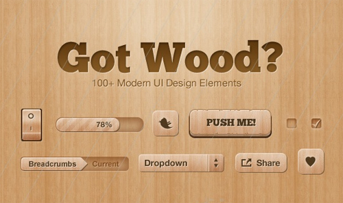
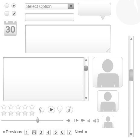
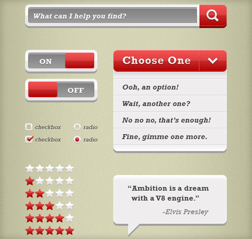
Got Wood UI Design Elements by Tony Thomas

Uikit20 in 20 Free Top Shelf UI Kits for Web Designers

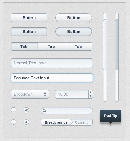
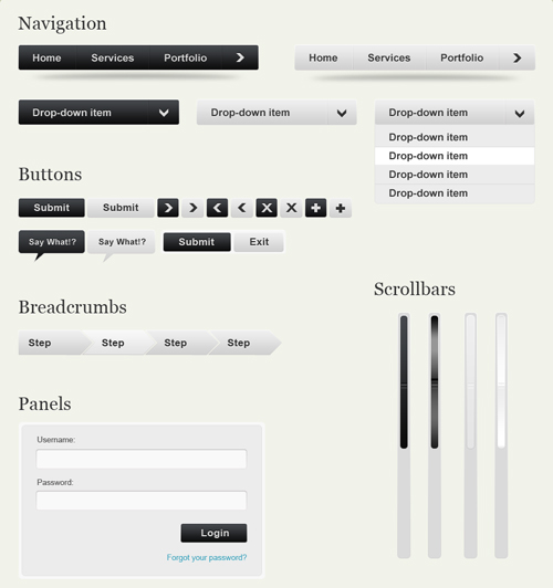
UI Kit by Raj Ramamurthy – The link will take you to the comment where you can download the UI kit. The kit is almost entirely CSS (only two small images are used)

Uikit1 in 20 Free Top Shelf UI Kits for Web Designers

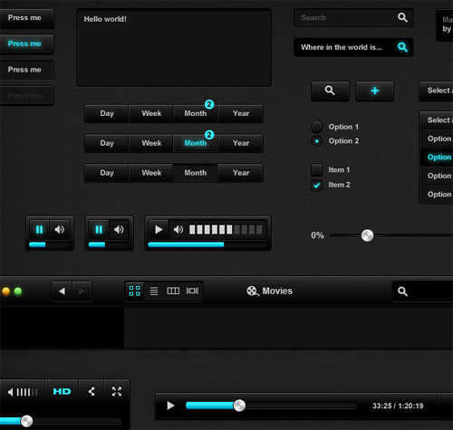
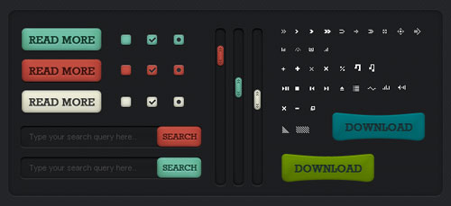
Black UI Kit by Alex Patrascu

Uikit2 in 20 Free Top Shelf UI Kits for Web Designers

Moonify UI by jlofstedt

Uikit3 in 20 Free Top Shelf UI Kits for Web Designers

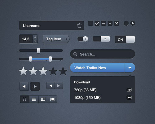
Black UI Kit by Jonathan Moreira

Uikit4 in 20 Free Top Shelf UI Kits for Web Designers

Fuel UI Design Kit by Jeff Olson

Uikit5 in 20 Free Top Shelf UI Kits for Web Designers

Snow Modern UI Kit by MediaLoot

Uikit6 in 20 Free Top Shelf UI Kits for Web Designers

Web Elements by Dillen Verschoor

Uikit7 in 20 Free Top Shelf UI Kits for Web Designers

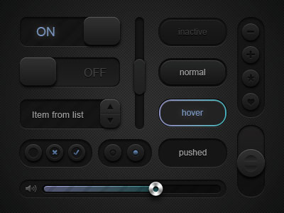
Dark UI Element Set by Ryan Forgan

Uikit8 in 20 Free Top Shelf UI Kits for Web Designers

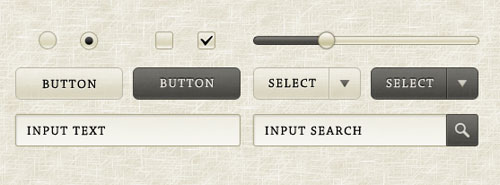
Sepia GUI Elements by takuji ikeda

Uikit9 in 20 Free Top Shelf UI Kits for Web Designers

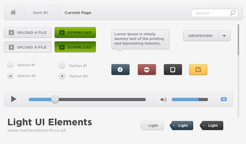
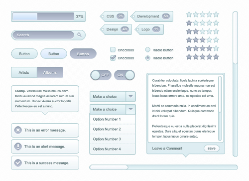
Light UI PSD by Matt Wadsworth

Light UI in 20 Free Top Shelf UI Kits for Web Designers

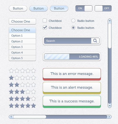
Simple UI Elements by Adrian Pelletier

Uikit10 in 20 Free Top Shelf UI Kits for Web Designers

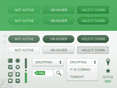
Spring GUI by Jon Ovander

Uikit11 in 20 Free Top Shelf UI Kits for Web Designers

E-Commerce Steps UI by Mateusz Dembek

Uikit12 in 20 Free Top Shelf UI Kits for Web Designers

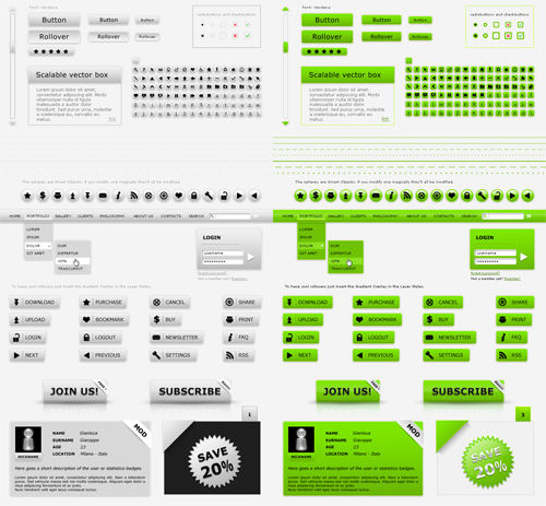
Web Kit Interface Layout Pack by Gianluca Giacoppo – Comes in 6 colors (blue, yellow, gray, green, red and purple)

Uikit13 in 20 Free Top Shelf UI Kits for Web Designers

Modern Web UI Set by Dimi Arhontidis

Uikit14 in 20 Free Top Shelf UI Kits for Web Designers

Soft UI Kit by Design Kindle

Uikit16 in 20 Free Top Shelf UI Kits for Web Designers

UI Kit by Dany Duchaine

Uikit17 in 20 Free Top Shelf UI Kits for Web Designers

Big Block UI by Adrian Pelletier

Uikit18 in 20 Free Top Shelf UI Kits for Web Designers

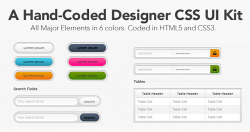
A Hand Coded Designer CSS UI Kit – Another CSS kit using HTML5 and CSS3

Uikit19 in 20 Free Top Shelf UI Kits for Web Designers

(rb)


Inspiration Shift: Tilt-Shift Photos and Effects

Advertisement in Inspiration Shift: Tilt-Shift Photos and Effects
 in Inspiration Shift: Tilt-Shift Photos and Effects  in Inspiration Shift: Tilt-Shift Photos and Effects  in Inspiration Shift: Tilt-Shift Photos and Effects

With all of the various techniques and lenses that photographers use to create over the years in the development of their craft, we see many spring to the forefront of the industry to take hold. Of these that are popular with the public, several have been adopted by graphic artists who attempt to replicate the outcome with their own works. One that continues to grow in favor with the masses is tilt-shift photography.

Across the Web there are tutorials and tools that can assist any amatuer shutterbug or graphic artist with applying this technique to their photos after the fact. No longer is this popular style only available to those with the expertise and the proper, high end equipment. And the replication processes are getting even better with each new iteration. In fact, below we have a mix of both real tilt-shift photos and altered photos to make them appear to be tilt-shift. See if you can tell the difference!

Photography Mix

Image38 in Inspiration Shift: Tilt-Shift Photos and Effects
tilt-shift of Commonwealth Stadium by Ainsley Baldwin

Image1 in Inspiration Shift: Tilt-Shift Photos and Effects
tilt-shift train by Josh Mock

Image8 in Inspiration Shift: Tilt-Shift Photos and Effects
tilt-shift by mackenzie

Image31 in Inspiration Shift: Tilt-Shift Photos and Effects
Tilt-shift Vôlei by Paulo Guedes

Image41 in Inspiration Shift: Tilt-Shift Photos and Effects
tilt-shift Test 3 by Brian Finifter

Image5 in Inspiration Shift: Tilt-Shift Photos and Effects
tilt-shift by evanrudemi

Image61 in Inspiration Shift: Tilt-Shift Photos and Effects
tilt-shift cemetery by George Foster

Image9 in Inspiration Shift: Tilt-Shift Photos and Effects
Tilt-Shift Baseball by Jonathan Assink

Image10 in Inspiration Shift: Tilt-Shift Photos and Effects
Tilt-Shift – First attempt by drew_anywhere

Image111 in Inspiration Shift: Tilt-Shift Photos and Effects
tilt-shift Diamond Head by Kyle Nishioka

Image121 in Inspiration Shift: Tilt-Shift Photos and Effects
Fake Tilt-shift by James Turnbull

Image131 in Inspiration Shift: Tilt-Shift Photos and Effects
tilt-shift Test 2 by Brian Finifter

Image142 in Inspiration Shift: Tilt-Shift Photos and Effects
Met tilt-shift by hey tiffany!

Image15 in Inspiration Shift: Tilt-Shift Photos and Effects
Millook beach, Cornwall tilt-shift by Adrian Byrne

Image16 in Inspiration Shift: Tilt-Shift Photos and Effects
Backhoe tilt-shift by Mrs. Gemstone

Image171 in Inspiration Shift: Tilt-Shift Photos and Effects
River Thames tilt-shift by Rob Hawkes

Image18 in Inspiration Shift: Tilt-Shift Photos and Effects
second tilt-shift test: Santa Fe Depot by Chris Radcliff

Image191 in Inspiration Shift: Tilt-Shift Photos and Effects
The tiny bus- tilt-shift by David Rynde

Image71 in Inspiration Shift: Tilt-Shift Photos and Effects
tilt-shift by mackenzie

Image201 in Inspiration Shift: Tilt-Shift Photos and Effects
Gherkin tilt-shift by Rob Hawkes

Image211 in Inspiration Shift: Tilt-Shift Photos and Effects
NY_Tilt_Shift by Daniele Pesaresi

Image22 in Inspiration Shift: Tilt-Shift Photos and Effects
Paradise Point tilt-shift by Robert Simmons

Image23 in Inspiration Shift: Tilt-Shift Photos and Effects
Mercadillo (tilt-shift) by Jose Maria Miñarro Vivancos

Image24 in Inspiration Shift: Tilt-Shift Photos and Effects
dubrovnik tilt-shift by nonanet

Image25 in Inspiration Shift: Tilt-Shift Photos and Effects
My First tilt-shift by Scot Campbell

Image26 in Inspiration Shift: Tilt-Shift Photos and Effects
Frontierland at Dusk (tilt-shift) by Justin Ennis

Image27 in Inspiration Shift: Tilt-Shift Photos and Effects
Sydney Opera House tilt-shift by hey tiffany!

Image28 in Inspiration Shift: Tilt-Shift Photos and Effects
Fake tilt-shift lens effect by Janne Moren

Image29 in Inspiration Shift: Tilt-Shift Photos and Effects
Tilt-Shift Zebra Stripe by Jon Mountjoy

Image30 in Inspiration Shift: Tilt-Shift Photos and Effects
tilt-shift by Jim Sher

Image311 in Inspiration Shift: Tilt-Shift Photos and Effects
tilt-shift sofas by Richard-G

Image32 in Inspiration Shift: Tilt-Shift Photos and Effects
tilt-shift Amsterdam by Angelogyn

Image33 in Inspiration Shift: Tilt-Shift Photos and Effects
tilt-shift lens test2 by Jargalsaikhan Dorjnamjil

Image34 in Inspiration Shift: Tilt-Shift Photos and Effects
Tilt-Shifted Monaco by bobito

Image21 in Inspiration Shift: Tilt-Shift Photos and Effects
tilt-shift – 2nd attempt by drew_anywhere

Image35 in Inspiration Shift: Tilt-Shift Photos and Effects
Tilt&Shift Paris by weckscjo

Image36 in Inspiration Shift: Tilt-Shift Photos and Effects
Tilt-shift, Osaka by jim

Image37 in Inspiration Shift: Tilt-Shift Photos and Effects
tilt-shift of Rexall Place by Ainsley Baldwin

Image39 in Inspiration Shift: Tilt-Shift Photos and Effects
Tokyo + tilt-shift by Leo Lambertini

Image40 in Inspiration Shift: Tilt-Shift Photos and Effects
Manitou Incline by Angie Bowen

< < Tilt-Shift miniature faking is a creative technique whereby a photograph of a life-size location or object is manipulated to give an optical illusion of a photograph of a miniature scale model. Altering the focus of the photography in Photoshop (or similar program) simulates the shallow depth of field normally encountered with macro lenses making the scene seem much smaller than it actually is. In addition to focus manipulation, the tilt-shift photography effect is improved by increasing color saturation and contrast, to simulate the bright paint often found on scale models. >>

Tilt-Shift Resources

If you enjoyed this showcase and would like to try your hand at this technique post photo then take a look at some of the assembled goodies below to get your tilt-shift angling towards something more visually stunning:

Tutorials

Generators

(rb)


  •   
  • Copyright © 1996-2010 BlogmyQuery - BMQ. All rights reserved.
    iDream theme by Templates Next | Powered by WordPress