Author Archive

U-Turn

I’ve packed up and moved things back to WordPress. As much as I’ve come to love Tumblr, using it as a primary way of hosting your business isn’t a rock solid option right now. Rate limits and downtimes have been on the rise in recent months, and it got to the point where reverting back to owning my own data and setup made more sense.

Luckily, I’ve always had a WordPress installation happily running back on my own server, which was still managing the 10 years of archives that have been sitting around here collecting dust. Reworking the WP templates to handle different post types (links, quotes, photos, etc.) wasn’t all that difficult when running if/else conditionals using categories (I’d been doing this prior to the switch over to Tumblr).

Sill a fair amount to clean up, particularly in the portfolio, but I’ll be posting from WP from now on. That means you’ll want to grab the new (old?) RSS feed here.

I’ll likely still use the Bitstream account here to post random bits that don’t fit on the main blog.


Evolution

One of the things I’ve tried to maintain with the branding around here is a building on top of what currently exists. Rather than completely toss out the visuals of designs and previous logos, I like to keep hints to the past. Part of that helps familiarity, but it also maintains a path of evolution rather than revolution.

evolution

Last week I rolled out an updated SimpleBits mark and simplified layout. I started tinkering a few months ago over on Dribbble and after some great feedback, settled on hex shape borrowed from the inner cube of the old mark, which was carried over from the original pixel art logo way back when. The new mark should work far better at smaller sizes and applications (which was the reason for the tweaking) and seemed fitting to bring back the original orange from the first (extremely dated) design from years ago (11px Verdana still looks good, no?).

Along with the new logo I made some adjustments to the template here as well. Most of those changes centered on a new typeface: FF Milo Web Pro which is versitle in various sizes, looks great in all caps and can be served up via Typekit (you need to purchase the font from FontFont first, which then unlocks it for use with Typekit).

Here’s to personal sites being a perpetual sandbox.


CSS3 For Web Designers

For the fourth time in my life, I’ve written a book. It’s titled, CSS3 For Web Designers and it’s available today in paperback and ebook formats from A Book Apart. I couldn’t be more excited, seeing this little green thing launch after months of planning, writing, editing, fretting. I certainly didn’t do it alone.
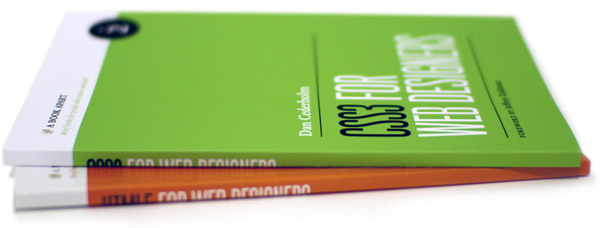
book cover Photo by Jason Santa Maria

I wouldn’t be writing books if it weren’t for Jeffrey Zeldman, so it’s especially fantastic to have CSS3 For Web Designers be the No. 2 offering from A Book Apart—a publishing house created by Jeffrey, Mandy Brown and Jason Santa Maria. Their focus on “brief books for people who make websites” was a perfect fit for the book I wanted to write: a practical guide to portions of CSS3 that work today, usable by anyone right now. I’ve been speaking about how CSS3 can be safely and easily utilized on the experience layer of well-crafted websites over the last year, and it’s wonderful to have that research packaged up in paper and pixel form.

Following up Jeremy Keith’s HTML5 For Web Designers masterpiece was an impossible task. His book was the right time, the right subject and the right author. It’s an instant classic. Daunting as it was, I set out on a similar task: show what can be done right now, no filler, and let people get back to work. The brief book format is rather brilliant for these types of subjects, and ABA already has several more titles in the works from the likes of Kissane and Marcotte. It’s an honor to be a part of this.

If anything sounds good in the book it’s because of Mandy Brown, the most detailed editor I’ve worked with. Mandy has a frightening grasp on the subject matter while at the same time mastering the editorial tone. That combination makes her some sort of supereditor (a word I’ve just invented). If anything looks good in the book it’s because of Jason Santa Maria, whose design system is one of the most clear and pleasant book layouts I’ve worked within (that’s Jason’s photo above as well). And if anything is accurate it’s because of Ethan Marcotte who handled tech editing like the gentleman-genius he is. As I mentioned earlier, I wouldn’t be writing books if it weren’t for Mr. Zeldman, so to have him publish this little book is a special thing.

So go grab a copy! I recommend the paperback + ebook bundle. You’ll get the beautiful book as well as inline video within the epub version. A great way to demonstrate those transitions, transforms and animations.

And check out Jeffrey’s blog post, Jason’s blog post, Mandy’s blog post, as well as a sample of chapter 2, Understanding CSS Transitions over at A List Apart which was also published today.


"Designing for the web is like building sand sculptures."

“Designing for the web is like building sand sculptures.�

- Dan Rubin

I’m back in the saddle this week after returning from…


I’m back in the saddle this week after returning from Build, a conference in Northern Ireland, expertly assembled by Andy McMillan. It was a great event, and a nice way to cap off a busy year of speaking. Build was my last event till 2012. I decided I need some time off to recharge, focus on some other things, not be away from the family, and take a good long while before thinking about diving into Keynote again to construct a fresh talk. Looking forward to attending an event or two in 2011.


  •   
  • Copyright © 1996-2010 BlogmyQuery - BMQ. All rights reserved.
    iDream theme by Templates Next | Powered by WordPress