Author Archive

Desktop Wallpaper Calendar: February 2013


We always try our best to challenge your artistic abilities and produce some interesting, beautiful and creative artwork. And as designers we usually turn to different sources of inspiration. As a matter of fact, we’ve discovered the best one—desktop wallpapers that are a little more distinctive than the usual crowd. This creativity mission has been going on for over five years now, and we are very thankful to all the designers who have contributed and are still diligently contributing each month.

This post features free desktop wallpapers created by artists across the globe for February 2013. Both versions with a calendar and without a calendar can be downloaded for free. It’s time to freshen up your wallpaper!

Please note that:

  • All images can be clicked on and lead to the preview of the wallpaper,
  • You can feature your work in our magazine by taking part in our Desktop Wallpaper Calendar series. We are regularly looking for creative designers and artists to be featured on Smashing Magazine. Are you one of them?

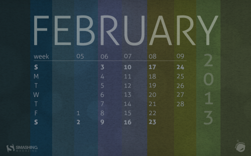
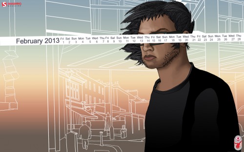
February Theme

Designed by Ricardo Gimenes.

Smashing Wallpaper - february 13

I Believe I Can Fly

Designed by Elise Vanoorbeek from Belgium.

Smashing Wallpaper - february 13

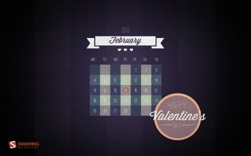
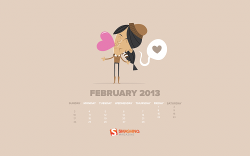
Happy Valentine’s Day

Designed by Steffi Ulm from Germany.

Smashing Wallpaper - february 13

Dear Love

“Spread the love!” — Designed by Abel from Singapore.

Smashing Wallpaper - february 13

This Is Love

Designed by Katerina Bobkova from Ukraine.

Smashing Wallpaper - february 13

Like The Cold Side Of A Pillow

Designed by Sarah Tanner from USA.

Smashing Wallpaper - february 13

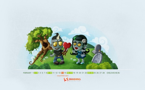
Zombie Love

Designed by Cheloveche.ru from Russia.

Smashing Wallpaper - february 13

Moody February

“Shades from a February evening walk: twilight sky, fallen leaves, new growth.” — Designed by Dangerbrain from USA.

Smashing Wallpaper - february 13

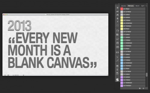
Photoshop Life

“Each layer in the layers panel is a day in the month of February. The inactive tabs are the months before and after. The tools in the panel are to apply weather, activities and food. If only life could be as simple as a photoshop document with the ability to undo or apply filters to everyday life.” — Designed by Debbie Burkhoff from USA.

Smashing Wallpaper - february 13

Flower

Designed by Jong S. Kim from United States.

Smashing Wallpaper - february 13

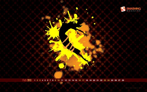
Dance

“Be a free spirit, unwind & splash your moves and make the world jive with you.” — Designed by Ngangbam Kishor from India.

Smashing Wallpaper - february 13

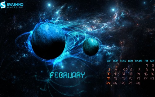
Abstract

“A view of 2 frozen planets, lots of blue tints.” — Designed by Rutger Berghmans from Belgium.

Smashing Wallpaper - february 13

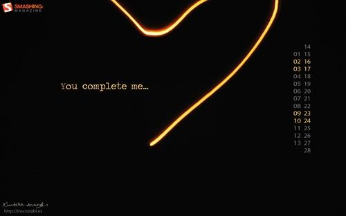
You Complete Me

“Dedicated to one of the most famous lines in romantic movies’ history. The incomplete heart has been created by photographing a floating lantern in slow shutter speed !! Happy Valentine’s Day :).” — Designed by Krutika Anand from India.

Smashing Wallpaper - february 13

Ripped Away

“Abstract self portrait with added on acrylic medium.” — Designed by Ashley Rose from USA.

Smashing Wallpaper - february 13

Winter

“A winter themed background for the last month of winter.” — Designed by Yasmine Damiri from the Netherlands.

Smashing Wallpaper - february 13

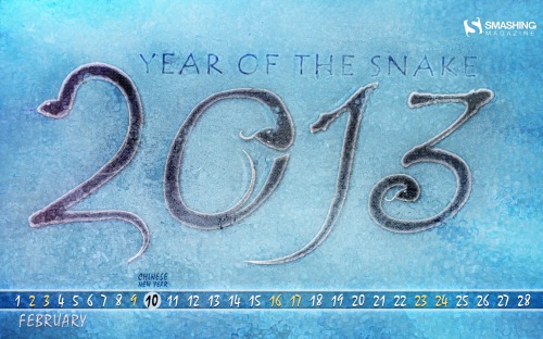
Year Of The Snake

Designed by John Patrick Buenaobra from Philippines.

Smashing Wallpaper - february 13

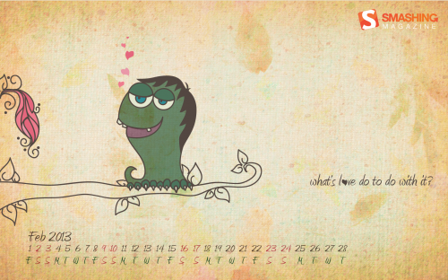
Whats Love Got To Do With It?

“A different angle to love and the innocence attached with it. My depiction of February.” — Designed by Debjani Bhattacharya from India.

Smashing Wallpaper - february 13

Be My Valentine

“The month of love.” — Designed by Jana Engelhardt from Australia.

Smashing Wallpaper - february 13

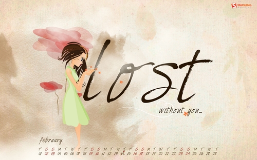
Lost Without You…

“February, the month of love. This wallpaper is dedicated to all those people out there who have found that one person in life. They would understand this feeling of being lost, if that person is not around to share your joy, sorrow, success, failure. Happy Valentine’s Day!!” — Designed by Charuta Puranik from India.

Smashing Wallpaper - february 13

She Loves Me

“Ah February, the 14th is the day when we dare a little more than usual, or we await something special from that one person – the better friend, or the better half!” — Designed by Rihards Gromuls from Latvia.

Smashing Wallpaper - february 13

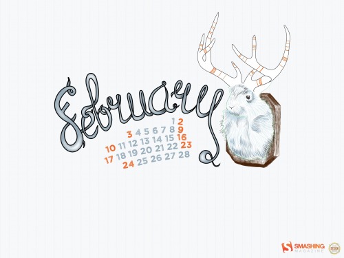
Jackalope

Designed by Sasha Endoh from Canada.

Smashing Wallpaper - february 13

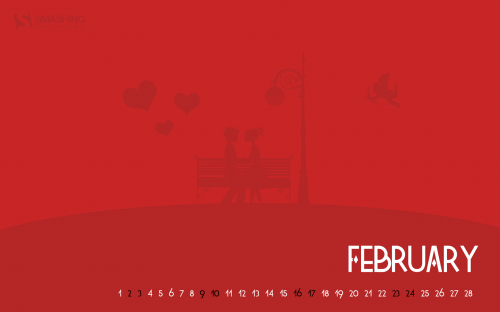
Valentine

“Love is in the air…” — Designed by Nicolas De Rechter from Belgium.

Smashing Wallpaper - february 13

Groundhog

“The Groundhog emerged from its burrow on February 2. If it is cloudy, then the Spring will come early, but if it is sunny, the groundhog will see its shadow, will retreat back into its burrow, and the Winter weather will continue for six more weeks.” — Designed by Oscar Marcelo from Portugal.

Smashing Wallpaper - february 13

Love Affairs

“Love is in the air this February! The last month of winter is always very romantic and inspires us to open our hearts and express our feelings to ones we love very much. This February calendar illustrates an unusual story of a young couple, who met each other by an accident.” — Designed by Brianna Davis from USA.

Smashing Wallpaper - february 13

A Lost Woman.

“Instead of going with something happy and loving, I decided to make a wallpaper for those who have lost an important woman. To me, the picture means the following: The man is together with a woman he loves. But when looking in the mirror he sees the woman he should be married to. I believe all men have that one girl they loved with all their heart but could never conquer.” — Designed by Maarten Van Isterdael from Belgium.

Smashing Wallpaper - february 13

Joy Of Life

“…I get most Joy in life out of Music.” This famous quote from Albert Einstein together with the firsts notes of Handel’s Recorder Sonata in G minor, inspired me to create this wallpaper. I am willing to create a series of wallpapers about the Joy of Music. We’ll see!” — Designed by Yiannis Kranidiotis from Greece.

Smashing Wallpaper - february 13

Elemental Micah: Just Exhale

“I would draw one A5 image perday for five days and post it off and this was one of them. It’s strange to think that after those humble beginnings, it would end up being the cover of my graphic novel. This is something I’m very proud to show you and everytime it pops on your desktop, I hope it’ll remind you of the love that might have been…” — Designed by Michael Georgiou from the United Kingdom.

Smashing Wallpaper - february 13

It’s Valentine’s Day!

“February is usually the coldest month of the year, but it is also the month of love…So Warm those days with the Valentine’s day wallpaper!” — Designed by Webolution from Greece.

Smashing Wallpaper - february 13

February Flowers

“A little bit of romance, a little bit of vintage: Happy Valentine’s Day this month!” — Designed by Kari Andresen from USA.

Smashing Wallpaper - february 13

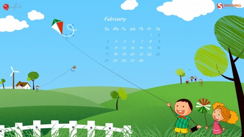
Spring Kites

“Here is a wallpaper that celebrates the kites festival in India.” — Designed by Aadheesh Rajput from India.

Smashing Wallpaper - february 13

Every Day Should Be Valentine’s Day

“Valentine’s Day is a big business today. I personally don’t celebrate it, because I think if you love someone every day should be Valentine’s Day. :) That’s what this wallpaper is all about. The two birds – Milo and Pipita – are a wallpaper series and usually they argue about things men and women argue about ;), but as it’s the Valentine Edition I just went with something cute.” — Designed by Nicole Bauer from Germany.

Smashing Wallpaper - february 13

Join In Next Month!

Please note that we respect and carefully consider the ideas and motivation behind each and every artist’s work. This is why we give all artists the full freedom to explore their creativity and express emotions and experience throughout their works. This is also why the themes of the wallpapers weren’t anyhow influenced by us, but rather designed from scratch by the artists themselves.

A big thank you to all the designers for their participation. Join in next month!

What’s Your Favorite?

What’s your favorite theme or wallpaper for this month? Please let us know in the comment section below.


© Smashing Editorial for Smashing Magazine, 2013.


The Smashing Mobile Book: Have You Got Yours Already? (Now With Extra Chapters!)


The brand new Smashing Mobile Book was officially launched a couple of weeks ago and since then we’ve been receiving remarkable feedback and overwhelming, positive book reviews. You thought it’s done now? Well, it’s not! We now have an exclusive bonus ready for you: The Mobile Book Addendum is now available for free download.


Once you’ve ordered your printed copy of The Mobile Book, you’ll receive the eBook version in PDF, ePUB and Kindle formats, as well as the Mobile Book Addendum.

The Mobile Book Addendum is free of charge to anyone who orders the printed Mobile Book. Of course, if you have already ordered the Mobile Book, the Addendum has been added to you your .zip file in your personal dashboard — available in PDF, ePUB and Kindle. Also, keep in mind that the digital version of the Mobile Book and Addendum are included in the Smashing eBook Libraryour annual subscription with 70% discount on all Smashing eBooks.

The Mobile Book Addendum

The Mobile Book (+Addendum!)

The future is mobile. As more and more people are turning to mobile devices, designers and developers are facing new challenges and opportunities. Web design has to adapt. But before it can do so, we have to do our homework — understand the new medium and discover the right techniques and tools to design for it. Our brand new Mobile Book serves exactly this purpose.

These extra chapters of the Mobile Book provide insights into design and development for iOS, Android, Windows Phone, as well as introduce techniques for advanced HTML5 Web applications and explore UX patterns on these platforms.

Table of Contents (Addendum)

AUTHOR CHAPTER DETAILS
Greg Nudelman
Rian van der Merwe
Mobile Design Patterns

The key to using design patterns is not to get caught up in copying the exact implementations, but instead to witness the underlying reasons for why something works, and then adopt a unique design situation with authenticity, grace and vision. This chapter attempts to collect strategic patterns that reflect the underlying customer experience trends unique to the mobile environment, and use examples of particular implementations that call out important existing or emerging trends.

Chapter keywords: faceted refinement, parallel search, zero results recovery, tap-ahead, engagement, rollaway dashboard menu, tabbed views, reading and pagination.

Nathan Barry Getting Started With Design And Development For iOS

As an experienced designer of iPhone and iPad applications, Nathan Barry takes us on a detailed journey through the iOS platform. Starting with general culture and language of iOS, he moves to iOS design patterns, technical implementations in Xcode, the design and development process for new iOS apps as well as pricing, marketing and submission guidelines. Each section is accompanied with examples, suggestions and best practices.

Chapter keywords: mobile, user experience, native applications, native as culture, interaction design principles, responsive Web design.

Arturo Toledo Designing Windows Phone Apps

With its new Windows design language, Microsoft created an entirely new design methodology focused on the content of applications, relying more on type and less on graphics. In this chapter, Arturo Toledo, former UX designer at Microsoft, explains the new design concepts such Hub & Spoke model, Panoramas, Pivots and Pages, reviews Windows Phone design grid and design guidelines, provides UX advice on when what model is most appropriate and presents a workflow from the ideation phase to the design and development phase of a Windows phone app.

Chapter keywords: sketching, flow, hub & spoke model, panoramas, pages, list views, design grid, app bar, animations, branding.

Greg Nudelman Rian van der MerweNathan BarryArturo Toledo
From left to right: Greg Nudelman, Rian van der Merwe, Nathan Barry and Arturo Toledo.

Table of Contents: The Mobile Book (Printed)

AUTHOR CHAPTER DETAILS
Jeremy Keith Foreword
Jeremy Keith has been around on the Web for a while and saw the emerging mobile medium from its earliest days. With his preface for the Mobile Book, Jeremy introduces us to this new facet of the Web and the new possibilities and challenges that the Mobile industry produces as a relatively young medium.
Peter-Paul Koch What’s Going on in Mobile?
This chapter provides a general overview of what’s going in the mobile industry today, who are its main players and how they influence each other. From a technical perspective, the chapter reviews the peculiarities of mobile networks and platforms, existing mobile browsers and guidelines for testing websites on mobile. You’ll understand the mobile market, how it works, what it involves and how it affects our daily work.

Chapter keywords: mobile value chain, operators, device vendors, fragmentation, Android, iPhone, Windows Phone, OS vendors, proxy browsers, open device lab, mobile network.

Stephanie Rieger The Future of Mobile
This chapter provides a glimpse of where the future of mobile might lead, and what technologies will lead us there. These include new low-power computer chips, new display technologies, new APIs and the growing penetration of near field communication (NFC). But more important than the technologies themselves is how they will need to work together, enabling new and exciting ways to do business, to connect with friends and family and to interact with the world around us.

Chapter keywords: connected devices, TVs, consumer customization, display technologies, RFID, NFC, Device APIs.

Trent Walton Responsive Design Strategy
The main components of Responsive Web Design(RWD) — flexible grids, flexible images, and media queries — are just the tip of the iceberg. And with the ever-increasing number of devices flooding the market, RWD is the most effective way to address them all at once. This chapter by Trent Walton features strategies, techniques and design workflow tips on building effective and bulletproof responsive designs.

Chapter keywords: image aspect ratios, resolution independence, breakpoints organization, vertical and em-based media queries, content choreography, image hierarchy, fluid type.

Brad Frost Responsive Design Patterns
As Responsive Design continues to evolve, we’re confronted with difficult problems about how to create adaptive interfaces that look and function beautifully across many screen sizes and environments. E.g. how do we handle navigation that’s four levels deep? This chapter features emerging responsive design patterns and explains how to use them meaningfully in your projects. Brad Frost provides useful tips and expert advice on various design elements covering everything from complex navigation to advanced data tables.

Chapter keywords: style guides, layout, navigation, conditional loading, progressive disclosure, background images, icons, maps, type, carousels, accordions, forms, tables.

Dave Olsen Optimization For Mobile
Although Responsive design per se has provided a great fundamental concept for designing mobile-optimized websites, the core ideas that make up these concepts pre-date the mobile revolution. In this chapter, Dave Olsen reviews what it takes to optimize mobile experiences in terms of performance. How do we keep responsive websites lightweight? What do we need to know about caching, lazy loading, latency? How can we start using RESS? Device detection or feature detection? Also, how do we develop and test our websites for performance? This chapter answers all these questions and more.

Chapter keywords: mobile performance, latency, localStorage, lazy loading, Data URI scheme, JS frameworks, RESS, browser detection, feature detection.

Dennis Kardys Hands On Design for Mobile (UX Perspective)
Mobile requires us to rethink the way we create, develop and build experiences for our users. In this chapter, you’ll look at some of the more glaring pitfalls to conventional processes, specifically as they pertain to how we design—and how we communicate design—for an increasingly mobile-accessed Web. You’ll learn about implementing and selling processes that support a realistic understanding of what it means to design with mobile in mind.

Chapter keywords: psychology, contextual interviews, collaborative design workshops, design studio methods, sketching, wireframing, convergent prototyping.

Josh Clark Designing With Gestures and Touch
Among the many new opportunities of the mobile medium are the capabilities of mobile devices. One of the major interaction changes, however, involves gestures and touch. In this chapter, Josh Clark explains how we can use them to improve the mobile user experience and provides concrete examples of implementations in real-life applications.

Jeremy Keith Peter-Paul Koch Stephanie Rieger Trent Walton Brad Frost Dave Olsen Dennis Kardys Josh Clark
From left to right: Jeremy Keith, Peter-Paul Koch, Stephanie Rieger, Trent Walton, Brad Frost, Dave Olsen, Dennis Kardys and Josh Clark.

Sample and Technical Details

The Mobile Book
The Mobile Book. Large preview

The Smashing eBook Library

60 Quality eBooks For €89/$99 A Year

The Smashing Library: Eine super Sache für alle!

Web design is an ever-changing industry, so if you want to learn how to get better at your craft and stay up-to-date with what’s going on, learn what techniques are emerging and what practices are changing, the Smashing Library is just what you are looking for.

The Smashing eBook Library grants you immediate unlimited access to all Smashing eBooks, released in the past and in the future, including digital versions of all of our printed books! The annual fee of €89/$99 covers the immediate access to the complete Smashing library — we think that’s a reasonable price for a total of 60 quality eBooks during the first year. Subscribe today!

Snapshots Of The Mobile Book

Some of our Smashing readers and fans have already received their printed copies of The Mobile Book and have kindly sent us their pictures to share their joy. Thanks to everyone who has sent us a snapshot of their copies of the Smashing Mobile Book! Please feel free to send more pictures to ideas [at] smashing-media [dot] com!


Image Credits: Josh Johnson


Image Credits: Billy Moat


Image Credits: Jordan Moore


Image Credits: Brian Jensen


Image Credits: Carsten Schuetz


Image Credits: David Roessli


Image Credits: Lucas Dechow


Image Credits: Jason Gittings


Image Credits: Pete Hotchkiss


Image Credits: Christopher Butler

Thank You For Your Support!

We would appreciate it if you could inform your friends, colleagues and followers about the book. Feel free to link to www.the-mobile-book.com, this post and use the hashtag #mobilebook on Twitter.


Once you’ve ordered your printed copy of The Mobile Book, you’ll receive the eBook version in PDF, ePUB and Kindle formats, as well as the Mobile Book Addendum.

Thank you for your support, everybody—we truly appreciate it. And we hope that you’ll love the Mobile Book just as much as we do!


© Smashing Editorial for Smashing Magazine, 2013.

Freebie: Christmas Icon Set (10 Quality Icons, 256×256px PNG)


Today, we have a beautiful Christmas icon freebie for you created by the talented, hard-working folks at RocketTheme. The icon set contains ten icons available as 256×256px PNGs that have been lovingly and exclusively prepared for Smashing Magazine and the Web design community. As usual, the set is released under a Creative Commons license and can be used in commercial and private projects.

Christmas Icon Set

is work is licensed under a Creative Commons Attribution-NoDerivs 3.0 Unported License. You are free to build them into your work, even commercially. However, please always credit the original designer of the set (in this case, RocketTheme).

Download The Christmas Set For Free!

You can use this icon set freely for commercial and personal projects. Please link to this release post if you want to spread the word.

Free Icon Set

Description

The set contains 10 icons for the upcoming Christmas holiday. Each icon is available as a PNG. The icons included are:

  • A bag full of presents,
  • A glass ball ornament,
  • A Bullfinch,
  • Cookies,
  • Christmas decorations,
  • Christmas presents,
  • A Gingerbreadman,
  • A pair of mittens,
  • A Nutcracker,
  • A Christmas stocking.

The amount of hard work the guys behind RocketTheme have put into creating this icon set is remarkable. Hats off, guys! We sincerely appreciate your time and effort!

And if you’d like to stay updated with more upcoming freebies as well as our recent articles, make sure to subscribe to our email newsletter. Happy holidays, everyone!

(il)


© Smashing Editorial for Smashing Magazine, 2012.


The New Mobile Book Is Finally Here!


Yes, our brand new Smashing Mobile Book has finally arrived, and it has almost reached your doorstep! If you’ve already pre-ordered the book weeks ago, then it’s really only a matter of days! Until then, the complimentary digital version is waiting for you in your Smashing Shop dashboard. And if you haven’t ordered just yet, make sure to get the book now!

At this very moment, all pre-orders are being shipped from Berlin, Germany, by airmail. Due to an unexpected huge amount of pre-orders in the past days, delivery of the new book orders will take a bit longer since we only have a limited amount of printed books in pre-sale stock.

Of course, we are printing extra copies in this very moment as you read this post. But unfortunately, the shipping of the new printed copies can only start in early January 2013. Still, you get the eBook automatically once you’ve ordered the printed book, so you can start reading right away!

eBook Is Now Available

The eBook of the Mobile Book is available for download immediately: PDF, ePUB and Kindle formats for your convenience. If you have pre-ordered the book, your eBook is waiting for you in your Download Area. Also, keep in mind that the eBook is included in the Smashing eBook Library—our annual subscription with 70% discount on all Smashing eBooks.

And if you still haven’t ordered yet, you can get the Mobile book right now, and start reading within a couple of minutes! You won’t be disappointed. Why? Let’s see why.

About the Book

The Mobile Book

Our brand new printed Mobile Book features the most important things that you need to know as a designer, developer or mobile strategist to make your websites optimized for mobile. You’ll dive deep into the peculiarities of the mobile industry, explore responsive design strategy, design patterns and optimization techniques, learn about wireframing and prototyping for mobile as well as the guidelines for designing with gestures and touch. If you are looking for a good book on mobile, this is the one.

Table of Contents

When setting up the concept of the book, we worked hard to ensure a delicate balance between advanced knowledge and the current state of the art:

AUTHOR CHAPTER DETAILS
Jeremy Keith Foreword
Jeremy Keith has been around on the Web for a while and saw the emerging mobile medium from its earliest days. With his preface for the Mobile Book, Jeremy introduces us to this new facet of the Web and the new possibilities and challenges that the Mobile industry produces as a relatively young medium.
Peter-Paul Koch What’s Going on in Mobile?
This chapter provides a general overview of what’s going in the mobile industry today, who are its main players and how they influence each other. From a technical perspective, the chapter reviews the peculiarities of mobile networks and platforms, existing mobile browsers and guidelines for testing websites on mobile. You’ll understand the mobile market, how it works, what it involves and how it affects our daily work.

Chapter keywords: mobile value chain, operators, device vendors, fragmentation, Android, iPhone, Windows Phone, OS vendors, proxy browsers, open device lab, mobile network.

Stephanie Rieger The Future of Mobile
This chapter provides a glimpse of where the future of mobile might lead, and what technologies will lead us there. These include new low-power computer chips, new display technologies, new APIs and the growing penetration of near field communication (NFC). But more important than the technologies themselves is how they will need to work together, enabling new and exciting ways to do business, to connect with friends and family and to interact with the world around us.

Chapter keywords: connected devices, TVs, consumer customization, display technologies, RFID, NFC, Device APIs.

Trent Walton Responsive Design Strategies
The main components of Responsive Web Design(RWD) — flexible grids, flexible images, and media queries — are just the tip of the iceberg. And with the ever-increasing number of devices flooding the market, RWD is the most effective way to address them all at once. This chapter by Trent Walton features strategies, techniques and design workflow tips on building effective and bulletproof responsive designs.

Chapter keywords: image aspect ratios, resolution independence, breakpoints organization, vertical and em-based media queries, content choreography, image hierarchy, fluid type.

Brad Frost Responsive Design Patterns
As Responsive Design continues to evolve, we’re confronted with difficult problems about how to create adaptive interfaces that look and function beautifully across many screen sizes and environments. E.g. how do we handle navigation that’s four levels deep? This chapter features emerging responsive design patterns and explains how to use them meaningfully in your projects. Brad Frost provides useful tips and expert advice on various design elements covering everything from complex navigation to advanced data tables.

Chapter keywords: style guides, layout, navigation, conditional loading, progressive disclosure, background images, icons, maps, type, carousels, accordions, forms, tables.

Dave Olsen Optimization For Mobile
Although Responsive design per se has provided a great fundamental concept for designing mobile-optimized websites, the core ideas that make up these concepts pre-date the mobile revolution. In this chapter, Dave Olsen reviews what it takes to optimize mobile experiences in terms of performance. How do we keep responsive websites lightweight? What do we need to know about caching, lazy loading, latency? How can we start using RESS? Device detection or feature detection? Also, how do we develop and test our websites for performance? This chapter answers all these questions and more.

Chapter keywords: mobile performance, latency, localStorage, lazy loading, Data URI scheme, JS frameworks, RESS, browser detection, feature detection.

Dennis Kardys Hands On Design for Mobile (UX Perspective)
Mobile requires us to rethink the way we create, develop and build experiences for our users. In this chapter, you’ll look at some of the more glaring pitfalls to conventional processes, specifically as they pertain to how we design—and how we communicate design—for an increasingly mobile-accessed Web. You’ll learn about implementing and selling processes that support a realistic understanding of what it means to design with mobile in mind.

Chapter keywords: psychology, contextual interviews, collaborative design workshops, design studio methods, sketching, wireframing, convergent prototyping.

Josh Clark Designing With Gestures and Touch
Among the many new opportunities of the mobile medium are the capabilities of mobile devices. One of the major interaction changes, however, involves gestures and touch. In this chapter, Josh Clark explains how we can use them to improve the mobile user experience and provides concrete examples of implementations in real-life applications.

To ensure the quality of the book’s content, the chapters have been reviewed by a number of active members of the mobile design community such as Scott Jenson, Bruce Lawson, Lyza Danger Gardner and Bryan Rieger—just to name a few. It wasn’t easy to bring together such a stellar line-up of experts, but a compromise wasn’t an option.

Sample and Technical Details

The Mobile Book
The Mobile Book. Large preview

Extra eBook: Addendum

Initially, we wanted to cover all popular mobile topics within the printed book, but because some chapters took more time to write and review than planned, we decided to release them in an addendum to the printed book. All buyers of the Mobile Book will get the Addendum for free in January 2013. The eBook will provide insights into design and development for iOS, Android, Windows Phone, as well as introduce developing and debugging techniques for advanced HTML5 Web applications and explore UX patterns on these platforms.


Our new Mobile Book is available as a printed book, single eBook or as a part of the Smashing eBook Library.

What Reviewers Say About The Mobile Book

A few reviewers have had the chance to read the book a few days before its release, and share their views in a non-committal way. The result is very clear: the book is worthwhile. Should you get it? Yes! Let’s see why:

“I got my hands on an early copy of The Mobile Book, by Smashing Magazine. I’ll cut to the chase and just say this: It’s fantastic. You should own it. Really.”

Christopher Butler

“The standard, the reference book for Mobile. I worked for a mobile web publishing company for 18 months and the depth of knowledge provided by the experts in this book is extraordinary. It blew me away. This book provides a diplomatic, comprehensive guide to understanding “Mobileâ€�, delivered by people who have a real passion for the Mobile endeavours in our community.”

Ben Howdle

“I’ll cut to the chase for those deliberating a purchase: it’s well worth the cover price. The eBook edition is a steal! This book establishes a mindset of understanding and exploring the medium. It embraces the breadth of its domain and will set you on an exciting path.”

David Bushell

“As somebody who spends a lot of time tinkering and tweaking websites to make them work better, I thought this book was bloody brilliant. There is so much depth and information packed into its 336 pages that I think it will become the book for the mobile Web.”

Ian Nuttall

“Every chapter is full of golden nuggets of information and the standard of writing is, as you would expect from a Smashing Magazine book, impeccable.”

Craig Lockwood

“It’s essential reading for those involved with the design and development of web/app based output. The essays within will encourage you to consider how people interact with mobile technology and help you to produce mobile friendly solutions to your projects.”

Dave Hughes

“This book has something for all levels of expertise. [..] It doesn’t patronise, it doesn’t talk over your head either, it teaches. It is an important book of its time, don’t hesitate in picking it up.”

Jordan Moore

“Earlier I mentioned that you should add this book to your shelf, in reality, you’ll probably want to keep it on your desk.”

Joshua Johnson

“In general I think this book is a great addition for a company or agency library. As a specialist, it can leave you with a few chapters that are very much beyond your reach and can leave you with dangerous “knowledgeâ€� but a team reading the applicable chapters and then pooling their knowledge and learnings can use this book to go into the mobile future kicking and screaming. And kicking arse.”

Christian Heilmann

“The Mobile Book provides a detailed and well curated overview and reference for designers getting to grips designing for, and working with, the ever changing world of devices and responsive design.”

James Young


Frequently Asked Questions (FAQ)

We want to make it as easy as possible for everyone to buy the new Smashing book. We welcome all suggestions and advice that could improve Smashing Magazine’s user-friendliness. Here are answers to some frequently asked questions about the brand new Smashing Mobile Book:

Questions
What are the costs for shipping to my country?
The shipping cost for one book or a bundle is $5 — wherever you are in the world. We ship everywhere worldwide. We are paying a share of the shipping costs ourselves to make it possible for anyone to purchase the book. Our prices are transparent: we don’t have any hidden costs, and we won’t confuse you with tricky calculations. What you see is what you pay!
What about delivery times?
All books will be shipped via air mail to keep delivery times as short as possible. You can find the anticipated delivery time for your country in the delivery times overview. Please note that we will start to ship the books early-mid December 2012.
Will the book be available in other languages?
Maybe in future, but we have not made arrangements for that yet, so don’t hold your breath.
Is the Mobile Book available as an eBook?
Yes, the book will be available in PDF, EPUB and Kindle (Mobipocket) formats, and you can pre-order the eBook bundle now.
Is “Mobile Book” the “Smashing Book #4″?
No, “The Mobile Book” is a new series that we are starting here at Smashing Magazine. It is not Smashing Book #4 — it has a different design, layout and concept than other Smashing books. However, the Smashing Book #4 will be published in May 2013 — please stay tuned!
What payment methods are accepted?
We accept PayPal, VISA, MasterCard and American Express. We use a secure connection, with 256-bit AES encryption and a green GeoTrust Extended Validation SSL CA certificate.
Is there a money-back guarantee?
Yes, absolutely! No risk is involved. Our 100-day full money-back guarantee keeps you safe. Don’t hesitate to return your purchase. You’ll get your money back—no ifs, ands or buts about it.
I have a question that is not covered here.
Please leave a comment below, or get in touch with us via the contact form or via @SmashingSupport on Twitter. We would love to help you in any way we can!

We would appreciate it if you could inform your friends, colleagues and followers about the book. Feel free to link to www.the-mobile-book.com, this post and use the hashtag #mobilebook on Twitter. If you choose to blog about the book, please feel free to use the images and information from our Mobile Book media kit (.ZIP, 6.6 Mb) which includes screenshots, photos and general information about the book.

Thank you for your support, everybody—we truly appreciate it. And we hope that you’ll love the Mobile Book just as much as we do!


Our new Mobile Book is available as a printed book, single eBook or as a part of the Smashing eBook Library.

(vf) (il)


© Smashing Editorial for Smashing Magazine, 2012.


The Smashing Conference: Exclusive Videos And Interviews


In September 2012 we ran the very first Smashing Conference — friendly, valuable and inspiring community event — in a beautiful medieval building in our home town Freiburg, Germany. The conference was a huge success, and we haven’t anticipated the fantastic feedback we’ve received during and after the event.

All conference tickets and workshop tickets were sold out within weeks, and to bring the event closer to everybody we blogged live from the venue, and captured all talks on video. We had the pleasure of welcoming and interviewing many top-class speakers and well-respected experts from the Web design industry.


Opening credits for the Smashing Conference, created by the No-Domain design studio from Barcelona, Spain.

With the Holidays being so close we are happy to release videos of the talks along with exclusive interviews with speakers that we conducted during the conference. We are starting off with the first 3 talks – by Jeremy Keith, Rachel Andrew and Stephen Hay. More videos will be released in the next days, and we’ll feature them here, on Smashing Magazine as well.

The videos were taken by Frank Sippach, cut by Marc Thiele, the co-organizer of the event, and the interviews were conducted by Esther Arends and Melanie Lang from the Smashing Editorial Team. Subscribe to our events mailing list to stay updated about the next Smashing Conference and other upcoming Smashing events!

Jeremy Keith: The Spirit of the Web

Jeremy Keith makes websites. He is responsible for the death of the trees used to print the books DOM Scripting, Bulletproof Ajax and, most recently, HTML5 for Web Designers. He also shot a man in Reno just to watch him die. Originally from Ireland, Jeremy now lives in Brighton, England, where he pretends to work with Clearleft. Peas grow there.


The Spirit Of The Web, a talk by Jeremy Keith at the SmashingConf 2012.

The Interview

Question: Hey Jeremy, thanks for taking the time for an interview. You lived here in Freiburg early in your career. What brought you here?

Jeremy Keith: Before I went to Freiburg, I was playing music on the street, and I also went to art college for a bit back in Ireland, but I dropped out.

I came to Freiburg because a friend of mine studied here and told me that I should visit. So, I did and eventually moved here. That was around the early to mid ’90s. I was working in a German bakery selling bread, Brezels and all that good stuff. I really miss German baked goods. When I learned German, all of my vocabulary was bread-based. I knew German words for things which I couldn’t even name in English.

Question: Where was your flat?

Jeremy: It was just by the Stadtgarten. The address was Stadtstraße 1. It was a basement flat, which wasn’t pretty but very central.

Question: You also met your wife, Jessica, here, who is not originally from Freiburg either. How long did you live in Freiburg?

Jeremy: Jessica is American and came to Freiburg because she studied German and wanted to do her year abroad. We played in a band together. She extended for another year but then had to go back and finish her degree in the States for another year. I also went over to visit her, and when she was finished we moved back. So, I lived here around six years, but I also lived in the USA in between that.

Jeremy Keith at the Smashing Conference
Jeremy Keith at the Smashing Conference. A photo by John Davey.

Question: You also played music in Freiburg? What kind of music did you do?

Jeremy: The band was more rock but with a bit of folk influence. People didn’t really know what to make of it. Later, the band went with us to England, and we were much better there.

I was also playing bass in the best surf band of the Schwarzwald (Black Forest), called Leopold Kraus Wellenkapelle. They’re actually still going and got a lot better when I left. But it was a lot of fun playing with them.

Question: Where was the most inspiring place for you in Freiburg?

Jeremy: The Freiburger Münster. I think I’m still a member of the Münsterbauverein, an association to fund the upkeep of the building. There is a lot of cool stuff in it. Have you seen the carvings in the stones in the front? It shows the shapes of circles, bread loaves and stuff like that. They’re measures of certain things so that people would know how big those things had to be. Those where the standards back in the day. You can even see the wealth of certain times. In poor times you had smaller measures than in better ones.

I also think about hanging out at the Augustiner Platz, having a beer, playing guitar, singing along. This is so different from England. In England, there would be a fight at some point, because it’s such a different drinking culture. The English get rowdy and want to let you know that they are really drunk. Here, people just have a few drinks and relax.

It was a shame that Ganter was the beer of Freiburg because it’s not the best. Tannenzäpfle was really nice. Back in the day, Tannenzäpfle used to be the secret of the Schwarzwald (Black Forest); now it’s actually become a trend beer. On the plus side, we might start seeing it in England. I had withdrawal from good beer when I moved to England.

And there is another fun thing in Germany. Why do you have just one flavor of crisps? It’s always paprika, paprika, paprika.

Question: Um, but now we have whole range of flavors. I like the plain salted ones, for example.

Jeremy: Yeah, but it’s always paprika. Even the salted ones taste like somebody licked a paprika.

Question: Hmm, I wouldn’t know the answer to this. What was your impression of Freiburg in general?

Freiburg market at Münsterplatz.
Grilled German sausage from the farmer’s market at the Münsterplatz. Yummy!

Jeremy: Freiburg is pretty for the most part. I love the Münster and the market around it. I didn’t really appreciate it when I was living here. Now I look around and think this is really amazing. It’s a student town, and back then there was a really good music scene here. I remember how it was in the old Vauban. [Vauban is a part of Freiburg known for its alternative character. It was rebuilt as a sustainable model district starting in the mid-’90s –Ed.]

I also miss the wine because it doesn’t get exported. I definitely will be stocking up on some Spätburgunder. The white wine is very nice here, even though I normally prefer reds.

Question: You started doing Web design here. How did you start?

Jeremy: Around the mid to end of the ’90s, we decided that our band should have a website because everyone had one. We already had an email address, and we were very proud of that, but no website. I said I would look into making it, because Jessica had a computer and I had been on the Web.

An old friend of mine who had been to art college with me was in the States, and I knew he was doing something with computers and probably with the Web. I knew that you needed Photoshop to design, so I thought that if you wanted to do Web design you’d need some other flashy expensive software, and I asked him about what I should use.

He said that I should open up a text editor and type in some HTML, save the file, and it will open in a browser. I tried and it actually worked! It was amazing—I couldn’t believe it. It was like when I was a kid just using the computer. You play around, something happens, and you feel so powerful. Considering that our band website was my first one and that it was the ’90s, it wasn’t too bad. It was 640 × 480 pixels.

I was never interested in Irish music when I was in Ireland, but I got into it when I came here. After finishing the band’s website, I didn’t know what else to do with my fresh HTML knowledge, so I decided to share Irish music. I started a site called The Session. Initially, it was just me posting one tune a week. This was actually better than posting everything at once. And I was able to add comments. This was a big deal back then, because before you had PHP, you had to write Pearl scripts. But it actually taught me how to program. Later, I learned how to create databases and so on. That project is actually still going. It’s changed, but it’s still going. It needs a redesign, which I’m working on right now.

I like having a long-term project going on. The Session has been going on for 10 years now, and it’s great because, in Web terms, this is forever. A lot of times, things on the Web go very fast. They are here today, gone tomorrow. And people forget this. People talk about Facebook like it’s always going to be there. But they also thought that Friendster would be there forever.

After my first website, people started asking me if I could do their website, so I started freelancing. I got more work and quit working at the bakery. Not long after that, we moved to Brighton, and until today I hadn’t been back to Freiburg in 12 years.

I only came to Freiburg by accident. When I look back, it was like it all came together when I started Web design. I didn’t know what to do otherwise. I played music, but I wasn’t very good, and I wasn’t really good at art college. It was like I was waiting around until the Web was invented.

Jeremy Keith at the Smashing Conference
Jeremy Keith is coming up next. A photo by John Davey.

Question: Why did you decide to move to Brighton?

Jeremy: As I mentioned before, Jessica and I played in this band. Our singer decided that he should finish uni because he never graduated. But he didn’t want to do it in Germany because back then it took much longer than in the UK. So, he went back to England and studied in Brighton. I thought that would be it with the band. He asked us to visit, which we did, and thought that it was a very nice place. At that point, we also got a bit tired of Germany, so we checked out Brighton. And then a flat became available in the same building where our singer lived, so we decided to move there.

We actually didn’t move because of the Web scene or anything. But once we got there, we found a lot of good stuff going on. I found people who were blogging, and I met people in real life who were doing the same stuff as I did.

Now, Brighton is — as Andy Clarke puts it — the center of the universe. There are many smart people and a lot of great stuff — for example, the Brighton Digital Festival, which consists of many events. If you consider the size of the city, it’s amazing how much is going on.

Question: How did Brighton become so special?

Jeremy: I don’t think there is any special reason for it. It’s more like this self-perpetuation circle. Now, people come down here because of the scene. Kevin Kelly made up this term, “scenius.� There is no particular reason why a scene manifests in one place. It just starts at some point; then it gets this positive feedback and develops. But that could be anywhere. A lot of factors play into it, like the fact that it’s a student town with many young people. It’s a good place now, but I don’t think you could guess those things and reproduce it.

Question: Do you see a difference between Freiburg and Brighton?

Jeremy: There definitely is. Freiburg is really lovely, and Brighton I wouldn’t describe as lovely at all. There are towns in England which are very picturesque and lovely — towns where you would bring your mother and have a lovely time. And Brighton is not one of those. It’s actually a bit seedy, sleazy, scuzzy and dirty. But because of that, it’s also active, and a lot of stuff is going on.

Freiburg doesn’t have a sleazy side to it. It’s amazing how little has changed in 12 years. When I’m two weeks away from Brighton, there will be new stuff everywhere when I get back. Freiburg is much more steady and calm in this respect.

Brighton is hectic, but way less than, for example, London, which is far too extreme. Sometimes I tend to feel that Brighton is hectic. But then I come back from a day in London, and when I get off the train, I see Brighton as such a sleepy seaside town. So, it always depends on what you compare it to.

Question: What are some must-do’s in Freiburg? And in Brighton?

Jeremy: The Freiburger Münster, and the farmer’s market which takes place in front of it every morning. Another great thing is to sit at the Haus der Badischen Weine (House of the Baden Wines), eat fruit from the market and drink a glass of Neue Süße (a German speciality –Ed.).

When you visit Brighton, you have to see the Royal Pavilion. It’s such a tacky building. It looks like the Taj Mahal and makes you think, “What is this doing in an English town?� It was originally build for sex, feasts and things like that. The interior design completely looks Chinese, except that the guy who came up with it had never been to China. There is also the pier, which is a bit overrated, but you probably should go there once. You can also stroll around the North Laine and find a lot of great coffee shops around there. It’s also great to go to the beach and just hang out there when the weather is nice.

As a geek, you should time your visit right, because the chances are good that some event or meetup will be taking place during your stay. There is always something on, and you should meet the local guys and hang out with them.

Smashing Flags outside the conference venue.
Smashing Flags outside the conference venue. A photo by John Davey.

Question: In your speaker’s biography at the Smashing Conference, you included the sentence, “He also shot a man in Reno just to watch him die.� What is this about?

Jeremy: It’s just a line from the song Folsom Prison Blues. When you speak at conferences, you’re supposed to make up your own bio — and even then in the third person. So, I say stuff like that, which I make up. I also kind of have an ongoing thing with job titles. I come up with a new one every two weeks. On the Clearleft website, there is a list of all of the staff members and their titles, such as UX director and lead creative strategist. I just put in names like King of Brighton or Long-Time Super Genius. It looks ridiculous, and it sort of makes the other titles look ridiculous, too, which is my point because I’m not a fan of job titles. Senior Lead Creative Manager — that’s another one. What does that even mean?

Question: How are you enjoying the conference so far?

Jeremy: I feel a bit behind because I’ve been sneaking out a lot to enjoy the market. But I haven’t been here in so long, so I just had to do that.

I like that it’s a single-track conference and that design and development are mingled. I really dislike multi-track conferences, especially when design and development are separated. What happens is that both groups just go to the topic they already know about, whereas in a single-track conference you have this shared experience. Designers and developers can learn from each other and will understand each other way better when collaborating on a project.

I like that you can go to the market and just have local food. I know how much catering adds to the ticket price, so I think that is a lot better.

The Wi-Fi was up and down, but I wouldn’t judge a conference on its Wi-Fi. Vitaly and Marc encouraged people to tweet, but I just don’t see the point of it, to be honest. You have to be here; you don’t get any real impression of it from 160 characters. Blog posts instead are great because the author can state what they learned or what bits inspired them. So, I’m more a fan of that.

The line-up is great, the talks are good, and the speakers great. There is no shortage of smart people in this industry. A lot of them really know their stuff, but it’s tricky to be on stage. Not many people are able to speak on stage and express their technical skills — this is a wonderful skill. It doesn’t matter how smart you are: you have to be good at making it entertaining and interesting for the audience. So, here we have those people.

Audience at Smashing Conference.
A Smashing audience, attentively listening.

Rachel Andrew: The Future of Content Management

Rachel Andrew is a front- and back-end Web developer, author and speaker. Her books include the bestselling CSS Anthology for SitePoint, and she is a regular contributor to a number of publications both online and off, including Smashing Magazine. She writes about business and technology on her own website.


The Future of Content Management, a talk by Rachel Andrew at the SmashingConf 2012.

Question: You seemed pretty nervous before you went on stage, how was it to be part of the first Smashing Conference?

Rachel: I’ve written for Smashing Magazine before and I was really pleased to be asked, especially along with the other people who are real stars. I’ve done a new presentation here, so it’s always a bit scary to see how the slides will go and what people think. But I think it’s gone pretty well.

Question: Have you been on many conferences this year? Is there anything special about the Smashing Conference?

Rachel: Yes, I have been all over the place this year. The venue here is amazing. It’s real cool to be at someplace so exciting, and it’s warm and very friendly. It’s been like coming and meeting up with a lot of friends.

Question: In your talk you talked about content management system and CMS nightmares. What was your biggest CMS nightmare?

Rachel: It was one where the client insisted on doing something which we knew was going to damage that content and we told him that. But in the end we gave up. To actually give someone something which we we don’t think is right — I just hate that. I want to give clients great solutions. But if you can’t explain why something is a better solution, there is nothing you can do about it.

Rachel Andrew at Smashing Conference
Rachel is speaking at Smashing Conference.

Question: You developed your own CMS, called Perch. For what sort of projects is Perch great?

Rachel: We designed Perch for smaller sites. We assumed it would be used for websites with five to six pages. Launching Perch 2.0 was really a response to the fact that people who were using it used it for much bigger sites. It’s still fairly simple but we made changes to support people who want to use it on bigger sites.

Question: Is Perch only good for regular websites, or can you also use it for blogging?

Rachel: We’ve got a blog add-on. One of the improvements we’re looking at is an import function for importing WordPress content if people want to move over. We’ve got add-ons for various things like for a blog or events. We create more plugins and add-ons as we go along.

Question: Beside Perch, do you have a favorite CMS?

Rachel: Before we coded Perch we did a lot of custom work for clients because there was often nothing which really fit for the projects. For me everything is great as long as it works for the job you’re doing. But if you insist on only using a certain CMS and try to force everything into it — that’s when you run into problems.

Question: What is one of the main future challenges which CMSs are facing?

Rachel: In my opinion things like the responsive images problem is a challenge for the future. It’s something which every CMS developer should look into. It’s going to be interesting to find solutions for this problem and media content in general.

Stephen Hay: Style Guides Are The New Photoshop

Stephen Hay
Stephen hay on stage. Image by Littlemad.

Stephen has been designing and developing for the Web since 1995. He currently helps clients with front-end design and development, multi-platform strategy and accessibility through his consultancy, Zero Interface. He is co-organizer of Mobilism, one of the world’s leading mobile Web development conferences and co-creator of Grip Workshops, a series of two-day intensive workshops for Web project managers on the client side.

Stephen has written for publications including A List Apart and .net Magazine. He also contributed a chapter to the Smashing Book 3 with a host of super-talented folks. When he makes the time for it, he publishes his thoughts on The Haystack.

At the Smashing Conference we were able to ask humble Stephen a few questions about his work and his personal insights at the first Smashing Conference.


Style guides are the new Photoshop, a talk by Stephen Hay at the SmashingConf 2012.

Question: Originally you studied and worked in print media. Why and how did you start doing Web design?

Stephen: I started doing Web design in 1995, so I kind of brought Web design into the company I was working for at that time. And then I just wanted to focus on doing Web design so I stopped doing print work.

Question: What makes Web design more exciting than print design?

Stephen: I like the fact that it keeps changing. I tend to get tired of things pretty quickly, so when things keep on changing, there is always something new to learn. And I love learning new things even though I may not use all of them. I like the speed of it all, it brings a lot of opportunities.

Question: You mentioned in your talk that unlike many designers, you don’t use Photoshop for creating Web design mock-ups. What do you use instead?

Stephen: It’s not that I don’t like Photoshop, I just don’t need it. I don’t own Photoshop. If I need image editing I use GIMP or Inkscape, but I only use them for image assets generally. I’m one of those who sketch on paper and I have a Bamboo tablet, so I sketch on a blank pad on the screen. But it’s still only sketching.

I also don’t use Illustrator or Fireworks. However, I do use Adobe Edge Inspect, which allows you to display your page on several devices while testing it, as well as taking screenshots on all these devices. Great stuff.

Question: What is your favorite tool or editor to create your mockups?

Stephen: The editor I work with is vim. I learned about it from a former employee. That was about eight years ago, and I hardly know anything about this editor because it’s so powerful and there is so much you can do with it. I’m faster than I used to be, but I still consider myself a beginner. I’ve seen people who are really, really fast in vim. What I like is that it is so powerful but you don’t see any of that power on the screen. It is just like a blank screen. There are no buttons, no menus, nothing. The commands are there, but you have to type them in, so they’re only there when you need them. Everything is done with the keyboard.

Steven Hay at Smashing Conference

Question: Which keys or keyboard shortcuts in vim do you use mostly?

Stephen: Probably the movement keys. The H, J, K, L are used to move up and down and sideways. And also jumping from word to word with the W key.

Question: So is your work more about design or more about development?

Stephen: It depends on the project. There are plenty of projects where I do some of both. Sometimes, especially since I became an independent contractor, I’m just hired to advise clients on how they can approach specific Web-related problems. I ask them lots of questions and help them figure out what approaches they might consider regarding design and front-end development issues.

Question: Which coding or markup languages do you use for your projects?

Stephen: I use a little bit of JavaScript but I’m not a JavaScript hero by any means. I use mainly CSS and HTML.

Question: What is your favorite HTML element and what is your favorite feature in CSS?

Stephen: In HTML5, I really like the track element which will allow for adding things like subtitles to video. In CSS, I like everything that has to do with layout. Right now, I like what they are doing with flexbox. I love it, because it will change the way we lay out components on a page.

Question: How was it for you to be part of the first Smashing Conference?

Stephen: I feel honored and humbled. A lot of these speakers are people whose work I’ve admired and read about for the last eight to ten years. People like Andy Clarke whose thinking I’ve always respected. Almost everyone here (except from myself; I really feel like the odd one). But I really feel honored that Marc and Vitaly asked me to speak at their conference. It’s well organized, the location is beautiful and the city is gorgeous.

Question: Are you speaking at many conferences?

Stephen: I have done some conferences but not many. The Fronteers Conference in Amsterdam, Breaking Development in the United States and Mobilism, which I co-organize. I do a lot of speaking for clients. I’ve done several workshops and things like that. Much of that is related to Web accessibility; I’ve done a lot of accessibility-related work. There’s not much more on the agenda for now but I hope to do more speaking because I like doing it even though it is a lot of work and I get really nervous. But it is great fun to do (especially when you’re finished).

Question: Was there anything special for you at the Smashing Conference?

Stephen: It is still early, but what comes to mind immediately is the line-up of speakers. It’s almost the who-is-who of Web design and development brought to one place. This group of talent in one place… it’s just incredible. And the location… Freiburg is a beautiful, beautiful place.

Stay Tuned!

More videos and interviews will be presented on Smashing Magazine next weeks. Subscribe to our events mailing list to stay updated about the next Smashing Conference and other upcoming Smashing events.

(cp) (al)


© Smashing Editorial for Smashing Magazine, 2012.


  •   
  • Copyright © 1996-2010 BlogmyQuery - BMQ. All rights reserved.
    iDream theme by Templates Next | Powered by WordPress