Author Archive

Pre-Order Now And Save 20%: The Brand New Printed Smashing Book: “The Mobile Book”


The future is mobile. As more and more people are turning to mobile devices, designers and developers are facing new challenges and opportunities. Web design has to adapt, but before it can do so, we have to do our homework first. We have to understand the new medium, discover the right techniques and tools, and be well-prepared before we start designing for it. The Mobile Book, our brand new printed book, serves exactly this purpose.

This beautiful hardcover book will be released late November/early December 2012, and will be provided as an eBook (ePUB, PDF, Kindle) as well. Starting from today, you can pre-order and save 20%!

Get the Mobile Book today!
Our new Mobile Book is available as a printed book, single eBook and as an Mobile eBook Bundle. The first and the last options include the brand new Smashing Mobile Bundle — four extra eBooks that contain the best articles on mobile on Smashing Magazine. You will receive them right away after the purchase.

Our brand new printed Mobile Book features the most important things that you need to know as a designer, developer or mobile strategist to make your websites optimized for mobile. You’ll dive deep into the peculiarities of the mobile industry, explore responsive design strategy, design patterns and optimization techniques, learn about wireframing and prototyping for mobile as well as the guidelines for designing with gestures and touch. The extra to the book will also provide insights into the popular platforms such as iOS and Windows Phone, as well as introduces developing and debugging techniques for advanced HTML5 Web applications.

What’s In The Book?

The Mobile Book

When it comes to mobile, there are more open questions than definitive answers. Due to its fragmentation, it’s not so easy to understand how the mobile market looks and works in general. How can you pick the right mobile strategy and select the right approach for your website? What design patterns and what UX techniques can assist you to design faster and more effectively for mobile devices? What design patterns do you need to be aware of when building responsive websites and what patterns will help you optimize the performance for mobile? When you design with mobile in mind, how exactly should your design process differ from a traditional design workflow?

Our new book attempts to answer these questions. Well-known experts such as Peter-Paul Koch, Stephanie Rieger, Trent Walton, Brad Frost, Dave Olsen, Josh Clark and Remy Sharp have contributed to the book to present the most relevant and valuable insights. To ensure the quality of the material, the chapters have been reviewed by Scott Jenson, Bryan Rieger, Tim Kadlec, Bruce Lawson and other active members of the mobile design community. The foreword was written by Jeremy Keith. It wasn’t easy to bring together such a stellar line-up of experts, but a compromise wasn’t an option.

Technical Details

  • 320 pages, 16.5 × 24.0 cm (6.5 × 9.5 inches).
  • For both newcomers and experienced Web designers and developers.
  • Quality hardcover with stitched binding and a ribbon page marker.
  • Shipped from Berlin, Germany, only via air mail.
  • $5 worldwide shipping (check worldwide delivery times).
  • Also available as an eBook (PDF, EPUB, Kindle).

Why You Should Pre-Order “The Mobile Book”

The mobile environment is a new major challenge, but also a great opportunity. In our upcoming Mobile Book, 12 brand new chapters from experts on mobile summarize the knowledge and best practices in mobile design and development to prepare you, dear reader, for the challenges of the mobile future.

The traffic coming from mobile devices is steadily increasing and has become significant in marketing. It’s time that we learn how to address these pressing issues — how to develop the best solutions for our clients so they don’t lose traffic, gain better brand awareness, find new customers and be prepared for the unpredictability of the mobile environment in the future. If there is a book that every Web designer and developer needs today, then it is surely this one.

Get the Mobile Book today!
Our new Mobile Book is available as a printed book, single eBook and as an Mobile eBook Bundle. The first and the last options include the brand new Smashing Mobile Bundle — four extra eBooks that contain the best articles on mobile on Smashing Magazine. You will receive them right away after the purchase.

Table of Contents

When setting up the concept of the book, we worked hard to ensure a delicate balance between basic knowledge and the current state of the art. Please note that changes to chapter titles are still possible.

AUTHOR CHAPTER DETAILS
Jeremy Keith Foreword
Jeremy Keith has been around on the Web for a while and saw the emerging mobile medium from its earliest days. With his preface for the Mobile Book, Jeremy introduces us to this new facet of the Web and the new possibilities and challenges that the Mobile industry produces as a relatively young medium.
Peter-Paul Koch What’s Going on in Mobile?
This chapter provides a general overview of what’s going in the mobile industry today, who are its main players and how they influence each other. From a technical perspective, the chapter reviews the peculiarities of mobile networks and platforms, existing mobile browsers and guidelines for testing websites on mobile. You’ll understand the mobile market, how it works, what it involves and how it affects our daily work.

Chapter keywords: mobile value chain, operators, device vendors, fragmentation, Android, iPhone, Windows Phone, OS vendors, proxy browsers, open device lab, mobile network.

Stephanie Rieger The Future of Mobile
This chapter provides a glimpse of where the future of mobile might lead, and what technologies will lead us there. These include new low-power computer chips, new display technologies, new APIs and the growing penetration of near field communication (NFC). But more important than the technologies themselves is how they will need to work together, enabling new and exciting ways to do business, to connect with friends and family and to interact with the world around us.

Chapter keywords: connected devices, TVs, consumer customization, display technologies, RFID, NFC, Device APIs.

Trent Walton Responsive Design Strategies
The main components of Responsive Web Design(RWD) — flexible grids, flexible images, and media queries — are just the tip of the iceberg. And with the ever-increasing number of devices flooding the market, RWD is the most effective way to address them all at once. This chapter by Trent Walton features strategies, techniques and design workflow tips on building effective and bulletproof responsive designs.

Chapter keywords: image aspect ratios, resolution independence, breakpoints organization, vertical and em-based media queries, content choreography, image hierarchy, fluid type.

Brad Frost Responsive Design Patterns
As Responsive Design continues to evolve, we’re confronted with difficult problems about how to create adaptive interfaces that look and function beautifully across many screen sizes and environments. E.g. how do we handle navigation that’s four levels deep? This chapter features emerging responsive design patterns and explains how to use them meaningfully in your projects. Brad Frost provides useful tips and expert advice on various design elements covering everything from complex navigation to advanced data tables.

Chapter keywords: style guides, layout, navigation, conditional loading, progressive disclosure, background images, icons, maps, type, carousels, accordions, forms, tables.

Dave Olsen Optimization For Mobile
Although Responsive design per se has provided a great fundamental concept for designing mobile-optimized websites, the core ideas that make up these concepts pre-date the mobile revolution. In this chapter, Dave Olsen reviews what it takes to optimize mobile experiences in terms of performance. How do we keep responsive websites lightweight? What do we need to know about caching, lazy loading, latency? How can we start using RESS? Device detection or feature detection? Also, how do we develop and test our websites for performance? This chapter answers all these questions and more.

Chapter keywords: mobile performance, latency, localStorage, lazy loading, Data URI scheme, JS frameworks, RESS, browser detection, feature detection.

Dennis Kardys Hands On Design for Mobile (UX Perspective)
Mobile requires us to rethink the way we create, develop and build experiences for our users. In this chapter, you’ll look at some of the more glaring pitfalls to conventional processes, specifically as they pertain to how we design—and how we communicate design—for an increasingly mobile-accessed Web. You’ll learn about implementing and selling processes that support a realistic understanding of what it means to design with mobile in mind.

Chapter keywords: psychology, contextual interviews, collaborative design workshops, design studio methods, sketching, wireframing, convergent prototyping.

Greg Nudelman
Rian van der Merwe
Mobile UX Design Patterns
The key to using design patterns is not to get caught up in copying the exact implementations, but instead to witness the underlying reasons for why something works, and then adopt a unique design situation with authenticity, grace and vision. This chapter attempts to collect strategic patterns that reflect the underlying customer experience trends unique to the mobile environment, and use examples of particular implementations that call out important existing or emerging trends.

Chapter keywords: faceted refinement, parallel search, zero results recovery, tap-ahead, engagement, rollaway dashboard menu, tabbed views, reading and pagination.

Josh Clark Designing With Gestures and Touch
Among the many new opportunities of the mobile medium are the capabilities of mobile devices. One of the major interaction changes, however, involves gestures and touch. In this chapter, Josh Clark explains how we can use them to improve the mobile user experience and provides concrete examples of implementations in real-life applications.

Jeremy Keith Peter-Paul Koch Stephanie Rieger Trent Walton Brad Frost Dave Olsen Dennis Kardys Greg Nudelman Rian van der Merwe Josh Clark
From left to right: Jeremy Keith, Peter-Paul Koch, Stephanie Rieger, Trent Walton, Brad Frost, Dave Olsen, Dennis Kardys, Greg Nudelman, Rian van der Merwe and Josh Clark.

Extras: The Mobile Platforms

The book is currently being finished, yet we don’t know whether all chapters will fit into the printed book. However, the remaining chapters will be offered as an extra document that will be available to download along with the digital version of the book.

AUTHOR CHAPTER DETAILS
Nathan Barry Developing and Designing for iOS
As an experienced designer of iPhone and iPad applications, Nathan Barry takes us on a detailed journey through the iOS platform. Starting with general culture and language of iOS, he moves to iOS design patterns, technical implementations in Xcode, the design and development process for new iOS apps as well as pricing, marketing and submission guidelines. Each section is accompanied with examples, suggestions and best practices.

Chapter keywords: mobile, user experience, native applications, native as culture, interaction design principles, responsive Web design.

Remy Sharp Developing and Debugging HTML5 Apps
If you’ve had some experience with debugging in mobile browsers, you’ll know that debugging in IE6 back in the day was easy. In this chapter, Remy Sharp explains the technical workflow for developing, testing and debugging your Web applications on mobile devices. The chapter focuses on how to reduce the edit-refresh-test cycle and how to get inside these devices to debug.

Chapter keywords: mobile testing, debugging tools, open device lab, Android, Opera Mobile, Firefox for Android, simulators.

Sebastiaan de With Understanding The Android Platform
As an experienced designer of Android apps, Sebastiaan de With provides a detailed insight into the Android platform, its peculiarities, the difficulties caused by fragmentation of the Android OS as well the developing and submission process for Android apps.
Arturo Toledo Designing For The Windows Phone
With its new Windows design language, Microsoft created an entirely new design methodology focused on the content of applications, relying more on type and less on graphics. In this chapter, Arturo Toledo, former UX designer at Microsoft, explains the new design concepts such Hub & Spoke model, Panoramas, Pivots and Pages, reviews Windows Phone design grid and design guidelines, provides UX advice on when what model is most appropriate and presents a workflow from the ideation phase to the design and development phase of a Windows phone app.

Chapter keywords: sketching, flow, hub & spoke model, panoramas, pages, list views, design grid, app bar, animations, branding.

Nathan BarryRemy SharpSebastiaan de WithArturo Toledo
From left to right: Nathan Barry, Remy Sharp, Sebastiaan de With and Arturo Toledo.

Understanding The Intricacies Of The Mobile Landscape

In discussions about user experience on mobile, we tend to make general assumptions about the environment in which users will be using an app or a website on their mobile device. However, mobile context is a myth. We can’t make any realistic assumptions about the context because we just don’t know anything definite about it — when and how the device is used or what connectivity it currently has. Obviously we can plan for different scenarios — and so we should — but mobile context is often as unpredictable as particle physics. We just don’t know for sure when mobile devices are being used – on-the-go, in the kitchen, or when watching TV.

In the first chapter of the book, Peter-Paul Koch and Stephanie Rieger explore the mechanics of the mobile world and the ongoing developments in the industry.

“[We've had] a total of 880 million Android & iOS devices entering the market in just over five years. Consider the shift that occurs when iOS & Android put a combined billion [mobile] devices in people’s hands. That’s almost half the Internet population of the world and equivalent to the total number of (Windows) PCs in use around the world. Mobile first yet?”

— Luke Wroblewski

Mobile Landscape
The first chapter of our new “Mobile Book” describes the mobile landscape and provides insights about the future of mobile.

Learn To Develop Better Responsive Designs

As a result of random assumptions, we tend to think that mobile experiences should be the “light” versions of traditional “desktop” experiences — because well, that’s what users need. However, research shows that 80% of users want to have all “desktop” features on mobile — they want to be able to use the features everywhere, and in a similar way. That’s when meaningful, performance-optimized responsive design solutions become important. In the second chapter, Trent Walton introduces strategies for developing responsive websites, Brad Frost discusses emerging responsive design patterns and Dave Olsen explains what you need to know to optimize the performance of mobile websites.

Responsive Web Design
The second chapter explains the strategies, design patterns and optimization techniques for Responsive Web design.

Explore “Mobile” Workflow & Mobile UX Design Patterns

Whether you are designing a mobile-optimized website or a native app, you will have to use emerging design patterns and techniques that wouldn’t work on desktop. The mindset shift affects not only layout, but general interaction paradigms, especially since mobile devices are actually “smartphones”, with capabilities that can’t be used in a similar way on desktop devices — e.g. gestures, touch, accelerometer, gyroscope etc. Users want to have access to information and functionality, and they want the content to be usable — wherever they use it. It’s our task to make it work, using emerging UX design patterns.

In the third chapter, Dennis Kardys explores the wireframing and prototyping process for mobile, Greg Nudelman and Rian van der Merwe explores mobile design patterns and Josh Clark explains how we can utilize gestures and touch meaningfully on mobile.

Mobile UX Design Patterns
The third chapter explores the implications of the mobile medium for UX design process and mobile UX design patterns.

Extra Chapters: Understand Mobile Platforms and Their Differences

When it comes to desktop browsers, we are used to obvious big players and traditional platforms Mac, Windows, Linux. The mobile world is entirely different, and the platforms are very different — they have a different culture and a different design language. In these extras of the book, you’ll look closely at the various mobile platforms — iOS, Android, Windows Mobile as well as the Web itself (HTML5 Apps).

Mobile UX Design Patterns
The last chapter provides insights into the mobile platforms: iOS, Android, Windows Mobile as well as HTML5 Apps.

Book Features

The Mobile Book consists of 320 pages sized at 165×240 mm (6,5 x 9,45″). It’s a damn real hardcover with a luminous red bookmark and stitched binding. The minimalist cover is coated with original gray fabric and has a shiny metal imprint. It’s printed on sophisticated 130/gram paper. Of course, the printed book comes with a portable companion — an eBook edition that you get for free along with the printed book.

The Layout & Artwork Of The Book

After three successful “Smashing Booksâ€�, we wanted to do something entirely different this time — something that does not look like yet another item of our series (which in fact is coming in spring 2013). And so we did. If you prefer to have a printed book, you want it to be a beautiful, honest, classic book. We wanted to achieve a high contrast between the modern content of today, but with that cozy little feeling from the good ol’ times. So we went to great efforts to create something unique, memorable and valuable. A book with a classic, conservative look and feel, a book in the best sense of its kind – that is guaranteed to look good on a desk or on a bookshelf.


Large preview

Mike Kus

The chapters of the book are illustrated by talented, well-respected UK-based designer and illustrator Mike Kus who is known for his artistic, vivid and memorable artwork. We’ve asked him to create abstract, minimalistic illustrations that will fit nicely within the concept of the traditional, classic book layout. After a couple of iterations, Mike knew exactly how he wanted the illustrations to be, so the design process didn’t take as much time as we thought.

The Mobile Book

Here are some insights from Mike about the design process:

“When Vitaly asked me if I was interested in producing a series of illustrations for ‘The Mobile Book’, I jumped at the chance. I always love to get my teeth into a creative project.”

It was an open brief, so I wanted to do something interesting. I didn’t want to go down the route of illustrating mobile phones and computer screens etc. It felt too obvious. Instead I opted for an abstract approach. Based on the section titles of the book, I created a visual representation of the titles.

For example, for the title ‘Responsive Web Design’ I created an illustration that shows circles based on a grid that are overlapping and morphing into each other. This is represent the fluid and reactive nature of ‘Responsive Web Design’. For the ‘Mobile Platforms’ section my idea came from the overlapping highways on a spaghetti junction. This is to represent the the complexity of developing for multiple platforms and mobile browsers. For the cover of the book I created four icons, which are essentially simplified versions of my illustrations.

This was one of the most difficult projects I’ve worked on in recent months but it was also one of the most rewarding. I’m supper happy with the outcome and thankful I was asked to be involved.”

— Mike Kus

Mike Kus' early drawings for the Mobile Book

Mike Kus' early drawings for the Mobile Book

Mike Kus' early drawings for the Mobile Book
Mike Kus’ early sketches for Smashing Magazine’s Mobile Book.

Icons
We wanted to create a simple cover design, so Mike has designed four icons, which are essentially simplified versions of his illustrations. The cover is coated with original gray fabric and has a shiny metal imprint for the icons.

Make Your Choice

You can pre-oder The Mobile Book starting from today. The official release is scheduled for late November/early December 2012. Please note that two options also include the brand new Smashing Mobile Bundle — four extra eBooks containing the best Smashing Magazine articles based on mobile.

The printed books will be sent only via air mail. You can find the anticipated delivery time for your country in the delivery times overview. We ship books from Berlin, Germany — the eBook version will be available for download on launch day, and those who pre-order will be informed of the launch via email.

Get the Mobile Book today!
Our new Mobile Book is available as a printed book, single eBook and as an Mobile eBook Bundle. The first and the last options include the brand new Smashing Mobile Bundle — four extra eBooks that contain the best articles on mobile on Smashing Magazine. You will receive them right away after the purchase.

Frequently Asked Questions (FAQ)

We want to make it as easy as possible for everyone to buy the new Smashing book. We welcome all suggestions and advice that could improve Smashing Magazine’s user-friendliness. Here are answers to some frequently asked questions about the brand new Smashing Mobile Book:

Questions
What are the costs for shipping to my country?
The shipping cost for one book or a bundle is $5 — wherever you are in the world. We ship everywhere worldwide. We are paying a share of the shipping costs ourselves to make it possible for anyone to purchase the book. Our prices are transparent: we don’t have any hidden costs, and we won’t confuse you with tricky calculations. What you see is what you pay!
What about delivery times?
All books will be shipped via air mail to keep delivery times as short as possible. You can find the anticipated delivery time for your country in the delivery times overview. Please note that we will start to ship the books late November/early December 2012.
Will the book be available in other languages?
Maybe in future, but we have not made arrangements for that yet, so don’t hold your breath.
Is the Mobile Book available as an eBook?
Yes, the book will be available in PDF, EPUB and Kindle (Mobipocket) formats, and you can pre-order the eBook bundle now.
Is “Mobile Book” the “Smashing Book #4″?
No, “The Mobile Book” is a new series that we are starting here at Smashing Magazine. It is not Smashing Book #4 — it has a different design, layout and concept than other Smashing books. However, the Smashing Book #4 will be published in May 2013 — please stay tuned!
What payment methods are accepted?
We accept PayPal, VISA, MasterCard and American Express. We use a secure connection, with 256-bit AES encryption and a green GeoTrust Extended Validation SSL CA certificate.
Is there a money-back guarantee?
Yes, absolutely! No risk is involved. Our 100-day full money-back guarantee keeps you safe. Don’t hesitate to return your purchase. You’ll get your money back—no ifs, ands or buts about it.
I have a question that is not covered here.
Please leave a comment below, or get in touch with us via the contact form or via @SmashingSupport on Twitter. We would love to help you in any way we can!

Thank you for your support, everybody! We truly appreciate it.

Yours sincerely,
The Smashing Team


© Smashing Editorial for Smashing Magazine, 2012.


Freebie: Movie Icon Set (PSD Source, PNG, JPG)


Today, we present yet another freebie — a free set of icons related to movies and television, designed by Samuray and released for Smashing Magazine and the design community. The icons are available in six different sizes as transparent PNG files, JPG files as well as Photoshop PSD source files. The icons are released under a Creative Commons Attribution license.

Movie Icon Set

Download The Set For Free!

You can use this icon set freely for commercial and personal projects. Please link to this release post if you want to spread the word.

Description

Perhaps you’d like to showcase your interests in your portfolio, or perhaps an obscure indie filmmaker has asked you to put up a small site for their upcoming movie. Or maybe you are organizing a party and would like to invite your good ol’ friends or colleagues to a movie evening. Eventually you might end up looking for a set of original cinema or TV-related icons, and purchasing generic stock icons isn’t really an option. In these (and hopefully many other) cases, this icon set might be useful.

This set contains 10 images related to film, movies and the movie-going experience. Each icon is available in six sizes: its original size, 256×256px, 128×128px, 64×64px, 32×32px and 16×16px. The icons included are:

  • Ticket
  • Anaglyph Glasses
  • Camera
  • Cinema Seat
  • Clapperboard
  • Soft Drink
  • Film Reel
  • Megaphone
  • Popcorn
  • TV Set

The icons are licensed under the Creative Commons Attribution-ShareAlike 3.0 Unported license. You are free to distribute, transform, fiddle with and build them into your work, even commercially. However, please always credit the original designer of the set (in this case, Nikolay Kuchkarov).

Free Movie Icon Set

Behind The Design

As always, here are some insights from the designer:

“My inspiration was the Academic Icon Set. I saw this amazing set and decided to make my own, and today I am honored to share the results with you all. This icon set is the result of about a month of work, and I hope that you will love it!”

— Nikolay Kuchkarov

Also, you can watch the video of the design process for the icons below:

Making of Clapperboard icon from Samuray on Vimeo.

Making of Popcorn box icon from Samuray on Vimeo.

Thanks, Nikolay! We sincerely appreciate your time and efforts!

(jc) (vf)


© Smashing Editorial for Smashing Magazine, 2012.


Freebie: Movie Icon Set (PSD Source, PNG, JPG)


Today, we present yet another freebie — a free set of icons related to movies and television, designed by Samuray and released for Smashing Magazine and the design community. The icons are available in six different sizes as transparent PNG files, JPG files as well as Photoshop PSD source files. The icons are released under a Creative Commons Attribution license.

Movie Icon Set

Download The Set For Free!

You can use this icon set freely for commercial and personal projects. Please link to this release post if you want to spread the word.

Description

Perhaps you’d like to showcase your interests in your portfolio, or perhaps an obscure indie filmmaker has asked you to put up a small site for their upcoming movie. Or maybe you are organizing a party and would like to invite your good ol’ friends or colleagues to a movie evening. Eventually you might end up looking for a set of original cinema or TV-related icons, and purchasing generic stock icons isn’t really an option. In these (and hopefully many other) cases, this icon set might be useful.

This set contains 10 images related to film, movies and the movie-going experience. Each icon is available in six sizes: its original size, 256×256px, 128×128px, 64×64px, 32×32px and 16×16px. The icons included are:

  • Ticket
  • Anaglyph Glasses
  • Camera
  • Cinema Seat
  • Clapperboard
  • Soft Drink
  • Film Reel
  • Megaphone
  • Popcorn
  • TV Set

The icons are licensed under the Creative Commons Attribution-ShareAlike 3.0 Unported license. You are free to distribute, transform, fiddle with and build them into your work, even commercially. However, please always credit the original designer of the set (in this case, Nikolay Kuchkarov).

Free Movie Icon Set

Behind The Design

As always, here are some insights from the designer:

“My inspiration was the Academic Icon Set. I saw this amazing set and decided to make my own, and today I am honored to share the results with you all. This icon set is the result of about a month of work, and I hope that you will love it!”

— Nikolay Kuchkarov

Also, you can watch the video of the design process for the icons below:

Making of Clapperboard icon from Samuray on Vimeo.

Making of Popcorn box icon from Samuray on Vimeo.

Thanks, Nikolay! We sincerely appreciate your time and efforts!

(jc) (vf)


© Smashing Editorial for Smashing Magazine, 2012.


Desktop Wallpaper Calendar: October 2012 (Halloween Edition)


We always try our best to challenge your artistic abilities and produce some interesting, beautiful and creative artwork. And as designers we usually turn to different sources of inspiration. As a matter of fact, we’ve discovered the best one—desktop wallpapers that are a little more distinctive than the usual crowd. This creativity mission has been going on for over four years now, and we are very thankful to all designers who have contributed and are still diligently contributing each month.

This post features free desktop wallpapers created by artists across the globe for October 2012. Many of the wallpapers this month are related to Halloween which seems to have become a tradition on Smashing Magazine over the years. Both versions with a calendar and without a calendar can be downloaded for free. It’s time to freshen up your wallpaper!

Please note that:

  • All images can be clicked on and lead to the preview of the wallpaper,
  • You can feature your work in our magazine by taking part in our Desktop Wallpaper Calendar series. We are regularly looking for creative designers and artists to be featured on Smashing Magazine. Are you one of them?

Halloween

Designed by Mohamad Khatib from Lebanon.

Desktop Wallpaper - October 2012

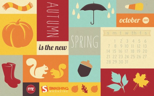
Autumn Is The New Spring

“Who says Autumn isn’t fun? It’s the new Spring, after all!” Designed by Marina Zhukov from USA.

Desktop Wallpaper - October 2012

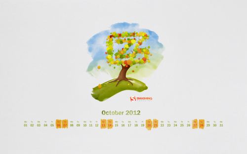
Watercolor Autumn

“There is nothing like being surrounded by beautiful, fiery, natural art for 2.5 months every year. This piece was inspired by the Falls I remember back in my New England hometown.” Designed by Rachel Ladew from USA.

Desktop Wallpaper - October 2012

Sweet October

“I love eating candy corn in the Fall time. Especially around Halloween. It just makes me think of Fall.” Designed by Lindsay Ebner from USA.

Desktop Wallpaper - October 2012

Departing Monsoon Clouds

Designed by Paarva Creations from India.

Desktop Wallpaper - October 2012

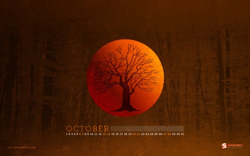
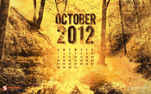
Fallen Woods

Designed by Dan Ioanitescu from Canada.

Desktop Wallpaper - October 2012

Will Miss You On This Halloween

“It’s the Halloween tonight… Jack-o-lanterns and spooky ghosts are coming to fight the haunted house, witches all alive again! But this time don’t miss your friends. It’s time to scare the family, pals and mates with ghosts! Wish you a happy Halloween night again and again.” Designed by Debobrata Debnath from India.

Desktop Wallpaper - October 2012

Autumn Squirrels

Designed by Jenny Hurman (Evoluted New Media) from United Kingdom.

Desktop Wallpaper - October 2012

Autumn Leaves

“Altering tints bringing belief.” Designed by Lubos Volovar from Slovakia.

Desktop Wallpaper - October 2012

Halloween

Designed by Cheloveche.ru from Russia.

Desktop Wallpaper - October 2012

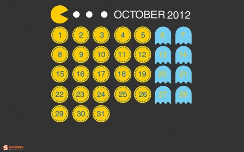
Pac Man

“A tribute to the iconic video game, Pac Man.” Designed by Simona Gosu from Romania.

Desktop Wallpaper - October 2012

Stinging Nettle

“Stinging nettle in front of Vienna.” Designed by Kai Szendi from Austria.

Desktop Wallpaper - October 2012

Halloween

Designed by Katerina Bobkova from Ukraine.

Desktop Wallpaper - October 2012

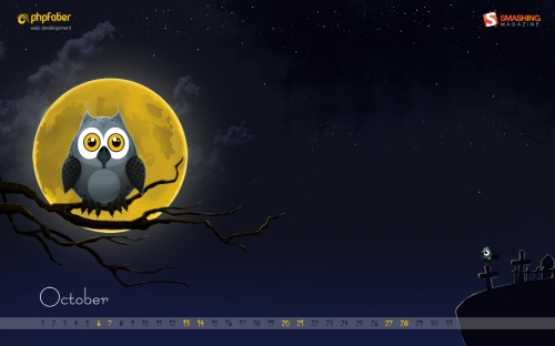
Halloween Moon

“A simple Halloween wallpaper for October.” Designed by Andy Murphy from Northern Ireland.

Desktop Wallpaper - October 2012

Dream Of Autumn

“Graphics and hand-drawing picture a cat.” Designed by Irina.

Desktop Wallpaper - October 2012

Say “Bye” To Summer

“And hello to Autumn! The Summer heat and high season is over. It’s time to pack our backpacks and head for the mountains — there are many treasures waiting to be discovered!” Designed by Agnes Sobon from Poland.

Desktop Wallpaper - October 2012

Sweet Halloween

Designed by Cortando Pixeles from Argentina.

Desktop Wallpaper - October 2012

Delusional

Designed by Andrei R. Terbea from Romania.

Desktop Wallpaper - October 2012

Cheerful Autumn Days

“This photo was taken in an English garden in Prague. It was a beautiful Autumn day. I was walking in the park and suddemnly saw leaves, cones and other nature objects on the bench. What I saw inspired me to shoot this image. At first I created this photo, and then I photographed still life at sunset.” Designed by Larina Yevgeniya from Ukraine.

Desktop Wallpaper - October 2012

Blue October

Designed by Elise Vanoorbeek from Belgium.

Desktop Wallpaper - October 2012

Whoops

“A vector illustration of a dragon tipping over a wheelbarrow of pumpkins in a field with an illustrative fox character.” Designed by Cerberus Creative from USA.

Desktop Wallpaper - October 2012

Autumn Chillout

“It’s Autumn — chill out and prepare yourselves for the Winter.” Designed by Lasuperbaa from Poland.

Desktop Wallpaper - October 2012

Autumn Red

“The colors of autumn captured in New Zealand.” Designed by Ashley Hau from Singapore / Malaysia.

Desktop Wallpaper - October 2012

Creepy October

Designed by Christina Mokry from Germany.

Desktop Wallpaper - October 2012

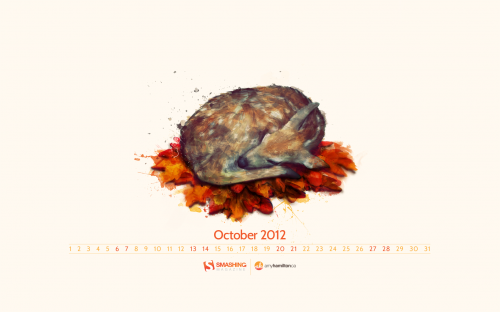
Autumn Deer

Designed by Amy Hamilton from Canada.

Desktop Wallpaper - October 2012

Zfort Autumn

“When nature prepares to rest, it brings very beautiful transformations – immense inspiration resource. That’s how Zfort is inspired by Autumn.” Designed by Zfort Group from Ukraine.

Desktop Wallpaper - October 2012

Scent Of Autumn

“After october’s rain you want to go to the backyard, wrap yourself in a blanket and feel the scent of Autumn.” Designed by Sotnikova Antonina from Ukraine.

Desktop Wallpaper - October 2012

Rose

“October in Poland was always nostalgic. I also love to draw things with a pencil, ink and stuff and then colorize and manipulate it in an image editing application. So I’ve mixed nostalgy and my skills and here it is!” Designed by Kanze from Poland.

Desktop Wallpaper - October 2012

Spooky Forest

Designed by Colin Whitehurst from USA.

Desktop Wallpaper - October 2012

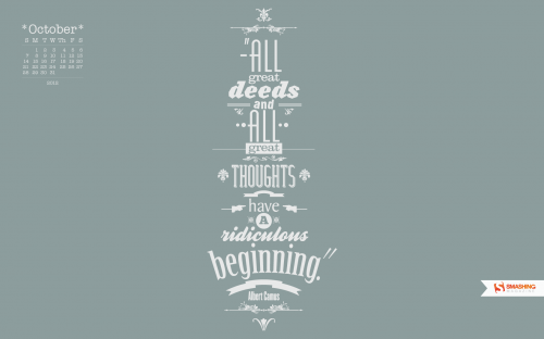
October Quotes

Designed by Jonathan Guillou from France/Canada.

Desktop Wallpaper - October 2012

Superman Goes Halloween

“Superman, chubby bee, and pink rabbit, hit the streets for their first Halloweeen!” Designed by Sean Bobbato from Canada.

Desktop Wallpaper - October 2012

Eat, Drink And Be Scary

“This calendar is a play on the olds saying, ‘eat, drink, and be merry.’ I am a huge fan of clean, minimal design. As my college design teacher would say, “give me exactly what I want, no more, no less, do it well, get the A, and let’s move on.” Designed by Brandon Barringer from USA.

Desktop Wallpaper - October 2012

Fancy Sugar Skull

“Day of the Dead fanciness inspired by a make-up and rock and roll.” Designed by Barbra Ignatiev from USA.

Desktop Wallpaper - October 2012

Weird Season

Designed by Ryan Thompson from USА.

Desktop Wallpaper - October 2012

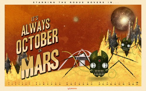
Roger That Rogue Rover

“The story is a mash-up of retro science fiction and zombie infection. What would happen if a Mars rover came into contact with an unknown Martian material and got infected with a virus? What if it reversed its intended purpose of research and exploration? Instead choosing a life of chaos and evil. What if they all ran rogue on Mars? Would humans ever dare to voyage to the red planet?” Designed by Frank Candamil from USA.

Desktop Wallpaper - October 2012

Join In Next Month!

Please note that we respect and carefully consider the ideas and motivation behind each and every artist’s work. This is why we give all artists the full freedom to explore their creativity and express emotions and experience throughout their works. This is also why the themes of the wallpapers weren’t anyhow influenced by us, but rather designed from scratch by the artists themselves.

A big thank you to all designers for their participation. Join in next month!

What’s Your Favorite?

What’s your favorite theme or wallpaper for this month? Please let us know in the comment section below.

Stay creative and keep on smashing!

(vf)


© Smashing Editorial for Smashing Magazine, 2012.


  •   
  • Copyright © 1996-2010 BlogmyQuery - BMQ. All rights reserved.
    iDream theme by Templates Next | Powered by WordPress