Author Archive

Limited-Edition Posters Giveaway: Comment And Win!


Yesterday we described who we are, and today it’s your turn to tell us your story. Looking back at where we’ve come from and where we are today, we see that one principle has not changed a bit over the years, and it is one of the core elements of our work: that is, we’ll go as far as it takes to deliver value and substance to you, our dear reader.

Smashing Cat has already got into the party mood.
We’re celebrating our sixth anniversary. Apparently, the Smashing Cat has already got into the party mood.

We measure success not by traffic and not by the number of advertising spots sold, but by the amount of value an article provides you with. And to measure that, we quantify the attention an article receives and the overall feedback it gets in comments, blog posts and social channels. We listen to you, and we listen carefully. Our team reads through each and every email and tweet sent to us, and we also double-check comments that get marked as “spam� and approve the legitimate ones. Every meaningful comment contributes to the discussion and helps us further improve the quality of our content. And that’s a huge deal for us.

Leave A Comment!

But with such rigorous standards and high expectations, failing is very easy. Therefore, it’s crucial for us to learn how Smashing Magazine has helped you over the years, what you like and dislike and what you’d like to be different in future.

And since the greatness of a birthday party depends on how much the guests are into it, we kindly ask you to share your feedback, thoughts and ideas in the comments section. Where do you live? How well recognized is Smashing Magazine in your area and among the people you know? How has Smashing Magazine helped you in your career? What has been the most memorable article for you? Which author drives you nuts most often? What do you miss in Smashing Magazine? Whether you feel like replying to all of these questions or just to one, we are genuinely interested in hearing what’s on your mind, and we look forward to reading your answers:

The Prizes

Among all the commenters, we’ll raffle 30 sets of exclusive poster prints. Each set contains six prints of some of the best entries from our “Redesign the Web, Redesign the World� poster competition. The prints are limited editions and were printed especially for this giveaway. They would definitely look nice on your office or studio wall!

Redesign The Web - Redesign The World Poster Prints
Some of the best entries in the “Redesign the Web, Redesign the World� poster competition.

The Anniversary Schedule

As promised, we have prepared limited-edition prizes and special Smashing Book discounts. Please keep in mind that the event only runs for a limited time span (starting at midnight CET).

September 7 (Friday, tomorrow): 30% anniversary discount for printed books
Our print books are our editorial flagships. Well-respected experts in the industry contribute to our Smashing Books, delivering best practices and innovative techniques to the community. If you don’t have one yet, you should definitely not let this special pass you by. Get a 30% anniversary discount on all printed Smashing books for 48 hours, e.g.

This is a chance to add to your reference library or to surprise a colleague or your department with a great set of Smashing Books.

30% on all printed books

Special eBook Discounts

Be sure to keep up to date via the Smashing Newsletter as well.

We sincerely appreciate your time and support, and we look very much forward to your feedback!

(al) (il)


© Smashing Editorial for Smashing Magazine, 2012.


Desktop Wallpaper Calendar: September 2012


We always try our best to challenge your artistic abilities and produce some interesting, beautiful and creative artwork. And as designers we usually turn to different sources of inspiration. As a matter of fact, we’ve discovered the best one—desktop wallpapers that are a little more distinctive than the usual crowd. This creativity mission has been going on for over four years now, and we are very thankful to all designers who have contributed and are still diligently contributing each month.

We continue to nourish you with a monthly spoon of inspiration. This post features free desktop wallpapers created by artists across the globe for September 2012. Both versions with a calendar and without a calendar can be downloaded for free. It’s time to freshen up your wallpaper!

Please note that:

  • All images can be clicked on and lead to the preview of the wallpaper,
  • You can feature your work in our magazine by taking part in our Desktop Wallpaper Calendar series. We are regularly looking for creative designers and artists to be featured on Smashing Magazine. Are you one of them?

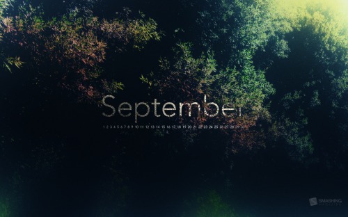
Autumn Invaders

"Invaders of autumn are already here. Make sure you are well prepared!" Designed by German Ljutaev from Ukraine.

Smashing Desktop Wallpaper - September 2012

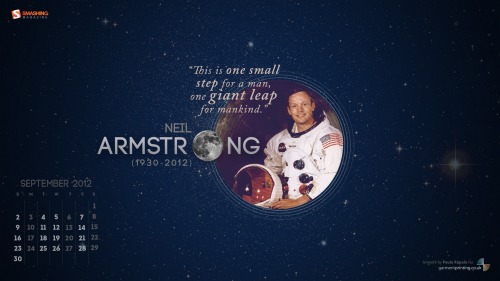
Man On The Moon

"A tribute to Neil Armstrong (1930-2012), the first man to ever walk on the moon." Designed by Paula Rupolo For Garment Printing from United Kingdom.

Smashing Desktop Wallpaper - September 2012

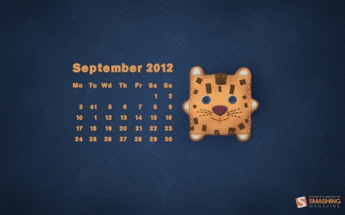
September Calendar

Designed by Vlad Gerasimov from Russia.

Smashing Desktop Wallpaper - September 2012

Photo Manipulation

Designed by Joana Machado from Portugal.

Smashing Desktop Wallpaper - September 2012

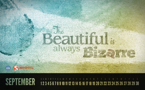
Beautiful & Bizarre

"The Beautiful is always Bizarre – a quote by Ralph Waldo Emerson." Designed by Roland Szabo from Hungary.

Smashing Desktop Wallpaper - September 2012

Colorful Trees

Designed by Blazoon.

Smashing Desktop Wallpaper - September 2012

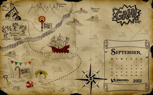
Back To School Me Hearties

"19th September is ‘International Talk Like a Pirate Day’ and September is the month our children go back to school after the summer holidays here in the UK. We have combined these two things to bring you the ‘Back to School me Hearties’ desktop wallpaper calendar. We hope you enjoy exploring the wonders of Holiday Island and manage to escape the waiting terrors at School Island! Perhaps you would rather walk the plank and face the shark infested waters than return to School Island?" Designed by Donna Hall and Loren Grosvenor from United Kingdom.

Smashing Desktop Wallpaper - September 2012

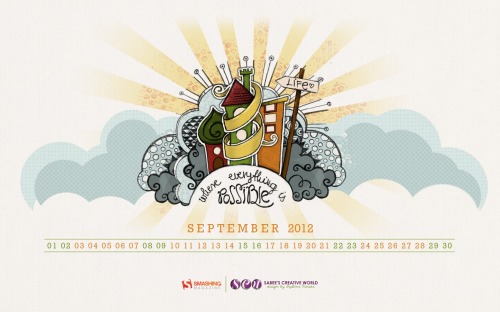
Life

"This drawing was done first as a pencil sketch, then traced and colored in Photoshop." Designed by Szabina Korsos from Hungary.

Smashing Desktop Wallpaper - September 2012

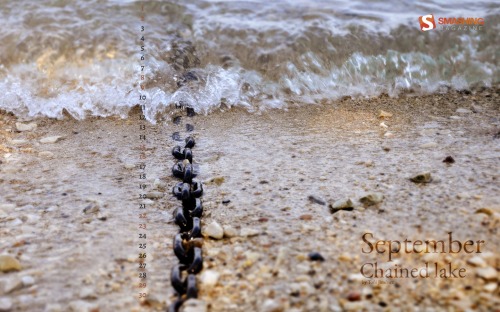
Chained Lake

"Chain in a lake (Garda, Italy)." Designed by Toci Jimenez from Spain.

Smashing Desktop Wallpaper - September 2012

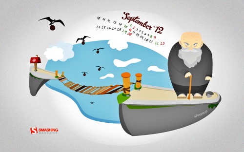
Deadline Bridge

"He who would cross the Deadline Bridge
Must answer me,
These questions three
Ere the other side he see.
— Wallpaper is based on the film “Monty Python and the Holy Grail”." Designed by Patrycjusz Brzezinski For 4people.pl from Poland.

Smashing Desktop Wallpaper - September 2012

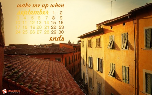
Autumn Memories

"September shares with us the end of summer. Autumn is coming, all around is full of orange shades, a perfect weather to relax, to admire the infinite world from your window." Designed by Simona Gosu from Romania.

Smashing Desktop Wallpaper - September 2012

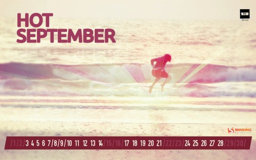
Hot September

"Summer’s heat is too exhausting. Let us just rest for a little while." Designed by Zis | Inbal Zissu from Israel.

Smashing Desktop Wallpaper - September 2012

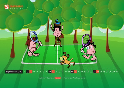
Frederique In September

"Frederique is a satiric comic strip about hanging around at beaches, getting rejected by hot chicks and enjoying life with full blown optimism." Designed by Richard Dancsi from Hungary/Germany.

Smashing Desktop Wallpaper - September 2012

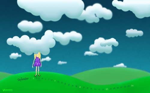
Head In The Clouds

"Keep your head in the clouds and your feet on the ground." Designed by Kari Andresen from USA.

Smashing Desktop Wallpaper - September 2012

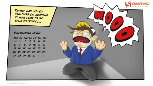
Back To School

"A simple illustration capturing the emotions of going back to school." Designed by Mark Mcgall from Northern Ireland.

Smashing Desktop Wallpaper - September 2012

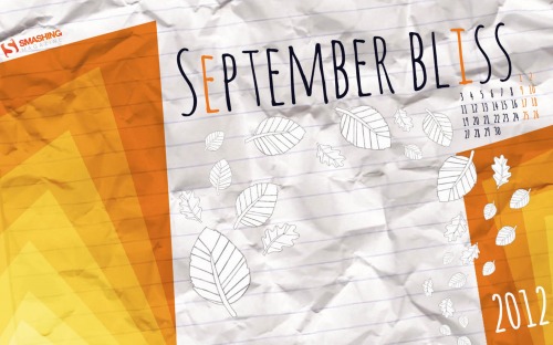
September Bliss

"This wallpaper represents both the early autumn (with orange colors) and back to school (with paper texture in the background)." Designed by Elise Vanoorbeek from Belgium.

Smashing Desktop Wallpaper - September 2012

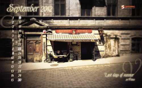
Last Days Of Summer

"Summer is saying goodbye to one of Vilnius’ streets." Designed by Karolina Przesmycka from Poland.

Smashing Desktop Wallpaper - September 2012

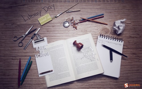
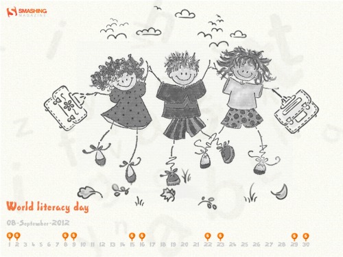
World Literacy Day

Designed by Cheriyan Manalel from India.

Smashing Desktop Wallpaper - September 2012

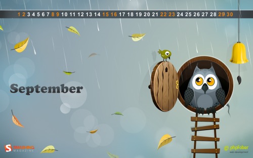
Autumn Owl

Designed by Katerina Bobkova from Ukraine.

Smashing Desktop Wallpaper - September 2012

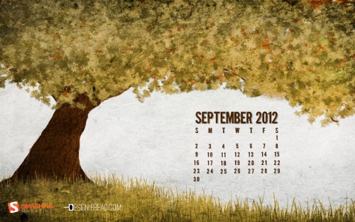
Early Fall

Designed by Colin Whitehurst from USA.

Smashing Desktop Wallpaper - September 2012

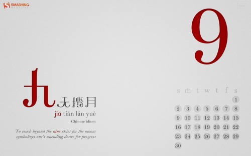
Nine

"I’m always interested in bridging language and cultures with design. In this wallpaper, I introduce a Chinese idiom with the word ‘Nine’ (in red, pronounced Jiu) – corresponding to September, which is the ninth month of the year. What’s different here is that I’ve constructed my own Chinese words instead of using Chinese fonts – I’ve broken up, joined and bridged glyphs from the Didot font and formed these words – so it’s actually a very visual, design-oriented approach to bridging languages. Hopefully if time permits, I’ll complete the set and do one design for each month, each with a different Chinese idiom containing the number of the month." Designed by Teo Yu Siang from Singapore.

Smashing Desktop Wallpaper - September 2012

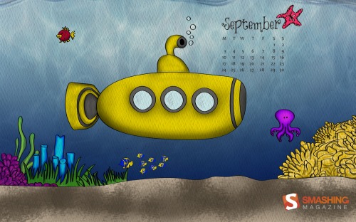
Under The Sea

Designed by Ana Henao from Colombian in Spain.

Smashing Desktop Wallpaper - September 2012

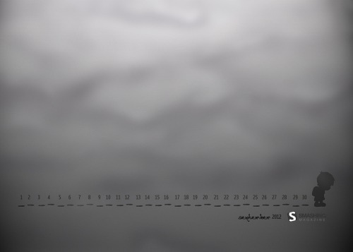
Traces

"A little boy is going to school. His foot traces are as sad as he is." Designed by Mypoint from Poland.

Smashing Desktop Wallpaper - September 2012

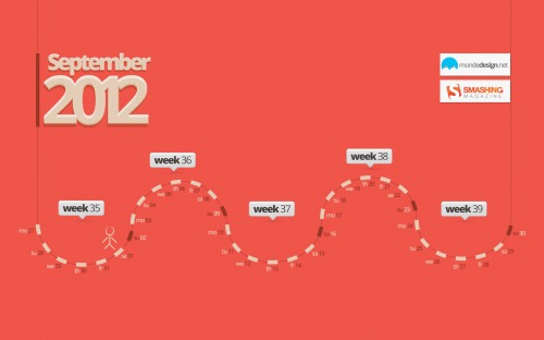
September Map

"Map for the month." Designed by Sherif Saleh from France.

Smashing Desktop Wallpaper - September 2012

Join In Next Month!

Please note that we respect and carefully consider the ideas and motivation behind each and every artist’s work. This is why we give all artists the full freedom to explore their creativity and express emotions and experience throughout their works. This is also why the themes of the wallpapers weren’t anyhow influenced by us, but rather designed from scratch by the artists themselves.

A big thank you to all designers for their participation. Join in next month!

What’s Your Favorite?

What’s your favorite theme or wallpaper for this month? Please let us know in the comment section below.

Stay creative and keep on smashing!

(vf)


© Smashing Editorial for Smashing Magazine, 2012.


Useful Print And Online Magazines For Web Designers // Recommended Reading


One of the advantages of working in a creative industry is the number of designers and developers who take their craft seriously. The design community shines in one regard in particular: the design community seems to be less willing to hoard knowledge and skills. Instead, we present them, elaborate on them and keep improving on each other’s techniques — among other media — magazines and books.

In this overview of useful magazines you’ll find everything from purely online publications to monthly, glossy print editions, where all subjects relevant to art and design are being investigated in colorful, eloquent detail.

Print And Digital Indie Publications

The Manual
Three beautiful A5 handcrafted hardback books-magazines a year, each one with a bit over 100 pages. The Manual delivers intelligent and critical thinking, and voices on the “Why?” of Web design, taking the reader to a deeper and richer level of work. Published by Andy McMillan, edited by Carolyn Wood, and designed by Jez Burrows, you can get it for 25$.

CODEX, The Journal of Typography
An infrequent 164 page magazine with feature articles, book and typeface reviews, interviews, type history, essays and type design — from typography experts. The first issue was released in spring of 2011, the second one is coming out in summer of 2012. The Codex magazine is only available in print and PDF version (8$).

Offscreen Mag: The People Behind Bits & Pixels
Offscreen is a high-quality print magazine created, edited, designed and published by Kai Brach, issued three to four times a year, and available online for 17,90$. With each issue built around six lengthy interviews, it explores the off-screen life and work of people who create websites and apps, and tells their stories of creativity, passion and hard work.

Offscreen Magazine

TYPO
A magazine dedicated to visual communication, graphic design and typography. It is aimed at both professionals and beginners in typography, font design, graphic design and education, as well as marketing and visual communication specialists. The magazine is published quarterly. All 34 issues between 2003 and 2008 are also available in PDF.

8Faces
“If you could only use eight typefaces for the rest of your life, which would you choose?” This is the core question of 8faces, which — amongst many others — is asked to leading designers from the fields of Web design, print design, illustration and type design. With each issue (printed on heavy stock and pressed at just 2000 limited editions), this is definitely a collector’s item, and only 19£. Designed and edited by Elliot Jay Stocks, 8faces is also available as a PDF.

8faces
8faces
Image credit: Typetoken.

Distance
A quarterly journal about design and technology. Each issue contains three well-researched essays with opinions from day-to-day practitioners who speak out on contentious issues. Distance comes in both digital and print formats (digital 5$, print 15$), the digital bundles contain ePub, Kindle, and PDF editions.

Distance - 2nd Issue
Image credit: Brent Knepper.

Process Journal
The Melbourne-based quarterly publication Process Journal exhibits designers and their work on 96 pages (at a format slightly larger than A4). These high-quality prints (25$) and their congruent iPad app are dedicated to the artistry of design.

Process Journal

Ferocious Quarterly
A printed publication (with a handy size of around A5) featuring illustrators, graphic artists, short fiction authors and written text. Ferocious Quarterly calls itself an ongoing exercise in curation and collaboration, and has been released yearly since its first edition in 2010 (12$).


Ammo Magazine
The independent, UK-based Ammo Magazine is dedicated to illustrations and their creators. This cute little A6 Landscape publication (with thick 160 g pages) displays it feature illustrations in full color on 64 pages and for the cute price of 5£. Best of all, the editors refuse to let editions go out of print. Find it in their shop, in print format only.

Ammo Magazine

IN GRAPHICS
In Graphics is a printed magazine from Berlin that features only infographics. It’s released twice a year, and bilingually in German and English and available on Amazon for 14,90€. Its 96 pages cover challenging topics from politics and economics to architecture, TV shows, culture, entertainment and the environment — very interesting and fascinating content for visual people who have a love for details.

Plog
An autonomous publication designed and cared for by students and dedicated to showcasing student and graduate artwork (both on and offline). Plog is issued four times a year, in print, and with a limited run of 1000 issues. It can be ordered online (or purchased in many leading stores and universities around the UK) for 3£.


Image credit: Booooooom.com.

Collect
This Australian Adelaide-based magazine talks about design, culture and lifestyle around the world — all in a small-world context. Collect is about people, “neighborhoods” and a revival of quality print media. This 64 pages print-only publication comes out every two months for 5$.

Collect Magazine

IdN Magazine
A publication for creative people which wants to be exactly what its initials declare: an International designers’ Network. The magazine features creative designs, works, projects and events from around the globe. Each issue is sold world-wide (17,50$), published bimonthly, available in English and Chinese, and connected with feeds such as iTunes Podcasts and Video. Each issue comes with a DVD, which presents a theme-based, visual compilation of IdN magazine.

Hacker Monthly
The print magazine version of Hacker News features the top-voted articles from it’s mother-website, ranging from coffee guides to design and coding philosophy — anything goes. Available in glossy print (9$) and various digital formats (3$) (PDF, MOBI, EPUB) this magazine is often gorgeously illustrated, curated by Lim Cheng Soon.

Hacker Monthly

Colors
A fair-minded magazine that celebrates cultural diversity and deals with current social issues through an abundance of photography and unambiguous text. With its single-subject publications, Colors explores each theme with creative virtuosity on non-glossy, recycled pages. The monthly publication is available in print in most book stores or via an iPad app.

Colors Magazine

Online Publications

Think Quarterly
Google’s Think Quarterly looks like an online magazine (but Google calls it a book on its website). The articles are in-depth insights and outlooks on the digital future from visionaries, heads of industry, innovators and experts. It’s issued about three times per year, and with a very good look: clean lines and minimalism mixed with colorful art and images.

Dmig
This online-only publication presents the works of Germany’s best designers and firms. Even though it requires fluency in the German language, the content of this magazine is varied with serious journalism, and is well worth browsing if you can read the language. The content ranges from design industry facts and news to interviews — of which there are many — focused around one main theme in every issue.

Dmig

Appliness
Appliness is a digital magazine edited by passionate developers for passionate developers. Available on iPad and Android tablets, and funded by Adobe.

Appliness

TGD
The Great Discontent is a journal for artists, by artists, and about artists. This online publication concentrates on interviews focusing on subjects that are close to the community’s heart — creativity, risk and connections. This illustrated journal churns out a new interview every Tuesday.

TGD

Method & Craft
This small magazine focuses on the “making-ofsâ€� within the design industry. Their contributions take on an educational aspect when they discuss the techniques or motivations behind design pieces in different formats — articles, interviews, videos and notes. Available only on the website, this journal continuously publishes new and interesting content.

Method & Craft

Contents
Contents is an online magazine about content strategy, online publishing and new-school editorial work. It’s aimed at everyone who creates, edits, publishes, analyzes or cares for internet content. The issues run six to eight weeks, and each one has a set of annotations that links to thematically related work.

Contents

.net magazine
.net magazine is one of the most respected online magazines for Web designers and developers. The articles feature general news in the industry, tutorials, interviews as well as practical tips and techniques for everybody who is designing or building websites. A (beautifully designed) print edition of the magazine is available as well.

.net magazine

GOOD Magazine
GOOD is a very well-done online magazine, a collaboration of individuals, businesses, and non-profits who — besides doing many other great things — have made this magazine “for people who give a damn”, and care about what is sustainable, prosperous, productive and creative.

GOOD magazine

TXP Magazine
TXP Magazine is the mouthpiece and discussion center to the world the good ol’ Textpattern project. With two issues already published and one issue every two to three month planed, this publication aims at providing the best publishing system conceived, discusses topics with the community and features expert in the field. However, TXP also features topics that aren’t directly related to Textpattern, so even if you aren’t using the CMS, you might want to check the magazine as well.

TXP Magazine

Form And Future
This magazine’s tag line says it all; “A Journal for New Designers”. This small online publication specializes on featuring interviews with accomplished designer. Their goal is to allay fears of beginners and help them stay the course. This very young publication releases several interviews per month.

Further Resources

Magpile
Magpile is a Web community for magazine lovers. In it you can browse through your friends’ lists of publications, show off your own stockpile of magazines and put together a wish list of issues you’ve been craving to read. With it’s growing wiki-like database of publications. Magpile represents one of the most comprehensive archives of Magazine titles.

Magpile

No Layout
No Layout is a no-frills digital library for independent art and fashion publishers. Freely accessible from any platform, all featured magazines are all only readable online. It is meant as a promotional and archive tool for any topic-related media.

No Layout

Mag Is In
This dynamic Italian project is an archive as well as a prophet of contemporary independent magazines. They are dedicated to spreading consciousness about the excellence of current magazines. The creators are planing to complement their online presence with an exhibition to introduce indie magazines to non-expert audiences.

Mag Is In

Counter-Print
Counter-Print is committed to promoting art and design related products. While this is not a free website, they sell all sorts of educational materials that a designer might need. From posters to vintage books, their large selection caters to designers’ specialized requirements. All of their materials are in print formats.

What Publications Do You Read?

What print and online publications would you recommend and why? An important magazine is missing? Share your tips and pointers with the community by leaving the comments below!

(fi) (jc) (ea) (vf)


© Smashing Editorial for Smashing Magazine, 2012.


Poster Design Contest “Redesign The Web”: The Best Entries


Yes, it’s time to announce the winners! A couple of weeks ago we had announced the “Redesign The Web” Poster Design Contest that encouraged you to design a thought-provoking poster. We wanted to encourage everyone to actively get involved in making the Web a more accessible and usable place today.

Among the entries, many have picked up the idea of the globe. We received clean and minimalistic designs, complex artworks, illustrations, inspirational quotes and call-ups, as well as a comic strip. One participant even produced a poster using only HTML5 and CSS3 (including the bleed and trim marks inside the print style sheet).

We’d like to sincerely thank all the contributors who had taken on this challenge and had sent us their work! Overall, we’ve received over 150 entries, and in a thorough review process, selected 35 of the best entries (which are now presented in the article below). And trust us—it was no piece of cake to choose the best from many excellent poster submissions. Of course, the owner of each poster owns all the copyrights for their artwork.

Winners

Rafal Tomal — Redesign The Web

Redesign the Web Poster

Hugo Tobío — Boiled Web

Redesign the Web Poster

Danae Botha — Limit is the Sky

“I believe true simplicity is achieved through regressing to a child-like state. It’s about seeing what is really there, as well as all the possibilities available. Deriving joy from the uncomplicated, and rejecting the clutter.”

Redesign the Web Poster

Bonzzu — Webworld

“Redesign the Web one pixel at at time; redesign the world one individual at a time. The gap between digital and analog is disappearing fast and we have the power to change the world for the better.”

Redesign the Web Poster

Radomir “Wingerie” Kupfer — Redesign the Web

“It’s simple, but everyone who’s connected to Web development will surely understand the message.”

Redesign the Web Poster

Congratulations to all the winners of the contest! You should have been contacted already. We sincerely appreciate your time and support!

Below, you’ll find more selected entries submitted by our dear readers across the world for the “Redesign The Web, Redesign The World” contest.

Selected Entries

Kimberly Passmore — Rhythmatical

Redesign the Web Poster

Jacob Greif — Redesign The Web

Redesign the Web Poster

Maren Katelaan — Redesign The Web II

Redesign the Web Poster

Gautam Bambolkar — Evolution

“We have been evolving right from the day life on Earth began. It’s the human urge to think, ideate, innovate, change, and think again. Initially, we travelled in person to communicate, to share. Then came the revolutionary Web, wherein we achieved virtual communication. Desktops, PCs came into action. Communication changed, people moved, the Earth reshaped. Now we are inside the world of mobiles and tablets; a wireless world indeed! The world is constantly shaping into a new form. Hence, we, the Web transformers, ought to change the way we say things. The need is to redesign the Web, and the world!”

Redesign the Web Poster

Mark Dewdney — Redesign The Web

Redesign the Web Poster

Melda Wibawa — Redesign The Web, Redesign The World

“The Web is like a virtual city, with its streetscapes and furniture. HTML 5, CSS 3, Social Media, etc. form the ‘WEB’ city. This city has to be well organized and designed in order to function well. By redesigning the city we can achieve a better organized world.

REDESIGN THE WEB, REDESIGN THE WORLD.”

Redesign the Web Poster

Vidhi Mehta — Redesign The Web, Redesign The World

“My concept behind this design is a ‘tree’ to redesign the Web, redesign the world. Redesigning of the Web involves using greener technologies by working collectively to use elements that will be less hazardous to the environment. If accomplishing this, then I truly believe we have redesigned the ‘world’ by redesigning the Web.

The tree denotes collective working, growth in terms of better design, and that we are all connected to the same root, indicating that we redesign the Web (and hence the world, together). I have modified the red dot in your typography with a green leaf saying “lets begin” to mark the enthusiasm of redesigning the Web.”

Redesign the Web Poster

Maren Katelaan — Redesign The Web

Redesign the Web Poster

Teo Yu Siang — Join the Revolution

“This poster design—titled Join the Revolution—is inspired by Maoist ‘Red Revolution’ propaganda posters, hence the very texture-rich and grungy, old-world feel. It’s designed to feel distinctly oriental and reek of imperialism—meant to instill a sense of higher purpose and exhilaration in the Web revolution. At the center of the poster, there’s this giant symbol that represents the revolution to redesign the Web and the world—kind of like how the star represents communism. The triangle stands for delta, the mathematical symbol of change, while the globe represents the Web (and the world). Together they form a symbol of change and hope for a better Web—and thus, a better world.”

Redesign the Web Poster

Alexander Katin — Keep Calm Redesign the Web

“I’ve come up with a no-brainer idea—it’s not original, beautiful or unique; the whole thing is just a tribute to the famous British wartime poster.”

Redesign the Web Poster

Johannes Ippen — Redesign the World

“Instead of designing it in a classic DTP tool, I tried to utilize HTML and CSS. I wanted to create a beautiful layout, and export it with a print style sheet into a print-ready PDF file (including generated bleed & trim marks).

It’s more of an experiment to see if HTML and CSS are already usable for the production of complex editorial/poster designs.”

Redesign the Web Poster

Marko Srdoc — HTML Globe

“Here is my modest design contribution to your Web poster contest.”

Redesign the Web Poster

Courtney Starr — Web Wide World

Redesign the Web Poster

Kevin Riedy — Redesign the Web World

“Yep—that’s Arial, Baby!!

Curious, after it’s all over, how many went with this paradigm.”

Redesign the Web Poster

Chris Zappala—Redesign The Web

Redesign the Web Poster

Mecury Brand Mission — W

Redesign the Web Poster

Ian Caie — Flash

Redesign the Web Poster
Posters available in: download in A3 size (PDF), download in A4 size (PDF)

Anita Mercy—The Masked Coders

Redesign the Web Poster

Jin Wook — Click Click Done

Redesign the Web Poster

Grzegorz Norberciak—Webld

Redesign the Web Poster

Ian Caie — Mouse

Redesign the Web Poster

Jose Luis Elizalde — Redesign The Web

Redesign the Web Poster

Lourdes Irizarry — Redesign The World

“To help redesign the world I created a “Webtopia” App, where form and function unite. Using vibrant shapes as basic building blocks, I organized the town into an infographic-style pie chart, with equal parts technical and creative. The result is a clean, engaging, productive and functioning town. Influenced by travel and my favorite surroundings, I used both modern and traditional elements to create a well-balanced, multi-dimensional world.”

Redesign the Web Poster

Steven Quinn — Redesign the World

Redesign the Web Poster

Marcus Marritt — Designing for a Narrative

Redesign the Web Poster

Paul Johns — A Fresh Coat of Paint

“My concept for this design is a floating city that represents both the world and the Web. This golden city has been created atop the ashes of a crumbling old city. The gold city is a representation of good design, best practices, cross-browser and platform compatibility, and the implementation of Web standards. Gold is used to represent the highest caliber quality and value, and the orange hue is a nod to Smashing Magazine.

The crumbling city beneath represents sub-par design (outdated coding practices and incompatibility across browsers and platforms). The clouds in the background reflect the status of this Web/world, fading up from dark and polluted to airy and clean. The ‘good’ city is slowly melting downward, so eventually there will be nothing left of the original city. This represents the hopeful concept that thoughtful, well-planned design will overtake careless, poorly executed design. Once standards and good designs take over everything, the floating city (the world) will have been redesigned as well.

I think it’s important that the city represents both the world and the Web simultaneously, to show that they are intrinsically connected. The Web is the world’s way of communicating and interacting, so the more efficient the Web, the more efficient the world. The more beautiful the Web is, the more beautiful the world will be.”

Redesign the Web Poster

Sergio Nakamura — Huella

Redesign the Web Poster

Vinícius de Thomaz Domingues — Redesign The Web

Redesign the Web Poster

Yankale Hochman — The Web as a Butterfly

“The Web has been developing very fast. In a short time, we believe that development can be compared to a caterpillar (or silkworm) that has been transforming itself into a cocoon. But there is still one step more in the evolution: the step, where a complete Web becomes light, fast, functional and as attractive as a butterfly. This last step is in our hands. Let´s make it together.”

Redesign the Web Poster

Zachary VanDeHey — Leave Your Mark

“My idea is pretty simple, redesign the web redesign the world is all about leaving your mark. I’m a firm believer that great web design can create feelings and emotions. In the same way that music and literature can move people to change and take action so too can web designs. Take hold, reload, and leave your mark.”

Redesign the Web Poster

Inspirational Interpretations By Five Well-Respected Designers

By the start of the contest, we presented you striking and inspiring interpretations from five well-respected designers. For your convenience, these are now also available for download.

Nick La

Nick La interprets the Web as an earth-like eco-system. The Web is situated in an abstract, futuristic environment, with colors and elements that convey an almost mystical atmosphere. The interpretation has a visionary quality to it and shows a touch of Jules Verne. Have you noticed how Nick managed to have both dinosaurs and tweets in one artwork?

Redesign the Web Poster

Larissa Meek

Larissa Meek’s first poster concept is strongly geometric and bursts with color. “I wanted to capture the essence of what a more beautiful world would feel like based on the statement ‘Redesign the Web, Redesign the World,’” says Larissa. The result sure catches the eye.

Redesign the Web Poster

Larissa Meek’s second concept shows another interesting approach: visualizing the various elements that the Web currently consists of. The poster captures techniques such as CSS and HTML, workflow elements such as storytelling and also the daily realities of the professional designer (such as deadlines, coffee breaks and ideation). All elements are interconnected in a clever composition using just two main colors: red and orange.

Redesign the Web Poster

Simon C. Page

Simon C. Page is known for his abstract geometric styles. His poster design is made up of a variety of shapes and structures that are fundamental to the Web—the world being one of them.

Redesign the Web Poster

Ricardo Gimenes

Brazilian designer Ricardo Gimenes’ concept relies on Smashing Magazine’s familiar cartoon style and introduces what might be considered a <redesign> tag.

Redesign the Web Poster

Veerle Pieters

Veerle Pieters’ cover design for our Smashing Book 3 reflects the various elements that a redesign has to balance with the various building blocks of the Web. Read more about Veerle’s ideas behind the design and the process and read more about the printed Smashing Books 3 and 3⅓.

Design by Veerle Pieters

Be Sure To Join In Next Time!

Thanks to all who have participated in this contest. There will be more contests and goodies coming up soon, so be sure to stay tuned! And you might want to check out our previous contests as well.

Sincerely Yours,

 —  The Smashing Team

(jvb)


© Smashing Editorial for Smashing Magazine, 2012.


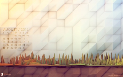
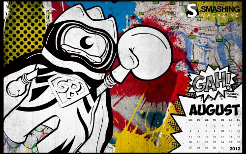
Desktop Wallpaper Calendar: August 2012


We always try our best to challenge your artistic abilities and produce some interesting, beautiful and creative artwork. And as designers we usually turn to different sources of inspiration. As a matter of fact, we’ve discovered the best one—desktop wallpapers that are a little more distinctive than the usual crowd. This creativity mission has been going on for over four years now, and we are very thankful to all designers who have contributed and are still diligently contributing each month.

We continue to nourish you with a monthly spoon of inspiration. This post features free desktop wallpapers created by artists across the globe for August 2012. Both versions with a calendar and without a calendar can be downloaded for free. It’s time to freshen up your wallpaper!

Please note that:

  • All images can be clicked on and lead to the preview of the wallpaper,
  • You can feature your work in our magazine by taking part in our Desktop Wallpaper Calendar series. We are regularly looking for creative designers and artists to be featured on Smashing Magazine. Are you one of them?

The Lady With Red Coat

Designed by Viktor Mazhlekov from Bulgaria.

Monthly Quality Desktop Wallpaper - August 2012

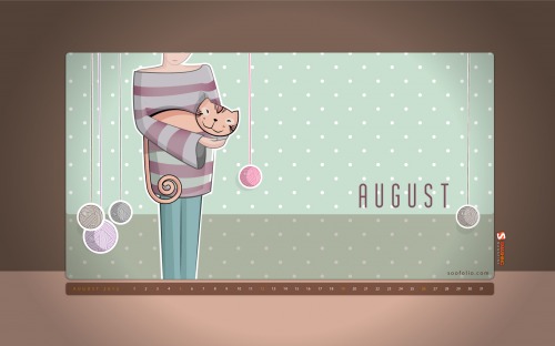
August Cat

Designed by Soodabeh Amirakbari from Iran.

Monthly Quality Desktop Wallpaper - August 2012

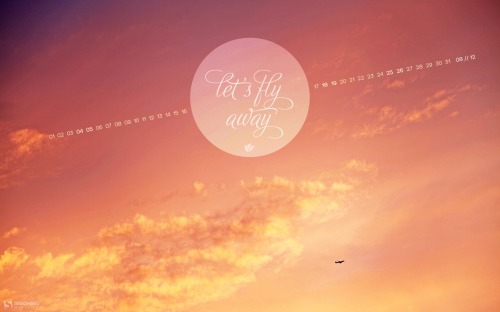
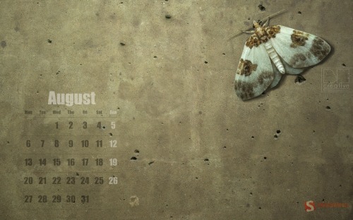
Fly

"Colors!!" Designed by Lotum from Germany.

Monthly Quality Desktop Wallpaper - August 2012

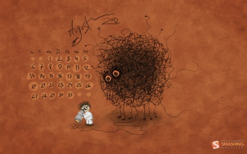
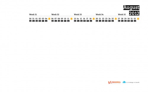
Searching for Higgs Boson

Designed by Vlad Gerasimov from Russia.

Monthly Quality Desktop Wallpaper - August 2012

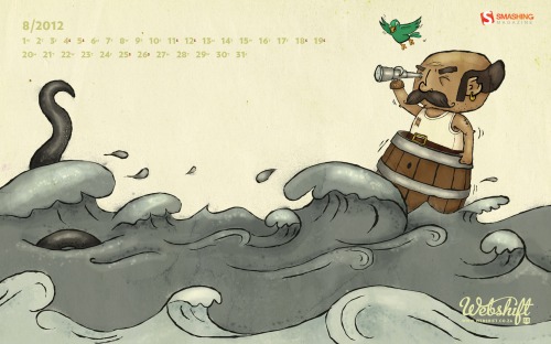
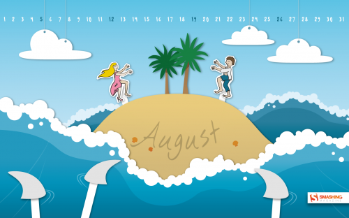
Ahoy

Designed by Webshift 2.0 from South Africa.

Monthly Quality Desktop Wallpaper - August 2012

Through Happy Shades

Designed by Mihai Fischer from Romania.

Monthly Quality Desktop Wallpaper - August 2012

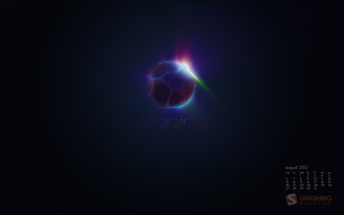
Colorstrike

Designed by AndrР№ Presser from Germany.

Monthly Quality Desktop Wallpaper - August 2012

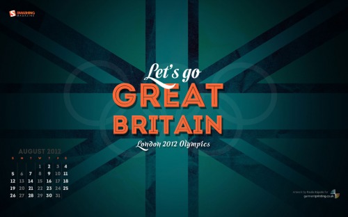
Let’s Go Great Britain

"”Let’s go Great Britain!” typographic wallpaper to cheer at the 2012 London Olympic games." Designed by Paula RГєpolo For Garment Printing from United Kingdom.

Monthly Quality Desktop Wallpaper - August 2012

Childhood Memories

Designed by Francesco Paratici from Australia.

Monthly Quality Desktop Wallpaper - August 2012

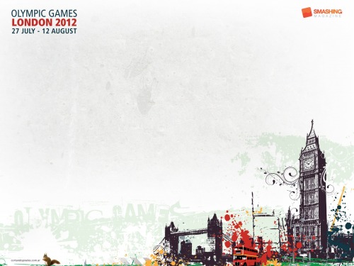
Olympic Games

Designed by Cortando Pixeles from Argentina.

Monthly Quality Desktop Wallpaper - August 2012

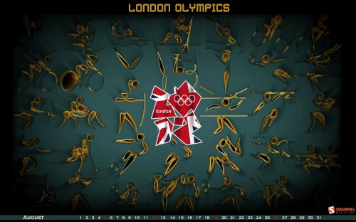
London Olympics

Designed by Meenal Jain from India.

Monthly Quality Desktop Wallpaper - August 2012

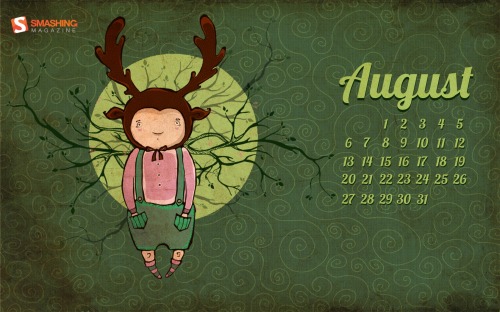
Deer Summer

Designed by Resko Elena from Russia.

Monthly Quality Desktop Wallpaper - August 2012

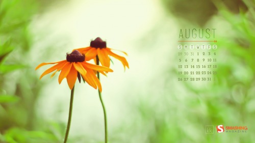
Late Summer

"Butter yellow daisies for the last of summer days!" Designed by Karen Keung from Canada.

Monthly Quality Desktop Wallpaper - August 2012

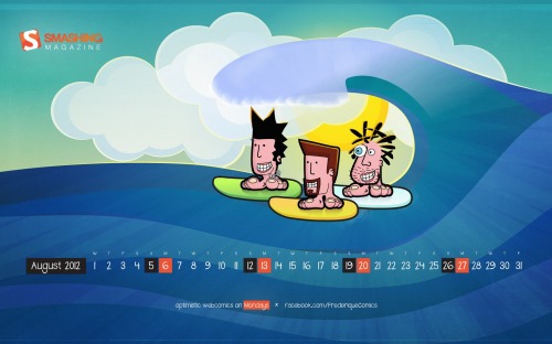
Frederique’s Summer

"Frederique is a satiric comic strip about hanging around at beaches, getting rejected by hot chicks and enjoying life with full blown optimism." Designed by Richard Dancsi from Hungary/Germany.

Monthly Quality Desktop Wallpaper - August 2012

Forest

"A trip into the woods. August 2012." Designed by Timothy J. Reynolds from USA.

Monthly Quality Desktop Wallpaper - August 2012

Team Gb

"August 2012 is here which means it is time for the Olympic Games! This calendar incorporates various aspects of London, the UK and the Olympics." Designed by Donna Hall And Loren Grosvenor from United Kingdom.

Monthly Quality Desktop Wallpaper - August 2012

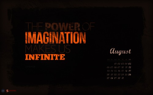
Infinite Imagination

"The Power of Imagination makes us Infinite." Designed by Roland Szabo from Hungary.

Monthly Quality Desktop Wallpaper - August 2012

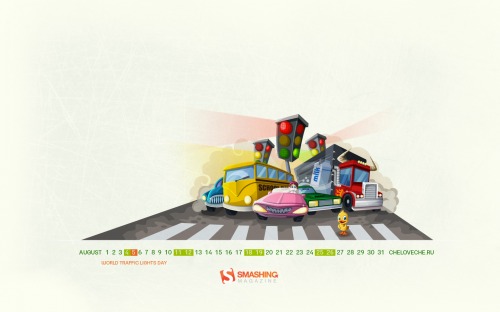
World Traffic Lights Day

Designed by Cheloveche.ru from Russia.

Monthly Quality Desktop Wallpaper - August 2012

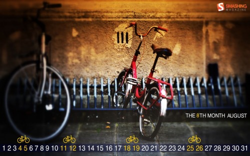
Cycling Holidays

"“Nothing compares with the simple pleasure of a bike ride.” – President John F. Kennedy." Designed by Simona Gosu from Romania.

Monthly Quality Desktop Wallpaper - August 2012

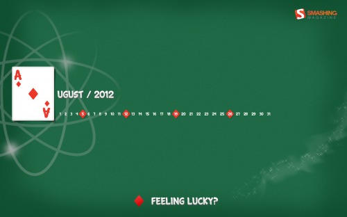
Lucky August

"Life is a game. Are you feeling lucky in August?" Designed by Marina-art from Russia.

Monthly Quality Desktop Wallpaper - August 2012

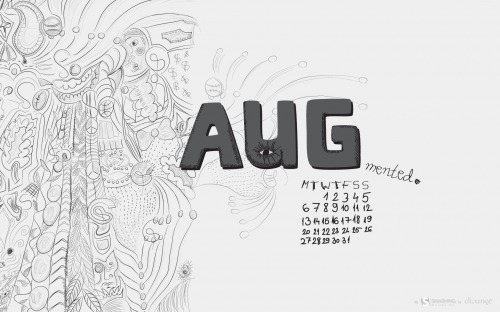
Augmented August

"In summer things may seem different then they really are. Which is not necessarily a bad thing." Designed by Sanja Vukasinovic from Serbia.

Monthly Quality Desktop Wallpaper - August 2012

Summertime

"It’s summertime so enjoy the weather!" Designed by Christina Mokry (allaci Gmbh) from Germany.

Monthly Quality Desktop Wallpaper - August 2012

Your Title Holed

Designed by Agata Maciљgowska from Poland.

Monthly Quality Desktop Wallpaper - August 2012

Summer Rain

Designed by Virginia Saint from USA.

Monthly Quality Desktop Wallpaper - August 2012

Responsive Wallpaper

"I was thinking to make the wallpaper as a responsive design, i’d add more interaction next month." Designed by Mondedesign.net from France.

Monthly Quality Desktop Wallpaper - August 2012

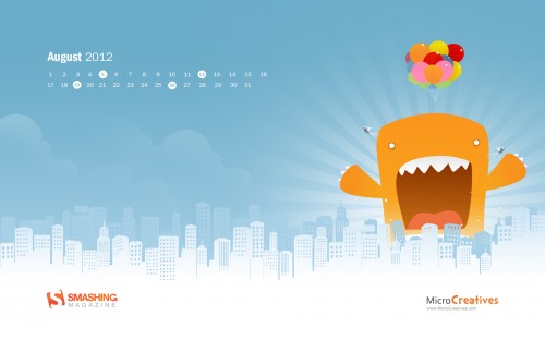
Monster Attack

Designed by MicroCreatives.

Monthly Quality Desktop Wallpaper - August 2012

Join In Next Month!

Please note that we respect and carefully consider the ideas and motivation behind each and every artist’s work. This is why we give all artists the full freedom to explore their creativity and express emotions and experience throughout their works. This is also why the themes of the wallpapers weren’t anyhow influenced by us, but rather designed from scratch by the artists themselves.

A big thank you to all designers for their participation. Join in next month!

What’s Your Favorite?

What’s your favorite theme or wallpaper for this month? Please let us know in the comment section below.

Stay creative and keep on smashing!

(vf)


© Smashing Editorial for Smashing Magazine, 2012.


  •   
  • Copyright © 1996-2010 BlogmyQuery - BMQ. All rights reserved.
    iDream theme by Templates Next | Powered by WordPress