Author Archive

New High-Quality Free Fonts


Every now and then, we look around, select fresh free high-quality fonts and present them to you in a brief overview. The choice out there is enormous, so the time you need to find them is usually time you should be investing in your projects. We search for them and find them so that you don’t have to.

In this selection, we’re pleased to present Signika, Plastic Type, Bariol, Alegreya, Metropolis, Typometry and other quality fonts. Please note that while most fonts are available for commercial projects, some are for personal use only and are clearly marked as such. Also, please read the licensing agreements carefully before using the fonts; they may change from time to time. Make sure to check the free quality fonts round-up from January 2011, too.

Free Quality Fonts

Signika
A remarkable sans-serif typeface with a gentle character, Signika was developed for wayfinding, signage and other media in which clarity of information is required. Developed by Anna Giedrys of Poland, the typeface has a low contrast and tall x-height to improve readability at small sizes and at far distances. The typeface has a wide character set, supporting most European languages, small caps, pictograms and arrows. All weights from light to bold have alternative negative versions, optimized to solve the effect of juxtaposed positive and negative text setting, whereby negative text tends to look thicker. Available at Google Web Fonts and for free download at Fontsquirrel.

Plastic Type
The designers of this typeface were inspired by the plastics industry, exploring how they could use the various forms and imperfections of plastic in their design. The result of their experimentation is a freely available, beautiful, playful font, released under the Creative Commons Attribution Share Alike license.

Sullivan
Sullivan is a bold display face that comes in three variations. Each variation can be used effectively on its own or layered on the others to create a modern, industrial visual effect. The typeface was designed by Jason Mark Jones and released under the name-your-price policy.

Corki
Corki is a distinctive condensed slab-serif typeface suitable for headlines. Four styles are available: Regular, Rounded, Tuscan and Rounded Tuscan. The typeface includes 134 glyphs: both Latin and Cyrillic scripts, plus two manicules and various arrows. It is available for free.

Bariol
Bariol is a friendly, rounded, slightly condensed typeface, available in four weights and designed with versatility and readability in mind. It’s nice and familiar, without being too sweet, and very readable even at small sizes. Bariol Regular is available for free (a tweet or Facebook update is requested), but each font weight can be purchased for just $1.00.

Alegreya
This beautifully designed serif typeface has a classic, olden feel. The uppercase letterforms seem to be based on Roman script, while the lowercase characters rather have the feel of a humanist book. The family consists of 12 fonts (including regular, italic, bold, black, bold italic and black italic.)

Alegreya

Metropolis
Metropolis is a distinctive, experimental typeface in the Art Deco style. The design was inspired by the industrial movement of the 1920s, when skyscrapers where born. As the designer explains, “Using a double line technique, I wanted to create my own Art Deco style font that represented this era. The result is a bold, bumptious typeface with a stolidly calm disposition.� Metropolis could be a good choice when you are looking for a retro or retro-futuristic look. Released under Fontfabric’s Free Font EULA, you may use it in your private and commercial projects for free, but if you use it with a @font-face declaration, then a credit to Fontfabric is required somewhere on your website.

Typometry
An experimental display typeface inspired by geometrical forms. An interesting choice for unique patterns or just playing arond with glyphs. Designed by Emil Kozole. An advanced version of the typeface with 2 weights, 4 styles and 220 glyphs is available as well.

Tikal Sans Medium
Tikal Sans is a family with curved terminating strokes, ending in sharp edges. With a contemporary feel, a tall x-height and OpenType contextual alternate letters, Tikal Sans offers a functional look with a friendly touch. The thin and black weights are great for display sizes, while the light, regular and medium weights are well suited to longer texts. Tikal Sans Medium and Tikal Sans Medium Italic are available for free, but registration is required.

Tikal Sans

Actor
If you are looking for a workhorse typeface, then Actor might be it. It has a tall x-height, which is why it requires fairly high line spacing. The digits of Actor are created as old-style figures. The font can be used for free via Google Web Fonts.

Veneer Extras and Veneer Extras Italic
Veneer is a versatile, handcrafted “letterpress� font that has an authentic vintage feel with a touch of grunge. The freely available extras include 70 glyphs, in both regular and italics. Registration is required for the free download.

Wayfinding Sans
This type family, designed by Ralf Herrmann, sets a new standard for legibility in signage and wayfinding. Herrmann started this project with extensive field studies, driving tens of thousands of miles to explore the legibilty of road signage typefaces in dozens of countries around the world. The results of these explorations, along with an extensive study of relevant scientific legibilty research, formed the theoretical framework for creating an “ultimate� signage typeface. Wayfinding Sans includes 400 glyphs in one style, with arrows. To get the font, a tweet or Facebook update is required.

Ranger
Here is a playful Colorado-inspired italic typeface, designed by Evan Huwa. It’s a good choice for a bold movie title or a vintage book style. This typeface is sans serif and uppercase only.

Poly
José Nicolás Silva Schwarzenberg of the University of Buenos Aires designed this free font specifically for the South American indigenous language Wayuunaiki. Fortunately, the tyepface can be used not only by the 305,000 Wayuu people, but by everyone across the world. It is a medium-contrast serif font, optimized for the Web and efficient at smaller sizes. Poly is available in the Google Web Fonts library as well.

Free Font: Poly, A Quality Serif Font

Adec
Designed by Serge Shi of Russia, Adec is an original experimental typeface. The texture of the glyphs makes the typeface a good choice for distinctive playful designs and graphic branding. The typeface has three styles: Main, Initials and Text. The download contains samples of patterns created using the typeface alone.

Frontage Outline
Frontage is a charming layered typographic system that allows you to combine fonts and colors to achieve an interesting 3-D effect. Add the shadow font or just use the capital letters of the regular and bold cut for a stark effect. Unfortunately, only the Frontage Outline one is available for free (or at least paid for with a tweet or Facebook update).

Andada
This serif typeface might be the perfect fit for the headlines and body copy of your next corporate or personal project. Designed specifically for Spanish text, this typeface is a solid fit for English as well. The free typeface was given the 2010 Desigh Award by Bienal Ibero-Americana. It includes the basic set, accented characters, signs and punctuation, numbers, ligatures and mathematical signs. Released under the SIL Open Font License.

Blanch
Blanch is a distinctive display face, designed for the Fruita Blanch brand, a family-run company. The typeface is a great match for brochures and posters, but can be used for headings on the Web as well. Although it might look a bit rigid, the typeface has a modern, contemporary feel. The family consists of six weights: three condensed weights and three caps weights. Designed by the Spanish design studio Atipus, and released with a name-your-price license.

Valentina
Valentina is a classic “didone� that follows some of the principles of Bodoni from the 18th century, while incorporating many characteristics of the Spanish style of the time. The font contains 457 glyphs, with 125 alternative lowercase glyphs and 46 ligatures. Some of the glyphs can be nicely integrated in a logo or branding design and combined with Ampersand (featured above) or Zeta.

Sánchez
Sánchez is a display serif type family. Similar to Rockwell, it has rounded edges, which provide contrast and balance to the overall square forms. Regular and italic variants are available for free.

Erler Dingbats
This typeface covers the full encoding range for dingbats in Unicode (U + 2700 to U + 27BF). Erler Dingbats is the result of a collaboration between designers Johannes Erler and Henning Skibbe to create a consistent, contemporary font that could be used for everyday communication. It includes a range of popular symbols and pictograms, such as arrows, pens, phones, stars, crosses and checkmarks.

Entypo Pictograms
Entypo Pictograms is a set of more than 100 pictograms available as OpenType fonts, released under the Creative Commons license and free for commercial use. The collection consists of many navigation elements and other familiar icons. Its designers, Daniel Bruce and Andreas Blombäck, look forward to seeing usage of it.

Great Vibes
This beautiful, flowing typeface has looping ascenders and descenders, as well as elegant uppercase forms. It is a Unicode typeface that supports languages that use the Latin script and its variants.

Arvo
This typeface has strong contrast without feeling overwhelming. It can be used in headings and design campaigns. The smaller sizes (9, 12, 14 and 16 points) are hinted in TrueType format for better legibility on Windows. The font is published in the Google Font directory as a free open font (OFL).

Banda Free Regular
Banda is a semi-serif typeface with a tall x-height and rounded semi-serifs. Playful and inviting and suitable for logos, headlines and packaging designs, Banda Regular is available as a free download.

Edmondsans
Edmondsans is a free display typeface with three weights (regular, medium and bold). The typeface isn’t suited to every occasion but would be good for bold, conservative headings.

Fenix
Fenix is a serif typeface designed for display and long passages of text, with its strong serifs and rough strokes. Fenix is elegant yet legible at large sizes, probably a good fit for editorial work, books and newspapers. It is freely available for private and commercial use.

EB Garamond
Georg Duffner is recreating the classical Garamond with his open-source project EB Garamond. His goal is to revive Claude Garamont’s famous humanist typeface from the mid-16th century. Duffner’s design reproduces the original, with its letterforms taken from a scan of a specimen known as the “Berner specimen.â€� It’s a good, comprehensive Web font, released under the SIL Open Font License, 1.1, and also available on Google Web Fonts. The project is under ongoing development, so if you’d like to help Duffner, feel free to contribute.

Noticia Text
This slab-serif typeface was designed for long passages of texts in digital newspapers and other on-screen publications. Available for free in four styles, the typeface is currently under development, but the first version is available now.

Lusitana
Lusitana is a classic serif typeface inspired by the type found in the 1572 first edition of The Lusiads, a Portuguese epic poem by Luís Vaz de Camões. This typeface is made for long passages of text at small sizes. Designed by Ana Paula Megda.

Cardo
Cardo is a large Unicode font designed especially for academic needs. It works well for general typesetting in situations where a high-quality old-style font is appropriate. Its large character set supports many modern languages, as well as those studied by scholars. Cardo also contains ligatures, text figures (i.e. old-style numerals), true small capitals and a variety of punctuation and spacing characters.

Exo Font Family
A successful Kickstarter project made it possible for Natanael Gama of Portugal to create this typeface and release it publicly. Exo is a comprehensive geometric sans-serif font family with nine weights, in both regular and italic. Each font comes with many OpenType features such as small caps, ligatures, alternates, old-style figures, tabular figures and fractions. Both the OpenType and source files are available to download for free.

NeoDeco
This typeface was designed by Jonatan Xavier to imbue the Art Deco style with a strong modern feel. It is best for brochures and packaging designs, posters and magazines.

Bitter Regular
This slab-serif typeface was designed specifically for literary texts and for reading on screen with eInk technology. The typeface is a great fit for headings in a corporate brochure or on a website. Only one font weight is available, in TrueType and OpenType formats. A description and images are available on the designer’s website. The download link on the official website isn’t working anymore, but you can still download it from Designer In Action. Released under the SIL Open Font License.

Alegreya

Last Clicks

Type Connection
A good relationship can be characterized as two people who fit together. Aura Seltzer adopted this idea for her game Type Connection, which was her MFA thesis project. In this game, you are a procurer who helps different typefaces mate with each other. Each typeface is a lonely character searching for love, and your job is to find its perfect partner. By playing the game, you not only explore type history, but also learn typographic terms, while learning how to pair typefaces.

Type Connection

Just My Type
Picking just the right typeface can be difficult. On this page, Dan Eden presents a collection of beautiful font stacks delivered by Typekit. Some of the combinations aren’t necessarily revolutionary, but Eden delivers a nice, visually pleasing collection nevertheless. Some of the fonts are even free. Whether you’re looking for a new font to please a client or just want to play around, you won’t waste your time visiting Dan’s website. And for a more thorough article on combining typefaces, check out “Four Techniques for Combining Typefaces.�

Novel Constructions
A detailed case study on how Christoph Dunst designed the typeface Novel. Interesting and unique insights into the design process.

Showcase of Typographic Posters
This project is curated by André Felipe, a graphic designer who loves typography and its unorthodox uses. Featuring literally hundreds of posters, this project is a great resource that could serve either as a platform to show off your talent or as a reference for your next project.

Showcase Of Typographic Posters

Squared Superheroes
How well do you know your favorite superheroes? What kind of weapons do they fight with? What do their masks look like? Instead of drawing the usual fine details (facial expressions, hair, shadows, special visual effects), René Schiffer goes for a rather laconic, minimal style. He has picked out the most important characteristics of each superhero and represented them as squared forms. Placed side by side, the superheroes make for a great composition. Now, see if you recognize your childhood heroes! And no, it’s not a typeface, but… well, it could be one!

Squared Superheroes

Further Resources

  • Lost Type Co-Op
    The Lost Type Co-Op is a pay-what-you-want type foundry. Users can pay whatever they like for a font or type in “$0� for a free download. All proceeds from sales go directly to the designers of the fonts themselves.
  • The League of Moveable Type
    This open-source type movement brings high-quality tyepfaces to the Web. The creators of the project release quality fonts every now and then, so stay tuned!
  • Google Web Fonts
    This growing directory offers hundreds of free open-source fonts optimized for the Web. Google also provides ready-to-use snippets to integrate the fonts on your website.
  • Typography and free fonts on Smashing Magazine
    An overview of typography-related articles and free font round-ups on Smashing Magazine.

We sincerely appreciate the time and effort of all of the type designers featured in this post. Please keep in mind that type design is a time-consuming craft that truly deserves compensation and support. Please consider supporting the type designers who create and release these amazing typefaces for all of us to use.

(al)


© Smashing Editorial for Smashing Magazine, 2012.


Smashing Daily: Brands, Business and UX


We have lots and lots of good stuff here for your weekend reading pleasure in the Smashing Daily, like some thoughts about the first transatlantic communication cable, and some thoughts about brands (and if you can actually care about them). We have a good article about expectations when doing business, and an idea to serve images that are acceptable to the retina. There’s news about jQuery, a post about browser update policies, and much more. Enjoy!

The Brands I Care About Are All Yelling At Me

Are there any brands that you care about? If there are, you should probably read this article by Ben Werdmuller. And if you think the idea that people could care about a brand is ridiculous, you’ll probably enjoy reading this article too. I definitely did.

Cables

There are no real great distances anymore in our world. If we wanted to (and we had the money) we could be anywhere in the world by tomorrow—probably. Traveling still takes time, but communicating is instantaneous, from wherever you are. Communication is mostly done through cables, and a long time ago the very first transatlantic cable was realized. Jeremy Keith went to the landing site in North America and wrote down his thoughts about it, including lots of great links and movies.

Cables Changed the Way We Live

A List Apart: Articles: Agreements = Expectations

Since Mike Monteiro wrote his excellent book Design Is A Job (yes, you should definitely read it), the business side of design seems to be getting more attention, and that’s good. For too long we’ve been playing the artist who doesn’t want to know about money. Here’s another great article by Greg Hoy about legal agreements you sign with your clients, and what they mean.

Acceptable Retina Images

A while ago I was wondering if we really need to quadruple all images in size in order to keep our visitors with a retina display happy. I thought that maybe a smaller increase in size might actually be good enough, so I wrote a little draft about this idea (with a half-assed example… I didn’t really have the time to do proper research and to test it on various devices).

The Skinny On IE’s Update Policy

If we wait for people to update their ancient browsers, how long will it take before we can build the things we really want to build? Paul Irish takes a look at the new IE update policy and shows us some charts. I think the results don’t look too good, so maybe it’s time we lower the support for browsers that are not up to date. And by lowering them I mean something like removing all styles. Maybe people will upgrade if the Web looks broken?

Is a New Update Strategy Helping?

UX Is Simple

If you just follow these 25 simple rules by Alex Morris then UX is simple. There are some excellent points made, well worth living by.

jQuery Core: Version 1.9 And Beyond

One of the problems many developers have with jQuery is that it’s enormous. One of the reasons why it is this big is because it supports some ancient browsers. The big news is that support for these old browsers will stop in version 2.0, and that jQuery will be available as a bunch of optional components (although this is not mentioned in the article). This will probably decrease the file-size dramatically. Good news for people with good browsers on flaky connections.

Reading List

Do you need more to read? Here’s a great reading list by Bruce Lawson about Web standards, the Web industry and more.

Last Click

Regu.la Blog Network

If you like small facts, interesting numbers or quotes, then this small network of blogs by Kai Brach is for you. It looks absolutely beautiful and the small articles are an unobtrusive pleasure for our over-filled news feeds.

A Nice Set of Small Blogs

Previous Issues

For previous Smashing Daily issues, check out the Smashing Daily Archive.


© Smashing Editorial for Smashing Magazine, 2012.


Poster Design Contest: Redesign The Web, Redesign The World!


Web design has evolved dramatically in recent years. Better browser support and innovative design techniques are changing the way we design websites. In fact, we’ve become quite versed in producing beautiful and performant user experiences. However, this doesn’t hold true for most websites out there, now does it?

How often do you stumble on slow, clunky websites? Websites where text is embedded in images and interfaces are unusable and messy — not to mention that the code is hacky and unmaintainable? Websites that are completely unusable on mobile devices and that are cumbersome to navigate?

We all deserve better than that. With this poster contest, we’d like to raise awareness of the beautiful and accessible Web:

Redesign The Web, Redesign The World

Yes, it’s about time to redesign the Web and, hence, to redesign the world. We can make the Web a better place. But to do that, we need your help.

Where Do We Begin?

As professionals, we do our best to employ the best coding and design practices. We encourage our friends, colleagues and clients to advocate the user’s interests, and we follow recent developments in the industry. However, we probably have to do a bit more if we really want to make the Web a bit more usable. We have to remind ourselves, our colleagues and our clients of the problems that their websites have, and potential solutions to these problems. We have to make it clear that websites require a minor adjustment or a major redesign.

All of the little tasks listed below would take just a couple of minutes each day, but if we use them consistently and stay persistent, our voices eventually will be heard.

Here is what each one of us can do:

  • Create a critique email template that you can use to notify website owners about issues with their website. Then, whenever you come across a poorly designed website, just paste the template into an email and send it to the website owner. Also, if you have a minute to spare, tweet the owner directly using the hashtag #redesigntheweb to raise awareness among your friends and colleagues.

    Subject: Your website is very difficult to use!

    Dear [--Website Owner--],

    I just stumbled on your website [--URL--] and found it very difficult to use. I wasn’t able to [-- perform a certain task / find what I was looking for --], although I am confident that your website does have this information. I would love to use your website, and I am sure you’ve put a lot of time and thought into it, but unfortunately it was more frustrating than helpful. For me, a website’s information and features must be, above all, accessible and useful. It they aren’t, then the website doesn’t serve any real purpose.

    Please consider redesigning the website and improving its user experience so that I can visit it again. Otherwise, I’ll have to keep seeking alternatives.

    Thank you for your time, and I hope to stumble on your (redesigned) website in the future!

    Sincerely yours,
    . . . . . . . . . . . . . .

  • Whenever you see a bug or dark UX pattern on a website, report the issues via the website’s contact form. Explain the issue and suggest solutions for solving the problem if you can.
  • Whenever you stumble upon a truly poor customer service, drop an email to the website owners explaining that you’ll seek an alternative service provider because your experience has been unacceptable. Be concrete in your criticism.
  • Upgrade the browser of your friend, colleague, coworker or relative to the latest version.
  • Propose solutions. Most owners don’t know that their website is inaccessible or slow, so help them help their users. Point them to useful templates and resources that will help them solve their problem.
  • Whenever you see a useful or clever design solution, send a short email to the owners applauding them for their effort and attention to detail.
  • If you are a designer or developer, join the Move the Web Forward campaign and help browser makers and open-source projects do just that. And, of course, recommend only best practices to students and newcomers to the industry.

Or you could also join this contest and create a poster to spread the message!

Join The Poster Design Contest!

We challenge you to design a beautiful, thought-provoking and inspiring A4/A3-sized poster and send it over to us. The poster should encourage everyone to create fast, user-friendly and accessible websites; websites that deliver value and are a pleasure to use. We will then select the most interesting designs, release them for free on Smashing Magazine, and invite everyone to republish them, print them out, post them on walls and send us photos of the posters from across the globe.

Prizes To Win

As always, we have valuable prizes for the best entries. The winners of the contest will be determined by Smashing Magazine’s editorial team. Here are the prizes:

  • Letterpress Prints
    If you love letterpress posters like we do, you can select two of them from Jessica Hische’s collection or Wilkintie collection and we’ll deliver them for you. Alternatively, you can pick the ILoveTypography’s limited edition “A World Without Type” type poster.

    Letterpressed X

    Poster

    I Love Typography Poster

  • 52 Aces Card Deck
    A limited edition poker deck consisting of 52 extremely different cards, each of them individually designed by an international designer or illustrator in their distinct style.

    Card Deck

    Card Deck

    Card Deck

  • Wacom Inkling Drawing Pen
    This pen records your sketches as you draw. Simply transfer the files to your computer and continue working on the sketches digitally. It’s a tool that every modern designer should have.

    Wacom Inkling

  • Bose QuietComfort 15 Acoustic Noise Cancelling Headphones
    According to various tests, the Bose QuietComfort 15s currently offer the best quality sound and silencing capabilities in a pair of noise-canceling headphones. If you want to focus on your work and do not get distracted by subway or cars driving nearby, that’s the headphones you probably need.

    Bose Headphones

How Do I Join the Contest?

To participate in the poster contest, please follow the rules listed below. Please note that we will not consider designs that don’t meet these guidelines.

  1. Come up with an original, beautiful and unique design. It could be an illustration, collage, photographic piece, typographic design — anything! Please make sure the design looks great when printed out, both in color and black and white.
  2. The design should be well formatted for printing: in A4 and A3 sizes, and with a 5-mm print margin.
  3. The design should include a small Smashing Magazine’s logo. You may also include your own logo. Please make sure both logos are readable yet unobtrusive.
  4. Pack up your source files, preferably in a layered PSD, AI, EPS or INDD file, in a ZIP-archive, e.g. [your-name]-[submission's-title].zip would be great.
  5. Submit your poster design by the 23rd of July 2012 to the email address submissions[.at.]smashingmagazine.com, with the subject line Redesign the Web Contest.

Please also give credit where credit is due. Make sure to respect the copyright of designers whose images and words you use in your design. And feel free to submit multiple entries; however, each entry should be unique and distinguishable.

In the future, we’d love to print the best designs in a series of t-shirts (only with your permission, of course), so bear this mind when designing your work. We will feature the selected posters a week after the submission deadline. Feel free to include a link to your portfolio in your submission email; we’d love to link to it in the release post!

Redesign the Web: Inspiration

But what might such a poster look like? Well, we asked five well-respected designers to interpret the “Redesign the Web, Redesign the Worldâ€� theme with their own ideas, creativity and style. The results are striking and inspiring, and they prove once again that cultural diversity turns every task and problem into a unique experience. These are only few interpretations of the theme — there are many more out there!

Nick La interprets the Web as an earth-like eco-system. The Web is situated in an abstract, futuristic environment, with colors and elements that convey an almost mystical atmosphere. The interpretation has a visionary quality to it and shows a touch of Jules Verne. Have you noticed how Nick managed to have both dinosaurs and tweets in one artwork?


by Nick La

Larissa Meek’s first poster concept is strongly geometric and bursts with color. “I wanted to capture the essence of what a more beautiful world would feel like based on the statement ‘Redesign the Web, Redesign the World,’� Larissa says. The result sure catches the eye.


by Larissa Meek

Larissa Meek’s second concept shows another interesting approach, visualizing the various elements that the Web currently consists of. The poster captures techniques such as CSS and HTML, workflow elements such as storytelling and also the daily realities of the professional designer such as deadlines, coffee breaks and ideation. All elements are interconnected in a clever composition using just two main colors: red and orange.


by Larissa Meek

Simon C. Page is known for his abstract geometric styles. His poster design is made up of a variety of shapes and structures that are fundamental to the Web — the world being one of them.


by Simon C. Page

Brazilian designer Ricardo Gimenes’ first concept relies on Smashing Magazine’s familiar cartoon style and introduces what might be considered a <redesign> tag.


by Ricardo Gimenes

Veerle Pieters’ cover design for the Smashing Book 3 reflects the various elements that a redesign has to balance and the various building blocks of Web. Read more about Veerle’s ideas behind the design and the process. If you would like to buy a print of the poster, please visit our Smashing Shop.

Design by Veerle Pieters
Smashing Book #3 and #3â…“ cover designs by Veerle Pieters

It’s Your Turn To “Redesign the World�!

We are excited to see what you are capable of, and we sincerely believe we can all shape the future of the Web together. The poster contest is just a humble attempt to change the way things are, and it will hopefully trigger your creativity and encourage you and others to reinterpret the Web and the world through a new lens.

Good luck, everyone! We are looking forward to receiving many beautiful entries!

Yours truly,
The Smashing Team

“Now is the accepted time, not tomorrow, not some more convenient season. It is today that our best work can be done and not some future day or future year. It is today that we fit ourselves for the greater usefulness of tomorrow. Today is the seed time, now are the hours of work, and tomorrow comes the harvest and the playtime.â€� — W. E. B. DuBois


© Smashing Editorial for Smashing Magazine, 2012.


Desktop Wallpaper Calendar: July 2012


We always try our best to challenge your artistic abilities and produce some interesting, beautiful and creative artwork. And as designers we usually turn to different sources of inspiration. As a matter of fact, we’ve discovered the best one—desktop wallpapers that are a little more distinctive than the usual crowd. This creativity mission has been going on for over four years now, and we are very thankful to all designers who have contributed and are still diligently contributing each month.

We continue to nourish you with a monthly spoon of inspiration. This post features free desktop wallpapers created by artists across the globe for July 2012. Both versions with a calendar and without a calendar can be downloaded for free. It’s time to freshen up your wallpaper!

Please note that:

  • All images can be clicked on and lead to the preview of the wallpaper,
  • You can feature your work in our magazine by taking part in our Desktop Wallpaper Calendar series. We are regularly looking for creative designers and artists to be featured on Smashing Magazine. Are you one of them?

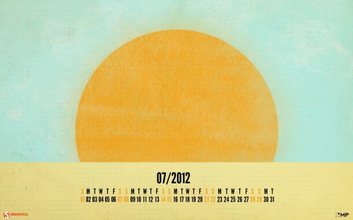
Sun In July

"…enjoy the sun in July!" Designed by Marco Palma from Italy/Germany.

Smashing Desktop Wallpapers - July 2012

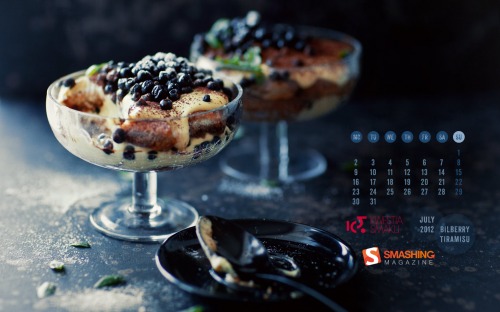
Bilberry Tiramisu

Designed by Kwestia Smaku from Poland.

Smashing Desktop Wallpapers - July 2012

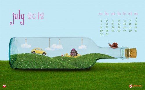
Message In A Bottle

Designed by Pietje Precies from The Netherlands.

Smashing Desktop Wallpapers - July 2012

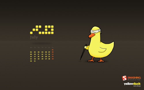
Blind Duck

"Would you let a blind duck lead you through July?" Designed by Yellow Duck Web Design from Essex, UK.

Smashing Desktop Wallpapers - July 2012

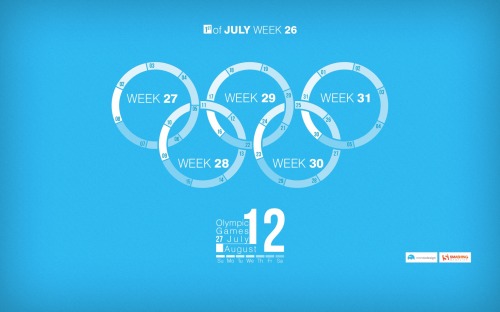
Jeux Olympiques

"Olympic Games and july 2012 weeks calendar’s infogrpahics." Designed by Sherif Saleh from France.

Smashing Desktop Wallpapers - July 2012

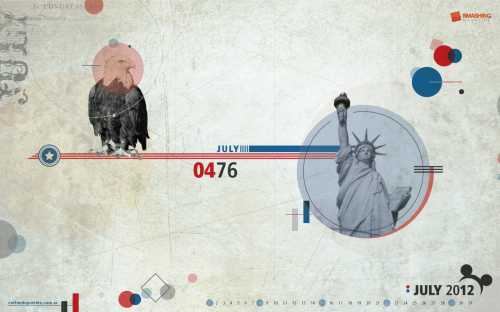
Fourth Of July

Designed by Cortando Pixeles from Argentina.

Smashing Desktop Wallpapers - July 2012

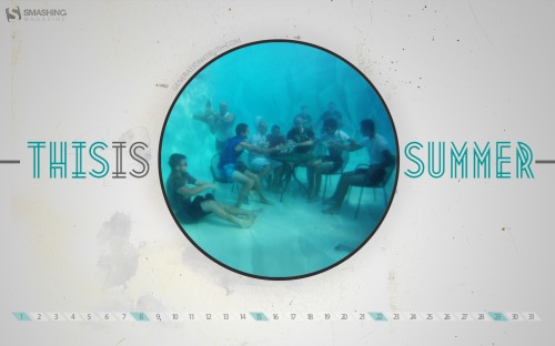
This Is Summer

"Design for 10th anniversary of our youth ministry’ summer camp!" Designed by Lex Valishvili from USA/Russia.

Smashing Desktop Wallpapers - July 2012

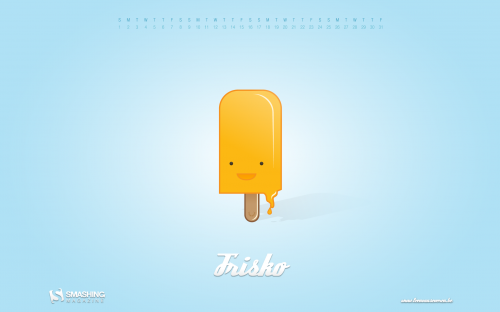
Frisko

Designed by Leen Van Severen from Belgium.

Smashing Desktop Wallpapers - July 2012

Cool Summer

"Even tough it is not summer in my country, I made a summer theme. A coolest approach to summer themes, tough, very fresh and “twilighty”." Designed by Marcos Sandrini from Brazil.

Smashing Desktop Wallpapers - July 2012

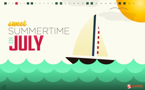
Sweet Summertime In July

Designed by Anna Downer from USA.

Smashing Desktop Wallpapers - July 2012

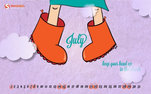
Up In The Clouds

Designed by Ioana Bitin (yoot) from Romania.

Smashing Wallpaper - july 12

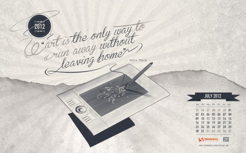
Art Is..

"A personal illustration for my new website and corporate identity i descide to share as free wallpaper! Hope you like it!www.fredericchristian.dewww.facebook.com/fredericchristianart." Designed by Frederic Christian from Germany.

Smashing Desktop Wallpapers - July 2012

Summertime Picnic

"Ants enjoying a summertime feast." Designed by Tommy Digiovanni from USA.

Smashing Desktop Wallpapers - July 2012

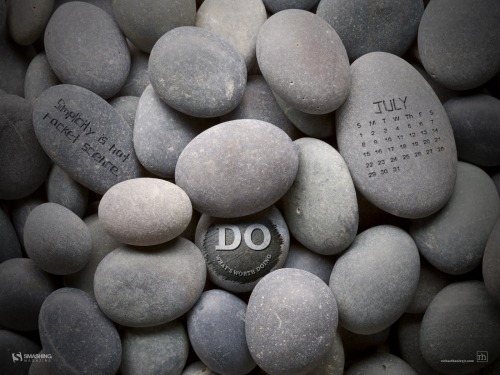
Do Zen

"The year is more than half-way through and this is a reminder to live life, be adventurist, and take a breather. Whatever the challenge is, Doers make it happen — they always find a way." Designed by Richard Hanley Jr. from USA.

Smashing Desktop Wallpapers - July 2012

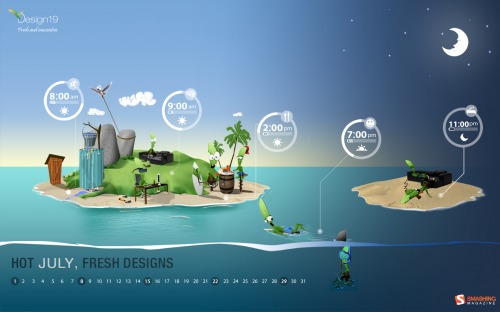
Hot July

Designed by Design19 from Romania.

Smashing Desktop Wallpapers - July 2012

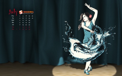
Splash Dance

"Most Flamenco dances are fiery, passionate affairs, this one however is a bit soggy…" Designed by James-n-osborne from United Kingdom.

Smashing Desktop Wallpapers - July 2012

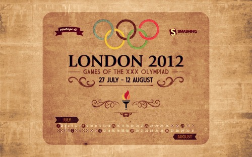
Vintage Olympic Poster

Designed by Davide Vicariotto from Italy.

Smashing Desktop Wallpapers - July 2012

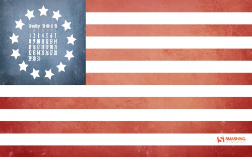
Original Thirteen

"A throwback to the original United States Flag in honor of the 236th birthday of the nation." Designed by Geoffrey Sagers from USA.

Smashing Desktop Wallpapers - July 2012

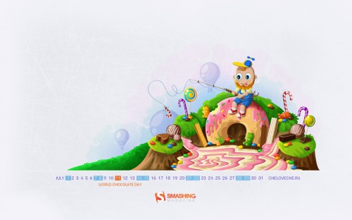
World Chocolate Day

Designed by Cheloveche.ru from Russia.

Smashing Desktop Wallpapers - July 2012

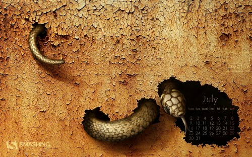
Cracked

Designed by Agata MaciÄ…gowska from Poland.

Smashing Desktop Wallpapers - July 2012

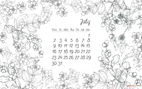
Floral Thing

"Wallpaper which I created consists of my personal sketches of Polish herbs and flowers and custom typography. I wanted it to be light and simple with a hint of romantic feeling. I hope you’ll enjoy it!" Designed by Beata Kurek from Poland.

Smashing Desktop Wallpapers - July 2012

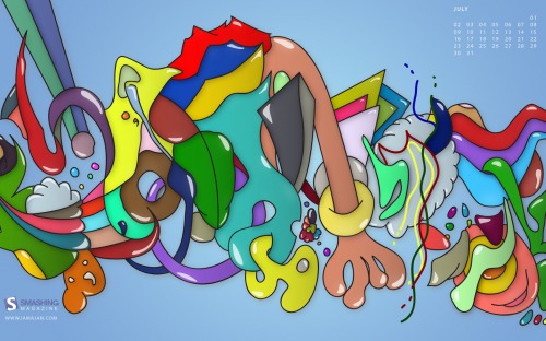
Summer

Designed by Ajan Navaratnasingam from London, UK.

Smashing Desktop Wallpapers - July 2012

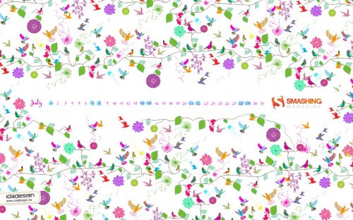
Birdie Nam Nam

"I have created a pattern that has a summer feeling. For me July and summer is bright color, joy and lots of different flowers and birds. So naturally i incorporated all these elements in a crazy pattern." Designed by Lina Karlsson, Idadesign Ab from Sweden.

Smashing Desktop Wallpapers - July 2012

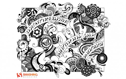
Inspired By Henna

"I wanted to bring the organic, flowing art of henna to the digital world." Designed by Tara M Baker from USA.

Smashing Desktop Wallpapers - July 2012

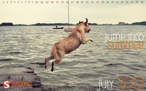
Jump Into Summer

"This is photography of my dog who is jumping into lake on our short vacation." Designed by Agencja Reklamowa Kalisz from Poland.

Smashing Desktop Wallpapers - July 2012

Summer Essentials

"A few essential items for the summertime weather at the beach, park, and everywhere in-between." Designed by Zach Vandehey from USA.

Smashing Desktop Wallpapers - July 2012

Join In Next Month!

Please note that we respect and carefully consider the ideas and motivation behind each and every artist’s work. This is why we give all artists the full freedom to explore their creativity and express emotions and experience throughout their works. This is also why the themes of the wallpapers weren’t anyhow influenced by us, but rather designed from scratch by the artists themselves.

A big thank you to all designers for their participation. Join in next month!

What’s Your Favourite?

What’s your favorite theme or wallpaper for this month? Please let us know in the comment section below.

Stay creative and keep on smashing!

(vf)


© Smashing Editorial for Smashing Magazine, 2012.


Powerful New CSS- and JavaScript Techniques


Since our last round-up of useful CSS techniques, we’ve seen a lot of truly remarkable CSS geekery out there. With CSS3, some of the older techniques now have become obsolete, others have established themselves as standards, and many techniques are still in the “crazy experimentation” stage.

Since the release of the previous post, we’ve been collecting, sorting, filtering and preparing a compact overview of powerful new CSS techniques. Today we finally present some of these techniques. Use them right away or save them for future reference.

Please note that many techniques are not only CSS-based, but also use HTML5 and JavaScript. We are going to present useful CSS tools and responsive design techniques in separate posts. Please don’t hesitate to comment on this post and let us know how exactly you are using them in your workflow. However, please avoid link dropping; share your insight and experience instead, and feel free to link to techniques that really helped you recently. Thanks to all of the featured designers and developers for their fantastic work!

Table of Contents

  1. CSS Transitions and Animations
  2. Useful and Practical CSS Techniques
  3. CSS Typography and Text Techniques
  4. CSS Navigation Menus and Hover Effects
  5. Visual Techniques With CSS

CSS Transitions And Animations

CSS transitions and animations are often used to make the user experience a bit more smooth and interesting, especially when it comes to interactive effects on hover or on click. Designers are experimenting with technology and create sometimes crazy, sometimes practical—but often innovative techniques which you could use to make your websites just a tiny bit more engaging.

Interactive CSS3 lighting effects
An interesting effect to create interactive lighting effects with 3-D transforms, CSS gradients and masks; the cast shadow was created using box shadows and transforms.

Interactive CSS3 Lighting Effects

CSS3 dodecahedron
A fancy dodecahedron experiment, created using CSS Transforms and a tiny JavaScript snippet.

CSS3 Dodecahedron

CSS 3D Lighting Engine Photon
Our editor Tom Giannattasio has created a JavaScript library that adds simple lighting effects to DOM elements in 3D space using the WebKitCSSMatrix object. It would be great to have an implementation for other rendering engines as well.

CSS 3D Lighting Engine Photon

3D Thumbnail Hover Effects With CSS
This technique produces 3D thumbnail hover effects with CSS 3D transforms. The code is quite verbose and probably could be optimized, but the effect is quite neat.

3D Thumbnail Hover Effects With CSS

Slide In Image Boxes
A technique for creating a “slide in” effect for boxes on hover to make them a bit more interactive.

Slide In Image Boxes

CSS3 bitmap graphics
The bitmap graphics is rendered with CSS: no images, no canvas, no data URIs and no extra markup. The pixels are drawn with CSS gradients, sized precisely to the pixel’s boundaries.

Pure CSS3 Bitmap Graphics

Paperfold CSS
A visual folding effect for hidden comments by Felix Niklas. The plugin takes a DOM element, slices it into parts and arranges them like a folded paper in 3-D space.

Paperfold CSS

Beercamp: An Experiment With CSS 3D
A CSS 3D popup book á la Dr. Seuss. The website was a test to see how far SVG and CSS 3D transforms could be pushed. This is the article about it.

Beercamp: An Experiment With CSS 3D

Covers: A JS / CSS Experiment
Now, that’s quite an experiment: what if we combined a music song, stylesheet and beat detector to create animated… covers? Sure, we can do it with CSS3 and JavaScript! Covers does exactly that. The result is interesting, what can you do with this approach?

Covers: A JS / CSS Experiment

Animation on Apple’s page
John B. Hall explains the CSS animation on Apple’s Web page for the iPhone 4S.

An explanation of the CSS animation on Apple’s iPhone 4S webpage — John B. Hall

Experimental animations for image transitions
A post about experimental 3-D image transitions that use CSS3 animations and jQuery. Only CSS3 transforms are used.

Experimental CSS3 Animations for Image Transitions

Maintaining CSS style states using “infinite� transition delays
This demo allows you to move the character around with the D-pad, and notice how it always keeps its position after you stop moving. This demo doesn’t use any JavaScript. The effect is made possible by using a virtually infinite transition delay, so that the CSS rules never return to their default state. The figure will be stuck in a transition and will move only when you hold down a button.

Maintaining CSS Style States using “Infinite� Transition Delays

CSS 3-D clouds
An experiment in creating 3-D-like clouds with CSS3 transforms and a bit of JavaScript.

CSS3D Clouds

Animated popover of profile box
A technique for an animated profile popover menu, built using CSS transitions.

Animated Profile Popover With CSS

CSS3 scrolling effects
A library of various scrolling effects, such as curl, wave, flip, fly, skew and helix, created with CSS3 and sometimes with JavaScript to spice up the scrolling behavior.

CSS3 Scroll Effects

Spin those icons with CSS3
A simple technique for creating a neat effect that spins social icons with the help of a transform and transition when you hover over them. By Tom Kenny.

Scrolling the Z Axis with CSS 3D Transforms
This article explains how to create the z-scroll effect step by step.

Useful and Practical CSS Techniques

CSS3 Family Tree
Display organizational data or a family tree using just CSS, without Flash or JavaScript. The markup is very simple and uses just nested lists. Pseudo-elements are used to draw the connectors. It also has hover effects: hover over a parent element and the entire lineage will be stylized. Make sure to check Nicolas Gallagher’s Introduction to CSS Pseudo Element Hacks.

CSS3 Family Tree

iOS-style popover
A simple technique for iOS-style custom checkboxes and a subtle hover effect. The technique is a bit buggy but a good starting point in case you need it. Also, check an excerpt from Lea Verou’s talk on customized checkboxes and her article on rule filtering based on specific selector(s) support.

iOS-style Popover

Timeline-Style Comments
Nicolas Gallagher developed a simple and clean technique to present comments in a timeline-alike overview.

Timeline-Style Comments

CSS Table Grid
Here is a nice technique for aligning columns in a table, building a “table grid system� of sorts. The idea is to apply classes to col elements in a table’s colgroup; you always leave one col without a class so that it remains fluid and can “soak up� the effects of any breakages elsewhere in the table.

CSS Table Grid

Confirmation Feedback Buttons
This article explains how to create buttons that take on different states depending on the user’s interaction. This type of interaction is especially useful on links such as “Purchase� and “Delete� for which it’s wise to confirm that the user indeed wants to take the specific action. It looks too much like an iTunes button, though.

A calendar in CSS3 and jQuery
A step by step tutorial on how to create a CSS3 calendar with some jQuery animation. Also, check out David Bushell’s responsive calendar demo.

A clean calendar in CSS3 & jQuery : Finishing Touch

Outdenting properties for debug CSS
Let’s assume you are experimenting with CSS or debugging code. You add properties to figure out how things fit together. How often do you forget to remove all of them? A simple technique for this is to mark a CSS property as a temporary or debugging property by outdenting it and putting it at column 0 in the file. A small trick that can save a lot of time.

Outdenting properties for debug CSS

Show Markup in CSS Comments
Chris Coyier discusses the idea of including the basic markup that you will be styling as a comment at the top of your CSS file.

Show Markup in CSS Comments

Selectively displaying data
This technique shows how to selectively display content in a table and add responsive breakpoints to create an responsive, complex multi-column table.

Remove Margins for First/Last Elements
If you ever wanted to remove the top or left margin from the first element in a container, or the right or bottom margin from the last element in a container, you can do this by using pseudo-selectors :first-child and :last-child.

CSS Diagnostics Stylesheet
A very useful snippet to have nearby when you are debugging your CSS or want to find mistakes in HTML.

CSS Diagnostics Stylesheet

Radio Buttons With Two-Way Exclusivity
Learn about the :empty pseudo-class selector and jQuery to ensure that when a radio button is clicked, the area is determined and all other radio buttons in that column are turned off, and then is turned back on when clicked on.

Radio Buttons with 2-Way Exclusivity

Tabbed Navigation With CSS
An elegant tabbed navigation menu with drop-down menus — no JavaScript, of course. Nothing new, but it’s a quite clean solution.

Tabbed Navigation With CSS

Menu With Notification Badges With CSS
A ready-to-use snippet for a navigation menu with notification badges.

Menu with Notification Badges With CSS

Styling based on sibling count (slides)
A fantastic overview of the possibilities for styling based on sibling count. Also, make sure to click through the rest of the slide deck — valuable and useful techniques. Make sure to watch Lea Verou’s presentation as well.

Styling based on sibling count (Slides)

Stuff you can do with the “Checkbox Hack�
Wiht the “checkbox hack,� you use a connected label and checkbox input and usually some other element that you are trying to control. Learn what you can do with it.

CSS3 Facebook Buttons
Nicolas Gallagher presents a set of CSS buttons for Facebook with different colors and icons. You might want to check Nicolas’ CSS3 Social Sign-In buttons as well as Free Social CSS3 Buttons that we released earlier as well.

YouTube Popup Buttons
This article explores the default state of YouTube buttons, which have a very subtle bevel but pop up on :hover and :focus states, eager to be clicked.

YouTube Popup Buttons

Centering in the Unknown
When it comes to centering things in Web design, the more information you have about the element being centered and its parent element, the easier it is. Chris Coyier shows how to do it when you do not know anything.

Centering in the Unknown

Uncle Dave’s Ol’ Padded Box
What if you combined background-size: cover and Thierry Koblentz’ intrinsic ratios. The result is images and video than maintain their aspect ratio; but you can also use background-size: cover to change the aspect ratio and auto-cropping of images with just a little CSS. And the great news is that the property is supported in all modern browsers and matches media-query support exactly.

Micro Clearfix: Force Element To Self-Clear its Children
Chris Coyier presents various technique for forcing elements to self-clear its children, including Nicolas Gallagher’s short code snippet from 2011.

Micro Clearfix: Force Element To Self-Clear its Children

Conditional CSS
A clever technique by Jeremy Keith to load additional content conditionally. The idea is that once a media query fires, the content on the body element is generated and can be detected by a JavaScript, prompting extra content to be loaded.

* { box-sizing: border-box } FTW
Once you start mixing and matching various units in CSS — such as % for the container width, em for padding and px for border — then you run right into the box-model problem because the width of the container doesn’t include padding and border. We can easily solve this using box-sizing: border-box. And the best part: it is even supported in IE 8.

Multiple Attribute Values
How to treat multiple values in attributes rather than classes.

Multiple Attribute Values

Diagonal CSS Sprites
If you build a sprite on a diagonal, there will be no components below or to the right of the component you are showing. This allows you to make the element using the sprite as wide or as tall as it needs to be, without worrying about exposing the next component. Also, check out David Storey’s article on CSS sprites for the moder era.

Double Click in CSS
Is there a way to detect whether a link is tapped or double-clicked on mobile devices? In fact, we can. However, the code requires some hardcore CSS nerdery. Also, check Pure CSS Clickable Events Without :target by Ryan Collins.

Replacing the -9999px hack (new image replacement)
In the beginning was FIR (Fahrner image replacement). Scott Kellum, design director at Treesaver, has now developed this refactored code for hiding text.

Replacing the -9999px hack (new image replacement)

Fighting the Space Between Inline Block Elements
A series of inline-block elements formatted like you would normally format HTML will have spaces between them. But we often want the elements to butt up against each other, thus avoiding in the case of navigation) those awkward little unclickable gaps. How do you solve it? Chris Coyier has found a couple of solutions.

CSS pointer-events and a pure CSS3 animating tooltip
The pointer-events property allows you to specifiy how the mouse interacts with the element it is touching. See what you can do with it and what to consider when using them.

Anatomy of a mobile-first responsive Web design
An excellent article by Brad Frost about the different considerations for responsive designs. How do you start? What features would you implement and how? What about advanced optimization such as LocalStorage or AppCache? This article provide an excellent guide for getting started with future-friendly responsive designs.

SouthStreet Progressive Enhancement Workflow
A fantastic article by Scott Jehl and Filament Group in which they present a set of tools that form the core of an advanced responsive design workflow. Definitely useful to keep in mind for your next responsive design project.

Typography And Text With CSS

Advanced CSS techniques provide us with remarkable options to style text in very different ways. Not only can we make the typography look sharper and beautiful on the Web with tools such as Lettering.js, Kerning.js and FitText; we can also play with glyphs, line breaks, font sizing, truncating text and styling lists. The typography can be adjusted and improved with just a couple of practical approaches.

Interactive Typography effects with HTML5
This techniques uses canvas and JavaScript to create ab interactive typography effect. Users can interact with the glyphs and as designer you can define forms or shapes of the word you’d like to present and how you’d like them to change on hover. Fancy!

Interactive Typography Effects with HTML5

Rocking letters with CSS3 and jQuery
A simple animation of letters with CSS3 and jQuery.

With Rocking Letters into the New Year

CSS 3D Typography
What about integrating stripes into glyphs and adjust the shadow on hover? This technique uses just that, creating a nice, subtle yet engaging visual effect. You can find more interesting type experiments in CSS3type Showcase.

cssandtype.com, gallery of css text effects

cssandtype.com, gallery of css text effects

CSS3 animation and masking text
Chandler Van De Water had a challenge for Trent Walton after seeing the header animation in his “CSS3 in Transition� post. Noticing that he used a PNG image file with knockout transparency, he wanted to do the same CSS animation with selectable text. Trent was happy to oblige! At the moment, this works only in Safari and Chrome.

CSS3 Animations and Masking Text

CSS mask-image and text
Trent Walton uses background-clip: text and mask-image to implement a subtle gray-flecked texture effect over white text. Hover over the box to see how it degrades in unsupported browsers. Make sure to check out Lea Verou’s “Text Masking: The Standards Wayâ€� as well.

CSS Mask-Image & Text

Fake bolding of Web fonts
Most browsers simulate bold weights for fonts that do not actually have bold weights. For example, Helvetica Neue Light does not have a bold weight. If you used font-weight: bold with it, browsers would artificially create a bold weight. This article explains how to avoid fake bolding of Web fonts in your designs. By Divya Manian.

Fake Bolding of Web Fonts

Tomorrow’s Web type today: Say it With a Swash
The excellent series “Tomorrow’s Web type today” by Elliot Jay Stocks provides insights into what will be possible with Web typography soon, e.g. swashes. In fact, you can already use them today if you include a swash subset of a font to achieve the desired effect.

OpenType Swashes

Internationalization Language CSS
A very handy CSS nippet with language-specific quotes. Perfect for international, multilingual projects.

Internationalization Language CSS

Experiments with background-clip: text
With the CSS property background-clip: text, we can add a background image to a text element.

Experiments with background-clip: text

A Call for ::nth-everything
With CSS3, we have positional pseudo-class selectors to help us select a particular element when it has no distinguishing characteristics other than where it is in the DOM in relation to its siblings.

A Call for ::nth-everything

Smooth font using the text-shadow property
A common problem: is there a way smooth the appearance of glyphs on older machines, especially Windows XP (standard / ClearType rendering mode)? Yes, perhaps. You can give a try the text-shadow-property which adds text-shadow on the top-left and the bottom-right to smooth text.


Smooth font using CSS3 text-shadow property

Fluid Type
Trent Walton explains his approach to fluid typography in which he asks himself how we can make sure that browser width and typographic settings such as measure or font-size and how should we handle panoramic viewports? An interesting article, especially if you use a typography-out approach in your designs.

Fluid Type

Pragmatic, practical font sizing in CSS
Harry Roberts shares his thoughts on how to size fonts more efficiently, writing your CSS differently in the process.

Automatic line breaks with CSS3 hyphens and word-wrap
Roger Johansson shows how to solve a common problem: as columns of text become narrower, the risk of a single word being longer than the column’s width increases. When that happens, the text normally extends beyond the column. Luckily, CSS offers two properties to improve the situation: word-wrap and hyphens.

Molten leading (or fluid line height)
When a responsive composition meets a viewport, there are different ways to fill space. Adjusting any one element without also adjusting the others is a recipe for uncomfortable reading, which is one reason why designers have such a difficult time with fluid Web layouts. Tim Brown started a discussion about this issue and provides a couple of techniques for opimization.

Molten leading (or, fluid line-height)

Prevent Long URL’s From Breaking Out of Container
Another snippet by Chris Coyier for keeping long URLs within the container. word-wrap, word-break and hyphens properties in use. Also, learn how to Prevent Superscripts and Subscripts from Affecting Line-Height.

Viewport-sized typography
This technique uses new CSS values for sizing elements relative to the viewport’s current size: vw, vh and vmin. This allows you to couple the size of, say, a typographic heading to the available screen space. Browser support is quite poor for now, so if you are looking for an alternative, check out FitText.js.

Viewport Sized Typography

Minimum paragraph widths in fluid layouts
This article shows how to solve the problem of paragraphs that are too narrow, by implementing a minimum paragraph width. If the space left a the floating image is less than this width, then the whole paragraph moves below the image.

Styling ordered list numbers
Roger Johansson shows how we can style ordered list numbers with the :before pseudo element, which can take a counter as a value through the content property. Also check out Chris Coyier’s post and Louis Lazaris’ CSS Counters: counter-increment and friends.

Styling ordered list numbers

Reverse ordered lists in HTML5
The reverse attribute allows you to write a descending list of numbered items. Louis Lazaris summarizes what it does and offers a solution to get around a lack of browser support for this attribute.

Reverse Ordered Lists in HTML5

Preserving white space with CSS3 tab size
By default, HTML pages ignore anything more than a single space and collapses them. But there are occasions when you’ll want to preserve this space via one of several possible techniques.

Truncating text using only CSS
This code snippet can be used to shorten a line of text using nothing but CSS.

New CSS3 properties to handle text and word wrapping
Louis Lazaris explains the possibilities and problems of text-wrap, overflow-wrap, line-break and word-break, text-overflow and hyphens. Also worth reading: Kenneth Auchenberg discusses the options for word wrapping and hyphenation in combination with dynamic width elements.

End Articles with Ivy Leaf
A clever technique for adding an extra touch to the end of your articles. :last-child, :after and content in use.

We are used to classical navigation patterns such as tabbed navigation or drop-downs, but we can do a lot more to spice up our navigation menus with pleasant hover effects, often without extra images. Especially if you’d like to add a bit more polish to your portfolio, gallery or e-commerce website, these techniques can be quite useful. What about “over-the top” hover effect for your links,

Circle Navigation Effect With CSS3
A bubble-like thumbnail preview for your navigation with CSS3.

Circle Navigation Effect with CSS3

Create a CSS3 Image Gallery With a 3D Lightbox Animation
Tom Kenny has extended a CSS lightbox gallery by adding a few hover effects to the gallery grid itself and a 3D rotation to the lightbox content, all with CSS.

Create a CSS3 Image Gallery with a 3D Lightbox Animation – Inspect Element

3D Gallery With CSS3 and jQuery
This article shares an experimental gallery that uses CSS 3D transforms. The idea is to create a circular gallery with an image in the center and two on the sides. Because perspective is being used, the two lateral images will appear three dimensional when rotated.

3D Gallery with CSS3 and jQuery

Creative CSS3 animation menus
Mary Lou presents a couple of creative navigation menu hover effects. The idea is to have a simple composition of elements, an icon, a main title and a secondary title that will be animated on hover using only CSS transitions and animations.

Creative CSS3 Animation Menus

How to spice up your menu with CSS3
Yes, another technique by Tympanus: this tip shows how to spice up a menu by adding a neat hover effect to it. The idea is to slide an image out to the right when the menu item is hovered over.

How to spice up your menu with CSS3

Create a zoomable user interface
David DeSandro reveals how to use CSS transforms to create a zoomable user interface similar to that of Beercamp 2011. In this tutorial, you’ll also learn how to use JavaScript to hijack scrolling to manipulate the zoom.

Create a zoomable user interface with CSS3

Flipboard Navigation
An experimental page layout inspired by Flipboard’s interface.

Flipboard Page Layout

Multi-direction hover
This element shows different hover effects when hovering from different directions.

Multi-direction hover

Experimental Hover Effects
Original and innovative hover effects discovered via Twitter on what appears to be a Japanese code sharing website.

Share JavaScript, HTML5 and CSS

Over-the-top hover effect
A CSS and JavaScript technique for creating an “over-the-top� hover effect using the transform-origin transform-style properties as well as 3-D transforms.

Accordion With CSS3
Mary Lou experiments with the adjacent and general sibling combinator and the :checked pseudo-class. Using hidden inputs and labels, she creates an accordion that animates the content areas on opening and closing.

Accordion with CSS3

Expanding Text Areas Made Elegant
An expanding text area is a good choice when you don’t know how much text the user will write and you want to keep the layout compact. In this article, Neil Jenkins explains how to do this simply. Also, you might want to take a look at Textarea Auto Resize, another technique by Louis Lazaris, using a hidden clone element.

Filter Functionality With CSS3
Using the general sibling combinator and the :checked pseudo-class, we can toggle states of other elements by checking a box or radio button. This tutorial explores those CSS3 properties by creating a experimental portfolio filter that toggles the states of items of a specific type.

Filter Functionality with CSS3

An accessible, keyboard-friendly custom select menu
A new approach for more accessibility by Roger Johansson. He styles only the select element.

Visual Techniques with CSS

We used to heavily on images and visual elements to create basic visual effects on the Web. With CSS3, we can not only improved the loading speed of the content, but also make our visual elements more flexible and adaptive. Let’s take a look on a couple of examples of how we can achieve that.

Create the Illusion of Stacked Elements with CSS3 Pseudo-Elements
Tom Kenny shows how to create a simple “stacked� look to a group of images.

Create the Illusion of Stacked Elements with CSS3 Pseudo-Elements – Inspect Element

CSS3 Unfold Map with Pins
A handy snippet for placing pins on a map. The code looks a bit verbose, so you might want to remove a couple of visual “nice-to-have” elements.

CSS3 Unfold Map with Pins

Turn Images Into Postage Stamps With CSS3 border-image
Dudley Storey shows a simple way to create a postage stamp from a simple image with border-image.

Turn Images Into Postage Stamps With CSS3 border-image

Slopy elements with CSS3
Angled shapes and diagonal lines can create an interesting visual flow and add some unexpected excitement. This tutorial shows some simple examples and ways how to create slopy, skewed elements with only CSS.

Slopy Elements with CSS3

CSS Flip Clock
A code snippet for displaying a flip clock-alike time display using CSS.

CSS Flip Clock

CSS3 Image Styles
When applying a CSS3 inset box-shadow or border-radius directly to an image element, the browser won’t render the CSS style perfectly. Here’s a quick tutorial on how to use jQuery to make perfect rounded corner images dynamically. And check out the second part.

CSS3 Image Styles – Part 2

Creating Reusable and Versatile Background Patterns
A simple tutorial on how to create reusable background patterns with Photoshop and CSS.

Creating Reusable & Versatile Background Patterns

Diagonal Graph Paper Gradient
A very nice CSS technique for creating diagonal graph paper gradients using repeating-linear-gradient property in CSS.

Diagonal Graph Paper Gradient

Tucked Corner Effect
A clean CSS technique for producing tucked corners using the pseudo-elements :after and :before as well as data URI-coded images. Also, check out Corner Ribbon Effect with CSS.

CSS Tucked Corner Effect

Scrolling… shadows!
An original technique by Roman Komarov to create CSS-only shadow-scrolling effect using background-attachment: local. Developed by Lea Verou, inspired by Roman Komarov.

Scrolling shadows

Multi-colored CSS progress bars
A quite verbose yet CSS-only solution for displaying multi-colored progress bars. It’s linear-gradient in action! Also, check out CSS3 progress bars that display data inside localized leaderboards for the new analytics platform at G5. They are lightweight and require no JavaScript or images.

Multi-colored CSS Progress Bars

CSS3 breadcrumbs
Learn how to create your own cool CSS3 breadcrumbs. Also, check the CSS Breadcrumbs Example which uses only CSS linear gradients.

CSS3 breadcrumbs

Adobe-like Arrow Headers
A detailed article about the technique Adobe uses to create header bars for modules on its website.

Adobe-like Arrow Headers

Adding a Top Shadow to a website
If you ever wanted to add a shadow along the top edge of the website, you can easily do it by styling body:before.

Adding a Top Shadow to a website

A flexible shadow with background-size
It’s amazing what you can achieve when you combine different techniques—even when facing a challenge such as a flexible shadow. If you had to create an adaptive shadow effect, how would you create it?

Star Ratings With Very Little CSS
Chris Coyier shows how to code star ratings done with very little CSS code and lots of a bit of Unicode madness.

Convert Images to Black And White With CSS
Filters allow us to visually process an image in the browser without needing to go through PhotoShop or use cycle-intensive, script-heavy methods in JavaScript or PHP. CSS3 filters are broadly supported in the most recent versions of Firefox and Chrome, and we can gain support in older versions and alternative browsers — even IE — by using a combination of techniques.

Punching Holes With CSS
A clever and simple technique to make a block in a container appear transparent and display a background image. Also, take a look at Lea Verou’s accessible star rating widget with CSS.

Simple Styles for Horizontal Rules
With the help of a few contributors, Chris Coyier put together this page of simple styles for horizontal rules.

Simple Styles for Horizontal Rules

Optimizing Graphics With CSS Masks
In this video, Aaron Bushnell shows how CSS masks can help make the process easier on you and how to make sure you have fallbacks in place for non-Webkit browsers.

Browser-Specific CSS Hacks
A useful, comprehensive list of browser-specific CSS hacks for targeting legacy browsers. Unfortunately, most of us will need them quite often.

Last Click

CSS3 Lasers!
Shows a laser shot effect when hovering over an element.

CSS3 Lasers!

The DOM Tree
This DOM tree is generated via JavaScript every time you visit the page, so you’ll never see the same one twice. All of the forms are filled with holiday greetings in a variety of languages. CSS3 3D transforms are used to position and rotate, via translate3d() and rotate3d() respectively, the elements when the page loads. The infinitely looping rotation on the tree is controlled by an infinitely looping CSS3 animation. Just one word: crazy!

DOM Tree

What’s Your Favourite Technique?

We’d love to know your experience with some of the featured techniques, or perhaps you’ve stumbled upon another interesting CSS technique recently? Let us know in the comments to this post!


(jvg) (al) (vf) (ml)


© Smashing Editorial for Smashing Magazine, 2012.


  •   
  • Copyright © 1996-2010 BlogmyQuery - BMQ. All rights reserved.
    iDream theme by Templates Next | Powered by WordPress