Author Archive

Definitive Daft Punk

A Blue Perspective: <p>

Download the "Definitive Daft Punk" MP3 (16MB)
This file has been removed due to record company demands

In honour of the fact that Daft Punk have composed the music for the new TRON: Legacy movie (which is out today) and also because of the fact that I've been at home with my arm in a sling all week, I decided to create an homage to the rocking robotic duo.

In true 139 Mixtape style, I've mashed up, edited and remixed 23 of my favourite Daft Punk tracks into 6 minutes of Daft bliss that I'm calling "Definitive Daft Punk".

Here's the tracklisting:

  1. Daft Punk - Da Funk
  2. Daft Punk - Aerodynamic
  3. Daft Punk - Too Long
  4. Daft Punk - Oh Yeah
  5. Daft Punk - Steam Machine
  6. Daft Punk - Television Rules The Nation
  7. Daft Punk - Tron Legacy
  8. Daft Punk - Alive
  9. Daft Punk - Burnin'
  10. Daft Punk - Around The World
  11. Daft Punk - Voyager
  12. Daft Punk - Crescendolls
  13. Scott Grooves - Mothership Reconnection (Daft Punk Remix)
  14. Daft Punk - Digital Love
  15. Daft Punk - Harder, Better, Faster
  16. Daft Punk - Human After All
  17. Daft Punk - Face To Face
  18. Daft Punk - Short Circuit
  19. Daft Punk - Daftendirekt
  20. Daft Punk - Revolution 909
  21. Daft Punk - Technologic
  22. Ian Pooley - Chord Memory (Daft Punk Remix)
  23. Daft Punk - One More Time

So download, listen, enjoy, and discover your inner robot.

Update (2010-12-19): Due to popular demand, "One More Time" has been added into the mix.

Update (2011-05-10): The mix has been remastered for smoother listening and an extra song added in: Harder, Better, Faster.


Desktop Wallpaper: Space Frames

A Blue Perspective: <p>

I'm a big fan of a black desktop. It's easy on the eyes and icons are highly visible. But you have to have a dash of colour to add personality, so it's a fine balance between style and stark.

A few years ago, when I was heavily into Processing I wrote a program that dynamically generated spacey looking spectrum wallpapers, with the aim of offering it to the public so that 6 billion people could each have their own unique desktop wallpaper. Didn't work out. (But I used one of its outputs as my own wallpaper for the last 4 years).

A bout of recent procrastination made me realise that I hadn't changed my wallpaper in far too long and this time instead of breaking open some code I headed to Illustrator to make some jaunty little geometrics.

Now, I've got a new wallpaper and you can have one too! I'm calling it Space Frames and you can download it by clicking on the image below. Bon appetit!

Space Frames wallpaper


Visualising drawings in 3D with DrawPad

A Blue Perspective: <p>

Last February at Ignite Sydney we thought we'd try something a little different to get the crowd involved.

While most people were downing a few drinks, a bunch of lovely lads and ladesses with iPads were circulating through the audience asking people to draw (with their fingers) what inspires them. On the iPads was a drawing application that recorded the time and position that each stroke of their fingers made and that data was used to create a 3D timelapse visualisation of their drawing on the big screen behind the stage. I've put together a little video of the end result:

It was actually quite exciting to see what people came up with. And equally exciting was seeing the looks on their faces as they interacted with the iPads and then waited with anticipation to see how their drawings would be interpreted by the foreign shapes appearing on the screen.

Someone drawing on an iPad using DrawPad 
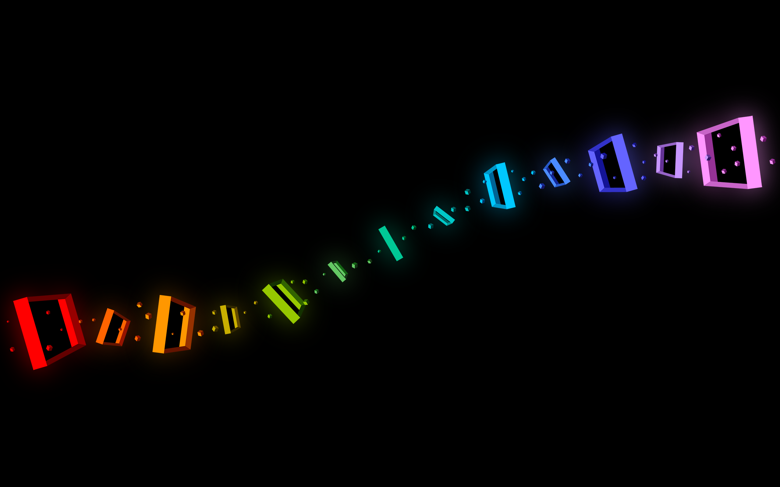
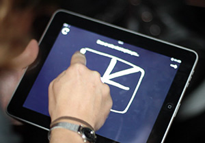
To pull off this stunt we used all open web technologies: a webpage running my "DrawPad" Canvas application that allowed people to draw, and captured the movements of their fingers; storage of the stroke data in JSON on the backend (thanks to Tim Lucas); and visualisation of those strokes in 3D using WebGL via Mr. Doob's wonderful three.js library.

To get people drawing, I took a look at 37signals' Chalk but it lacked one important feature: multi-touch drawing, so I decided to write my own drawing app.

If you're never done multi-touch event handling it can be a mysterious process (it certainly was to me) but once you get your head around the notion of an event object that contains multiple points of interaction, then it's actually quite fun.

3D visualisation of a drawingI've uploaded the source code for the drawing app (and the 3D visualiser) into a DrawPad Github project if you want to take a closer look (or improve it in the countless ways that it could be improved upon). Certainly the 3D visualiser is a result of cramped deadlines. I really would have loved to create the stroke paths as true 3D meshes, but had to settle for a series of spheres that follow the path of the stroke instead. (Kind of like voxels.)

But at the end of the day the technology didn't matter. What mattered was the outcome: an easy-to-use way for people to draw what they wanted, and a pretty-as-a-picture translation of what they drew. The fact that it was done in a browser made no difference at all.


Anatomy of a Mashup: Definitive Daft Punk visualised

A Blue Perspective: <p>

See "Definitive Daft Punk" visualised in realtime ยป

I've always believed in the strong connection between sound and vision. Music videos are like little slices of synchronous art, designed to please all of your senses. (Go ahead, lick your TV next time "Poker Face" comes on!)

Every so often I delve into music making, but aside from the cover art for those releases my music has remained very separate from my visual design work. Now and into the future I plan to rectify this, and first cab off the ranks is a data visualisation I've had in my head for a while.

The art of the mashup has come to the fore in pop culture of recent years, but beyond Biggie Smalls crooning over Elton's keys I feel that the general public understands little of the nuance that goes into constructing a complex mashup from tiny pieces of songs.

In order to explain the layering and interplay that goes into something like a Girl Talk album or The 139 Mix Tape I decided to take my own mashup of Daft Punk's discography -- Definitive Daft Punk -- and reveal its entire structure: the cutting, layering, levels and equalisation of 23 different songs. By dividing up the sound data for each song and computing its appearance in realtime, the resulting visualisation gives you an understanding of the unique anatomy of this particular mashup.

The entire piece is composed from the latest HTML5 and CSS3 technology (canvas, audio, transforms & transitions) so you'll need a newer browser to view it in. I recommend Chrome because it pulls off the best performance with my mangled code. All of the waveform and spectrum visualisation is performed in realtime, so your browser is rendering a music video on the fly!

Hopefully it gives you a new insight into the artform of the mashup, otherwise you can just stare at the pretty shapes.


Realtime visualisation of @replies

A Blue Perspective: <p>

See @replies visualised in realtime

Back on September 15, 2010, it was "R U OK?" Day. This is a national day of action which is designed to raise awareness of suicide by encouraging people to reach out and make contact with others by asking "Are you OK?"

We were commissioned by the R U OK? organisation to create a visualisation that highlighted the connections people were making throughout the day, and after a number of rounds of brainstorming (and budget cuts) we chose to highlight the connections that were being made over Twitter.

Because of fears about subject matter we weren't allowed to highlight content contained in any tweets, so to gather our data we performed a search for all tweets in Australia that are directed at someone (@replies), geocoded both ends of the conversation, recorded the timestamp of the message, and map this connection in time and space. For each location we also perform frequency analysis on the tweets and provide a tag cloud of the most used words (available if you hover over a city).

All of this is done in realtime, so you can see actual conversations as they are formed. Beyond the realtime aspect, we also give you two weeks worth of historical data so that you can see the rise and fall of activity throughout the day and across weeks. Each of these hourly periods also has a unique pattern of replies that crisscross the country, showing up when people from other cities strike up conversation with one another.

It's interesting to see the times of day when people are on Twitter the most, and also see the days of the week when activity is high. On the actual R U OK? Day we saw a dramatic (~2x) spike in @reply activity which we could hopefully attribute to the spread of R U OK? Day.

The Achilles heel of this visualisation, however, is the amount of processing that it has to do. Firstly, it fetches a search from the Twitter API several times a minute (you have to be careful to stay within the rate limits), then for each tweet it has to check whether the sender and receiver have location data, and if they do, geocode both locations.

Geocoding is an expensive operation and because I'm geocoding roughly 200 points a minute, we quickly fall afoul of hourly geocoding rate limits. To counteract this, I have it setup to try geocoding via Google Maps, and than fail over to Yahoo! once we hit the limit. Somewhere along the way I implemented caching of geocoding results and we now have a pretty handy database of geocoded strings.

The price for daisy chaining all these APIs is fragility. It's a lot of work to keep this system up, and as a result I'll be taking the whole thing offline in about a week. (Also, it's costing me a fair bit in App Engine hosting charges.)

Still, if you want to check it out, you can for now. Thereafter, I'll replace it with a video of what it once was.

Update 2011-04-19: I've replaced it with a video of what it once was.


  •   
  • Copyright © 1996-2010 BlogmyQuery - BMQ. All rights reserved.
    iDream theme by Templates Next | Powered by WordPress