CSS

Tell CSS that JavaScript is available ASAP

When you’re styling parts of a web page that will look and work differently depending on whether JavaScript is available or not, it can be very useful to use JavaScript to change or add a class name to the html element.

By doing this you can create CSS rules that will only be applied when JS is available and vice versa. The trick is to make sure the class names are switched as early as possible during page load.

Read full post

Posted in , .

Copyright © Roger Johansson


Metro UI CSS: You can have a tiled website too


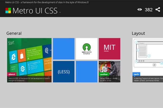
Microsoft’s new UI, once known by the name of Metro, has caused quite some buzz in the tech world. Meanwhile the name has been dropped, which again caused quite a buzz in the tech world. We don´t know why this was done nor do we know if the next Windows will be a market success. What we know is, that Metro as a design style has its fans. If you are one of them, we have great news for you. Thanks to Metro UI CSS you can give your very own website the same tiled look, the interface of the next generation Windows will have. Go ahead!


Metro UI CSS

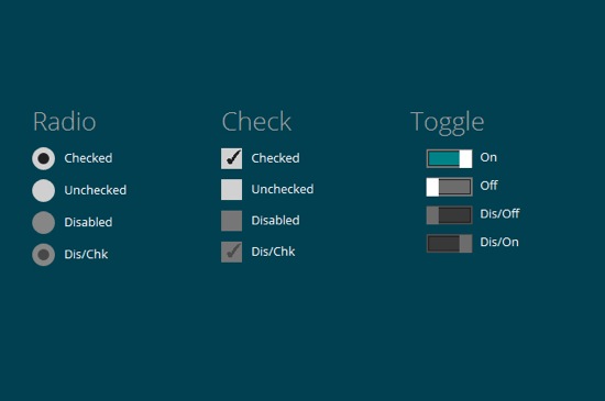
Metro UI CSS is actively developed by Sergey Pimenov, who proves generous enough to leave the tool for us to use free of charge under the MIT license. Pimenov not only copied the typical Metro design, but also implemented a variety of effects from the original Microsoft product, for example the fade-in of subtitles on pictures or the switch buttons.

Metro UI CSS: A feature-rich framework

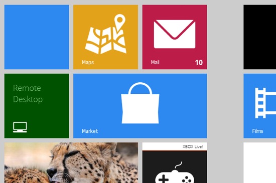
Get your own impression of what Metro UI CSS is capable of by visiting the demo. You’ll find several pages with examples of how pictures, forms, buttons and the typical tiles, bound to substitute the former Windows icons, look and interact.


Metro: Tiles

Ever seen Metro on a tablet? On these devices, Microsoft implemented vertical scrolling as the standard scroll direction. That’s just the way Pimenov implemented it in Metro UI CSS. Using a touch-device you can elegantly scroll through your website. You’re not forced to, though, as mouse scrolling is also supported.


Metro: Buttons

Metro UI CSS: Made with, yes, CSS and JavaScript

Metro UI CSS is not pure CSS, but relies on several JavaScript libraries for advanced functionality. The foundation is, as it often is, jQuery with some complementing plugins and the new superstar Bootstrap. Pimenov wants it mentioned, that he also integrated some of his very own JavaScript functions.


Metro: Pictures

If you like to learn along the guidelines of a thorough documentation, Metro UI CSS is not for you. Because there simply is no documentation. The demo can be downloaded, that’s it.  But it contains all elements for which the Metro style is available and thus should be a good starting point for the first steps to your very own tiled website. Several effects are invoked simply by calling the corresponding classes. You can easily find out by sneaking through the source code. Metro UI CSS needs a modern browser. Microsoft’s own Internet Exploder is supported from version 9 onwards.

(dpe)


Get Your Form On: Modern Web Forms Tutorials


This article is designed to show you (through tutorials) how to create and better understand CSS forms. With a proper understanding of each element (radio buttons, checkboxes, textareas ..), CSS know-how, a little patience and some creativity you can create beautiful and appealing forms.

Having a website with beautiful and functional forms is vital for managing a web business. Keeping your visitors and potential customers satisfied and making your website more accessible should be one of the primary focuses to any website owner. As a designer, the contact form is the first step a client takes to communicate with you, but it can also be the final step a user takes on your website. Having a good and functional contact form is vital to convince the client you are the right choice.

Whether you are looking for tips and tricks for creating contact forms, sign-up / sign-in or checkout forms this article will help you find what you are looking for; or at least inspire you.

Below you can find a showcase of beautiful web forms tutorials:

Get Your Form On

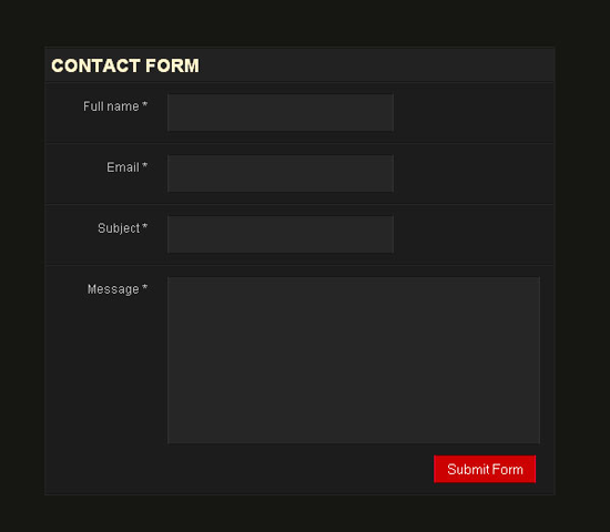
Create a simple CSS form

This tutorial explains how to design a good contact form using a clean CSS design with only label and input tags to simulate an HTML table structure.
Create a simple CSS form

Postcard CSS comment form

This tutorial will show you how to create a stunning comment form using an old postcard image.
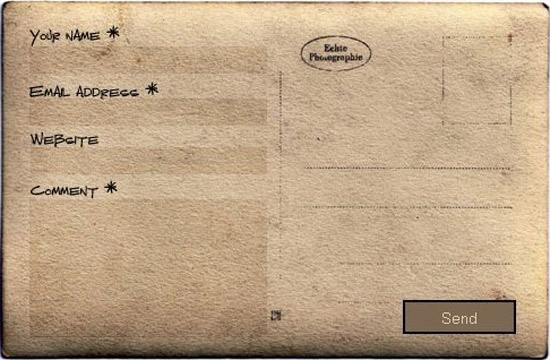
Postcard-like CSS Contact Form

Stylish Responsive Form With CSS3 And HTML5

This tutorial shows you how to create a stylish contact form in CSS3 and the details of working with gradients, drop shadows and rounded corners.
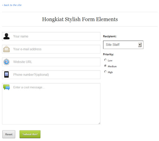
Stylish Responsive Form With CSS3 And HTML5

Facebook-like Registration Form with jQuery

Probably the most known registration form is the sign up form of Facebook. Learn how to create it.

Facebook-like Registration Form with jQuery

A simple and stylish HTML 5 and CSS 3 contact form

Step by step tutorial on how to create a beautiful contact form using Photoshop, HTML5 and CSS3. The tutorial starts from scratch with the Photoshop mock-up.
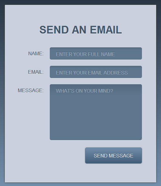
A simple and stylish HTML5 and CSS3 contact form

Build a Neat HTML5 Powered Contact Form

This form tutorial is built using HTML5 for the input elements and uses the browser’s built-in form validation. Also for older browsers the tutorial uses jQuery and Modernizr and PHP on the server side to validate the input.
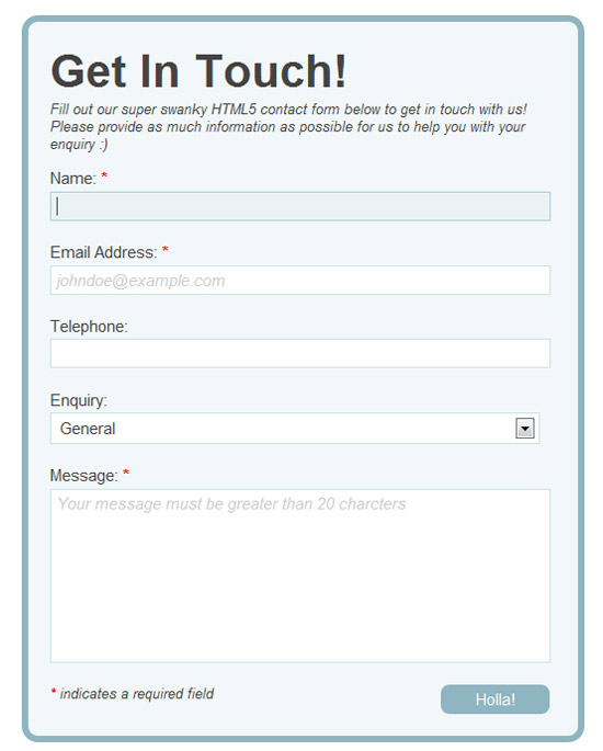
Build a Neat HTML5 Powered Contact Form

Fancy AJAX Contact Form

AJAX contact form that uses PHP, CSS, JQuery, formValidator and JQTransform plugins to style input fields and buttons and make the form functional. In addition it uses the PHPMailer class to send out the contact form emails.
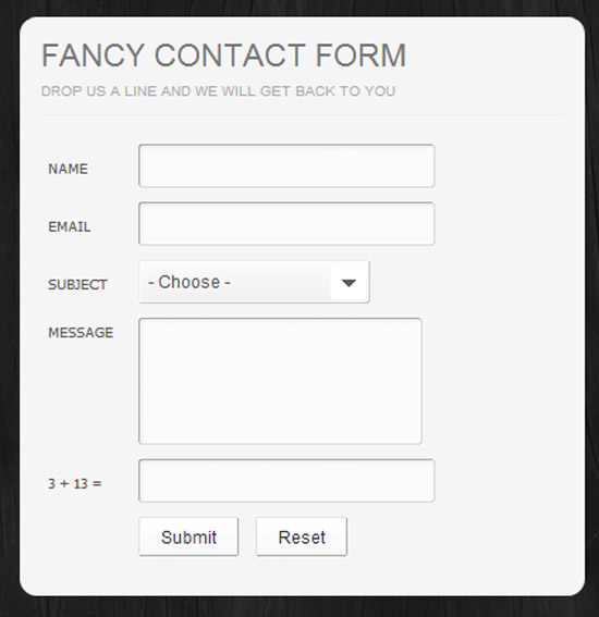
Fancy AJAX Contact Form

Floating Feedback button contact form

This tutorial features the creation of an AJAX contact form. The form is not visible initially and is activated by clicking on a Feedback button floating to the left of the website.
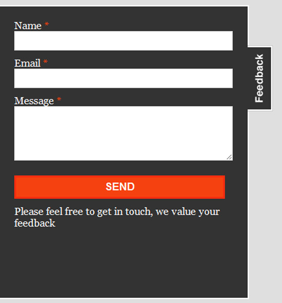
Floating Feedback button contact form

Sign-in dropdown box likes Twitter with jQuery

This tutorial helps you create a JQuery Dropbox sign-in box, just like on Twitter.

Sign-in dropdown box likes Twitter with jQuery

Cross-Browser HTML5 Forms

This tutorial teaches users to create beautiful HTML5 forms for modern browsers and how to use a mix of Webforms2, Modernizr, jQuery UI and assorted jQuery Plugins for compatibility with older browsers.
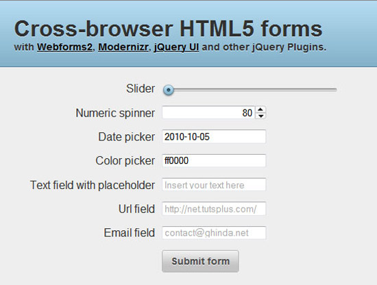
Cross-Browser HTML5 Forms

JQuery and CSS3 drop-down menu with integrated forms

A jQuery and CSS3 tutorial that creates a drop-down menu where each sub-menu has a different form integrated (login, contact form or sign up).
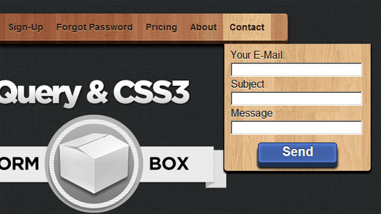
JQuery and CSS3 drop-down menu with integrated forms

Modern Web Forms with HTML5 and CSS3

A beautiful sign-up form with rounded input boxes and button. Also each textbox includes a small icon relevant to the given field.

Modern Web Forms with HTML5 and CSS3

CSS3 forms with HTML5 validation

This form validates itself in real-time whether the completed data fits the recommended format for name, email or website.
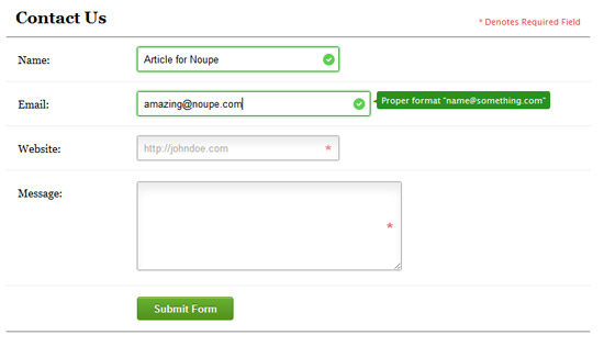
CSS3 forms with HTML5 validation

Simple gradient CSS3 form

A simple CSS3 form tutorial explaining the usage of shadows and gradients in HTML5 contact forms.
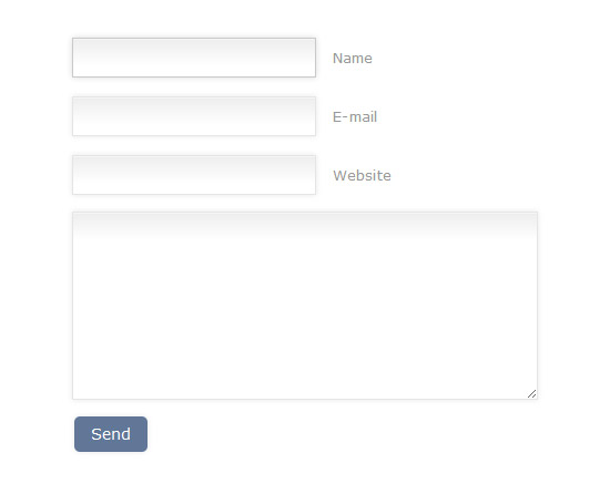
 Simple gradient CSS3 form

Conclusion

Contact forms have come a long way in the past years, especially after the release of HTML5 and CSS3. You should always be up-to-date with technology and this is an essential part of your online presence. Hopefully you found these tutorials useful, maybe even convincing enough to change the ones on your own websites. We would love to hear your opinions below.

(rb)


Using media queries to hide CSS3 from older browsers

When working around bugs and different levels of support in various browsers, a common approach is using conditional comments to target certain versions of Internet Explorer. Come to think of it, it’s pretty rare to need to fix something for an older version of any other browser. People who do not use IE tend to upgrade quicker and CSS-related bugs in other browsers tend to be less severe than in IE, especially compared to IE7 and older.

Anyway, while working on a lot of responsive layouts lately I’ve started using an approach that I’ve found reduces the risk of more advanced CSS, especially CSS3, tripping up older browsers. I simply wrap any CSS that I know won't work at all or may only half-work in a very basic media query, like this:

@media only screen {
    /* "Advanced" CSS2 and CSS3 goes here */
}

Read full post

Posted in .

Copyright © Roger Johansson


Beware of @import rules when concatenating CSS files

If you like to spread your CSS over multiple files, as many people do (but I don’t), it is generally a good idea to concatenate them before deployment to reduce the number of HTTP requests.

There is one thing to be aware of when doing this – if you use any @import rules they must precede all other rules in that file, as per the CSS 2.1 specification. So if any other than the very first of the CSS files you concatenate has an @import rule, the combined file will violate the specification.

Read full post

Posted in .

Copyright © Roger Johansson


  •   
  • Copyright © 1996-2010 BlogmyQuery - BMQ. All rights reserved.
    iDream theme by Templates Next | Powered by WordPress