
Shutterstock is a renowned global marketplace for designers and creators to sell royalty-free images, footage, illustrations, and vector graphics. With a huge contribution all over the world, its library of more than 200 million stock photos, illustrations, and vectors make Shutterstock one of the best vector websites to find design elements in the creative community.
But as the stock image market grows, there are more and more websites and platforms that also provide high-quality and even free images. It’s no doubt that when it comes to design, having more options, and more inspiration is never wrong. In this post, I am going to list the 10 best vector websites to find and download free illustrations as Shutterstock alternatives.
Shutterstock: Pros and Cons
There are many advantages of Shutterstock that we can mention, including:
- High-quality and various resources of many kinds (images, videos, sound effects, music, templates)
- Enhanced licenses are also provided to use the content for distribution to a large audience or on merchandise. (of course, except editorials)
- AI-powered search with truly impressive results
However, together with some pros above come several cons that we might want to search for other platforms instead.
- Difficult for beginners or amateurs: so many choices regarding types of resources and packs of subscriptions make it more difficult to use, especially for those who are not really Internet masters. I believe that even for those who are experienced, it takes time to read and fully understand their licenses and other useful guides.
- Too expensive: subscriptions come with limited numbers of image downloads monthly and enhanced licenses do cost an arm and a leg even for single users.
In terms of simplicity and affordable pricing, I suggest the 10 following best vector websites and platforms as Shutterstock alternatives.
illustAC
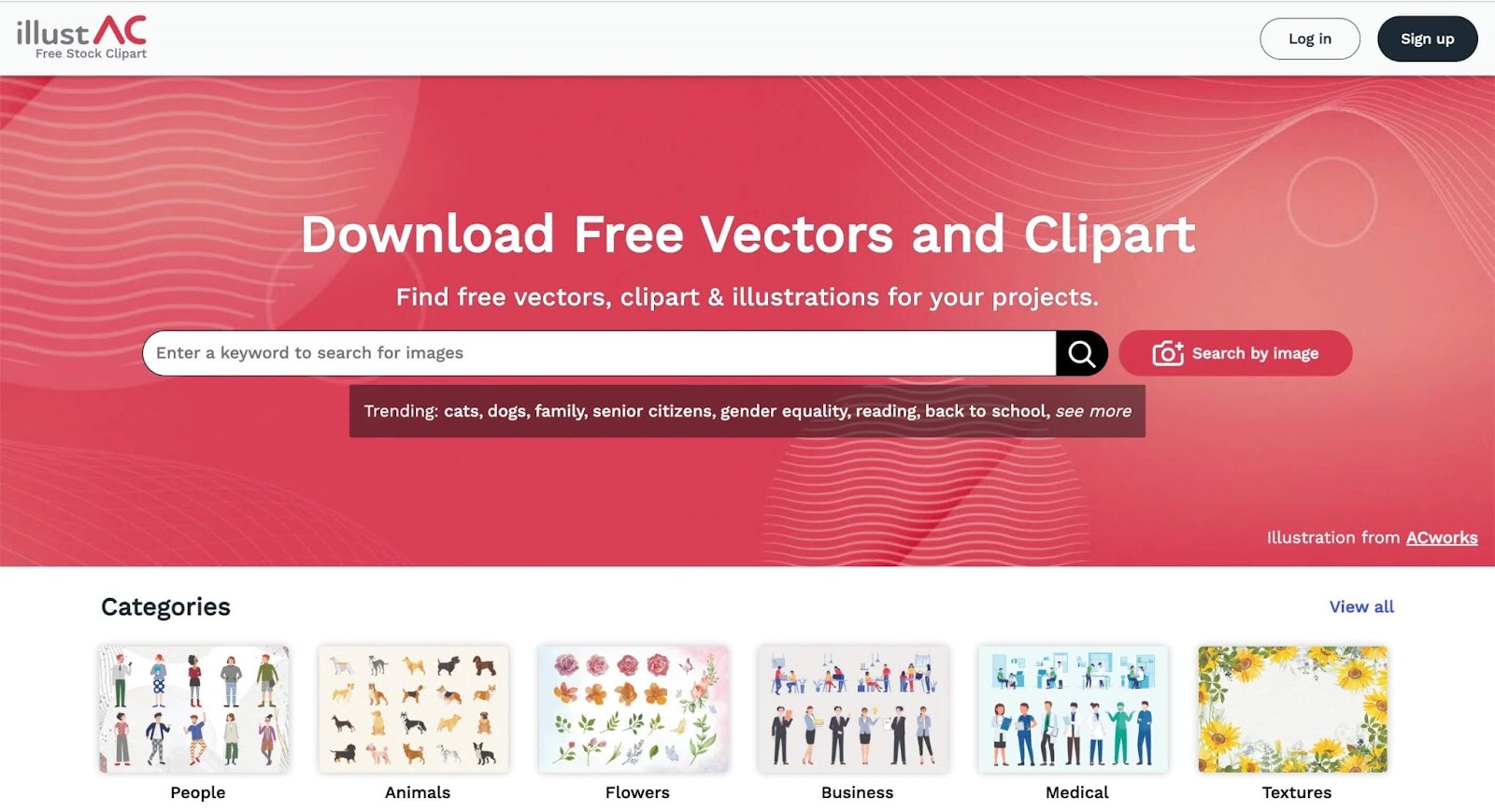
Compared to Shutterstock, illustAC has some advantages below.
- Simple to use: this is about illustrations and vector graphics – no other distractions. You visit the site, start searching for the illustrations you want and download them. You need to sign up or log in to download, but no card info is required when onboarding as free users.
- Simple and affordable subscription packs: Monthly for 12.2$ and Annually for 132$
- NO download limits: unlimited download times for premium users
- NO attribution required
Other advantages:
- Bulk download for premium users: from search result pages, you can choose file types you like, add them up to the download folder and download up to 10 files at a time.
- License for commercial uses at a reasonable price: offer an Extra license at 29.99$ per license to cover the usage of the images as the main element for products that will be sold to multiple clients. No limitation in the number of distributions and time of use.
- Download one format at a time: Shutterstock and some other platforms will let you download all files in a pack. Usually, it’s not really necessary to download such heavy files. On illustAC, we can choose what type of file format we want to download. You DON’T need to unzip or check any licenses within – SIMPLE and EASY in a single click.
- Unique content: illustAC offers various types of free vectors including brushes, templates, graphic backgrounds, etc. But the truly special one is that you can find real Japanese tastes here, from sushi illustrations to bold Japanese decor patterns that you can see from nowhere else.
Freepik
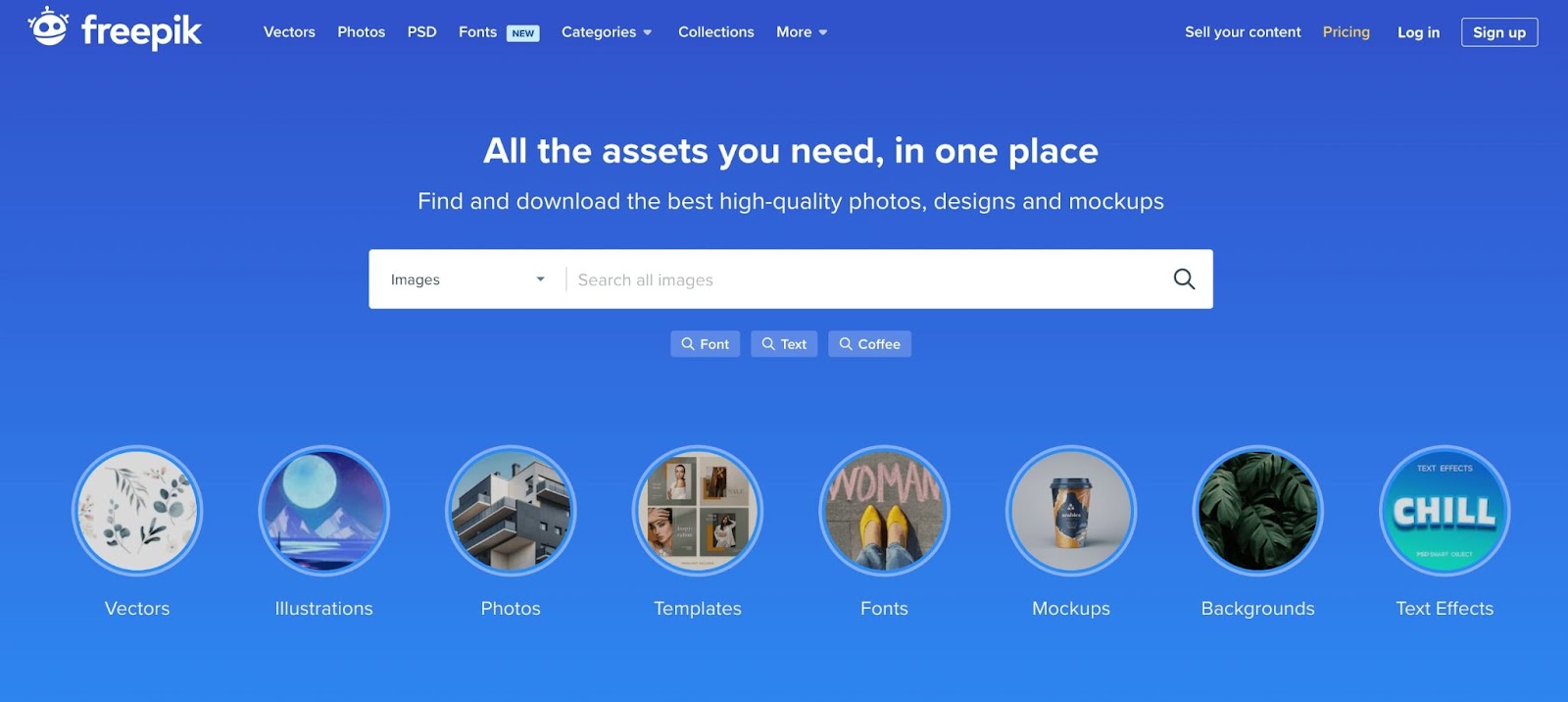
Compared to Shutterstock, Freepik has some advantages below.
- Simple and affordable subscription packs: Monthly for 15EUR (~14.72$) and Annually for 108EUR (105.98$)
- Free downloads both for guests and free users: you don’t need to sign up or log in to download images you like. Guests can also download up to 3 free illustrations per day. If you want more, free users can download up to 10 images, and premium users for 100 downloads a day.
- Trendy and up-to-date content: just like Shutterstock, Freepik is a house of millions of creators around the world, you can always find trendy content there.
- Other embedded platforms for UI designs: Flaticons and Storyset are two other platforms from Freepik where you can find and download free icons and illustrations for user interface design
Vecteezy
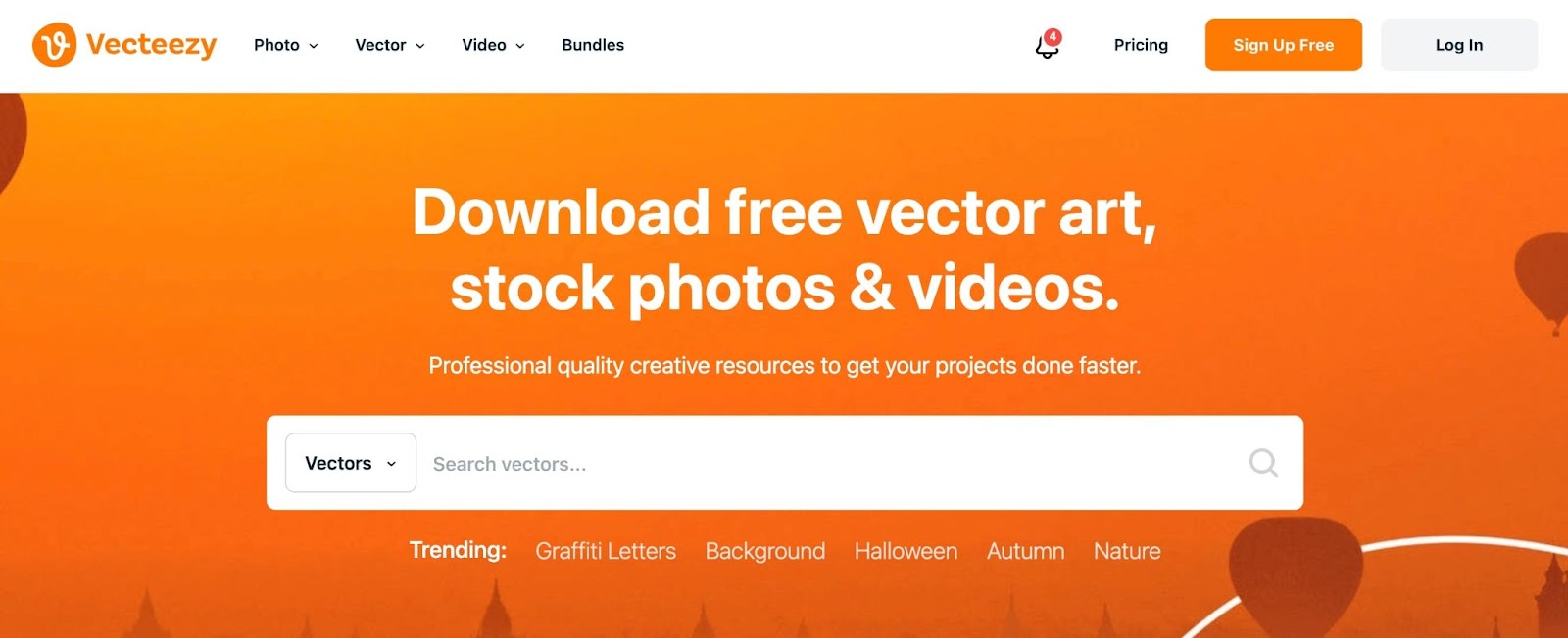
Compared to Shutterstock, Vecteezy has some advantages below.
- Simple and affordable subscription packs: Monthly for 15$ and Annually for 108$
- Free downloads for both guests and free users: you can download a lot of free content on Vecteezy with download limits of 3 images for guests and unlimited for free users. Of course, attributions are required in this case, just the same as Freepik. Pro content can only be downloaded when upgrading.
- Licenses are easy to understand and compare: Vecteezy doesn’t challenge users with difficult terms when it comes to licensing explanation and comparison. It won’t take long to fully understand what they offer.
IconScout
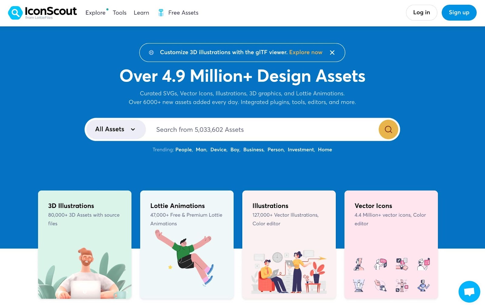
IconScout is all about illustrations of all types (flat illustrations, icons, 3D illustrations, and animations). Compared to Shutterstock, it has some advantages below.
- Simple and easy navigation: if you want to search for illustrations, IconScout is easy to navigate.
- Simple licenses to understand and compare: IconScout provides 2 kinds of licenses (digital license and physical unlimited license) which are clearly explained and compared in simple words.
- Free assets to download with attribution
- Affordable subscription packs (annually only, no monthly packs): Yearly for all assets will cost 179.99$ and for icons only will cost 155.99$.
Manypixels
Manypixels is a platform providing design solutions for businesses, entrepreneurs to cooperatives. Together with design services, it also shares free illustrations and free icons resources to download.
Although these libraries are limited in the number of content available, compared to Shutterstock, it still has some advantages below.
- The content is all FREE for commercial and personal uses: you don’t need to pay to download illustrations and icons on Manypixels. You can
- NO download limits: you can download any content you like without sign-up / log-in and no limits.
- NO attribution required
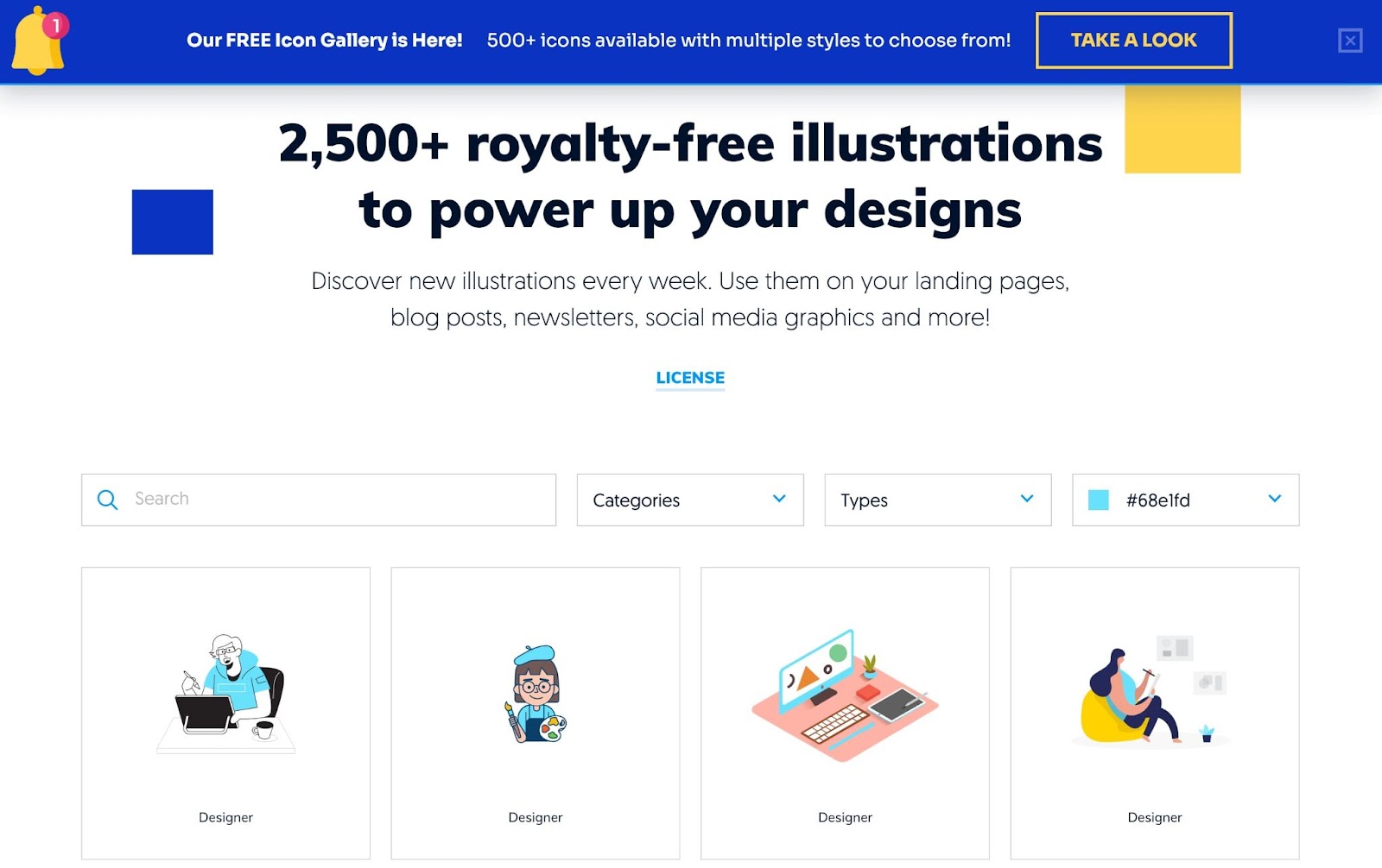
Drawkit
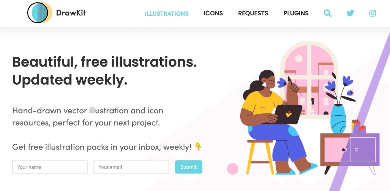
Drawkit is also another platform that offers both free and premium illustrations and icons. It is a good alternative for Shutterstock in terms of good pricing, free downloads, and simple licensing.
- Free download: Drawkit offer free content with SVG & PNG formats
- Good pricing: Premium content is offered by different themes. You can pay for each pack you like.
- Simple licensing: Drawkit’s license is easy to understand (not for merchandise or included in digital design templates, for example)
Other Open Sources and CC0 Platforms
The websites below surpass Shutterstock in terms of no download limits, simple licenses, and no requirement for attribution.
- NO download limits: you can download whatever you like with no limitation (but of course, there are fewer options to choose from, and most of them are suitable for UI design)
- FREE for all non-commercial or commercial uses EXCEPT redistribution
- NO attribution required
However, the number of resources available on these websites and platforms is limited. If you want to have a wide range of free illustration options, you’d better try the stock and royalty-free illustrations platforms mentioned above.
Conclusion
Here we’ve mentioned the top Shutterstock alternative vector sites to download free illustrations. Each of these sites has its own usage guides, licenses, and type of resources. Before downloading the images, make sure to check out their terms and conditions to avoid any unwanted copyright infringement.
We hope that with the list of best vector websites above, you can save time and costs when you need to find illustrations and vector graphics for your next projects.
The post Shutterstock alternatives: Best Vector Websites to Find Free Illustrations appeared first on noupe.


