Design

Poster Design Ideas – Fundamentals of Creating Eye-catching Posters

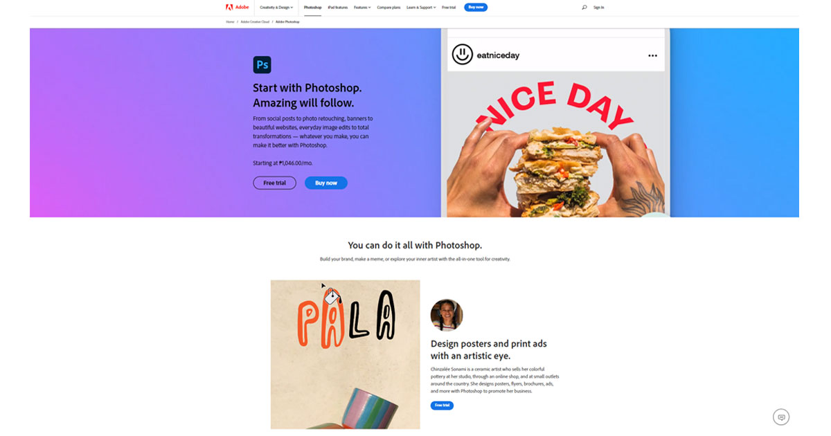
What is the most effective way to generate interest in a new film, book, product, or future event? Posters.

Posters are a global favorite because they work for everyone; no matter who you are, what you do, or what you’re marketing, a poster is a powerful and eye-catching way to provide information and excite your audience about upcoming events. They’re inventive, daring, funky and may elicit a wide range of feelings. 

Some movie or music posters grab your attention, while other poster kinds may be informative and instructive. Finding the ideal balance between the title, content, photos, and design is crucial. Your poster will be ready once you achieve that.

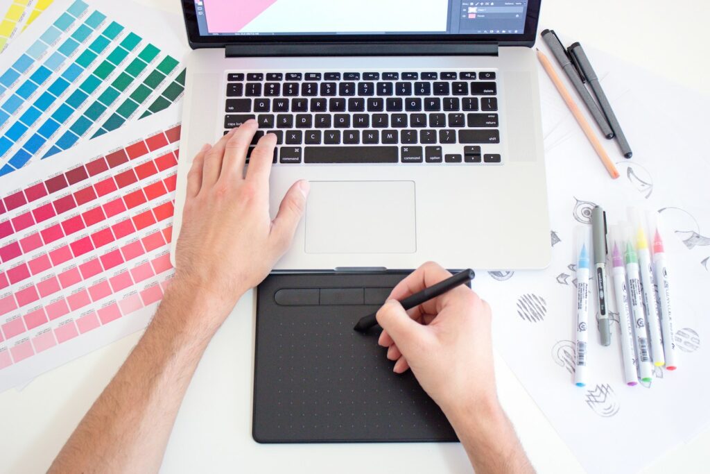
The first and most crucial step in making a poster is understanding your target audience and product. Following that, you may experiment with color, alter forms, modify background textures, and apply stylish typography in order to complement the content. Here are some suggestions and poster ideas to help you find the best approach to convey your message.

The Principle Ideas of Poster Design

Understanding the elements of poster design is crucial for comprehending contemporary poster design concepts. The right poster will express your brand message and connect with your target audience, from storytelling aspects to title treatment design, technological requirements, and data-influenced decisions that you will make to convey the story and attract desired audiences. When you select these unique components, you will enhance your brand message, increase your audience’s recognition, and increase your product’s interest.

Here are some principles that help you strengthen your message.

Creating Color Harmony

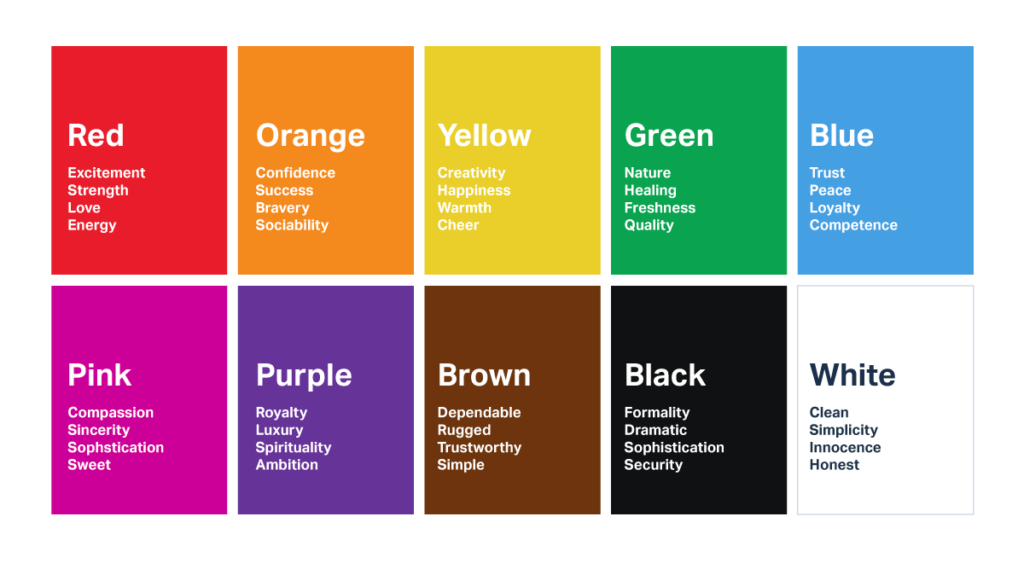
Choosing the right colors is not always simple, especially if you have to stick to a logo or a certain theme. In this situation, you need to adhere to a color palette to create appropriate and attractive color combinations. In order to discover the ideal color combinations, you may also try working with the PowerPoint color palette.

To keep things basic and appealing at first, try not to select more than two colors in addition to white and black. Use various shades of your current color choices if you need to add extra colors to your design. Also, remember that each color is symbolic and can represent a range of emotions. The colors that you pick will each convey a different feeling. Keeping color symbolism in mind is advised in poster design.

Below is a chart to help you.

https://www.linkedin.com/pulse/color-psychology-brand-development-brooke-janousek/

Text and Font

Remember that your poster should be simple to read. You wouldn’t want your information lost due to incorrect font selections or sizes. Avoid using elaborate typefaces that might strain the eyes. Less is more! If your poster has a clear, straightforward, and readable font, your audience will be able to comprehend your content easily.

Instead of utilizing a distractive typeface, try using vibrant colors or intriguing imagery to show creativity and originality. It is important to utilize bright and intense colors as a crucial element in poster design since this will draw the focus and ensure it is a main component in the design.

Additionally, we advise you to ensure that the color of your text and the background contrast significantly. For instance, using the white font on a dark backdrop will ensure that everyone can see your message.

The Visual Hierarchy

An order of significance indicates that the most critical elements must be noticed first. Designers should adhere to this rule since it directs viewers to focus on the most crucial elements. You must ensure that the size of symbols and forms match their significance. The most important symbols should be highlighted on your poster.

The title, subtitle, and body content of the poster should be arranged according to size. Since the title is always the first thing readers will see, it should take up most of the page and be written in a standout font. The subtitle should support the title even if it should be smaller. The body copy must also be easier to read and smaller. Also, keep the information on the poster to a minimum. It is natural to want to include all pertinent information, but doing so risks cluttering your design and diverting the reader from the message.

What is the most important piece of information you want a viewer to remember? Your design should center on this statement.

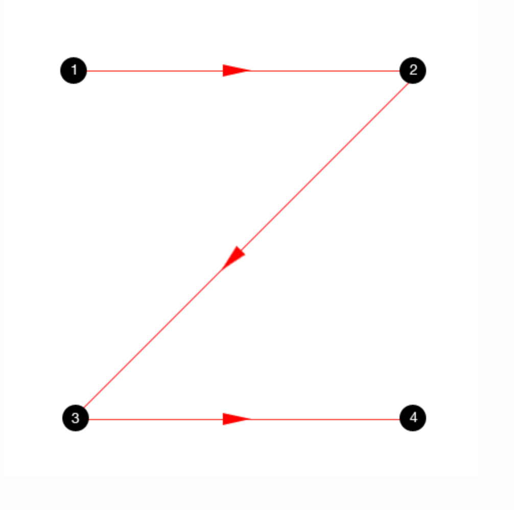
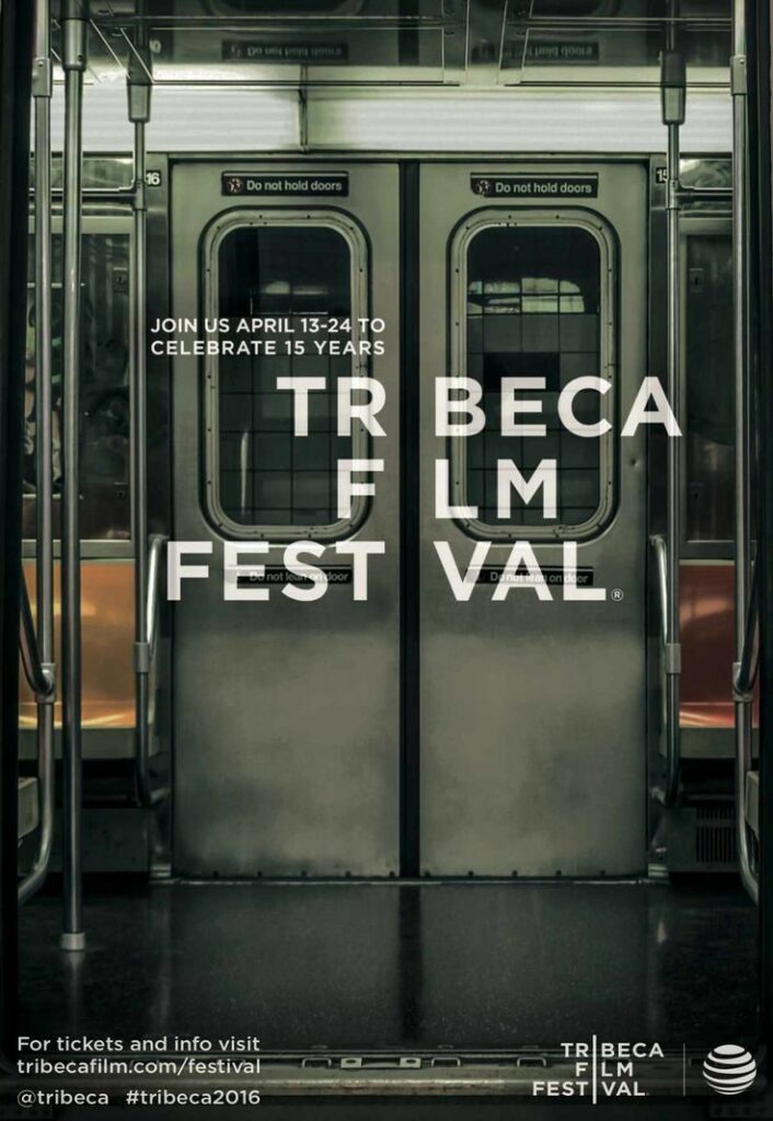
The human eye is practically ‘conditioned’ to follow a Z-shaped pattern, which means it starts at the top left of a page, scrolls to the right, then returns to the left before continuing down the page. Keeping this in mind, it is typical to position the attention grabber in the top left of the page, followed by the necessary information about the product or event in the bottom right-hand block.

https://vanseodesign.com/web-design/3-design-layouts/

Take this into consideration while designing your poster.

Now that you’ve given your poster design some semblance of order and piqued your viewer’s interest, you can fully unleash your creative side!

Spacing and Alignment

A key design element is to align and space your text properly. Text that is spread out rather than jammed together is more readable, and readers will almost certainly retain the information better.

Additionally, it creates a scene that looks more integrated and unified, which is appealing to the eye.

Your components must all be in harmony with one another. The edges of one element must intersect the edges of another element if you extend their edges. This guideline is true for both text and pictures!

Creative Ideas for Poster Making

1. Use Color to Evoke a Feeling.

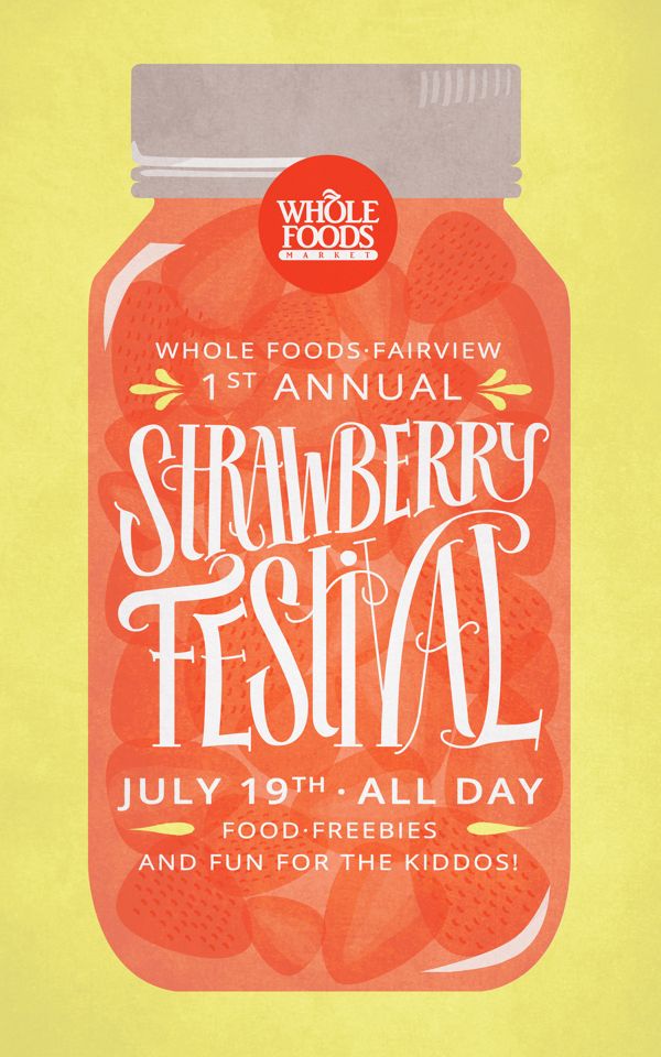
Use complementary colors to convey the mood and tone you want to see in your poster. Look into some correlations between emotions and color! An illustration of how to use hues like green and blue to evoke a sense of tranquility, peace, and nature is seen on the following poster

[image 1]

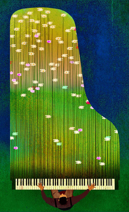
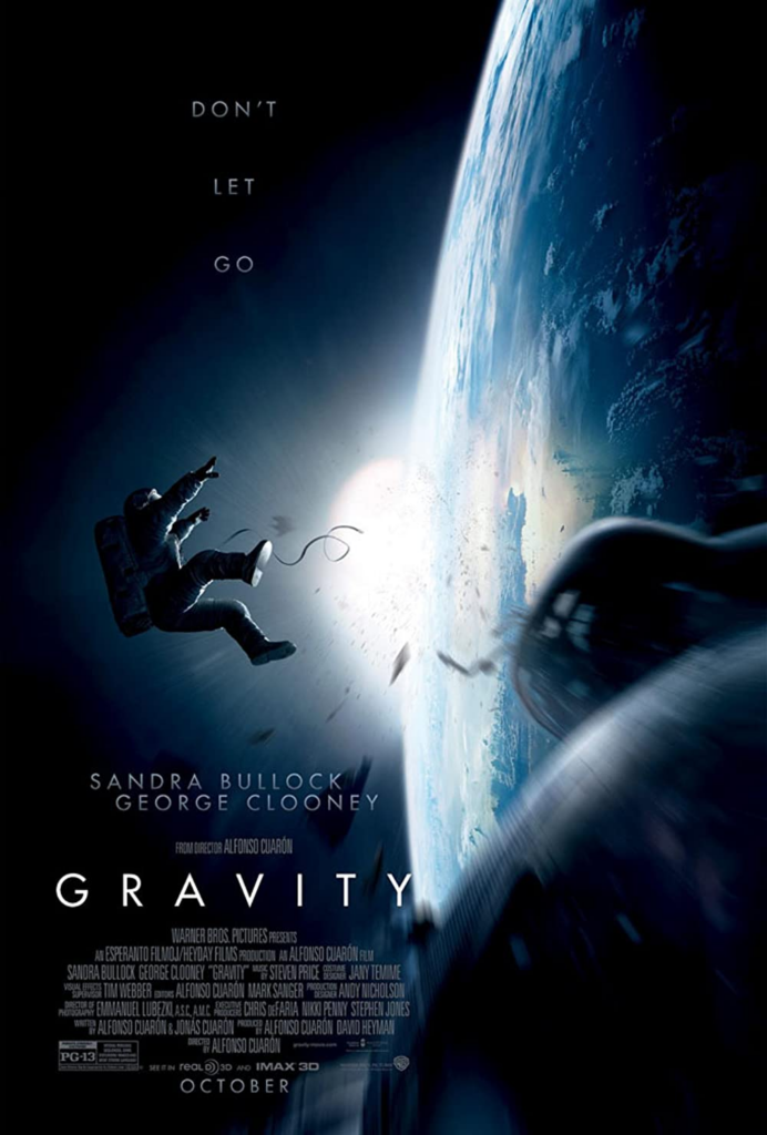
Take note of how the usage of the color blue in this poster elicits a sense of isolation, iciness, and dread.
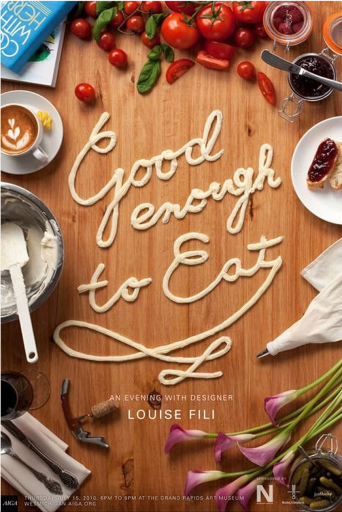
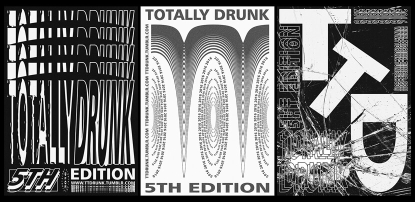
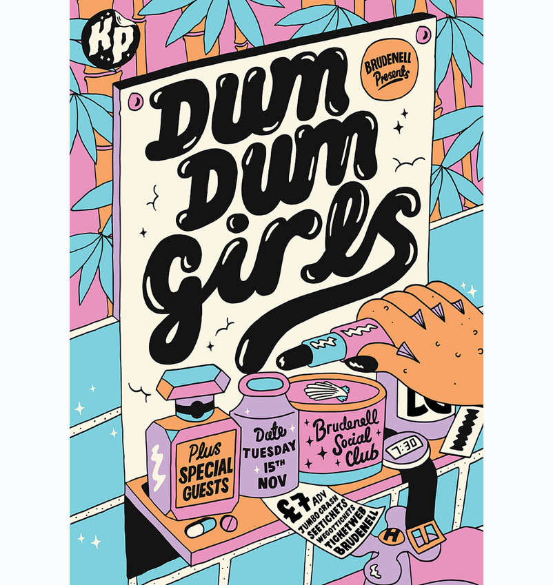
[image 2]

2. Use Typography

Experiment with different fonts to create a great impact on your viewers. 

[image 3]

This poster used the imagery of food through typography to further emphasize the message.
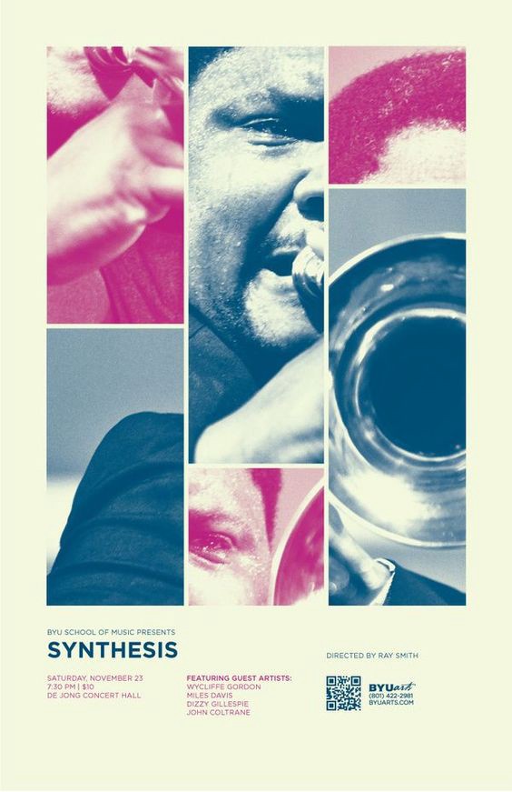
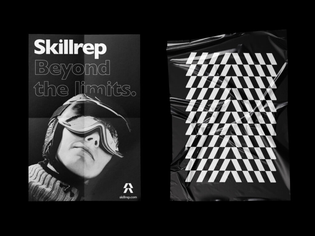
[image 4]
[image 5]
[image 6]

3. Create Hierarchy

Making one element noticeably larger than the others is one of the quickest and easiest methods to establish hierarchy in your design. 

The main emphasis of this poster is a collage of jazz instruments and musicians.They compliment each other in terms of space and color, resulting in one large photo that serves as the design’s focal point. The audience quickly recognizes this as a promo for a jazz music performance. The poster also includes the event dates, venue, and artist information at the bottom. 

[image 7] 

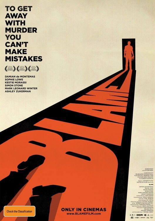
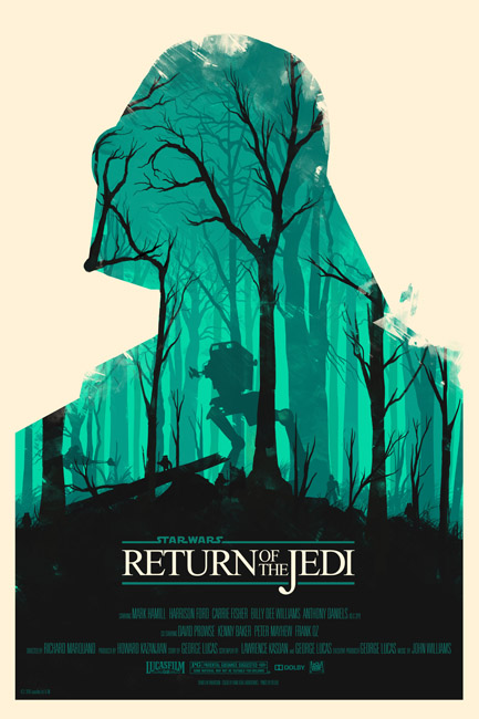
This poster design captures your attention not just via the use of scale, but also through the use of leading lines and perspective. The word “Blame” is surrounded with a black background and connected to a silhouette standing within a doorway as the main design element. The use of colors instantly gives us the impression that this is a murder mystery film narrative.
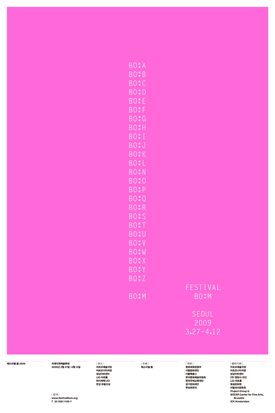
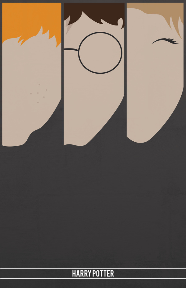
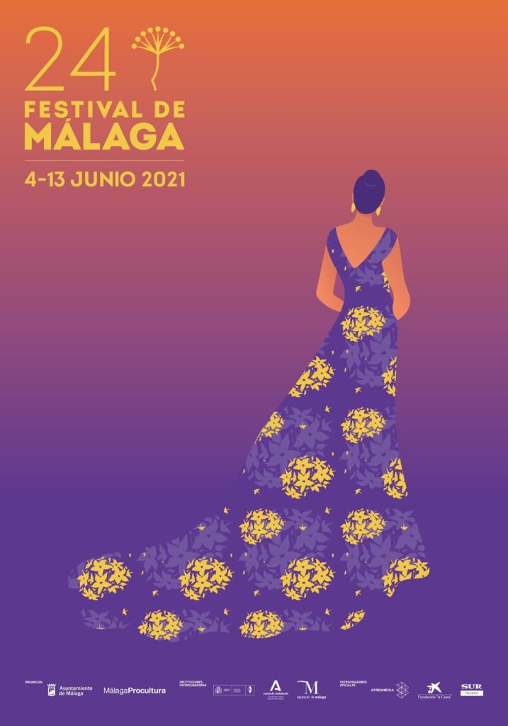
[image 8]
[image 9]

4. Use Minimalism

Sometimes, simple is better. Using basic design components to express whatever thing you want to say to your audience is possible with a minimalist approach to design.

[image 10] 
[image 11]
[image 12]
[image 13]

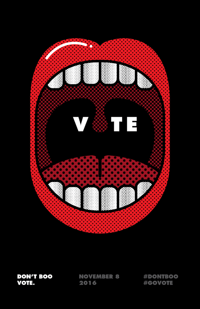
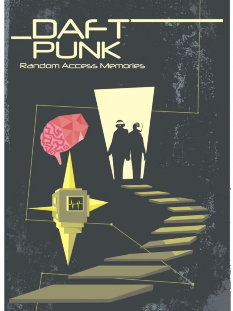
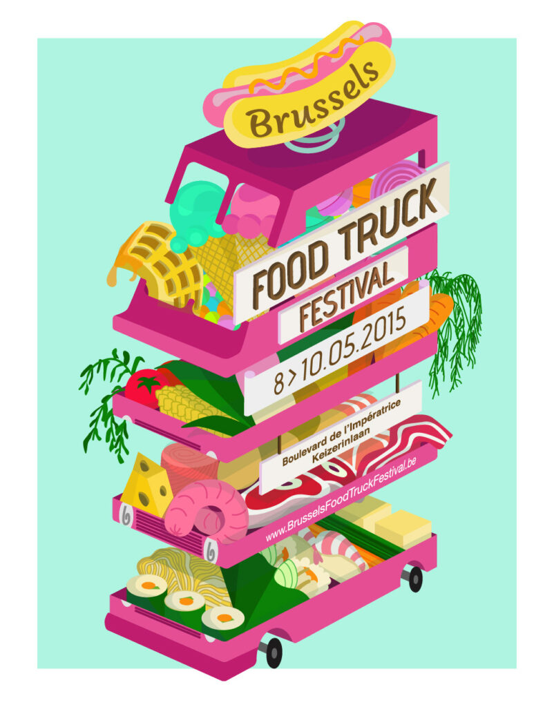
5. Focus on Graphics

When it comes to making a compelling poster, reducing text to a minimal and focusing on the graphics is sometimes the best way. Instead of overloading your audience with words, graphic posters are a great choice for marketing a movie or event since you can leave it up to them to make sense of the imagery.

[image 14]

[image 15]

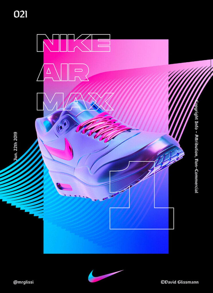
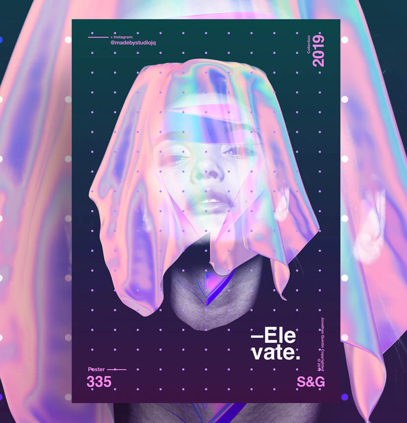
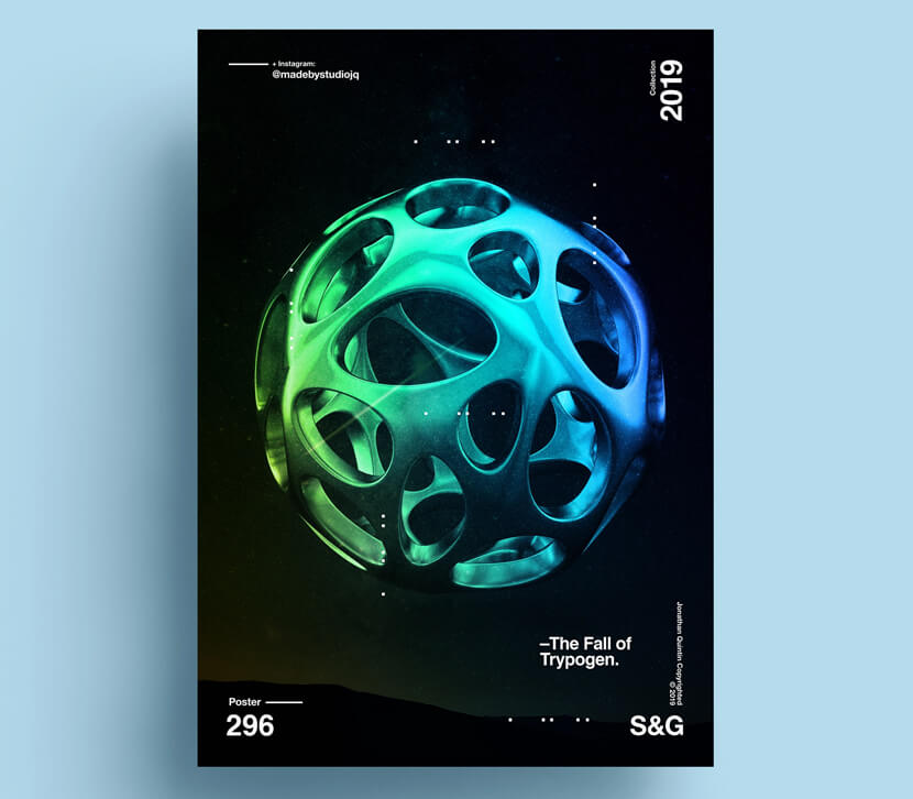
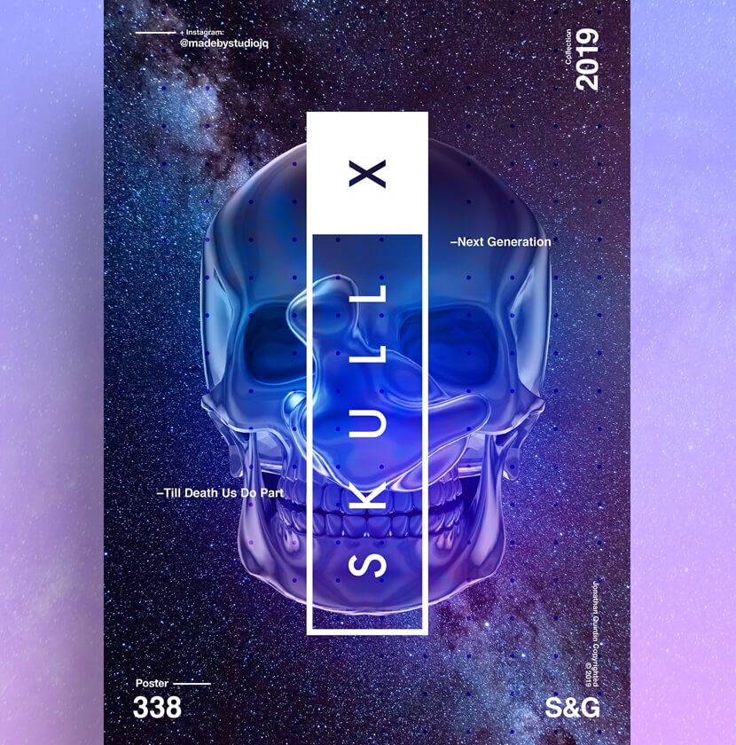
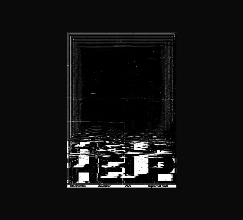
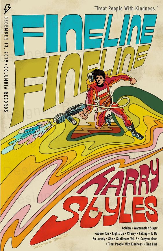
6. Use 3D effects and Play With Dimension

Posters that appear futuristic and extraterrestrial steal the show. These designs have futuristic-looking color combinations, neon hues, semi-transparent effects, liquid effects, iridescent effects, and 3D effects.

[image 16]
[image 17]
[image 18]
[image 19]
[image 20]

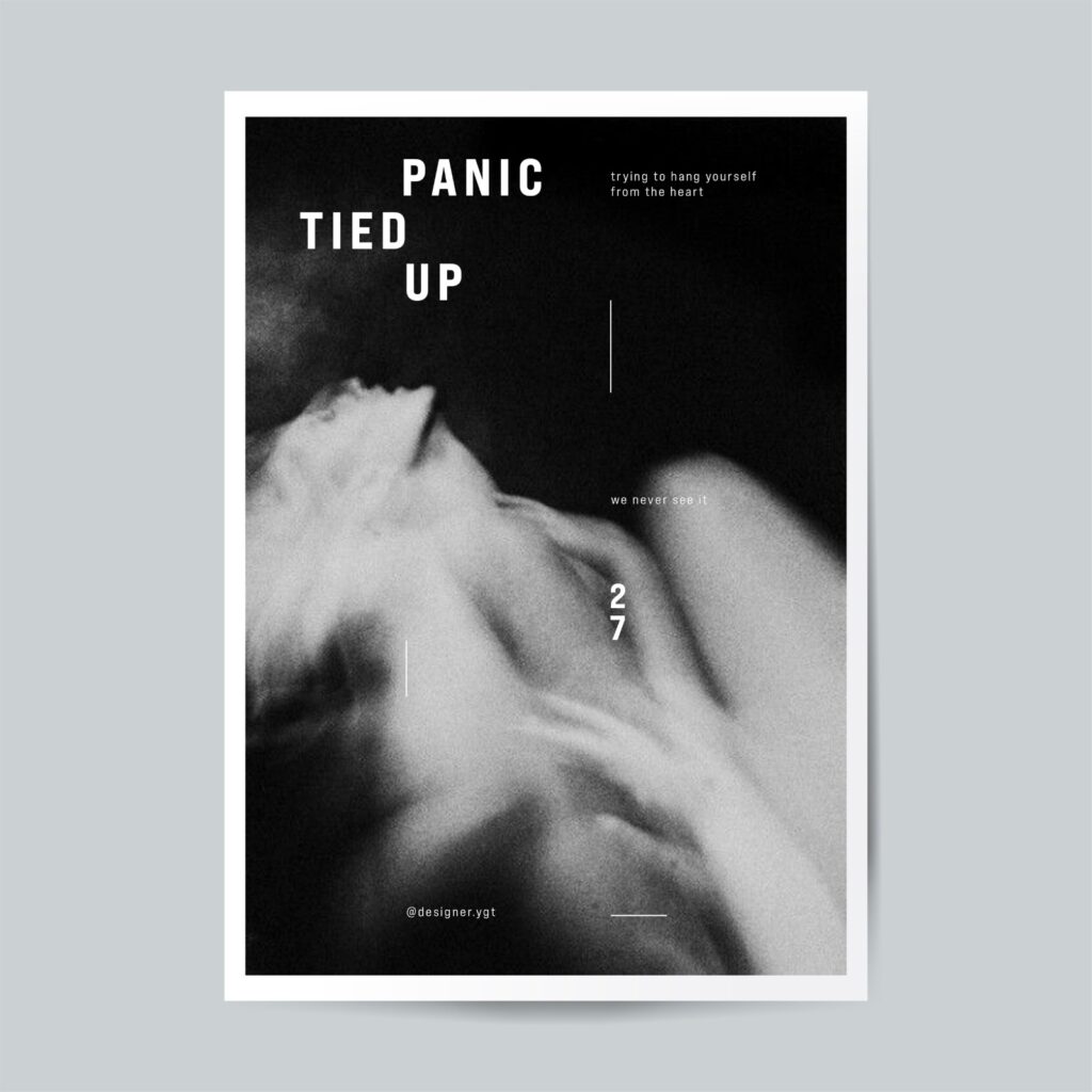
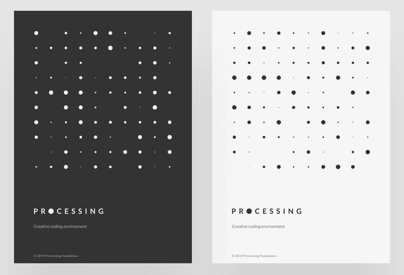
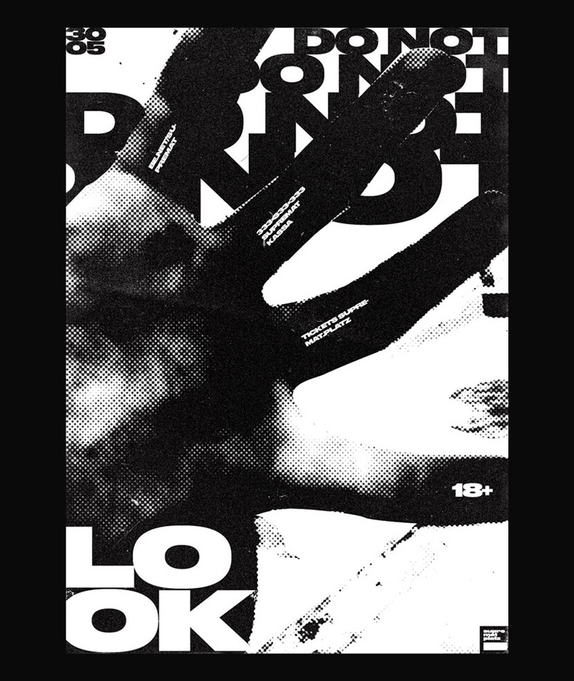
7. Use Only Black & White

A poster may still make a big impression even with a limited color scheme since sometimes using too many colors might divert the audience’s attention from the content. Simple black and white posters are simple to read.

[image 21]
[image 22]
[image 23]
[image 24]

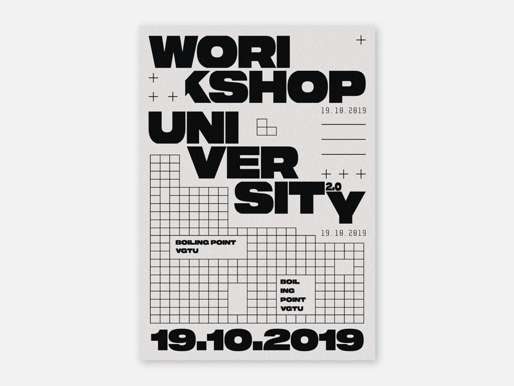
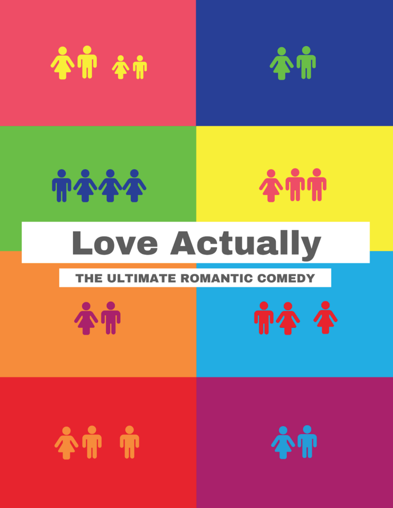
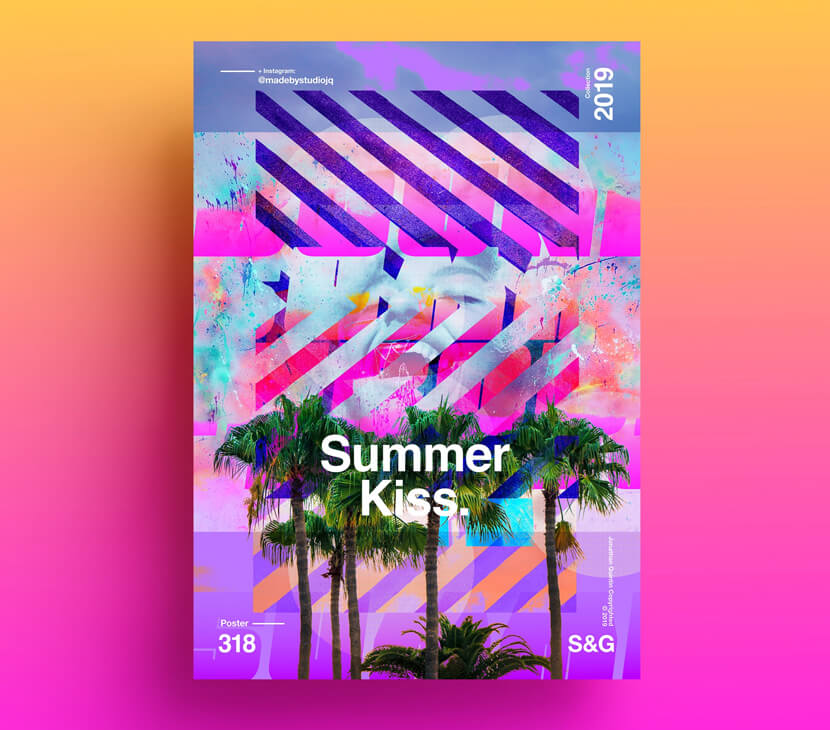
8. Experiment With Different Shapes

Using shapes is another approach to direct and lead a reader’s eye. They are used to contain text, to make an unusual composition, or to focus the viewer’s gaze in a specific direction. To bring attention to your message, you might utilize a background full of shapes and forms or build shapes with your text.

[image 25]
[image 26]
[image 27]

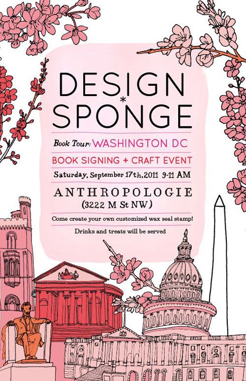
9. Use Creative Illustrations

Instead of using photographs to produce a poster, use an illustration to create a poster that is uniquely intended for your purpose. Be creative!
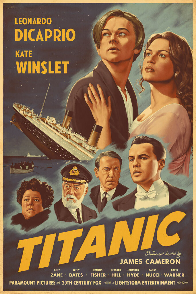
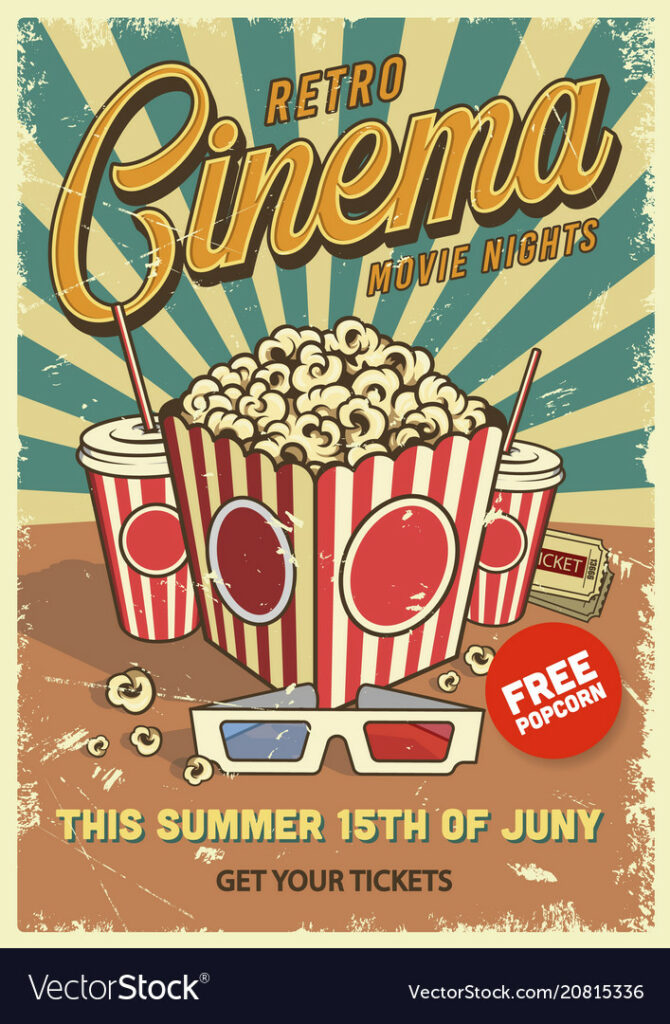
[image 28]
[image 29]
[image 30]

10. Go Vintage

Retro is undeniably trendy right now. Vintage clothing and film photography are closely intertwined, as is your new poster design concept.

Check out some of these poster design ideas to get inspired!

[image 31]
[image 32]
[image 33]

Now, It’s Your Turn !

That’s all. We hope you found this article as inspirational to read as it was to write. Now that you’ve seen many types of posters and some crucial principles to follow, it’s time to figure out which strategy is ideal for your company. Finding the right pictures, shapes, and fonts to convey your message can result in a wonderful design. You are now ready to design your poster!

The post Poster Design Ideas – Fundamentals of Creating Eye-catching Posters appeared first on noupe.


Graphic Design: Your Ultimate List of Tools and Resources

We can’t do what we want to do without the aid of tools. Chefs employ fire to conjure up gastronomic wonders in the kitchen. Playing an instrument is an essential part of the music. A bridge that allows people to travel between two points in suspended space must be built using the correct tools and materials.

Visual art designers, such as graphic artists, require more than natural aptitude and skill to produce their work. Graphic designers use simple and advanced graphic design tips and tools to capture the constantly altering patterns and colors they see in their heads. 73 percent of firms are willing to invest in graphic design to stand out.

Even if there is a great demand for graphic designers, it is essential to note that there is a lot of competition to beat, which results in about 40% of new designers quitting the business after just two years. The instruments of graphic design tips have changed drastically over the centuries, beginning with Renaissance brushes and progressing to electronic styluses. Audiences and buyers of visual art agree. You must master a wide range of abilities and become adept in graphic design tools to succeed in today’s digital world as a successful graphic designer.

Many options exist, but these 22 critical tools for graphic designers who want to unleash the next generation of visual experiences are an excellent place to start.

Books

Thinking with Type

We have a copy of one of the first graphic design books we recommended reading, Thinking with Type, and occasionally refer to it. The book’s design enhances its usefulness by providing beautifully drawn examples of how to apply the topics addressed in the book.

Ellen Lupton provides specific and detailed instructions on how to align, space, order, and shape letters, words, and paragraphs. The book covers all aspects of typography, from typefaces and type families to kerning and tracking to the use of grids.

Graphic Design Thinking: Beyond Brainstorming

Second on this list is Ellen Lupton’s Graphic Design Thinking: Beyond Brainstorming. In Graphic Design Thinking, Lupton, the design curator of the Cooper-Hewitt National Design Museum in New York, draws on her expertise and those of industry leaders.

To come up with creative and practical solutions, graphic design thinking uses a range of strategies to encourage new ideas. Various visual examples and case studies follow a short narrative text to clarify each process.

How to

We see pieces for Saks Fifth Avenue, The New York Times, and Yale School of Architecture in this retrospective of Michael Bierut’s graphic design work. Bierut’s design philosophy is explained in the context of 35 of his creations in the book How to.

Each step of the process, from historical images, to early sketches, to working models, to the finished product, is explained by the artist in his voice through various media. It is revealed in the book that the author has a personal and professional life as well as obstacles he and other designers face in making fresh ideas available to a broader audience.

Work for Money, Design for Love

We highly recommend Work for Money, Design for Love to anyone starting in the design industry, especially as a freelancer. In his book Work for Money, author David Airey covers the business side of design. 

Internationally renowned logo designer David Airey, the author of Logo Design Love, offers a refreshingly plain guide to the challenges many designers confront when they first strike out on their own. In this new book, he finally addresses their serious challenges using tales, case studies, and sound advice garnered from his experience and that of well-known designers.

Graphic Design Rules: 365 Essential Dos and Don’ts

You can use Graphic Design Rules to improve your designs, whether you’re a student or an experienced artist. Clear-cut instruction on everything from typography to developing page layouts is provided in this article.

This colorful compilation of design dos and don’ts is full of practical guidance and walks readers through 365 guidelines like understanding when to utilize a modular grid—and when to chuck the grid out the window. These talented authors, who draw on years of experience to help you produce beautiful designs, will be appreciated by all designers.

Websites

Dribbble

Dribble, the company that poses the greatest threat to Behance’s market share, is yet another excellent portfolio website that creative professionals use to exhibit their work, network, and look for employment prospects. Since the user interface of this platform is intended only to provide “snippets” of projects, you will frequently find links on Dribble leading to the whole project presented on Behance. Dribbble, on the other hand, is an excellent platform for sharing work in which attention to detail is particularly crucial, such as logos or individualized illustrations.

Behance

Behance is currently the most popular platform for online portfolios, enabling design professionals to share their work in various fields, including typography and interior design. However, Behance is more than just a venue to display your best work to the world. It is an ideal venue for networking, drawing inspiration from the work of others, and even discovering employment prospects through the job search area of their website. It has a fantastic user interface that enables you to search for projects by name and industry or subject.

99Designs

Not only is 99 Designs a one-of-a-kind platform for freelancers, but it is also one of the oldest online design communities. They are well-known for hosting design contests, in which independent designers compete against one another to be awarded the design job of a client who has posted a pitch. In addition, 99 Designs features an excellent blog and provides a beautiful environment in which to investigate the work of others.

Inkbot Design

As a freelance designer, if you’re seeking a website that gives unique websites for learning about design and an incredible opportunity to improve your skills, Inkbot Design is the perfect option for you. They have a blog where they post design-related information. There is a wealth of information for independent designers in the articles provided. Inkbot is well-known for offering ‘Specialized logo composition’ at a low cost. Inkbot helps you get your business off to a good start by providing graphic design skills and services. Place your order for a characterized logo as soon as you have checked all your assets.

You’ll be able to come up with some great denomination names with Inkbot. The success of your business relies heavily on the strength of your company’s brand. Assert your brand’s personality in a memorable way on the internet. Inkbot Configuration is a complete trademark trading company for small and medium-sized enterprises that provides electronic advertising and promotional solutions. Elegant, effective websites that are simple to manage can be learned quickly. Focusing on your business while staying abreast of technological advancements allows you to do both.

Influencers

Maztrone

Parisian graphic designer Anthony Thiebaux, better known as Maztrone on Instagram, is a self-taught artist. Motion design, art, and typography are some of his specialties. For two reasons, he is one of Instagram’s top graphic designers.

He creates a scrolling feed of revelation and contemplation on his social media accounts. Two, the graphics are incredibly fluid, fascinating, and unexpectedly smooth. Maztrone is a terrific place to start for design teams looking for a means to give life to their creatives.

Rylsee

Designer Cyril Vouilloz, better known as Rylsee, is based in Berlin and has worked on projects for Nike, HP, Ikea, and many more. For a variety of reasons, the Instagram account of the graphic design influencer is a treasure trove of inspiration.

But the one that stands out the most is his use of avant-garde typography. At a minimum, his lettering adds a dimension that might serve as a muse for creative teams. So Rylsee’s account is an excellent place to start if you’re looking for an experimental and unique perspective for creatives.

Neil Secretario

Typographer Neil Secretario joins the ranks of graphic designers worth following on Instagram. In contrast to the majority of lettering artists, his work is eloquent, refined, and full of purity that piques your interest.

The Atlanta-based left-handed designer has worked for various companies, including Condé Nast, GQ Germany, Intercom, and Lionsgate. He regularly posts lessons learned on his Instagram profile. As you scroll through the stream, you’ll discover various knowledge about the creative process, from concept to completion.

Foreal

Foreal, a German design studio, is the place to go if you’re looking for a minimalistic design inspiration account. Clients like Google have come to rely on their eye-pleasing visuals and images. The Foreal Instagram account is an absolute must-follow if you like playful and whimsical designs.

Jon Contino

A self-employed illustrator, Jon Contino is the creative director of Contino Studio. Instagram is a virtual portfolio for a well-known graphic designer.

What makes it stand out is the constant experimenting with a wide range of mainstream and unusual styles. If you’re looking for a new perspective on branding, you should follow him.

Equipment

Large High Definition Monitor

It may seem like an unnecessary luxury if you don’t have a huge, high-end display. As a result, a high-quality monitor is critical to the quality of your job. Most folks have no idea what to look for regarding exhibitions. Getting lost in the language may be tricky, we know. The resolution is still essential, with or without a 4K monitor.

The most common resolutions for graphic artists are UHD (3840×2160 pixels) and QHD (4096×2160 pixels). Regarding size, most designers recommend that you go between 27 and 32 inches. There are many options for workstation accessories, but the monitor should not be slashed.

External Hard Drive

An external hard drive is a must-have for anyone who works with a lot of data or relies heavily on external files. Hard drives have many advantages, including portability, ease of use, and storage capacity. For projects involving animation, film, or other huge files, it’s critical to have a large storage capacity, even if you don’t utilize them to back up your existing files. Even though they aren’t specifically tools for graphic designers, external hard drives are a must for any professional designer.

Tablet and Stylus

Graphic designers often ignore tablets and pens. We overlook Wacom’s limitations since it’s been the leader in graphics tablets and design tools for so long. Some designers can’t spend all day on their laptops. This is true for mobile designers.

Freelancers, digital nomads, and people who work “in the field” love the iPad Pro and Apple Pen. With the variety of iPad apps, they don’t have to sacrifice quality for mobility. Graphic design is a creative ocean. You may construct a career and portfolio that were unimaginable a decade ago with the correct tools. Investing in the appropriate equipment helps your career and creativity.

Software Tools

Adobe Photoshop

Photoshop is a popular graphics application. It’s been used for design and picture editing since 1988. The broad spectrum of creative professions uses it for picture resizing, retouching, illustrations, digital art, and photo manipulation. Photoshop’s user-friendly interface, editing capabilities, and online tutorials make it ideal for beginners and pros alike. Photoshop tutorials, courses, and learning tools can help you master its complete control and creative capabilities.

Removal.AI

Removal. is powered by a cutting-edge Artificial Intelligence system. AI is one of the most user-friendly free online photo editors for amateur and professional photographers. This picture editor is not only simple to use, but it also has a plethora of photo editing options. Image background removal is its primary function.

However, with the easy photo editor, you can do far more than removing the backdrop. All you need is a simple photo editor to change the photo’s background to white or any other color. With its ease of use, it can handle a small number of photographs, up to tens of thousands.

Procreate

For the first time, both Photoshop and Affinity Photo are available for iPads. Procreate, on the other hand, is perhaps the most outstanding graphic design skills program if all you need is a few drawing tools and nothing else. It’s no surprise that Procreate has a stellar reputation in the art world. It has a plethora of attractive brushes and valuable features like QuickShape, which automatically creates precise shapes, and StreamLine, which smooths out your jerky strokes. Filters can also be painted directly onto the canvas. This is a must-have iPad app at a lower price than Affinity Photo. Even if you don’t have an iPhone, you should check out Procreate Pocket(which opens in a new tab).

Adobe Illustrator

Adobe Illustrator is the industry standard for vector drawing, design, and editing. As a standard in the business, it allows users to generate everything from digital art to typefaces to logos. Using Illustrator, designers have complete creative control and access to a wealth of shortcuts to expedite their work processes.

Pink Pony Creative co-founder Kristy Campbell said, “I’m a big fan of Illustrator since it’s so versatile, but I’d have to say that for branding, Illustrator is my go-to.” Using my Wacom drawing tablet, I’ve completely re-written the rules for myself.” Because of the ease with which I’ve been able to do so much more, I’ve produced far better work.”

Figma

It’s no secret that Figma, a cutting-edge design tool, is taking over the industry. Everything from wireframing websites, designing mobile app interfaces, prototype designs, and crafting social media posts can be done with it. No strings attached. Designing projects can be made more accessible using Figma’s vector, prototype, and code-creation tools.

Conclusion

As you begin your career as a graphic designer, we hope you find our list of resources and tools helpful. Whether you’re trying to find inspiration or preparing your workspace, you must ensure you have everything you need to succeed.

The post Graphic Design: Your Ultimate List of Tools and Resources appeared first on noupe.


How to Create Engaging Videos with the Top Trends in the Animation Industry?

Video animation is the manipulation of characters and figures drawn by hand in a digitized system. The manipulation of these characters allows animators to create a compelling storyline that engages viewers and communicates a pre-determined message to the viewer(s).

Why is video animation better than making real-life videos?

Video animation is useful because of a few reasons. The first is that it is cost-effective when compared to the production of a real-life video. The second reason is that it is much easier to make as compared to a video advertisement. But perhaps the most important reason is that video animation provides a certain versatility to its creator, enabling them to make content that would otherwise be impossible or at least troublesome to create. 

But aside from being easy, cheap, and versatile in creation, animated videos allow for the possibility of clearly and precisely conveying an idea that could be useful in marketing, education, training, social awareness, and several other areas depending on the creativity of the animator. So without further ado, here are the top trends in the animation industry.

Keep it simple

Whether you’re making a video for a complex product or just a simple message, the first thing an animator must keep in mind is to simplify the content as much as possible and use a clear and concise design language that does not pull the viewers’ attention away from the main message. By providing motion to a collection of dots and lines, institutions like IBM can create animated videos that far surpass the creativity of some of the largest marketing agencies in the world. Similarly, a great animator can learn from their execution on a video titled “IBM Design Language” and incorporate their simplicity into their animations.  In a short phrase, the optimum balance between design is “simple yet breathtaking”. If you can find how to incorporate that into your work, chances are your video will do great. 

Combine animated and real-life elements

This may sound counterintuitive. But it also makes some sense. Compared to the design of the universe, human hands can only go so far in the pursuit of replicating it. Sometimes, your work should embed certain elements of real-life into the animated video to make it seem more realistic. And at the same time, using this method can help the animator by minimizing the number of details they have to draw by hand. Not only that, but this method can provide a canvas for the animator that allows them to bring their imagination to life. And with that, the viewer’s imagination as well. 

Don’t be afraid to mix things up

The majority of animators and design experts believe in using colors and styles that complement each other as conventionally as possible. However, the animator that is willing to take risks will often tell you that experimenting with various styles and color palettes is a great way to innovate an industry that seems to be at the peak of its creative time. By creating bold statements through never-before-seen combinations of styles and colors, animators can make viewers pay more attention and therefore get their message across in a more effective manner. 

Use Illustrations

While making an animated video, it’s important not to forget the “animated” part. This is exactly why we recommend putting one or two illustrations in your animated video. Possibly at a time when you’re trying to explain a stark statistic that dampens the mood, illustrations can come in to make that information that much easier to understand and take in. The skilled animator will always find the right opportunity to place an illustrative infographic or even a few decorative illustrations into their video to maintain a certain effect. 

Use Color Gradients

In trend number 3, we mentioned how great animators are willing to experiment. And one very useful way to do that is by understanding color gradients. This gradient is a sort of charting of how dark or light color can become. And by using this gradient, many animators can imbue the colors of the company they are creating the video for, into the video itself. This allows the video to feel more connected to the message on a subconscious level. 

Create Layers

An animator can design many things, but trying to design every single aspect at the same time can become daunting. Once you get a certain amount of experience under your belt, designing a set for video animation services can become easier as you understand the various elements and how they fit into the picture. For example, if you’re designing an underwater animation, the first thing you would design is the sea bed. Following that, you would at moving plants in layers. Some would be small while others would appear closer and hence larger. And finally, the animator will then add the fish and other characters on top of the predesigned set. By following this method, almost anyone can animate an entire world onto the storyboard. 

Bend Reality

As an animator, you are close to being the highest power in the animated world you create. And in moments of greatness, animators have found it helpful to create renderings that could be construed as unrealistic. This is because in the world of animations nothing is beyond reach. Other than a larger imagination. Of course, this doesn’t mean that you simply have to break reality. Rather, just bend it slightly to place your message into the original picture. 

Conclusion

Creating a new animation that engages your audience can be hard. Especially in a digital world where new kinds and styles of content are being spewed out by the second. But it isn’t that hard to make a mark either, all it takes is a little ingenuity and the occasional unorthodox approach. Whether these trends can help you or not depends entirely on how you choose to use them to make your voice just a bit louder. Even if you’re not an animator and are just someone who regularly employs Video Animation Services, these trends can help give you greater insight into how you can control your narrative in your animations.

The post How to Create Engaging Videos with the Top Trends in the Animation Industry? appeared first on noupe.


Design Thinking in Data-Driven Marketing

In design thinking, there is one principle more vital to success than any others. That is creative problem solving centered around improving the human experience. Fortunately, data provides a means to access and improve upon this principle for businesses that apply it. 

As companies strive to incorporate more data-driven decisions into their operations, the role of design thinking should not be neglected. Data as a means of understanding user experience enables businesses to streamline their marketing strategies. Where design thinking and data analysis intersect, the results are actionable insights. Data-driven marketing is about using these insights to form a more relevant and impactful platform for your business. 

But what exactly does design thinking entail? How can you use these concepts in data-driven marketing? And how can your business grow as a result?

Here, you can explore these questions and more as you learn how design thinking powers data-driven marketing. From principles to potential, these insights can elevate your marketing for greater success. 

What is Design Thinking?

Let’s start by defining what design thinking is and how it can relate to data-driven analysis procedures. This ideology informs your ability to solve problems in terms of your audience, helping you to frame solutions around real and impactful strategies. In marketing, it can be the most effective tool in your toolkit. 

In short, design thinking is a multi-stage set of tools and principles that puts a target audience at its forefront. It assesses who you’re designing for and centers actionable solutions around real needs and problems. Attributed to former Boeing engineer David Kelley, this philosophy/toolkit is your key to better marketing strategies. 

Design thinking makes this possible through its unique principles. These include

  • Empathy. Because real people are at the center of all business, design thinking places the user’s or customer’s needs at the center of the work.
  • Collaboration. You need the input and opinions of customers and partners to build an effective and empathetic design.
  • Innovation. Solutions and scalability require thinking outside the box.
  • Experimentation. Trying out new ideas alongside your target users is key to generating greater success.
  • Actionability. The design thinking process focuses on hands-on strategies for improvement and innovation, actions you can take to explore business improvements. 

Central to all these principles is empathy. Design thinking is all about putting yourself in the place of your users and customers to better provide solutions. Through it, you make it easier to experiment and innovate in ways that can make a real difference. In marketing, this often revolves around content and messaging that is especially relevant to your audience.

Big data, or information sets too vast to be analyzed by a human being, can be an effective means of supplementing user-focused design thinking for even more powerful results. That’s because data itself can be a source of ideas and actionable strategies. 

Where Design Thinking and Data Analysis Meet

The data you gather (big or small) represents information. As a result, you can plug that information into the stages of design thinking to help you identify areas of improvement. From here, an empathetic approach to problem-solving elevates your ability to derive actionable insights. 

The intersections between design thinking and data analysis are many. These are the situations you’ll need to focus on as you look to improve your marketing and grow your business. From making your marketing data more palatable to enhancing overall visibility, the combination of data analysis and design thinking makes it easier to avoid analysis paralysis and come away with real-world improvement strategies. 

Businesses in all kinds of industries have made use of these intersection points to great success. For example, Airbnb transformed itself into a household name by applying design thinking, experimenting, and analyzing the data. The vacation rental platform found itself stuck at a flat revenue of $200 a month, but by exploring non-scalable solutions to the problems it found itself in, it was able to turn things around. 

This was a risk that gave the company the resources it needed to derive more scalable features and design a user-focused platform that grew with time. Similarly, PillPak went from a start-up to a $1 billion Amazon acquisition with design-thinking innovations applied to data from the pharmaceutical industry. 

With growth potential like this, applying design thinking to customer-centric marketing is one of the best things you can do for long-term business success. But how can you use design thinking in data analysis to produce the kinds of results Airbnb or PillPak did?

How you can use Design Thinking in Data Analysis

To understand the applications of design thinking in marketing, it helps to understand data analysis. This is a multi-step process that requires first specifying data collection requirements and then cleaning and organizing that data for assessment. Ultimately, you’ll have to effectively communicate your data-driven insights to your marketing team and even your customers if you hope to maximize the potential of data-driven design thinking. 

You can even pair the data analysis process with the stages of design thinking to inform a customer-centric experience from the start. Through the intersection points of these ideologies, it’s easier to identify real customer pain points and problems.

These are a few of the ways you can go about applying design thinking in data analysis for better, data-driven marketing:

Framing your analysis questions

To start, design thinking should frame the questions you ask of your marketing campaign. These should be questions you can answer with data, complete with built-in indicators of success. You want your approach to data to be targeted and focused on real solutions.

That’s why even the data requirements you specify for your marketing campaigns should be tied to design thinking. You want to evaluate which data informs customer outreach, success, loyalty, and more to ensure you maintain relevant messaging.

Then, the areas of improvement identified by the data you collect frame the ways you proceed with innovation. Examples of effective analysis questions that result might include

  • How can customer engagement be improved by at least 5%?
  • What ad strategies can we employ to boost conversion rates by 2%
  • What UX improvements can be made to reduce landing page bounce rates by 3%?

These and many more analysis questions like them combine the power of data with the empathy of design thinking. Above all, improvements in customer engagement come from adding value to the experience. Assisted by data, you can see the monetary implications of these improvements as well. 

Creating a data-driven workflow

Similarly, design thinking and data analysis can be combined to produce a more efficient workflow. This is because more convenient and collaborative ways to work give employees more time to focus on the customer and evaluate issues. 

This is why Agile development has taken off in the Software as a Service (SaaS) industry. Agile development (like design thinking) is all about collaboration and empathy, allowing developers to focus on the end-user experience throughout the process. A reported 41% of marketers already employ this flexible and customer-centric framework, with another 42% of marketers looking to implement it. 

Design thinking in data-driven marketing can offer similar flexibility in an empathetic context. By collaborating with employees, customers, and clients, you can generate higher-quality data directly from your most important sources. 

From here, your marketing approach can cater to actionable and highly relevant strategies. 

Targeting marketing success

Data analysis is also an essential method of segmenting your marketing audience to focus more specifically on niche marketing or certain demographic pain points. Any marketing strategy worth its salt includes customer personas. Each of these entails its unique data points.

From here, design thinking can be applied to each targeted group to help form narratives around needs and challenges. The metrics you evaluate through the data analysis process reveal your audience and the ways your marketing is or isn’t meeting their needs. 

For example, higher rates of abandoned carts for a certain demographic could indicate that your marketing to this group is misleading in some fashion. The data allows you to go back, reassess, and reevaluate. 

The focus, no matter what the application, is to take the collaborative and customer-focused aspects of design thinking and apply them wherever the data indicates a need. Whether this data comes from page analytics, customer surveys, or a healthy combination, its potential can mean more effective marketing strategies. 

The Potential of Design Thinking in Data-Drive Marketing

Design thinking is vital to every element of business success. That’s because it combines a customer-focused approach to business with innovation, collaboration, and data analysis to create the most relevant solutions to any given problem.

McKinsey research even found that high design scores correlated with higher revenue growth. The top quartile of these businesses experienced an average revenue that was 10% higher than their competitors. 

The key is empathy. Data helps us understand and collaborate. By applying these concepts to a marketing strategy, you stand to elevate your business as a whole. Indirect results may also include a better brand perception overall, a feature you can’t put a price on. 

Explore the potential of design thinking in your data-driven marketing campaigns and reap the rewards of a customer-centric business model.

The post Design Thinking in Data-Driven Marketing appeared first on noupe.


How Accessible Product Design Improves Business

Approximately 2.2 billion people all over the world suffer from visual impairments of varying severity, 5% of the world’s population experience hearing problems and 15% have disabilities. Therefore, when developing a software product, it is important to consider the accessibility of its design and inclusion. In this article, we’ll tell you how to put these principles into practice. 

The importance of accessible design

A low-floor bus is accessible to users with disabilities. In the digital world, a similar rule applies: if a person with a physical or mental disability can use a service or application, such products are considered accessible. 

Applications must be accessible to users who have hearing, visual or physiological impairments. In practice, this means, for example, providing subtitles to videos for the deaf, sign language translation functionality for the deaf-and-dumb, voice control for people who don’t have one or both hands. Accessible design helps people with disabilities to become full-fledged Internet users. 

In 2006, the UN adopted the Convention on the Rights of Persons with Disabilities, which accelerated the integration of people with disabilities into society. Since then, the principles of accessibility have been extended to the virtual environment. Microsoft is one of the world leaders in accessible design and its promoter. The company has created a guide for designers on how to develop better apps. 

Another example of accessibility is Netflix. The interface of the platform has sufficient contrast so that the visually impaired can use it. Audio description allows the blind not only to listen to the dialogues in videos but also to imagine what is happening on the screen. 

Users of services themselves began to pay attention to accessibility. In 2017-2019, about 3,000 lawsuits were filed against brands without accessible website design, including well-known Apple, Domino’s Pizza, etc. 

Accessibility and inclusion

Design agencies focus on the average person: designers see a general portrait of the user and may not take into account the characteristics and needs of each person. 

Accessible design focuses on a specific group or groups of users. Inclusive design, in its turn, is a broader concept. This approach means that a product solves the problems of different people in different life situations. 

Proponents of inclusive design believe that people with different physiological abilities can, under certain circumstances, be in the same conditions. For example, both an elderly person and a child with a congenital illness can see poorly. Not only those who have lost a limb can use an application with one hand but also people who have been injured. 

Microsoft has a special term for such consumers which is extreme users (brink users / extreme characters). By creating universal products, developers solve the issue of accessibility for a wide range of users. It turns out that subtitles designed for deaf people can also be useful for those with good hearing but in conditions of poor audibility. 

Accessible and inclusive design helps companies to improve customer experience as customer focus is one of the defining factors of brand awareness. 

How do you know that a site meets accessibility requirements?

To create an accessible site, you should refer to the Web Content Accessibility Guideline (WCAG). The standard is built on twelve guiding principles for creating content at three levels – A, AA, and AAA. 

  • Level A

This is the minimum recommended level that can be implemented without a major redesign of an application. A software product must comply with 30 WCAG requirements: in particular, a text must be given an accessible name, labels are required for form fields, the application can be controlled using the keyboard, etc. 

  • Level ??

This is a more advanced level of the standard including 20 additional points. To implement AA requirements, you need to make changes to the product design: change the contrast, focus, adjust the status of messages, and so on. 

  • Level ???

This level summarizes the requirements of the previous levels and adds 28 serious conditions. Developers and designers must ensure that complex text has a simplified version, excludes embedded images, etc. 

Let’s compare the levels based on one example. The contrast should be 4.4-3 for Level A, 6.9-4.5 for Level AA, and 21-7 for Level AAA.

Source: jeffbullas.com

The compliance of the site with accessibility parameters can be checked through WebAIM, Colourcontrast, Contrastchecker, Color Oracle, Wave, etc. 

How to improve design accessibility

When implementing accessibility requirements, designers need to pay attention to the following issues:

  • Color

The contrast between the text and background is of great importance for visually impaired people and for those whose eyes get tired from working at a computer. 

The color of the text and buttons is significant for those who do not distinguish between colors (colorblindness) or see the world in black and white (monochromacy). For example, red and green warning messages can be misunderstood and should be provided with textual indicators: “Stop”, “Forward”, “Back”, “Resend”, etc. 

Infographic 2:

??????????? ???????? ??? ?????, ?????

????????????? ????????? ????????
  • Font size and dimensions of elements

These characteristics are important for visually impaired people, the elderly, and users who are trying to read text from small smartphone screens. When choosing a font size, consider the semantic hierarchy of the elements on the page so that it is clear which element is the heading and which is a subheading. The size of the elements affects usability: small buttons are harder to click. 

  • Subtitles

Subtitles make it easier for deaf viewers and those in noisy environments to watch videos.

  • Alternative text in graphics

By adding alternative text to photos, images, and icons, you will make it easier for blind people to use the app. A screen reader helps them to navigate the virtual world. 

  • Simplified text and navigation

Not all users perceive complex text in the same way. By adding a simplified version of the content to your site, you will help people with dyslexia, attention deficit hyperactivity disorder, and low IQ to perceive information about your company, products, and services. Keyboard navigation is for users with limited mobility. 

How to create products with accessible design

To make software design accessible:

  • Let your teams know beforehand

While designers are responsible for this, both developers and testers should be aware of design issues to best implement the project with inclusiveness in mind. 

  • Conduct UX/UI research

UX/UI research helps to better understand your users. By conducting it, you will learn how people of different sex, ages, levels of physiological and mental development interact with the product. The study will show how effective your solution is and whether you are limiting your circle of users due to a lack of awareness. 

Use accessibility assessment tools

When creating a custom web design, use the tools to assess the accessibility of the application:

  1. Color Oracle shows the site through the eyes of the colorblind and people with color vision deficiencies, 
  2. Check My Colours evaluates the contrast of the color and background of pages,  
  3. Wave evaluates the site’s HTML structure, contrasts, and compliance with the WCAG standard. 
  • Provide the same user experience for everyone

Compliance with the WCAG requirements does not always determine the convenience of a product for customers. For example, if subtitles are set up carelessly, users will not have time to read. An alternative solution is to invite visitors to choose the playback speed and transcript format themselves. 

Accessibility as part of UI/UX design brings benefits in terms of business outcomes. By implementing the principles of inclusion, you will make software products more convenient, expand your audience, and improve your site’s SEO. If you want to create a product with accessible design, you should turn to an experienced software development company.

The post How Accessible Product Design Improves Business appeared first on noupe.


  •   
  • Copyright © 1996-2010 BlogmyQuery - BMQ. All rights reserved.
    iDream theme by Templates Next | Powered by WordPress