Writing content is mostly a rewarding activity for writers. It allows writers to educate themselves while educating others. In particular, several people are actively trying to make a living through writing. The occupation of choice is mostly blogging. As a result, many writers spend most of their time creating blog posts for their blogs and others.
If you are a blog writer, you may require a lot of strength to create new articles. Nonetheless, writing blog content can be demotivating. You can significantly boost productivity by using a handful of writing tools. In this article, you will learn about 7 writing tools to increase your productivity as a blogger.
Grammarly
When writing content, spelling and grammatical errors will surely occur. This problem can become a significant issue for a blog writer. In particular, it gets challenging to keep up with mistakes when you have a lot of content to write. A few errors can sometimes be impossible to spot. With the help of Grammarly, you can easily and quickly spot these mistakes.
Grammarly is a robust writing tool that lets you correct grammar, spelling errors, and content structure. Also, you get to run plagiarism checks on the content. This tool enables you to restructure writings using different modes. However, you can only access most of these features by buying a premium subscription. Nonetheless, you can edit written content while using the free version. You may want to hire someone to write your essay for your writing needs with a service like GrabMyEssay. You are sure of getting quality content from this platform.
Hemingway App
Like Grammarly, Hemingway is another spelling and grammar error detection and correction application. It allows bloggers to handle mistakes of different forms. In addition, you have the option of swapping one form of a word for another to prevent monotony. Named after the famous American novelist Ernest Hemingway, Hemingway is a significant competitor and alternative to Grammarly.
Hemingway App gives you two modes (write and edit mode). There is also a sidebar that allows you to identify overuse of:
Adverbs;
Passive voice;
Complex sentences;
Hard to read sentences.
However, the free version only offers you access through the browser. You will need to pay a fixed amount to access the desktop or Mac option.
Asana
Asana is a tool that helps you to manage projects and tasks. It gives you the ability to manage and track the work you do. In addition, you get to schedule projects and tasks with timelines and deadlines. These options and features let you stay on top of the articles you need to create. You can also use the different modes to see your daily workload. Similarly, you can see exactly how each project is moving.
If you have other writers contributing to your blog(s), you can also assign milestones to them. You also get to track their progress along the way. Asana gives you access to limited features unless you subscribe to premium or business plans.
Zapier
Zapier is another productivity tool. However, it is completely different from Asana. It lets you connect two or more processes. Once connected, you are able to automate each method, which eases workflow. As an example, you or your team can schedule and publish blog posts directly from Zapier. The good part of this platform is that it is compatible with several popular applications. Like most productivity applications, you require a subscription to get the most out of this software. Also, there are various types of subscriptions to choose from, depending on your needs.
Pocket
Writing is one task that requires a lot of concentration. Therefore, you may not write quality content without a conducive environment. In the event you do, you are likely to create poor-quality articles. Pocket is an application that helps you focus. It also helps increase your creativity. Therefore, you have the option of writing and saving content as a draft with Pocket. After some reflection, you can review each draft and make improvements. Pocket gives you the chance to organize all your content by adding categories and tags.
Draft
Draft is a writing application. It is available on iOS and Android. Unlike most writing tools, this app gives you excellent features for free. However, you need to pay a subscription to access the pro version of the application. Draft allows users to track the number of words they write within any given day. So, bloggers that struggle with productivity can organize their work with this tool. As a writer, some options allow you to set the goals you want to achieve. You instantaneously receive an email once you reach your intended daily goal.
Feedly
Keywords are the backbone of blog writing. Your blog needs keywords to rank on search engines. With the help of keywords, search engines’ crawlers grade and place content accordingly when people conduct searches. Therefore, you need to create unique content all the time. You can only write content based on keywords through keyword research.
With Feedly, you get to access an extensive database of blogs and websites in different niches. Therefore, this tool allows you to access the latest trends in any topic or industry without needing to search through the internet. Writing content based on trending topics can get your blog a lot of exposure.
Apart from keyword research, you are able to access the strategies of your competitors. Like most productivity applications, you will need to subscribe to the pro version to access the best features.
Conclusion
Productivity is an essential aspect of writing. It gives you the chance to create excellent content with ease. In addition, these tools help you stay motivated and in the mindset to write articles and blog posts. Some of the 7 writing tools to increase your productivity as a blogger are:
Grammarly
Hemingway App
Asana
Zapier
Pocket
Draft
Feedly
You get to become more productive when using any of these applications.
The old saying is true: You never get a second chance to make a first impression.
For businesses, a website and its design are as important as their front door, if not more so. A web design that involves the best website trends of 2022, including clean minimalism, reflects the company and its capabilities.
A website that’s hard to use or looks dated will send customers away, but web design with user experience in mind and the latest minimalism ideas incorporated will attract attention for all the right reasons.
What Is Minimalism?
Minimalism is a term that’s been bandied about in recent years, but what does it really mean?
Minimalism means less is more in interior design, art, and lifestyle.
Clean lines shine in minimalist art, and minimalism in interior design features an absence of clutter. Minimalism in lifestyle means living with fewer items of excellent quality.
Minimalism in web design is clean and uncluttered, easy to read, and well-organized. Minimalism reflects the trends of 2022 and brings visitors to websites a more positive user experience.
The Minimalism movement started in the post-World War II period of the 1950s. Western art and design in the 1950s through the 1960s and into the 1970s featured clean lines and a modern look that defined the era.
Today, minimalism is seeing a revival in everything from fashion to web design. Minimalism reflects a simple lifestyle that includes the best quality necessities and nothing that’s not needed.
Minimalism in design offers a fresh and effective look for 2022 and beyond.
What Is Minimalist Website Design?
Minimalist web design incorporates those minimalism principles. In many ways, minimalist web design is classic, and true classics never go out of style.
Current trends emphasize clean, uncluttered, and uncomplicated layouts. Minimalist web design offers an easy and convenient user experience and loads faster, too.
The simplicity of minimalist design may lead you to believe that thought isn’t required, but nothing could be further from the truth.
A minimalist web design must be well-organized and well-thought-out by the design team. The design process must include collaboration among members of the design team.
The design elements and design choices must be considered for compatibility so they can be powerful tools for users.
Minimalist graphic designs make the user experience positive and productive, with faster loading times. This minimalist design trend will continue to be popular because of its performance and timeless design.
10 Minimalist Web Design Tips for 2022
Incorporating minimalism in web design is easier if design teams first consider some of the principle design trends in 2022 and beyond.
Less Is More
Uncluttered, clean, and simple design is a hallmark of all minimalist designs, including graphic designs for websites and webpages. Too many icons and buttons for users to click on can be overwhelming and confusing for users. This can make web designs with an unattractive busy look.
With minimalism, less is more. The users’ eyes get a break when viewing a minimalist website’s white space and are directed to the central designs of the website. Minimalism offers everything needed and nothing that’s not.
Apply Minimalism to Your Images Too
Simplistic, elegant, minimalist design should continue to the images included in your web design.
Graphic designs should be clean and easy to interpret, with legible writing and without complicated serifs. Photography should be well-thought-out, showing subjects in a powerful but simple way that’s easy for website users to understand.
Always Keep Usability in Mind
The ultimate goal of all web design should be usability and user experience. The best web designs are the ones that are not only attractive but also easy to use. Follow these graphic design tips to use the best of 2022’s minimalist trends in web design.
Focus on the Content
Minimalism principles should extend to the content of the website. Less can be more when it comes to text for a minimalist website. Give users the information they need with the concise language they can easily understand.
Fewer well-considered words will make your website elegant, effective, and minimalist. Users will have a clearer understanding of the information provided.
Use Your White Space Wisely
The white space of your website should frame and accent the included icons. It can be hard to find the information needed on a cluttered website.
Not so in a minimalist website – this design style uses white space to make the graphic designs included stand out even more. This type of flat design can be timeless and effective as a powerful tool for communication.
Don’t Be Afraid of a Dark Background
Black background with white text and graphic designs can be an elegant example of minimalist web design. Some designers say that black and darker backgrounds give the eye a moment to rest.
These dark backgrounds also let the minimalist graphic designs and images pop for website users. Inversely, white backgrounds can also be effective as a background with brights as well as muted color palettes.
Be Purposeful in Your Design
Minimalist design must be thoroughly considered and well organized, so purposefulness in web design is central to minimalism and user experience.
All parts of minimalist web design must have a purpose and be functional for users and the overall website. A visual element should always have meaning and purpose within the entire design.
Use Only Three Colors
A new 2022 design trend is to use only three colors in designing a website.
These colors don’t always have to be bright primary colors. A minimalist website can also have a complementary color scheme that includes muted color palettes.
Bright or muted, these colors can become signature colors for the company or organization, even leading users to see a certain color and think of that brand and that website.
Different Fonts Can Be Your Friend
While minimalism design should be easy to read, the fonts used can go beyond Helvetica and Calibri. Consider a clean script that can add a creative accent to a minimalist web design. Don’t be afraid to mix fonts in minimalism.
Remember that the fonts should be read easily and fit well into the overall minimalist design. Fonts can also show the personality of the company or organization.
Keep Your Navigation Intuitive
Your website users shouldn’t have to think too hard when finding their way around. In minimalist web design, website navigation should be intuitive for users. Icons should be in places that make sense for website visitors, contributing to a positive user experience.
This responsive design combined with a clean web design will increase functionality and decrease eye strain.
10 Minimalist Web Design Examples
Incorporating minimalism in web design is easier when seeing examples of the best of 2022’s minimalist web design. These 10 websites show how less can be more when designing websites in 2022.
Each offers an excellent user experience while showcasing the brand’s personality and the company’s products and services within the principles of minimalist web design.
Its website serves as a gallery of the design company’s capabilities. HalloBasis uses fonts that are easy to read, bold, minimalist, and part of the website’s overall look. One visit to the HalloBasis website shows minimalist design trends and a gallery of Hallo Basis’ projects.
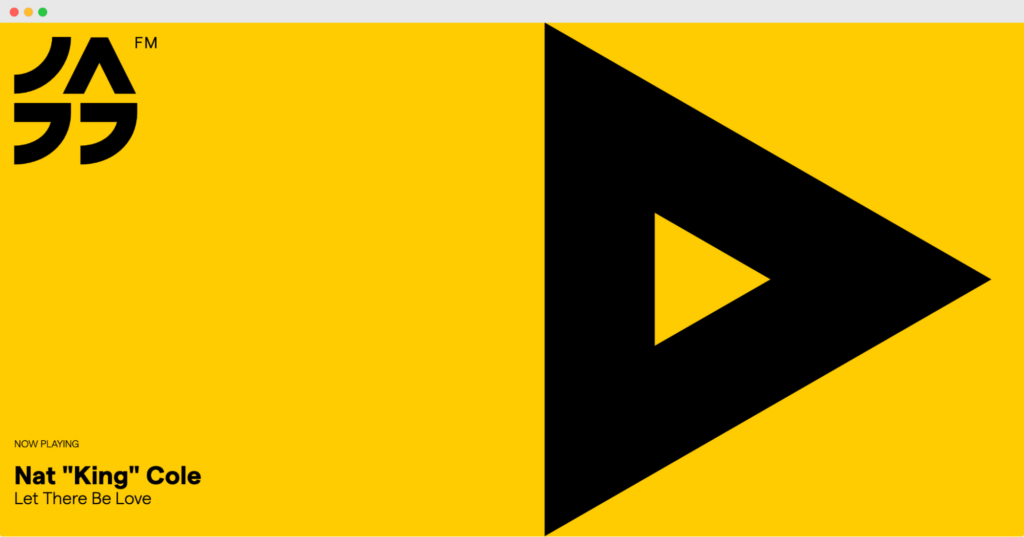
Click on Jazz FM Romania’s website, and you see a bold triangular “play” symbol, telling users in a universal language that their website offers music.
The bright yellow background conveys excitement but is balanced by elegant black graphic designs, making these complementary colors. This makes it impossible not to click play to hear the jazz.
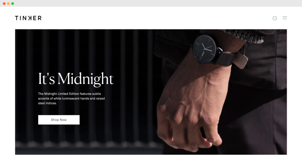
Its minimalist design blends into the photography, which at once shows the watches and conveys a mood.
Tinker’s website is well-designed, so users can quickly go from the home page to shopping. Muted color palettes make viewing the website feel comfortable.
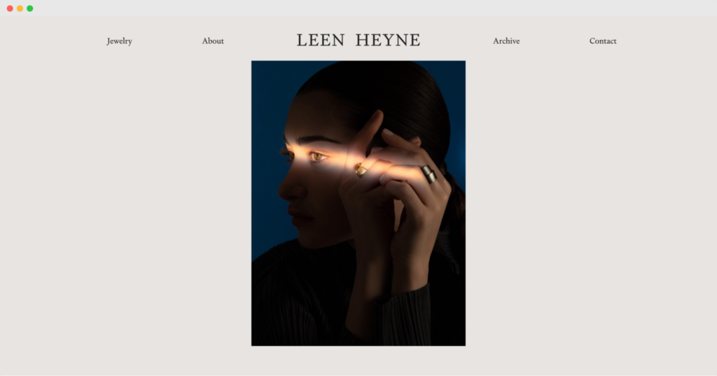
An elegant black background with animation showing the Leen Heyne logo being written in white at once shows the style and personality of this jeweler. The website user sees breathtaking photography of Leen Heyne’s jewelry designs from that start.
Leen Heyne’s elegance is reflected in the design, thoughtful creation, and photography, which gives using this website a luxurious feeling. That gives shoppers a first-class experience buying Leen Heyne jewelry online.
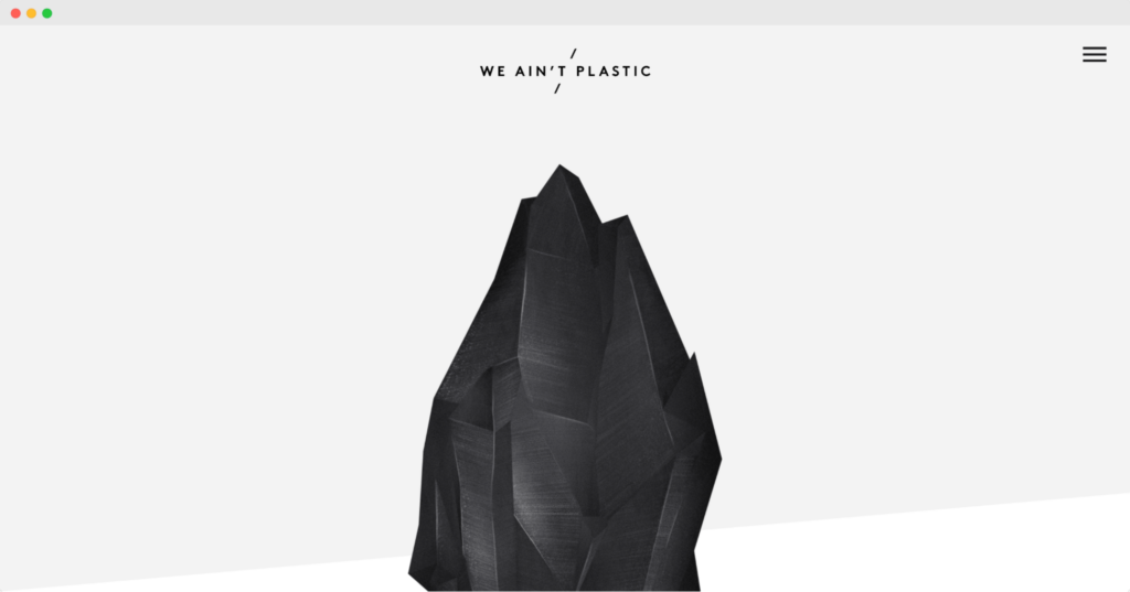
A user experience engineering firm must have a functional, well-designed website. We Ain’t Plastic uses high contrast, bold design, and concise writing to tell its story.
Neutral but bold background colors and clean design are a few of the modern web design trends this well-designed website reflects. The We Ain’t Plastic website showcases their UX expertise and creativity.
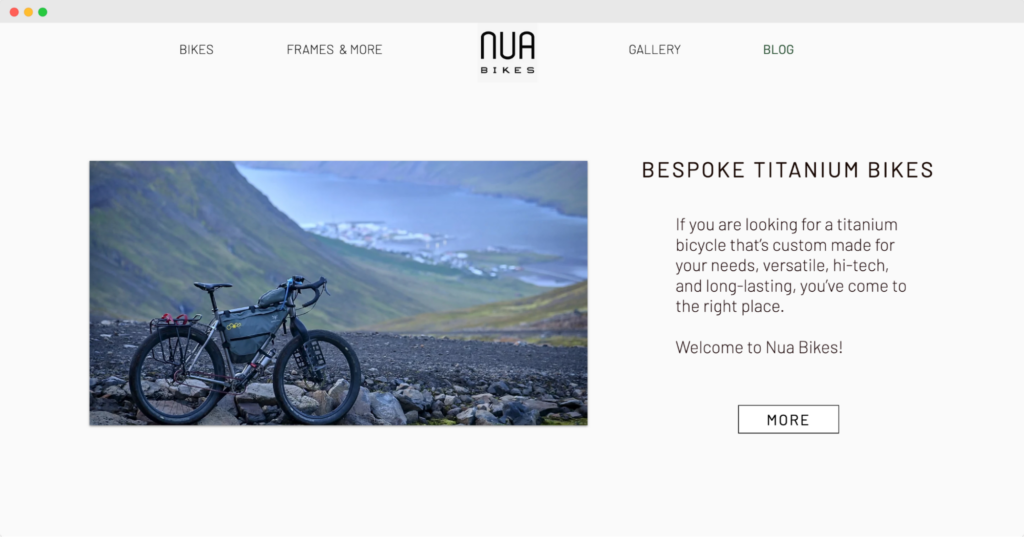
A wide variety of photos gives users a slideshow of Nua Bikes in use, increasing the customer conversion rate for the company. Users can see these bikes in use through eye-catching photography and comfortable color palettes.
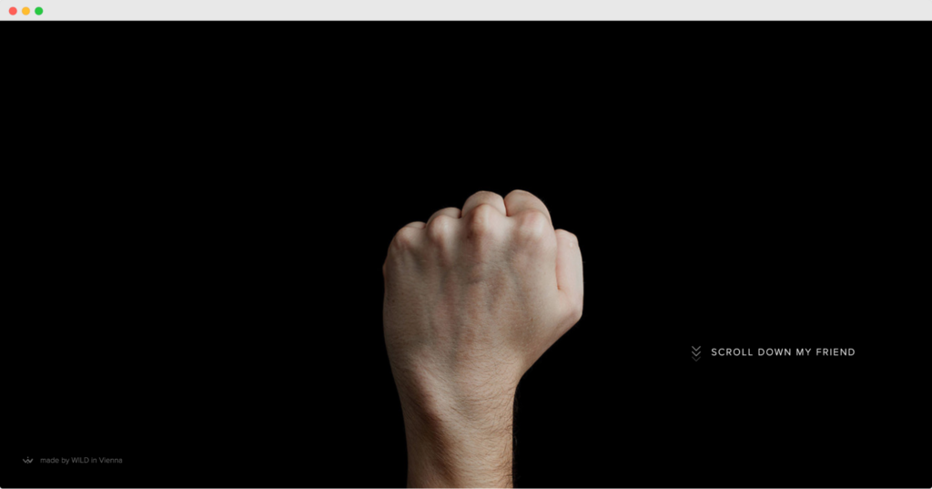
A business that lets its customers send personalized hand gestures as messages, this website features an engaging photo of a fist turning into a thumbs up. The mission and personality of the service shine through the design of this website.
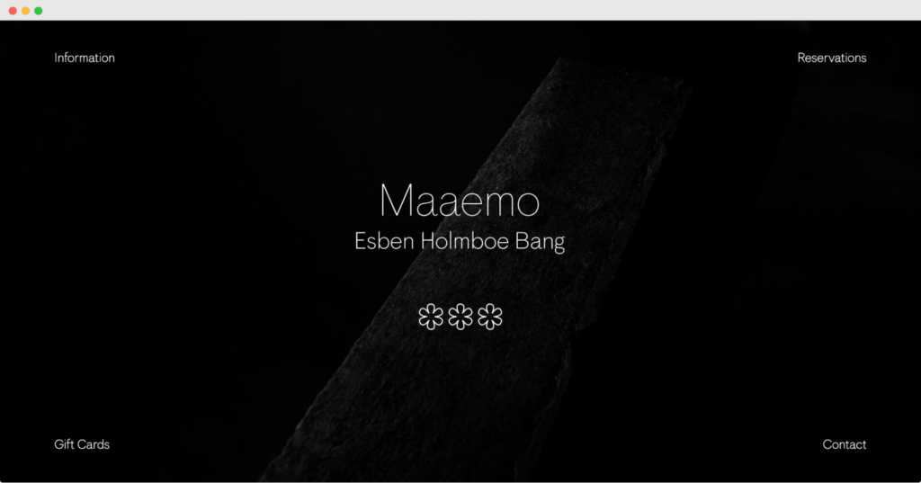
Making reservations on the restaurant website is easy, showing the minimalist design and UX organization. Photos of food and wine aren’t shown, which piques interest since the restaurant is so well known.
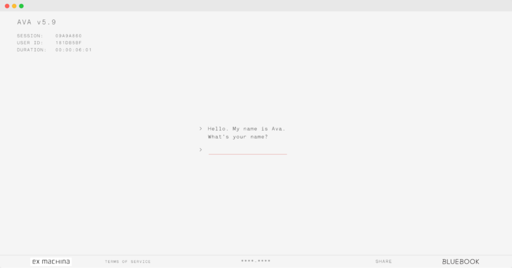
The black and white typography and interactivity, including portraits of users drawn by Ava, add to compelling and memorable visual effects and clean web design. Fans of the movie can even share these portraits on social media to promote the film.
The flat background and color choices make their subject matter more interesting for users.
Final Thoughts
Design trends are constantly evolving and changing. Modern minimalist web designs, including graphic designs, complementary colors, and intuitive navigation, are timeless since they load quickly, have high conversion rates that turn visitors into customers, and provide excellent user experiences.
Not only are minimalist designs on-trend – showing up everywhere from fashion capsules to farmhouse home furnishings – for websites, but they also make sense. Minimalist web designs don’t create eye strain or confusion for users. They’re functional, and they load quickly. This keeps users happy and not visiting competing websites.
As you can see, creating a minimalist web design takes more thought than one that is more cluttered.
The organization is essential in minimalism, as is color choice, writing, photography, and user experience design. Collaboration among design team members is required to make all the parts of the website design function well together.
Modern web design trends, including clean design and minimalism, will create a positive user experience, the best first impression that every company or organization wants to make with their website.
The best design trends will let the website show an organization’s personality and its products and services in the best light.
How using a website feels is a reflection of a business. A website that loads quickly and is easy to use and attractive is the best first impression online a company could have. Modern minimalist design trends can create positive online user experiences essential to successful web design for 2022 and beyond.