Design

Behind The Scenes Of Tourism New Zealand (Case Study)


In 2011 we saw the rise in popularity of two relatively new trends: responsive Web design and the use of HTML’s canvas. While some websites had experimented with both, in the last 12 months we’ve seen these trends move from the fringes firmly into the mainstream.

Responsive Web design is more a concept than a technology — an ideal that many new websites aspire to. Canvas, on the other hand, is an HTML5-based technology that opens the door to a new wave of interactivity. In this article, we’ll look at a website that embraces both of these elements, one that has been nominated for a Technical Achievement award at SxSW Interactive 2012: Tourism New Zealand.

I spoke with the creative and technical teams at the New Zealand-based firms Shift and Assembly about the technology behind Tourism New Zealand’s home page, how it was made and how they balanced the breakthrough effect with bandwidth.

After we learn how Tourism New Zealand was built, we’ll look at the basics of putting together your own animated HTML5 canvas background.

The Inspiration

Tourism New Zealand has a history of strong media and advertising campaigns, particularly through TV commercials, and its destination marketing website has long featured these videos.

So, when a redesign of the website was planned without an accompanying TV commercial, the team at Shift had a new challenge: to showcase the landscape and breadth of activities in New Zealand to an audience that has come to interact with a website, not to watch a video.

Shift was inspired by, among other things, Nike’s Better World website (which Smashing Magazine has covered). But whereas that website used HTML5 animation to create an effect of parallax scrolling, Shift proposed a camera view that moves through the real world.

Shift’s first idea was to use video as a background, with the camera descending through some of New Zealand’s most exciting locations. The problem was bandwidth: at 25 frames per second, Shift would need to deliver thousands of full-screen frames. This was an impossible goal, so instead the team set a target of around 200 frames for the entire website. But 200 frames for the amount of footage they wanted worked out to about three frames per second, which doesn’t look particularly good.

At this point, they nearly abandoned the idea.

By chance, though, a solution was found. Scrubbing through a QuickTime video, Shift’s creative director, Mark Zeman, noticed that being able to control the frame rate as you move the play head gives the illusion of a smooth experience. He suspected that if the browser’s scroll bar could be used to scrub the footage, it would feel similarly smooth. And if the camera shot photographs as it moved through each scene, it would create the illusion that the user was practically controlling the camera as it descended through New Zealand.

The first prototype was made with a few images and some JavaScript, just to prove that the browser could handle this type of manipulation. Freelance front-end developer Jeff Nusz was then tasked with turning this proof of concept into a working website. The brief was simple: no loading bar, and the first frame must load almost instantly. Furthermore, the website had to be usable even when the user doesn’t wait for all of the images to download.

On Location

With the prototype built and approved by Tourism New Zealand, it was time to load up the trucks with scaffolding and start shooting.

Shift worked with directors Damon Duncan and Matt von Trott of Assembly throughout development of the project, which enabled them to build the large motion-control rigs that were required for the shoot.

A 15-meter-high motion-control rig was built, with a vertical dolly track that housed a Canon 5D DSLR. The rig was set up at each location, and the camera travelled 12 meters down it, taking anywhere between 750 and 950 stills, a process that lasted at least two hours each time (and six hours at Milford Sound, the first location on the website), because the camera moved around 15 millimeters every 10 seconds.


Milford Sound, New Zealand

Each location took three days to shoot. The first day was spent building the tower and putting together the motion-control rig. The second day was usually spent rehearsing the scene, and the third would be for the actual shoot, which included multiple passes of the scene. Indeed, the scene for Waiheke Island is a combination of two takes.


Time-lapse sequences from all four shoots (watch on Vimeo)

Front-end developer Jeff Nusz had built a suite of tools to help the crew plan the photography. The directors also showed the original prototype to the cast and crew, which helped to demonstrate what they were filming and how the time-lapse footage would work.

Post-Production

There were only five days between the final day of shooting and the launch of the website. Most of the code had been written and ported to JavaScript using prototype images, and so it was now a matter of editing the hundreds of photos from each location down to 200 hand-optimized 1280 × 720-pixel frames.

The team spent time testing the website in each browser, noticing different memory quirks in Chrome and Firefox, and it worked on optimizing the website’s performance. Because many of New Zealand’s tourists come from China, the time was also spent making sure the website worked even in IE 6. To better understand the toll of such a heavy home page, Shift used WebPagetest to test it from various parts of the globe.

From 25 MB To 300 KB

Although the entire website weighs in at 25 MB, it enables a usable experience after the first 300 KB of data and images have loaded.

On the initial loading of the page, a 40 KB image is loaded that contains all 200 frames at a very low resolution. This means that as soon as the initial frame of Milford Sound has loaded, you can scrub through the entire website and get some approximation of the full experience. Then, when you stop scrubbing, the website loads the frame you’re on and starts loading the frames before and after it. Moreover, as you scroll the page, all downloading activity stop to ensure the smoothest possible scrolling experience. When you stop scrolling, all downloading resume.

Interestingly, Jeff’s background is mainly in working with Flash, so the initial website was built in Flash and then ported to HTML5 at the last minute. Jeff says that the similarities between ActionScript and JavaScript made this a relatively pain-free process:

ActionScript 3 is a lot like JavaScript. I did a lot of the work in Flash, and I wanted to see how well it would translate, and it was pretty much cut-and-paste for the most part. I just had to structure things in a similar way and make a few semantic changes. Ninety percent of the code ported as it was, which was great.

One of the team’s early breakthroughs was in figuring out how to split up the website’s elements. You can see in the sketch below how a website normally works: you have a long page and, conceptually speaking, the browser’s viewport moves up and down the page (i.e. the latter moving across the former).

In this next sketch, the page itself is a giant empty GIF that you scroll up and down; but the website detects every time you scroll, calculates your position and then translates that to the frame you should be on. The height of the window also changes depending on how big your browser’s viewport is, because if the page is huge and your viewport is small, then the scroll bar would be tiny; Shift wanted to keep the size of the scroll bar consistent, regardless of the browser’s size.

As Jeff notes, “Although it’s not exact, the goal was that one click of your mouse-wheel would be one frame�:

The tag layer and the UI layer is just HTML and CSS, but the background is either an HTML5 canvas that we draw to or it’s Flash. There’s about a 20-millisecond lag between the frames moving and the background changing in Flash, so the canvas version became the primary method used for browsers that support it.

The tags do not scroll in the conventional sense, but for each frame, they are assigned specific x and y coordinates based on the frame. This allows tags to be “gluedâ€� to background elements — a tree, mountain top, etc. — and these coordinates would be recalculated on the fly if the browser window was resized.

To create this effect, the team used Adobe After Effects to keyframe each tag and output the coordinates. Jeff built a PHP script into which the team could copy and paste the After Effects keyframe data, whereupon the script would generate JavaScript that the website could use. Jeff then tweaked the tags in JavaScript to make sure they scrolled as expected.

Sprite Sheets

To create the illusion that the page loads quickly, Jeff came up with the idea of using sprite sheets. As he puts it, “The sprite sheets were the breakthrough that allowed us to make the website usable so quickly after the page loads�.

The first frame (of the background image) is 90 KB. So, together with the first low-resolution sprite sheet (which is 30 KB), these images initially weigh only 130 KB. Once the page has loaded all of the content, it loads a higher-resolution sprite sheet, and then another, and then it loads in the full-resolution images one by one. Rather than loading these large images in sequence, it loads them based on your scroll position within the document.

You can check that the sprite sheets load before the full-resolution images by turning the Webkit Inspector on and watching the “Network� activity after the page has started to render.

Using Inline JavaScript

I asked the team at Shift why so much inline JavaScript was in the head of the document. Best practice would suggest it should be moved to a separate file. However, something more is going on here.

Shift’s solution architect, Glenn Wright, has been working on the website for the last six years. He explains:

The inline JavaScript is there to define the configuration for each page. We can cache each page’s configuration in JavaScript, then all the external libraries that the page loads utilize that data. It gives us an easy way to configure the responsive grid and all of the interactions that the page will have to use.

Testing Mode

A testing mode on the website lets you see some of this loading process in action. Clear your browser’s cache, load Tourism New Zealand’s home page, and then hit the tilde (~) key five times to enable testing mode. You won’t see any change immediately, but once in this mode you can use the following keyboard commands:

  • 1
    Turn on the visualizer for “frames loaded�
  • 3
    Toggle tags on and off
  • 0
    Toggle the high-resolution image on and off
  • -
    Go to the previous low-resolution sprite
  • +
    Go to the next high-resolution sprite

Building Your Own Canvas Background Animation

While websites like Tourism New Zealand take months to design and build, creating your own animated canvas background is relatively straightforward. All it takes is a little JavaScript, a pinch of HTML5 and an enormous amount of imagination to dream up a worthwhile use.

Indeed, a word of caution is in order. We all know that with great power comes great responsibility, and just because we can load 50 high-resolution frames and animate them as the user scrolls the window doesn’t mean we should. As mentioned earlier, websites that use this technique are both lauded and criticized. Make sure that you are enriching the user experience rather than needlessly slowing it down.

First, we need to do a couple of things. Let’s grab some video (a time-lapse video works best for this), and then create our 50 frames. You can create as many frames as you like, but we’ll stick with 50 because this is how many Tourism New Zealand uses for each scene.

Next, let’s grab some royalty-free time-lapse footage from Artbeats and import it into iMovie, where you can export individual frames.

Choose Share → Export Using QuickTime, and in the pop-up dialog box select “Movie to Image Sequence.â€�

We export the images as JPEGs, which leaves us with hundreds of images. So, we have to do two things:

  1. Batch process the images in Photoshop to the required size (here, we went with 480 × 270 pixels to maintain the aspect ratio).
  2. Edit the number of images down to 50. Shift was painstaking in doing this, retouching and editing thousands of images down to just 200. To keep things easy for this tutorial, let’s just delete three photos out of every four.

You should now have 50 photos that, when played in sequence, make for a somewhat choppy time-lapse video.

On to the next couple of steps. First, we’ll figure out how to load the images in the browser and control them with the scroll bar. Secondly, we’ll create our own sprite sheet and use that instead. Open your code editor of choice, and create a new JavaScript file. Or why not head over to GitHub and download the project to play around with?

You’ll also need an HTML file with a canvas element in it, which is as simple as this:

<canvas id="canvas"></canvas>

Hopefully, the comments in the code sufficiently explain what’s going on, but here’s a breakdown anyway.

First, we set up the canvas element and use some basic maths to set start and end points:

// Create our timeLapseVideo object and cache the window object
timeLapseVideo = new Image();
$window = $(window);

// Define the timeLapseVideo element
timeLapseVideo.onload = function(){
  videoContainer.width = 960;
  videoContainer.height = 540;
  videoContext.drawImage(timeLapseVideo, 0, 0, 960, 540);
}

// Load the first frame
timeLapseVideo.src = 'images/TimeLapse001.jpg';

// Calculate how far to scroll before changing a frame
var scrollDistance = $window.height() - $window.scrollTop(),
    totalHeight = $(document).height() - scrollDistance;
    frameDiff = totalHeight / (numberOfFrames - 1);

Then, when the window scrolls, we work out which frame needs to appear on screen:

// Which frame do we need to show?
frameString = (Math.round($window.scrollTop()/frameDiff) + 1).toString();

// Change the image in the canvas
timeLapseVideo.src = 'images/TimeLapse' + frameString + '.jpg';

Make sure to go through the full source code to see it in action. Be careful, because there is no check to determine whether an image has already loaded; you could end up hitting your server with hundreds of requests per page. So, like Tourism New Zealand, you need to build in a check to see whether an image has been cached.

Creating And Using A Sprite Sheet

We can also create our own sprite sheet with our image to emulate more of Tourism New Zealand’s behavior. Some apps and websites are available to help you do the job (see the “Related Links� section at the end), but it’s probably easier to run a simple script that pastes all of the images onto a canvas and then take a plain screenshot of that. The code for this script is in the GitHub repository in case you want to take a look.

There are two main differences with this technique. First, we load only one image onto the canvas, which is the sprite sheet:

timeLapseVideo.src = 'images/spritesheet.jpg';

When the window scrolls, we then draw part of this sprite to the canvas:

videoContext.drawImage(timeLapseVideo, x, y, 80, 45, 0, 0, 960, 540);

In the line above, x and y are the starting coordinates of the sprite, which in turn are dictated by the frame. We’re using a simple loop to iterate through the sprite to find the right coordinates, but you could set up an array of values to look up. These tiny frames are 80 × 45 pixels, and they are drawn from 0,0 to 960 × 540 pixels. CSS then stretches this canvas to fit the entire window.

You can improve this script a great deal by, for example, preloading images when the user isn’t scrolling (some links are below to point you in the right direction). If you make improvements, please do share your work in the comments below.

Creativity In Design And Development

Distilling 18 months of hard work into one article like this is an impossible task. Shift had the time and budget to fly around New Zealand and take thousands of beautiful photographs. This is not an option for the average Web designer!

However, what is perhaps most striking about Tourism New Zealand is the imagination in its concept and execution. By taking the leap from virtual to physical world (and back again!), the scroll bar has become a conduit by which the user can control their experience of New Zealand — if only for 200 frames.

Jeff’s ingenious loading techniques and the use of sprite sheets also kept away the loading bar that is so familiar with websites like this. On an average broadband connection, the experience is effortless and fun.

Perhaps the biggest lesson to be learned here is this. Despite its many bells and whistles, Tourism New Zealand encourages the user to discover the website in much the same way they would discover the country.

Technology supports the great design, not the other way around. If we could all exercise this level of creativity, imagination and user engagement, then we, too, would create amazing websites that shape the future of Web design.

Related Links

I must extend my very special thanks to Jeff (@jeffnusz), Glenn, Che and, in particular, Mark (@markzeman), who were patient with my intermittent Skype connection and who were so transparent in offering their thoughts and many of the images and resources featured in this article.

(al)


© Richard Shepherd for Smashing Magazine, 2012.


Lasting Impressions: Unusual Business Cards That Will Definitely Be Kept


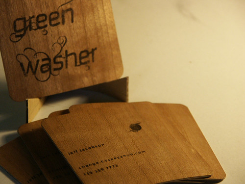
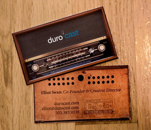
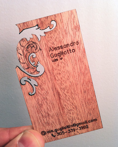
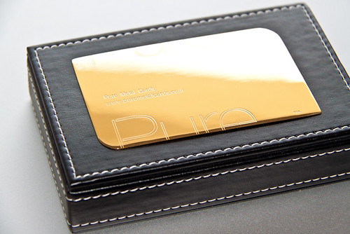
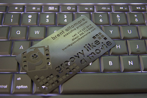
As a designer creating a good business card for yourself can be quite task. The need for a visually appealing business card design is greater than in other work fields. There are 2 steps to giving a business card, not only as a designer, but as a business individual in general. The first step, and most important is ensuring the business card is kept. The second step is, of course, getting the project.

Sharing a great looking business card with a partner can often make the difference between getting the job or not. Not to mention that most, let’s say ordinary business cards end up in the trash after awhile. An unusually creative card made out of metal, plastic or rubber can ensure you a permanent slot in that ever-growing pile of business cards of your potential business partners.

There is a growing trend of digitizing business cards through card scanners. Though there are some advantages to having the cards scanned such as the space gained and ease of search, the lasting impression of receiving an appealing and unusually creative business card cannot be matched.

Feeling the unusual shape, the embossed metal or letterpressed paper will certainly help gain you the appreciation and respect needed to start or cement a good business partnership. So take a look at the showcase we have prepared of unusual business cards.

Lasting Impressions

Unusual Business Card Header

Unusual Business Card 1

Unusual Business Card 2

Unusual Business Card 3

Unusual Business Card 4

Unusual Business Card 5

Unusual Business Card 6

Unusual Business Card 7

Unusual Business Card 81

Unusual Business Card 9

Unusual Business Card 10

Unusual Business Card 12

Unusual Business Card 13

Unusual Business Card 14

Unusual Business Card 15

Unusual Business Card 16

Unusual Business Card 17

Unusual Business Card 18

Unusual Business Card 19

Unusual Business Card 20

Unusual Business Card 21

Unusual Business Card 22

Unusual Business Card 23

Unusual Business Card 24

Unusual Business Card 25

Unusual Business Card 26

Unusual Business Card 27

Unusual Business Card 28

Unusual Business Card 29

Unusual Business Card 30

Unusual Business Card 31

Unusual Business Card 32

Unusual Business Card 33

Unusual Business Card 34

Unusual Business Card 35

Unusual Business Card 36

Unusual Business Card 37

Unusual Business Card 38

Unusual Business Card 39

Unusual Business Card 40

Unusual Business Card 41

Unusual Business Card 42

Unusual Business Card 43

Unusual Business Card 44

Unusual Business Card 45

Unusual Business Card 46

Unusual Business Card 47

Unusual Business Card 48

Unusual Business Card 49

Unusual Business Card 50

Unusual Business Card 51

Unusual Business Card 52

Unusual Business Card 53

Unusual Business Card 54

Unusual Business Card 55

Unusual Business Card 56

Unusual Business Card 57

More business card  inspiration

(rb)


Web of Color: Bold and Beautiful Uses of Color in Web Design


As we look around the web, we see so many examples of designers who have brilliantly used color in web design projects to make the page or various page elements really pop. Even in some cases when we see designers opting for more minimal designs, using bold splashes of color can really take the look to fantastic new heights in very simple ways. Using bright, bold colors can often be risky, as the colors can end up visually overwhelming or even downright uncomfortable. So it has to be done with care.

Below is a showcase of sites where the designers struck that balance nicely. From headers to backgrounds to calls to action and beyond, these bold and beautiful uses of color in web design are sure to inspire you to find interesting ways to wield this powerful element in your next project.

Web of Color

Will Fernandes’ Personal Portfolio is a perfect example of using bold colors throughout the design to really bring the personality of the site to life in beautiful fashion.

Blurst uses both strong colors and bold typographic elements to create a really sharp design that by contrast remains soft and comfortable.

Somos la pera limonera has a very simple illustrated site design, where the multitude of earth tones give the site a wonderful natural cartoon feel.

Sitesquared has a design overrun with exciting layers of colors bursting all over the site. Even using multiple font colors well, which cannot often be done in such a complementary and visually pleasing manner.

Mydezzign is an example where the minimal website design, and dark background really pop with the splashes of color that have been added in around the content area edges.

Cultural Solutions uses a large burst of colors in the site header, but as you scroll down through the page, the colors come in more subtle splashes. The Bokeh style background elements work well to drop in the color throughout.

Web Munky uses a nice soft background with bold, royal purple elements that stand out beautifully against it. Creating a welcoming feel and a sense of reliability through the colors.

Panda Creatiu has an elegant look created with a warm brown background that allows the colorful portfolio navigation to shine.

Eye Styles uses softly shaded navigable, animated menu elements that provide the subtle design beautiful splashes of color. They really work well to draw the user’s eyes to the products.

Camp Creative Group uses a slightly transparent streak of bold colors in their over-sized header to set a professional tone through the design.

Meomi has a wonderfully whimsical website design with bold splashes of color scattered down throughout the warm background colors. They help visually lead the users down the page.

Art4web uses bright colorful elements in the header to really set off the clean, sharp design. Coupled with bold, colorful typography highlights, the design is fed by the splashes of color added in throughout.

Treehouse uses a dark design with large colorful button calls to action to grab the user’s attention as soon as they arrive at the site.

Moby beautifully injects random bits of color in an otherwise lightly tinted design. With a couple of colorful headers, but also with a clever logo design that follows the user down the page, changing colors with each section.

Sanctuary T Shop has a colorful navigation menu to grab the user’s focus and help steer them along without drawing too much attention away from the products.

nGen Works has a bold header and footer with other soft colorful elements on the page that give the design a very striking impact.

Duoh! uses lots of bold colorful elements to edge the design and scattered throughout the site and its pages that really help the website’s playful and professional edges combine in flawless fashion.

Soup Studios uses lots of pastel coloring throughout the design beautifully. So much color without crossing the line and hurting the site or the products it features.

Mooty Graphic Design boldly fills their header, and to a lesser degree footer, with bright colors, meanwhile using sporadic colorful elements in the main content area to draw the users.

Beautiful 2.0 keeps their bold colorful elements to the upper reaches of the page, descending into more darkness as you go down. The colors really make the the navigation pop.

Bjarke Clauson-Kaas breaks up the large, softly tinted background of the page with two bold, leading splashes of color. One main set of colorful arrows to direct the reader down the page, and another arrow cutting across the page as you hover to split up the work from the bio.

Stripes Design has a very subtle background and design overall, with an explosion of color down the side of the page which creates a powerful contrast and calls to mind a sense of creativity.

Havaianas uses a canvas like textured background filled with bold colorful decorative watercolor styled elements that perfectly complement the feeling of creative energy which drives the company.

Clair Baxter has a website filled with bold colorful design elements scattered throughout to add extra flair and a creative edge to the design.

F91W uses a large, colorful background which carries a light unobtrusive flow around the content area.

(rb)


Top Fifteen Photography Portfolio Sites


What sets great images apart? What do the most successful photographers do to make their work stand out? Often the difference between a great photo and a great photo that captivates and prompts exploration is a good showcase.

The goal of a photography portfolio site is to make photos shine, but the best sites do this while subtly expressing a style. A good portfolio design supports the images without overpowering or trying to outshine them. It can be simple and clean, or styled and characterized, but the important thing is that the personality of the photographer and the photos shine through.

That’s something each of designs featured in this showcase of the best photography portfolio sites achieves with flying colors. So how do these top fifteen portfolios make both their images and their personalities stand out? Exploring them, a few trends become evident.

Navigating

Grids: Grids let users explore sets of images intuitively. Responsive, resizing, and irregular, these are much more than a digital photo album.
Mouse: Forget your regular cursor arrow. These sites turn your mouse into styled arrows, pointers, and gesture-capable extensions, letting you swipe, draw, tap, and drag.
Tags: The larger the portfolio, the more you need to be able to sort and curate. Filtering images by project, theme, subject, or even color, makes massive sites navigable and gives them personality.

Interacting

Curation: These lightboxes, albums, and favorites lists let you create your own curated selection of images and store them for later review, letting you add a bit of your own personality to the site.
Social Media Integration: Want to share that image of the ugliest, happiest dog you’ve ever seen? These sites are tied into social media, letting you tweet or post to Facebook with a single click.

See how the best portfolio sites use, tweak, and make these trends their own.

The Top Photography Portfolio Sites

Tony D’Orio

Tony D'Orio

Tony D’Orio’s style is playful, colorful, and visually packed. His portfolio site masterfully brings out this style, using whimsical interaction to bring you in, bright color to draw your eyes, and a full-bleed grid to pack your screen.

Photos in the grid colorize when you hover over them. Select an image and the grid slides to the side in a non-traditional transition that is playful and pleasurable. The navigation makes browsing fun, and the lack of organization (the photos aren’t divided by project or into galleries) mirrors the artist’s own hectic, captivating style.

Each image tells a story, and the profile facilitates those stories by smoothly animating transitions, providing large image detail views, and using nifty cross-outs to check off previously viewed photos.

By Hello Monday

Steve McCurry

Steve McCurry

On his site, Steve McCurry describes his own style as “grounded in people.� He says he tries to “convey what it is like to be that person� through his images. His portfolio communicates this style by conveying McCurry’s own personality.

The site holds over 2,000 images, hundreds more than most portfolios can manage, yet still makes them easily accessible. The 55 galleries can be sorted by place, but also by theme. This gives you a direct look at McCurry’s artistic interests. The color scheme goes beyond the typical safe black and white, yet still expertly compliments the images’ colors.

You can find your way to the popular, well-trafficked blog from anywhere on the site. The entries are selections of McCurry’s photographs, curated by theme and subject, giving you an idea of what makes an image interesting to him. The site also features an in-depth bio that lets you peek into McCurry’s history.

By Bluecadet 

Nick Onken

Nick Onken

Nick Onken’s youthful, carefree images shine in this playful, cheery portfolio. The simple red/white color scheme and font choices are lighthearted, and fit well with the bright, sunny photos. The design underscores the style, all without overpowering the light, airy images.

The bottom thumbnail navigation is a nice visual roadmap, and the grid view for galleries is responsive. The site and images have a blithe “be yourself� and “follow your bliss� tone, and the portfolio practices what it preaches. It features a Lightbox, where you can select your favorite photos to be rendered in an image flow, maybe to share with a happy, laughing friend.

By Knowawall 

Rickard Sund

Rickard Sund

Rickard Sund’s clean, often single-subject photographs are focused on the fashion. They draw your eyes single-mindedly to the models and clothes, with matte, unremarkable backgrounds. His portfolio is focused on the photos, more so than most. It uses the least intrusive of trends in service of his images.

There are no arrows or advance buttons to get in the way of the full-bleed images. Instead, navigate through the photos by gesture of your mouse, drawing lines to transition from left to right.

The interface is present but under the surface, popping up when you need it, and fading away when you don’t. Gallery titles and social media prompts display when you transition to a photo, but all meta data disappears if you linger. The portfolio structure itself fades away and focuses on the full bleed images with the most minimal of distractions.

By Hugo Ahlberg

Josh Cogan

Josh Cogan

Joshua Cogan’s images are almost anthropological. He is an observer of people and their everyday events. The photographs span many areas and subjects, few of which are the same but all of which have overlapping themes and commentary.

The site captures this interconnectivity with an intricate, interactive tagging system that allows you to navigate through main categories and themes, as well as create your own personal filters.

There’s granular social media integration, allowing you to share direct links to images. You can mark your favorite images, which are displayed on an unobtrusive bottom navigation bar and stored, making sharing your favorite images upon return visits simple.

By Bluecadet 

Nicola Walbeck

Nicola Walbeck

Nicola Walbeck’s portfolio feels like it belongs to an architect, and it’s not just because there are so many buildings. The clean lines of the tiling, artfully divided galleries, delicate advance/return arrow boxes, sans serif font choices, and muted, subtle colors all point to an architectural bent. His images themselves reflect this style, with carefully framed angles and a keen sense of place, even in his portraiture.

One of the best things about the portfolio is the rare chance to see the photos in detail. Click in to an image and you get a hi-res, extra-large view that you can explore with the movement of your mouse. Scroll with your wheel or trackpad, and you advance to the next image.

By Hans Schaale and Christian Potthast

More on Page Two

We are not quite finished yet. The bulk of this fine showcase awaits on page two. So be sure that you click over and check out the rest of the design excellence.


A Showcase of Great Looking Tumblr Themes


Tubmlr has gained a lot of fans over the last 5 years, and with good reason. Whereas many blogging platforms are striving to add more and more features to their platform, Tumblr has stayed true to its microblogging roots by keeping things simple. This has resulted in one of the most user friendly interfaces available online.

And though it may be simple, it still has some great features. There are a wide range of post formats to choose from and you can automatically update your Tumblr page with your latest entries from Facebook and Twitter.

The Tumblr design can be changed in seconds through your Tumblr dashboard. There are over 1,200 free and premium themes currently available in the Tumblr Theme Garden. Today we would like to share with you 30 great designs from the ranks. You can install any of these themes easily through the customise section of Tubmlr. Enjoy!

The Themes

1. Vacant
FREE

A cool design that features a large content area for displaying images. Large fonts are used and the bottom of each post has been designed to look like a torn piece of paper.

Vacant

Info & Download | Demo

2. Showroom
FREE

Showroom gives the impression of notes being pinned on a wooden wall. The right hand side of the page has a sidebar with a great looking ‘about me’ widget displayed at the top.

Showroom

Info & Download | Demo

3. go CRAZY!!
FREE

A colourful minimal theme that uses green, pink and blue fonts throughout the design. Each icon is also a different colour.

go CRAZY!!

Info & Download | Demo

4. Royal Ribbon
FREE

An elegant theme that has great typography and beautiful post icons. With only one content column, there is no space for any widgets or additional information, just the title and description at the top of the page. This minimal approach should appeal to quite a few users.

Royal Ribbon

Info & Download | Demo

5. Griddlr Theme
FREE

A unique design that packs content into 3 columns. The top navigation area remains fixed as the user scrolls down the page. Clicking on the information link underneath the navigation area will bring down a menu with your profile details, a search bar and a list of the latest posts.

Griddlr Theme

Info & Download | Demo

6. Hobo
FREE

An interesting design from British designer Mike Ballan. Your profile info and various links are displayed in a fixed left hand colummn. The main content area is split into 3 sections

Hobo

Info & Download | Demo

7. Pink touch 2
FREE

A conversion of the popular WordPress theme of the same name, Pink Touch 2 is an elegant one column design with beautiful typography. A search bar is placed in the header with navigation links in the footer.

Pink touch 2

Info & Download | Demo

8. Color Shades
FREE

A multi colour one column theme that alternates the colour scheme in every post. There are around a dozen colour schemes to choose from via the colour picker.

Color Shades

Info & Download | Demo

9. Postage
FREE

A mail themed design with a traditional 2 column blog layout. Profiles are posted in the sidebar with rss, random and archive icon links all contained in the footer.

Postage

Info & Download | Demo

10. Panda Classics Recycled
FREE

A great looking one column design with beautiful typography. Posts are divided using colourful banners and the one column design makes it great for showcasing images.

Panda Classics Recycled

Info & Download | Demo

11. Solaris
$9

A premium one column design that has a cool navigation menu at the top of the page. To the right hand side of each post are the post icons and tags with the date the post was published on the left.

Solaris

Info & Download | Demo

12. Savory
$49

One of the most feature rich Tumblr themes available. You could be forgiven for thinking that Savory was designed for WordPress or Drupal due its design and typography (powered by Typekit). Links to your Tubmlr RSS feed and archives are displayed at the top of the page with other content and navigation links being displayed in the sidebar. Social media sharing buttons have been integrated into the post area and it has support for Disqus too.

Savory

Info & Download | Demo

13. Beckett
FREE

A clean minimal design that has a simple navigation menu at the top and sidebar at the right hand side. The large fonts make reading a pleasure.

Beckett

Info & Download | Demo

14. Juuvy
$49

A fashionable design that comes with over 70 appearance options. The sidebar is on the left hand side though the content area can be divided using shortcodes. Posts can be 220 px, 500px or 780 px wide. This allows you to show 1, 2 or 3 posts in the main content area.

 Juuvy

Info & Download | Demo

15. Julia
FREE

Large fonts and big bright colours are used throughout this large one column design to really set it off.

Julia

Info & Download | Demo

More Waiting for You on Page Two

You are well on your way, with half of the themes now behind you! However, don’t stop just yet, as the rest of this beautiful collection of resources is still waiting for you on page two.


  •   
  • Copyright © 1996-2010 BlogmyQuery - BMQ. All rights reserved.
    iDream theme by Templates Next | Powered by WordPress