|
Perhaps one of the most talked about websites in the last 12 months has been Nike Better World. It’s been featured in countless Web design galleries, and it still stands as an example of what a great idea and some clever design and development techniques can produce.
In this article, we’ll talk to the team behind Nike Better World to find out how the website was made. We’ll look at exactly how it was put together, and then use similar techniques to create our own parallax scrolling website. Finally, we’ll look at other websites that employ this technique to hopefully inspire you to build on these ideas and create your own variation.
Nike Better World

Nike Better World is a glimpse into how Nike’s brand and products are helping to promote sports and its benefits around the world. It is a website that has to be viewed in a browser (preferably a latest-generation browser, although it degrades well) rather than as a static image, because it uses JavaScript extensively to create a parallax scrolling effect.
A good deal of HTML5 is used to power this immersive brand experience and, whatever your views on Nike and its products, this website has clearly been a labor of love for the agency behind it. Although parallax scrolling effects are nothing new, few websites have been able to sew together so many different design elements so seamlessly. There is much to learn here.
An “Interactive Storytelling Experience�
In our opinion, technologies are independent of concept. Our primary focus was on creating a great interactive storytelling experience.
– Widen+Kennedy
Nike turned to long-time collaborator Widen+Kennedy (W+K), one of the largest independent advertising agencies in the world, to put together a team of four people who would create Nike Better World: Seth Weisfeld was the interactive creative director, Ryan Bolls produced, while Ian Coyle and Duane King worked on the design and interaction.

I started by asking the team whether the initial concept for the website pointed to the technologies they would use. As the quote above reveals, they in fact always start by focusing on the concept. This is a great point. Too many of us read about a wonderful new technique and then craft an idea around it. W+K walk in the opposite direction: they create the idea first, and sculpt the available technologies around it.
So, with the concept decided on, did they consciously do the first build as an “HTML5 website,� or did this decision come later?
There were some considerations that led us to HTML5. We knew we wanted to have a mobile- and tablet-friendly version. And we liked the idea of being able to design and build the creative only once to reach all the screens we needed to be on. HTML5 offered a great balance of creativity and technology for us to communicate the Nike Better World brand message in a fresh and compelling way.
– W+K
HTML5 is still not fully supported in all browsers (read “in IE�) without JavaScript polyfills, so just how cross-browser compatible did the website have to be?
The primary technical objectives were for the site to be lightweight, optimized for both Web and devices, as well as to be scalable for future ideas and platforms.
– W+K
To achieve these goals, the website leans on JavaScript for much of the interactivity and scrolling effects. Later, we’ll look at how to create our own parallax scrolling effect with CSS and jQuery. But first, we should start with the template and HTML.
The Starting Boilerplate
It’s worth pointing out the obvious first: Nike Better World is original work and should not be copied. However, we can look at how the website was put together and learn from those techniques. We can also look at other websites that employ parallax scrolling and then create our own page, with our own code and method, and build on these effects.
I asked W+K if it starts with a template.
We started without a framework, with only reset styles. In certain cases, particularly with experimental interfaces, it ensures that complete control of implementation lies in your hands.
– W+K
If you look through some of the code on Nike Better World, you’ll see some fairly advanced JavaScript in a class-like structure. However, for our purposes, let’s keep things fairly simple and rely on HTML5 Boilerplate as our starting point.
Download HTML5 Boilerplate. The “strippedâ€� version will do. You may want to delete some files if you know you won’t be using them (crossdomain.xml, the test folder, etc.).
As you’ll see from the source code (see the final code below), our page is made up of four sections, all of which follow a similar pattern. Let’s look at one individual section:
<section class="story" id="first" data-speed="8" data-type="background">
 <div data-type="sprite" data-offsetY="950" data-Xposition="25%" data-speed="2"></div>
 <article>
  <h2>Background Only</h2>
  <div>
   <p>Pellentesque habitant morbi tristique senectus et netus et malesuada fames ac turpis egestas. Vestibulum tortor quam, feugiat vitae, ultricies eget, tempor sit amet, ante. Donec eu libero sit amet quam egestas semper. Aenean ultricies mi vitae est. Mauris placerat eleifend leo.</p>
  </div>
 </article>
</section>
I’m not sure this is the best, most semantic use of those HTML5 tags, but it’s what we need to make this effect work. Normally, a section has a heading, so, arguably, the section should be a div and the article should be a section. However, as W+K points out, the HTML5 spec is still young and open to interpretation:
HTML5 is still an emerging standard, particularly in implementation. A lot of thought was given to semantics. Some decisions follow the HTML5 spec literally, while others deviate. As with any new technology, the first to use it in real-world projects are the ones who really shape it for the future.
– W+K
This is a refreshing interpretation. Projects like Nike Better World are an opportunity to “reality check� an emerging standard and, for the conscientious among us, to provide feedback on the spec.
In short, is the theory of the spec practical? W-K elaborates:
We use the article tag for pieces of content that can (and should) be individually (or as a group) syndicated. Each “story� is an article. We chose divs to wrap main content. We took the most liberty with the section tag, as we feel its best definition in the spec is as chapters of content, be it globally.
– W+K
As an aside (no pun intended!), HTML5 Doctor has begun a series of mark-up debates called Simplequizes, which are always interesting and illustrate that there is rarely one mark-up solution for any problem. Make sure to check them out.
In style.css, we can add a background to our section with the following code:
section { background: url(../images/slide1a.jpg) 50% 0 no-repeat fixed; }
We should also give our sections a height and width, so that the background images are visible:
.story { height: 1000px; padding: 0; margin: 0; width: 100%; max-width: 1920px; position: relative; margin: 0 auto; }
I’ve set the height of all our sections to 1000 pixels, but you can change this to suit your content. You can also change it on a per-section basis.
We have also made sure that the maximum width of the section is the maximum width of the background (1920 pixels), and we have specified a relative position so that we can absolutely position its children.
Here’s the page before adding JavaScript. It’s worth digging into the source code to see how we’ve duplicated the sections in the HTML and CSS.

Even with this code alone, we already have a pleasing effect as we scroll down the page. We’re on our way.
The HTML5 Data Attribute
Before looking at parallax scrolling, we need to understand the new data attribute, which is used extensively throughout the HTML above.
Back in the good old days, we would shove any data that we wanted to be associated with an element into the rel attribute. If, for example, we needed to make the language of a story’s content accessible to JavaScript, you might have seen mark-up like this:
<article class='story' id="introduction" rel="en-us"></article>
Sometimes complex DOM manipulation requires more information than a rel can contain, and in the past I’ve stuffed information into the class attribute so that I could access it. Not any more!
The team at W+K had the same issue, and it used the data attribute throughout Nike Better World:
The
dataattribute is one of the most important attributes of HTML5. It allowed us to separate mark-up, CSS and JavaScript into a much cleaner workflow. Websites such as this, with high levels of interaction, are almost application-like behind the scenes, and thedataattribute allows for a cleaner application framework.– W+K

So, what is the data attribute? You can read about it in the official spec, which defines it as follows:
Custom data attributes are intended to store custom data private to the page or application, for which there are no more appropriate attributes or elements.
– W+K
In other words, any attribute prefixed with data- will be treated as storage for private data; it does not affect the mark-up, and the user cannot see it. Our previous example can now be rewritten as:
<article class='story' id="introduction" data-language="en-us"></article>
The other good news is that you can use more than one data attribute per element, which is exactly what we’re doing in our parallax example. You may have spotted the following:
<div data-type="sprite" data-offsetY="100" data-Xposition="50%" data-speed="2"></div>
Here, we are storing four pieces of information: the x and y data offsets and the data speed, and we are also marking this element as a data type. By testing for the existence of data-type in the JavaScript, we can now manipulate these elements as we wish.
Parallax Scrolling
On our page, three things create the parallax scrolling illusion:
- The background scrolls at the slowest rate,
- Any sprites scroll slightly faster than the background,
- Any section content scrolls at the same speed as the window.
With three objects all scrolling at different speeds, we have created a beautiful parallax effect.

It goes without saying that we don’t need to worry about the third because the browser will take care of that for us! So, let’s start with the background scroll and some initial jQuery.
$(document).ready(function(){
 // Cache the Window object
 $window = $(window);
// Cache the Y offset and the speed
$('[data-type]').each(function() {
  $(this).data('offsetY', parseInt($(this).attr('data-offsetY')));
  $(this).data('speed', $(this).attr('data-speed'));
});
// For each element that has a data-type attribute
 $('section[data-type="background"]').each(function(){
  // Store some variables based on where we are
  $(this).data('speed', parseInt($(this).attr('data-speed')));
   var $self = $(this),
   offsetCoords = $self.offset(),
   topOffset = offsetCoords.top;
   $(window).scroll(function(){
    // The magic will happen in here!
   }); // window scroll
 });	// each data-type
}); // document ready
First, we have our trusty jQuery document ready function, to ensure that the DOM is ready for processing. Next, we cache the browser window object, which we will refer to quite often, and call it $window. (I like to prefix jQuery objects with $ so that I can easily see what is an object and what is a variable.)
We also use the jQuery .data method to attach the Y offset (explained later) and the scrolling speed of the background to each element. Again, this is a form of caching that will speed things up and make the code more readable.
We then iterate through each section that has a data attribute of data-type="background" with the following:
$('section[data-type="background"]').each(function(){}
Already we can see how useful data attributes are for storing multiple pieces of data about an object that we wish to use in JavaScript.
Inside the .each function, we can start to build up a picture of what needs to be done. For each element, we need to grab some variables:
// Store some variables based on where we are
var $self = $(this),
    offsetCoords = $self.offset(),
    topOffset = offsetCoords.top;
We cache the element as $self (again, using the $ notation because it’s a jQuery object). Next, we store the offset() of the element in offsetCoords and then grab the top offset using the .top property of offset().
Finally, we set up the window scroll event, which fires whenever the user moves the scroll bar or hits an arrow key (or moves the trackpad or swipes their finger, etc.).
We need to do two more things: check that the element is in view and, if it is, scroll it. We test whether it’s in view using the following code:
// If this section is in view
if ( ($.Window.scrollTop() + $.Window.height()) > ($offsetCoords.top) &&
( ($offsetCoords.top + $self.height()) > $.Window.scrollTop() ) ) {
}
The first condition checks whether the very top of the element has scrolled into view at the very bottom of the browser window.
The second condition checks whether the very bottom of the element has scrolled past the very top of the browser window.
You could use this method to check whether any element is in view. It’s sometimes useful (and quicker) to process elements only when the user can see them, rather than when they’re off screen.
So, we now know that some part of the section element with a data-type attribute is in view. We can now scroll the background. The trick here is to scroll the background slower or faster than the browser window is scrolling. This is what creates the parallax effect.
Here’s the code:
// Scroll the background at var speed
// the yPos is a negative value because we're scrolling it UP!
var yPos = -($window.scrollTop() / $self.data('speed'));

// If this element has a Y offset then add it on
if ($self.data('offsetY')) {
  yPos += $self.data('offsetY');
}

// Put together our final background position
var coords = '50% '+ yPos + 'px';

// Move the background
$self.css({ backgroundPosition: coords });
The y position is calculated by dividing the distance that the user has scrolled from the top of the window by the speed. The higher the speed, the slower the scroll.
Next, we check whether there is a y offset to apply to the background. Because the amount that the background scrolls is a function of how far the window has scrolled, the further down the page we are, the more the background has moved. This can lead to a situation in which the background starts to disappear up the page, leaving a white (or whatever color your background is) gap at the bottom of each section.
The way to combat this is to give those backgrounds an offset that pushes them down the page an extra few hundred pixels. The only way to find out this magic offset number is by experimenting in the browser. I wish it was more scientific than this, but this offset really does depend on the height of the browser window, the distance scrolled, the height of your sections and the height of your background images. You could perhaps write some JavaScript to calculate this, but to me this seems like overkill. Two minutes experimenting in Firebug yields the same result.
The next line defines a variable coords to store the coordinates of the background. The x position is always the same: 50%. This was the value we set in the CSS, and we won’t change it because we don’t want the element to scroll sideways. Of course, you’re welcome to change it if you want the background to scroll sideways as the user scrolls up, perhaps to reveal something.
(Making the speed a negative number for slower scrolling might make more sense, but then you’d have to divide by -$speed. Two negatives seems a little too abstract for this simple demonstration.)
Finally, we use the .css method to apply this new background position. Et voila: parallax scrolling!
Here’s the code in full:
// Cache the Window object
$window = $(window);

// Cache the Y offset and the speed of each sprite
$('[data-type]').each(function() {
  $(this).data('offsetY', parseInt($(this).attr('data-offsetY')));
  $(this).data('speed', $(this).attr('data-speed'));
});

// For each element that has a data-type attribute
$('section[data-type="background"]').each(function(){

// Store some variables based on where we are
var $self = $(this),
    offsetCoords = $self.offset(),
    topOffset = offsetCoords.top;

$(window).scroll(function(){

// If this section is in view
if ( ($window.scrollTop() + $window.height()) > (topOffset) &&
( (topOffset + $self.height()) > $window.scrollTop() ) ) {

  // Scroll the background at var speed
  // the yPos is a negative value because we're scrolling it UP!
  var yPos = -($window.scrollTop() / $self.data('speed'));

  // If this element has a Y offset then add it on
  if ($self.data('offsetY')) {
    yPos += $self.data('offsetY');
  }

  // Put together our final background position
  var coords = '50% '+ yPos + 'px';

  // Move the background
  $self.css({ backgroundPosition: coords });

  }; // in view

}); // window scroll

});	// each data-type
Of course, what we’ve done so far is quite a bit simpler than what’s on Nike Better World. W+K admits that the parallax scrolling threw it some challenges:
The parallax scrolling presented a few small challenges in cross-browser compatibility. It took a little experimenting to ensure the best scrolling experience. In the end, it was less about the actual parallax effect and more about synchronized masking of layers during transitions.
– W+K
W+K also reveals how it maintained a fast loading and paint speed by choosing its tools wisely:
The key to maintaining faster speeds is to use native CSS where possible, because DOM manipulation slows down rendering, particularly on older browsers and processors.
– W+K
For example, the “Moreâ€� button below spins on hover, an effect achieved with CSS3. In browsers that don’t support CSS3 transforms, the purpose of the graphic is still obvious.

Adding More Elements
Of course, one of the other common features of parallax scrolling is that multiple items on the page scroll. So far, we have two elements that move independently of each other: the first is the page itself, which scrolls when the user moves the scroll bar, and the second is the background, which now scrolls at at slower rate thanks to the jQuery above and the background-position CSS attribute.
For many pages, this would be enough. It would be a lovely effect for the background of, say, a blog. However, Nike and others push it further by adding elements that move at a different speed than that of the page and background. To make things easy — well, easier — I’m going to call these new elements sprites.
Here’s the HTML:
<div id="smashinglogo" data-type="sprite" data-offsetY="1200" data-Xposition="25%" data-speed="2"></div>
Put this just before the closing </article> tag, so that it appears behind the contents of <article>. First, we give the div an id so that we can refer to it specifically in the CSS. Then we use our HTML5 data attribute to store a few values:
- The status of a
sprite, - A
y(vertical) offset of 1200 pixels, - An
x(horizontal) position as a percentage, - A scrolling speed.
We give the x position of the sprite a percentage value because it is relative to the size of the viewport. If we gave it an absolute value, which you’re welcome to try, there’s a chance it could slide out of view on either the left or right side.
Now about that y offset…
Inception
This is the bit that’s going to mess with your noodle and is perhaps the hardest part of the process to grasp.
Thanks to the logic in the JavaScript, the sprite won’t move until the parent section is in view. When it does move, it will move at (in this case) half the speed. You need the vertical position, then, to account for this slower movement; elements need to be placed higher up if they will be scrolling more slowly and, therefore, moving less on the y axis.
We don’t know how far the user has to scroll before the section appears at the bottom of the page. We could use JavaScript to read the viewport size and then do some calculations based on how far down the page the section is positioned. But that is already sounding too complicated. There is an easier way.
What we do know is how far the user has scrolled before the current section is flush with the top of the viewport: they have scrolled the y offset of that particular section. (Put another way, they have scrolled the height of all of the elements above the current one.)
So, if there are four sections, each 1000 pixels high, and the third section is at the top of the viewport, then the user must have scrolled 2000 pixels, because this is the total height of the preceding sections.
If we want our sprite to appear 200 pixels from the top of its parent section, you’d figure that the total vertical offset we give it should be 2200 pixels. But it’s not, because this sprite has speed, and this speed (in our example) is a function of how far the page has been scrolled.
Let’s assume that the speed is set as 2, which is half the speed at which the page is scrolling. When the section is fully in view, then the window has scrolled 2000 pixels. But we divide this by the speed (2) to get 1000 pixels. If we want the sprite to appear 200 pixels from the top, then we need to add 200 to 1000, giving us 200 pixels. Therefore, the offset is 1200. In the JavaScript, this number is inverted to -1200 because we are pushing the background-position down off the bottom of the page.
Here’s a sketch to show this in action.

This is one of those concepts that is easier to understand when you view the page and source code and scroll around with the console open in Firebug or Developer Tools.
The JavaScript looks like this:
// Check for other sprites in this section
$('[data-type="sprite"]', $self).each(function() {

  // Cache the sprite
  $sprite = $(this);

  // Use the same calculation to work out how far to scroll the sprite
  var yPos = -($.Window.scrollTop() / $sprite.data('speed'));
  var coords = $sprite.data('Xposition') + ' ' + (yPos + $sprite.data('offsetY')) + 'px';
  $sprite.css({ backgroundPosition: coords });
}); // sprites
HTML5 Video
One criticism levelled at Nike Better World is that it didn’t use HTML5 video. HTML5 is still not fully supported across browsers (I’m looking at you, Internet Explorer), but for the purposes of this article, we’ll embrace HTML5 video, thanks to the lovely folks at Vimeo and Yum Yum London.
But we can’t set a video as a background element, so we have a new challenge: how to position and scroll this new sprite?
Well, there are three ways:
- We could change its
margin-topproperty within its parent section; - We could make it a
position: absoluteelement and change its top property when its parent section comes into view; - We could define it as
position: fixedand set itstopproperty relative to the viewport.
Because we already have code for the third, let’s grab the low-hanging fruit and adapt it to our purposes.
Here’s the HTML we’ll use, which I’ve placed after the closing </article> tag:
<video controls width="480" width="320" data-type="video" data-offsetY="2500" data-speed="1.5">
  <source src="video/parallelparking.theora.ogv" type="video/ogg" />
  <source src="video/parallelparking.mp4" type="video/mp4" />
  <source src="video/parallelparking.webm" type="video/webm" />
</video>
First, we’ve opened our HTML5 video element and defined its width and height. We then set a new data-type state, video, and defined our y offset and the speed at which the element scrolls. It’s worth nothing that some experimentation is needed here to make sure the video is positioned correctly. Because it’s a position: fixed element, it will scroll on top of all other elements on the page. You can’t cater to every viewport at every screen resolution, but you can play around to get the best compromise for all browser sizes (See “Bespoke to Brokeâ€� below).
The CSS for the video element looks like this:
video { position: fixed; left: 50%; z-index: 1;}
I’ve positioned the video 50% from the left so that it moves when the browser’s size is changed. I’ve also given it a z-index: 1. This z-index prevents the video element from causing rendering problems with neighbouring sections.
And now for the JavaScript! This code should be familiar to you:
// Check for any Videos that need scrolling
$('[data-type="video"]', $self).each(function() {

  // Cache the sprite
  $video = $(this);

  // Use the same calculation to work out how far to scroll the sprite
  var yPos = -($window.scrollTop() / $video.data('speed'));
  var coords = (yPos + $video.data('offsetY')) + 'px';

  $video.css({ top: coords });

}); // video
And there you have it! A parallax scrolling HTML5 video.
Bespoke or Broke
Of course, every design is different, which means that your code for your design will be unique. The JavaScript above will plug and play, but you will need to experiment with values for the y offset to get the effect you want. Different viewport sizes means that users will scroll different amounts to get to each section, and this in turn affects how far your elements scroll. I can’t control it any more than you can, so you have to pick a happy medium. Even Nike Better World suffers when the viewport’s vertical axis stretches beyond the height of the background images.
I asked W+K how it decides which effects to power with JavaScript and which are better suited to modern CSS techniques:
Key points that required complex interaction relied on JavaScript, while visual-only interactivity relied on CSS3. Additionally, fewer browsers support native CSS3 techniques, so items that were more important to cross-browser compatibility were controlled via JavaScript as well.
– W+K
This is a wonderful example of “real-world design.� So often we are bamboozled with amazing new CSS effects, and we make websites that sneer at older browsers. The truth is, for most commercial websites and indeed for websites like Nike Better World that target the biggest audience possible, stepping back and considering how best to serve your visitors is important.
W+K explains further:
We started by creating the best possible version, but always kept the needs of all browsers in mind. Interactive storytelling must balance design and technology to be successful. A great website usable in one or two browsers ultimately fails if you want to engage a wide audience.
– W+K
And Internet Explorer?!
IE was launched in tandem with the primary site. Only IE6 experienced challenges, and as a deprecated browser, it gracefully degrades.
– W+K
The Final Code
The code snippets in this piece hopefully go some way to explaining the techniques required for a parallax scrolling effect. You can extend them further to scroll multiple elements in a section at different speeds, or even scroll elements sideways!
Feel free to grab the full source code from GitHub, and adapt it as you see fit. Don’t forget to let us know what you’ve done, so that others can learn from your work.
Of course, remember that manipulating huge images and multiple sprites with JavaScript can have huge performance drawbacks. As Keith Clark recently tweeted:

Test, test and test again. Optimize your images, and be aware that you may have to compromise to support all browsers and operating systems.
Tell A Story
Above and beyond the technical wizardry of parallax websites — some of the best of which are listed below — the common thread that each seems to embody is story. That’s what makes them great.
I asked W+K what it learned from the project:
That a strong voice, simplicity and beauty are integral to a great interactive storytelling experience. We often hear things like “content is king, and technology is just a tool to deliver it,â€� but when you’re able to successfully combine a powerful message with a compelling execution, it creates an experience that people really respond to and want to spend time with.
– W+K
We really have just scratched the surface of the work that goes into a website like Nike Better World. The devil is in the details, and it doesn’t take long to see how much detail goes into both the design and development.
However, if you have a compelling story to tell and you’re not afraid of a little JavaScript and some mind-bending offset calculations, then a parallax website might just be the way to communicate your message to the world.
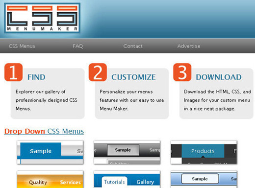
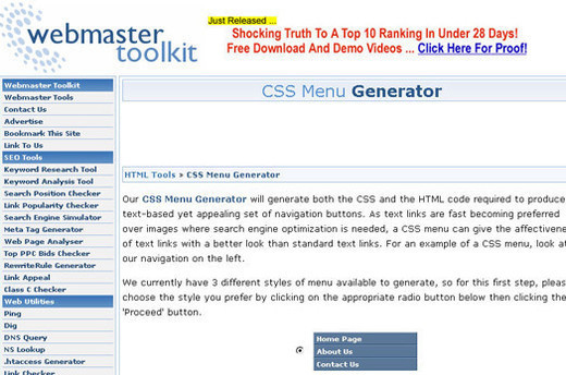
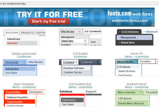
More Examples
Nike wasn’t the first and won’t be the last. Here are some other great examples of parallax scrolling:


If you’ve seen or built a great parallax website, please let us know about it in the comments.
… If you need any more encouragement to create a website as compelling as these, here’s what the team at W+K used to put together Nike Better World: MacBook Air 13″, Canon 5D Mark II, Coda, Adobe Photoshop and Adobe Illustrator.
Thanks
Putting together this article took the cooperation of a number of people. I’d like to thank Seth, Ryan, Ian and Duane for answering my questions; Katie Abrahamson at W+K for her patience and for helping coordinate the interview; and Nike for allowing us to dissect its website so that others could learn.
(al)
© Richard Shepherd for Smashing Magazine, 2011.


 It’s been quite a while since I read a new book on CSS. It seemed like most books on the subject had already been written. But then browsers started implementing CSS3, and developers started using it.