Design

CSS3 and HTML5 Toolbox Starter

Advertisement in CSS3 and HTML5 Toolbox Starter
 in CSS3 and HTML5 Toolbox Starter  in CSS3 and HTML5 Toolbox Starter  in CSS3 and HTML5 Toolbox Starter

As designers and developers we tend to always be on the look out for awesome resources to add to our virtual toolboxes. With the web design landscape moving in the direction of CSS3 and HTML5 we thought that we would help our readers find a few choice tools to start building up their toolboxes. So we went out across the web looking for some of the top offerings from the development and design community that can help get you started on using CSS3 and HTML5 today.

So take a look down through the round up of available resources that you can hopefully find some tools that you have not come across before, and that can help aid both designers and developers alike.

CSS3 Tools

CSS3 Button Maker

This intuitive tool from CSS-Tricks is labeled a “CSS3″ button maker owing to the fact that it makes use of gradients, shadows, and rounded corners which are generally not supported in older browsers. However, whenever these properties are not supported, the buttons degrade naturally and nicely. To use, you simply adjust the settings until the example looks like you want it to then you just click the button to get the CSS code. Then you copy and paste it into your stylesheet.

Button-maker in CSS3 and HTML5 Toolbox Starter

CSS3 Maker

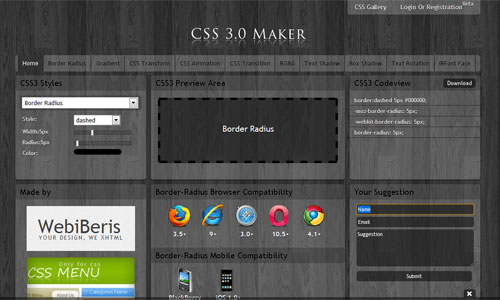
Another uber easy and user-friendly code generator is CSS3 Maker which supports “border radius” “gradient” “css transform” “css animation” “css transform” “RGBA” “Text Shadow” “Box Shadow” “Text Rotation” and “@Font Face” with browser and mobile compatibility. Users can also create an account to save snippets created during your session. (If you want essentially the same service with a different ui, give http://css3generator.com/ a try)

Image2 in CSS3 and HTML5 Toolbox Starter

CSS3 Please

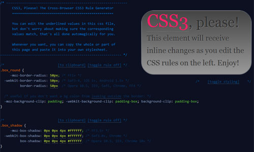
How about a handy cross-browser CSS3 rule generator? Just say please! CSS3 Please is an online stylesheet with an inlaid code generated example so you can see the changes you make take immediate effect. And the best part is, change one value, and all the corresponding values update to reflect these changes as well. Then when you are ready and have the box styled as you like, then just copy the whole code or just part of the code and paste it into your own stylesheet. With great annotations this is an awesome learning tool to boot as you are working directly with the code itself.

Image3 in CSS3 and HTML5 Toolbox Starter

Modernizr

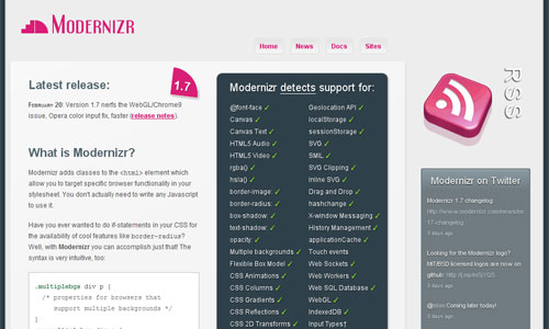
Need a compact, easy to use JavaScript library to aid in implementing emerging web technologies like CSS3 or HTML5, without sacrificing function and control in older browsers that have not made it ahead of the curve? Modernizr might be the answer. With feature detection for browser testing supporting “RGBA”, “Border-Radius”, “CSS Transitions” and more, this is a great way to get started modernizing your site while keeping control of the fallbacks for older browsers.

Image4 in CSS3 and HTML5 Toolbox Starter

CSS3 Transforms

If it is transforms that you are interested in, then step right up! With this useful tool you can rotate, scale, skew, and otherwise transform your HTML elements with CSS3. (This resource is supported in multiple browsers such as Opera 10.5, Firefox 3.5 and Safari 4 and higher).

Transform-origin in CSS3 and HTML5 Toolbox Starter

CSS3 Pie

If it is progressive enhancement that you are looking for, and you are tired of holding off on using CSS3 due to older versions of IE, then CSS3 PIE is for you. Progressive Internet Explorer (PIE) makes Internet Explorer versions 6 through 8 capable of rendering many of CSS3′s most promising and decorative features. Currently, PIE fully or partially supports the following CSS3 features:

  • Border-radius
  • Box-shadow
  • Border-image
  • Multiple background images
  • Linear-gradient as background image
  • Other features are under active development

Css3-pie-screenshot in CSS3 and HTML5 Toolbox Starter

CSS3 Menu

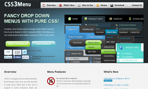
Time for menus, don’t you think? With CSS3 Menu you can build a rounded navigation menu, without using any images or Javascript. And the fun doesn’t stop there, you can also effectively make use of the new CSS3 properties border-radius and animation. This menu works with Firefox, Opera, Chrome and Safari. The dropdown elements also work on non-CSS3 compatible browsers such as IE7+ in limited fashion, without the rounded corners and shadow effects.

Image7 in CSS3 and HTML5 Toolbox Starter

CSS3 Pattern Gallery

What toolbox would be complete without some patterns and textures that you can use for your web projects. CSS3 Pattern Gallery is a growing collection of both simple, repeating textures and patterns created using pure CSS3. This is useful for reducing load time on large patterned backgrounds for websites.

Css-buttons-colorful in CSS3 and HTML5 Toolbox Starter

CSS3 Watch

As far as CSS3 inspiration goes, CSS3 Watch is a fantastic resource that provides examples of extremely creative, innovative and at times unexpected uses of CSS3. This is a great way to kick start your outside the box thinking with regards to the style of your site.

Css3-watch-screenshot in CSS3 and HTML5 Toolbox Starter

CSS3 Power Tools Tut

And now that you have all of these great tools to play with, you need to be sure that you completely understand the elements of CSS3 that you will be creating. Enter the NetTuts tutorial, Getting to Work with CSS3 Power Tools, which is a wonderful starting point.

Css3-power-tools-screenshot in CSS3 and HTML5 Toolbox Starter

More on CSS3

HTML5 Tools

Initializr

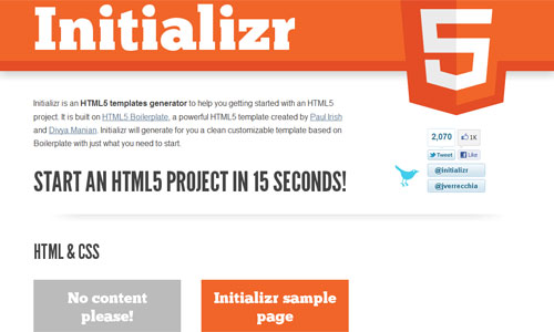
As generators go, Initializr is a nifty little one that specializes in creating HTML5 templates to get you started with any of your HTML5 projects. Initializr will generate you a crisp, clean fully customizable template based on Boilerplate with just what you need to get rolling.

Image11 in CSS3 and HTML5 Toolbox Starter

Switch to HTML5

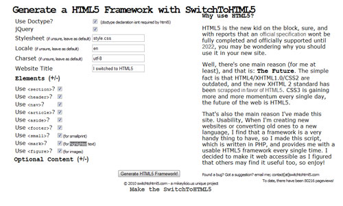
Making the switch over to HTML5 is one timely task that keeps many on hold, rather than moving forward, but with Switch to HTML5 that not be a bother or barrier anymore. With this tool you can generate a bare bones html5 framework, making it easy to both start new HTML5 projects or convert existing sites to HTML5. This is the first step…

Image12 in CSS3 and HTML5 Toolbox Starter

HTML5 Demos

Once again, if it is a matter of inspiration you are looking to amass and creatively pour through, then HTML5 Demos should be a stop over you make soon. This is a growing collection of HTML5 experiments complete with the source code so you can see the full scope of the project.

Image13 in CSS3 and HTML5 Toolbox Starter

Canvas Demos

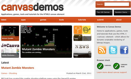
If you want to get a little more specific for your sampling of HTML5 in use, then head over to Canvas Demos. It is home to applications, games, tools and tutorials that all use the HTML 5 canvas element which allows for dynamic scriptable rendering of bitmap images.

Image14 in CSS3 and HTML5 Toolbox Starter

HTML5 Rocks

One tool that is something of a toolbox in and of itself, is HTML5 Rocks. This is Google’s full featured HTML5 resource hub including an interactive presentation, an HTML5 playground, demos and tutorials, oh my. Certainly a place worth checking out for the coding enthusiast and expert alike.

Html5-rocks-screenshot in CSS3 and HTML5 Toolbox Starter

HTML5 Boilerplate

Most of our readers are probably already familiar with HTML5 Boilerplate, but we couldn’t do a toolbox post and not include this fully customizable coding base. This template base that comes ready to rock for any of your HTML/CSS/JS needs, has a reputation that precedes it when it comes to future-proofing your site. Through years of development it is ready for cross-browser normalization, performance optimizations, even optional features like cross-domain Ajax and Flash.

Html5-boilerplate in CSS3 and HTML5 Toolbox Starter

HTML5 Doctor

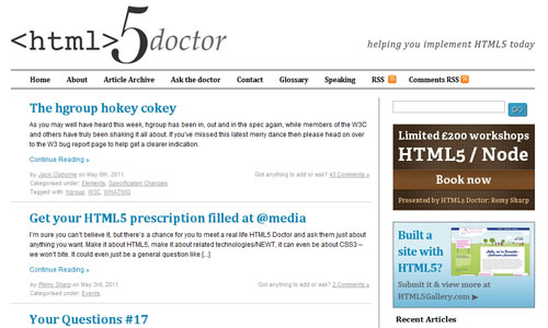
HTML5 Doctor is a dedicated blog focused on helping you implement HTML5 today. Their archives are loaded with articles relating to HTML5, its semantics, and how to use it without delays in your current web design projects. There is also a section for submitting questions for help with your troubleshooting and more, the answers to which are posted in future articles on the blog.

Image17 in CSS3 and HTML5 Toolbox Starter

Sproutcore

App developers around the web are very excited about this latest development in the field with regards to HTML5 and beyond. That is SproutCore. With their bindings system you can create your very own data-centric applications. Simply input your app details, down to your data flow specs and this resource handles the rest. These semantic templates allow you to write HTML and CSS that automatically updates with each of your alterations. With data management and syncing features to boot it is easy to see what all the excitement is about.

Sproutcore-screenshot in CSS3 and HTML5 Toolbox Starter

Dive into HTML5

Speaking of those eager to learn, Dive Into HTML5 by Mark Pilgrim is another fantastic tool that can assist you on this quest for knowledge. Here Pilgrim seeks to expand on certain features, one he has hand-picked in fact, from the HTML5 specification and other fine standards for anyone interested in bulking up on their grasp of this expansive version of this programming powerhouse.

Image20 in CSS3 and HTML5 Toolbox Starter

More on HTML5

(rb)


Getting Started With Defensive Web Design

Advertisement in Getting Started With Defensive Web Design
 in Getting Started With Defensive Web Design  in Getting Started With Defensive Web Design  in Getting Started With Defensive Web Design

Nothing ruins a great website UI like people using it. At least, it often feels that way. You put in days or weeks building the interface, only to find that a vast majority of visitors abandon it partway through the process that it supports. Most of the time, visitors leave because they’ve hit a roadblock: a problem that lets them go no further. They typed their credit card number wrong or clicked the wrong link or mistyped a URL. And it’s not their fault.

Business-strategy-user-needs-portal-funtionality in Getting Started With Defensive Web Design
What exactly is meant by defensive design? Image by Richard Winchell

A good design assumes that people make mistakes. A bad one leaves visitors stuck at a dead end because they mistyped one character. The best professionals account for this with smart, defensive design strategies (also known as contingency design).

Defensive Design Means…

I’m a simple guy. In the book Defensive Design for the Web, 37Signals defines defensive design as such: “Design for when things go wrong.”

Gets right to the point, doesn’t it? Defensive design anticipates both user and website error. Then, it tries to prevent those errors and provide help to get the user back on track. Defensive design for the Web usually focuses on the most common points of failure: forms, search, the address bar and server problems.

Defensive design:

  • Employs validation to check for mistakes before they frustrate the user,
  • Expands available options based on the user’s implied intent,
  • Protects site visitors from server errors and broken links with informative messages and
  • Assists the user before mistakes happen.

Defensive Design: Business Sense

If you want to grow your online business or just improve your blog, defensive design is one of the easiest upgrades — instead of trying to build audience, defensive design helps you better serve the audience you’ve got. The latter is far, far easier than the former.

What-is-strategy in Getting Started With Defensive Web Design
Self-explanatory. Image by What consumes me

Think about it: You can work on marketing, search engine optimization, community-building, display ads and content strategy, and attract 1,000 new visitors. If 5% of visitors to your online store make a purchase, then those 1,000 new visitors mean 50 new orders. Or, you can practice defensive design. That might increase your current conversion rate from 3% to 3.5%, adding 50 new orders.

The best way to learn defensive design? By example. Here’s a quick overview of best practices, plus some tips for doing it yourself.

Inline And Contextual Help

The best contingency design prevents errors from occurring. Sometimes a simple tip or explanation can prevent error and visitor frustration. Instead of making customers trek to a separate help area, try to assist them with tips and instructions inline or in context.

Inline help offers pointers on specific items on the page. 37Signals provides inline help throughout its applications. For example, I can find out exactly what the 30-day trial of BaseCamp entails without leaving the page:

37signals-inline-help2 in Getting Started With Defensive Web Design
Inline help on 37Signals clarifies the conditions of the free trial.

The inline help box appears the moment I roll over “30-day free trial.� It’s easy to read, well positioned and clearly related to the free trial. And the language is crystal clear. This is important. Defensive design is as much about the message as it is about the circumstances that call for it.

Contextual help provides guidance relevant to the current page or process. Hence, “contextual.� Unlike inline help, contextual help usually relates to the entire page, and it can appear without a click or rollover.

WordPress offers contextual help in the administration area of the application. The “Get help with dashboardâ€� message appears the first time you open the dashboard. The message might be a bit too lengthy, but it’s helpful and it is right for the given context. Note the simple language, plus the option to dig deeper by going to the full documentation or support forum:

Wordpress-contextual-help1 in Getting Started With Defensive Web Design
WordPress contextual help alerts me to helpful instructions.

HootSuite explains every feature of its application and service packages with simple inline help boxes. The boxes answer basic questions at a glance, without pulling users away from the all-important sign-up page:

Hootsuite-inline-help in Getting Started With Defensive Web Design
HootSuite uses inline help to explain individual features.

These websites all anticipate that users might miss certain features and requirements. And then they present those features with clear direction, in context. Make no assumptions! A field, button or feature that makes total sense to you may be nonsense to the typical visitor. Provide help.

Slow Connections

Another, subtler form of defensive design accounts for slow Web connections. Downloads can slow to a crawl on mobile connections. When that happens, visitors may be forced to find their way through your website without images or Flash elements to guide their way.

37Signals makes sure that you can read its entire content, including interactive elements, without images. It does this by relying more on CSS and text than on images. Even if the background and images don’t load, critical navigation, calls to action and rollover elements will still work:

3signals-no-images1 in Getting Started With Defensive Web Design
Even without images, users can use the 37Signals’ website.

A List Apart looks a bit minimal without images, but everything from the articles to the navigation remains in place. Users can easily find and read the articles they want:

Alistapartnoimages in Getting Started With Defensive Web Design
The layout of A List Apart is preserved even without images.

CNN’s home page remains intact without images. Visitors can see all links, search tools, navigation and content in exactly the same position as if images were displayed:

Cnn-no-images in Getting Started With Defensive Web Design
CNN’s website remains 90% intact and navigable without images.

Some designers still want 100% control over type and layout, and they want the freedom to use images, Flash and other slow-loading elements to achieve it. But more and more users are accessing the Web on wireless connections, which are getting faster but are still unreliable. Plan ahead and have a website that still works when bandwidth shrinks.

On-Site Search

On-site search is wonderful, if visitors can actually find what they’re looking for. If your website contains a lot of often misspelled words for products, concepts or services, then your search tool may be an exercise in tooth-gnashing frustration. Anticipate misspellings and typos and turn on-site search into an asset.

Amazon’s on-site search tool automatically recommends close matches. It presents the same kind of “Did you mean?� message that Google does, plus it displays results for the correct spelling of the query:

Amazon-search-typo in Getting Started With Defensive Web Design
Amazon modifies search results to show products that match correct spellings.

Like the others, CNN provides closest-match spelling correction. Then it provides two other sets of options: top stories for the closest match and top general searches on the website for that week. The correction and variety of results get visitors back on track so that they don’t have to perform a second search.

Cnn-search-typo1 in Getting Started With Defensive Web Design
CNN returns the closest match of spelling, plus top stories.

These examples anticipate typographical and spelling errors. Sometimes, though, a visitor submits an unusual query: for example, “java� instead of “coffee,� or “band� instead of “ring.�

Zappos provides a graceful solution by making its search results transparent. The website examines your query and shows categories and concepts to which your search maps. Plus, the user has the option to remove any of the categories from the search result:

Zappos-search1 in Getting Started With Defensive Web Design
Zappos clarifies how it delivers results and lets you correct them.

So, if I submit the wrong query, Zappos might show me the wrong results, but it also shows me why the results are wrong and helps me figure out a better search.

If you’re just running a small website in your spare time, these automated search suggestions and mapping tools may seem out of reach. But they’re not. Tools like Google’s Custom Search give you them from the start. And if you’re feeling nerdy, solutions like Lucene come with entire libraries that do “Did you mean?� matching and let you customize matches. Or you can write your own script to identify common misspellings and handle them exactly the way you want. How fancy you get is up to you.

Form Validation And Error Handling

Forms are the number one cause of customer’s hate. Filling out a form requires a lot of work — it forces you to do the hardest combination of clicking-typing-clicking, and often involves digging through your wallet for credit cards and other information. A typo, missing field or incorrectly formatted phone number can force a visitor into a loop of retype-submit-retype, fixing their errors one at a time. Smart defensive design starts with clear direction (see the section on “Inline Helpâ€� above).

But mistakes happen. So, defensive form design does the following:

  • Preserves visitor data
    When a user is returned to a form to fill in missing data, the website should keep completed fields filled in. The visitor should be able to fix their errors without retyping the entire form.
  • Highlights errors with clear graphics and text
    Fixing and completing entries should be obvious and easy.
  • Doesn’t make the visitor feel like a criminal
    Full-caps messages telling the visitor that “YOU COMPLETED THE FORM INCORRECTLY� aren’t exactly endearing.

Wufoo highlights errors, explains exactly what the user did wrong and preserves the data across refreshes, which makes corrections easy. The only problem with the design is that the message “There was a problem creating your account� doesn’t tell me anything useful. A more descriptive message would be better.

Wufoo-form-validation1 in Getting Started With Defensive Web Design

Wufoo highlights what you did wrong, but a clearer message would help a lot.

FreshBooks keeps it nice and simple. Even better, it doesn’t make users feel like they’ve failed a test:

Freshbooks-form-validation in Getting Started With Defensive Web Design
The form message on FreshBooks is simple and friendly.

Complex and simple form layouts can provide equally great feedback and help users get back on track, as the following screenshots of SEOmoz and MailChimp show.

Seomoz-form-validation in Getting Started With Defensive Web Design
SEOmoz’s form tells you when two fields don’t match.

MailChimp uses JavaScript to validate inline as you type, so you can correct mistakes before submitting the form:

Mailchimp-form-validation-javascript in Getting Started With Defensive Web Design
MailChimp validates before you click “Submit,� saving you even more time.

Another interesting technique for defensive design in Web forms is presented on Mailchimp when a user tries to delete his/her subscriber list from their account. The tool requires a user to manually type “DELETE” to confirm the action. A nice example of making sure that the list will not be deleted by accident. The technique might look a bit annoying at first glance, but it clearly minimizes the error rate for users who delete sensitive data by mistake.

Mailchimp-delete in Getting Started With Defensive Web Design
“Type ‘DELETE’” pattern on Mailchimp. It will save users some headache.

Great contingency design never gets in the way. In all of these examples, each error is highlighted. Also, the description of the error is positioned near the relevant field, so it’s easy for visitors to find and fix the mistake. This keeps the form compact, maintains eye flow and lets the visitor continue with their task uninterrupted.

“Page Not Found� Errors

On the internet, broken links are abundant. A webmaster may have moved a page or mistyped the URL in a link, or a visitor may have left out a forward slash from an address. Whatever the cause, the last thing the user wants to see is this vaguely hostile message:

Bad-404 in Getting Started With Defensive Web Design
A bad 404 page. Somewhat upsetting, isn’t it?

Great websites customize their “Page not found� area (also called a 404 page), by providing options, explaining what happened or even injecting a little humor into what can otherwise be a frustrating experience.

ThinkGeek includes full navigation on its 404 page. It also provides a search form, so if I know what I’m looking for but not the URL, I can submit a query to track it down. (Assuming the Jedi mind trick doesn’t work…)

Thinkgeek-404 in Getting Started With Defensive Web Design
ThinkGeek tries Jedi mind tricks but doesn’t rely solely on them.

Climate Wisconsin keeps it simple, with two options on their 404 page. It’s easy to quickly digest, and the visitor can immediately decide their next action:

Climate-wisconsin-404 in Getting Started With Defensive Web Design
Climate Wisconsin’s 404 error page is simple and to the point. A search functionality could be a useful helper for users, though.

You don’t have to make the 404 page a work of art. Just make sure that if a detour is required, you do the following:

  • Reassure visitors that you’re still there by branding the page.
  • At a minimum, link back to the home page.
  • Ideally, provide concrete options for getting back on track.

Server Errors

Sometimes things just go kerploiee. That’s a technical term for when your server, tired of its humdrum day-to-day existence, stops delivering pages, flips over on its back, lets out a horrid gurgling sound, and utterly fails to deliver content, data, information or anything else.

Normally, this will give the user a message like this:

500-server-error1 in Getting Started With Defensive Web Design
A standard 500 server error. Scary at the best of times.

Imagine you’re the visitor. What does this page tell you? That the apocalypse is at hand? Or that you have to find something called a “server error log”? Which pretty much means the apocalypse is at hand. Either way, you’re going to cross this website off your list.

Great contingency design accounts for everything, including servers going kaput.

Here’s the page on Carsonified. It explains what happened and lets you send a message to its developer, Elliott Kember:

Carsonified-error in Getting Started With Defensive Web Design
Carsonified leaves nothing to chance, and it says a few words about the person who may have caused the error.

The Food Network isn’t as entertaining, but it certainly makes sure that users know it’s still in business. And like any good 404 page, it gives users a few ways to get back on track:

Food-network-500 in Getting Started With Defensive Web Design
Even if the Web server dies, a user knows that the Food Network is still around.

Brushfire Digital explains the error, provides navigation and contact information and, again, makes sure you know it’s still there:

Brushfire-500-error-in-Great-examples-of-defensive-design in Getting Started With Defensive Web Design
Brushfire makes sure you know it’s not you — it’s them.

Again, you don’t need to create a work of art. Just make sure visitors know that the error probably isn’t their fault and that you’re taking care of it.

Detect Holes In Your Defenses

Some defensive design issues are easy to spot: bad forms, error messages and inline help are obvious. But you can spot subtler issues and their solutions using some basic Web analytics.

The Checkout Funnel

You can grow sales in a hurry by getting more of your existing audience to purchase. That’s far easier than getting more visitors. So look at your checkout funnel to see if there are any places where many new customers abandon their shopping cart. In this example, over 70% of visitors who place items in their cart abandon the checkout process. The overall sales conversion rate is 1.7%:

Checkout-funnel-1 in Getting Started With Defensive Web Design
A broken checkout funnel. It’s losing 70% of potential customers at the first step.

This is a true story, by the way. The problem was very clear: customers abandon on the initial checkout page. We thought the cause might be the page’s layout. It gave visitors a strong impression they’d have to register in order to check out. So, we changed the page, adding inline help and a modified layout to make the guest checkout option clearer. Cart abandonment on the first page dropped dramatically, and overall sales conversion rate improved to over 3% (I wish I could show you the resulting data and the pages, but client confidentiality and all that).

The Missing Link (page)

Sometimes, prominent third-party sites link to you. And sometimes they link to you incorrectly. While a good 404 page (see above) can help, you’ll still lose a lot of visitors — they’re clicking a link on a site they trust. When the target site shows a “Page not found” error, the visitor will likely click the “Back” button. In a perfect world, you’d put a custom page at the linked URL, and then use that to gently steer visitors to the right place. Or, you can set up a 301 redirect from the broken URL to the correct one. But how do you find these links? If you’re using a hosted analytics solution like Google Analytics, it won’t report 404 errors out of the box.

A quick look at Google Webmaster Tools, or a little Web server log file analysis, can help you spot these problems. Look for pages that show repeated 404 errors. In the example below, Google Webmaster Tools shows a 404 error from a link placed on 29 different pages. That’s a broken link that begs for redirection or a transition page:

Broken-links-gwt in Getting Started With Defensive Web Design

Broken links in Google Webmaster Tools. 29 pages? This one needs a redirect.

This kind of analysis and fix enables defensive design even when you didn’t cause the problem. And again, it lets you build audience, sales and leads without getting new visitors. You’re just improving the experience of current ones.

Avoid Common Mistakes

Walk a mile in your visitors’ shoes, and you will easily be able to avoid the most common defensive design mistakes.

Mistaken Assumptions

Never, ever assume that visitors will “figure it out.� Nor assume that they have any familiarity with your website. Your visitors have plenty of options — the Web’s a big place. Cater to their needs, and be prepared to handle every imaginable mistake. The fewer assumptions you make, the more bulletproof your design will be.

Fake 404s

When you set up your 404 error page, make sure that the server delivers a 404 error code if a page doesn’t exist. Some developers and Web hosts instead redirect users to the 404 error page with a temporary or permanent redirect.

Fail-Snail in Getting Started With Defensive Web Design
The Fail Snail. Image by Todd Bernard

Those redirects deliver a 302 or 301 code, which usually tells search engines to index your error page at many different URLs. I won’t go into the painful details of canonicalization and why this is bad. Take my word for it: the 404 error code was created for a reason. Use it.

Limited Landing Pages

Visitors will come to your website via links, search results and who knows what else. That makes every page a potential landing page. So, practice good defensive design on all of them.

Lousy Copy

Carefully write and edit your copy for inline help, error messages and other contingencies. Your visitors’ patience will already be strained. This is your chance to fix the problem and maybe even start to build a great relationship with them. Make every word count.

Limited Browser Compatibility

Every contingency must work in all browsers. If visitors need the latest browser to see inline help, then it’s not very helpful, is it? Use progressive enhancement to ensure that everyone benefits from every element on the page.

Good For The Brand, Good For The Business

Almost any brand can benefit from good customer service. Defensive design lets you deliver great service effortlessly when your customers need it most. It builds sales and makes customers love you. So, hope for the best and plan for the worst.

It pays to plan for user mistakes and bugs. If you’ve ever managed a website, then you know you’re guaranteed a few bumps along the way. And while putting all of these defensive design measures in place is extra work, it also means more happy visitors. And that means business growth from the audience you have.

Other Great Defensive Design Resources

  • “Amazon gets even more defensive,â€� Signal vs. Noise.
  • Defensive Design for the Web, 37Signals
    I’m not a 37Signals fanboy, I swear.
  • Bulletproof Web Design, Dan Cederholm
    Another great read.
  • useit.com, Jakob Nielsen
    A treasure trove of all sorts of usability-related wisdom, including defensive design.

(al)


© Ian Lurie for Smashing Magazine, 2011. | Permalink | Post a comment | Smashing Shop | Smashing Network | About Us
Post tags: ,


Designing the Airwaves: Podcast’s Part in Design

Advertisement in Designing the Airwaves: Podcasts Part in Design
 in Designing the Airwaves: Podcasts Part in Design  in Designing the Airwaves: Podcasts Part in Design  in Designing the Airwaves: Podcasts Part in Design

One powerful outlet that many designers have been turning to over the recent years, which in turn has allowed for a further evolution of the design community and conversation, is podcasting. This completely accessible, and open format for extending the design dialog is proving a viable solution for many seeking to lend their voice to the field in another way altogether. And by actually lending their voice to the process, no longer in just a metaphoric manner.

Radiotower in Designing the Airwaves: Podcasts Part in Design

Image Credit

So how does one go about throwing their proverbial hat into this ring, and just exactly why do they do it? Those are a couple of the questions that we will tackle in this post, which will then end in a showcase of outstanding contributions to the design airwaves. So if you are either a fan of the form or perhaps looking to find your own footing in this continuously burgeoning market for designers then hopefully this post can give some food for thought for the weekend to accompany the new listening material provided.

The Why

There are many reasons that designers have opted for this direction in order to engage the community. However there are three major headers that most design podcasts fall under, when you begin looking into the reasons they cast. It is more than the accessibility it offers, in fact, it tends to be more tied to the community aspect of the field in one way or another.

To Teach

One of the main missions that we see when designers turn to the virtual airwaves, is so that they can educate the masses. So many podcasts are out there to provide the community with another resource that can be tapped when you are working in the field. Whether you are a relative newcomer to the market, or even a seasoned veteran, the design arena is constantly evolving and we have to keep up with those changes. In fact, it is a staple piece of advice within the field, that if you want to make it, then you need to always be learning.

Podcasts have provided yet another means for designers to reach this end, and so we see many moving to this platform in order to teach others what they have learned along the way, techniques that they developed over the years, or even what their guests have to offer. It is one thing to set up a tutorial, but some people learn better with more auditory instruction, and so podcasts can work better for them overall. Not to mention that some lessons that need to be taught are handled better more anecdotally. Just like blogging can achieve this connection and impart these lessons, podcasting can do the same thing in via an auditory presentation.

To Preach

Another powerful motivator that drives designers to the casting side, is to further that engagement that they have through their blogs. They can use this platform to establish themselves as an authority in the field. Be it in a particular niche, or in more general terms , some designers come to these waters because they feel their perspective is a valuable one and they are going to share it. They want to help steer the directions the field might take and they set out on the airwaves to make their mark.

Tworoads in Designing the Airwaves: Podcasts Part in Design

To help guide the community down an alternate path is a mission that brings some to the format. Image Credit

While blogging can help designers to plant their authoritative seeds, podcasting can engage with the community on a much more personal level. With writing it is easy to keep the tone professional and the personality reigned in. However podcasting is a different beast where personality goes a long way. So it does take a slightly different approach than blogging, though the paths are somewhat parallel. And given that both can prove essential with the authority establishing, it is easy to see why many in the field are walking both roads.

To Reach

The third major reason that designers opt for this form, is to help extend their reach with their audience. This needed reach extension could be for helping them to build their following, develop their brand, or simply to offer an added source for revenue. Whatever the purpose they use this reach for, it is often the extra mileage they can attain into the heart of the community that pushes them towards the podcasting outlet. And when they consider how easily one can break into this field it does improve their chances of being found and heard above the horde.

The How

As previously mentioned, podcasting is a very accessible market, which you can dive right into with a small investment of capital or a large one. It really is up to you. Either way you go, the only other investment required on the part of the podcaster is time. This too can vary depending on the style and length of show you are wanting to produce. But one that must be considered nonetheless. And if you have the time to commit, then it can really prove worth your while to try your hand at the casting.

The Gear

First off in order to get started, you are going to need the proper equipment, and again, the amount that you invest in the equipment is really up to you. Most designers already have the computer covered which can be the biggest hurdle on this path. Some sort of microphone is required, as well as some sort of recording software. That is about it. And the great thing is that when it comes to software, there are both free and premium options that rank highly among users. And if your computer is a laptop with a decent built-in microphone, then three of your bases are already covered.

If you plan to add an interview or call in element to your show then naturally things get more complicated, as does the equipment or software necessary to pull it off. Skype is a wonderful free tool for being able to connect with others and have them on the podcast and there are free programs like MP3 Skype Recorder that will do just that. Record your entire call and save it as an .mp3 file. So high priced mixers and attachments are not that necessary for a more modest program. Mac users may find getting started particularly easy if they already have Garageband installed. It even has added sound clips and effects to juice up your program that free apps like Audacity lack.

More Tools and Resources

  • TalkShoe is a web based service that allows you to create calls and have podcast participants join in on the show.
  • Propaganda Podcasting Software is a relatively inexpensive program for windows users for recording their shows.
  • Adobe Audition CS5.5 is Adobe’s premium recording solution.
  • Podcasting Tools is a site that can help point you in the right direction with any of your podcasting needs.

The Grind

Like with anything, there is a fair amount of work involved with putting a podcast together that also needs to be considered in this discussion. The grind is still fairly easy in comparison to most, however there are a couple of areas where you are going to need a little guidance. For example, in order to get started delivering your podcast to your audience, you are going to need to consider, coordinate, and implement a delivery system. The web is full of services to help you connect your podcast with an audience, iTunes, Podcast Alley, and so many more. WordPress users can also take advantage of various plugins that help in this area as well.

Podcasting-plugin-image in Designing the Airwaves: Podcasts Part in Design

One of the most important elements to this delivery system, especially if you intend for users to be able to subscribe to your feed, or to set up that feed through these various sites and services, is to create and manage an .xml file for your podcast. Also when you begin trying to calculate how much time you must invest into the show, you have to account for not only the recording time, but also the time it takes to edit the show together, adjust your .xml file, create a blog entry for the new episode (if applicable), and the time it takes to convert and upload the necessary files. So it can become quite a project depending on the scope you have taken with it.

The Gab

Before when we mentioned the personality that the format carries with it, that was to highlight how important it is you bring some of this to the show yourself. If you want your show to connect with the audience, then the host tends to have to be somewhat personable, relatable, or otherwise bring something vibrant and exciting to the table. The gift of the gab is a common phrase that does apply in this context. In order for your podcast to rise among the rabble then you need to be able to engage your audience, and it tends to take a bit of that gift to make this happen.

The Bar

Below are some active design based podcasts that come highly recommended, and are certainly worth checking out. Especially if you are considering starting a podcast of your own, the bar has been set by these fantastic design related casts that have come before you, so you might want to give them a listen to see what is already being done, and how.

Workers of the Web

Workersofweb in Designing the Airwaves: Podcasts Part in Design

Web Workers, UNITE! Witness the molten glow of pixels as they strike your screen-burned face. Now raise your calloused, carpal tunnel twisted fist into the air and scream, “I. AM. A WEB WORKER!”

TEDTalks

Tedtalks in Designing the Airwaves: Podcasts Part in Design

Each year, the TED (Technology, Entertainment, Design) conference hosts some of the world’s most fascinating people: Trusted voices, and convention-breaking mavericks, icons and geniuses. These podcasts capture the most extraordinary presentations delivered from the TED stage.

SitePoint Podcast

Sitepoint in Designing the Airwaves: Podcasts Part in Design

News, opinion, and fresh thinking for web developers and designers. The official podcast of sitepoint.com.

Think Vitamin Radio

Thinkvitaminradio in Designing the Airwaves: Podcasts Part in Design

Think Vitamin Radio is a bi-weekly podcast, typically around 20 minutes in length. Topics will include web design, web development, and web applications as well as news and views from host Keir Whitaker with Ryan Carson and Mike Kus.

37signals Podcast

37signals in Designing the Airwaves: Podcasts Part in Design

A look at the world of 37signals, the Chicago-based web application company. Discussions about business, design, experience, simplicity, and more. Featuring Jason Fried and David Heinemeier Hansson.

The Boagworld Show

Boagworldshow in Designing the Airwaves: Podcasts Part in Design

Boagworld is a podcast for all those involved in designing, developing or running a website on a daily basis. The show is divided into seasons consisting of 6 episodes. Each season covers a particular topic and is accompanied by an associated ebook. They also interview leading figures in the world of web design including people like Jeffrey Zeldman, Jeremy Keith and Andy Clarke.

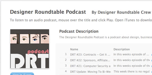
Designer Roundtable Podcast

Designerroundtable in Designing the Airwaves: Podcasts Part in Design

The Designer Roundtable Podcast is a podcast about design, business and freelance. Come chat with us!

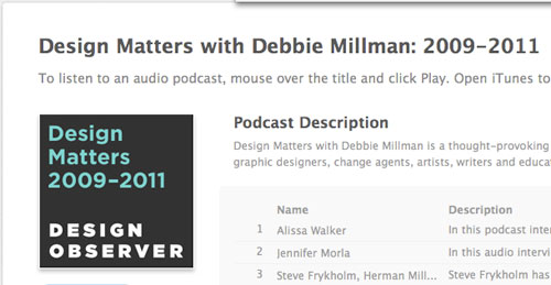
Design Matters with Debbie Millman: 2009-2011

Designmatters in Designing the Airwaves: Podcasts Part in Design

Design Matter with debbie Millman is a thought-provoking internet podcast, which profiles industry-leading graphic designers, change agents, artists, writers and educators.

(rb)


Styling ordered list numbers

I’ve always been annoyed by how difficult it is to style the numbers of ordered lists. Quite often a design calls for something other than just a plain figure – a different font, size, colour, background, whatever.

The traditional approach to solving this problem has been to prevent the browser from rendering the numbers of the list items (li elements) and instead hard code the numbers in the text content of the li. That makes it possible to add styling hooks to the number and style away until you’re happy.

Doing it that way works visually, but it isn’t exactly a semantically correct way of using lists. When you view a faked numbered list with CSS disabled you see either a list with the item numbers repeated or a list with bullets and numbers, and that feels backwards to me. I wanted to find a better way.

Read full post

Posted in .

Copyright © Roger Johansson


Building An Effective ‘Coming Soon’ Page For Your Product

Advertisement in Building An Effective Coming Soon Page For Your Product
 in Building An Effective Coming Soon Page For Your Product  in Building An Effective Coming Soon Page For Your Product  in Building An Effective Coming Soon Page For Your Product

I recently had to design a couple of teaser pages for a client and a personal project, and this led me to think about what exactly makes for a good teaser page — or to be more precise a “coming soon” page that companies often put up before they’re ready to launch their product. After careful research and many scientific tests in the brand new field of teaserology, I’ve developed a patented Teaser Effectiveness Analysis Matrixâ„¢, consisting of four elements. The perfect teaser page must score high on all four axis of the following:

  • Memorability,
  • Virality,
  • Desirability,
  • Data collection-ability.

I know that “data collection-ability� is not proper English, but inventing new words is one of the perks of being a scientist. As we’ll see, most teaser pages focus strongly on two or three of these elements but rarely hit all four.

Why Do I Need A Teaser?

Even though people seem to put out a teaser website for anything these days, let’s step back and think about why one would need a teaser. After all, putting one together takes time and energy, and you could argue that the effort would be better spent on the product itself.

But a teaser can go a long way to ensuring a successful launch. Raising awareness of your product long before it ships makes sense: people are more likely to interact with your app if they’re somewhat familiar with it, so letting them hear about it as soon (and as much) as possible helps. Ideally, you would create a climate of anticipation, and make people look forward to the release date. People love to know in advance about the next big thing, and you can use it to your advantage.

A Powerful Motivating Tool

Another factor that is not as obvious but perhaps even more important is motivation. When you’re working hard on something, without any guarantee of success, doubting yourself and losing motivation is easy, and this circumstance often leads people to abandon otherwise promising projects.

Raising awareness and collecting email addresses long before launch does two things to combat this lack of motivation. First, by putting the project out there, you make it much harder for yourself to quit, because we all hate to let people down. Secondly, pre-registering users shows you that there’s actual demand for what you’re building, which goes a long way to silencing those gnawing doubts. In this context, the teaser is a vital part of any product’s Web strategy.

Now that we know the why, let’s look at the how, and analyze a few strategies.

Teaser Page Strategies

Create a Strong Identity

As stated, the first dimension of a good teaser is memorability. One way to achieve this is with a strong brand. By “brand,� I mean all of the visual attributes that people associate with your product: logo, colors, style, etc. Once you launch, the website could end up looking very different than the teaser page, so having a strong brand is a great way to maintain continuity.

Many websites combine an attractive logo and strong color scheme to establish the brand’s identity, without even telling you what they do. It doesn’t have to be just color or a logo, though.

Pictu in Building An Effective Coming Soon Page For Your Product

As for Piictu, nothing in its teaser stands out at first glance, but the care given to the overall design (from the subtle background pattern to the combination of typefaces and colors) is memorable in itself, putting the application in a class of its own.

Talkbee (see the screenshot below) is a personal project of mine. I decided that I wanted a strong design with bright colors and a memorable logo to differentiate it from the competition.

Talk-bee-screenshot in Building An Effective Coming Soon Page For Your Product
The logo is prominent on Talkbee, and the whole page is designed around it.

Use a Gimmick

One design detail trumps even great branding: a gimmick, something special that people haven’t seen before. One of the most famous examples of this was the teaser page for Silverback, which included a CSS parallax effect (you can still see the effect on the current website if you resize your browser window). The website went viral in social circles and became hugely popular on the strength of that little CSS trick alone.

Kickoff in Building An Effective Coming Soon Page For Your Product
The Kickoff‘s teaser page features a subtle yet nice illustration and a small email subscription box..

One popular technique that you could use to achieve a “gimmick” is animations, today usually created with CSS transitions and CSS animations. Animations could quickly get overwhelming and frustrating on “realâ€� websites, but they’re appropriate in small doses in teasers. Recent examples of teasers with animation are Cloudring and Kickoff.

Ben-the-bodyguard-screenshot in Building An Effective Coming Soon Page For Your Product
Ben the Bodyguard draws you in with storytelling.

Another interesting techniques is to use vertical scrolling to tell a story. The poster child for this is certainly Ben the Bodyguard which doesn’t provide all information right away but rather unfolds a story using animations and scrolling.

A very similar idea was used by Dayri and the beautiful Youzee. The technique is successful because storytelling helps people make sense of their environment in a logical and linear way. A linear story hooks us much more effectively than disjointed facts.

Leverage the Power of Social Circles

A more interesting recent development in design of “coming sooon” pages is to include viral mechanisms in the pre-registration process itself. The simplest form of this is a simple “Tweet this pageâ€� button on the page.

LaunchRock, a service that lets you quickly generate a teaser page of your own, takes this a step further. After registering for a LaunchRock-powered website, the user gets a personalized link to the teaser. The more people register through this link, the sooner the user gets access to the website. In fact, LaunchRock itself uses this technique: in order to create your own teaser website through LaunchRock, you need to get three other people to sign up to the service… Confused yet?

Cowritable-screenshot22 in Building An Effective Coming Soon Page For Your Product
The teaser for Cowritable, powered by LaunchRock.

Another interesting idea is used by the “king of viral sign-ups” Dabble.in. Sharing Dabble.in’s link won’t get you early access. Instead, if multiple people request the same user name when signing up (say, “Johnâ€�), then whoever gets more people to sign up wins the user name, while the others have to settle for less desirable alternatives (like, say, “John1986â€�).

What-do-you-dabble-c in Building An Effective Coming Soon Page For Your Product
Dabble.in lets you win your preferred user name.

If you’d rather not go to these extremes, then simple “Tweet� and “Like� buttons are still a good way to encourage people to spread the word. Of course, the easier it is for visitors to share your link, the more they’ll do it.

Give Something Back

Probably the most effective way to make people share your teaser is to not just help them reserve a special spot, but also give something in return. For example, if enough of your friends sign up, Fab.com gives you up to $50 in website credit.

Fab-dot-com-screenshot in Building An Effective Coming Soon Page For Your Product
Fab.com knows that nothing motivates people like money.

But you don’t have to offer money. You can imagine all sorts of deals: free icons, WordPress themes, etc. Even better, offer the product itself. For example, for every person you refer to its service, Dropbox credits you both with extra storage. The best part is that this strategy won’t cost you anything until you’ve actually launched, and even then, because it’s your own product, the costs remain low.

Make People Want It

A word of warning. No matter how clever the viral trick, it won’t matter if people don’t actually want to use your app. As smart as Dabble.in’s sign-up process is, nothing on the website hints at what the app actually does. The effect is that many users might find no incentive to share the teaser, because they’re not even sure why they’d want access to the website.

This is why the vast majority of teasers fail: they simply don’t make you want to use the product. The easy solution is to just come out and say what your product does. Show screenshots, post a short video or write some killer copy.

Popcorn-screenshot in Building An Effective Coming Soon Page For Your Product
Youzee’s teaser is so full of eye candy that you can’t help but be curious about the app.

Even if you’re restricted in how much you can say about the product, you still need to make people care. You can do this through exceptional design, as Piictu, Youzee and Kickoff do. People will naturally assume that if your teaser is well designed, the product will be, too.

Collecting Data

Of course, if the teaser is successful and goes viral, you’ll face another problem: what to do with all of these visitors? The easiest thing would be to just collect email addresses and add them to your mailing list. You can use services such as MailChimp or Campaign Monitor to manage your list. Both services make it easy to embed and style a simple form on your page; and then you leave the rest to them.

Pre-finery-screenshot in Building An Effective Coming Soon Page For Your Product
Prefinery promises to make you happier by removing alien probes from your brain.

You also have more advanced options. For example, Prefinery promises to streamline the pre-launch process, taking care of everything from email collection to beta management. But obtaining data doesn’t necessarily mean collecting email addresses. You could poll visitors on your teaser page using a service like KISSinsights, or use Olark to let visitors chat with you in real time.

A Teaser Template

The teaser should be all about your product and should be tailored to your goals. That being said, I’ve designed a generic template for you to study, adapt and use as is in your own project. (Thanks to Sharypic for letting me use its screenshots.) You can download and use the PSD template for free in all your private or commercial projects.

Cloudwidget in Building An Effective Coming Soon Page For Your Product
Download the PSD (.zip, 1.6 MB).

Going Further

The teaser is just one piece of the puzzle. Other important parts of a successful pre-launch campaign are a Twitter account, Facebook page, blog, and others. Unlike on a teaser page, which is usually a one-way medium, people can reply to your tweets and leave comments on your blog. These channels are valuable because they help you get feedback on new ideas and maybe even correct course to better target your market.

Resources

Disclaimer

I’m involved in a few of the start-ups mentioned in this article. Talkbee is my own personal project, and I do design for Cowritable and Cloudring.

(il) (al)


© Sacha G for Smashing Magazine, 2011. | Permalink | Post a comment | Smashing Shop | Smashing Network | About Us
Post tags: ,


  •   
  • Copyright © 1996-2010 BlogmyQuery - BMQ. All rights reserved.
    iDream theme by Templates Next | Powered by WordPress