In an age where artificial intelligence (AI) is booming and dominating virtually every sector, it’s no surprise that its innovative prowess has extended its reach to the design world. From healthcare to finance, transportation to entertainment, AI has carved its mark, revolutionizing industries at an unprecedented pace. Among the many realms it’s reshaping, one stands out as a vibrant canvas for its creative impact—User Interface (UI) design.
UI design, once confined to arranging elements on screens, has now transformed into an artistic tapestry that weaves together aesthetics and functionality. As AI’s influence expands, it brings with it a dynamic wave of change that is propelling design into uncharted territories. The fusion of AI-generated art and UI design is propelling us into a new era—one where design isn’t just visually pleasing but also technologically captivating.
In this unfolding landscape, we find ourselves at the crossroads of innovation and imagination. The partnership between AI and human creativity propels UI design beyond the conventional, giving birth to an exciting revolution. Through this journey, we’ll unveil the seamless integration of AI-generated artistry into UI design, a synergy that amplifies the impact of both realms.
Explore the transformation where art and code converge to reshape design norms. Witness how AI acts as an inspiration and partner, sparking a revolution in UI aesthetics. As we dig deeper, you’ll unveil AI’s impact, redefining the core of design concepts. Brace yourself for an unfolding evolution as AI’s creativity illuminates fresh possibilities for digital interactions, merging innovation and beauty in unprecedented ways.
Unveiling the Dual Nature of AI in UI Design: Ally or Adversary?
The emergence of AI raises a crucial question: should designers greet this evolution with open arms or cautious skepticism? While AI offers immense potential to reshape the design landscape, its impact hinges on a delicate balance of human ingenuity and technological prowess. Let’s navigate through the complexities, exploring the symbiotic relationship between designers and AI and how prudent usage can amplify creativity while also highlighting potential pitfalls.
The Promise of Amplified Creativity
AI’s role as a creative ally is undeniable. It streamlines processes, generates novel ideas, and gives designers a fresh lens to envision and iterate. This partnership has the potential to revolutionize design by freeing up designers’ time for conceptualization and innovation.
The Imperative of Human Intervention
However, AI’s capabilities come with a crucial caveat: the necessity for human intervention. While AI can generate designs, it needs the innate human ability to infuse emotions, cultural nuances, and context into the creative process. Designers wield the power to imbue interfaces with empathy and resonance, ensuring user experiences transcend mere functionality.
From Asset to Liability
The allure of AI-driven efficiency can become a double-edged sword. Relying solely on AI-generated designs risks homogeneity, where interfaces need uniqueness and character. Human intervention prevents UI design from being reduced to a mechanical formula, allowing for tailored solutions that cater to diverse needs.
Ethical Considerations and Bias Mitigation
AI’s impartiality is only as good as the data it learns from. Unchecked AI can inadvertently perpetuate biases present in the data. Designers play a pivotal role in identifying and rectifying such biases, ensuring that interfaces remain fair, inclusive, and unbiased.
Bridging the Chasm for Positive Impact
Designers who harness AI responsibly bridge the gap between innovation and ethical design. With human insight steering AI’s suggestions and outputs, designers can harness its potential without compromising on the essence of human-centered design.
A Confluence of Creativity
In the end, the harmonious blend of human intuition and AI’s computational prowess can yield groundbreaking results. Designers who wield AI as a complementary tool elevate their craft, pioneering solutions that are efficient, empathetic, and innovative.
The Power of AI-Generated Art in UI Design
The emergence of AI-generated art is a testament to technology’s continuous innovation, far beyond mere task automation. It is heralding a transformation in the potential of UI design that reaches uncharted territories, breaking through previous limitations.
Unveiling AI’s Artistic Potential
AI’s foray into art and graphics is genuinely revolutionary. Rather than mere mimicry, AI’s algorithms are dynamic and evolving, transforming data into visually stunning creations. The potential to produce intricate and captivating art is both inspirational and transformative. AI can replicate diverse artistic styles through advanced algorithms, opening up endless avenues of creative exploration.
Shattering Traditional Design Boundaries
AI’s impact on design surpasses aesthetics; it pushes the very boundaries that traditional design struggled to breach. By transcending human limitations, AI accelerates design iterations to unprecedented speeds. This not only challenges designers but empowers them to venture outside their comfort zones. Designers now embrace novel solutions that might have remained undiscovered without AI’s creative partnership.
Harmony Between Machine and Imagination
Vitally, it’s crucial to understand that AI’s role in UI design isn’t to overshadow human creativity but to conduct a harmonious interplay of synergistic capabilities. Operating as a collaborator, AI enhances the creative prowess of designers. By weaving its analytical finesse with human thought processes, AI ignites the flames of innovation. This seamless merger of machine precision and human ingenuity nurtures an environment where ideas flow freely, ultimately giving birth to designs that profoundly connect with users.
Harnessing AI in UI Design: Practical Applications
Incorporating AI into UI design is not just a futuristic concept; it’s a dynamic reality that’s already redefining design processes. Let’s delve into concrete ways AI can be harnessed to enhance UI design and deliver experiences that resonate deeply with users.
Identifying User Patterns and Preferences
AI’s analytical capabilities enable UI designers to gather insights into user behavior. By analyzing patterns and preferences, designers can tailor interfaces to meet user expectations, ensuring a more personalized and engaging experience.
Streamlining Design Iterations
Traditionally, design iterations could be time-consuming. With AI’s rapid generative abilities, designers can explore a multitude of design options in a fraction of the time. This accelerates the ideation process and allows for more creative experimentation.
AI-Enhancing Visual Assets and Content Generation
AI is transforming content and imagery in UI design. Advanced tools now produce AI-generated images and content based on prompts. Unlike standard placeholder materials, these AI-generated responses closely match design intentions. This empowers designers to streamline processes, make informed choices, and elevate the end visualization.
Creating Adaptive Interfaces
AI’s adaptability shines in creating interfaces that evolve based on user interactions. By understanding user intent, AI can dynamically adjust visual elements, layouts, and interactions, ensuring an interface that’s both intuitive and responsive.
Enhancing Accessibility
AI-powered tools can assist in making UI designs more inclusive. By identifying potential accessibility challenges and suggesting improvements, AI ensures that interfaces are usable by a broader range of users, regardless of their abilities.
Generating Contextual Content
AI-generated content can seamlessly integrate with UI design, providing dynamic and relevant information. From personalized recommendations to real-time updates, AI-driven content enhances user engagement and keeps interfaces fresh.
Balancing Consistency and Creativity
AI can assist in maintaining design consistency across various elements while still allowing room for creative expression. This balance ensures that UIs are coherent yet distinctive and visually appealing.
Collaborating with AI
Perhaps the most exciting aspect is that AI isn’t here to replace designers—it’s here to collaborate. By integrating AI as a creative partner, designers can leverage its capabilities to enhance their creative process, experiment with new ideas, and bring innovative designs to life.
Future Prospects and Collaborative Possibilities
As we peer into the future of AI-generated art in UI design, exciting prospects and collaborative possibilities unfold. The integration of AI with design processes has already begun redefining the industry, propelling it into uncharted creative territories. The potential for collaboration between designers and AI algorithms is immense, allowing for the amplification of design ideas and the exploration of unexplored concepts. This collaboration can drive innovation, offering designers new tools and perspectives to create captivating and user-centric experiences.
Challenges and Limitations
Yet, as we embrace the promises of AI-generated art in UI design, we must also address its challenges and limitations. While AI offers efficiency and creativity, concerns about originality, adaptability, and potential biases arise. The need for human intervention to infuse empathy, cultural understanding, and context into the design process is paramount. Ethical considerations and bias mitigation are vital aspects to navigate, ensuring that AI-powered designs remain fair, inclusive, and unbiased.
Conclusion: A Harmonious Symphony of Creativity and Technology
In an era propelled by the momentum of AI’s advancement across industries, the fusion of AI-generated art and UI design stands as an epitome of the dynamic synergy between creativity and technology. This discourse has navigated the intricate relationship between AI and designers, underscoring AI’s dual potential as both an ally and a challenge. It has delved into the revolutionary potential of AI-generated art in UI design, spotlighting its capacity to elevate visual components and redefine user interactions.
Through judicious harnessing of AI’s capabilities, designers find themselves at the vanguard of a paradigm shift—a convergence of innovation and aesthetics. Through collaboration with AI, designers can amplify their creative voices, elevate their craftsmanship, and pioneer solutions that exude efficiency, empathy, and innovation. This narrative has illuminated a pathway ahead, one where technology and human ingenuity harmonize seamlessly, promising a horizon where UI design flourishes in unprecedented dimensions.
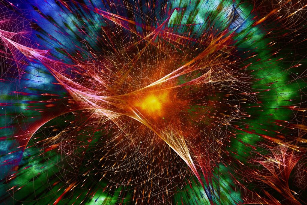
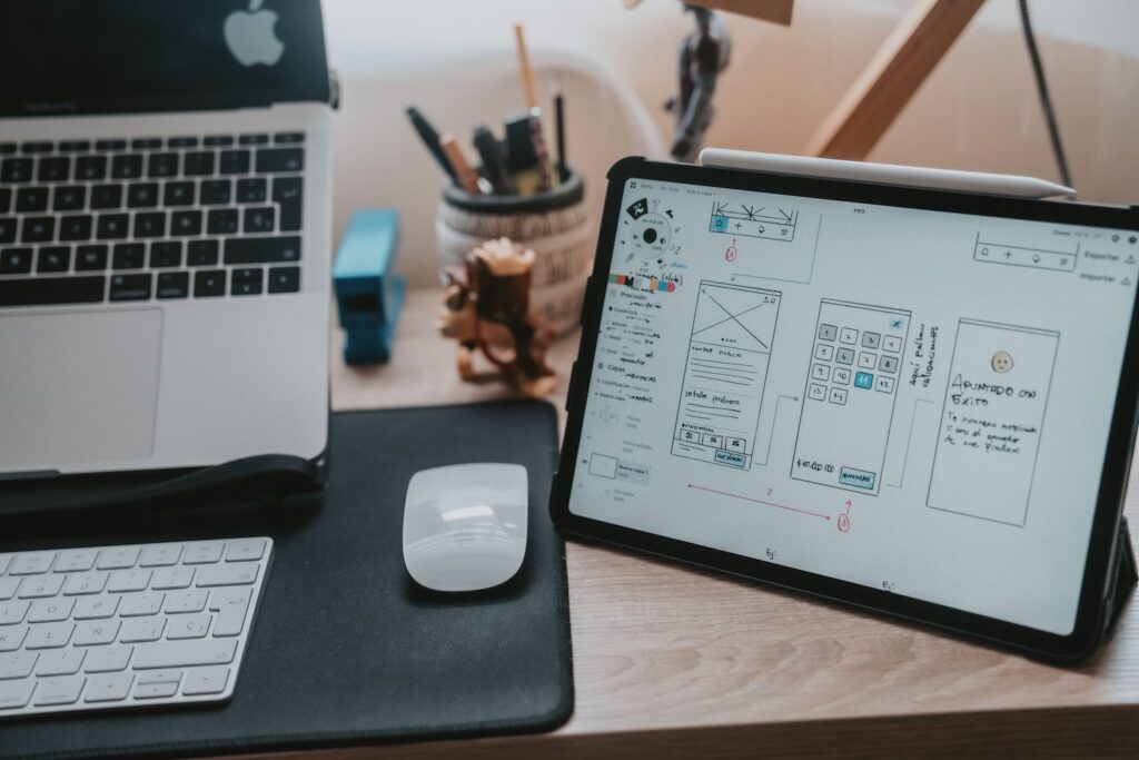
Featured image by Alvaro Reyes on Unsplash
The post The Creative Revolution: Elevating UI Design with AI-Generated Artistry appeared first on noupe.