Design

Designing For Start-Ups: How To Deliver The Message Across

Advertisement in Designing For Start-Ups: How To Deliver The Message Across
 in Designing For Start-Ups: How To Deliver The Message Across  in Designing For Start-Ups: How To Deliver The Message Across  in Designing For Start-Ups: How To Deliver The Message Across

Start-up organizations provide an extraordinary example of chaos organized into manageable chunks. Perhaps more than anyone else, the individuals who comprise a start-up team are required to understand their team’s goals across a variety of disciplines — research, marketing, design, development, architecture, etc. — as well as their own responsibility to move the company’s overarching objective forward. Entrepreneurs must choose the direction, designers must think through the options, and developers must cull a functional product or service, all while giving feedback to and receiving it from their colleagues.

At least, that’s the idea. Most start-ups tend to take liberties somewhere along the way. Some start-ups begin with a novel business model, whereas others begin with a beautiful design. Still others try to test things out first with a functional prototype, even if it is a bit ugly. All of them — regardless of their initial approach — adapt their process over time in order to create a well-rounded product or service. And for this reason, most of today’s start-ups describe themselves as “agile.â€�

Agile start-ups, as the name implies, should be capable of changing their design, development and/or business objectives on a dime. This is much easier said than done — especially for today’s user experience designers. The user experience (UX) designers who work at agile start-ups are required to do two things exceptionally well: (1) grasp the intent of the product or service being developed, and (2) effectively communicate those good intentions to end users in a language they’ll understand. Neither of these is as straightforward as it might sound.

Ideally, designers will jumpstart their design process by carefully selecting well-reasoned entrepreneurs to work with; but what happens when the designer is altogether alien to the community he is designing for? The breakneck speed of agile start-ups makes it incredibly difficult for designers to craft appropriate messages to their audience at large. Only by understanding the processes and opinions that dominate start-ups can designers begin to reach out and make a difference for the end users of their product or service.

User-Centered Design, Sans User

Designing with a clear idea of who the users are has never been simple. Most designers who have experience with the trial by fire known as a “lean start-up� will almost vehemently agree: because there are more than a few fires to fight, adopting a big-d Design process at start-up organizations is, simply put, exceedingly difficult. Invariably, this means that most start-up organizations devolve to the point that salability reigns supreme, or form trumps function. But whereas flexible, agile environments are very good for getting those things done, good design takes time, which makes the design process of start-ups almost universally hamstrung.

User-Experience in Designing For Start-Ups: How To Deliver The Message Across
Keep the levels of UX in mind. (Image: Jon and Barb)

In short, agile, user-centered design tends to ignore the aesthetic, intangible, ambient qualities that good experiences are all about. As a consequence, budding artistic directors, brand ninjas and interaction designers have been apt to worry. Without the ability to intimately understand the audience for whom they’re designing, these team members can’t do their jobs. The logical question becomes, how can they? How can designers effectively communicate with an audience they’ve yet to meet?

The textbook definition(s) of UX design yields some clue. User-centered designers are encouraged to perform design research and then create personas as well as other deliverables. Certainly those would spotlight the factors that affect a company’s relationship with its users… right? Perhaps. While research is undoubtedly necessary to the design process, its deliverables are not.

I’ve written before that designers should bootstrap their own culture of UX within an organization. In this article, I’ll take that idea one step further: in order for a start-up to effectively communicate with its target audience, a spirit of empathy must pervade its every design decision — empathy cultivated by engaging in an ongoing, outward, user-centered conversation.

Where Has All The Empathy Gone?

The task of any designer who works in a start-up environment requires empathy. The designer, perhaps more than any other team member, must empathize with stakeholders (to understand the project’s business objectives), developers (to understand its technical requirements) and, of course, users (to understand the nature of the problem they’re solving), all at once. Designing with consideration for all three parties effectively frames their strife.

Valuable though it may be, however, most start-up environments discourage empathy. Consider the number of times you’ve heard something like, “We’re targeting wealthy single males, ages 45 to 55,� or “We’re just like Amazon, but for baby boomers.� Well, that’s just great. A product description like that might initially help a team grok (a word that, ironically, means “understand by empathy�) an idea, but as far as rhetoric goes, merely saying that you know what segment you’re targeting isn’t enough.

Every e-commerce company sells products. Newcomers to the space can, and often do, learn a lot by studying the desire paths paved by industry notables (indeed, entire books are written on the subject). But let’s be clear: “I want to be Amazonâ€� doesn’t imbue the designer with empathy. Creating something that looks and feels like Amazon will, of course, look and feel like Amazon. If that website is then marketed to a wholly different crowd, then the resulting outfit will be disingenuous — the polar opposite of empathetic.

In order to create something real, unique, of lasting value and with a look and feel of its own, members of start-up teams must vacate their cubicles.

One… Erm, Three Processes

Adding to this perceived resistance are the various processes that drive start-up organizations at any given time. A recent blog post by Whitney Hess contrasts three specific types. It’s worth noting that all of the approaches detailed below show the exact same verbs in the exact same sequence. What’s different in each is the primary action that drives change along the way.

To cite Hess:

Reactive in Designing For Start-Ups: How To Deliver The Message Across

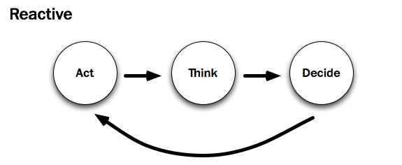
I see a lot of products developed using the Reactive Procedure:

  1. I’m scratching my itch.
  2. Should I keep scratching this itch?
  3. I’ll scratch this other itch.

As a designer who frequently consults with agile start-ups, I concur with Whitney’s sentiments: the reactive approach (“build it and they will comeâ€�) is far and away the most common. There is, of course, a good reason for all that action: development drives change. Start-ups act in order to build an initial prototype. Prototypes, in turn, move the company — indeed, the user feedback loop — forward.

Unfortunately, the prototypes developed by most start-ups exhibit a keen lack of consideration. Who is the prototype targeted at? 40 to 50 somethings? There are certainly a lot of them. Will those 40 to 50 somethings be able to grok it? That is, will users be able to tell what it’s “all about� from the design? Because this kind of subjectivity is incredibly nebulous, prudent start-ups rely on experienced UX designers to help them uncover the answers. It’s no wonder that Whitney and I see this in our line of work.

Preactive in Designing For Start-Ups: How To Deliver The Message Across

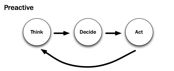
As a user experience designer, consultant and member of the New York tech community, I instead advocate for using the Preactive Procedure:

  1. Who’s itchy?
  2. That itch isn’t being scratched.
  3. This is how to scratch that itch.

I believe that most UX designers would agree — dare I say, empathize — with Whitney’s prescribed preactive approach. Beginning with thinking — with research — is in a user-centered designer’s blood; it helps them understand their audience and voice their messages appropriately. Further still, “preactivityâ€� appears to be the only real way for designers to gain empathy. But most start-up environments run counter to this approach. Acting and then thinking usually leaves little room for the voice of research. Has Whitney encountered a start-up that tries to reconcile the two?

As luck would have it, she has. Whitney recently worked with an entrepreneur who marches to a different beat:

Campbell McKellar, founder of Loosecubes, is the first person to make me realize that there’s something even better than the Preactive Procedure — the Proactive Procedure.

Proactive in Designing For Start-Ups: How To Deliver The Message Across

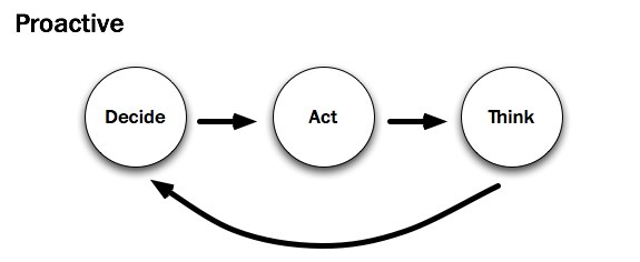
By acting sooner, you are actually achieving more. You are creating the future instead of just predicting and accommodating for it. You are inventing a new reality, based half in what people need, and half in what you want them to have. You can observe behavior sooner and course-correct. It is the most transformative of all three procedures for both the subject and the object.

An entrepreneur at heart, I want to agree here, too. The proactive process appears to be a viable alternative to the unenviable tension between designers and developers at start-ups. But just because a group is humming along with a decision-based proactive process doesn’t mean that the organization’s designer understands its users any better. By UX standards, this process almost seems to disenfranchise them: it moves “thinkingâ€� — and here, I presume, research — all the way to the back of the bus.

In sum, it’s easy to envision scenarios at a start-up in which a given development process proves more valuable, more productive, than its alternative. Should the team think, act or decide? It depends. Regardless, as designers join start-ups, they’re very likely to find that design is secondary to the process unless, of course, their organization follows a preactive process. But for most start-ups, that’s simply not the case.

In order for an organization to learn more about its users, the design-minded members must advocate to that effect, changing the way that design is approached. Designers must stand up for their part of the process. As UX designer Joshua Porter attests, “The further a designer is from the people they’re designing for, the harder it is to design for them.�

Start-ups — or more specifically, the designers at start-ups — need to get as close to users as they can. Product development can’t rest in the entrepreneurs’ and/or the developers’ hands alone.

Why Design Fails

When asked, most designers don’t take long to provide honest, valid reasons why the design process is important to developers and entrepreneurs alike. There is firm precedent to that end, and they are designers by choice, after all. But just because the truth and beauty of good design is evident to most designers doesn’t exactly mean that their colleagues share their sentiments.

Making-dollars in Designing For Start-Ups: How To Deliver The Message Across
If it isn’t making Dollars… (Image: Kristian Bjornard)

Start-ups — and more importantly, the individuals who comprise them — have a great number of mental hurdles standing in the way of their empathy with end users. The aforementioned quickened pace and changing processes aside, here are those hurdles:

  • Start-up teams have strong convictions.
    Anyone who believes strongly in a cause (be it an idea or a Web application… or both) will identify with it. If a designer questions the validity of an idea, then they are questioning the team. This is a difficult, integral part of the design process.
  • Research doesn’t (immediately) sell.
    It doesn’t take weeks of research to sell a product to someone, and given enough time a good marketer can sell anyone almost anything — especially something beautiful. As a consequence, team members are likely to judge the design book by its cover. Research rarely affects their notion of beauty.
  • Start-ups trust results they can measure (preferably in dollars).
    Web metrics are currently the bread and butter of today’s Web-savvy marketers. Saying that a design is good is one thing. Saying that a design has increased conversions by 200% is another. Attaching a number to something makes entrepreneurs (and, yes, designers, too) feel better about the problem being addressed. If the current process is measurable, should an up-front design process be allowed to slow that down?

In sum, short-term, yes-or-no, go-or-no-go (Decide! Act!) thinking pervades the start-up space. The reality is that most agile start-ups favor a “design-less� process. While UX designers might trust that empathy (or understanding) is tantamount to a start-up’s success, their teammates won’t necessarily believe so. In order to effect change, designers must fight for the integrity of their design from the inside out.

Leading The Way With Empathy

To be clear, good design doesn’t come about at start-ups just by studying the metrics generated from a prototype or by talking to users through a proxy — say, support emails. That isn’t to say that these things aren’t valuable — they certainly can (and often do) point to the consequences of prior decisions. But feedback, by definition, cannot determine the company’s next — or, more importantly, first — steps. There’s the rub. Unfortunately, that is the problem routinely faced by start-up designers.

Create-Empathy- -Inclusion in Designing For Start-Ups: How To Deliver The Message Across
Create Empathy and Inclusion. (Image: Kristian Bjornard)

No one would argue that determining what’s “good� for a Web design is subjective, which makes it a frightening prospect. As D. Keith Robinson wrote on A List Apart all the way back in 2005:

Knowing what people want on the Web can be hard. You either need to have incredible empathy or have done fairly extensive research. This empathy I’m talking about, in my opinion, can really only be built up over time observing all kinds of people doing all kinds of things on all kinds of websites and applications. Even then, as you move from project to project, the people, problems and needs change.

With every new project comes a new target user, a new person to empathize with. And just as with meeting a new person, understanding what they like and don’t like takes time. If designers are to appeal to this new person, they first have to get to know them. As both Whitney Hess and Cennydd Bowles have asserted, focusing on a rapid proactive process — decide, act, think — gives most start-ups a solid plan of attack. Not only do teams get to test market viability first, they can then think about how they’ll differentiate the product shortly thereafter.

Yes, this process makes brand-conscious designers uneasy, and understandably so. In the beginning, though, without the context that a prototype creates, designers must lean towards the relatively “safe� side, where all interaction design begins: buttons look like buttons, drop-downs look like drop-downs and perhaps even the names of start-ups sound like start-ups. Robert Hoekman, Jr. calls this Designing the Obvious. I call it designing the boring bits.

Because what this approach makes up for in usability, it certainly lacks in propriety. To determine what’s appropriate (which is subjective), designers must conduct field research.

Hold Your Own Convictions

Plenty of UX designers preach preactivity; they are the ones who want to understand — to empathize with — their audience and build something tailored to them. Moreover, these designers have the relative luxury of working within organizations. For them, Cennydd Bowles and James Box have written a lovely book, Undercover User Experience Design. If you’re at a company where design is ailing and you want to fix it, I suggest picking up a copy right away.

If you’re an independent consultant or a designer working with a start-up that’s out to craft the best possible experience, then I would suggest a couple of things, all centered on the same concept, which is to make listening a part of the company’s design process:

  1. Create a design strategy.
    Articulate who you’ll be designing for (even if they’re only make-believe) and how they’ll use the website. I’ve written before how I do this. Regardless of how you do it, know who you’re trying to know.
  2. Have a solution.
    Work with a development team to generate a quick prototype that demonstrates your best (albeit uninformed) solution. Have at least two people use the prototype the way it is intended to be used. Befriend them, and see if they’ll contribute feedback as you refine your vision.
  3. See for yourself.
    Finally, and most importantly, see for yourself. Visit your users in their natural environment, and make sure their concerns are addressed. If you’re in a position to do this, ask them questions related to the problem your start-up addresses.

In all cases, start-up designers should center their design process on listening to users. Instead of speaking to users by way of the design, converse with users to inform the design. Empathy, the human connection, makes or breaks an informed experience.

Because most of us work behind computers for hours, days or weeks at a time, gaining empathy is obviously easier said than done. However, empathy is the only way to turn a good business idea into a well-articulated design conversation. Respect is earned, a brand is born, when every interaction that an organization has with its users is open, earnest, honest and, most of all, appropriate.

Related Resources

(al) (sp)


© Andrew Maier for Smashing Magazine, 2011. | Permalink | Post a comment | Smashing Shop | Smashing Network | About Us
Post tags: ,


Examining The Design Process: Clichés and Idea Generation

Advertisement in Examining The Design Process: Clichés and Idea Generation
 in Examining The Design Process: Clichés and Idea Generation  in Examining The Design Process: Clichés and Idea Generation  in Examining The Design Process: Clichés and Idea Generation

Where do good ideas come from? It’s a question that matters a great deal to designers, yet seems to be curiously discounted in the common perception of graphic design. Any time I talk with, say, an uncle at Thanksgiving about my work, I’m reminded that, in most people’s minds, the job of being a designer is mainly a matter of learning a set of computer applications — programs which, when properly operated, presumably do the work of generating ideas on their own.

If pressed further, most people will offer up some version of the Genius Theory: the idea that certain individuals are simply blessed with a force called ‘creativity’ that (as the theory goes) allows them to summon remarkable visual solutions to problems where the rest of us see only a blank canvas.

In this article, we will look at four examples of successful visual solutions created by well-known designers, and examine the process by which each designer arrived at his final concept. In each case, we will see that the solution did not arrive as a sudden flash of inspiration from out of the blue; rather, a good idea emerged methodically out of a sensible analysis of readily-available ideas and impressions.

In particular, we will zero in on the dual role played by clichés in this process: while clichés can derail the creative process, for seasoned designers they can act as the building blocks for effective solutions by telling them what not to do. In the final balance, we will see that good ideas are not created by magic, nor are they generated by computers — the process of developing them is a skill that can be learned, taught and practiced, and, like a muscle, gets stronger the more it is used.

Exhibit A: Imaginary ‘Drive Safe’ Campaign for Teens

Suppose we are working together at a studio and we receive a job to design a poster for a public service campaign aimed at educating teenagers about the dangers posed by drinking and driving. We meet for our first internal review to critique our initial ideas, and I present the following proposal:

Unicorn2 in Examining The Design Process: Clichés and Idea Generation

In this case, the problem with my work is painfully easy to diagnose: the image simply has no connection to the message. It may or may not be nicely illustrated… but this is somewhat beside the point: unless it’s trying to speak to eight-year-old girls, this poster is not going to make a meaningful impression on its audience. If we imagine a spectrum of all possible design solutions to this job ranging from ‘totally clear’ to ‘totally unclear’, this would rank pretty far in the latter direction:

Graph12 in Examining The Design Process: Clichés and Idea Generation

‘Fine,’ I reply, tearfully storming back to my desk. A week later, I present a revised concept, confident that it speaks to the audience more directly:

Stop4 in Examining The Design Process: Clichés and Idea Generation

This time, the problem is a little harder to put one’s finger on. The image communicates clearly… but it does so at the cost of boring us half to death, with no humor, inflection or engagement. Also disturbing is the fact that I’m using a pre-existing visual symbol from the urban environment — the stop sign — to do my communicating for me.

If we had never before seen a red eight-sided shape with the word ‘STOP’ inside, it might be a powerful and abstract creation; as things stand, however, the symbol has become so deadeningly familiar that it has lost all capability to impact us in a meaningful way. In my eagerness to communicate clearly, I’ve run headlong into the arms of a cliché — which, in the context of graphic design, can be defined as  ‘an image that may or may not have been memorable at one point, but has since been so overused that it has lost all ability to surprise.’

Graph1b1 in Examining The Design Process: Clichés and Idea Generation

The Problem of Clichés

This imaginary case study demonstrates why clichés are such a stubborn problem for designers. In the example above, I didn’t arrive at a cliché because I’m a terrible or uncreative person; I arrived at it because I took the most readily-available solution from the environment around me, and stopped there.

Clichés are hard to banish from our thoughts because their sheer familiarity makes them appealing: they are always at hand, ready to be put into service; and — especially if we are working under pressure — their familiarity offers a certain amount of reassurance, a guarantee that we won’t be misunderstood. Design solutions that employ clichés are the hardest for me to critique in the feedback sessions that I run as a teacher: often, there is the frustrating sense that the student has done nothing wrong exactly, yet the overall design leaves us wanting more.

Most depressing of all is the fact that clients often prefer clichéd solutions to original ones. This is the syndrome of the Chinese restaurant owner who wants us to use the same tired chopstick lettering for her sign because ‘that way, people will know it’s a Chinese restaurant’. Wanting only to be correctly identified, the client is drawn to the universality of clichés: they have, after all, the same meaning for everybody within a particular culture, which — if only they weren’t so hackneyed — would make them an ideal communication tool for designers.

In the haste to fit in, the need to stand out has been forgotten. It is our responsibility as designers to make the case that design can serve both ends at once: it can speak plainly while still leaving a mark on its audience.

Ethnic-signage1 in Examining The Design Process: Clichés and Idea Generation

Every area of graphic design has its built-in clichés. But none more so than images that seek to convey a sense of ethnicity, where the same predictable type choices pop up again and again (shown left to right: Sunamy, Papyrus, Neuland). See Rob Giampierto’s indispensable article New Black Face for more on this topic.

Clichés, in short, are the empty calories of the design world: like junk food, they are available everywhere and easy to consume, but pass through us without leaving nutrition behind. Their prevalence arises from the shared nervousness with which designers often view their clients and their clients view design: satisfied merely to get to the point across in an obvious manner, both sides neglect to create a message that will live in a viewer’s memory and foster long-term recognition and loyalty.

If the above hypothetical campaign has given us examples of two flawed extremes — one too obvious and the first not obvious enough — what does it look like when a designer hits the sweet spot in between? And, more importantly, how did he or she get there?

Graph22 in Examining The Design Process: Clichés and Idea Generation

Exhibit B: Craig Frazier

In 1987, the designer Craig Frazier did a poster for this very purpose, a public service campaign aimed at persuading kids to not drive home drunk from their senior high school prom. His poster:

Frazier in Examining The Design Process: Clichés and Idea Generation

Like Goldilocks’ bowl of porridge, this solution is just right: it communicates its message with appropriate urgency, but the weapon of surprise is also part of the attack. “It has an art quality that removes it from the realm of ordinary public service campaigns,” Frazier noted in a 1996 interview with Critique magazine, in which he also identified it as a personal best. “It presents a visual riddle that’s almost attractive at first glance, but gets more gruesome the more you study it.â€�

The unconventional presentation of the subject matter requires us to spend a split second visually decoding the image, discerning its story… and, in that moment of cognitive engagement, a connection is formed between viewer and image. The abstract and original treatment of the topic allows the poster to sneak past our defenses — in Frazier’s words, “it proves that you don’t have to be condescending to convey a deadly serious message.â€� Whereas the Stop Sign approach droned authoritatively at its viewer, this execution lures the onlooker into a perceptual dialogue, and refrains from talking down to its touchy teenage audience (note the quiet treatment of the tagline in the lower left corner).

In sum, by avoiding an overly obvious delivery, the designer cleared the way for a work that leaves a lasting impression: “I still get tingles when I think about the poor guy on the road,” Frazier commented nearly ten years later. “I have a visceral, emotional reaction.â€� Impactful? Check. Emotional? Check. Clear in meaning? Check. “What makes the poster work is the same thing that makes any good ad or brochure work,” Frazier concludes: “It’s engaging and memorable to its intended audience.”

So how did he get there? Not, as my uncle might assume, by virtue of being a creative genius who effortlessly vaults over commonplace ideas (nor simply by owning a computer). Rather, to judge from his own comments, Frazier arrived at his solution by taking accurate stock of the commonplace and determining in what direction the fresh territory lay:  “These kids had already been hit with plenty of preaching and scare tactics about drunk driving and drug abuse, not only from their parents, but also the media,” the designer recalled, explaining his thought process.

“I knew what I didn’t want to do — a poster that presented the consequences in such a grizzly fashion that the student could dismiss it as another image from a Highway Patrol film. Even though I knew these images could be effective — like the ads of that time by Fallon McElliot — I wanted this poster to be gripping, not scolding.” Put in the simplest possible terms, Frazier came up with his idea by identifying the resident cliché and then setting out in the opposite direction.

Simple as this approach might sound, the tangible benefits are worth taking note of:  “All reports indicated that the students received the poster well,” Frazier recalled, “and many students requested copies for their bedroom walls. The effectiveness of any poster is hard to measure, but the fact that they looked at it, and are still looking at it, makes it a success.â€� What the reaction to Frazier’s poster, and the process behind its making, point to is the surprisingly transparent nature of graphic design — the extent to which the creator’s subjective experience in making a piece bleeds over into the observer’s reaction to it.

Creative solutions that take no searching on the part of the designer rarely make a mark on the audience either. If the designer is willing to set out in a direction whose end point is not immediately apparent, on the other hand, the journey taken is relayed back to the viewer in the split second of perception, and this experience of distance — of having a message relayed to us in terms that are clear and yet outside the ordinary — can make the experience of seeing memorable. In the next section, we will look at another work whose dramatic impact derives from the fact that its author moved beyond his immediate first impressions in order to create it.

Exhibit C: Art Spiegelman

Best known as the creator of the acclaimed graphic novel Maus, Art Spiegelman was working as a staff artist for the New Yorker magazine on September 11th,  2001. A resident of downtown Manhattan, he lived a short distance from Ground Zero and was grappling with the day’s events when a call came through from the New Yorker office explaining that, incredibly, the magazine would be putting out a special issue at the end of the week and needed a cover from him as soon as possible.

Settling down to a daunting task, Spiegelman started out by painting his most immediate visceral impressions of the day: the vivid blue sky that hung over New York on that day and its incongruity with the smoke, ruin and destruction that had transpired. After a while, he had created an illustration that looked something like this:

110-stories in Examining The Design Process: Clichés and Idea Generation

We know what this image looked like because Spiegelman later used it for the cover for an anthology of writing about the September 11th attacks called 110 Stories. But, for his magazine cover, Spiegelman rejected this direction. Why? “I was barking up the wrong tree,â€� he later told The Progressive magazine: “It had a blue sky and orange building; it was channeling [René] Magritte, with the thought bubble, ‘It’s such a nice day, what a bummer.’ It was a reasonable cover for a book that came out a year later, but it just wasn’t sufficient, because anything with a nice blue sky and pretty orange building was just too pretty. And pretty outweighed whatever meanings those shrouds had.â€�

Spiegelman’s use of blue sky here isn’t a cliché in the conventional sense… but in the context of his design process, it was functioning in much the same way that a cliché does: a too-readily-available impression that speaks too literally to its audience and thereby dulls the piece’s potential emotional charge.

Rather than trashing his canvas and starting from scratch, however, Spiegelman simply responded to what he didn’t like: “I kept trying to gray down and dim down the image, so, OK, a less blue sky, less orange buildings. [...] Then I finally said to Francoise that it should just be a black-on-black cover because every time I was walking to my studio from my house I kept finding myself turning around to make sure the towers were not there, as though they were a kind of phantom limb”:

Spiegelman in Examining The Design Process: Clichés and Idea Generation

What binds both Frazier and Spiegelman’s accounts together is the evidence that neither artist could have visualized his final solution from the outset of the process. Both used (perhaps it’s even fair to say needed) the intermediary steps of (a) identifying cliché and (b) reacting to cliché to set them in the right direction.

Exhibit D: Ivan Chermayeff

Our fourth example involves a case where simple associations were not so much rejected as stitched together in an imaginative manner to create a complex and engaging message.

For decades, the office of Chermayeff & Geismar has managed to produce memorable images with a narrative capability, pieces that quickly tell a story in an engaging manner. One such work is Ivan Chermayeff’s poster for a television series called Between the Wars that covers the diplomatic efforts that transpired between 1914 and 1940. Even more overtly than Craig Frazier’s poster, this work deliberately presents a puzzle to the viewer, whose enjoyment of the piece lies in the process of assembling its visual clues:

Chermayeff1 in Examining The Design Process: Clichés and Idea Generation

The designer did not, however, set out with the intention of being clever. When I emailed Chermayeff to ask about the challenge of Between The Wars, he replied as follows: “A title which raises many questions. The process of illustrating such a title was the search for images that will immediately answer those questions. Together those images must connect as a coordinated and related whole image.”

“What are possible symbols of World War I and World War II that existed and that are immediately recognized in our time?” Note that, again, the process again begins with the gathering of simple, readily-apparent associations:  ”Maps, armaments, tanks, nationalities and their physical characteristics, trends, battlefields — there are many, many things. Most of them too complex to be a simple, resonating image.” In response to the problem — complexity — the designer sets out looking for its opposite, simplicity: “One thinks and searches, one looks at the available visual records of two world wars, and what comes up —Helmets!”

“Helmets evolved and they changed over the years. But they are always there in the photographs. Once seen, they are seized. One can hold them in one’s hand, and everyone recognizes them. So what remains to fill the gap between 1918 and 1940? What is the image of the 22 years between to match the simplicity of the two helmets at either side? Talk and discourse and ambition all surround the nations engaged in these two conflicts. The common thread is diplomacy. What is like a helmet but not a part of war? A hat! A diplomatic hat of a statesman in the twenties and thirties is the homburg, and it fits between the wars on the head just like a helmet.”

In this case, the final design does not so much refute the clichés of the field as cleverly assemble them. But the thought process behind it works in the same way: it starts with the readily-available information and works methodically, step by step, to react to what is lacking in the first sweep of associations.

Exhibit E: Jesse Bennett-Chamberlain

It seems to be easier to talk about idea generation in the context of print than web. A designer’s success, or lack thereof, in coming up with a good idea shows itself more plainly when the medium is something like a poster (as in the Frazier and Chermayeff examples above) or a magazine cover (Spiegelman), which are only called upon to communicate a single visual message to the onlooker. A typical web interface, in contrast, must balance a host of competing priorities — navigational, functional, hierarchical — the sum of which can frequently obscure our understanding of how successful the designer was in one particular area.

Nevertheless, web design needs fresh thinking just as much as print design, and the role played by clichés can be every bit as detrimental. Jesse Bennett-Chamberlain’s account of redesigning the website for Steinway and Sons explains how a formulaic approach to one issue (in this case, layout) can deprive the design of strength in another key area (aesthetic/emotional impact). Bennett-Chamberlain has a nice write-up of this project in the Notebook section of his site, 31three.com — the following discussion is drawn from his account and from follow-up questions I posed to him by email.

Having never worked with the client before, Bennett-Chamberlain recounts that he “played it safe” in his initial process and “started off with a design that closely followed a wireframe that they provided”:

Steinway-schematic in Examining The Design Process: Clichés and Idea Generation

This wireframe suggests a classic template for usability — “a layout that was very typical,” Bennett-Chamberlain recalls, “and reminded me mostly of Apple”. (In fact, you can see that this layout is almost exactly that of Apple’s homepage). While there is nothing necessarily wrong with following the lead of an acclaimed site like Apple’s, in this case, the boxy, conventional guidelines proposed by the client’s wireframe led to an initial design that failed to do justice to the subject matter:

Steinway1 in Examining The Design Process: Clichés and Idea Generation

Not a bad design, by any means… and yet if you removed Lang Lang from his piano bench and placed him inside a luxury car, this could quickly become a site for Audi or Lexus. “I thought the initial design was okay,” Bennett-Chamberlain explains, “but it still didn’t feel ‘Steinway’ to me. It seemed a bit underdeveloped, too easy of a solution for such an elegant brand.”

Much of the problem lay with the cookie-cutter wireframe: “Although the image of Lang Lang was dynamic and had some energy, the layout of the site felt pretty linear, boxy, and well… boring.” Lost in the conventional presentation were the aspects of the grand piano that make it truly remarkable: its shape, its contours, and, of course, its sound. “I wanted the piano to be in the spotlight,” he recalls, “and not share the stage with anything else.” Bennett-Chamberlain presented a variant design that strayed a bit from the recommended wireframe by “placing the piano front and centre, and then building the site around it”:

Steinway21 in Examining The Design Process: Clichés and Idea Generation

In the final iteration, Lang Lang has been reluctantly whisked off the stage, and the instrument itself is the star of the show. The piano’s distinctive contours are emphasized by the graceful arc placed behind it, and by the decision to have its lid peek up above the designated promo area into the top nav. The background motif of piano strings has been ramped up to create a semi-abstract, radial representation of sound (indeed, you can almost hear the piano in the final design).

In the nav bar area, the usual ‘logo left’ convention has been discarded here for centered treatment that makes you feel like you’re sitting on the bench itself and gazing at the Steinway and Sons trademark sitting over middle C. Yet nothing has been lost in terms of ease-of-use compared with Bennett-Chamberlain’s original design — it simply took an effort of self-critique and problem-solving to do justice to both the functional and aesthetic possibilities of the project: “I figured that if these guys can spend a year making a single piano, I could probably spend an extra couple hours here and there on refining these details.”

Putting It Into Practice

These works by Frazier, Spiegelman, Chermayeff and Bennett-Chamberlain are classic examples of what designers like to call ‘process work’ or ‘methodology’, terms that refer to a method of drawing ideas, direction and inspiration from the process of working on the design itself, rather than simply having a fixed destination from the outset. No one can write step-by-step instructions on how to do this — the entire point, after all, is to react, rather than obeying fixed directives — but there are certain steps we can take at the outset of a project that help clear the way to let this process happen:

  • Start with a sketchbook, not a computer. There was a time when I once suspected that the teachers who tried to impress this point on me were just cranky technophobes… but over time, I came to appreciate the wisdom of this suggestion. The computer is a bad companion to start with because its particular toolset pushes us in certain directions (towards clearly defined shapes and hard edges) and because it tempts us to focus overly on execution (by offering up sexy drop shadows and whatnot) before our concept has really come together.
  • Using your sketchbook, start by drawing every association you come up with for the subject matter. Draw it quickly, and don’t be critical. At this stage, it’s not about making pretty pictures, and it’s not about evaluating your ideas (in fact, the ability to turn the critical part of your brain on and off is one of the most helpful tricks you can develop).
  • Don’t try to avoid clichés — let them happen. Trying not to think of clichés is like the old joke where someone says ‘Don’t think of a pink elephant.’ It’s best to get them down on paper and get them out of your system.
  • Once you’ve jotted down every association you can think of, take a break, come back and jot down a few more. Then, take a longer break…
  • Come back with fresh eyes and look at what you have in front of you. Now is the time to be critical, but also to be fair. Seeing our own work clearly for its merits, without bias and defensiveness, is one of the hardest things for graphic designers to do. George Orwell wasn’t thinking about graphic designers when he wrote, “To see clearly what is in front of one’s face requires constant struggle,” but he might as well have been.

Conclusion

There is no single answer to the question of where good ideas come from. Some designs actually do seem to come out of thin air, like the Citibank logo that Paula Scher infamously drew on a napkin during an early meeting with the client. But a great many more good ideas come about through the incremental process described in this article, of gathering and making decisions about readily-available information.

The viability of this approach suggests that coming up with good ideas is not a matter of genius, but rather simply a challenge of seeing clearly and thinking sensibly. The good news that this implies is, idea generation is a learnable skill that can be cultivated in many of us, not just in a chosen few. The only disappointing part is that you don’t get to feel like a genius while you’re doing it.

If idea generation is a process that is accessible to everyone, then what accounts for the fact that it can be so hard to pull off? Part of the answer lies in our inability to get out of our own way, a condition which stems largely from our ideas about what it means to be a ‘professional’. The term ‘professional’ is generally used to connote a person who is in control of their work process at all times… and, yet, as we’ve seen in this article, the condition of absolute control is rarely a place where exciting design comes from.

“What is required in our field, more than anything else, is the continuous transgression,” Milton Glaser writes in his wonderful essay Ten Things I Have Learned. “Professionalism does not allow for that because transgression has to encompass the possibility of failure and if you are professional your instinct is not to fail, it is to repeat success.” Graphic design is one of the few fields where it works to our advantage if we can let go of the reins from time to time, a feature that makes it to be an exhilarating place to work if we can manage not to find it unnerving.

Credits

I would like to thank Craig Frazier for his assistance in locating a copy of the Critique ‘My Best / My Worst’ interview used in this article, and also Ivan Chermayeff and Jesse Bennett-Chamberlain for taking the time to answer my questions.

Sources

  • Neumeier, Marty and Frazier, Craig (1996) ‘My Best / My Worst’, Critique, Summer 1996
  • Siegal, Nina (2005), ‘Art Spiegelman Interview’, The Progressive, January 2005
  • Unicorn illustration by Xploitme, used under Creative Commons license

Other Resources

You may be interested in the following articles and related resources:

(ik) (vf)


© Dan Mayer for Smashing Magazine, 2011. | Permalink | Post a comment | Smashing Shop | Smashing Network | About Us
Post tags: , , , , , ,


Five and a Half Habits of Highly Effective Designers

Advertisement in Five and a Half Habits of Highly Effective Designers
 in Five and a Half Habits of Highly Effective Designers  in Five and a Half Habits of Highly Effective Designers  in Five and a Half Habits of Highly Effective Designers

We have theories about everything: why the sky is blue, why apples fall, why bees buzz (and do other unmentionable things), why my boss said a certain thing, why that girl in the restaurant looked at me, why didn’t that girl in the restaurant look at me…. We’re wired to theorize. Theories make us feel secure. We can wrap our heads around them and explain them with little diagrams on whiteboards, or with equations, or even graphs. We give theories fancy names like “The Classical Elemental Theory� and “The Flat Earth Hypothesis.�

The bottom line is: we humans love theories. Yet as a wise person once said, “In theory, theory and practice are the same. In practice, they are not.� This article is about practice. It’s about five and a half — yes, half — habits that highly effective designers tend to share and which I’ve observed first-hand in the complicated, non-theoretical, absolutely real world. If practice is your thing, keep reading.

Title in Five and a Half Habits of Highly Effective Designers
This article doesn’t provide an ultimate medicine for becoming a highly effective designer, but it might help you achieve a better workflow.

They Know When To Quit

Some of you might know Vince Lombardi as a football legend. I know him as the guy who ruined the world by uttering seven simple yet lethal words: “Winners never quit, and quitters never win.� You’ll find this unassuming little quotation’s fingerprints all over tragic events worldwide: co-dependent lovers who implode their relationships, leaders of warring nations who refuse to compromise for peace, CEOs who won’t back down from flawed strategies to save their company from bankruptcy, and blackjack players who double-down instead of retreating to their rooms.

Admittedly, Vince wasn’t the real offender. He was just a messenger for the real culprit: our humanness. The urge to persevere despite seemingly unconquerable conditions is as human as opposable thumbs. We’re so awful at cutting our losses that there’s even a technical term for this tendency: loss aversion. We strongly prefer to avoid losses than to achieve gains. It’s central to our inability to quit. Quitting has a bad rep, but it’s often the most rational option.

Maguire in Five and a Half Habits of Highly Effective Designers
Quitting doesn’t necessarily mean pulling a Jerry Maguire, although it did work out well for him in the end.

As Seth Godin writes in a little book about quitting called The Dip, “Winners quit all the time. They just quit the right stuff at the right time.� It’s worthy, practical advice that can curb the runaway idealist in every designer. Bear in mind, we’re not just talking about quitting your job. We’re talking about quitting things on a daily basis. This entails: picking your battles at work; discerning not just your design goals, but your non-goals; relenting to client needs when necessary; and trading off some design idealism for business karma.

Ironically, quitting can be good for your career. So, that’s the first habit: learn to quit. Let things go. Kill your darlings.

They Redesign Processes

I remember when Agile software development methodologies were all the rage. I was working at Amazon as a program manager at the time, and our team was the first to adopt Scrum. Scrum was going to enable us to ship early, with twice the features and zero overhead (at least, that’s how we interpreted Ken Schwaber’s words).

DilbertAgileProgramming in Five and a Half Habits of Highly Effective Designers

It would have been nothing short of a miracle, but then again, most of us were fresh out of school, and miracles, free pizza and unicorns were part of our reality. In the end, we shipped almost a year behind schedule, with fewer than half of the planned features. Worse, over 75% of the team quit within 90 days of launch (which is not necessarily a bad thing, as we just learned). Yippee ki-yay!

What’s most worrisome about failures such as these, though, is that they so often occur despite “gold standard� processes. It happens all the time.

Tomes have been written about why our best practices fail so frequently. For a literary (even theoretical) overview, I direct you to two books: The Design of Design by Fred Brooks, author of The Mythical Man-Month and recipient of the 1999 Turing Award; and The Black Swan, by the brilliant, Larry David-like Nassim Nicholas Taleb.

Awnd in Five and a Half Habits of Highly Effective Designers
A Website Named Desire illustrates (see the screenshot above) the non-linear and highly erratic nature of the web design process in the real world.

To understand such failures from a practical standpoint, we must turn to another book: Predictably Irrational, by behavioral economist Dan Ariely. Ariely’s research confirms that predictable irrationality is often the root cause of process failures. Indeed, as A Website Named Desire illustrates, our biases, prejudices, quiet agendas, irrational actions and diverse portfolio of imperfections are more often to blame than the processes themselves.

Formal processes work when we accept the irrational nature of people and make room for those imperfections. Thus, the key to successful processes lies in how practically we implement and execute them, not in how well we adhere to an ideal.

Highly effective designers embrace and learn processes — and then tweak them to work well in reality.

They Combat Distortions Of Reality

Picture this. You’re reviewing final comps with a set of stakeholders. After multiple iterations, you’re finally feeling great about the design. Then, out of nowhere, a senior manager says, “I think we need to change the blue on the top bar. It doesn’t feel right. I showed it to my wife, who’s pretty good at picking colors, and she felt the same way.” He continues, and then delivers the final blow: “I know you worked hard to find the right color scheme, but picking colors is pretty subjective, right? It’d be worth taking another pass at this.”

Groan.

Oatmeal in Five and a Half Habits of Highly Effective Designers
“How a Web Design Goes Straight to Hell,â€� a classic post on Matthew Inman’s “The Oatmeal”, humorously depicts distortions of reality.

“Design is subjective� is one among many prevailing distortions of reality — ideas that have gone unchecked for so long that they parade around as facts — in our organizations. You might recognize these other distortions: “Data and logic trump intuition,“ “Design is decoration,� and “More feedback leads to better designs.� Then there are those that hit closer to home, like “The page has a fold,� and (everyone’s personal favorite) “Make the logo bigger.� (Note that there is now much evidence out there against distortions like these.)

These clichés seem benign but, in fact, are extremely harmful. They are the proverbial elephant in the room at the heart of dysfunctional organizations. Highly effective designers work to resolve these distortions in their organizations.

They Find The Right Environment

People are brilliant scavengers. In a world of a million choices, we know exactly where to look when we need something. We’re good at identifying environments that meet our demands, almost without thinking. We instinctively know how to find certain things (keyword: certain).

When it comes to finding slightly more intangible things — true love, a good job, a great employee — many of us spend a lifetime searching awkwardly and failing repeatedly. We can’t wrap our minds around such abstract pursuits. God knows we try, though; how many times have you heard someone proclaim that they have made a spreadsheet to determine a life choice or a good partner?

Identifying a good work environment falls into the same category. We’re usually terrible at it. Here’s a little secret: highly effective designers are most often products of a good work environment and know how to seek them out.

What does a good work environment look like?

The answer is hidden in a brilliant presentation on clients by Michael Bierut. I recommend watching the whole thing, but if you don’t have the time, then watch the four-minute section from 13:00 to 17:00. In it, Michael answers the questions “What do I look for in a client?� and “What should I look for in a work environment?�

Bierut in Five and a Half Habits of Highly Effective Designers
Michael Bierut’s presentation on clients also answers the question “What should I look for in a work environment?”

The simple answer is trust, passion, courage and brains. Each quality has obvious benefits. In a trusting environment, stakeholders can rely on their designers’ gut instincts. Where there is passion, the will to make meaningful progress will flourish. Courage enables designers to take risk and bring cutting-edge designs to market. Brains — not genius, but real-world, common-sense brains — bring it all together.

All four of these qualities must exist simultaneously to make a good environment. Take one away, and the environment will eventually become dysfunctional. For instance, take away trust, and you end up testing 41 shades of blue to find the right one.

They Habitually Rewrite The Habits

In the software industry, we strive to build “perfect� (read: bug-free) things that can’t be improved. This is a worthy goal, but it can have negative side effects. For example, we often conclude that certain practices, processes and lines of thinking have reached their zenith and can’t be modified. We start treating real life like a line of code — a meticulously crafted string, neatly concluded by a semicolon, that reaps a perfect, logical result (needless to say, I’m not referring to Web development here).

Reality — or should I say practice — proves that this kind of thinking is a mistake.

If this article were written a decade ago, it would have listed different habits. A decade from now, I expect some of the habits will have changed; for example, eventually we’ll all agree that “Design is subjective� is a distortion of reality. Heck, if you had written this article, you might have listed completely different habits.

Highly effective designers are aware of this. They’re always questioning, rethinking, improving and refining the dogma. Their methods are best captured by an old Chinese proverb: “All things change, and we change with them.�

There you have it: the final habit. It’s one and a half times as important as the other habits.

Now you know what the “half� means.

(al)


© Nishant Kothary for Smashing Magazine, 2011. | Permalink | Post a comment | Smashing Shop | Smashing Network | About Us
Post tags:


jQuery Menus with Stunning Animations

Advertisement in jQuery Menus with Stunning Animations
 in jQuery Menus with Stunning Animations  in jQuery Menus with Stunning Animations  in jQuery Menus with Stunning Animations

jQuery is a great tool that helps our imagination turn ideas into reality. We can do almost everything we can think of with the help of this useful tool. Apart from being a lightweight cross-browser JavaScript library that simplifies HTML and Ajax interactions for rapid web development, it also gives sites that sleek look while also representing important data in a very attractive way.

You should always keep in mind that once a user lands on your site, the fist thing s/he does is to navigate and check out the content. If your site lacks in providing the user an attractive navigation, s/he will loose interest and will be clicking on that ‘Back’ button within seconds — even if the content on the site is excellent. Hence to stand apart you need to make your menu on your site different and appealing to users.

We’ve collected some tutorials to help you understand how to give your menus that stunning visual effect and animations. Please feel free to share any sites you’ve discovered that have been developed with jQuery. Enjoy!

Scrollable Thumbs Menu with jQuery
In this tutorial you can learn how to create a fixed menu with scrollable thumbs which you can nicely control with your mouse:

Fashion1 in jQuery Menus with Stunning Animations

Sweet Menu
Sweet Menu takes an ordinary list of links and makes it a sweet looking menu. It does this by utilizing jQuery and it’s plugin system:

Sweet in jQuery Menus with Stunning Animations

Creating a Fancy Menu Using CSS3 and jQuery
Here you can see how a fancy menu can be created with the help of the new CSS3 features along wth jQuey:

Lava-1 in jQuery Menus with Stunning Animations

Rocking and Rolling Rounded Menu with jQuery
In this tutorial you can make use of the rotating and scaling jQuery patch from Zachary Johnson to create a menu with little icons that will rotate when hovering:

Rockroll1 in jQuery Menus with Stunning Animations

Slick Drop-Down Menu with Easing Effect Using jQuery & CSS
Drop-down menus are an excellent feature because they help clean up a busy layout. When structured correctly, drop-down menus can be a great navigation tool:

Erasing in jQuery Menus with Stunning Animations

Thumbnails Navigation Gallery with jQuery
Here is a great tutorial on how to create an extraordinary gallery with scrollable thumbnails that slide out from a navigation:

Thumbnailsnavigation in jQuery Menus with Stunning Animations

Collapsing Site Navigation with jQuery
A collapsing menu that contains vertical navigation bars and a slide out content area can be created like this:

Collapsingsitenavigation in jQuery Menus with Stunning Animations

jStackmenu
Here is a jQuery UI widget for Stack Menus. Click here to find out more:

Heart in jQuery Menus with Stunning Animations

Create Your Own “kwicks� jQuery Effect
Check out this tutorial to find out how you can create your own kwicks jQuery effect:

Kwicks in jQuery Menus with Stunning Animations

Overlap that Menu!
In this tutorial, you can learn how to achieve overlapping effects to your menu:

Overlap1 in jQuery Menus with Stunning Animations

Overlay Effect Menu with jQuery
In this tutorial you can learn how to create a simple menu that will stand out once you hover over it by covering everything except the menu with a dark overlay:

Overlay1 in jQuery Menus with Stunning Animations

jQuery Multicolor Animation Drop-Down Navigation Menu
Check out this tutorial on how to create a multicolor drop-down navigation menu with jQuery:

Multicolor1 in jQuery Menus with Stunning Animations

jQuery Floating Menu
A simple navigation menu that “follows� page scrolling and expands on mouse over — made with CSS and jQuery:

Floating in jQuery Menus with Stunning Animations

Kwicks for jQuery & a Horizontal Animated Menu
Here is a walkthrough where you can see the final result of using Kwicks. A jQuery plugin that builds a horizontal menu with a nice effect like Mootools but much more customizable and versatile:

Horizontal in jQuery Menus with Stunning Animations

Fading Navigation Menu
Here is a simple, neat navigation menu using CSS sprites and a bit of jQuery code to give it a visually appealing fade effect:

Fade in jQuery Menus with Stunning Animations

UI Elements: Search Box with Filter and Large Drop Down Menu
A tutorial that will show you how to create a search box with a filter and a large drop-down menu:

Largedropdown in jQuery Menus with Stunning Animations

jQuery Convertion: Garagedoor Slider Navigation Effect
Learn how to turn your menu to jQuery and give it a Garagedoor slider navigation effect as well:

Garage in jQuery Menus with Stunning Animations

Create Bounce Out Vertical Menu with jQuery
A simple bounce out vertical menu is created here with the help of a little bit of CSS3 and jQuery Framework to create a vertical menu which on mouse hover gives a nice bounce out sliding effect:

Bouncer in jQuery Menus with Stunning Animations

Slide Down Box Menu with jQuery and CSS3
Learn how to create a unique sliding box navigation. The idea here is to make a box with the menu item slide out, while a thumbnail pops up:

Slidedown in jQuery Menus with Stunning Animations

LavaLamp Plugin
This plugin has some attractive features like targeting and container options, automatic default location, vertical and horizontal morphing:

Lavalamp in jQuery Menus with Stunning Animations

Little Boxes Menu with jQuery
A nice display of little boxes that animate randomly when the menu item is clicked. It then expands and reveals a content area for some description or links:

LittleBoxes1 in jQuery Menus with Stunning Animations

Horizontal Scrolling Menu Made with CSS and jQuery
Here is a tutorial that explains how to make a horizontal scrolling menu made with CSS and jQuery:

Vertical in jQuery Menus with Stunning Animations

Beautiful Background Image Navigation with jQuery
Learn how to create a beautiful navigation that has a background image slide effect. The main idea here is to have three list items that contain the same background image but with a different position:

BackgroundImageNavigation in jQuery Menus with Stunning Animations

Awesome Cufonized Fly-out Menu with jQuery and CSS3
One of our favourites! Here is a full page cufonized menu that has two nice features:

Cufonized in jQuery Menus with Stunning Animations

(ik)


CSS: Innovative Techniques and Practical Solutions

Advertisement in CSS: Innovative Techniques and Practical Solutions
 in CSS: Innovative Techniques and Practical Solutions  in CSS: Innovative Techniques and Practical Solutions  in CSS: Innovative Techniques and Practical Solutions

Although CSS isn’t that difficult, useful CSS techniques are not easy to find. Sometimes finding a cross-browser solution might take time, but you don’t have to reinvent the wheel every single time. Other designers may have had the same problem in the past and thus the main goal of this round-up is to share with you a goldmine of new techniques which you will hopefully find very useful and valuable. We also hope that these tutorials and articles will help you solve common design problems and find new ways of approaching tricky CSS issues.

The main goal of the article is to present powerful new CSS techniques, encourage experimentation in the design community and push CSS forward. Please notice that we feature both experimental demos and practical techniques in this article. Next week we will present even more useful new tools and resources for front-end developers. We sincerely appreciate the efforts of the design community — thank you, guys!

Interesting and Original Techniques

Wonder-Webkit: 3D Transforms
This is a remarkable example of what can be done using CSS3 3D transformations. The interesting stuff is the possibility of manipulate the transformation matrix of any element of the DOM, In this case we get the matrix given only the four end points of the element. Don’t forget to click on the items, too. Who thought a couple of years ago that something like that would be possible with only CSS?

Css-187 in CSS: Innovative Techniques and Practical Solutions

CSS Box Shadow & Text Shadow Experiments
The CSS box-shadow and text-shadow allow us to create some pretty cool design elements that don’t even look like shadows. The key is to think about how CSS shadows work and use them to get the desired effect. The article features three remarkable examples of using box-shadow property creatively to achieve effects that don’t have much to do with shadows.

Triangle in CSS: Innovative Techniques and Practical Solutions

CSS3 Depth of Field
Sawyer Hollenshead’s experiment is an attempt to create the “Depth of Field” effect with CSS. The blurry text is accomplished using text-shadow, with the text color set to transparent. Take a look at the demo and don’t forget to press ‘n’ to toggle animation.

New-css-techniques-119 in CSS: Innovative Techniques and Practical Solutions

Art Deco Selectable Text
This is a quick proof-of-concept of split typography, based on Pierre Fix-Masseau’s Art Deco style. The challenge was to have this kind of ‘split letters’ as part of a web page layout, while retaining the ability to select text.

Art-deco in CSS: Innovative Techniques and Practical Solutions

CSS3 :toggle-button without JavaScript
This demo presents a CSS3 toggle-button that works without JavaScript. If you ever need it: You stack two <a>s on top of each other and then disable pointer-events for the top <a> on :target.

Css-268 in CSS: Innovative Techniques and Practical Solutions

About War and Bananas
This student project explores new ways of styling and designing websites in an artistic way. The students from Merz Akademie in Germany used Picasso’s “Guernica” as the footage, seperated the picture into different layers and animated them using CSS.

Css-150 in CSS: Innovative Techniques and Practical Solutions

WebKit Clock
This demo is driven by HTML5 canvas, CSS3, JavaScript, Web Fonts, SVG and no image files. The CSS file is huge, yet the result is quite remarkable.

Css-146 in CSS: Innovative Techniques and Practical Solutions

Pure CSS Slideshow
This technique uses CSS transforms and positioning to create the pure CSS-based slideshow. Unfortunately, no documentation is available (yet).

New-css-techniques-102 in CSS: Innovative Techniques and Practical Solutions

CSS Dock
This is a quick CSS3 experiment trying to replicate the Dock of OS X, complete with labels, animations, reflections and indicators. It uses CSS transitions for the magnification effect and the :target pseudo-class and CSS animations for the bouncing effect.

New-css-techniques-108 in CSS: Innovative Techniques and Practical Solutions

Andrew Hoyer
An interesting experiment by Andrew Hoyer. The walking man is implemented using only CSS3 animations and simple HTML. The key idea behind all of this is the fact that a CSS transformation applied to an element also applies to all of its children. Works in Webkit-browsers only.

New-css-techniques-197 in CSS: Innovative Techniques and Practical Solutions

Type study: An all CSS button
Dan Cederholm explains how through the use of box-shadow, text-shadow, border-radius, and CSS gradients, we can create a highly polished three-dimensional, responsive button that doesn’t require images.

New-css-techniques-103 in CSS: Innovative Techniques and Practical Solutions

3D Text
This technique uses multiple text-shadows to create a 3D appearance of the text on any HTML element. No extra mark-up is used. Works in the latest builds of Safari, Chrome, Firefox, and Opera.

3d-text in CSS: Innovative Techniques and Practical Solutions

Spin those Icons with CSS3
Tom Kenny features a neat effect which spins the social icons with the help of a CSS transforms and transition when you hover over them. A very nice enhancement.

Css-111 in CSS: Innovative Techniques and Practical Solutions

The Shapes of CSS
The article presents various geometrical forms, all created using CSS and a single HTML element. The following forms are presented: square, rectangle, circle, oval, triangle, parallelogram, trapezoid, star, pentagon, hexagon, octagon, heart and infinity — all using CSS only.

Css-272 in CSS: Innovative Techniques and Practical Solutions

CSS background image hacks
Emulating background image crop, background image opacity, background transforms, and improved background positioning. The article explains a few hacks relying on CSS pseudo-elements to emulate features unavailable or not yet widely supported by modern browsers.

Background-image-hacks in CSS: Innovative Techniques and Practical Solutions

Making Better Select Elements with CSS3 and jQuery
This tutorial explains how to take an ordinary select element, and replace it with a better looking version, while keeping all the functionality intact. It uses CSS3 multiple background and a transparent PNG image as a sprite. Currently, multiple backgrounds are supported by Firefox, Safari, Chrome and Opera. For Internet Explorer and older versions of the first browsers, a fallback is defined, which is basically just a regular version of the background. When parsing the CSS document, browsers that do not understand multiple background will just ignore the rule and use the plain one.

Css-190 in CSS: Innovative Techniques and Practical Solutions

CSS-Only 3D Slideshow
This tutorial shows how to create a 3D slideshow using only HTML and CSS. No JavaScript required. You’ll be able to mimic a click event with CSS using the :focus pseudo-class and the HTML5 element <figcaption>, but the idea is the same. As the author admits, this method isn’t necessarily “betterâ€� than using JavaScript, but simply a neat alternative that takes advantages of the newest HTML5 elements.

New-css-techniques-157 in CSS: Innovative Techniques and Practical Solutions

Have Fun with Borders
This tutorial shows three simple technique to add a light shadow, “pressed” and “beveled” states to text blocks and images. By Soh Tanaka.

New-css-techniques-223 in CSS: Innovative Techniques and Practical Solutions

Animated CSS3 Owl
“What about having an owl that moved his eyes every so often and when hovered over would raise his wings while a few light rays would spin in the background. A little excessive? Probably. Necessary? Not at all. However, that’s exactly what I was looking to do with CSS3 transforms, transitions, and animations.” An interesting experiment, best viewed in Safari or Chrome.

Owl in CSS: Innovative Techniques and Practical Solutions

CSS Social Sign-in Buttons
This blog post describes a fairly simple technique for creating nice responsive CSS-buttons using a CSS sprite, border-radius, shadows and CSS gradients.

Css-258 in CSS: Innovative Techniques and Practical Solutions

Rotating color cube box with CSS3 animation, transforms and gradients
A yet another remarkable experiment that presents a rotating color cube using CSS3 animations and transforms. Be aware that the browser may slow down a bit when loading the demo.

Css-260 in CSS: Innovative Techniques and Practical Solutions

CSS3 Demo: 3D Interactive Galaxy
A CSS3 demo where you can interact with a procedurally generated 3D galaxy. In order to create the effect, the designer used 3D CSS properties available in Safari 5 and on the iPhone and iPad.

Galaxy in CSS: Innovative Techniques and Practical Solutions

Getting Hardboiled with CSS3 2D Transforms
Andy Clarke explains how to use CSS3 two-dimensional transforms to add realism to a row of hardboiled private detectives’ business cards. The working demo is available as well.

Css-261 in CSS: Innovative Techniques and Practical Solutions

How to create Microsoft Office Minibar with jQuery and CSS3
Janko Jovanovic explains how to create a Microsoft Office Minibar that exposes context-related functionality. In case of MS Word, context is a text selection. Since Minibar always pops up near the mouse pointer it enables users to quickly perform actions related to a selection.

New-css-techniques-171 in CSS: Innovative Techniques and Practical Solutions

Angled Content Mask with CSS
This article explains how to create angled CSS content “masks”. The idea is pretty simple and uses CSS transform property (rotation, to be more precise).

Bicycle in CSS: Innovative Techniques and Practical Solutions

Rotating Feature Boxes
All the animation here are CSS3 transitions. JavaScript only watches for the clicks and applies and removes classes as needed. So when you click on a block, that block’s class’ is adjusted. The new classes have different size and position values. Because the block has transition CSS applied, those new sizes and postion values are animated as well.

Feature-boxes in CSS: Innovative Techniques and Practical Solutions

Pure CSS3 box-shadow page curl effect
Okay, the CSS3 code here is quirky and might seem a bit bloated first, but it’s a nice example of using various CSS3 features together to create an effect that would usually require images.

Curl in CSS: Innovative Techniques and Practical Solutions

Pure CSS Folded-Corner Effect
Learn how to create a simple CSS folded-corner effect without images or extra markup. It works well in all modern browsers and is best suited to designs with simple colour backgrounds; supported by Firefox 3.5+, Chrome 4+, Safari 4+, Opera 10+, IE 8+.

Fold in CSS: Innovative Techniques and Practical Solutions

Useful Practical Techniques

Smooth Fading Image Captions with Pure CSS3
Learn how to use CSS3 transitions to create nice, animated, semitransparent image captions. Full example and code download included.

Smooth in CSS: Innovative Techniques and Practical Solutions

Fade Image Into Another
Learn how to create an image rollover by giving the element a background image. There are three ways to fade in the opacity. Click here to find out more:

Web-services-030 in CSS: Innovative Techniques and Practical Solutions

New @Font-Face Syntax: Simpler, Easier
With IE9 and FF4 nearing release, Ethan Dunham from Font Squirrel has revisited the problem of a cross-browser CSS @font-face syntax and found a new and simpler solution. In this article, Richard Fink explains the new syntax and its variations and suggests the most reasonable syntax to use. Also, check FontSpring’s The New Bulletproof @font-face Syntax. Please notice that this technique no longer works in Internet Explorer 9.

New-css-techniques-174 in CSS: Innovative Techniques and Practical Solutions

The New Clearfix Method
The clearfix hack, or “easy-clearing” hack, is a useful method of clearing floats. The original clearfix hack works great, but the browsers that it targets are either obsolete or well on their way. The new clearfix method applies clearing rules to standards-compliant browsers using the :after pseudo-class. For IE6 and IE7, the new clearfix method triggers hasLayout with some proprietary CSS. Thus, the New Clearfix method effectively clears floats in all currently used browsers without using any hacks.

New-css-techniques-168 in CSS: Innovative Techniques and Practical Solutions

Quick Tip: Mimic a Click Event with CSS
Jeffrey Way shares with us a quick tip with a video that will illustrate a nifty technique by using plain and simple CSS to mimic click events.

Breadcrumb Navigation with CSS Triangles
This article describes a fairly simple technique for creating triangles with pure CSS. You just make a block level element with zero width and height, a colored border on one side, and transparent borders on the two adjacent sides. Useful for little arrow sticking out from speech bubbles, navigation pointers, and more.

Css-200 in CSS: Innovative Techniques and Practical Solutions

Responsive Images: Experimenting with Context-Aware Image Sizing
Since Ethan Marcotte coined the term, responsive Web design has gained a lot of attention in the Web design community, mainly due to its remarkable potential for flexible layouts that respond to the browser’s viewport for the best user experience. The main problem with such designs, however, is figuring out how to serve small images to mobile devices and tablets and large ones to desktop displays. The goal of this technique is to deliver optimized, contextual image sizes for responsive layouts that utilize dramatically different image sizes at different resolutions.

New-css-techniques-121 in CSS: Innovative Techniques and Practical Solutions

CSS powered ribbons the clean way
Harry Roberts presents a simple technique that uses an image and CSS to create clean ribbons. This technique creates a white <h2> with a pink background, pulls the <h2> out of the content area with a negative margin and then places the image absolutely left-bottom of the <h2> in a :before pseudo-element.

New-css-techniques-123 in CSS: Innovative Techniques and Practical Solutions

Create a centred horizontal navigation
Centring block level elements is easy, just define a width and set margin: 0 auto;, but what if you don’t know that fixed width? You could use text-align: center;, but that won't work on 100%-width block-level elements either. However, there is a way to have a centred horizontal navigation without knowing an explicit width, and without adding CSS.

Keep Margins Out of Link Lists
When building a menu or other list of links, it's generally a good practice to use display: block; or display: inline-block; so that you can increase the size of the link target. The simple truth: bigger link targets are easier for people to click and lead to better user experience. Make sure list items don't have padding, but links do and don't use margins, so there are no un-clickable gaps.

New-css-techniques-198 in CSS: Innovative Techniques and Practical Solutions

Pure CSS3 Post Tags
This is a rather simple pure CSS trick you can use to style your blog post tags, usually placed at the bottom of the posts. See also Image-Free Tag Shape.

Tag-name in CSS: Innovative Techniques and Practical Solutions

Styling children based on their number, with CSS3
Lea Verou presents an interesting technique for styling children based on their number. It is based on the relationship between :nth-child and :nth-last-child. With the technique, the number of total rules is still O(N), but the number of selectors in every rule becomes just 2, making this trick practical for far larger numbers of children.

New-css-techniques-115 in CSS: Innovative Techniques and Practical Solutions

Wrapping Long URLs and Text Content with CSS
To wrap long URLs, strings of text, and other content, it's enough to apply a carefully crafted chunk of CSS code to any block-level element (e.g., perfect for <pre> tags). Very useful for cases when code snippets need to be presented in a blog post with a fixed content width.

New-css-techniques-165 in CSS: Innovative Techniques and Practical Solutions

Pure CSS(3) accordion
An interesting accordion technique that uses nothing but semantic HTML, CSS and some progressive CSS3. There are also two versions, a horizontal one and a vertical one.

Css-114 in CSS: Innovative Techniques and Practical Solutions

Target iPhone and iPad with CSS3 Media Queries
A detailed explanation of how to se CSS3 media queries to apply CSS style to the portrait and landscape modes in mobile devices such as iPad or iPhone.

Rein In Fluid Width By Limiting HTML Width
If you are making a fluid width site but wish to limit the maximum width it can expand, you can do so easily by literally applying a max-width to the html element. Quick and useful tip.

New-css-techniques-193 in CSS: Innovative Techniques and Practical Solutions

Inline Boxes with Bottom Alignment
Imagine that you want to keep a "Submit" button at the bottom of a line box, aligned with form controls positioned below their label (see below). If the containing block is not wide enough for the "Submit" button to flow next to the other controls, that button must be displayed at the beginning of the next line box with minimal space above it. The article explains a solution for this problem.

Css-168 in CSS: Innovative Techniques and Practical Solutions

Transparent CSS Sprites
The idea of the technique is to create a transparent sprite allowing the background-color to show through. If you are familiar with CSS Sprites, you should be able to grasp this twist relatively easily. Simply, an image with a transparent “knocked-out� transparent center is placed over a background colour. Changing the background colour changes the appearance of the element.

Jump links and viewport positioning
"Using within-page links presses the jumped-to content right at the very top of the viewport. This can be a problem when using a fixed header. With a bit of hackery, there are some CSS methods to insert space between the top of the viewport and the target element within a page."

Css-170 in CSS: Innovative Techniques and Practical Solutions

Mimic Equal Columns with CSS3 Gradients
"What happens when your main content area needs two specific background colors: one for the primary content, and another for the sidebar? If you’ve ever tried applying the background to each container itself, you’ll no doubt have realized that your layout quickly becomes fragmented as soon as the primary content section exceeds the height of the sidebar. Generally, the solution is to set a background image on the parent element, and set it to repeat vertically. However, if we get clever with CSS3 gradients, we can achieve the same effect with zero images." A nice piece by Jeffrey Way.

Double Click in CSS
There has been some interesting talk about how we essentially lose the :hover pseudo class in CSS as well as mouseenter, mouseleave, and mousemove in JavaScript. Now, here is the idea: can we somehow pull off a double click with pure CSS? Yes, we can, if the input covers link, buries on focus, which triggers hover on link keeping it on top. Work on WebKit (including Mobile) and Firefox. So we've basically created a "light" alternative to hover for the sequence tap → change state / activate link → tap again to visit link.

New-css-techniques-207 in CSS: Innovative Techniques and Practical Solutions

Center Multiple DIVs with CSS
At some point, you may have a situation where you want to center multiple elements (maybe «div» elements, or other block elements) on a single line in a fixed-width area. Centering a single element in a fixed area is easy. Just add margin: auto and a fixed width to the element you want to center, and the margins will force the element to center. You can achieve something similar by taking advantage of CSS’s flexibity with “recastingâ€� elements.

Center in CSS: Innovative Techniques and Practical Solutions

Clearing Floats with Overflow
One of the common problems we face when coding with float-based layouts is that the wrapper container doesn't expand to the height of the child floating elements. The typical solution to fix this is by adding an element with clear float after the floating elements or adding a clearfix to the wrapper. But you can also use the overflow property to fix this problem. It's not a new trick, but still very useful.

Overflow in CSS: Innovative Techniques and Practical Solutions

Different Transitions for Hover On / Hover Off
The idea of this technique is to solve an interesting problem: what about using different transition for hover on and off? In the example, when you hover over, the :hover transition overrides the transition set in the regular state, and that property animates. When you hover off, the transition from the regular state takes over and that property animates. Useful.

Stretch a Box to its Parent's Bounds
A powerful feature that enables absolute positioning of stretching a box. The most popular use is having a box positioned in either top or bottom and right or left coordinates.

Equal Height Column Layouts with Borders and Negative Margins in CSS
This article demonstrates different construct techniques and brushes up on a few concepts you might have missed.

Layout in CSS: Innovative Techniques and Practical Solutions

Using CSS Text-Shadow to Create Cool Text Effects
The CSS3 text-shadow property has been around for some time now and is commonly used to recreate Photoshop's Drop Shadow type shading to add subtle shadows which help add depth, dimension and to lift an element from the page. A demo is available if you'd like to see what it looks like before you give it a try yourself.

New-css-techniques-186 in CSS: Innovative Techniques and Practical Solutions

Fluid Width Equal Height Columns
Equal height columns have been a need of web designers forever. If all the columns share the same background, equal height is irrelevant because you can set that background on a parent element.

New-css-techniques-204 in CSS: Innovative Techniques and Practical Solutions

CSS Box-Shadow:Inset
It's always nice to be able to add a vignetting effect to photos sans-Photoshop, but the way browsers interpret box-shadow:inset is to throw the shadow behind the image, rendering it invisible. While this seems pretty useless, it does make sense when you consider other kinds of content.

Inset in CSS: Innovative Techniques and Practical Solutions

Flexible Navigation
An interesting technique for a navigation that uses only CSS transforms and transitions and no JavaScript.

Deaxon in CSS: Innovative Techniques and Practical Solutions

Circle Zoom
A very nice hover effect: the Twitter icon has a circle as a background and the circle increases its radius when the users hovers the mouse over it.

Circle in CSS: Innovative Techniques and Practical Solutions

Last Click

CSS3 Memory
A game of memory in which you will have to find three matching cards (as a tribute to the CSS transitions).

New-css-techniques-199 in CSS: Innovative Techniques and Practical Solutions

CSS 3D Scrolling @ BeerCamp at SXSW 2011
Now, that's innovative: while you are scrolling down the page, the site appears to have a 3D scrolling effect. And it has a nice Inception reference. Can you discover it?

New-css-techniques-175 in CSS: Innovative Techniques and Practical Solutions

50 New Useful CSS Techniques, Tutorials and Tools
The previous round-up of CSS techniques on Smashing Magazine. In this post we present recently released CSS techniques, tutorials and tools for you to use and enhance your workflow, thus improving your skills.

Css-237 in CSS: Innovative Techniques and Practical Solutions


© Vitaly Friedman for Smashing Magazine, 2011. | Permalink | Post a comment | Smashing Shop | Smashing Network | About Us
Post tags:


  •   
  • Copyright © 1996-2010 BlogmyQuery - BMQ. All rights reserved.
    iDream theme by Templates Next | Powered by WordPress