 Presentations are PowerPoint, you say? Well, think again. Most people I know start yawning as soon as PowerPoint gets mentioned. You don't want your clients to yawn. If you are into presenting using your Android or iPad, you'll even need additional tools to get a PPT up and running. As we are web developers, why not use the fine JavaScript framework Reveal.js, that just caught my eye? Reveal.js lets you build your presentations as a website, so all you need to - well - present is a browser.
Javascript
Presentations With Reveal.js and HTML5: Better Than PowerPoint
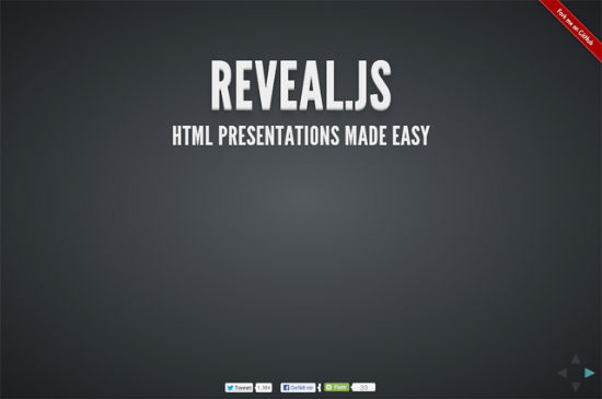
 Presentations are PowerPoint, you say? Well, think again. Most people I know start yawning as soon as PowerPoint gets mentioned. You don't want your clients to yawn. If you are into presenting using your Android or iPad, you'll even need additional tools to get a PPT up and running. As we are web developers, why not use the fine JavaScript framework Reveal.js, that just caught my eye? Reveal.js lets you build your presentations as a website, so all you need to - well - present is a browser.
Tell CSS that JavaScript is available ASAP
When you’re styling parts of a web page that will look and work differently depending on whether JavaScript is available or not, it can be very useful to use JavaScript to change or add a class name to the html element.
By doing this you can create CSS rules that will only be applied when JS is available and vice versa. The trick is to make sure the class names are switched as early as possible during page load.
Posted in CSS, JavaScript.
Copyright © Roger Johansson
Typography rules: Eye-Catching Headlines with slabText for jQuery
Typography in web design has long been treated as an orphan. With the rise of web fonts the situation changed and thanks to jQuery we have loads of elegant little helpers to make our sites prettier. The more advanced plugins even introduce possibilities formerly only known to print designers. Today we are going to take a look at slabText.js. This tool will split longer headings into two or more rows and set these rows to full justification, where each row is scaled individually, which guarantees for an eye-catcher.
slabText: FitText clone at first, but not at second sight…
You might have already put your hands on FitText, a very popular plugin, that at first sight seems to achieve the same tasks slabText intends to. The difference is small, but profound. FitText only scales one-row headings to the size of its container.
slabText takes the next step and provides almost the same functionality for longer headings. Taking a longer title marked H1, slabText will split it in rows. Then it takes these rows and justifies them to the left and to the right, which obviously requires changes in font-size, as not all words are created equal. In doing so, slabText calculates by itself where to fill in the line breaks. Thinking of event announcements or other layouts with a focus on structured information, automatic line breaking will usually not lead to intended results. We don’t need to worry about that as slabText allows for manually set forced line breaking, too. All you need to do, is fill in the text between this markup:
<span class="slabtext"></span> |
You can even preset line breaks using JavaScript. We’ll refer to the following example later on:
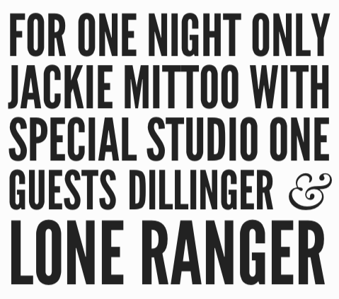
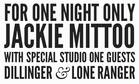
1 2 3 4 5 6 7 8 9 | var stS = "<span class='slabtext'>", stE = "</span>", txt = [ "For one night only", "Jackie Mittoo", "with special Studio One guests", "Dillinger & Lone Ranger"]; $("#myHeader").html(stS + txt.join(stE + stS) + stE).slabText(); |
If you’re puzzled as to where the problem might lie, let’s take a look at an eye-catching heading. The first variant is based on the automatically calculated line breaking of slabText, whereas the second alternative shows forced line breaking depending on manual settings. I think you’ll agree that the second variant is much more attractive, readable, world-changing, what else:
Using the function viewpointBreakpoint, we are able to define the minimum resolution for the plugin to be invoked. You’ll usually not want to have scaled heading if your browser’s viewpoint is below a certain resolution, say 300 to 400 pixels in width. With the definition of a breakpoint, slabText stays completely idle (if invoked in the defined range), whereas it interprets all other resolutions responsively.
Important note for web font users: Make sure all fonts are loaded before you fire up slabText. The product’s website doesn’t stick to this rule, but intentionally. The developer wants you to see the untouched heading for a short period of time before slabText goes into effect. Live websites shouldn’t risk to work that way.
slabText is under active development. The latest changes happened only a few days ago. slabText can be used free of charge under a MIT-/GPL-license.
Related Links:
tiltShift.js: Tiltshift-Effects with CSS3 and jQuery
tiltShift.js is nothing short of a little sensation. Using the new CSS3 Image Filters, developer Noel Tock realized a tiltshift-effect for any image you’d want to apply one to. It has of course to be said, that at the time of this writing only Chrome and Safari 6 are able to visualize the effect. Furthermore the pictures have to be generally qualified for the use of tiltshift. But this proves true for all possible fake tiltshifts, as can be achieved by Photoshop and others.
tiltShift.js: Very Clever Use of CSS3 Image Filters
To be absolutely honest, Noel Tock’s jQuery-plugin is more or less a wireframe. The effects applied only work in Chrome and Safari 6 and are generally dependent on being invoked on suitable photos. These should be taken from quite a distance and a higher angle of a subject that is best to be found in the middle of the photo. Of course you could apply tiltshift.js to any other photo, but wouldn’t achieve a visible tiltshift-effect in these cases.
That said in advance, Tock’s little javascript can be steered rather finely by using several parameters. Parameters are passed through the use of the new HTML5 data-attributes. Using data-position you define the position of the image section that should stay in focus. Valid values range from 0 to 100. A value of 50 would center the focus in the middle of the image. Combine that with data-focus, also ranging from 0 to 100, to set the size of the focus. Setting a value of 10 would mean, that 10 percent of the image would stay focussed, while the rest would appear blurred.
Having set that, data-blur is there to define the radius, while data-falloff will control the size of the area between full focus and full blur. You see, there’s nothing left to chance. For invoking the effect you fire it on a div-wrapper, that should be styled via CSS to avoid unwanted behaviour designwise.
tiltShift.js is made available under the GNU GPL license. Thus it is freely usable for any legal purpose. The project has just been setup on Github and shows a glimpse of the bright future, we as web developers are moving to with accelerating velocity.
Related Links:
- CSS3 Filters: Altering HTML and Images with just CSS – inserthtml
- tiltShift.js – noeltock.com
- noeltock / tiltShift.js – Github
Metro UI CSS: You can have a tiled website too
Microsoft’s new UI, once known by the name of Metro, has caused quite some buzz in the tech world. Meanwhile the name has been dropped, which again caused quite a buzz in the tech world. We don´t know why this was done nor do we know if the next Windows will be a market success. What we know is, that Metro as a design style has its fans. If you are one of them, we have great news for you. Thanks to Metro UI CSS you can give your very own website the same tiled look, the interface of the next generation Windows will have. Go ahead!
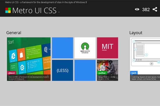
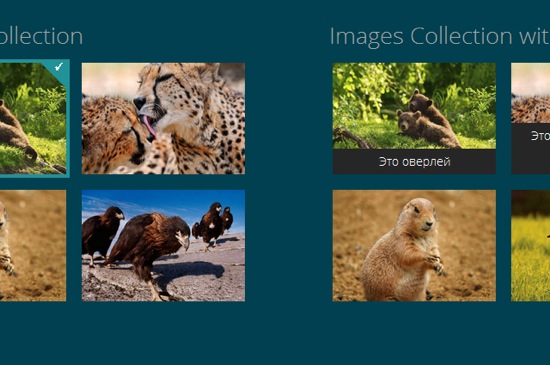
Metro UI CSS is actively developed by Sergey Pimenov, who proves generous enough to leave the tool for us to use free of charge under the MIT license. Pimenov not only copied the typical Metro design, but also implemented a variety of effects from the original Microsoft product, for example the fade-in of subtitles on pictures or the switch buttons.
Metro UI CSS: A feature-rich framework
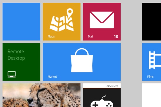
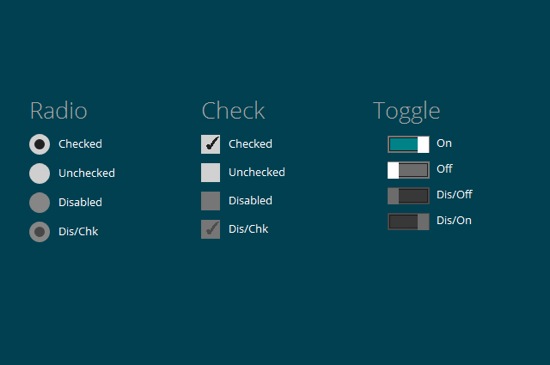
Get your own impression of what Metro UI CSS is capable of by visiting the demo. You’ll find several pages with examples of how pictures, forms, buttons and the typical tiles, bound to substitute the former Windows icons, look and interact.
Ever seen Metro on a tablet? On these devices, Microsoft implemented vertical scrolling as the standard scroll direction. That’s just the way Pimenov implemented it in Metro UI CSS. Using a touch-device you can elegantly scroll through your website. You’re not forced to, though, as mouse scrolling is also supported.
Metro UI CSS: Made with, yes, CSS and JavaScript
Metro UI CSS is not pure CSS, but relies on several JavaScript libraries for advanced functionality. The foundation is, as it often is, jQuery with some complementing plugins and the new superstar Bootstrap. Pimenov wants it mentioned, that he also integrated some of his very own JavaScript functions.
If you like to learn along the guidelines of a thorough documentation, Metro UI CSS is not for you. Because there simply is no documentation. The demo can be downloaded, that’s it. But it contains all elements for which the Metro style is available and thus should be a good starting point for the first steps to your very own tiled website. Several effects are invoked simply by calling the corresponding classes. You can easily find out by sneaking through the source code. Metro UI CSS needs a modern browser. Microsoft’s own Internet Exploder is supported from version 9 onwards.
(dpe)

