Tag: kranthi

Desktop Wallpaper Calendar: September 2012


We always try our best to challenge your artistic abilities and produce some interesting, beautiful and creative artwork. And as designers we usually turn to different sources of inspiration. As a matter of fact, we’ve discovered the best one—desktop wallpapers that are a little more distinctive than the usual crowd. This creativity mission has been going on for over four years now, and we are very thankful to all designers who have contributed and are still diligently contributing each month.

We continue to nourish you with a monthly spoon of inspiration. This post features free desktop wallpapers created by artists across the globe for September 2012. Both versions with a calendar and without a calendar can be downloaded for free. It’s time to freshen up your wallpaper!

Please note that:

  • All images can be clicked on and lead to the preview of the wallpaper,
  • You can feature your work in our magazine by taking part in our Desktop Wallpaper Calendar series. We are regularly looking for creative designers and artists to be featured on Smashing Magazine. Are you one of them?

Autumn Invaders

"Invaders of autumn are already here. Make sure you are well prepared!" Designed by German Ljutaev from Ukraine.

Smashing Desktop Wallpaper - September 2012

Man On The Moon

"A tribute to Neil Armstrong (1930-2012), the first man to ever walk on the moon." Designed by Paula Rupolo For Garment Printing from United Kingdom.

Smashing Desktop Wallpaper - September 2012

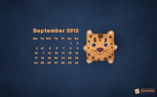
September Calendar

Designed by Vlad Gerasimov from Russia.

Smashing Desktop Wallpaper - September 2012

Photo Manipulation

Designed by Joana Machado from Portugal.

Smashing Desktop Wallpaper - September 2012

Beautiful & Bizarre

"The Beautiful is always Bizarre – a quote by Ralph Waldo Emerson." Designed by Roland Szabo from Hungary.

Smashing Desktop Wallpaper - September 2012

Colorful Trees

Designed by Blazoon.

Smashing Desktop Wallpaper - September 2012

Back To School Me Hearties

"19th September is ‘International Talk Like a Pirate Day’ and September is the month our children go back to school after the summer holidays here in the UK. We have combined these two things to bring you the ‘Back to School me Hearties’ desktop wallpaper calendar. We hope you enjoy exploring the wonders of Holiday Island and manage to escape the waiting terrors at School Island! Perhaps you would rather walk the plank and face the shark infested waters than return to School Island?" Designed by Donna Hall and Loren Grosvenor from United Kingdom.

Smashing Desktop Wallpaper - September 2012

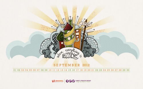
Life

"This drawing was done first as a pencil sketch, then traced and colored in Photoshop." Designed by Szabina Korsos from Hungary.

Smashing Desktop Wallpaper - September 2012

Chained Lake

"Chain in a lake (Garda, Italy)." Designed by Toci Jimenez from Spain.

Smashing Desktop Wallpaper - September 2012

Deadline Bridge

"He who would cross the Deadline Bridge
Must answer me,
These questions three
Ere the other side he see.
— Wallpaper is based on the film “Monty Python and the Holy Grail”." Designed by Patrycjusz Brzezinski For 4people.pl from Poland.

Smashing Desktop Wallpaper - September 2012

Autumn Memories

"September shares with us the end of summer. Autumn is coming, all around is full of orange shades, a perfect weather to relax, to admire the infinite world from your window." Designed by Simona Gosu from Romania.

Smashing Desktop Wallpaper - September 2012

Hot September

"Summer’s heat is too exhausting. Let us just rest for a little while." Designed by Zis | Inbal Zissu from Israel.

Smashing Desktop Wallpaper - September 2012

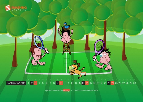
Frederique In September

"Frederique is a satiric comic strip about hanging around at beaches, getting rejected by hot chicks and enjoying life with full blown optimism." Designed by Richard Dancsi from Hungary/Germany.

Smashing Desktop Wallpaper - September 2012

Head In The Clouds

"Keep your head in the clouds and your feet on the ground." Designed by Kari Andresen from USA.

Smashing Desktop Wallpaper - September 2012

Back To School

"A simple illustration capturing the emotions of going back to school." Designed by Mark Mcgall from Northern Ireland.

Smashing Desktop Wallpaper - September 2012

September Bliss

"This wallpaper represents both the early autumn (with orange colors) and back to school (with paper texture in the background)." Designed by Elise Vanoorbeek from Belgium.

Smashing Desktop Wallpaper - September 2012

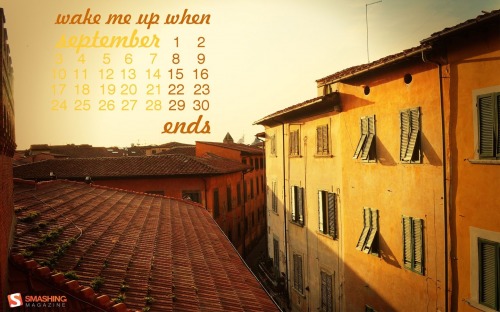
Last Days Of Summer

"Summer is saying goodbye to one of Vilnius’ streets." Designed by Karolina Przesmycka from Poland.

Smashing Desktop Wallpaper - September 2012

World Literacy Day

Designed by Cheriyan Manalel from India.

Smashing Desktop Wallpaper - September 2012

Autumn Owl

Designed by Katerina Bobkova from Ukraine.

Smashing Desktop Wallpaper - September 2012

Early Fall

Designed by Colin Whitehurst from USA.

Smashing Desktop Wallpaper - September 2012

Nine

"I’m always interested in bridging language and cultures with design. In this wallpaper, I introduce a Chinese idiom with the word ‘Nine’ (in red, pronounced Jiu) – corresponding to September, which is the ninth month of the year. What’s different here is that I’ve constructed my own Chinese words instead of using Chinese fonts – I’ve broken up, joined and bridged glyphs from the Didot font and formed these words – so it’s actually a very visual, design-oriented approach to bridging languages. Hopefully if time permits, I’ll complete the set and do one design for each month, each with a different Chinese idiom containing the number of the month." Designed by Teo Yu Siang from Singapore.

Smashing Desktop Wallpaper - September 2012

Under The Sea

Designed by Ana Henao from Colombian in Spain.

Smashing Desktop Wallpaper - September 2012

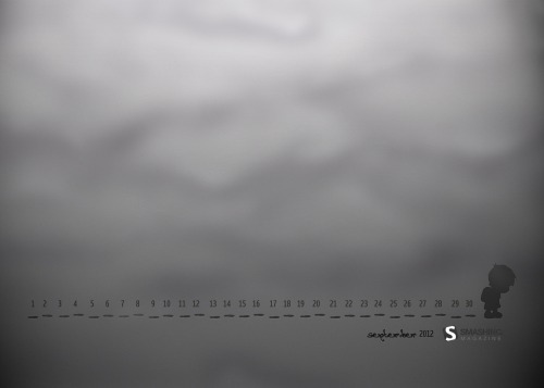
Traces

"A little boy is going to school. His foot traces are as sad as he is." Designed by Mypoint from Poland.

Smashing Desktop Wallpaper - September 2012

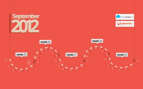
September Map

"Map for the month." Designed by Sherif Saleh from France.

Smashing Desktop Wallpaper - September 2012

Join In Next Month!

Please note that we respect and carefully consider the ideas and motivation behind each and every artist’s work. This is why we give all artists the full freedom to explore their creativity and express emotions and experience throughout their works. This is also why the themes of the wallpapers weren’t anyhow influenced by us, but rather designed from scratch by the artists themselves.

A big thank you to all designers for their participation. Join in next month!

What’s Your Favorite?

What’s your favorite theme or wallpaper for this month? Please let us know in the comment section below.

Stay creative and keep on smashing!

(vf)


© Smashing Editorial for Smashing Magazine, 2012.


Developing Responsive Designs With Opera Mobile Emulator // Free Testing Tool


This is our seventh article in a series that introduces useful and freely available tools and techniques, developed and released by active members of the Web design community. The first article covered PrefixFree; the second introduced Foundation, a responsive framework; the third presented Sisyphus.js, a library for Gmail-like client-side drafts. The fourth shared a free plugin called GuideGuide with us, and later we’ve announced Erskine’s responsive grid generator Gridpak and Remy Sharp’s debugging tool JS Bin.

Back in 2009, when coding version 10 of Opera Mobile, my Opera colleagues decided to tune the Opera Mobile build machine so that it would churn out builds not only for common mobile platforms, but for Windows and Linux as well. Originally intended for quality assurance and testing, these desktop builds proved also to be useful for Web development; being able to use Opera Mobile on a desktop machine took away the need to do all testing on a phone, and the mobile browser window was suddenly only an Alt/Command + Tab away from our text editor — exciting!

So, we decided to iron out the wrinkly bits, added a Mac build channel, and turned it into a publicly available developer tool, called Opera Mobile Emulator. Coming in at a fairly small size, Opera Mobile Emulator can be downloaded for free from Opera’s developer website or from the Mac App Store, and installing it is straightforward. The engine and UI are exactly the same as when you run Opera Mobile on a phone, while desktop-specific hooks, such as the profile selector, keyboard shortcuts and command-line flags, give you a bit of extra debugging power.

Opera Mobile Emulator Profile Selector and Opera Mobile Instance

In this article, we’ll look at how you can use Opera Mobile Emulator to create responsive designs, and we’ll cover some of its more exotic settings.

Disclosure: I work for Opera Software and am the product manager of Opera Mobile Emulator, among other things.

Basic Usage

When launching the emulator, you are greeted with a profile selector. Using the profiles on the left side, you can launch one or more Opera Mobile instances with device-specific settings. For example, selecting the “HTC Desire� profile will launch Opera Mobile in WVGA (480 × 800 pixels) portrait mode with a zoom level of 150%, just like it would on an actual HTC Desire phone. If you select a different profile, a separate Opera Mobile instance will launch with settings to match that profile.

Profile Selector

Pages can be loaded by typing in the URL in the address bar (obviously!), or else by dragging and dropping any file or URL onto the browser window. In-page navigation is similarly easy: clicks match to taps, and you can use pinch gestures on the trackpad to zoom in and out of pages. If the latter does not work on your machine, you can zoom by using the scroll wheel on your mouse or by clicking the “+� and “-� overlays that appear in the browser window when you pan around.

You’ll notice that spawned Opera Mobile instances can be resized from all sides, and the loaded website’s layout will alter accordingly. This is, of course, different from the experience on devices where the browser is a full-screen app, but it comes in very handy when you want to test how your viewport meta tag or media query settings work at different screen sizes. In fact, resizing an Opera Mobile instance to test different layouts will give you a more realistic feel of viewport behavior than doing the same on a desktop browser, because the latter will not respond to different viewport settings, and so viewport-related bugs might get overlooked.

Two Opera Mobile instances

It’s worth noting here that the device-width media query in Opera Mobile Emulator is not querying the width of the computer screen, but rather the width of the launched Opera Mobile instance. Also, if you’re only interested in checking the differences between portrait and landscape orientation, you can use the Alt/Option + R key combo, or click on the “Rotate screen� button in the bottom-right corner.

Of course, everyone’s workflow is different, and I’m here to help make yours more efficient, not dictate to you. Obviously, nothing beats testing on actual devices, because you’ll get an accurate idea of the feel of your website in a mobile setting, on a device with limited CPU and so on. However, actual device testing is finicky, so I prefer to leave it until my project has reached at least alpha quality, preferring a rapid (1) develop, (2) test with Opera Mobile Emulator, (3) debug iteration while getting the project off the ground.

Advanced Launch Options

On the right side of the profile selector, you’ll find a number of profile options.

The “Resolution� drop-down menu gives you a choice between a number of common screen sizes and orientations, with the option to add your own as well. The “Pixel Density� drop-down menu is a list of PPI values: for the HTC Desire, this is 252, which will result in a 150% default zoom and a devicePixelRatio of 1.5 when launched. Selecting a PPI of, for example, 285, on the other hand, will result in a zoom level of 200% and a corresponding devicePixelRatio of 2.

In short, this combination of resolution and pixel density values will differ per profile and affect how the viewport behaves, as well as determine which media queries are applied.

Finally, the “Input� drop-down menu allows you to choose between three input modes to which certain UI and UA changes are tied:

  • “Touchâ€�
    This option will launch Opera Mobile with a UI that is optimized for use on touchscreen phones, and will give it a UA string with Opera Mobi in it.
  • “Keypadâ€�
    This option will launch Opera Mobile with a UI and shortcut keys optimized for non-touchscreen phones — for the developer’s convenience, mouse clicks, panning and zoom gestures will still work, though. The UA string will contain Opera Mobi.
  • “Tabletâ€�
    This option will launch Opera Mobile with a tablet-optimized UI. In this case, the UA string will contain Opera Tablet.

Opera Mobile instances with tablet, touch and keypad input

Launching With Arguments

The last option in the profile selector is the Arguments field, which is arguably the most powerful one of the bunch. In it, you can type a number of arguments or flags, which will be used to launch a new Opera Mobile instance. For example, -displaysize 320 × 480 -url www.opera.com will launch Opera Mobile with a window size of 320 × 480 pixels and will load www.opera.com.

These flags also work from the command line. By default, the Opera Mobile Emulator is executable from the following locations:

  • Mac
    /Applications/Opera Mobile Emulator.app/Contents/Resources/Opera Mobile.app/Contents/MacOS/
  • Windows
    C:\Program Files\Opera Mobile Emulator\
  • Linux
    /usr/bin/

Repeating our last example would then look as follows:

  • Mac
    ./Opera\ Mobile -displaysize 320x480 -url www.opera.com
  • Windows
    OperaMobileEmu.exe -displaysize 320x480 -url www.opera.com
  • Linux
    operamobile -displaysize 320x480 -url www.opera.com

Two arguments that come in very handy when testing responsive designs are -displayzoom and -monitorppi:

  • -displayzoom
    This is useful if you want to reduce the size that an Opera Mobile instance takes up on your desktop, while preserving its reported width and height values, devicePixelRatio and so on. In other words, if you want to try out the “Samsung Galaxy Noteâ€� profile, which results in a browser with a size of 800 × 1280 pixels, then you can add a -displayzoom 50 flag to launch it with a quarter-sized surface of 400 × 640 pixels — a much better match for the 900-pixel-high screen of, for instance, a MacBook Air.
  • -monitorppi
    This, on the other hand, allows you to set the PPI of your computer monitor (for example, -monitorppi 128 for a 13-inch MacBook Air) and launch an Opera Mobile instance with a zoom factor adjusted to match the physical dimensions of the profiled phone’s screen. This will give you a better idea of how big, say, the clickable areas really will be when the page loads on an actual device, but remember that the PPI you get on the screen won’t be representative of what you’ll see on the device.

Note that -displayzoom and -monitorppi are mutually exclusive and thus cannot be used together.

For a full list of possible arguments, click on “Help� in the profile selector, or run the emulator from the command line with the --help argument.

In-Browser Settings

One thing to keep in mind is that, even when launching an Opera Mobile instance with an Android profile, the UA might be different. You can change the UA string after launching Opera Mobile by clicking on the red “Oâ€� and going to Settings → Advanced → User Agent, where you can choose between five options, including “Android.â€� If you need to set a completely custom UA string, go to opera:config in the URL field and search for “Custom User-Agent.â€� In this field, you can set a custom UA string, which will override any other set UA string.

Other settings worth highlighting are the options for clearing the cookies, cache and shared locations, found under Settings → Privacy, and the toggle to turn off the on-screen keyboard, found under Settings → Advanced → Opera keyboard.

Connecting To Opera Dragonfly For Advanced Debugging

In any Web project, there is a point when you absolutely need to look under the hood of the browser to see what precisely is going on. That’s why Opera Mobile Emulator can talk to Opera Dragonfly, Opera’s built-in Web debugger.

Connecting Opera Mobile to Opera Dragonfly

You can easily set this up as follows:

  1. Download, install and run Opera for desktop.
  2. Load a page in Opera for desktop, right-click anywhere, and click “Inspect Element� to launch Opera Dragonfly.
  3. In Opera Dragonfly, click on the “Remote debug configuration� button (third button in the top right), and click “Apply� (the default settings are fine)
  4. Then, open Opera Mobile Emulator and launch an Opera Mobile instance.
  5. Go to opera:debug in Opera Mobile, and click “Connect� (the default settings are fine)
  6. You are now connected and can load any page you want to investigate in Opera Mobile. Be sure to select the correct debugging context (fourth button in the top right) in Opera Dragonfly when you change tabs.

Under Opera Dragonfly’s Network → Network log, you can, for instance, inspect whether your media queries are written correctly and whether image files referenced in the style sheet are not unnecessarily downloaded to devices with small screen sizes. If done right, you should see them only pop up towards the bottom of the waterfall chart when expanding the Opera Mobile browser window’s dimensions.

Also worth noting are the features under Network → Network options. There is a checkbox to disable all caching (which you may want to do when testing), and there is an option to set global header overrides — this is particularly handy when you rely on browser sniffing (careful!) or particular headers to optimize your content for, and you want to test out different header variations without opening up different browsers.

For an overview of other Opera Dragonfly features, including those related to inspecting the DOM and scripts, CSS profiling, picking colors, and using the command line, I recommend looking at the Opera Dragonfly documentation.

So, that’s a wrap! I hope you’ve enjoyed this introduction to how Opera Mobile Emulator can help you optimize your responsive designs. Try it out for yourself, and let us know what you think and how you want to see it improved.

(al)


© Andreas Bovens for Smashing Magazine, 2012.


Beyond Wireframing: The Real-Life UX Design Process // The Roots of User-Centered Design


We all know basic tenets of user-centered design. We recognize different research methods, the prototyping stage, as well as the process of documenting techniques in our rich methodological environment. The question you probably often ask yourself, though, is how it all works in practice?

What do real-life UX design processes actually look alike? Do we have time for every step in the process that we claim to be ideal? In this article, I’ll share a couple of insights about the real-life UX design process and speak from my own experience and research.

User-Centred Design: Truth Vs. Fiction

A few years ago, I joined one of the biggest e-commerce companies in Eastern Europe. When I entered my new office, I immediately spotted a huge user-centered design (UCD) poster on the wall. The whole process was described in detail that left hardly any doubts about the step-by-step approach to design. Exciting interior design for an aspiring UX designer, right? I stared at the poster with great hope and imagined how exciting following the ideal UCD process would actually be. Guess what? They didn’t apply a single step from the poster to the actual process. They never did any research, nor any serious analysis of user behavior. Yikes, they didn’t even prototype! This fancy poster simply hung shamefully on the wall.

For the next three years, we worked hard to put user experience design at the heart of a developer-driven culture. We forgot about the poster and structured our own process, which fitted well with the company’s capabilities and allowed us to constantly optimize our main service. Why didn’t we use the crystal-clear theoretical approach? Because we couldn’t afford to go step by step through a classic UCD process with a lot of different activities. It would have taken too much time, and therefore it was economically invalid — the budgets for our projects were way too tight.

To deliver a user interface on time, we were forced to get really lean. We used a classic UCD process as inspiration and created a process that was simple but actionable for the company. We defined the problem, defined the scope of the project, iterated through paper prototyping and wireframing, pushed code to production as fast as we could, and always used multivariate split-testing and detailed Google Analytics event tracking.

Post-launch was the time to measure and plan optimization, which we executed immediately. Unfortunately, only huge projects had budgets for qualitative testing. Huge projects were also full of preliminary diagrams (site maps, flow charts, conceptual diagraming) — a enormously recommended activity to find order in a complex mess of information.

All in all, our process was simple but efficient. Of course, in general terms, it was a UCD process, but compared to any popular approach and a famous UPA poster, we used about 20% of the recommended tools and studies. We assumed that users don’t benefit from poster unicorn processes. Users benefit from the hard work of a product team; therefore, a simplified process is better than a robust unactionable theory.

UPA UCD Poster
Designing the user experience. (Large version)

Suddenly, I started to wonder how others managed to apply UCD. There’s a lot of talk about wireframes, but what does our work look like beyond wireframes? Was I the only one with a simplified approach? What can we do to create successful designs? What does the process beyond “the poster� look like? Is there a pattern that works well for the majority of designers?

The Reason For Research

Luckily enough, I was about to find some answers to my questions about the design process. I was forced to perform a worldwide reality check on my opinion about the classic UCD approach and design processes. Sharing this reality check is the raison d’être of this article.

  • If you’re fresh in the UX design world, learning how more experienced designers work might be useful.
  • If you’re a seasoned designer, treat this article as an incentive to reconsider your approach to design. We’re all rushing our designs every day. This is the time to take a breath, see what others are doing and think about what works and what doesn’t work in our real-life approach — beyond a UCD poster.

You may wonder what force persuaded me to revise my approach to the design process. The answer is simple: my own startup. Together with my friends, we created UXPin paper prototyping notepads to make our process more efficient, and then we created our own collaborative wireframing application. We suddenly became quite popular, took VC investment and decided to face the challenge: to create a user experience design toolset to support teamwork in the design process.

We felt that we were trying to fight Godzilla (or Tywin Lannister, if you prefer Game of Thrones to old Japanese movies). If my UX teams couldn’t apply a classic UCD approach, how could I be sure that using any theoretical framework would enable me to design a toolset that fits anyone’s real-life process? I couldn’t. Is there any pattern in design processes that we actually apply in our companies? I had no idea.

We felt that we needed to find out the truth about real-life design processes and we needed it now. It appeared to us that our research might be of vast importance to the community and even beyond. A simple equation: a great tool for the design process equals less work for designers on the tools side, equals more time for creative work, equals better designs for all of us.

The stakes were great, and there was just one right thing to do: get out of the building, get our hands dirty with research, find out and learn about the real-life design process (if it exists), and literally hunt out pain points in it to make the work of our team much easier and more pleasurable. We packed our stuff and crossed the great pond, so to speak, to do some serious research in San Francisco and Silicon Valley. Read on if you want to know what we found out about the design process!

The Customer Development Process And Tons of Individual In-Depth Interviews

The life of a modern startup is full of UX design work, even if the founders don’t realize it. Drake Martinet (Wall Street Journal, Stanford University) considers the whole lean startup movement to be a mere application of design principles to the business environment. I couldn’t agree more.

When starting a new project, you actually need to talk to people from your target group. Here comes what are well known as IDIs (individual in-depth interviews): moderated, individual interviews in which you try to learn as much as you can about the problems of your interlocutor in a particular area of their life.

Our target group was user experience designers, so we scheduled above 50 interviews (personally and via Skype). Each focused on the same theme: the real-life UX design process. We asked designers to tell us stories of their usual process based on one of their projects. During the interviews, we asked a ton of in-depth questions to learn as much as we could about the process.

We hardly asked about problems in the design process, though — we tried to spot them in the stories on our own and then confirm our judgment by asking questions (for example, “I understand that X was troublesome in this particular project?â€�). We tried as hard as possible not to push any views onto our interlocutors. Letting them speak was important.

We interviewed UX heroes Mike Kuniavsky, Indi Young, Luke Wroblewski, Peter Merholz, Brandon Schauer, Jeffrey Kalmikoff and John Zeratsky and some lesser-known but excellent UX designers, including current UXPin clients. Among our interlocutors were in-house UX designers, designers from consultancies and freelancers. Surprisingly enough, the problems that usually trouble UX designers were similar in all three groups.

It was an intense learning experience, and I highly recommend considering such preliminary research in every project. It will give you a ton of ready-to-use knowledge — a kind of canvas to work from.

The Process That Emerged From Designers’ Stories

First of all, we didn’t find any unicorns, but we did find racehorses in excellent condition. While all of the processes that emerged from the stories were somehow simplified UCD processes, they were tailored to the specialities of the designers. Flexibility is what helps us survive in the diverse jungle of projects. Processes morph to fit projects.

The approach to an e-commerce website differs from the way we design mobile apps in the healthcare industry (guess where context analysis matters most?), and government clients differ from corporate stakeholders and startup entrepreneurs, and so on. With few exceptions, though, the process looks surprisingly similar. There is a visible pattern that we all use to design interfaces in different environments:

1. Collecting Information About the Problem

Every UX designer needs to be a kind of detective in the early stage of a project. We need to find out as much as we can about the three Ps (people, problem, project). Activities in this stage, in contrast with the classic UCD approach, are vastly simplified:

  • Meeting with the client (no matter whether externally or internally) and identifying the product’s requirements (often in the form of a standardized product requirement document);
  • Benchmarking and trend analysis (oh yes, most of the designers we interviewed do that).

We seldom perform user interviews, but writing user stories is one of the commonly accepted attachments to the product requirement document. Our user stories are sometimes created based on personas, which are hardly ever backed up with data. Field studies and task analysis are hardly used by any of the designers we interviewed.

2. Getting Ready to Design

This is clearly the ideation part of the process. It’s completely conquered by analog tools. I haven’t met a single designer who doesn’t use quick messy sketching or some other paper prototyping form at the early stage of a design process!

Designers try to act on the material gathered in the first step of the process and find a design worth refining. This stage is not about documenting; it’s about artistic fury and creative explosion. Many of us use Adaptive Path’s multipage templates to quickly create very generic sketches.

Unfortunately, testing lo-fi prototypes is not popular. We prefer to take the risk of choosing one option with a stakeholder and begin the refinement process. Not very UCD-like, but that is the reality.

3. Design

In contrast to the anti-documentation agile approach, most of the interviewed designers create wireframes and prototypes to document the experience and then hand them to the developers.

Refined sketches from the previous stage are still rather lo-fi and are usually not tested. Hi-fi design is left for visual designers. In Aristotelian terms, we create the form, while developers and visual designers fight to create the matter. Heuristic evaluation is definitely out of fashion, while expert review backed up with a cognitive walkthrough is quite popular.

4. Approval

This is surprisingly an important part of the design process. Research documents and deliverables usually also serve as persuading factors in the “buy-in� process. This does not differ between in-house UX designers, freelancers and folks from consultancies.

Buy-in is the unfortunate peak of our process. None of us want to see our work go directly to the trash, and I’ve seen some great projects rejected just because the story behind the design process wasn’t particularly persuasive.

And guess what? A lot of the interviewed designers actually create a special presentation to tell stakeholders the design story. The presentations show stages of the process, deliverables and interactions, and they aim to give stakeholders lazy access to all of the information.

The four points mentioned above form a pattern visible in the majority of design processes that we went through with our interlocutors. You might have noticed that not a lot of iterative research is done in these processes. Sadly, the classic usability study is not a permanent part of the process. Why? The answer is simple: budgets are tight. Problems that appeared in the company that I used to work for appeared to be common. Tight budgets are forcing UX designers to tailor their processes and skip costly research.

I believe the best answer to this problem is guerrilla research methods. Startups do adapt guerrilla research as a part of the customer development process, but more “mature� companies, in my opinion, are strangely afraid of spontaneous and methodologically questionable yet efficient and cheap research methods. One of the challenges of the UX design community in the coming years will be the popularization of guerrilla research methods and bringing them into our real-life design processes.

Houston, We Have Several Recurring Problems

During our research, we tried to spot recurring problems in the design processes of our interlocutors — a so-called pattern of pain. Surprisingly enough, similar problems appeared in almost all individual interviews. Apparently, a lot of us live arm in arm with three tough unresolved problems that tend to slow us down:

  1. Spreading an understanding of the design process
    How to engage the whole team in the process and show them that UX designers are not people who lack talent in visual design yet still insist on drawing something? How to teach that there’s user experience beyond wireframes?
  2. Communication within the team
    How to communicate with a team throughout the process and actually use different perspectives of teammates to evaluate design deliverables?
  3. Demonstrating the process to get buy-in
    How to present the design process to stakeholders and developers to actually get buy-in, both formally and psychologically?

One of the UX designers we interviewed said the following:

Do you know what the most painful thing is in my job? Bureaucracy. Having to go to meetings. I would rather design than fight over the picky details. We should make at least part of the workflow online instead of in person. Have the approval process online, instead of in a meeting.

Another said this:

It’s really hard to show the process to clients and spread some understanding of the importance of design.

We have probably all tried to solve these problems countless times, but we still lack efficient and fast methods. This results in less time for creative work and research.

My hypothesis is this. We as UX designers need to resolve the three painful problems identified above to have more time for creative work and research. We need to demonstrate our work beyond wireframes, spread understanding of UX design and, in fact, sell ourselves both internally (within the product team) and externally (outside the product team, in front of clients and stakeholders). This is the recipe to increase our effectiveness.

Our real-life UX processes need adjustment, and since we share the pattern of the process and the pain points, we can solve them together. This is most likely the most positive outcome of this research.

Outcome Of The Research

The research shows that UX designers are constantly modifying the classic and complex UCD approach. Less emphasis on iterative usability studies and a narrower range of design activities (compared to classic UCD) are the main traits of the current real-life design process that have emerged from our research.

A process tailored to the capabilities of our companies and our clients proved to be generally effective, but it still causes some recurring troubles that should be eliminated.

This is, generally speaking, the state of our field. Don’t get me wrong: I don’t mean to criticize classic UCD — it still serves as an inspiration for our work. After all, I’m happy that I worked in that office with “shameâ€� hanging above my head (yes, I mean the UCD poster), which constantly reminds me of the need for adjustment in the process. I’ve learned that what matters, though, is an actionable process — possible to use, adapted to the company’s culture and financially effective.

After talking with dozens of UX designers, I’ve started to wonder, however, whether we should actually create a poster that shows this version of the process. It could help a lot of aspiring UX designers take their first steps in the field and could be effective as an educational tool for our internal and external clients.

After all, our work is not nearly as expensive and time-consuming as the old poster says.

P.S. A study of the process and the problems spotted in it inspired us to create “The UX Design Systemâ€� — it’s a work in progress, and I’d love to hear your feedback.

Further Resources

(al)


© Marcin Treder for Smashing Magazine, 2012.


Optimizing The Design Workflow With Extensions // Adobe Fireworks


I’ve been using Adobe Fireworks for over a decade now and I can recommend it to anyone searching for the optimal screen design workflow. Much has been said about Fireworks’ capabilities as a design application, but today I want to focus on one of its other biggest strengths — its extensibility.

As a platform, Fireworks gives its users a lot of freedom, when it comes to extending it. Because of that, Fireworks has a thriving ecosystem of add-ons (extensions) that add a lot of valuable functionality with newer options.

In this article, I’ll try to list some of my top extensions for Fireworks. These are not necessarily the most complex or powerful extensions, but rather those that have helped me be more productive with my Fireworks workflow over the years. Also, all of these are free to test and use, so you can even try them right away!

My article is pretty detailed, so to help you navigate it, you can use the following list:

  1. Grids Panel
  2. Guides Panel
  3. Smart Resize Auto Shape
  4. Tables Auto Shape
  5. Placeholder Auto Shape
  6. Orange Commands
  7. QuickFire

Working With Extensions In Fireworks

Fireworks can be easily extended, but the extensions are installed and maintained via the Adobe Extension Manager — a tool that must be run separatey from Fireworks.

Before we review in detail the extensions that I can personally recommend, I would like to share a few general tips and suggestions on how to work with extensions in Fireworks. Although these tips are mostly geared towards Fireworks CS5 and CS5.1, there are actually only a few minor differences if you are using version CS6.

Easy fix for issues with Windows Vista / Windows 7

If you are using Fireworks on Windows Vista or Windows 7, the Extension Manager may give you strange errors when you attempt to install an extension. The easiest solution to this problem is to run the Extension Manager as administrator. Simply right-click the “Extension Manager” shortcut and select “Run as administrator”.

Note: The reason why the EM needs to be run sometimes with administrator privileges in Windows Vista and Windows 7 is simple — some extensions specify installation locations in the Program Files folder, and Windows requires administrator approval to install anything in this area, for security reasons. Usually older extensions (that were not recently updated) are installed into the Program Files folder, while new extensions are installed into the User Application Data folder. Fireworks can run extensions from either the Program Files folder or from the “User Application Data” folders in order to maintain backward compatibility with older extensions.

Where are the installed extensions located?

If you are installing Fireworks extensions for the first time, keep in mind that:

  • Commands will usually appear in the Fireworks Commands menu.
  • If an extension also installs a panel, you will find it in the Window menu.
  • If an extension installs an auto shape, it could be found in the Auto Shapes panel.

Extension descriptions

The best way to learn how an extension is supposed to work, or in which menu / submenu you’ll find it, is to look for the extension description in the Extension Manager. However, please note, that the Extension Manager lets extension developers link to descriptions online, which means that if you are not connected to the Internet, you will see empty description boxes in the Extension Manager. If you do come across these, know that a missing internet connection might be the cause.

Using shortcuts

If there are some commands that you find yourself using very often, you may want to assign keyboard shortcuts to them for gaining more productivity.

To do so, go to menu EditKeyboard Shortcuts, duplicate the default shortcuts set, then select your command from the list and add a shortcut combination of your choice. Fireworks will let you know if the shortcut you want to assign is already in use. Then, depending on what it already does, you can either choose to replace it with the new one, or select a different key combination.

Updating extensions

Updating extensions in Fireworks is pretty straightforward — you just have to open the Extension Manager every once in a while. If an extension has an update available, you’ll see a notification in the list of extensions. Then, simply select the extension and click “Update”.

Updating Extensions Using the Adobe Extension Manager
Process of updating extensions.

Please note that not all Fireworks extensions have the “Automatically Check For Updates” option built-in. So alternatively, you can simply download a newer version (if there is one available, of course) from the website where the extension was originally posted, and then run the Extension Manager. The EM will ask you if you’d like to replace the old version with the new one — select “Yes”, and the process will complete automatically.

Now that we’ve covered the basics, let’s move on to the list of extensions!

1. Grids Panel

John Dunning is a legend in the Fireworks community, and his growing list of powerful extensions often compete with themselves for the top spots as valuable and useful. His grids extension is unquestionably the first one I reach out for every time I start a new project.

In a nutshell, the extension lets you set up a grid for your design. You set the parameters (the column width, gutter width, number of columns, etc.) and it then creates a locked layer with the columns, rows and guides spanning the height of your canvas. Since there are a couple of setups that I usually prefer to work with, I’ve saved them as presets, so it’s simply a matter of opening the panel and selecting an existing preset.

For responsive designs, what I typically do is create a few grid setups for different viewport sizes. Then I simply create a new page for each breakpoint and apply the appropriate grid before pasting the content in for realignment.

Insert Grid Panel
Insert Grid Panel: Typical setup for a 12-column grid. Large preview.

The features of the grid panel are evident from the screenshot, and make it easy to control columns, gutters, and baselines as wells the appearance of the overlay (and whether or not guides should be created). If you have ever tried to set up a grid in Fireworks without this extension, you’ve wasted a whole lot of time!

Useful tip: Using Photoshop and need something similar? The GuideGuide panel might be something worth giving a try.

2. Guides Panel

As awesome as the grid panel is, it’s probably not suitable for every situation. Sometimes you may need to just create a set of guides without all of the other grid structures (e.g., if you are creating individual assets such as banner ads, rather than entire pages — grids are great for entire pages and screens, but they can be an overkill for specific components).

Also, for those of you who work extensively with guides, it often seems much easier to quickly set up the grid precisely with guides. If you are like me, and addicted to the fine control that guides offer in Fireworks (or any other design application for that matter), you most certainly would like to check out the Guides panel by Eugene Jude.

The panel gives you several options to add guides to the canvas with precise numerical control: you can set margins on either (or all) four sides, create columns and rows, or add individual guides at specific coordinates.

Guides Panel — General
Guides Panel (with the “General” tab selected in it).

You can copy entire collections of guides and paste them into another page or document, or even save sets to retrieve later (this feature is pure gold if you have a setup that you work with often, and want to reuse).

But where this panel really shines is in its ability to work with selected objects. Lets say you need guides all around and through the middle of that image you just placed in your design, so you can align objects around it. Simply select the object, go to the “Selection” tab in the Guides Panel and select the appropriate boxes. You can even set an offset value between the object and the guides.

Guides Panel — Selection
Adding guides through the center of a selected object.

Finally, there’s the ability to delete all guides, or at least only the vertical or horizontal ones (oh, how I wish I had this panel a little earlier — this would have easily saved me a couple of precious weeks every year!).

3. Smart Resize Auto Shape

Since Adobe Fireworks is used extensively for UI design, a very common use case is to create an interface element by grouping a few objects together — rectangles, text fields, buttons, etc.

Fireworks’ object-based workflow makes this an easy task (compared to Photoshop’s predominantly layer-based structure). The problem though is that once you have created such a group, resizing it can be difficult. You can’t just select the group and change its width or height, since Fireworks will simply stretch everything in the direction specified, and deformations to the individual objects will occur.

That’s where John Dunning’s Smart Resize comes into play.

Once you’ve selected a group that you need to resize, use menu CommandsSmart ResizeAttach, and the command will convert your group into a special smart object with the typical yellow resize handles.

Smart Resize: Saving Time When Resizing Groups of UI Objects
Smart Resize: Saving Time When Resizing Groups of UI Objects.

You can use these handles to resize the group in any direction and witness the magic in action. The extension will resize only elements that extend across more than 50% of the group’s size — which is typically your background boxes — and retain the rest of the elements in position relative to the closest edge of the group.

Smart Resize in Action
Smart Resize in action.

For extra control over how elements in your Smart Resize group scale or are being repositioned, you can set anchor points for each individual object. For example, elements that have their X anchor set to the left will only scale on the right side; the left edge will stay fixed in proportion with the rest of the group.

Smart Resize: Selecting Anchor Points
In this example, the X anchor was set to the left, then the group was resized.

Text boxes will be resized while maintaining their text properties intact — the height and width of the text box will change, but not the text itself. John demonstrates the extension’s usefulness when working with a mock-up of a dialog box on his website. But of course, there are many more cases where you can save time with this extension. Personally having used it for a couple of months now, I’ve found my workflow immensely optimized, especially when creating wireframes where quick changes to try out variations become the “need of the day”.

4. Tables Panel

If there is one extension in this list that I would award as the “Most Underrated”, it would have to be the Tables Panel from John Dunning.

It does something that seems very simple but is actually much more complex and tedious: building and editing tables (painlessly!) in Fireworks. It can also be an indispensable tool for editing many other design elements, including buttons, styled boxes, and placeholders.

We’ve all been there, haven’t we? Every designer knows that often the task of mocking-up a table inside a Web design (or a Web design prototype) can come up. Unfortunately, it is rare for a graphics editor to provide a decent level of support for building tables, and Fireworks is no exception. Everything from deciding whether to use rectangles for rows or individual cells, or aligning things manually every time there’s a change in the design, tables in Fireworks can be a pain.

But things change a lot with the introduction of the “Tables” extension!

Tables Panel: Easily Build Tables in Fireworks
Tables Panel: Easily build and modify tables in Fireworks.

To create a table, you simply lay out the content of the table roughly on the canvas, in the sequence you want. Select all objects, and hit the “Create” button in the Tables Panel. The extension will add individual boxes for each element and lay them out with the height and width of the biggest element that appears in a row or column. You can change the padding, decide whether you want to see the table outlines (or not), and so on — and what’s better, everything always remains editable. Lets say you changed some text in the table, and now it’s too long for the cell that contains it? Simply press the “Update” button and the table will auto-adjust accordingly!

Apart from the obvious goal of creating tables and grids, one can use the extension in a few other scenarios. For example, you could use it in adding a background and border to text boxes for pull-quotes, so that the box always adapts to the size of text.

I often find myself using it for buttons when creating wireframes. It has always been very annoying to me that I have to keep managing a rectangle and a text field every time I need a button. With this extension it’s all taken care of, and I never have to manually change the width of a new button to fit the text inside it! Besides, you can even have borders of different widths around the button by changing the border widths in the Tables Panel.

Tables Panel: Creating Dynamically-Sized Buttons Quickly.
Tables Panel: Creating dynamically-sized buttons quickly.

The Tables Panel is pretty flexible and has many other options. You can even insert a table from a text file (tab-delimited or comma-separated text file — .txt or .csv). After you select the file, the contents of the table will be inserted at the upper-left corner of the document (you can later drag the table around and position and style it in any way that you want). You can also import a table from a Web page — you’ll just need to first convert it to tab-delimited or CSV format.

Tables Panel
Tables Panel: it provides you with a high level of customization and with various options.

As you can see, the possibilities for working with tables are almost unlimited. All of this is possible again thanks to the power of Fireworks and the talented extension developers that give so much to the community!

5. Placeholder Auto Shape

If you use Fireworks extensively for wireframing, you are no doubt aware of the frustration of maintaining placeholder boxes and the necessary information contained within. I usually draw gray boxes for my images and include a descriptive label, the height and width co-ordinates within the box. The problem is, this metadata often needs to change with the size and position of the placeholder. Updating this information manually and re-aligning the text so that it is always in the center can be a pain.

John Dunning to the rescue again, with his Placeholder auto shape extension.

To create an image placeholder, pick this auto shape from the Tools panel (instead of the standard Rectangle tool), and it will draw a box with the necessary data already filled in. Every time you resize and reposition the placeholder, the coordinates will automatically update as necessary.

Placeholder Auto Shape: Dynamic Placeholders that Always Stay Up-To-Date
Placeholder auto shape: Dynamic placeholders that always stay up-to-date.

It’s interesting to mention that the Placeholder tool can be found in the Tools panel. But also, this extension installs a Placeholder auto shape, which can be found in the Auto Shapes panel. Both the tool and the auto shape do the same thing, and the difference between their use is very minor (you can select the Placeholder tool and drag it to any size on the canvas, while the Placeholder auto shape should be first dragged and dropped to the canvas, and then resized).

As you can see in the screenshot above, you can decide what information gets displayed in the placeholder. The choice is between showing a custom label for the placeholder (like “logo”, “screenshot”, “banner”, etc.), and the coordinate of the image (height, width, x & y coordinates). Clicking the crosshairs in the middle of the placeholder opens up a dialog box where you can turn these details on or off. You can also change the size and position of the paceholder precisely right from within this dialog box and change (or remove) the fill color.

Placeholder Auto Shape: Choose What Content You Want on the Placeholder
Placeholder auto shape: choose what content you want on the placeholder.

Useful tip: If you have multiple placeholder shapes in your file, you can select them and resize them all at the same time. Neat!

6. Orange Commands

If there’s anything I would call a Swiss Army Knife for Fireworks, it would have to be Orange Commands by Ale Muñoz.

Unlike every other extension in this roundup that focuses on a single task or a group of tasks, Orange Commands aim to bring efficiency to tasks across your entire Fireworks workflow. From aligning objects, to setting guides around selected objects, to combining two text objects into one — Orange Commands are a collection of small tasks that you would typically perform through a series of steps. And what’s more, they’re not only free, but are also open-source, letting anyone with enough know-how to tweak and extend them even further!

Here are a few of my favorite commands from the 100+ that this extension comes with:

  • Most designers don’t know this, but there is a way to change the alpha / opacity of a stroke in Fireworks CS5.1 as well as earlier versions. Unfortunately, to change it you will need to go into the “Edit Stroke” panel and then inside “Advanced” to get to this control — the feature is pretty much buried. Orange Commands bring this ability right up to a single click with the Stroke Alpha set of commands under Alpha.

    (Using Fireworks CS6? You’re lucky! A few new options were added in the Properties panel, which include independent control over the opacity of both stroke and fill!)

  • If you like to number your pages so they appear in a specific sequence after being exported, just set them in the right order in the Pages panel. Then hit Numberize under Pages, which adds a number in front of the name for each page. Need to change the order? Reorganize the pages and hit the command again. There is also a De-Numberize command that will let you get rid of those numbers, if needed.
  • Need to swap the position of two objects in your design? Select them and hit the Swap command under Position. Easy!
  • Fireworks has shortcuts for aligning multiple objects to each other, but you still need the Align panel if you want to align something in reference to the canvas. That’s where the Center on canvas set of commands under Align comes into play.
  • You can use the Space horizontal and Space vertical commands under Align to distribute selected objects with a specified distance between them.

This is just a small part of what Orange Commands can do. You can check out the detailed documentation for more details on what’s available.

Since Fireworks lets you assign keyboard shortcuts to all menu items, you can assign them also to your favorite commands, converting any series of steps into single, keyboard-driven actions. Although I have a few favorite ones, virtually every one of the commands has contributed to “shaving” precious seconds off my workflow, which amount to hours saved every month.

Useful tip: Did you know that Orange Commands come with their own keyboard shortcut sets that pair perfectly with the commands themselves? If you’d like to use one of them, simply copy the shortcut XML files to the “Keyboard Shortcuts” folder (see “Installation” for reference), restart Fireworks, and then select one of the “+ Extras” sets. Of course, you can can further customize these shortcut sets, as well.

7. QuickFire Command

With the large number of useful extensions available for Fireworks, it doesn’t take very long before your “Commands” menu becomes overcrowded with items. At this point it could be really difficult to get to the command you need right at that moment. On the other hand, remembering countless shortcuts for quick access of all the commands, panels and menu items in Fireworks can also be difficult.

And that’s where QuickFire comes into play. This extension is again from John Dunning, and it is a fitting tribute to the power and flexibility of Fireworks. QuickFire is similar to Quicksilver on Mac OS and Launchy or Colibri on Windows. It is a super simple, keyboard-driven interface for getting to the Fireworks command you need, without all the slow digging through various menus and sub-menus.

Once you’ve installed QuickFire, assign a keyboard shortcut to it and restart Fireworks. Then, when you hit the QuickFire key combination, you can start typing what you need. It will instantly list everything that matches what you are typing, with various icons to easily differentiate between panels, commands, auto shapes, pages and more! The most relevant item will be at the top of the list and ready to be run once you press Enter. The icing on the cake is that QuickFire works with everything in Fireworks, and not only the custom commands that you have installed.

QuickFire: Access any Command, Panel and Auto-Shape in Your Fireworks Set-Up with a Few Keystrokes.
QuickFire: access any command, panel and auto shape in your Fireworks set-up with a few keystrokes.

Let me take a real-life example to demonstrate how I use the QuickFire panel to increase my productivity in Fireworks on a day-to-day basis. Let’s say I need three lines that I need to align to each other, position them with even spaces from one another and add vertical shadows to each one. Here’s how I do it (without ever touching the mouse) once I’ve drawn and selected one of the lines:

QuickFire: Lightning Fast Editing Workflow.
QuickFire: lightning fast editing workflow.

Useful tip: When you open QuickFire and search for a specific command in the list, pressing Enter normally executes the selected command and closes the dialog, while pressing Shift + Enter runs the selected command but keeps QuickFire open — this will allow you to run several commands in a row (and save a few more keystrokes).

QuickFire offers many more productivity enhancements. It will let you:

  • Open panels quickly.
  • Insert Symbols from the Common Library.
  • Insert Auto Shapes.
  • Access standard Fireworks menu commands.
  • Apply textures and patterns to selected objects.
  • Open recent files or create new files from templates.
  • Select layers and pages, and also move or copy selected objects across layers and pages.

Again, you can check the detailed description of QuickFire and its common uses on John’s website.

Conclusion

As you have probably already guessed, I’m a huge fan of extensions and use them quite regularly in my design workflow with Adobe Fireworks. The list of extensions I use on a daily basis is much longer than what I can include in just one article — what’s covered here are just a few of them that address critical areas in Fireworks, to make a designer’s life a bit easier. And please note: in a possible follow-up to this article, I’ll try to review in detail a few more extensions that address several more specific areas within Fireworks.

Also, with the sheer number of extensions available for Fireworks, I’ve only scratched the surface of what’s possible. If you feel I missed any important ones, do let me know in the comments — I would love to learn about those and try experimenting with them myself.

(In)complete List Of Useful Resources

Finally, I think that this article should end with a list of places to get (or to learn about) the best extensions for Fireworks:

  • “Fireworks Interviewsâ€�
    The idea behind this project is to interview designers all around the world who use Adobe Fireworks on a daily basis. You’ll also see there are quite a few recommended extensions (with tips and tricks) by many skillful designers, such as: Keith Lang, Nick Myers, Benjamin De Cock, Jonathan Snook and many others.
  • “Extending Fireworksâ€�
    is all about articles on Fireworks extensions and commands, interviews with their authors and helpful tips. The website is relatively new but already has a few valuable resources posted on it.
  • “Fw Policeâ€�
    Brings many free resources to people using Adobe Fireworks — extensions, Fireworks PNG files and other freebies (by the way, the same FwPolice guys are now working on a new project that will relate to Fireworks extensions, as well).
  • “Adobe Fireworks: The Most Awesome Extensionsâ€�
    Designer Mikko Vartio talks about his favorite extensions and what they do.
  • “Favorite Adobe Fireworks Extensionsâ€�
    A long list of Fireworks extensions, prepared by UX designer Dave Hogue.
  • “John Dunning’s extensionsâ€�
    John Dunning’s extensions for Fireworks. Make sure to check all of them out!
  • “Aaron Beall’s extensionsâ€�
    Aaron Beall (who is an experienced user and developer for both Fireworks and Flash) has some pretty useful extensions, too.
  • “Matt Stow’s extensionsâ€�
    Matt Stow has a few extensions that will help any professional Web designer and developer.
  • “Fireworks extensions | Adobe Exchangeâ€�
    List of all Fireworks extensions published on the Adobe Exchange website.

(mb) (jvb)


© Ashish Bogawat for Smashing Magazine, 2012.


Usable yet Useless: Why Every Business Needs Product Discovery

Usable yet Useless: Why Every Business Needs Product Discovery

Brasília is a remarkable, bizarre city. The vision of architect Oscar Niemeyer, it was built in just four years, from 1956 to 1960. More than 50 years later, its beauty and elegance are renowned.

But Brazil’s capital city is known for something else as well: how difficult it is to live there.

A “shiny citadel” from far away, as The Guardian once wrote, up close Brasília has “degraded into a violent, crime-ridden sprawl of cacophonous traffic jams. The real Brazil has spilled into its utopian vision.”

This problem echoes across today’s web landscape as well, where the needs of ordinary users spill constantly into designers’ utopian vision. All around us we see beautiful, empty monuments erected not for their users, but for the people who built them—and the VCs who are scouting them. Even sites and apps that go beyond beauty to usability often fail because they can’t find a big enough market.

Why can’t some interactive products find enough users to be sustainable? Why are there so many failed startups, despite a renewed focus on design?

Most importantly, what can we do about it?

The rise of usable, useless products

We’ve long accepted that for a product to be useful, it needs to have acceptable levels of both utility (“whether it provides the features you need”) and usability (“how easy & pleasant these features are to use”). Yet far too often, we seem to ignore the former in favor of the latter, ending up with lots of easy and pleasant applications that have no reason to exist. One could argue that the first version of Color fell into this trap. And when’s the last time we heard something about Path?

One of the major problems that new products in particular run into is a lack of product/market fit, as Marc Andreessen has noted:

The quality of a startup’s product can be defined as how impressive the product is to one customer or user who actually uses it: How easy is the product to use? How feature rich is it? How fast is it? How extensible is it? How polished is it? How many (or rather, how few) bugs does it have? The size of a startup’s market is the the number, and growth rate, of those customers or users for that product…

The only thing that matters is getting to product/market fit. Product/market fit means being in a good market with a product that can satisfy that market.

The problem arises when startups and companies don’t spend enough time to increase the likelihood of good product/market fit before they start design and development. The Lean Startup concept of “Minimum Viable Product” is certainly useful, but shouldn’t we rather focus on Minimum Desirable Products? What’s the use of fast iteration if all it does is get us to the local maximum more quickly?

But before we get ahead of ourselves and discuss how to fix this, let’s jump into some of the all-important “why” questions.

Why products fail to fit

Brasília’s biggest problem is that the architects who designed it didn’t consider how the city would be used once millions of people were living there. They exhibited Architectural Myopia—designing for industry, not people. I’ve written before about a similar phenomenon in our industry, Designer Myopia. Lured by the recognition (and clients and VCs) they deserve, designers are drawn to being featured in galleries and list-driven blog posts that drive tons of traffic.

There is nothing inherently wrong with that need for recognition—but it is a problem when it hurts users. If Brasília teaches us anything, it’s that becoming blind to the needs of users leads us down a dangerous path where we lose control over our products, with no way to get it back. Once something has shipped, you can either iterate or pivot. Iteration is great if you’re on the right path. Pivoting is dangerous because changing course can wreak havoc on employees and users alike.

Product discovery: a better way

If we want to design better, more useful products, we need to stop designing solutions too early and start instead with product discovery: a process that helps us understand the problem properly so we don’t just design things better, but design better things.

Product discovery consists of three steps:

  • Step 1. Frame the problem and maximize the opportunity
  • Step 2. Explore and assess multiple solutions
  • Step 3. Prioritize and plan

1. Frame the problem and maximize the opportunity

It’s hard to argue with Einstein:

If I had an hour to solve a problem I’d spend 55 minutes thinking about the problem and 5 minutes thinking about solutions.

Step 1 of product discovery is that proverbial 55 minutes. Here, you should discuss and answer questions such as:

  • For whom are we solving this problem?
  • Which user needs are we trying to address? For existing products, what are the shortcomings we need to fix?
  • What customer insights do we have available to inform the solution (customer support, analytics, market research, user research, competitive analysis, etc.)?
  • How will solving this problem help our business?
  • Why is our business capable of making this solution a success?
  • How will our success be measured?

There are several techniques to structure the discussion and make it easier to get to the bottom of these questions. Fishbone Diagrams and The Five Whys are two root-cause analysis techniques that can be applied very effectively to defining a problem in terms of user needs and business goals.

This phase always—without fail—produces insights the team finds incredibly valuable. Startups gain clarity about what to say “yes” and “no” to in their product, and large corporations learn how to go beyond customer-centricity buzzwords and discover which benefits they should be selling to their users. As just one of many examples, I was once in a workshop that revealed the executives had a completely different vision for the company than the designers and developers. It was an awkward two hours, but in the end they agreed on the tough but correct decision to suspend their e-commerce plans until some of the content areas on the site had been sorted out. It’s great to see a statement of purpose emerge from these sessions—one that finally gets an organization to agree on what the product’s focus should be.

From this step, I produce a problem-frame diagram, which is simply a visual summary of the main takeaways in the form of three overlapping circles:

  • User needs
  • Business goals
  • Core competencies

Every decision the team makes should be anchored in at least one of these circles—preferably in the overlap of all three. Design decisions should focus on meeting those needs and capitalizing on the business opportunities by using the core competencies identified.

Customer journey maps are another useful output, and Megan Grocki and Jamie Thomson’s take on them is very informative. Journey maps are visual representations that help to summarize research, highlight and prioritize opportunities, and get buy-in from stakeholders.[1]

Once the problem has been defined (and agreed on by all stakeholders), it’s time to start thinking about solutions.

2. Explore and assess multiple solutions

The takeaways from problem-framing lead into a period of divergent thinking, where you produce many different possible solutions as quickly as possible—visually. Break out the pencils, and lots and lots of paper.

Rather than open your laptop too early in the design process, use sketching to produce a variety of solutions in a short amount of time. Sometimes “Move to Trash” just doesn’t cut it when you need to let go of an idea you wish you never had. There’s nothing as satisfying as crushing a bad idea and throwing it over your shoulder in disgust.

In this phase of the process, you work together to come up with storyboards, sketches, and low-fidelity prototypes to visualize ideas. It’s also a great time to start getting feedback from potential customers. And yes, let’s say it together: Everyone can draw. If Dan Roam says so, who are we to disagree?

3. Prioritize and plan

I talk to many teams who complain about “analysis paralysis”—an inability to make decisions because there are just too many factors (and people) involved. Good prioritization methods give teams comfort that even though they’re not focusing on everything at once, they are focused on the right information to make good decisions.

You can do this with a phase of convergent thinking that narrows down which ideas and solutions to explore further. There are many established processes for this type of prioritization, each designed for a different scenario:

  1. With the KJ-Method, you group similar issues together and use a voting mechanism to rank those issues in order of importance. It’s best when you have a large group of stakeholders who all have strong opinions about the product and you want to make decisions quickly.
  2. The Kano Model uses a two-dimensional axis to group issues into one of three categories: basic expectations (features that users expect as a given), excitement generators (delightful, unexpected features), and performance payoffs (features that need continuous improvement to increase user satisfaction). This method works when you want to ensure you have a balanced roadmap that addresses basic requirements, as well as innovative features that might help the product pull ahead of competitors.
  3. Amazon’s approach prioritizes large themes first, before going into individual features/projects to address those themes. It’s a good approach when the sheer number of features or improvements required feels overwhelming, and you need a way to structure and make sense of all of them.

These methods work because they facilitate teamwork without falling into the traps of “design by committee.” Everyone gets a voice, but not everyone gets to make decisions. That’s an essential attribute of any good prioritization method, because as Seth Godin says, “Nothing is what happens when everyone has to agree.”

In addition to providing the necessary structure to reach prioritization decisions quickly, these methods also produce tangible artifacts that can help you sell your ideas to internal stakeholders. User experience is often much less a design problem than it is an organizational problem. As much as we just want to do our work without obstruction, we can only be truly effective if we also make a compelling argument to people in other parts of the organization. These structured prioritization methods make that step reasonably painless by helping you produce written and visual records of your thought process.

Once done, you should be able to narrow down ideas to a select few you want to build and test—and be comfortable that those ideas have the best chances of meeting your user needs and business goals.

The output

The artifacts produced during product discovery depend on the scope and nature of the project. Sometimes it’s a few sketches on the back of a napkin that a developer uses to start prototyping; sometimes it’s a big PowerPoint document summarizing the process and key takeaways in an effort to bring senior executives along for the ride.

Regardless of the physical output, at the end of the process you should be able to answer the following questions with ease:

  • What is the problem we are trying to solve?
  • For whom are we solving it? Why should they care?
  • What’s the vision for the solution?
  • What’s in it for us?
  • What’s our implementation plan?

The real power of this process is that it will give your team comfort that you’ve introduced enough variation into the design process to ensure you’re not climbing the wrong mountain to a local maximum.

That’s fine for you

“This is nice,” I hear you say, “but we’re a fast-moving startup and we don’t have time to sit around and talk.”

You do if the alternative is failure, brought on by an unhealthy addiction to pretty things that lead to 15 minutes of fame, but not much else.

We’re entering an interesting era in web design. Retina displays might not have mass adoption yet, but it’s only a matter of time before they become the norm. We’re also seeing a level of interest in typography and graphics last experienced when color CRT monitors became a thing. There are many shiny objects out there, and if we focus on those (or focus on impressing the VCs that are focused on them) to the neglect of usefulness, we might find ourselves in a situation similar to that of only a few years ago, when we built Flash intros on every site just because we could.

In other words, product discovery is essential for startups precisely because we’re in a time of such exciting visual innovation.

We cannot let the allure of the visual tear us too far away from the usefulness of the products we develop. It is true that failure teaches us a great deal about what works and what doesn’t. But it’s so much cheaper and more effective to fail at a variety of ideas on paper than it is to fail at one full-blown, VC-backed idea. As Color can probably attest, it’s hard to come back from that.

Together, we can avoid building digital Brasílias—projects that generate buzz, but don’t meet the needs of the people who live there. So let’s discover before we build.

References

[1] If you’re new to journey mapping, see: The Anatomy of an Experience Map, Using Customer Journey Maps to Improve Customer Experience, and Building a Vision from a Journey Map.

Translations:
Italian


RSS readers: Don't forget to join the discussion!


  •   
  • Copyright © 1996-2010 BlogmyQuery - BMQ. All rights reserved.
    iDream theme by Templates Next | Powered by WordPress